#liquitex acrylic ink
Text

My favorite sketchbook is the Canson XL Mixed Media sketchbook, I HIGHLY recommend it and I am not gatekeeping it because queens never gatekeep. It holds up really well with all types of media with no warping!!! I also use Liquitex acrylic ink because you can paint watercolor over it and it doesnt smudge!! I have no idea what watercolors i use though sorry, they are so old!!!
#artdump#sketchbook#watercolor#ink drawing#oc#original character#war medic#canson xl sketchbook#liquitex acrylic ink
1 note
·
View note
Photo
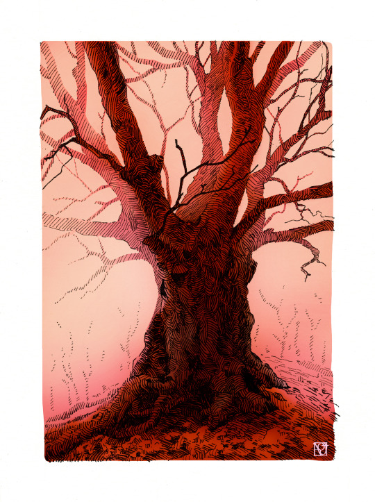
#Illustration#pen and ink#tree#art#mixed media#spooky tree#acrylic ink and photoshop color#I'll try watercolor again here soon#PS is just way faster#my art#liquitex
3K notes
·
View notes
Text


Portrait of Luo Yunxi with a golden cat⚜️ Painted with acrylic inks.
#luo yunxi#portrait#acrylic#traditional art#ink portrait#ink art#liquitex#cat#portrait with a cat#metallic ink#traditional portrait#grey paper#golden ink#stylized#stylization
67 notes
·
View notes
Text

I posted a lily of the valley art only like 4 days ago… But here’s one I really love 💕
Inktober day 10! Liquitex brand acrylic ink on 210 gsm black paper
#inktober#inktober 2023#art#flowers#lily of the valley#flora#floral#florals#flower#liquitex#acrylic ink#inks#ink art#ink painting#acrylics#acrylic inks#white#green#botany#botanical art#nature#blossom#blossoms#lilies of the valley#my art#my posts
25 notes
·
View notes
Text

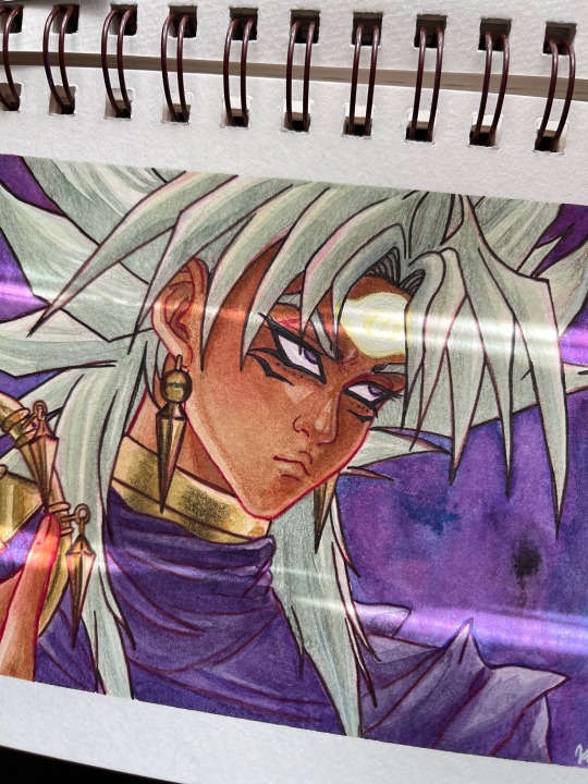
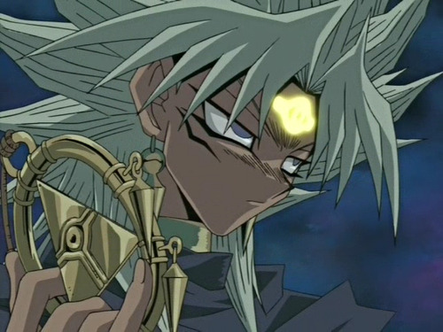
Screen redraw of Yami Marik using acrylic inks and colored pencils. I made a few mistakes here and there, as I hardly use acrylic inks and am not used to them, but it was fun practice! I really like drawing Marik! I hope to do more of him in the future~ 💜
#katimariposaart#traditional art#fan art#yugioh#yami marik#screen redraw#acrylic ink painting#acrylic ink#colored pencil#liquitex#watercolor sketchbook
27 notes
·
View notes
Text
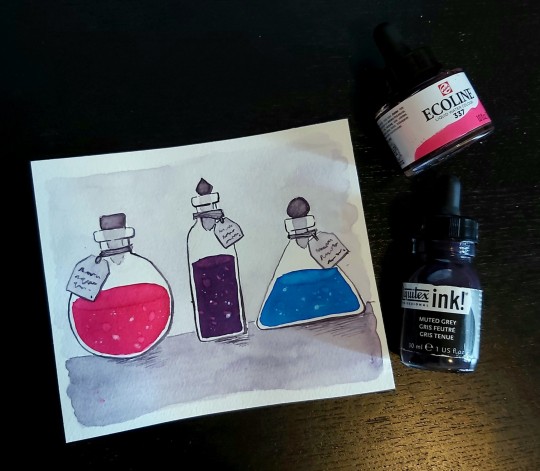
The spooky seasons auto makes me think of potion bottles. Wanted to work with super saturated colours for this one.
4 notes
·
View notes
Photo
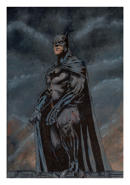
Here's an unused layout for an "In-store" variant cover that was rejected, then reworked a bit, given some spit and polish, and then a whole lot of TLC, and then was accepted as said "In-store" variant, but on a much smaller run. Oh, and it's also going to be a limited poster run:
"Sunrise over Gotham"
Pencil, Inks and Liquitex Professional Heavy Body Acrylic Paint's on 300gsm coldpressed Watercolour paper
#batman#comicbook#dccomics#comicbookart#comics#art#sketch#artwork#original art#drawing#Inks#sketchbook#artist#sketching#creative#painting#liquitex#acrylics#variant cover#poster#poster design#comicartist#no ai art#support human artists
1 note
·
View note
Text
Painted this Nebula with fluorescent acrylic inks, and the black light version of this piece turned out soloooo fun!
0 notes
Text

Making Taquito the Boa my first art post on my new Tumblr. Cheers to new beginnings (hopefully). It's been a decade since I used Tumblr and honestly, I can't remember why I left in the first place.
Taquito was a painting made for my friend Kelsey. Tools: Faber castell ink markers, liquitex basics, artist's loft acrylics, and jelly roll pens. 2022
2K notes
·
View notes
Text
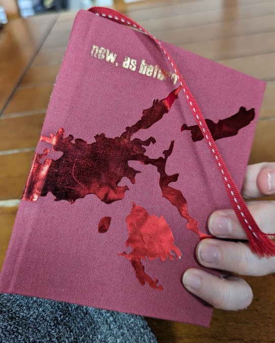

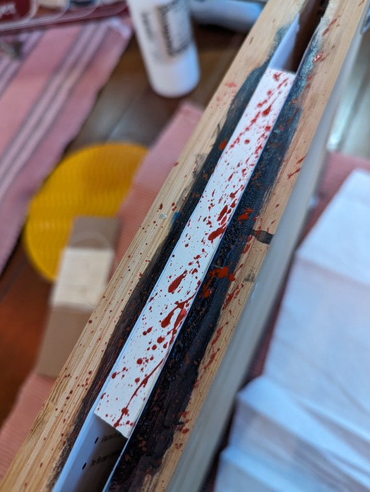

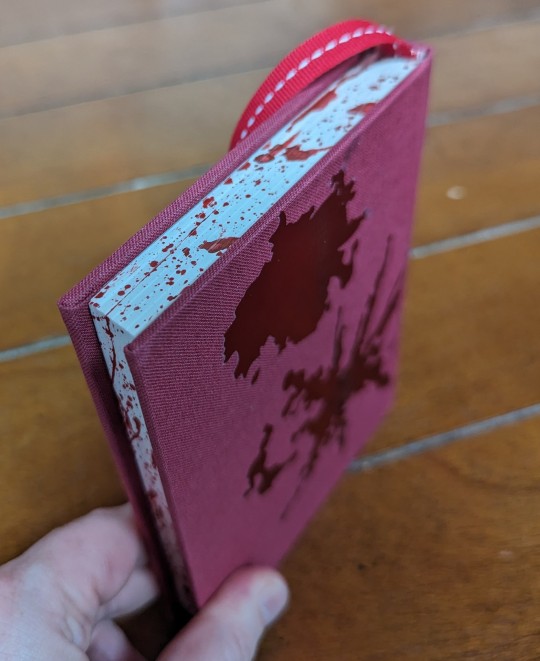
An au fic that is near and dear to my heart, and one that spawned hundreds of thousands of words of follow-up, companion pieces, aus, and so on. AKA the one where I fixed canon by turning a major character into a zombie.
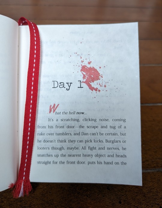
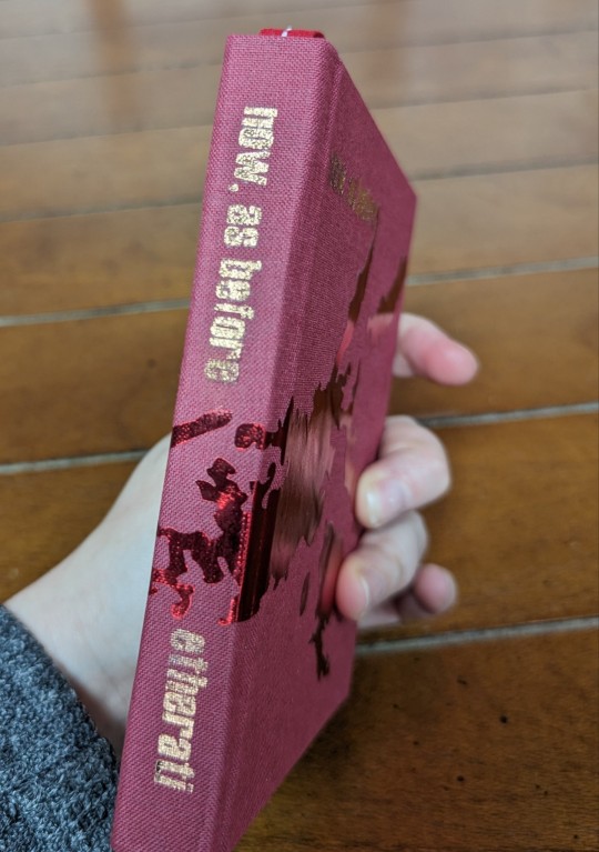
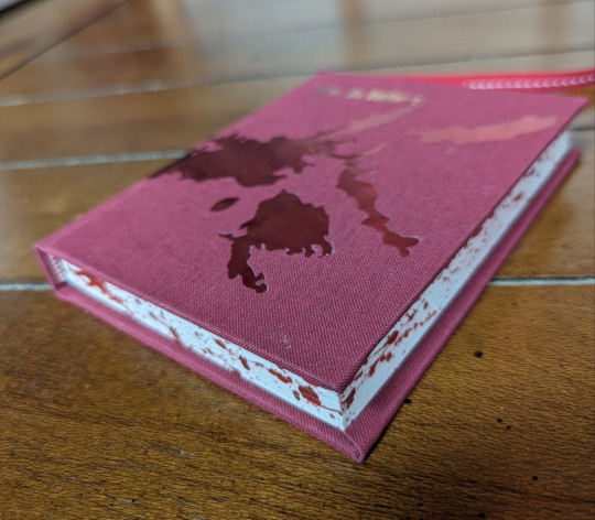
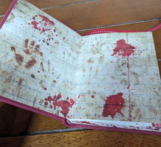
Lot of firsts on this bind -- first time using a guillotine for the edges, first time including a bookmark, and first time using heat transfer vinyl, for the lettering and bloodstains on the cover. For a first attempt, not awful; the letters came out a little raggedy but I decided to just roll with it since this is, thematically, supposed to be a bloodied and ratty relic of an apocalypse. And I FUCKING LOVE how the blood splattered page edges turned out.
Technical details under the cut.
Body text is Kozuka Mincho Pro R on French fleece white parchtone; titles are Haettenschweiler; chapter headers are Traveling Typewriter; chapter caps and Tshirt text are You Murderer BB. Blood splatters from a font called simply "splatter".
End papers are some kind of scrapbook paper from a "blood splatter" pack I found online somewhere. Bookcloth is generic BbH. Vinyl is Siser Metal HTV, cut with cricut, that I jacked up by using an iron instead of a proper heat press. Edge splatter with mix of liquitex naphol red light and FW Pearlescent black acrylic inks.
I think that's everything. Most ambitious bind I've done and one of the ones I'm happiest with in terms of overall presentation.
#book binding#bookbinding#fan binding#fanbinding#fic binding#ficbinding#hand binding#handbinding#book arts#I'm still very much a newbie at this ok#so don't be too harsh about my messed up vinyl#watchmen zverse
55 notes
·
View notes
Note
as an aspiring comic artist looking to move from graphite and oil painting to more ink/inkwash/watercolor like you- could you explain your process a bit? any tips for beginners? i love your art and you're at the top of my inspiration list right now :,)
Thank you! I've been using ink and watercolour for a long time, and ink/inkwash is definitely my favourite medium. A key tip for getting started would be to know the different kinds of ink available because they all work differently. The three main ones are:
Dye-based ink - these have their uses, but they are not lightfast at all (fade quickly) and they act kinda weird. The colours are very vibrant, but they tend to dry very fast, not be waterproof (tricky for layering), and stain the paper. I use very few dye-based inks. Some ink brands look like they have a big colour range, but when you look at the boxes half of them say "dye based" - don't buy Higgins those.
Acrylic ink - think of this as very liquid acrylic paint. There are a lot of fancy options, many specialty kinds (metallics, pearls, neons), but they aren't going to give you the transparent inkwash look. It's good for drawing opaque lines over colour, and you can dilute it with water for a wash, but it gets chalky. Waterproof may vary (test it first), and it usually has a matte finish. White acrylic ink is well worth having as you can detail over solid black or tint it with coloured pigmented inks, and god knows I love using neons, but I treat acrylic ink like "effects" ink. It’s not my main drawing ink. Daler Rowney is good and widely available (pigment-based is not the same as pigmented ink, this is still acrylic ink), they have a few lines at different prices. Liquitex is decent.
Pigmented/India ink - this is my favourite kind of ink and probably what you want! Pigmented ink dilutes well (it’s a transparent medium like watercolour) and often has a glossier finish depending on shellac content, and it will say on the bottle if it’s waterproof (test that first). It’s good for brush or nib, good for layering, works nicely with watercolour and other types of ink, can be mixed to make new colours/tints...she’s got it all. If you’re in Australia, Art Spectrum is great, I stock up every time I’m back there. If you’re elsewhere, I recommend Speedball for black ink (Blick Black Cat in the US is good). Dr Martins Bombay India Ink has great colours and they’re usually affordable.
There are many brands and everyone has their preferences, and over time you will find your own. I have a mix of different types and brands, though probably fewer than you’d think. Get a small bottle in one or two colours and play around, see if you like it before investing in a set. Don’t buy fountain pen ink or Rapidograph ink for nib/brush, those are best suited to being used in specific types of pens.
The nibs I use are Hunt #512s. #102s (called crow quills) are popular and I like them too, but they are very sharp and will rip up your paper, and can be a little too flexible and hard to control. The #512 is a good all-rounder with a smooth line capable of variation, and I think they’re a solid choice for a beginner. These nibs and holders are cheap and widely available. I don’t buy expensive watercolour brushes because ink will wreck them a lot faster than watercolour will. What you want to look for is the fibers holding a point - the brush should not have bedhead.
My only real advice to someone looking to try watercolours is to not buy the cheapest shittiest kind. You know from oil painting that all paints are not created equal and bad paint is going to frustrate you, especially when you’re starting out. I started with one of these twelve years ago and I still use it in conjunction with other sets I’ve built myself, I just refill the pans from (better quality) tubes when they get low. They last a long time. So do bottles of ink.
I’d like to do a process post, but I’m not sure what would be interesting or helpful to you, and I use ink/watercolour/gouache in a lot of different ways. If there’s a specific piece you liked the look of, I’m happy to demonstrate that method, or I can just go through my favourite approach.
As for comics...the best advice I can give you is pretty general.
Anatomy is a rewarding life-long study, but what really counts for narrative art, over technical accuracy, is GESTURE, EXPRESSION, and BODY LANGUAGE. Look at people. Look at how they move, look at their faces, look at their hands, listen to how they talk. In comics, you are the director and the actors.
Environments are a bonus character in your story and can add a lot of depth and atmosphere! Understanding perspective will make using them a lot easier.
Do not start with your graphic novel idea, start with a short story (under eight pages) and finish it. Finish it. Fucking finish it. Then do some more, getting longer over time. The best idea you never do is worth less to your progress than the worst finished piece.
There aren’t a lot of books that dig into the nuts and bolts of sequential storytelling for artists in a way I like. Filmmaking books are handy, but they’re dealing in moving images and don’t have to worry about page design. There are some good “how to make comics” books (the two Will Esiner did are my favourites), but as a genre it can be very hit or miss. I always look at what the writer/artist has made to see if I want to listen to their instructions - if you hate their art and think the graphic novel they made sucks, don’t buy their how-to book.
Bob McLeod, one of my teachers, gave us all this list:

These rules aren’t inflexible, but they cover the big issues.
For actual storytelling advice, the best one I have read was Directing The Story by Francis Glebas. It’s aimed at storyboard artists, which I was, but it discusses visual storytelling and explains how to approach it and the reasoning behind choices in a way that is useful for anyone making sequential art.
233 notes
·
View notes
Text


Advent Anthology by @pacific-rimbaud
A Compilation of PR's one-shot entries for DHr Advent, years 2020-2022.
Fandom: Harry Potter
Relationship: Draco Malfoy x Hermione Granger
Art by the wonderful @chestercompany
My binderary baby and second fanbinding project.
read below the cut for the process and other binding deets.
Quick Specs
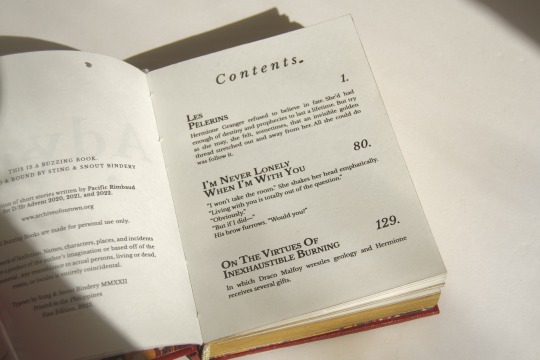
20,015 words | 179 pages | Quarto (1/4 of Letter)
Technique: Flatback bradel
Title & Body Font: Libre Baskerville (in various style emphasis)
Fics included:
Les Pelerins (10k; 2020 entry)
I'm Never Lonely When I'm With You (5k; 2021 entry)
On The Virtues of Inexhaustible Burning (5k; 2022 entry)
Pac is the type I could trust to write anything and I know I'll absolutely love. Her advent fics, in particular, I especially adore. The writing is very visceral and I will not admit how many times I've reread these.
On The Book
I had not intended to bind any book/s for @renegadepublishing's binderary because of my hectic schedule, however FOMO won over and this book was born. It was a relatively quick design and typeset (I really do better under pressure lol). I wish I could say the same for when I started the actual binding though. This is the 8th book I’ve bound and I had expected it to go relatively smoothly, but this book fought me every step of the way and I'll indulge in expressing my distress on this post.
First, the print place I go to messed up my typeset, thus me having to travel back home to use our old crappy inkjet (that took 3 hours to print). And because said printer is crappy, I had to use 100gsm short grain to minimize show-through, and well, you can imagine how stick straight the pages are. Second, I made the case too small (I worked on the book after a toxic 12 hour lab day and was not in the right state) and instead of redoing the covers, I re-trimmed and repainted the fore edge (at cost of my lovely margins ..wails). Third & last, the vinyl refused! to stick to the cover and I proper burnt the HTV as well as my finger on my iron. In the book's defense, it was my first time using leather paper and I forgot to test their chemistry.
On The Bind
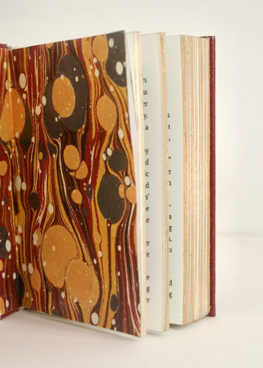
Everything else went swimmingly, aforementioned shit aside. I tried not to make this book scream Christmas and leaned into a more subtle theme through color choices. I finally got to use this lovely red leather paper from Itoya, which my parents bought me during their trip in Japan. Many thanks to @celestial-sphere-press for helping me out with the shops to visit!
The design cover was made on Illustrator. The words are actually the fic prompts which I arranged in concentric circles, inspired by the arrangement of the advent candles in our local church from years back. I have no idea what paper my print place used, but it has some nice pulp to it.
As I said, I melted the HTV and certain parts refused to stick, so I peeled all of it off, except for the spine title (which miraculously stuck) and used my foil quill pen instead. I used an off-brand one and it's really good!
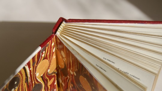
I also did this sort of strip across the edge which I learned is called a "river" as Nic @bindsbymunchkin called it. The side near the spine though, looked asymmetrically empty, so I added the foiling. And as this is an anthology, the punctuations was a design choice to convey the start and end and pauses in-between stories (and mostly because they just look fancy lol).
Like my last bind, the edges are gold which is comprised of an undercoat of diluted dark gray Sakura acrylic paint and many layers of Liquitex iridescent gold acrylic ink.
Endbands are made with alternating colors of cream, gray, and gold DMC cotton threads, however I'm learning I don't very much like how sewn endbands look on small flatbacks.
The endpapers are my fave. I had already tipped in plain cream cardstock but then I was like: this book needs MARBLED PAPER! so I ripped off the one I had stuck and replaced it. It's actually not real marbled paper HAHA. I sourced it from this site, printed it on some heavy paper, and oh my god I believe the universe really meant for me to find this pattern because it coincidentally matched the colors of the endbands!!
On The Typeset
I wanted to keep things cohesive but also give each story its own character. Libre Baskerville was a lovely typeface to do that on.


From left to right: Les Pelerins, I'm Never Lonely When I'm With You, On The Virtues of Inexhaustible Burning
For Les Pelerins, I wanted to mimic the silhouette of the establishments in Montmartre, hence the varying heights of the letters. If I wasn’t on a time crunch, I would’ve spent more time editing the headers but alas this is what we get. INLWIWY is more straightforward– a pinecone, which was a recurring theme in the story. And I think OTVOIB is my favorite. I drew tiny gold cracks onto the coal rock which is a significant element in the story. It still gives me that stomach flip whenever I reread it (iykyk).
#sting and snout bindery#buzzing books#z’s biblioteca#fanbinding#bookbinding#binderary2023#dramione#pacificrimbaud#dhr advent 2022#dhr fic#ficbinding#dhr advent
130 notes
·
View notes
Text
Clamp Art Style Analysis: Part 2: Series styles and Compare and Contrast
Series Styles
Over the years the Clamp art style changes constantly depending on the series, and the art direction always changes depending on the work and magazine. Clamp’s art style always changes to suit the genre of the magazine the work is running in. When I researched I noticed when I look at their earlier works and recently it's in that their art style changed over the years I saw that the art of these series improved due to different works' sterilization and the hiatus this is seen in a few series that I am going to talk about. I am not going to go over all of their works just choose these series and discuss them in this segment, I am going to be heavily biased and choose this series to talk about the art style, lines, and materials used while drawing the series
X1999
I don’t know the art style with x as I did with the other series since there wasn’t much to talk about in the interviews.
Mostly I think this is the beginning of Clamp’s early years when the art style looked this way. The art style Clamps early years as artists. The one in charge of X's art direction is Nekoi, Nekoi is in charge of the art direction of x with Igarashi assisting, The art in X changed with the art shifted to Nekoi’s delicate style.
The art of X changed expeditiously compared to how the art looked in the first chapter,
The art at the beginning of X had thick ink lines and more dramatic shading in the early volumes and is more or less gone. X is drawn in a more ornate style characteristic of shoujo manga, noting that x is a series intended for a female audience. X takes on a shojo style bolder and more intense art for drawing X there is a heavy use of screen tone. While drawing X, they used straight lines they drew with Thick lines in the beginning, X had a lot of colored backgrounds in the illustrations, and manga X is one of the series in that they had trouble applying screentone.
If you compare x it has changed a lot due to Clamp working on other series though mostly it's because it ran the longest in the magazine. X was sterilized during Wish, Card Captor Sakura, Chobits, Magic Knight Rayearth,Suki, Legal Drug, Legend of Chun Hyang and Angelic Layer.
When it came to creating for x it was the original character profile, Clamp drew all the aspects they wanted to include in the final character in a bulletin-type chart they drew it like a New Year's greeting card.
Unlike with other sterilization, they didn’t decide on the materials they would be using so X doesn’t have any specific material for drawings. Nekoi and Mokona did a lot of experimenting with materials in x. Clamp used many different materials and a variety of techniques when drawing X the colors in x they painted with a lot of new materials and a lot of contrasting colors. There was a lot of experimenting with materials with x. You can see it in the illustrations.
The materials that are used for x are color screentone. Colortone is a type of colored screentone called overlay, their usual color ink, gash, and pastel products X has many different kinds of illustration paper used for coloring from wrapping paper and cardboard to tea wrappers.
I am going to go over the materials they used in their color illustrations from 1992-1996 and 1997-2004
1992-1997
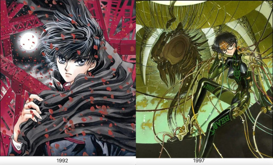
Paper: Kent Block, BB Kent, BB Kent rough surface, Kent paper, sand textured paper, Shinden shi paper, Feather Waltz, Arches, parchment paper, manuscript paper, Watson paper, wood free paper
Lines: Holbein Color Ink (Special black), Photocopied pencil lines, Pigma Graphic pen, Pigma Graphic ink pen, color pencil, pencil, Holbein Color Ink (sepia), poster color, color pencil, Winsor and Newton Drawing Ink (nut brown), Dr. Ph. Martins Sepia Ink
Color: Dr. Ph. Martain’s Color Ink, Acrylic, airbrush, modeling paste, gouache, color tone, poster color, Liquitex, Acrylic gouache, color tone, white out, Copic markers, Lumocolor Ink pen, Lumocolor
1998-2003
Paper: Watson paper, BB Kent, copy paper, Sheet of paper with a light brown color, hotel stationery paper,
Lines: Pigma Graphic ink pen, India ink, Ballpoint pen, Sepia black ink,
Color: Lumocolor ink pen, modeling paste Lumocolor, sepia, copic marker, airbrush, poster, Acrylic gouache, airbrush, color ink, Liquitex, Dr. Ph. Martains Color Ink, Gold brown Ink, Poster color, color ink,
If you looked at the materials and techniques in the comments used for drawing the illustrations of x they
put a lot of work in the color illustrations for x. The materials used in the illustration change the impression.
For the illustrations, There were a few comments about it, A 2002 comment that Fuuma's head looks a little big; this is a drawing habit they had while working on Chobits at the time.
When it came to illustrations sepia ink was used for outlines of characters with pale color profiles since the lines stand out too much in black in illustrations sepia ink was used for characters with pale color profiles. Hinoto, Kakyou, and Kotori have Saphia outlines. Yuto is the only exception. He has a light color profile but looks good with crisp outlines so he is drawn with black ink. When Clamp drew Kotori they always made sure to draw her with a very faint and soft touch when it came to drawing her in illustrations they used Sephia instead of black for her lines.
X is a shoujo manga that ran in Asuka for some time. It has a lot of action scenes that attracted male readers, Asuka gave the team the freedom to create what they saw fit.
There is a difference in colors between the first and subsequent printings as seen in the volumes of X. The volumes up to 4 were a lot tidier but on volume 5. Clamp started to get busier and messier.
Everything in X is written by script, even the details of the collapsing and the destruction of the buildings look like the destruction of the buildings is written from the script from Ohkawa. The backgrounds and destruction of the city were mentioned by Ohkawa. While Clamp is drawing the destruction of the buildings they have reference photos taken beforehand which Igarashi finds tiring and painful.
In Kamui’s character design, Kamui has Tsuri-me-type eyes like Ashura from RG Veda Clamp considered Kamui's hairstyle and uniform average.
The character that Clamp had a hard time drawing appearance-wise is Kotori, Kotori was the character that Clamp found trouble with drawing. When Ohkawa looked at the manuscript copy of chapter one Ohkawa was a little shocked at the drawing of Kotori even considered her like udon. Mokona did her in pencil in the rough draft, Kotori looked soft and sort of limp when she added a pen she looked thicker by thinning down the lines her body became less solid making her float around she became lighter and more impermanent so they used the tip of the pens instead when inking her.
Another one of the difficulties that came with drawing X was drawing all the characters from the dragons of heaven and the dragons of the earth in one picture in the same illustration. They are parts of the character that give you trouble that you confuse with others but individually they are easy.
Clover
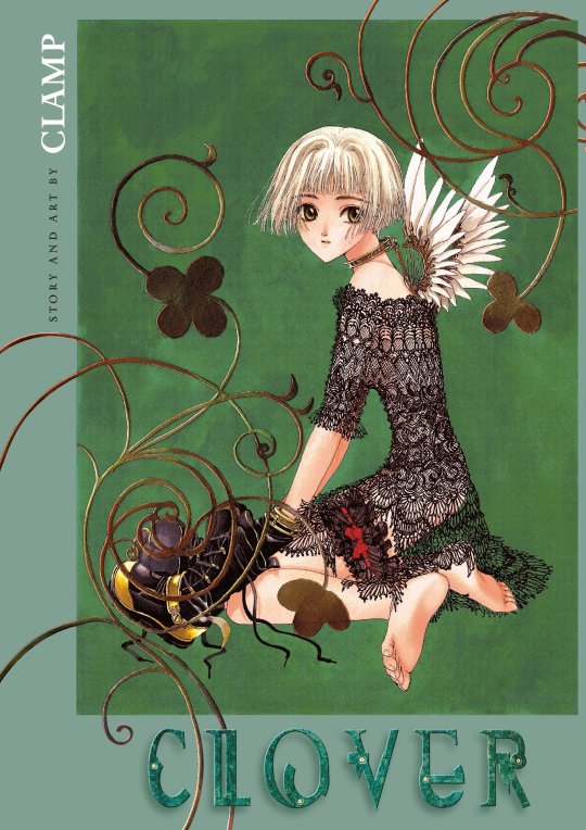
Clover has a different sense of atmosphere and techniques. The art in Clover has a feeling of decadence or nostalgia, the wing design looks like older Mecha Ohkawa was influenced by the movie “1984” she made Mokona watch it to recapture its mood. The buildings in Clover reference old movies made to resemble German and European countries. They also used European photographs as references, like photos of German factories.
Ohkawa made modifications to Clovers' art style since it ran in a magazine for young girls the intended audience for Clovers was older so the art style is made to look prettier since it's for girls.
Mokona is in charge of the art in Clover even the story paneling was planned out by her Both Mokona and Ohkawa planned the panels in the manga Clover. The distinctive layouts and layouts of the panels are created with music videos and movies in mind. The panels in Clover look like frames from a movie. Ohkawa had a hand in it with half having to plan the width of each panel. It wasn't easy and took more time. Clamp found the layout the most challenging and most fun they had in the series, for Clover has dialogue or scenes with big spaces between sentences. Clamp used thinner frames to look pretty.
The art material they used is gayoushi paper which is used to emphasize the bounciness of Sue's hair. Gayoushi paper is a type of cartridge paper in Japanese. They used drawing paper for clover the drawing paper here is contrasted with other, more common media. Clamp used different paper for clover which is cartridge paper or gayoshi paper for drawing the manga but the screentone kept slipping off and was annoying to Clamp. They used the copy machine to give Clover a picture book blurred look they had a hard time getting it right and tried many times.
Card Captor Sakura
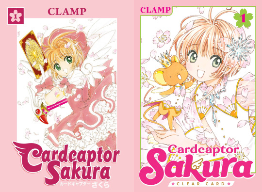
For the art style of Card Captor Sakura, Clamp wanted to create something really cute.
It focuses on the cute factor so the lines and use of ink are to give it a soft and cute feel Card Captor Sakura uses thin, curved lines the manga Mokona the one who makes the lines thin in Sakura and doesn’t use a lot of ink making the pages light and to make it look soft feel. It is a shoujo manga with a magical girl genre so it would make sense that the series would look soft. Card Captor Sakura uses color ink for the illustrations the color ink is used to create a clear image. For materials Card Captor Sakura and clear card Arc used copic markers and modeling paste in the illustrations.
For designing the Clow cards, the design of borders of the cards was created first. Mokona filled in the illustrations, and the rest determined the card name and functions in the story. Clamp didn’t have problems with designing characters but the expressions changed from the plan.
Chobits
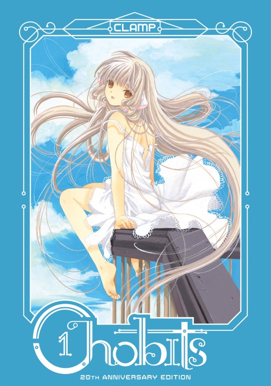
The materials of Chobits are based on Ohkawas decisions for materials. Clamp uses ball pens for drawing. They used ball pens since they wanted something drawn by pencil. The illustrations for Chobits have Clamp use acrylic gouache and more gouache.
In Chobit's art style the character has shorter arms and legs and the shoulders aren't wide. the character designs for chobits for Chi, Chi’s design is the most detailed one.
Legal Drug
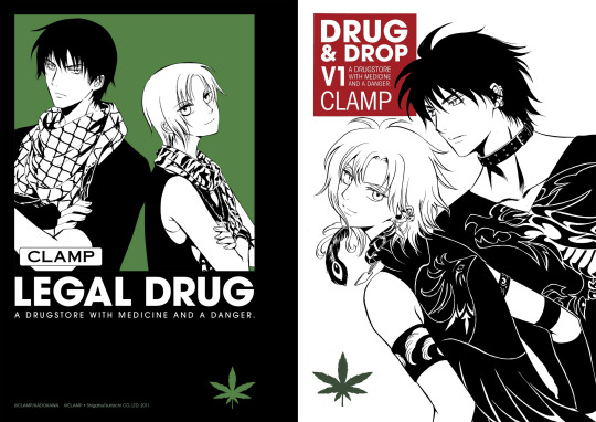
Legal Drug came after Suki, Clamp was into underground crime dramas so the manga has serious and dark tones. The series went on a hiatus so the art style changed compared to when it was first run making the art style similar to XXXHolic.
Clamp used digital computer equipment for Legal Drug, Legal Drug is the first series that Clamp drew colored digital for the first time. Clamp drew all the CG color illustrations for Legal Drug. They wanted to use CG as a tool so they learned how to use CG from Katsuya, Okazaki Takeshi, and Takashi Yamazaki. Clamp struggled using the computer for the first time they ran into problems like the power ran out of the computer before saving.
Tsubasa Reservoir Chronicle
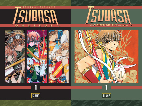
The drawing methods changed with Tsubasa and XXXHolic, two series that worked in tandem; this goes with the drawing style of both series since the art style has been changing. Both scripts of XXXHolic and Tsubasa have a lot of difficulty, Tsubasa was supposed to be for a younger audience which caused it to increase complexity but it gave the team complete creative freedom. Clamp didn’t want to make the pacing too complicated due to being about a young man's journey.
Tsubasa had thicker lines and simple page layouts, Clamp used a marker with thick lines that could be drawn while printing on rough paper since the frames did not work well the fine lines looked blurred Clamp had a problem making the lines too thin, and didn’t have the impact they needed to stand out the lines need to be bold and popped out since it's a weekly manga series said readers tend to forget. The thick lines in Tsubasa are to make the art be seen in the magazine printings since thin lines are too delicate and will make scenes hard to see in the printing of the magazine
Since Tsubasa is running a weekly magazine the thickness of the lines affects the visibility of the magazine printing.
Tsubasa started the trend of drawing thin vertical borders and thick horizontal ones, the difference between the panel borders Clamp separating the panel in the layouts to link it to XXXHolic.
The art style of Tsubasa was based on a suggestion from the editor The editor asked the group to make the drawing style attractive to readers of Shonen magazine Tsubasa is a shone manga drawn to fit that genre Clamp already had design decided and materials prepared.
For materials they are seen using when drawing, Tsubasa is a monograph mechanical pencil used for pencil drafting in their manga. The Clamp uses a marker with which thick lines can be drawn to make it pop out on rough paper in printing the ink markers they use to fill in the large spaces. Clamps have Copic markers for colored illustration in Tsubasa.
Ohkawa directs the art style of Tsubasa, she tells the members to draw the male characters with vigor and take more care of the female characters. Mokona is the artist who crafts the characters and storyboards she draws most of the characters in Tsubasa, female characters have soft fluffy hair and look like they are drawn with soft touches, and male characters are drawn with a rougher touch. Ashura wasn’t easy to draw since they have a feminine beauty and it wasn’t easy to draw those with loose eyelashes. They decided not to draw lower lashes which made the faces stiff, evident with Emeraude they changed her hair and put curls in her hair to make her more graceful. They used their normal style to get the readers to pick up the story. When accustomed to the new style they thought of slowly returning to their art style during the country of Oto.
The script of Tsubasa takes 5 hours, the storyboard 10, and the drawing for the manuscript takes two days for 20 pages. If not going well, it could take three days.
XXXHolic
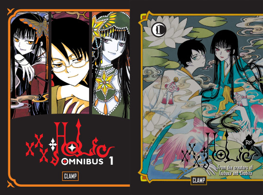
The drawing methods changed with Tsubasa and XXXHolic Two series worked in tandem compared to the two series XXXHolic was the series that Clamp found was easy to draw.
The characters of XXXHolic are drawn to be very tall and have long limbs; they are thinner and longer in the drawing. It makes characters more expressive in the manga. XXXHolic and Tsubasa have similar proportions for characters The reason is that they cross over Tsubasa is linked to XXXHolic the proportions of the characters are similar to be meant to cross over to Tsubasa.
The materials for XXXHolic they use for drawing are felt tip pens since human characters are drawn by 2 people if they used a regular pen the brushstroke strengths would be uneven Clamp members have strong drawing pressure so having the same pen can even it out. Clamp decided not to use screen tones for xxHolic, XXXHolic is drawn without screen tone to give more of an impression of occultism.
They used mechanical pencils for the drafting stage when drawing in xxxHolic and inking markers to fill in large spaces.
There are a lot of Japanese and Chinese in XXXHolic The style Clamp uses for XXXHolic is similar to traditional Japanese Ukiyo-e paintings, a Ukiyo-e art style that dictates longer proportions for the characters. The character looks tall and lean. xxHolic looks more like a wood block painting and has Japanese prints and Alphonse Mucha with an art nouveau in it. The female characters in XXXHolic are drawn by Mokona and the male characters are drawn by Nekoi who are also Yokai and spirits that aren't in human shape and animals.
The covers and color pages are drawn by Nekoi and Mokona together, the base colors of the covers are never white, gold, or silver then color printed over it.
The storyboard for XXXHolic takes 6 to 8 hours done by Saturday.
Kobato
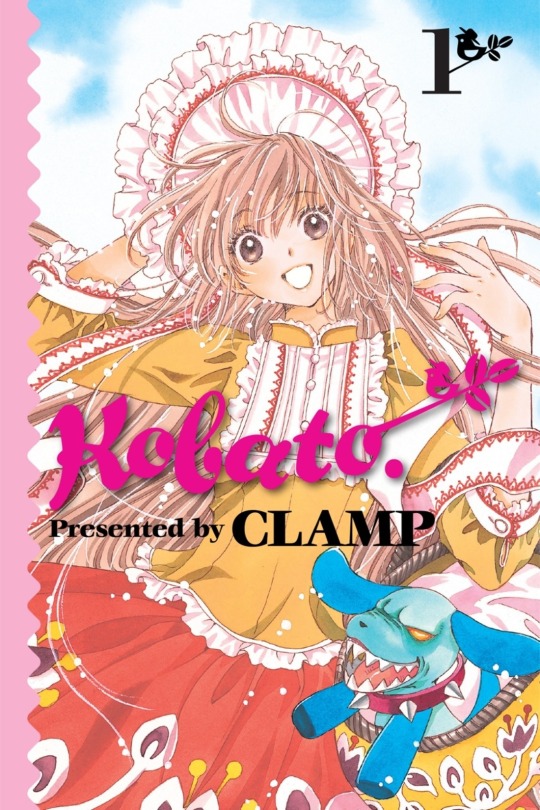
Kobato's art style is similar to Card Captor Sakura’s. The lines used in Kobato are similar to the lines in Card Captor Sakura, and the lines in the manga are thin, like a shoujo manga. The colors of the illustration are pale with a touch of watercolor.
Kobato was made into a brighter series since Tsubasa was heading into a dark development, Kobato's story is loose and not too dark and is meant to be more relaxing.
Comparing and Contrasting the panels of these series
X/1999 & Clover
Clover and X are two old shoujo manga done by Clamp though Clover was drawn during the run of X
making X the longest-running series. Each of the members of Clamp is in charge of the art direction of the manga
with Nekoi in charge of the art direction of x and Mokona in charge of the art direction for Clover.
The lines that are used to ink and the line thickness in the two series are different along with the amount of pen pressure seen in the manga. The members of Clamp have strong drawing pressure. You can see it in the way they drew the lines in the ink and the line weight in the ink in the manga. You can tell the amount of pen pressure used in both the manga series is a testament to how strong the drawing pressure is.
For the line thickness for both series, the lines in X have straight bold thicker lines. The lines in Clover are thin and along with the panels the lines have thin frames.
X uses a heavy amount of screen tone whereas Clover doesn’t use too much screen tone.
They use a different sort of paper for clover that is gayoushi paper which is used to emphasize the bounciness of Sue’s hair.
These are two styles. The art style for Clover is made to look pretty since it's for girls and drawn with an air of decadence to give people old-fashioned feelings when they read it. The style of Clover stands out due to how it's drawn. The frames of Clover are supposed to look more like a movie. The art style of X went through huge changes due to a long year run so its art style changed to be more defined and detailed.
Both manga series have different art styles to suit the atmosphere of the manga X used a heavy atmosphere where Clover has some sort of emptiness that the characters in the manga face to symbolize how bleak their situation is though someone pointed out that a large amount of negative space for clover is drawn to emphasize for the characters loneliness. The atmosphere of X gives a more foreboding sort of feel since it's near the end of the world.
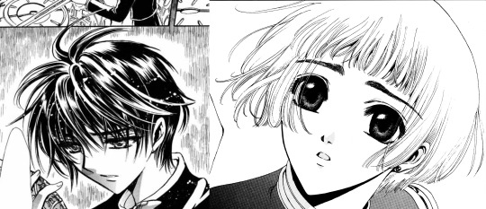
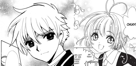
Tsubasa and Card Captor Sakura
These two manga series went through two second series there is major art development compared to how it was first runned here to properly focus on the current art style.
When you put the two together they are radically different.
The art styles for the two series are created to fit the genre with Card Captor Sakura being a shoujo manga and Tsubasa being a shonen manga.
For the lines of the series, Card Captor Sakura is thin curved lines and doesn’t use a lot of ink The lines in Tsubasa are bolder and thicker with simple page line art.
The materials used when drawing Tsubasa for which thick lines can be drawn is a marker with thick lines as stated before the impre.ssion of the series can change depending on the materials used this is true for Tsubasa and Card Captor Sakura
The characters in Tsubasa are drawn differently by different artists the female characters have soft fluffy hair drawn with soft delicate touches and the male characters are drawn with a rougher touch to emphasize masculinity.
The eyes of both series are different. The eyes in both series have different textures in the irises with the upper eyes in Card Captor Sakura being thin and dark. The eyes of Tsubasa are angular and thick there are no lashes in the eyes of Tsubasa
Sakura and Syaoran

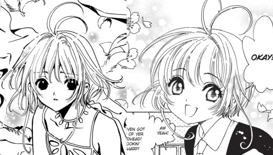
If you need to compare the series the styles would be seen best in the designs of the two characters of Sakura and Syaoran. Looking at them together the impressions of these two characters do change depending on the art style of the series they are drawn in. Sakura and Syaoran are drawn differently in Tsubasa than they were in Card Captor Sakura Even though Sakura and Syaoran are drawn the same there are a few differences that set them apart seen in the hair and eyes.
The designs of Sakura and Syaoran are re-used in Tsubasa in designs. I would notice a lot of small details in their designs that make them different and stand out as their hairstyles and eyes differed when you put the two of them together. The new designs of the characters convey the impression of their characters.
There a different impressions of the two characters when you look at the art style how they are drawn with thin lines and how they are drawn with thick lines the impression of the two characters are There different when looking at the different art style and how differences there are in their designs
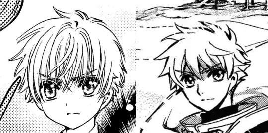
In the Card Captor Sakura Syaoran looked more like a boy fitting since he is in elementary school so he's drawn to be much younger. The syaoran in Tsubasa gives an image of a young man between boyhood and manhood Tsubasa’s syaoran design highlights maturity in contrast to Card Captor Sakura Syaoran. The height is obvious in the designs drawn with the Tsubasa design.
If I compare the two Syaoran together their expressions are different, Card Captor’s Syaoran looked dour and moody
whereas Tsubasa’s Syaoran spots a determined, serious look. Card Captor’s Syaoran looks like a little kid while Tsubasa’s Syaoran looks like a bright honest, sincere young man. The only difference between the designs of syaorans would be their expressions conveying their overall look and personality in their design. Syaoran is designed based on a shonen protagonist it answered with what would happen if Card Captor Syaoran is the shounen protagonist with Tsubasa Syaoran as the answer.
For Syaoran’s hair: Syaoran’s hair is a crew cut with the end shaved. Both Syaorans have the same hairstyle drawn differently from the series. In Card Captor Sakura there are a lot of lines and details in the hair of Syaoran’s with his bangs being thin lines. Tsubasa’s Syaoran hair is simplified and doesn’t have too many lines his hair and bangs are drawn simply and look blocky and rough he is drawn with rough edges as seen with his hair that emphasizes masculinity.
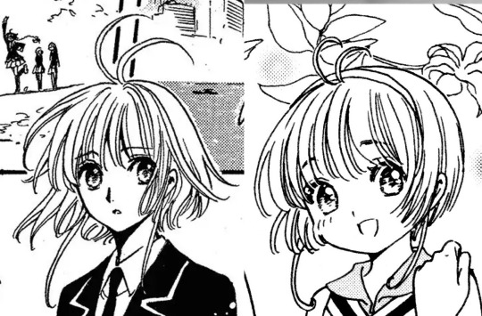
For Sakura's hair, both the Card CAptor and Tsubasa have short hair. She does have the same short hairstyle; there are a few noticeable differences. Card Captor Sakura’s hair looked straighter in the art, Tsubasa’s Sakura hair has soft fluffy hair and looks bouncy and floofy. her hair moves in different directions to emphasize the bounciness aspect and there are a lot of strands in Sakura's hair.
Card Captor’s sakura is designed based on one of Clamps nieces and Despite them being designed as normal girls, they have this cuteness to them that makes them appealing with Tsubasa sakura designs being reused but still have an image of cuteness like with card captor’s sakura still retains her cheerful and lively personality as she had in Card Captor Sakura.
Card Captor Sakura and Kobato
The two of them are both shoujo mangas but have different audiences with Card Captor Sakura created for a younger audience and Kobato for an older audience in mind.
The two series have different tones Kobato is focused on drama and is more serious but light and loose. Card Captor Sakura is a lighter series than Kobato but is drawn with a soft cute-like feel in mind with Kobato being a focus of reality and the supernatrual in the manga.
The amount of lines when inking at Kobato has a similar style to Card Captor Sakura with the series both using thin lines The lines in Kobato are thin and shojo manga like Card Captor Sakura use curved thin lines and don’t have a lot of of of ink. There are different textures in eyes when inked, Kobato has a lot of lashes in her eyes Sakura has a few lashes
Card Captor Sakura and Chobits

Card Captor Sakura is a shojo manga intended for a younger audience in mind, Chobits is an ecchi manga drawn for an older male audience in mind the art style is appealing to a male audience.
Though the genre of the two series has different art styles they are both drawn with the same thin lines the series are drawn with the use of thin lines and both look soft. Card captor Sakura Doesn’t use a lot of ink and has thin curved lines.
The difference is the materials that are used for the series Chobits uses different materials from Card captor Sakura, for materials for Chobits Clamp use ballpoint pens to make it look to be drawn by pencil The thickness in the eyes of Chobits have a thin line drawn, the ballpoint pen has something to do with it changing the thickness in the eyes.
Tsubasa and xxxHolic

Tsubasa and xxxHolic are both manga series that are drawn in tandem so it wouldn’t be a surprise they have a similar art style. Holic and Tsubasa have similar proportions for the characters this is supposed to show they are both linked. The characters in Holic are drawn tall and have long limbs which are thinner and longer in the manga.
Holic is styled as more of a woodblock painting. Holic art style resembles Japanese ukiyo-e paintings with ukiyo-e longer proportions. Holic is drawn without screentone to give more of an occult feeling.
Clamp uses different materials for the two series, Holic has members draw the characters they use felt tip pens to match Clamps' strong drawing style and use an inking marker to fill large spaces. For Tsubasa the materials they use are a marker with thick lines they used a marker with thick lines to make it pop. Since Tsubasa is more action-oriented since it is a shounen the art needs to pop.
Comparing the thickness of the lines in the series, I would say that Holic has thin lines to contrast with Tsubasa's thick bold lines The eyes of Holic look like there drawn using thin lines and the eyes of Tsubasa have heavy lines in them.
Prev/Next
#clamp#card captor sakura#card captor clear#tsubasa reservoir chronicle#x/1999#clover clamp#kobato#xxxholic#meta#legal drug#drop and drug#chobits#mokona#tsubaki nekoi#nanase ohkawa#Satsuki Igarashi#my meta
30 notes
·
View notes
Text

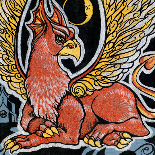
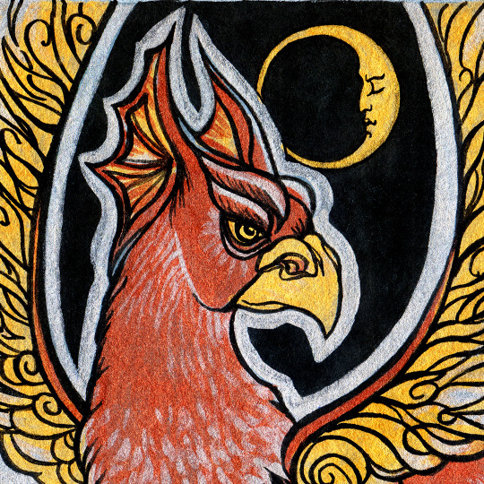
Gold winged gryphon guardian and his moon comrade🌛 (Two of my favourite subjects in the same art, yay!😍) Metallic acrylic inks on grey paper.
#gryphon#fantasy art#crescent moon#magic creatures#illustration#liquitex#liquitex work#acrylic#ink#metallic ink#guardian
4 notes
·
View notes
Text
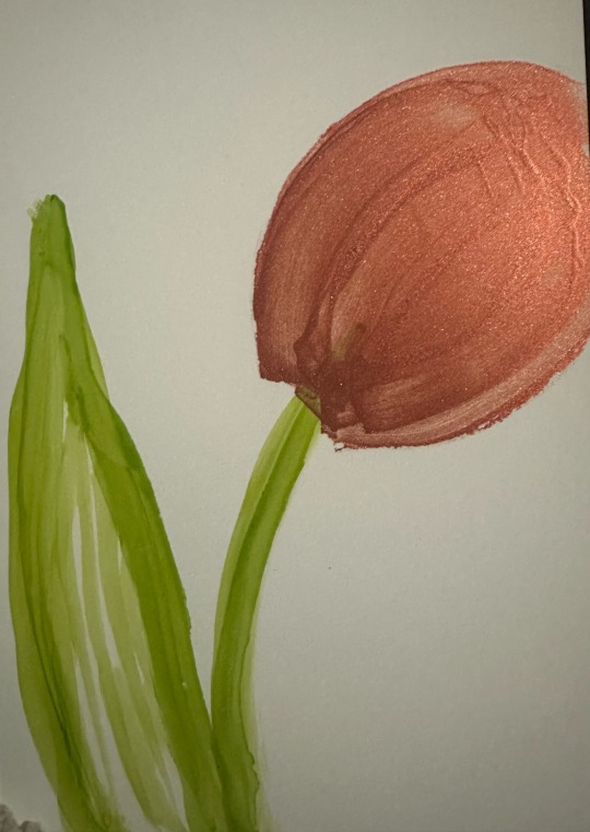
Tulip in green alcohol ink and copper acrylic ink on synthetic paper
#inktober 2023#art#inktober#acrylic ink#alcohol ink#inks#liquitex#flora#floral#florals#flower#flowers#botany#botanical art#tulip#tulips#painting#painting on paper#ink painting#synthetic paper#my art#my posts
5 notes
·
View notes
Note
Sorry if someone asked this before, but what mediums do you use when you do your traditional art (mainly the later chapters of Deathsitter)? Do you typically add anything digitally after you draw it out? Everything about it is just so pleasing to look at!
(so many apologies for taking such a long time to answer, I was out of the country and just now getting a chance back home to look at some messages)
So, for DeathSitter chpt6 and intermission 2, I've been experimenting with a number of traditional mediums-mostly because I have no clue what I'm doing and I need to learn lots of things fast-
But most consistently, I've used mainly acrylic paint, liquitex brand. I've been most recently laying panels out on hot press watercolor paper with pencil, and sometimes I ink things with black deleter ink or microns (I'm unsure yet if I like painting right on top of my sketches or inking first).
After I battle the painting process, I scan the panels and digitally touch them up with clip studio. The scanner isn't able to pick up really bright pinks or fluorescents, so I always have to color correct the scans (I try to match the painting by messing with the tone curve and levels, and then I try to punch it up to something I feel looks more vibrant and interesting). I paint out any fuzz or eraser markings left on the painting, and then I correct bigger mistakes like wonky looking faces or missed details and inconsistencies I'm lucky enough to catch.
I'm also not skilled enough yet to make my traditional work look crisp and sharp in focus areas, so I use digital ink to sharpen areas that blur a little too much for my taste.
I'm still learning, so I'm sure my production pipeline will continue to change as the comic goes, but for now, that's the general idea! I hope that helps and answers your question, sorry again for the late <3
20 notes
·
View notes
Last Seen Blogs

justaboot
Raviolibreak

wuyueduli
吴越独立建国联盟
sodafine
Sodafine
mayman112
Mayman112
elceetheporcupine
LC "Elcee" Rod