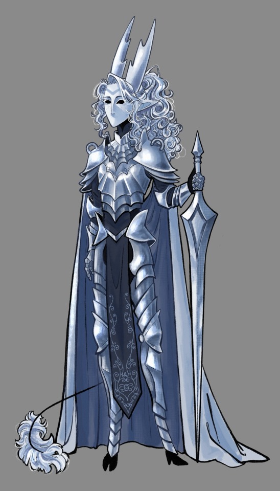
#this is. a redesign of an old character
Photo

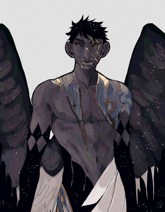
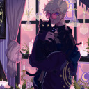
Aquila
__
Prints
#original character#oc#character design#aquila#this is a super old oc that I finally redesigned now#5k
6K notes
·
View notes
Text


I don’t even do it on purpose it just happens
#digital art#digital sketchbook#trans#sketch#this is so stupid but the transgenderification beam has been in my brain and I needed to communicate it#this happens both with characters from media I like and my OCs especially old ones I redesign#not my fault they’re all obviously trans
31K notes
·
View notes
Text
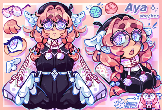
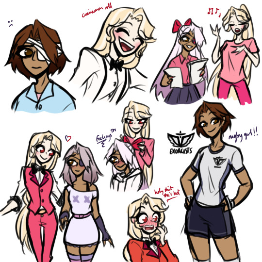
🌸💾 and she had the bubblegum hair with the angelic flair
#My Characters#Aya#old oc redesign time !!! ! (sorry no fullbody.. i;ll show off her full outfit at some point ;;)#aya is. a VERY old oc of mine. very special to me.#also! her angel wings are robotic/cybernetic. same thing goes for her eyes!! however theyre simply cosmetic.#she experiments with a lot of technology stuff and gave herself those cause she felt it was very gender and comforting to her!! QwQ#also she's harrison's younger sister *nodding*
471 notes
·
View notes
Text

I kinda miss drawing suns i should draw suns again
#also redesign#because my old design is kinda bland and muted#wanna redesign everyone but rn i just feel like drawing suns sobs#my art#rain world#gijinka#seven red suns#rw seven red suns#spearmaster#rw spearmaster#character design#lyss art
448 notes
·
View notes
Note
your designs for the rogues are so good i wanna eat them (in a completely normal way). do you have a penguin design?? little bird guy??


Not a current one, but I DID have a design heavily based off the Gotham iteration. (Art from 2022) Designed w aztec purple accents with the intention to match Ed’s excessive green glitter suit.
Most likely keeping the shoes, feathered boa and big coat elements of the design and scrapping the penguin-themed masquerade mask. Dropping it on the basis that it makes him look like persona joker. If you couldn’t tell, this penguin was initially designed to match with Ed’s peacock masquerade outfit.
Not entirely sure if I want to stick w a skinny penguin bc the twink label plagues me. I’d go for something more original but I feel Gotham kind of nailed it so I’m inclined to use Gotham Oswald as a dress-up doll. Gotham had it so that he didn’t particularly need to be fat as he was still weird and gay and a fucked up little guy. His name is still Oddballs Gobbleballs. He was the Penguin before they stuck him in that goofy season finale fat suit.
#vclownverse#I need to fucking redesign him#old art#penguin#oswald cobblepot#riddlebird#nygmobblepot#gotham fox#gotham penguin#batman rogue redesign#character design#creaman 1k#digital illustration#edward nygma#batman#fanart#vinegarclown#creaman#creaman-answer-sheet.pdf
561 notes
·
View notes
Text
If you've been here a while you've probably noticed I started drawing Holly's face a lil different recently, and that's bc they have a new design!!!!
Say hiiii Holly
#my art#hollow knight#ill prolly do a turn around#and different stages#like my original ref of them#but that's something for future feather to worry about ahshdjxj#the hollow knight#thk#pure vessel#hk pv#hk hollow#hollow knight gijinka#gijinka#might post this next to the original design actually bc it was just under a year old when I started the redesign#turns out being hyperfixated on a character for a year helps improve ur art skills#who knew
344 notes
·
View notes
Text
so like….. chaggie college au anyone

I’m thinking designs based on their demon forms instead of like human before dying give me ur thoughts yeah
Charlie fell first vaggie fell harder it’s canon
#I’m planning college au radioapple next#(Except they’re old men not students but eh)#I have so many world building ideas for this au yall#Brainstorming with my friend who’s a hh fan#We weren’t sure on vaggies degree but it’s fine I guess#She’s on her way to becoming Charlie’s personal manager#Charlie has brown eyes because I said so#(It’s closer to her canon red eyes and also I like it)#hazbin chaggie#hazbin hotel#hazbin art#hazbin hotel 2024#hazbin hotel fanart#hazbin hotel charlie#hazbin charlie#charlie morningstar#vaggie#chaggie#charlie x vaggie#rainbowmoth#vaggie hazbin hotel#thorium.art#My brother suggesting a marketing degree btw for vaggie#He insisted I mention that#human au#hazbin hotel au#humanized#character redesign#redesign#alternate universe
389 notes
·
View notes
Text
I'm not even gonna sugarcoat it
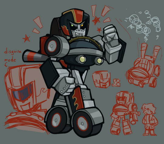
Rolling Thunder redesign
#the old one was probably fine#but I couldn't figure out if her transformation made sense ;v;#this one is a bit more coherent#the lore is pretty much the same tho#amnesiac protoform breaks into rescue bot headquarters#proceeds to fuse with a gokart she finds#ok technically she became amnesiac only after fusing but she still had no idea what she was doing in griffin rock#transformers#art#artwork#illustration#oc#fanart#fancharacter#redesign#character redesign#maccadam#my art#original character#rescue bots#transformers rescue bots#tfrb cody#cody burns#transformers oc#rescue bots oc#tf aligned oc#tf aligned
173 notes
·
View notes
Text
OK SO HERE'S THE RUB.
I think that as it currently is, the base uniform for hope's peak looks boring as shit to me. like. yes. it is very customizable and versatile and when they DO stuff with it then it usually looks great. BUT for such a prestigious school I think there could be just a tiny bit more flare to it.
So before making any design I made some changes to the hope's peak emblem itself. The design is fine on its own, but I thought it could add to it if i gave it a couple of colour variants, so this is what I came up with!

Each variation belongs to a specific group, with the coloured versions belonging to the student groups. For the sake of this were just gonna focus on the student emblems so like. ignore the other 2.
Here are the uniforms themself!

I wanted to give a BUNCH of options that range from totally normal to. fashion crime territory if you arent careful. The solid orange options are by far the least popular ones, and the reserve course is really just hung out to dry, unless you want orange pants with a black blazer.
I imagine that there are so many pieces because not only can hope's peak afford it, but they have had this consistent issue for years where the one thing they just cannot keep straight is a dress code. So as a result, they allow students to mix and match all they want, so long as they're wearing the emblem to SOME extent.
try as they might, they can't enforce the school colours as much as theyd like to.
#syd spiels#i did this for a potential thh cast redesign someday#because it always irked me that the characters came to the school wearing their old high school uniforms#not entirely sure how i feel about the plaid on the pants but idk. i can probably make it work#i kept joking about how it looked like the fucking. a&w colours#and thats funny so im not changing it#school that has zero fashion sense but the students can work with it#my art#syd's art#danganronpa#danganronpa trigger happy havoc#super danganronpa 2#sdr2#danganronpa thh#danganronpa 1#danganronpa 2#celeste is gonna have to work hard to serve#godspeed
364 notes
·
View notes
Text

if you remember this AU then you may qualify for a senior discount
#hahaaaa kinda#it’s not that old just old for my blog lol#it’s a little over four years old now… first posted about it in December 2019#I do miss it sometimes ;v;#I might draw some of the other characters (+ more sonic) but idk we’ll see#my art#my doodles#chaos arena AU#sonic the hedgehog#I could not be bothered to find the font for the text on his shirt…#… but apparently I COULD be bothered to completely redesign his bionic hand smh
215 notes
·
View notes
Text
I've seen so many bishoujo Starscream drawings these days so why not make a possible human design for my Starscream instead lmfao
I should do this for my other designs
#I pressed the comment thingy on the poll so that way I could see the results 👍#au#digitalart#transformers#art#photoshop#character design#decepticons#starscream#redesign#humanformers#holoform#original design#drawing#alternate universe#old fart starscream lmfao#im dying kahsjshsjsjss#guys hes so babygirl#hes a twig Soundwave can snap him in half
237 notes
·
View notes
Text
i miss my stardew valley oc and her (our) husband
#sdv#sdv farmer#sdv oc#sdv shane#stardew valley#theyre bi4bi t4t btw. its important you know that#if anyone remembers my old sdv ask blog no u don't but also it was fun i miss it a little bit#anyway I redesigned my farmer heavily so she's less of a self insert and more of her own character i'm very happy with how she turned out#gave her her own name too and everything
474 notes
·
View notes
Photo

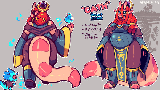
The Last Architect: “Cath”
3K notes
·
View notes
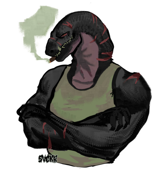
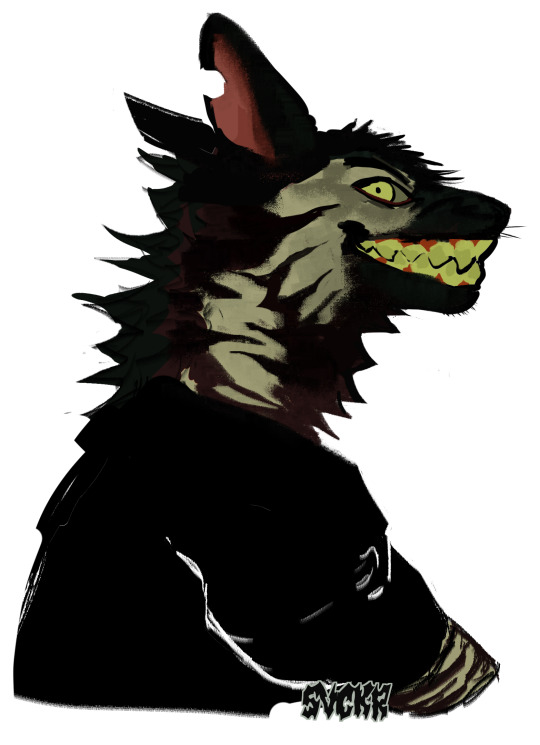
Text
guys
#redesigned another old ocs#theyre Handoko (komodo) and Purgant (hyena)#(these are still concepts#i will draw them fully later#idk#my art#oc art#furry#furry art#scalie#drawing#art#digital art#furry drawing#character design#painting#world goes down
1K notes
·
View notes
Text
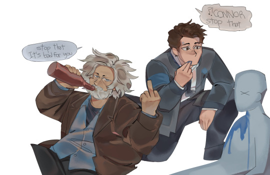
#art tag#detroit become human#i think im gonna stop that thing i do of posting many drawings at once bc i'll go insane if i have to finish a bunch of stuff AND#NOT POSTING IT IMMEDIATELY#this type of colouring is funny bc it looks like they threw a bucket of water over them#this is a redraw of an old drawing#i was cooking back then (in that)#i wanted to change connor's uniform (the triangle and arm thing ) but idk what . i did a redesign before. yeeears before#i checked it now and i dont like it bc connor's thing is to be in a suit to re-fix his tie and look cool so the suit is staying (my designs#were with no suit ) hello artists where are ur connor clothes redesign#everytime i go back to dbh brainrot is because of hank and connor BECAUSE IM SIMPLE AND PREDICTABLE#I LIKE EMOTIONALLY CONSTIPATED CHARACTERS AND THEY BOTH ARE#I LIKE CONNOR DYING AND PRETENDING ITS NOTHING#and him getting adopted of course#hank anderson#when i saw hank's button up patterns i went im not doing allat and i forgot to do it at the end LMAO
138 notes
·
View notes
Text
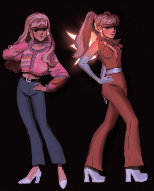
So i remembered that i didn't post this series here aaaaaand i'm going to start from here bc i completely ignored Stella and Aisha in my recent series
if you post me anywhere, please link one of these!!!! https://vk.com/kiroussstuff or twitter.com/k1r0uu
#WAIT i have this old ass winx redesign!!!#stella winx#winx club#winx#winx redesign#redesign#character design
400 notes
·
View notes
Last Seen Blogs
monkey-wrench-zeurel
Monkey Wrench
lepra-art
LEPRA
kellu-chan
A pretty picture but the scenery is so loud
mansorus
Finding My Way🧭🏔️🥷🏾