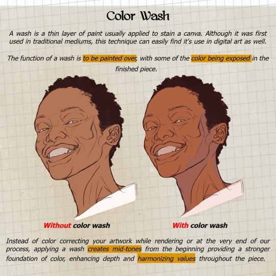
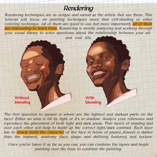
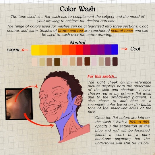
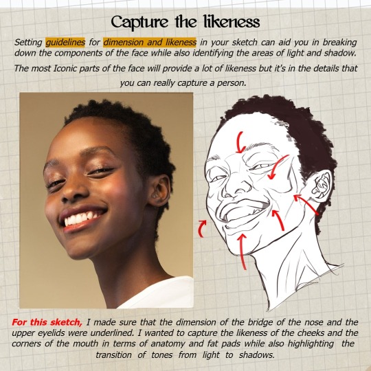
#Drawing Tutorial
Text
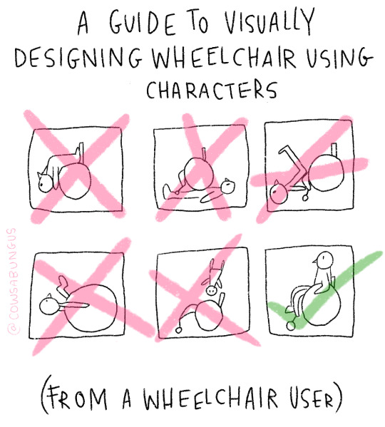


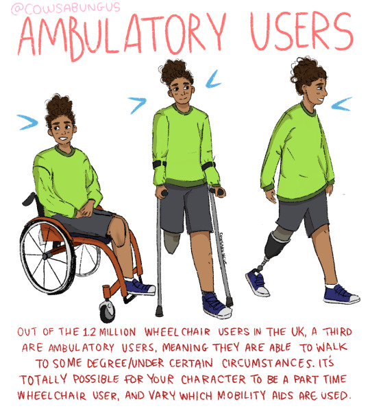
A guide to designing wheelchair using characters!
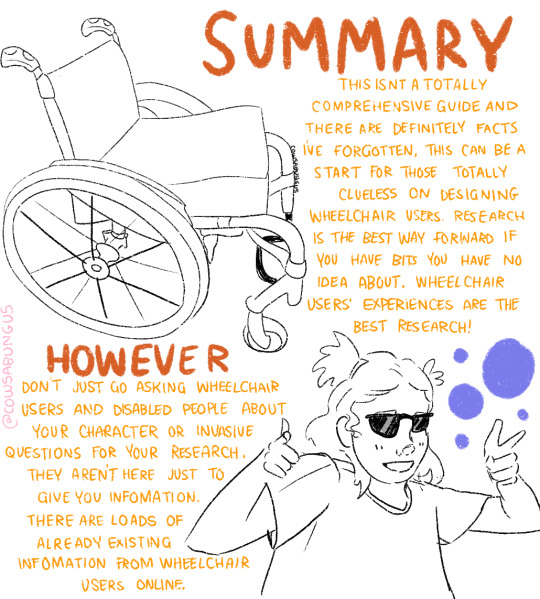
I hope this helps anyone who's trying to design their oc using a wheelchair, it's not a complete guide but I tried my best! deffo do more research if you're writing them as a character
#art#original art#artist#oc art#original character#queer#disabled#disabled rights#disability#disability pride month#tutorial#art tutorial#disabled character#design tutorial#drawing tutorial#Tumblr tutorial#character design#character illustration#concept art
89K notes
·
View notes
Text


some anatomy tips for drawing cat legs - works for big cats too
36K notes
·
View notes
Text
This is just a personal pet peeve of mine but i feel like a lot of online art tutorials overstate the importance of stuff like guidelines to get “correct” anatomy every single time and while those are typically really good handgrips for beginners we should also tell beginners about gesture drawing. Like maybe i’m being too animatorbrained here but being able to pump out a pose in anywhere from 15 seconds to 2 minutes and quickly move onto the next drawing without lingering on every little mistake is a really really good way at getting good at drawing people proportions quickly. If you make mistakes fast you learn from them fast. So here’s a little exercise:
Sit down, grab some reference images, draw ten poses in twenty minutes (or do ten poses in ten minutes if you’re feeling adventurous or confident) and take a step back and look at your work after the fact. Be sure to move from drawing to drawing quickly once your timer is done. Pretend you’re in a model drawing class and the model has already changed pose whenever your timer hits - finish up whatever lines you were drawing, move on to looking at what the model is doing now.
You will make a lot of shitty drawings, of course, but that’s not so bad. You only spent a minute or two making each one. Focus on the drawings you do like, and look at them as a whole.
Look at all the drawings together and how they fit together on the page. Look at little details and lines you’re proud of. Take note of things you found difficult to get right in such a short time. Take note of the things you liked doing. Do the exercise again, and focus in on the things you want to improve or explore.
Maybe you want to focus on how the torso conveys its weight on the legs. Maybe you want to focus on how shoulders and arms bend around the neck. Maybe you want to focus on how to convey depth on the torso. Maybe you can learn something more about how to draw a body if you only draw using sharp lines and angles. Maybe you can learn something more if you only draw using squiggly, overlapping lines. Maybe you can learn more about how to draw a body if you only fill out the shadows with thick, quick lines. Congratulations! You’re not just learning how to draw a body, but you’re now also exploring your tastes!
This is a fine exercise to do alone, but it’s a lot more fun to do as an activity with a small group so you get to discuss the art you made together.
5K notes
·
View notes
Text
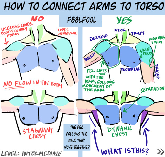
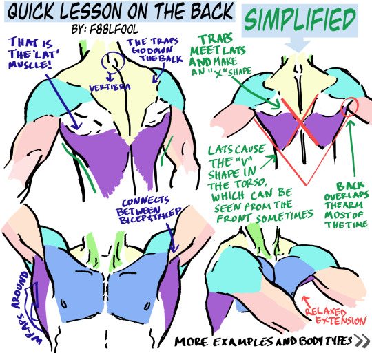
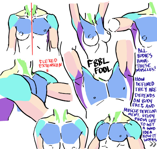
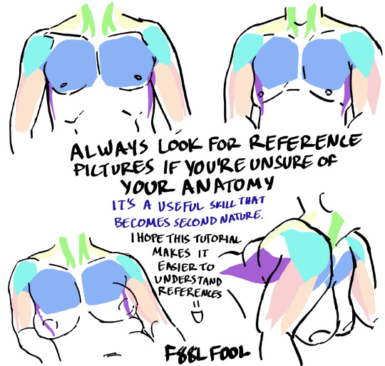
My first anatomy tutorial. How I connect arms to the torso. Simplified the muscles for better comprehension
PS. Pectoral is misspelled as “pectorial” in the picture. Don’t make that mistake haha
And I’d love to see the art made from using these as reference, you can message or tag me.. whatever you want
Edit: The extended names of the muscles:
Neck - Sternocleidomastoideus
Traps - Trapezius
Lats - Latissimus Dorsi
#pec-torial#pec tutorial#there i said it#also keep in mind each body (even the leanest ones) have fat on them#a reblog pointed this out and I thought it was a good reminder#none of these bodies have 0-1% bodyfat#art tutorial#anatomy#anatomy tutorial#drawing tutorial#drawing tips#muscles#muscle tutorial#art study#digital art tips#anatomy tips#art ref#art#reference#tutorial#art references#titorial#f88lfool
27K notes
·
View notes
Photo
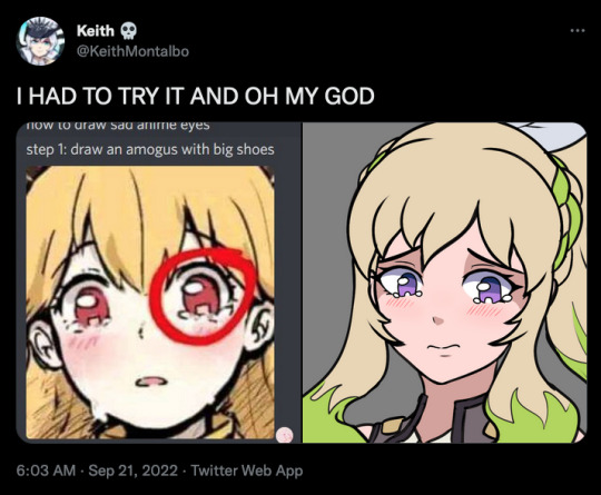

i think i fucked up - her eyes look too drippy
25K notes
·
View notes
Text
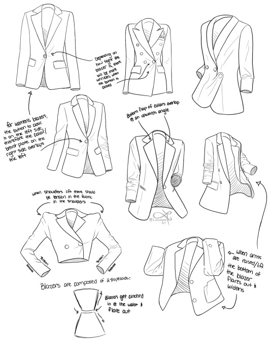
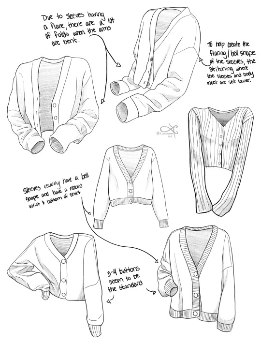
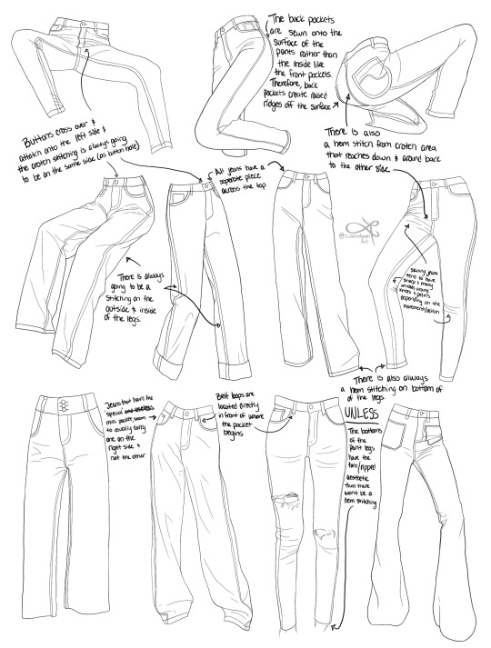
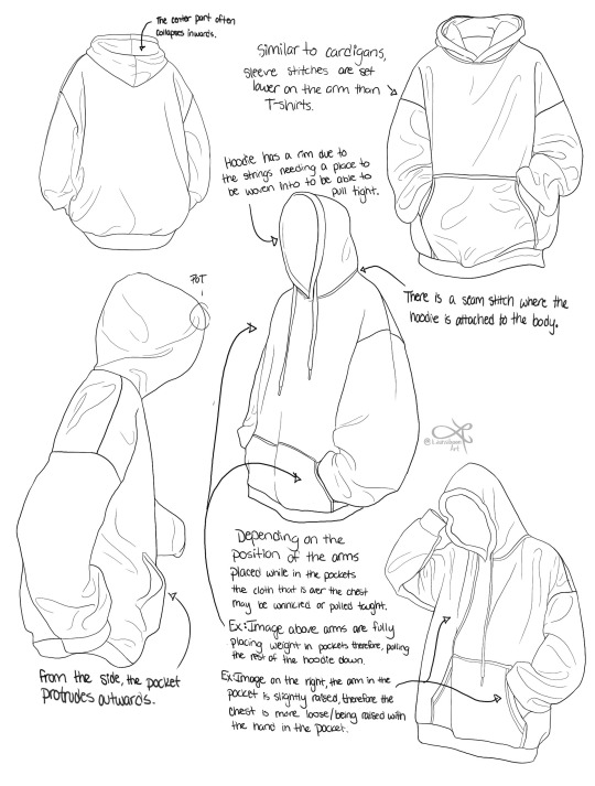
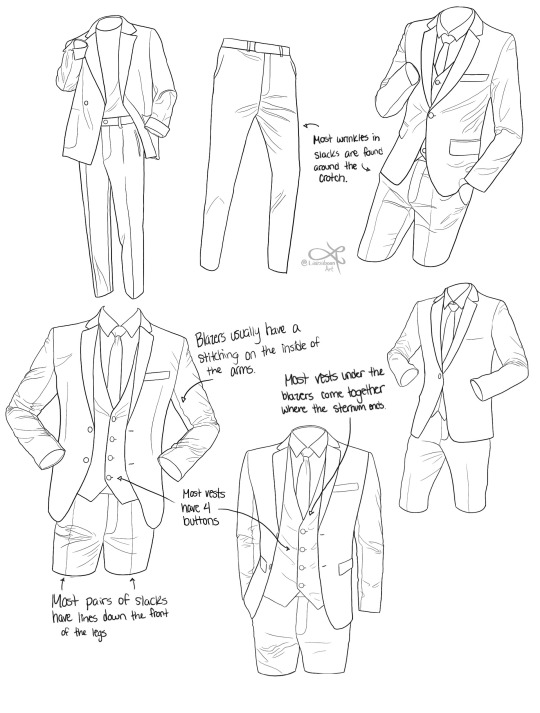
I'm currently doing an online art school program and I thought I'd share some notes on clothing pieces for anyone else whose like me and for some reason can't understand objects with free from lol I hope you find some of these observations/ notes useful for any of your art journeys!
#art reference#reference#art tutorial#art tips#art resources#art advice#drawing tips#drawing reference#clothing reference#how to draw clothes#drawing#how to draw#drawing tutorial#art education#art help#clothing#fashion drawing#art school#artists on tumblr#art community#art study
19K notes
·
View notes
Text
Manual Wheelchair Tutorial by Fade31415
So... I technically drew this 3 years ago but forgot to post it. I think I was going to clean up the end and make a nice recap, but I ran out of steam and then just left it as a wip for years. I got reminded of it because I was talking to a friend about how to draw wheelchairs today.
This covers most of what I view as the most common errors when it comes to drawing characters who use manual wheelchairs. I hope it helps you a lot.
Image description is in alt text, but there is a back up image description under the cut in case that does not work for some reason
[image description: a 4 picture long wheelchair tutorial. the background is white and the text, when it appears, is black and in calibri. each step will be labeled with "Step #" and a description of the drawing next to it, and "text" and then the text that is written to explain it to follow.
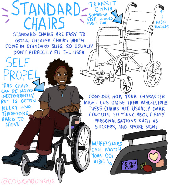
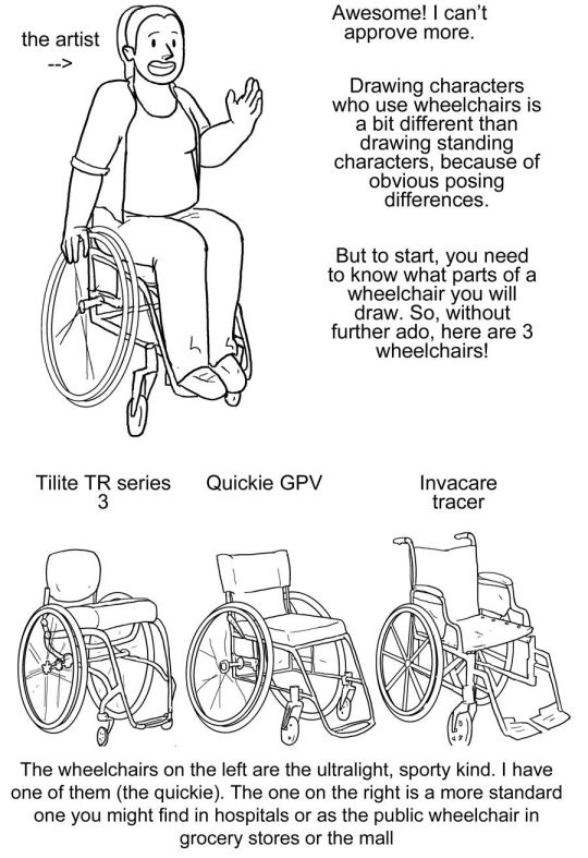
Step one text: So, you want to draw a character who uses a manual wheelchair? Awesome! I can't approve more. Drawing characters who use wheelchairs is a bit different than drawing standing characters, because of obvious posing differences. But to start, you need to know what parts of a wheelchair you will draw. So, without further ado, here are 3 wheelchairs!
Step one image: a simplified drawing of a chubby woman sitting in a quickie GPV manual wheelchair and resting her hand on the handrim of one of the wheels. this is labeled "the artist"
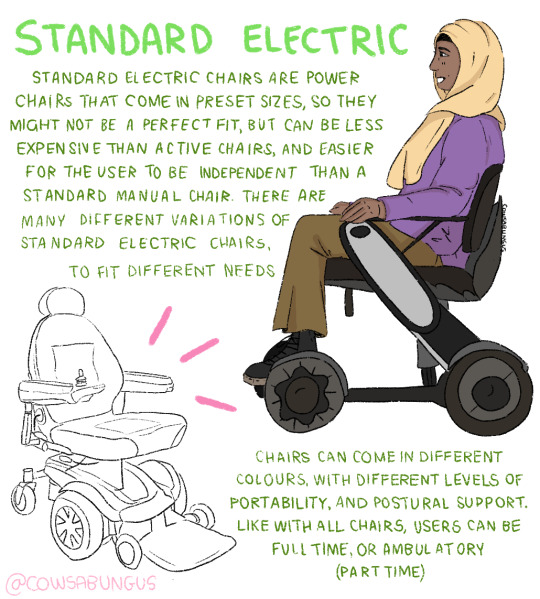
step two: next there is a lineart drawing of three wheelchairs. one is a tilite TR series 3. this is an ultralight wheelchair with a bucket seat (the back is lower than the front), a big cushion and a short backrest that kind of contours to the back of the person who would sit in it. the caster wheels (front wheels) are very small and the footrest is just two little metal bars. next image is a quickie GPV. this is also an ultralight wheelchair with a low back, but its caster wheels are slightly larger, the back has regular upholstery (it does not look like it was made to conform to the back of the person who sits there) and the frame is boxier -- there is no bar underneath the seat where the wheels would attach, rather each wheel is attached to the side of the chair. the next wheelchair is an invacare tracer. it is how most people imagine wheelchairs when they hear 'wheelchair'. it has no cushion and it has a high backrest with handles. it has high armrests that would be comfortable to rest your elbows on if you were just sitting. the wheels are not bicycle wheels like the previous two but are rather plastic. it has big footrests and big caster wheels.
text: the wheelchairs on the left are the ultralight, sporty kind. I have one of them (the quickie). the one on the right is a more standard one you might find in hospitals or as the public wheelchair in grocery stores or the mall.
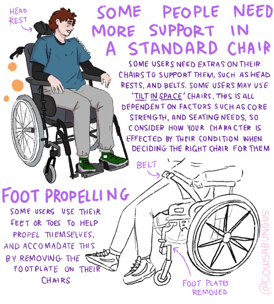
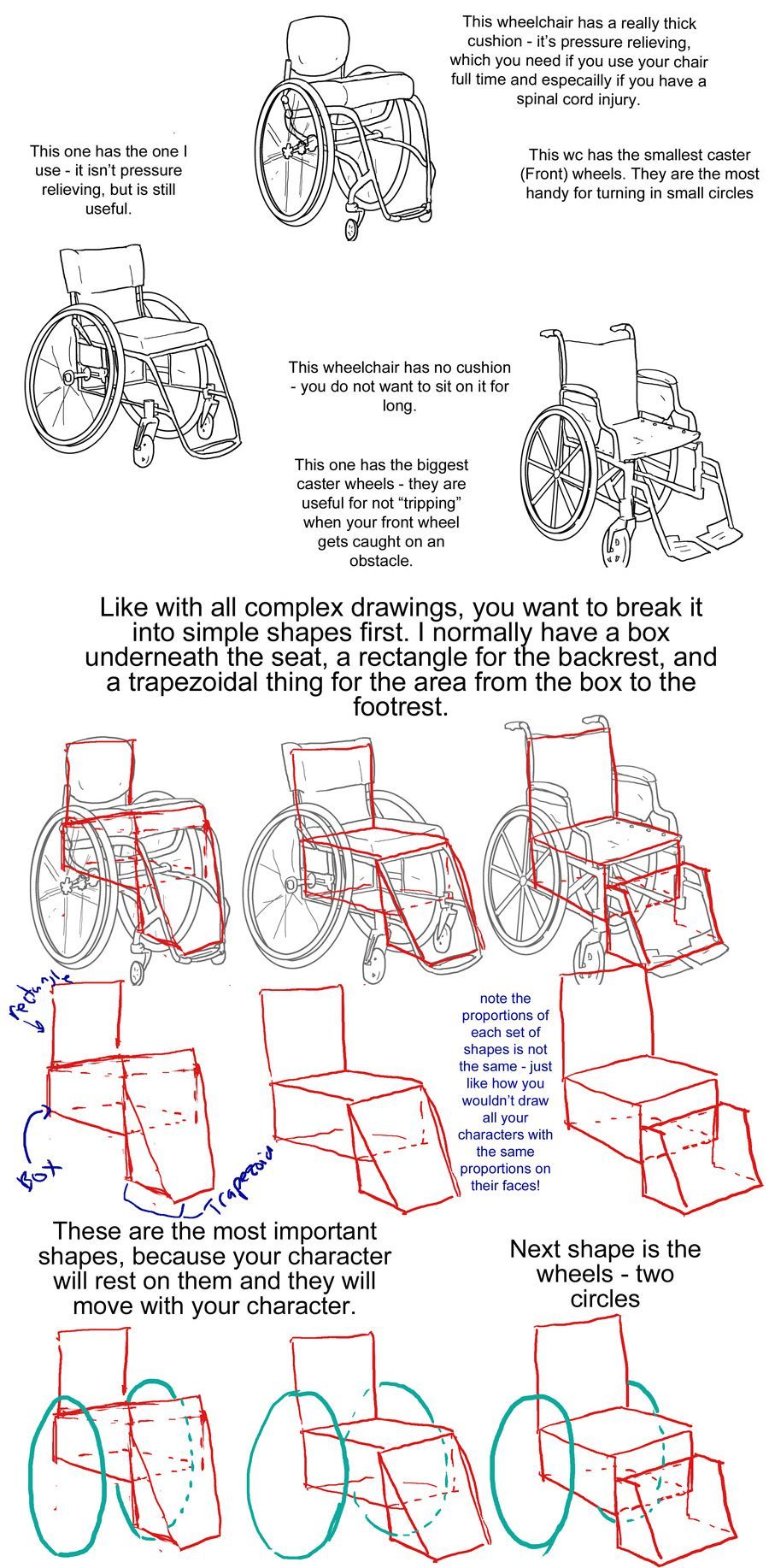
step three: first is text to accompany the tilite. "This wheelchair has a really thick cushion - it's pressure relieving, which you need if you use your chair ufll tiem and especially if you have a spinal cord injury. This wc has the smallest caster (front) wheels. They are hte most handy for turning in small circles." next there is text to accompany the quickie gpv: "This one has the one I use -- it isn't pressure relieving, but is still useful." next is text to accompany the invacare: "this wheelchair has no cushion - you do not want to sit on it for long. This one has the biggest caster wheels - they are useful for not 'tripping' when your front wheel gets caught on an obstacle.”
step four text: like with all complex drawings, you want to break it into simple shapes first. I normally have a box underneath the seat, a rectangle for the backrest, and a trapezoidal thing for hte area from the box to the footrest. these are the most important shapes, because your character will rest on them and they will move with your character.
step four image: the lineart of each wheelchair has been put on reduced opacity, so we can see the square representing the backrest of each seat (the square is the smallest for the tilite and biggest for the invacare), the box for each seat and area underneath it, and the trapezoid for the footrests. the next step labels the images of these simplified shapes as the lineart is removed. "Note the proportions of each set of shapes is not the same - just like how you wouldn't draw all your characters with the same proportions on their faces!"
step 5: we see the same shapes to form the wheelchair, but now with blue circles drawn where the back wheels would be.
text: next shape is the wheels - two circles
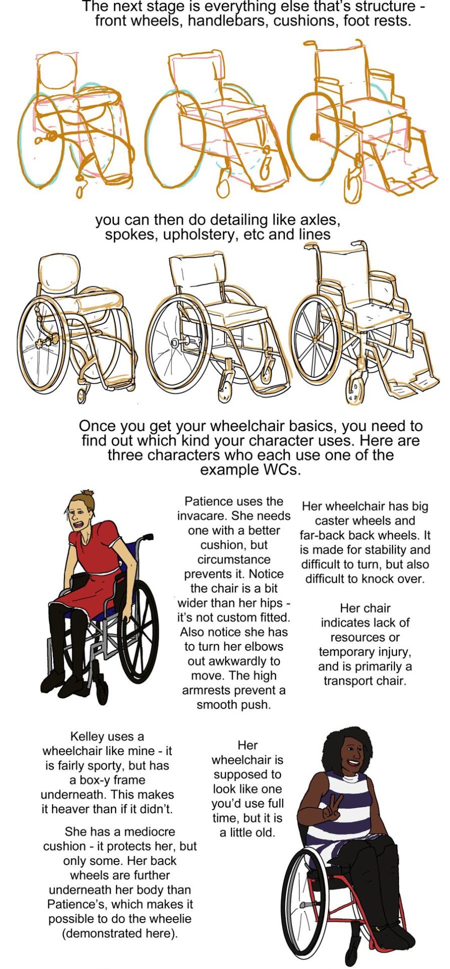
step six: next we see the wheels and shapes have been reduced in opacity and the basic structure of everything about each wheelchair: footrests, caster wheels, upholstery details, axles has been drawn on in orange.
text: the next stage is everything else that's structure - front wheels, handlebars, cushions, footrests.
Step seven: we see the lineart on top of the lowered opacity sketch.
text: you can then do detailing like axles, spokes, upholstery, etc and lines
step eight: next we see three drawings of different characters. there is patience, a skinny white woman sitting in a blue invacare wheelchair. kelley, a slightly chubby black woman wearing a stripey dress sitting in a red quickie gpv wheelchair and doing a wheelie while smiling. then luke, a white man with short blond hair wearing khaki pants. he is sitting in a tilite chair.
text: once you get your wheelchair basics, you need to find out which kind your character uses. here are three characters who each use one of the example WCs. patience uses the invacare. she needs one with a better cushion, but circumstance prevents it. Notice the chair is a bit wider than her hips - it's not custom fitted. Also notice she has to turn her elbows out awkwardly to move. the high armrests prevent a smooth push. her wheelchair has big caster wheels and far-back back wheels. it is made for stability and difficult to turn,but also difficult to knock over. Her chair indicates a lack of resources or temporary injury, and is primarily a transport chair
kelley uses a wheelchair like mine - it is fairly sporty, but has a box-y frame underneath. this makes it heaver than if it didn't.she has a mediocre cushion - it protects her, but only some. her back wheels are further underneath her body than Patience's, which makes it possible to do the wheelie (demonstrated here). her wheelchair is supposed to look line one you'd use full time, but it is a little old.
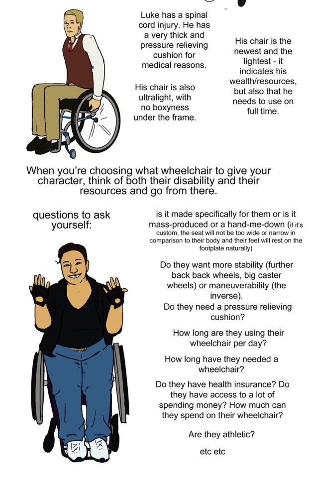
luke has a spinal cord injury. he has a very thick pressure relieving cushion for medical reasons. his chair is also ultralight, with no boxyness under the frame. his chair is the newest and lightest - it indicates his wealth/resources, but also that he needs to use on full time.
step nine: just a drawing of me sitting in my wheelchair holding my hands up to show fingerless wheelchair gloves. we're looking at me from above.
text: when you're choosing what wheelchair to give your character, think of both their disability and their resources and go from there. questions to ask yourself: is it made specifically for them or is it mass-produced or a hand-me-down (if it's custom, the seat will not be too wide or narrow in comparison to their body and their feet will rest on the footplate naturally). do they want more stability (further back back wheels, big caster wheels) or maneuverability (the inverse). do they need a pressure relieving cushion? how long are they using their wheelchair per day? how long have they needed a wheelchair? Do they have health insurance? do they have access to a lot of spending money? How much can they spend on their wheelchair? are they athletic etc etc
posing steps:
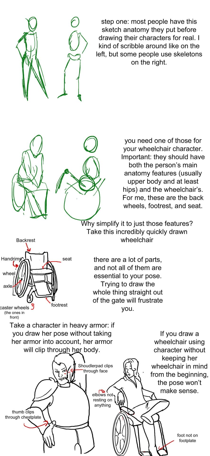
step one: a sketch of two people standing up. one just shows the outline of a person's body, with legs that are ind of triangle shaped, the other shows a sketched pelvis and rib cage to go along with the bones of the legs and arm. text: step one: Most people have this sketch anatomy they put before drawing their characters for real. I kind of scribble around like on the left, but some people use skeletons on the right.
step two: there are now too sketched pictures of people in wheelchairs. one shows lightly traced human form (arms articulated, curve for a stomach, legs that are kind of triangle shaped and pointing down) sitting in a wheelchair that is just the sketch of footrests and wheels. the other sketch shows the sketch of a body with a circle for hips and an oval for a rib cage and the person doing a wheelie (lifting the front end of the wheelchair off the ground and leaning back). their wheelchair is also sketched out and defined by a circle for their wheels and 2 lines, 1 of the seat and 1 for the backrest. text: you need one of those for your wheelchair character. important: they should have both the person's main anatomy features (Usually upper body and at least hips) and the wheelchair's. for me, these are the back wheels, footrest, and seat. why simplify to just those features? Take a look at this incredibly quickly drawn wheelchair.
step three: there is a lineart drawing of a manual wheelchair with slightly cambered (angled towards the seat) wheels, a backrest, and a footrest. the frame is light and there are no handlebars. there are labels pointing to different parts of the wheelchair: Backrest, handrims, wheel, axle, seat, footrest, and caster wheels (the ones in front). text: there are a lot of parts, and not all of them are essential to your pose. trying to draw the whole thing straight out of the gate will frustrate you.'
step four text: take a character in heavy armor: if you draw her pose without taking her armor into account, her armor will clip through her body. if you draw a wheelchair using character without keeping her wheelchair in mind from the beginning, the pose won't make sense.
step four image: next we see two lineart drawings of different characters. one is a bulky woman wearing plate armor. her hand is on her hip and she is trying to scratch her back with the other hand. there is the label "shoudlerpad clips through face" and "thumb clips through chestplate." the next drawing shows a woman in a wheelchair with one foot rested on her knee and her arms rested back, such that they would be rested on the back of a regular chair, but the back of her wheelchair is not wide enough for them to actually be resting on anything. the text here reads "elbows not resting on anything" and "foot not on footplate"
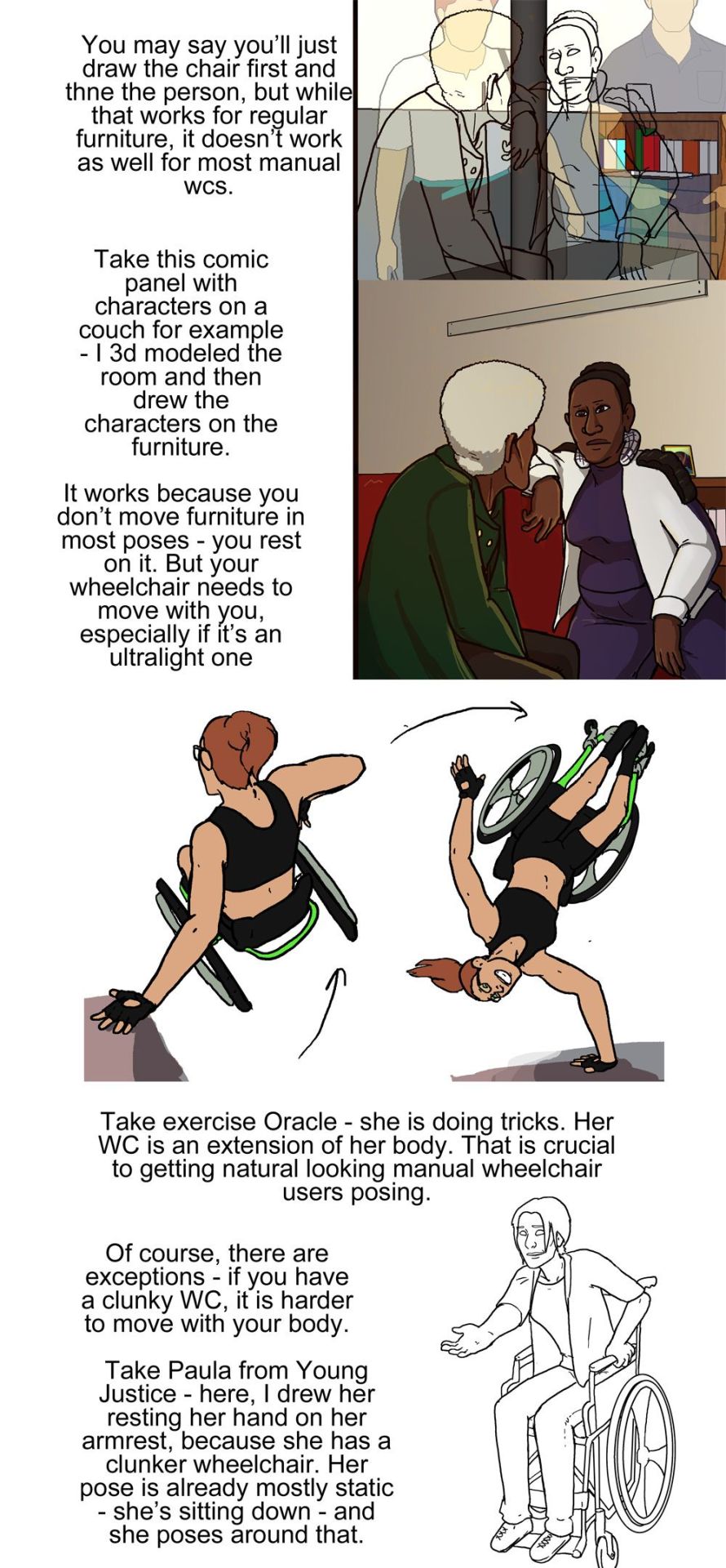
step five: there are two images, one is lineart on top of a 3d modelled apartment with sketchup, the other is a colored in version of that lineart with the background also colored in and no longer a 3d modelled screencap two characters, one old woman wearing a green jacket and one younger woman wearing a white shirt and blue undershirt, are sitting on a couch. the old woman is leaning forward and the young woman is resting her arm on the couch. behind the young woman is a bookshelf.
step five text: you may say you'll just draw the chair first and then the person, but while that works for regular furniture, it doesn't work as well for most manual wcs. take this comic panel with characters on a couch for example - I 3d modeled the room and then drew the characters on the furniture. it works because you don't move furniture in most poses - you rest on it. but your wheelchair needs to move with you, especially if it's an ultralight one.
step six image: there is a flat color drawing of barbara gordon in her wheelchair. she is wearing a black sportsbra and black shorts. in the first image we see she is doing tricks in her chair, zooming through the air (as if she has just launched herself off the ground in a skater park or somethign) while her left hand is resting on a structure and her right hand is heading towards the right handrim. the next image shows her right hand planted on the ground and her chair and body above her, such that she is briefly doing a one-handed handstand, but the motion line indicates that she is moving and this will not last. her left arm is near the handrim of her left wheel.
text: take exercise Oracle - she is doing tricks. Her WC is an extension of her body. That is crucial to getting natural looking manual wheelchair users after posing.
step seven: we see a lineart drawing of paula from young justice. she is sitting in a standard manual wheelchair with high armrests (goes up to the bottom of her ribs probably) and a high backrest (goes up to just below her shoulderblades). she is setting her hand on the armrest, leaning forward, and holding her other hand out.
text: of course, there are exceptions - if you have a clunky WC, it is harder to move with your body. Take Paula from young Justice - here, i drew her resting her hand on her armrest, because she has a clunker wheelchair. her pose is already mostly static - she's sitting down - and she poses around that.
#wheelchair#wheelchair user#manual wheelchair#wheelchair tutorial#tutorial#drawing tutorial#my art#disabled characters
49K notes
·
View notes
Text
Very happy to finally post my third tutorial! Thank you so much for your overwhelming support of my last tutorial, I am so happy it was useful for you guys 🙇♀️. I feel like this topic was harder to explain so feel free to ask me some questions if you want!
Like last time, I really hope this helps some of you in your art path 🙌
6K notes
·
View notes
Text
Go nuts y’all!
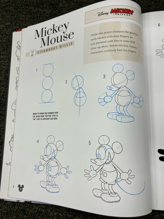
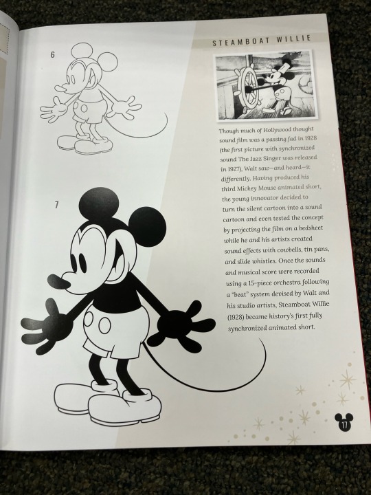
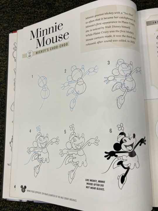
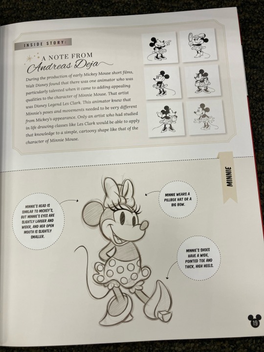
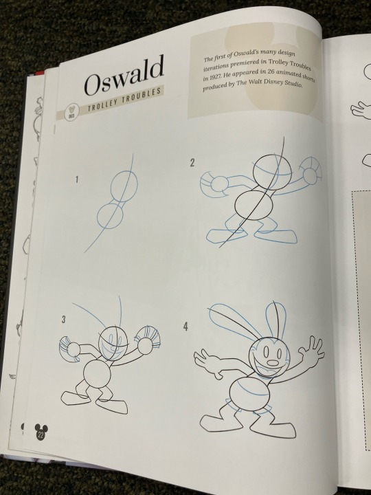
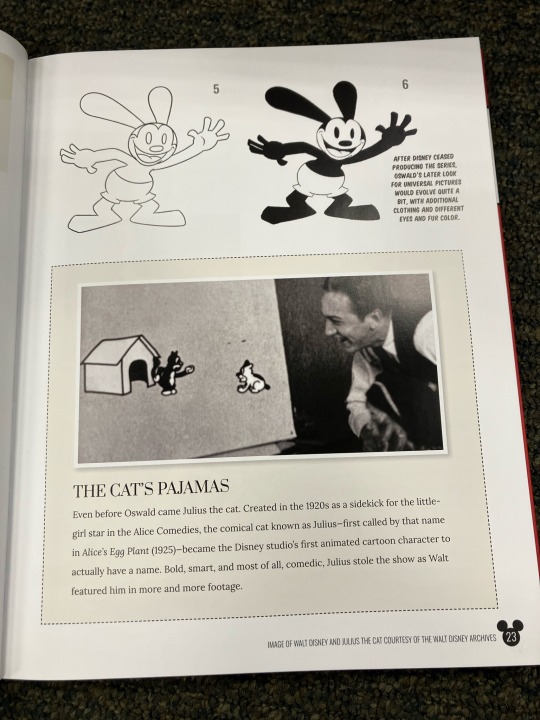
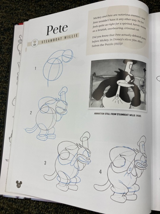
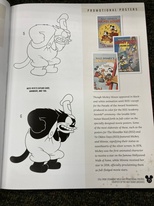
Source: Drawing 100 Years Of Disney Wonder
#Mickey Mouse#Minnie Mouse#Oswald The Lucky Rabbit#Pete The Cat#Peg Leg Pete#Stinky Pete#Public Domain#Disney#Drawing#Drawing Tutorial#Reference#Let me know if you need better snapshots of these pages
2K notes
·
View notes
Text
Hell yeah' more shitpost drawing studies'
I mostly to these scribbles/notes for myself, but sharing is caring and my brain simple won't acknowledge and comprehend how light works.
It's actually so simple doing shadows ( in theory ), still' i wanna rip and tear at my hair whenever i actaully have draw dynamic ones.
13K notes
·
View notes
Text
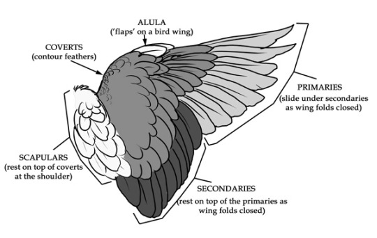
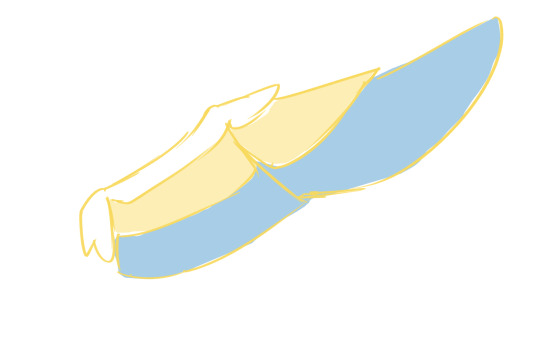
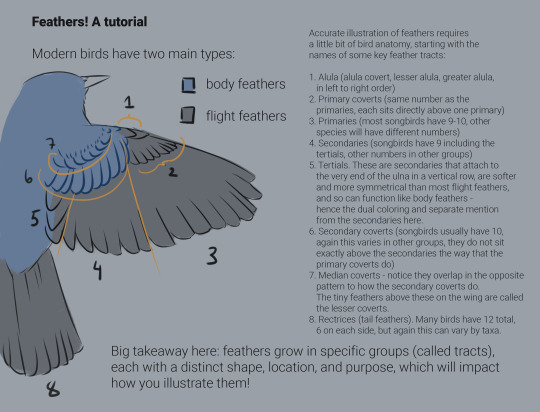
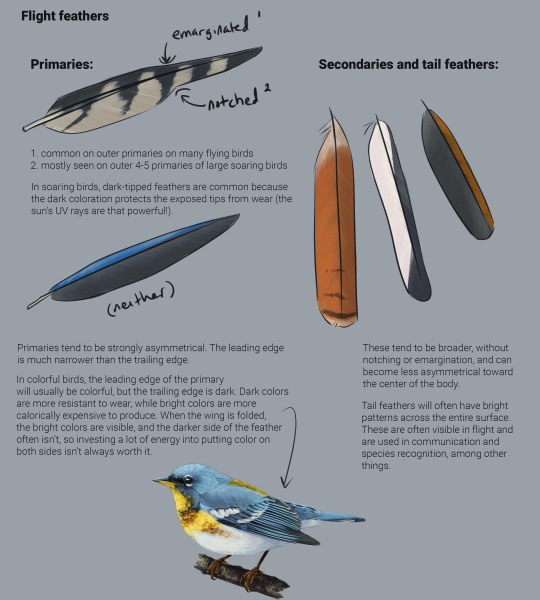
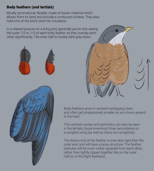
Wing tutorial~
Since it has been asked, I made a little breakdown on how to draw wings.
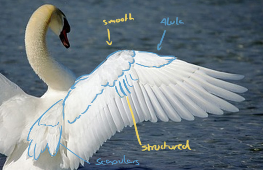
So, first thing to understand is wing anatomy. I used a swan wing as reference for my artwork. Divide the wing into blocks of feathers. There's sort of three layers to the feathers outlined in the second picture, and these divided along the top joint of the wing where it folds. See the second image. Make sure you bring in these nice, flowy shapes here!
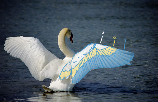
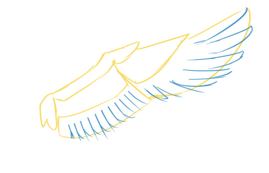
Now that you have these big shapes, you can cut into them and make the individual shapes of the primary and secondary feathers (layer 3.) also make sure they overlap correctly depending on if you are drawing the wing from the front or the back. make sure you stick with a nice rythm and have the feathers get gradually bigger as you get closer to the tip.
Like this:
when you go ahead and draw that layer 2 of coverts, make sure that every feather you drew for the bottom layer has (approximately) a feather overlapping it (so you have pretty much the same number of feathers in each layer) and that they line up nicely. But you can also make them a bit more ruffled. Like this:
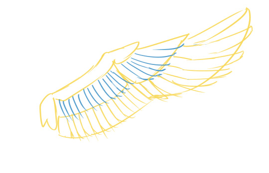
Other than the flight feathers, the very top part of the wing is very smooth, with shorter, more rounded feathers (almost half-circles!). They can lie very flat or also look a lot more fluffy. think of them almost like overlapping scales. There is also the Alula at the top of the wing, a sort of extra feathery bit that sticks out over the primaries. also don't forget the scapulars which cover over the shoulder blade and are on top when the wing is folded. The Scapulars also have two layers of feathers. (see first graphic).
From there, it's only a matter of lineart and shading or however you want to finish your artwork. Hope this helps with the structure! Drawing wings folded together is a whole other story that I'm not going to get into here... lol.
TL:DR: understand the structure of wings and use references to get it right, work from big shapes to small shapes.
Edit: I demand to be tagged in the results, I desperately need to see more wing art. ÒwÓ
#art tutorial#art tips#art resources#art help#drawing tutorial#wings#wing tutorial#good omens#how to draw#angel wings
2K notes
·
View notes
Text
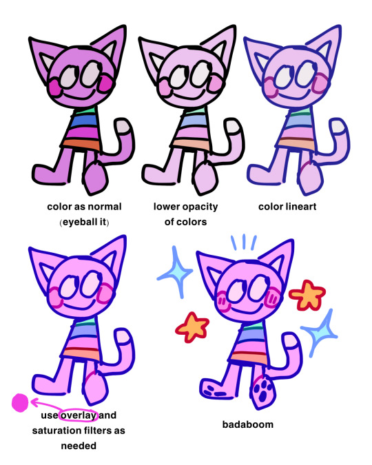
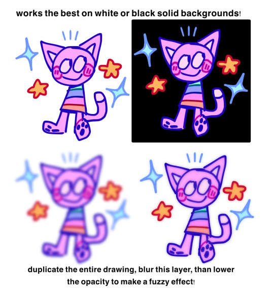
little visual for how i use pastel colors!!
826 notes
·
View notes
Text
(via artmaker223)
#how to draw hands#art tips#art advice#tiktok#gordon ramsay#art appreciation#hands#how do you draw hands#art help#drawing advice#drawing tutorial#drawing tutorials#drawing help#art reference#art references#artist advice#advice for artists#art tutorial#how to draw
2K notes
·
View notes
Text


I put this on tiktok but figured I would post it here too, some small tips for how I draw Ghost's mask.
Remember we all start somewhere, and don't be afraid to use your resources - feel free to reference this, and any of my other Ghost artwork, if it helps you!
598 notes
·
View notes
Note
gIrL HOW do you draw potion bottles w potions??? I can't figure out how to make them look good 😂😭
Spedran this for u <3
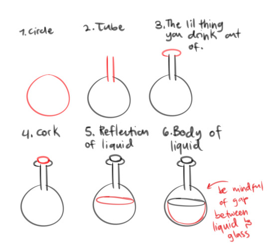

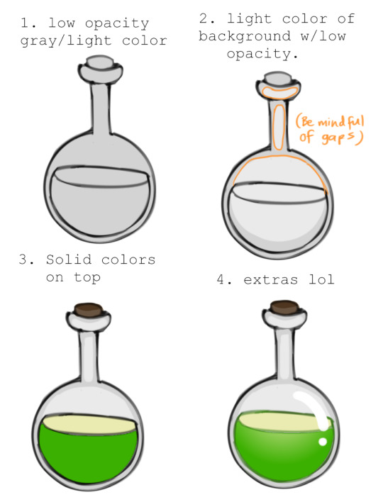
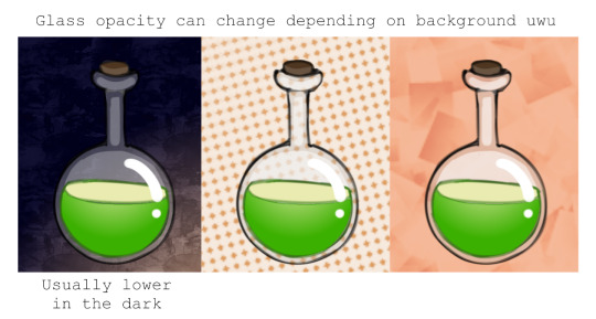
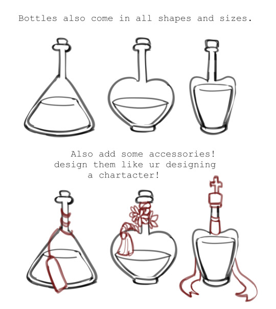
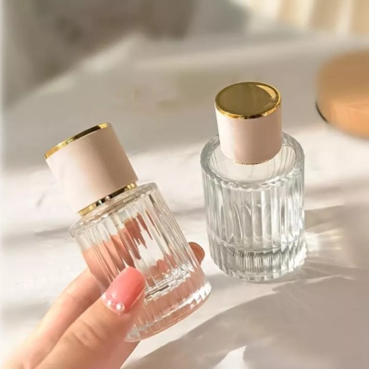
You could also have IRL inspo for vials uwu! For example, Angus' love potions are based on perfume bottles!


2K notes
·
View notes
Photo
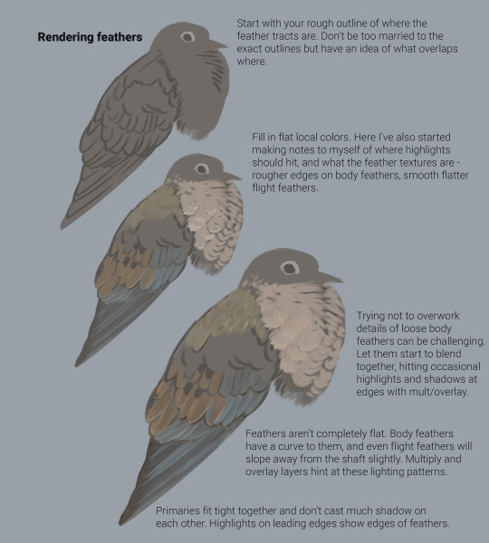
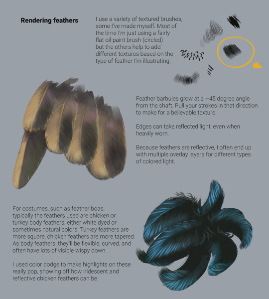
Feather illustration for non-biologists! It occurred to me that some of you might find this useful. It starts with a necessary biology lesson, because I find that understanding the structure and function of feathers will greatly improve accurate rendering of those feathers.
A lot of this is general - obviously you can find all kinds of exceptions in the natural world (penguins, ratites, I’m looking at you guys). But it should cover the bulk of the illustration needs if you’re not comfortable drawing feathers and want some ideas on how to improve.
For photo references, I highly recommend birdpixel (a very generous online art reference created by Leena and Vivek Khanzode), Cornell’s Macaulay Library, and Piranga, which is mostly aimed at North American bird banders but shows excellent close-ups of a variety of species.
#birdblr#drawing tutorial#feathers#ornithology#scientific illustration#tutorial#art tutorial#feather tutorial#birds#bird art
6K notes
·
View notes
Last Seen Blogs
mistaekn
mistaekn

falkandersson
mortgagebroker539

buladeremedios
Sem título

nimapie
nim
othabor
*screm*