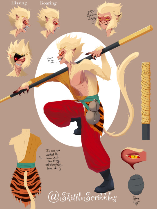
#and by that I mean that there's a lot of grey-red-white-black designs
Text
...what it means is they're all drawn by the same studio
#hazbin hotel#vaggie#carmilla carmine#rosie hazbin hotel#rosie#cc’s contextless theories#also I am Aware that's not Carmilla's more recent finalized design but I am trying to not dive too deep into things and spoil myself#so I can still make theories without having any background knowledge#but the point about thigh highs and snatched waists still stands for her newest design#also as I'm typing this I'm noticing Lute Vaggie and Carmilla all have similar neckline + upper thigh skirt outline#and you may say I'm reaching but HEAR ME OUT#also there's no good pics of Carmilla's daughters or they've be in there too#I thought my musings on color theory would be disproved by Husk and Valentino et al#and by that I mean that there's a lot of grey-red-white-black designs#and yet all those other characters (also Charlie) have gold in them too#now look am I wrong? almost certainly#but WHAT IF I'M NOT
160 notes
·
View notes
Text
The Submas Designs are a lot more clever than you thought.
First lets look at the Submas overall design. We know that the original design was intended to make the Subway Bosses look like clowns and kind of creepy (that backfired); hence the comically large shoes and exaggerated expressions. Let’s start to break down each part of the design.
To begin, The Submas extreme expressions are a possible reference to the symbol of theatre; the mask of Tragedy and the Mask of Comedy. The mask of tragedy is commonly portrayed frowning ( not necessarily cry) on a black base mask while the mask of Comedy is portrayed smiling on a white base masks. Sometimes these masks are gold or split black and white color. The masks together represent the two extremes of the human psyche. Definitely the contrast we see between Emmet's smile and Ingo’s frown.
Next up, the coats. These are obviously designed to look like train tracks. The vertical grey lines representing the rails, the red brown the tie (the wood connecting the rails), and the buttons are the spikes that secure the track. You can see the pattern best on the back of the Submas coat. Looking at it you could laugh and say “I guess that makes the Subway boss themselves the train”, and you know what? You’re right.
This brings us to the most interesting part of their design, the color and pose. Yes, there is an explanation to the silly pose too. It’s so silly that we can just brush this whole design off as being another funny Pokemon character design; but unfortunately it’s actually thought out.
The Submas themselves are the New York Subway. Or at least they are the personified version of it. Let’s look at the colors again. Black and White. Very fitting for a game literally called Pokemon Black and White. That alone brings us to some interesting comparisons with the game themes and pokemon.
Kudari or (Emmet in the English version) wears all white. He values routine and rules and is ultimately pretty point blank. We can easily make that conclusion that Emmet represents Reshiram and truth. If we break down his name we see that in Japanese it means something along the lines of “down train” or moving away/going down hill. The different translations usually mean the same, except the name “Emmet” is a bit out of place. A lot of people say the Submas names in English are most likely to be puns of “Ingoing and Emitting”. But my crazy self did more digging and found that Emmet means “truth” specifically universal truth. This name goes back to old German, Irish, and even Hebrew. All looping back to Reshiram and themes of the game. (On a funny side note, Emmet is also the Cornish word for ant; so Emmet having a Durant is really funny. )
Next up is Nobori or Ingo who wears a black coat and appears frowning. Despite that , his is very encouraging and excited about moving forward. This makes sense since the name Nobori in Japanese more or less means to move up/forward ( specifically up a mountain). That’s why a lot of people believe that the poor man was eebie deebied for the pun because Warden Ingo works on Mt. Coronet. In English, Ingo is thought to be a shortened version of “Ingoing” which also aligns with not only the Japanese name but the character’s reoccurring theme of progress, moving forward, and ideals. In this sense Ingo very much represents Zekrom and ideals.
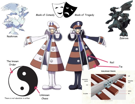
Truth and ideals, Reshiram and Zekrom, Tragedy and comedy, white and Black. All very good interpretations and symbolism for two funny train men. I would be satisfied with just knowing that, but no; the Submas are also a funny gijinka of the New York Subway. This is the part the has me laughing at how simple it is and yet we just easily accepted that they were just a bit strange.
Take a look at this. This is a Zebra Board.
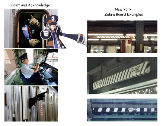
Yep, it’s black and white. And do you know what? This MTA sign only appears in the New York subway. What does it do? These are used by conductors to indicate safety and that the train has lined up in the station. Every time the subway comes into the station, the conductor has to physically point at this board/bar to indicate that it is safe for the doors to open. The action is called "point and call" or "point and acknowledge". This practice is used in a few other train/subway stations (such as Japan), but the black and white board is New York specific. The pose of the submas suddenly makes a lot of sense.
Other Important notes observations.

The Submas face represents the front of the train. So their eyes are the lights (hence Ingos glowing eyes in PLA), their side burns are cow catchers ( see graphic), and the Medalion on the hat is round like a train number plate. Another interesting thing is that the Submas use airline Captain Pilot hats like Japanese train conductors use. The only part of their outfit that confuses me is the arm bands. This is more of a police uniform element and not a train conductor thing.
so to conclude, the Submas are basically a reference to in game themes, Reshiram/Zekrom, Trains, and literally the New York subway
I am not an expert. These are just my observations. I could be completely wrong. Take and add what you would like to. If you have more to add about the design, feel free to reblog that info. I would also like to see your interpretation.
#submas#ingo#emmet#subway boss ingo#subway boss emmet#kudari#nobori#warden ingo#pokemon submas#this took too long and I can't look at it anymore please ignore the spelling errors#ill come back and fine tune this later#but this is the basic info#I still have more to say about them though i will leave it for another day
1K notes
·
View notes
Text
Trans Flags
I made a post with 4 striped trans flags a while ago, but I wanted to revisit it with some new edits/flags.
(Not all of these are mine, I just like having everything together as a set. I'll also be splitting them into sections, since there are a lot of flags.)
──────────✦──────────


transmasculine/transmasc ★ transfeminine/transfem ★ transnonbine/transenbine/transnbine/transnonbinarine
(Note: nonbine, enbine, nbine, and nonbinarine are words for nonbinary gender quality, nonbinary versions of masculine, feminine, etc. The first 3 I came up with, and nonbinarine comes from here.)
✦ All these flags follow these trans flag formats. The white and grey black stripes are the same for all of them, and the only thing that changes are the center 2 stripes, for the respective gender qualities.
The transmasc and transfem flags are the same as their originals.
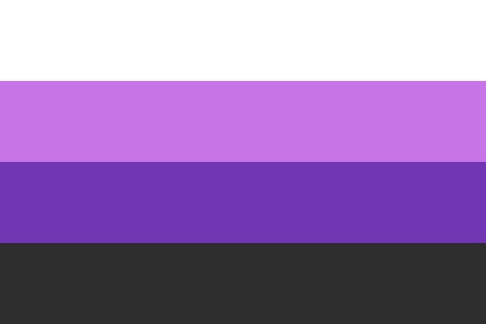
Transnonbine was made by me. I used the yellow and purple stripes from the nonbinary flag.
──────────✦──────────


transandrogynous ★ transgenderless ★ transneutral/transneu
Transandrogynous is just a slight colour edit of the original. (I changed the bottom stripe to grey and adjusted the purples.)
Transgenderless is the same as the original.
For transneutral I chose green, as that's a common colour for neutrality. So it's like this variant of transneu.
──────────✦──────────


transmaverine/transmav ★ transxenine/transxen ★ transbine/transbinarine
(Note: bine/binarine is binary gender quality. Binarine comes from here, but I came up with bine follow the same naming convention as nbine.)
Transmav is pretty much the same as the original, though I changed the yellow and orange to be slightly darker, for more contrast.
Transxenine is quite different from the original. Instead of copper colours, I used a light purple blue colour scheme, just because I felt those colours were fitting.
Transbine uses the colours from this binarine flag.
(I chose the lighter colours so it wouldn't look too similar to the transmascfem flag.)
──────────✦──────────

transmidbine/transmidbinarine ★ transabine/transabinarine ★ transatrine/transatrinarine
(Note: midbine/midbinarine is midbinary gender quality, abine/abinarine is abinary gender quality, and atrine/atrinarine is atrinary gender quality. I came up with midbine/abine/atrine following the naming format of nbine, and derived atrinarine from midbinarine and abinarine (which weren't made by me).)
Transmidbine, transabine, and transatrine all use the colours from my alt midbinary/abinary/atrinary flags.
Besides this transabinarine flag, which uses a different format, I don't think flags for these exist, so they're pretty much new designs.
──────────✦──────────

transaporine ★ transoutherine
Transaporine is fairly different from its original. Instead of using bright red orange, I used the colours from this aporine flag.
Transoutherine is also kind of different from its original, mainly it's the colour configuration. I used this outherine flag as reference.
──────────✦──────────
From here on are combos of the above flags/terms :D


transnbinemasc ★ transandrogynousmasc ★ transgenderlessmasc
(Note: transandrogynousmasc is also called transandromasc. The wiki page lists transandromasc as both transandrogynous and transmasculine, so I assume andro is supposed to be a shortening of androgynous. However shortening it like that just means masculine, so I use androgynous instead so it's clearer.)
Transnbinemasc is a mix of the blues, yellow, and purple from the transmasc and transnbine flags.
Transandrogynousmasc is bluish purple, as a combo of the blues of transmasc and purples of transandrogynous. Same idea as the original, though I used slightly different colours.
Transgenderlessmasc is just greyish blue, as a combo of the grey from transgenderless and blue from transmasc.
(I don't think transnbinemasc and transgenderlessmasc have been made before, so those are new flags.)
──────────✦──────────


transneumasc ★ transmavmasc ★ transxenmasc
Transneumasc is just a edit of the original flag.
(The colours are slightly lighter.)
Transmavmasc uses orange yellow from the transmav flag, and a adjusted blue from the transmasc flag.
Transxenmasc uses the purple from transxen, and the light blue from transmasc.
(I haven't found transmavmasc and transxenmasc before, so these are new flags too.)
──────────✦──────────


transnbinefem ★ transandrogynousfem ★ transgenderlessfem
(Note: same as the one about transandromasc, this one is also called transandrofem.)
For transnbinefem is a mix of the pinks, yellow, and purple from the transfem and transnbine flags.
Transandrogynousfem is a lot like the original, I just used slightly different colours.
Transgenderlessfem just uses a greyish pink, as a combo of the greys of transgenderless and pinks of transfem.
(Transnbinefem and transgenderlessfem are also new flags, as far as I'm aware, I wouldn't be surprised if similar flags have been made before, though perhaps just not in this format.)
──────────✦──────────

transneufem ★ transmavfem ★ transxenfem
Transneufem is based off of my transneumasc flag, I chose a light peachy colour for it. The original is pretty different, it uses a bright red instead.
Transmavfem uses the same orange yellow from transmav, and the dark pink from transfem (which I adjusted the hue of, so it would match better with the orange).
Transxenfem uses the same light purple from transxen, and the light pink from transfem.
(Last note about this, but I transmavfem and transxenfem should be new too.)
──────────✦──────────

transmascfem/transfemasc
Transmascfem flags have been made before, but not in this 4 stripe format (that I know of). I chose the dark pink from transfem, and the light blue from transmasc.
──────────✦──────────
There's also transoutherinemasc and transoutherinefem flags in the same 4 stripe style.
I didn't make any though, since I couldn't figure out how to make it look. It's the same reason why I skipped out on making combos with transbine, transmidbine, transabine, transatrine, and transaporine, I just couldn't figure out a good design.
──────────✦──────────
I'll also note about the names, there's a lot of possible names for these terms, I didn't list all of them because there's a lot.
So feel free to use these flags for alt terms, or come up with your own terms (as long as they mean the same thing).
✦
Haha I typed a lot, I guess it's a kind of a masterpost / compilation post with all these links, I think it's nice to have everything together in a matching set like this anyways.
#trans#transmasc#transfem#transnonbine#transenbine#transnbine#transnonbinarine#transandrogynous#transgenderless#transneu#transtransmaverine#transmav#transxenine#transbine#transbinarine#transmidbine#transmidbinarine#transabine#transabinarine#transatrine#transatrinarine#transaporine#transotherine#transmascfem#pride flag#new flag#alt flag#edited flag#high res
159 notes
·
View notes
Text
Emphasizing Louis's Beauty
I've talked previously about how Louis in the 2nd half of the season is rarely seen in suits anymore but what about the earlier episodes when he wears a wide array of colorful suits while he is still performing his role in human society? What stands out is how many vibrant colors and patterns we see him in vs. Lestat who is always in some kind of tan, gray or navy. A lot of this is simply historical record as vibrant colors were more typical of black male dress of the era and we see that Louis is trying to maintain appearances, but on the show his bright costuming always stands out from other background male characters black OR white (confirmed by the costume designer that his colors are like a flame drawing Lestat in) and the tailoring and color choices often stands in contrast to Lestat on screen next to him in a more traditional masculine (aka duller) color. I mean compare this to how romantic period dramas typically style the men and women.


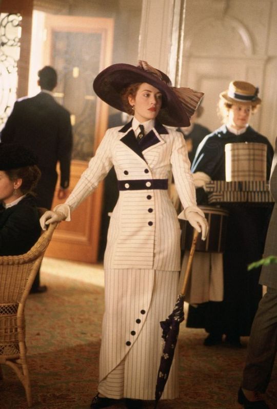
Beyond the historical nods, which most tv viewers don't have detailed references to as there aren't many color images we have from that era, I think the show does a great job of connecting cultural references everyone can immediately pick up on (the Leydecker outfits were obvious examples). For example, if you think of a white stripey suit from the 1910s, the image that came to mind was probably Rose in Titanic. So even as Louis is projecting what was period standard masculinity, what the modern viewer is likely thinking of is a tailored suit worn by the female protagonist in one of the biggest movies of all time. These looks screams high fashion latest designs from Paris, decked out pampered princess of the ship ("prince of your district").
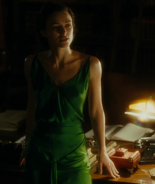
In the same vein, when you imagine an iconic green period costume you're probably thinking of Keira Knightley in Atonement. In fact if you google "green suit in period film" all the results are of women. Rarely are men put in these colors in period romances particularly. I mean I think they put Keira in that green dress simply because she looks incredibly beautiful in that color and that's also how I feel about Louis in his green outfit.

I've talked before about the use of red on Louis but looking at the actual context of when Louis wears red they are specifically scenes of lust (w/ Jonah), shame (the slutshamig w/ the soliders) or anger/revenge (killing the Alderman) and hello look at these!!


And this is really an exclusively female character trope where vivid color costuming is used to convey mood or emotion! When a man is angry or lustful in a film, he's never wearing red, he's just wearing a boring color like black or grey. Evil and goodness are conveyed by black vs. white costuming with men (i.e Lestat's evil black darth vader get up) but rarely any colors not on that b&w scale.
Also speaking of cultural references in costuming here's this again.
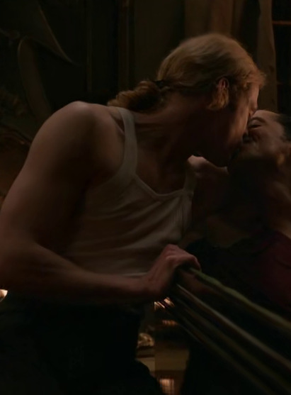
#iwtv#im making everyone look at the wifebeater outfits with their eyes taped open like its clockwork orange#my point is the costumes make louis even prettier while they make lestat appear powerful#(and scary)#so many outfits highlight how broad his chest is and his giant ass biceps#costume analysis
397 notes
·
View notes
Text
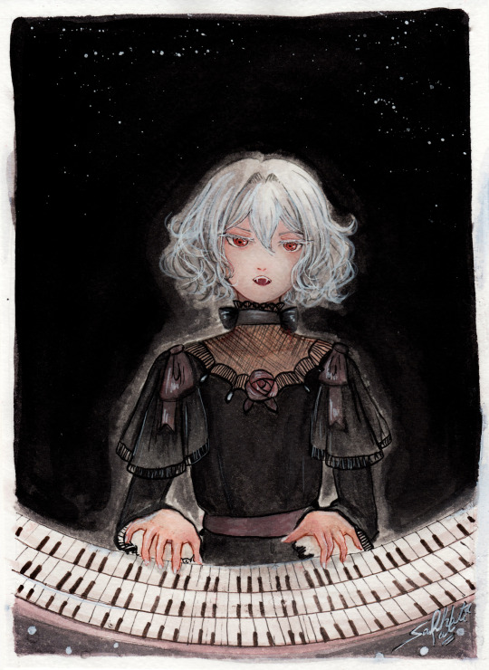
"Noble d'Apchier"
A little watercolor painting of Chloe,with the Zorn palette! I found out about this palette a while ago and I really wanted to try it out! (More on that below )
Chloe's hair is something I adore, it's gotta be one of my absolute favourite character designs ever,I love how swirly and fluffy it is,very fun to draw. I've drawn her normally before,I wanted to do one with her vampire eyes and fangs too. I decided to try to draw a white fuzzy rim around the foreground against the plain background,for a change,like in some of the VnC panels.
The Zorn palette,or Apelles Palette was a colour scheme used by Anders Zorn in the late Victorian/Early Edwardian era. It ,or something similar,might have been used by artists of old civilizations too, because it avoids the use of blue and green entirely: which would eliminate the need for rare pigments . It's essentially a colour mixing challenge,to draw the entire paintings with 4 pigments,2 basic colours: Ochre yellow, Vermillion,and Black and white,which can be mixed into different shades. It can be an excellent exercise and means for portrait painting
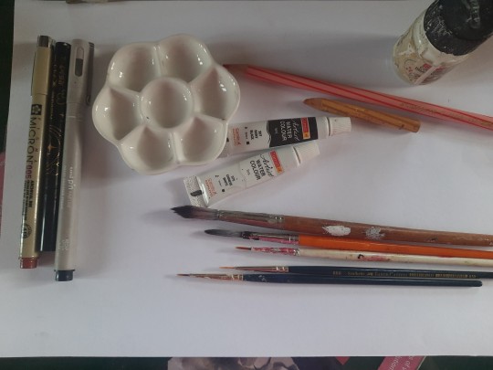
Modern artists use red instead of vermillion,but the essence is the same. So that's what I did too. I considered using vermillion,but I realised that it would introduce a lot of yellow tint, making the picture very warm. Which is usually something I prefer honestly,but not what I was going for here. Also,I need to consider the fact that I'm a watercolour artist,which is very different from the original intended palette. Zorn used oil paints,but other artists use it fine for gouache and acrylic too, however,that too is different from watercolor, because instead of mixing with white, I'll be diluting with water,which changes the composition of the palette considerably. So I went with these supplies: ochre yellow and red watercolor pencils (for me, basically watercolor pigments,I don't use them to draw,I grind and dissolve them in water),white and black watercolor tubes,and white ink. In addition: lineart with sepia,grey and black brush pens,which are well within the bounds of the palette
To be honest,I ended up not using the white paint tube at all,water makes more sense to me. I didn't use anything else though,and stuck with the original materials.And the results:
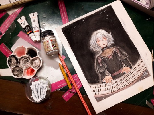
Does it work? Hell yeah. It's not perfect,but I'm happy with how she turned out
Was it restricting? That's kind of the point,to paint with some limitations
Was it hard? Honestly? No. Not at all. It's definitely very different from what I'm used to,I use a lot of colours both as is and mixed,but this was surprisingly easy. Perhaps because of my subject,which didn't have much colour to begin with
Do I recommend it? If you want a small challenge,or to experiment or practice colour mixing,definitely
Will I do it again ? Absolutely. I feel like I haven't utilised much of the potential of this palette. I ended up using mainly red and black, hardly any yellow at all. So I'd like to do something more colourful with this palette, perhaps a sunny painting of a gingerhead girl with flowers,and for this I'll probably use vermillion,not red
Anyways, that's all! If you read all this,thank you for your time!!
#chloe d'apchier#the case study of vanitas#vanitas no carte#VnC#my art#traditional art#zorn palette#vnc fanart#vanitas no shuki#jun mochizuki#case study of vanitas
274 notes
·
View notes
Text

Oh yeah, so I’ve been actually coloring my stylized versions. This is just what I have so far on the page, but I still felt like sharing
First we have Dark Cacao and Choco, obviously, since they were what started it and they’re my faves
I feel like I should mention, I said previously that they were gonna be monochromatic, specifically greyscale, with the eyes (and probably gems) being the only pop of color. I did that, and then sent it to a Discord group I’m in, but then someone there told me “hey maybe don’t color them as grey”. To be fully honest, I’m still not entirely sure why (note that I’m white and also tend to live under a rock when it comes to real world stuff), but I do vaguely recall some people being upset that Fettuccine when she came out had a somewhat grey dough color, so I assume there’s some sort of negative connotation around coloring black people with grey skin. Yeah I’d say this was a case of me not thinking before I do something, which is pretty common for me tbh. So I decided to instead make their colors purple and red monochromatic (outside of the hair), and that person on Discord said it looked a lot better
I probably didn’t need to tell you all that, I could have just said I decided to make them purple and red and avoided saying that I did that, but I don’t know, I felt like I should? I don’t like being dishonest (unless it’s my parents)
Also Dark Cacao and Choco’s eyes are white as a partial reference to the Shadow Milk puppets
Anyways, so on to Golden Cheese and Black Raisin
I mostly drew them because on Twitter, there’s someone who ships the two of them and she’s been liking my art, so I thought to draw them. Well I was already drawing Golden Cheese, but I drew Black Raisin too because of that
They’re triangles because birds, and also because Golden Cheese has the triangle Soul Jam
To be perfectly honest, I feel like Golden Cheese didn’t turn out that well. Or at the very least, she looked better in the rough sketches. Maybe it’s because I don’t draw her that much
Golden Cheese was the one I probably took the most liberties with design wise, but color wise she stayed mostly the same. It’s mostly because how her face is drawn, meaning you only see one side of it, and her colors kind of just work as is with the stylization
Golden Cheese is probably going to be the only Ancient to keep her normal dough color, other than maybe Pure Vanilla
Black Raisin turned out better I think. She has sharper angles mostly because I didn’t realize until later that I should make GC sharper, but it didn’t look right. And also I think it fits with Black Raisin’s character to be sharper
Black Raisin has a lot less colors, mostly because I didn’t think she needs that many, she’s relatively simple color wise
Sorry I’m in class right now, and I’m only half paying attention to this post. I think I’ve got most everything down, so I’ll just post now
#cookie run#my art#dark cacao cookie#dark choco cookie#golden cheese cookie#black raisin cookie#stylized cookies#honestly I’m having a lot of fun doing these stylizations#we’ll see how long it goes#and if I can eventually draw their bodies
44 notes
·
View notes
Note
When you did your version of wukong did you have a specific species of monkey in mind to base him of? Or was him a mix of some monkeys?
It got me curious when you said you know a lot of monkey facts and I wondered if you used this to concept him?
EEEEEEEEE! You have no idea how excited I got when I woke up and saw this ask! I literally don't even care that it's the newest one I'm answering rn!
And also! Before I get into how I made the design for ITTW Sun Wukong, something I wanted to throw out is that a few people have asked for me to give more monkey facts after I foolishly /j divulged that I am an encyclopedia of monkeys, so I've been thinking of doing like a Monkey Facts Monday cause alliteration where I post a bunch of monkey facts on mondays! So lemme know what you guys think of that idea cause I absolutely am willing to do it! :D
Now ONTO THE MONKIE MAN!
In Journey to the West, Sun Wukong is described to be that of demon Rhesus Macaque.
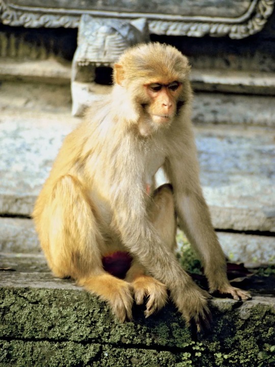
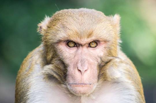
Rhesus Macaques can come in a variety of browns, greys, whites, and blondes, but for the most part are largely this stunning platinum gold color like in the picture above. I personally love this this color and wish we could see more golden furred Monkey Kings instead of just monkey=brown.
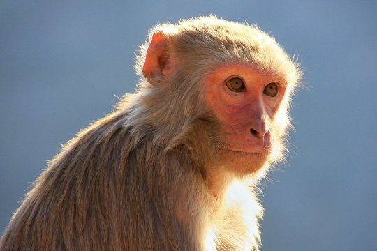
In addition to golden furs, a Rhesus Macaque's skin is largely a pinkish-peachy color with darker, nearly black, fingers and feet (You can see this in the first picture as well :)). And males tend to have more redish saturation around their eyes. (The saturation of this "mask" on males has been linked to levels of testosterone and therefore the dark/more red the mask the more potent the male, meaning it may be a sexual selective male trait as females have been observed preferring males with redder masks.... *looks at LMK Macaque simps*)
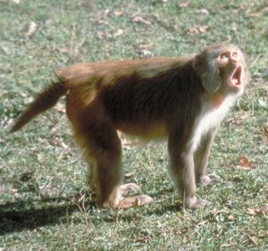
However, one thing about Rhesus Macaques is that they have very short tails. (As depicted below)
And that just wasn't quite the look a was going for. So while I was thinking "Eeeeh I could just say that he's a Rhesus Macaque with a long tail" but as I was sifting through my monkey knowledge I remembered another macaque species!
The Crab-Eating Macaque! Aka the Long Tailed Macaque!
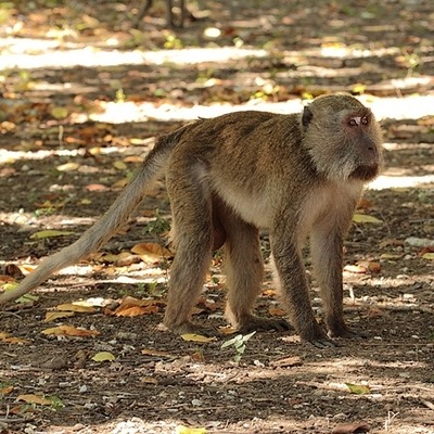
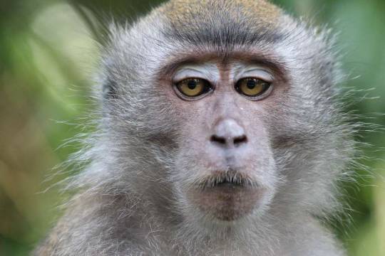
These macaques very closely resemble Rhesus Macaques in facial features as well as fur as they also come in a variety of gingers, browns, greys, and blondes with their main color variation being this brownish-gold. (below) Tho their pelts tend to range darker than a Rhesus Macaque's.
And instead of having mainly peachy skin with a few black tones around the hand and feet, they largely have very dark skin with the brightest parts being around the eyes and the darkest being their pitch black ears, hands, and feet.
And come on, you can't tell me this isn't a Monkey King face:
Plus I might be just a liiiittle biased because my favorite monkey picture is a Long Tailed Macaque:
Just look at this dude! He's so done with life! 😂
But along with just physical characteristics, Rhesus Macaques and Long Tailed Macaques share many behavioral qualities as well.
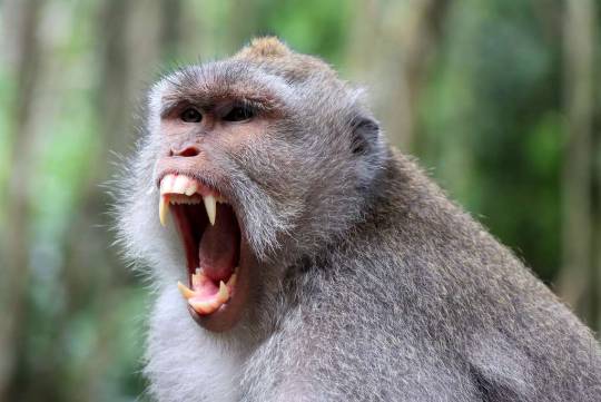
They both display threats in similar ways, such as baring teeth paired with screaming to frighten predators and other monkeys. Though, Rhesus Macaques tend to be more aggressive and bold (accurate to Wukong) while Crab-Eating Macaques are very cautious and skittish. A Rhesus would much rather fight while a Long Tailed would much rather run.
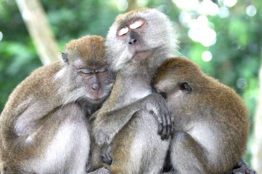
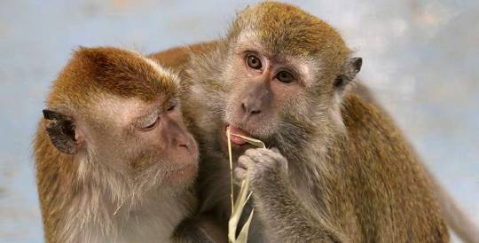
Another thing they share is their open affection for each other. Both Rhesus and Crab-Eating Macaques have extremely tight knit bond within their troop and with even form best friends from a very young age. Just look at this family unit and how the younger two hold the elder monkey! So sweet. 🥹
All in all! In the end, I went with a mixture of these two species for my ITTW Wukong design, leaning slightly more toward his original species, the Rhesus Macaque, and gave him the proportions of a human since he's a monkey demon.
The traits that I took from the Rhesus Macaques were his blonde fur and peachy pale skin tone as well as his more saturated peach mask, which I blended with a darker blackish-red at the bottoms to pay homage to the Crab-Eating Macaque's darker faces.
The traits that I took from the Crab-Eating Macaques were their long tails and black tipped ears. (as well as the blended mask)
And the traits I took from both were the black tipped hands and feet as well as their long fangs.
While his eye come straight from the book.
And this was the result!
#skittle answers#my art#isekai'd to the west#ittw#ittw sun wukong#journey to the west#jttw#jttw sun wukong#jttw sun wukong fanart#jttw wukong#jttw monkey king#sun wukong#wukong#monkey king#original monkey king design#original sun wukong design
310 notes
·
View notes
Text
Mew trying to become Ray let alone date him was not on my bingo card for this week but I'm no professional bingo card designer, let's talk about this anyway
We all went into this show knowing it was going to be messy, asking for it to be messy, we're all weak for SandRay so RayMew is upsetting because we want Ray with Sand, sure, but setting all of that aside, the thing that is really concerning to me about the fact that Mew is choosing to rebound with Ray is the fact that he is very creepily BECOMING RAY while doing it. He's putting on a persona to handle his life right now and it's really unhealthy and boy needs to cut it out and get some therapy. (they all need therapy.)

At the beginning of the episode, before the confrontation with Boston, Mew is dressed more or less as himself. He and Ray do dress similarly on a base level- they both wear a lot of patterned, unbuttoned shirts over a second shirt, but Mew normally wears stripes over tshirts, and mostly light colours with a lot of blues and greens. Ray wears a lot of darker colours and patterns with shapes and designs, with a lot of reds, tans, and oranges, over tanktops/vests/whatever you want to call them where you're from.
After blasting Boston into the pool and delivering one of the most satisfying kicks on television, before going for his confrontation with Nick, we get the creepy tub shot of Mew sinking into his misery and his upcoming revenge era-
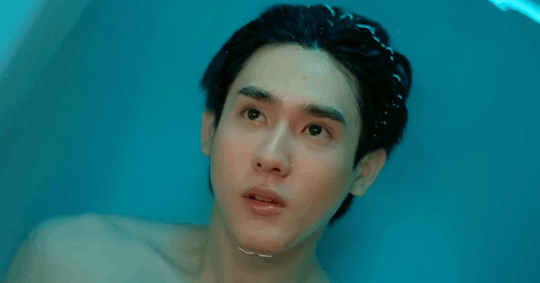
To put on his Ray cosplay, he's gotta sink down into the deep. This isn't a rebirth or an emergence of a new, stronger version of himself; this is him descending, covering himself and his hurt with someone else's aura and attitude so that he can cope with the path he's decided he needs to go on to burn his enemies and get his revenge.
He tries it out when he goes to see Nick and it works for him-

This is his soft launch, where he's up against someone else who has, or feels he has, been done wrong by Boston and Top (and done wrong, obviously) but that Mew knows is vulnerable. Mew pushes on Nick to help him get his revenge on Boston, and Nick crumbles. Using this persona, this attitude, is working for him.
He uses it to hunt down Gap next, another trial run, that goes flawlessly for him as well.

He's got the black tank, the necklace, and a black, white, and grey shirt this time, another test of borrowed confidence. And he's successful: he pulls Gap with almost no effort, he gets the file, he's ready to go now. He's used the Ray based persona twice with people he doesn't know, his confidence is up, which means he's ready to use it on someone he does know.
So when he gets ready to confront Boston, we get a whole sequence of him preparing for the battle, and checking all the details. There's a lot of very close up shots of his face and eyes here that I left out of the gifs because this scene was already long, and a lot of focus on each detail.

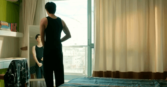

The necklace like Ray wears, a tanktop like Ray wears (but black! because this is Mew in his angsty villain era!), a patterned button up shirt like Ray wears, check the hair and go. Armored with this other persona, he's ready to handle Boston, and he does. Much, much better than Ray himself, mind you, compared to when Ray went and confronted Boston in the last episode.
The next big outfit switch we get for Mew in this episode (I'm not counting the whole big Top punching Mew confrontation since Mew and Ray are both just wearing their school clothes there) is Top's daydream about dancing with Mew. This whole sequence is so soft focus and Top looks so sad and there's no one else there which implies to me he's imagining this and it's not an actual memory, but either way we're back to Mew in stripes, with Top in stripes as well.
What's different about Mew and Top matching versus Mew matching himself to Ray? Mew and Top don't really MATCH so much as coordinate. They're often in different colours, different styles, different material shirts, etc. Like here, Mew is wearing an unbuttoned dress shirt with vertical stripes over a tshirt, while Top is wearing a collared polo shirt with horizontal stripes, AND they're wearing different colours. They work together without fully matching, and they're distinct to the characters as well. Even when their styles get a little closer, like Top wearing some solid colour button up shirts in episode 6 instead of polo shirts, he styles them differently than Mew does and I at least can't really picture them switching clothes and having the outfits really look right.
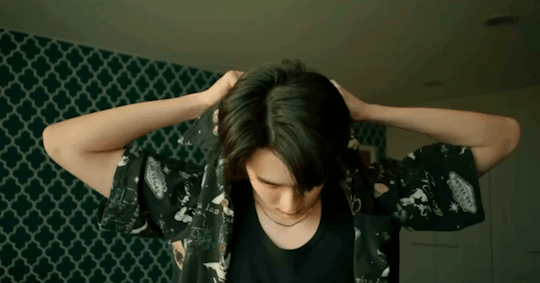
Meanwhile, the last scene of the episode, with Mew dancing with Ray, we get this-

Mew is dressed as Ray again, even shifting into Ray's common colour schemes with the flowers on this one. His first outfit when he went to see Nick was a trial and the pattern still had a lot of blues in it, but he's been shifting into darker colours with the tans and oranges we see Ray in pretty often with this.
(Ray, meanwhile, is wearing a shirt that looks like something Sand would have chosen for him, of course.)
Ray is reckless, Ray is fearless, Ray is bold, Ray is confident, Ray is wild and sometimes unpredictable, or he at least seems to be to the much more conservative Mew, so slipping into Ray's clothes and taking on what he thinks is Ray's persona is a way for Mew to push himself in ways he hasn't before. There's no way Mew could have handled his whole spy mission to get the video file from Gap as himself the way he has been; that's not in his wheelhouse.
From the preview for next week it looks like Mew is sliding into more of Ray's persona with the partying behaviors, and I don't think it's going to end well for him. But being with Top has taught him that trying to get someone to change is useless because they're still the same mess on the inside, so his decision to slide down the same path as Ray and let go of his inhibitions instead of trying to fix Ray is as unsurprising as it is self-destructive.
Seeing Mew take some kind of power over his life should have been satisfying, and in some ways it definitely was, like watching him burn the notebook page and try to put his foot down with Top, but then seeing him do it while spiraling mentally and slowly covering himself with Ray's outward persona at the same time was incredibly unnerving. Adding in him deciding to get involved with Ray romantically and it just speed ratchets up the unhealthy factor by a million miles a minute.
It also shows how well Mew actually knows Ray now compared to how well he thinks he knows Ray and who and what he thinks Ray is, that he could send himself down this path without seeing the writing on the wall about who Ray is trying to be and what Ray is trying to deal with behind Ray's substance abuse problems and everything else, but I imagine that will be part of the inevitable explosion that THIS impending disaster will also turn into, potentially very soon.
You can't fix your problems by pretending to be someone that you're not, especially if who you're trying to be is someone you know who is incredibly problematic and unhealthy themselves. It's a whole toxic situation even BEFORE you start trying to DATE THEM AT THE SAME TIME.
We wanted a mess and boy are we getting it.
(ETA: Should have stuck a credit in here earlier oops, a post from @spokenfromtheheartandsoul got my brain going in this direction last night and this post is what happened after the gears turned on this for most of the day)
#only friends the series#ofts#only friends#only friends meta#ofts mew#ofts ray#ofts top#raymew#topmew#only friends ep7#it took me all day to write this after having “Mew dressing as Ray to pick up Gap unhinged fiasco” saved in my drafts at 4am#mia gifs things#mia gifs drama things#mia gifs only friends things
93 notes
·
View notes
Text
now i wanna, be your dog

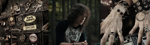
eddie munson x metalhead!fem!reader
summary: five times Eddie knew that he was undeniable head over heels for the leather wearing hellcat that rode into his life and rattled him in his boots (and by boots i mean doodle littered converse).
a/n: okok so i've seen plenty cheerleader x eddie munson fics but i've seen like ONE metalhead x eddie fic which is much needed. Im talking like motorcycle riding, eyeliner wearing, beer shotgunning, motley crue enjoying bad ass bitch that can outsmoke eddie like theres no tomorrow. So, i made one :)
this is literally the fluffiest of fluff, a bucket of sexual tension, and smut thrown in a basket and tossed back at you with a pink ribbon.
❀ warnings: afab and she/her pronouns used, fluff, smut (number where smut occurs in bold) [riding, fingering, cum eating, pulling out] , drug use, under 21yo drinking, smoking (weed and cigarettes), cursing, y/n is said to wear heavy makeup, tiny little reference to blood, y/n is also said to have facial piercings. y/n is 18 here and in her senior year and Eddie is 19.
❀ poc friendly
Not responsible for your media consumption choices but preferably 16+ from here on down ;)
There was no doubt that from the second Eddie Munson laid his eyes on the new y/n y/l/n, she had him wrapped around her little ring covered finger.
With heavy black eyeshadow and lips blood red, the moment she stepped foot into Hawkins, he was right behind her, chasing her like a lost puppy.
Y/n had just moved to Hawkins, rumors of "the new girl" were circulating around the town like a wildfire.
Eddie didn't think much about the fact a new girl was around, only that it wasn't going to affect him much but on the first day of school he was proved extremely wrong.
1.
The very first day of the new school year, Eddie jumped out of his van and was in the process of locking his door when he heard an unfamiliar roar of a motor behind him.
He turned around and caught a glimpse of a motorcycle driving into the student parking lot, much faster than allowed. The motorcycle in itself was what initially had him reeling. It was a Suzuki Katana, painted a dark red. So dark it almost looked black when the sun wasn't hitting it. All his years in the treacherous highschool and in this horrid town and never once had he seen that bike.
On it, was what he last expected to be riding it. A woman? Now, it's not that Eddie had any issue with it, but here? In Hawkins, Indiana?
There was no way that wasn't the new girl because trust me, Eddie would have noticed her before.
The second thing that caught his attention as he walked in the direction of where the girl was pulling into, was her shirt. It was baggy and the sleeves had been torn off, the sides of her black bra showing when she lifted her arms. It was dark grey and had a white design, the words 'Iron Maiden' large in the front and in the back had all of the dates and places of their 1984-1985 'World Slavery' tour. It was one of Eddies favorite bands.
As she parked the bike, turning off the engine and throwing her bag over her shoulder, some kid jumped up besides her.
"That's a beautiful ride ya got there." He said. Caught by surprise, she flashed the boy a smile, the brightness of it contrasting the darkness of her eyes.
"Thanks. Fixed her up myself." She said, patting the seat.
After a beat of silence, Eddie stuck his hand out towards her.
"Eddie. Eddie Munson, but you, can call me whatever you please." He said, a smile much too sly on his face.
y/n couldn't lie, he wasn't bad looking. He was rather attractive. He didn't look like the jock kind. With hair almost as wild as hers, rings of skulls and gargoyles, patches and pins of various metal bands she was familiar with sewn into his jacket and converse completely covered in doodles of the most outrageous of things, he seemed just like her kind of person.
"Y/n y/l/n and i think i'll decide what to call you while you walk me to first period." She replied, walking past him and avoiding his hand which was still stuck out.
From then on, Eddie knew he was in for it.
2.
"Dude this is the worst shit i've ever fucking smoked." the girl giggled as she laid on the floor of Eddies van, her legs mounted up against the door of the van and her back on the ground.
"It's not that bad." Eddie slurred from his place in the beanbag.
They were parked out front of Eddie's trailer, using the van as a more convenient place to hotbox.
"There's no fucking way Rick doesnt have better shit to offer you. I mean your like his best... busboy. Where's the better shit? I think we should interrogate him." y/n muttered, bringing her legs off the wall and sitting up against it.
Eddie merely snorted at her struggle to sit up. Her eyeliner had smeared a little, now intense and under her eye. Strands of hair stuck onto the piercings on her face, causing her to swat them away, then lightly whine when her aggressive actions pulled on her piercing harshly.
"What are staring at, freak." y/n said playfully, looking up to Eddie who gazed at her from the beanbag, his eyes half opened and hair wild.
"You." He said. Thats what y/n liked about him. An honest man. Only one she'd ever met.
"Why don't you come here and get a little closer, maybe you'll see better." She lited, tilting her head to the side and smiling a smile so innocently titillating that made the boy swallow harshly, sitting up and leaning towards her.
His face was now mere centimeters away from hers, air hot and still reeking of pot. Her smile faltered slightly, now just a smirk.
Eddie was mesmerized. His lips parted as his breaths came in quiet pants. His eyes lazily flickered back and forth between her eyes and her lips.
If he were sober, he would've sealed the gap ages ago but now, countless puffs in and all he could think about was how soft her lips looked, the now faded crimson color looked so delicately venomous. Like one kiss would kill him but oh how endearing that one kiss would be. Almost as if he leaned in, hed never get to lean away and right now, he had no problem with that. So instead of closing the small space between them, he just stared into the abyss that was her lips.
"Why don't you get some Motley playing before i decide to do something dumb like jump your bones, Munson."
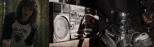
3.
The crowd at The Hideout was fuller than usual. A few unrecognized faces littered the crowd. Mostly middle aged men with beards and bandanas.
Eddie was crouched by the back of the stage area, plugging his amp into the wall. Next to him, Jeff and Gareth argued over some stupid cables and which go where as if they hadn't done this millions of times.
"You're a fucking idiot Jeff. That's the XLR cable, not whatever the fuck you're saying. That goes into the amp not the wall." He whisper shouted, making Eddie roll his eyes.
"Then how would the mike turn on, Gareth." He replied, dramatically placing his hands on his hips.
"It connects to the amp that AMPlifies it considering that's what an AMPlifier does. Then the amp goes into the wall. It's not fucking trigonometry. I mean shit, Eddies had to retake highschool like a hundred times and he gets it."
Eddie raised his arms and turned to look at them "I'm right here dumbass." He said annoyed, being dismissed with rolling eyes and waved hands. "I need a beer." He mumbled before making his way past them and up to the bar.
"Luke, can you gimme a Busch?" He ordered, placing the cash on the counter and receiving a nod from the bartender.
"Make that two." A voice rasped behind him, followed by the scent of cigarettes and vanilla.
He turned to welcome to sight of his now bestfriend (and occasional fuck buddy) looking like she just came out of a Rolling Stones magazine. Just a black lace bra as a top, black leather pants, two chains attached to the belt loops and a dark weathered denim jacket thrown over, oversized and the sleeves bagging.
He was holding back any and every urge to immediately fall to his knees at the sight of the y/n y/l/n. The girl that had grabbed the boy by his shoulders and shown him what the world is like outside of the wretched town. The girl that had shown him what it's like to truly have the rug pulled from beneath him and a heavy boot wearing damsel step on his throat.
"On you, of course." She chuckled, jumping onto the bar stool besides him and leaning her forearms onto the sticky bar counter.
"Oh of course. Can't have the punk rock princess pay for her own drinks." He laughed, making y/n laugh at the rhyming but slightly cheesy name he'd decided to give her.
"Would that make you the metalhead macho? Or shall i say, the iron maiden." Y/n laughed at her own joke, making Eddie bark out in laughter as well.
The bartender placed the two bottles before them and Eddie slid him the money for the second one and made his own seat on the barstool next to him.
"So, what brings you here at this treacherous hour of the night?" Eddie asked, never having had seen her at his gigs before.
"Got stoned, bored, and remembered it was tuesday. Plus they don't ID here. Why, don't want me here?" She asked playfully, placing her chin on her palm and elbow on the counter.
"No no no that's not why. I mean definitely it's wonderful you're here, you just didn't have to come if you didn't want to. It's not like we're all that."
"Im playing with you Eds. Came to support my metal monarch and hope he plays some Stooges. Nowhere else i'd rather be." She said, punching his shoulder lightly.
Y/n's words made him blush, followed by his endless hopes that she didn't catch onto that.
"Your wish is my command because as a great poet once said, 'i wanna be your dog'." He said in a fancy voice, grabbing his beer and jumping out his seat to make his way back to his band who now looked about ready to begin playing, but not before bringing his hand up to her chin and swiping it with his thumb lightly, an act of admiration he'd grown used to doing.
"Go get em tiger." She cheered before chugging down her beer.
4. smut belowwwww
Eddie was already deep in the waters of adulation even before the sex began but now, a cigarette in between her lips and legs over his hips, what he felt was near worship.
Riding him with a frevity and hunger that Eddie never knew one could have, he felt like he was orbiting saturn, his hands gripping the skin of her hips as he helped (barely) her motions. Leaning her head back and exhaling the smoke, she looked like an angel to the man beneath her. Or more fitting, a fallen angel.
Because nothing of the things she could do and did do to him were anything near holy. The way she made Eddie feel whether if it was with a simple movement of her body, a knead of her hands, or a lewd comment that dripped out of her lips like the sweetest of honeys was anything but sanctified.
"Fuck y/n. I- i can't. To good. Fuck." Eddie muttered, his words falling incoherent.
"Hold on there pretty boy." y/n moaned, bringing her hand down to his shoulder for support. "I'm close too."
A symphony of the most obscene of moans clouded the room, mildly covered by the heavy guitar of Push and Stomp by Joan Jett & the Blackhearts bouncing off the thin walls, the creaking of Eddie's bed loud and just as incriminating as the very sounds that left their lips.
"Fuck, im gonna cum." Eddie groaned, pulling y/n off of him, ropes of white liquid squirting onto his abdominals.
"I can help with that." y/n mumbled, stuffing her cigarette into the ashtray on Eddies nightstand before grabbing her hair out of her face and leaning her face down to his stomach area, boldy licking him clean.
"Shit." Eddie hissed at the sight. His eyes rolled at the entire scene.
When finished, y/n kissed and licked her way up to his neck, then his jaw, then finally, his lips. He groaned into the kiss, his hands coming up to her waist and flipping the two of them over, now him on top.
"You didn't get to finish." He said, barely letting himself finish his own sentence before muffling it in her neck, biting and nipping at her skin. His hands found its way to her core, fingers gently brushing through her wet folds, pulling a sultry moan from her lips. He made his way down to meet his mouth with her pussy, licking and sucking like a man starved.
Between his fingers and his tongue, he pumped in and out of her, watching from below as he body arched and her eyes squeezed closed. He bathed in pleasure when she gripped onto his hair, pulling on it with authority and possession.
He was hers and there was nothing anyone could do to change that.
5.
The last song Eddie couldve ever expected to have brought y/n such joy was the one that had her on the bed besides him sitting on her knees, in nothing but her black lace panties (which had a tiny rip in the lace trim due to a little impatient man with long black hair) and his hellfire shirt, her arms close to her chest as she swayed with the song.
"OH ONCE IN YOUR LIFE YOU FIND SOMEONE!" y/n sang the lyrics of Heaven by Bryan Adams dramatically, emphasizing the emotion behind the melodic piano and moving instruments.
Eddie laughed at her antics, the haze of the early hour of 3 a.m and the wearing off of the pot they'd smoked earlier made everything so cohesive and the moment so endearing.
"WHO WILL TURN YOUR WORLD AROUND!!" She continued, now theatrically "falling" on top of Eddie, arms still swaying with the music.
Brain fuzzy with laugher, Eddie looked down at her, singing the lyrics to the cheesy song he had no idea was even on her radar, considering it was so out of her character. The dim light of his lamp illuminated her, shadowing her features perfectly.
Once the theatrics were over, instead of rolling off of him, y/n decided to remain on his chest, head tilted up and looking at him and legs intertwined.
He looked down at her, indulging in all her beauty.
"You missed some." He said, his thumb coming to the area right below her eye to wipe off a bit of excess eyeliner that hadn't come off with the makeup wipes, frowning when it didn't come off.
"It's that new waterproof shit i bought. Gotta scrub it off with every bit of strength in me to get it all off." y/n laughed lightly, clearly not showing any sign of her actually getting up to do it.
Eddie reached over to the nightstand and grabbed the packet of makeup wipes shed left on there and grabbed one.
He gently grabbed her face so her chin was on his chest and he sat up slightly against the pillows, y/n closed her eyes and he began wiping around her eyelid and lower lashline, ever so gently and lovingly. Almost like he was scared to hurt her if he got to rough.
As he laid here, he thought to himself about how he could do this every night for the rest of his years. He thought to himself about how he'd finally found a person who got him. Without instruction or persuasion or the need to change, she just got him. From the minute she rode into the oh so boring school of Hawkins High where Eddie felt like he was imprisoned, she graced him with a ground shaking beauty and freed him, gifting him a sense of self and new found enjoyment of his life here in Hawkins. And he wished that when his life here in Hawkins ended, she'd be with him for whatever next life was to come, making a mess of it with smeared eyeliner, smudged nail polish, and lips so dark just the sight of them could make a saint profane.
"thank you." y/n mumbled, eyes still closed as Eddie wiped.
Eddies motions stilled and he stared at her tranquil face. He felt something, something which he had to get out.
"I think i love you." He said quickly and without thinking. A spring of fear blossoming in him. All his worries eased when she let out a soft chuckle, opening her eyes and looking dearly at him.
"i think i love you too, freak."
#ˋ°•*⁀➷ ꜱᴏꜰɪ ᴡʀɪᴛᴇꜱ#eddie munson smut#eddie munson fluff#eddie munson x you#eddie munson x reader#eddie munson x y/n#eddie munson#stranger things smut#stranger things#st4#st4vol1#st4vol2#st4 vol 2#stranger things season 4#eddie munson headcanons#eddie munson x metalhead!reader#eddie munson my beloved#eddie stranger things#eddie munson stranger things#eddie x reader#i love eddie munson#eddie munson fanfic#stranger things season four#eddie munson x female reader
907 notes
·
View notes
Text
The "Teacher is Teruko's Brother" Theory
(Before we properly start, I think I should say that I am using @xmicrophonyx's names when talking about the Alt-DRDT characters. I probably didn't have to say that because Teacher's name makes it the most obvious who he is, but just thought I'd get it out of the way)
(Also, everyone seems to be using the tag #AltDRDT for talk about this new cast, so that is what I will be using as a placeholder name for the fangan until we get the actual name. I hope this won't be too confusing !!
-
From the day the Alt-DRDT cast was released, people have been theorizing that certain members of the cast might be siblings to the main DRDT cast. The most prominent one I see is that Scale might be Charles' dead older brother Elliot, which I do think has a bit more weight to it (see my previous post on Alt-DRDT for that) but I am on the fence of believing. A few of my discord friends theorized that Min and XF could be siblings due to their similar eye color, which I don't believe at all due to what we know of Min's homelife and what led to her encountering XF-Ture-Tech in the first place (though those two undoubtably have beef and I am so excited to see it)
However, there is one sibling theory that I think has a massive chance to actually be canon in the DRDTverse, one that I've seen around a couple of times...
...Why the fuck am I trying to build suspense, you read the title.
I think that Teacher is the brother that Teruko mentions in CH1-4.
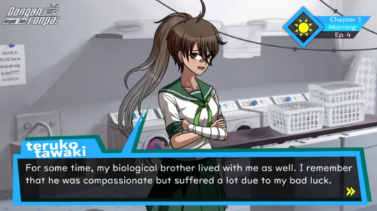

I think this has a lot more evidence surrounding it then the other sibling theories I've seen. So take a seat and let me explain why ! I mean duh that's what this post is about
-
In this post, I want to talk about their designs and how they contrast each other

graphic design is my passion /joke /ref
So there are already three, count-em three! Things that I think are very important
For one, Teruko and Teacher basically have the exact same skin color.

Teruko

Teacher
Other than the very very tiny difference in hue that you could basically only see if you squint, I think it's safe to say they have the exact same skin color.
> "But Haru, you incredibly pretty sun demon ! Skin color isn't enough to consider someone related !"
Firstly, thank you for calling me pretty :D. And second of all, I am aware. But in conjunction with my next point I think you will see why I decided to mention this first.
Which leads me to my next point, and one that I've seen talked about quite a lot already: In all of the art currently out of Teacher, his eyes are closed.
There's obviously his full-body which I just showed, but even in unrelated art, his eyes are shut
Eyes completely sealed.
Now, I don't think it's a stretch to say that DRDT-Dev really likes eyes, specifically hiding things related to a character in their eyes. And eyes in general have shown to be a very useful plot point on multiple occasions
So the fact that Teacher's eyes are always closed definitely brings some attention, and part of me highly doubts it is just a design choice. There is a reason why Teacher's eyes have not been shown to us. Perhaps...sharing an eye color with someone?
And with the first point acquired of Teacher and Teruko sharing skin colors, I don't think it's a stretch to say Teacher might be sharing Teruko's eye color as well.
Now I will admit, that is mostly speculation. However there is undoubtably a reason as for why Teacher's eyes aren't shown, and with the added fact of the two sharing skin colors. It's definitely a likely possibility.
-
Now for my third point in relation to designs, which is the color schemes of both Teruko and Teacher
For starters, their color schemes are actually not that different from each other when you really look at them, both comprising mostly of neutrals (white, black, brown, and grey) with one particularly popping color. And it's that color in particular that I want to talk about
Teruko's color is green, meanwhile Teacher's color is red. And I bring this up for two reasons
Firstly, green and red are the most well-known complimentary colors, and considering Fire and Ice (two characters that are speculated and basically confirmed siblings) also have main colors across the color wheel from each other, I find that decision to be very interesting
But I didn't just mention this to nerd out about color theory...okay I kinda did but that's not the only reason I mentioned color schemes. Because there is one more point I want to make, and it's one I'm honestly surprised no one has mentioned yet
Teacher's color is red. Do you guys remember the QNA? Specifically, do you remember the favorite colors question and what Teruko's answer was?

Red. Reasoning: association.
I think that in of itself is very revealing, but the extra information that red is Teruko's favorite color because of association is really the icing on the cake.
> But Haru ! We haven't seen a design of Teacher from back then ! You can't be sure that that would be the reason for Teruko's favorite color !
True, but at the same time if we take this in consideration with the other two pieces of evidence, I highly doubt that this could be a coincidence. If Teacher really is Teruko's brother, then him being the association she has with the color red makes a lot of sense, especially considering red is literally the only non-neutral color in Teacher's design, and as such it sticks out like a sore thumb in combination with the rest of his design (in a good way).
So yes, I do think this is intentional, and it works very well considering the other two pieces of evidence. And with all three combined, I think there's no denying that Teacher being Teruko's brother is a very, VERY likely possibility.
#haru chats about drdt#danganronpa despair time#drdt#altdrdt#teruko tawaki#drdt teruko#altdrdt teacher#I was gonna add more but it is 3 AM on a school night#So be on the look out for a part 2 ;)
96 notes
·
View notes
Text
Interview with Charles Leclerc from Sportweek (La Gazetta dello Sport): “I play the piano, I love art, I want to fly. And I dreamed of Ferrari” (published January 7, 2023).

What is fashion for you?
Charles: “A way of expressing oneself without speaking. I realized this when I started travelling all over the world, thanks to F1, visiting countries and cities I didn't know before.
“I realized that dressing well had a different meaning according to different cultures and traditions. That's when fashion really started to interest me, I would say from 2017, even though I've always liked it.”
What was the next step?
Charles: “I started attending fashion shows, then I became a testimonial for Giorgio Armani and then I came more and more into contact with this environment.”
You also take great care over the graphics of your racing helmets. Which design do you like the most?
Charles: “Probably the one used in France (2022), with the reproduction on the two halves of the photographs of my father Hervé and Jules Bianchi.”
Ferrari is red, but for your 488 Pista you chose a different colour.
Charles: “At that time I was using a matte black helmet with the Monégasque flag going from the front to the back. So I decided to order the car exactly the same. I still like it very much.”
What did you think when you saw yourself in a Ferrari suit for the first time?
Charles: “It was a very big emotion, because it was my childhood dream to get into F1 and race for the Prancing Horse, even though at that time I was not yet an official Ferrari driver (only FDA).”
Do you have any good-luck charms you don't part with?
Charles: “I had some as a kid. My grandmother always used to sew a cross inside my overalls, under the sponsors' logos, but that tradition has disappeared since she is no longer here…”
How do you express your creativity?
Charles: “Mainly through music. I play the piano and invent my own pieces. I will never be as good with a pencil at drawing.”
How do you choose the clothes you wear every day?
Charles: “There's a very classic part of me, which seeks simplicity and comfort, and another more creative part that leads me to play around with streetwear.
“I let myself be guided by the mood of the day, by how I feel, because dressing is a way of making something clear with one's image.”
Will we see a clothing line of your own like Hamilton did?
Charles: “I had started the project, but I stopped. Maybe in the future.”
Do you ever talk about fashion with Lewis Hamilton?
Charles: “Sometimes we discuss the brands we like. He really has good taste and a lot of courage to show off the strangest looks when he comes to the circuits.”
Favourite colours or colours you would never wear?
Charles: “These days I prefer grey, beige and white. I'm not a big fan of fuchsia, in the sense that I wouldn't see myself dressed all in fuchsia, but I've worn that too.”
How do you feel about walking the catwalk?
Charles: “I'm not comfortable. Too many stares on me. But I like to watch the show and observe the more unusual garments. I was at the Ferrari Style show in Milan last year and before that at Armani.”
Try describing the feeling of driving an F1 car to someone who does not know racing. Valentino Rossi, when he tested the Ferrari, said: It is faster than I thought.
Charles: “A nice definition, because it is difficult for a normal person to think about the speed of a F1 car. I always make the comparison with the Rollercoaster. It's like being up there, but keeping everything under control.”
Why are you happy racing?
Charles: “For the adrenaline and because on the track I feel free.”
Do you like motorbikes?
Charles: “I have one motorbike, customised, which I bought in Bali when I went there on a trip with my best friends. We rented it on the spot and I wanted to take it with me to Monte Carlo, even though it was a mess to get it registered to ride there.”
Why that particular motorbike?
Charles: “Because of the memories it holds. I had just arrived in F1 and I decided to take all my closest friends on holiday, for the first time outside Europe. We had a great time.”
Do you still think of getting a flying license?
Charles: “I've already had a few lessons, I'm now at 11 to 13 hours of flying, let's say I have the basics. I had to stop, I hope to start again in 2023. There is a lot of theory to study and I obviously like the practice more.”
How was the feeling?
Charles: “Excellent. I like the stall tests, because there's adrenaline, but also checking the plane in general. And to say that I've always been afraid of flying...”
What do you mean?
Charles: “Even though I've taken planes countless times in my life, I wasn't calm. Now, knowing what pilots do and all the options there are in case of unexpected events, has reassured me.”
Even today you are karting like when you were a kid. Would it be nice to discover a new Leclerc?
Charles: “I would like to help talented young people, who don't have the means, to emerge and make their dreams come true. However, it is a project that takes time and which I therefore see as possible only in the future.”
What does it mean to be the hero of so many very young people?
Charles: “Every time I come to Maranello, outside the Ferrari factory there are always kids waiting for me. In recent years, F1 has regained popularity, also thanks to Netflix. It's nice to see a child's eyes light up when we make a photo. A small gesture is enough, which does not cost effort, to give joy to others.”
Do you feel like an example to follow?
Charles: “I try to be myself, behaving well, if this can then serve as an inspiration for those who observe me, I'm happy about it.”
Translation by vetteleclerc.
346 notes
·
View notes
Text
Frankie’s got me falling apart
Frankie Stein my beloved! G3 has given me a newfound appreciation for Frankie.
As usual, this is by no means a G3 hate post or account. If you hate G3, keep it to yourself or tell someone who cares. This post is about G1 and my take on it. Don’t like it? Leave.
Anyways with that out of the way, onto some design explanation and general info about my version of Frankie!
First of all, you’ll notice right away I changed a lot of things on them. Frankie is a Frankenstein’s monster, an amalgamation of dead body parts. So I tried to make the mismatched vibe a little more obvious. Both with patches of a deeper green for the skin, and with two different eye shapes. I also made her hair texture more puffy like her mothers hair, mainly just because I thought it’d look cute. I made it mainly black instead of mainly white because I thought it looks nicer, and now it’s just white and black instead of white grey and black.
As for their outfit, it’s always bugged me that Frankie has like, hardly any red in her design? Which is wild I know, I know her main color is green, but it just feels like… not enough for an accent color. And their random purple eyeshadow is just, odd to me. So I gave them more red in the design, keeping it as an accent color while still letting the deep green shine. Frankie also has always felt like one of the most Alt to me of the main group, so I tried to incorporate more edge with the tattered sweater vest and extra fishnets, as well as piercings, because I love them. I just tried to embrace the prep punk aesthetic she had going on.
Onto headcanons, or I guess canon for my designs? (Idk)
Frankie is non-binary. I love it, non-binary Frankie is like, I can’t unsee it now. Anyways g1 is a she/they to me, or maybe a they/she. As for sexuality, I’d say probably pan, and, importantly, polyamorous. G1 Frankie always felt polyamorous to me and so I felt the need to incorporate that into this. After all, Frankie has had the most amount of love interests. If I had to ship her with someone I’d say Jackson and Holt, it’s super cute. And also because as much as I love g3 Clankie I just, don’t really see it with G1, even if it does have that interest of like, mean girl x new kid that I usually love so much.
#frankie monster high#monster high#frankie stein#monster high redesigns#monster high g1#mh gen 1#mh g1#redesign#character design#frankie redesign#frankie#digital art#nonbinary artist#digital artist#artists on tumblr#art#nonbinary#procreate#artblr#art tumblr#queue art
90 notes
·
View notes
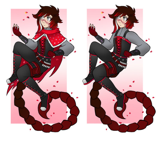
Note
May you explain the thought process behind all of Scorpion Faunus RWBY AU designs if you please?
Absolutely, buckle in. I'm a bit of a chatterbox, so I hope you don't mind long responses.
Let's start with Miss Scorpion Faunus herself. Now, Ruby has two versions of her design, one with her hood and one without, so I'm gonna pop them both beside each other just to contrast them.

Starting with Ruby's Vale/Beacon outfit, originally I hadn't changed it all that much from her original look, but then looking at it beside her other designs it looked a bit dull, so I revamped her to have a white top under the corset-vest and what my friend dubbed 'Miku Sleeves'. I'm honestly a lot happier with how it turned out.
Breaking it down, my main focus was to try and bring in some extra red into Ruby's look. I've always felt that without her cloak, her first look was really plain, with all the red on her dress being dark and her tights being black meaning she didn't have much of her colour. I made her tights redder and changed her corset design to be more similar to her later look, with a long stripe of central red, and some brighter accents all around.
Her white sleeves and the collar decoration are tied off with darker red, and I mostly kept them because they looked both cute and kinda fairytale-ish, but the main thing I wanted to do with this design was bring in the star theme that I want Ruby to have. The scorpio constellation decorated the sides of her corset, the two buttons on her white vest are star shapes, and her cloak has a small clasp that has another star on it. I axed the crosses she had in her show look, no hate to Qrow but I just never liked them on Ruby, and overall I think she looks cute.
I really like her Mistral look here. First major change is that her top is now a light grey instead of white. This will start a trend. Second major change is obvious, while in Vale Ruby is devoted to hiding her tail under her skirt, in Mistral she starts to wear it out a little more. Thirdly, I liked the idea from her show concept of battle damage, with the ragged cloak and the nicks on her red tights.
The main idea with Ruby's Mistral outfit here is that it carries elements of the people who were lost or impacted in the Fall of Beacon. The black neckpiece is taken from a cute piece of concept art and also references Penny, similar to the slits on her skirt. The trim at the top of her boots slightly references Nora's shoe style, and the puffier sleeves with a black cuff is a clear reference to Yang's own Beacon outfit. She also has changed her emblem to sit on her cloak, which is how Summer wears it in Antares as well.
Her hair's a bit messier, a little longer, and finally we can properly see that she has Tyrian's nose, which is one of my fav dumb details because it helps me slightly avoid same face syndrome (my enemy). There's a few extra belts, because belts on kickass goth boots Do Not Count as unnecessary, they're part of the style, and her gloves are way thicker and a bit more practical. I was able to bring in a darker red into this outfit, which ends up helping break up the black and red in a nice way without being too out of her colour scheme.
And yes: she has two star clasps on her neckpiece and the scorpio constellation on her skirt. Little star girl, falling fast.
The Atlas outfit is where we start getting the signs of story progression beyond just Ruby's outfit. Her tail is thicker due to a moult she undergoes in Mistral, her face is scarred from SpoilerSpoilerSpoiler, and her hair is beginning to turn silver-white due to overusing her silver eyes. It also has a little braid in it (can't be a scorpion faunus without braids), and has gotten to its most fluffi and messy it'll be here.
The big goals with this outfit were two-fold: make it look warm, and reference Tyrian (though in-universe it's subconscious on Ruby's part). The skirt has been officially switched out for a set of overalls, the belts on her waist are an exact replica of Tyrian's in Ruby's palette (she starts wrapping her tail around her waist as a fake belt, similar to him), and I snagged the undershirt and cuffs from her Mistral outfit and made it a darker grey again from her Mistral outfit. Her cloak has also become even more tattered, I wasn't a fan of her getting a new cloak in Atlas.
The other main things in this outfit that are different is the addition of the metal caps on her boots, which helps keep the silver travelling through Ruby's outfit as she becomes more in-tune with her SEW heritage. The scorpio constellation is again on her cuffs, she has some dark red gloves to stay warm, and while she has three stars on her overalls, between the belts, the star pattern is mainly on her shawl.
Speaking of the shawl, it's fur lined to bring in a little bit of white, and once again, a reference to Tyrian's overcoat. It is also where her emblem is now located, on the back, as at this point Ruby's having some struggles with the concept of 'identity', poor thing.
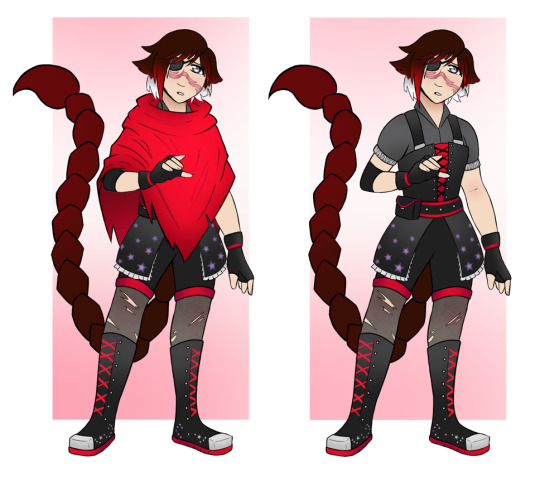
I'm a little biased but I still think her Vacuo look is my personal favourite out of these four. The hood is gone entirely, replaced by what I happen to think is an Adorable Poncho, and there is also the matter of the eyepatch. Due to SpoilerSpoilerSpoiler. But it has her emblem on it, very very faintly.
The rest of the Vacuo outfit is almost a reference to her Vale outfit more than anything else. We've nixed the darker red for a simpler colour palette, and her hair is messily cut short again, and a lot more silver. She still has a slight reference to Tyrian in the collar style of her undershirt, which is the darkest grey that she gets. She has cute lil lace edges on the sleeves tho.
The tights have also officially switched from red to grey, and while we haven't returned to the skirt, instead going for shorts-overalls, she does have a little overskirt patterned with scars that keeps her tail warm during the cold desert nights. The elbow cover adds a little funky assymmetry, very important in a rwby design, and the keen-eyed will notice the big departure in this from the other designs, the lack of bullets on her belt. It'll all make sense in context.
Finally, we've moved the scorpio constellation to her boots, nixed the goth belt on said boots, and kept the metal toecap from her Atlas outfit. Honestly there's not as much to say about this outfit, it's a bit simpler than the others, and there's less red in order to balance out Poncho Era, but I just think it's real cute, she's real precious.
Onto Weiss!!
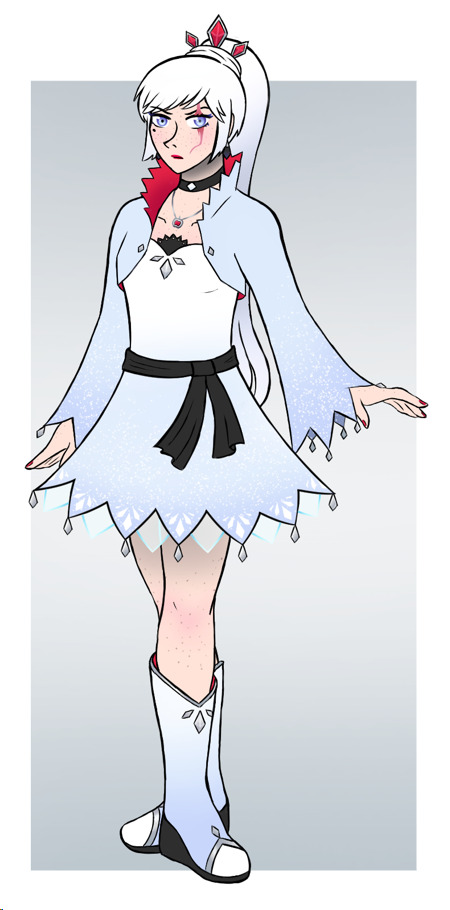
Weiss was, no joke, a goddamn headache and a half. I find it really hard to understand her exact 'style' of fashion. But here she is and I'm happy with her anyway. The first main things that one might notice is that she has a much larger scar then the thin one from the show. That would be because A. Scars are Cool, and B. her scar is from blunt force trauma over her orbital socket, and the cut is from the skin splitting right over the bone. Which is supposedly what happened in the show but whatever. Bigger Cooler Scar.
The other main things are thricefold: she has the beauty mark from her original concept, she has freckles all over if you look close, a really pointy nose to look down on people with, and she has the Snow White 'lips red as blood'. If anyone would wear lipstick into battle its Weiss.
Her Vale outfit honestly isn't that different from her show look because it was overall solid if very bright. Mostly I just added extra details to make her look richer, such as all the little metal diamonds on her dress and sleeves, and decorating her boots and dress, and adjusted the colouring a bit so it wasn't all Bright White (see also: the black heels on her boots and the black sash, just to break up the colours). I did change up some of her accessories, like making her apple necklace have a red jewel, adding a cute choker, black diamond earrings, and red nail polish.
The other main thing was her hair. I decided to borrow the idea from the amazing AZRE au that Weiss started with her ponytail being straight instead of assymetrical, to show how she's still under Jacques's control, and I'll be entirely honest I kinda stole her headpiece from Amity's grown-up look in Owl House because it looked real cute and princessy. Her emblem is also located on the back of her bolero, and you don't see it in any of these designs, but its canon now that the underside of her boots, like the sole part, is red.
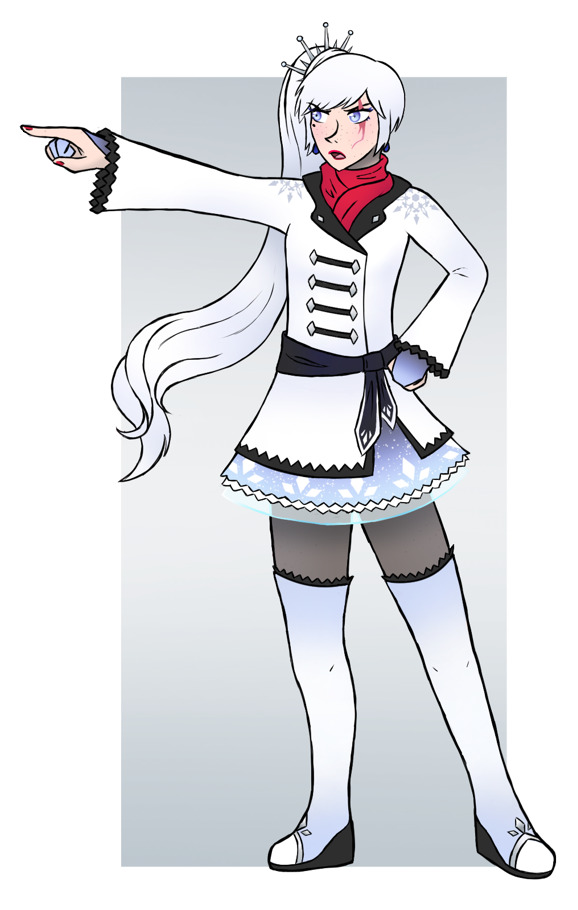
I based her Mistral Look mostly off her Snowpea look, except instead of making it a whole dress I decided to make it a jacket she wore over a dress. The dress is probably more like her Mistral outfit, you can see a bit of it peeking out, and I just adore the idea of Weiss wearing sweetheart bodices when she is flat as a board (I say this lovingly, and with respect). It's not visible here, but her dress is actually trimmed with sapphires that match her earrings, and the same with the gloves that you also can't see much of here but are very cute opera gloves. I try to keep Layers in mind when it comes to outfit design, usually.
The other big thing from Snowpea is that I gave her the thigh high boots, just to really look a bit different from the other outfits she has. She has a red scarf because I liked the idea in the show but not the execution, and I moved the idea of the white trim pattern of the scarf onto the black sash, just to help with breaking up the designs. Her jacket is designed to look vaguely business and vaguely military, since her Mistral arc has her very torn between her identities as Jacques's Heiress and being a Huntress like Winter.
I didn't mention it prior, but one thing I wanted to do for all the designs for the girls was to have some repeating elements throughout to tie all the designs together. Ruby has her stars, the belt, and the general boot design, Weiss has her jewellery, the triple diamond pattern seen on her skirt here, and transparent fabric, which is something that becomes more prominent across her designs as she grows into her own.
Also, we finally have the assymetrical ponytail, and the cute hairpiece from the show. She also has a slight change in her hairstyle from the show with the lil sidebangs, because if her hair was down I wanted it to reference the 'hime cut' a bit. And her emblems are on her shoulders here, just to add a lil extra spice to the jacket.

I truly do love Pixie Cut Weiss, I think it's still super feminine and cute and also she should have been the one to cut her hair, not Blake. I'll die on this hill. Anyway, Atlas look. I wanted to go full Magic Knight here, adding in pieces of armour (the shoulderpiece has her emblem), the transparent overskirt, the whole shebang.
Some of the major changes here is that Weiss's tights are darker, as in thicker material, and she has a similar thicker undershirt below her dress and jacket. Again, same with Ruby, I wanted to make a look that actually appeared warm, and I didn't want to go the route of the show where they made her look cluttered and also freezing and also just Not Good. I decided to keep the red gem accents, but instead of having them on a hairpiece they're meant to be on her bodice (again, thinking in layers), and her boots.
The other thing I really wanted with this was to have her both reference Winter, with the white jacket tucked into the black gloves, and be the most 'militaristic' of her outfits, what with the actual belt, and the epaulette. In Atlas, Weiss is almost a go-between with her team and the Atlas Military, after all her training with FANCI, the Ace Ops, and Winter, and has a lot of trust in them.
The scar on her neck is gonna make sense in the story. If anyone can figure out how it references Snow White, I'll give you an internet cookie.
We have reached Vacuo, and Weiss's Military Look is gone and her Rich Princess Look is toned down in favoour of what my friend dubbed 'punk ballerina'. Which is very fitting because this is the part of the story where Weiss takes the final step in a long journey towards anti-capitalism. In order to take out some of the princessy vibes, Weiss no longer has high boots, she instead has ankle boots that vaguely look like laceless converse, she has short fingerless gloves instead of something more operatic, and we've gotten rid of the jackets for a see-through top over a shoulderless look.
I think her dress here is pretty cute. I decided to do a sort of corset style that reminds me of the old-school disney princesses, and she still ahs a few metal diamonds scattered around, it's her thing. The observant may notice that all Weiss's buttons are diamond-shaped throughout her outfits, which was harder to detail then I first thought!
The skirt is meant to be more of a sundress style rather then something full of petticoats, and the red mesh under the dress was my way of trying to keep the pattern of 'red focused around Weiss's neck'. It also helps a bit with the more punkish look, which is aided by the pixie cut, which has grown out slightly. The white stockings are also just there as something of a sun/sand protection, and also because I wanted to really bring the colour back hard for Vacuo.
To Blake!
Observant people might notice that Blake has melanin here. I would be disqualified from Certain Redesign Contests for such a deviation from canon. What a shame.
But anyway, most of the Beacon looks really were solid outfits, as seen by how they're the ones that get press in everything rwby does outside of rwby 90% of the time. I honestly didn't have to change much. Mainly just doing a few small tweaks here and there. I changed her shorts to lose the excess zippers and added one of those like useless button straps that don't actually do anything but look cute, and here we see that I made all of Blake's buttons look like lil moons. Just for flair.
I gave her a purple belt and changed the tone of the purple in general, since I prefer Blake with bluer purples/indigos to Yang's more lilac purple when it shows up. She has the purple soles, but not heels, one thing I wanted to do with all these designs was make sure that the shoes could all look similar but different, give them all something specific to them.
The other big thing I did was I took her glove away and replaced it with two shorter gloves, one of which has her emblem rather than it being on her leggings, and the other of which has fishnets on it, because Blake Shops At Hot Topic and Listens to Evanescence you cannot tell me otherwise. The little white straps on her top were just, again, a bit of visual flair, and a way to keep some white travelling through her design without making her upper arms empty with nothing to look at.
Also you can't see it at this angle but she has a crescent moon nose piercing throughout all of her looks, even in Beacon, and she has black nail polish. I like to think she, Weiss, and Yang all did manicure sessions together in Beacon.

Her Mistral look is already a departure from canon, though I kept the thigh high boots and the idea for the cutouts on her top, even if I made her crop top white. You can't see it here that well because Blake is also wearing a sleeveless croptop jacket over a sleeveless croptop. It's fashion.
I gave her the glove from her show Beacon design here instead, for the assymmetry, and she has a bandanna tied around her right bicep with a moon pattern to kind of mirror the metal band on the glove. The big thing I wanted was to put her in a low ponytail, because that meant I could keep her bow motif while still showing off her ears. When she wants to cover them she has a beanie, because beanies are cute.
The zip for her zipper is, again, a crsecent moon, and she has a moon phases pattern along the tops of her boots. I gave her kneepads because Mistral Blake is ready to scrap and it matched with the metal band on the glove, and popped her emblem on her hoodie in a similar way to her vol2 outfit. Also similar to her vol2 outfit, I added those adidas tracksuit lines but in purple on her trousers. I liked this one a lot. It had the stuff I liked from the show Mistral one but without completely drowning her in not her colours.
This one gave me trouble, I went through so many sketches before I decided on this, but I think I'm happy with it overall. As a lil sneaky on this I made her jacket clasps the Bi Double Moon, which can also be seen on the metal tops of her boots. I had a sort of idea for stripes for her pattern here, just to look cohesive and also distinctive. She has the white to black gradient on her trousers, which are meant to be thicker and warmer. I wanted to always make sure she had white on her upper legs, just for the follow-through.
The bow for her ponytail is also white here in Atlas, and it's not on this look but she has a new beanie with white trim and one of those fluffy pom-pom thingies. The belt has her moon phases design that I introduced in the Mistral design, and her jacket was just me playing around until I had something I liked that kept her colour and had just the slightest hint of a suit jacket or waistcoat or something, in the shape and the white cuffs, mostly.
Her emblem is on a neckerchief that she can pull up over her nose to stay warm, and she's gotten two silver piercings in her right ear as a homage to her mom's gold piercings. Also, the notch in her left ear? She gets it from a fight, but she also comes out winning, and if anyone can guess why 'A V-shaped Notch' and where I got the reference from, another internet cookie and also my apologies, possibly.
I love Blake's Vacuo design, I shouldn't be biased but I am and I love it. I wanted her to have pirate boots, where I moved her bows to because she's dropped the ponytail, but my biggest wish for this look was 'that goth bitch at a rock concert who's about to scrap'. Everyone is punk in Vacuo, apparently.
She's wearing torn fishnets in the desert because she's hardcore like that, I gave her assymetrical gloves, one of which has like, a studded band purely for the 'about to dropkick someone in the moshpit' look, and a single-shoulder croptop that has her moon phases pattern. The more I look at her top the more I realise I may have been thinking of Amethyst from Steven Universe but Amethyst's designs all rocked so that's not a bad thing.
She still has the double bi moon on her pirate boots, right at the end of the bits that flop over (I don't know terminology), and finally she has her emblem on her legs, on her high-waisted shorts that are based off a pair I had as a teenager but in black.
And the jacket. Yes. Okay, I know: holographic fabric in the desert? Well the desert can be cold at night so she'll be warm then and also: she can blind her enemies with it. I just really like the shape and style of it, and I think it really distincts from her other looks. It was also really fun to draw, and I'm allowed to keep one darling alive as a present to myself.
Onto the fourth and final teammate, Yang!
Well first of all, her new Vale look is pretty much just 60% of vol2 outfit with a few minor tweaks. i turned the black miniskirt under the cream miniskirt into a pair of short-shorts because she deserves it, I took her emblem off the sparkly purple sash so she could keep it on her stockings.
The top is a mix of her original outfit in her new colour scheme of black, white, cream, and yellow, but I changed up her sleeves to be white for the poofy-fairytale-goldilocks appearance. I also turned all her buttons into rectangular clasps, and made the croptop under her jacket purple, to really bring the colour through the outfit. She and Blake are really close in Beacon, so having more purple in Yang's outfit, the bows on her boots, and the matching black scarfs was a fun way to show that for her.
One may also not that Yang's now got a bit of an updo going on. I wanted to incorporate just a few more Chinese influences into her design, though I will admit it is heavily stylised, and not very obvious in her Vale look. I also gave her a tan, just to really help bring out the colour palette a bit. And she has lilac nail polish because goddamnit she's allowed to be girly AND tough I hate the erasure of Yang's femininity just because this fndm can't wrap their lil heads around a wlw relationship that's not butch/femme when Yang isn't even butch in the show.
Anger aside. Part of what I wanted with this look was to make it seem, well, a little impractical. More fashion and form over function. Her boots have four belts each that need to be individually done up, her sash reaches her knees, that sort of thing. She can still fight in it, obviously, but she's in the fight for the thrill of things, because she's cool and knows it, and isn't really choosing to think deeper.
Her Mistral Look is meant to be very, very different from her Beacon look. She's axed the miniskirt and belt boots completely, she's wiped almost all traces of purple from her design, and she's got no bows. Yang in Mistral is almost running from everything in Vale, and especially anything that reminds her of Blake. She's trying to be a lot more practical here, her boots zip on, her qipao-influenced dress is short, cut high over the thighs, and out of the way of any kicks she might do, the sash wraps around the top of her boot and that's all, her hair's up in a ponytail.
The short jacket is pretty much the half of her vol2 look that didn't make it into her Vale look, and her yellow crop top under the qipao has her emblem, deliberately obscured and covered up a bit for symbolism. She has a black liner for her prosthetic here, and takes it on and off when she wants to. She didn't just put it on and never remove it, like in the show, here it's a bit more of an adjustment for her. Not as much to say about this outfit, it's simple but effective.

Yang's in a much better headspace from about Atlas onwards. She's more willing to combine fashion and function, she's finally started incorporating cute patterns into her style, and she has the cute hair bun covers that are purple and sparkly and adorable! She really starts coming into her own in Atlas, and I wanted to show that by having her settle into her motifs of fire and bears, as shown by the fire design on her jacket and the bear patterns. She has a trio of ursa skulls on a patch on her super fluffy jacket, and a set of bear pawprints on the edge of her qipao.
The boots have belts, though they're mostly decorative and the boots are actually zip on, and her emblem is still a bit hidden on her thigh. She's incorporating a lot more gold metal onto her shoes, following through from her Mistral look, and has a little golden band she can use to tie off the sleeve of her jacket when she's not wearing her prosthetic. Under the jacket, I like to think the sleeves are short before it cuts off just above the end of her right arm, and transitions into a full black glove on her left arm. She's switched the liner out for a bright yellow one, and she's just happier here. Someone has to be the sunshine in this team.
Similar to Blake, and Ruby, and possibly Weiss once I can look at her designs again, Yang's Vacuo outfit is my favourite of the four. She's got her hair up in cute buns for the bear ear ref, she's got cute ribbons that aren't bows because she and Blake have sorted stuff after Beacon but they're not codependent, and she's still got the purple sparkly fabric as her socks.
The main thing for Vacuo was to try and bring back some of the biker babe aesthetic, which I mostly did with the denim shorts that have that specific white fray thingy. She's got gold caps on the knuckles of her glove too, just for some extra fun. The emblem on her boots matches the metal inset of a fire pattern, and I brought back the bear idea with a paw on her sleeve. Maybe she has the ursa skulls patch on the other arm, I'm not sure yet, I'll need to decide if I want symmetry or not.
I simplified her arm from her show look, by trimming the amount of yellow into a few clear plates to cover the main workings. I never was sure how she managed to spray it perfectly enough on the finger grooves to not get paint everywhere.
Her necklace has turned into a clasp at her throat now, jsut to prevent it swinging around in combat, and the qipao is now at its longest, but still cut high over the sides so it's not impeding her movement. The pattern at the bottom is a fire pattern I found that also looked vaguely watery, which I think made it perfect, since she's kind of mixing the two into her mindset at this point, she's doing the kung fu panda thing, she's seeking inner peace. And she's looking great while she does it, she has a better colour scheme here.
And that's all of them!! All I have to say. I think. Thank you so much for this question, Nonnie, it was fun. I hope the quality of the images is at least half-decent, my tumblr fucks them all so I'll never be sure
#rwby#ruby rose#weiss schnee#blake belladonna#yang xiao long#rwby rewrite#rwby redesign#rwby au#scorruby au#rwde#but only a little bit just when yelling about how shit some of the show designs are#hope you enjoy anon I gave you an essay and a half
58 notes
·
View notes
Text


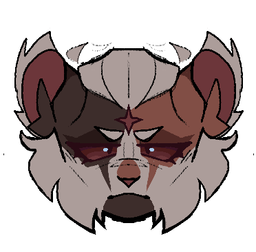
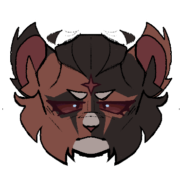

posting these design ideas on main because why not
working with how I want to possibly redesign cat!miguel (Reclusestar in the warriors AU), here’s a few quick headshot ideas for em :)
dunno which one I should go with, but I’ve got some notes on each
Original:
Dark blue-grey tortoiseshell with reddish brown markings meant to replicate his most recent suit design. Small, slightly curved up ears with tufts around them that I want to stay in the design regardless of the fur color. A 4 pronged star on his forehead that will also stay true to every other design (supposed to be his leader mark. Usually I like the idea of leader marks either being like.. spots or stripes or something else but a physically inflicted marking not only fits his role better but is also just more visceral and reflects the implied and not so implied cruelty of StarClan in the warrior cats series. For those who don’t know StarClan is like… a holy amalgemation of all of the cats ancestors that went from this mysterious and whymsical force in the first series to unreliable and actually manipulate due to how biased they are.)
— why is he blue
— not accurate to comic design
— more accurate to his movie design, however, I believe the blue in his suit is meant to be light bouncing off of a black suit. So still isn’t exactly accurate
+ simple, easy to replicate markings and probably easy to animate (haven’t tested it but seeing as he barely has any floating stripes or markings other than his star marking it’d be easy to do frame by frame)
+ bluestar
original but the blue is changed to black.
Classic black and orange tortoiseshell. Same other features mentioned before.
— boring. Yawn.
+ the mask markings are more prominent
+ the most accurate to the comics. Miguel has a black and red suit.
same as the last 2 but with a darker blue-black tint
— still blue :/
— his eyes blend into his face and it bothers me
+ colors are actually really nice
+ average cat Miguel design honestly this is how everyone draws him
tortie-tabby dual colored cap mask. Instead of the usual ginger ear tufts he has white, and he has a lot more white in his design than usual
— I don’t like how much white I used for this design, I don’t think it works.
— replicating the fangs in the mask was kinda difficult I didn’t know if I wanted to make it a stripe or apart of the base mask so uh
+ is a tortie-tabby
+ accentuates his jawline!! The other designs did before as well, his markings are just placed a little differently here
+ the white hair is cute
Half and half tortie with minimal white markings (I’m leaning towards using this one)
+ I really like half and half tortie designs
+ cool symmetry
+ he looks like a lil guy here.. just lil.
— jawline isn’t ver visible, especially on the dark brown side :(
Half and half with medium white markings
+ same perks as above
+ accentuates jawline better than the others
(If you’d like please rb for a better sample size for the poll below :3)
Here’s an optional poll, just to see which ones people like more (doesn’t mean I’m gonna choose that one)
#atsv#across the spiderverse#miguel o'hara#warrior cats#procreate#digital art#cat miguel#cat au#warriors au#warrior cats au#designs#✭ Spider scribbles ✭
26 notes
·
View notes
Note
scrambles … hi, what is your thought process when planning out designs / drawings if you have a specific one
Helloo!
Both have general processes!
Drawings wise just depends on if I want to make a new piece or not. If I do, usually I make a symmetry tool and make some kind of a box in the middle! Take this WIP for instance:
Which is a scrapped composition for my "We're Gonna Win" piece! I still liked it, so I moved it to a new canvas and made the inner box a little bit bigger than what it is for my CCCC album works!
Though a lot of these canvases get left at the wayside. Unfortunately. But my point still stands! Compositions I will usually draw anywhere from 1 to upwards of 5 thumbnails for. Most of the time though, that is only if I have a specific idea in my head.
I've got a lot of "mass doodle" canvases where I've just drawn a host and assortment of things, some of which I've blown-up on a canvas and drawn over to make a full piece of work!
As for designs,, sort of? I like to put a lot of symbolism and meaning into them where I can, otherwise its pure unfiltered self indulgence. Lots of the time with HMS aus I've asked myself "what haven't I done yet?" and gone from there. Thus giving me white haired Heart, Mind, and Soul in different varying aus (Good Day, Syncopation, Lacuna).
I also like to use colors that are going to look nice with one another, and for clothing I'll occasionally peruse Pinterest for ideas.
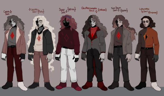
Good example I suppose is my Soul Line-up, of which I intended to do a Mind and Heart version, I just.. haven't had the focus for it (Plus there are souls I could probably add to this by now. oops!)
For Soul, though, I like to keep the red and the grey, then add in black and white where I see fit. I also generally try to consider the personality of the character when giving them a design.
Purpose isn't going to have many accessories, he's based more in being useful and fulfilling their point in being Whole than he is looking like someone at all. Versus, Calliope (Eleutheromania)! Who desperately wants to individualize himself and feel in control. What gives you more control than a goofy suit with a tailcoat? Or, Pluto (Lacuna), who wears items of his long since dead Mind and Heart to remember them by. He is so so cozy but also soo sentimentally sad.
Just things like that, which I think make sure the character is evident in their clothing, hairstyle, expressions and so on.
Hopefully that is well explained! But thank you for asking o7
#asks#I didnt want to make this 200000000 words long so I tried to condense down my thoughts#voidthoughts
20 notes
·
View notes
Note
Hullo! Do you have any tips on just coming up with designs and markings and how to colour those designs/lines without making stuff clash? You're always able to make such creative and nicely made designs and I'm curious if you have anything you get inspiration off of and how you're able to colour your marking lines so smoothly?
i would make a nice image tutorial like i did yesterday but i do Not have the time to Sadly so you get words instead
colouring lineart:
colouring the lineart is easy peasy lemon squeezy. you gotta wait until youve FINISHED the colouring to do this part. okay, so, for the characters ACTUAL LINEART, when i draw their legs & tail & face & whatnot, i colourpick the DARKEST colour on the character, whether it be in their markings, eyes, accessories, or whatever. and then i take that colour and make it just... a LOT darker! and maybe shift the hue around aswell (ex: if the character was mostly yellow/cream i'd give them orange or red lines)! and then for the MARKING LINES i take the darkest MARKING. ignore the accessories and characters eyes they dont matter JUST pick the darkest coloured marking. and then make THAT darker, but not as much as you did the actual lineart!! you can also change the hue on this :3
how i come up with designs + inspirations:
hmm well i'm going to be honest with you i don't exactly know how i come up with my designs? a lot of it just comes from how i picture the character in my head! especially if its a warrior cat design! i don't tend to stray away from those thoughts unless i picture them as like stupidly boring LOL !
inspirations is a biiit tricky, but i guess i kind of just look at a LOAD of other warrior cats animations & art, and uh! anime! lol! looking at how other people draw cats has gotten me better at drawing anatomy & whatnot, and watching various animes is why i started giving my cats hair lol! it's kind of hard for me to explain like, my EXACT process on why & how i design certain characters im sorryyyy x'''P i would if i could but literally 90& of is me drawing whatever and then thinking 'does this look good' and then saying yes or no LOL
how i colour my designs:
similarly to how i DO my designs, it's a lot of my just asking myself if it Looks Good or not, but there are a few things i do!
a lot of designs i do i jump around the colour wheel a LOT! hue wise, i mean. i think i've managed to find different ways to use every single colour on the colour wheel lol! blues and greens and purples are good for greys & blacks, blues & yellows & oranges are good for white/ light markings, red & orange & yellow & purple are good for brown cats, etc etc etc!
the other main thing is layer effects! sooo like if i draw a character but i'm not super happy with their colours, i find it hard & annoying to fiddle around and change each colour individually, so instead i make layer above the colouring, set it to one flat colour, and go through all/most of the layer options (like multiply, linear burn, lighten, glow dodge, difference, subtract, the list goes on) and find something i like! and then i usually do that a BUNCH of times with ALL sorts of different colours until the character ends up looking good!
also hi mossy !!!!!!!!!!!!!!! i hope this helps maybe? if you wanna get specific with another question, or maybe send some images (u can here on tumblr or message me where ever) then id love 2 help more!!!! this goes for anyone, i'll always accept art-help/tips/how i do things questions lol!
27 notes
·
View notes
Last Seen Blogs
ianfinlayson-blog1
An accountant abroad
andjusticeforall1979
Oh, king of edible leaves, his majesty the spinach
dungeonmastersconsortium
THE DMC
dr-golden-ratio
Dr. Ratio
motherofdevils
Insomniart 🏳️⚧️