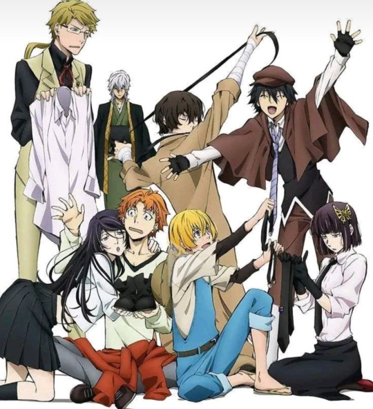
#costume analysis
Text
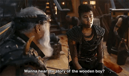
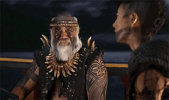
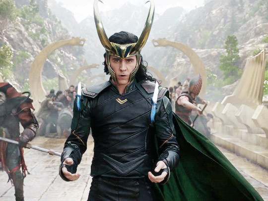
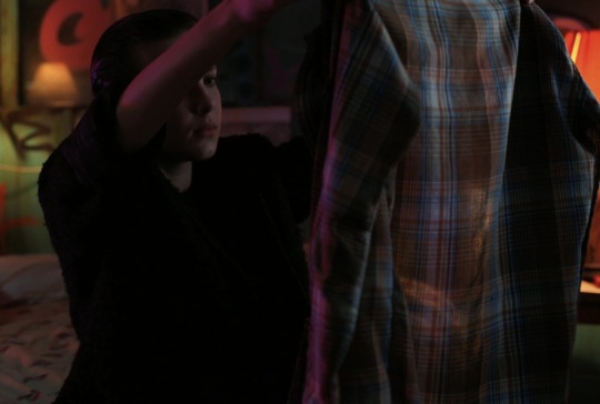
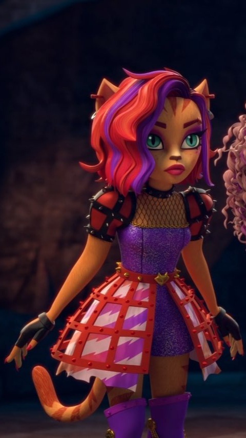
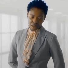
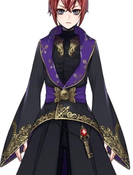
i absolutely love that jim is the one to keep the heart of stede’s crew alive while ed did everything he could to destroy it.
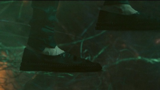
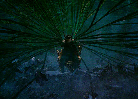
one of the first comments ed makes to stede’s crew in season 1 is “everyone’s covered in rope!” so what does jim do? literally covers themself in rope, to remind ed that, as long as they’re alive, that hope and love isn’t going anywhere.
not only that, but, in the bible, rope is a symbolism for trust and security. jim became a secure place for the crew to tie themselves to while just trying to stay alive.
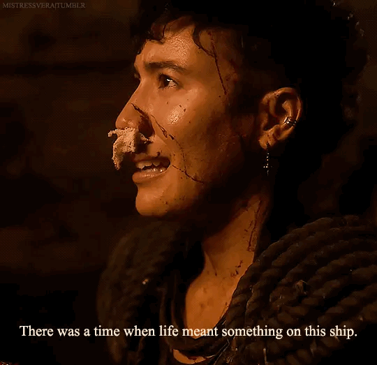
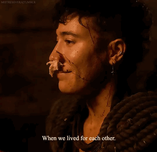
of course, i then had to look into why they have a fishing net around their shoulders as well, and found The Fishing Net Parable from the Book of Matthew (13:47-52):
"Once again, the kingdom of heaven is like a net that was let down into the lake and caught all kinds of fish. When it was full, the fishermen pulled it up on the shore. Then they sat down and collected the good fish in baskets, but threw the bad away.”
“This is how it will be at the end of the age. The angels will come and separate the wicked from the righteous and throw them into the fiery furnace, where there will be weeping and gnashing of teeth.”
jim amputates izzy’s leg, despite having never done it before. they quite literally separate him from the rotten bits to save his life.
jim says, “he was your friend.” they separate ed from who he was before from who he’s allowed himself to become, not to punish him, but to remind him of the consequences of his actions.
jim tells izzy point blank, “you’re in an unhealthy relationship with blackbeard.” they aren’t trying to break them up; they’re just bringing to light whats true so things can (hopefully) get better.
jim shows archie that, just because pirating is normally done a certain way, doesn’t mean it has to—they separate archie from the toxic belief that “that’s just how things are, it’s just life,” and “why save him if he’s a dick?”
jim tries to separate the idea from the crew that ed is fine, because they immediately recognize that things are about to get much worse: “so, do we think he’s better?” “FUCK no!”
jim immediately says, “wasn’t the wedding thing a bit over the line?” they know they’re all pirates and have questionable morals anyway, but knows it was fucked up of them to massacre a wedding, an event that’s supposed to be joyful and full of life and beginnings, not death and destruction. they’re, again, dividing up the way things are vs. how they could (and should) be.
ed tries to pin them all dying on jim cause they wouldn’t kill archie, but they bite back with, “you would’ve done it anyway!” they know exactly where the lies are, and separates them from the truth, and ed can’t deny it.
jim separates themself (and olu) from the bounds of monogamy through their honesty. olu is still their best friend and lover and family even though they found and did things with someone else.
jim holds out their hand for olu to take when they’re escaping the red flag. olu’s interest in zheng yi sao isn’t bad and jim’s not trying to separate them, but is trying to keep together the things that are good: their family.
(later addition, edit) jim is also the one that “kills” ed. they’re the one to make that final choice, to say, “it’s you or us.” jim’s actions and choices entire first two episodes led them to that moment, like it was the “final judgment” of blackbeard.
jim is the rope and net of the crew. they’re trust and security and honesty, everything that stede was trying to get the crew to understand from day 1, everything stede is always trying to embody (and i dare say is starting to succeed at).
#jim jimenez#jim jimenez meta#ofmd#our flag means death#ofmd s2 spoilers#crew of the revenge#rope and nets#ofmd costuming#trust and security and honesty#god i love them#vico ortiz#david jenkins#characterization#costume analysis#character analysis#ofmd meta
479 notes
·
View notes
Text
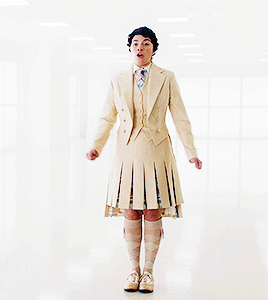
Poster on my right shoulder with a cheap angel wing costume (the one from Oldboy (2003)): "You should write about how Krouse making an unsecured tophat that's constantly in danger of falling off a key part of his costume actually fits his themes really well. You've already written about how his ringmaster getup is part of cultivating a sense of mastery-within-instability; Krouse excels when thrown into a chaotic situation because he can use chaos better than others. Styling himself as a leader of a circus, master and causer of chaos who holds things together just enough to have them culminate in a grand spectacle, shows what type of reputation he cultivates. But that instability is a constant in his life, he seeks it out, it seeks him out, and despite the air he puts on of having everything under control it really is always in danger of falling apart. The tophat can fall off at any moment, the travellers can collapse at any time, the cultivated and uncultivated chaos surrounding their lives can suck them all into the undertow at any time. If you actually write an analysis post fleshing that out it would be an excellent use of your time."
Poster on my left shoulder, taking the form of Judge Holden as he was depicted in Cormac Mccarthy's Blood Meridian: "You should write about how whenever his hat falls off Krouse just puts a rock or large piece of trash on his head and switches them. Fuckin. Eight times during the fight with the Wards Vista had to deal with the fact that she was nearly getting killed by a guy putting a brick on his head. Sometimes he'd throw his hat at you and then put a brick on his head and then swap them and bam you've gotten hit in the face with a brick."
#wormblr#wildbow#parahumans#francis krouse#leo says#leo reads worm#costume analysis#i should go back and tag my old costume analysis posts huh.
263 notes
·
View notes
Text
Okay I’m going to geek out about Toshinori’s costume designs because I’m an English major and analyzing tiny details in text is what we do and also I love??? The designs! And each one tells us so much about All Might and his focus during each costume.
Costume 1 (Young Might):
So first off, despite young All Might’s longtime dream of being a hero, his suit is mostly black. A stark difference from comics books and his later self which tend to be bright primary colors. The few dashes of primary colors he has are desaturated, even in the second instance where we see this costume. This would have likely been the only costume Toshinori designed himself, as David became his designer in college.
Obviously, others have pointed out the similarities to Nana’s suit, just like how Izuku copied AM’s, so I don’t think it will be necessary for me to point that out. But this suit is also very practical. Something the flashy All Might isn’t really known for, but let me point the details out. He has boots, gauntlets, as well as what appears to be protection for his upper torso, and even for his neck. A decent balance between more protection and more weight, which would slow a hero down. Also, unlike Nana’s suit, his extends completely down the arms. The only skin surface available is that of his hands, something that stays the same through all of his costumes and as such, must be something he personally insists on. In media, gloves often represent someone with secrets, or a guarded personality. All Might not wearing gloves shows how open he is, not just with his friends but strangers too. And it’s humble, too. It’s not an unfeeling, covered hand extending to you when you’re in danger, it’s the bare-handed reach of a friend, and I fully believe that’s why Toshi goes without gloves. Also it’s possibly a sensory thing for him as well, which goes with my canon-supported theory that this man has ADHD, but that’s a nerd rant for another time.
The colors are important because while obviously they mimic Nana, you can practically see through the color choice that Toshinori is not in his right mindset here. While later the oversaturation of colors serves to show how his own heroism has made him into something Else, and outside of his own head, leaving the man inside to shrivel away, these muted colors show that Toshinori has not yet blossomed. Also in the brief scenes we see of him when he is younger, Toshinori is very solemn. The one scene we get of him smiling when he’s young is when Izuku is comparing them at the same age, and even then, it’s more of a smirk as opposed to the signature All Might grin we all know and love. Black also is just a reasonable color for something like crime-fighting. Black shows the least grime/dirt, so he could reasonably spend more hours out in this costume without having to come home and wash it/trade it out. (Which is something that I love that this series includes, by the way!)
Costume 2-ish:
Toshinori adds some shoulder pads for the fight with AFO, probably expecting to stand side-by-side with his mentor. I could give a more full-body image but this is really the only difference I could pick out.
Costume 3 (College Might):
This is the first costume of All Might’s that is designed by David Shield.
First off, props to David. He’s an awesome designer. He not only made a new design, but incorporated several choices from AM’s previous suit, and definitely conferred a lot with Toshi on how he wanted his suit to look while still ensuring its functionality.
Black is traded for a dark, unsaturated blue, giving AM a more peaceful look, as navy blue is considered to be a calming color. (Even Endeavor wears it! But maybe copying AM and not wearing it for the same purposes?) All Might’s cape is also changed from red to blue, taking away the dark look and making it the color of the sky, again adding to that Symbol of Peace idea that is Toshinori’s dream. The gauntlets and boots remain, but the chest-piece has been removed, offering up more mobility. The yellow of his belt has been brightened, and added in place of the blues on his gauntlets and boots, giving him an overall more friendly look as opposed to the more subdued one he had before with the blue accents. The red has been removed as well, and by moving it to his body, it gives the impression of veins and the blood that is pumping away through the heart of this hero, which is fantastic for someone who cares as much as Toshinori does. White was also added vertically on the sides of the suit, thinning out the very intimidating form of Toshi and making him more approachable, while adding a more pure look to his overall form. This appears to be in part, a stylistic choice on David’s end that follows through to the other suits, though it’s hard to know if it remains on the Bronze Age Suit as well.
Overall the brighter colors telegraph that Toshinori is doing much better mentally at this point. He now has A Friend, and for the time being, is safer from the troubles at home, until he has to return.
Costume 4 (Bronze Age):
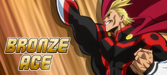
We don’t even get a full look at this suit, indicating that its time in use was likely short-lived. As I’ve seen others suggest, it seems very likely that when All Might returned to Japan, he went straight down to business and began doing vigilante work as he tried to track down AFO. However, possibly due to a combination of not finding him and All Might’s rising popularity, he seems to abandon this track and move on to a different form of heroism, which his suit symbolizes. I’ll briefly point out that Toshinori returns to the primarily black suit he had as a teenager, as well as the shadows of his face that add to the idea that as soon as he got back to Japan, he reverted to the mindset he had when he left.
Costume 5 (Silver Age):
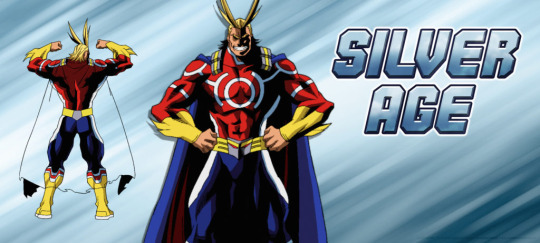
This suit indicates to me that this period was All Might’s prime, despite his later suit being considered the Golden Age of All Might. (And even though it’s my least-favorite design.) He has the typical cape of a hero, and the bright colors are now fully of typical comic book style. The circular design on his chest indicates a target, but with being cast in white and surrounded in red, gives the impression that he himself is not the target, but the villainy around him is. Or at least, that is likely the thought process for this design. Other than the dashes of white here and there, the colors are very solid, possibly indicating a more stable, but single-minded train of thought, something AM is notorious for. No offense to Dr. Shield, but I would have mixed the colors better in here, and the cape connection is too bulky for someone who’s as jacked in the shoulders as Toshinori is. Alas, I am not the designer. We shall move on.
Costume 6 (Golden Age):
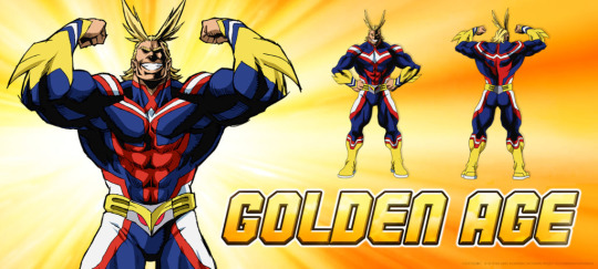
I love this suit. Plenty of analysis has been done on it already, but I think it’s a fantastic representation of how Toshinori’s been crushed under the very image he had originally wanted to create. His shadows are darkest and most severe here, reminiscent of how body-builders dehydrate themselves to get the best appearance of their musculature. His posing is also more inward, as opposed to the silver age, with the angles of his elbows being less directly out and more in, and instead of appearing confident, it’s more of how a cat puffs out its hair to make itself appear larger when it’s scared. I had a long bit to go with this but it was eaten by the Tumblr gremlins. Basically I believe this suit was made post AFO-battle. All Might is declaring he’s not finished yet, all while knowing his time is running out. This suit has several callbacks to the original suit David designed for him, with the navy, though more saturated base and the red lines running throughout the form, though the gauntlets and boots from before have been integrated into the suit itself. This could reflect David’s mindset as well, as he reminisces about the days when Toshinori was healthy and happy, when now Toshinori’s health is rapidly fading.
Anyway, here’s my costume analysis! I think it adds a little more insight to Toshinori’s mental state and situations in the years outside of the show as well as in them, and I hope you enjoyed this read! I’d love to hear other ideas too, if anyone has them!
#all might#yagi toshinori#character analysis#bnha headcannons#mha headcanons#costume analysis#character design analysis#nerd ramblings#my post
433 notes
·
View notes
Text
Loki’s costume at the end of S2E6 was perfect.
Yes, every part of it, down to those slippers.
And here’s my unsolicited (and delayed) thoughts on the matter.

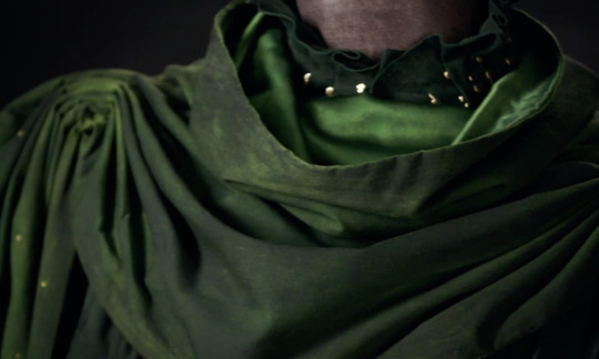
First, let’s talk about his robe. Not only was it utterly beautiful, down to the draping and the deep, rich shade of green (and I mean come on, would we expect anything less?), its style was incredibly symbolic.
If you look at previous Loki ensembles, especially the ones that include a horned helmet, there is an air of grandeur and finery about them. The exquisitely stitched, buttery leather; the shiny gold trimmings and metal armor accents; the dramatic, billowing capes and overcoats. Even the silhouette of these looks is broad and structured — one might even say severe. Everything about these past looks screams “Look at me; I’m important” and reinforces Tony’s own observation in The Avengers that Loki is a “full-tilt diva” — he longs for the respect and attention that he deserves (and has been denied almost all of his life) and that longing is reflected in his clothing. They are reminiscent of the royal palace in which he was raised. They allow him to be battle-ready, because he’s had to fight and claw for every scrap of love and attention he’s managed to get. They represent a broken prince. A warrior cloaked in royalty. A would-be-king.
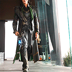


Now, compare that to his robe in Loki S2E6. It isn’t flashy. It has a soft silhouette. The shade of green is deeper and richer than we’ve seen; more earthy. An earthy shade of green which, in my opinion, is a nod to Yggdrasil, the cosmic tree that he will weave the branches of the multiverse into. The gold trimming across the front is subtle and understated - I even missed it at first and didn’t realize there was any gold trimming on the robe at all until I got a closer look later. It is simple. The draping is reminiscent of the robes worn by Buddhist monks. His robe reflects a Loki that has more wisdom and humility, and who has realized that being a good king — a proper god — means he will spend his life in service to others. It is the robe of a man who is confident and self-assured and knows exactly what kind of god he needs to be.
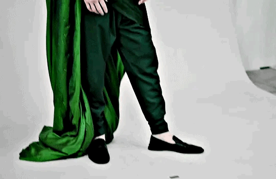
Now let’s talk about the slippers. I noticed that they got quite a bit of flack immediately after the finale aired. And I get it — they’re an odd choice, especially when we are so accustomed to the dramatic boots and finely-crafted and statement-making dress shoes he typically dons. For similar reasons as the robe, they are symbolic and fitting for Loki’s development into a wiser, more humble character. Don’t get me wrong, these loafers are still impeccably stylish, and no doubt they are of the finest craftsmanship, because this is still Loki we are talking about here. But they have a purpose, and that purpose is to get him to his final destination. These simple slippers barely even protect Loki’s feet, showing us a kind of vulnerability that we’re unaccustomed to seeing from Loki. He isn’t guarded in this moment; he’s open, connected to his purpose, and sure of himself. The shoes aren’t for battle; they aren’t meant to impress. They are meant to serve.
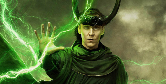
Now, about what is, quite possibly, my favorite feature of the costume. The horns. These iconic horns which we’ve associated with Loki from the very beginning take on an entirely reimagined look in the finale. First of all, they are bigger than any set we’ve seen resting upon Loki’s brow. So big, in fact, that they weren’t actually a physical part of the costume Tom Hiddleston wore. So big that they would likely hinder his performance if he actually had to bear their weight on his head.
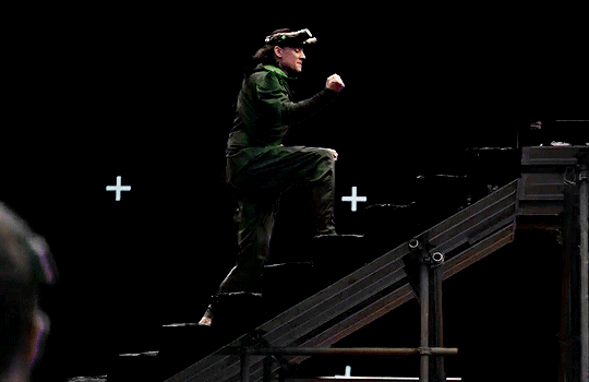
In addition to their size, the horns are made of the same temporal-infused material from which both HWR’s talisman and the citadel at the end of time are constructed. Gone are the opulent golden horns that glisten and shine with the grandeur of royal finery. These horns are dark and heavy. They symbolize the unfathomable weight of the burden that Loki bears in his godly endeavor to save the multiverse. The golden temporal material that runs throughout the horns like veins is reminiscent, to me, of Kintsugi, the Japanese art of mending broken things with gold. And in a way, Loki is a broken thing that has been healed and mended throughout his personal journey of self-acceptance and friendship, and is now more beautiful than he ever has been. More humble. More selfless. More godly.


In addition to the horns, the cape, too, is the largest we’ve seen Loki wear. And while at first, this dramatically oversized cape may seem to stand in opposition to the humility that the rest of the outfit encapsulates, it works. It works because, like the horns, it is symbolic of the burden Loki has chosen to bear. This cape would be unbearably heavy; it would make even the most basic movement difficult. And on top of its sheer size, his cape even becomes torn into strips that are woven into the timelines themselves, literally securing his burden — his service to the multiverse — around his neck.

Lastly, I want to talk about the way this outfit manifested. There’s been a common thread throughout this discussion about the humility and selflessness that this ensemble puts on display. And while that’s true, we’re talking about a relative level of humility and selflessness, when compared to Loki’s previous tendencies. This is still Loki we’re talking about here. He’s got a flair for the dramatic. He’s nothing if not intentional about the way he presents himself. And the way he marched down that gangway like it was his own personal runway, while his clothing fell away in shreds and tatters to reveal this completely fresh but familiar look, was completely on-brand for him. It was theatrical. It was glorious.
His outfit at the end featured accessories that were heavy and larger than life. Those parts were a burden.
It wasn’t short on the style and drama that we’re so accustomed to seeing from Loki. It was glorious.
And every part of it, down to his humble shoes, was fit for purpose.
One look at this finale costume and you know, without doubt, that Loki is burdened with glorious purpose.
A/N: If you’ve made it this far, thank you for reading my unsolicited thoughts on this beautiful piece of costume design! Also, apologies for the delay in posting. I know some of you have been told this post was coming since the night the finale aired, weeks ago. Thank you for your patience with me as I gathered my thoughts and found the time to organize them and type them out.
🏷️ @peachyjinx @acidcasualties @muddyorbsblr @lokischambermaid @lokisgoodgirl @mochie85 @tallseaweed @give-me-a-moose @fictive-sl0th @coldnique @maple-seed @loopsisloops @gigglingtiggerv2 @simplyholl @superficialdomina @mischief2sarawr @ijuststareatstuffhereok89 @wheredafandomat @liminalpebble @ladyofthestayingpower ++
#loki#loki season 2#loki series#loki show#loki finale#glorious purpose#burdened with glorious purpose#costume design#loki costume#joyful enchantress writes#costume analysis#costume symbolism
337 notes
·
View notes
Text
I could talk for days about the costuming in the show, and I probably will. One of the small details I’d like to point out is Persephone’s hair. It’s easy to point and talk about her change from vibrant greens to dressing like she is headed for a funeral but I think her hair speaks volumes (ha)
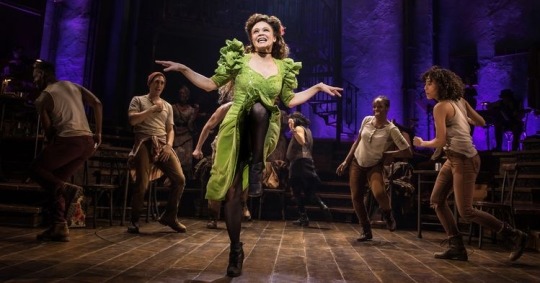
Up top Persephone let’s herself loose. She’s dancing and moving- hell! She floats from person to person absolutely buzzing with excitement as everyone in the bar is so alive - literally! She’s loose and very telling with her body language. Her hair is down and wild as she is. She has a nice bit of flowers braided in too.
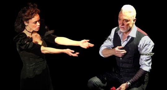
Down below she’s stiff. It’s like her clothes confine her just as much as the town and hades himself does. She still moves and has expression but she’ll toss her wrist instead of something full body. She gestures , she stands and she walks instead of floating. Here her hair is put into a snood, her hair is caged. All that wild energy is subdued, even the little flowers on it are black and dead (likely as apart of the snood and not real flowers but the point stands).
I just— this show has so much loving detail put into it down to the floors and the smallest fiber oh costumes and I’m so in love.
#hadestown#hadestown broadway#hadestown musical#Persephone#persephone hadestown#hades and persephone#character study#costume appreciation#costume analysis#meta#greek mythology#small details
899 notes
·
View notes
Text
Trying super hard not to obsess over the deliberate choice of having Oliver be dressed in a costume that has very heavy themes of Puck/Robin Goodfellow AND King Oberon for his birthday party while Felix has cheap golden wings strapped to his back in an outfit that just SCREAMS Titania (despite his mother being implicitly dressed as such-) in the way it symbolises Titania's refusal to reconcile or reunite with Oberon throughout the plot of A Midsummer Night's Dream, as well as her disdain for Puck and his tricks, which is further supported by Felix's own choices to make his costume the bare minimum for an event celebrating Oliver and his refusal to forgive or forget Oliver's lies.
A theme/symbolism which is only further emphasised with Felix doing the best he can to avoid him at all costs and Oliver refusing to let him do so for his own selfish needs and wants-
#foxglovevibes#saltburn spoilers#saltburn#felix catton#oliver quick#shakespeare#shakespearean#titania#oberon#puck#robin goodfellow#costume analysis#character analysis
150 notes
·
View notes
Text


claudia's costume references to golden age child stars
-judy garland: after touring with her family in vaudeville, garland was signed to MGM at age 13. due to her short stature (4'11) and cute looks, she often felt insecure being compared to MGM's other young starlets she attended the studio's school with who represented a more "mature" beauty. the abuses she suffered at the hand's of the studio and her troubled adult life are well-documented.
-shirley temple: beginning her film career at just 3(!) years old, shirley temple was one of the biggest stars of the 1930s. her signature ringlet curls, blue dress and musical dance numbers won her millions of fans and a miniature juvenile oscar in 1935.
-jane withers: a contemporary of temple, withers was often cast as temple's opposite, playing tomboy-ish troublemakers vs temple's angelic characters. she was extremely prolific in the 1930s. she also had a collection of 3,500 dolls!!!
like claudia, child stars of the golden age often struggled to transition to adulthood/adult roles as the audience had difficulty seeing them as anything other than children. they were picked out as children for their cuteness but that often meant they didn't adhere to the adult beauty standards of the time. garland managed to have a very successful career as an adult but her small stature and childlike looks posed a major obstacle for the types of roles she would be offered in comparison to her more voluptuous contemporaries like lana turner and elizabeth taylor. temple retired in her 20s and went on to have a career in politics/diplomacy. withers also retired at age 20 before making a comeback in middle age as a character actress.
#iwtv#claudia#costume analysis#i love that they styled her with ringlet curls and the child star comparisons are sooooo#well its all just so exploitative as nadja said
372 notes
·
View notes
Text
Do you ever just think about how Amy Parris (st costume designer) said that El’s “milkshake dress” may be a remainder from El and Max’s shopping trip in s3? And then you think about what El is doing while she’s wearing that dress?
She’s….. she’s pretending to be happy.
El is pretending to be happy and she’s wearing a dress she most likely bought with Max!
And while Amy Parris also said that the flannel she wears is Will’s, El wearing flannels in general has always been linked to Hopper.
The very first flannel El wears in the entire show is Hopper’s:

and from then on all the flannels she wears are from him (until s4). And when she’s with Kali and her crew it’s Hopper’s flannel that reminds her of home and makes her decide to go back, and at the end of s3 El wears on of Hopper’s flannel again (after having stopped wearing them) to feel at home and safe even though Hopper isn’t there anymore:
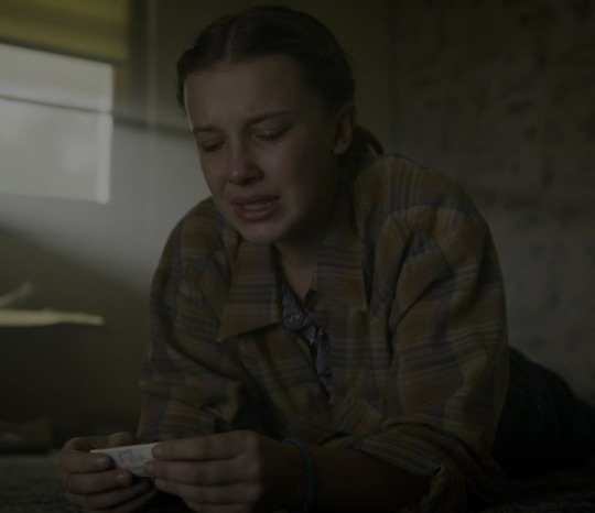
El tries to pretend like she feels at home in Lenora and that she is so happy and she wears clothes with connections to Max and Hopper because the last time she was truly happy was with them </3
Amy Parris also specifically points out that the flannel and the dress do not match! And they’re not supposed to either.
I feel like the fact that her outfit is deliberately mismatched could signify that El is trying too hard. She’s doing too much because it’s all forced. El isn’t actually happy, doesn’t actually feel at home in Lenora. And her mismatched clothes reflect that she’s just mimicking happiness. They reflect that she does not live in harmony in Lenora like she pretends she does in front of Mike.
btw, I don’t mean to say that El picked these clothes because of the connection to Max and Hop. Amy Parris says that the in-story-reason for why El wears what she wears is that she’s trying to find her own style and that she simply doesn’t know that these items don’t go together. But costume design is a story telling device that supports the overall plot and that’s where the connection between El’s clothes and important people in her life takes its place.
#that’s it#that’s the mini analysis#kinda disappointing i know#maybe that’s why i put off posting it lmao#el hopper#costume analysis#byler#not byler but i thought you might be interested#elmax#stranger things
277 notes
·
View notes
Text
Just realized i never posted my insane analysis of toradeen costume design here. Let me fix that :)
Alright so here is Clawdeen's core outfit
It's kinda boring in my opinion but that's besides the point. Note the structure and colours. The shortalls specifically and the purple being paired with black
Now this is Toralei's core outfit
Literally one of the best outfits hands down S tier, but again, besides the point. Note the structure and colours again. Crop top showing her midriff with a coat on top and the red being paired with white.
Now let's look at their Monster Ball outfits :)

A switcheroo!! Tor's fit now feature shorts and black being a more prominent colour. Meanwhile Deen's fit is a crop top showing her midriff with a coat on top and it's a lighter colour too!
Aside from this, Tor's ball fit obviously has a lot more purple than her core outfit does and Deen's suit colour is a much warmer colour than her core fit's colour (closer to magenta; reddish purple)
If you think I'm insane that's because I am but also much clearer visualisation hopefully:

Also Tor's core having a lot of purple already like come on. Not a lot of red on Deen's core tho that's kinda sad. The closest to red I can see on her is the shitty pattern on her black top but looking closer it's more of a pinkish magenta. But y'know what, with enough delusion, it's red in my heart
Okay bye thanks for sticking around to read all that, you didn't have to.
#monster high#clawdeen wolf#toralei stripe#toradeen#costume analysis#im off my meds again#which is only half true#im always off my meds because ive never been prescribed#checkmate!
67 notes
·
View notes
Text
"But you're not your dad."
This past week's episode made me think "I've never seen Roman in a checkered office shirt before." His style had always seemed more modern and sleek to me with solid and well fitted shirts
Like this is what we know him for
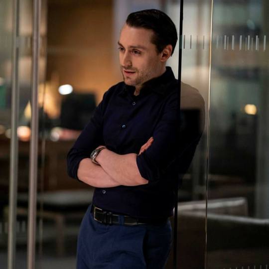
This seemed like a new look for him
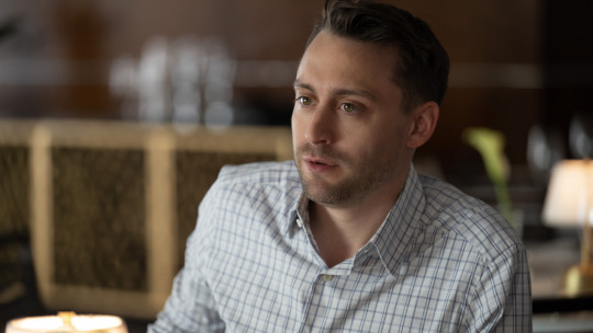
but I had a suspicion
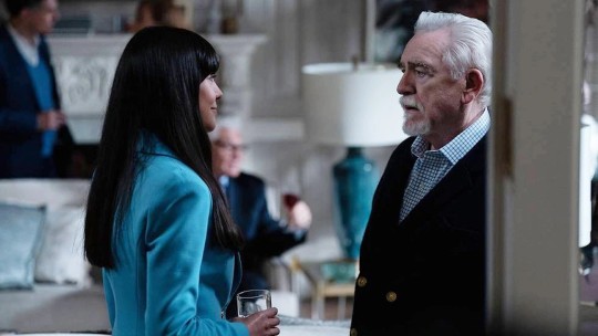
and I was right
this one has a smaller checkered print but you get it
you haven't processed your grief and thought the only way to run the company was to do what your dad did and act the way he acted! adopt his style maybe they'll take you seriously and give you the 'sufficient respect' you desire!
#succession#hbo succession#roman roy#i dont know if i'm reaching or not#but seeing the sweater from last week and now this#i'm sure there's some intention behind it#logan roy#kieran culkin#his firing spree was hard to watch like babe you're spiralling#costume analysis#successionedit
227 notes
·
View notes
Text
Clothing Within Ranks
(Many people have made wonderful color analysis about good omens before me and I’m going to try and link where needed but I know l'm going to miss some so just know I am sorry about that - it’s not intentional)
What I wanted to get into today was what these colors mean for our characters, their ranks and roles, specifically Heavens uniforms over the years. I'm also only going to talk about the times we see more angels than just Aziraphale (and probably not even going to do a section on him here because that could be a whole post on its own) - one for comparison reasons and two this is already going to be quite long without getting into every single Aziraphale outfit
When going into this I was trying to look for why these angels were displaying these specific colors - what is an in-universe explanation? - what do these colors mean to Heaven? - what is with the big clothing changes throughout the years? why put these colors on clothing - making them physical instead of just atmospheric?
and I’ll admit I struggled with this and almost just gave up on it but I knew it wouldn't leave me alone so I pushed through and shout-out to these here metas that kept me sane and were my jumping off points but without further ado strap in it’s going to be a long one and let's just get into it.
We are going to start all the way back Before the Beginning because although there is not much to go off of (and going to be totally honest this is mostly just a crack thought but I figured why the hell not) there are still differences in their outfits, which I have touched on in a previous post. To summarize the difference is in the sleeves - the cut on Aziraphale’s sleeves are wider while crowley's have a more straight cut - but that is not what I wanted to touch on today, it's the placement of the gold on their sleeves. Aziraphale has the gold, which I should mention that the design on both them is the same, on the bottom of the sleeve but Crowley's is higher up by a couple inches.
Now this got me thinking about how the atmosphere of Heaven would have been before the War and this could just be me but I don't imagine there would a big need to show off rank - and I do believe they had a different ranking system during this time but that is a whole other thing - yknow it would just be something small nothing to really show off. Now we know that Crowley was probably a high ranking angel so to combine all this - what if how high the gold was on the sleeves was the indicator of how high they were in rank? I know that Aziraphale is not the lowest ranked angel but what if at the time he was? I mean he was referred to as a cherub here - which has been explained as just a young angel. Anyway this was mostly just a fun little thought.
The next time we see multiple examples of Angel clothes is in the Companion of Owls minisode and we get a lot of them. Now it has been pointed out before about how the gold embellishments are meant to show off their ranks as angels here - which is a great read so go do it - it really goes into the detail and it is probably easier to just go read it than me trying to summarize.
But why is this such a big difference from literally everything we have seen before? They are big and over the top and really showing off their status. For angels they really seem to be leaning into their pride for this whole story - just a visual way to show Heaven is not as good as they project - it’s giving when royals are just letting other people do their dirty work and when confronted about them sitting in their riches while their people suffer and they say “well what are we supposed to do about it?”
I also find it interesting that literally every other robe outfit we see from Aziraphale they are way more simple, almost like he has different outfits for when he is on a job and then when he is trying to blend in and live among humans - which just opens up a lot of cans
Lets fast forward to more modern times of season 1 and 2 to see how much things have changed and take a look at each angel individually (and the actual reason i wanted to do this post)
Gabriel

His main outfit consist of a gray suit with a white shirt and purple tie and tan shoes. He has some variations with a long gray coat and a gray turtleneck and scarf but we are really just going to focus on his main outfit. The gray is pretty straightforward as the color of archangels but the fully gray suit is specific to this council/leaders of angels. The purple tie is where it gets interesting though. Initially I thought it served the same purpose as his purple eyes, just as a way to show his rank as Supreme Archangel until purple showed up in other angels outfits also in places around their necks. So I had to look into what those angels did and how this would fit into what is essentially a government system. So yes this tie does symbolize him as a leader just not in what you expect.
I will get into the two kinds of base angels later but right now we are going to have to dive a little deeper to understand what the purple means - it is a job. I am proposing that the purple is an indicator that angel is a part of an intelligence/legal department in Heaven and because Gabriel has a solid purple tie instead of it in tartan, he is the leader of them or he at least is the angel they report to. It is a home for our creative angels, the ones making the plans. I will get into why the other angels fit into here when I talk about their outfits but as for why with Gabriel well lets look at his character (his season 1 character at least).
As Supreme Archangel he would need to be the angel that knows the most about what was going on, he very much wants to stick to the agreed upon plan, he spreads information around to make sure everything is going to said plan, and he very much does not want to know anything about the "illegal” back-channels that Heaven may have. These are just a few broad examples but it is worth something to look at. Now to understand the white and tan in his outfit we are going to have to move on to the rest of our gray suits - just remember he is the leader of all angels.
Michael

Their outfit consist of a gray suit and a white frilly shirt with white shoes. The gray suit is of course for their archangel council rank but what is with just the white? White is thought to be just the base color of angels and I think is was but it has changed a little. As the concept still fits with what I am about to propose - it is now just one of the two base kinds of angels.
I'll admit their outfit tripped me up so took a step back and looked at it backwards and it was Muriel that actually helped lock this in. Muriel starts out in a tan outfit but changes into a completely white officer outfit to complete a job - a job to blend in, observe, and confirm and it got me thinking of the actions we see Michael do. They are the one to get pictures of Aziraphale and Crowley, they are the back-channel to hell, and they refer to themselves as a duty officer to name a few.
So to put this all together I think the White is meant to show the angels that are for surveillance - to watch over and observe humanity - kind of like a civil service. Michael is the leader/representative of these angels and that's why the white is so big and frilly to show off this position instead of just a simple shirt.
Uriel
Their outfit is very similar to Micheals with a gray suit and solid color shirt underneath though his is tan. Again the gray suit for their archangel council rank and with the new addition of tan.
So after taking a look at the angels that wear tan Uriel, Sandalphon, Aziraphale, and a few background angels let me introduce the second kind of base angels - the protective ones - the fighters- think of them like the military. Uriel would then be the leader/representative of this group with their tan frilly shirt. Uriel and Sandalphon have pretty similar attitudes as I imagine a pretty high up military officer would have and you have an actual platoon of angels dressed in military uniform - all in shades of tan.
Now I do think something changed in Heaven that required them to start forming this protective side instead of just leaving it as it was or maybe it's the simple fact that God likes threes more. The reason I say this is because in the Companion of Owls minisode Uriel is nowhere to be found and the lack of any tan in Aziraphales outfit until Golgotha in 33 A.D. but even then not consistently until 1793. It just paints a picture that this side is a later development but I am getting off track.
This is the end of the Archangel council and moving forward it will be lower ranked angels which have a lot more to their clothes. You may be wondering about Sandalphon and Saraqael as we see them working with the other archangels as a group of four well then stay tuned we are about to get into it
Sandalphon

Its outfit is mainly various shades of tan which stands out so visually from the others he is grouped with. A long tan coat with black buttons and a tan based tartan waistcoat and pants -it's a big change from the gray. He’s one of the darkest angel outfits we see considering it is bordering on brown and it's long coat, it doesn't look too good for his morals.
Now his tartan consist of a lighter tan and gray which if it wasn't clear enough what kind of base angel catagory it was in, it is the protective one, and the gray to show he is still an archangel. So he is still a high ranking angel probably just below Uriel. But we see him with the council, receiving reports from Aziraphale, why would he be there then? Well what has Heaven been preparing and training for these past few years? A war. It wouldn't be too far fetched to think they would bring in the highest ranking angel that is actually working with the angel troops to keep them updated on how it is looking and for him to be informed of what is going on, on Earth.
It is also worth noting his connection to the Metatron, they are brothers in actual angel lore, their clothes are kind of mirrors of each other (plus the black buttons people), and the fact that Sandalphon completes the weird obsession with fours that the Metatron has but I can get into that later.
So basically what I'm saying is that it was brought on specifically for Armageddon and it would explain why he wasn't there in season 2 (besides the fact the actor couldn't make it)
Saraqael

Their outfit is mainly white with some interesting colors in the tartan on their collar, cuffs, and in a stripe down their pants. The white of their outfit puts them under Michaels surveillance side of base angels which makes sense when looking at their actions, always trying to make themselves invisible and just watching plus they are the one who goes looking for Gabriel on the security cameras. But now on to their tartan which consist of white, a light gray, a dark gray, purple and a blue-green color.
At this point we know what the white means as well that light gray is for archangel rank so that leaves the rest. The purple puts them under Gabriels intelligence/legal team which make sense as they are seen as one of our more intelligent angels. The dark-gray I am going to say puts them in connection with the Metatron and the reason it is not fully black is because they are doubtful about him, maybe even scared. Now the blue-green color had me stumped for a bit but the most satisfying conclusion I came up with is that it is for the angels that are planning/apart of the Second Coming - another job. This particular shade of blue-green is new to this season and only on angels particularly associated with bringing about the Second Coming - Saraqael, Muriel, Jimbriel, and the Metatron(i think but not a big deal if not).
This is why we see Saraqael grouped in with the archangel council this season - Heaven has shifted into planning mode instead of fighting.
Muriel
Before I get started I just wanted to say they were the reason I almost threw this all away because of their color combinations but I think I pulled it around
So lets just get into this - they are wearing a tan outfit and have a very similar tartan to Saraqael with the purple, the blue-green, and a dark gray.
This color combination with the tan and this kind of tartan really threw me for a loop. Why would a protective kind of angel be doing these jobs? So I went looking into actual u.k. military rankings because I didn't know anything about them and tried to find out what the lowest ranking members did. And one of the jobs of a lance corporal is a clerk which rung the bell that they also say they are a Scrivener, which is also a clerk.
It has been theorized that they work under Saraqael which seems to be reflected with the tartan. But what their actual job seems to be is writing down and recording these agreed upon Second Coming plans, yknow War plans and filing them. (also looking back there seems to be a very light shade of gray stripe in the tartan - almost like it is faded - maybe a visual hint they were demoted)
I also think it is interesting they sent another protective angel who has a love for written word down to Earth and eventually ends up staying. Only this time they have the complete knowledge of what Heaven is planning even if they don't realize it - they were the one who wrote it down.
The Metatron
Yes we are going to end with him because I guess he deserves a mention. No but seriously his outfit is interesting and hard to read particularly - mainly because it is very difficult to find good pictures - so I don't have a lot of clear cut answers for him and most of this is speculation I guess you could say but I figured I had to include him. His outfit consist of black long coat, pants, and tie with the addition of a blue flower?? shape on it, and a white shirt with blue vertical stripes underneath.
Now he is the only angel we see wear black as the base color in their main outfit - the only other time is Aziraphale’s magician outfit - which has interesting implications of this color - is it a mystery? An illusion? He also seems to have influence over the darker colors we see in heaven, as Saraqael is the only angel we see recognized him. But since I don't have an answer for that so let’s move on to the blue.
I go back and forth on whether this is the same blue that I talked about earlier or just like a generic blue - either way they both kind of boil down to the same thing for Heaven - and that is that Heaven is going through a change. Most of the time when we see blue it is with Aziraphale who we see change a lot for an angel and we see him start to include shades of blue in his outfit in 1601 (though I could see an argument for 537 a.d.) We also see Heaven itself go from a warm yellow undertone and change into the cool blue undertone at some point. And if you think this Second Coming isn't going to involve a big change in Heaven - well have fun. It is also the color Jesus is draped in on the Resurrectionists sign. But anyway lost the plot a little there - my point is that the Metatron seems to like to change things into his favor.
Remember when I said I'd get into the Metatron and his connection to fours well lets get into that now. In the design of the blue parts of his tie their seems to be four sides to it and it got me thinking other fours we see. Another instantance of fours directly related to the Metatron is right before he appears in season 1 four lights float down and when they connect then boom Metatron head. Now on to more nuisance fours and you get that they have a running theme that one of them is off, Adam - the only non-human in his for person friend group, Pollution - pestilence’s replacement, and most importantly the forth archangel pushed up into the archangel council. The thing is without the insistance there be four of them the rankings in heaven would fall into a pretty pyramid scheme - a perfect three one of Gods favorite. But I've probably rambled for far too long about this and it’s getting into other things so I'll leave it here.
So just to summarize what the colors mean
White - is for our base angels that are meant to surveillance
Tan - is for our base angels that are meant to protect
Gray - to show archangel rank - gray suit is for the council
Purple - is a job type for intelligence/legal dealings
Blue-Green - is a job type specifically for planning the Second Coming
Blue - just meant to symbolize change in heaven/angels
Black - just sus - it's a mystery - hiding something
#bless the costume department#i was writing this while in line for a ptv concert#good omens#good omens 2#good ineffable omens#good omens meta#good omens analysis#good omens angel costumes#costume analysis#aziraphale#good omens gabriel#good omens michael#good omens uriel#good omens sandalphon#good omens saraqael#good omens metatron
65 notes
·
View notes
Text
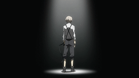
what can Atsushi's outfit tell us about his role, not only in the ADA, but the entire story?
(I'm slowly starting to cross-post everything from my tiktok analyses to tumblr and twitter. I'll link all of the original videos at the end of each post!)
let's first talk about what I think of as the Central Theme™️, something echoed throughout all aspects of BSD: the balance of light and dark. I have an entire tumblr post talking about it which you can read here, but for those of us who need a tldr: every character, organisation and even action is sorted into the category of "dark" (evil; yin; black) or "light" (good; yang; white). the PM is considered the "ruler of darkness," and the ADA the "guardian of the twilight."
when we first meet Atsushi, he is dressed in clothes that are ill-fitting and look very uncomfortable. we very quickly learn that his biggest internal conflict surrounds his lack of self-confidence- he thinks of himself as a nobody who belongs nowhere... and this is echoed in his outfit. in a city divided into black and white, he wears grey. his clothing does not only give us an insight into how we are supposed to see him, but also into how he sees himself!
this is where I want to bring up a point Asagiri sensei mentioned in an interview once- he chose Atsushi to be his main character because he felt that he could easily change the course of Atsushi's life. the RL Atsushi Nakaijima was not as well-known as the others, leading Asagiri sensei to feel as though he was more malleable than the others.

(translation via Popopretty1)
anyway, back to the costume design.
some people know this, but others have never heard: the outfit gifted to Atsushi in episode 2 (chapter 2) is comprised of items donated by each member of the Agency.
(I'm sorry for the Tanizakis but this image is just too helpful)
this outfit indicates a hugely important shift for Atsushi; the difference between being a nobody and becoming a somebody.
he became someone, because the Agency believed in him, far before he believed in himself.
the best part about all of this, to me, is that Atsushi still has a very long way to go! his character development so far has been so incredible, though, and comparing the Atsushi we know now to episode 1 Atsushi genuinely makes me tear up 🥺🥺
I hope this makes sense!! here's the original video link ~
#the specific brand of found family the ada has going on makes me sob#atsushi my beloved#costume analysis#costume design#bsd#bungou stray dogs#bungo stray dogs#analysis#atsushi#armed detective agency
39 notes
·
View notes
Text
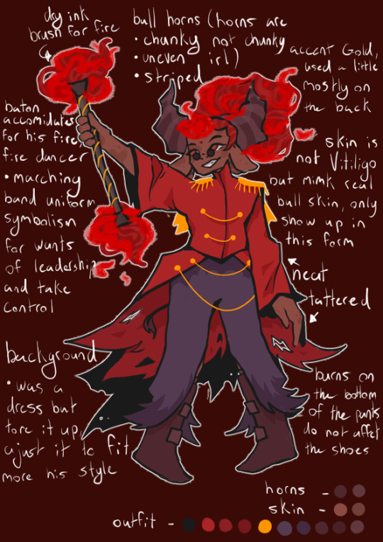
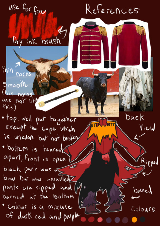
So I may of gone a little insane and done a full costume analysis for my own magical girl Au, whoops
#lego monkie kid#lmk#monkie kid#art#fanart#monkie kid fanart#lmk red son#red son#red boy#Monkie kid red son#red son fanart#magical girl Au#au#Monkie kid au#costume analysis#for my own god damm Au#and I haven’t shared anything else just this#anyway
70 notes
·
View notes
Text
analysis of NRCs fashion as a fashion student (1)
hello!! if your new here m amari and im a big fashion enthusiast especially with historical garments, im working on my schools fashion show this year n ive been thinking of going into fashion and costuming after highschool. i sew alot becasue its just so fun so this is an analysis of the clothing in twst. any fashion or clothing terminology will be explained unless its something simple like a button hole or a hood or smth silly like that
*this mini series will only cover the main stories as of rn, this post will be broken up into multiple chunks for each respective dorm*

Ceremonial Robes-
so the ceremonial robes are all the same the only thing that changes between dorms is the color of the gem due to each dorm having their own color, other than that the ceremonial robes are all the same apart from malleus who has a cut out for his horns. (as seen below) although i have yet to see any official posts of what exactly is going on with these robes i have found some nice fan posts that i will be using and linking in this post because theres a lot going on in these designs.

the base outfit of the cerimonial robes is a longer button down robe with mandarin collar, a shorter over robe and black pants and heels. the longer robe has a gold embroidering as shown below. NRC is a prestigious school so it makes more scenes to have these robes be embroidered than have that gold detail be something printed on it adds to the fact that this is an elite school and this is a very important cerimony, alot of these kids are rich and talented mages and theirs a reputation to uphold.
the robe warn over the longer robes is lined with the same purple and gold key pattern fabric as the longer robes, the hoods have a gold embroidery on the top as well as a gold colored bias tape edge, the embroidery on the top of the hood is the same on the sleaves, malleus has a slightly edited hood embroidery due to his horns (better seen above) the bottom of the outer vest has more gold embroidery. the sleaves of the outer robe are whats giving me a headace as they look like angel sleeves but angel seams have a extra seam that the cerimonial robes dont have

angle sleeves vs the ceremonial robe sleeves (see the lack of a seam around where the elbow would be)


the long robe has long sleeves with a little bit that goes around the middle finger the long robe has a clearer view of the NRC key pattern thats seen on the hood aswell, i had a better picture but sadly lost it
the pants are just plain black pants that end a little bit above what i think would be the ankle (i never took an anatomy class cut me some slack) but what i find interesting is that most depictions show the ceremonial robes shoes as being some kind of heeled loafer i actually believe they are some sort of boot instead as we never see where the shoe ends and the socks stop with we normally see so i believe them so be some sort of boot that the pants cover, ruggie is often depicted in some heeled boot because if we take a good look at his shoes we see they are ill fitting and are probably a hand me down but seeing how standardized the ceremonial robes are it wouldnt make scene for him to have diffrent shoes so i suspect they all have boots


riddle also has the little loose bit but its more apparent in ruggies witch is why i believe the shoes are boots instead of the commonly depicted heels
Credits (in no perticular order)
riddle robes
ruggie robes
heeled version of shoes
boot version of shoes
angel sleeve picture
malleus hood up (took a screen shot as i dont have that mal card)
malleus ceremonial robes default icon
malleus ceremonial robes in game sprite
ceremonial robes embroidery
riddle in game sprite
riddle default icon
purple ceremonial robes lining fabric
ace ceremonial robes
some of these came from the same place but i liked them multiple times just so yall can find everything
#twisted wonderland#disney twst#disney twisted wonderland#ace trappola#malleus draconia#ruggie bucchi#riddle rosehearts#costume analysis#sewing#twst#twst analysis#amari analysis#amari rambles
112 notes
·
View notes
Text
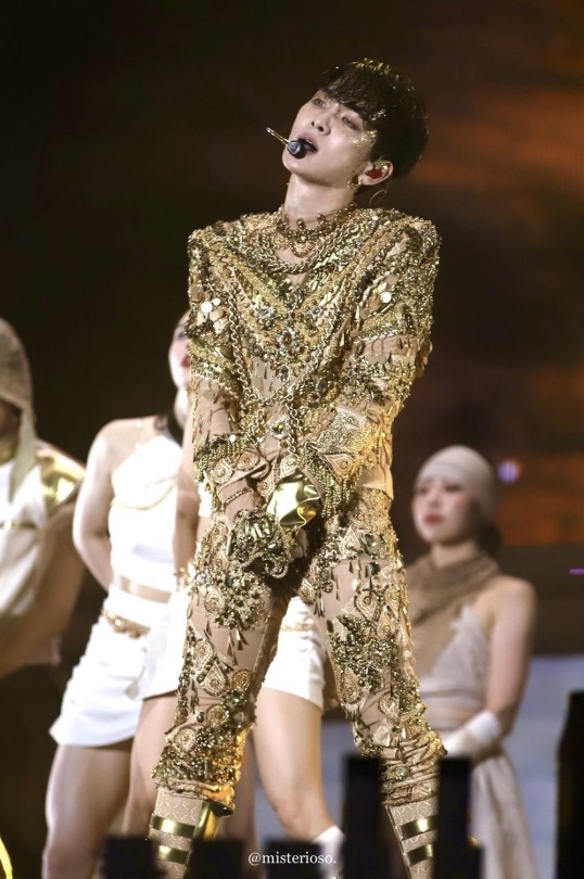
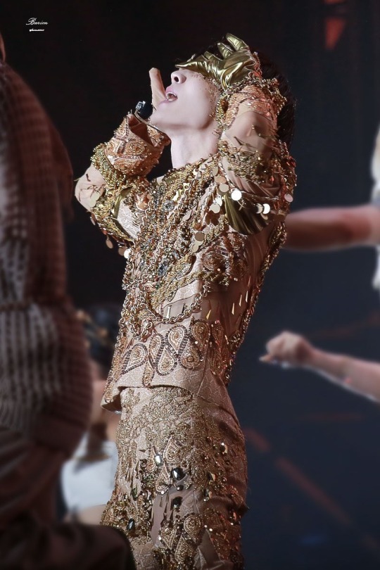
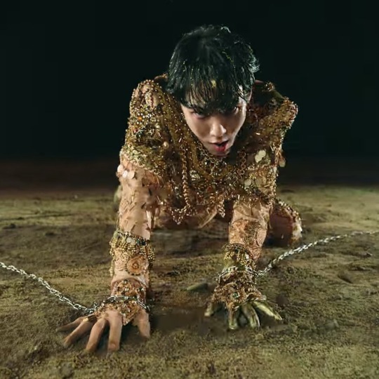
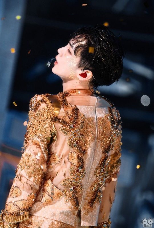
Isn't it glorious?
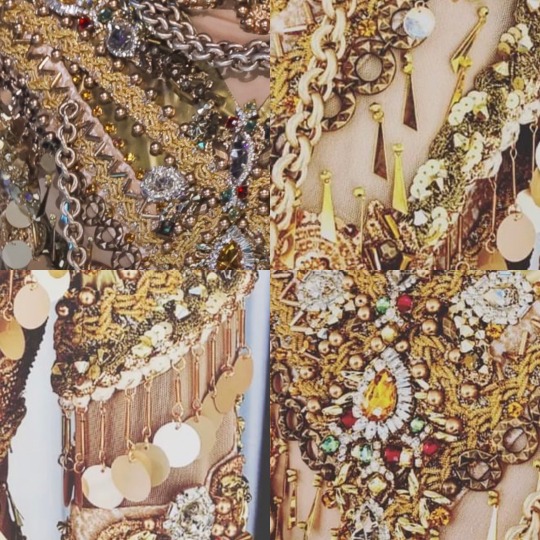
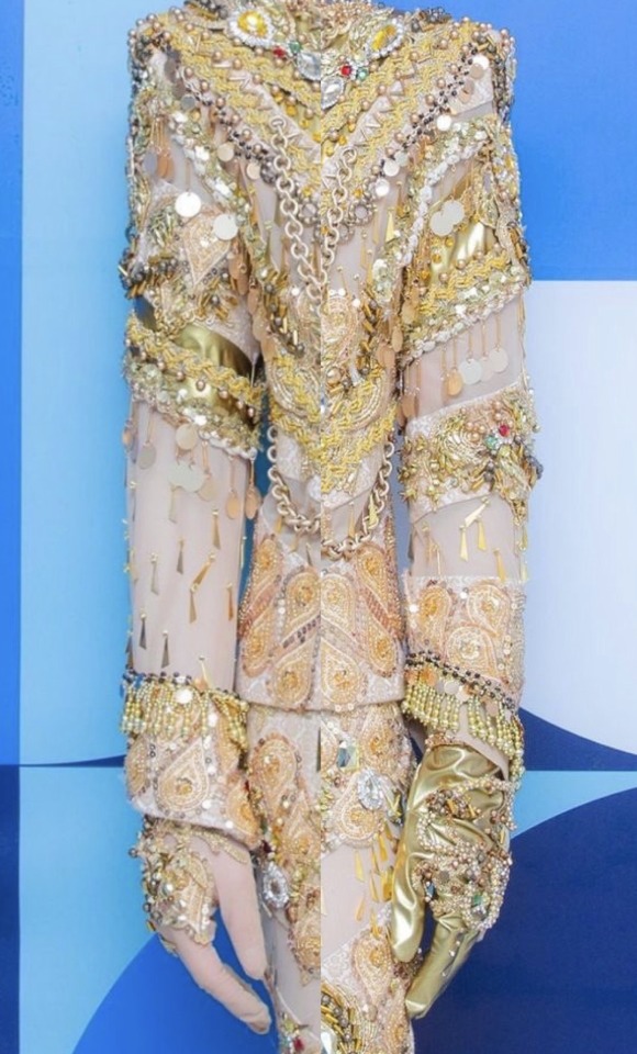
It’s here! I finally tackled my analysis of Key’s gold Gasoline era costume, worn in his music video for the song, photoshoots, a stage performance at the Inkigayo show, and a live performance at SM Town 2022. I’ll discuss everything from the fabrics used, the gloves, the shoes, complain about the zipper, talk about whatever the heck jumps are, break down all of the tiny little types of ornamentation (including the things I don’t actually know the name for) and more.
It’s scary in the best way. Buckle up. Grab some coffee or tea or vodka and a blanket.
I want to preface this by saying that this is going to be VERY long. I’ve polled my followers and nearly everyone said they want me to get as granular as I want. So I’m doing that. If that’s not your thing, here’s your exit ramp now. I get it. This is absurd.
You can also read it on my Twitter here. It actually has a LOT of bonus photos because they only allow me to have 30 on here, if you’re interested in seeing more. It may help clarify some things, as well.
Now then. Welcome to those who are left. Let’s begin!
Costumes by Dénicheur by Seo Seung Yeon
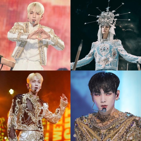
For his Gasoline era, Key has had four costumes designed and made by Dénicheur by Seo Seung Yeon, a Haute Couture Designer House that, among other things, makes elaborate costumes for Kpop performers. They’ve got an amazing Instagram portfolio to check out. They made him a gold and black costume for his G.O.A.T in the Keyland concert, the blue and white one for the Gasoline MV, this gold one, and a cream and gold beaded jacket for the 2023 SM Town Concert.
This fashion house’s trademark is intricately beaded, appliquéd…encrusted…costumes. I was able to get some high quality photos from some of you (thanks so much!) And the more I looked, the more I discovered.
If this were a piece of art (well, it is, but not in the same way) “Mixed Media” is what I’d call it. There are literally over twenty different types of beading techniques, appliqués, various types of sequins, trims, braids, rhinestones, chains, and more.
First, I’ll do an overview of the garments themselves, and then I’ll move on to the ornamentation.
The top (it’s not a jacket, it’s not really a shirt, it’s not a tunic. So I’m going with “top”) has a very boxy torso with exaggerated wide, padded shoulders. They’re completely squared. There are straight sleeves—not too slim, not too bulky. There’s a heavily ornamented oversleeve that reaches down to about his elbows and a “nude” colored full length under sleeve. It also has heavily ornamented cuffs at the bottom the sleeve. It has an exposed zipper up the center back that goes up into a short turtleneck collar. The collar and a portion of the lower neck back region are sheer with some beading and appliqués. There are sheer spirals around his arms and in chevrons on his front and scooping around to his back.
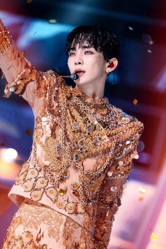
Just LOOK AT that masterpiece
The trousers are closely cut through the waist, hips, and thighs but become a bit wider at the knee. It looks like they were made full length but are always worn bunched up over knee high boots. They close at the center front with a very beautifully set fly zipper and flat trouser hook and bar. It’s so low profile that it wasn’t until I got some 4K images that I was even sure of where they closed. It was like he had been sewn in. I wrote a whole thread about it on Twitter that reads like a mystery novel, though I already spoiled the ending for you. Sorry.
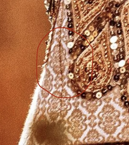
The top is made of what is probably a “nude” (aka specially dyed to his skin tone) base fabric to hold the structure, with the ornamentation stitched over top. The external stabilizing fabric is what appears to be some sort of jacquard, possibly silk.
Jacquard is a type of weave, where the fabric is made of long and short “up and down” stitches of sorts, to make a pattern. Because some of the time it uses longer “stitches” on top, it becomes more vulnerable to the fiber breaking and makes it become kind of “fuzzy” looking. This can be especially true if it’s a natural fiber that usually has less structural integrity than a synthetic one. I initially thought this had started to happen on Key’s rear, but after a very close zoom in, I think that’s just a bit of appliqué edge pulling up. I think maybe one of his mic packs is down there too, but I’m really not an expert in that. I did the research so you don’t have to, folks.
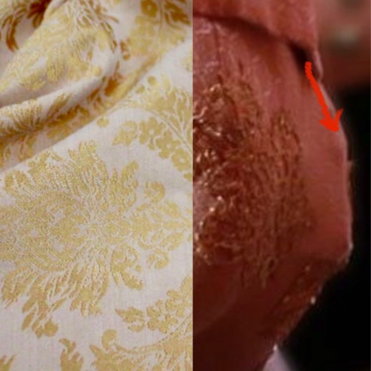
Left: A type of jacquard fabric. The shine comes from the longer top threads, contrasting with details of shorter threads. Right: Is it an applique or is it some snagged fibers? Ultimately, I think it's an applique edge.
Perhaps the most interestingly nerdy thing about jacquard is that it was originally made on a loom that led to the creation of computer programming by utilizing a sort of “binary code.” There were punchcards that showed the strands of fibers when to go up and down. Like “holes and not holes” in which to weave.
A Jacquard Machine Loom with punchcards that create the desired design on the fabric
It’s important to note that this fabric needs to have some stretch because it is also used to make his very tight fitting trousers. If it were not a stretch fabric, he wouldn’t be able to do this like THIS or…most things, really.
Even though the jacquard is stretchy, it has some structure to it. It’s used as a stabilizer in between the “flesh mesh” on the outer layer. (aka power net, stretch mesh... There are many names!) It forms the base on which the majority of the ornamentation is stitched.
Flesh mesh is a stretchy mesh fabric dyed to the performer’s skin color and is used to give the illusion that you’re seeing their skin, but it gives much more strength than just a cutout. I wrote a thread about flesh mesh and the importance of taking into consideration the performer’s actual skin tone when building them a costume here
In this case, flesh mesh allows for adornment of these areas, as well. It’s important to note that, even though it’s a separate layer over the base, it is “tacked” through all layers in a regular fashion so it doesn’t droop with the weight of all of the ornamentation.
There are also some parts that have metallic gold applied pieces. This was probably made of a beefy metallic spandex applied on top of the base rather than some solid pleather, due to way it behaves on the body. The latter would have been way too rigid in comparison to the rest of the fabrics.
Heavy gold stretch spandex, forming a chevron on which to affix beads and other trims
Okay. Range of movement time. You know how I love discussing this. That’s because it’s the single most important aspect of costumes for dancers.
Let’s talk armpit gussets. They’re an American football shaped piece of fabric that is stitched in the armpit partially to the sleeve underarm, and partially to the torso underarm. It’s often made of a stretch fabric, but sometimes it’s out of the original “fashion fabric,” which is what we call the main garment fabric.

Gussets out of different fabrics under each underarm. You can see the gold bunch under his arm when it's at his side
It allows the performer to more easily move their arms above their chest and head to help keep the top from riding up. You can see in this photo, though, that it does bunch up a little when his arm is down, because of the extra fabric. It has to go somewhere when it’s not taut.
With this particular top, it’s interesting to note that, due to the asymmetrical decoration of his arms, one gusset is the gold stretch fabric and the other is the jacquard. That means that, either both fabrics have the exact same stretch, or his arms may be SLIGHTLY more limited on one side than the other. That’s fun! I really geeked out about this observation.
Often with jackets for dancers, they’ll have what are called “commodity pleats” around the center back shoulder area. They’re a sort of sneaky hidden accordion-like bit of fabric that stretches out during movement that may otherwise split the back open. Taemin uses them a LOT. But, since this top is so boxy, Key doesn’t need them in this instance. He already had the room he needed without any other accommodations.
They put commodity pleats in the back of most of Taemin's closer fitting jackets. I wish they'd make them the same color as his jackets, though!
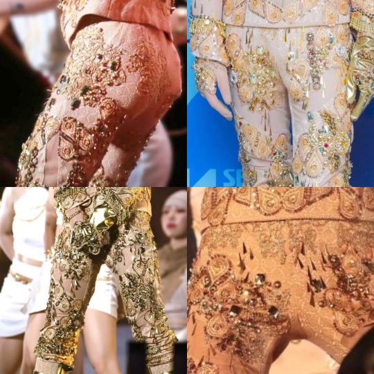
With Key’s trousers, we’ve already established that they’re made of a fabric with a decent amount of stretch. But since I can’t find many good photos of his bottom half, I’m unsure about if he also has “crotch gussets.”
By this point, I’m kind of notorious as being the “crotch gusset person.”
The following posts explain them in much more detail, but basically, they’re long triangular wedges that start in the trouser crotch and taper down to nothing in the inseam. These are often put in trousers of dancers when people need a better range of movement.
I wrote about this in detail regarding Taemin’s pleather pants he wore in his Metamorph concert, as well as all of SHINee in the Your Number dance video. You can find my posts on the subject here:(Metamorph) (Your Number)
Jinki rocking a black crotch gusset in SHINee's "Your Number" Performance Video (Black Version)
Gussets allow for extra room and movement when one is trying to do extreme leg movements like squatting. Unfortunately, I don’t have many good photos of his inseam. There’s so much going on with appliqués and piecing of mesh vs jacquard, it’s hard to tell. Part of the front half of his trousers is flesh mesh, swirling around them. The other parts are the jacquard, whereas the back is all jacquard.
I saw one photo which made me begin to wonder if the inseam is a little further forward than it could be, though. That could mean there IS a gusset. I’m really not sure...I don't have official visual confirmation, but now you know more about crotch gussets either way. You’re welcome.
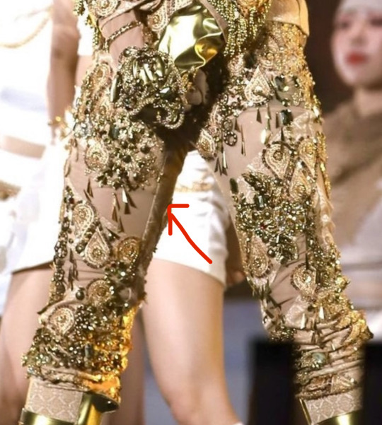
That seam line is up a bit more forward than usual. It really has me wondering, because that would happen if there was a gusset installed. Hmmmm.
Okay. Zipper education time. I apologize in advance. Things get spicy but I tried to tamp it down. The center back (abbreviated as “CB” in the industry) of the top has an exposed zipper. This means exactly what it sounds like: it’s exposed. You look at it, and it looks like there’s a zipper right there. It’s not hidden. Sometimes it’s a perfect match, and sometimes it’s “featured.” Exposed zippers actually become a trend every once in a while in everyday fashion.
I thought it was extremely interesting that, on this elaborate costume, they chose to use a zipper with metallic teeth on white “tape.” (The fabric on the sides of the teeth.) It was a huge disappointment for me, actually. I would have loved to have seen the zipper more carefully hidden like his fly was.
Hello, zipper. I see you loud and clear!
I have to comment a bit on what I view as the one flaw in this otherwise perfect costume. I will preface this by saying that I was not in the fitting room where this was conceived, and I don’t know about any extenuating circumstances and the reasoning behind this decision. But there a few things that I would have done differently regarding the zipper and back collar of this top if were to have made it.
But first: some zipper education. Besides exposed, there are center lapped, as well as regular lapped zippers. With the center lap, it’s like the fabric covers your zipper but you can pull the zipper down through it. Your hoodie probably has one. The regular lap zipper is more like your trouser fly in that there is one flap of fabric that covers the whole zipper, hiding it.
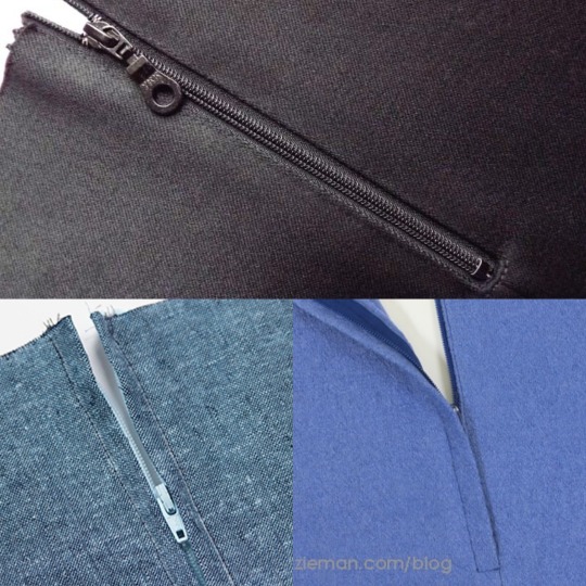
Top: Exposed. (Though it has a matching zipper and zipper tape.) Bottom Left: Center Lapped. Right: Regular Lapped.
Either of those types could have been used to make the zipper more discreet. I personally would have chosen to use a regular lapped zipper, which is less likely to get snagged than a center lapped zipper.
People have defended the exposed zipper by asking if it’s because it’s less likely to get caught. I very much get this argument, and, technically it’s right.
But, in my extensive experience, I don’t think I can recall a case of an exposed zipper in the back of a costume, quick change or no. It’s unattractive. (Not to mention a dead giveaway in a period garment!)
If it’s sewn well and tested, with the correct size lap and no loose fabric, it will work just fine. There should be a hook and eye at the top to make sure that it stays secure while dancing.
Part of being a good dresser is being methodical and purposeful, not frantically zipping something up in a way that is more prone to snagging. They keep their cool, perhaps taking a couple more seconds but ensuring that they pull it up smoothly. They use their fingers to block the overlap as they guide the zipper up.
(Random side note: I met a dresser once who preferred zippers be installed upside down for their quick changes. Hey, whatever works best for them! I wonder how they discovered that…)
I will also note that, as far as I’m aware, the only times he’s worn this costume, he didn’t need to get in or out of it quickly. I know that he wore it in the MV, the Inkigayo performance, and the photoshoot. He also performed at SM Town Tokyo 2022, though he had 11 songs during which to change between Bad Love and this. He never wore this look at his G.O.A.T. in the Keyland concert. Oh, and the collab with the Jinro frog. I’ll talk about that later.
So ultimately, all of the zipper quick change talk is for nothing. There COULD have been a chance that this was going to be worn during his concert, I suppose. But if not, in the end, I can find no reason that there needed to be an exposed zipper other than: they wanted it that way.
Sorry for that rant. I know that it was intense. I just…wish it were pretty. That’s all. I know it wouldn’t have bothered most people, but I personally think that the costume deserved better!
Well then. They arranged the symmetrical beaded appliqué motifs so they didn’t interfere with the center back line, so it wasn’t an issue being all chonky around the zipper.
Unfortunately, since the zipper was built into the neck with just the “stretch mesh,” it moves very differently than the rest of the top. It has a substantially weaker structural makeup and it can’t support itself the same, so it stretched at a different rate than the zipper on the solid fabric on the bottom. It kind of “bubbled” when he moved and it rode up.
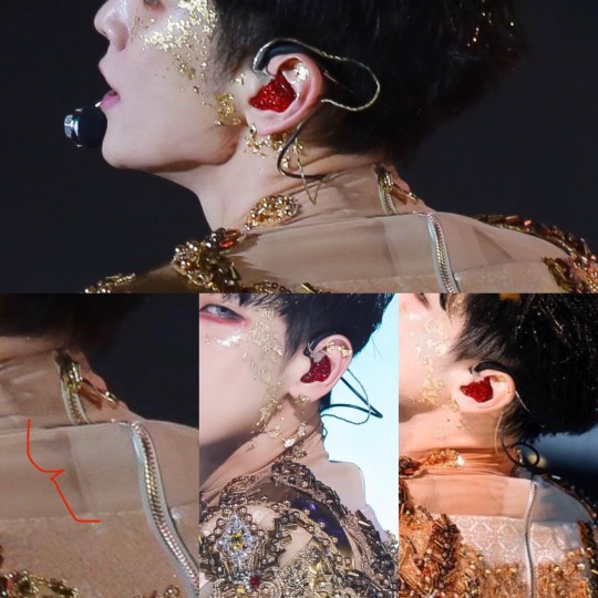
Showing the neck bubbling, and, on the bottom left photo, you can see that there is some sheer stabilizer to ensure that the zipper doesn't just tear out of the sheer net.
It couldn’t have been helped unless that whole back neck area had been backed with the solid nude base fabric. That’s what I would have done, personally. But using the stabilizer helped a bit. Without it, it may have not lasted a performance.
I don’t know why they did it that way, but the result was rather disappointing to me, especially considering the care that was taken with the rest of the garment.
Okay. End rant. The rest of the costume is EXQUISITE.
One more thing to note is that the zipper terminates about 4” above the top’s bottom hem. It is right around where his waist is. It was built that way to ensure that he was able to move his legs and hips comfortably without getting hung up anywhere.
His knee high boots were covered with the same peach jacquard as his top, as well as utilizing the gold fabric to serve as ornamental buckled straps.
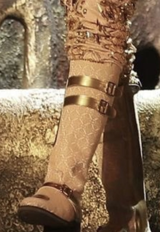
The stretch element of the jacquard is further showcased by the fact that it pulls over the boot toe smoothly, with little issue. A completely stable fabric wouldn’t be able to do that.
Now for the ornamentation. Oooooh boy. There are around twenty types of various adornments on this costume, and I thought I’d highlight some of them.
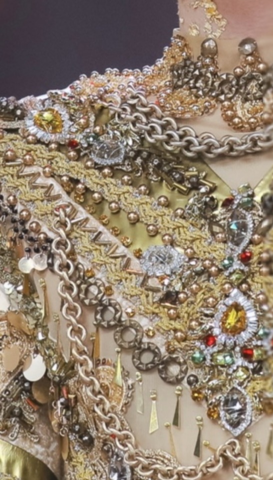
I can spy about 15 different types of ornamentation here alone.
Beaded appliques at the neckline
Heavy chains
Rhinestone appliques and/or individual rhinestone pieces
Bugle bead chevrons
Gold round beads
Yellow individual small rhinestones
Grey beads in between bugle beads
Gold and silver flat braid trim
Gold stretch fabric
Round flat decorative chain
Hanging paillettes
Dark seed beads with some of the paillettes
Gold dangling lil dudes
A sequined applique peeking out from behind a chain
Utilizing the main fabric as a chevon stabilizer as a design detail
About paillettes: these might actually be my favorites. They’re like “floppy sequins” that only have one hole at an edge. They’re made of a very lightweight plastic, so they’re virtually silent. If you wear a dress completely covered in paillettes, you’ll just hear a little rustle. In this case, his were mainly attached via dangly wires as fringe around the upper sleeves. There are a few other random instances throughout the garment where they’re stitched on individually. You can read more about paillettes in my post here.
Appliqués: There are at least three different types of appliqués in this costume:
Beaded
Lace
Sequined
Rhinestone
Appliqués are premade decorative pieces. It looks like someone hand beaded everything on the costume, but they were able to take a shortcut by using these. So no, contrary to what you might believe, there wasn't someone laboriously hand beading every single thing on to this costume.
It still takes FOREVER to invisibly stitch each motif on to the costume as well as, in this case, sometimes layer upon layer. A lot of them are attached to a net base, and in closeups, I saw how they trimmed the net away closely around the motifs.
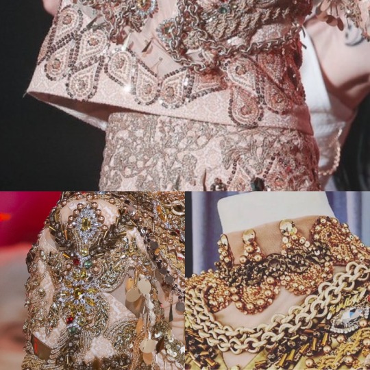
On the top, we have the gold paisley sequined appliques. On his trousers, you can see the low profile lurex embroidered lace appliques. Bottom left, you can see the beaded and rhinestone applique. And on the right, beaded appliques. You can see that they're over flesh mesh so, when it's on Key, it just looks like he has a beaded collar.
The sequined, beaded paisley motifs are the most prominent and plentiful form of appliqués, focusing around the top’s cuffs and lower edge. They’re also heavily featured spiraling around the trousers. There are even some appliqués stitched across the seams of the trousers and top.
There are some huge, gorgeous bead and rhinestone appliqués, like this one on his right bicep that you can see in the photo above.
There’s also the Lurex lace (metallic threaded) embroidered appliqués that concentrate mostly on his trousers' waist and hips. It’s low profile without any bits that might snag the top while moving. They added a few jewels to it further down once it was no longer posing any danger to snags. There are also a few flat appliqués on his rear, so as to not make sitting uncomfortable but still be adorned.
Beads and gemstones: There are also individual beads and jewels both sewn and what appears to be discreetly glued on as accents. A popular adhesive we use for that sort of application is called E6000. It bonds pretty much everything from plastic, leather, metal, rubber, and wood. It’s like a slower acting super glue, but is more flexible.
You definitely need to use this in a ventilated area or, ideally, with a respirator. The fumes are no joke! There are little chevrons made out of long tubular metallic bugle beads that were probably glued instead of stitched on. There are also round bronze beads and gold rhinestones glued to the edges of the metallic fabric.
There are little dangling gold dudes, though I don’t know what they’re officially called. There are individual sew on rhinestones. There are circular decorative flat chains. There is gold beaded fringe at the wrists of the sleeves.
Top left: gold braid, beads and chains are heavily featured. Top right: the dangling gold dudes. I don't know what to call them. Bottom left: Paillettes, hanging on gold wires on the upper sleeve hem. Bottom right: Gemstones highlighting the center of the chest, with a whole organized, beautiful mess of braid, beads, etc.
There’s gold flat “braid” trim that also looks like it has a bit of silver in it to add dimension. It’s basically like a braided ribbon, often in metallic colors. It’s used a lot in military uniforms.
And there are a few other various random beads and trims that show up amongst the circus of adornment.
The layout of the overall design is asymmetrical, with left and right arms and legs that don’t match. However, the front of the top is completely symmetrical (which is extremely impressive) except for a few rampant rhinestones that intentionally deviate a bit. Here’s an abomination I made of the sleeves next to each other to see the asymmetry more clearly.
I THINK (not based on this photo but others that aren't Frankensteined together with different perspectives) that the sleeves are actually different lengths as well.
Something that I should cover is that with garments made out of a stretch fabric, like Key’s trousers in this case, stitching on something non-stretchy (like some appliqués) can be fraught. The appliqué can keep the fabric from stretching as much as it needs to accommodate a body in it, and it might tear off.
Sometimes, we need to stretch the fabric a bit as we sew on the motif so it will look normal when a leg is in it. It may look a bit puckered when it’s not being worn. The good news is that it appears that most of the motifs in this costume are on what is most likely a mesh backing, so they probably didn’t have to deal with that headache here!
Since the motif on the Jacquard fabric is pretty small, as well as the fact that some of the appliqués wrapped across the side seams, “pattern matching” wasn’t a big priority on this. However, it’s always preferable to keep the motifs at the same horizontal height. This is a REALLY small pattern, so it wouldn't matter terribly, plus the fact that it was so covered it can hardly be seen. There WAS a point on the right side seam where the pattern did match, but the fabric slightly torqued on the left so it didn’t. All in all, it wasn’t a big deal whatsoever. If it were a bigger print though, it could have been. I made a thread about pattern matching here. It's a subject I'm pretty passionate about!
This side seam was cut so that, at a fixed point, the motif was all at the same level horizonatally at there was a part where the motif perfectly matched up to create one complete one. Because there are curves in the seam, it can't do that everywhere.
Now for a bit of a departure: SHINee and its members have done a few collabs over the years, dancing with the frog mascot from Jinro soju. SHINee did one for Don’t Call Me, Taemin did one for Move, and Key did one for Gasoline.
They dressed the frog up like Key, complete with jewels and chains! It was precious. SO GOOD. Watch it now. I also bring this up because that video was the resource I used to figure out where the gold chains on Key’s top were “tacked” (AKA stitched to keep it held down strategically.) It was a nice close-up view. Thanks, Jinro frog!
(Side note: I have made mascots before and it's ironic because they freak me out. I also refurbished a hot dog mascot that had gotten too gross after public appearances over a decade. My life is weird.)
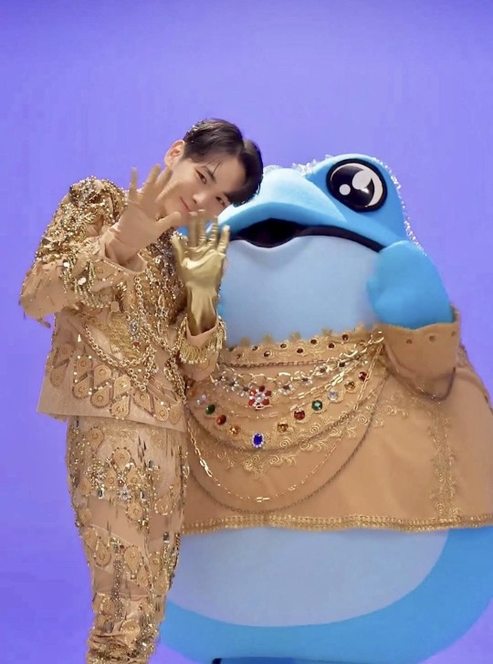
I love how scaled-back but accurate the frog's costume was.
Through the magic of the Jinro frog, I found the answer to the question “where were the chains tacked?” Here. Enough that they still have independent swing and look natural, but frequent enough to keep them from smacking him in the face. Based on the way they move, I think that is metallic coated plastic and not actual metal. Also, for safety's/comfortability's sake! You don't want to be thumped in the chest with every move.
Here's where the chains were tacked
Someone asked me how much they thought this costume weighed. My answer?
I really have no idea…but probably not NEARLY as much as it looks? I'm like 99.9% sure the chains aren't actual metal. I’m not sure if the “jewels” are glass or plastic. The tiiiiiny “seed beads” and "bugle beads" are glass, but there aren’t enough that they would weigh a significant amount. There's a lot of gold braid on there that's very lightweight. A lot of what you see are layered appliqués with sequins and seed beads, which weigh nearly nothing. The dangling paillettes are just a light plastic.
For the garments themselves, as we’ve established, the are a few layers of fabric and mesh, which aren’t very heavy. Because of the “encrusted” nature of the ornamentation, of course, it still weighs a bit more than just a regular top, and is probably kind of rigid on the front. However, it’s not like he’s dancing around in chainmail.
Lastly, there are his gloves. His left one is made out of that heavy gold stretch fabric that was incorporated into the rest of his costume, and his right was also made out of a flesh mesh. From the way it behaves in this photo, it appears to be a much heavier mesh than the top and trousers.
The right glove has thicker mesh that almost appears to have a natural fiber content that is getting snagged. It doesn't completely conform to the skin like a tight flesh mesh would.
The gloves are heavily ornamented with appliqués and beads. I’m going to guess that these were actually custom made for him, which is a big deal. I know very little about glove making, except it involves a TON of pieces to be done right. Gussets in between the fingers to make them slim and elegant and such. No Mickey Mouse hands here.
Stitching the ornamentation on to gloves is pretty difficult work. You either need a hand form and a curved needle or a very brave stitcher who uses their own hand as a form (palm up.) I haven’t done that for gloves, specifically, but I have been a “sacrificial hand” for other situations. I’m so calloused in most places, I don’t really feel much anymore!
There’s one more aspect to this costume that was seen in the intro for his Gasoline Inkigayo performance: the cloak. He didn’t wear it for very long, but it appears to button across his chest to the other shoulder with snaps underneath. The snaps keep the underlap from peeking out from…under the lap.
It looks like they might have had a wardrobe emergency here, because you can see that two of the three snaps were hastily stitched on with red thread. The ornamentation is asymmetrical, mostly focused on his right side. On his left shoulder, there is a decorative beaded “epaulette.” Those are the ornamental shoulder pieces you often see on military dress uniforms.
Left: The full cloak. You can see the facing on the inside edges, made of the same fabric as the outside. I'll write about that in a bit, and I'll show you a closer view later. Top right: The red thread holding on the upper snaps. Bottom right: Metallic epaulette.
It’s hooded and made out of the same jacquard fabric as the rest of his costume, and it has a satin lining the same color as the “fashion fabric.” It appears to be about calf length. One of the photos I found actually has a shot that shows the facing, the lining, and how the hem is done. Of course, I nerded out. It’s “self faced,” which means that there’s the same fabric that’s on the outside making up the “facing.” The facing is the first ten inches or so of the inside edge of the cloak. It makes a pretty transition from the outside to the inside, without a harsh switch to lining.
Then, there’s the hem.
While attached at the top, the hem of the lining and the outer fashion fabrics are allowed to “hang out” separately while on a dress form. Because fabrics stretch out at different rates (and it also changes by the direction they’re cut from the fabric, but that’s a whole different lesson…) it’s ideal for something like this to hang on a dress form and do its thing for a day or so.
In an ideal world, you’d have a fitting with your performer and you would mark a “level line” on them while they’re wearing the cloak (and also the shoes they will be wearing. Different shoes can change a lot!)
There are several different ways you can mark a hem. You can safety pin it up the way you want it, using a ruler measuring up from the floor to keep it even. But this can be awkward and clunky.
Or you can safety pin a “level line” and say that it’s, for instance, 18” off the ground, and you’d like the hem to be 16” off the ground. You’d draw a new hemline 2” down from the pins. It's the easiest way to know what's level and then decide exactly what you want to do later.
OR you can use what I call “the poofer” which is a little measuring stick on a tripod with chalk and a rubber squeezy ball that poofs chalk into a line at a set height, instead of dealing with pins. But sometimes the chalk doesn’t like to brush away, so that’s a bit of a risk in exchange for convenience.
First, let’s talk about hemming the outside cloak fabric. Because it may have stretched out unevenly, you may have wildly different hems lengths now that they’ve been “leveled.” Let’s say we’ll leave 6” of “hem allowance” to fold up into the garment so it can be lengthened later if we need to. You’ll trim the rest of it away. I can’t tell you how many times I’ve altered hem lengths on cloaks over the years! I'm always grateful to have extra.
You may want to finish the hem with a “serger” or “overlock” machine, which is the sewing machine that uses 3-4 threads to sew things, often stretch, together and kind of seals off the edges. It’s probably what stitches together the side seams of your t-shirt or hoodie or lounge pants or basically anything stretchy. It’s used to keep hems and the edges of fabrics inside garments from fraying. Sometimes people don’t do it, especially since it's inside, but it’s nice if you’re planning on altering it or if the fabric is really prone to fraying.
The cloak fabric is then thoroughly pinned and hand stitched up. There are many different sneaky stitches which grab a few threads at a time from the front of the fabric and are virtually invisible. Everyone has their favorites. My personal favorite is the “vertical hemming stitch” or “vertical blind hem.” I like it because it holds the inner hem and the outside of the cloak more tightly together than a lot of other styles. The “cross stitch” which is called the “blind catch stitch” here in this diagram is one of the most popular methods. However, I feel it can be a bit too loose some times and is more likely to be caught on something. The one downside of the vertical blind hem is that, if you pull it too tight, it’s more likely to show from the outside. It takes a very sensitive hand to get it right. The lining is usually slip-stitched to the cloak hem.

Once you’ve got your level line of your fashion fabric, it goes back on the dress form. I’m…not entirely sure I’ll do a good job explaining this because I work best with showing things with points and grunts. My apologies.
You mark the lining to match the level where the hem of the fashion fabric ends. You decide how far up from the bottom of the hem you want the lining to end (in this case, 4”.) So normally, you think you'd fold it up 4", right? Ha! You subtract two inches from that number. This means you’ll be folding up only two inches of lining. But, since we will be stitching it 4” up from the hem, that means there’s a floppy extra two inches. (Cue Advice.) What’s that for? Now I have to tell you about “jumps.”
Jumps are a sneaky trick. This method is used in suit coat hems and sleeve linings as well. Basically, they’re a way to give a little bit of wiggle room with the length of the lining to hem interaction.
After the fashion fabric is hemmed, you hand stitch the lining 4” up from the hem. You have two extra inches of lining. One extra inch of lining is pressed down so there’s an extra inch of “underlap". This photo (top right) showed me that they had done this to Key’s cloak. You can see it stretched out with the pressed line on the left, and it is folded over on the right.
Left: The "self fabric facing" at the center front inside of the cloak. Top right: The cloak hem showing the underside of the "jump" (left) and it down in its "resting" position (right). Bottom right: the "poofer." They're marking a level line.
If you want to get even MORE granular, that is considered a “soft press”, which means that the iron steams and very lightly rests on the fabric. A “hard press” is what it sounds like. Squish that lil dude and steam the heck out of it. That line is never gonna come out.
Okay. Enough of that. I can’t believe myself.
I could literally discuss this costume inch by inch, but I think I’ve covered it enough that you can peruse it yourself if you’d like and kind of know what you’re looking at.
I deeply admire and respect the, perhaps, 100+ hours of craftspersonship that it took to make this stunning costume. Don’t even ask me what it cost to make!
Do check out the Instagram of @denicheur.official where you can see other costumes they’ve worked on for groups like IVE, Enhypen, Stray Kids and more. They’ve got an amazing portfolio to drool over.
I hope you’ve gained an even greater appreciation for this gorgeous look, and the knowledge you’ve gained here can go forward with you as you enjoy future costumes! And thanks so much for sticking with me. I hope it was worth it!
#Shinee key#Key shinee#kpop#kpop costume#kpop costumes#Key#shinee#costume design#costume construction#costumes#gold costume#costume analysis#fashion analysis
50 notes
·
View notes
Text
youtube
Thought this would appeal to many of my mutuals.
Bernadette Banner is a Dress Historian/YouTuber who specializes in historical reconstruction of clothing (as accurately as possible), using period-appropriate methods.
In this video essay (~30 minutes) she examines how well (or not) Doctor Who's costume department uses costumes to communicate character and story for the people in the historical stories, the companions, the aliens (including the Time Lords), and the Doctor and Master, themselves.
The last two minutes (-ish) is taken up by a sponsorship ad.
#youtube (closed captions in english)#video essay#eye contact#bernadette banner#costume analysis#long video#Youtube
101 notes
·
View notes
Last Seen Blogs
billxharry
Bill Anderson/Harry Bright
10ccs
HOLY / SINNER

mherlyncueva
Mherlyn Cueva

thatonebl0nde
Eu Me Amo eu Me Cuido