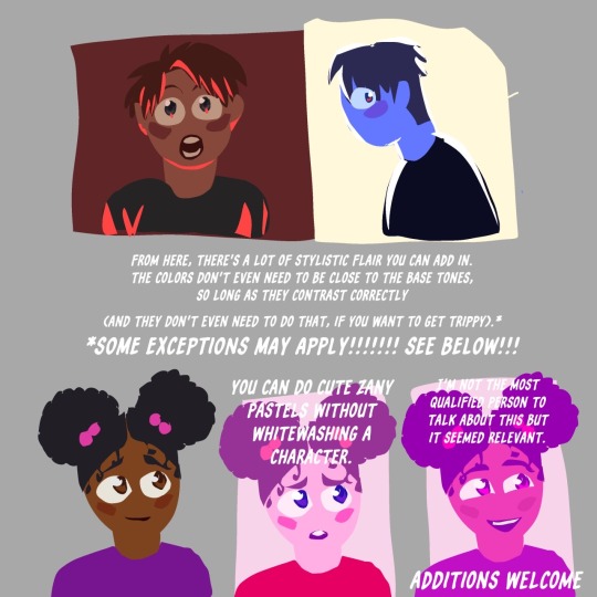
#color theory tutorial
Text
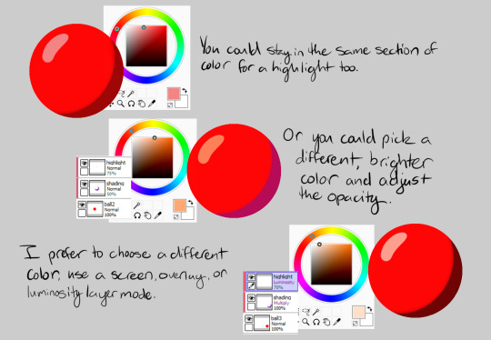
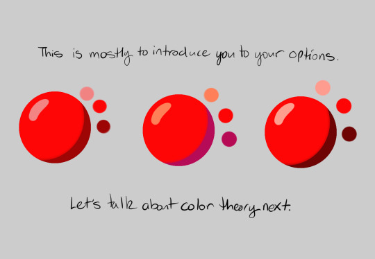
🎨 ~ Color Theory & Design Tutorial ~ 🖌️
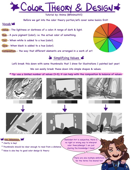
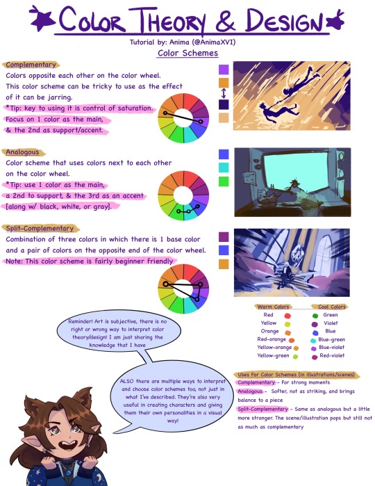
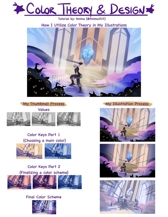
I've been thinking about making tutorials for a while now. So I thought I'd share about a subject I'm really passionate about! I did my best to make this beginner friendly & also as a review sheet 💜
(Please note this is from my own knowledge/experience! There are waaaay more resources, like books & videos, out there that are super helpful and go further in depth of this topic!)
#art tutorial#color theory tutorial#color theory#artists on tumblr#art advice#color scheme#color design
804 notes
·
View notes
Text
for all the artists out there, here are my favorite resources i use to learn!
Files
The Complete Famous Artist Course
Art Books and Resources
Art, Anatomy, and Color Books
PDF Files of Art Books
Internet Archive
YouTube
My YouTube Playlist of Tutorials
How to Draw Facial Features
Drawing and Art Advice
Drawing Lessons
Art Fundamentals
Anatomy of the Human Body
2D Animation
Perspective Drawing
Acland's Atlas ( GRAPHIC but very good for understanding anatomy! )
Websites
Pinterest Board for Poses
Another Pinterest Board for Poses
Pinterest Boards for References
Reference Angle
Figurosity
Sketch Daily
Line of Action
Human Anatomy
Animal Photo References
Humanae - Angélica Dass
Fine Art - Jimmy Nelson
Character Design References
CDR's Twitter Account
iamagco's Twitter Account
taco1704's Twitter Account
takuya_kakikata's Twitter Account
EtheringtonBro's Twitter Account
Drawabox
Color Wheel
Color Palette Cinema
Free Images and Pictures
Free Stock Photos
FILMGRAB
Screen Musings
William Nguyen Light Reference Tool
Animation References - sakugabooru
Animation References - Bodies in Motion
#art#art resources#art books#anatomy#composition#painting#art tips#art help#art tutorial#perspective#color theory#art reference
15K notes
·
View notes
Text
Johnny Depp trial: Amber Heard called makeup her 'bruise kit' | LiveNOW ...
youtube
0 notes
Text
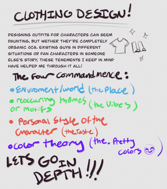
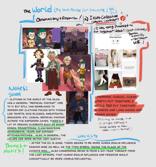

I’m really not sure why this took me a week but here’s a little tutorial on how I design clothes for characters ??? I hope it’s somewhat comprehensive, making tutorials can be hard for me because I have so much to say LOL
While I used a preexisting show in this example, this method can really be applied to any oc universe or story as long as you establish the basics :]
#my art#art tutorial#character design#clothing design#the owl house#toh#color theory#toh nextgen#Briar Spitzfyre#brischa
639 notes
·
View notes
Text
how did you get so cool kim
when i was playing DE i searched for some hints. you know how google always shows you the section with related questions? almost every time i got one that went somehow like ‘was kim this hot from the very beginning’
i have zero idea on how or why it appeared on absolutely unrelated searches, but the correct answer is YES YEEEES
#bowyo art#it’s not whirling in rags btw. it’s the roof of 41th#i made this after watching tutorial about color theory#my personal pride is that i picked all the colors by hand from the wheel#like there’s no filters or layer modes oher than normal#god i love this man so much he’s so beautiful and fun to draw#disco elysium fanart#de fanart#kim kitsuragi#disco elysium
436 notes
·
View notes
Text
Toastyglow: “local colors!!!! relative hues!!!! listen I love a good adjustment layer they are so helpful especially when you need to work fast. but I also love picking special colors myself so here is a crash course in that–as I understand it, anyway.”
Source: Twitter toastyglow
#relative colors#art tutorial#digital art#art reference#art tips#illustration#drawing tips#local colors#relative hues#color theory#colour theory
345 notes
·
View notes
Note
Hello! Nice to meet you. Been following this blog for a while and I've become a big fan of your work~♡
So, about this question here, could you elaborate a bit more about using references and "editing" the colour palettes? Also, what is colour dropping?
As a (not digital) painter I also often struggle a lot with finding the right colour scheme to make what I want. I think that's partly why I have trouble finding inspiration too.
color dropping is using the eyedropping tool on an image and taking the colors from it directly!

so basically i find a picture i like the vibes of/think it could be pretty and just edit the color. I draw with photoshop so I edit the colors with it as well! i use the curves tool usually and just mess with it until im happy! above is an axample.
first image is the original then i color edited it, then i used the color dropping tool on photoshop (pictured in the top right corner) to create the palette then i usually edit the colors a bit more!
generally when i color pick i start w the lightest then go darker! this isnt what i do every time, this has gotten me to the point of being intuitive enough with colors that I can pick my own now, but I think its a great way to learn abt colors digitally!
#color tutorial#color#artist help#artist tutorial#artist tips#pixel art color theory#digital art#digital art help#pixel art#reference#art reference#art tips
524 notes
·
View notes
Text
75 notes
·
View notes
Note
And also, I forgot to put before but color theory is...oof, I’ve watched countless videos and it hasn’t knocked inside me yet when it comes to coloring or figuring out values when it comes to drawing, what are ways or exercises to get better?
I was asking the same question as you, so I went on a lil hunt and created an article to center my favorite resources:
I hope this helps!
An exercise to practice applying these concepts:
sketch something simple, or even base it off a piece that you have been working on but feel stuck with the colors
Now start working with simplified thumbnails, keep it blocky and keep it fast
experiment with different schemes and types of color combos. ie, try complementary, triad, split complement, analagous
rinse and repeat, bonus points for adding different color schemes.
best of luck,
<3 Al
feel free to show me ur results and ask any follow up questions. (note: I respond quickest to Dms bc my asks are really backed up sadly)
955 notes
·
View notes
Text
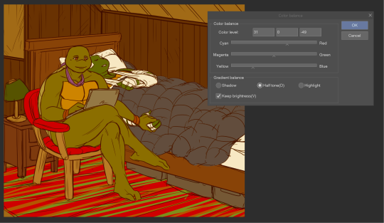
Coloring Tutorial Part 2
Part 1
As promised, here's the 2nd part of my color ramblings. This time I'll go a bit into how I pick colors for cohesive and atmospheric looks in my illustrations.
Usually, when working on a piece, I'll think about what kind of mood I'm going for and then choose one color as a base.
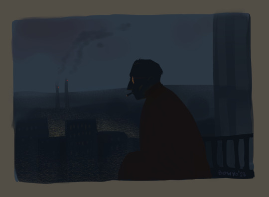
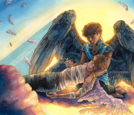
Let's use this pic as an example:
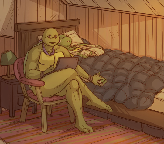
I wanted something warm and cozy, and the feel of an old house. For the base color, I chose brown.
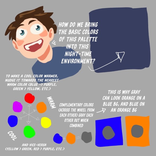
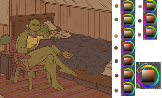
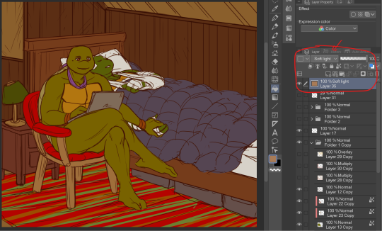
The funny thing about colors is, that they can look veeeery different depending on which shades you put next to each other. For example, you can make a shade that's not actually red, look like it's red by putting greenish tones around it.
Let's look at the shades I picked for this piece. When you look at the color spectrum, you can see that all the colors can be found somewhere within the range of red and yellow. Don and Leo look like their normal shades of green, even though there's not any real green in this picture.
For comparison, I colored this picture as if it was in a neutral light and all the objects showed up in their true colors.
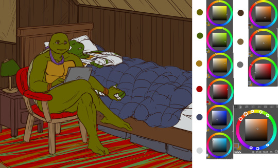
Looks rather jarring, doesn't it? The colors are picked from all around the spectrum and there's no consideration of whether they match or complement each other.
When you pick colors from a more condensed 'area' within the hue spectrum, it's easier to harmonize them. Also, in general, it's wise to stick to a limited palette. It doesn't have to be in the same hue range either. You could pick something like blue and orange as your base colors and then use shades that are close to those two.
Another trick is to repeat your chosen colors in different areas, instead of picking a new tone for everything. This will make the overall look more cohesive. And if you want something to stand out, pick a more unique color for it. (This same rule can apply to character design too.)
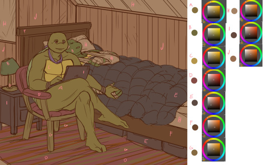
A demonstration of how almost all the colors appear in several spots within the picture. Note, how most of the BG is non-obtrusive browns and reds, while Don and Leo become a focal point with their greens and the blue duvet.
So, how do I actually pick out these colors? I'll show you.
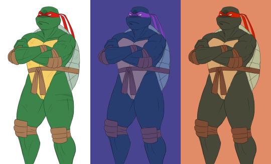
Here's Raph in neutral light aka in his true colors. And two different versions where I've used indigo and orange as the base colors.
Now, I'm not sure how comprehensible this is, but I tried to explain my method with this visual guide.
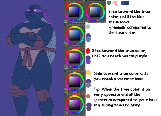
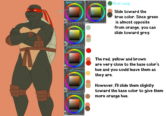
Basically, I'll try to remain close to the base color in the hue range and then fiddle around with how the different shades look together. It does take some practice and using various color adjustments or blending layers is very helpful if picking the colors manually is too hard!
I hope someone got something useful out of this, thanks for reading and sending the ask!
104 notes
·
View notes
Note
how do you determine your color palette...? color is something i have a lot of difficulty with and i really want to learn how to at least figure out a color palette 😅
i guess another way to phrase it is how did you go about learning color theory?
the number one most helpful thing i did for myself when teaching myself to color was to realize that every artist colors differently.
i already knew color theory in advance, i memorized every word i had been told throughout every highschool art class i had taken, but knowing the actual facts and knowing how to apply them are very different skills!
if you haven't learned the facts of color theory, i highly suggest these two videos (thing 1) (thing 2). <- the most important part of watching those videos is to hold them in your head as facts. if watching them doesn't make you necessarily understand how to apply them, that's okay! these videos are to give you the skills to be able to study color.
for a simple example, when it comes to picking colors based off the mood of your piece, pretty much everyone knows that blue will make an image feel more sad and emotional. yellow feels happy, red feels angry, pink feels affectionate.
a great way to teach yourself how to APPLY mood through color is to go back to a drawing you're already very proud of, and just mess around recoloring it. pick one thing you want to work on and try to use your color choices change the emotional effect of the piece.
it's incredibly helpful to use a piece that you have already colored, preferably one you're the most proud of. this is so that you aren't stressing yourself thinking about things like proportion or composition, and allows you to think solely about your color choices.
here's my example! for this example, my goal was to make this one feel far more bleak than my original finished piece.
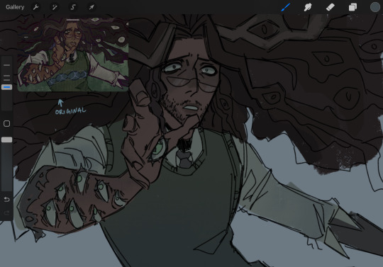
i achieved this change by shifting the colors to all be more cold and desaturated, as well as making the blacks of his undershirt and tie look more washed out. most people associate cool colors with sadness, and dull colors with defeat. mixing those two makes the mood more bleak. color placement can also change a lot— for this version, i placed a lot of the blush color (which i desaturated significantly) higher up his face, which gives him a more horrified and thoughtful expression
once you've done exercises like this once or twice, a great way to decide how you want to color is to find out how other people pick their colors. one way to do this is color picking studies, and another is to watch youtube videos like this one where an artist explains their personal thought process while choosing colors.
if you'd like to know how i, personally, go about picking my colors, i would be happy to make a separate post outlining my process! it would take a pretty long time, though, because a lot of my process is to not leave things alone until i'm satisfied with how they look
the thing about being a self-taught artist is that everyone tells you that the way to get better is to "just practice," but that's not the whole story! art is a skill you have to build, and i've found the most effective ways to improve are to do studies, and to learn how to spot your mistakes and problem-solve until you can fix them.
i hope this was a good way to get you started on learning how to internalize and apply color theory! the more you study, and the more you learn, the better your results will be
youtube
#color theory#echolocating#art tutorial#art tips#artists on tumblr#digital artist#tma#the magnus archives#jonathan sims#how to color
44 notes
·
View notes
Photo
A Bunch of Watercolor Tips!
I love working in watercolor, especially with lots of details, dramatic lighting, and vibrant colors. So, I get a lot of folks who ask me for tips and tricks...and here’s a big compilation of them!
P.S. Find my watercolors on Instagram and Twitter too :)
Understanding how the paint works:
The more watery the paint, the lighter it will dry
If you add a more watery color into a partially dry color, it will bloom (those spidery effects) outwards from the wet paint (the wet pain pushes the pigment of the semi-dry paint away
Some paints are “granulated” which means you can see the pigment in little spots (reds and blues do this a lot). This is okay, just roll with it! It’s a beautiful part of the medium.
More water means less control, but it’ll give you more of those unique watercolor effects like “blooms”
Brush tips:
Get one with a good point, as that will allow for clean lines (I use this in my art ALL the time!)
Lean towards using a bigger brush than you think you need. It’ll be more precise than you expect and that way you can paint a larger area before it dries. This allows for smoother gradients.
Synthetic and natural brushes both work well, but I find synthetic to hold more pigment and water, and to be more precise
Turn your paper as you work, so the brush tip is going along the edge of where you want to paint. Never paint with the middle/back of the brush as it won’t make a clean line.
For detailed spots, use a small pointed/round brush and not very watery paint. This’ll give you the most control.
Supplies tips:
Paper matters! So much! If there’s one thing to invest it, it’s good paper. I love Arches, but I’ve heard Baohong is great and cheaper too.
Hot press paper will dry quick and doesn’t allow for a lot of blending, and leaves crisp lines. It’s smooth, so good for lines.
Cold press paper allows for blending and dries at a moderate speed, but has some texture to it
Rough press paper has a lot of texture, but will allow for a lot of smooth blending
Student grade watercolors are totally fine, they just have a little less pigment to binder ratio--so you might need to use more paint to get a vibrant color. I found Cotman watercolors to be a good starting set (some people prefer pans rather than tubes, though)
Have a big broad palette, so you can mix lots of colors without them running into each other. I use a flat pan, and then have a smaller palette with separated spots for mixing larger color batches
The thicker the paper, the less it will warp (I love 300-400lb). Optionally, you can learn to stretch watercolor paper before painting to prevent warping!
Masking fluid can be SO helpful if you want to protect spots from getting paint on them (you can also use masking tape to cover larger areas). But fyi, these both almost always contain latex--so watch out if you have an allergy!
To use masking fluid, buy a “ruling pen” that you can dip in the fluid. It’s a weird metal contraption that can tighten and loosen to make lines. This way, you avoid ruining your brushes with the liquid.
Color tips:
You’ll keep your colors vibrant by using few layers. In the pieces I shared above, I used basically three layers max (besides a few deep shadows or tiny details)!
Don’t be afraid to blend while it’s still wet, by adding in a new pigment--just keep in mind it will bloom out if your new pigment is wetter than the color on the paper already
All layers are transparent, so keep color theory in mind. If you have golden skin and paint purple over it, you’ll get a more brown tone, since they are complementary colors.
Try not to use brown paints directly for skin colors (unless they are exact color you’re looking for). They tend to look too muddy, especially on darker skin. It’s more realistic to use a mixture of yellows (like yellow orchre or naples yellow), reds (like a nice magenta or rose) and blues to mix purple to darken the skin. This combo allows for more realistic highlights, shadows, and blushing/warmth!
Never use grays or blacks to shade darker skin (unless it’s a very intentional and careful stylistic choice), it almost always makes the skin look ashy and unrealistic
Use a spare piece of watercolor paper to test the colors you mixed first, to see if it’s what you want
Keep this in mind when having a light source: if the light (and things lit by it) is warm in tone, the shadows will be cool. If the light is cool, the shadows will be warm. So, anytime you make a gradient, think of how it’s lit and go from warm to cool (or vice versus) depending on your lighting!
It is actually okay to use colors straight from the tube/pan sometimes! Go for vibrancy. :)
Lighting tips:
Work from light to dark, as you can’t lighten watercolor well once it’s put down
...but if you do need to lighten/remove a color, try wetting it with clean water and then lifting it up with a tissue! I’ve also heard a magic eraser works (wild)
Keep a dry tissue nearby for the above reason
Think of watercolor like working in multiply layers. They are transparent coatings of paint over each other!
Want dramatic lighting? Check out this other tutorial I made!
Think through your lighting before you paint. Once you put watercolor down, it’s hard to go back...so mentally plan where you need to shade before you put your brush down.
For deep shadows, sometimes you will need to use a lot of layers, especially if you’re avoiding black (which can work, but it can also create a blah visual pit). Layers here are really helpful!
Misc tips:
Try sketching with a colored pencil, so it isn’t as see through! (I like Prismacolor ColErase)
Or...draw your sketch and then roll a kneaded eraser over it to lighten it, so the pencil isn’t visible through the paint
Explore mixed media! I’ve done pen line art (microns) and then painted, and I’ve mixed acrylic and gouache for highlights and effects after the watercolor is done too.
Let your work bloom sometimes! Roll with that unique beauty of watercolor.
It can look really cool if you mix totally different colors alongside each other. Play with what it looks like to have an orange bloom in a blue spot, etc! :D
Play with fun effects! Drop alcohol, salt, or add plastic wrap that you leave to dry. These (and more) can all look really cool.
You can paint in whatever style you want! It doesn’t have to be that typical watercolor look. Mine is really graphic and different, but it vibes with me!
Have a question? Feel free to send me an ask, or reach out on Instagram or Twitter! If you use these tips, tag me and I’ll totally check out your work too!
#art tutorial#watercolor tutorial#watercolor tips#art tips#watercolor#painting help#watercolor help#painting tips#color theory#color tips
1K notes
·
View notes
Photo


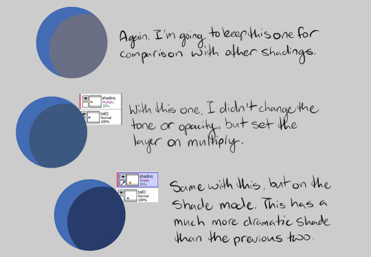
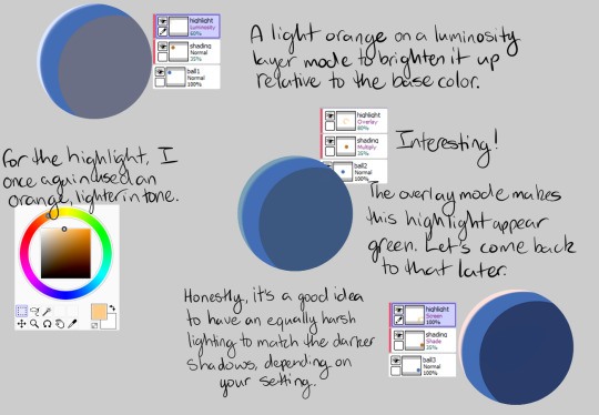
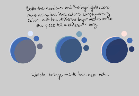
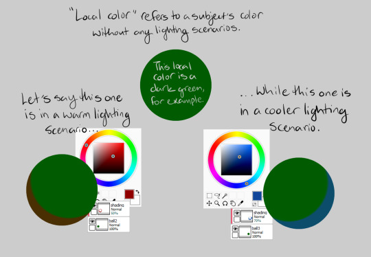
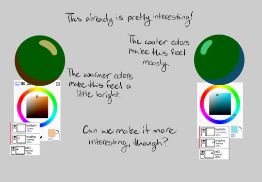
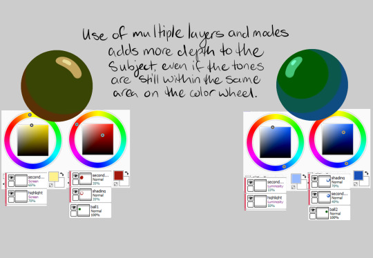

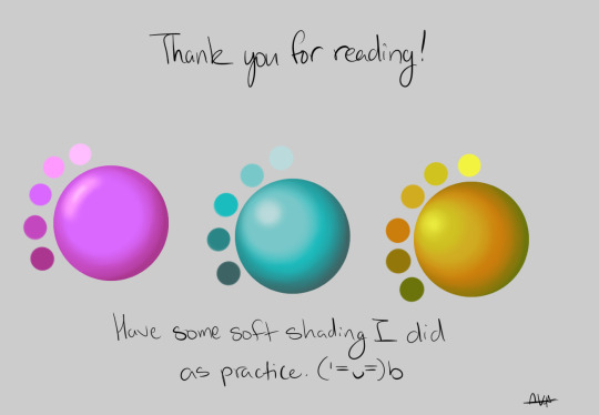
A friend on Discord asked me about how I do digital shading while we were in a voice call, and while I tried to explain I ended up going on like three different tangents about color theory and layer modes, so instead I ended up haphazardly slapping this together. I’m not an expert by any means and I am entirely self taught (aside from like...a couple oil painting classes) but I hope it helps some of y’all too!
186 notes
·
View notes
Text
I had a color revelation today and now I know how to explain the colors I use!!
Color theory schemes never really helped me.
It was focusing on saturation, tint, and temperature that gave me the skills I have now.
Here’s a compressed guide :]
384 notes
·
View notes
Text

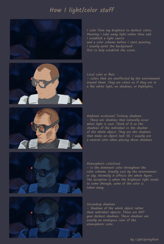
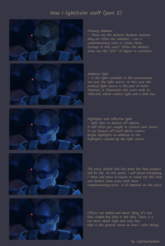
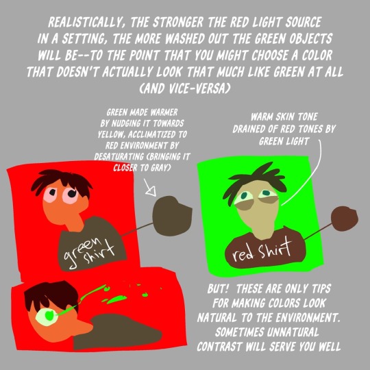
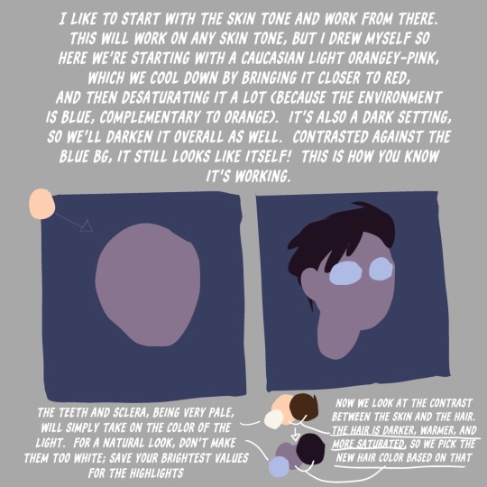
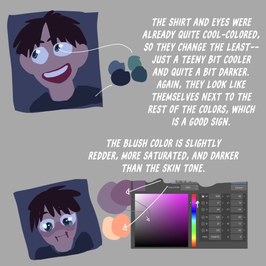
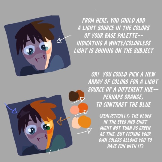
You asked for it! I tried to explain it. Here is a tutorial on how I color/light stuff. It is more of a "why" rather then a "how" I do things. Basically, a lot of color theory. Hope it helps!
#tbb#thebadbatch#tbb fanart#star wars#star wars fanart#star wars tbb#the bad batch fanart#the bad batch tech#art#tbb tech#tutorial#art guide#color theory#lightspringrain
130 notes
·
View notes
Text
i took a break from making youtube videos for a bit but i've decided to start again! if you have any suggestions for videos you'd like to see, please reply to this post!
#weirdcore#weird#art#creepy#horror#borzoi#liminal#dogs#odd#youtube#creators#community#artists on tumblr#cryptid#extinct animals#dog breeds#history#art tutorial#color theory
39 notes
·
View notes
Last Seen Blogs