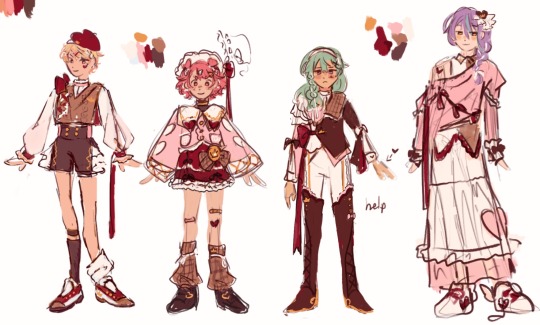
#idk if got it right
Note
greetings! i have come to play your game hehe
chan + stargazing LET’S GO!!! (yes i’m still not over the fact that the weather has been bullying me 😤)
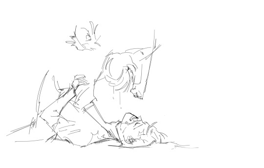
chris’ features glow in the moonlight. the strands of his hair and the angles of his face and the tip of his nose are tinged silver, a stark contrast to the night sky you’re both laying under. see anything good? he asks, angling his head towards you with a fond look that you don’t see, too busy searching the expanse of stars above you. orion, you say, and i think mercury! you can’t keep the excitement out of your voice, and the way he shuffles closer to try and see where you’re pointing makes your heart race more. you know so much, he says in awe, and this time you meet his eyes, heat rushing to your cheeks when you look away. i love stargazing with you. it’s almost like looking at the stars in your eyes.
—
if anyone else wants to play
#stray kids imagines#skz fluff#stray kids fluff#skz chan fluff#bang chan fluff#bang chan imagines#did i look up what planets you can see from sydney tonight for this#maybe#idk if got it right#but the effort was there#also this was way cheesier than i intended it to be
77 notes
·
View notes
Text
brennan reintroducing the bad kids with genuine titles they hold in canon like “archdevil” “captain of the owlbears” & “risen saint” but adding “holder of the tin flower” to gorgug’s intro because of how gorgug offering his tin flower to fabian, even after they fought, so effectively represents the type of person gorgug is (a kind one).
#what if i died#gorgug thistlespring#fantasy high#dimension 20#fhjy spoilers#fhjy#if u think about it this is a win for the thistlecaster agenda (i’m delusional)#fellas is it gay if offering a tin flower to my bro which he later got put on the ax holster he gifted me is a core tenet of my character?#(no)#idk if tenet is the right word there but whatever it’s 5 a.m. idc at this point#but anyways. zac oyama characters you are often so kind & i love that about you.
4K notes
·
View notes
Text
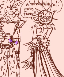
just cactus ring things ya know
#desertduo#3rd life smp#tw violence#tw choking#grian#goodtimeswithscar#3rd life#mcyt fanart#berry art#uuuuhhhhhhhh desert am i right?#we love the desert here#good times#mhm#idk what happened here#i got hit with the brainrot#I TOO WANTED TO DRAW THE 3RD LIFE FINALE OK#no one yet commenting on the clipped wings or the flowers behind his ear smh
3K notes
·
View notes
Text
Tucker gets Recognized
So! This is using the Egyptian version of Hawkman and Hawkgirls past, cause that's the only way this works
The basic idea is Hawkman and Hawkgirl used to live in Egypt in high positions of Power. Hawkman used to be the Prince, and Hawkgirl used to be the High Priestess. They died one day and became cursed to forever reincarnate.
Ok, onto the prompt.
So, Hawkman is one day flying over the Midwest USA while lost in thought. He gets hungry and decides to set down in a small-ish town called Amity Park.
He goes to a nearby Burger Restaurant, and while he is waiting for his food he sees someone else pick up their food and walk out the door.
And one thought passes through his mind.
"Is that my fvcking Dad?!"
Yeah, Duulaman was Hawkman's Dad in his first life. He just never knew that his Dad was also a Reincarnator (he had the power before even his son, he just never told him).
Tucker, who has Duulamans powers but not his memories (by choice), has no idea why this Guy with Wings keeps following him around.
Wait, did that guy just call him Duulaman?! Oh Hell No!
#Dpxdc#Dp x dc#Dcxdp#Dc x dp#Danny Phantom#Dc#Dcu#Hawkman#Tucker Foley#Duulaman#Tucker is a Reincarnation#Duulaman was Hawkmans Dad#Idk if I got the backstory entirely right#I mostly based it off the CW version cause that's the one I remembered#Hawkman did not know his Dad was also Reincarnating#(Duulaman has been Reincarnation longer than his son by a large margin)#(Duulaman was just one of Ra's many lives)
2K notes
·
View notes
Text

bike stickers
#watch me project my kirby obsession onto literally everyone#chuuya does not let ANYONE fuck with his bike buuut accessorizing isn’t fucking it up….right?#speaking of motorcycles idk how to draw them 🤡👍🏼#they are teens in this but honestly idk if ppl can tell😔#anyway sry for no art i got a life and school is beating my ass#bungou stray dogs#bungo stray dogs#bsd#osamu dazai#dazai osamu#nakahara chuuya#chuuya nakahara#soukoku#skk#lotus draws
1K notes
·
View notes
Text
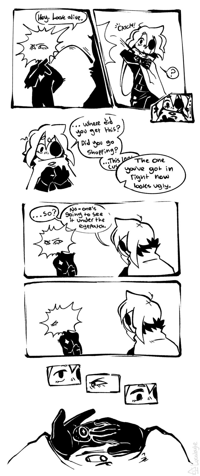
Taking pride in One's own appearance.
#you people are becoming my guinea pigs for my finally learning how to communicate information via comics. a thing ive needed to practice at#also BLEGH. YUCK. andrew hussie was right candy makes you sick. this is a little too saccharine for me. yeesh. let me get back to the meat.#isat#isat spoilers#in stars and time#in stars and time spoilers#isat fanart#in stars and time fanart#isat siffrin#isat loop#sifloop#doodlebyte#'let me get back to the meat' i say eyeing something similarly sickly in my sketches. at least it's mildly tormented as a counterbalance...#you people have no idea how much im having to stay my own hand. oh i can draw miserable nudity but the most basic of fluff? visceral#anyway i dont know the logistics of picking up a glass eye or where loop got money (besides pilfering from siffrin) & ive previously drawn#sif with a vague blank middle-grey eye as either being scarred over or a blank occular prosthesis put in quickly at the nearest town#i dont know that they'd have a glass eye during the game but considering prosthesis are reccomended to keep the skull etc from deforming#id imagine it would probably come up postgame as something to do now theyre not on a time limit trying to save the country#plus i assume that having it gouged at by a sadness wasnt exactly a clean wound by any measure#all this to say. idk i just wanted to get some information across in comic form to Test my Abilities#and we're far enough down now to say my absolute most wretchingly sweet fluff headcanon that actually inspired this#which is that i think siffrin gets into the habit of not wearing the eyepatch around loop so they kinda match.#and as a signifier to the other that they're letting their guard down around them. vulnerability etc.#just kinda wearing it around their neck so they don't lose it
700 notes
·
View notes
Text

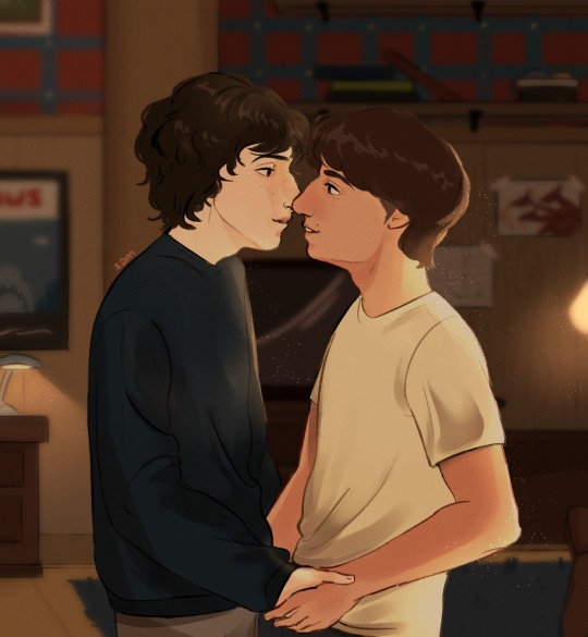
are friends electric?
#byler#byler fanart#mike wheeler#will byers#stranger things#i always imagine their first kiss in s5 being in the basement for them idk ab yall#endgame couples got all their first kisses in dimly lit rooms w a lamp in btwn them or to the side ik thats right#also i headcanon will giving mike the jaws poster and mike giving him the thing poster that is all#sammi's art
1K notes
·
View notes
Text
happy valentines day... 2!
#you mind if i post month old art i never finished#project sekai#pjsk#prsk#emu otori#proseka#tsukasa tenma#nene kusanagi#rui kamishiro#I WAS MAKING POLYSHO VALENTINES ART AND NEVER FINISHED IIIT. NO TIME. I GOTTA GO#omfg wait i have the cyberpunk desd boy art i never finished um youll get that later too bc idk when i'll have something new to post .#well if tumbltbr never got it does it even count. I think not. wxs killing me rn snd i cant even draw about it#ok adios#youll get month late white day themed art too probably#omfg someone on twt asked if they could Cosplay the tsukasa that made me feel insane because 1 what a compliment lord in heaven#but 2. Please dont do that toyourself i cant imagine having to fuckig sew any of this. as i sew right now i would never wish it upon anyone
707 notes
·
View notes
Text
the way this is filmed is like when a protagonist in a movie dies and theres a scene where jesus christ bring them into heaven
#calico.exe#matpat#game theory#scott cawthon#do you guys think he sat down and told him everything he got wrong#or right idk
597 notes
·
View notes
Text

More brothers but much less happy this time. I wanted to partially get my hc for Falena drawn in case he actually shows up in canon and also draw how i picture the princes' dynamic. Maybe the eldest prince is a little entitled and bratty too so he and Leona clash a lot. Fighting with your sibling sorta counts as bonding though i guess
#fanart#leona kingscholar#falena kingscholar#or farena idk#twisted wonderland#twstファンアート#doodle#my art#also this is a crybaby Leona truther household#i got no source and#no evidence i just know I'm right
3K notes
·
View notes
Text
So my partner and I are rewatching supernatural from season 4 on for nostalgia's sake
And my partner has never been involved in any fandom space, he knows some basic stuff but he's pretty much free of fanon and fandom consensus of any kind
And as we were watching he said:
"Damn I didn't remember how intense Dean and Castiel's relationship was back then. They're shooting this like a romance or something with all the close-ups."
And then, the KICKER :
"Must be a fic or two about that, right?"
Oh BUDDY. Oh PAL. YOU JUST. You have NO IDEA DO YOU
#supernatural#spn#destiel#this is by noooooo means a SPN blog at all#but?????????? the fact that he picked up on that was hilarious#and then we got to the siren episode#and he was like???????? his siren...... is.... a dude????? mmmmhhhhh ok right right sure#also i'd actually encourage you to rewatch SPN purely to study the changes in writing and filming short hands#cause the way beauty standards have evolved is FASCINATING and really shows through??????#idk there's SOMETHING THERE#mine
4K notes
·
View notes
Text
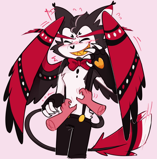
They got me
#my art#hazbin hotel tickle#They got me#sorry#you can always tempt me with an alcoholic furry. always#idk what else to tag here#oh right#I think he would try and hide his face with his wings when he gets tickled#sorry i eman i'm normal#WHAT ELSE DO I PUT HERE!!!!!!!!!!#Im not drawing his gay little hat
561 notes
·
View notes
Text

Gordon/Barney/Alyx is really really funny to me conceptually bc it's like, two hot geniuses in their 20s who look at the 40-something smartass who hangs around and go 'yeah that guy. we both want him carnally'
#and they're SO right#half life#half life 2#gordon freeman#alyx vance#barney calhoun#freemance#valhoun#freehounce#idk what the hell their poly ship name is sorry lol#(me. posting about a ship with an age gap on the 'can't be normal about age gap ships' website:#SURE HOPE THERE ISN'T ANY AGE GAP DISCOURSE IN HERE)#this was the first time I've drawn any of these characters in LITERAL YEARS and. wow........#feels so crazy that this was the fandom that got me to join tumblr in the first place (in 2011!!!!) and I used to draw them ALL THE TIME#interests change I guess#but I think I'll always come back to hl and portal occasionally. they're too much a part of my dna at this point LOL#my art#description in alt text#oh my god I just went back through my half life tag and the last time I drew these three was when I drew that freehounce meme LMAOOO#how serendipitious
557 notes
·
View notes
Text
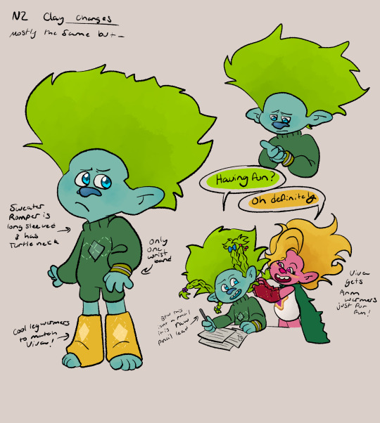
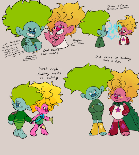
Clay's design for this lil thing, including Viva cuz these two are practically inseparable.
Viva was the one who pulled him away from the cave in time and Clay helped her guide all the trolls to safety and kept her grounded
They both help each other in many ways and I love them so much. Idk if you can tell but i love Cliva
Bonus little comic about these little guys and their little thoughts:
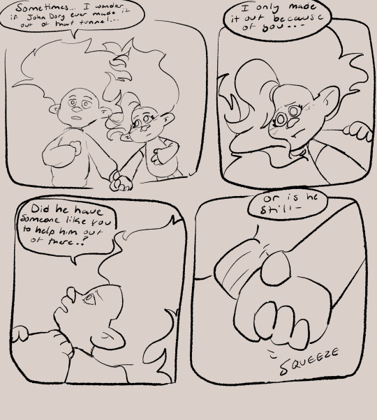

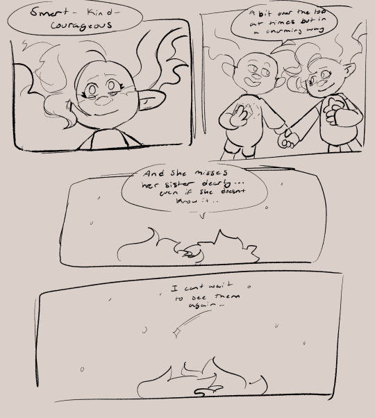
#my art#not the only one au#n2 au#trolls#trolls 3#dreamworks trolls#cliva#trolls band together#trolls clay#trolls viva#idk if imma fully color clays side of the comic#his side of the cave in#its very short#since the whole thing that happened is a lot#but i wanted to show a bit#so thats coming soon#also Clay thinks a lot about whether or not John dory survived the cave in#cuz Clay was right under it and only got out because of Viva#but he doesnt know if JD was able to avoid it#so he worries about it a lot#also Viva and Clay are p close in age but she still calls him Mr. Clay#its a little nickname she gave him that caught on so everyone calls him that#he got the nickname after he got his CPA license#but yeah#viva and clay also like to stargaze together a lit#they tell stories to each other about what the other trolls are probably doing#as a way of comforting themselves#and each other#i love them so much augh
918 notes
·
View notes
Text

first meetings (bonus panel under the cut!!)
i didnt wanna add it to the main post bc it's a different size and it would mess up the format lmaooo
i think about these two a lot i think they could be really fun together in several ways. monty golf is right next to the daycare after all!!
#my art#daycare attendant#sundrop#sunnydrop#oh idk how to tag for monty....#montgomery gator#monty gator#this isnt explicitly ship but if u wanna read it that way go for it lol#i genuinely do think these two are like.. connected in some way. i just have a hunch okay just trust me#monty golf is right next to the daycare. they were both side attractions before bonnie's disappearance#they've both got destroyed staff bots in their rooms. the 'decommission monty' mission makes you go back to the daycare#as well as monty being the one that gets called when a staff bot finds you in the daycare#IM JUST SAYING.... it cant be a coincidence right. it probably is but just hear me out okay#what if monty didnt kill bonnie. thats all i'll say for now#i'll stop being a conspiracy theorist in the tags now
2K notes
·
View notes
Text
why Aurora's art is genius
It's break for me, and I've been meaning to sit down and read the Aurora webcomic (https://comicaurora.com/, @comicaurora on Tumblr) for quite a bit. So I did that over the last few days.
And… y'know. I can't actually say "I should've read this earlier," because otherwise I would've been up at 2:30-3am when I had responsibilities in the morning and I couldn't have properly enjoyed it, but. Holy shit guys THIS COMIC.
I intended to just do a generalized "hello this is all the things I love about this story," and I wrote a paragraph or two about art style. …and then another. And another. And I realized I needed to actually reference things so I would stop being too vague. I was reading the comic on my tablet or phone, because I wanted to stay curled up in my chair, but I type at a big monitor and so I saw more details… aaaaaand it turned into its own giant-ass post.
SO. Enjoy a few thousand words of me nerding out about this insanely cool art style and how fucking gorgeous this comic is? (There are screenshots, I promise it isn't just a wall of text.) In my defense, I just spent two semesters in graphic design classes focusing on the Adobe Suite, so… I get to be a nerd about pretty things…???
All positive feedback btw! No downers here. <3
---
I cannot emphasize enough how much I love the beautiful, simple stylistic method of drawing characters and figures. It is absolutely stunning and effortless and utterly graceful—it is so hard to capture the sheer beauty and fluidity of the human form in such a fashion. Even a simple outline of a character feels dynamic! It's gorgeous!
Though I do have a love-hate relationship with this, because my artistic side looks at that lovely simplicity, goes "I CAN DO THAT!" and then I sit down and go to the paper and realize that no, in fact, I cannot do that yet, because that simplicity is born of a hell of a lot of practice and understanding of bodies and actually is really hard to do. It's a very developed style that only looks simple because the artist knows what they're doing. The human body is hard to pull off, and this comic does so beautifully and makes it look effortless.
Also: line weight line weight line weight. It's especially important in simplified shapes and figures like this, and hoo boy is it used excellently. It's especially apparent the newer the pages get—I love watching that improvement over time—but with simpler figures and lines, you get nice light lines to emphasize both smaller details, like in the draping of clothing and the curls of hair—which, hello, yes—and thicker lines to emphasize bigger and more important details and silhouettes. It's the sort of thing that's essential to most illustrations, but I wanted to make a note of it because it's so vital to this art style.
THE USE OF LAYER BLENDING MODES OH MY GODS. (...uhhh, apologies to the people who don't know what that means, it's a digital art program thing? This article explains it for beginners.)
Bear with me, I just finished my second Photoshop course, I spent months and months working on projects with this shit so I see the genius use of Screen and/or its siblings (of which there are many—if I say "Screen" here, assume I mean the entire umbrella of Screen blending modes and possibly Overlay) and go nuts, but seriously it's so clever and also fucking gorgeous:
Firstly: the use of screened-on sound effect words over an action? A "CRACK" written over a branch and then put on Screen in glowy green so that it's subtle enough that it doesn't disrupt the visual flow, but still sticks out enough to make itself heard? Little "scritches" that are transparent where they're laid on without outlines to emphasize the sound without disrupting the underlying image? FUCK YES. I haven't seen this done literally anywhere else—granted, I haven't read a massive amount of comics, but I've read enough—and it is so clever and I adore it. Examples:


Secondly: The beautiful lighting effects. The curling leaves, all the magic, the various glowing eyes, the fog, the way it's all so vividly colored but doesn't burn your eyeballs out—a balance that's way harder to achieve than you'd think—and the soft glows around them, eeeee it's so pretty so pretty SO PRETTY. Not sure if some of these are Outer/Inner Glow/Shadow layer effects or if it's entirely hand-drawn, but major kudos either way; I can see the beautiful use of blending modes and I SALUTE YOUR GENIUS.
I keep looking at some of this stuff and go "is that a layer effect or is it done by hand?" Because you can make some similar things with the Satin layer effect in Photoshop (I don't know if other programs have this? I'm gonna have to find out since I won't have access to PS for much longer ;-;) that resembles some of the swirly inner bits on some of the lit effects, but I'm not sure if it is that or not. Or you could mask over textures? There's... many ways to do it.
If done by hand: oh my gods the patience, how. If done with layer effects: really clever work that knows how to stop said effects from looking wonky, because ugh those things get temperamental. If done with a layer of texture that's been masked over: very, very good masking work. No matter the method, pretty shimmers and swirly bits inside the bigger pretty swirls!
Next: The way color contrast is used! I will never be over the glowy green-on-black Primordial Life vibes when Alinua gets dropped into that… unconscious space?? with Life, for example, and the sharp contrast of vines and crack and branches and leaves against pitch black is just visually stunning. The way the roots sink into the ground and the three-dimensional sensation of it is particularly badass here:

Friggin. How does this imply depth like that. HOW. IT'S SO FREAKING COOL.
A huge point here is also color language and use! Everybody has their own particular shade, generally matching their eyes, magic, and personality, and I adore how this is used to make it clear who's talking or who's doing an action. That was especially apparent to me with Dainix and Falst in the caves—their colors are both fairly warm, but quite distinct, and I love how this clarifies who's doing what in panels with a lot of action from both of them. There is a particular bit that stuck out to me, so I dug up the panels (see this page and the following one https://comicaurora.com/aurora/1-20-30/):

(Gods it looks even prettier now that I put it against a plain background. Also, appreciation to Falst for managing a bridal-carry midair, damn.)
The way that their colors MERGE here! And the immense attention to detail in doing so—Dainix is higher up than Falst is in the first panel, so Dainix's orange fades into Falst's orange at the base. The next panel has gold up top and orange on bottom; we can't really tell in that panel where each of them are, but that's carried over to the next panel—

—where we now see that Falst's position is raised above Dainix's due to the way he's carrying him. (Points for continuity!) And, of course, we see the little "huffs" flowing from orange to yellow over their heads (where Dainix's head is higher than Falst's) to merge the sound of their breathing, which is absurdly clever because it emphasizes to the viewer how we hear two sets of huffing overlaying each other, not one. Absolutely brilliant.
(A few other notes of appreciation to that panel: beautiful glows around them, the sparks, the jagged silhouette of the spider legs, the lovely colors that have no right to make the area around a spider corpse that pretty, the excellent texturing on the cave walls plus perspective, the way Falst's movements imply Dainix's hefty weight, the natural posing of the characters, their on-point expressions that convey exactly how fuckin terrifying everything is right now, the slight glows to their eyes, and also they're just handsome boys <3)
Next up: Rain!!!! So well done! It's subtle enough that it never ever disrupts the impact of the focal point, but evident enough you can tell! And more importantly: THE MIST OFF THE CHARACTERS. Rain does this irl, it has that little vapor that comes off you and makes that little misty effect that plays with lighting, it's so cool-looking and here it's used to such pretty effect!
One of the panel captions says something about it blurring out all the injuries on the characters but like THAT AIN'T TOO BIG OF A PROBLEM when it gets across the environmental vibes, and also that'd be how it would look in real life too so like… outside viewer's angle is the same as the characters', mostly? my point is: that's the environment!!! that's the vibes, that's the feel! It gets it across and it does so in the most pretty way possible!
And another thing re: rain, the use of it to establish perspective, particularly in panels like this—

—where we can tell we're looking down at Tynan due to the perspective on the rain and where it's pointing. Excellent. (Also, kudos for looking down and emphasizing how Tynan's losing his advantage—lovely use of visual storytelling.)
Additionally, the misting here:

We see it most heavily in the leftmost panel, where it's quite foggy as you would expect in a rainstorm, especially in an environment with a lot of heat, but it's also lightly powdered on in the following two panels and tends to follow light sources, which makes complete sense given how light bounces off particles in the air.
A major point of strength in these too is a thorough understanding of lighting, like rim lighting, the various hues and shades, and an intricate understanding of how light bounces off surfaces even when they're in shadow (we'll see a faint glow in spots where characters are half in shadow, but that's how it would work in real life, because of how light bounces around).
Bringing some of these points together: the fluidity of the lines in magic, and the way simple glowing lines are used to emphasize motion and the magic itself, is deeply clever. I'm basically pulling at random from panels and there's definitely even better examples, but here's one (see this page https://comicaurora.com/aurora/1-16-33/):

First panel, listed in numbers because these build on each other:
The tension of the lines in Tess's magic here. This works on a couple levels: first, the way she's holding her fists, as if she's pulling a rope taut.
The way there's one primary line, emphasizing the rope feeling, accompanied by smaller ones.
The additional lines starbursting around her hands, to indicate the energy crackling in her hands and how she's doing a good bit more than just holding it. (That combined with the fists suggests some tension to the magic, too.) Also the variations in brightness, a feature you'll find in actual lightning. :D Additional kudos for how the lightning sparks and breaks off the metal of the sword.
A handful of miscellaneous notes on the second panel:
The reflection of the flames in Erin's typically dark blue eyes (which bears a remarkable resemblance to Dainix, incidentally—almost a thematic sort of parallel given Erin's using the same magic Dainix specializes in?)
The flowing of fabric in the wind and associated variation in the lineart
The way Erin's tattoos interact with the fire he's pulling to his hand
The way the rain overlays some of the fainter areas of fire (attention! to! detail! hell yeah!)
I could go on. I won't because this is a lot of writing already.
Third panel gets paragraphs, not bullets:
Erin's giant-ass "FWOOM" of fire there, and the way the outline of the word is puffy-edged and gradated to feel almost three-dimensional, plus once again using Screen or a variation on it so that the stars show up in the background. All this against that stunning plume of fire, which ripples and sparks so gorgeously, and the ending "om" of the onomatopoeia is emphasized incredibly brightly against that, adding to the punch of it and making the plume feel even brighter.
Also, once again, rain helping establish perspective, especially in how it's very angular in the left side of the panel and then slowly becomes more like a point to the right to indicate it's falling directly down on the viewer. Add in the bright, beautiful glow effects, fainter but no less important black lines beneath them to emphasize the sky and smoke and the like, and the stunningly beautiful lighting and gradated glows surrounding Erin plus the lightning jagging up at him from below, and you get one hell of an impactful panel right there. (And there is definitely more in there I could break down, this is just a lot already.)
And in general: The colors in this? Incredible. The blues and purples and oranges and golds compliment so well, and it's all so rich.
Like, seriously, just throughout the whole comic, the use of gradients, blending modes, color balance and hues, all the things, all the things, it makes for the most beautiful effects and glows and such a rich environment. There's a very distinct style to this comic in its simplified backgrounds (which I recognize are done partly because it's way easier and also backgrounds are so time-consuming dear gods but lemme say this) and vivid, smoothly drawn characters; the simplicity lets them come to the front and gives room for those beautiful, richly saturated focal points, letting the stylized designs of the magic and characters shine. The use of distinct silhouettes is insanely good. Honestly, complex backgrounds might run the risk of making everything too visually busy in this case. It's just, augh, so GORGEOUS.
Another bit, take a look at this page (https://comicaurora.com/aurora/1-15-28/):

It's not quite as evident here as it is in the next page, but this one does some other fun things so I'm grabbing it. Points:
Once again, using different colors to represent different character actions. The "WHAM" of Kendal hitting the ground is caused by Dainix's force, so it's orange (and kudos for doubling the word over to add a shake effect). But we see blue layered underneath, which could be an environmental choice, but might also be because it's Kendal, whose color is blue.
And speaking off, take a look at the right-most panel on top, where Kendal grabs the spear: his motion is, again, illustrated in bright blue, versus the atmospheric screened-on orange lines that point toward him around the whole panel (I'm sure these have a name, I think they might be more of a manga thing though and the only experience I have in manga is reading a bit of Fullmetal Alchemist). Those lines emphasize the weight of the spear being shoved at him, and their color tells us Dainix is responsible for it.
One of my all-time favorite effects in this comic is the way cracks manifest across Dainix's body to represent when he starts to lose control; it is utterly gorgeous and wonderfully thematic. These are more evident in the page before and after this one, but you get a decent idea here. I love the way they glow softly, the way the fire juuuust flickers through at the start and then becomes more evident over time, and the cracks feel so realistic, like his skin is made of pottery. Additional points for how fire begins to creep into his hair.
A small detail that's generally consistent across the comic, but which I want to make note of here because you can see it pretty well: Kendal's eyes glow about the same as the jewel in his sword, mirroring his connection to said sword and calling back to how the jewel became Vash's eye temporarily and thus was once Kendal's eye. You can always see this connection (though there might be some spots where this also changes in a symbolic manner; I went through it quickly on the first time around, so I'll pay more attention when I inevitably reread this), where Kendal's always got that little shine of blue in his eyes the same as the jewel. It's a beautiful visual parallel that encourages the reader to subconsciously link them together, especially since the lines used to illustrate character movements typically mirror their eye color. It's an extension of Kendal.
Did I mention how ABSOLUTELY BEAUTIFUL the colors in this are?
Also, the mythological/legend-type scenes are illustrated in familiar style often used for that type of story, a simple and heavily symbolic two-dimensional cave-painting-like look. They are absolutely beautiful on many levels, employing simple, lovely gradients, slightly rougher and thicker lineart that is nonetheless smoothly beautiful, and working with clear silhouettes (a major strength of this art style, but also a strength in the comic overall). But in particular, I wanted to call attention to a particular thing (see this page https://comicaurora.com/aurora/1-12-4/):

The flowing symbolic lineart surrounding each character. This is actually quite consistent across characters—see also Life's typical lines and how they curl:

What's particularly interesting here is how these symbols are often similar, but not the same. Vash's lines are always smooth, clean curls, often playing off each other and echoing one another like ripples in a pond. You'd think they'd look too similar to Life's—but they don't. Life's curl like vines, and they remain connected; where one curve might echo another but exist entirely detached from each other in Vash's, Life's lines still remain wound together, because vines are continuous and don't float around. :P
Tahraim's are less continuous, often breaking up with significantly smaller bits and pieces floating around like—of course—sparks, and come to sharper points. These are also constants: we see the vines repeated over and over in Alinua's dreams of Life, and the echoing ripples of Vash are consistent wherever we encounter him. Kendal's dream of the ghost citizens of the city of Vash in the last few chapters is filled with these rippling, echoing patterns, to beautiful effect (https://comicaurora.com/aurora/1-20-14/):

They ripple and spiral, often in long, sinuous curves, with smooth elegance. It reminds me a great deal of images of space and sine waves and the like. This establishes a definite feel to these different characters and their magic. And the thing is, that's not something that had to be done—the colors are good at emphasizing who's who. But it was done, and it adds a whole other dimension to the story. Whenever you're in a deity's domain, you know whose it is no matter the color.
Regarding that shape language, I wanted to make another note, too—Vash is sometimes described as chaotic and doing what he likes, which is interesting to me, because smooth, elegant curves and the color blue aren't generally associated with chaos. So while Vash might behave like that on the surface, I'm guessing he's got a lot more going on underneath; he's probably much more intentional in his actions than you'd think at a glance, and he is certainly quite caring with his city. The other thing is that this suits Kendal perfectly. He's a paragon character; he is kind, virtuous, and self-sacrificing, and often we see him aiming to calm others and keep them safe. Blue is such a good color for him. There is… probably more to this, but I'm not deep enough in yet to say.
And here's the thing: I'm only scratching the surface. There is so much more here I'm not covering (color palettes! outfits! character design! environment! the deities! so much more!) and a lot more I can't cover, because I don't have the experience; this is me as a hobbyist artist who happened to take a couple design classes because I wanted to. The art style to this comic is so clever and creative and beautiful, though, I just had to go off about it. <3
...brownie points for getting all the way down here? Have a cookie.
#aurora comic#aurora webcomic#comicaurora#art analysis#...I hope those are the right tags???#new fandom new tagging practices to learn ig#much thanks for something to read while I try to rest my wrists. carpal tunnel BAD. (ignore that I wrote this I've got braces ok it's fine)#anyway! I HAVE. MANY MORE THOUGHTS. ON THE STORY ITSELF. THIS LOVELY STORY#also a collection of reactions to a chunk of the comic before I hit the point where I was too busy reading to write anything down#idk how to format those tho#...yeet them into one post...???#eh I usually don't go off this much these days but this seems like a smaller tight-knit fandom so... might as well help build it?#and I have a little more time thanks to break so#oh yes also shoutout to my insanely awesome professor for teaching me all the technical stuff from this he is LOVELY#made an incredibly complex program into something comprehensible <3#synapse talks
743 notes
·
View notes
Last Seen Blogs

mohajio12345
Untitled
111whatsup
Untitled

charlotteportia379-blog
charlotte 💖

greyunicornproductions
Grey Unicorn
lukassowadaphotography
Lukas Sowada Photography