#a song so catchy
Text
youtube
Huey Lewis & The News - 'Hip To Be Square' - 1987
#Hip to be Square#huey lewis and the news#1987#80s music#rock#pop#fore!#In '87#Huey released this#Fore#their most accomplished album. I think their undisputed masterpiece is#a song so catchy#that most people probably don't listen to the lyrics. But they should#because it's not just about the pleasures of conformity#and the importance of trends#it's also a personal statement about the band itself. HEY PAUL#TRY GETTING A TABLE AT DORSIA NOW#Youtube
83 notes
·
View notes
Text
TTHE SKATING RINK PLAYING HIP TO BE SQUARE RIGHT NOW LET ME OUT
#YOU LIKE HUEY LEWIS AND THE NEWS?#THEIR EARLY WORK WAS A LITTLE TOO NEW WAVE FOR MY TASTE#BUT WHEN SPORTS CAME OUT IN '83 I THINK THEY REALLY CAME INTO THEIR OWN COMMERCIALLY AND ARTITSITC LY#THE WHOLE ALBUM HAS A CRISP CLEAR SOUND#AND A NEW SHEEN OF CONSUMMATE PROFESSIONALISM THAT REALLY GIVES THE SONGS A BIG BOOST#HES BEEN COMPARED TO ELVIS COSTELLO#BUT I THINK HUEY HAS A FAR MORE BITTER#CYBICAL SENSE OF HUMOR#IN'87 HUEY RELEASE FYJIS#(HIP TO BE SWUARE PLAYIMG)#fORE! THEIR MOST ACCOMPISHED ALBUM!!#I THINK THEIR UNDISPUTED MASTERPIECE IS#HIP TO BE SQYARE!!!!#A SONG SO CATCHY#MOST PEOPKE PROBABLY DONT KISTEB TO YHE LYRICS#BUT THEY SHOULD#BECAUSE ITS NOT JUST ABOUT THE PLEASURES OF COBFORMITY AND THE IMPORTANTCE OF TRENDS#ITS A PERSONAL STATEMENT ABOUT THE BAND ITSELF#HEY PAUL!!!!🦐🚒🦐🚒😝🚒💥🚒💥🚒🦐🚒🦐🚒💥🦐🚒🚒🚒🦐🦐😝😝🦐🚒🚒💥💥🚒💥#AMERICAN PSUCHO#goblin 5
1 note
·
View note
Text
Sometimes I remember that one of the JumpStart video games have a section where you play as a leafcutter ant, and one of the minigames involved running away from a parasitic fly that was trying to lay eggs in you

#jumpstart#video game#leafcutter ant#parasite#ants#insect#bug#entomology#this never struck me as odd as a kid. probably bc i knew i wasnt an ant so i didnt have to worry#yes the screenshot is from a playthrough i found on youtube#all the songs in this game were so catchy
401 notes
·
View notes
Text


SAKURA & KAZUHA ✧ 'EASY' OFFICIAL MV
#sakura#kazuha#le sserafim#kpopedit#femaleidolsedit#femaleidol#femadolsedit#lesserafimedit#lesserafimnet#userngocchi#userzaynab#ninqztual#heyteo#userlovevivi#alitracks#usershreyu#*mine#i wasn't 100% sure who to tag so if i shouldn't have tagged you just ignore this lol!#i love this song!#i think it's catchy and fun!#i can't wait to listen to the other songs!
333 notes
·
View notes
Text


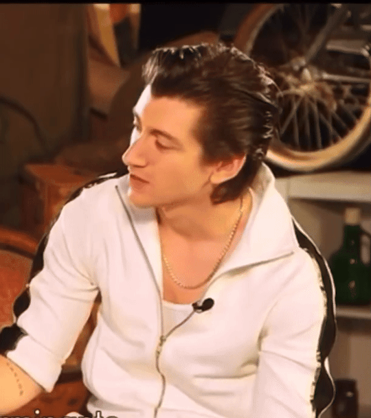
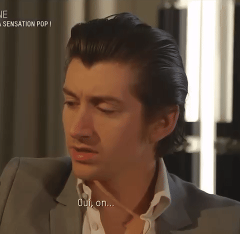
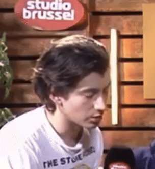
[ 1 , 2 , 3 , 4 , 5 ]
#everyone shush hes forming a thought#someone wont stop beaming stupid catchy pop songs into his head#mini comp for now#i saw a few more but they werent as aggressive as i needed them to be#so ill do a part 2 when i go through the interviews instead instead of just pulling these out of my head#alex turner#arctic monkeys#charlies autism collections#painful thoughts#interviews#hes just stimming
233 notes
·
View notes
Text
Get her number!

Get her name!
Get a good thing while you can!
Kiss a blonde!
Kiss a friend!

Can a gay girl get an Amen?


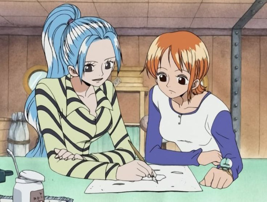
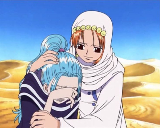
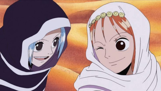
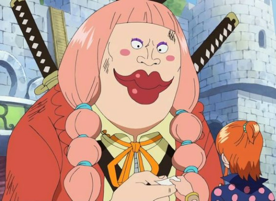
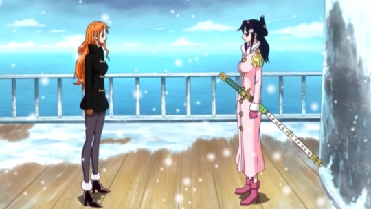
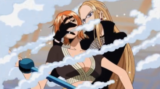
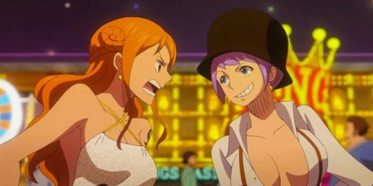
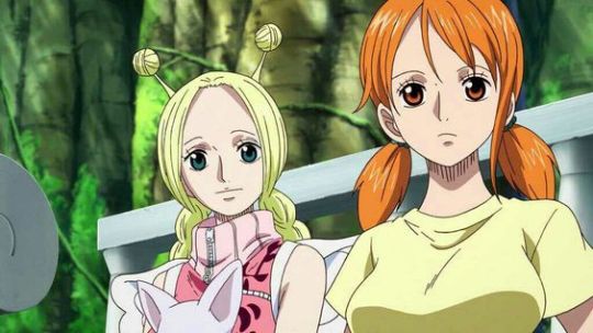
#this song has been on my mind the whole week i swear#IT'S SO CATCHY IT'S SO GOOD#and i can only think about nami#and regina george ofc but y'know lesbian queens in general#nami how come oda lets you have so many girlfriends#cat burglar nami#nami#nefertari vivi#namivivi#camie one piece#charlotte lola#tashigi one piece#kalifa one piece#carina one piece#namitash#conis one piece#wanda one piece
223 notes
·
View notes
Photo
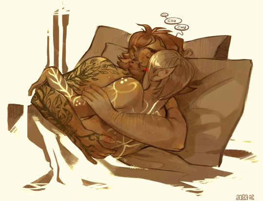
I’ve been dreaming of this pose since last sunday
#dragon age#dragon age 2#fenris#hawke#fenhawke#kerry#ndo sta l'art tag#my playlist while drawing this was like#I should be so lucky - easy lady - boys boys boys#aka those kind of super catchy energetic songs from the 80s that you can't get rid of unless you hit your head purposefully#also these two omg I never give them enough room in this blog#go! be free my little chickens#until the legit rulers of boredom come back#ur a free range fenhawke now go peck the ground or whatever
767 notes
·
View notes
Text
alright, here it is: ZENO'S COLOR GUIDE 3.0 !
here, i'll have three "chapters" regarding color:
CH1: how i color in illustrations
CH2: color and character design (in zeno's case)
CH3: how zeno makes his colors cooler
CH1: HOW I COLOR IN ILLUSTRATIONS
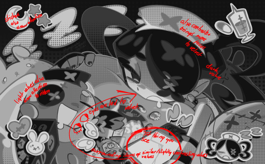
it must be noted that, as of lately, i heavily use halftones in my art and the way i use them for gradients effects my color choices. of course you don't need to use halftones if you don't want to, as it's just my personal choice, but anything regarding halftones here could (probably) also apply to regular gradients!
when choosing colors in an illustration, i usually have three things in mind: mood, character, and contrast. we'll be using "gloomy bunny naptime" as an example here.
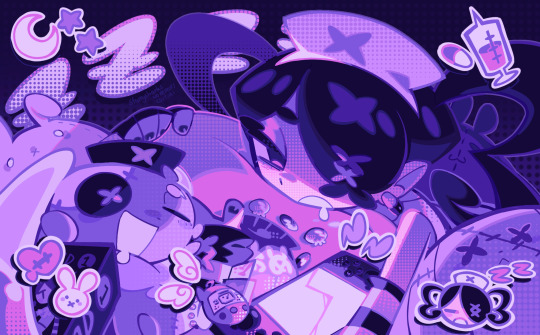
MOOD: what's the vibe of the piece? for example, here in "gloomy bunny naptime", wanted a mellow, sleepy vibe, so purples and pinks seemed like the best choice. these colors also have a dreamy effect due to being common in real-life early mornings/summer nights - basically, i tend to use associative colors in illustrations.
i usually only use a pallete of 3-7 colors, though of course more characters calls for more colors. for multi-character pieces, i would actually make a "rainbow" of colors based on the mood of the piece - essentially, a bank of colors to use for your colorful casts based on the actual rainbow. you can alter this based on the saturation levels you want! hope that makes sense. i'm not the best at this though, so i would heavily recommend looking for guides from artists who are more skilled in that department.
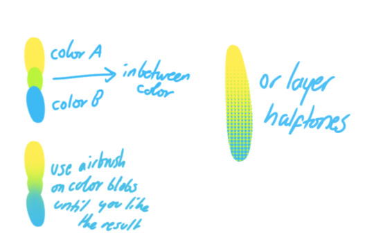
CHARACTER: velvet is the focus of the piece, and as a character her palette is made up of many purples and pinks. of course, it's easier because she and ribbon both have similar designs, but i would still recommend using colors based on/complementary to the focus character's pallete, though this is a rule that can and should be broken if needed. gradients can be used to provide a smooth transition from color-to-color and add depth to the piece, as well as showcase velvet's pallete. when making any gradient, you probably want to have a vibrant middle color. this is difficult to achieve in most art programs, so i'd do it like this:
you can use gradients in lots of cool ways to make stuff pop! (i think this collage shows i use too much purple and pink though.)

CONTRAST: the context of the piece also aids the color through contrast. (that's a lot of Cs!)- we see that velvet is just waking up, and the light from her switch is glowing brightly. i wanted to convey something like her switch suddenly turning on in the middle of the night, waking her up - so the console emits "light" in the form of illuminating the contrasting color of pink against the purples. it might seem specific to this piece, but what i'm trying to say is that contrasting colors can lead the eye to the focal point of the piece, that being velvet herself. because a great deal of the rest of the piece is dark, we look at the contrasting switch screen - the brightest thing in frame - and our eyes move around and up to take in the focal point character. at least that's how i wanted it to be ;w; i guess you could convey it as something like this?
CH2: COLOR AND CHARACTER DESIGN (IN ZENO'S CASE)
this is where i start to get annoying, so stand back! when deciding on colors for a cast of characters, there are many factors: time period, variety, personality, and more that i can't think of.
TIME PERIOD: this one is simple. for example, a futuristic time period (such as that in x-calibur) calls for colder colors, such as greens and blues. for characters involved in futuristic professions such as space exploration, this works incredibly well. for modern time periods, less focus can be on colors and more on the shapes of the clothes, but this is not a shapes tutorial! i don't have any ancient times oc stories, but i'd probably use earthy and warm tones.
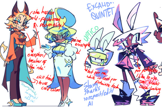
VARIETY: this is also rather simple. i try to be aware of the palletes that i used, and the similarities they might have with other characters. i try to use similar colors for characters who belong to certain organisations or have a uniform, but of course, it's not like catholic school students adhere their entire look to their uniform, so this is a rule that can be broken yet again. art is all about learning things and breaking them, remember that!!!
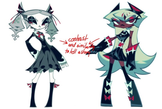
color can also be used for symbolism. my absolute fav example for this is vivica and octavia - the amount of red in their designs is supposed to represent the amount of freedom/passion/anger/confidence they have or are allowed to express under their different circumstances. as vivica belongs to a strict organisation, she has far less red in her design, showing her emotions are stifled - meanwhile octavia has it as her main complementary color because of her freedom to express her emotions, though those emotions may be destructive because of her circumstances.
PERSONALITY: what colors are associated with your character's personality? i actually usually refer to magical girl groups to see what's commonly associated with different colors. here's the main trend:
red: hot-headed, passionate, firey
orange/yellow: bright, happy-go-lucky, sunshine personality
green: wise, mellow, kind
blue: serene, graceful, elegant
purple: magical, regal, fancy
pink: usually the main character (though this because magical girl anime tends to be marketed towards young girls), sweet, relatable, determined
of course these are only stereotypes from one genre of anime, and different colors have tons of different meanings. color theory is the best way to learn this! these colors can also express different moods, which ties into ch1. i myself constantly ignore these rules - v-con, a bombastic hyper DJ, is purple (though he does have yellow accents) for example. basically, i just take them as a general rule and try to have them in mind while drawing.
CH3: HOW ZENO MAKES HIS COLORS COOLER
this might be the most important part of this guide. once again, there are a few things to consider here: filters, hue, overlays, and more!
FILTERS: for ibispaint, you can use an adjustment layer on your whole piece to use a filter. i usually only use brightness/contrast here - upping the brightness (or darkening it based on the mood of the piece) and upping the contrast. this helps to better express values and intensify the colors if that's what you want. i often use it in all my pieces to some extent.
hue/saturation/lightness is also helpful in moderation. you can alter the hue - though it usually only helps if you bring it back or forward by just a few points, or the entire pallete will change. saturation is what it sounds like, and slightly over/desaturating the piece can help with atmosphere. lightness is what it sounds like - lightens the colors in the piece. i don't use it at all.
posterize and sharpen mask are some that i've used recently. posterize can add some crazy effects to your art, but i'd probably need to edit it slightly after using it because it can mess with certain colors.
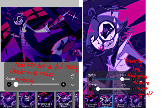
HUE: it's a layer type that can change the overall hue of the piece. i usually use it at a low percentage for atmosphere. kind of like a gradient map but nothing like it? idk
and OVERLAYS: i just use a very saturated blue/purple color over the entire piece at a very low percentage, around 5-10%. it can wash out the piece at too high a percentage.
and that's basically it! sorry it kind of derailed at the end i spent like 2 hours on this and got super tired. goodnight i'm going to sleep please also look at other artists etc etc. bye.
#zeno's art#long post#color tutorial#liar by korn is actually a really catchy song yea the lyrics are weird but its so good tbh#peak drums and bass and guitar and vocals and then the lyrics are hot booty. this is what nu metal's all about people#ask questions if you want#about nu metal or art i dont care
312 notes
·
View notes
Text
oh my god, so high school is SO funny
#i fucking love it#what a great song#i love the sound production melody too#so catchy and so 90s somehow#and so fucking scathing 😂#she is brutal and i know most people will not catch it
87 notes
·
View notes
Text
How are we feeling about the new jello biafra song me personally im feeling GREAT. Anyhow oc for the song/album its from
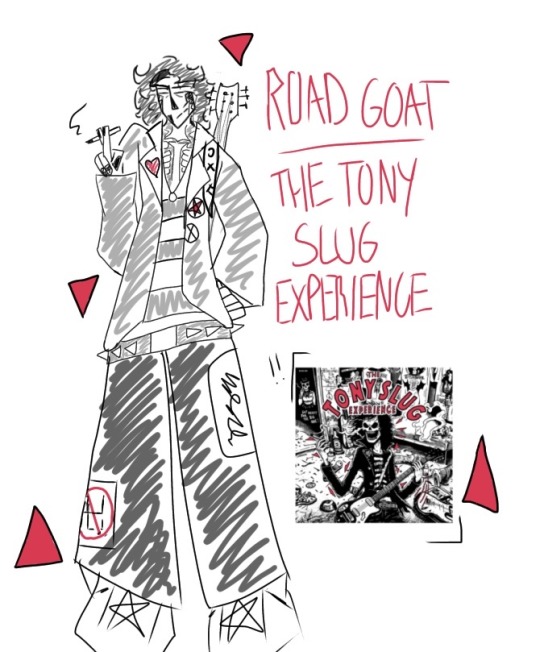
#AHEM NEW SONG TO LISTEN TO FOR HOURS#Jello biafra make a bad song challenge (he failed the challenge)#this is kinda of a mix w/the album (?) and the song road goat#i didnt know which one to choose to draw as an oc#so i just meshed them together#lovelovelove road goat ITS SO CATCHY#anyways#the tony slug experience#jello biafra#yikes added the tag lets see if i dont delete this post bc of it#closet rambles again on tumblr#closet art tag ^^#Spotify
118 notes
·
View notes
Text

Bananas in a trench coat
#my art#mammon#helluva boss#he's horrible but he's silly#REALLY DIG the design he's got so much charisma#also juggling iz cool is unironically my favourite song from the episode ITS JUST SO CATCHY#fizzarolli
350 notes
·
View notes
Text
so anyways some legends are told some turn to dust or to gold but you will remember me, remember me for centuries, and just one mistake is all it will take, we’ll go down in history, remember me for centuries, remember me for centuries. Mummified my teenage dreams, no it’s nothing wrong with me, the kids are all wrong, the story’s all off, heavy metal broke my heart. come on, come on and let me in, bruises on your thighs like my fingerprints- and this is supposed to match, the darkness that you felt, i never meant for you to fix yourself. some legends are told some turn to dust or to gold but you will remember me, remember me for centuries, and just one mistake is all it will take, we’ll go down in history, remember me for centuries, remember me for centuries. And i can’t stop till the whole world knows my name, ‘cause i was only born inside my dreams. Until you die for me, as long as there’s a light, my shadow’s over you ‘cause I am the opposite of amnesia. And you’re a cherry blossom, you’re about to bloom, you look so pretty but you’re gone so soon. some legends are told some turn to dust or to gold but you will remember me, remember me for centuries, and just one mistake is all it will take, we’ll go down in history, remember me for centuries, remember me for centuries. We’ve been here forever, and here’s the frozen proof, I could scream forever, we are the poisoned youth. some legends are told some turn to dust or to gold but you will remember me, remember me for centuries, and just one mistake is all it will take, we’ll go down in history, remember me for centuries, remember me for centuries.


#need to have a centuries revolution bc i am also sick of ppl acting like this song is bad just bc it got played a lot almost a decade ago#it is such a good fucking song it plays into the common fob themes of fame and legacy patricks vocal performance on it is so impressive#it is so catchy which is a Great thing it is so well produced ALSO i think the lyrics are some of petes best. i cannot lie abt that they#are so fucking good. so come to centuries world w me because i love this song so so so much#txt#p: 100
271 notes
·
View notes
Text
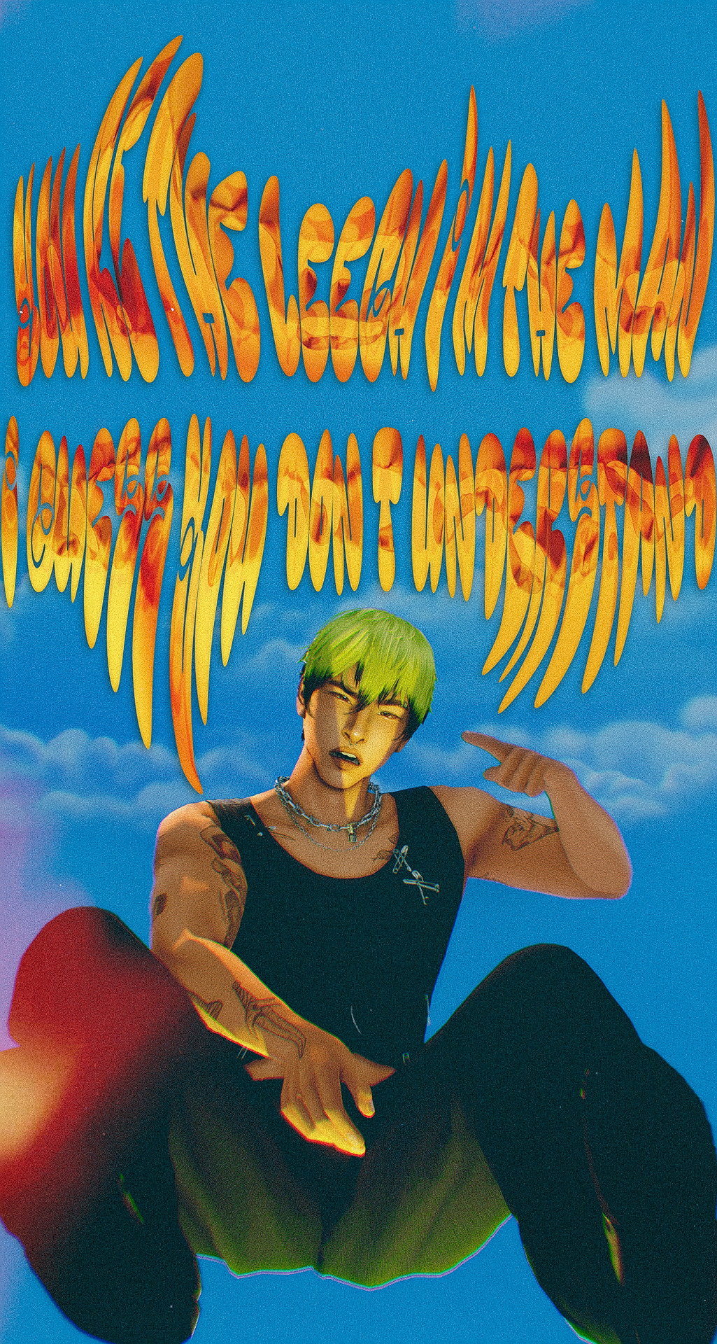
HAD THE BLUES OVER YOU, I DIDN'T HANG WITH MY FRIENDS!
#i showed my bf this one and he was like this one is my fave :)#this honestly feels so different even for me but i loved editing this sm!#the font says “you're the leech i'm the man i guess you don't understand” v catchy song#fellas it's gonna be a heartbreak summer in tessellate#because i am evil#oc: ares#ts4#simblr#my sims#sims 4
84 notes
·
View notes
Text
Fuck the critics Wish is fucking dope and the songs slap violently hard especially the villain song (which is my favorite in the movie)
Also I love Chris Pine and this song really shows off his vocals
youtube
#honestly this might be my favorite Disney villain song period#It’s so fucking catchy#wish 2023#disney wish#wish#wish movie#chris pine#king magnifico#Youtube
124 notes
·
View notes
Text


As long as we have each other
Spending every day together
As long as we stand next to each other
That’s all that matters
Unshaken, come what may
With your hand in mine, we’re okay
Together, we are
เรามีเรา (WE ARE) Ost.We Are คือเรารักกัน - Pond, Phuwin, Winny, Satang, Aou, Boom, Marc, Poon
#my next 16 weeks will be so full of them all!#we are#we are series#we are the series#weareseriesedit#*gifs#april.gif#we are series ost#music video#pond naravit#phuwin tangsakyuen#winny thanawin#satang kittiphop#aou thanaboon#boom tharatorn#marc natarit#poon mitpakdee#i love this song already. so catchy with sweet vibes and cute mv <3
69 notes
·
View notes
Text
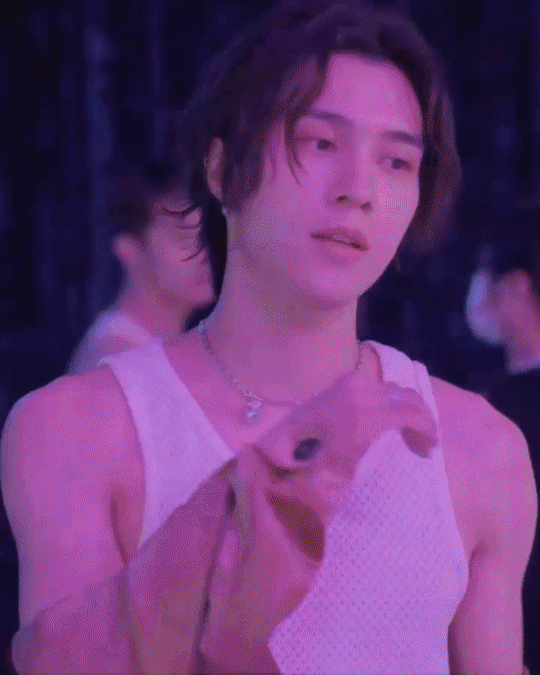
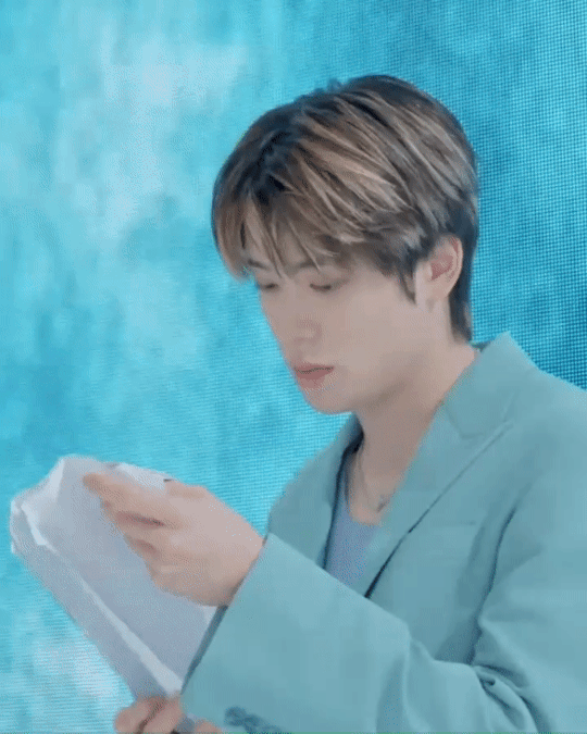
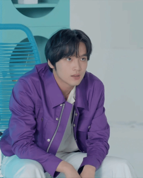

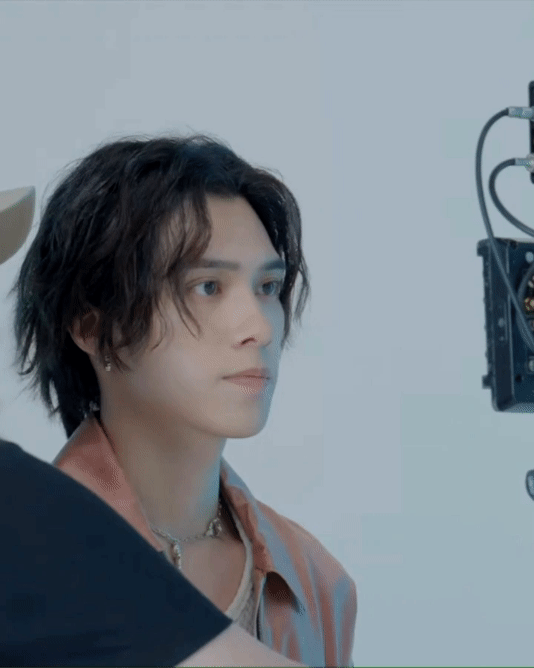


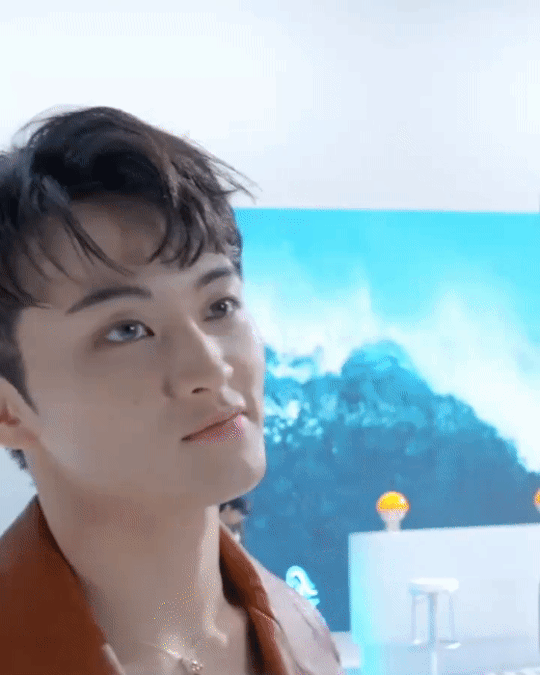
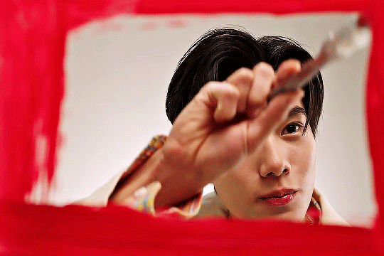
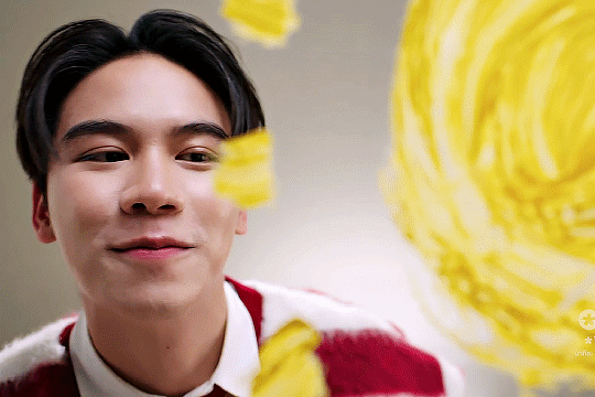
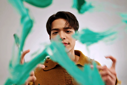
‘PADO’ Archiving Video Behind the Scene
#nct 2023#cute.#nct u#nct 127#wayv#nct dream#johnny suh#taeyong#jaehyun#mark lee#xiaojun#hendery#haechan#pado mv behind the scene#gifs#nct#potentially my favourite song on the album.it's just so catchy
170 notes
·
View notes
Last Seen Blogs
puddingonyourheartstrings
Pudding the Raichu

realee17
제목 없음

nartaliemarsxo
The Natalie Mars💝

potatoflamingo
Untitled

pleasantlyinsincere
the trash treasury