#also since the original sketch had no reference
Text
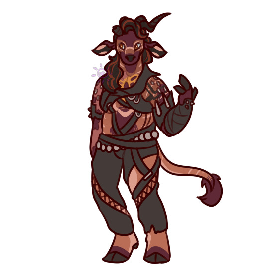
cargo shorts scaramouche
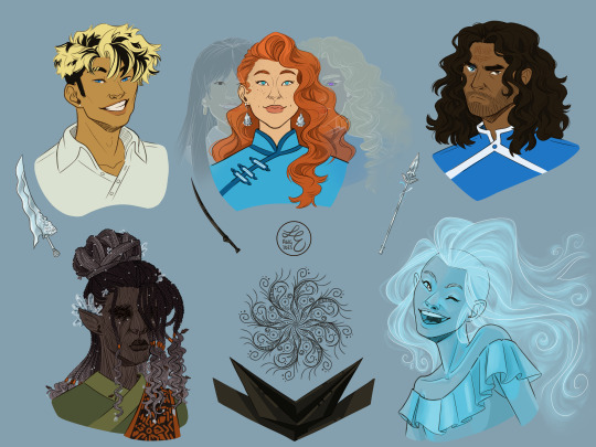
#genshin impact#genshin impact fanart#ok how many names does this guy have lets go:#scaramouche#wanderer#kunikuzushi#the balladeer#actually i'm not doing all of that#sorry scara#hat guy with no hat#please don't flop#[kisses this post before releasing it to the rest of the world]#he doesn't have his regular clothes because i didn't have a reference while making the original sketch#i was gonna pass it off as a modern au but#i forgor & made him ball-jointed#also since the original sketch had no reference#i fucked up his bangs BIG TIME#my bff said that ei did the same thing & now it's real in my head#i love the idea of a scraggly scaramouche#would scaramouche wear cargo shorts?#that was so much rambling. that's enough#goodbye world#my art
132 notes
·
View notes
Text
Happy birthday to the number one princess in the world!! 💖
~from her biggest fans :)
ramble of my scattered thoughts on the piece under cut as usual cuz i love talking 😋
This has been an idea I've been cookin for a while, and it was so cluttered and unlike any other ensemble piece I've made... and I decided I oughta do it anyway. I love Miku, I love Vocaloid, and I wanted to do something really ambitious and crazy for her anniversary. Crazy that she's turning her "canon" age this year TwT
I had the idea floating around since like, May...? And then finally started acting on it around June 18. I'm terrible with deadlines, obvious with how I can never make a silly birthday post in time, so I started wayyyy ahead to make sure I have some room to be lazy lol, especially with an idea as ambitious as this.
This was finished on July 12! So I had to sit on this for an annoying amount of time. Very difficult for someone like me who just wants to talk about everything I'm working on to the masses. But at the very least, that gave me the time to work on the draft for this post.
~~~
Here's some ~behind the scenes~ scribbles leading up to the finished piece!
Left is the chicken scratch plan i made in my handy dandy notebook (whenever things are getting real and ambitious, i always made a rough ROUGH plan in there. Usually I'd do a rough pass of the full thing, but this was too complicated for me to do traditionally. I majorly benefited from digital tools to make this possible). CyberDiva and CyberSongman were considered, but I ended up cutting them cuz I just didn't feel like drawing them sorry-- (just pretend they're off to the side. They gave Ruby and Clara the pizza lol).
Right is the "final" completed sketch (before I decided to include Chika mid-way through coloring and VY1 and VY2 near the finish line). I started by drawing the main "groups" separated on a different canvas so I can plop them into the main canvas for easy rearranging and transforming. However I got lazy and ended up drawing everyone in the bottom right corner directly on the canvas since I liked seeing the big picture of everyone's positions. Y'know.
Almost excluded Chika! But I like her design so much that I just felt like including her last-minute. You win this time, Chika fans.
VY1 and VY2 were very close to being cut! I added them when I began doing the banner and thought "eh why not". I figured their non-human designs would be pretty easy to include pushed back in the bg. Ik VY1 is more commonly associated with the fan design, but I referenced the hairpin cuz it was simpler and the fan looked very annoying to draw 😭
Sorry to the fans of many Vocaloids I had to cut because this composition was insane enough as is. I promise I wanted to include fellas like CUL, LUMi and Sachiko 😭 I will admit I was a little biased on who I wanted to include over others. Like, I don't normally care for Bruno and Clara, but I wanted to get some more international 'loids in the mix. Also wanted to stick in the realm of official designs and not fan-designs since, as much as I can appreciate those, are just a whole "wait who is that guy supposed to be" situation I didn't wanna deal with.
I also did wanna include even more character references through the balloons, but they ended up being kind of ugly and overcomplicated the BG :,)
(Oh, and while this was originally planned to be a Vocaloid-only piece, I did end up including Teto, Neru, and Haku 'cuz those are Miku's besties dude!!! They may not be Officially in the club but they're her girls and it would be criminal to not invite them to her birthday).
Anyway, this project marks the first time I've drawn a lot of Vocaloids. Lily, Piko, Rana, Yuki, Yukari, Miki, Maika, and many more lol. All of 'em I've heard or seen in passing, but now I actually drew them, and some have really cool and fun designs!! I got into a habit of drawing Merli after this since I just love her design for example. And I'll probably be drawing more lol!!
Oh and the last thing I'll add for now!! The cake is indeed made up of various song references!! I wanted to reference the "big four" producers, just absolute icons in Vocaloid history. The pink/black checkerboard is "World is Mine" (Ryo), the crescents on the side is "Rolling Girl" (Wowaka), the smiley faces is "Matryoshka" (Hachi), and the three hearts on the side is "The Vampire" (DECO*27, which is sort of a symbol of his whole Mannequin album tbh). I know "The Vampire" is a bit modern but I couldn't think of anything else off the top of my head. I'm a fake DECO fan I know 😔 "Matryoshka" was originally going to be referenced in the colors of the candles but believe me it looked like shit so I just went for something else last minute 😭
That's all I have to say!!! Hope you didn't mind the text wall if you made it here. I hope you like it as much as I do!!!! Happy freakin' birthday Miku!!!!
I have to deal with tagging all these characters now for my page,,, in the drafts my tags got cut off after a certain point so I think I'm massively breaching the tag limit 😭 um... I'll figure that out later...
not losing sleep that i can't tag everyone, even for page organization purposes because some characters have pretty generic names and some are a little hard to see in full yknow. If you're one of those people who tag every character in the art piece you reblog... I am very sorry.
#mayor doidles#fanart#vocaloid#hatsune miku#miku#kagamine rin#kagamine len#rin and len#meiko#kaito#megurine luka#gumi#kamui gakupo#ia#vflower#mayu#kaai yuki#oliver#otomachi una#fukase#sf-a2 miki#utatane piko#yohioloid#big al#sweet an#kasane teto#i literally dont think i can tag everyone. um. so you get the idea right#digital art#cell shaded
2K notes
·
View notes
Text
taken me ages but behold archive karecktors
adolin and maya beloved but also the most time consuming because i had to figure out how the hell i was going to do adolin's hair and not hate looking at it, and maya took me forever to figure out the colours lol. looked at so many references trying to figure out what dead vines should look like and what i would like it to look and i couldnt really find what i wanted lol. but what i went for was like really dried out and very very dead looking fibre. that wasnt too bad but trying to figure out her clothes that would look decent before and after she becomes a deadeye was hell for me an amateur colour theory understander lmao
i have drawn shallan before so she wasn't too difficult but i was truly torn about which version of pattern i wanted to show?? so i did a few of them hahah. i did a canon compliant version, alluding a bit to BE NOT AFRAID angel vibes. but im pretty passionate about ferrofluid-looking pattern as thats what i picture in my head (but i couldnt really find a good reference so i couldnt really do it well. it's also like, about the way it moves more than a still frame so extra challenge). and if you've seen my shallan art you know i. asdlkfjh. i originally pictured pattern as a QR code so i was compelled to continue it. @mistbjorn this one's for you because youre so right <3
syl i usually picture similar to kida in disney's atlantis when she merges with the crystal and you can see her scalp beneath her transparent hair, so thats the inspo for her. for the sylspear i designed it to look a bit like a caduceus as homage to kaladin's medical training and his dad, and like it's not that deep but i guess the swirly glowy bits are his duality and being torn between two worlds etc etc or you can just picture spren zipping about if you want lol like i definitely pictured syl was one but the other makes no sense
the kholins i dont have much to say since they were not part of my original plan hahaha but i couldn't help adding them too. i lowkey struggled to make them unique but also similar because family alksdjfhs i was sketching this around a time i did a lot of face studies so it was so whack and the colouring absolutely killed me so it is what it is asldkjaklsdjf
#lyn's posts#lyn's art#//#brandon sanderson#cosmere#stormlight archive#adolin kholin#mayalaran#shallan davar#veil#radiant#pattern#kaladin stormblessed#sylphrena#evi kholin#dalinar kholin#navani kholin#gavilar kholin#renarin kholin#jasnah kholin#elhokar kholin
892 notes
·
View notes
Text
Cod Grian Cosplay Build!
The fish man himself, season 10 Grian!
Reference Sketch

Some notes:
I always end up changing somethings from the reference when making the actual outfit, although I stayed pretty close it it this time.
I initially drew him with a handlebar mustache and goatee to mimic the whiskers of a fish, however I switched to a fluffier mustache beard to match the guy from Frozen.
I also opted for my turtleneck shirt over the red sweater+collar to go for more of a fisherman vibe
Since Grian is usually drawn with parrot wings, I wanted to call back to that with red yellow and blue feathers on the bobbers.
The tail and fins
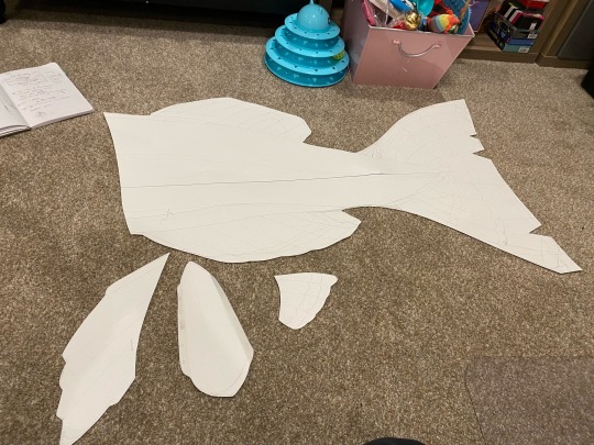
I wanted to lean into the “fish”er man design and gave him fish fins and a tail.
It’s design is based on a cod fish with striped fins based on the feathers of an osprey
To make it, I drew the tail pattern on a large piece of paper, cut it out, cut each section out of the respective fabric times two, sewed the two sides together, and lastly filled it with a ton stuffing.
The tail is heavy, but it’s fun to wack people with it.
The fins for the arms and beanie are made in a similar way, each hand sewn onto the beanie/bracers once stuffed.

The Overalls
I had originally planned for him to be wearing waders, but wanted to make the outfit more wearable for everyday wear without overheating. So I opted for some brown corduroy overalls instead.
To add a “wet” look to each pant leg, I briefly dipped each one into some black fabric dye before rinsing and drying.
The green pixels on his skin look like they could be kelp or patches so I decided to go with the latter and dug through my scrap fabric to find these green pieces.
I embroidered the edge of each piece with a unique stitch and placed them randomly on each leg.
The snails!
Of course we can’t forget about the snails
There are three snails for this project with two more eventually on the way (a plush pink snail, and a plush brown snail).
I made the clay blue snail first with polymer and attached tie tacks to the underside so I can use it like a pin and stick it anywhere on my clothes.
Same goes for the pink worm snail which is also made of clay.
The blue plush snail is based on a pattern from Etsy by willowynn with some slight modifications, mainly to the eyes/feelers, and doubling the size.
Facial hair
This was one of the parts I was the most excited about for this cosplay and the only part I didn’t do myself. I commissioned @basic-amoeba to make a custom ventilated beard, styled and everything. This part turned out so good!
Some final notes for this project
This cosplay took from Feb 20 to March 15th to complete since I was so determined to finish it before Grian changed his skin. Haha look at me now. He still hasn’t changed it.
Not pictured (cause why can I only add 10 photos 😭) is the mending book with a fish hook I made using scrap faux leather, cardboard, and some cut printer paper. I painted in galactic the word mending and sprayed the whole thing in my “enchanting” spray paint (a blue to purple iridescent glitter spray paint)
A small fun backstory to the fishing rod:
My grandpa is an experienced fisherman and has dozens of fishing poles. When I talked about this project with him, he brought me out to his workshop and pulled down the dustiest fishing rod there. He told me he had fished this fishing rod from a lake one day with the line and bait still attached. Can’t get anymore accurate to Minecraft fishing than that lol.
Obligatory cosplay photo:
#grian#hermitcraft#grian cosplay#hermitcraft season 10#cod grian#fisherman grian#hermitcraft cosplay#cosplay build#cosplay#skygoldcosplaybuild#skygoldcosplaywip
400 notes
·
View notes
Text


another one of these posts lol... sketches vs final. not much changed for these ones, i kind of went into them with a very solid mental image already in my head. all of these were done start to finish in procreate
thoughts below the cut
horse fight .... this is based off a really really beautiful sky i saw while driving home one evening. i'm really proud of getting the colours i saw exactly right, this kind of greenish yellow fading to dark blue and with grey clouds low over it that looked very dark against the yellow by the horizon, but very pale against the dark blue.
i thought it would be a cool backdrop to draw a scene i've been thinking about for a while. The little cartoony horses are there to provide some tonal whiplash but also because these are two immortal shapeshifters who can fight violently without it being a huge deal. the little horses represent the actual gravity of the fight (that is, kind of a slap fight between two drama queens) which contrasts with the visuals of two animals brutally tearing at eachother. also i got the two horses at the bottom mixed up, Pascal is the one with the skinny plumed tail and Macha has a more traditional horse tail and i put them on the wrong sides.
i had a LOT of trouble shading this. i didn't want the horses to be too shiny but that meant a much lower contrast in shading and even with my screen brightness turned up i could barely see what i was doing. but i wanted it to read as realistic. mixed results i think. if i did it again i might try a different shading style because this one didn't really do it for me
--
spooky van!!! the post i deleted by accident (rip. i will repost it soon). this is a picture of the barrow (the field) taking a different shape - in this case a cool van. the van contains every single thing the field does (including the human victims that get lost in there...) but compressed down into a manageable shape. the void is Pascal because the field is inside him. he did this for his human bf to provide novel way to travel through the Otherworld. don't ask how this works like, spatially, because the answer is: i don't do hard magic systems in this setting
i loooove shading things with pencil hatching and i really like contrasting it with smooth colours/shading so that's mainly what i did here. it was simple enough. the van is of course heavily referenced and i wish i had been able to stylise it a little more.. maybe next time. i want to draw a kind of cutaway illustration of the van showing exterior and interior (like an old blueprint schematic), which i might use as a cover for the book/comic/whatever but that will require a very intimidating level of precision so i think i'll work up to that.
--
RUA magazine. this is my third time doing a rua magazine cover (first time posting tho). this is an in-universe magazine distributed throughout the Otherworld to an audience of fairies. in the sketch, the illustation was originally the King of Pentacles tarot card (the pentacle being the disco ball). but i decided to make a different King of Pentacles card for him instead, since I try hard to move away from symmetrical composition for the tarot cards (it's boring). so i repurposed this one into another magazine cover. like i said Pascal is a self-absorbed attention whore and has a habit of giving bullshit interviews just so that he can be on the cover as much as possible. he dresses like this all the time (the year is 2017)
the disco ball took 15 years off my life and it's not even the first disco ball i've drawn! i finished my actual king of pentacles card before i finished the rua cover sketch, so i can show u this
which is much better even if i did reference so heavily that it isn't exactly stylised. but this card needs some serious revision before i even think about posting it. i'm just not happy with his face.
original intent was for it be mysterious with emphasis on the neon lights but it ended up far more suggestive than i expected. that's life!
4K notes
·
View notes
Text
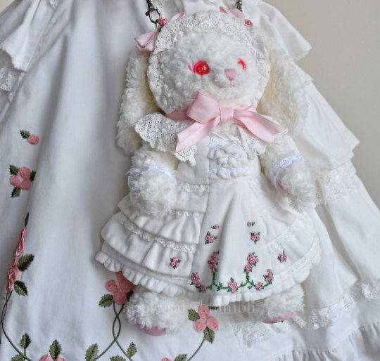
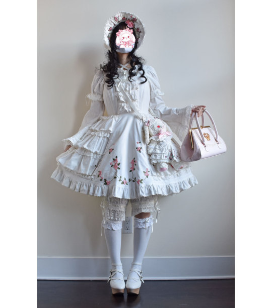
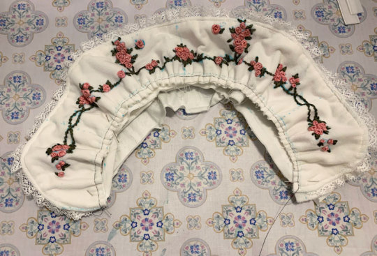
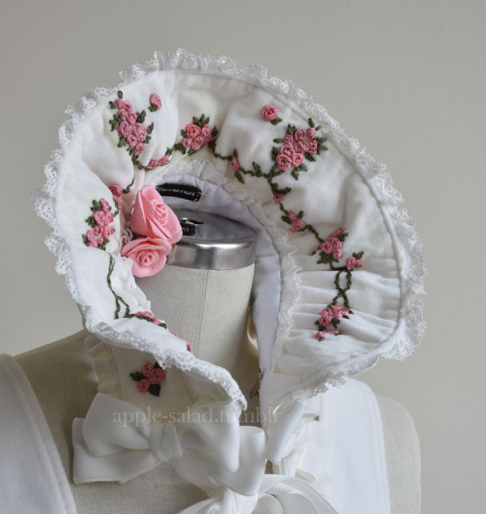
Rose Ribbon Embroidery "Mini" Projects (for BABY NYFW) Part 2: Embroidered Bonnet
I decided semi-last minute to attend BABY's fashion show at NYFW!
BABY had mentioned in their NYFW brand description that their newest collection would be a return to their origins, as well as presenting archival items.
You have to dress to impress for NYFW, right? So of course, I had to pull out all the stops and wear my Rose Ribbon Embroidery.
Also at the last minute, I decided to make a few extra complementing items...
A matching RRE kumya JSK, and a bonnet.
What follows is more of a sew-along/journal rather than a tutorial or guide, mainly for my own memory's sake. But if you enjoy looking at my process (sometimes sloppy), I'm happy!
Also feel free to take a look at the more romantic process video I edited.
Part 1: Kumya JSK
Part 2: Bonnet (you are here)
This post will be my process pictures and notes for the bonnet, as well as a matching mask as a bonus.
I don't believe BABY released matching headwear for Rose Ribbon Embroidery, although I've seen an unknown velveteen headbow with rose lace sold with RRE before.
BABY usually coords RRE with the bunny ear bonnet since Ichigo wears it this way in Kamikaze Girls.
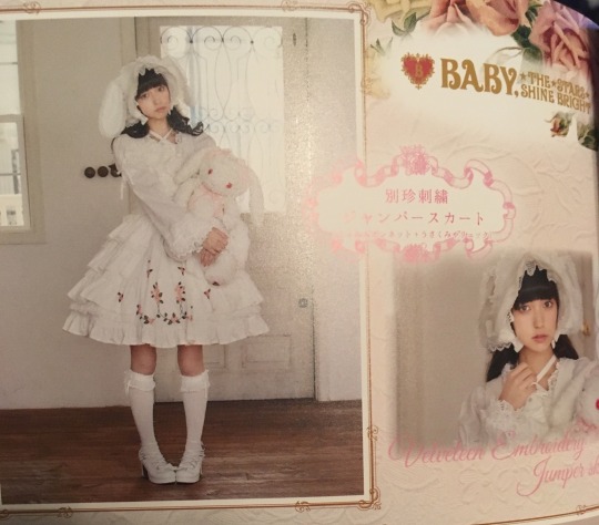
I do own this because I wanted to wear an Ichigo-like outfit at some point, but for this occasion I decided to do something different and make a "matching" embroidered bonnet.
I originally wanted to make a hard bonnet with a very defined brim that could show off the embroidery clearly as I don't really like soft bonnets, but when looking at existing BABY bonnets as a reference, it doesn't look like hard bonnets were a thing back in 2004 (and as it is, BABY rarely releases hard bonnets). So to keep with the oldschool theme, the bonnet is a soft one, although I later make some decisions to make it slightly more structured.
The next decision to make was full bonnet vs half bonnet. The bunny ear bonnet is a full bonnet and I think this is technically more "period accurate", but I am not a fan of how they look like a weird hood from the back so I opted for half (plus, that makes construction and patterning easier for me).
I still used my own bunny ear bonnet as a reference for approximate brim dimensions!
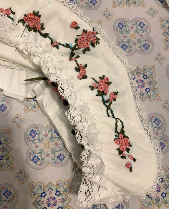
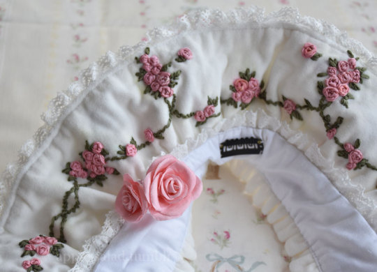
The kumya JSK was a little easier to carelessly sketch out and embroider since I was copying 1:1 from an existing design, but I felt I needed to do at least a bit more careful planning for the embroidery on this. I'm quite bad at creating embroidery designs from scratch, but with the mental image of the rose clusters and swags of vine, as well as referencing the embroidery from the film, I came up with this:
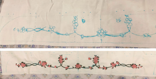
I wanted to emulate the embroidery style of the Momoko's (well, in reality likely the embroidery designer Onoe Megumi--unclear if she did the actual embroidery, but it's likely) embroidery, which I figured wouldn't be too difficult if I was also embroidering by hand.
For material, I am using the same velveteen I used for kumya's JSK. Not my first choice and I actually purchased some thicker looking 100% cotton velvet that I thought would be more similar to the original JSK material, but was worried it wouldn't arrive in time and wanted this project out of the way in case things went wrong/took longer than I expected (it did arrive about a week before the event, but it was totally wrong IRL so I'm glad I just went with this acceptable option). I also bought some more torchon lace, so I used that and another lace from my stash.
The colours of the embroidery in the film also seem to be quite different than BABY's dress. I'm not sure if the pink of the roses has faded over the years, but it has a slight salmon tone whereas the film's roses seem to be more of a pale cool/neutral pink (hard to tell with the yellow tint of the entire film) with some variegation. I love the colour scheme of the film's embroidery, but to keep things coordinated I try to opt for the same colours as the actual dress I have.
I only have white silk ribbon in the width I wanted, so I opted to attempt to dye it to match. Previously I have used alcohol markers to colour the embroidery afterwards, but I find the colour hard to control and it tends to bleed into the fabric. I've also tried colouring the ribbon with the marker before embroidering, but without heat setting the colour transfers onto the fabric as well (and it seems like trying to do so with the amount of ribbon I need would be a waste of ink).
I don't have a lot of experience with it, but since the ribbon is silk, acid dyeing seemed like the way to go.
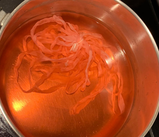
Very interesting photo of ribbon in pot (the pink ribbon gets eaten up by pinwheel roses much faster than I expected so this is the second batch I had to dye--not ideal as they are definitely slightly different in colour but it's not too noticeable). In total, I think I had to dye 3 batches of ribbon and 4 for the pink ribbon as I just barely ran out near the end, and they are all slightly different colours. Thankfully the undertone is the same so it's difficult to tell unless you are really comparing up close.
I thought I would take this opportunity to use the "peach" acid dye that I bought years ago for another project, but this ended up being a mistake as the colour was totally off (maybe the red dye was too expired). I ended up using my regular fiber reactive procion dyes (with heat/acid), because I have many more colours I could mix together, and that was much better. I really should have done this from the start as I wasted perfectly good silk ribbon by making it too dark/off for my purposes (I ended up overdyeing it in pink so it's a usable colour now, but not for this project).
The silk seems to take on dye extremely fast--even just heating up the dyebath will colour it. In some cases I removed the ribbon before adding any acid at all because I felt the ribbon was already getting too dark.
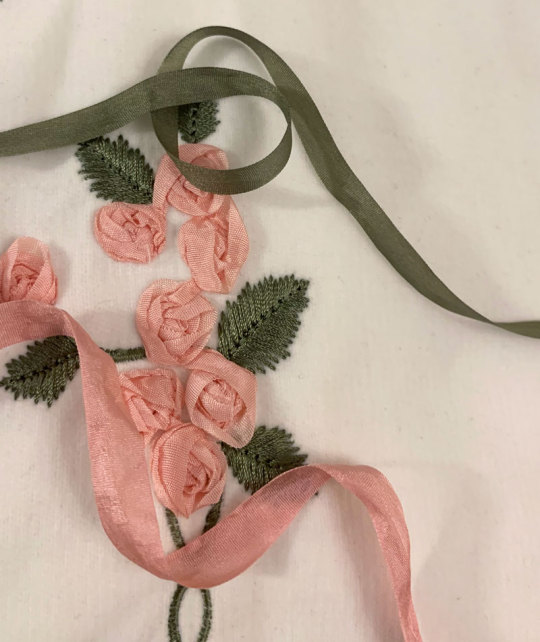
I managed to get a fairly usable mossy green colour for the leaves and vines, however the pink still ended up being a little off/dark compared to whatever BABY used. It's not too bad here as one strand of ribbon, but when many layers are on top of each other in a rose it seems pretty dark. While not ideal, I think it's still okay, especially considering the embroidery colours used in kumya's JSK match nothing else (many pinks will be going on in this coord).
After dyeing and drying, the ribbon is super wrinkled so I ironed it and wound it on some spare card so it's ready to use.
And now I can start the arduous process of embroidery.
Like before, I mainly use a combination of ordinary ribbon stitches, pinwheel roses, and french knot roses. However, this time I try harder to duplicate, or at least evoke the appearance of the embroidery of the film.
It's interesting how plain and somewhat boring the roses look on their own, especially with this monotone colouring. The varied colours of the film's embroidered roses are lovely, but I decided against it here because the BABY dress has monotone ribbon roses.
The roses definitely seem to just be pinwheel style which is very easy and doable, however I am a bit more confused about the leaves. They look like a number of straight stitches in various lengths and directions that fill in a leaf-like shape. I have no idea if this technique has a name and if there is a proper method for it, because I am a silly beginner who is very uneducated in embroidery.
Anyway I do my best and hopefully I got close enough. Ribbon embroidery is really all about the texture, which is really lovely to look at. Except I have trouble looking at my own work for too long because I start nitpicking all the mistakes I made...
Adding the green and leaves really helps the embroidery come to life.
I took even fewer pictures of the embroidery process than kumya's JSK this time because it's not that interesting. I was definitely getting sick of doing the same pinwheel over and over...
I stupidly decided that aside from embroidering the front of the brim, I also wanted a little bit of embroidery on the back of the brim for interest, as well as on the side.
The designs I drafted out for these two pieces is much simpler, but still, more work....
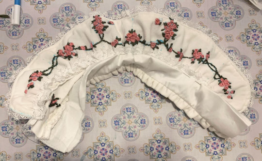
Almost ready for construction! Hopefully a lot faster with the handwork out of the way.
I iron on some interfacing onto the back brim panel and the bonnet band for slight extra stiffness.
The bottom part of the brim is plain cotton sateen because I was worried that the part that touches the head would get dirtier more quickly it if was velveteen.
I wanted some lace gathered around the brim and an extra velveteen ruffle on the back of the band, so I prepare that now. The lace is gathered with a single gathering thread and sewn down before sandwiching between the two brim panels.
Brim sewn and topstitched (and band is ready for attachment).
The upper flowers ended up a little closer to the top of the band then I intended, but I think it's okay.
Gathering brim and attaching it to band. Because the velvet fabric is so thick, the usual "sew one line of stitching with a wide stitch length" not only made the fabric incredibly difficult to gather, but the thin polyester thread also continually broke when trying to do so. Therefore, I opted for an alternative method I think I'd remember seeing in my sewing machine manual of all things--a zigzag carefully stitched over a central gathering thread. This worked much better, although I probably should have used a thicker/extra strong thread as the central gathering thread because it did break the second time I had to gather the brim due to a mistake.
I also add a bit of lace to the inside of the brim. I think this adds some luxury and frilliness between the head and the bonnet's brim, so I wanted to add a small width. I probably could have used even more of the lace's width since it turned out very subtle when worn. But I still think it adds a small amount of interest to the innermost part of the brim and was worth adding.
Unfortunately here after sewing on both brim parts I realize that I gathered both using an incorrectly marked centre line, so I had to rip it out and do it again ;_;
Next, I can carefully align and pin the bottom of the brim to the bonnet and sew it down. I tack this down by hand because I'm not skilled/accurate enough with a sewing machine to topstitch both sides nicely at once (look closely, and my messy stitching is quite visible...)

I also fold in the raw edges and finish the sides of the brim by hand, leaving some openings for ribbon ties.
At this point I spray almost the whole bonnet with water to disperse and fade my markings. Unfortunately, some of the earlier batches of ribbon that I dyed (Can you tell the variance in the 3 dye batches I needed to do?) were probably not washed well after dying and seem to have bled into the fabric from the water...but hopefully it's not too noticeable.
Next I topstitched all around the brim and attached the ribbon ties.
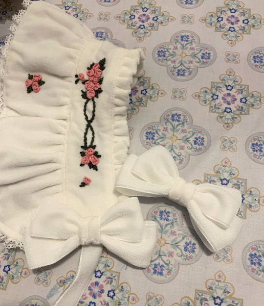
I bought some double sided velvet ribbon in my last minute supplies shipment and made some bows from it. I think the material is a little thick and petersham would have worked alright as well, but the consistent velvet material feels more luxurious, doesn't it? I also think as an added benefit (?) the ribbon being plush and double sided made the bows more puffy looking.
I add some clips to the sides and a toupee clip to the top for security. I opted for a toupee clips because I think it's really the way to go if you don't want the head item to move at all, no matter how thin or slippery your hair.
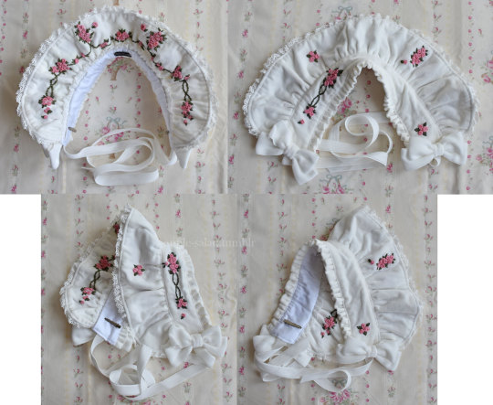
Finished.
Bonus 1: rose accent pin
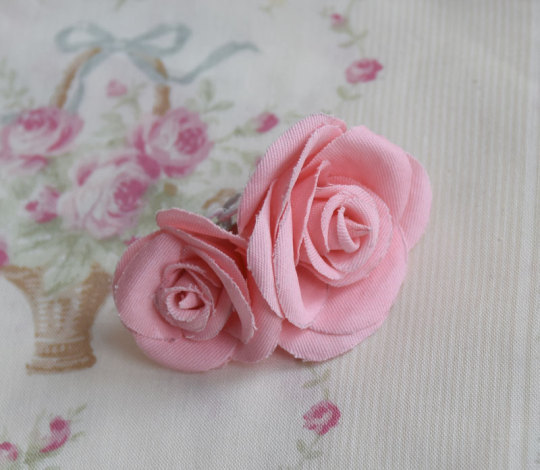
I was in a bit of a rush at this point as it was near the end of the week coming up to the show, so I didn't take any photos of the process here but the technique and templates I used were identical to my handmade faux rose rosettes I made for UM (and the bonus corsages). I have a post with all the details of this sitting in my drafts that I will post eventually, and I will update this post when that happens.
The brooch was just meant to add a bit of 3D faux flower accent to the bonnet, bringing in the rose motif even more. Partially inspired by the faux flowers BABY adds to their bonnets sometimes, like on Milk Tea Doll.
The fabric was "custom dyed" with the same fiber reactive dye I used for the silk. The fabric was further starched, cut out by hand, and shaped with flower iron tools before gluing together.
Bonus 2: matching embroidered mask
I wasn't sure about whether or not I wanted to wear a matching mask, but decided to do so for situations when I would want my face at least half-covered in public. I didn't really expect to be visible in fashion show pictures as someone in the back, but just in case. (I think this decision was worth it, although my makeup transferred all over the thing and in most pictures my face was even more unflattering. eh well)
I forgot to take a lot of pictures of my process for this, but it's very uninteresting and not dissimilar from every other mask sewalong from 2020. I draft out a design similar to the bonnet motifs on both of my mask panels (cotton sateen), and embroider.
I should have embroidered closer to the centre of the mask because when worn the embroidery is not very visible/covered by my hair at the sides. What can I do since the panels were already cut though...oh well!
The lining material is some Japanese CLEANSE Ex fabric I had bought previously to make masks during the pandemic. It's supposed to be antibacterial and antiviral, as well as washable, but I have no idea how well supported those claims are.
Sew together normally on both upper and lower sides, turn inside out, add a channel for nose wire and side channels for elastic.
I also have some mask elastic on hand so I use that.
And the finished outfit again with all my items~
Thank you for reading! If you ever feel inspired to take up a similar project, such as the kumya JSK, I'd love to see it!
222 notes
·
View notes
Text
the minds of a lab at three different points (LONG rambling under the cut)
I am constantly in awe of the analyses people put out about Arknights on this website. I feel like my own interpretations are somewhat lacking as a result, but I was confident enough to post this, at least. I've had this idea for a long time now, I think since Lone Trail released, but I've only been able to make the time for it now.
Rhine Lab has so many fucked up elements and people involved in it that it's actually impressive. They were really gunning for "most unethical scientific consortium" reward. Really, though, it's just the result of Kristen gunning for her parents' wishes. All of the directors want something and all of those somethings are different.
Things I want to mention or just feel proud of (allowing myself this because of how long this took):
-I was originally planning on crossing out Saria's surname to reflect that we still don't know what it is in canon, but I don't know why whoever has this poster would do that, so I just kept it in. Hermon refers to Mount Hermon, which Saria's name apparently derives from. Technically, her name here is the same thing twice. Oh well.
-I don't know who this poster belongs to. It's just in some Rhine Lab tech's personal desk, I guess? Doesn't explain the doodles, though. Maybe they were bored and feeling spiteful about the potential job insecurity of your boss being comatose in space.
-I realized only while making this post that I made Saria's, Muelsyse's, and Jara's doodles reference Kristen, yet Kristen's only references herself and her parents. Completely unintentional, but appropriate nonetheless.
-I am so happy with how the poster came out. It makes up for how hard I had to fight Canva for it to come out like that. Here it is in full if you want to look at it closely for whatever reason. (writing an actual description for this thing was fun!)

-Andenate doesn't actually have a face under the sticky note. That's why he's still Mike Wazowski'd in the poster png. I didn't feel like drawing one since it wouldn't be shown in the finished pieces anyway. His jacket is just the same as Magallan's.
-Ifrit's picture board was a literal last-minute addition. It's why the images are sketches rather than being in the lineless style of the poster. It feels fitting, though, so I'm keeping it that way. Seeing Ifrit all grown up and doing so well in Lone Trail was wonderful. There's something in her being happy and healthy and also surrounded by not just her loved ones and friends from Rhine Lab, but also people outside of it. She's cultivated her life to be as fulfilling as she wants it to be, and while there is still room to grow, she has plenty of support and insight from others for it to do so. I may be misrepresenting her a bit (the sleepiness doesn't help), but man. I love Ifrit. She's so cool.
#she rhine on my lab til i (incorrect buzzer noise) she ark on my horizon til i (incorrect buzzer noise) she diabolic on my (LOUD INCORRECT B#i think you can tell when being awake for too long started to get to me lol#arknights#rhine lab#lone trail#lone trail spoilers#kristen wright#saria#arknights saria#muelsyse#jara wilson#ahrens parvis#ferdinand clooney#arknights dorothy#dorothy franks#nasti lunorey#justin fitzroy jr#andenate maryam#(i guess)#ifrit#arknights ifrit#olivia silence#arknights silence#i'm not tagging everyone else.#luc art#fan art
210 notes
·
View notes
Text
My interpretation of Alejandro's wedding dress by @courtney-deserved-better 's fic Slippery Slopes! Heavily recommend to anyone who's watched TDWT, and if you haven't? Just binge watch it so you can binge read it! ;)
I loved the idea of him wearing what was originally Heather's dress, but as I was drawing I took some slight liberties. Let's just say the staff had to tweak it due to his bigger size or something, but I'm happy to say I feel like I slayed his look. I loved making it more unique to him and wanted to give him gold jewelry since I felt it complimented him better, even if he took home silver in the end >:].
Also? I made a hidden heart with Noah and the eel motif in the background if you can tell what it is. Very cute.
Art Process Under The Cut!
References and Flat(-ish) Colors. They've got the same goddamn faces in their show reference models it was driving me nuts. Also Heather in the corner made me giggle so much as I was drawing, she looks so miffed lol.

And the sketch that Made Me Realize... that I accidentally made Alejandro's hands so goddamn big for no reason... Oops! Mr. Yaoi ass hands.
#alenoah#alejandro x noah#tdi alejandro#tdwt alejandro#tdi noah#tdi fanart#tdi#slippery slopes#total drama world tour#total drama island
458 notes
·
View notes
Text
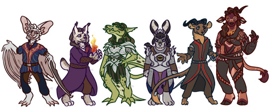
I turned your Baldurs Gate 3 characters into furries. Sorry. Actually no I'm not I won't pretend anymore.
General notes and specific species under the cut.
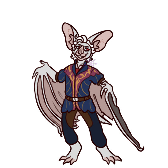
Astarion: He is a Ghost Bat! I like to think him being a vampire and being a bat are entirely unrelated, it's just a coincidence and he's honestly pretty mad about it. Ever since I first started playing bg3 I had him assigned as a Ghost Bat or a Spectral Bat in my brain, just arbitrarily, and I went for the former just because the colours work.
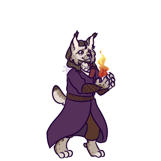
Gale: He's a Eurasian Lynx! I had to make him a cat. I just had to. And I trawled through the wikipedia pages for pretty much every type of cat and Lynx was about the only one that fit in my brain. The fluff kinda evokes his beard and hair I think, and I almost didn't have him have proper hair, just the fur, but in the end I wanted to be consistent about it so he got it. Peep the greying muzzle because mans is stressed and dying.
Karlach: She's a Bongo Antelope! I knew I wanted her to be some kind of large hooved mammal, because of the horns but also because their builds and general sturdiness really suit her I think. It was a tough pick, there's so many cool ones, and when sketching I was actually going to have her be a Mountain Nyala, but I changed my mind last minute just because the colours of the Bongo fit SO well. They're also my favourite antelope. Let me have this. She's so cool and she gets to be one of my favourite animals.
Lae'zel: She is a Pterosaur! My specific reference was Dorygnathus, but I was fairly loose on the details and so she doesn't super resemble them beyond the teeth and tail. I wanted her to be something prehistoric since the Gith are aliens or something (i dont know dnd lore that well), and so I wanted her to be in her own sort of category apart from the rest so, prehistoric! I considered making her a dinosaur but the idea of a Pterosaur just really appealed for whatever reason. Kind of parallels their dragon riding if they can fly, I suppose? And their Enhanced 10 Foot Vertical Leap.
Shadowheart: She's a Hare! Very specifically a Hare rather than a rabbit. Hopefully that comes across. I wasn't super sure what to do for her honestly, but in several scenes she has these big scared eyes, and she's generally just kind of having an awful time and being harmed by the gods for the whole game and I was like 'hey I know an animal that looks like it's been personally slighted by the gods' and so Shadowhare was born. There is a part of me that wishes I'd made her a cat for the warrior cats joke though.
Wyll: He's a Pine Marten! I just kind of got it in my head he should be a Mustelid of some kind, I'm not sure why, he just has that kind of vibe to me? Maybe it's the way he moves, maybe it's his skill at killing, maybe I'm just biassed because I love him and I love mustelids, who knows. I looked through em all and I didn't want one of the bigger sturdier ones like a Wolverine because. Strength stat of 8. So I went for one of my smaller favourites, the Pine Marten. The reason he's not an animal with horns naturally like Karlach is because I still wanted them to look out of place on him! I toyed with giving him wings (because they're cool) but ultimately didn't wanna stray toooo far from Pine Marten.
And that's all! Perhaps I'll get around to anthropomorphising the non origin characters, but who even knows. Halsin would almost be too easy. I could make Jaheria a cool ass fox or something though. Much to consider. If I do them then I'm gonna be doing my Tav Deimos and my Durge Lethe though. That's da law.
#baldurs gate 3#astarion ancunin#wyll ravengard#karlach cliffgate#Lae'zel#gale dekarios#Shadowheart#Bg3#dandy doodles
166 notes
·
View notes
Text
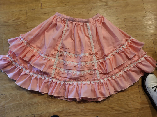
If anyone is wondering, this tutorial to make this skirt is still a method that works. Both those links are from wayback machine captures from a time before Photobucket betraying us all and deleting pictures.
Yes, I'm still mad about that.
Anyway, in the spirit of seeing if budget lolita was still doable in 2023, here we go with a cost breakdown:
>Main skirt fabric was a $10 walmart 4-yard precut; enough fabric to make waist ties not pictured here
>Skirt is fully lined with a polyester bedsheet I got for $1 at a surplus store
>The bow lace was part of a bulk purchase, ended up costing 21cents a yard. Skirt probably has 6-8 yards of lace on it. The little vertical strips were scraps from another project. Back shirring on skirt is 1/4" elastic, which covid conveniently made super cheap.
>I didn't have the zipper on hand, so I had to buy one for $1 at walmart. As anyone who has been on Wawak knows, that's massively overpaying for zippers.
This skirt is 3" longer and a few sizes larger than the one in the post. I had to make a new cutting layout for the skirt, and it took a fair bit of additional fabric. In addition, to save on fabric width, the "side seams" on this are actually a little bit farther back than the side of the skirt. I cut the back of the skirt to full fabric width, and then added the adjustment for the fullness into the side front pieces. Clarice, who wrote the original tutorial, mentions that the person she made it for was very small, so I sized it up a little bit.
I make sketches like this as I go for personal reference, but maybe it'll be helpful.
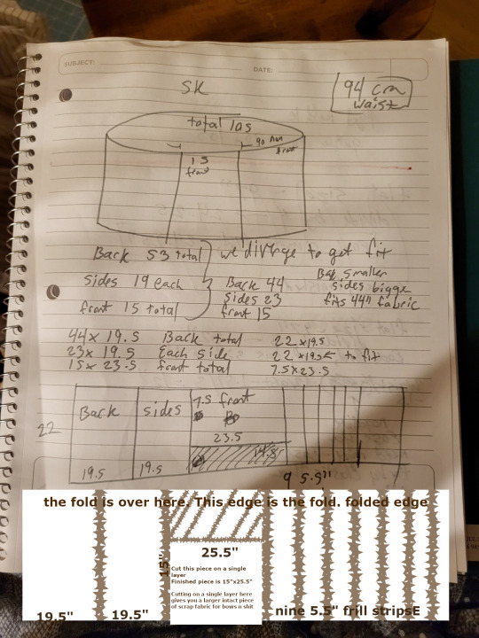
In the spirit of livejournal, I "clarified" my sketch by making it more confusing in GIMP.
(Your pieces you need to cut will be back: 44"x19.5", cut 1. Side Front, 22"x19.5", cut 2. Center Front, 15"x25.5", cut 1. Frills, 5.5"x44", cut 9 or 10).
So, when we get into it, yeah, if you have a good design (or can copy a good design) and you're willing to put some time into it, you can still do a budget lolita skirt for under $20 of materials, if you're careful. I'm mostly making this post to save which archive.org captures are the ones with working pictures.
(It also helps if you don't mess up on the waistband so many times that it slowly shrinks into a 1" waistband.)
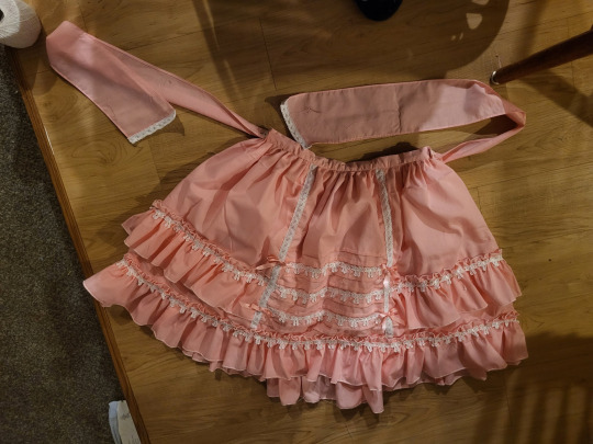
Fun fact: the trim on the ends of the waist ties may or may not be because I hemmed them sloppily and the hem came up bubbly, and zigzagging some lace onto the bottom handily covered up the bubbling. One of the advantages about knowing a decent amount about lolita fashion is that you can look at things and go, "Yeah, if I added x here, it'd be fine," and knowing enough about sewing to go, "yeah, if I do x cheat here, it'll look better" and being able to put the two together and go, "hey, if I cheat here, it'll still look lolita!" It's a good feeling.
Anyway, if anyone else has ever used Clarice's tutorial to make a skirt, I'd love to see it! This is my second time using it, but the last time was almost a decade ago at this point, and I think I've improved a lot since then.
390 notes
·
View notes
Text
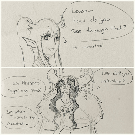

Crowley Levan is Meleanor’s “eyes, limbs, and husband”…wouldn’t it be cool if the one who married into the Draconia family had a crown/headpiece that resembled horns, worn for ceremonies, public appearances and the like?!
We haven’t seen Levan yet but I know in my heart he’s just a silly little guy as long as you ignore The Killings 💞
I talk more about concept art and costume details below the cut!

Levan’s headpiece is designed to have more of a live-action Maleficent feel, where she wrapped her horns in…fabric? Snakeskin? Whatever it was, it looked really shiny, oily, and really cool, so I tried to depict that texture to show how his horns are fake.

And sort of elaborating on the Draconia crown idea, perhaps each crown from every ruler who married into the family has its own unique shape? Levan’s halo-like shape is unique to him, so ones before him perhaps had more “traditional” dragon-like horns, and others had twisting ones like a sheep, etc etc. Since I’m OBSESSED with TWSTs religious symbolism- the Dawn Knight popped off with that winged helmet- I also wanted a halo shape to make Levan look slightly angelic.
The beads on his horns were slightly inspired by the mianguan, a formal headdress worn in ancient China. He also wears nail guards covered in shiny jewels… Let him be extra ✨
Levan having wings over his eyes like the Dawn Knight would be a fun parallel, and as a reference to him being Meleanor’s “eyes, limbs, and husband.” Like I mentioned in the comic, he covers his eyes and disguises his body under bulky clothing to be publicly dramatic af 😭 he takes his title way too seriously haha. The idea is that when he isn’t around Meleanor, he sheds his mask so he can report what he sees to Meleanor. But when he is with her, he “blinds” himself as a demonstration of trust. I’m sure he can actually detect his surroundings very well despite the mask- he just likes to play around and act dumb to make Lilia and Meleanor laugh haha. I haven’t thought much about the clothes under his cape, but I imagine it’s very like Malleus’ masquerade outfit. Something very streamlined and agile in case he has to enter a sudden battle or fly into the air.
And with my concept art, he was meant to have the shoulder feathers like Crowley and Malleus! They were like pauldrons covered in feathers. But when I was working on the final piece, I spontaneously changed it to fit the sketch for something more flowing and bulky haha. In my head, this bigger cape has a more “General” vibe to it? Something that draws your attention when Levan walks into a war room! Speaking of, I really love the fantasy-vibe of the costumes in Book 7- I feel like I can really go all out with Levan’s costume if the Dawn Knight is allowed to have a helmet like that!
This was super last minute in the painting process, but I’d like the inside of his cape to have constellations and stars all over it! I tried to draw the Corvus, Crater, and Hydra on the visible parts of his cape.
I prefer painting with ink far better than acrylic or even watercolor…so doing this in mostly black and white inspired me to give Levan porcelain-like skin, shading his skin almost like he was a doll and not a person. I think about how Diablo in Sleeping Beauty was turned into stone, so it’s meant to be a bit like marble too
I imagine Levan to have long, wispy hair that resembles briars and a bit like live action Aurora from Maleficent. Its very striking how he’s repeatedly described as “beautiful,” and although short hair is very beautiful in its own right, something about his mysteriousness and beauty gives me Aurora vibes specifically. Speaking of, Book 7 seems to be more obvious with combining elements from the original Sleeping Beauty and the live action Maleficent. Perhaps Silver could be the OG Aurora, but I can still give Levan live-action Aurora’s pretty hair haha.

When he wears his headdress and cape, he has his hair pinned up in the back. I’d like to draw my interpretation of Levan more in the future so you can see how his hair would look when it’s all down or in a ponytail. Perhaps Raven-Fae do more elaborate hairstyles that incorporates jewels/shiny things into their hair? Also, this inspiration is VERY specific haha, but if you ever read or watched Cardcaptor Sakura, Nadeshiko’s hair is very close to how I imagine his hair to be- very full and flowing! (Cardcaptor Sakura’s aesthetic snatched me up many years ago and has never let go since haha)
I don’t know, I just think it’s really cool yet ironic that Meleanor and Lilia talk about Levan as someone whose a crybaby, kind, beautiful, airheaded, but then Lilia casually drops that Levan is one of the top generals, an extremely skilled diplomat, and battled the DAWN KNIGHT and survived, when even Lilia hasn’t at that point. So I thought it would be fun if he had angelic themes in his outfit, while still making it clear that he’s dangerous.
Whoops this got pretty long! ∑(゚Д゚) Haha, I think I like sharing my designs- not for the art it self but just to ramble about my entire thought process/inspiration/details! Although I try to get better at depicted all these ideas through the art itself, I can’t help but want to talk about it haha
#cant wait to be horribly wrong with his design#no seriously. I CANT WAIT SHOW ME LEVAN ALREADY. SHOW ME THE BOYYYYY ARGHHHHHH#twisted wonderland#twst#twst fanart#Twst levan#twst revan#twst papa draconia#twst meleanor draconia#Twst General Lilia#KallistoPost#my art
159 notes
·
View notes
Text
Congrats @zaptrap on hitting 1k! :DD
Click for clearer image
Had lots of fun with this especially how I feel like I've finally taken a breath of fresh air after getting burnout from linework and sketching, so thank you for making me think long and hard for a couple of days on how i wanted to do this, the limitations and challenge you've given for this dtiys was headache inducing in a good way that I'd always welcome, since it's helping me improve and have fun. So thank you and congratulations again!
Now let's talk about the illustration itself, the inspiration came from when we were tasked to act, aka theater. From that one thing it set off all alarms in my head that THAT was the one! So I went with that and began thinking of other words, "Dramatic, Dynamic, Tragic, continuation and Symbolisms etc. And with the words now chosen my brain began to visualize exactly what I wanted, and ofc the original art as my base, taking the pose and making it as dramatic as possible while still retaining the original pose but making it feel after it's the continuation ofc inspired by your reply "nah it's not already in him (unless u want it to be lmao)" so took your words and ran with it! XD
Plunging that knife into Cole's heart and ripping out that same knife to create something beautiful.
The Lilies and Spider lilies, I wanted them in illustration as symbolism of sorts, I've never been good with symbolisms but still wanted to try em. (By google definition) Lilies mean life while ofc Spider lilies means death, in the illustration i tried to make the lilies on Cole transition into spider lilies, as well as the petals on blood trail towards Jay's knife while there’s a actually blood dripping down going pass the spider lilies and lastly the petals that are drifting upwards towards the stage light is presumed to be.
Since I've taken theater as inspiration ofc i really wanted make sure that the lighting gave what i wanted it to give, while it also became a challenge for since i realized that lighting and shadows were one of the things i lack so again thank you @zaptrap for making this dtiys because not only was it fun but gave me a milestone that i wanted to achieve which is to improve on understanding with lights and shadows and i have achieved it subsequently thanks to this dtiys!
Now you might've noticed Jay's design. It's actually because when waiting for the references I already started doing the illustration. Since i didn't wanna burn out my overload of motivation with doing nothing.
And this is the illustration 3hrs in. As you can see Jay would've looked completely different and wouldn't have any no parts of his face showing because I thought that literally half of his face was metal xD the thing on his chest would've been different, no metal parts going down his abdomen, no belt, and the boots. So for his design here i did change some aspects of it like the chest part and a lil bit on the boots and ofc giving Jay's face back, but kept some of what i originally drew which is not adding the metal parts on the abdomen and keeping the ribbon belt and mixed the boot with some parts of Jay's shoes in the references. I kept these because i thought it add to the compassion and overall flow of the piece especially the ribbon belt (I don't know what they're already called but i need something to differentiate them 😭) because without it it feels to much empty space that the drifting petals wouldn't be able to fill in as I wanted it to.
Anywho again congratulations @zaptrap ! I really REALLY had fun with this and I hope this piece makes you feel rewarded for reaching the milestone of 1k because you deserve em mate!
#jay#jay walker#ninjago#digital art#art#lego ninjago#ninjago jay#cole#cole brookstone#bruise#blood#spider lilies#lilies#illustration#zaptrap dtiys
118 notes
·
View notes
Text
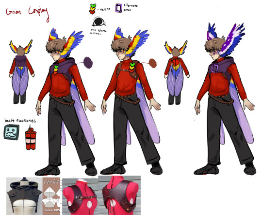
First time posting here and I wanted to start off with one of my favorite recent projects: Grian’s elytra
I also want to show off more of my progress with builds since I don’t do that often anywhere else
The idea
To say this project was painful is accurate, but the final result was well worth it.
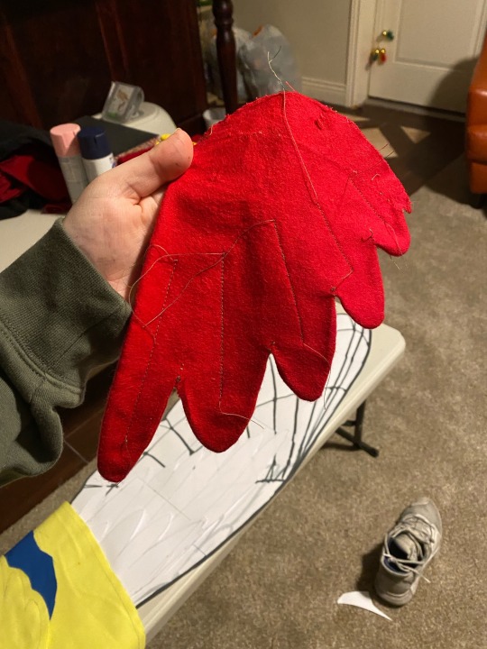
Many Grian cosplays I’ve seen have the full parrot wings, but I was inspired by a Mumbo cosplayer I briefly met at a convention in 2022 who had a set of elytra wings on his back, and I wanted to make a version that was a “what if the hermits customized their elytras”. Hence, the parrot theme stayed with the mini layers of feathers at the top
The process
To start a cosplay I will often sketch out a character reference that is fairly accurate to the final build. What’s not shown here are the 10+ pages in my sketchbooks with the different designs for the wings, outfit variations, many accessories, as well as a visual breakdown of all the layer and steps to things.
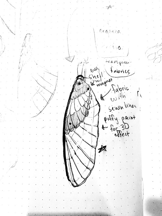
Out of all the wing designs, I picked my favorite and traced my sketchbook design of the wings onto an digital art program an cut it into 8.5x11 pages, printed it, and cut it out.
I then used some very incompatible and tricky fabrics to cut and sew each side.
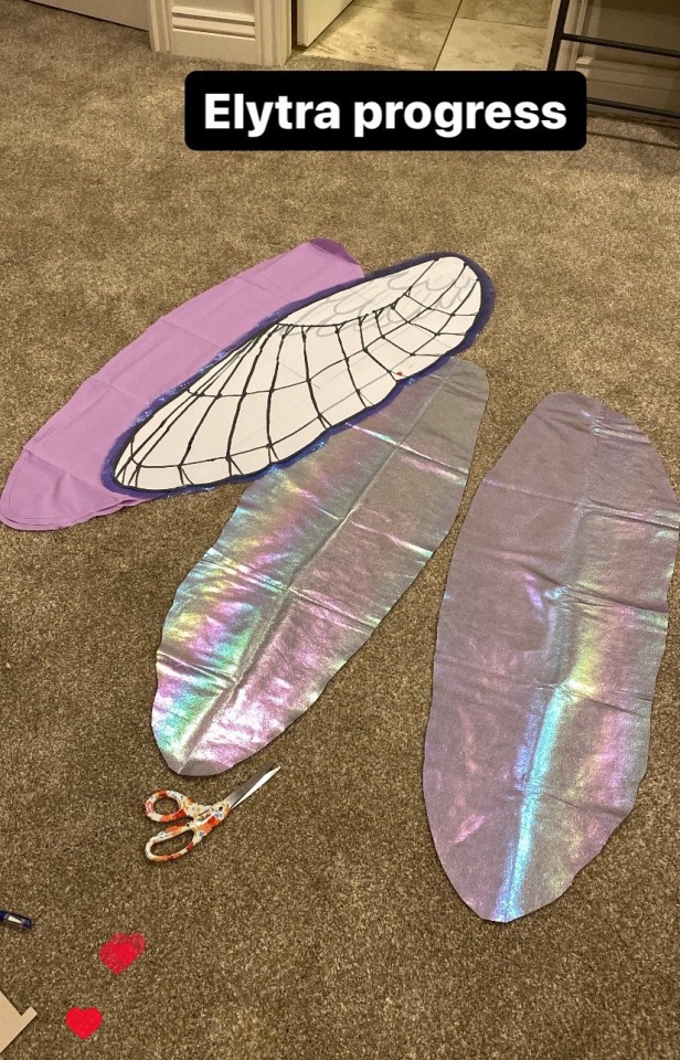
The inner side of the elytra has a holographic vinyl layer and the outer side has a layer of cotton with some shimmery toile on top.

The insect wing detailing could have been drawn on and then stitched over, but I decided to freehand the majority of it with some guide points dotted here and there to make it mostly symmetrical based on the original sketch.

To finish it off, I made some feather layers from flannel and stitched them along the top
The final step was to add the harness the elytra connects to since I wanted it to be obvious these wings were not a part of the character, rather just an accessory.
Using a pattern from this Etsy listing, I cut faux leather using it and used rivets and cording to keep it together
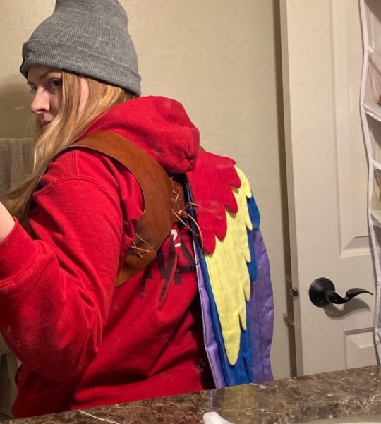
And there you have it! My Grian elytra!
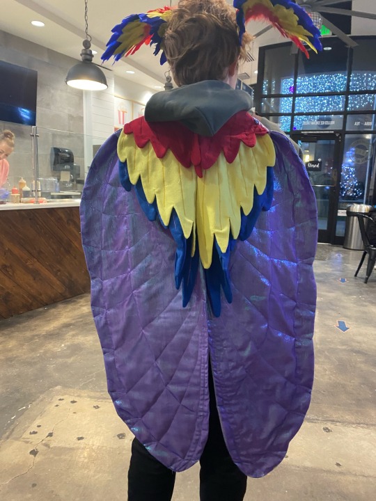
The full cosplay project isn’t fully done yet, but at least the wings are
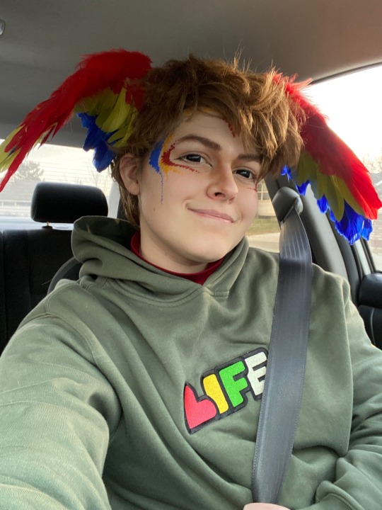
Bonus:
Obligatory cosplay selfie in a car
More projects coming in the future!
#grian#cosplay#grian cosplay#cosplay wip#cosplay build#hermitcraft#hermitcraft cosplay#minecraft cosplay#idk what im doing#skygoldcosplaywip#skygoldcosplaybuild
231 notes
·
View notes
Text
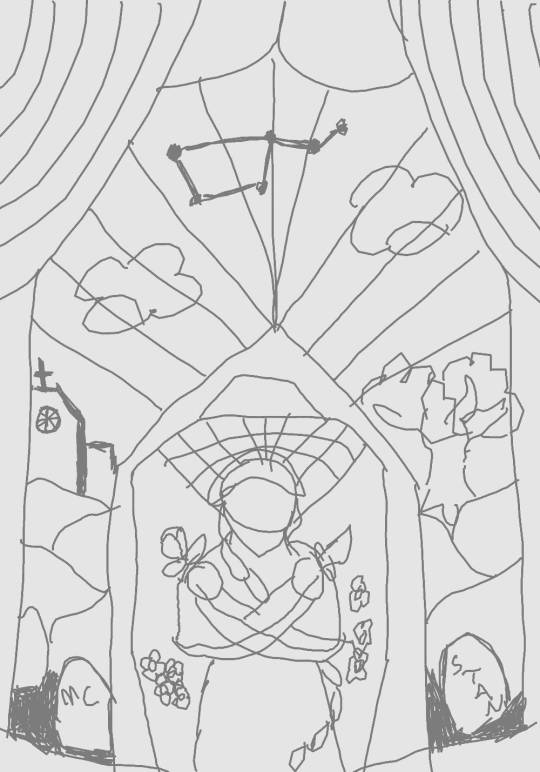
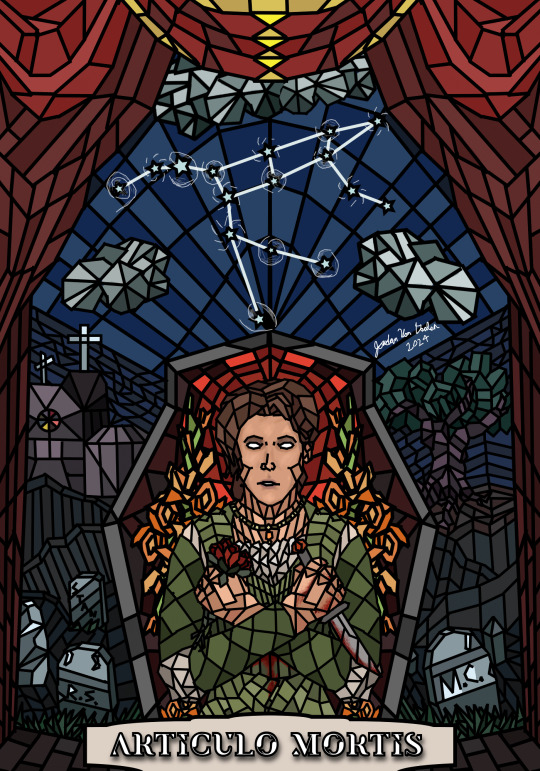
tale of woe

ARTICULO MORTIS- the moment of death
(Reblogs/comment are appreciated, I read every tag! :3 See under the read-more for an alternate version without the lighting effect, notes on details, as well as a copy of the final sketch)
The constellation is one of the two mentioned during Cassandra's stargazing scene, Ursa Major. The other, Orion the Hunter, was already featured in my previous piece, Stargazer.
Having a 'halo' of red around her head was one of my earliest concept points for this piece, in reference to her cult ending.
In Romeo & Juliet, Juliet's decision to end her life isn't just about her grief over Romeo, it's the knowledge that her only real options are either to die or to be sent off to live as a nun. When so much of her story is already about trying to choose her own fate, to avoid the life that has been planned out for her, it's easier to understand her final decision. Anywho, the real point of this paragraph is that this is why the left side of the piece features a church building.
The circular window in the church has 8 slices, each with a color representing one of the 7 routes, plus a bonus one for Mia. The colors are all eye-dropped from the character sprites, minus Miranda's, which I selected from the piece I did for her.
The three graves on the left are for the Stans. One of them literally says STAN, one is blank, and the last one has the initials R.S. (Rebecca Stan). On the right side we have a grave for the MC, partially since they die in the cult ending, partially because the right side is more symbolic of the play's canon ending, so the MC's grave is really Romeo's grave.
The main color for the curtains was taken from Cassandra's default sprite, specifically her shirt, because why not? Similarly, the color for the boards/stage at the bottom is taken from her pants. Because why not?
technically the flowers in her hand are supposed to be roses, but I realized about halfway through this piece that over the years my simplified way of drawing roses has gradually turned into just drawing tulips. oops. seriously tho, oops. also realized that this one pan I use for cooking, which I always thought was an 8x8 pan, is actually a 9x9 pan. which explains several recurring difficulties with some of my favorite baking recipes. guess I'm just a silly goose
this had so many layers holy fuck. I used the same file for the original pose sketches, as well as a bunch of reference photos, but even with that in mind it's crazy that this had over 70 layers. by the end there's still, like, 20 active ones. each section had a separate layer for the outline + the color, another couple layers for the banner on bottom, one for lighting, and then the constellation was it's own layer.
Final outline sketch:
Version without the lighting effect (which is intended to mimic the way stained glass looks when hit by sunshine):
#j does art#resident lover#resident lover spoilers#cassandra dimitrescu#this. is kind of. technically r&j fan art.#BUT I ONLY DID IT FOR CASSANDRA OKAY
91 notes
·
View notes
Text
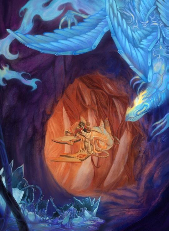
...and when the last blood-beast comes to rest unto the Earth, what next will arrive to inherit it?
i drew this sci fi piece for my portfolio, but it also turned loosely into a marcoace au because my brain got zoomies
short version: guy on a joyride (coughs ace) accidentally travels to another world filled with mythological-ish creatures, but they're actually all robots mimicking life with no real sentience of their own - except one lone, lonely consciousness (coughs marco) whose mind was digitally preserved before the rest of organic life got wiped out, and has been waiting a long time for a friend
long nerdy version under the cut:
ace's world is a fun and scrappy sci fi future world, with stuff like his hovercraft that syncs to his body's movements too
he was out riding with deuce and got too caught up in the thrill of flying that he went way out of safe bounds (not pictured: deuce panicking) and got swallowed by a giant sky beast
somehow (i haven't thought that hard about it) he appears in marco's world after this - when i first had this idea i was just thinking of a literal reference to the philosophical concept of animals as other worlds/animal alterity, a la Barbara Noske), plus i like the idea of gateways being where you least expect them
anyway yeah he gets isekai'd
enter: marco's world!! this is a land where organic life once thrived, including sentient beings (i haven't decided if they were also humans), but all organic life has long since died out and given way to a new, constructed "ecology"
it's full of seemingly mythological-ish creatures (phoenix, dragon, etc. but all are also warped from what we would imagine)!! but SIKE they are actually robots; cybernetic constructs!!! each one goes through the motions of life for many years until they steadily break down. their parts get recycled and they are remade to spawn from egg-like structures (like the one in the bottom left corner of the drawing)
and who is remaking them? MARCO! aka the last, lone remaining consciousness from the sentient race that died out. his mind was preserved digitally, but by the time he awoke he only remembers snapshots of his original life. he continuously cares for and builds all the robots, and uploads himself into different bodies whenever he wants, but no matter what he tries he can't recreate anything truly alive with its own free will
so he's lonely and sad
basically the whole thing was an exploration of the concept of a man-made mythos! and the boundaries of what defines life, will, sentience, etc. etc.
but when he meets ace - a real, living breathing organic human - it will change his life! because............because...i haven't thought that far
many questions remain...is ace's world a past version of marco's? will he find a way to restore organic life to marco's world? should he even do that? will he find a way back home? will they kiss? ? will marco get a human body?? will i ever make something bigger from this or even turn it back into ocs instead of op characters??? will they wear wigs???? when will they wear wigs????????? who knows!
but for now it is what it is hehe
i doubt anyone read all that, but if you did, thank you for your time....here i reward you with a secret:
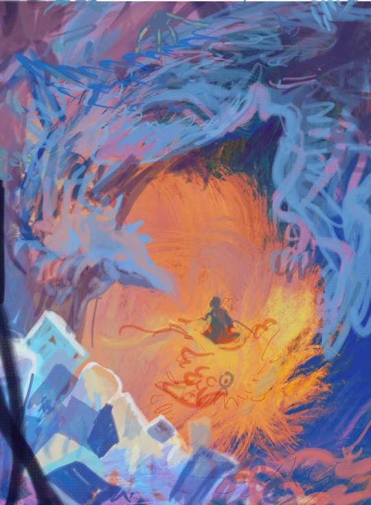
below is an early sketch of this illustration, and underneath that, the composition originally came from A FAILED DRAWING OF MARCO!!!
the brainrot goes deep :')
#illustration#original art#kinda#its so far removed i think i can call it that#one piece#marco the phoenix#marcoace#one piece au#fushichou marco#my art#marco one piece#ace#portgas d ace#op ace#op marco#procreate#digital art#digital painting#digital illustration#sci fi art#science fiction#science fiction art#marace#drawing#artists on tumblr#artsg#artwork
116 notes
·
View notes
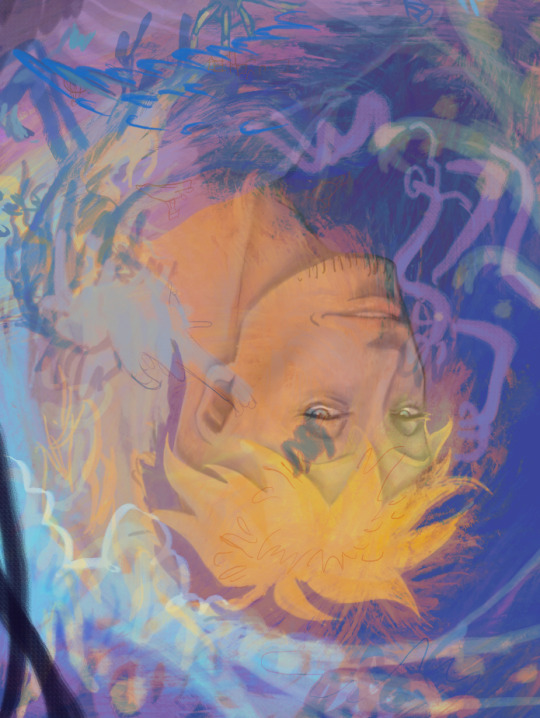
Text

(notes and comments next, tumblr will not let me add a cut no matter how hard i try!!!!!!! killing and maiming!!!!)
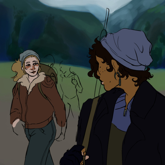
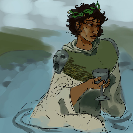
silt verses wips, some will get finished and some wont :p which is which?? who knows !!! not me !!!!
1) thurrocks and faulkner on their quest to the endless drear, with jasp, tapper and wallace in the background (or at least thats the idea). most of my time on this one has been spent adjusting values on the hills in the background, and its absolutely too vibrant and green for how i imagine the scene lol theyre also really shitty hills if you look at them for less than a second so. dont do that please LMAO
2) faulkner in his katabasian garb, sat in a river for to maximise his solo slay. this one is kinda old atp but the design hasnt changed much. ive mentioned the open-mouthed epaulettes referencing the mouth delivering/returning before, but the green uhhh idk thing is dried and woven seaweed :) the rest of the robes will be more decorated with abstract woven patterns and embroidery if i ever start working on this one again
3) now THIS is the relgious faulkner that was giving me brain damage a couple days ago, that ive since realized wont be fixed with the ideas a couple people offered because of the perspectice. its pretty obviously mimicking a guillaume dufube sketch intended for a ceiling that i absolutely love. the parts ive produced, im really happy with, but i cant work out the composition fully so its gonna be abandoned at least for a while. not to mention the absolute misplacement of a sky motif. its one of those paintings i wish i had thicker/oil paint or gouache style brushes on medibang for
4) my mercer design!! heavily inspired by paleoart from various sources. everything she and gage have is organic, except a very few, like her sheath (oblong metal with a leather "cap" around the tip of the blade, a real ancient design i found references for on google) and her rifle. the original image also features gage playing their flute while squatting, but both of those things are hard poses to draw and hard to find refereces for, and im not willing to put in THAT much effort god lord i draw for FUN if its hard im giving up baby
5&6) snare dog!!!! i love these silly guys but i dont like this design, its too wolfish and i imagine them sorta borzoi/greyhound aligned. i also dont like the way the face opens, since i imagine that as more of a twist. i do like the flopping tongue though and i liked the half assed rendering
#the silt verses#tsv#brother faulkner#sister thurrocks#mercer and gage#tsv mercer#tsv faulkner#tsv thurrocks#art#my art#wips#wip#digital art#digital wip#character design#character designs#guillaume dubufe#digital painting#religious art#religious imagery#talking about my art#talking about art#nonsexual nudity#tsv snare dog#snare dogs#medibang#medibang paint#siltposting#my artwork#the silt verses fanart
85 notes
·
View notes
Last Seen Blogs
paranoid-polly
Basket case addicted to space
littlledollmonika
all in one

b2crealestate
B2C for Real Estate
k-albumcover
K-ALBUM COVERS

joanriversofficial
jack✨