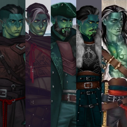
#desaturation
Text
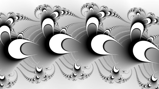
#fractal#fractal art#digital art#Newton-Raphson method#orbit trap#desaturation#ImageJ#original content
11 notes
·
View notes
Text
I realize there are probably artistic reasons for doing this but I'm annoyed by color de-saturation in shows and movies. Let's give some examples.
12 Monkeys: lots of gray and brown here.

The Exorcist, 2 hot priests stare at each other in de-saturation land.

Let's compare to gorgeous show Foundation, which has color saturation and good lighting.
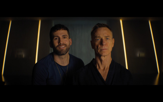
#shows#tv#movies#color#desaturation#lighting#yes ben daniels is in two of these#foundation#12 monkeys#the exorcist#cinema#film#editing
6 notes
·
View notes
Text
Desaturation —Aesthetic
Desaturation Definition
The addition of white light to pure color. This produces a paler less saturated color. In images and art, the process of desaturating something means to make colors more muted by adding additional black and white shades to the hues presented in the artwork.
5 notes
·
View notes
Text
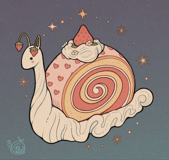
strawberry swiss snail 🍓
#artists on tumblr#digital art#illustrators on tumblr#strawberry#artsypeachy#not sure why tumblr desaturates images. weird. just gonna leave it be tho
12K notes
·
View notes
Text
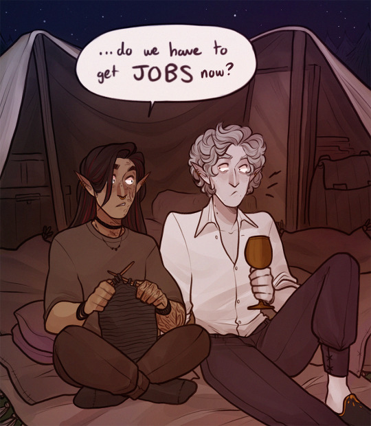

domesticating your vampire: a memoir
(beautiful high res version on patre0n)
#bg3#baldur's gate 3#astarion#tavstarion#KARLACH#i nearly forgot her#when you just escaped vampire slavery but now you have to save for a down payment#i can't stress how important it is to me that astarion has a birthday#i don't know why#also sex is fine but have you ever had someone wash your hair for you. there is nothing more intimate#i'm devastated that i had to desaturate the polaroid because the lighting was so pretty
19K notes
·
View notes
Text

Moon touched
#bg3#dame aylin#shadowheart#isobel thorm#art#if the colours on this are crazy saturated OR desaturated. forgive me. the colours are displaying differently between my monitors#and different apps???? ugh. im gonna have to figure out what settings are off to create this#anyway. obsessed with the moon trio frankly#nudity
4K notes
·
View notes
Text


Many things change; some things never do.
Art by @ornerine and @agarthanguide!
#critical role#critical role spoilers#beauregard lionette#caleb widowgast#yasha nydoorin#caduceus clay#jester lavorre#i did flip some portraits for continuity but they're otherwise unaltered#the solstice portraits look pale and desaturated#fjord stone#veth brenatto#luc brenatto#mighty nein#echoes of the solstice#i did flip some portraits for continuity#the new ones seem pale and desaturated but they're from screengrabs. i suppose we'll find out what they really look like later
4K notes
·
View notes
Text
Beware the Mountain's King
#chew toy of a man.#i was!!! trying to replicate ggdg's palettes bc i am obsessed with how they do colors in soulsov#i am Not good at it yet. but hey. i had fun! and i think this turned out alright....#undertale#asgore#myart#TUMBLR STOP DESATURATING MY ART CHALLANGE
2K notes
·
View notes
Text

I MADE A BOOK BASED ON PHIL' HARDCORE WORLD :D
Some of my favorite pages:

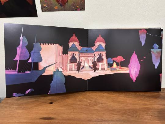
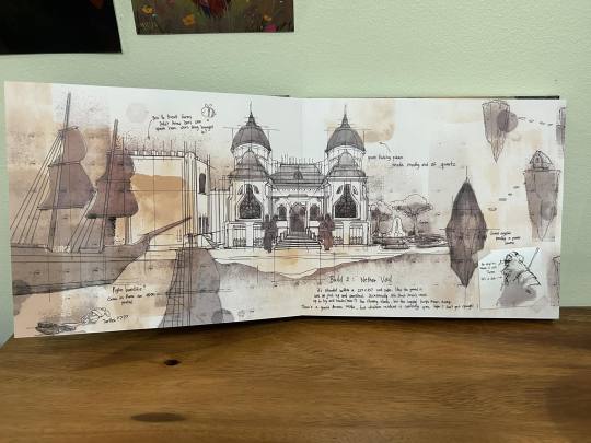


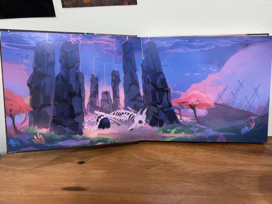
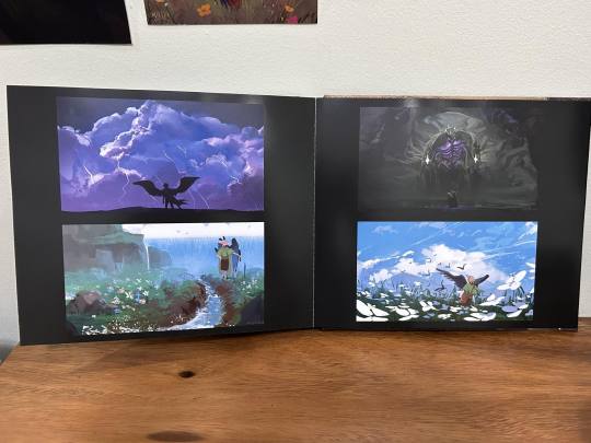
#art#I'll post a video in a bit#digital art#philza#mcyt#philza fanart#concept art#its a bit desaturated on my camera unfortunately#but ah well
3K notes
·
View notes
Photo
- sometimes life requires abstraction like letting your mind wander through the swirls in a piece of marble something subtle to let your mind assign meaning to a sort of visual version of ambient music or a new way of looking at your surroundings a new way of viewing your life a new way of enjoying an old favorite a new way of appreciating the lights at the end of your evening #sometimesithinktoomuch #niseilounge #abstraction #desaturation #FortyTwos (at Lakeview, Chicago) https://www.instagram.com/p/CnOM625udvP/?igshid=NGJjMDIxMWI=
0 notes
Text

12 notes
·
View notes
Text
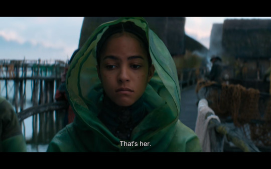
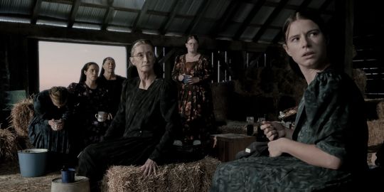
Women Talking, directed by Sarah Polley. Source: Library DVD.
A group of women from an isolated religious order gather to discuss what actions to take after their colony has experienced brutal violence and gas-lighting from their own men. They are trying to determine whether all the women should stay and fight, or leave the colony. There are women and girls of all ages taking part in the discussion.
This is a great film, I was into it. Unfortunately I had a really hard time seeing the people's faces and expressions and…anything at all. Below is a still demonstrating the de-saturated quality of this film. It all just runs together; each object or body blends in with everything around it, it's all just gray, brown and black. The object that stands out most is a bucket in the corner of the frame.
My TV is an older one and I'm playing the disc on the older X-box; maybe this looked better on a big screen in a theater. Maybe the settings on my TV are off; but looking at stills online, it's still hard to see anything.
Maybe the Barbie movie will bring back color in films. One can hope.
(cross-posted to Dreamwidth, https://sasha-feather.dreamwidth.org/1321730.html)
1 note
·
View note
Text
I think 90% of my gripes with how modern anime looks comes down to flat color design/palettes.
Non-cohesive, washed-out color palettes can destroy lineart quality. I see this all the time when comparing an anime's lineart/layout to its colored/post-processed final product and it's heartbreaking. Compare this pre-color vs. final frame from Dungeon Meshi's OP.


So much sharpness and detail and weight gets washed out and flattened by 'meh' color design. I LOVE the flow and thickness and shadows in the fabrics on the left. The white against pastel really brings it out. Check out all the detail in their hair, the highlights in Rin's, the different hues to denote hair color, the blue tint in the clothes' shadows, and how all of that just gets... lost. It works, but it's not particularly good and does a disservice to the line-artist.
I'm using Dungeon Meshi as an example not because it's bad, I'm just especially disappointed because this is Studio Trigger we're talking about. The character animation is fantastic, but the color design is usually much more exciting. We're not seeing Trigger at their full potential, so I'm focusing on them.
Here's a very quick and messy color correct. Not meant to be taken seriously, just to provide comparison to see why colors can feel "washed out." Top is edit, bottom is original.
You can really see how desaturated and "white fluorescent lighting" the original color palettes are.
[Remember: the easiest way to make your colors more lively is to choose a warm or cool tint. From there, you can play around with bringing out complementary colors for a cohesive palette (I warmed Marcille's skintone and hair but made sure to bring out her deep blue clothes). Avoid using too many blend mode layers; hand-picking colors will really help you build your innate color sense and find a color style. Try using saturated colors in unexpected places! If you're coloring a night scene, try using deep blues or greens or magentas. You see these deep colors used all the time in older anime because they couldn't rely on a lightness scale to make colors darker, they had to use darker paints with specific hues. Don't overthink it, simpler is better!]
#not art#dungeon meshi#rant#i'm someone who can get obsessive over colors in my own art#will stare at the screen adjusting hues/saturation for hours#luckily i've gotten faster at color picking#but yeah modern anime's color design is saddening to me. the general trend leans towards white/grey desaturated palettes#simply because they're easier to pick digitally#this is not the colorists fault mind you. the anime industry's problems are also labor problems. artists are severely underpaid#and overworked. colorists literally aren't paid enough to do their best#there isn't a “creative drought” in the anime industry. this trend is widespread across studios purely BECAUSE it's not up to individuals#until work conditions improve anime will unfortunately continue to miss its fullest potential visually#don't even GET ME STARTED ON THE USE OF POST-PROCESSING FILTERS AND LIGHTING IN ANIME THOUGH#SOMEONE HOLD ME BACK. I HATE LENS FLARES I HATE GRADIENT SHADING I HATE CHROMATIC ABBERATION AND BLUR
2K notes
·
View notes
Text
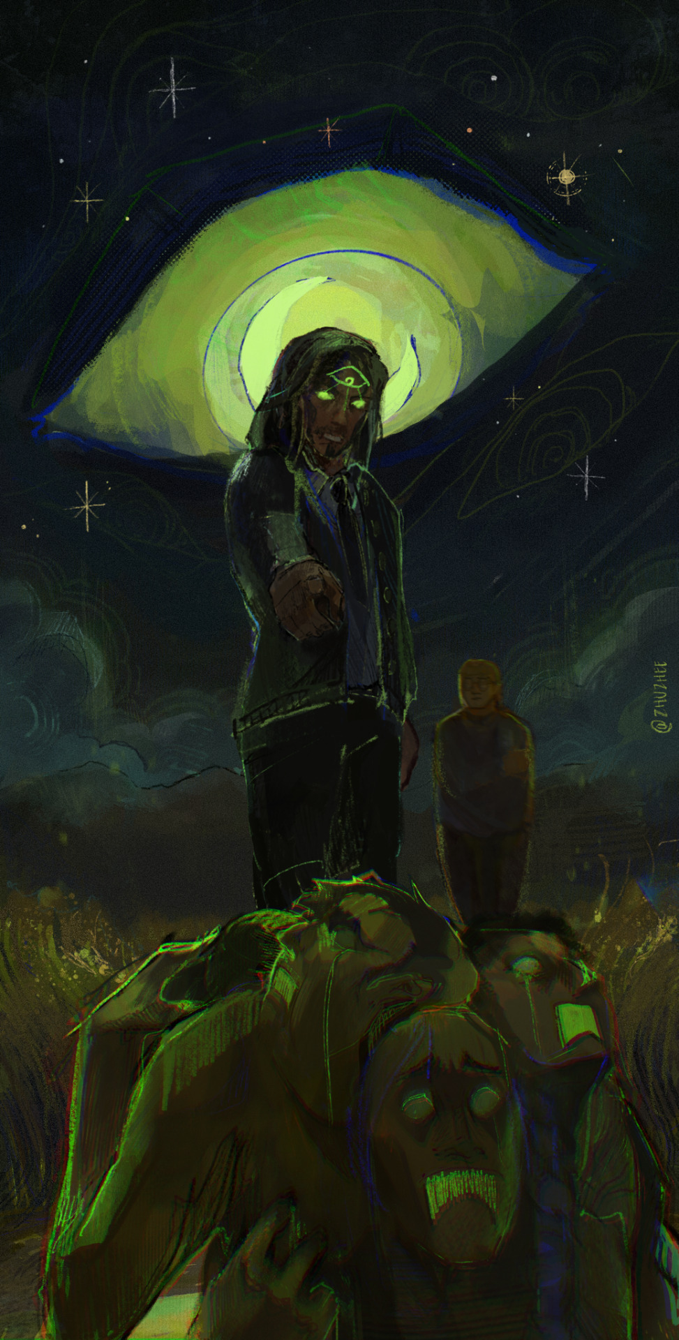
me 😳 when da watcher👁️ is ceaseless 🥵
#the magnus archives#tma#tma fanart#jonathan sims#martin blackwood#not sasha#mag165#whats interesting abt always paintng in orange and red is actively Not Doing That#my art#im not Entirely sure how i feel abt a more desaturated vibe#i think its mostly because i just can't stand green tbh jdkdl
4K notes
·
View notes
Text
eeskall….
#my art#iskall85#actually like the sketch i posted b4 better but had fun coloring this X)#having my desaturated green moment#sorry for giving everyone a blank turtleneck. as if it’s my fault
1K notes
·
View notes
Text
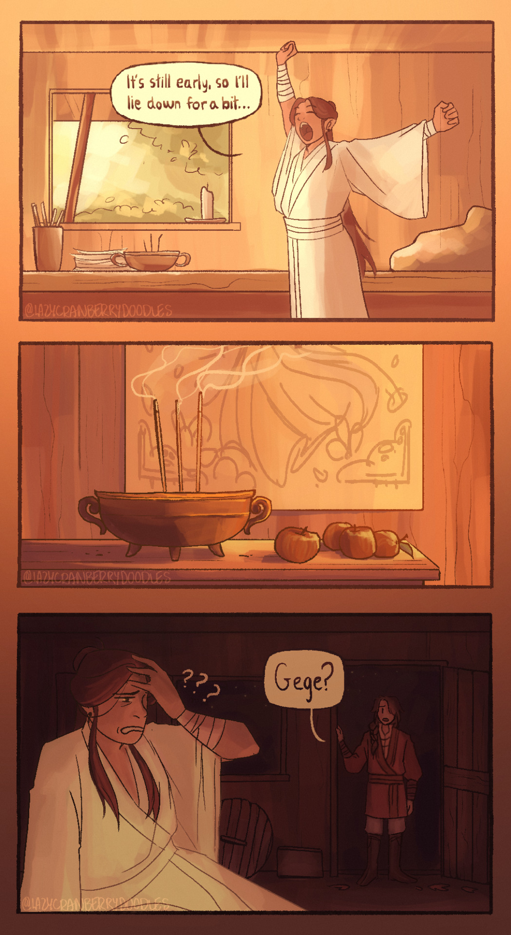
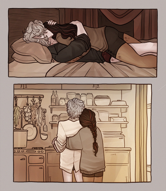
you’d think after 800 years he’d learn his lesson about taking afternoon naps. / prev comic / follow for more sleepy xie lian
#i think xie lian and hua cheng are sleep deprived for different reasons. xie lian does get sleepy at like 10pm#but prayers will often keep him up past then. or he’ll get up at 4 for similar reasons#hua cheng doesn’t need to sleep. he would never pass up an opportunity to cuddle but when xie lian isnt there#you can BET he’s working on a new sculpture for 8 hours straight#or reading. or managing his city. or painting. or taking care of black water’s fish. or any of the other 8 million things he excells at#i think they’d try to minimize the times they sleep apart though….. theyve both been alone for so long :(#i am a BIG believer in hualian naps. what a luxury yknow?? when youre touch starved and busy all the time?? i want these men COMFY#ALSO TUMBLR DESATURATED THIS TO HELL GRRRR IT HAD SUCH A NICE GOLDEN HOUR EFFECT#tgcf#art#comic#tian guan ci fu#hualian#xie lian#hua cheng#san lang#hob#heaven official's blessing#tgcf fanart#天官赐福#mxtx#my art#lmao#tgcf meme
2K notes
·
View notes
Last Seen Blogs

saffur
Little Prince

educationonline728
Online Learning

bakokujavuq
Untitled

ryekat
How Many Nights Does It Take To Count The Stars
trenchcas
castiel [omitted]