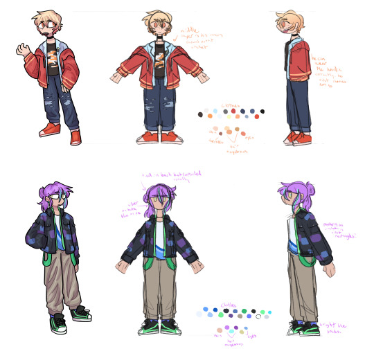
#i might redesign them both slightly
Text
I'm in the trenches of my brain when I start making oc Pinterest boards
#mostly florence and dieter but also the side characters i have come up with#i might redesign them both slightly#and come up with outfits for the past and what theyre wearing in the present
0 notes
Text

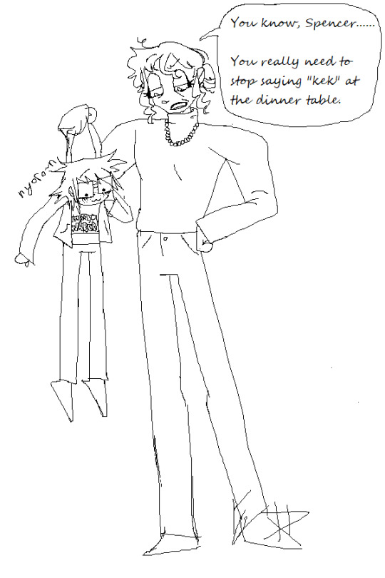

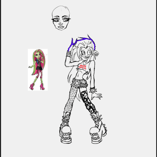
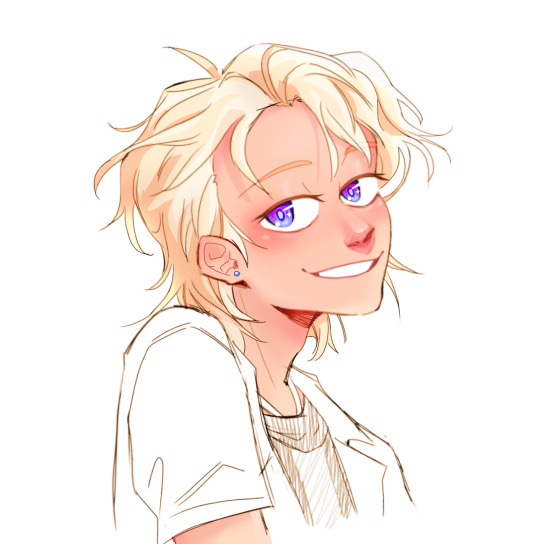
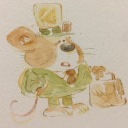
picking him up by the scruff of his neck like a kitten cat.
#you guys have no idea how POWERFUL i would be if i could make my own shimeji and run it on my computer#i could be throwing him against the wall of my desktop all day long like that one post about the milk soaked beanie baby#anyways hope you all appreciate the sally fashion moments. first time trying to draw baggy socks like that and she looks cute in them!!#i think im gonna redesign her ever so slightly after this though because i recently thought up the idea of sally being afrolatina...#rather genius of me.#i also want sue to be black. hers might be a more major redesign but she wears the ski mask anyways so it shouldnt be too glaring....#yes i read the overthinking taleblr sally post.#and the part about sally and sue both having textured hair and doing eachothers styles is so based so i want it to be real for mine too#enough of this drivel. tags.#venturiantale#taleblr#venturiantale fanart#fanart#images that are horrid to see and look at#spencer acachalla#sally acachalla#gertrude acachalla
15 notes
·
View notes
Text

Ai generated Cookie number 5, this is Cabbage Rose Cookie
Again not too sure of the name, since cabbages aren’t really part of the design at all, but it’s just the name of the rose, so eh
I quite enjoyed this one, though I do also kind of wish there were more lighter colors too
I actually have a bit in terms of this character’s whole deal as well. So Cabbage Rose is young (probably no older than 15) and quite small, and has a meek sounding voice that never goes much higher than a whisper. If you were to meet Cabbage Rose normally, he’d seem rather fragile and a bit of a pushover. However, despite his meek demeanor he is incredibly powerful, able to carry his heavy sword and easily cut down large enemies. He’s used to people looking down on him and underestimating his abilities, but at the same time he’s aware enough that he understands why. Also, he’s missing his left arm, as he lost it in a battle. I imagine he comes from a noble house of roses, but as of currently he’s more a wandering warrior
I enjoy him and I hope you do too!
#I wanna draw him alongside Dark Choco#as the whole “big sword with large cape around them” is something they both share#along with being relatively quiet individuals#though Cabbage Rose is always quiet#also he might be a bit sickly?#not sure about that yet but I feel like it would play into his whole schtick#I do also wanna slightly redesign each ai cookie to make their designs more coherent#which I mean makes sense considering in these I’m trying to stick as close as possible to the original#and I don’t really expect an ai art generator to be good on character design#anyways#cookie run#cookie run kingdom#ai generated cookies#cookie run oc#my oc#ai art generator#my art#cabbage rose cookie
10 notes
·
View notes
Text
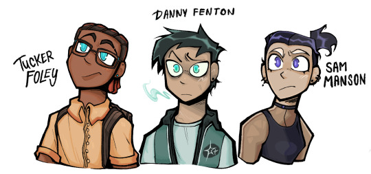
Both a redesign for funsies and for imagining what the trio would look like when they’re a little bit older! Was fighting for my life trying to choose a shape for Tucker’s head oh my god, translating designs in my style can be an uphill battle and it is definitely not for the weak. Thoughts behind the design below!
DANNY: For my style for this, I decided pupils normally are lighter than the eye’s base color (‘cause it looks pretty) but since Danny is Schrödinger’s fav mystery, he’s got the reverse! His pupils are actually darker than the base color. Plus, space nerd gets the space jacket. And overall, keeping him grey and blue and cool, with a grey tinted shadows (while everyone is a bit warmed) and the blush thingy I do as another nod to him being a spooky. That and faint scars from battle.
TUCKER: was fighting for my life trying to translate his curved head shape in my style without wanting to gnaw off my own arm. Took away the hat and gave him classic cornrows instead, but kept the color by having him dye his hair. Button down instead of the yellow shirt, changed up his glasses, and boom! Fav primary colored lad. Still might change him a bit later on.
SAM: Easiest to do oh my god. Head shape? Got lucky it went well. Changed up her outfit slightly, gave her some bleached eyebrows, more piercings and cut her hair. Feels all like things she would definitely do, favorite design thus far.
ALL: Their ears are all pierced because they all got one piercing together! Danny’s fine with just the ones and never takes them out. Sam has plenty, and Tucker is currently vibing with two at a time and has a few different pairs. I like to think he’d incorporate some of kind of tech in one pair eventually.
#the brainrotsreal's art tag ✧˖°:*♡#digital art#danny phantom#fanart#procreate art#phanart#danny fenton fanart#danny fenton#sam manson#tucker foley#dp redesign#dp fanart
1K notes
·
View notes
Text
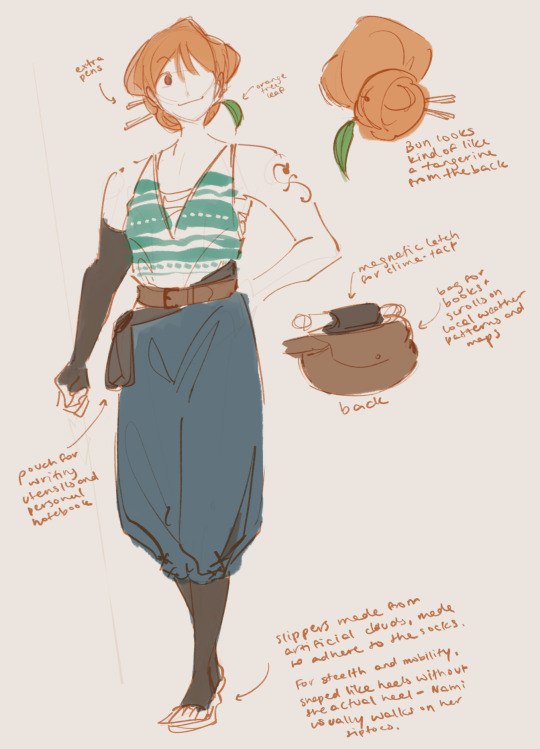
Straw hat women redesigns :) I was trying to doodle some of the crew and came to the realization that I just Could Not with Nami so I wanted to play around with it a little bit
Some more design notes below:
Nami’s design actually went a lot smoother for me than Robin’s! I think canon post timeskip Nami is a very low bar. While you can argue that to some extent Nami being vain and seductive is part of her character, I do feel that there are many more integral parts of her character that can be highlighted in her design, namely map making and her combat. Though not one of the stronger straw hats, Nami does seem to be well practiced with her staff outside of its use for weather manipulation, and I think her being a physical combatant, even slightly, can be better reflected with more loose clothing for better mobility.
For her mapmaking, I wanted her to have constant easy access to her tools and to information about the locale, so around her waist she has one large pouch at the back for books and scrolls and maps in progress and one small pouch to the side for writing utensils and measurement tools. As backup she also has 2 pens in her bun, which also act as pins for keeping her hair up if she ever needs to move a lot.
I’m not sure how clearly it shows up in the notes, but Nami’s shoe soles are also made from whatever artificial cloud material makes up the weather island she stayed on during the timeskip, so that it both pads her steps to make them soundless and bounces for better mobility. The shoes are naturally shaped like heels but without the actual heel, since she tends to move around on tiptoes anyways- a nod to her epithet as cat burglar and her past as a thief.
I made her shoulders a bit broader because I think they probably get a lot of exercise with her staff, and changed out the bikini top for a more supportive chest wrap, with a loose tank over it for breathability. The compression socks and sleeve are more stylistic than anything, since I like layers, but they might come in handy for her if she spends extended amounts of time sitting down making maps for the crew.
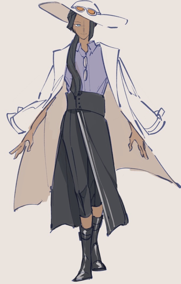
Robin’s was a bit more difficult for me to figure out, and I might go back and revisit it at some point. For Nami, it was a bit easier to imagine what would pair well with her combat methods and her needs as a mapmaker, but with Robin, she’s an academic who fights almost completely hands off, without a specific weapon to her name. Because her strength lies mostly in her devil fruit, she has a bit more room for style over functionality, but I also still wanted her to have something that made sense with what she was. I don’t really think I succeeded in that regard, but it’s also hard to convey what she does visually— she’s more of like a professor than a field archaeologist I think.
I really really enjoy her cowboy hat but I didn’t think it would match with the rest of the outfit so I switched it out for a wider brimmed hat and kept the orange sunglasses on it, as a nod to the revolutionaries with the combination of headwear and eyewear. She deserves a trench coat. I don’t make the rules. And the rest of the fit mostly came down to things I think I would enjoy wearing, haha
The trench coat is partially a nod to the scholars of ohara, who seem to wear white coats like lab coats in some screenshots of robin’s backstory. I think also the reading glasses help to make her seem a bit more academic, but aren’t prominent enough to leave a strong impression. All in all I do wish robin’s design had more functionality in it but I also think that robin is a character who probably enjoys dressing up nicely like this, especially in the comfort and stability of the straw hats.
935 notes
·
View notes
Text
Okay, it was difficult, but I finally came up with and drew designs for the characters according to my Mafia AU :D
I promised to tell you about them, but it will be quite brief (because I don't know how to tell beautifully)
All these characters can be divided into three groups, two of which are two mafia gangs, and the third is ordinary citizens who stand for the law. Bosses from the original game will be humanizations 👀
You have already seen Peppino and Gustavo (btw I made a small redesign for Peppino, he will have metal claws instead of a pizza cutter).
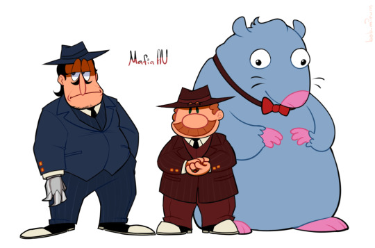
Gustavo here plays the role of the one who created the usual gangster group together with Peppino, which later acquired some rules and became the mafia. Since Peppino's small restaurant some people already knew – they managed to promote their business to a large scale on the name of Peppino by building several pizzerias all over the city, from which they receive money (not only at the expense of visitors, but also at the expense of some illegal "things").
Gustavo is the head of the whole group, a calculating and intelligent man who does most of the business. In appearance, we can say that he is an ordinary kind man, but I don't advise you to peck at his kind appearance. Peppino is his right–hand man. Despite their friendship in the past, they now have a slightly strained relationship due to aggressiveness and Peppino's anger problems.
Now them
Pizzahead, one might say, is also an organizer of his own group, but here his job is to promote his casino, from which he receives money (obviously not in the most honest way). Once upon a time, his father (Pizzaface) was the head of a mafia gang, but Gustavo and Peppino managed to destroy them. He always wears a pizza mask and plays the image of a friendly cheerful guy, and rarely shows his real appearance. He hopes to crush Peppino and Gustavo's business with his competition, since he has his own personal scores with them.
Noise and Pepperman are his assistants. Noise is the one who promoted the casino with the help of advertising and attracted visitors to it, and also works there himself. Insanely gambling guy, incredibly greedy for money. Pepperman is one of Pizzahead's bodyguards, the closest to him. He's a bit of a gambler, still loves to draw, gets a lot of money with his paintings, doesn't draw infrequently.
And them

Noisette here is Noise's ex-girlfriend, who left him because of his excessive gambling. As in the original game, she owns her own small cafeteria, but, unfortunately, she has a similar fate as the original Peppino – a rather small attendance.
Vigilante is a local policeman who was initially on his own side. He and Noisette have been good friends since their youth, Vigilante is also the main visitor of Noisette cafe. He was the one who helped Noisette recover after the breakup, and has some romantic feelings for her.
Mr.Stick is a detective and Vigilante's assistant. He was also initially on his own side. The three watch both mafia gang together, Noisette and Stick help Vigilante gather some evidence against their criminal activities.
*spreads tiredly on the floor* I'm not sure if this all sounds good enough, I spent a lot of time to more or less correctly come up with everything, but I hope it was not all in vain x")
495 notes
·
View notes
Text
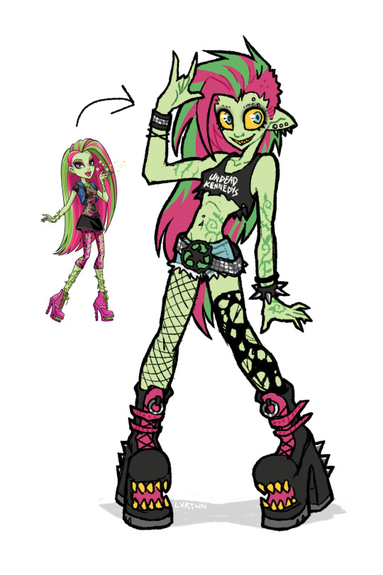
venus if she was awesome
speedpaint and more thoughts under the cut
venus has always been one of my favorite characters, though i feel her design is pretty underwhelming with a lot of wasted potential. this is kind of a redesign, kind of my own personal headcannon, and kind of how i imagined venus in my head as a kid.
this is supposed to be my version of g1 venus, more similar in facial features and keeping the straight hair. i absolutely love her new hair and face in g3 but im hesitant to call the new outfit an improvement. both g1s outfit and g3s outfit are bad in their own ways. i dont want it to seem like im shitting on the new design. again i think the face sculpts, hair, and body types of g3 are so awesome. its great to see more diversity being included in the designs. i just decided to go with g1 venuses look because thats the venus i grew up with
i definitely took some inspiration from g3s outfit for this design. i like the idea of it but the execution is just not great, not to say her original outfit is any better. i feel like out of all of tge original monsters she was the one with the most waisted potential. i love her personality and the abilities she has but the way she was styled has always bothered me.
in the movies shes described as “eco-punk” which is SUCH a cool style to go with a plant monster character. i just feel like the “punk” in “eco-punk” was never really represented in her outfits. i personally love punk music and clothing; ive been an active member in my local diy scene for many years and i love seeing all the outfits people put together.
i thought i would give her an outfit that shows off a couple of my personal favorite staples of punk style. big chunky leather boots with lots of straps and buckles. kept the shoe mouths from the original because they cool as hell. lots of leather, studs, spikes. i gave her denim cutoff shorts inspired by her gen 3 outfit, same with the torn black top. punk style has a big focus on comfort, practicality, and making things yourself. i imagine she cut a pair of old pants into shorts, roughly cut her “undead kennedys”band shirt tank into a crop top, and probably repurposed the remaining fabric. i also totally didnt draw this whole thing as an excuse to use that pun. i included asymmetrical leg accessories, with one fishnet stocking and one torn up sock. i also feel like she repurposed these, continuing to wear her old torn up socks instead of just throwing them out. i gave her a big chunky studded belt matching one of her cuffs with a recycling symbol belt buckle. i feel like it communicates an important aspect of her personality just at a glance, plus i just love big belt buckles. lastly i added piercings because 1. theyre cool and 2. i for some reason remembered her having an eyebrow piercing but i guess she never had one.
i mostly kept her body and hair the same. changed her ears and hair color slightly but thats just personal preference. i decided to make the vines on her body look more like tattoos instead of being 3d. i imagine she can make them grow into real vines, but when shes not using her powers theyre just flat against her skin. gave her a facial expression that made her look a little more unhinged. she might only do things for the good of the earth but she can still mind control people at will.
i wish i leaned a little bit more into the plant theming but im overall still super happy with how this came out. maybe ill made more monster high redesigns in the future
164 notes
·
View notes
Text
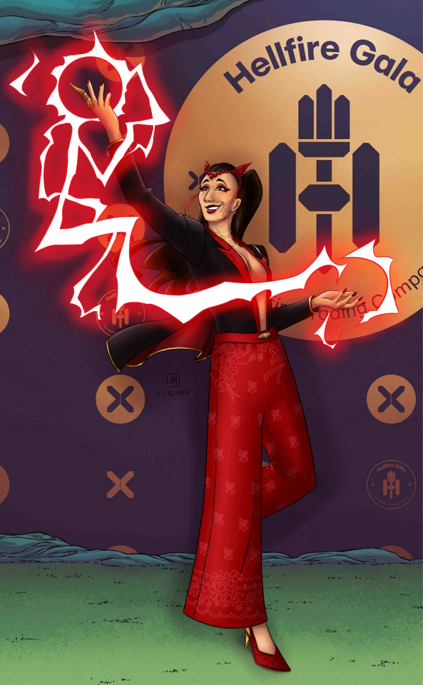
“They say looks can kill, and I might try.”
— Taylor Swift, “Vigilante Shit”
an outfit for my beloved Wanda if she ends up going to the 2024 Hellfire Gala (if there is one at all tbh)!! I wasn't personally a fan of her 2023 look, so I decided to try my hand at designing a look of my own despite knowing jack shit about fashion. design breakdown, inspiration photos, and just general rambling under the cut :)
main inspo:


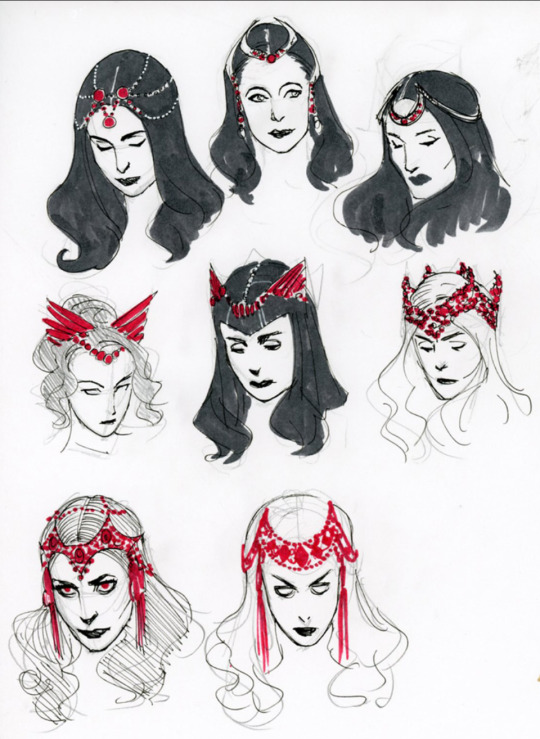
top row: left by REEM ACRA, right by unknown
middle row: sketches by Kevin Wada
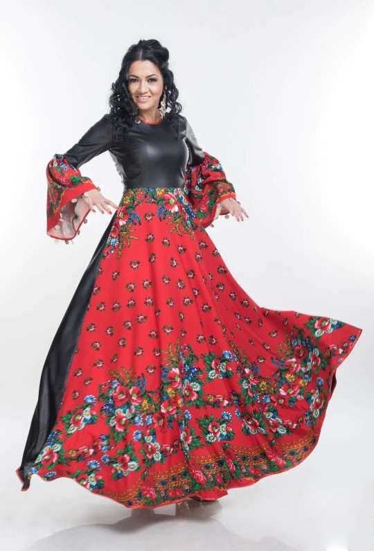
bottom row: garments by Zita Moldovan (website)
--
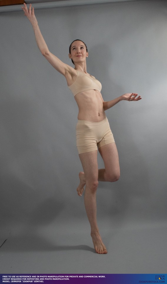
hehe, this is the part where I ramble about my design process!! I will confess, it took me four full sketches before I finally managed to purge the "high fantasy fairy queen dress" brainrot from my mind and arrive at a concept that actually felt like Wanda. given that as of her 2023 solo run, she's a self-employed business owner, a twist on a suit felt appropriate!! it's elegant, it's dramatic, it's sexy, it's powerful, and it's also a garment that, like, real people could wear?? which, I know this is a comic book and she also has magic, but, like. girl deserves a fit that's also reasonably comfortable. girl deserves pockets (I didn't showcase them, but the pants absolutely have humongous magic pockets.) talking fabric, I will confess that I really don't know much, but I picture the red fabric being pretty thick silk and the black fabric possibly being velvet? the shoes are beaded pretty much all over with the same crystal material as the crown.
as I continued to refine my concept, I looked to Kevin Wada's 2015 redesign for Wanda's last solo run for more inspiration. that's how I arrived at concepts such as the use of beaded accessories, floral embroidery, and especially the plunging neckline. I also knew I wanted to pay homage to Wanda's heritage without being stereotypical, so I decided to look to Zita Moldovan, a Romani designer whose site is linked above, to see how she incorporated her culture into her work. (as an aside, there's this other dress from her Romany Dreams collection that I would LOVE to draw Wanda in at some point, but that was not this project. maybe soon.) the dress I included in my (very, very trimmed down) inspo board was my primary reference as I drew the pattern for the pant part of the pantsuit. (I attempted multiple versions where the pattern was in color, but it wound up looking really muddy, so I opted for the slightly more subtle version you see here.) the pose for the final piece doesn't showcase the epaulette well (or the crown pin, which was another reference to the Kevin Wada design), so here's a bonus sketch that came out of the "design" part of this whole project that shows them both better:
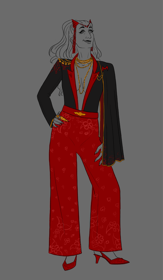
anyone who has followed my art knows that I generally draw my Wanda with a high ponytail, but I decided to spice things up and draw her with a half-up like she has circa Uncanny Avengers #27 (this is when she and Jericho are being so very sweet together). the golden hoop earrings are another thing I carried over from my general Wanda design, and the makeup is just a quick thing I came up with on the fly. it's not the spiciest, I know, but I decided there was enough going on elsewhere that she didn't need a crazy makeup look as well. the full-finger ring is specifically a reference to her very first appearance in X-Men #4, where she calls upon her power by pointing her right index finger. I thought it would be cool to accentuate that finger as a result!!
and there you have it--a tribute to Kevin Wada and Zita Moldovan from an artist who knows nothing about fashion but does have severe enough blorbo brainrot to attempt to design an outfit regardless :D
shoutout to @jookpubstock for once again enabling my shenanigans :)
#ari does art#marvel#scarlet witch#wanda maximoff#romani wanda maximoff#jewish wanda maximoff#alba flores as wanda maximoff#marvel fanart#hellfire gala#digital art#artists on tumblr
67 notes
·
View notes
Text


so i like the april fools shuffle units a normal amount. i have done redesigns for almost all of them and i draw them A Lot.
rambling additional notes on all of the redesigns below
a couple notes if you ever want to draw any of these redesigns for yourself at any point: i'd appreciate being credited for these redesigns (obviously anyone not redesigned i don't need credit for lol) and you don't need to follow my specific skin tone + hair/eye color schemes i have laid out. those are how i personally like to draw the characters and i've included them for anyone who might want to stay completely accurate to my redesigns, but you're welcome to use your own preferred color schemes for the cast when drawing them with these outfits!
now onto the fun(?) stuff
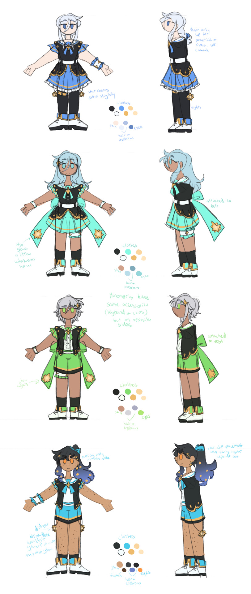
aoharu is pretty straightforward with redesigns, its basically just leoni but with a sun theme instead of stars. adding the image for the color palettes for the unchanged designs just because it has the notes for ichisaki too (their changes were too minor to completely redraw them, in my opinion).
ichika remains entirely unchanged design-wise other than adding a sun pin to her suspenders. saki stays mostly the same too, other than changing the design on her armband and switching her pigtails for a ponytail (in an attempt to seem a little more mature/imitate airi's hairstyle/move on from her childhood self since she's started to believe that honami and shiho want nothing to do with her and ichika anymore).
not too much to say about airi and ena's outfits either, i wanted to go a little more cute with airi and cool with ena, but there's minor changes with both of their hairstyles, with airi switching her pigtails for a ponytail as well (moving on from her idol days but still maintaining her usual sort of style) and ena's hair being a bit longer/messier.

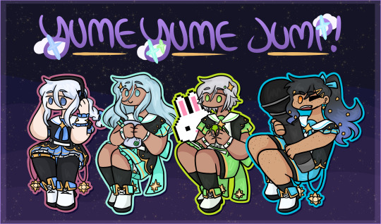
yyj is definitely the most drastic, they're the only unit where i changed every single character... i have a lot of trouble drawing the mmj outfits, but also the lighter color scheme and clover theme just didn't really make sense for yyj to me? so instead i went with a mainly black and character color combo for their color schemes, alongside gold and white to accent it and a more spacey/dreamlike theme. everyone's black and white are slightly tinted with their character colors too!
they're split into pairs for matching accessories, but it doesn't mean much otherwise. kanade and an both have the dangling star charms and a single larger wristband (with those being on opposite sides from each other) as well as no buttons on the front of their outfits, while both hinomoris have the large bows on the backs of their outfits, smaller wristbands on both arms, a legband, and star shaped clips (like the other pair, the clips and legbands are on opposite sides from each other) and they do have buttons. they're split differently for the same style outfits though, with kanade/shizuku and shiho/an being the matching pairs this way.
kanade has the most obvious design changes. i swapped her character color to a medium-light blue rather than red, because tbh she kind of stood out too much if she was still red. she's not meant to be the leader of the unit, she doesn't want to stand out. her hair is a lot shorter than canon and she usually keeps it braided for practice and performances (and leaves it loose otherwise) (both the haircut and style were initially suggestions from shizuku). shes the only member of the unit to wear tights and to lack any star shaped hair accessories.
shizuku i don't have that much to say about, i had designed kanade first and then shizuku to match. its pretty straight forward i think? she's got the tallest socks not counting kanade's tights though.
for both an and shiho i wanted to go a slightly cooler/less feminine direction, while still sticking to the general theme i had going. which lead to the shorts and vest combo! otherwise the only notable change with either of them is that an's changed her clips to two regular gold ones and she's got a ponytail now when they practice/perform, much like kanade's braid.
fts was both very fun and an absolute pain to redesign because on one hand, i can do whatever i want, on the other hand, it's like vbs there's really no consistent theme to carry through everything. except a lot of layers i guess. so my goal was to kind of merge their casual aesthetics with something more vbs-like.
tsukasa wearing his jacket incorrectly was inspired by my own tendency to do so whenever i get too warm. i think he just does it because he thinks it looks cool though (its a little silly and a pain to keep it on but he's committed to the look). also leaving his middle layer as his fish jacket from his casual sprite was a funny little thing i thought worked for him.
with rui my goal was just pockets. lots of pockets. they're probably hiding little robots and tools in those pockets. i should have put more pockets on their pants too but oh well. combine that with wanting some obnoxious bright greens and blues and at least one item that kind of clashed color-wise with the rest (their pants in this case) and this is the result. the sketch doesn't convey it well but their black jacket and pants are both kind of loose, while the green hoodie and tshirt underneath fit okay. also their hair is kind of long if they ever untied it, but no one ever sees that.
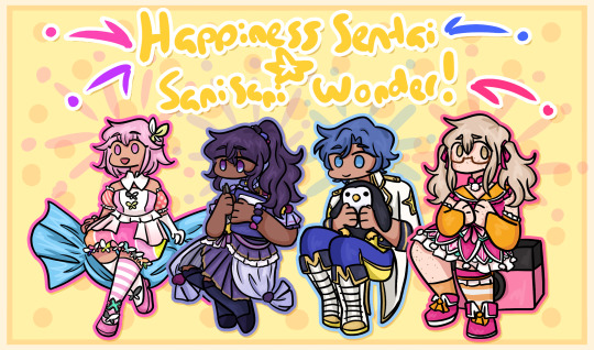
hapisen for the most part sticks to their canon sprites, just simplified slightly for my sanity. mafuyu's costume still drives me insane to draw though, that's so many layers to think about.
other than questioning my sanity every time i draw mafuyu, there's only one change from her sprite, which is making her hairtie one decorated with pompoms much like a lot of other parts of her costume. i just thought it tied things together a little more.
the upper half of haruka's outfit is more or less completely unchanged (other than making it fit in a way that looks slightly more masculine), but then i replaced his skirt with pants and gave him boots (wxs meiko, who is the sprite haruka's outfit is originally just a recolor of, wears heels). i figured if i was going for a more princely sort of design for haruka then changing those felt fitting. beyond that he's obviously got shorter hair (a choice he makes after seeing kohane decide to change herself, wanting to embrace the genuine person he wants to be beyond the idol people knew him as) and that's about it. hits this guy with the transgender beam.
kohane's outfit is really just a bit simplified from the original with sizing/proportions of elements adjusted to (in my opinion) suit her better. the ribbons in her hair felt like a cute addition (and i like to give kohane ribbons in general), while her hair length is an in between of her two standard canon ones, longer than the usual one we see but shorter than pre-canon/early mainstory. her glasses are optional, she changes between them and contacts with how she's feeling for the day and what kind of shows hapisen is planning. the more intense the show, the less likely she is to wear her glasses.
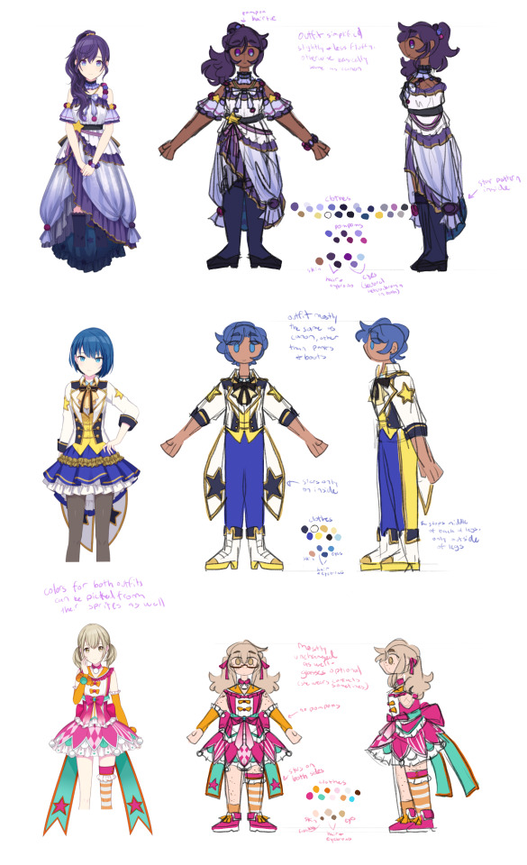
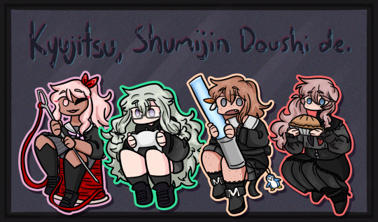
kyushumi was kind of intended as niigo but without one member in a mostly white outfit since they don't have someone like kanade who is intentionally trying to save people. although they're also a little happier off anyway, so they don't need someone like that. they're my most drawn shuffle unit, so also probably my most thought-through redesigns.
each design takes slight inspiration from a member of niigo (nene/kanade, minori/ena, honami/mafuyu), but that was just kind of as a personal guide for what kind of vibes to go with for the outfits. they've all got personal touches to them.
nene's hoodie is very loose on her body and arms, but a normal fit in the length, and her shorts are actually long enough to be seen. she just wants to be comfy, she's tired a lot, very low energy girl. glasses because i think nene should wear glasses anyway, so as opposed to canon nene who i like to believe just favors contacts, this nene does not.
minori is pretty obviously similar to ena's outfit, but there's a few nods to mmj in here. she's got clover shaped earrings, the pattern along the bottom of her dress is meant to resemble the tips of the clover leaves from mmj's symbol, and her shoes are just the mmj unit outfit shoes in different colors.
the goal with honami's outfit was simply "how little skin can she have exposed" because i imagine her being more worried about that than usual here. so long sleeves, long skirt, high collar, etc. her hair is longer (for no particular reason tbh, i simply liked how it looks) but still styled the same, and she's got a solid red scrunchie now. the four buttons on her outfit are all meant to look like the moon, two full moons and two opposite facing crescents. also i will never stop joking about the fact that she's naturally the second tallest girl in the cast (not counting vs, then she's third tallest) and i gave her tall heels on top of that. she is towering over all of her unitmates here.

while you're welcome to use these designs for any (non-incest) ships you'd like, i do have a personal list of ships that are canon to my own au with the shuffle units, which is what i originally designed these for. the "canon" ships are
ichika/saki
ena/airi
honami/kanade
akito/touya
mafuyu/rui (qpr)
haruka/kohane
mizuki/nene
however you are not by any means required to follow these specific ships! i have no desire to enforce the ships that go with these, so draw whatever ships you might prefer with these designs. i'm happy to see anything!
anyway if you made it this far congrats on surviving i know this is a lot of text o7 i hope you've enjoy my silly little character design insanities ^^;
#you guys have no idea how much these live rent free in my head#the chibis were a fun little project#and then it turned into the full sketch references for everyone once i realized i needed a better way to share my designs#project sekai#prsk art#project sekai fanart#prsk fa#w1f1 draws#saki tenma#ichika hoshino#airi momoi#ena shinonome#kanade yoisaki#shizuku hinomori#shiho hinomori#an shiraishi#akito shinonome#touya aoyagi#tsukasa tenma#rui kamishiro#emu ootori#mafuyu asahina#haruka kiritani#kohane azusawa#mizuki akiyama#nene kusanagi#minori hanasato#honami mochizuki#april fools shuffle units
157 notes
·
View notes
Text
Kiss Kiss Fall into another old hyperfixation
Anyway, I randomly wanted to redesign the main cast of Ouran in my style/ with headcanons and my own embellishments
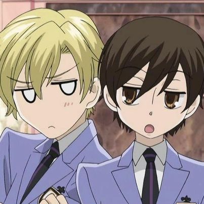
Here's a screenshot redraw, I'll put all the redesigns below the break bc I did all the main characters & wanna talk about the choices I made. Also I made up that uniform redesign on the spot bc I when I was doing the characters I just put them in casual clothes lmao
(I might do some others later, like Renge, Kasanoda, Yasuchika, Benibara, etc.)
Going in order of my least favorite to top favorite. And dont mind that I didn't color the clothes, that's not whats important here lmao
Mori is only at the bottom because I don't like the drawing that much, I still think the design is pretty good. Though, like right when I finished coloring, I decided a bun/top-knot would look better so it's a bit disappointing there. In my head, Mori is kind of struggling to figure out who he is & what he wants to do, which is why he follows Honey around and doesn't talk much. He does genuinely like being around the other hosts though.
Also, the undercut because A) he has the reputation for being the scary one & it kinda suits that, B) uh do I even have to say it? ...its hot He does lowkey look like Sokka from Avatar tho, especially with the blue accents
(edit: I accidentally deleted Mori's file so now this is the only copy so 😭)
Honey is next because again I think the drawing itself is a little off and the design is pretty close to Basil from Omori, which i didn't notice until it was too late lmao. One of the main things I didn't like about his character in the show was obviously how childlike he was & how girls still flirted with him even though he looked and acted 6; So now he still acts a bit childish but doesn't play it up as much & definitely has a more normal voice, not a fckn child's.
Haruhi! I definitely had to keep her glasses cuz they were really cute and kinda sold the whole 'commoner' thing in a way. But other than that I mainly wanted to balance out her femininity and masculinity to make her more androgynous/nonbinary/gender-fluid since she definitely has some of that going on in the show as is. I also gave her dark circles under her eyes to kinda show that she worked really hard to get into Ouran with low status.
Next up is Tamaki of course, getting into the characters I'm most happy with the designs of. One small thing I tried to do for each of them was give them varying hair tones; so even though Honey and Tamaki are both blond, I went very platinum-blond with him. When I started drawing him, my only real thought was "he has to be a pretty boy" so I dont have much to say about my choices, but i do think I succeeded. Don't mind the modern mullet thing, I can't stop it
Kyouya is definitely one of my favorite characters as is, seeing as he has one of the more fleshed out & heart-wrenching backstories in the show. I think the only thing I really wanted to change was getting rid of the Anime Bangs, so I just gave him this kinda sleek, kinda messy pushed-back look with a blue tint. Even though it's simple, I really struggled to come up with anything, until I found a page from the author saying smth like "I don't like the idea of him wearing neat clothes" with a picture of him in like a track suit so I did kinda the same outfit
My absolute #1 favorites, Hikaru & Kauru. They're honestly the ones that started it all because Kauru has been my favorite since I first saw the halloween episode (iykyk).
I don't know why, but I wanted their hair to be fluffier/curly and more of a natural(?) ginger color. I knew I wanted Kauru's to be redder and Hikaru's a bit lighter/blonder, but only subtly. I also gave Kauru a scar on his cheek from that time in Karuizawa, but most notably, I gave them blue and pink eyes as their signature colors. Lastly, their expressions are slightly different, because no matter how much they are in sync and try to match each other perfectly, Kauru's a much gentler soul than Hikaru, so I made Hikaru's smile a bit more snarky while Kauru's is soft.
Thank you for looking at my art/ reading my thoughts, here's an extra little design edit & comparison

(lol, I think they're mimicking Kyouya in this panel idek) (Also here you can see I tried the bun hairstyle w Mori, I think it looks good, but this is a really simple drawing so.)
#ouran high school host club#ouran hshc#haruhi fujioka#tamaki suoh#kyouya ootori#mitskuni haninozuka#takashi morinozuka#hikaru hitachiin#Kauru hitachiin#character redesign#my fanart#my art#screenshot redraw#im hyperfixating again#ouran redesigns#33xhausted art
64 notes
·
View notes
Text

Enseigne - The Sword of King Baldwin IV
============================================
Finally, here's a little finished something for the KoH fandom - a total redesign of the sword of Baldwin IV.
Don't get me wrong - I love the swords in Kingdom of Heaven, but they are a tiny bit historically inaccurate due to their extended hilts. So, taking inspiration from both history and the film, I've overhauled Baldwin's weapon to be one slightly more in line to what I envision a 12th-century King of Jerusalem possessing.
The overall design is that of an Oakeshott XII-type sword. I do realize that this category tends to be a catch-all for swords that don't quite fit into X, Xa, XI, or even XIIIb, but it does seem appropriate for a late 12th-century warrior who would have had access to cutting edge (har har) technology and would have also needed the versatility of a weapon that could both slice and thrust with ease.
The blade is pattern-welded (you might have to zoom in to see it). Whether or not it is true Damascus steel is up to your own imagination; it is evident that the Franks would have also practiced their own pattern-welding techniques at the time. The shortened fuller bears the inscription "Virtus, Fides, Voluntas", which is Latin for "Virtue, Faith, Will" - appropriate, imo, for a chivalric king of the Holy Land.
As for the rest of the sword, I've replaced the almost cartoonish "roses" on the crossguard with more fanciful etching, but that's a matter of personal taste. I've also removed them from the pommel. The grip, instead of being cord-wrapped, is bone/ivory with gilt blue enamel detailing.
And what's a weapon of a legendary king without a name? My personal choice is Enseigne, which, according to the Old Norman dictionary, can mean everything from "sign" or "prophecy" to "paragon" and "exemplar", and even "war cry", depending on the context. A rather flexible definition that has multiple implications.
Anyway, I hope you like it as much as I liked designing it!
#kingdom of heaven#baldwin iv#king baldwin iv#the leper king#baldwin iv of jerusalem#fanart#kingdom of heaven fanart#12th century#medieval#sword#my art#aurianavaloria
29 notes
·
View notes
Note
https://youtu.be/C6x5bkvC1ms?si=V0YAS4OMGsTS0BIT
Hello clown dick anon here, I got a recommendation of a reupload of the extended song of known bitch a day or two ago and ended up finding a metal cover as well when I remembered and looked for it. Still trying not to get mad at the missed gold level rhyme of "bitch" and "dick". Also thinking of trying to redesign the twins and lean heavy into the horny aspects by having them both nearly being half dressed literally. Like two halves shit. Outfit inspo being the main reason and coming from a party femme I saw when heading home from errands at night who had a slim white dress with fluffy hens that looked like it barely covered her (it didn't, accidentally got flashed and i felt bad for being semi obsessed with her clothes because she looked like she put a lot of effort into her outfit) with white fishnets. I wouldn't use it as the complete inspo for both outfits (I would want it to be a complete eachother sort of thing) and would probably have the silhouette be completely different from the brave gal and her friend/bf on the bus that night. I might put a lotta sparkly crystals cause iirc the strangers fishnets had little crystals sewn into them. Not sure if I'd share it but I am slightly in love with the bitch twins despite how low effort and lackluster they both are.
Nothing wrong with loving those bitch twins. Loving a character Vivzie's failed at every turn is the HH/HB fandom experience in a nutshell.
19 notes
·
View notes
Text

Alright, this kid has been fully finished since like, Monday, I’ve just been too lazy to post him, but now I’m gonna post him, this is Black Choco Cookie
As you can see, this is yet another darklico kid. I’m sorry. But he’ll be the last one I do; I already semi had plans for him when I made Licorice Cream, it’s just that I decided to just do Licorice Cream. But then the night prior to making him, I was thinking about ideas for him and just drew this the next morning
The only other darklico kid thing I plan to do is redesign Gancao, since her look really doesn’t match her name, and it bothers me. Either that or her name changes. But fundamentally she’ll still be the same character
Anyways back to Black Choco, so with his name, he’s dark chocolate like his father. His name is just Black Choco because while he’s chocolate, he supposed to have this smell of licorice about him
Maybe he’s these chocolate licorice brownie cookies I found online that one time. But his name is still Black Choco
Anyways, let’s get into his design
So you’ll notice he looks very similar to Dark Choco except for the eyes. Well that’s because he’s the third one of these, and frankly I feel like the girls look enough like Licorice, so might as well have one of the kids be the Dark Choco clone like Dark Choco is to his own father. I think the fact he’s the third of these I’ve made is the only reason I allow him to look mostly like one parent and be the clone
But I finally gave one of them Licorice’s yellow eyes, so that’s good. I’ve been wanting one of them to have the yellow eyes and white eye lines since Gancao, it just didn’t work with her or Licorice Cream. Though I changed up the yellow slightly so that it’d work better with the white
I based Black Choco’s look off of the young design of Dark Choco in the artbook, since his sisters all look like they live in the Dark Cacao Kingdom too (the three are all supposed to exist in the same universe as siblings), and he’s supposed to want to be a fighter like his dad. Also with the brown it makes him look like the cookies I showed above. That wasn’t the intention but I like that
I think the way his hair looks was supposed to be inspired by how Licorice’s hair, like specifically in how it’s parted or something, but looking at it again I can’t really see that
I just realized the drawing I have of Black Choco here is with his gradient. I wasn’t sure if I should give him one; I did it so he’d look at least a little closer to Licorice, but I wasn’t sure it worked well. Ah well, I suppose you tell me
Anyways, so let’s get into his character
So Black Choco is a shy and a bit anxious kid, as well as someone who gets spooked easily, as shown in one of the sketches. He’s also generally quiet and soft spoken, not very capable of loud noises. But despite his timid nature, he’s a good kid who just wants to help people
He greatly admires his father, Dark Choco, and wants to be like him, which is part of the reason he wants to be a warrior. Thankfully for Black Choco, I imagine Dark Choco to be more openly affectionate than Dark Cacao was, so Black Choco isn’t gonna grow up with those same parental issues. But unfortunately, Black Choco isn’t as great with a sword and fighting, especially since he tends to accidentally drop his sword. But he does want to learn, and he tries hard to overcome this
Despite this however, he does know magic, and he’s actually very skilled at it, far more than he is at fighting. However, he chooses instead to become a warrior. Perhaps in the future, he learns to try and do both, combining his skills and becoming a warrior that uses both sword fighting skills and magic, becoming a real powerhouse
Now, as for his connection to his siblings, I’m not sure, as some of it depends on his age compared to them. I want to make Black Choco Licorice Cream’s twin, probably since I imagined Black Choco as a child and I drew Licorice Cream as one too, but also I don’t think I can really do that since Licorice Cream herself has a particularly unique origin, one that Black Choco doesn’t necessarily fit in to. Not only that, but I think I drew Licorice Cream as a child because I couldn’t figure out what to do for her other than her origin and possible connection to dark magic and the Strawberry Jam Sword. She’s technically supposed to be the older than Gancao, and I imagine Black Choco to be a child. But at the same time, I can really see Black Choco and Licorice Cream as a twin duo, and I like that concept, especially since personality wise, they’re pretty different, Licorice Cream being an extrovert while Black Choco is the introvert, for example. But it just doesn’t work with what Licorice Cream actually is
*sigh* I think I’m gonna need to do a redesign with all three of them, putting them on the same canvas and figuring out definitively what order they’re in and their ages relative to one another. Though Black Choco I don’t see changing much, he’s fine as he is
I suppose for now, Black Choco is the youngest of the three
But in any case, I think that’s it for Black Choco. To be honest, I feel like sometimes, I put too much into these characters and should just try to keep them simple, which is sort of what I tried to do with Black Choco here
But in any case, I hope you like him
#the darklico kids are a mess I need to untangle#but I like Black Choco#and the other two it’s just they’re inconsistent between the three#cookie run#cookie run kingdom#cookie run oc#black choco cookie#fankid#fanchild#darklico#dark choco cookie#licorice cookie#almost forgot that bit#my ocs#my art
62 notes
·
View notes
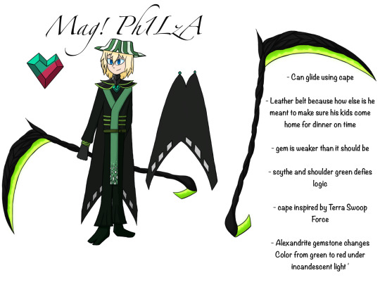
Text

So I drew a Mag!Philza for A-Non-ymousWriter’s Wishes and Family and I looked back on it because it was one of my first drawings on procreate, and the thing I noticed is that… I could do better. Way better. So this was kind of both a redraw and a redesign of that original artwork.
Notes and the original under the cut:
Notes on Phil’s design
His scythe is made of twisting branches with a glowing acidic green metal. The reason I kept it was mostly for the cool factor, however I did switch the smaller blade to the other side and gave it an extra needle point.
He gets his hat because of course he does
I slightly altered the neck armour to be a little lower and fit closer to real life references.
Shoulder armour stays but the green highlights no longer glow
Mag stone is located on his chest like last time because admittedly it looks good there and pretty natural there.
The wing! I have Philza his wings instead of the cloak (I didn’t want to draw the other one)
The tunic is a lot more green this time since before it was hard to make out his outfit.
The pants are now flare out with the leg bracers brining them back in because before it felt less practical.
Got a better belt from reference images because the old one was too thin
Leaned a bit more into the heart aesthetic
All in all I think I did do a good job at redesigning Mag Phil
I might actually do the others in my sorta design stuff, idk.
Here’s the original for comparison:
#dream smp#puella magi madoka magica#crossover ig#philza#philza minecraft#au#fanart#character redesign
8 notes
·
View notes
Note
What's your favorite outfits for the Trix?
I love this ask because I am nothing if not obsessive about fashion and the narrative use of fashion in TV. Unfortunately, the trix don't get a big variety of outfits, but I'll work with the few ones we do get.
Darcy's civilian clothes.
This look is just amazing and shaped my fashion sense as a tender seven year old child. Not to mention, the whole look really reflect Darcy as a character, her uniqueness, personality and powers. It's fashionable and modern which makes us realise she cares about how she's perceived and conventional standards (reflecting her vanity), but still have a strong sense of individuality with the witchy 70s influences, mainly the bell bottoms and yellow sunglasses, setting her apart from the crowd. And by the way, while we're on the topic of those damn sunglasses?? They're an endless source of fandom debate because we never really know for sure why she wears them. I personally subscribe to the headcanon that she wears them purely for aesthetics but probably pretends she wears them due to being light sensitive. Whichever the case, both go so well with her personality. The whole look is also very much giving sexy-nerd which is just so real tbh. This is peak character and fashion narrative.
2. Stormy's disguise
There's a good reason the boys at the red fountain started flirting with Stormy when she was in this disguise, she was scandalously hot in it. It might not have a big narrative purpose but it's beautifully mid 2000s. I love that the color scheme is Stormy's regular colors slightly brightened up and with the blue being dominant - a little sneaky hint about who she really is.

3. Icy's disguise
The whole vibe of this outfit is reflective of Icy's personality. It's sporty, fashionable and hot, designed in all blue. I also just adore the platinum blonde hair that went with this look.
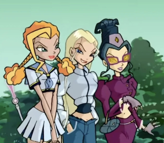
4. Darcy's gypsy look.
It's so fun to see the disguises the trix put on. I like this one solely because Darcy looks stunning in it. Lol.

(dis)Honorable mention: Disenchantix
Disenchantix is one of those looks that I can never make up my mind about, because frankly I find it too sexualised. I mean, Valtor putting three young women in lingerie makes me physically cringe when watching it but none the less I can appreciate what the show was attempting with this look. The shawls and skirts bring my mind to the witchy vibes of Stevie Nicks in the 70s and the fashion of witchy and occult communities. However, the overly revealing interpretation of this look very much screams male-fantasy to me. It had so much potential that just went down the drain. If I had even an ounce of drawing skills I would redesign disenchantix in a heartbeat.
#winx#winx club#the trix#darcy#icy#stormy#asks#littlegirlywerewolf#also call me delulu but stormy's disguise is giving Rory Gilmore
42 notes
·
View notes
Note
Hitting you up because I want to hear more about Emperor Qianlong's art collection! My two big all-consuming hobbies are drawing and reading about history, so I pretty much can't get enough of either topic
OH OH where to BEGIN with Qianlong and his love of the arts???? And also okay he historically is SUCH a funky guy idk where to even begin on how much I love cool and kind of failflop Qianlong facts. If you want to know about his hilarious terrible poetry I leave you with this poem he wrote about cucumbers:
It is the best ingredient on the plate in Beijing;
I tasted it lately in February, but how can I give it a review?
Weighing down the trellis, and embellishing the fence, it looks so beautiful,
The rural landscape contains true feelings.
No this isn’t any better in Chinese. You can find it and other Qianlong poetry roasts here.
Okay, I don’t know if Qianlong’s art collection/paintings created for him can be contained in a single answer, BUT, I’ll do my best!
Emperor Qianlong was an avid patron of the arts, and his collection of paintings, jade pieces, and other antiques remain one of the greatest reasons why we still have a lot of the pieces on display around the world today. He was also in the habit of writing on/stamping his personal seal on his favorite paintings and art pieces, and some of these repeatedly viewed paintings (with his notes/thoughts/writings) also preserve great portions of his life, which is a really intimate look into him as a person especially throughout time. We rarely get this sort of information from a ruler since MOST imperial writing has been edited/was meant to present to other people. He also liked to take landscape paintings with him on his travels to compare the landscapes in the paintings to their irl presentation.
His habit of turning his favorite paintings into diaries is NOT a common practice btw, most people didn’t deface the paintings in their collections. (Okay they might put their personal stamp on it to explain that they own it, but WRITING NEW SHIT ON IT? nah.)
Art historians, btw, have been in argument about his practice of defacing paintings and basically being in conversation with them ON the painting itself, since practically the time he started doing this about if it’s destroying the art or enhancing it somehow. He was just. SUCH a guy.
(He uh, may also have used coercion, threats, and force to acquire some of these because he was the emperor and he wanted them. This behavior was normal for emperors but his obsession with art and antiques was slightly less normal. Like, this man was IN LOVE with art.)
The OTHER hilarious thing about Qianlong was that while he LOVED paintings and antiques and poetry and art he uh, well okay see the above roast re his poetry but he wasn’t very good at any of these things per se. (For example, there are multitudes of stories about how he’d get really happy about a certain painting or antique in his collection, only to discover that it was a GREAT forgery or a fake or not actually all that old and oh here’s the actual thing your majesty this is the real one and be SO embarrassed by this new knowledge that he’d just KEEP BOTH and pretend nothing was wrong. Like just WHAT a guy. What a guy lmao.)
Qianlong also really loved western style paintings and painters. For example, Giuseppe Castiglione was one of his favorite court painters (Chinese Name Lang Shining) and did these two paintings of Emperor Qianlong:
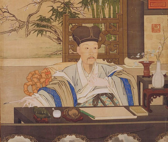
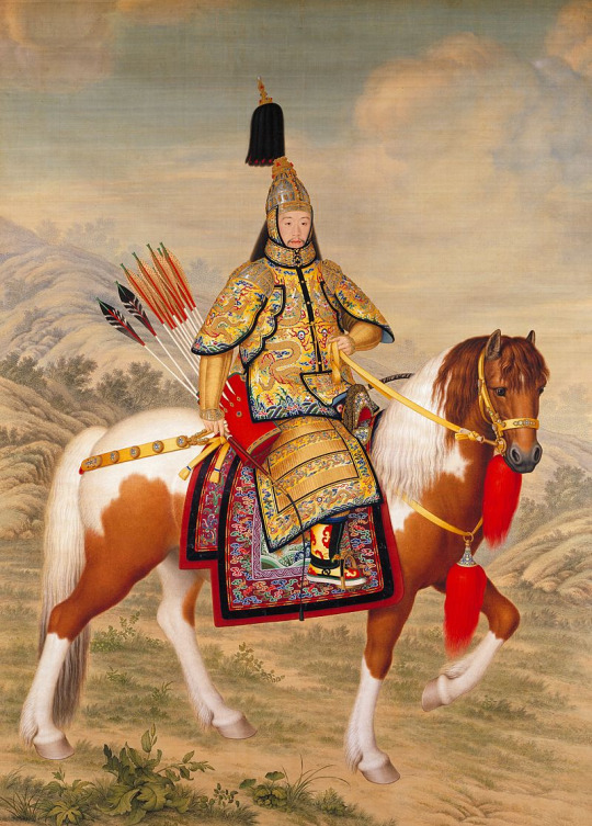
These two paintings are like, some of my favorite things because like, the combination of east and west, and utilization of like, different techniques and perspectives is !!!! in my brain. Like, it’s incredible and I love it so much.
Qianlong also incorporated a lot of western style architectural elements in his redesign and beautification of Yuanmingyuan and had a REALLY interesting life overall, but this is getting kind of long so 😂I’ll leave off for now.
Feel free to ask about anything that sounds interesting about this though! I love to ramble.
#qianlong#asks and answers#history#chinese history#he was just SUCH a guy#if I had historical blorbos this would be a historical blorbo
35 notes
·
View notes
Last Seen Blogs
squid-in-a-party-hat
Squid In A Party hat
taylorkrahenbuhl
Taylor Krahenbuhl
peoplegettingkindamadatfood
why.. my peanus weanus of course :)

flourishing-pink-heart
flourishing-pink-heart
naoamaya
a girl inside a dream