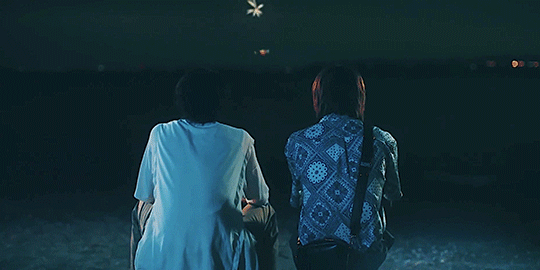
#I love creative typography
Text

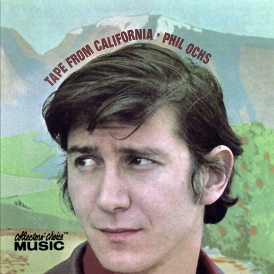
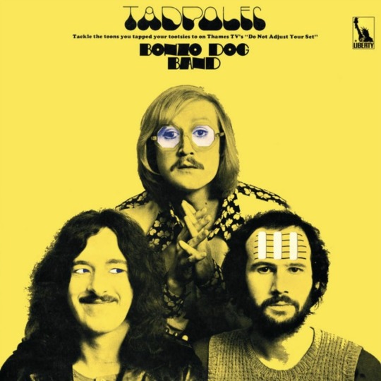
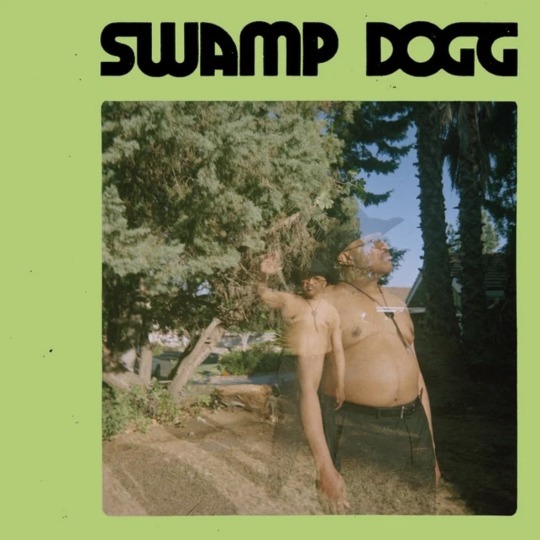
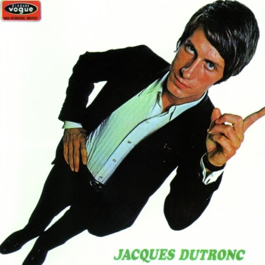


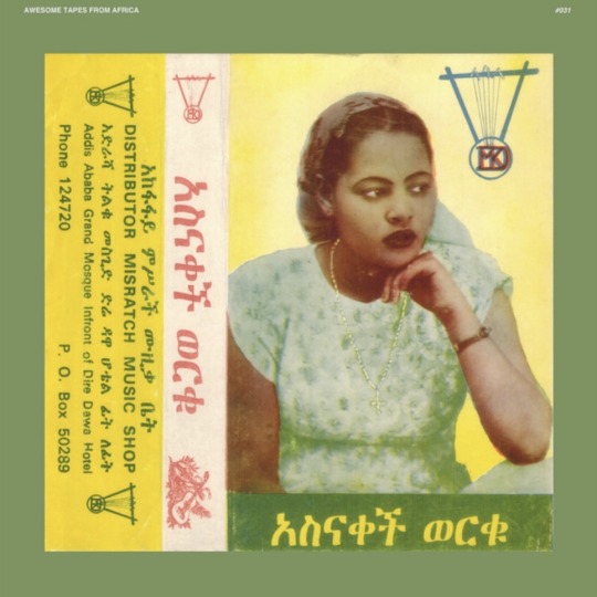
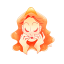
i was tagged by the wonderful @frogeye-pierce to share 9 of my favorite album covers! one of these is a single cover but i am pretending like i do not see 🙈
ooh-wakka-doo-wakka-day - gilbert o’sullivan // tape from california - phil ochs // tadpoles - bonzo dog band //cheating in the daylight - swamp dogg // et moi, et moi, et moi - jacque dutronc // we are nots - nots //strangers from the universe - thinking-fellers union local 282 // philosophy of the world - the shaggs // asnakech - asnakech worku
tagging…. @westerberg @bingokill @magentagalaxies @fast3ddie @magentagalaxies
8 notes
·
View notes
Text

Love or Hate? Creative typography
#love#i hate this#lord hater#typography#logotype#creative#letter#font#web devlopment#social media marketing#consulting services#usa#new york
165 notes
·
View notes
Text
#mine#reminder#had fun making this but it took forever#my words#edit#typo#typography#text#writing#collage#photo#photography#photographers on tumblr#digital#nature#been feeling so creative lately#i love it#♡
91 notes
·
View notes
Text
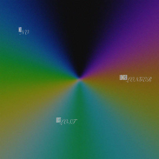
no longer lost
#clumsydoodles#clumsy#graphic design#illustration#modern art#original art#digital illustration#artists on tumblr#artwork#digital artist#procreate#digitalart#digital drawing#digital art#illustrator#adobe illustrator#illustrative#art#poster#poster art#graphic art#visual art#typography#design#creative#poster design#my art#drawing#love quotes#i love you
10 notes
·
View notes
Text
some graphic design resources cause im bored and itching to write something but i cant write anything i'm happy with--- anywayssss
unsplash for lots of royalty free pics
heres a cool site to learn how to pair fonts together
heres another site to learn kerning [spacing]
in fact heres a bunch of games to help u get better at graphic design stuff
some free online video editors x x x
color accessibility resources :]
savee.it - like pinterest but for designers!! unfortunately it has a save limit for free users but u should still be able to browse it for inspo i think?
some free fonts
aside from coolors i really love adobe color!! it has color palette generator [triads, monochrome, complementary, etc.], accessibility tools, palettes+gradients extractors, and color palettes inspired by trends within diff industries.
make moodboards online for freeee i miss u polyvore
spline and womp for web based 3d design! + blender of course [go make that donut!]
we all know and love them: photopea [photoshop but free and on a browser?!] and canva [no introduction needed im sure]
upscale the resolution / quality of pics it says anime but it works really well with most stuff like video game screenshots [gets rid of hard edges/pixels]
typography inspo
more color palette generators [already meets accessibility guidelines]
filmgrab - a curation of movie scenes 💕
here's another one but for color palettes from films
more inspo and tutorials
cargo - for web design stuffs
an archive of BRANDING GUIDES
free online zine hosting
milanote - very very useful for organizing creative projects :D kinda like a mix of notion and pinterest ? [its basically notion but more visual]
a collection of free luts
lots of pngs for editing
freepik - lots and lots of free design assets.
flaticon - lots of flat icons / vectors. i haven't used this in a while, but it was free last i checked
in case u need more help pairing fonts go here and here
idk ilu all have fun!!!!
2K notes
·
View notes
Note
I have another idea, but it would be a spoiled and clingy Princess with her dear childhood friend. I now have no way of elaborating on this idea, other than a Princess - 💙☺
Ooo, this is interesting because I have mentioned a few times about a Knight OC I never posted - maybe if I ever end up posting him, there could be some kind of crossover with him and the Princess? Idk lol Dead Dove Extended Universe confirmed
Anyway, I hope this is okay!! I really like historical stuff, especially Mediaeval and Victorian era my university dissertation was about Mediaeval monks and how their handwriting influenced modern letterforms and typography so this was very fun to write!!

OC Intro - Her Royal Highness, The Princess Theophania
Royal Yandere
Female ♡ 24 ♡ Human ♡ Princess
TW: Stalking, obsession, abuse of power, implied murder, reader is gender neutral as far as I could manage but it was kind of difficult since nobility titles and servant titles were very much gendered in the middle ages
♡ - You were fortunate - your mother working as a chambermaid in the castle and you being born around the same time as the princess meant that unlike most people who weren’t nobility, you got to spend time with Theophania.
♡ - You were childhood friends. Whenever she had a spare moment not taken up by her education, she’d run down to find you, and you’d both play whatever games you could think of until some tutor or the Queen dragged her off again.
♡ - She’d always smile at you, and even as children, as you looked at each other, you couldn’t help but wonder - what was the difference between royalty and the common folk? Why were they kept so separate?
♡ - As time went on and you both grew older, however, you two were kept separate more and more, the King finding it unbecoming that the princess spent her time with a commoner. Eventually, it got to the point where you never saw her anymore as she was kept locked away, learning the responsibilities that came with royalty.
♡ - It wasn’t until you were grown, and took up working as a servant yourself, that you saw her again - a banquet, held in honour of her reaching the age were she was ready to be married. You were stunned by her beauty as she stepped into the grand hall, luminous before all the guests. You doubted that she even remembered you existed.
♡ - But Theophania never forgot - as her eyes scanned the hundreds of people looking at her, she recognised you almost immediately even though you’d changed so much since you were children. She never forgave anyone that she’d been torn from you, and now she had influence of her own as a fully fledged royal, she was determined to use it to get to you.
♡ - The King brought in many suitors for Theophania to court, each bringing lavish gifts of fine silks, gold, furs, jewels, rare spices and fruits from the East, myrrh from the Holy Land, or rare texts, all in hopes of winning Theophania over. Knights, nobles, princes and kings from other kingdoms all came to try their luck at being betrothed to Theophania, but all were rejected.
♡ - Theophania was determined her marriage shouldn’t be one of political convenience. She wanted a love match, and she wanted you, but she knew the King would never allow her to marry a commoner. So she had to get creative.
♡ - There was a great deal of controversy and outrage when, out of nowhere, she asked for you to serve as her chamberlain, getting rid of her old one. You could hardly believe it yourself - did she really remember you?
♡ - You struggled to get used to your new duties, helping her get dressed, stoking fires to keep her warm, bringing her things to eat, cleaning her chambers, yet she was very forgiving of you when you did make a mistake. She never mentioned the time you spent together as children, though, making you wonder if she really did recall.
♡ - More suitors tried for her hand in marriage, and the King was becoming impatient, ready to begin forcing her to marry one. But that’s when they began to mysteriously die.
♡ - Everytime a new suitor came, he was discovered the next morning, dead. No one could work out how they died, and rumours began to spread that the Princess was cursed.
♡ - The many gifts from her dead suitors stayed stashed in her room, and after spying you admiring them, she gave you a wicked smile, and offered them to you. You declined at first - it was illegal for a commoner to own such finery, and besides, you couldn’t have read any of the book anyway with no education of your own. But Theophania insisted.
♡ - She fed you sweetmeats and quinces and fruit dusted in beautiful spices the likes of which you’d never tasted. She draped you in furs when you were cold and silks when you were warm and demanded that anyone who objected leave you alone before they were executed. She patiently sat next to you, teaching you how to read and scribe with a quill, so that you could be educated.
♡ - Little by little, you began to look less like a servant and more like a noble - completely changing over the course of months.
♡ - Suddenly, the King mysteriously began to get ill, a terrible sickness worsening with each passing day. It looked as though he may die soon - but Theophania was oddly calm.
♡ - With no brothers to speak of, nor a husband, she’d be next to inherit the throne, and as the King became too weak to rule, she had to take on the mantle of Regent Queen, making her the most powerful in the Kingdom.
♡ - With no one left to challenge her, she turns to you, a saccharine smile on her face. “My beloved servant - Now I am Queen, how would you like to be gifted a Dukedom?”
♡ - After all, she couldn’t marry a commoner - but nobility was more than acceptable.

Dividers Credit: See Pinned Post
#yancore#yandere#yandere blog#yandere fic#yandere imagines#yandere x darling#yandere drabble#yandere oc#yandere oc x reader#Ask#Story#Meet Cute#Theophania#female yandere oc x reader#female yandere x darling#female yandere oc#female yandere#yandere female#tw stalker#tw stalking#stalking#stalker
121 notes
·
View notes
Note
hi lovely!! do you have any tips on making cool fun and sexy typography?
hey joanna!! this made me giggle haha, i'm not quiiiite sure how to answer that, but here are some tips i keep in my when i do typography, and some examples:
FONTS
don't be afraid to "shop" for fonts and try funky fonts you've never used/seen. i often try so many before settling. i almost always use at least 2 different font for gifsets, even 3 sometimes. i think a good font pairing can do a lot for a gif. it's usually something like:
serif + cursive/funky fonts (example)
sans serif + cursive/funky fonts (example)
serif + sans serif fonts (example)
two different cursive/funky fonts (example)
or even simply the same font but all caps + all lowercase (example)
in case you're unsure where too start or want inspiration, here's a great resource: usergif's font pairing guide and its fonts page
BLEND MODES & LAYER STYLES
i think playing around with different blend modes and layer styles will always elevate your typography game, in my opinion. it's usually a bit more dynamic than just an opaque color. tho this minimalist typography can also be really good.
when you double click on a text layer, you get all the layer style options, as well as the blend modes. a very popular layer style is setting the layer's blending option to difference, paired with a color and/or gradient overlay (often set to multiply/color dodge). a drop shadow is also important so the text is more easily readable. we often see a black soft drop shadow, but don't hesitate to be creative with it, for example a thick, hard line, colorful drop shadow.
i feel like this step often takes the most time for me because the possibilities are endless. definitely play around with layer styles, especially drop shadow, color overlay, gradient overlay, stroke. and also try different blending modes for these settings.
as for the layer's blend mode, also definitely play around with them. and keep in mind that the text's color will also give a different result, it doesn't have to be white + blend mode set to difference, even tho this is a classic that works well.
TEXT WRAPING & POSITION
a great feature on photoshop is definitely the text warping tool. to access it, right click on a text layer and go "warp text". from there you'll get a few different styles and setting sliders. my favorites are flag and wave (example). you can always go back to edit these settings once they're done by right clicking again. and you can even keyframe/animate these settings!
typography doesn't always have to be centered and straight, i often prefer it on a side and rotated a little. you can easily rotate typography by selecting the layer(s) and hitting ctrl + T. you can also play with the skew and pespective after hitting ctrl + T by right clicking the canvas and clicking on either. these will give different ways to move your text.
SIZING
i love playing around with different font sizes, it makes the typography more interesting in my opinion, and it's a way to emphasize some words.
so for that reason i usually put each word on a different layer so i can edit each word separately. sometimes i will also put each letter on a different layer, because it can be interesting to offset/rotate some letters sometimes (example) (another example).
i often pair a quite small serif or sans serif font with a much bigger funky font (example). and often that bigger font will also have different sized words (example). i play around a lot with this!
ADDED EFFECTS
there are some things than can be done to enhance typography:
adding a colorful rectangle block behind the text (example)
using text symbols such as quotation marks or backets (example)
using lines around the text (example) (another example)
these can definitely bring typography to a different level
MORE RESOURCES
great font website
usergif's typography tag
my fonts tag
this is all i can think of right now, i hope it helps :D if you have any question on a specific text effect let me know, i can definitely make a tutorial!
#alie replies#silversmists#typography#photoshop#*ps help#resource#completeresources#allresources#resourcemarket#usercats#userabs#userpjo
170 notes
·
View notes
Text
Rose Recaps Rose Tinted Glasses
It's been three months since I made a post thanking this community for being a place for me to share my love of BL.
And since then, every day I feel a little bit more comfortable here.
This place is so special to me for so many reasons and the fact that I found it is a small miracle. I was talking with my friend Neely about something BL related and they told me that they think I'm doing much better since I came here. So thanks again.
I was never a part of any online fandom. And before BL I never really felt like I was missing something. Maybe because I always found someone irl that I could freak out about whatever I was watching I never really felt the need to go look.
And the people here are exceptionally kind. Before, I made a point to never engage much online, except for certain support groups, because of the hate that sometimes exists in certain spaces. So I was very much surprised by the kind humans that exist in this bl fandom in this corner of the internet.
Also. There is some serious brilliant people here.
Look giffing is not easy, it takes a long time, sometimes you spend so much time with a set only to hate it by the end and never posting it. And sometimes you post something and you're really proud and crickets. And sometimes you post it just so it doesn't go to waste and all of a sudden it explodes. It's all part of the magic.
I keep my sets pretty simple so I'm in awe of how some people make these beautiful art pieces with layers and colouring and typography. It's incredible and I applaud your creativity and patience.
Speaking of brilliance, I'm constantly in awe of the meta writers. That shit is not easy.
It takes way longer than we think, to make it neat and readable, adding gifs or shots to illustrated a point, sometimes wasting so much time finding the gif you want in the mess that is the gif search (I understand it now, cause yesterday I was on the hunt and it would've been quicker to make the damn gifs), and reviewing it before posting, changing it in the process, sometimes leaving it in drafts because the idea is not completed. I'm tired just thinking about this. I'm not able to do that. Sure I can talk for hours about this stuff but actually organize my ideas into a coherent point of view and writing it down. Nope. Not me. So bravo meta writers. I applaud you.
And of course all the people that share the stuff that really matters. Like the colours, the wardrobe, the places we see, the news about what's coming, language nuances, pictures of the pretty people in sometimes ridiculous or beautiful outfits, sometimes the pretty people before shirts were invented, and some of the funniest commentary I ever encountered.
I don't wanna single people out by tagging them because truly there are way too many. So I just want to thank some people that helped me navigate this place and made this time so enjoyable.
First and foremost.
@twig-tea You were the first person I talked to here and you were so kind and patient with me and my awkwardness and lack of knowledge of how this place works. She also writes great meta and is brilliant and everyone should be following her.
@lurkingshan because of the Sahara-Sensei post that you tagged me in and made me feel so seen.
@pharawee because IFYLITA just wouldn't have been the same without your sets.
@respectthepetty because she helped get the colour coded subs right and she appreciates the bokeh in all its glory.
@itsallaboutbl for screaming with me in portuguese.
@mikuni14 Because she's been so incredible kind to me.
@iguessitsjustme because of many reasons.
And If I ever reblogged anything from you, consider yourself tagged in this post. All of you are amazing.
And finally...
@blmpff for a lot but mostly for the most unexpected and incredible moment I experienced in this short time. The day that a bird took over my dash. Khun Feathers was such a treat and this masterpiece was the highlight of the day.
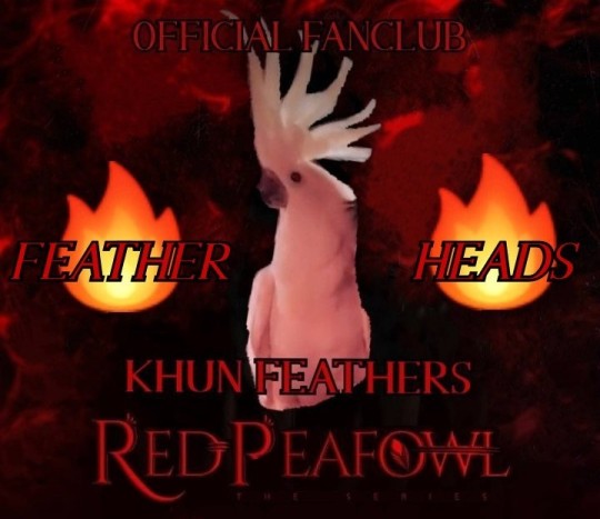
image by @blmpff
It's been a wonderful year and I look forward to see what happens tomorrow.
Wishing you all a happy new year!💜
54 notes
·
View notes
Note
Hi Loa! You said you started off with HTML/CSS/JavaScript, and you post a lot about your website projects. So I wanted to ask if you have any advice for the process of designing a website and making various graphics. I enjoy coding a whole lot, but I've avoided front-end stuff until now because looking into design and tools for it made me feel a little overwhelmed. What would you do if you were to start learning anew web design for your coding job and hobby projects? Thank you a lot :)
Hiya! 💗
I'd be happy to share some advice on designing a website and creating graphics. It's great that you enjoy coding and want to explore front-end development and design, and don't worry, though I love frontend stuff a lot, I still find some things overwhelming e.g. I'm currently learning Django which I have put off from learning because it looked "hard" but now I love learning it. Just give yourself a little push and you'll enjoy it! 😉🙌🏾
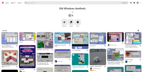
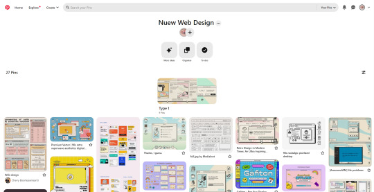
Web Design Inspiration
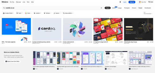
Two key places I get inspiration for my website designs are Pinterest and Behance!
For instance, when I was, and still am, researching Old Web GUI designs, I made a Pinterest board of images relating to what I wanted to design and I used that as a reference when building the design in HTML and CSS. So, I would look at the picture and think "Okay in terms of HTML elements and CSS styling, how can I replicate this? 😉👍🏾". You can check out these boards: board 1 | board 2
Pinterest is the main inspiration place, and Behance is for more in-depth web design components. What I mean is if I need inspiration for a navbar design or a certain card design, I would use Behance.

Now I don't particularly do this, which is bad, but I do recommend making a wireframe for your web designs. I talked about wireframes in a previous post, but to sum it up; wireframes are good because they allow you to stick to your design plans and not go off on a tangent. These are especially good when working in a team at work, for example.
The reason why I don't particularly do them as often as I should is because I see things in my head vividly enough that I won't forget where everything should be - no super power but that's the main reason I don't make wireframes. As well, I change ideas halfway through so there's no real need for me to keep making wireframes if I will change the design 2 minutes later! 😭💔
But that's just me, but you should totally start designing wireframes. Practising drawing up some wireframes will definitely help with being creative in your designs. Take everything around you as an inspiration. The way I think of it is to think like an artist who is capable of painting anything - all you have to do is look around and paint. You can do the same with web development - everything is an inspiration. I saw a person make a whole webpage with amazing graphics... just about water. You can do the same.
If you need help on that part, definitely look into graphic design. I took extra classes in Graphics (which was just graphic design) when in school which involved looking at graphic artists and studying their work, then replicating something with our own twist. You can do the same with web design - study websites online, some you like or random ones. Look at a piece of the website and try and replicate it. That's why I like projects which are like "make a Google clone" or "make a Netflix clone" because it gives you the chance to study other people's codes and you can keep that knowledge for any future projects!
And lastly, study web design principles. There are some principles that good websites all put into their design that make the user's experience good. Read this article about it and this should even give hints to how you could design your next website! Learn about fundamental design principles such as colour theory, typography, layout, and composition. Understanding these principles will help you create aesthetically pleasing and user-friendly designs.
Web Design Tools I Use
Now, what do I use every time I start a new "project", what online tools do I use? I literally have these on my browser's bookmarks, ready to go!
Pinterest (inspiration) - LINK
Behance (inspiration) - LINK
Coolors (colour palette generator) - LINK
CSS Gradient Generator (because I'm lazy) - LINK
Google Fonts (main source for fonts) - LINK
Font Palace (fonts I want but not on Google Fonts) - LINK
Font Awesome (for the little icons) - LINK
Image Colour Picker (if I have an image and I want to pick the colour from it) - LINK
Optional tools:
Bootstrap 4/5 (sometimes I use this for personal projects, definitely use it at work) - LINK
Pattern.css (creates a patterned background for you, again I'm lazy) - LINK
Storyset on Freepik (people graphic images) - LINK
Pexels (stock background and even fake product images) - LINK
Unsplash (same as Pexel) - LINK
LottieFiles (set animations) - LINK
TinyPNG (makes image sizes smaller so less space) - LINK
CSSmatic (4 cool CSS generators) - LINK

That's all I have to say, if I didn't help with your question, message me to help you further but I do hope this helps you!! Good luck! 🥰🙌🏾💗
#my asks#resources#codeblr#coding#studyblr#tech#progblr#programming#studying#software developer#webdev#web design#web graphics#tools
115 notes
·
View notes
Text
DmC: Devil May Cry Thoughts
So I finally decided to experience the DmC Reboot, and my overall verdict is: Not As Bad As I Expected.
I took notes, so let’s break it down. This is over 3 pages in a doc btw, so buckle up I guess. Hope it was worth the wait.
What I Liked
Level Design
This is probably the game’s biggest strength. Great amount of variety, and the atmosphere of each level was great.
Limbo is a really cool concept.
The twin’s special abilities (like Dante’s grappling hook type weapons) made for some really cool platforming.
The typography really works in this game. Like, words and phrases appearing in the environment to taunt Dante or just provide additional flavor to whatever is happening. Very comic book.
The Bob Barbas boss battle had a really cool neon techy aesthetic, which isn’t something I would have expected for this game. Neat!
The game show levels leading up to Lilith’s boss fight were cool too!
The Succubus boss battle made really good use of the environment.
Enemy Design
General demon mobs are automaton-like, which is pretty neat. I’m not a fan of that sort of aesthetic, but I respect the creative direction.
All the bosses had decent variety in terms of design and battle mechanics.
Item/Weapon Design
I think this was another pretty strong point for this game
It’s a small thing, but the designs of the orbs were nice.
Rebellion’s shape shifting is neat. Rebellion doesn’t really have any cool powers like Yamato does in the mainline games, so it was nice to see it do something besides being a big sword.
AQUILA IS SUCH A COOL WEAPON
Ebony and Ivory were pretty, but didn't seem particularly useful what with all the other weapons Dante had at his disposal.
Misc
Combat looks dynamic and satisfying, and I can see the influence it had on DMC5’s combat.
The voice acting is good
Occasionally, it was genuinely funny
The Vergil gameplay at the end? INCREDIBLE.
The music was good. Nothing really stood out to me, but it did enhance the game.
What I Disliked
Lilith
I really hated her character design. And I’m not saying it wasn’t effective character design, or that it was bad. I just personally didn’t like it.
Her weirdly pulled skin, the corset piercings, the way her skin bunches up around the tops of her gloves… ugh.
And maybe that’s the point! I’m probably supposed to find it offputting! But I hated looking at her.
Pregnancy is a really intense squick of mine, so all that was just no! No! No! No!
I wish I could unsee her boss battle
Minor Design Complaints
Dante’s DT design was a little disappointing, especially considering how well designed everything else is.
Yamato’s design was also lackluster.
Misc
The fatphobia was disappointing but not surprising, especially considering the year this was released.
Mundus sex scene… ew
The sniper abortion scene wasn’t as shocking as I expected it to be, but it sure was there
The way Vergil pronounces Yamato lol. Ya-MATT-o
Pronouncing Mundus differently was a little weird. The mundus amungus….
Mundus’ boss fight was uninspired. Wow, a giant statue trying to squash Dante on a platform. Never seen that one before.
A lot of this game has a ‘gross’ factor, which I’m not really into. That’s just personal preference, because I do think it mostly works in context. Just not my thing.
Characters:
In general, I found the characters to be pretty one-dimensional.
The Twins
The two of them working together in Mundus’ tower, one in each world, was really cool. If you’re going to have twins in a setting with two worlds overlapping, having one in each is (chefs kiss). Being able to play as both of them to achieve the goal would have made it even better.
I really enjoyed the scenes they had together, but there just weren’t enough of them.
It was nice seeing them share physical affection (in the form of a mutual shoulder pat)
But “I loved you, brother” just didn’t have the emotional impact I wanted it to have.
And the issue is really… they’re strangers. They may be brothers, but they barely know each other. Their relationship just didn’t get as much attention and buildup as it should have.
Vergil
He’s so friendly and helpful sounding at the beginning, it was kind of cute.
But it is revealed he’s pretty cold and calculating, willing to sacrifice Kat because saving her wasn’t worth the risk to him.
His mad hax lol
give him his hat back, cowards
Even though he was carrying Yamato around, I wasn’t sure he could even fight until the very end. He just seemed so weak. The thing about the twins is that they’re equals on the physical level. IDK, it was just weird to see a Vergil that didn’t fight.
honestly, a way more interesting character than Dante.
Dante
A devil-may-care character that learns to give a shit? Always a classic.
As unnecessarily edgy as he seems, his poor coping mechanisms make sense for how he grew up.
Kat
An assault survivor, because of course she is. It’s just disappointing. Was it necessary? Was it??
Overall, she’s fine. No real strong feelings about her.
Despite having a ‘role’ (guiding Dante through Limbo and helping him escape it), her job could have been given to Vergil and the game would have worked fine. Maybe even better.
Sparda and Eva
Having Sparda outlive Eva and be responsible for hiding the twins was an interesting choice. I also like that we have confirmation for what happened to him (eternal torture).
I would have expected an angel and demon to be a power couple, but they seemed to have been beaten pretty easily. For plot, I guess.
The Story
I wasn’t really all that invested, tbh. There’s nothing wrong with the story, but at the same time there isn’t really anything notable about it (except Vergil’s bit).
It’s a hack n’ slash, so I’m not expecting a masterpiece, but it was pretty one note.
WHY is there a war between demons and angels? Where did the Nephilim come from, how many were there, what role did they play? More importantly, why should I care about any of this?
The twins avenging their parents should have felt like… like taking on a mantle to continue their cause, and I really didn’t get any of that. There wasn’t any weight of legacy. And the main games handle that so well.
Overall, I just felt like there wasn’t enough emotional impact, especially between the brothers. There wasn’t enough time to really grow to care about the three protagonists, imo.
Dante's character arc is... learning to give a shit, I guess, but even then, his decision to be the protector of humans feels really out there. Did he really show that much growth throughout the game for this declaration to really feel deserved? Rewarding?
Likewise, Vergil's shift from revolutionary to would-be king is equally abrupt. Like maybe the entire point of it was to be out of left field, but from a storytelling standpoint... an out-of-nowhere twist like that just doesn't feel rewarding. Having more time with Vergil as Dante throughout the course of the game, to have a subtle buildup so that when you look back and say 'the signs were all there and I missed them', that would have been really good. Like, disregarding the fact that any fan of DMC knows Vergil is going to abandon everything for power.
Vergil’s gameplay and story at the end was a lot more compelling than the rest of the game combined. It’s literally the only thing I’m interested in learning more about.
Final Thoughts
The game was… alright. Not as bad as I expected it to be, but I’m not sure I would call it good, either. There were a lot of really interesting concepts that just didn’t reach their full potential. The ‘hard’ elements like design and combat were there, but the characters and story were lacking. Making a DMC game heavily influenced by the Divine Comedy is a great idea!
I think that there are two things that really held this game back.
Making it a DMC game. As its own thing, it could have been really good. Could they have told a story based on the Divine Comedy with twins named Dante and Vergil without stepping on DMC’s toes? Probably not. But with some changes, it could have worked.
The marketing. I didn’t see it in real time, but we’ve all heard of the weirdly homophobic marketing for this game. And I think that really soured people’s opinions of the game. Still does, tbh. ‘Dante is not a gay cowboy’ as if that isn’t his entire appeal….
Anyway, I don’t think it quite deserves the hate it gets. If you go in knowing you’re not getting a ‘real’ DMC game, it’s not bad.
Rating: 5/10
21 notes
·
View notes
Note
I'm interested in signing up, but I'm wondering if you have an idea how this will be organised. I would love to do art for a card, but are we working with other people to create it? Will we just be assigned a card and then we draw it? Is there a set border for the cards or will each one be unique?
Also I'm not sure how to word this, but is there a specific style you want for these cards? I know most tarot cards are very elegant and detailed, but will we stick to that same style, or can we branch out to other types of styles like the Teknebrae or Lubanko deck styles?
Sorry, I know it's a lot but I'm honestly interested in this, I would love to work on it haha
Hello there! There's a few questions here, and since this project is still in it's very early planning stages I may not have perfect answers to them all but I'll try my best! This may actually help clear up some questions others have been asking, as well:
Q: Will we (artists) be collaborating with other artists?
A: If you want! We're entirely open to accepting artists who exclusively want to collaborate (maybe you don't do backgrounds very often and want to work with someone who does!) or those who say "I'm fine to do my own card, but could collaborate on one too!". There will likely be places on the application that indicate whether you're open/closed to working with someone else.
Q: How will cards be assigned?
A: While we will ask for any ideas you may have on your application, most of the assignment will be done in-server via artist pitches for specific cards. In addition, we'll be trying to assign hermits/builds to cards beforehand so that everyone's on a similar page, but obviously artists can deviate from that if they have a pitch that fits!
Q: Will there be a mandatory style/consistent component to the deck?
A: The short answer here is 'No, artists will not be required to work in any specific "tarot" style'. To elaborate on that though, the hermitcraft community is full of a ton of different unique styles and part of the goal of this project is to feature that on the cards. Additionally, asking artists to operate out of their usual style can be not only very limiting to the artist, but it also makes applications much harder to vet because not everyone will have an example of the exact style we'd hypothetically be looking for.
HOWEVER, there will absolutely be consistent borders and typography provided for all artists to use on their cards, and we hope to determine other ways to help the deck feel more cohesive while giving each artist as much creative freedom as possible.
I hope this helps to clear some stuff up! Thanks for asking :)
22 notes
·
View notes
Text
dmatmoobil
The one that gave me incessant amounts of laughter and taught me about ancient celtic holidays...
I felt that the long title lends itself wonderfully to a typography heavy cover - but I decided to jumble it all up a bit to mirror Draco's slightly confused state of heart and mind in this story.
Gorgeous typeset by @mrsyoflam
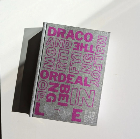
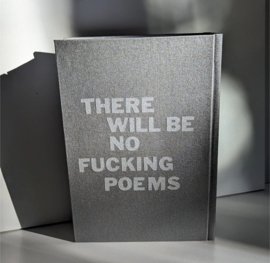

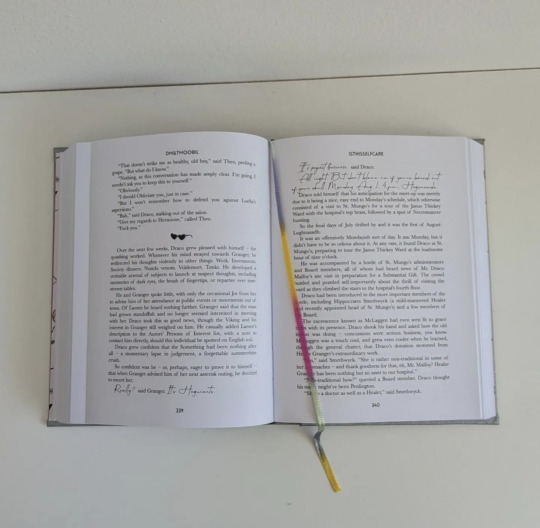
Draco Malfoy and the Mortifying Ordeal of being in Love by the incredibly witty and creative @isthisselfcare
Bound for personally use only.
44 notes
·
View notes
Note
your tolkien edits are always so lovely, do you have graphics editors that inspire you?
hey anon.. would you perhaps want to join me in a small and tumbledown cliff-side castle by the shining sea within whose shelter we can spend the rest of our days. circle yes or no
anyways!! tumblr is the school of athens and i am but a humble student sitting at the feet of greater talents, so here are a few of my biggest editing inspirations for your happy perusal:
@himemiyaaah / @tarninausta - probably my original editing inspiration back when i took my first waddling steps into making graphics myself! rosie just has such an amazing command of color, style, balance, etc.. her edits are so beautiful and harmonious, and i love her expressive use of text.
@miriel-therindes - also someone i discovered early on! i swear there isn't a form lyndeth hasn't tried her hand at and succeeded with in high style. her incredible sense and editing of colors and creative typography are just !!!
@arwenindomiel /@edwinas - the enormously talented mastermind behind tolkien south asian week! her edits are striking and have a real cinematic feel with bold, gorgeously cohesive color palettes (her dramatic shadows are spectacular) as well as innovative use of text and other graphic elements that just tie it all together each time.
@emyn-arnens - save me atlas of arda series atlas of arda series save me !! whenever i need inspiration on how to make dynamic edits that don't include people, i go to this master of her craft. her colors mesh so well together, her formatting is creative and refreshing, and her photo choices are on point. whence does her power flow.
@aredhels - so elegant and sleek! sari is so good at using all the parts of her edits to evoke the desired mood--for lack of a better word, everything she makes is just so aesthetic. i love her understated, low-text style and how she can make incredibly compelling edits just with her impeccable image choices and color editing. and besides all that she singlehandedly gave me the confidence to experiment with the eight-image picspam format yayay
@tilions - legendary user of non-text elements! i honestly have no idea how emily comes out with some of the image layering that they do. her edits feel professional-grade (hoping tentatively that this is a comparison that makes sense but who knows). she makes such bold color choices! it's easy to be scared off by bright palettes but apparently emily is immune to aesthetic fear. she also concocts these amazing silhouette edits that are like those 70s nasa posters and it's. so cool.
@russingon - i want to imbibe mayim's delicious color palettes into myself for real. something about them is so distinctive and pleasing! how much punch he can pack into a two-image edit never ceases to astound. i'm especially fond of their family/house edits (i love seeing their great faceclaim choices all together)!
@brighter-arda - toi is so endlessly committed to making the tolkien fandom a more diverse, inclusive, and accepting space, and i really admire all the work she puts in to uplift other creators. her own edits have really interesting and creative themes and formatting, and it's wonderful how she always incorporates meaningful elements of the character's culture.
@someoneinthestars - their use of darker colors is so evocative, and i love their latine tolkien series! they often align text to elements within the image, which takes such precision (i've only done it once, i think!), but when they do it it always comes out gorgeously.. awuagh.
@outofangband - the attention and research nelyo puts into their environmental edits could power three mid-size cities and i have nothing but respect for them and their dedication. honestly i think they know more about the ecology of middle earth than tolkien himself did when he made it (and he also never made edits about it, so another point to nelyo)!
anyways, this is only a cross-section of the plethora of amazing and talented people i get to share this community with, but i hope it was what you were looking for anon! many many thanks for giving me the ever-welcomed opportunity to kvell a little over some of my favorite creators, and as always, many many thanks to those creators themselves for sharing their spectacular works ♡♡♡
#i hope you have a safe + happy day anon :]#call and response#the professor's world#btw if any of you would like to not be tagged here just let me know and it shall be banished#edits with the wild hunt#brought to you by me
12 notes
·
View notes
Text

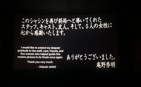
Finally saw End of Evangelion (1997) in theaters as it was meant to be with a fellow animation nerd. When it comes to cinematography, there hasn't been another anime that left me awestruck more than NGE. The abstract visuals, symbolism, and composition are out of this world. Even simple shots have so much meaning. I love its bold use of color, sillouhettes, and typography and how unafraid it is to be experimental. This is part of what gives NGE such unique vision and identity.
Experiencing this film on the big screen resurfaced feelings of dread like I was watching it for the first time again. Hearing every bit of audio in surround sound made the immersion of those grand scale scenes and oppressive atmopshere even more intense. The sandbox sequence hit the hardest- quiet scenes with no dialogue always do a phenomenal job of letting the mood sink in. Like that low angle shot of lonely little Shinji watching the Rei and Asuka dolls leave with their mom, unable to cross the gap separating them.
While the ending made me depressed upon my first viewing, after multiple rewatches I realized it has a bittersweet yet hopeful message. It's meant to be distubing and you feel the unpleasant existential crisis of everyone, which makes Shinji's rejection of Instrumentality all the more impactful.
The truth can be painful, but it is necessary for living and forming genuine connections while ambiguity isolates people is a message I couldn't agree more with.
As an artist myself, I'm grateful that Anno stayed true to his vision in both the creative sense and with his unconventional narrative. He knew it'd upset/piss off certain fans but made this film anyway. Without based directors like Anno, we wouldn't have Evangelion and other groundbreaking masterpieces that make you think.
「生きていこうとさえ思えばどこだって天国になるわ。だって生きているんですもの。幸せになるチャンスはどこにでもあるわ。」
“Anywhere can be paradise as long as you have the will to live. After all you are alive, so you will always have the chance to be happy. "
13 notes
·
View notes
Text
CREATOR TAG GAME
thank you for tagging me erika @padme-amidala! 🥰
pick your 5 favorite gif sets of 2023 that got less than 1k notes and then pick 10 gifsets of someone else's that got less than 1k notes.
my sets:
this jake set (theyre all probably gonna be jake sets) cause that's when i started using those coloring settings that i always use now!
this other jake set cause it's my favorite combo of colors which is evident akshsd. it also was my first comission 🤍
this set and guess who's featuring it. jakey. not a fan of the 1st and 3rd gif but i love the rest
this set of leslie knope. jk it's jake peralta. and the set definitely deserved 1k notes 😤
and this set of not jake peralta! but it's andy samberg. it was easy to gif but one of my faves cause it's him
sets from awesome talented people: (ngl i had to scroll down some of their gif tags cause i'm not in all of their fandoms askjdhskdf)
merlin set by @ughmerlin i love her style so much, i even wanted to do a set inspired by it but i dont have the talent AKJSHDKS it's a really creative concept and the colors are so gorgeous and perfect for it!
sab set by @yenvengerberg she's a legend and this set is hilarious and i love the green! it's a crime that not all her sets get at least 1k notes cause they all deserve it
arthur set by @usershelby cause it has a quote from succession and also it's BEAUTIFUL. it was kinda hard to find a set of hers that didnt have 1k and i love that for her. also shoutout to this set cause why the hell not. and also this set. they're freaking mindblowing
jake set by @kitconnor it has a special place in my heart and ilysm mwah
got set by @padme-amidala it was so hard to pick one but this one is just... wow. those two colors go so well together and the typography is out of this world. also here's her gif page cause youre gonna wanna see it all
steve harrington set by @robin-buckleys i always recognize her gifs and i'm obsessed with her style! like the sharpening and vibrant coloring are so pretty always. i love this set cause of the color and also the no no no gif i love how each little "no" is arranged aksjhksd
bridgerton set by @cal-kestis i'm in love with the blue and the typography is so perfect. also their blending is always amazing and so smooth
sab set by @saws2004 this gifset is INSANE. like excuse me who allowed you to be this talented. blows my mind and it's one of the only things i've ever saved in fave to go back and look at it
percy set by @edwards-teach the blending on this set are you kidding me?? that second gif is straight up breathtaking i love it
heartstopper set by @lespanaye this set is hilarious and the coloring is *chefs kiss*
i'm also tagging the people mentioned above, no pressure :)
17 notes
·
View notes
Text
CREATOR TAG GAME
thank you for tagging me char @bixcaleen! <3
pick your 5 favorite gif sets of 2023 that got less than 1k notes and then pick 10 gifsets of someone else's that got less than 1k notes.
mine:
this anakin skywalker set is probably one of my favorite gifsets i've made in general. i absolutely love this quote from the rots novelization (matthew stover i'm in your walls) and the parallels are so satisfying to me
i had so much fun making this obi-wan kenobi set! i love when people make sets like this and wanted to give it a go myself, pretty happy with how it turned out!
this shadow and bone set took literal years out of my life. wouldn't do it again but it was fun lmao
i'm really happy with the coloring on this alicent hightower set. my best girl <3
this katherine pierce set which is pretty simple compared to the other sets on this list but i love my evil girlie and loved giffing her!
others:
this yennefer set by @bixcaleen is SO spectacular i'm never getting over it. everything from the lilac coloring and the absolutely mindblowing triple blends to the typography are flawless and i'm so in love!
this daenerys set by @zoya-nazyalenskys lives in my head rent free!! ana always uses the most beautiful shades of blue in her sets and that combined with the red accents and incredible blending are the most stunning thing i've ever seen.
i literally gasp every single time i see this yellowjackets set by @cardvngreenbriar!! this set is what really sold the casting for me, the scenes chosen and the way the gifs are blended are pure magic. i will never ever stop gushing about this one, it's a masterpiece.
i'm never not thinking about this alicent set by @azoraahai. the most beautiful muted green coloring combined with black & white and flawless blending AND the lyrics that hit so incredibly hard?? yeah it's perfect. and i'm enamored.
this anakin skywalker set by @hayden-christensen is literally everything to me. the absolutely perfect song and scene combinations and the flow of colors make my brain buzz. truly a masterpiece!!
this jake peralta set by @jakeyp is pure genius (as is literally everything ives makes, i'm constantly blown away by her creativity) and i'm in love! it's beyond gorgeous. it's so funny. it's everything to me. i need to physically consume it.
i'm not sure i have the words to describe how this anidala set by @lady-arryn makes me feel. the gutwrenching quote with the b&w coloring that compliments it perfectly has me on the floor. not to mention the insane triple blends that i could stare at forever. i will cherish this set forever.
i'm so obsessed with this alicent hightower set by @saws2004!! literal perfection from the coloring and the blending to the layout. i love outfit sets and this one is so creative. all the details. the quote in the last gif?? the most perfect addition.
this kaz set by @cal-kestis is one of the prettiest things ever and a masterful display of typography, blending and coloring. nik's ability to pair fonts so flawlessly always blows my mind. the rich colors blend together so beautifully i'm in awe!!
forever sobbing about this rogue one set by @starfighters!! in addition to the most heartbreaking lyrics (NIALL MY LOVE) this set also has one of the prettiest color combinations ever. the scenes, the blending... i'm in heaven.
no pressure tagging all the people above!
16 notes
·
View notes
Last Seen Blogs
incorrectgreekmyths
War And Homos

infowindtech57
Untitled
new-world-desahogate-sin-miedo
Dream Catcher
noahmwashburn
Blog Titles Are Hard.

artedaeleganciamasculina
A Arte da Elegância Masculina