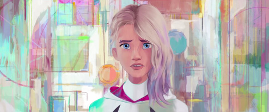
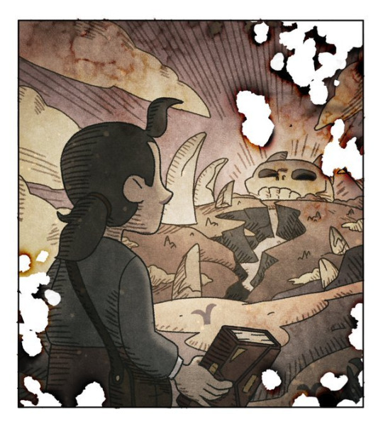
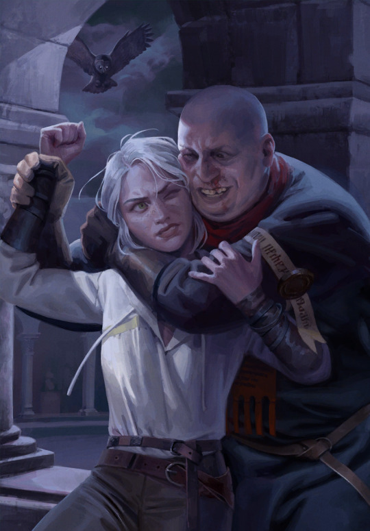
#I mean even the color palettes are paralleled
Text
“We have to recreate the moment you first fell in love”
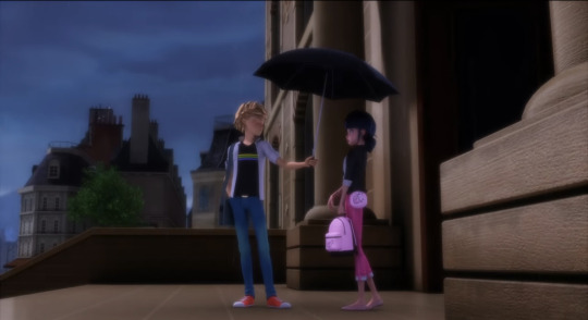
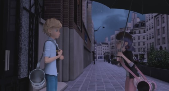
#don't know if this has been done already#but I love how ml is always on point with parallels#I mean even the color palettes are paralleled#I could probably write a whole essay about parallels in miraculous#and about the foreshadowing#but I have to save that energy for finals 🫤#adrinette is really the most ship ever#so is the whole lovesquare by the way#adrinette#ml origins#ml mr pigeon 72#ml puppeteer 2#ml determination#ml season 5#adrien agreste#marinette dupain cheng#ml leak free#miraculeakless#miraculous ladybug#mlb#miraculous#ml
57 notes
·
View notes
Text
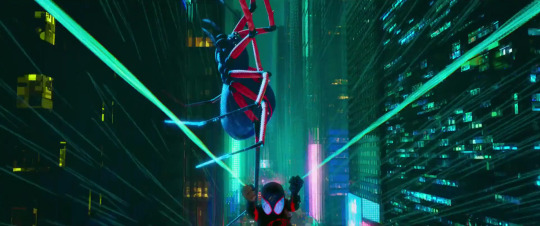
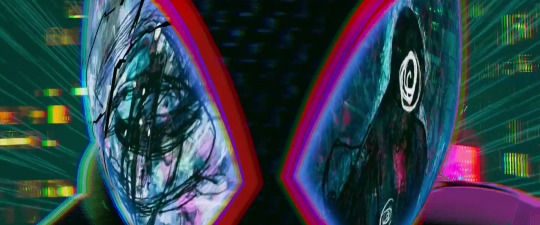
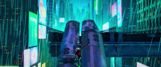
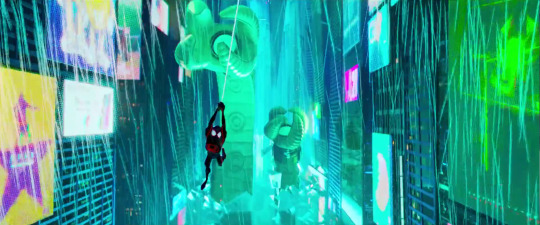
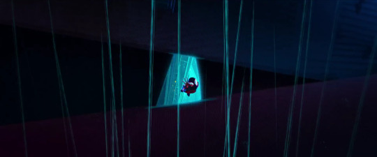
the visuals for the last like 20 minutes of atsv are my favorite things ever
specifically: the color theory
earth-42 is obviously striking on a whole nother level
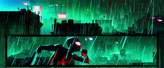
we tend to automatically think of red as the color of danger, but that's loud and passionate and angry. this haunting, sickening green feels more conniving and threatening and apocalyptic.
(if you think of color in disney movies, all the scariest, most cunning villains--maleficent, scar, ursula, evil queen, facilier, gothel--have either palettes or grand moments or motifs heavily utilizing green)
and something i always notice is that rio 42 looks just a little off, and it's because they reflect so much green in her eyes they look almost entirely green
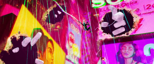
and, if this is your first time watching, you have no idea why the environment is made to be so deeply unsettling. let's look at gwen's dimension for a sec
being home is a really bad thing to gwen. while miles was doing everything he could to get home, gwen was literally dragged there--because gwen views her dimension as unsafe (ignore the trans parallels ignore the trans parallels ingore the tra
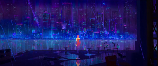
it's dark. it has the same ominous rain. but you can tell it's 65. that bisexual lighting is unmistakable
i can't even go into the colors of gwen and george's argument because there is an image limit and i am lazy. but we know it's insane. the emotional peak of the scene is also where we see the colors most vibrant and changing the most abruptly
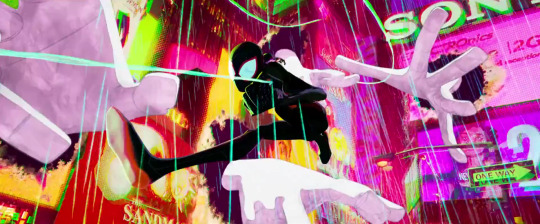
and when they have their beautiful lil moment, this is what happens
not only is it blindingly bright and trans colored all of a sudden, but the characters don their "true" coloring
and even after gwen leaves, the scene is still bright, and familiar
miles should be safe in his dimension. but we know he's not.
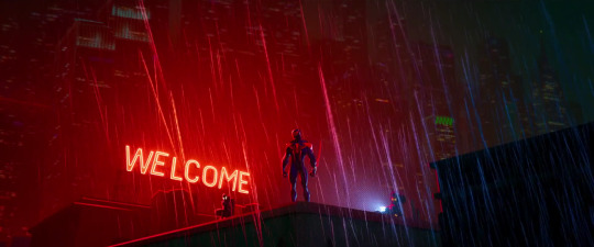
back to earth-42. well i mean we have these absolute visual bangers what do i need to say u get it

and then there's this absolutely incredible moment where i would say miles is at his emotional peak (manic peak as well; i mean spot's hands and the infamous revenge line...yoikes.) and just like with gwen, the emotional high is where we see the most dynamic colors so coincidence i think not
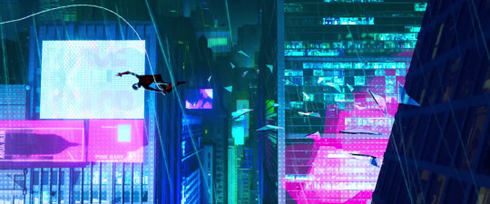
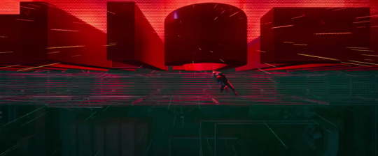
this next sequence is just one of the coolest fuckin chase-esq scenes i've ever seen. like the mumbattan one slapped but the pacing and direction and elements and epicness together here are just immaculate
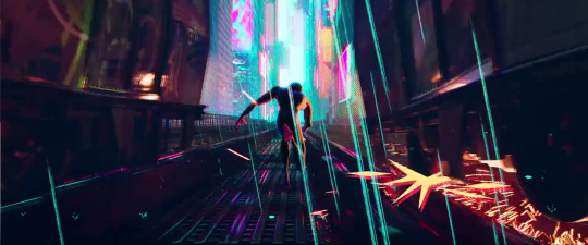
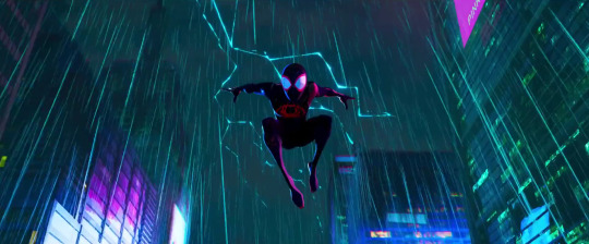
another thing--miguel/ben's post is heavily shrouded in red. he's supposed to be ominously looming over exactly where miles is headed. buttttttttt~ when miles first crash lands, there is quite a bit of red, and as he gets closer to home, the city gets bluer and bluer with less and less red, bc yk he's not actually headed towards miguel/ben. woah. i make sense guys. i am a fart smella. i mean smart smella. i mean fart fella. i mean fart smella. i mea

#extra credit for anyone who wants to count how many times i say color and visuals#atsv#across the spiderverse#across the spider verse#spiderverse#spider verse#earth 1610#earth 42#earth 65#color theory#atsv analysis
409 notes
·
View notes
Text


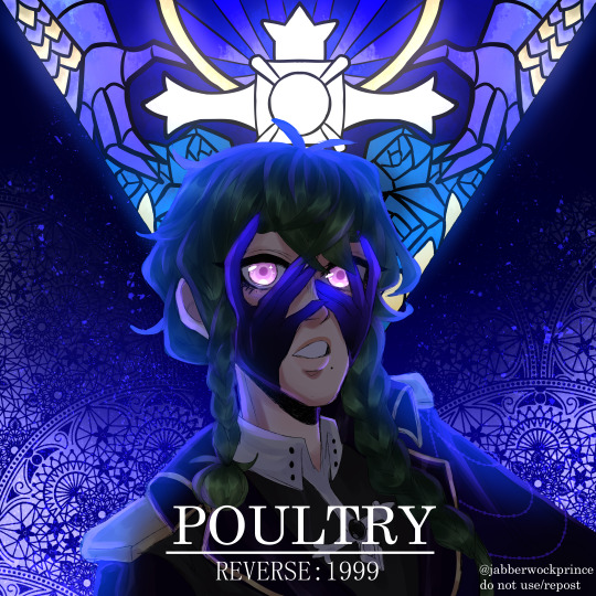


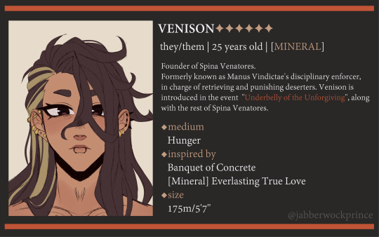
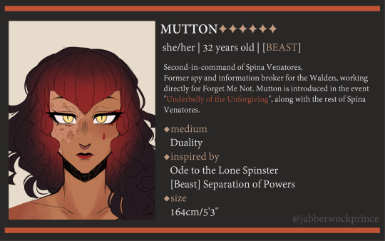
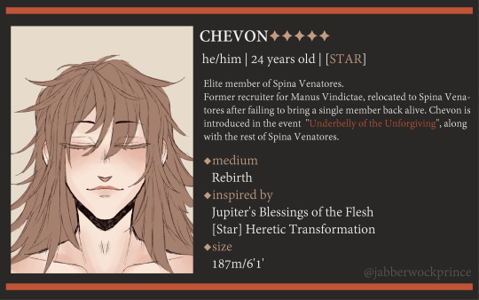
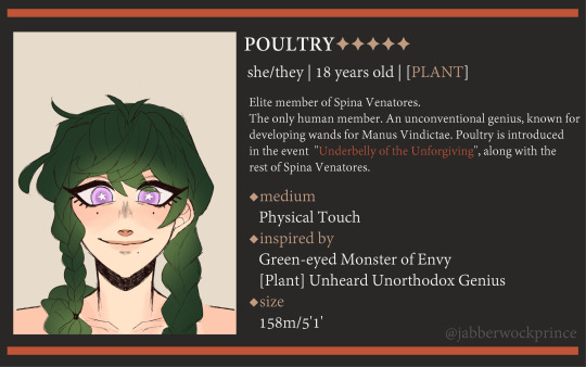
SPINA VENATORES
A small organization of mercenaries working for Manus Vindictae, tasked with erasing people from history as a way to call upon the "Storm". Their targets' names, families, influence and connections to this world will be dragged into oblivion.
Individual profiles and some more info/ramblings under the cut <3
The whole point of Spina Venatores is to be a parallel to Vertin's own independent group of Arcanists - the same way St. Pavlov's Foundation has her, Manus Vindictae has Venison and Spina. They're the mouth and teeth of Manus.
But whereas Vertin aims to create a safe, neutral space for Arcanists to thrive without human influence despite being tied to the Foundation, Venison is aiming to create a paradise for those they care about and no one else due to the heavy influence Arcana and Manus have on them.
Spinas Venatores is, at its core, a cult that was allowed to grow thanks to Venison's codependent and obsessive mindset - with them as the leader, all the troublesome and rebellious members of Manus Vindictae (that are much too powerful to get rid of or who are still clinging on to their former lives) will simply be assimilated into Spina or pressured to comply with Manus Vindictae as a whole. The third secret option is dying <3.
They also serve as a narrative device to remind everyone of the fact that, no matter how hard one may try, there's no way EVERYONE can be saved from the "Storm" - all five main members are related in some way or another to Arcanists that Vertin has met, they're people that weren't lucky enough to be taken in, who found themselves in the right time and place for Manus Vindictae to take advantage of their vulnerable state.

R1999 also portrays a LOT of oppression from various minorities that overlap with each other in very interesting ways, so I also wanted them to tackle similar things that mean so much to me - they're problematic queers is what I'm trying to say lmfao
The thing they share is that all of them are delusional to a degree, and that they're constantly haunted and defined by their relationships to others. The loss and discovery of the self through another, Ship of Theseus, cannibalism, body horror, being transgender as a really visceral and intimate experience, an obsession for love in all of its forms etc etc.
I don't have the FULL scope of their backstories, but I do know who they're tied to!
Venison was Pavia's coworker in a constant, obsessive loop of wanting to kill and save each other. Mutton was part of Schneider's mafia and romantically involved with one of her oldest sisters. Chevon was a regular visitor in Necrologist's museum and a friend of hers, she later went on to exhibit his many, many tombstones. Poultry is the "Lilian" mentioned in Darley Clatter's Stories. And Veal is a mystery even to me </3

Their uniforms are meant to look outrageous and outlandish, entirely out of place with the setting and their respective eras/times, inspired by fantasy - just BARELY reminiscent of Manus Vindictae by virtue of using a similar palette, as a way to drive that feeling of not belonging and delusion even harder.
Whereas everyone else is dealing with very real issues, all members of Spina Venatores live pretty much in their own heads (similar to Forget Me Not and how Manus Vindictae causes their recruits to become... YEAH.....THOSE MONSTERS....)
Venison gets the BIG COAT and the biggest silhouette because they're responsible for pretty much 80% of what happens within Spina Venatores! Veal gets the more simple design to allude to their whole unassuming, shapeshifter/Doppelganger thing.
They all have ribcage/bone motifs in one way or another, most of their jewels are meant to look like rosaries, they wear the Manus Vindictae silver cross and Arcana's blue color more often than regular members of Manus. Also! Hands!! Love the fuckin hands!! DID YOU GUYS SEE DIGGERS' MANUS VINDICTAE SKIN???? YEAH.
The naming convention being. types of different meats. is entirely because of Venison, you can ALSO blame that entirely on them <3
#reverse 1999#reverse: 1999#reverse 1999 oc#manus vindictae#spina venatores#purinsu art#my beloved r1999 OCs#also i love drawing stained glass GRRR ITS SO GOOD#i have so much info about these motherfuckers idk where to put it
97 notes
·
View notes
Text
McGillis and the Pied Piper
because February 24th’s Wordle was piper and I am procrastinating on school work
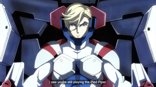
At 16:57 of S2E21 (E46) Gaelio says this to McGillis before charging him.
(Gaelio is speaking through the comms offscreen.)
(Apparently this line was also used in a game. I forgot which one. I don't play Gundam games.)
Gaelio literally says something along the lines of "Are you still going to play the pipe of Hamelin even when the battle is going like this?" Not sure why this is the subtitle. But they mostly mean the same thing so maybe I'm just nitpicking.
To refresh your memory a little, this is when the Revolutionary Fleet is very clearly losing to Arianrhod, and McGillis just made his pep talk and this iconic frame. They are preparing to retreat and regroup when Gaelio shows up to fight McGillis.
Gaelio referencing the Pied Piper of Hamelin (Hameln, same thing) is of course connected to McGillis's and thus his love of myth/folk tales. Because of McGillis's influence, Gaelio also has a strong liking for stories. He names himself and Gundam Vidar/Kimaris Vidar after Vidar, the Norse god of revenge and silence, son of Odin and slayer of Fenrir (Fenris, same thing but IBO uses Fenrir) the monster wolf son of Loki during Ragnarok. The same side story 'Eve of Vidar' also tells us he used to hit on girls using Norse mythology fun facts, including Yamazin Toka when he was a test pilot for the Schwalbe Graze.
Although these are relatively common knowledge for us, the viewers, they are probably niche facts however many years in the future the Post Disaster timeline is (in UC0079 Hitler and WW2 is considered "middle ages" despite being historically quite recent for us). This is one thing Gaelio and McGillis have in common and it is because of McGillis.
(Also this is kind of a weak diss? Like if you're gonna insult McGillis why compare him to something so cool. "Snake on the moon" - now that's an insult. But I digress.)
But what is the Pied Piper exactly? The Pied Piper, or the Ratcatcher (der Rattenfänger) is a legend of the town Hamelin in Lower Saxony of Germany. There are dozens of variations of this tale, but I'll only be talking about the most popular versions that relate to the events of IBO.
In 1284, Hamelin had a rat problem. Basically there were a whole bunch of rats, and they made life suck for the townspeople, as large numbers of rats tend to do. According to Robert Browning's poem, the people were mad at the mayor for not being able to solve the problem, and were about to kick him out. Then a man wearing a coat of many bright colors (Browning's version says yellow and red, both in McGillis's palette at some point) and holding a pipe showed up. The Piper promised to get rid of all the rats in exchange for 1000 guilders. He then played his pipe and all the rats came out and followed him into the river Weser and drowned.
The townspeople did not follow through on their end, however, and came up with all sorts of excuses to not give him the promised 1000 guilders. This angered the Piper, and he played his pipe again, and this time all 130 of the town's children came out and followed him away dancing and they never returned, nor were they ever seen again. Versions disagree on what happened to the children. In the Grimm Brothers and Browning's versions they went to Transylvania. Others say they went to a land like paradise in a cave. Others say they drowned in the river like the rats.
So how does this relate to McGillis and IBO? Well actually it's pretty obvious - Gaelio is simply saying McGillis is luring Isurugi, the Revolutionary Fleet and Tekkadan to their doom with false promises.

However, the point of this post is to point out some interesting details of this parallel. The Piper lured the children of Hamelin away as an act of revenge on the adults of the town because they didn't pay him what was rightfully his for his service. McGillis's coup can be framed as revenge on the corrupt system of the world Gjallarhorn maintains, and those who personally victimized him.
Interestingly, some accounts describe the Piper as "a miracle of God" and that he was sent to test the townspeople, and punish them when they didn't keep their word. Others call him the devil in disguise, who intended to trick the people and take their children. This is like how McGillis can be seen as a charismatic leader aiming to change the world for the better, or a ruthless, cold-blooded, lying, backstabbing, power-hungry traitor who will stop at nothing.
Additionally, Bael, the demon king, is a fallen angel who was cast out with Lucifer for rebelling against God, and Gundam Bael's gunpla box describes it as "a demon with the appearance of an angel" (this could also apply to McGillis himself).
In many versions of the story, some children are left behind. Which ones exactly vary, but Browning's focuses on a boy with a broken leg who couldn't keep up with the other children, so he was able to tell the villagers where he saw them go. The boy said they went into a portal on the side of the mountain, and on the other side was a paradise where everything was beautiful and peaceful. The boy was very sad he couldn't join his friends there because now he was all alone and couldn't return to that land.
Sounds kind of familiar, doesn't it?
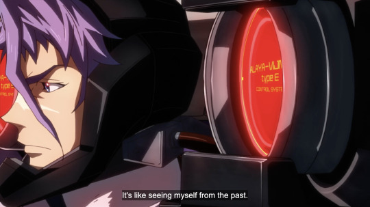
In the epilogue, Gaelio is in a wheelchair and his bandaged neck suggests that his Alaya-Vijnana implants had been removed fairly recently. Supplemental info reveals that McGillis injured his spine during their fight at Edmonton, and Gaelio was only able to be up and about in S2 thanks to his AVS.
If the land the Piper and the children went to is Heaven, then this could be read as Gaelio being the only one not to follow McGillis into death, and being the sole survivor of his friends (for the sake of this argument Julieta doesn't count because Gaelio wasn't fighting for or against her).
An important difference is the boy longed to follow the Piper, while Gaelio rejected McGillis because he schemed to kill him and his friends.
The Piper's other name, the Ratcatcher? Tekkadan are space rats?
Also McGillis's true name Montag, presumably his surname before Iznario's adoption, is German for Monday, hinting at his heritage, and the Piper is a German story (obviously).
The Pied Piper is a legend that originated in the Middle Ages, and Gjallarhorn's leadership, ideology and overall aesthetic is reminiscent of that.
There is a version of the story that the Piper will return in 300 years. Which he did not do, but 300 years? McGillis, the self-proclaimed successor to Agnika Kaieru after 300 years?
I can't be bothered to write a separate piece on Gaelio's legs so I should also mention that Vidar, the Norse god defeats Fenrir by stepping on his lower jaw with his shoe made from all the collected pieces of leather people cut from their own shoes, and grabbing his upper jaw and ripping him apart at the mouth.
Vidar's special shoes are like how Gaelio says he’s carrying all the wishes of Carta and Ein, and the AVS Type-E also serves as his literal feet. (Also he wears very striking white thigh-high boots that are very hot. What they're not is part of the Gjallarhorn uniform, just to make this connection, in addition to exacting revenge in style.)
In many carvings, Vidar is shown stabbing Fenrir through the heart also, and Gaelio/Kimaris Vidar defeats McGillis by pinning him against the Arianrhod flagship and stabbing him/Bael through the torso.
Proposed origins of the Pied Piper
Now obviously there was no piper guy dressed in goofy clothes that stole all the children of a town with magic music. There are several theories about what the legend is based on. This has nothing to do with IBO anymore and I just thought it was fun so feel free to stop reading if you don't agree.
Plague: According to this theory, all the children died because of illness and the place they went to is a mass grave. The Piper's many-colored clothing represents the sores and discoloration of skin of those who contracted the illness, and he is the personification of the plague/death. Rats are carriers of fleas, which spread the plague. 1284 is a bit too early for the Bubonic Plague (Black Death) though, so it may have been something else.
Emigration: The emigration theory suggests that much of the people of Hamelin moved to eastern Europe in search of better opportunities as only the eldest son had inheritance and the others could only be serfs. In this theory, "children of Hamelin" are not actual children, and it's just a figure of speech to say they were of a certain place. This correlates with some versions where the Piper and the children he took were sighted in Transylvania.
Human trafficking/the Children's Crusades: In these two theories the Piper is the recruiter/trafficker and the story was made up by the town to please their officials.
Dancing mania: There have been records of dancing mania in about the same time period in the surrounding region, and children were among the affected. Dancing mania can sometimes result in death due to exhaustion. It was originally attributed to a curse by a saint (St. John or St. Vitus) and you had to pray to them to lift the curse. Modern explanations for dancing mania are neurological disorders or collective mental disorders.
Pagan ritual: supposedly the pipe music and dancing children are part of this ritual that took place in the mountains, and the children died from a landslide or similar accident.
"You're reading way too much into Gaelio's one line" no actually I am reading exactly the right amount into it and everyone else isn't reading into it enough
35 notes
·
View notes
Text
'Barbie' is a transgender masterpiece
I'm going to go away from my usual clown related content for this post, but i've watched Barbie twice now, and aside from the movie painting a beautiful portrait about men's rol in feminism as well as reivindicating being a mother is ok, the movie has proven to be a transgender masterpiece in many ways, just like Barbie as a figure! Buckle up because this is going to be a long, long post.
For startes, fashion dolls, and specifically Barbie as the most important of them, has been a queer icon more than a feminist icon. Feminism has distanced itself from Barbie as a figure because her representation of womanhood was faulty (something i disagree on, since Barbie was a powerful successful woman who didn't let that make her not be interested in fashion and other feminine hobbies and interests!!), but the queer community has, i feel, a different appreciation for Barbie as a character and doll. Gay men, drag queens and transfemme folks mostly share memories of playing with Barbie and dreaming, via the doll, about the lifes we could have as adults. Barbie was a very important role for many drag queens who loved the glamour and fashion, it helped gay men relate to female friends who where more friendly and safe (usually although not always) than other boys, and it helped us trans women and femme enby folks to distance ourselves from the masculinity society tried to force on us. Barbie has also proven to be an icon for lesbians since, i mean, nobody ever bought a Ken doll, and even for some trans men who used Barbie dolls transitioned into boy dolls to enact heteroromantic fantasies! The union between Barbie and feminism is a faulty one, and i can't blame the feminist movement for it, but the relationship between Barbie and the queer community is very real and strong. It's no surprise that many trans women and drag queens use the term 'doll' to refer to themselves, or that Ken has always been a sort of feminine and, let's be honest, queer man.
So how is the new Greta Gerwig Barbie movie transgender ? Well, Barbie herself, as a protagonist, is such a real transfemme experience! Barbie moves from Barbieland to the real world, learning what it really is to be a woman in the real life world of California, much like many trans women have to look at the world around them to learn and internalize their new lifes at the beginning of their transitions. Barbie also says, explicitly, that she doesn't have a vagina, or genitals, and by the end of the movie she decides to turn into a human, and goes to her gynecologist, which implies she went from not having a vagina to having one. Isn't this the most trans thing ever ?? Of course there are some problematic implications in this reading of the movie, because Barbie turns into 'a real woman' and gets a vagina, which is not what being a real woman is, but i also think this is a very powerful messaging. Consider also some minor details like the fact the color palette used for Barbie is one with blue and white added to her always bright Barbie Pink, which isn't odd since Barbie has used this combo before, but it cannot be a coincidence. Barbie going from a hyperfeminine woman to a more laidback woman is also very parallel to a lot of trans women's experiences, since many of us behave and are hyperfeminine from an early stage in our transitions because of dysphoria but then we become more comfortable in ourselves and realize that we don't own anyone hyperfemininity (even though i am, still, a hyperfeminine woman, but it's more in my own terms of femininity!!) Of course, we also have Hari Neff, a trans actress, as a Barbie in Barbieland, which is amazing, and in one scene we see that, in the Mattel headquarters, there's a small transgender sign in the wall, which is subtle, but still there.
This movie has so many queer undertones and experiences, showing Ken dolls that were queer coded in the market like Magic Ring Ken and also proving how patriarchal relationships between men are very homoerotic in a way, which is shown in how Ken interacts with other Kens and viceversa. Weird Barbie is also a very much queer character, being played by a lesbian actress, and i feel like the movie is so campy and has such an aesthetic that reminds us of queer movies like But I'm a Cheerleader. We also have to aknowledge the references to big queer favourite and queer films like Matrix and Wizard of Oz. I think this reading of the movie is definetly plausible and i hope to hear some of your thoughts!
#barbie#barbie 2023#the barbie movie#greta gerwig#barbie movie#ken barbie#transgender#transgirl#queer#barbie is a cinematic masterpiece 10/10 recommend#trans rights#trans pride#trans#nonbinary#trans femme#lgbtqia#lgbtq community#lgbt pride#lgbtq#lgbtqplus#pride#queer community
84 notes
·
View notes
Text
Observations on the Hollow Mind Portraits
Rebecca Rose has answered my wishes today by releasing HD versions of the portraits used in Hollow Mind. Here are some things I noticed:

They're churning butter <3 This is one of the pictures we saw more clearly, so there's not much to say here. Liddol bois <3
Another picture we've seen pretty clearly in the episode. Someone's already noticed that the rope trap Phillip sets to catch Caleb looks kind of like the one he set in Hollow Mind to catch the palisman monster. Parallels, I guess.

Here the boys are getting ready for a witch hunt. Again, we've seen this. The expression on Caleb's face seems more aggressive than Phillip. Guess he's older and therefore understands what the witch hunts mean better.
These boys only have one shirt and one set of overalls. Judging by the rip on Phillip's overalls, and the fact that they each only have one strap, I guess it's an indication of how poor they are. How did they even manage to get a house on their own? I doubt little boy Caleb could have built it himself. Must be an already vacant house or the townsfolk did chip in because they can excuse hanging innocent women but god forbid these two boys be homeless.
The brothers are older in here. They still have similar hairstyles, but their proportions definitely look less "baby." Phillip still has the same overalls, but Caleb either got new ones or got a new strap for it at least. They also got new boots. While in the previous picture of a witch hunt, the brothers were playing with sticks while the adults did all the work, here the brothers have a torch and a pitchfork and are going with the adults.
We can't see Phillip's face, but it's notable that Caleb looks both excited and malicious here. It's not either of the brother's faults that they were indoctrinated into a puritan society where witch hunts are okay. But this does indicate that Caleb wasn't as horrified by the witch hunts as fanon makes him out to be. I like that. I like the idea that the brothers both started out as bigots, a byproduct of their upbringing. The difference between Phillip and Caleb is that Caleb decided to change when given the chance. Phillip didn't.
We also saw this one pretty clearly but here's some more detail. They look even older here. Phillip no longer has the buttoned shirt, I think? And if this takes place right before the next picture, then Phillip has tied his hair into a ponytail as well in this scene. Plus, Caleb was holding a torch in the last witch hunt, but now he's holding a pitchfork. So this is probably a different hunt. Moreover, Evelyn's fire looks like it has a purple-pink hue? Maybe that's just the color palette.

And here it proves that Caleb entered the Boiling Isles through the gate in the graveyard. From what I can see, part of it was also a lake back in the 1600s, though it was definitely more flooded in Thanks To Them. While Caleb is rushing in, (which is definitely reminiscent of the scene where Luz entered the portal door) Phillip seems to be lagging behind.
If this is the first time Phillip entered the Boiling Isles, then there was definitely a timeskip between this picture and the last. His hair is longer, he looks older, he has a bag and a journal, and he's wearing a whole new outfit. This looks like part of the outfit Phillip wore in Elsewhere and Elsewhen. He isn't wearing his brother's jacket, though, but he may be holding it with the arm that isn't shown well in the picture. I guess after Caleb ran through the portal, it closed and Phillip was trapped on the human side? And somehow, he managed to go through the portal again after a timeskip. He still looks young here. But more like in his late teens than early teens like in the last few pictures.
Not sure what order these pictures should have come in, but this happened a lot later than the last pictures. Phillip's hair is already fading from brown to blond. Perhaps a side effect of palisman magic? Or maybe he's just graying weirdly.

I've seen people point out this picture as Phillip misremembering "Luzura and Dirtrude" but now that we have more detail, they...really don't look like them. They're wearing nothing remotely similar to what Luz and Lilith wore in that episode. Plus, they both have their palismen. The only similarity is that one is tall with black hair and the other is short and has brown-ish skin. But they're both obviously demons. I assume these are just some followers he's trying to brainwash.
(Also, it's funny that they had black garbage bags even in the 1600s in the Boilins Isles lol)
Phillip is going Sonic the Werehog on Caleb and his wife! I guess this means Evelyn did have brown hair. Unfortunate, because I kind of wanted the Clawthorne sisters to have inherited their red hair from Evelyn. Also, it looks like both Caleb and Evelyn were in possession of The Hair Skrungly. I wish Eda and Lilith also had it.
This one's also really commonly talked about. Nothing much to add here just Phillip being outraged that his bro is slutting it up with a hot witch I guess.

This one's also commonly talked about. What I'm unsure on is when all this happened. Phillip's beard is around the same length in the last few pictures so I assume at around the same time. But then, what? Did he see his brother with Evelyn and get mad, making the curse flare up, and after Caleb hugged it all out of him he left, only to come back later to kill Evelyn? Or did his curse flare up during the fight? I love those angsty fanarts where Caleb's trying to hug Phillip only to get stabbed. Also, why is Evelyn facing her husband, not Phillip? This is commonly thought to be Caleb trying to introduce his wife to his brother, so it would be weird for her to stand like that if that's the case.
:((((((((( But also, where are they? Are they in Caleb and Evelyn's house? Why are they in a forest later, then? Maybe I just read too many comics of this scene where Caleb died in his house. They've probably been in a forest the whole time. But now that we have more detail, Phillip is very clearly not looking at Caleb, but to the side, where Evelyn would have been standing previously. Guess it's pretty much confirmed that Phillip wasn't trying to kill Caleb, but Evelyn. Also other people have mentioned this but Caleb fighting his brother to save his wife, using the knife he used to carve his brother's mask???? :'''''''')
Again, when did this happen? Looking at it again, I feel like Phillip isn't even cursed at this point. At least, the curse isn't flaring up here. He's not goopified at all like in the show. You can even still see his sleeve. I think here, and the other picture where he looked like this, are just him looking extra demonic bc of how much he wanted to kill Evelyn. The picture where he's charging at Caleb and Evelyn looks like the background is on fire. And the couple is even positioned the same as the picture where Caleb is trying to "introduce" Evelyn to Phillip. Phillip wasn't out of control due to the curse in here, I don't think. It's lighting, plus dramatic effect that he looks like this. He found out where Caleb has been, flew into a rage and tried to kill Evelyn, and Caleb tried to hug him and calm him down, because his brother loved him anyway...

...and in return, Phillip kills him. Caleb is posed the same way as the Boiling Isles is. Looking at the reflection in the knife, Phillip also hasn't been punched in the nose by Lilith yet, either. Guess those bones we see in Phillip's lab in Elsewhere and Elsewhen really were Caleb's. And also Phillip has already long since started his descent to madness by the time he met Luz and Lilith. Kind of weird to think that they may have run into one of Caleb and Evelyn's kids running around in that episode, if they happened to travel a bit beyond Bonesborough.
We've seen this picture too but goddamn, they really did this over Caleb's dead body. Before I didn't agree with the idea that Evelyn gave Phillip his curse, because of the pictures we saw of him in black and having glowing eyes while Caleb was still around. But if All That was indeed for dramatic effect, then yeah, I believe the theory now! Evelyn Clawthorne still fucking up Phillip 350 years after the fact.

So with Flora Desplora's appearance in Elsewhere and Elsewhen, her appearance here, and her name on the book Bill the titan trapper was reading in Edge of the World, I'm certain she was meant to be more important. Again, while I'm pretty sure The Shortening was announced after Eda's Requiem was finished, with how cartoons are produced, I wouldn't be surprised if they already had work done for episodes up to Reaching Out. It would explain the Azura B-plot in Any Sport in a Storm, the Edric B-plot in Reaching out when they couldn't give Emira a B-plot elsewhere to balance it out, the implication that Warden Wrath and other EC members were suspicious about the Day of Unity, and of course, Flora Desplora's existence. They probably established all of this expecting to have more episodes to explore it. But they got shortened and had to cut some follow up episodes. But they weren't given more resources to rewrite the old episodes to not include any plot threads they couldn't follow up on.
Flora Desplora didn't need a whole backstory and relationship with Lilith, as well as a whole character design, to serve her purpose in the plot. She just needed to be someone Lilith knew in the EC, who was doing better than Lilith was, and rile her up enough to do the whole time travel thing. Lilith already has a track record of mentoring multiple EC members-to-be. They could have had a character say they're her old student and accidentally rile her up. They could have done that with Steve. But originally, I guess they wanted to set up Flora Desplora to use her later.
We already saw this picture too, of Belos mutilating his ear to look more pointed. But now that it's clearer uh...that's...that's his ear floating in the sink right there! He's a lot more blond than some other pictures, so I guess this is later into his conquest. But the green streak across his face isn't as big so I guess it isn't THAT late? Also, the mirror and sink look pretty fancy, so did he already have a castle by then?

Here he is, carving some glyph combos onto his arm. He's bleeding green here, which I guess would be from Evelyn's curse? Either that, or the color palette, or the knife is rusty and Belos got tetanus after this. We never found out if the curse or these glyphs were responsible for his goopy appearance.

He's snorting a palisman! This is still pretty early on in his journey, since his hair is still brown and his beard is shorter. In fact, it's only slightly longer than it was when Evelyn cursed him. Maybe this is when he discovers that palisman magic can help his curse?
Ah, the Golden Guard graveyard. This was the guard in Belos's first flashback in Hollow Mind, where he blew up that town. Look at that collar. This Golden Guard's staff has been shattered, and he's probably being killed by Belos's own staff, red magic and all. Funnily enough, this Guard didn't have a staff in the flashback. Guess Belos made one for him at some point.
Here's Belos's lab to make grimwalkers. Notice the ribcage in the background, probably Caleb's. I guess it's confirmed that you can use fragments of bone instead of just one whole bone, since some of the ribs are snapped. Guess Belos really did do the Biblical thing like some people said, where he used Caleb's rib to make a grimwalker. In fact, based on his outfit, this may have been one of the first grimwalkers he made. He probably ran out of rib bones by the time Hunter came around.
People speculated that this Golden Guard was Darius's predecessor, who was likely petrified in the public ceremony that Kikimora mentioned happened 30 years ago in Young Blood, Old Souls. However, this Guard's outfit is the same as the one who was with Belos in the mountains. Phillip seems to have ditched his journal by this point, so Belos definitely knew the petrification glyph. This Guard also got a staff at some point when he didn't have on in the Hollow Mind flashback.
Yo it's the guy with the really wild hair! You know, the one we saw as a hallucination in For the Future! Not much to say about him. He looks polite. Maybe HE was Darius's predecessor. He definitely has the Clawthorne genes with how his hair looks.
Portal door! I don't think I actually saw this picture when I watched Hollow Mind? Guess I just missed it. Me and most of the fandom lol.
And lastly, another golden guard. He looks like he's from Gurren Lagann lol. Maybe HE is Darius's predecessor. He's also being killed by Belos's red magic, it seems.
I think that's all the pictures? Feel free to chime in with anything that I didn't notice. These portraits kind of recontextualizes some of the fanon around the Wittebanes, I think.
#shut up pandora#the owl house#toh#hollow mind#emperor belos#phillip wittebane#the golden guard#caleb wittebane#evelyn clawthorne#analysis#toh theory#kind of?
70 notes
·
View notes
Text
are the pathless and abzu related? yes, and this connection is way more important than people give credit for (i will be rambling now)
visual cues are everywhere; the beheaded shark statue right at the start of the game, the purification process and the spirit realm architecture all nods to the previous game as the shells and the locked door at cerno's domain are literal imports from abzu, which are all sweet references present in the pathless
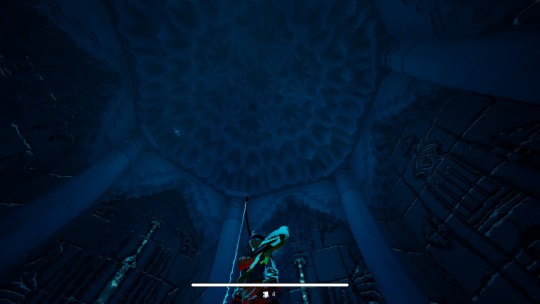
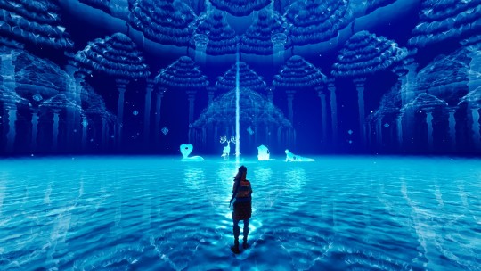
everything that concerns the spiritual realm has a touch of abzu (pantone abzu blue when)
i'd also add that i have autistic urges to just write about how the pathless feels like this result from accumulated knowledge/experience from past Nava games - the pathless has both the 'myth of creation' and the journey of the hero combined in order to tell this lil story with these silly characters (i see it all as if giant squid team woke up one day and said "what if we made like a fancy fanfic yknow" really best decision ever), however knowing myself it''d just feel like nonsense rambling (even worse than this) and a bit off topic, but i had to mention or my skin wouldn't stop itching

anyway back to the two games -
i have this recurring impression that abzu allegories and symbolism are woven in the fabric of reality in the pathless - it's not about them directly, but are foundational for whatever is being told here and now
you cannot, in full consciousness, tell me that these are just easter eggs in the pathless that giant squid introduced because it's a past title from the studio; not when there was giant effort in blending the two games sensibly - abzu is brought up in the symbolism, the color palette (red/blue), in the environment, and it's even present in the soundtrack
in short, tying the universe of the two games together was intentional
but despite visually tied, it still made no sense to me; ok we share the color palette, we wander around with the help of a tall one, we defeat the bad one, what else there's to it? is it just the start of the giant squid MCU? giant squid cinematic universe? or gaming universe? (i feel stupid)
regardless, as i answered the question to how, i wanted to understand why - and to make sense out of it all, i resorted to a feature unique to the pathless: written text
what is so important to tell the player that you need written text, something you were avoiding in all your past games but that suddenly you bring back out of nowhere to tell a story in a way you havent done before? i can just assume some topics were too necessary to just left it implied (at best), or never explained (at worst)
one of the reasons i have written this blog post until this point (the main reason, actually) is that i feel there's a bit of an overlook of an essential part in the established the pathless n abzu crossover (can i call it that?), something that permeates everything, but it's not really visible in a literal way
--
as i played the game, godslayer perspective and motives stood out - they are the focus of a good part of all the tablets and dead people's memories - and as i dived deeper into the abzu connections (pun not intended) certain lines got too remarkable:

so,,, godslayer deems this world broken because it's made out of pure chaos, ok i guess it makes sense uhhh wait wait im having flashbacks i have seen this befo-

uhh oooooohhh ok ok get it i can see some parallels ughhh woooow just wow omg
the underlying factor here is that chaos is origin, foundation for both games universes (tho we can all see that at this point it's the same universe)
in abzu, by ordaining chaos the diver brings back life; in the pathless the ordained chaos, the one that constitutes all life, is at risk because someone decided that having everything made out of (essentially) chaos wasnt really suitable for the second industrial revolution i guess
note: if you know nothing about abzu i recommend reading this post cause it explains a bit about what chaos means in abzu, hence it's relevant to the pathless too
and understanding the chaos that impregnates existence as a whole is central in the pathless, which brings us to another focal point the game brings up: religion
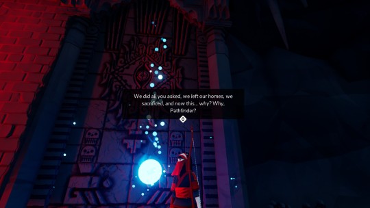
you see religion a big deal in the pathless in the sense that it defines factions; you pick a side, and it's what drives the line of action of almost everyone in the island - the pathfinder quest against the tall ones, the godslayer followers vs the tall ones followers, entire communities dedicated to their local gods, and so on
superficially, it's easier to go to the "bad vs good" route where godslayer must be defeated to keep the order and the light and tall ones good guys whatever, the problem of this line of thought is: too much black and white and no gray to be seen
the pathless final message speaks about decision making: you are free to trace your own path (and this message is reinforced through game design and the title and at the final boss fight, you can name it) however, here lies the detail: similar to the chaos surrounding us, it goes unnoticed that the will to take a determined path comes from within

that's why religion is a hot topic in the pathless, it's what allows people to trace a path in a chaotic world, literally
the myth of creation - the eagle mother, the branch, her children - in itself is a form of understanding reality, religion - prayers, sacrifices, lines of conduct, contemplation - is also a form of grasping the real, and from this understanding, this particular view of the world, you are invited to take action; you cultivate the land and you build temples dedicated to your god
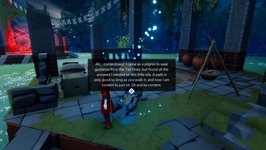
you take action based in what you believe, and you can see it better in the dead followers you can commune with through the island, they are fierce in their beliefs, which leads them to make a stand or fight back


it also stands out how the tall ones are imbued with negative traits; nimue shifts moods like summer rain, kumo is terribly jealous and childish, sauro despite everything will resort to violence, cernos is too shy, heck even eagle mother as gentle as she is let atrocities took place before any meaningful action was considered
all the tall ones have their virtues and imperfections because in the end they are also made out of chaos, essentially they are not that different from any tree on the plateaus; but, as the tablets about the masks state, they see things beyond this realm, and with this knowledge they try to guide those that dont see it - it's like this for their followers, and hunter is also guided by them
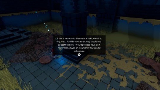
godslayer is no different, he took a path lead by his beliefs, beliefs those that reject the idea of having life from chaos, which lead to his obsession of fixing what he deemed broken; from his perspective, he suffered in the hands of the tall ones and their followers which made him believe that anything of their nature was treacherous - he failed tho, failed to understand that a single path would lead to perpetual suffering (as some memories states, "i was not meant to bloodshed"), which was a fate his followers had bittersweetly tasted
in this scenario, hunter is special: she's an outsider, she doesn't comprehend her mission just yet neither knows those lands; she's facing chaos in its pure form and in order to make sense of her new reality, she takes the eagle mothers advices; upon taking on the trials of the island she witnessed chaos in its many forms, and she assimilates it, not good nor bad but a 'in between' - that's why (from my understanding), on purifying the godslayer final form, her eyes glow in bright blue not because she's some 'declared since birth' allied of the tall ones, but because it signals purpose, she understands the chaos, the one that causes life and death, and she embraces that view from within and translates it into strength to fight back and endure
there's not a single creature in this world that doesnt feel lost and be it whatever creature - human, tall ones, demons, animals, everyone is trying to make sense of this confusing world we live in, be it through any path at hand - and religion is just one of the possible ways in the sea of infinite available paths
as hunter explores deeper into the island, she bonds with the tall ones but make no mistake, she's not really a faithful follower - and she doesn't need to be - cause she has the understanding that the tall ones represent this organized chaos necessary to the flux of life, she respects them
pathfinder, unfairly treated, will look at the tall ones and see just lies, refusing their guidance, he will strive for a new path not taken before and ignore any previous knowledge about the world, he will build up a single vision for a brand new reality absent of chaos because that's how he was conditioned to see and absorb the world around him
(and that makes godslayer feels even more tragic, having the possibility of seeing the world through new lenses by wearing the mask of the ancients yet he persisted in his views and ignored the reality as it was - chaos neatly woven - perhaps out of hate and sorrow for all past injustices; even in the end he resisted to accept the world that nurtured him, as he too was made out of chaos - and for that he's forgiven)
you and i can both worship sauro, but in the end we will look at the surrounding chaos from different perspectives and i will decide that pottery is the way to go while you see the sword as the suitable option; as the truth stands, this is a pathless land - there's no defined answer
the pathless, beyond the 'pathless land' lesson, has something more to tell - that perhaps the path is already established and to you is given the choice of going forward that path or re-evaluate and change directions;
if i had to define the pathless i'd say it's about what touches the eye and where you rest you hand (which can also explains why the eye is an ever present image throughout the game); through perception you grasp the world around you, you create your views and based on it you take action - will you release the bow string? will you strike with your sword? will you cultivate the land? or will you shed blood? what have you seen that made you act like this?
what a chaotic world

anyway, i have too much to say and no one to listen so my only options are write Big Blog Post or bang my head against the wall if you read until here (complete madness) thanks for enduring until the end
(cant wait to see the pathless references in sword of the sea i have faith)
#the pathless#abzu#im not crazy i swear#sorry for the low quality screenshots the game kinda hates me#the question is: are all these connections intentional? were matt and the crew actively trying to tie things this deep? we may never know#analysis#has anybody noticed that everything is so beautiful#i have been writing this for two days now#im not sure about my theory anymore#i may be stupid
7 notes
·
View notes
Text
so: the call me little sunshine mv. i think most people have probably 1) only watched that mv once, if at all, and 2) consider it to be a bit of a dud compared to some other ghost mvs. which is valid. i had only seen it once, maybe nine months ago, before i decided to watch it several more times today.
i'll level with you, i cannot tell who is playing the devil, because whoever it is is not credited on imdb. i can't even tell if it's tf or not. it might be. it might not be. i don't think it matters, but i do think it's an interesting choice to have him not be a preexisting character (or like. copia).
if you don't feel like watching it, the basic premise is that a victorian-looking woman is sitting in a train car dissociating and occasionally taking a hit off a pipe with a devil head on the end. she's high off her ass. lighting up in the middle of the day, if you will. there are some trippy sequences of a devil singing. the devil diverts the path of her train car, which then rolls onto a boat. the boat docks somewhere in a jungle, and she steps onto the dock where the devil's silhouette and a bunch of shadowy figures are waiting for her.
theme-wise, the video is definitely tied closer to the impera album theme than the song is by itself. it feels like it's touching on british imperialism and colonialism. there's a close shot of a globe in her train car that zooms in on africa. when she steps onto the dock in the jungle, she's holding that globe, and it's glowing. there's one shot of her in the window of the train car, and the glowing globe is in front of her like a sacred heart. personally, i think she's personifying british imperialism.
notably, she's not very active in the video. she moves through it looking dissociated and high, for the most part. she's distressed when the devil diverts the train car's path, leading to her final destination, but then she just lights up again and spends the rest of the video in a trance. she does not seem to be choosing where she's going or what she's doing.
so, we've got this woman who's a weirdly dissociated agent of imperialism aided by the devil. moving on.
i enjoy ruby modine's look in this video (you may know her from her iconic role as the roommate with the poison cupcake in happy death day). the top hat she's got in the train car is fun. the dress is, you know, it's giving a little bit of that party city haute couture vibe, but it's serviceable.
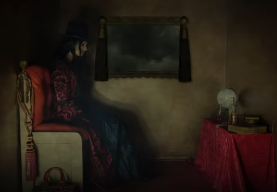
her color palette is interesting. a red outer layer over a black inner layer, with black gloves, socks, and shoes. what a random, meaningless assortment of clothing colors.


call me little sunshine was uploaded on january 20, 2022, preceding chapter ten: home coming and special guests, which was uploaded on march 15, 2022. chapter 10 is, of course, the debut of copia's casual look.
it's a very interesting order for these things to come out in, and it feels intentional. we have this woman traveling in a train car with a handbag beside her, then copia returns to the ministry in the first chapter video after this, wearing the same color palette, also with a handbag. both of them are agents of imperialism, both of them are being compelled onto that path by someone or something else.
i don't think it's far off to say that the call me little sunshine video could be a reflection of copia's situation and mental space in general. especially when you watch chapter ten right after it, the travel and arrival to the destination parallels feel sort of obvious.
at the very least, it's a fun connection that i never noticed before.
at the very...most, i guess, it now means that between this and the spillways dancer with the white eye, there are two impera-era videos in which a woman is paralleling copia. how about that!
9 notes
·
View notes
Text
KH1-KH2 parallels to FF7 (Pt.3)
If you haven't looked at the first two parts please check them out
Riku + Ansem SoD + Sora parallels to Cloud + Sephiroth + Tifa (feat. small Kairi and Aerith parallel)
KH2 and Advent Children Parallels
So If you haven't gathered already from reading the first post, Tetsuya Nomura was working on Advent Children at the same time of the CoM and KH2 production. And by now if you haven't already saw the parallels in KH1 and CoM, Nomura basically all but shows you that Riku parallels Cloud, Sora parallels Tifa, and Ansem SoD parallels Sephiroth by this game.

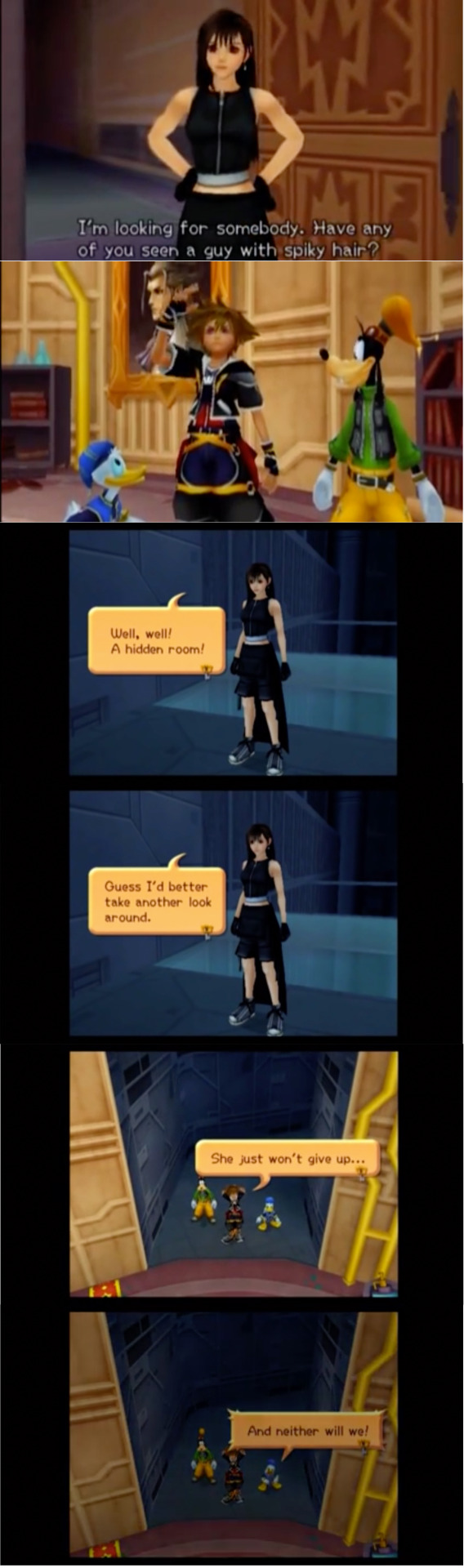
Here we have a very obvious in your face parallel of Sora looking for Riku and Tifa looking for Cloud. If you haven't already seen the Sora and Tifa parallels, then...
Interesting thing to note is that Advent Children only came out a couple months in Japanese theaters before the release date of KH2. Nomura choosing the Advent Children outfits for specifically Cloud and Tifa (and Yuffie) while leaving Aerith and Sephiroth unique outfits was definitely a choice. Whether it's a matter of wanting to promote Advent Children for $$ or wanting people to looking into Advent Children because the parallels are interwoven into the KH writing (we can only speculate).
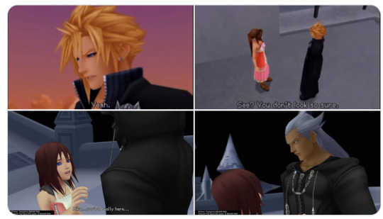
This one is more of a visual parallel with how Cloud and Riku look away. But also Aerith asks Cloud "you mean you don't want me there when you go away again?" and Cloud replies with "I just--- Listen even if I go far away, I'll come back". Aerith asks "Do you mean it?"
Cloud is unsure of whether he will come back or not which parallels Riku who was originally just going to leave once he was sure Sora and Kairi were safe.
Another note is how Aerith's KH2 outfit is something unique and incorporates white in her pink color palette which makes me wonder...
If you haven't gathered already that Sora was looking everywhere for Riku then idk...
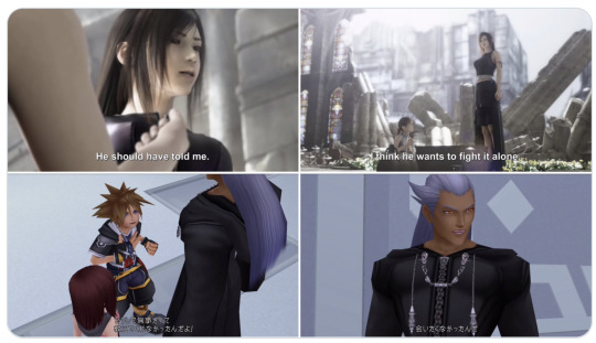
When you look into the actual Advent Children movie, you'll start to see similar dialogue to KH2. In Advent Children, Cloud has Geostigma (a disease described as "the Sephiroth gene") and he camps out in the abandoned church for a couple weeks in seclusion while trying to find a cure. We see Tifa and Marlene stumbling upon Cloud's stuff. Marlene asks "Is Cloud Sick?" which Tifa replies with "He should have told me" ("Why didn't he say something?" in localization) a couple seconds later she says "I think he wants to fight alone" then pauses "I don't think that he will"
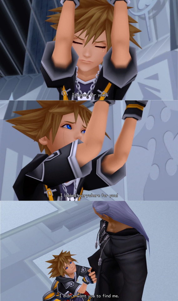
Sora in KH2 when finally reuniting with Riku is like "Why didn't you let me know you were okay?" and Riku replies with "I didn't want to be found... not like this."


Lmao funny dialogue but also


If you have not picked up on Riku paralleling Cloud and Ansem SoD paralleling Sephiroth then idk what to tell you...

Fun visual of driving a vehicle to the boss fight.
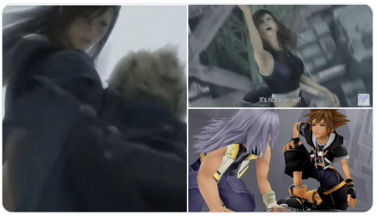
During the Bahamut boss fight, Cloud is being lifted by his team, and as Tifa lifts Cloud, in the Japanese version she says something like "まだんだ" (not over yet!) which got localized to "No giving up"
When Sora helps Riku up he says "まだ 終われないんだ" (it's not over yet) which got localized to "Don't say another word. It's not over, it's just not"
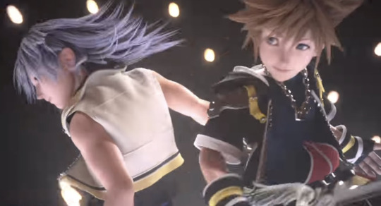
Anyways that's the end of the long post, keep winning Soriku
#kingdom hearts#キングダムハーツ#soriku#analysis#final fantasy#this is not to start any ship discourse I'm just pointing out parallels#kh2#advent children#long post
37 notes
·
View notes
Text
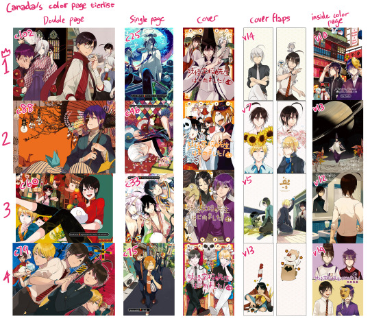
tierlist of my favorite color pages and stuff
gushing abt them below ⬇️
i did top 4 and not top 5 bc a lot of the 5th place for these is like a 5 way tie
Double page
ch102: what ive learned from this is i really like full scenes. cmon!! who doesnt!! also man the colors are really good. hatanaka really has a deceptively good character design, once again proving to be senseis blorbo
ch88: sorry principal color page u have been dethroned as my fav i still love u so so so much tho. love the umbrella and plum blossoms, and also obviously principal is really hot. im pretty sure i know the umbrella asset on clip studio and actually have it downloaded. also i just personally love the paper cranes bc my sona is based off paper cranes
ch60: culture fes arc has some of my favorite color pages and b&w pages and my favorite aesthetic in general really. also i owe hijita my life for proposing the chinese dress theme. haru looks so so so good in chinese clothes and the combo with hatanaka's hoodie in the underground culture fes is top tier. also my favorite non-cover color page and volume promo are from this arc too
the color palette is also so good i basically stole all the colors for that halloween art i did (still love it so much). now u might be thinking. if i have so much to say abt this one why is it only 3rd. tbh its bc this one is the oldest of the 4 so ive had more time to savor it. also i just like the principal one better than this one, and i like the hatanaka one better than the principal one. (but i dont actually necessarily like the hatanaka one better than this one?? its a rock paper scissors situation)
ch79: 2 harus. im sold 👍 also makuragaeshi arc just means everything to me also i consider this color spread a package deal with the vol 12 inside color page which makes me like both of them more
at this point the seimeiliker part of me is yelling WHATT THE 2 SEIMEI COLOR PAGES ARENT EVEN HERE??? THE AME ONE ISNT EVEN HERE??? FAKE FANNN theyre tied for 5th!!! maybe even tied for 4th!! i just really like the ones that are full scenes!!!
Single page
ch25: this one isnt getting dethroned anytime soon its just so good. the COLOR PALETTE the LIGHTING AUGH ITS SO GOOD. and of course haruaki looking sexy as always 👍 this might be one of the sexiest harus tbh. i think its also one of my favorite official arts in general i cant think of many that i would confidently say i like more than this one. ITS NOT EVEN ATTACHED TO SOME DRAMATIC CHAPTER ITS THE PTM CHAPTER LMAOOO
ch46: miki pretty privilege.... i think miki arc has my 2nd favorite aesthetic, behind culture fes. tbh i like the 2 b&w cover pages from this arc just as much as the color page (maybe bc theyre more angsty by virtue of being black and white??)
ch33: i am so married to this chapter. one of if not my number 1 fav chapter. tbh this one is tied for 2nd with the miki one, its just bc i like how colorful the miki one is. this is the only time haru gets drawn with just solid black hair and its very pretty 😳 this one is also a package deal with the 2018 october gfantasy cover in my head bc theyre both teacher trio, not really in their usual outfits, from around the same time, and gets made as merch together often
ch75: im not exactly married to this one like i am with the top 3 but its just good art good composition good colors!! its just such a... cozy and normal scene contrasted with it being a color page. (wait fuck thats what the arc was about)
u may be wondering. why are all the single page ones sort of old. this is actually bc recently all the color covers are double pages (from 76 to 102 there's 1 single page and 9 double page covers)
Cover
vol 13: aughhh seimei...... punches walls etc im so normal about it hahahahah god i love the parallel with vol 1. sensei insane for this. i have nothing else to say this cover just fucks so hard i spent days oogling it why is seimei so hot. also aughh the unused draft for it would have been so good too but the vol 1 parallel was probably the right choice....
vol 10: this one stockholm syndromed its way into being my number 2. ok not really its a really good cover everyone is rly pretty and its a very fun composition and u know i love culture fes. but also it was the thumbnail on a lot of manga sites for the longest time so it ended up being the cover i associate with yohaji in general the most, maybe even more than vol 1
vol 14: i am easily swayed by principal 👍 i see principal and i neuron activation. its so funny its like the most blantant spoiler cover
vol 9: i am also easily swayed by ebisu 👍 sensei sure loves her red and blues huh. also sano in the black shirt is really hot. can u tell i also love when theres parallels
vol 8 is tied with vol 9 tbh rintarou and ibara are so pretty
Cover flaps
i didnt do the back covers bc theyre all alright to me tbh theres not standout amazing ones that make me lose my mind. ok maybe the vol 6 and vol 8 one. i am easily swayed by seimei and ebisu
now the cover flaps on the other hand. oh ym god
vol 14: WOOF WOOF BARK BARK BARK WHITE HAIR HARU WOOF WOOF THIS ONE MEANS EVERYTHING TO ME......... normal harus expression is soooo good...... the mini harus...... and Him... my cat..... sobs.... tanaka mai is a cruel god how dare she pull out this design and concept for 1 chapter and we're probably never gonna see it again..... UNLESS??? (<- mentally ill) anyway heres this promo art for no real reason other than i wanted to oogle him more

v7 and v5: lumping these together bc theyre both harusanos. can u tell i love parallels. and vol 5 has the harusano handholding and vol 7 has the sano confession under the moon.... wow......
v13: i love animal trio they mean so much to me. also just look at weasel hatanaka i wanna squeeze him like a squeaky toy
Inside color page
for a while i was like "how come my fav inside color pages all seem to be from recent volumes" it turns out its bc sensei only started doing full scenes for them starting at vol 10

the vol 11 one IS really good but its up against such bangers as "has principal" or "has haru" or "has seimei" sooooo
vol 10: look this one has principal and is culture fes of course its my favorite. easiest decision in my life. i think for all these categories the top 1 spot was super easy and 2-4 could all be shuffled around. it may not make me as mentally ill as the other 3 but its straight up good art i would set this as my phone screen any day
vol 13: hi this one makes me mentally ill. its so cool it has such cool imagery and its also so inscrutable. what does it all mean. why is saturn there. this one (and also all of kyoto arc tbh) makes me want a anime so bad
vol 12: you KNOW im a sucker for makuragaeshi arc aughhhh this one makes me mentally ill in a different direction from the vol 13 one. the fact he wore a blazer uniform when he was actually in high school and him wearing a gakuran in this arc. fucks me up every time
vol 14: aughhhh...... tanaka mai is out to GET me...... i care them so much.... so so much......
5th place probably still isnt the vol 11 one LOL sorry renpapa thats gotta go to vol 6 (the one with haru in the bath)
in conclusion. i am easily swayed by haru/seimei/principal/ebisu and i will never recover from white hair haru
and also culture fes has my no. 1 favorite aesthetic and miki arc is no. 2. time travel arc will probably prove to dethrone miki arc to become number 2 but idk if itll dethrone culture fes
#youkai gakkou no sensei hajimemashita#a terrified teacher at ghoul school#yohaji#spends the afternoon writing this shit instead of answering asks or writing the 102 tl notes post
25 notes
·
View notes
Text
As a companion post, i also redid my least favourite Gwent card art into a top 20, though i daresay a lot of the technical complaints are universal. I'll try not to be too mean.
Also under the cut.
My (but i am objectively correct) top 20 least favourite Gwent card arts:
They can't all be precious...
There's a certain amount of "why is she naked" or "why is she dead" or "why is she dead and naked" kinda art, but then Karol Bem rolled up and somehow made the card pool so much worse. At least Whoreson Jr. is technically impressive.
20: Ciaran aep Easnillen by Bryan Sola
...however i'm still allowed to not like it when my blorbos suffer on their card arts. Bryan is a great artist and i'm sure he didn't mean malice, unfortunately this is Ciaran's most memorable (read: literally only) scene. This is mostly personal bias.
19: Milva by Bartłomiej Gaweł
To be nice! I like the tiled floor, that's a nice level of detail. I like her practical outfit in the spirit of the old minigame art, too. Heck, even the tragic irony of the scene wouldn't be so bad - she clearly shot before getting shot... If only this wasn't Milva's only card art for years and if she wasn't a well-explored book character with plenty of scenes to choose from. It could've been way worse too i guess.
18: Chapter of Wizards by Maciej Łaszkiewicz
Listen. Maciej is a cool artist with a very distinct, also quite "classical painting" style. I like a lot of his pieces from the last card sets. But. Whose idea was to solve the question of representing a historically changing organization with a statue of its founders? Furthermore, who thought people are gonna be blown away by the in-game avatar this inevitably spawned? :D It's just funny more than anything. I guess I can appreciate the Lord of the Rings reference.

17: Mammuna, also by Maciej Łaszkiewicz
This one is unfortunately not that funny. I'm not sure i can explain it; it's a Monsters card, offputting things are the name of the game. This is one of the artworks that definitely, or probably, fall under completely personal reactions, or at least i never heard loud complaints about it the same way say Coup de Grâce is widely considered one of the best Nilfgaard card arts. Maybe i don't like how the character design seems a bit random, maybe i'm tired of the tired witch=hooked nose trope, maybe it's the color scheme and weirdly unpleasant looking textures. I guess it's just very much not for me.
16: Selfeater by Alicja Użarowska
Similar case as previously. I don't even mind a lot of gross art - the infamous Parasite (the parallels now that bg3 is out lol) isn't on this list - and the Monsters faction is there to go crazy with this type of stuff. And yet, i can't stand this little abomination, and neither can most of the Gwent playerbase. It's not even the toe-in-mouth that really makes it bad, at least for me it's the texture and stretching of its skin. It simultaneously looks like it's melting and about to tear apart. Just an overall no thanks.

15: Miner by Christof Grobelski
Christof is my new, excuse the zoomer language, pogchamp, because i think he is severely underrated given the crazy impressive lengths he went into with card art like Vivaldi Bank and even Phooca, and Miner isn't really bad. Unfortunately, fear of depths.

14: Doppler by Bartłomiej Gaweł
Bartłomiej loves himself some dirt and mud and wet beast wednesday, and i can appreciate that. But this one isn't it. The palette, the scene. This, beside Dudu's card art, is the only way dopplers are represented in the game, and that's a shame. Leave the poor soul alone :(.
13: Brehen by Oleksandr Kozachenko
I'm sorry to say, this is the weakest Way of the Witcher art. I appreciate it's the one scene everyone knows Brehen for, but why must he look like the village lowlife parents tell you not to talk to? I mean, not that Brehen could be trusted with kids. He's despicable, but that doesn't need to be communicated by making him look unappealing. On the other hand, wouldn't his personality have more impact if he was comparatively good looking? Or maybe i'm a shallow bitch who'd rather some eye candy... To give some credit to the character design though, the fact the lady is wearing the opposite of revealing clothes is a welcome refreshment. And i quite like the shading on her clothes too.
12: War Chariot by Grafit Studio
There are a couple of more fairytale-like, bright and whimsical card arts, and there are arts with smoother, almost glossy textures, neither is really my issue with this. What rubs me the wrong way is the scene itself. It comes off as showing the elves as something grotesque, the butt of a joke, and, sure, this is a Northern Realms card, but it still feels... unserious in the wrong way. Admittedly i am biased.
11: Toad Prince by Marek Madej
It's again a matter of personal taste in the Monsters faction, because in essence, everything i don't like about it can really be justified by having the red faction sticker. But he still looks like a formless mass of vaguely green snot to me. And his comparably thin little arms look like he's wearing long sleeves that also got covered in green snot. Which, admittedly, was the case for the whole sewer in Hearts of Stone, so who am i to complain. It's far from the worst, maybe it shouldn't be this high on the list, at least this piece mostly fades into obscurity and Marek is an actually skilled artist. I'm saying this because Bem's time draws near.
10: Vilgefortz by Nemanja Stankovic
Full personal bias. Technically very much fine between the different textures, little drama in the lighting and fire particles borrowed from Bryan Sola. Look at the crazed look in Vilgefortz's face, lore accurate. Then look at the gloves of the guy he's melting into paste. And then suffer with me.
9: King Radovid V by Nemanja Stankovic and Radovid: Judgment by Valeriy Vegera
Ok, this is a special case. I'm lumping them together because my issue with them is the same; their metatext. CDPR has a very obvious boner for Radko and despite writing him to be a complete cringefail idiot, they keep pretending like he's the coolest mf this side of Yaruga. If they actually allowed him to be the 17yo grooming victim he is with some nuance and without the thinly veiled nationalism projected onto the worst possible candidate with no self-reflection, i'd hate his ass (at leas the Gwent one) a lot less. Also the second art is the stupidest decision in the last card drop. Calanthe died for this. Literally.
8: Saov Ainmhi'dh by Ivan Vilmant
Price of Power's infamous outsourcing of card art led to this unfortunate letdown. The artist tried! You can tell. But, in a spark of bitter irony, the spectral deer ended up looking as plastic as the Hobbit movies it references.

7: Temple of Melitele by Karol Bem
This should be higher and would be if i didn't have to go through some more "please don't do this, good artist". But trust, this is one of Karol's worst crimes against good card art. From afar it looks alright! Cute piece with maybe even a bit of an old postcard vibe. Then you look closer and it falls apart completely. From the top; some roofs have texture, some don't. Some windows and arches don't line up or have ever so slightly off perspective. In places that are unexplainably sharper or blurrier than others, it's apparent Karol used extra assets. And on the very left, the foliage just sort of blends in until it disappears, because Karol doesn't understand depth. As a cherry on top, check out the little wooden bridge making no sense. The more and closer one looks, the more of a mess it is. Karol, you bloody hack.
6: Savvy Huckster by Siarhei Hlushakou
This one, surprisingly enough, is more bearable upon closer inspection, but something about it used to absolutely grate my nerves when i still played or watched the game somewhat regularly. I don't know if it's the odd use of its color palette, the kind of obsolete idea of a card to begin with or the weird rocks on the tray unpleasantly standing out, or all of the above, but i can't stand looking at it for too long. But again. At least the artist actually painted something. Right, Karol?

5: Kerack Cutthroat by Valeriy Vegera
Technically alright, if only too dark and washed up. Then again, the scene itself is tired too. The "why is she naked and dying?"
And actually, taking the premium into account, why must she be getting stabbed over and over infinitely? Y'all didn't think this one through, did you. I'm sorry Valeriy, i still love your art, but this one really wasn't it on pretty much any front. But, even for this one, like every other legitimate artist on this list, you get the honorary "not a hack" badge.

4: Saint Gregory and Rosa and Edna var Attre by Karol Bem
These two don't necessarily have all the same issues, but i guess there isn't enough slots in the universe to describe Karol's astonishingly low levels of competence.
St. Gregory suffers from Karol's lack of depth understanding, but moreso it's a good example of that thing he does where he applies atrocious amounts of noise or grain onto everything. Enlarge and look at the area of and around the center left guy in the forefront. I'm also really not a fan of the magic fire glow this thing has.
Rosa and Edna deserved so much better. To get the carelessness out of the way, check out Rosa's thumb in the foreground. What. Both their faces are inhumanly smooth, someone said they might be 3D models painted over and i wouldn't be surprised. Even in such a detail as the texture of the wooden sword you can kind of tell Karol relies on outsourced assets and thelike a lot; he doesn't have that much of a personal style (other than the awful grain) so when a unique texture shows up, it's probably safe to assume he pasted it in. To top it all off, the lighting of this piece is atrocious.


3: Yaga by Bogdan Rezunenko and Lesser Witch by Karol Bem
Fatphobia. Just don't. That's to Bogdan. You, Karol, quit trying to fit in with the cooler kids, and by that i mean you should've long since quit making Gwent art by the time this unfortunately saw the light of day.
I did promise i'll try not to be too mean, but there really isn't much to say about these two. Bogdan is a capable artist who should maybe check his biases or maybe just think about whether the way too estabilished visual shorthands for evil are faulty (they are). Karol Bem wouldn't know believable illusion of perspective and good texturing if they smacked him across the face.

2: Artaud Terranova by Katarzyna Bekus
Molegion actually tried to explain this one to me. And, sure, having terrible characters with terrible traits represented by doing terrible things is fine on paper. For once we got a book scene, too (god why are most of the book scenes in Gwent all the painful stuff), that's cool. Making the canon pedo fat, i think less so. It's otherwise technically a good artwork with merits, i like Ciri's hair, the textures in the columns and the color palette. The pose, as much as i hate it, makes anatomical sense (this will become relevant in a short bit). But i can't get over how in the premium Ciri has to wriggle around waiting for Geralt who just won't show up.
In the end, did Terranova have to exist in Gwent at all? Since this was in the Thanedd drop, why not a Nilfgaard Isengrim card? That would've been cool. He actually has a few usable book scenes.
"Honorable" mention: Little Bird by Karol Bem
Karol's worst tendencies: the card. A pile of assets, none of which are fitted, or in the case of the stuff hanging from the ceiling, even cropped well. Misunderstanding of depth, the hanging herbs are blurry but the guys under them are sharp, the items in the foreground are blurry again but way too much. Strands of the girl's hair straight up cut off in the middle and then resume again. And, of course, a noise effect to try to cover it all up. I swear to god Karol.
1: Vereena by, of course, Karol Bem
I hate to hate it. Because it could've been another book-adjacent scene and the color scheme is actually a rare moment of brightness for Karol, because usually, Vereena is put in colder tones. But unfortunately, he bungled this one in a whole new kind of spectacular fashion.
The leg. The leg is very obviously, undeniably, comically, anatomically...incorrect. The rest of her isn't very good either, the front hand looks awkward, her neck and shoulders aren't properly built. The foot is too small. Even the hair is made in a way that makes it look like a weirdly solid mass. The drapery doesn't make sense in the waist area.
On a vibe or depicted scene level, there are probably pieces i loathe more than this one, but as an artist and a person with legs, the painfully obvious anatomy issue of this one earns it the title of worst Gwent art in my book.
Karol Bem is a hack, which is why this happened at all. I'm willing to believe he's not a malicious person either, but he should probably stop seeking work in a field he clearly has to fake his way through. Perhaps he'd make a better graphic designer?

To add something more positive at the end of this list as a whole, Gwent has a card pool of, i believe, a little over a thousand and a couple hundred, and the strong majority of it are incredibly stunning works of art. The overall quality is of its own kind, and it's much easier to choose 20 amazing and impactful pieces than find 20 that are bad enough to be ripped apart online. The existence of premiums is cool, but the static art on its own is some of the best modern fantasy art to be found. That's really heckin cool for an obscure game set in a relatively obscure universe.
#shut up elis#the witcher#gwent: the witcher card game#bem gave me a tummy ache it's nearly 4am and i'm about to peace out#read peace as pass btw#(im fine)
3 notes
·
View notes
Note
Do you have any insight on what the posters from the season 2 sets might mean?
Hi, if you're talking about these (x,x,x) I don't think they mean anything until we see if they even make it into the shots cause sometimes set dressing is just there to fill the space and not even clearly visible once we see the finished product. I'd say unless we see a scene where Louis is like LOOKING intensely at one of the posters or if they are very clearly highlighted in the background they're just worldbuilding props to help establish time and place, which is 1946-47. Sometimes posters are chosen for their color schemes as well and what the director wants the palette to be in the shot. None of them really stick out as OBVIOUS thematic parallels with s2 except maybe Children of Paradise which is about a woman and her crew of suitors.
also thank you to the anon who pointed out these set pics with extras (x, x) which like same thing I think extras are just background and the costumes are probably just stuff they had lying around from chevalier which also filmed in prague. The only thing they need to be is period accurate which looking at the potato quality pics and zooming in really hard at some of the dresses puts the time period in the late 1790s. Lestat is clearly on stage in character and in the audience there are a few ladies wearing empire waist on the far right (I think?? my eyes are straining to see) which is a post-revolutionary style and that tracks with the est. 1795 date for the theatre. Other than that, idk lot of tricorn hats which I LOVE and it does look like almost everyone in the outside pic is wearing a hat which is ACCURATE CAUSE NO ONE WOULD BE OUTSIDE WITHOUT A HAT ON THATS LIKE BEING HALF NAKED !!!! all the women are in updos and most of the men are in stockings/shoes and not boots (except that one guy but he could be a cab driver for all we know). The real question for ME is going to be if they will allow Lestat to be in stockings/shoes most of the time or are they gonna do the leading man thing and have him wear manly riding boots everywhere even in formal settings. Usually background costumes are the most accurate in film/tv but for the leads they always try to make them look more attractive by modern standards.
#iwtv#interview with the vampire#god this is my most plate of corn post yet i think#asks#costume analysis
9 notes
·
View notes
Text
Artemis Entreri is not a white guy... but not for the reason you might believe
[[ Foreword: As a BIPOC, I care a lot about proper ethnic and racial representation. During my early days in this fandom, I’ve encountered people who felt that properly representing a character’s skin color was unimportant, and these people attempted to silence my views on the matter. Nonetheless, I’m the one responsible for specifying Artemis Entreri’s skin color as dusky brown in the FR Wiki (my attempted edits of his article on Wikipedia.org to include his skin color have been repeatedly deleted). I’ve written numerous posts regarding Artemis’ status as a fantasy POC, even when his own creator seems to have forgotten the fact (i.e. as seen here). I’ve worked on my art skill for the sole purpose of depicting Artemis better, and in the process of doing so I’ve studied the theory behind depicting different skin colors accurately. I still have a long way to go, but what I’ve learned has helped me to see and understand much differently from before.
Recently, I saw a forum post about fan castings for a hypothetical live-action Drizzt show/movie. This kind of thing is pretty common, but I’m always perturbed when I see that most commenters suggest white actors for Artemis. Thankfully, more people these days understand the importance of proper representation and diversity in media and their suggestions come from a place of ignorance rather than bigotry. I couldn’t stop thinking about my most recent experience though, so I decided to re-check my sources and reassess everything that I thought I knew.
There’s a widespread belief that the Realms’ Calimshan is the equivalent of the real world Middle East. I subscribed to this belief until recently, and used it as a basis for arguing why Artemis is a POC. However, as it turns out, Calimshan is not the equivalent of real world Middle East. Ed Greenwood doesn’t draw direct parallels between Realmsian locations and real world locations, but Calimshan’s closest analogue is Al-Andalus: the Muslim-ruled area of the Iberian Peninsula. Due to its geographical location, that would mean that the people of Al-Andalus would look similar to modern-day Spanish and Portugese people, in other words, mostly white.

That being said, it does NOT mean that Artemis and native Calishites are not people of color. They still would be, but not because Calimshan is the equivalent of the Middle East. Calishites are brown-skinned because they descend from a line of people adapted to living in a desert environment.
So then, where does the belief that Artemis is white come from? Unfortunately, it’s due to some of Todd Lockwood’s illustrations, or rather, untrained and/or unthinking examination of his illustrations. One of the few things that I agree with Salvatore about is with regards to Todd Lockwood’s illustrations as the go-to visualization of Artemis. However, it is also these depictions that seem to throw a lot of people off about Artemis’ intended skin color.
Why is it that other people see differently? I think the first reason is that in most cases, people see what they want to see, they see an affirmation of what they’ve assumed to be the case. Historically, the bulk of Salvatore’s readers have been white. However, for those readers who aren’t white, who also aren’t of a similar ethnicity to Artemis, might look at those covers and assume he’s white because they live in the US, or because they assume that he’s the same ethnicity as his creator. Most of Lockwood’s covers are on a varied palette that makes it difficult to isolate the exact skin color of the characters. A lot of people don’t know color theory, and they don’t think about skin colors from the perspective of how to illustrate it accurately. They’d look at Artemis from the cover of Servant of the Shard:

And perhaps they’d think, oh, his face is in the shadow of his hood, and he’s in a cave, so dark on top of dark would mean that his actual skin color is very light. However, this line of thought is faulty, because if the above illustration was made to be accurate to the situation, then all we’d see of Artemis’ face would be a few highlights from Crenshinibon’s glow. Furthermore, the fiery breath in the throat of Hephaestus, the dragon in the background, should be so bright that it’d create a backlight so strong that Artemis’s features would be even more strongly hidden in shadow, causing an effect like this:
Crenshinibon could very well illuminate his face, but it would do so by splashing it with its own greenish hue. Here’s a very rough illustration of what I mean:

As you can see, that isn’t depicted in Lockwood’s painting, which leads me to believe that Lockwood’s chose to basically install an artificial white light source so that we can see Artemis’ face clearly. It looks very much like he intended it so that he could paint Artemis as though he were in natural light.
What people often don’t think about is that what sets different skin colors apart is how they react to light. Painting a very tan white person might start with the usage of the same palette as for painting a naturally brown-skinned person, but assuming proper application of the undertones, shadows and highlights, the difference becomes clear. The dusky brown skin of a desert native would be layered with a mix of darker reds and yellows, compared to the pink/lighter reds and yellows for white skin. This is the case with Artemis’ face on the cover of Servant of the Shard. Furthermore, the shadows on his face are dark, desaturated browns, flirting with gray but not quite there. If Lockwood were depicting a white character, he’d sooner use shades of blue and even orange than gray, as it is a lot easier to play with the versatility of depicting white skin. Any artist worth their salt would know that using grays to shade a color painting is very bad as it muddies the colors, so even approaching gray is to be avoided unless absolutely necessary. It isn’t necessary to tread that dangerous line to depict white skin.
It is most clear on the cover of Promise of the Witch-King that Artemis is not white. In this rendition of that cover art, while the background is lightened more than the foreground, the foreground is nonetheless lightened. As such, we are basically looking at Artemis in bright light:
Even here, in my opinion, he is clearly not white. A white man in bright light would not have shadows in shades of dark desaturated browns. His highlights are also more yellowish than pinkish, which is what is done for depicting dusky brown skin:

Although what has been discussed holds true to Entreri’s depiction on the cover of Road of the Patriarch, yet again it’s something that can fall to the misconception of, “Oh, it’s sunset, which means it’s dark, and he looks dark, so he would not look dark if it weren’t sunset.”

WRONG. Consider this video of an actual brown-skinned man at sunset, and note how the shadows on his face are unsaturated dark browns, and the highlights yellowish (the picture is a preview if you don’t want to look at the video):
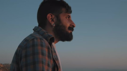
What I’ve covered also applies to Artemis’ depiction on the cover of Starless Night, so I won’t repeat it again.
Some might believe that Artemis is painted with desaturated shadows (grays) because of the absorption of the shade turning him grayish. However, I don’t believe Lockwood chose to depict that, as Artemis’ skin is too vivid even with the grayish-brown shadows. Salvatore specifically wrote:
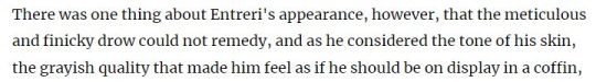
Lockwood was at that time no stranger to illustrating supernatural skin types, he certainly could’ve made Artemis’ skin look like that of a corpse’s if he wanted to. It looks very likely however that there was a conscious decision was made not to.
What I haven’t discussed is that some will pick up what looks like a very dark red on Artemis’ cheeks and nose on the Servant of the Shard cover. He could be flushed from exertion, anger, heat from the breath of Hephaestus, or perhaps it’s just a color choice to make his features pop more. However, even there, he’s no white guy with his face flushed, which if we look closely, would actually be more of a pink despite the phrase, “red-faced with anger”:
Meanwhile, Artemis’ “red” is more of a brown:

Thanks for coming to my TED Talk. ]]
#Artemis Entreri#legend of drizzt#Forgotten Realms#Calimshan#Todd Lockwood#fantasy POC#ooc#appearance
39 notes
·
View notes
Note
Hi! Would you like to explain how my portrayal of vsynths contrasts with Heron? I personally can’t figure out what makes it so interesting, since when I make Heron interact with other vsynths I rarely have a good idea of how they’ll work in mind, and just wing it.

hihi! i'd been meaning to get to this, so sure thing! for now i'll only focus on a few main ones that came to mind (i don't have a lot of brainpower atm 😔✌️) but i hope this is alright
mild disclaimer that some of this is based off information in older posts so i am aware that those prior details contained in them may no longer be canon. also again this just how i thought of/interpreted certain things, i'm obv not the og creator (you) so ultimately feel free to take this w/ a grain of salt since this might've not been the og intention.
also this is all under this cut here b/c it ended up being rly fckin long, sorry in advance if my explanations aren't very good 😭
so lets start w/ fukase; some of his character traits in your portrayal of him do seem to line up with some popular interpretations of him: silly guy/wisecracker who makes a lot of jokes, sometimes at the expense of others. also a he's a bit overdramatic ahdksjg. despite his sorta skewed goals, though, and behind that sassy attitude, he does really seem to care about people important to him. they're both very expressive characters (well in general everyone is depicted as very expressive in your art but thats an aside) but i think the way that is conveyed makes for an interesting contrast. fukase seems to show a lot more of his personality through his speech, while heron's personality is shown more through some of his actions. that's not to say heron is completely silent, but he does seem to save his words for more important occasions (or if he just really really feels like speaking his mind); whether that's because he's still a bit shy and/or just a quiet person in general, i'm not sure, but a lot more things with him seem to be conveyed through thoughts or external third-person commentary rather than him outright saying it. its definitely the opposite of fukase, who seems way more chatty and social. visually too there's a pretty neat contrast between them: aside from the height difference that sets them apart, both have limited color palettes that combine some neutral colors (fukase's off-white, black, and brown, heron's greys, muted teal, and tans) with a brighter color to pop out (fukase's bright red, heron's aqua seen on his collar + headphones).
flower and heron's relationship has previously been described as somewhat sibling-like, and it does definitely come off that way: there might be disagreements and rivalry but there's some calm nice/silly moments and genuine care & concern. they share a lot of similarities, but one could note how their relationship parallels that of heron & makarov's - flower occasionally takes on the more cheery and bubbly role in comparison to heron sometimes being the more serious and quiet one, which is seen reversed with the brothers. in spite of quarreling over small, petty little things sometimes, heron and flower seem to make up much easier and not hold any long-lasting resentment towards each other. i ofc know the heron & makarov situation is more complicated and it would make sense for it to be more strained given all that's happened, even in spite of heron forgiving his brother. but i do also wonder if it's been difficult for flower to try and calm heron down on certain occasions, seeing how he's also prone to spirals of his own thoughts that are hard to pull him out of, in a way very similar to his own brother. something sorta ironic there maybe
piko's interesting, pretty much the wild card here. his characterization does seem to vary quite a bit: he can be very playful and cutesy but also kind of a downer, as well as an angry little guy and a bit more ominous/spooky at times. there was a noteworthy point mentioned in this post though regarding how piko sees heron: heron reminds him of his younger self and wants to spare him of the pain that comes with getting your naive dreams of fame and popularity crushed. they're both very similar to each other, from the moodiness to being drawn—sometimes together—in a lot of pieces w/ similar subject matter (both have a fair share of lighthearted doodles as well as darker ones, more so in specific comparison with other characters), and taking the previously mentioned piko thoughts on heron, makes things a little bit sadder... maybe piko's current passive-aggressive and somewhat angry attitude is a mask he's developed over the years to protect himself from getting hurt more, though you can get to his nicer side if he trusts you enough. heron sometimes seems like a slight, cruel opposite of this: being nice and trusting others a bit too easily, but then breaking down emotionally in realizing his choices and impulsive actions, which might scare some people away. i want them to be happy kajhskj but i do wonder if, in spite of how much heron might look up to him, piko really feels the same way. i'm sure he does care about him, but... feelings is complicated. also i wasn't gonna touch on too much of this since i'm aware its not canon, but there's also the whole tall piko thing and how that version of piko specifically interacts with heron. that relationship in particular seems to represent an idealization: some sort of true happiness that'll come once there's an acceptance of the self, and a real willingness to accept help and be vulnerable to allow oneself to be healed... but again that's not canon and might not ever happen so, rip
and of course... there's len. i touched upon this in that original headcanon post but i did still wanna bring it up a little here. something i thought was interesting in looking back at a lot of your art was that most times, len is depicted in group settings; he's rarely seen alone and almost always interacting with someone else in some way. and generally he seems quite concerned, even more so in his interactions w/ heron. aside from the obvious fear of getting mauled to death probably lmao, he also seems to genuinely care about heron and worries about him. i think its worth noting that len is the first person heron sees after "waking up" here, and how he's the only one actually putting a hand on heron there in second-to-last panel. but again, even if len does have good intentions it is clear heron doesn't seem to be on the best terms with him. this piece has always been particularly intriguing to me, pairing what we see happening with the title. makes me think heron's blaming len for what happened to him, that it's len's fault somehow he ended up like this. a big thing also that's part of the len getting mauled thing is... len getting dismembered and eaten. i'm not gonna say too too much b/c i'm sure nobody wants to hear my cannibalism rambling but symbolically... "you are what you eat" yk? as mentioned with piko, heron seems to look up to a lot of the well-known vsynths and wants to achieve a status like them. and ofc len's arguably one of the most popular vocaloids with lot of fame and recognition. heron's design itself is said to take some inspo from len's outfit, and in general (like i mentioned in the original hc post), just wanting to be so much like someone, wanting what they have but not getting it, that might understandably drive someone to rage, and the mauling/dismembering/eating is the violent culmination of those feelings of envy. one last bonus point in terms of visuals too: yellow is the complimentary color to blue (ok ik heron's blues lean more towards blue-grey or aqua but shhhh), the literal opposite of it on the color wheel.
overall i feel heron honestly fits right in with the memesquad; everyone's personalities sort of compliment and mesh well with each other, which creates a fun dynamic that's really sweet to see. i think its really cool how you managed to make him fit in so well and how a lot of his interactions with the others make a lot of sense and are interesting to see, in happy moments as well as more serious/sad ones. sometimes i do really forget he's not a vsynth [yet?] so its surreal. ur doing a really good job tho, keep heronposting we love to see it
#ask#sorry this took so long to answer shkjghskjg 😭😭 a lot has been going on lately#i realize now this is more character relationships/comparisons and stuff rather than contrasts necessarily... oops.#i apologize in general if this makes like no fuckin sense 😭😭😭 my lit analysis shit always sounds better in my head than irl#there's more i could've put here but i was already struggling on how to phrase certain things properly so we'll leave it here for now#tho tbh: fucking around and not really knowing what youre doing will honestly lead you to some of the greatest shit youve made#<- thats a really weird fucking art/writing tip that ive learned over the years and it still fucks me up everytime but fr sometimes.#some of the best shit ppl have come up w/ was born purely out of messing around and improvising so. winging it is a solid development tip
4 notes
·
View notes
Note
Hi Anna!!! I'm so sorry to bother you but I keep noticing things I want your opinion on! Shannon wears a LOT of yellow. Both when she comes back, and when she dies. Chris wears yellow both during the tsunami and during Eddie's breakdown. I just want to know why! I know Eddie's army green is his armor and navy is his love color, and Chris wears green and blue whenever Buddie's in danger, but what's the point of the yellow?
Muah! 💚
Okay, so, I absolutely SUCK at clothing metas aside from the very well established blue and green thing with couples, but I have opinions because their clothing department is very on the nose lol
Something about 911 is that they tend to assign colors or color groups to characters, Eddie wears a lot of earth tones in greens and blues and greys and browns, Buck wears a lot of red and pinks and oranges, Athena also wears a lot of red, Bobby wears a lot of darker colors, Hen wears a lot of fun prints, and I'm sure that has something to do with the way they built the characters in ways I can't fully explain.
But I actually went to look at all of the Shannon scenes, and she's always wearing yellow or orange, expect for the beach scene where she's wearing pink and all the flashbacks where she's wearing red, and something else about the beach scene is that she's also always wearing a lot of accessories, she has a lot of rings and multiple necklaces most of the times we see her, except for the beach where she's wearing one ring and one necklace and there's probably a point to be made here that I can't fully articulate (there's probably something about color theory to be said with the way they assigned her yellow, the color next to green, which is a color we see Eddie a lot in, so they look nice next to each other since they are analogous colors but considering the way green is one of the assigned colors for couples but the other color there is blue, that’s the other side of the green analogous colors of the wheel, putting her in yellow could be making a bigger point here and the way she’s in brigher shades than earthy tones associated with Eddie, could also be making a point since they clash shades to show conflict sometimes), but since she's wearing a lot of yellows, I went looking for when Chris is wearing yellow and that's tsunami, after he gets hurt in school after the skateboard incident and during Eddie's breakdown, which is interesting when you consider the way that these are situations where Eddie gets emotionally distressed, to draw that parallel to watching Shannon die and the way Chris also has his own color palette, in season 2 and 3 he wears red a lot and after that he evolves to blues and greens kinda mirroring Eddie which I think is adorable, but his glasses are still red and so are his crutches, so to put him in the color they assigned to his dead mother in the situations where he's not exactly in danger (he is in danger on the tsunami but he's not in danger during Eddie's breakdown, I think the word I want here is that when he's scared), definitely means something, because like, she's wearing yellow in moments Eddie needs to be emotionally vulnerable, when they kiss after she did the interview with the school, when she shows up at the firehouse, when she dies, so it's definitely a choice being made there.
WAIT WAIT WAIT CHRIS IS WEARING YELLOW IN SCENES EDDIE IS WRONG. HE ASSUMES CHRIS IS SAFE FROM THE TSUNAMI, HE ASSUMES CHRIS WAS FORCED TO GET ON THE SKATEBOARD AND WHEN EDDIE THINKS THERE'S NO HOPE FOR HIMSELF. (this is an edit lol)
And Eddie definitely wears more blues than green around Chris and when you add the army green jacket and the situations we get that particular shade of green with him in, it definitely affects the way we view the scene even if it's not fully conscious (the navy blue it's complicated to say, i think, since its the color of their uniforms). And the yellow thing is interesting because they kinda push that in a way where you can make the assumption that yellow is Shannon's favorite color (even her jewelry is mostly gold, and from what i can tell there's almost always a ring with a yellow stone, so like, it's there) so it would make sense if Chris had more yellow stuff considering his stuff was picked out by her for half his life, because even if assuming based on his glasses and crutches that his favorite color is red, it would make sense for him to have a bit of his mother around him anyway (i mean, there's the way they put Shannon in red throughout all of Eddie Begins so maybe they added that there so that the red already is that bit and the evolution to his clothing matching Eddie's color palette is bringing a bit of both but that would be a retcon in my opinion) because I feel like even as a 7 yo if he got to pick stuff, he could very easily gravitate towards something that reminded him of his mom.
#i dont know what my point is anymore so I'm will stop typing#you did give me a lot to think about lol#colors man#colors#911 meta#911#i really need a tag for asks#maggie 💜
3 notes
·
View notes
Note
what the actual fuck i'm so fucking mad you got that message in your inbox, you're like the most loving most positive person here always enjoying your interests in such a nice way like that personally angered me you don't deserve that at all. that was written only to piss you off please don't let them, your love for vice versa and jimmysea is honestly the cutest most endearing thing and it makes me genuinely happy seeing you talk about it so excitedly every day. their episodes were soooo good imho so cute so them! i've missed them a lot and i'll be rewatching FOR SURE! what were your fave 3 moments? if you can choose! fuck that anon and the other ones that might be the same person. love you monica keep loving them as hard as you do <3
ANON YOU'RE MAKING ME TEAR UP THIS IS SO SWEET 😭😭 idk if i deserve all these nice words but please know that i deeply appreciate them and that they mean a lot to me!!!! thank you so so much for this 🥺💜
honestly i LOVED the our skyy episodes like i know im terribly biased, but out of all the ones we got until now i think the plot for vice versa felt the most organic and coherent to the characters and their journey. once again everyone involved in the show put so much care and attention into it, and jimmysea have such a natural easy chemistry to them, they sell the lovesick fools who have been married for five years SO WELL. IDK IF I CAN PICK ONLY 3 FAVORITE MOMENTS BECAUSE THEY WERE ALL SO GOOD BUT LET ME TRY:
1) the beach scene. IRREVOCABLY CHANGED ME MY LIFE MY PERSPECTIVE THE FOUNDATION OF MY PERSONHOOD THE BIOCHEMISTRY OF MY BRAIN AND THE ENTIRE MAKE UP OF MY BEING ON AN INTRINSIC MOLECULAR LEVEL. AGAIN. i haven't even begun to process A QUARTER of the insane amount of parallels they managed to pack in just 3 minutes of screentime and how, by doing that, they were able to show just how far puentalay have come in their journey: from strangers to lovers, from a one sided drunk kiss to a passionate yet tender mutual kiss, from a mouthed 'i like your name' to a mouthed 'i love you', from talay's life ending in the ocean to the ocean being the witness of his love, that same love he once thought was just an annoying distraction in the way to achieve his dreams and that now has become an essential color in the palette of his life..... literally made me experience every single emotion present on the spectrum of human consciousness, im gonna need a 2 weeks long vacation in a controlled environment to decompress and recover from the sheer high romance and the whole entire everything of it all

also not to toot my own horn but i love being correct and never losing:

2) both the birthday conversation and the drawing one. SORRY I KNOW IM CHEATING BUT I JUST CAN'T CHOOSE BETWEEN THESE TWO MOMENTS. WHEN I SAY PUENTALAY INVENTED COMMUNICATION UNDERSTANDING CARE LOVE SUPPORT!!!!!!!! im not mentally stable enough to be coherent about this but like.. one of the reasons i adore puentalay is that since the beginning they have always been willing to try to understand each other. no relationship comes without misunderstandings or conflicts, they're always bound to happen from time to time because we're all different and we all react to things in different ways, but what matters the most is the way you can come together after that to face the issue and make it better. i feel like people often have this idealized vision of love where everything must be perfect and passionate and all-consuming, but i believe love is actively choosing to share your life with someone every day as you help each other navigate through it and enjoy the quiet moments together, and i think these two conversations show that puen and talay have this kind of love, a love that will last forever because whatever happens being together is the most important thing for them


3) puentalay and jigsaw sleeping in the same bed. LITERALLY DON'T KNOW WHAT TO TELL YOU EXCEPT THAT I PERSONALLY DON'T EVEN WANT KIDS BUT SEEING PUEN AND TALAY BEING SO TENDER WITH JIGSAW AND REARRANGING THEIR LIFE TO MAKE SPACE FOR HIM HAD ME LYING IN THE DIRT SOBBING FOR SEVERAL HOURS TO CLIMB DOWN FROM THE SUGAR HIGH THIS SCENE GAVE ME WITH ITS SWEETNESS. it also reminded me a little of the scene in episode 6 when talay admits everything he has missed about puen: talay has always been more rational and reserved with his emotions compared to puen, but it's in quiet moments like these that you can see how deeply his feelings actually run. both puen and talay have so much love to give and one day, when they will be ready, they're gonna have a kid of their own and expand their family, and this knowledge is gonna MAKE ME DIE HAPPY AND IN PEACE

#since i ended up talking about vice versa so much (as always ;;;;;;;) let me send you all the hugs and hearts here in the tags anon!!!!!!#💜💜💜💙💜💙💛❤️💓💗💞💜💚🖤🩷💞💕💗💝💖💚💛💗🩵🩷🤍🧡💘🤎🩶💖💓🧡💝💙💜💜💜💜#thank you so much again for this and i hope you're having a wonderful day!!!!!#vice versa#our skyy 2#m: ask
11 notes
·
View notes
Last Seen Blogs


cranvela
La Obsesión Mía

beardednose
Untitled

ace-attorney-pride-flags
Ace Attorney Pride Flags
vytichka
vytichka