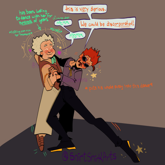
#YES I USED A POSE REF THIS TIME
Text
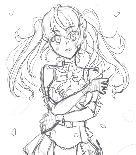
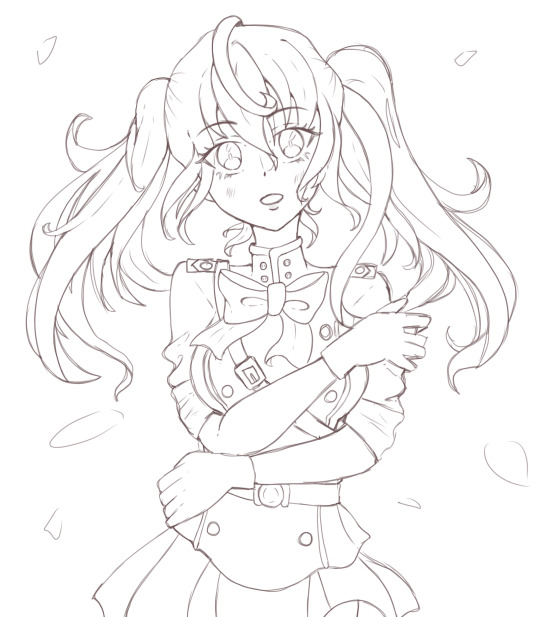
Another Mitsuba WiP <3
Ref link below ^v^
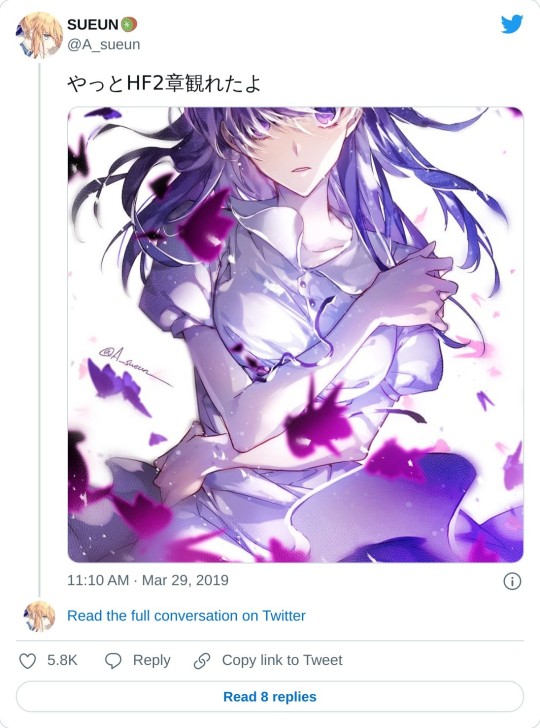
(Artist's personal art twt for Villains are Destined to Die/Death is the Only Ending for a Villainess)
#fanart#owari no seraph#seraph of the end#mitsuba sangu#digital art#my art#(sketch + 2nd pass)#deffo one I want to fully render when I have the time#I've done the lineart but I'm keeping hold of that for now hehe#might change the petal things to bubbles idk#everytime I draw Mitsuba:#Insert Baby u r my angel hamtaro meme here#YES I USED A POSE REF THIS TIME#the og artist doesn't allow reuploads of the art so I've put the link in to their acc#(I mean you always should link to the ref/og anyway...)#LINK IS BELOW THE CUT!#CHECK OUT THE OG ARTIST THEY'RE AMAZING#anyway also still working on Dancer! Akane - I want to add Mitsuba and Shinoa to my dancer au art eventually ^v^#the new chp releases at 11pm Thai time TvT#I love ons but I don't think it's worth staying up for a new chp#and I love sleep more... XD#first post of August let's goooooo#in Thai time anyway haha#if I could see Penny in OnS style or Mitsuba in VADD style I'd die of happiness#... maybe I should put some of my Manhwa faves into OnS uniforms...#a problem for future Sizz to draw XD
35 notes
·
View notes
Text
quick sketch to keep me sane at work
#I feel her so deeply#I kinda wanna draw some ds9 characters in the style but how cringe is that on a scale of yes to fuck me#adventure time#cartoon#sketchbook#I’m sorry I never use pose ref it’s an issue#my art#fionna and cake
11 notes
·
View notes
Text
Sorry I keep dying this took me a few days to finish. No it didn’t actually take that long I probably could have done it in two days or less, I just kept forgetting about it. Enjoy.
#good omens#good ineffable omens#good omens fanart#crowley#aziraphale#azicrow#go aziraphale#go crowley#I have many many art pieces I forget about.#I used a pose ref for this#which is why it looks better than my last one Lmaoo#yes I gave her freckles this time bc of angel kisses and stars and snake scales#all of the above#no I’m not drawing adventure time#i haven’t watched it yet#I would if I could#and I’m sure I’ll draw it when I do#anywho#enjoy
10 notes
·
View notes
Video
“Anyone here like The Human League?”
(version without source)
#the young ones#tyo#rick#rik mayall#animatic#this is the version with the source in the corner#theres another one without it#also yes the flowerpot has a png explosion#>:]#i had the source clip in the corner and used it as a ref for poses and where people were standing which was handy#cause i could move the cursor over the timeline and itd be at the right time#way better than just having it on ur phone and pausing it at random times and hoping its right#art tag
22 notes
·
View notes
Text
woa hold the fuck on since when did every character in moss get their poses updated
#yes i know shut up moss aint comin any time soon but i was looking for refs and noticed that all their poses were different. except like+#+airpods anf grays why didnt they update gray :(#only old mutuals remember when i used to have a moss hyperfixation#moss is still cool they have guys that are shaped#I GET IT peopel r going to bully me for liking moss#IM SORRY :(
2 notes
·
View notes
Text
haikyuu boys as things ive seen/done as a HS volleyball player:
sakusa borderline verbally assaulting someone for using his jump rope without permission during conditioning.
bokuto hitting a ball directly into the ceiling in such a way that it tore some of the instillation. (yes, we still make fun of the guy who did it.)
atsumu posing proudly when a coach calls his name, only for it to be for some absolutely foul criticism.
hinata running full force into the ref podium beside the net to make a pass, promptly knocking over the entire podium.
kageyama letting the gym door shut without thinking and accidentally locking out half of the team in the rain.
tsukishima - idk how to format this one, but that one time i texted my teammate i was going to be late and he responded "ok? what does that have to do with me? i dont care." (yes, im still very hurt.)
yamaguchi being told by a coach that he needs "confidence classes."
(thanks for reading, i have... so many of these...)
(part two here)
#haikyuu#haikyuu headcanons#haikyuu hcs#sakusa kiyoomi#bokuto koutarou#miya atsumu#hinata shouyou#kageyama tobio#tsukishima kei#yamaguchi tadashi#volleyball#omelette drabbles
1K notes
·
View notes
Text
alright, the other day i loosely implied that i would make a behind the scenes/tutorial type of thing. momma didn't raise no liar, so here goes nothing i guess!
step 1) rough sketch
honestly i skip this entirely if have a really concrete idea of what i want to do. sometimes compositions are just beamed into my brain from On High and a sketch is unnecessary.
step 2) 3d ref

this is where i refine the composition, lighting, camera angles, props, etc. i use DAZ studio for model posing and blender for almost everything else (props, horns, lighting, rendering).
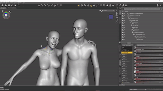
here's a 10 minute video on how to pose models in DAZ if you're interested in doing something like this! it's not very hard! basic posing requires almost no technical know-how.
i've heard magicposer and virt-a-mate are also good for model posing, but i don't have any experience with either program.

after i'm done posing, i transfer the models to blender so i can work on props, environment, and lighting because doing it in DAZ is ass. you can see that i went overboard on the ref for the paladin i worked on last year by modelling armor.
step 3) lineart

at this stage i'm synthesizing my 3d models, reference images, and style choices into lines.
the 3d likeness of my models is poor because I don't have time for that shit, so this is where my humongous folder full of bg3 screenshots comes into play.
for example: looking at my screenshots, astarion's forehead tilts back towards the back of his skull, much more so than my reference model. his chin and jaw are sharper and longer, and the transition between his brow ridge and nose is almost a straight line. if i combine the information from my 3d model and astarion's face, i get something like this:

3d models aren't fleshy (ie, tummy rolls, wrinkles, muscle deformations, butt squish) unless one puts in A LOT of effort like absolute madman chris jones.
you guys know bernini, right? he has a couple great examples of this. see how hades' hands press in on persephone's leg?
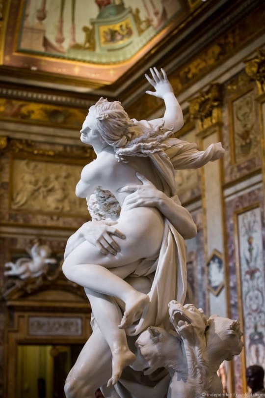

this is what we want to add in the lineart because it's too much effort for 3d. laziness is king.
i guess i draw clothes at this stage too, but for some reason there aren't many in this image. ( ͡° ͜ʖ ͡°)
step 4) base color
i have a little color picked palette that i use for everybody so i get their skintones right before i start messing with colored lighting. i'll use overlay and hard/soft light layers clipped to the base layer during the shading step later.
step 5) shading
if you thought we were done with the 3d part, guess again! i posterize my 3d reference so i can see the shapes of the shadows and highlights better. if i'm not feeling it, i can go back to 3d and change the lighting really easily.
could I make a cel shader for this? yes. am I going to? No. custom shaders are for people with intelligence and I am fresh out. posterization it is.

from there, i do a pretty standard cel shading deal that i usually blur and set to low opacity. (for this image i stuck to no blur because i had been looking at a lot of morebird's art and was really feeling the hard edges)
photoshop is what i use for final rendering because it has bangin tools. the brush customization alone make ps worth it, but i also particularly abuse puppet warp, noise generation, the camera raw filter, and layer styles.

step 6) background
i put the least effort possible into a background and then i blur it into oblivion so you can't fathom the depths of my ineptitude.
and then i have a finished image! ᕕ( ᐛ )ᕗ
#art tutorial#this got long!! the rest is under the cut#i encourage everyone to try out DAZ and blender! theyre both free!!#i love goofing around in 3d
71 notes
·
View notes
Note
do you use references when you draw? also, happy (belated?) birthday <33
Ty and yes i do! I use a metric fuck ton of reference for just about everything I draw
Like here's a little peak at my lae'zel ref file that I have up every time I draw her (even if I don't really need it atp)

Then I have folders on top of folders of pose and anatomy references that I also use, so yeah, I use reference lol
83 notes
·
View notes
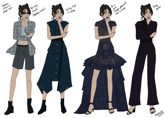
Text
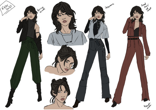

[surfaces from the deep with art in tow]
'tis i, the purveyor of fem!kinnporsche lookbooks, this time bearing kimchay. if you missed the kinnporsche one it's here. if you didn't, you know the drill, thoughts and refs beneath the cut.
okay let's start with kim:
i'm gonna be real with you folks: i struggled hard with fem!kim. in my head, kim much like fem!kinn is someone who uses her clothes to send messages, but where kinn is trying to communicate power and authority, kim is instead using her clothes to adopt different personas or elements of her personality. and so, i can see fem!kim wearing nearly everything, basically.
kimlor swift aka wik aka internet popstar kim
so, return customers may notice something odd about kim: i gave her different poses for each of her personas. why? i think kim is someone who embodies a lot of different personas, and i think the change is more than skin deep.
this was very much the first set i drew. the brief for these outfits in my head was something like "k-pop kim possible". also a lot of these were drawn when i still had covid lmao so i barely remember most of it.
it was very important to me that kim had a wolf cut. that fact came to me the moment i started thinking about fem!kim. so. you know. you're welcome.
runing errands (first outfit) - this one was the first outfit i drew for kim, and it was mostly summoned up from my own head. i spent a lot of time scrolling through pinterest before i started drawing. in my head, this is sort of what she wears when she's out and about as wik but not like, performing or whatever. still a very crafted image, but a little more casual than her performance gear.
performance (second outfit) - this one does have a ref! i found this image on pinterest and was like yes. this one. i thought long and hard about what i wanted wik's fashion and persona to be, because i debated going along the family friendly singer-songstress route, but in the end i figured she had to be cool and a little edgy. hence [gestures at the clothes].
award show/red carpet (third outfit) - this one's kind of fun. longtime listeners will recall that i started drawing these lookbooks bc @mortimerlatrice told me they didn't think fem!kinn would wear dresses and i had to disprove them -- so i thought it'd be fun if for kim, she only wore dresses when on mafia business. kim in a dress is a blaring warning signal that you're gonna get your shit rocked. so, kim's award show look is a pantsuit. she doesn't wear dresses at all as wik. there was definitely a reference image for this one, but i drew the entirety of this first set when i had covid, so i don't think i saved it OTL
detective wikachu aka mafia kim
another fun detail you might notice about mafia!kim -- she's always got her hair up. that was also deliberate. also holy shit this set killed me so bad. we'll get there.
running errands (detective errands) (first outfit) - this is what kim wears when she's gotta blackmail randos for info. fairly casual, all things told, but very different in vibe to her wik stuf. also the pattern on that suit is incredibly simple but it took me 45 mins to create bc i still had covid brainfog at this point. the reference for this look was celine's spring/summer 2021 rtw collection look 24.
visiting dad (to snoop) (second outfit) - another source of debate for me. what, exactly, does kim send as a message to her father when she comes back home? i played with the idea of her wearing a sort of perfectly pretty mafia princess disguise, but i don't think that's what she'd use to get on her father's good side. so, she's wearing a dress (fuck your shit up vibes for her) but it's got a strong vibe to it. so, i had to go with alexander mcqueen, which is one of my favourite designers. this one is specifically alexander mcqueen pre-fall 2022 look 17.
at a gala (mafia-flavoured) also to snoop (third outfit) - oh my god you guys will not believe how many of these i went through. i even fully drew another option before discarding it completely. (originally, i was going to go with erdem pre-fall 2023 look 8 which i drafted here but i just didn't vibe with it the more i worked on it. i guess it felt a little too princessy? so i pivoted.) this one is from another of those designers i actually really like, zuhair murad. this one's from fall 2022 couture, specifically look 38. very much love at first sight. the moment i saw it, i knew i was gonna draw it. and oh boy did drawing it make me suffer. that bead pattern on the dress? killed me. actually killed me. fucking OW. worth it though.
family portrait (fourth outfit) - after all the suffering of kim's formal look this one was comparatively a breeze. found a pic on pinterest, and whoosh i went drawing. the reference is here.
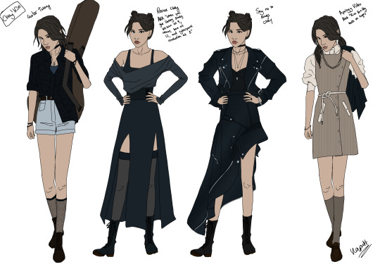
chay!kim
this set is very much what it says on the tin, the clothes kim wears around chay. let's go.
guitar tutoring (first outfit) - okay so in my head the brief for this one was "what kim thinks chay thinks wik wears on her downtime", which very much sets the tone for the entire outfit. i just think it's fun if kim twists herself out of sorts with how clever she is and then chay just bulldozes straight through that. i don't actually have a reference for this one. just drew it.
rescue chay (second outfit) - this is what kim wears to go save chay from the tawan kidnapping. i dubbed this one "when you got library study session at 9, rescue bae at 12, and cyberpunk revolution at 3". the loose inspo for this one was this dress on pinterest which i tracked to the brand ganni and then found they no longer made.
say no to drugs, chay (third outfit) - okay so i wanted this outfit to be like. a wake up call to chay. the first time chay sees kim in a skirt, and the first time chay realises that maybe kim is a little dangerous. it's alexander mcqueen (ofc it is) and actually in the time between me drawing this and posting it, someone actually wore the skirt from this look on the red carpet. it's the spring 2023 rtw collection, look 24. salma hayek wore the skirt to the 2023 brits here.
the youtuber apology video fit (fourth outfit) - the brief here was "kim forcibly bolting on hinges". the idea was to kind of soften her mafia edges but leave the cornerstones of how she dresses for that very much there. so, dress, hair up, but much more relaxed. this outfit is from tommy hilfiger's spring 2023 rtw collection, specifically look 17.
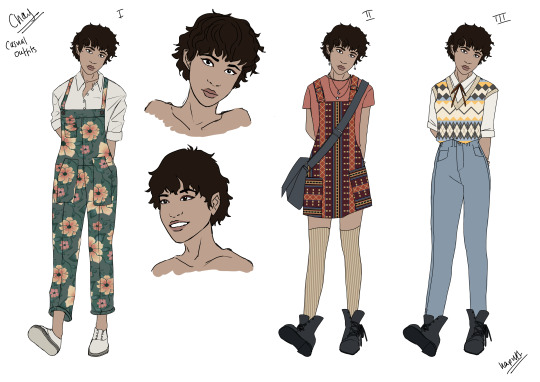
onto chay:
chay was really hard to start with, i'm going to be real. i think the sum total for my notes when i started was just one word: dungarees? as i drew more of her i started to think of her as someone who thrifts and then alters a lot of her clothes. i wanted colour and patterns, and i suffered for them. by god did i suffer.
a few lil headcanons i have about her:
i think chay probably finds it easy to be considered cute and hard to move out of that box. i think there's a part of chay that wants to be sexy the way porsche is (ESPECIALLY if this is a fem!porsche universe) but doesn't know how to go about trying to achieve that. she had to ask yok how to teach her how to apply eyeliner bc porsche doesn't know how to and doesn't care to learn.
i think the role of like, female role model/influence in chay's life is later taken up by fem!kinn, who is full of the kind of advice porsche would be horrified to hear given to her precious baby sister.
chay has short hair because when she had long hair porsche was obsessed with getting her the right shampoos and conditioners and stuff to take care of it (probs based on some internalised stuff from when porsche was at school and girls would mock her for her split ends) so chay just puts a stop to that by cutting all her hair off and it turns out she kind of likes it? so she keeps it.
casual outfits
i drew all these patterns myself. from scratch. you're welcome.
green dungarees (first outfit) - the reference image is here. this was the first look i drew and also the moment i realised how stupid i was to choose a "fun" foot pose for chay. this caused no end of suffering going forward.
orange dungarees (second outfit) - ref here. here i started to regret the pattern aspect of my chay design. also those messy canvas ankle boots killed me to draw. they were so hard.
sweater vest (third outfit) = MORE FUCKING PATTERNS. i also had a reference for this one somwhere but i was drawing this whilst playing dnd so i think it just got lost.
special outfits
school uniform (first outfit) - i did a bit of looking into school uniforms in thailand and from what i can tell they basically all look very similar. idk if the lilac shirt + navy skirt combo is standardised for girls but it was pretty much all i found when i went looking. also she has a long skirt because when she and porsche bought it for her, they bought a really big one that she could wear all through school.
one (1) smart dress (second outfit) - the idea here is that this is the one smart item of clothing that chay has, and it's the one-size-fits-all-occasions dress. it's dark so it can be worn to funerals. it's somewhere between business and formal so it can be worn to both those kinds of occasions. it was based on this dress i found on pinterest.
going to a concert with friends (third outfit) - i... just wanted to put chay in a bucket hat? yeah that's all i have. no ref. just my mind.
porsche's first paycheque present (fourth outfit) - the idea here was that after getting some money from the whole mafia thing, porsche buys this as a present for chay. maybe it's a dress chay's always looked at when they walk past it in a shop window? this is a slight tweak on this dress by alaia. the original's like £2k which i cannot picture porsche and chay spending on a dress but shhh it's fine.
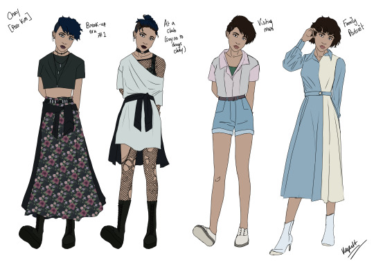
post-kim
these are the outfits from after the whole kim debacle goes down. i just really wanted to draw goth chay. and really, who wouldn't?
break-up era #1 (first outfit) - at this point i was just having way too much fun. the pattern took for-fucking-ever on the skirt though, because i thought i'd just cheekily re-use the dungaree flower pattern with colour changes but oh no that didn't work at all. i had to edit it so much. the reference is here. here her hair is freshly dyed blue, and she's given herself a little heartbreak undercut. you go girl.
say no to drugs chay (second outfit) - this is what chay is wearing when kim points at that rando in the club who offers chay drugs. you see all of the goth reference images i was finding were just too clean-cut and employable, you know? so torn fishnets it was. the refence i found for this is here but i changed it up bc i couldn't see chay wearing a little nightdress to go clubbing no matter how heartbroken she was.
visiting mum (third outfit) - in this one, in my head, chay has dyed her hair back to normal, but she's still got the undercut, so she straightens her hair and pins a little of it over the short bit to try and appear a little more normal chay to her mum. very simple outfit, no refs.
family portrait (fourth outfit) - there's a part of me which delights in this implied scenario because i just think it's funny if chay and kim are posing for a family portrait with kinnporsche and chay's ready to ignore the fuck out of kim and pretend like she doesn't care about her staring but then kim is in full-hide-any-weakenesses mode because korn's there so now chay's the one staring. relationship status: it's very awkward. anyway fashion wise i wanted two things from chay's outfit: for it to be simpler than any of the theerapanyakuls' and for it to be in a lighter shade of porsche's colour (blue). the reference was this cool dress i found on pinterest.
[exhales] is that everything? i think that's everything. obligatory tag for @yeetlegay bc i know they like to see the fem!kinnporsche content.
big shoutout to mort (tagged earlier), @antique-forvalaka, @luckydragon10, and @dr-lemurr for art troubleshooting and cheerleading duties.
everything was drawn in clip studio paint, which i cannot recommend enough. if you want more detailed info abt that side of things, send me an ask.
#kaputt suffers in art#kinnporsche#kinnporsche art#fem!kinnporsche art#i was originally planning on working on vegas and pete next but then the build stuff came out and kind of axed that plan#i just don't feel comfortable drawing the guy's face rn#i've been toying with recasting f!pete to get around that but i haven't found anyone i want to draw yet#anyway i just realised i didn't put my signature on a bunch of these one second just screaming#okay phew done
217 notes
·
View notes
Note
Hi Ari!
I’ve always been a fan of your severitus art and I’ve started to pursue digital art as a hobby, i only have procreate and I struggle to draw without using a reference. I was wondering if you have any tips to help, especially that I will usually be drawing Snape and Harry
Thanks in advance!
Hello!
Thank you! I'm delighted to hear you're picking up on digital art! It's a truly fun medium. I'm familiar with procreate, though I'm trying to stop using it. Nothing against the program(long story).
SO.
I want to address "I struggle to draw without using a reference" .
-clears throat- This is NOT an issue. Using a reference does not make you a lesser artist, or at all symbolize lack of skill. ALWAYS use a reference, even if you're sure you don't need one, you may notice something regardless. I have a bachelors in Illustration with a Concept Art Concentration and I STILL USE REFERENCES. Dreamworks, Disney, Marvel, Star Wars, DC, Wizards of the Coast artists, they all use refs. I know this because they were the ones who TAUGHT me.
Allow me to prove a point->

These are all WIP screen captures I've sent to servers I'm in. I'm using refs. When I'm at my PC?

Please, don't ever feel like using a reference is like wearing training wheels, or CHEATING. IT'S NOT and I know there are people out there saying otherwise and they ARE WRONG.
Do I use a ref for everything? No. But I do for a good 85% of my work. It can be a color ref, a mood ref, a pose ref, doesn't matter.
There is very little I don't need a ref for. Let me put it into perspective.
Darth Vader is the only subject(besides dragons) I 99% of the time don't need a ref for(sometimes I open my Vader model for tough head angles or take photos of my mask replica). I have been drawing Vader, consistently since I was SIXTEEN. I've been drawing him for 13 years. After 13 years, yeah...I don't need a ref. Like with anything, PRACTICE is key. Repetition makes for great xp points.
Do I use a reference for Severus? Yes. With my Sev, I created a face I felt fit my vision of him using Alan Rickman and JK's sketches as a base. After that, I used my OWN work of him as a ref just to ensure I kept him in the same style.
For Harry and Snape. Don't rely on the actors. You don't NEED to. My Snape looks nothing like Alan. You don't have to worry about likeness with these characters unless you are aiming for the actors. All I really grabbed from Alan for my Snape was his hair and robes, which I began altering over time. Have FUN with these characters. Go off what the books say and create your OWN VISSION. I did.
Sorry for the long reply. oops. I'm adamant/passionate about this.
#long post#ask answered#answered ask#darth vader#severus snape#harry potter#professor snape#art#piett#admiral piett#firmus piett
75 notes
·
View notes
Note
Hiiii
First of all I want to say that I love your art and I really admire it. It has kind of make me want to go back to drawing again. I used to draw a lot a few years ago but I stopped because I became unhappy with my progress. Now I want to go back to making art but I'm insecure about it because I'm worried I'm too old to start again (I'm 19) and whether I'm capable of relearning it properly. Do you have any tips about where to begin to learn art basics (specifically anatomy)? I would appreciate any advice.
Hello!!! Firstly thank you so much for the compliments, it really does mean so much <333
I'm nineteen, too! Of course you can start art again. I've taken a lot of breaks in between my own art, too, and it's only very recently that I started enjoying making art again (after .... like.... a year or two. lord) so I really do understand how you feel. But we're nineteen years young, and have so much time ahead of us to get back on our feet.
In my experience, improving comes quickest when you focus on one very specific skill at a time—and I mean SPECIFIC. Practicing gestures with torsos only, the muscles of the upper arm, skeleton heads in different angles. I've been studying arm anatomy (and only arm anatomy) recently, and I'm already miles ahead of how I used to draw arms in the past.
If you want a specific step by step on how I personally draw anatomy, I don't mind sharing a quick tutorial! But for general advice—form follows gesture, and gesture follows movement. The biggest mistake someone can make while drawing a body is focusing on the accuracy of the muscles/bones before getting the flow of the gesture down.
Even if the anatomy looks a bit wonky with the gesture, it's important that you capture the movement of the pose first, and then build muscle on top of that. Proko on Youtube has a very good quick drawing series on this, and explains it way better than I do, but that's the gist of it.
Also, PLEASE always use references! I know that hearing that gets old, but it's really important. If you'd like, I can make a quick tutorial on how to use references properly, too. Reference everything—pose, lighting, even art style if you're looking to switch things up (i have about 10 different tabs open on my computer with different artists I admire so I can reference their art religiously).
Speaking of referencing art styles, it's important to gather a bunch of artists you like in terms of style, and not just one. The trick is to separate them by skill—"this artist is for lining refs", "this artist is for anatomy refs", "this artist is for face refs", etc, etc.
And to jump off of That: I find that with anatomy, looking at other peoples' anatomy studies on pinterest is also very helpful. Obviously you should be referencing from real life too, but with art, it can be difficult to pin down what to put on the page and what to leave to the imagination. You wouldn't want to actually draw every single muscle in the arm individually, right? So I go and look at other artists' anatomy studies to see what they keep and what they don't keep.
(usually i find them on pinterest, and they look smth like this. the color coded ones especially help me.)
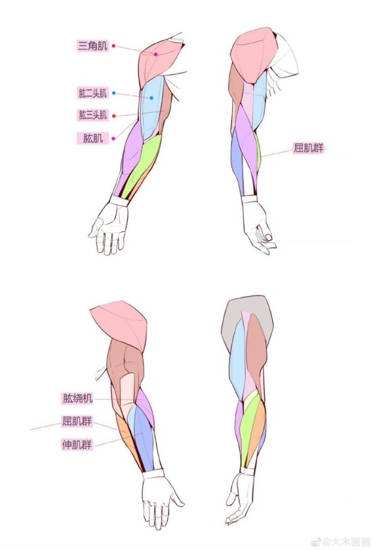
I'd recommend learning gesture and anatomy first, then building off of that to learn how to draw faces, then lining/coloring, just so that you have a solid base to work off on when it is finally time to color. (also because coloring/lighting requires a fair bit of how body anatomy works as well!!)
But yes, that's all the advice I can give from laying in my bed. I hope it helped somewhat, and if you'd like tips on how to do something more specific, I'm always willing to draw it out or go more in depth ^^ Best of luck on your art journey!
99 notes
·
View notes
Note
I have a serious question! What references did you use to learn to draw Roadhog's body type? It's my first time trying to draw a body like his and I'm STRUGGLING. I'm using your art as reference because your depictions of him are godly, but I could use any tips you have. He's my babygirl and I want to be able to do him justice 💓
hey ! good question and thank you very much for your kind words <3
i've been drawing body types like his not enough to say very comfortably that i know what i'm doing, this is mostly due to me not having done a lot of studies in this regards (i wanna change that)... but i've been trying to push it ever since the midnight crew days (since i love drawing our fabulous boy hearts boxcars and he's kinda the same category)...
i kind of looked at various references through out the years, starting with concept art from bioshock 2...
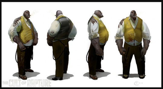
... to pictures of strongmen (they sometimes lack roadie's gut but pictures of them are amazing for arms, the chest area, necks, backs and all that)


(these are dennis kohlruss, eddie hall and rongo keene as examples)
this is older but you get the idea, just to see how things flow when there is more than just skinny muscles and skin.

sometimes it helps just tracing their ingame models, altho i'm more often changing a bit here and there (mostly roadie's giant hands... they’re just not... they just don't go with my stupid idea to go more realistic lol) but i think it's a good way to get a feeling of his body dimensions, especially length of legs, torso etc.

as a general tip i'd say don't be afraid to experiment! you know how to draw a skinny leaf of a guy? try adding more volume to it, try defining muscles through layers of skin. always google ref if you need, you don't know how a double chin rounds exactly? or how some skin folds at the sides move when twisting the torso? google it, or make ref yourself, see what your body does. because in the end we're all consistent of the same parts, it's just a matter of dimensions and volume i think
there are also a LOT of amazing artists out there i draw inspiration from drawing the best, beefiest bears... and yes i mean that in a literal way... they are mostly furry artists on the nsfw side of things, hence i'm not linking them here (i'm sorry)... but in general... idk if you're on twitter or what your preferences are, but a lot of artists specialize in drawing roadhog-type-o-guys and they're so much better at this than i am. and it's not just artists... to be perfectly honest a lot of people upload very good ref on twitter in form of photos of them it's just... mostly... nsfw x')
last but not least, i can always recommend the book "morpho fat and skin folds" for certain things
hope this helped a little and if you got any more questions or idk, need help with a certain pose?? feel free to ask
343 notes
·
View notes
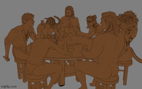
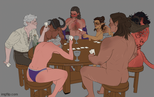
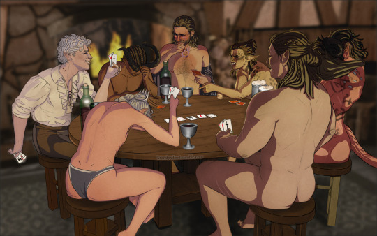
Text


Latest project: MTMTE/Lost Light Home Screen theme
This was a 3-day project, plus the time it took me to track down good character refs for all the icons. Each page tells its own story via app & widget arrangement, but I’ll put all of that under the cut since I know not everyone is interested in such things. But if you’re like me and enjoy nuanced explanations that go beyond the surface, read on.
Oh, and for any fellow iPhone users who want to do this (or something similar) for themselves, I’ve uploaded all the components I used into a Google Drive folder here.
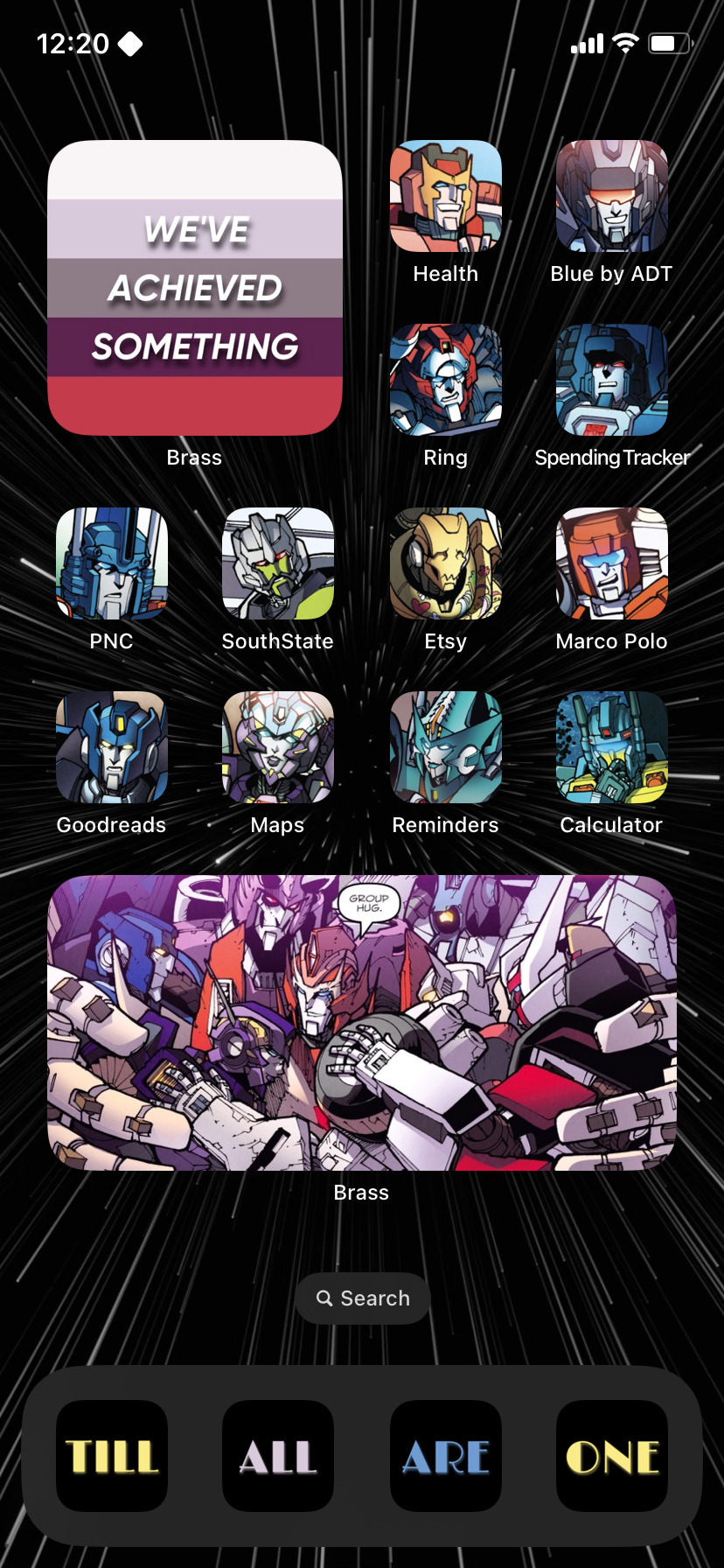
Page 1:
Comprised of much of the original crew arranged in no particular order, except Rodimus being an obvious choice for first as the captain of the Lost Light. I also made sure my favorites—Drift and Perceptor—weren’t far below. And of course, I couldn’t forget the Lost Light itself and the infamous Rodimus Star, which acts as the first of two “bookend widgets,” as you’ll see by the end of the page 4 breakdown. ;)
Page 2:
Here, I placed the rest of the main original crew, plus a few additions that came along after. The top section is meant to pose the question: “Yes, we’ve achieved something, but at what cost?” Y’know, since the four characters at the top eventually left the Lost Light crew, either by choice or by death. The bottom two-thirds of the page is a nod to the final standoff with the DJD. Those seven characters played a significant part or were at least present during the ordeal. R.I.P. Skids. *cries softly*
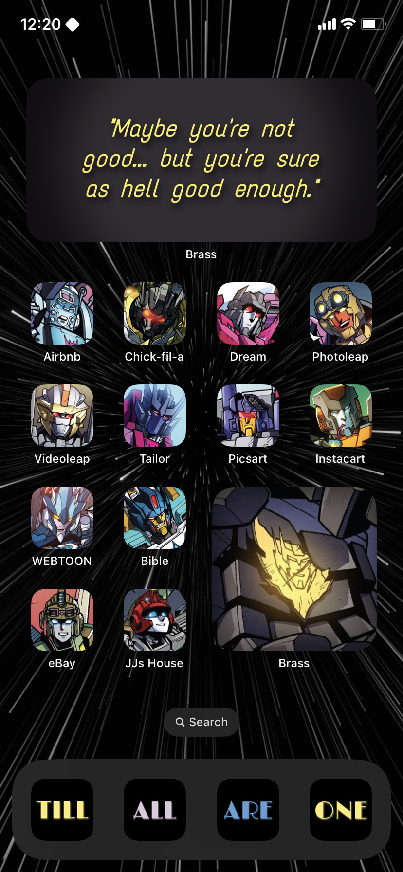
Page 3:
My favorite in terms of story-telling. ♡
I wanted to create a visual representation of Megatron’s redemption arc, starting with his old ideology of “peace through tyranny” to his somber moment of reflection in the field of spark flowers to his adoption of a new philosophy of “peace through empathy.”
And the character arrangement follows that, of course:
Top section: Most of the professionally sadistic DJD (i.e. those who fully embodied Megatron’s old philosophy of “peace through tyranny”)
Middle section: Two additional Decepticon sadists and two morally dubious Autobots (i.e. wild card characters who fall somewhere between the two sides)
Bottom section: Megatron himself and three characters who played key parts in his journey of redemption and striving for atonement (i.e. those who represent Megatron’s new philosophy of “peace through empathy)
Page 4:
Basically a summary of Lost Light. I mean, look at them: a former DJD member, a dinobot, a group of lowly Decepticon scavengers, a couple of “nobodies,” the “greatest Autobot of all time,” a disgraced-blacksmith-turned-adventurer, and an archaeologist. Not at all the bunch one would expect to come together and save the universe, yet they did just that. And it was beautiful. That’s why I chose the broken Rodimus Star as the final widget—the second bookend. It represents broken people coming together for a purpose that benefitted the greater good. It’s a tribute to these individuals (and all the others) from diverse and even controversial backgrounds who weren’t necessarily “good,” but were sure as hell good enough. In the end, every single one of the final Lost Lighters—old and new—was worthy of that silly little star.
174 notes
·
View notes
Note
youve probably had this ask before, but do you have any tips or resources on drawing gore without having to look at the actual thing as reference? im good with horror movies and all, but the idea of real shit makes me wanna throw uuup
yes yes and yes absolutely. there’s zero reason to look at the real deal, & frankly im thankful every day genZ has rejected it as hard as they have, cus i know i went on & on about it in ROTTEN but a lot of us millennials on the internet really suffered when gore was commonplace.
THE BIODIGITAL HUMAN: biodigital.com is a phenomenal free 3D medical-grade anatomy resource that will teach you what every solitary fiber of the body is called + where it goes! gore & horror art can be done any way you please, but if you’re looking to make more realism-based work, referencing anatomy & knowing your stuff is key. think of it like drawing a salad having never eaten a salad vs. drawing a salad where you know all the ingredients
GROCERY STORES: next time you’re shopping for groceries, it helps to pay special attention to the meat section! we’re all made of meat after all, so anatomy will teach you where everything goes, and grocery meat will teach you the behaviors of tissue - for instance muscles are soft and fibrous, the fat cell layer is here and behaves as such, skin is around this thick & so on. you won’t find particularly fatty cuts at the grocery store admittedly, so you’ll be missing the key fat cell layer, but that’s where anatomical ref comes in. adding the fat cell layer (yellows and oranges) steps up your work tremendously towards realism! also for any offal on sale (liver tripe etc) this is a great chance to look at organs & take note of their texture & how you would draw such an object
SHOWERS & MIRRORS: the best body ref you’ll ever have is your own self! really poke around and see where your bony landmarks are, where fat sits, & how skin bunches, stretches, & molds. the best thing ever to do too is to set your phone to a timer & then contort into a hideous pose on your floor & then try to draw it lol. self observation like this will help you figure out where the weight of the body moves towards, even if you don’t have much weight on you it’ll still move and behave with certain properties that are super helpful to study
ANY TIME YOU GET HURT BY ACCIDENT: next time you skin your knee or god forbid require sutures is also a fine opportunity for learning! blood is also a tissue & behaves with certain properties - its viscosity, how opaque it is, clotting factors, & so on. blood won’t always be a totally red Mass, it’s got texture & shade to it as well as different hues. don’t forget your browns! color is a big one too - a little orange in the yellow for the fat cell layer, a little purple in the red for muscle fibers, & so on
SURGERY FOOTAGE: the ONE actual life reference i can recommend, and this is only if you know yourself to be of a fair constitution, is youtube footage of surgical procedures such as knee replacements, ectopic pregnancies, top surgery, gastric bypass, small bowel obstruction, etc. clean sterile environments, significant education, & MOST IMPORTANT OF ALL: the knowledge that the patient walked away happy, healthy, & with a new lease on life. this will teach you countless things about anatomy, body structure, tissue behavior & color, you name it!
the most important thing to remember with the body is that anatomy will show you Where it is, meat will show you How it is, but remember that organs & tissues behave different than the models show, as they’re all in one place just for ease of visibility and education. the body is soft & it’s got all sorts of soft stuff in it that wiggles around & shines & makes weird farting noises LOL. think of the body like a cake, & horror art like a cake you dropped on the ground where every layer of it is going to behave differently!
45 notes
·
View notes
Text
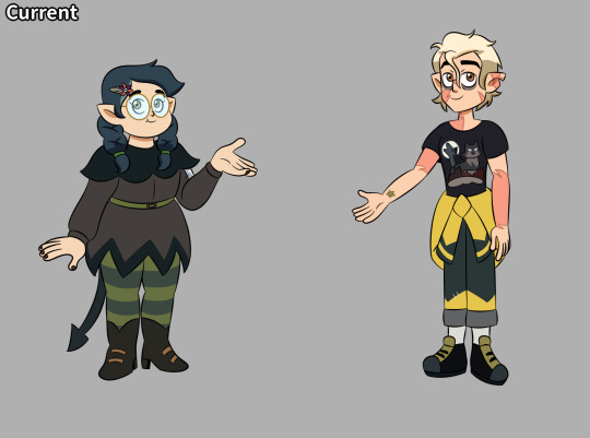

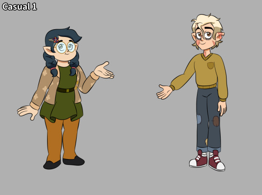
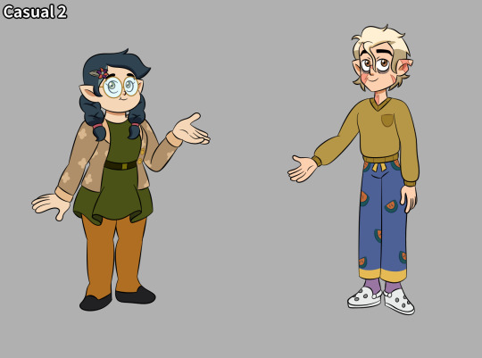
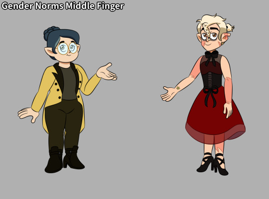

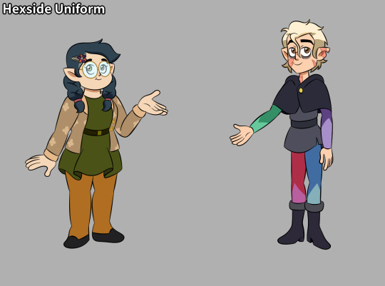
Buncha Personal Huntlow Refs I Made.
All of these are for future drawings.
I based their poses off their official model PNGs. For Willow I turned her to a 3/4's view because I HATE how her model is like the only one from a direct frontal view. Like WHY? It makes her model png look out of place somepared to everyone else's who are are 3/4's. But hey, maybe that's just a me thing.
You can really see just how off model I draw Willow here. This is on purpose. Body rep is very important.
Yes, I know I drew her hair clips on the wrong side. This is just because I needed to draw the clip for the reference and it wouldn't work if I put it on the other side.
Why does Willow's casual keep getting repeated? Because I needed more Hunter outfit refs then Willow refs and it'd be dumb to just take her out of the drawing for his extra refs.
Beileve it or not there is NO key frame or clear shot of the simplified design of Hunter's sigil in a daytime color pallete in the entire show (As of FtF). Beileve me, I have a folder on my phone completely dedicated to Hunter screenshots, and I have 2,019 screenshots of him from season 3 alone. (which is the only season the simplified sigil is ever shown). And no, that number isn't a joke or an exaggeration. That number isn't even half the amount of screenshots I have of him either. The total is 5,032. (Does it look like I have a problem? /s) Now tou'd think his model PNG would have the simplified design, but, no, it has the fully detailed sigil design. So the best I could do was use a clear shot of his simplified sigil in the wrong color pallete and try to guess the colors based off the fully detailed sigil. Was it fun? No. Was it annoying? Fuck yes.
I realized I might draw my Hunter summer design and the gender norms middle finger designs again sometime so that's why I decided to make refs of them despite them not being actual outfits in the show.
Also somehow this might be the best Willow I've ever drawn-
The improvement from the last two times I did personal ref drawings of these two is fucking crazy. Like if you bother to go back and look out the older two especially the first one just...wow.
#the owl house fanart#the owl house fan art#the owl house hunter#the owl house willow#the owl house#the owl house winter#winter the owl house#toh winter#wintery junk#winter toh#hunter toh#hunter the owl house#willow the owl house#willow toh#willow park#hunter x willow#toh willow#toh hunter#hunter park#willow x hunter#toh fan art#hunter noceda#huntlow#the owl house season 3#toh season 3#thanks to them#for the future toh
68 notes
·
View notes
Note
Bakura's sister is Dia? As in Diabound?
Yes! Dia is loosely based off Diabound! I saw this in my inbox last night, and had already started a rough sketch of her prior, so I used it as an excuse to finish her up.

I had a hard time finding a naga ref that really popped out at me pose-wise, so I ended up using multiple refs and this is the end result.
Before anyone asks why no big snake-boobies: Snakes aren't mammals. They do not have mammary glands, meaning no snake-boobies. Deal with it.
Same with Dia's androgyny. Unless you are a snake expert, you are most likely not going to be able to tell male from female at first glance. I've carried that over with this AU's Naga, with distinctions not becoming more obvious until they become much older.
Just like real snakes this AU's Naga are cold-blooded, meaning on cooler nights Dia used Bakura as her own personal body heater lol
9 notes
·
View notes
Last Seen Blogs

bluenovasnsfwart-blog
Triggered Black Nova

fee-ayra
Muffled Despacito
tiny-tk
tk’s agere sideblog
bramblescratches
the sound of a sunset; the prick of a thorn

shatteringzimmermann
boop.