#and also the fancy selection tool
Text
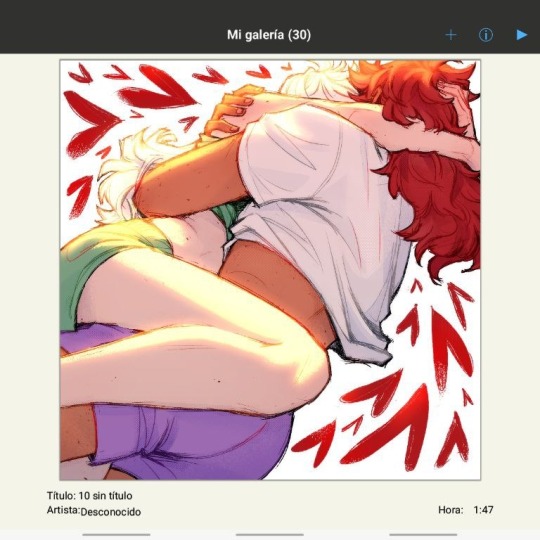
He's.having a time.
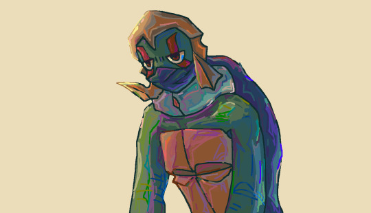
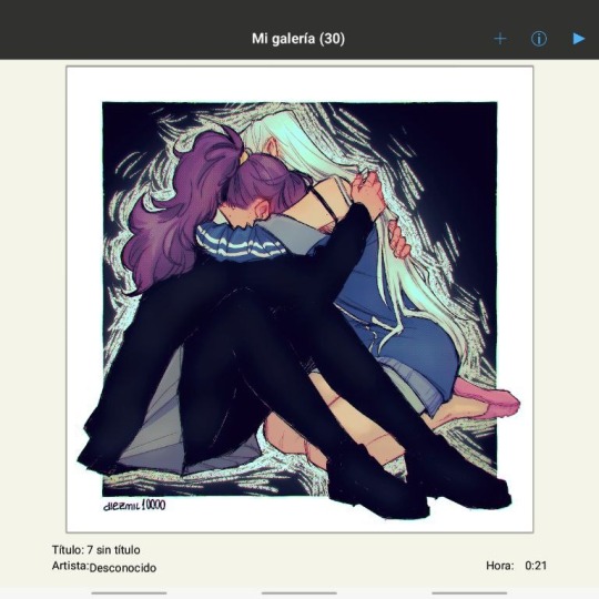
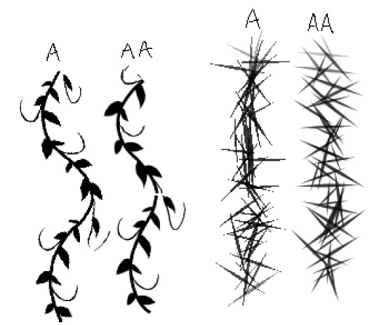
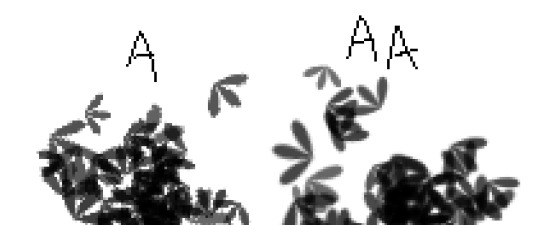
I used like 50 different color pallettes for this I had to switch between them in JS paint.
@eternalglitch
#Js paint#it's like#ms paint#but worse kinda#actually idk I've never used ms paint#lfls fanart#rottmnt lfls#lfls#green#I have to google color palletes then download them and upload them when I want to use the#them#it's a process#but it's worth it i I think#I like their square brush#and also the fancy selection tool
214 notes
·
View notes
Text
🌟 Types of Divination 🌟
🃏 Tarot Reading: Ah, the classic! Shuffle those cards, lay 'em out, and let the symbols tell your story. It's like a psychic storytime with beautifully illustrated cards.
🔮 Crystal Ball Gazing: Channel your inner fortune teller and gaze into the shimmering depths of a crystal ball. See visions, symbols, or just a really fancy paperweight – your call!
☕ Tea Leaf Reading: Sip your cuppa, but don't toss those leaves! The way they settle in your cup can unveil the mysteries of the universe. Get ready to decipher some leafy hieroglyphics.
🖐️ Palmistry (Chiromancy): Study the lines, mounts, and shapes on your palm. Each crease tells a story about your life path, personality, and potential. It's like reading a roadmap to your destiny right on your hand!
🕊️ Feather Divination: Feathers are more than just fashionable accessories for birds! They can carry messages from the spirit world. Find one, meditate on it, and decode its wisdom.
🌀 Runes Casting: Norse warriors used them, and now you can too! Grab some ancient runestones, cast them, and let the runic symbols weave tales of your destiny.
🕯️ Candle Scrying: Light a candle, focus on the flame, and let your visions come to life within the flickering glow.
🌿 Pendulum Magic: Swing that pendulum and ask it some yes-or-no questions. Allow the pendulum to swing freely and always keep your hand still to allow the energy to truly answer you questions.
🌗 Numerology: Numbers, man! They're everywhere, and they've got a lot to say. Discover your life path, destiny, and soul numbers.
🔍 Scrying Mirrors: Stare into the abyss... or, well, a special mirror! Gaze deep, and let the answers reveal themselves.
🌊 Water Scrying: Gaze into the reflective surface of water – be it a pond, a lake, or even a scrying bowl. Watch as ripples reveal the unseen.
🐚 Shell Divination: Channel your inner mermaid! Listen to the whispers of seashells and let them reveal their secrets. You can also collect a handful of different shells and cast them. Their placement, pattern, etc, can reveal important details!
🗝️ Key Casting (Cleidomancy): Gather a collection of old keys, close your eyes, and toss them onto a cloth. The position and arrangement of the keys will unveil symbolic messages or answers to your questions. It's like unlocking the secrets of the cosmos, one key at a time.
🎶 Music Divination (Alectryomancy): Play some tunes and let the lyrics, melodies, or even random song selections speak to you. The songs that resonate can offer messages or insights about your current situation. Let the music be your mystical DJ!
With this ever-growing list of divination methods, you'll have a magical tool for every occasion. Trust your intuition and let your inner seeker explore the mystical world of divination. Happy divining, cosmic explorers! 🔮🌠
#divination#witchcraft#witchy#witchblr#witches of tumblr#tarot#palmistry#tea leaf reading#scrying#runes#sea witch#lunar witch#astrology witch#green witch#kitchen witch#fae witch#forest witch#baby witch#baby witches
2K notes
·
View notes
Text
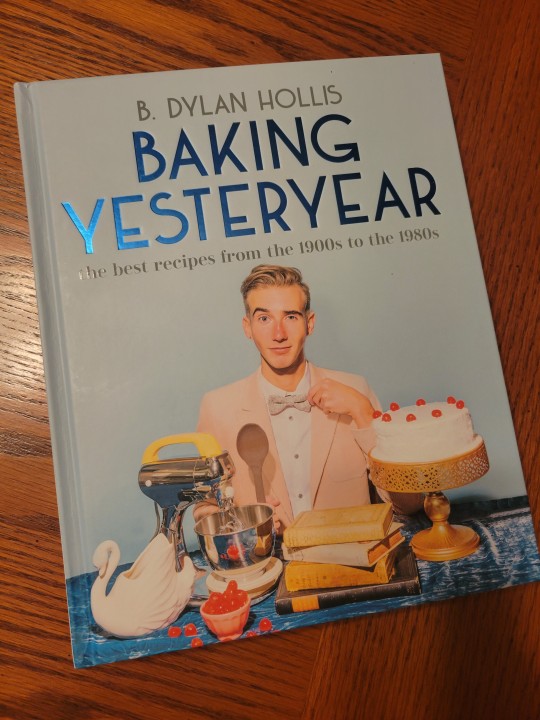
Baking Yesteryear. By B. Dylan Hollis. DK, 2023.
Rating: 4/5 stars
Genre: cookbook
Series: N/A
Summary: A decade-by-decade cookbook that highlights the best (and a few of the worst) baking recipes from the 20th century
Friends of baking, are you sick and tired of making the same recipes again and again? Then look no further than this baking blast from the past, as B. Dylan Hollis highlights the most unique tasty treats of yesteryear.
Travel back in time on a delicious decade-by-decade jaunt as Dylan shows you how to bake vintage forgotten greats. With a big pinch of fun and a full cup of humor, you’ll be baking everything from Chocolate Potato Cake from the 1910s to Avocado Pie from the 1960s.
Dylan has baked hundreds of recipes from countless antique cookbooks and selected only the best for this bakebook, sharing the shining stars from each decade. And because some of the recipes Dylan shares on his wildly popular social media channels are spectacular failures, he’s thrown in a few of the most disastrously strange recipes for you to try if you dare.
***Full review below.***
Since this book is non-fiction, my review will be structured a little different from normal.
I've had this book for a while, but I didn't want to post a review before making a few of the recipes myself. I was already a fan of Hollis from his TikToks, so that might introduce some bias into my review - just so you're all aware.
Overall, I found this book to be quirky, easy to follow, and fun. I loved the bright colors and retro-feel to the photo shoots, and I appreciated that almost all of the recipes were accompanied by a picture of the thing you're supposed to be making. I also liked the blurbs written by Hollis himself; they very much felt like his voice, with his characteristic sense of humor balanced by his genuine love for baking and "old things."
Perhaps the most valuable part of this book, however, was the emphasis on lowering barriers to entry. I've read my fair share of baking guides that call for special ingredients or equipment, and there are a lot of recipes out there that are finicky and sure ton dissuade new bakers. Hollis's book, however, emphasizes that most (if not all) of these recipes can be done with basic tools - one does not even need an electric mixer (though it does make some recipes easier). There also aren't many fancy ingredients that aren't readily available at most grocery stores, so that also helps.
I do, however, have some minor criticisms which relate to the usability of this book. For one, the organization makes it rather difficult to find a specific recipe (or even category), particularly if you're like me and don't recall what decade it came from. While organizing the recipes by decade makes sense given the book's premise, it does make it more functionally difficult - you can't flip to the cake section, for example, and browse or put yourself within the general vicinity of the recipe you're looking for. Thus, readers will have to rely on either the TOC or the index a lot more, but this is a minor inconvenience rather than a huge drawback.
I also don't think the majority of the recipes are blow-your-mind good, but honestly, given this book's premise, I don't think that's the worst thing. The recipes are largely taken from sources aimed at home bakers, so you're not going to get professional-level pastries out of them. You will, however, get things that are fun and relatively simple to make, and they taste good enough to me that I'd consider making them multiple times.
TL;DR: Baking Yesteryear is a fine book for fans of Hollis's TikTok, but it goes beyond being mere merch. It not only provides historical recipes that are easy to replicate, but it also does a good job of lowering barriers to entry for new bakers. Experienced bakers might not be overly impressed by the recipes, but engaging with food history is a treat in and of itself, and it's delightful to see someone like Hollis engaging with the past with such enthusiasm and adoration.
726 notes
·
View notes
Text
Incognito - JHS (WDBHG Drabble)
A Where Do Broken Hearts Go Drabble
Pairing: Hoseok X Fem!Reader X Jungkook
Wordcount: 1k+
Summary: Hoseok is curious about the guy who left you behind. So, he goes incognito.
Warnings: drinking!
Minors are not allowed in this blog!!
A/N: This takes place after chapter 4 and before chapter 5

Try as he might - Hoseok can’t think of anything else other than your lips, which he was about to kiss.
He doesn’t know what had possessed him earlier tonight but he really regrets it. He had been trying hard not to look at you for the better part of the day. But he failed
As if he hasn’t sold himself as a creep by continuously ogling his daughter’s therapist, that he had to lean down and almost kiss you.
Thank god Sua woke up and stopped him, otherwise things might have changed from the next session and he doesn’t want that. Not only Sua but also he have been forming a genuine relationship with someone for the first time in all these years, he doesn’t wanna fuck things up now. Even though you seemed ready for him to take you over.
He pours a good amount of Hibiki in his fancy diamond cut glass. Looking at the liquid he sighs, he thinks to himself of the countless identical nights that he has been spending locking himself up in his study after putting Sua to sleep.
He could have called Mina tonight. She is always ready and one call away. But somehow Hoseok feels greatly turned off by the idea.
He almost had a taste of you, he almost put his mouth on yours and lord, he can still somehow smell your sweet subtle vanilla scent in the air. How the fuck he can think of anyone else when you were ready to jump in his arms just an an hour ago?
He groans at the thought.
What is this feeling of confusion? Why does he want you but is grateful that things didn’t escalate?
The whiskey burns at the back of his throat but does nothing to take away the troubled thoughts he has been having.
Then something ticks in his mind.
“Jungkoo-?” he murmurs to himself. You didn’t say the full name but this jungkoo person has to be the ex boyfriend that supposedly fell out of love with you.
And suddenly Hoseok is curious. He wants to see the face of this idiot who let you go. He wants to see the person who broke you and whom you still probably love. Whom you probably thought of while he was about to kiss you.
He takes a big gulp from the glass and walks towards his desk. Settling down in the huge chair he opens his laptop, taps on the browser and goes into incognito mode. Typing a specific address and agreeing on using the site on guest mode, he filters out the search criteria.
Location: Seoul,
Gender: Male,
Age: he thinks hard about it. You don’t seem like the type to go for very older or very younger guys. Given the fact that you are still under 30, he selects the age bar from 20 to 35.
Name: Jungko
Enter.
There are 5 results that pop up:
Jeon Jung Kook
Shin Jung Kook
Kim Jeong Gguk
Kim Jeong Guen
Lee Jung Min
It’s good that your ex-boyfriend has a distinct name, it makes it easy to find him. The website showed him the most relevant results, so there are 5. But he knows which two he has to work with.
So, he clicks on the first profile:
Name: Jeon Jung Kook
Age: 28
Occupation: Modeling
Address: Unknown
Email ID: Unknown
Website: www.goldenstudios.kr
Hoseok frowns at that. He has been using this people finder tool for the better part of his career but this ‘website’ section is added only on special cases. Either this jungkook guy is a bigshot or a celebrity. And he doubts if you settle for those types.
But he clicks on the link regardless.
His breath hitches upon seeing Jungkook’s face. He is the Calvin Klein model, whose face is in every possible billboard?
Jesus. Is he really Y/N’s ex? He thinks to himself as he scrolls down the page.
He can be wrong as well. There is another guy with the same name, so yeah. And he doesn’t really think you would have the mind to put up with a celebrity for three years.
But something keeps him from exiting the page. He clicks on the instagram icon that is added at the end of Jungkook's bio.
When the instagram opens, the first thing he tries is to look for your face but he finds none. Then he clicks on a random post and starts scrolling.
Hoseok stumbles upon a post from a month ago. In the picture a pretty lady is hugging Jungkook tightly. As Jungkook lovingly wraps up her waist with one of his hands, laying his head on the top of her head. There are no captions but a ton of congratulations in the comments.
So, this guy is already committed.
Hoseok thinks of the likeliness of this guy being your ex. You said he broke up with you but didn’t mention when. Given the fact that your wounds are still fresh, it might haven’t been that long. And this guy just got into a relationship a month ago. So, he can very well be the Jungkook you were talking about.
However, still, you dating a celebrity doesn’t sit right with Hoseok. So he decides to exit instagram and investigate the other guy.
Before exiting, though, he decides to tap on the profile picture to view the recent stories.
There is a picture of Jungkook, with another strikingly beautiful guy inside a condo. The caption says “happy birthday @j.m” with a tagged location.
And.. it is the same location Hoseok picked you up from today. You also mentioned visiting a friend just before the session.
Hoseok’s eyes narrow at the screen as he takes a better look at Jungkook’s face.
“So you left Y/N for the girl in the photo, huh?” He talks to the screen as if Jungkook can hear him.
“What an idiot you are, Jeon Jungkook.” Hoseok takes a swig from his glass making a silent promise of making you forget your ex.
Taglist 1:-
@phenomenalgirl9 @variety-is-the-joy-of-life @sukunabitch @chimchimmarie @coffeedepressionsoup @meowstake @vonvi-blog @nochuel @xjoonchildx @justmewondering-recs @cuteipat @miakey98 @purpleanchorcrown @chimmisbae @ane102 @junniesoleilkth @terjeonbebas @kookssecret @appleh4ad @kayleeshinee @whoa-jo @definetlythinkimanalien @lovelgirl22 @agrika
Taglist 2:-
@llallaaa @mikrokookiex @parkinglot-nights @hiqhkey @diamonddia-mond @00frenchfries00 @koalasandcuddles @superchamchi88 @ttanniett @coralmusicblaze @multiasf @kookscumrag @sumzysworld @knjjjk @xtrataerrestrial @survivalistghost @kelsyx33 @aann95 @btsffreader92 @jjk174 @dragonflygurl4 @xwniazx
#bts angst#jhope angst#hoseok angst#bts x reader#hoseok x reader#jhope x reader#bts fanfiction#bts oneshot#bts scenarios
104 notes
·
View notes
Note
If you were to expand on southern water tribe culture, what sort of traditions would the people have?
I've written a few traditions into my fics. Off the top of my head, here are a few:
All the Things That Are and Will Be
The death rites of the SWT don't involved burial in the ground. Instead a the body is washed and prepped by the family, and the body is laid to rest under stones piled around and over top the body. The ceremony involves a song commemorating the deceased for becoming one of the ancestors.
Traditional
To mark engagements in the SWT, the potential husband presents his intended with tools and supplies that will be useful to her in married life. This is usually sewing needles, knives, beads and furs, but the intended bride is allowed to make special requests. For Katara, this included fancy pens, new waterskins for formal and everyday use, and a crown. In With the Changing of the Tide, she also made special requests for a talking mirror and the skin of a camel seal. The potential husband also presents his intended's family with furs, skins and tools, and also, he joins the men in the family on a hunt for what will become the engagement party meal.
Uncharted Waters
In the SWT, villagers will gather frequently to share stories about a lot of things. Sometimes they're historical accounts. Sometime they're folk tales. Sometimes they're about how they got their various scars, like Katara tells Zuko in chapter 8.
Summer Bloom
When a SWT girl has her first period, there's a celebration among the women. They go into the mountains to the thermal springs and have what essentially amounts to a spa weekend. There she has a formal introduction to the "polar bees and otter penguins", the older women share their advice on dealing with period symptom, and there's a feast. The girl is welcomed into womanhood with gifts of needles, knives, combs and beads.
Some traditions I've been thinking about, but haven't actually written down yet:
Siblings share a sleep cot until they're old enough to complain about it. When that happens, the family homes get bigger to accommodate more sleeping space.
There's a strong musical tradition within the tribe. Their instruments are limited. They have a drum, a hand drum, and a pipe for their major instruments, but they mostly sing. The SWT goes on to popularize acapella in the ATLA world.
The Southern Water Tribe is made up of several small villages lead by locally selected chiefs who then come together to choose one overall representative for all the villages. Hakoda is the third nonconsecutive member of his family chosen as the head chief, and Sokka is chosen after him. After Sokka, the next chief comes from an unrelated family and a different village entirely.
#atla#swt traditions#katara#sokka#hakoda#kanna#zutara#because the fics i linked are zutara fics or at least mention them
113 notes
·
View notes
Text
Poe's Giffing Tutorial (From One Beginner to Another)
Hey, everyone! So, I've been thinking about this for a while, and decided to finally make it happen. This post aims to be a giffing tutorial that isn't a bunch of technical jargon that nobody except experienced giffers understands. This is for the person that I was when I first started out: someone who wants to make gifs, for free, without having to learn the entirety of a new program. As such, if you're already familiar with the basics, this probably won't be super helpful to you.
In this, I'll cover the basics of actually capturing a gif, the how-to of color correction (though without getting into the nitty-gritty detail of it), some basic text effects, and some more decorative effects like overlays and ~fancy coloring. I'll also show you the program I use to resize gifs.
I don't have a fun quip to lead us into the next part, so, uh, let's just dive in.
Tools*:
A PC capable of handling heavy processor loads (I use a mid-range gaming laptop; it's a little slow sometimes, but it works)
Whatever you're giffing (obviously...)
ScreenToGif (a free, basic screencapture program)
Photopea (a free, in-browser Photoshop dupe)
RedKetchup (a free file resizer/converter)
*Note: These are not the end-all, be-all of gifmaking. They may not even be the best tools for the job! But they're free, they work well, and they're relatively intuitive.
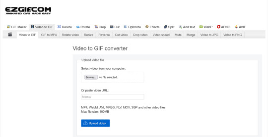
Step 1: Capture your gif.
I'm going to use ScreenToGif for this. The first thing I do is open the program and click Recorder, which opens the recording interface.

I click and drag (or manually input dimensions in the boxes next to the recording button in the lower right corner) to set my dimensions, and then I press record. The red "Record" button will change to a blue square that says "Stop," and a timer will appear in the upper right corner, showing how many seconds your gif is.
Generally, I'll pause the video 5-10 seconds before my desired start time, to give myself a buffer (you'll be able to delete those frames later), start the recording, and then start the video. You'll probably find a system that works for you once you do it a few times.
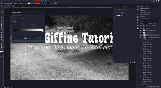
Once the scene that I want to capture is done, I'll click the blue "Stop" button, and the overlay will close itself. A few seconds later, depending on how long/complex/large your gif is, the program will pop up with a new window where you can edit. Here's what it looks like:
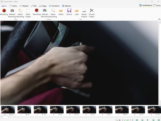
You can do a lot with ScreenToGif, but we'll be using the dead simple stuff today. Click the "Edit" tab, fourth from the left, and this will show up.
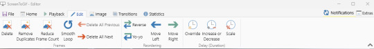
"Delete All Previous" and "Delete All Next" are our friends here. Go to the FIRST frame that you want in your gif, using either your arrow keys or just dragging the slider, and select it. Then hit "Delete All Previous." This will make that frame the first frame of your gif. Then, go to the LAST frame of your gif, and hit "Delete All Next." This makes the last frame of the scene that you want the last frame of the gif. You can also use the "Delete" option to delete frames by selecting them with your cursor if you want a more manual option.
Now you have your raw gif! Go to the "File" tab, the first one on the left, and select "Save As" from the menu. You want to make sure that it's saving as a .gif file, not an .mp4 or .apng --- you can check this up at the top. Don't worry, though, as .gif is the default, so unless you change it, you should be golden. Select whatever folder you want to put it in, name it, and save it.
You could absolutely stop here. It is by no means required to color your gifs or slow them down or any other number of things associated with giffing. But if you want to, here's how I do it.
Step 2: Edit your gif.
Head on over to Photopea. You'll see this:
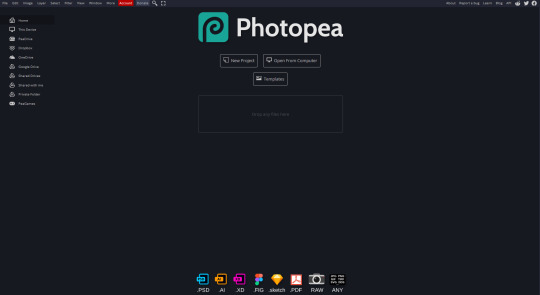
What we want is the "Open From Computer" option. Click it, and your File Explorer will show up. Navigate to whatever folder you saved your gif in and select it by double clicking or clicking once and hitting "Open."
It'll open in a new workspace that looks like this.
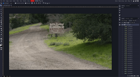
You may be saying, "Gee, Poe, that sure looks a lot like Photoshop!" Yes, it absolutely does. If you're familiar with Photoshop, you will most likely be able to find your way around Photopea just fine, and can probably go from here. But if you're not familiar with Photoshop, here's the basics.
First thing's first: gifs are frequently pretty fuzzy/blurry. Luckily, sharpening them is easy.
Select all your frames (the list on the right with all the numbered layers) by clicking one end, scrolling up/down, holding Shift, and clicking the other end. Then go up to the tabs and do Filter > Sharpen > Smart Sharpen. This will automatically sharpen each frame using a percentage; the default is, I believe, 150%, and this is usually what I use because I am fundamentally lazy.
If you don't select all your frames, only the one that you're currently on (the one highlighted in a lighter color) will get the effect applied to it. This goes for basically anything you do, so it's good to get in the habit of selecting all.
Now that it's sharpened, we can color it. Go up to the tabs again, and go to Layer > New Adjustment Layer > [whatever you want to adjust]. Most commonly in Escape the Night, you'll have to adjust brightness, because there's a lot of dark, moody scenes; Season 3 is also especially yellow/orange tinted, so you'll probably want to color correct it, too, using the Color Balance adjustment layer. This is a total guessing game based on the exact scene you're doing and my method is just selecting random things and adjusting sliders until it looks good (remember: fundamentally lazy). Honestly, I'm not an expert in coloring gifs, so I won't pretend to be — especially since people can and do write entire posts just dedicated to it. For this gif, I'm just lightening it a little.
And if this is all you want to do — no text, no effects — you're done! Go to File > Export As > GIF. It will take a few moments to load, so don't panic when your page freezes. A new window will pop up that allows you to do things like set looping, time, etc. but you can also just "Save" and you're done!
But let's say you want something fun. Maybe you'd like to overlay a quote or make it a cool color. If that's the case, continue on...
Step 3: Make your gif shine.
Three parts in this: text, fun colors, and overlays. You can combine these three to do some awesome things, and they're all very simple to do, once you know what you're doing. Think of them less like steps and more like a mix-and-match deal. You can use one, two, or all three!
So, here we go.
Option 3a: Add some text.
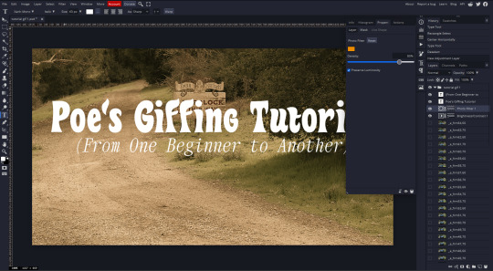
The easiest option of the three, this one works exactly like you think it does. The uppercase T symbol on the sidebar will create a new text layer where you can type something and set a font, size, and color.

I'll spare you the lecture on typography that I could give you — you can find better ones than I could make. Generally, though, you have a decorative/display font for headings and emphasis, and then a different, more generalized font for subheadings and other things. In this, the display font is Heavy Heap, which was used on the Season 3 tarot cards, and the general font is a relatively generic serif font.
(Sidenote: you can load fonts into Photopea! Just go to a font website like Dafont, download the font you want, and then open it as you would any other file by going to File > Open and selecting it from your files. You should get a message that says "Font [Your Font Name Here] Loaded," and then you'll be able to use it in your design. That's how I got Heavy Heap in there.)
You can change size and color with these, which will show up at the top when you select the text tool. Keep in mind that if you're making changes after you type something out, you will need to select (highlight) the text you want to change — it won't do it automatically.

I will admit that Photopea's text editor is not the cleanest, simplest, or nicest to use, especially at first. I came from Canva where it was much faster and easier. The downside, of course, is that Canva is highly limited with what you can do.
There are also ways to warp the text, change the blending, and do outlines, but I'll leave that for another time as to avoid making this any longer than it already is.
Option 3b: Make it a cool color.
You have a couple different ways to do this. Probably the most intuitive is to go to Layer > New Adjustment Layer > Photo Filter. Select the color box, pick the color you want using the picker or a hex code, select your desired density, and click OK. Boom, color over your gif.
It defaults to this vintage-y orange, but you can pick whatever color your heart desires.
However, I usually use a different method using Gradient Maps. This is also pretty easy; Layer > New Adjustment Layer > Gradient Map. If you leave it black and white, by the way, you get a B&W gif (you can also just select the Black and White option in the Adjustment Layer menu). Click on the gradient, select the white square on the right side of the gradient line, and then select the square down at the bottom of the window and change it to whatever color you want.

For this gif, I'm leaving it B&W.
(You can have a lot of fun with gradient maps. Play around with them!)
Option 3c: Overlay another gif on top.
Ooookay, so, this is the most advanced and tedious of effects to do (at least of the ones documented in this post), but it's worth it, I promise. For this, you'll need at least one other gif. I usually use a base gif that's relatively neutrally colored, oftentimes B&W but sometimes just faded or pastel, plus one (or more than one) colored, brighter gif. These are, of course, just guidelines — combine whatever gifs you want. The only real requirement, per se, is that they have the same amount of frames. If they don't, it'll look weird. (But if you do end up with two gifs that have different amounts of frames, you can delete the difference right in Photopea, so I don't stress about it too much.)
You also generally want to add text after this step, so if you're planning on doing this, save the text for last.
First things first: color your gifs the way you want and then save both of them. Then re-open them both in Photopea. Yes, this is annoying. I did say it was tedious.

So now I have both of them in my navbar, labeled as "tutorial base" and "tutorial overlay."
Go to your overlay gif and right-click on the gif folder. This is the top layer with a little arrow and folder icon next to the name of the gif.
Select "Duplicate Into" and then pick your base gif in the popup. In my case, it's named "tutorial base."

Now you'll click over to your base gif, and you'll see that your accent has been put on top of your base. Now you get to have fun with blending!
Right click on the overlay gif's folder again. Then, select Blending Options, which is the first menu item. It'll bring up a popup with all sorts of options for styling your layer.

The default setting is Pass Through, which is what we see here. If you want, you could just change the opacity to get your desired effect.
You could also play around with blending options such as Overlay, Color Burn, Lighten, and Screen. Every gif is different, and every gif will look different with different options, so experiment and see what looks best! You may have to go back and recolor it a few times, so I recommend just keeping the project open in your navbar for easy access.
For this gif, I think I'll go with Darker Color at 67%.
One last step, and then you're done with blending!
Go to Layer > Animation > Merge. This will merge each frame of your animation (the gifs) with each other, meaning that they'll play at the same time. If you forget this step, as I do frequently, you'll go to save your gif and find that it plays as a sequence.
Once you've merged your gifs, you can add texts, more effects, PNG overlays, whatever you want! Congrats! You did it!
Step 4: Resize your gif (if necessary).
Maybe you've made a gif, and it's beautiful, and it's amazing, and you wanna show everyone...but it's five million megabytes and you can't send or post it anywhere. Tumblr's max file size is 10 MB, while Discord's (standard) max file size is..7 MB, I think? Either way, if you try to upload something bigger than that, you'll get an error message and the familiar taste of disappointment.
Never fear, Redketchup is here!

This is Redketchup, and it's super simple.
Go to "GIF Resizer" under Animation Tools. Upload your gif, then scroll until you see the Resize GIF section. Input the percentage you'd like to reduce it by (presets are 25%, 50%, and 75% smaller, but you can set it manually, as well).
This is also the step where you can slow it down if you desire if you didn't do it in Photopea — it's in the next section down. Set the speed, if you'd like, and then go down to the bottom and hit Download.

It'll take you to a preview tab where you can check if your gif is small enough. If it is, hit Download again up in the top left, and that's that! Go share your gif with the world!
Conclusion:
Thank you for reading! I am by no means an expert gifmaker, but I want to spread the love and give other people the option to do it. I wouldn't know any of this stuff without the people who taught me, and I'll put a list of tutorials down at the bottom that I referenced when I was first learning to make gifs.
At any rate, if you use this post to make a gif, feel free tag me or send it to me so I can see! And for those of you who are on the fence about learning or starting to gif...
Do it. I double-dog dare you.
:)
References:
Blending Gifs by @the-mother-of-lions
Photopea Coloring Tutorial by @heroeddiemunson
Merging in Photopea by @bellamyblakru
And, though not a specific reference, I frequently browse @usergif for inspiration (they have tutorials there, as well, but I haven't checked them out yet).
#gifset#giffing#gif tutorial#how to gif#how to make a gif#photopea#escape the night#etn#I wrote this instead of socializing at my family's thanksgiving dinner#because that's just who I am
98 notes
·
View notes
Text
10 Thrifting Tips – Part ? I lost count just check my thrifting tag
1) Make friends with the staff. If you go into a particular thrift store frequently it’s well worth it to get friendly with the staff. Ask them about their day, chat with them about what you’re buying, infodump if you’ve found something exciting and unusual. When the staff get to know you and know what you buy they’ll start pointing out things in the store that have come in since the last time you were there, that fit your interests. They may even start putting things aside for you. Recently I walked into my favorite thrift store and had 2 separate staff members say ‘Oh I’ve got something for you’. Plus having the staff greet you by name and having little inside jokes with them just makes the whole experience more fun.
2) Brita jugs turn up at the thrift store frequently. If tap water in your area is safe but has A Taste, keep an eye out at the thrift store.
3) Coffee making equipment. Capsule coffee makers, the wire racks that hold the capsules, French presses, these all get donated frequently. The occasional espresso machine comes in – and goes out very quickly. Now and then you’ll find pour-over coffee equipment. If you like your bean juice you can get the equipment you need to make fancy bean juice at the thrift store.
4) Handmade pottery mugs. Story time: About 6 or 7 years ago I went into a thrift store and someone had obviously just cleaned out their mug cupboard and donated a pile of handmade pottery. I bought 4 because I thought they were cool, very tactile, nice to hold. This AWOKE something in me. Humans have used handmade pottery for thousands of years and there’s something about holding a handmade mug that sparks a genetic memory of warmth and comfort. Pottery also has much better thermal properties than mass produced ceramic, hot stays hot longer and vice versa with cold. Build up a little collection of handmade pottery mugs from the thrift store, each one has its own personality and it brings joy using them.
5) In the same vein: teaspoons. Build up a collection of fun teaspoons and take joy from using different ones depending on your mood. I have one with an owl on the end and another with a rose, a brass one with a wiggly handle in the shape of a snake, one that has the branding of an airline that now only uses wooden stirrers - probably because people kept pocketing the stainless-steel teaspoons (I always wanted to steal one as a child but never had the nerve). Whenever I need a teaspoon it’s always a little endorphin boost to open the drawer and select the perfect one for today.
6) If you need something to do a specific job, be patient, you will find the perfect thing eventually. I switched to solid shampoo and my old soap dish wasn’t big enough to hold my shampoo bar and my regular soap, so I waited and watched and found the perfect little glass tray that was exactly the right size and fits perfectly on the shelf in my shower. I could have bought a brand new made-for-that-purpose multi soap holder, but it wouldn’t have been as cool looking and when I’m done with it, it wouldn’t necessarily get another life.
7) Gift supplies. Thrift stores often have a selection of unused gift wrap, bags, bows, cards. It’s worth it to sift through what they’ve got and buy any you think you might use – even if you don’t have an immediate use for it. That stuff can get expensive so if you can create a small stash then, when you need it, you won’t have to shell out $$.
8) Look for things that can be made over – or thrift flipped as the DIY content creators like to say. There’s so much satisfaction from looking at something that was plain ugly when you bought it and you’ve turned it into something pretty. It doesn’t need to be a major transformation that requires 5 different power-tools and 100 bucks worth of supplies. It can be as simple as a lick of paint, but every time you look at you will feel good about it.
9) Sometimes it’s worth buying something that’s just really cool and figuring out a use for it later. I bought the coolest little silver plated mustard pot; it has 3 legs and at the top of each leg is a lion head. Do I eat mustard much? No. Did I know what the heck I would use it for? No. I get bad indigestion and keep antacids on hand, I hate how once you tear open the roll, they tend to spill everywhere so I like to put them in something. Guess what holds exactly one roll of antacids? If something is just freaking awesome but you don’t know what you’d use it for, you will find a use (and it will be so much cooler than anything else you might have bought for that purpose).
10) Use the fancy stuff. Don’t ever look at something in a thrift store and think: that’s too fancy, I’ll never use it. If it’s not bought and used it ends up in landfill. Save it from the landfill and use it. Today I bought the most OTT fancy silver pepper shaker to sit next to my stove and hold ground pepper for cooking with, one of my housemates never puts the damn pepper back in the cupboard when he’s finished with it, so now we have this ostentatious silver shaker next to the stove top. One of my dogs can be relied upon to get half of his food on the floor before he hoovers it up, I could have got a plastic mat to feed him on but I had a spare thrifted marble cutting/serving board (I have a problem, I own 3, I have so much trouble resisting them), and another plus - he can’t destroy it like he would a plastic mat. I keep my toothbrush in a crystal bud vase. I decant my micellar water into a bottle shaped like a seahorse. I eat off pretty vintage pink glass plates. Using the fancy stuff from thrift stores both helps you romanticize your own life and it gives these items another life. Do be sensible though, some items made before the early 1970s including glassware and dinnerware contain lead in the decoration so do your due diligence and be safe.
#thrifting#thrift shopping#solarpunk#solarpunk tag#eco home#fuck capitalism#reduce reuse recycle#sustainability
41 notes
·
View notes
Text
Where they like to shop-LOTR
Frodo- the bookstore obviously. He especially likes to support indie bookstores but if need be he will resort to Barnes and Noble. Always tells himself he will only get one book and walks out with ten (he always gets at least one for Sam) He likes artisan markets and boutiques and loves a vintage fashion store. He also can spend several hours in any yarn store.
Sam- the nursery! He goes through the entire store and every greenhouse very thoroughly. Usually comes out with a dozen new plants. Similarly enjoys the hardware store. Always has some landscaping project going on. Loves a good open air food market or little family run delis. Loves a good spice selection. Cannot go into a cookware store without buying something.
Merry- Merry of course loves the weed store. He also likes to shop for fancy wine. I get the sense that he would like shopping for nice suits too. He’s got a good sense of style. Loves to go to touristy shops and get the weirdest thing there. He does collect city mugs. He also collects the weird paintings at Goodwill which he will hang up in his parents house without telling them.
Pippin- Pippin is kind of an impulse buyer. Pretty much any store he enters he will buy something in. He spends way too much money at Target (“they have everything Merry!”). Is big on seasonal decorations and will always buy like the giant Halloween things that jump out at you and massive amounts of Christmas lights. Also has an absurd amount of ugly Christmas sweaters.
Gandalf- like Merry does spend quite a bit at the dispensary. Likes a good woodworking shop. Likes to buy unique carved pipes. And of course spends over a thousand dollars at the fireworks stand.
Aragorn- his main shopping destination is the feed store. Buys all kinds of shit for his horse. Is a loyal REI customer. He always buys the really good quality stuff for backcountry camping. He knows more than the employees there about what is a good brand to get and will happily assist other customers who assume he works there. He also likes to go shopping for Arwen and will usually get her some beautiful piece of jewelry or a really really nice handknit sweater.
Gimli- man loves the hardware store, loves his power tools. Likes to hang out in the lumber yard much to Legolas’s distress. Comes home with a bunch of rocks and woods that he builds stuff with. Also likes to jewelry shop and admire all the nice gemstones- he has an excellent eye and will often go with Aragorn when he is shopping for Arwen. He likes handcrafted stuff from wood, stone, and ceramic and likes to support local artists. Always on the lookout for a good bargain at the hardware store but willing to dish out quite a lot for something unique and handmade. Knows good craftsmanship when he sees it and likes to support other craftspeople.
Legolas- accompanies Gimli and Aragorn to the jewelry store and always manages to convince Gimli to get him something despite having plenty of his own money. Loves the plant store and samples all the edible and some non edible plants. He can legitimately spend a couple of hours at the wine store. Will go to fancy wine tasting events with Gimli. Fashionista man will happily spend an afternoon walking through the high fashion district where all the attendants know him. Similarly an expert Sephora shopper.
Boromir- like Gimli loves the hardware store they run into each other there and end up chatting for like an hour. Loves a good appliance store. Chats with the Best Buy people while picking out a new fridge. Is very particular about getting good quality shoes so he goes to like really nice shoe stores. Absolutely loves a furniture store-will always be on the lookout for a good sale there.
Bilbo- antique store expert! Wanders around until he sees something he likes. Buys a lot of nice antique furniture. An expert clothes shopper-he usually takes Frodo with him who doesn’t mind cause Bilbo pays. Bilbo will exclusively go to second hand bookshops and buy the super rare things behind the locked glass. Also likes to go look for nice rugs, blankets, and linens. Does love the cooking store and usually offers to pay for Sam there (Sam always declined when he worked for Bilbo but once he and Frodo got married he let Bilbo buy him stuff).
Eowyn- shopping for weapons. This woman has a massive sword collection its honestly kind of scary. Also likes the hardware store and the home improvement. Generally she’s not really a big shopper - she really only buys something unless she needs it or as a present for someone else.
Faramir- Faramir loves the pet store. Totally an animal person and has like four cats and two dogs and like a couple guinea pigs and maybe a turtle. Buys so many pet accessories. Eowyn thinks it is cute but ridiculous. She has to remind Faramir that no they do not have room for any more animals-yes not even that gecko- every time they go into the pet store.
Arwen- loves going high end fashion shopping with Legolas. Is really into nice fabrics and weaves so likes to shop for things like fancy tablecloths. Loves a good shoe store. Also a big fan of hat shops. Gondor is a lot brighter than Rivendell so she wears lots of hats to keep her eyes shaded. Starts quite a few fashion trends this way. She also likes to shop for art-especially paintings and statues. She often attends art gallery events and almost always buys something that will be priceless in a few years-she has the money she’s a queen!
#lotr#frodo baggins#eowyn#sam gamgee#aragorn#merry brandybuck#boromir#legolas#pippin took#gandalf#faramir#gimli son of gloin#bilbo baggins#arwen undomiel#lotr headcanons#samfro#legolas x gimli
112 notes
·
View notes
Note
Okay so while I've discovered how to do the fancy AO3 link tumblr posts, it only seems to work for chapter one? How do you link other chapters through the banner at the top of the post? When I click share on the fic (from the second chapter page), I can edit the code that pops up to change the link to be to that second chapter but when I hit share to tumblr, it removes that again and I can't edit the link there to bring someone to the second chapter instead of the first. The only thing I can change is the text so it says '2' instead of '1' but it still links back to the first chapter. I hope that's not a dumb question or an overly complicated description? Thank you!!
So if I understand your question correctly, you want to know how to make an AO3 link for each chapter of a multichapter that takes someone directly TO that chapter, rather than the start of the fic, while maintaining the format? I will show you how I do it, with screenshots (ooo, screenshots).
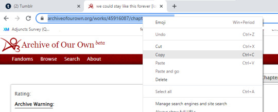
Let's say I wanted to post the latest chapter (chapter 8) of We Could Stay Like This Forever, and do it with the AO3 share tool. First, I would go to the fic on AO3 (it doesn't matter which chapter) and click the "Share" button, then "Share to Tumblr":

This will pop up the text box with code, from which I click the bottom option for Tumblr:

This pops up the AO3-formatted link on your Tumblr post editor:

If you posted it now, it would take you to chapter 1. But I'm trying to post chapter 8, so what you do is mouse over the top right corner until you see the red (x). Click on this:

Hey presto, it deletes the existing link text, leaving a place for you to input a new one, while retaining the rest of the format:

Now go back to AO3 (it should have automatically stayed in a separate browser tab when you launched the share tool) and copy-paste the link for your chapter from the top URL bar:
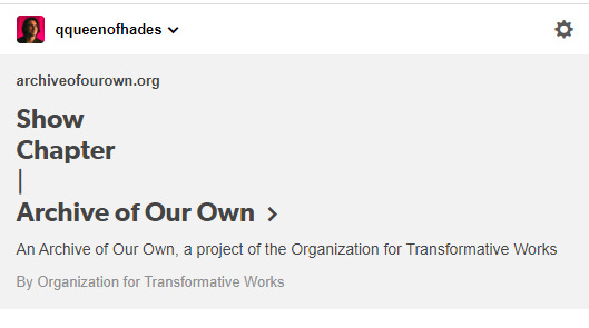
Go back to Tumblr and post this in the empty link bar instead. It will now look like this:
But because that's not how you really want it to look, you can now edit the text! Select "Show Chapter | Archive Of Our Own" and delete, whereupon it will prompt you to add a new title:
Whereupon I do that:
I also like to fix formatting/capitalization, bold the categories, indent the fic information, etc. Now my post looks like this:

Now I can add tags and post. Ta-da!
Anyway, this might seem like a lot of steps, but it's just because I screenshot all of it, and once you do it a few times, you'll be pretty familiar with the process. Congratulations, you are now an AO3/Tumblr whiz, etc.
150 notes
·
View notes
Text
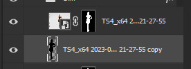
How I edit my Sims' shadow in Photoshop
as requested by @adelarsims
& based on this tutorial.
━━━━━━ ・❪ ☾ ❫ ・ ━━━━━━
1. Taking a screenshot
First of all take a screenshot of the Sim - I always do CAS but in-game works too ofc.
I take mine in front of a background that loosely matches the color of the background of my edit, in this case white. If you have a fancy CAS background, I recommend this CC by @sonyasimscc to easily get a simple background for screenshots.
I also use this tutorial by @katverse to get really good screenshots, I use 4000x3000px resolution, and this tutorial by @vyxated to not have a CAS UI in your screenshot if you use a reshade like me.
━━━━━━ ・❪ ☾ ❫ ・ ━━━━━━
2. Setting up the Photoshop file
Now in Photoshop create a file, I use 1250x2000 px.
I made a few guidelines, pink being the middle of the image and dark blue guidelines for my shadow editing.

I have a usually white background and a slight Curves adjustment layer with a gradient layer mask so it gets slightly darker at the bottom, completely optional ofc.
━━━━━━ ・❪ ☾ ❫ ・ ━━━━━━
3. Removing the original background
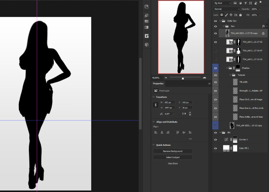
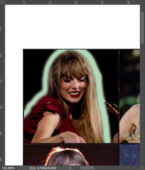
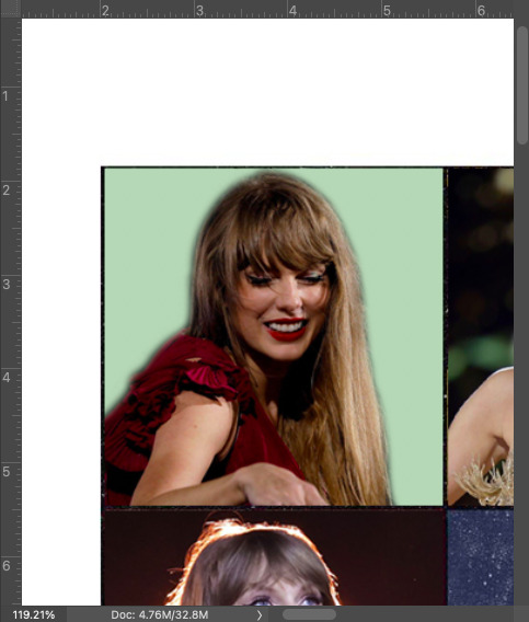
Import the screenshot and place it however you want. I try to align the Sim in the middle and make it as big as possible.
Then select the layer and go to Select - Subject.

This will usually do a decent job.
If there are some leftover unselected areas (like on her left hand on the hip) you can either add them to the selection now or edit the layer mask later.
Then create a layer mask.
Since the screenshot has a similar background, it shouldn't show too much if it is not perfect.
━━━━━━ ・❪ ☾ ❫ ・ ━━━━━━
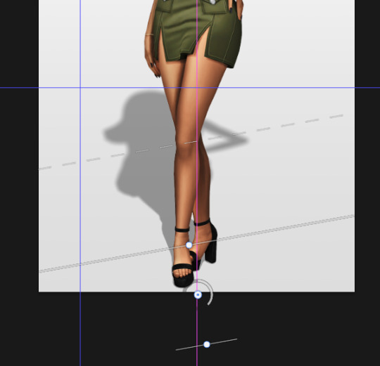
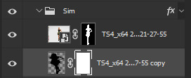
4. Creating the shadow
First duplicate the Sims' layer (Shortcut: Ctrl + J).
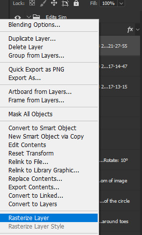
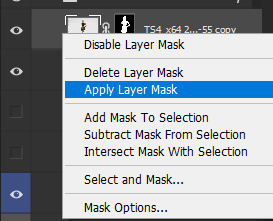
The layer is probably a Smart Object, so you need to rasterize it and right click the layer mask to apply the layer mask.
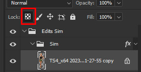
Now lock transparent pixels and paint the layer black.
Next unlock the transparent pixels again and move the black layer below the actual Sim. Leave it selected.
Now you will need the Perspective Warp tool.
Draw the grid over the Sim, it doesn't have to be perfect, but make sure every part of your Sim is in the grid and nothing pokes out.
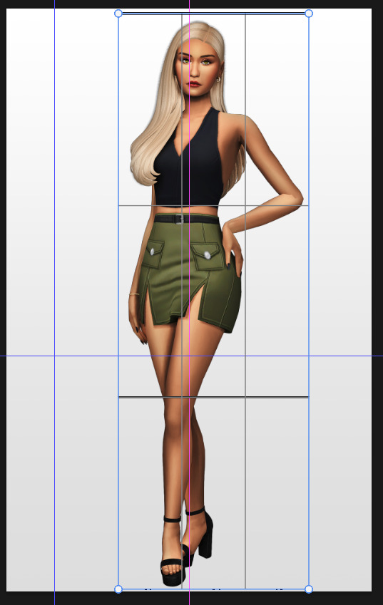
Press enter.
Now you want to drag the upper 2 corners separately wherever you want the shadow to be. I always put mine to the left and around the upper thigh area. I also try to match how slanted the left and right side are.
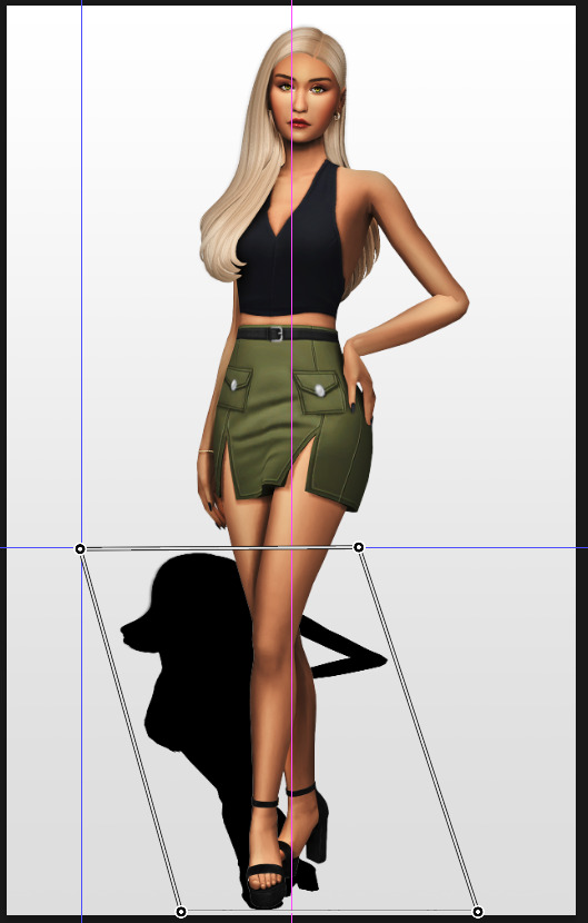
Now move the bottom 2 corners to try and match the shadow with the Sims' feet kinda. It won't work perfectly and you will need to fix it by hand after.
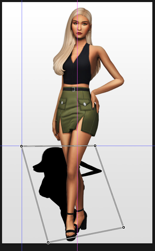
Press enter again.
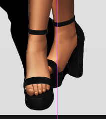
Now go in by hand and fix the shadow around the feet.
Simply paint with black on the same layer and erase parts if necessary.
━━━━━━ ・❪ ☾ ❫ ・ ━━━━━━
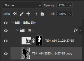
5. Making the shadow look nice
I like to change the layer opacity to 35%, but it depends how strong you want the shadow to be.
Next I apply a tilt shift blur, unlike in the video.
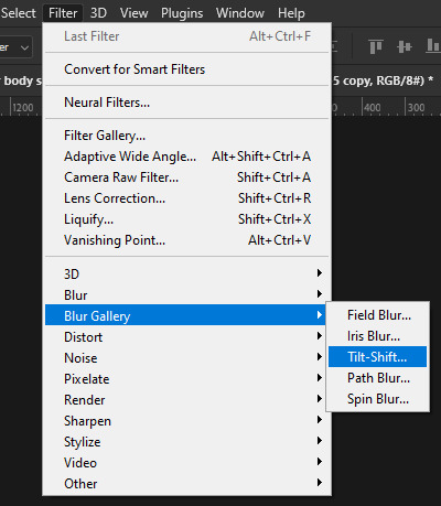
I use a blur of 15px.
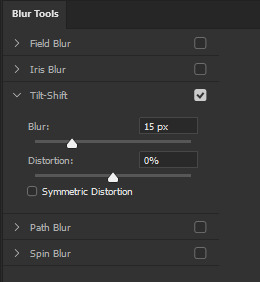
Move the circle at the edge of the image basically or a bit below by dragging the middle of it. Then rotate it on the bottom line by around 10°.
Next move the solid line to the middle of the circle and the dashed line around the ankles.

Then press OK at the top.

━━━━━━ ・❪ ☾ ❫ ・ ━━━━━━
6. Optional: Gradient layer mask
Lastly I like to make the shadow fade out a bit towards the top.
Apply a layer mask to the shadow.
Then get your gradient tool and the default black to white gradient.
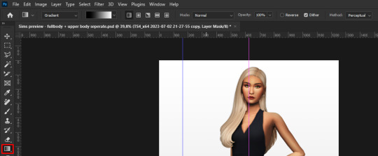
Hold shift to make a straight line and drag the gradient down.
This is how I roughly place mine so it's not too strong.
━━━━━━ ・❪ ☾ ❫ ・ ━━━━━━
And that's it!
If you have any questions, let me know~
80 notes
·
View notes
Note
i think i asked before but i cant find it 😅, but i was wondering what youd recommend for someone to look into who's only just now starting to get into digital art? like if you could recomment certain programs or devices or just any advice? also your work is rlly rlly cool btw
start with a free program like medibang, firealpaca, or krita or if u have windows just fuck around in mspaint tbh. (don't let people lie to u about mspaint it can be used for really good artwork people r just weird about it for some reason) if u wanna use ur phone ibispaint is still pretty good. just watch the ad and u get free things for like. idk what. 18 hours? still good.
for things like tablets there's plenty of cheap small starter graphics tablets out there for like 50 USD or less, idk what your currency is. A huion display is what I use but I've heard good things about their regular pen tabs too. Do your own research there, but you really don't need a super fancy tablet tbh. Also don't let people lie to you, you can use a mouse to draw it's not impossible. it's difficult but like it's possible LOL. I don't recommend it long term though it can fuck up your wrist.
I use paid products but I don't recommend that for beginners anyways. just get something free and have fun with it, that's honestly like the most important thing. Just have fun, don't worry about perfection or making something look good at first. Just enjoy the process because that's the most important thing anyways. Experiment a bunch and fuck around, eventually you'll learn things as time goes on cause that's just how it be.
Don't worry about the overwhelming amounts of settings on art apps right now either, all you really need to know is layers, brushes/erasers, eyedropper tools, color wheels, and select/transform tools since they're the more important ones anyways. I would recommend simplifying your app layouts to those core things if Possible, but if not then just remember where they are and only pay attention to those for now.
I hope u have fun starting out :] it can be overwhelming at first but it's really enjoyable i prommy.
88 notes
·
View notes
Text

this was requested by a few people so, without further ado, below the cut i’ll explain how to make an edit of the eras tour poster like the ones that can be found here. i’ve seen different versions of these floating around twitter/tiktok/etc for a while but let’s be honest..the picsart ones don’t look as cute. i use photoshop 2020, but older versions should work just fine since this edit doesn’t involve anything too fancy!
now, i started with the original poster and carefully removed all of the images to create a base template that i’ve used for all the posters since. i don’t really feel like explaining how to do that because it feels kinda unnecessary when i can just link it to you. so go ahead and start by downloading my base template, which you can find here.
once you have that open, you’ll want to gather your images. you’ll need nine images that should be at least 300x300px in dimension and one much larger image to serve as the center png. how big this needs to be depends how large the subject of the photo is, but it should probably be around 2000px. keep in mind that the subject shouldn’t be too wide either, or else it will block the surrounding photos when you try to position it. for example, the below image wouldn’t be a good option because her arm would cover at least one of the other eras.

once you have your photos picked out, you’re gonna want to drag the nine smaller ones into the document and crop/scale/position them so that there’s one in each square. remember that the template layer should be above the photo layers so that they’re contained within the frame. once you’ve done that, it should look something like this:

now it’s outlining time. first, make a new transparent layer and place that between the photo layers and the template layer. it’s really REALLY important that you remember to always paint on this transparent layer and NOT directly on the photos, as we want to be able to edit the photos later without also editing the borders. i used a website like this to find the color codes of the backgrounds on the original poster, so i’ll just put them here for you:
debut: #bcd5b8
fearless: #f4cb8a
speak now: #cfb6d4
red: #a45865
1989: #c0e6f9
rep: #5f5c57
lover: #f8bad3
folklore: #d3d0c9
evermore: #ceb69c
you’re gonna want to select the paintbrush tool and set it to 20px and choose the “soft round” setting in the general brushes folder (this will make sure that you don’t have any harsh edges). then, change the color of the brush to whichever era you’re starting with, using the hex codes above. now you’re ready to go in and start painting! on your transparent layer, outline the edges of the subject of your first photo. you don’t have to be super precise with this because the soft edges allow for more error!
once you’ve done that, go ahead and change the brush setting back to hard round in order to fill in the surrounding edges, like so:
and voilà! pretty easy, right? now you just have to do that eight more times for each era, using the corresponding hex code for your brush color. and again, ALWAYS REMEMBER TO PAINT EVERYTHING ON THAT TRANSPARENT LAYER!!! pro tip: you can use the rectangular marquee tool to contain the square of the era that you’re working with so you don’t have to worry about staying inside the lines. once you’ve done that, it should look something like this (just ignore that the reputation background is too light, i used the wrong color and didn’t notice until later):

ok now you’re gonna want to download this lovely psd pack in order to color the photos (you could also color them yourself, but i’m bad at coloring so i took the easy way out). open that up, and drag the first one over for whichever era you’re starting with. position it so that it’s directly above the corresponding era’s photo and then right-click the psd and select “ungroup layers” (you wanna do this because you won’t be able to create a clipping mask from grouped layers). then, with all the layers of the psd selected, you’re gonna wanna right-click and select “create clipping mask.” this should make it so that the filter is only visible on that era’s photo. now just repeat that process for each era! once you’ve done that, you should have eras-colored filters over each image, like so:
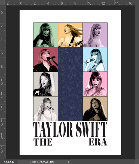
now it’s png time! i’m not gonna explain how to make a png here because it would take too long and i’m such a perfectionist that the way i make pngs would probably get me locked up. however, here’s a really useful, in-depth tutorial on the subject if you’ve never made one before. go ahead and make your png and drag it into the document once you’re done. scale/resize/crop the png so that it fits nicely in the center of the document (and remember that this should be the topmost layer at this point, right above the template layer, so that it’s visible). it should look something like this now:

now you’re gonna do the same thing for the center psd that you did for all the other eras, by creating a clipping mask from the “midnights” era filter:

now all that’s left is the text! you have a few options for this part depending on what kind of edit you’re making. for the eras edit series, i made a png of each album title and positioned that in the center, like this:
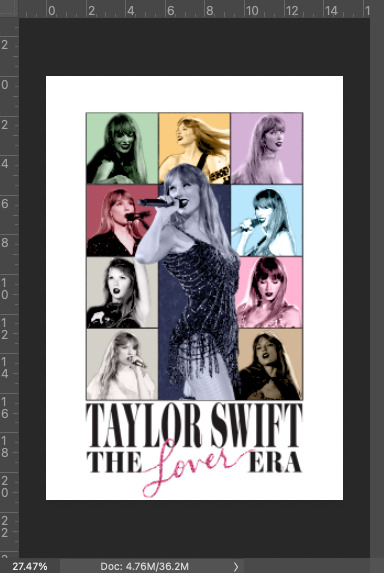
i’ve also seen a lot of people making edits of these for their pets/grandparents/themselves, in which case you probably want to put a name of some sort in there. i made a sample of this to show you. first, you’re gonna want to download this font. it’s not the exact font from the poster because that one costs money, but this one looks almost exactly the same once you stretch it vertically. once you’ve installed the font, make a new text layer and write whatever word you want. change the font size until it roughly matches that of the surrounding words (remembering that it won’t be as tall). then, right click the text layer and select “convert to smart object” so that you can stretch it and then select edit > transform > warp. a number of dots should appear around the text, which will allow you to pull the top and bottom edges of the word so that it looks as tall as the original font. once it roughly matches the poster font, press enter to exit out of warp mode. the text will also look blacker than what's on the poster, so just right click on the text layer/smart object, select “blending options,” and reduce the opacity until it matches. this is what i got:
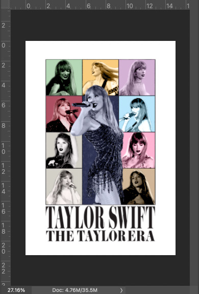
now you could stop there, but i like to mess with it a little (bc perfectionist) and go back and tinker with the paintbrush/clean up the edges and alter the brightness/contrast so that the images match each other a little better. after doing all that (and fixing the rep background color), this is what i ultimately ended up with (i also changed some of the images cause i didn’t like them):

and that’s pretty much all there is to it! i’ve never made a tutorial before so idk if i explained too much or didn’t explain enough but please please feel free to message me if you have any questions/require further clarification on anything!!! ok thanks bye!:)
50 notes
·
View notes
Note
What's your favorite thing about restoring photographs? Coloring, fixing age damage, the process itself, etc?
The before and after. When I really nail a restoration I love putting the photos fullscreen and flipping back and forth over and over. It's the reward for all of the tedious selections and masking and cloning and dust removal.
I also enjoy the problem solving. Like I said, each photo is a unique puzzle. You have to do a lot of trial and error, especially if there is significant damage. And whenever I figure out a new technique to solve a problem, the endorphins come rushing in.
Editing new photos taken on fancy new cameras often requires the same tools and techniques every time. I still love that process, but it doesn't challenge you the same way. And when my brain comes up with some crazy idea to fix an old photo, I can't help but pat myself on the back.
3 paragraphs, but they were all short. I'll take it.
19 notes
·
View notes
Note
Hi hi, hope you're doing well!!
Wanted to ask if you could explain how you pick colours! They're always so appealing to look at...
(If you could also explain how you pick blush colours it'd be great! I never manage to pick good ones, no matter how hard I try :'))
hi anon, i'm doing fine!! it's summer right now where i live and that's healing all my problems (◡ ω ◡)
i have recorded the process of some of my drawings and everything is posted in my youtube channel (in twitter too), so i'll drop the link here and try my best to explain the coloring part to you. the short answer is that none of the colors you see in my drawings are similar to those i initially picked.
i try to keep my lineart loose but i pay attention to the outlines so i can quickly select the outer parts, invert the selection and fill it with the bucket tool. my base colors are all 100% opaque and i don't use any fancy brushes here.
as to how i pick colors, i never use the color picker tool, i eyeball everything. that's important for me because i tend to make all of them warmer: the greens are dark yellows, the pinks are light reds, and everything that's close to blue is very desaturated. i do this even for drawings that turn out much different later, unless i have a very specific vibe in mind from the beginning. i also never use pure whites for anything, and if something is black i make it part of the lineart.
then i always color my lineart!! there's no trick to that, the layer is in normal mode and i just paint it with a darker color than what's below it. i usually add the shadows and highlights at this stage of the drawing too. you're going to kill me for this but shade with gray set in color burn or linear burn (never multiply). i just don't want to think about color variety at this stage because it makes things more difficult for later. sometimes i add textures and some basic color correction here (curves, color balance, layers set in overlay, etc.) but i mostly leave that for the next part.
as to how i choose blush colors, i usually pick the base color and move it towards the saturated end of the color wheel, and a bit more pink. sometimes i add a multiply layer and airbrush hot red over the base colors at low opacity. coloring the lineart with hot colors surrounding the blush areas helps a lot too :)
i also almost always duplicate the lineart, blur it and set it in linear burn (i paint this layer in a light gray). this adds a lot of depth to the drawing, especially if later combined with the bloom effect.
the key to why the colors in my art pop so much is that i don't enjoy drawing as much as i enjoy postprocessing pictures 😂🤣😅👌✌️👍 once i'm satisfied with the "base" colors i merge everything except the background, open a new canvas and go crazy with filters and textures. that's why i use ibispaint X even if i do the lineart elsewhere (krita), and even if it works a bit wonky with big canvases.
i do something different for each drawing here, so first i'm going to explain my reasoning so that you understand my process: i used to have a problem of using very strong colors that overshadowed my beloved lineart into which i had put a lot of effort, so my goal nowadays is to make everything look less contrasted without losing the visual impact of saturated colors. that way the lineart remains a strong point and not just a way to separate one color from another.
what i usually do is duplicate the new merged layer, set it to exclusion mode, add a gradient map and play with the opacity. then i duplicate that and do the same thing with another gradient or another blending mode. i tend to add like 3-6 layers of bullshit over my drawings, including textures and other filters like "bloom" or "sharpen". i understand everything that's going on there but i don't think too deeply about it, i just pick whatever looks best.
for the final touches i always pull up the saturation and contrast (since a lot of it gets lost in the process), and i usually have to manually change some colors (ibispaint X has a filter to do that) or tweak the curves. then i add chromatic aberration, noise set to overlay and little polka dots set to linear dodge.
here are some comparisons of the before and after of recent drawings. the 1st one is very subtle, but you can clearly see how much warmth and depth it gains it gets after all the postprocessing. the 2nd one is so different that i understand why you're curious about how i pick colors. i don't think i can replicate that look just from picking nice colors, there's a lot more going on!! the 3rd one personally feels like it had potential lost (i liked the yellow highlights), but the colors were too strong and all over the place, so the finished result looks more intimate and calm and i like it a lot more.

thank you for the interest anon, i'm very happy that you like the way i color things and i hope i have explained myself. good luck with your own journey!!
24 notes
·
View notes
Text
gif making tutorial for the inimitable @snowysobsessions
disclaimer: this is exactly how i do it, but im basically just winging it tbh. there may be other methods that are quicker and/or look way better. this is just the way to which i have become accustomed. i am not a fancy ass gif maker who does colouring and sharpening or uses photoshop whatever, those folks are the real pros. i just like to get the job done :) if you wanna make really fancy gifs other tutorials may be more appropriate. ok lets get into it under the cut!
step 1:
select your source. for the purposes of this tutorial im going to stay on-brand and use this video of weird al on 30 rock (aka the original Milf Weird Al).
youtube
step 2:
either download the video (i dont have a good recommendation for a website for that unfortunately, they all seem virus-ridden these days) or screen-record the part of the video you want to turn into a gif. for me, thats the part with al in it.
my computer runs windows something - 11 maybe? and it comes with screen recording software built in that saves into a folder called "captures" in the video folder, which can be activated with the keyboard shortcut Windows Key + Alt + R. most phones also have screen recording functions, you could record it on your phone and transfer it to your computer? (for the record the website i use works on mobile too, but its very slow and annoying so i much prefer to use my laptop.)
step 3:
use video editing software of your choice to cut the clip down to just the part you want giffed. i use microsoft clipchamp because thats whats on my computer. it can also be used to crop away any black bars around any video clip, which is useful, because a properly cropped gif will probably be better quality. export the clip in as high quality as possible.
tip: try to keep the gif 3 seconds or under. this keeps the filesize down. tumblr gif size limit is 10MB, but i keep all my gifs 5MB or below because otherwise the loading time/storage burden is painful, and like i said, im not making fancy ones here, i dont mind them being a bit lower quality.
here is my clip. i saved it muted because its filesize is smaller that way.
step 4:
go to https://ezgif.com/video-to-gif which looks like this.
note that ezgif has tools for cutting, cropping and resizing videos if you dont have access to any video editing tool. its quicker if you do it in advance, though, i find.
upload your video and you will see this type of screen appear.
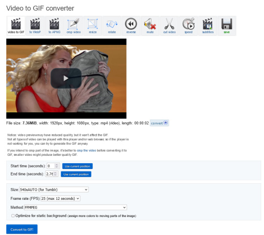
if youre uploading it to tumblr, the 540xAUTO size option is the one i go for by default, but it also has the following size options.
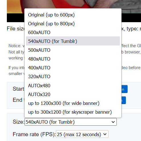
smaller size = smaller filesize, and you want the filesize as small as possible within reason. i sometimes make a gif smaller in dimensions if i'm really struggling to get the filesize below 5MB.
next is the frame rate: i set it to 25 because thats closest to the oriignal frame rate of most recorded video, but in order to make savings on filesize, it can be selected to 20FPS or 12FPS. i wouldnt recommend lower than that unless you want it to look weird and choppy, in which case, go ahead, and i wouldn't recommend higher unless you literally need the animation to be smooth as silk - for making it slowmo, for example.
i don't mess with the "method" drop down bc idk what it means.
the "Optimise for static background" tickbox is useful for if someone is doing something on a totally still background, because it reduces filesize by not animating every single bit of background in every frame. it could be helpful here as our background is not moving at all, just our heroine Alfina. i'm going to tick it.
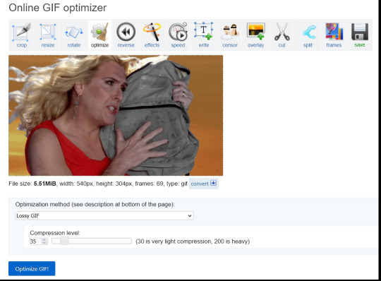
now you can click "Convert to GIF". you should see something like this - itll be animated of course, this is just a screenshot.
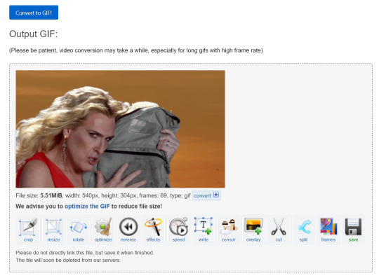
our gif looks crispy fresh (and has 69 frames - NICE), but its filesize is 5.51MB which is more than id like it to be, but first we're gonna look at Effects, so I'm not going to click the "Optimise" option yet.
step 5:
clicking effects will provide the following options
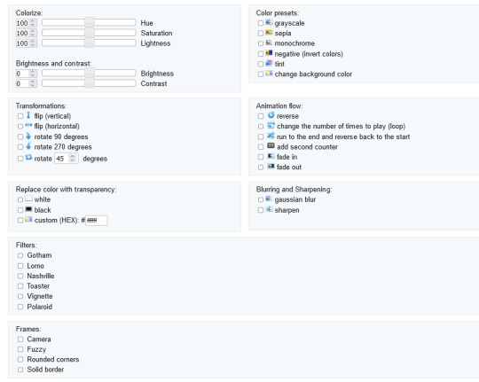
if the video was sort of dark and hard to see, for example if it was live footage, it can be helpful to increase the brightness. changing the brightness and contrast makes our gif look like this, and makes it pop a little more.
you can keep playing with the settings and clicking "Apply selected" until it looks about right to you, or not add any effects at all - it's up to you. I hit the back button in my browser to go back to the gif before i added the effects, then I went to Optimise.
step 6:
the Optimise screen is like this
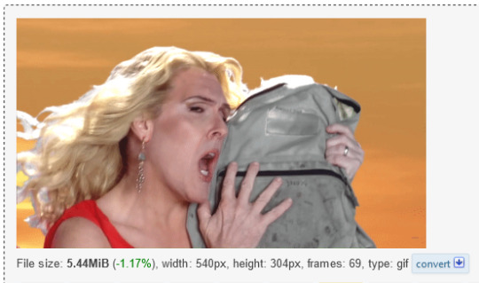
i tend to stick with the Lossy GIf optimization method. I put the compression level down to 30, and press Optimise GIF and see what happens.
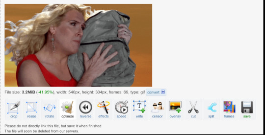
as you can see, the filesize has been reduced by 41.95% to 3.2MB without a super noticeable drop in quality.
if you set the compression level to 200, this is what it looks like
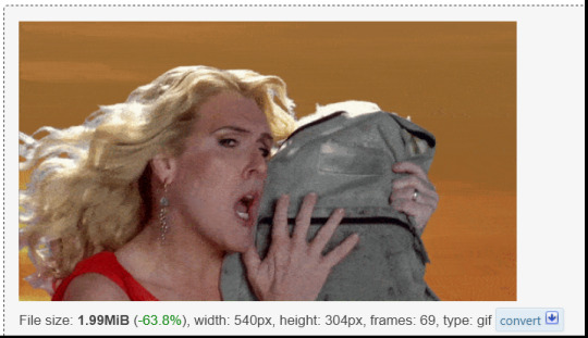
much more pixely, and not much further reduced in size, so i stick to the lower end of the compression scale.
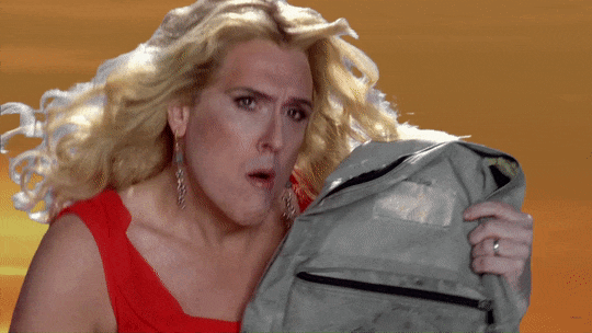
this is our finished gif! isnt she beautiful. i just right-clicked and hit save on it on the webpage after generating - on mobile, i guess you'd long-press on it to download it.
hope that helps!!! lmk if you need help with any other aspect like changing speed or overlays or anything but honestly it's pretty intuitive once you know how to do these bits.
17 notes
·
View notes
Text
the real basic review of art programs for sprite making (my opinion )
so tha main programs i use for art are KRITA, FIREALPACA, and PAINT TOOL SAI. im still tryin to figure out sai2. they all have pros and cons but this will specifically be abt how they handle ALIASED LINES!! aka "pixel" brushes, aka not anti-aliasing.
EACH PROGRAMS BUILT IN BASIC PIXEL BRUSH:

Krita has a few, but focusing on Pixel Art and Pixel Art Fill
Firealpaca has Dot Tool (can be 1-3 pixels big) and the basic Pen brush with AA turned off
PTSai has Binary Pen (or Legacy Pen)
---
PTSai easily has the smoothest binary pen out of these when the algorithm setting is on accurate!! unfortunately the pen has barely any settings compared to other brush types in PTSai.
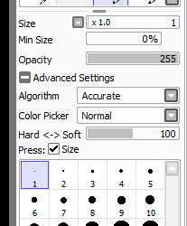
and when using pixel textures in regular brushes, unless theres a setting im missing, they still act like AA brushes and dont colour evenly.
Otherwise PTSai has a really easy compact UI and easy clipping layers
so its good for basic pixelly art without using fancy brushes.
---
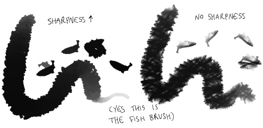
FIREALPACA Dot Tool is kinda rough, and when the aliased regular brush is too small then the lines break up and leave gaps. but at bigger sizes its pretty smooth. and a lot of firealpacas brushes can be pixel-ized in a single click!!!!

when this box is unticked then most brushes will no longer anti-alias and will become pixelly!! (the following images are zoomed to 200% to better see the effects)
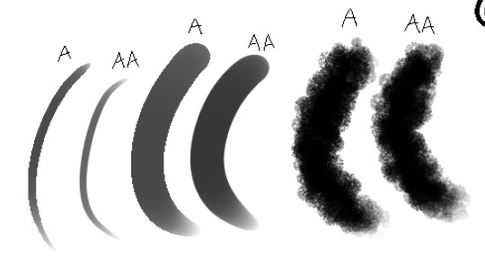


while the effect shows on basically all brushes, not all are strictly pixelly and still have anti-aliasing pixels on the edges.


but still! a lot of the brushes do become truly pixel brushes, and brushes like the Edge Brush can be really useful for making sprites.
also Firealpaca has easy clipping layers too.
---
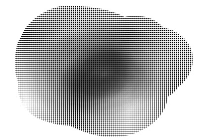
KRITA Pixel Art brush is pretty smooth, and Pixel Art Fill is probably smoother for ppl with more steady hands lol. and while its ui is a Lot More complicated than the prev two programs (usually requiring a few more steps to do similar things), it has A SHITTON OF BRUSH SETTINGS!! and in those brush settings is the Sharpness setting, which can be used to achieve a similar effect to Firealpacas' Anti-Aliasing box being unticked.
but in my experience it can basically guarantee pixel-ized brushes!!! OBSERVE (again, images are zoomed to 200% to better see the effects):

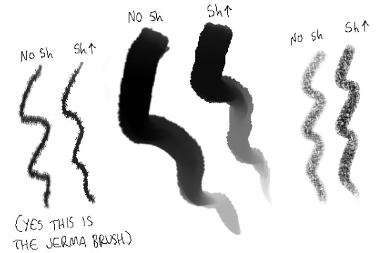
(there might be a way to have sharpness up but still keep the fish texture. im not sure yet)
this also means pixel texture brushes can apply evenly too
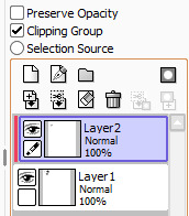
but alas. clipping is a bit more annoying to do in Krita. u gotta rightclick on a layer then select Group > Quick Clipping Group for the easiest clipping layer (maybe theres a better way but idk it yet.)

---
ok this is more of a comparison rather than a review. but still. i personally prefer Firealpaca for spriting homestuck style sprites, it just feels tha most natural for me
7 notes
·
View notes
Last Seen Blogs