#best art vinyl
Text
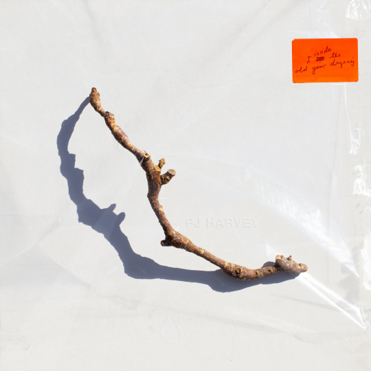
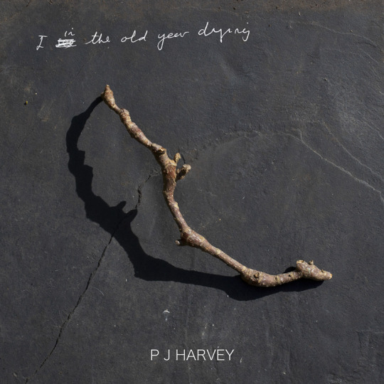
Uncovered: PJ Harvey - I Inside the Old Year Dying
We continue to delve into the detail of the creative process for some of The Best Art Vinyl 2023 shortlisted album artworks and today we take a look at this seemingly simple cover design for PJ Harvey’s tenth studio album that, in fact, couldn’t be less so. The final image is actually a result of months of preparation, awaiting perfect weather conditions and a combination of multiple photographs and techniques. We were lucky enough to get the whole story from artist Michelle Henning.
Henning’s background is in fine art, she started as a painter and installation artist. As well as being a Professor in Photography and Media in the School of the Arts at the University of Liverpool, Michelle works for PJ Harvey as art director/creative director, and as such is very much involved in decisions relating to many of the visual assets.
Michelle explained to us how the creative process starts and about her collaboration with PJ Harvey; “The way I approach the work is to listen to the music. Polly and I don’t discuss visual ideas at first, instead, she gives me everything to do with the album: recordings or demos, poems and lyrics, drawings and notes. I then immerse myself in it and try to get a feel for it and start working. I already had a way into it because I was familiar with her poetry book 'Orlam', which is connected to the album, and I had a strong sense of the world of the album. What matters most to me is trying to find a visual equivalent for the music, not to illustrate it or directly reference lyrics, but sense the atmosphere and convey that.”
Michelle elaborates, “In the case of ‘I Inside the Old Year Dying’, this album has a strange and interesting feel, on the one hand it’s about a twentieth century rural childhood, with references to Curly-Wurlys and Coca cola but also there are soldiers who appear from a much more ancient past, and there’s a strong presence of nature."
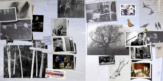
PJ Harvey, I Inside the Old Year Dying concept gatefold (Copyright © Michelle Henning, 2023) with photographs by Steve Gullick and drawings by Polly Harvey
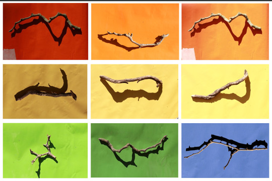
"I started by thinking I would try to put wildlife cameras in a forest, not to capture animals but to get infra-red photos of trees. So I did that for a while but I wasn’t satisfied with the results. Then I started to paint forests, but that didn’t feel right either."
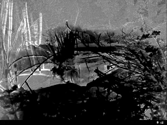
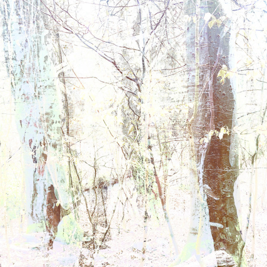
Early Forest concept ideas for PJ Harvey, I Inside the Old Year Dying (Copyright © Michelle Henning, 2023)
"I had a sudden realisation that I didn’t need a whole forest, I just needed one stick and such a simple single object would give it the feel of the classic album covers I admire. Now I realise an unconscious influence was Polly herself, because she had chosen to use drawings she had made of single twigs (“twiddicks”), to break up the sections in 'Orlam'."
Orlam by PJ Harvey
"I think the idea of giving the stick a shadow emerged from the process of finding twigs on the ground and photographing them — the shadows seemed to bring them to life and make something very ordinary suddenly seem almost animate."

Concept ideas for PJ Harvey, I Inside the Old Year Dying (Copyright © Michelle Henning, 2023)
"The back cover is a photograph of Polly by Steve Gullick, onto which I superimposed a scan of a tissue and plastic envelope, so it has a slightly battered, used look. I chose this photo because I loved the way her legs echoed the shape of the twig, and also how it could be cropped so that it seemed as if she was almost kicking the edge of the album away."

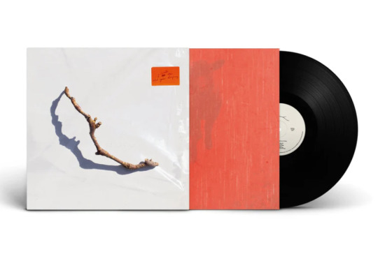
Front and back cover artwork for PJ Harvey, I Inside the Old Year Dying (Copyright © Michelle Henning, 2023)
Michelle has produced three album covers and a number of singles for PJ Harvey as well as several for other artists, including for John Parish, Mazgani and Dot Allison. She works with a wide variety of techniques; photography, clay models, printmaking, drawing in ink and watercolour and moves between analogue and digital, with a lot of work in Adobe Photoshop, creating very complex layered files.

Michelle Henning: PJ Harvey, Let England Shake (Island Records, 2011)
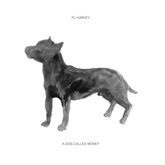
Michelle Henning: PJ Harvey, A Dog Called Money 7" Single

Centre label of Hope Six vinyl | PJ Harvey (Island Records 2016)
Expanding on her techniques for this current album cover artwork, Michelle tells us, “I photographed a lot of sticks in bright sunlight on different coloured and textured backgrounds. At a certain time in the afternoon the sun started to cast really interesting shadows. I remember Polly’s manager Sumit calling me and asking me when I would have something ready to show them, and I said I wouldn’t be ready until we had had more sunny weather. He was very patient with me but he must have wondered what on earth I was doing.”
She continues, “The stick that worked best, that I felt had the most mysterious shadow, I then rephotographed under plastic. The final image is a composite of about three or maybe more photographs of this twig, both under the plastic and not. The orange sticker is based on the sticker stuck on this piece of plastic — which was a large transparent folder in which my film photographs were returned to me. I liked the way it brought a pop of colour to the cover.”
"In Photoshop, I changed the lighting on the plastic, added more layers of plastic lighting, superimposed Polly’s handwriting onto the sticker, and created the fake embossed text in the centre (which is a mixture of hand-painted ink drawing and a lot of digital editing)."
"The gatefold is a scan of a 1980s sticky photograph album complete with the blue lines of glue and the plastic layer, and the inner sleeve is based on photographs of red kitchen linoleum superimposed over photographs by Polly of a lamb and a forest. I did a rough layout for the body text and type, and then handed that over to Rob Crane of Rob Crane Design, who did a brilliant job of making the typography on the inside and back covers look elegant and balanced, and made all the files print-ready."
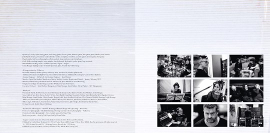
Inner gatefold for PJ Harvey, I Inside the Old Year Dying (Copyright © Michelle Henning, 2023) with typesetting by Rob Crane, and photographs by Steve Gullick gatefold pic
Michelle told us she looked at a lot of great album covers when creating this artwork and there are subtle references to some of them, both in the inner gatefold and the front cover. She says, "I love the idea that there are record cover geeks like myself who like to figure out the echoes of other designs, so I won’t say what they are!" (two iconic late 60s LP covers spring to our record cover geeky minds!)
Michelle Henning: PJ Harvey, I Inside the Old Year Dying concept (Copyright © Michelle Henning, 2023)
I Inside the Old Year Dying by PJ Harvey on Partisan Records is shortlisted for the Best Art Vinyl 2023 Award. Art Director, Design and front cover photography by Michelle Henning. Additional design and typesetting by Rob Crane.
#art vinyl#record frames#play and display#best art vinyl#lp cover frame#bestartvinyl2023#contemporaryart#mixartandmusic#artanddesign#recordcoverart#albumcover#photography
8 notes
·
View notes
Text

Vinyl Scratch my BELOVED 🗣️🗣️
#mango art#my art#mlp fim#MLP#my little pony#my little pony friendship is magic#vinyl scratch#dj pon3#fanart#mlp fanart#my little pony fanart#best pony#!!
33 notes
·
View notes
Text

This is the journal spread I did for my eras tour trips! It was so much fun to make and a great use of my Taylor stickers that I’ve been hoarding for like 3 years
#that is actually one of my tour bracelets yes#and some confetti from my sntv vinyl#we had the best best best time!!#eras tour#taylor swift#art#my art#journal#art journal#tsartists#traditional art
24 notes
·
View notes
Text
The Gaslight Anthem: The '59 Sound (2008)


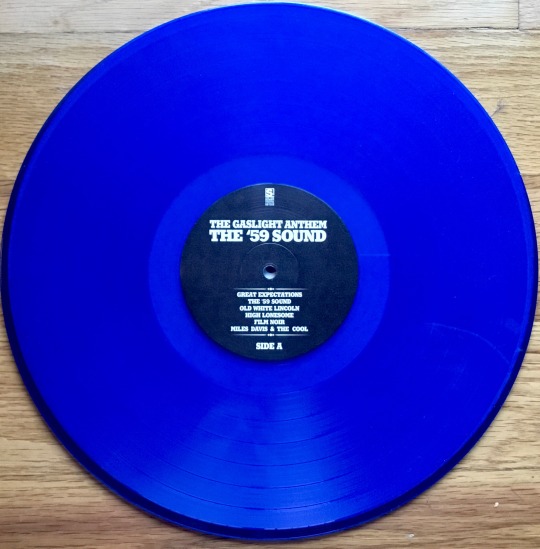
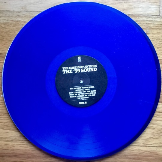
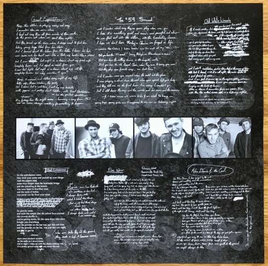

2023 Best Buy Exclusive on Blue Vinyl
Limited to 500 Copies
Side One Dummy Records
#my vinyl playlist#the gaslight anthem#brian fallon#alex rosamilia#alex levine#benny horowitz#side one dummy records#alternative rock#alt rock#garage rock#best buy exclusive#colored vinyl#record cover#album cover#album art#vinyl records
6 notes
·
View notes
Text
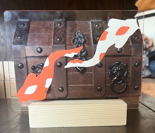
Koi Fish
Vinyl sticker on plexiglass
#not sure what kind of art you’d call this#I’m just messing around trying to find the best way to make big koi fish stickers for my car#koi fish#vinyl stickers
2 notes
·
View notes
Text
EEEEEEEEE LOOK WHAT CAME IN THE MAIL

#leave my teddy grahams alone#it was a long morning at the dentist and i deserved them 😂#but i didnt know it came with the BOOK!!!! with all the PRINTS!!!!!!!#i was just turning every page (delicately) and gasping#the artwork is so nice blown up at this big size 😭😭😭😭😭#i might buy all their vinyls just to look at the art 😩#oh and the record is clear 😎#impera#the band ghost#papa emeritus iv#ghost band#copia#papa iv#best album ever
26 notes
·
View notes
Text
Oh please, the last thing I would like to be doing is controlling the world. Too much unnecessary stress for me!
On that note, who’s “Bill”?

#traditional art#oc art#artists on tumblr#oc artwork#original character#original art#I introduce you; Illuminati but make it hipster#the idea was very funny and I decided to go with it#I tried my best to not make him look too much like Bill Cipher#instead of taking over the world/government he just wants to listen to one of his vinyls while sipping on his coffee
3 notes
·
View notes
Text
#love#quotes#music#quote of the day#music lover#new music#playlist#songs#best friends#vinyl#bff#couples#friendship#breakups#introvert#anxiety#depression#art#artist#life quotes
5 notes
·
View notes
Text
Rob Zombie: The Lunar Injection Kool Aid Eclipse Conspiracy (2021)

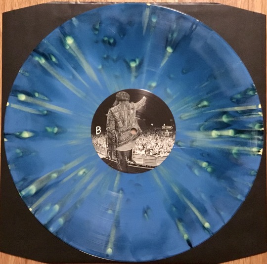

Limited Edition Best Buy Vinyl
Limited to 500 each
3 notes
·
View notes
Text
I HAVE HAD AN AMAZING DAY
#bro i had an AMAZING eggs benedict and then i went to the art museum where they had a piece by george bellows AND#OBLIQUE STRATEGIES. LIKE THE CARDS. but not only that they were the edition made as a christmas gift for a friend!!!!#AND NOT ONLY THAT. i went to the used bookstore and got both the original movie soundtrack for how to succeed on vinyl#but also an egon schiele artbook for 35 DOLLARS!!!!!! like it has 340 COLOR ILLUSTRATIONS and could easily go for 90 or above#AND I GOT IT FOR 35. the owner even said she just put it out that morning and how happy she was i could grab it#since they never get artbooks that nice and i.... BRO.#best day ever in all history
3 notes
·
View notes
Text
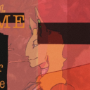
Uncovered: Glüme - Main Character
Continuing our insights into the creative behind the shortlisted album covers for Best Art Vinyl 2023. Andrea Riba talks us through her work and this evocative cover shot of the avant-pop star Glüme who flippantly calls herself the 'Walmart Marilyn' for her latest album Main Character.

Andrea Riba is a Mexican-Chilean writer, director, producer, and co-founder of Femina Films. The album cover for Main Character was shot on the film set for 'Child Actor' which is the opening track on the album and inspired the short film and music video of the same title produced by Femina Films and Italians Do It Better.
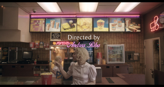
Andrea tells us “It's a surreal film in which Glüme revisits her child self in the 90s. The image was taken after shooting the climax of the film in a preserved 70s dressing room in the outskirts of Hollywood. In this scene, Glüme confronts her mother (played by Riki Lindhome - whose credits include Knives Out, Wednesday) about the loss of her childhood to the demanding world of child acting in Hollywood."

Riba first met Glüme on set for her debut album cover shoot for 'The Internet', although the shoot initially started as a passion project. Andrea explains, “I had a Blue Velvet inspired photoshoot I had been sitting on, and after discovering Glüme through music label Italians Do It Better, I thought she had the perfect cadence for the concept. At the time, the label had already announced the album cover for her debut album The Internet, but when the label saw the photos from our shoot, the plan changed and they landed on one of the images for the album cover and billboards around LA, which was such an exciting surprise.”

The Internet album cover - Glüme 2012
We asked Andrea how the iconic image for the cover of Main Character came about. She told us, “We purposefully scheduled this scene at the end of our 12 hour set day in order for the exhaustion of the day to aid Glüme's performance. After wrapping the scene, I thought of taking film stills to capture Glüme's raw emotions, which were at an all-time high. There was no intention for the image to be the album cover, but the distraught expression captured on Glüme sparked the attention of her label, so they landed on this image as the album cover. There is an interesting contradiction between the title of the album 'Main Character' - someone at the centre of the plot, with an image of a woman tearing and in pure vulnerability.”

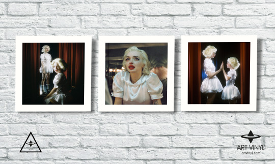
Vinyl scan image for 'Main Character' 2023 by Andrea Riba
We wanted to delve into how the vintage feel of this image was captured so effectively. Andrea tells us, "I wanted to shoot the image on Cinestill 800T because this film captures a beautiful halation and glow around practical lights, that being the vintage tungsten bulbs around the mirrors around the entire dressing room we shot in. There is also a thick grain to the film which provides a sort of surreal veneer between the audience and the world captured, which was meant to reflect Glüme's life as a child actor in the 90's. We also wanted to keep it same world, since her first album 'The Internet' was shot on Cinestill as well."

Riba and Glüme have a close professional and personal relationship which may account for how Andrea was able to capture such a wonderfully raw and personal image of the star. She explains, "Glüme approached me about joining her team as a creative director and this was the beginning of, not only an organic professional collaboration between her and I, but a long term friendship. She is an inspiring human being and we share the same aesthetic interests and love for film, music, and people."

Glüme Harlow and Andrea Riba
Main Character by Glüme on Italians Do It Better label is shortlisted for Best Art Vinyl 2023
#art vinyl#record frames#play and display#best art vinyl#bestartvinyl2023#lp cover frame#flip frame#record cover art#glume#maincharacter#childactor
3 notes
·
View notes
Text
.
#i know i should finish eating but honestly i think I'd rather throw the rest in the trash#i don't feel like eating#i fucking lost weight again#no matter what i fucking try i keep losing weight#i went back to just under 90 pounds#I've got a bmi of fucking 14.2#if i drop to a bmi of 13 I'm supposed to be hospitalized#i might as well let it fucking happen I'm not getting better anyways who gives a fuck#i just want to sit here and starve and i don't give a shit anymore#i don't care about the stupid fucking vinyl or the fabric or art or school or work#i don't give a fuck about anything right now i just want to lock myself in my room and wait the few days it'll take me to starve#I'm already halfway fucking there i don't give a shit anymore#i don't give a fucking shit about anything anymore#I'm never going to get better anyways who fucking cares I'm never going to gain weight I'm never going to walk properly#I'm never going to animate or act in plays or live with my best friends#i couldn't guarantee I'd survive until then anyways that's years down the line if I'm still losing weight after trying this hard to gain it#then I'm never going to be able to gain weight I'll just be postponing the inevitable I'm just going to starve in the next year anyways no#no matter what i try to do to stop it#better to make it a quick few days than drag it out hoping to make it when i know i won't#i just want to fucking die#I'm never going to get better#what's the point in trying#vent
5 notes
·
View notes
Photo

Comedy on Vinyl Episode 407 – Jason on His New Book, We’re Not Worthy – the History of 90s Sketch Comedy EPISODE HERE: https://is.gd/covwnw Jason talks about his new book, We’re Not Worthy, the history of ’90s sketch comedy, which comes out September 12. You can find pre-order info at SketchComedyBook.com, and you can see Jason do a reading at Toadvine Books in Berkley, MI on September 14. Host: Jason Klamm Producer: Mike Worden Please subscribe to us on Apple Podcasts, follow us on Twitter and like us at the Facebooks. ©2023 StolenDress Entertainment
View the Original Post Here
#2023#90's#acting#album#archiving#archivist#art#best seller#book#collecting#comedian#comedy on vinyl#dan gomiller#discussion#ep#funny#hilarious#history#humor#improv#jason klamm#klamm#lp#nostalgia#podcast#record#retro#review#satire#sketch
0 notes
Photo

No Bitching in my Kitchen Decal/ Wall Sticker/ Home Decor/ Wall Art Decoration/ Kitchen Rules A funny wall decal created for the kitchen says "No bitchin in my kitchen". The decal features a rolling pin and whisk for extra decoration which helps make the kitchen rule cute while still being humorous. La dimensions Basique (Small): 10"x15.3" Pratique (Medium): 14"x22" Classique (Large): 19.8"x30.6" Magnifique (Extra Large): 29.2"x45" If you would like this decal in a different size please contact us. * Depending on the size you order the decal may come in pieces ******SAVE AN EXTRA 10%****** For an extra 10% off your entire order join our mailing list and become a VIP member. Use this link https://mailchi.mp/40fdb628c1aa/new-customer-welcome-bella-wall-studios and you will be emailed a discount code for an extra 10% off. WHY SHOP WITH BELLA WALL STUDIOS? -Unique art work -Three different finishes to choose from -A portion of our profits is donated to charity (The Autism Science Foundation) -Premium interior adhesive vinyl made specifically for indoor walls -A special shopping experience -A unique high-end wall decal MORE ABOUT OUR DECALS Our high-end luxury decals are handcrafted using top quality interior vinyl which will allow the decal to adhere to most indoor walls and surfaces. We are the only shop that offers 36 different couleurs and three different finishes to choose from. Matte metallic, true matte, and semi-matte are the different finishes that are offered for your decal. Semi-matte vinyl will have slightly more of a shine to it than true matte vinyl. The result of using our premium matte vinyl is a stunning natural painted on effect with unrivaled quality that will stand the true test of time. In addition it will also reduce the amount of glare stemming from light or shiny objects. PROCESSING TIME It is important for us that your decal is absolutely perfect and that you have the best experience possible. For this please allow 2-5 days for your decal to be crafted and processed before shipping it to you. UNASWERED QUESTIONS If you have any unanswered questions please take a look at our FAQ section. If we still haven’t answered your question then please contact us so we can get your questions answered. We are always happy to help you out! OUR MOTTO "Our goal isn't just to make your wall beautiful, it's to make you feel special as well" - Bella Wall Studios https://www.etsy.com/listing/841751892/no-bitching-in-my-kitchen-decal-wall
#No bitching in my#Kitchen decal#Wall art decoration#Mom Grandmother#Dining room Present#Print sign poster#vinyl wall decal#no bitchin#Modern wall art#Best friend gift#Housewarming gift#kitchen sticker#saying quote gift
0 notes
Text
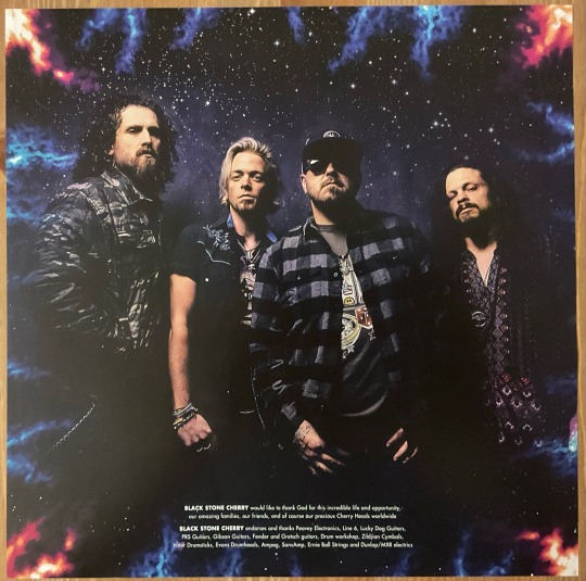
Black Stone Cherry: Screamin' At The Sky (2023)

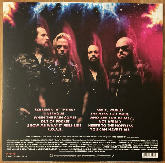


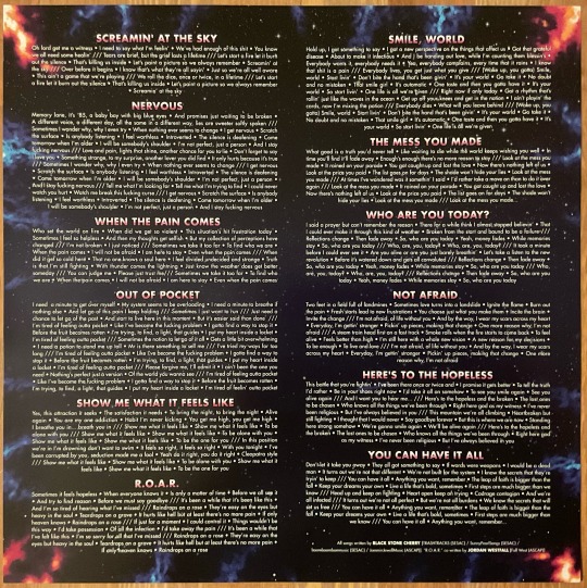
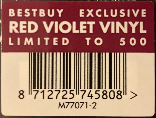
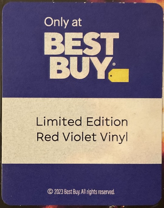
Best Buy Exclusive on Red Violet Vinyl.
Limited To 500.
Cover Design by Sam Malle
Mascot Records
#my vinyl playlist#black stone cherry#john fred young#ben wells#steve jewell jr.#chris robertson#blues rock#hard rock#heavy metal#southern rock#alt rock#alternative rock#best buy exclusive#colored vinyl#record cover#album cover#album art#vinyl records
2 notes
·
View notes
Last Seen Blogs