#i was practicing using digital screentones for this
Text

I have a love hate relationship with Miroku's character. But I do like how a lot of his themes are about him not believing he had long to live and so he lived shallowly and without restraint so that when he's with characters that actively want things in life he grows. I feel like his arc could be pushed more strongly though if his son inherited the wind tunnel though. The little boy is only passed out in the pic. If I wrote a sequel it would involve this as one of the main plots I think..
#me like : ) trust me i'll be nice to them#inuyasha#miroku#miroku inuyasha#miroku having to actively try and be positive for his son's condition even when he had no such hope for himself..#it was never really explained how naraku got the strangely over powered wind tunnel curse so I assume it'd make good sequel material#i was practicing using digital screentones for this
88 notes
·
View notes
Text
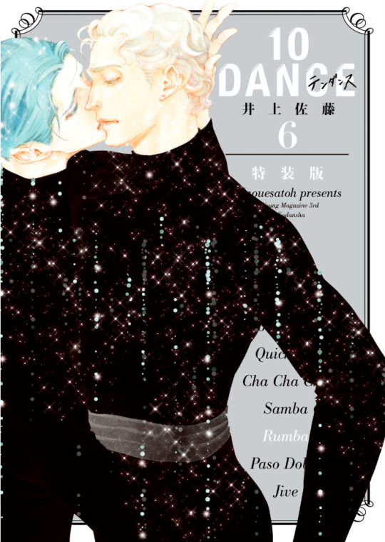
Inouesatoh Exhibition 2023
In the summer of 2019, Vanilla Gallery in Tokyo hosted an exhibition for Inouesatoh featuring her 10 Dance art. In July 2023, they announced they would be running a second exhibition from September 7th to the 24th, this time additionally including her works from before 10 Dance, serving to also celebrate the 20th anniversary of her manga career. In addition, there would be new 10 Dance goods for sale, as well as some merch from earlier events. After attending the amazing Real 10 Dance event in February 2023, surely I couldn't justify going to Japan twice in one year for 10 Dance related things, could I...? Well, spoiler alert, I did, so below the cut you'll find my report on attending this special exhibition!
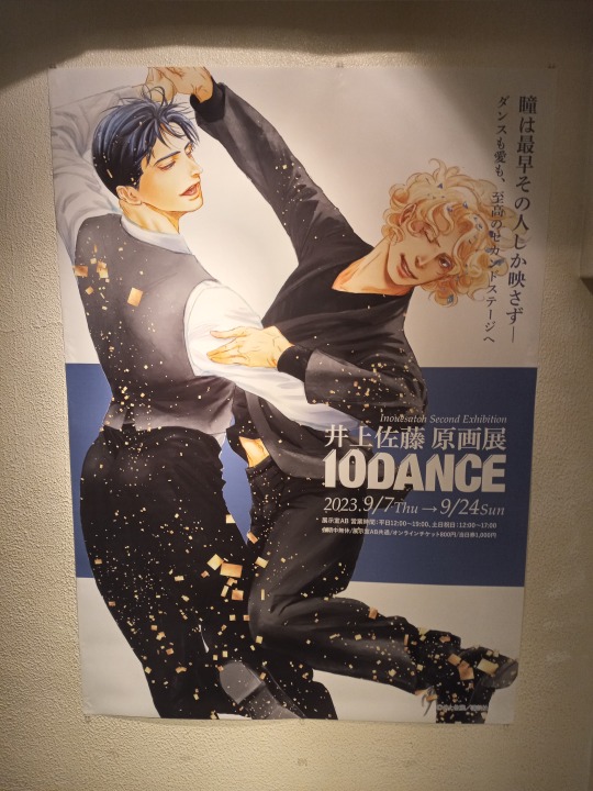
After a rather long trip that included a one-hour technical delay of my first flight and a three-hour weather delay of my second flight due to a typhoon going through Tokyo, I made it to Japan on the evening of September 8th, with my exhibition ticket set for entry at noon on the 9th. After doing various things in the morning such as getting a nice bowl of fresh seafood at Tsukiji, walking around the Hama Rikyu gardens, and stopping by the large Uniqlo in Ginza (where I ended up buying a Magic Knight Rayearth shirt, one of my old fandoms from the 90s lol), I arrived at Vanilla Gallery about 10 minutes before noon, where I saw several other people lined up on the sidewalk. Once the doors opened, we were led down a couple flights of stairs, where the above poster was displayed on one of the landings. Then, after getting to the bottom of the stairs, there were two different rooms labeled A and B. The left side was A, which contained all of the 10 Dance pieces as well as the merch selling area, and the right side was B, which featured Inouesatoh's older works, as well as displays of 10 Dance art reproductions that were available for pre-order. Everyone headed into the A side first, where all of the walls featured either original drafts (for chapter 31 and earlier) or large digital copies (for chapter 32 onward) of manga pages, plus various illustrations such as volume covers and special colored pages. For the earlier chapters you could see things such as white out, corrections, and notes about which screentones should be used. For the later, digitally created chapters, the pages looked mostly the same as how they were printed, except some were larger and showed bits from the edges of pages that were originally cut off and hence not fully drawn in detail or screentoned. There were over 100 pieces on display in total; some of the scenes featured included chapter 11's flirting practice, chapter 15's subway makeout session, the entire farewell dance sequence from chapter 33, and Suzuki and Norman's *ahem* "arrangement" from chapter 38.
The absolute "wow" piece was the new artwork created specifically for this exhibition, featuring Suzuki being a devil and angel simultaneously (and Sugiki indulging people who are into feet lol). I had seen some pics of it on Twitter, but it still surprised me with how impressive (and big!) it was in person. It was the only piece that pictures were allowed to be taken of, so here're the shots I took (due to the lighting, I couldn't really get a shot without reflections, unfortunately):

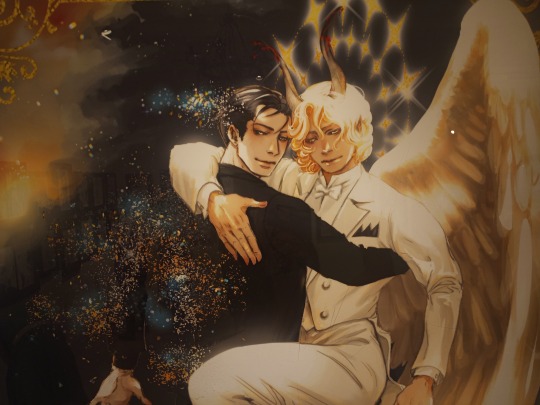
I'm absolutely o b s e s s e d with their expressions.
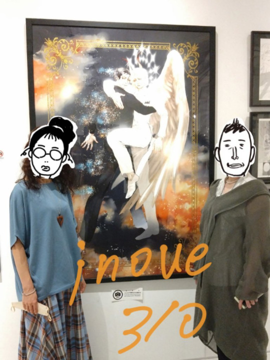
For a sense of scale, here's a picture Inouesatoh and Teacher shared on Twitter:
In the middle of the room, there was a set-up that included a map of the Ginza area that showed locations used in the series (including their route to Tokyo station from chapter 33), a chair that included an artfully draped dance tuxedo, four sketches of merchandise ideas (one that was used for the stand, one that turned into the angel/devil piece, one that she colored and shared on Twitter before we even knew about the exhibition, and a fourth that hasn't yet been used anywhere, but I hope it will be since it shows a really cool and dynamic pose), several flower arrangements celebrating the exhibition/Inoue's 20th anniversary as a manga artist/her birthday (September 10th), and a guestbook for fans to leave messages. I was wary of writing anything at first, since I don't ever practice hand-writing Japanese, so I know my penmanship is sloppy and I have a hard time writing kanji from memory (I tried turning to my phone for assistance, but alas did not have a wifi connection in that underground level). But I thought I should still try anyway, so I just wrote a short and simple message congratulating her on the exhibition, saying that I'd come from America to see it and it was great.
Here's an image that Vanilla Gallery shared on Twitter that gives a good view of the center and a partial wall:

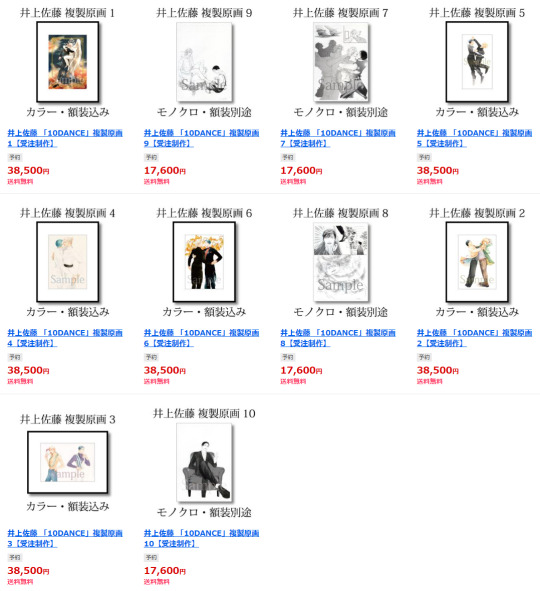
I then headed over to the B room, where Inouesatoh's earlier works from 2003 to 2011 were featured. Many of the pages included sex scenes, which somewhat amusingly had bits of black tape covering the naughty bits (I saw a fan note on Twitter that if you looked at them from a slanted angle you could totally see under the tape lol). One of the walls also had information about the signed reproductions that could be pre-ordered for delivery in mid-December. This is an image from the online sales afterward showing the options and prices:
I didn't place an order at the venue because I wasn't sure if they would deliver outside of Japan, and didn't know if my friends who live there would be available to receive the artwork in that timeframe. Instead, I waited until afterward and placed a proxy order for the new piece through Buyee.
There were other items available to purchase on site, so I indulged myself in a bunch of merch! On my first trip to the register, I picked up the tote bag, washi tape, art books for both this exhibition and the previous one, the acrylic stand, two blind pack keychains, and six blind pack art cards. The art cards included five regular designs and one rare special (the new angel/devil piece), and I hoped I could get all of them in one go. I tried to quietly open the packs to see if I'd gotten lucky, and while I did get all of the regular designs, no special was among them. So I bought a second round of six cards, plus two more keychains just because. Again I checked to see if I had gotten the one I wanted, but all I had was doubles/triples of the five regular designs. So I gave it one more shot, six more cards, and again ended up with duplicates. At that point, I figured I shouldn't let myself keep gambling since I'd probably just get more and more duplicates of the ones I already had, so I sadly accepted my fate lol. At least there's a beautiful print of the new art piece in the catalog book for me to stare at (plus the signed version that'll be coming my way in December!)

After the event ended, they started selling the exhibition catalog and acrylic stand online, which can be found here. Also available is a separate catalog featuring her pre-10 Dance works (assuming the split is because her earlier series are owned by a different publisher). That book is sold here.
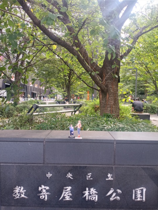
Though I had wanted to visit some more of the sites used in the series that I didn't get to see on my previous visit (when I had been racing against the clock as it got dark), ultimately I didn't end up having time to go on a full pilgrimage. However, on my last day just before heading to the airport, I wanted to at least visit one of the most important series locations and take a few photos with the adorable acrylic stand. So here I present to you, the Shinyas having a date in their favorite park!


Overall, it was a short but fun trip! I'm glad I was able to go to this exhibition, to see the original drafts in person and admire the craft that went into them. Also to feed my need for merch; I'm so happy to indulge in a more direct form of support than the secondhand goods I've bought before. I hope that this event was considered a success and let Inouesatoh feel the love and encouragement from her fans, inspiring her to keep pushing onward in her now two-decade career in manga!
15 notes
·
View notes
Text

Citrus' Art Summary 2021!
Here it is, my year in art! Overall, I did more digital art this year than any other year previous, managing about one major piece per month. Finally a year when I can fill in all those squares (and then some!)! That's a-bonkers-lot for me :O
Some more reflection 'neath the cut:
I set out with the goals this year of Doing Lots of Art Digitally for practice/learning purposes and also working with deadlines in mind, kinda maybe sorta... like a real professional might? Just to try it out?? Of the stuff I finished, two were for a zine (hmm, never did post those, though you can see most of the full-color piece in February!), three were paid work (blurred/not pictured, I don't really feel comfortable sharing those), one was a t-shirt design (not pictured), one was for an art giveaway (June), 10 were sketch requests (March-May), 7 were for Tumblr events (all digimon-related; July-October), 7 are for a personal project that I really won't be giving many details about (Nov), and 10 were index-card-sized pen-and-ink practices. Oh, and if we're counting ALL creative/fandom stuff, I wrote a fanfic and made a fanmix. Phew!!
I'd like to say I enjoyed every minute of it, but some of it was sort of stressful, actually ^^; I DO have a full-time job; my self-imposed artistic workflow made it feel like I was working two jobs sometimes, and that DEFINITELY took a toll on me (particularly since I was trying to meet all those deadlines!). I also tended to get wrapped around the axle being a perfectionist a lot of the time, which led to me to spending a LOT more time fiddling with not-actually-that-important stuff than I probably should have (this is a constant struggle for me!). TL;DR, there are still TONS of things I could afford to learn about being a more efficient/less neurotic artist, and, in hindsight, I think I was teetering on the verge of burnout several times throughout the year (oops).
One positive thing I did was upgrade from MangaStudio to ClipStudio this year, and while there there are things I miss about my old setup, I really like that you can download new brushes directly from Clip, as well as some new functionality I discovered that I had never figured out previously (or maybe it didn't exist?). I also realized I need to make major improvements to my posture, break-taking, and overall drawing setup. I tend to hunch over a lot and that has made my back and shoulders pretty unhappy a lot of the time, particularly when I'm in deep-focus and work-hard mode :P
I'd also like to... draw more for myself next year? Taking requests is a lot of fun (and I still have several in my inbox that I'd like to finish, WHOOOOPS), but sketching for myself used to be something I did to relax and unwind, and I realized it's not really relaxing if I'm drawing with the intent to post for an online audience. I also really want to make more progress on my Personal Project now that I've started it properly! So I'm anticipating my perceived art output will be a lot lower next year, for all these reasons, and that’s OK! Art goals for next year involve a) working on self-care and recovering from what-very-well-may-be burnout, b) jamming as much as I can on Personal Project and things I will probably never publish on the Internet, c) WORRYING LESS about small details & audience when I DO draw/post goofy fandom stuff, and d) remembering how to draw spontaneously and for fun. Fingers crossed these are achievable goals!
In terms of my personal favorites for the year... well, that's tough! I like them all for one reason or another. I REALLY liked how my December piece turned out; I think I nailed it (I really wish I could show it!!). And I'm also really proud of how the Daisuke Kaiser comic turned out. I got to play with some fun screentone brushes, and it's an ACTUAL (short) MANGA-STYLE COMIC that I finished, for once. Finally makin' comics!! Secretly, THAT'S THE DREAM!!! My teenage self would be so proud.
It'll be interesting to see what 2022 brings!
8 notes
·
View notes
Note
hey alan! this is probably a long shot bc i imagine you're v busy, but i am absolutely in love with the way you use textures! especially the screen tone dots and the grain in much of your limiter illustrations (for example post/618294174475845632). do you have any process videos or suggestions on how you get the textured look you want?
Hey dude! Thanks for asking. I’ve been having a fun time playing around and pushing my textures recently. Glad ya dig!
There’s two parts to this answer: tools and technique. I’ll start with tools.

I buy screentones from deleter-mangashop.com. I mainly use simple gradients and a 40% grey tone. Texture in ink lines comes from g-nib or ink brush on Bristol.
For digital images, I work in Clip Studio, which has an active/non-destructive layer style that translates grey values to screentones (you set dot shape and density). I use digital tools that mimic the traditional tools I like, so my current inker of choice is a brush with about the same flex and texture of the g-nib on textured vellum. Can’t recommend Frenden’s brushes enough (he even provides free updates for life): https://frenden.myshopify.com/
PJ Holden has some nice CS how-to tweets, including a nice thread on using the tone layer style: https://twitter.com/pjhtips
The image of Dazzler below uses a textured pencil for the soft edges. The background uses the same technique for the “airbrush” style coloring.

The second part of the answer is technique. I’ve been focusing a lot on values, edges, and shapes in my artwork for the past year or so. Most hard edges aren’t textured (aside from the inker/paper), but using texture on the soft edges (graphite, colored pencil, screentones, dry brush, airbrush -- or digital tools that mimic them) can describe a lot of information without a lot of rendering. It’s my current go-to.
Mike Mignola’s my idol for that: simple and graphic shapes, clear value stacking, very minimal rendering... but rich with texture. Both the low and high ends of the values are blown out, so silhouette is the main indicator of texture/form in those areas, not any sort of detailed rendering. He leaves that for the midrange, where the transition from high to low value is. Minimal rendering, maximal effect. Look up “3-value study” for some ideas of how to practice this stuff if it sounds like an answer you’re looking for.
Of course it all depends on what you’re trying to achieve with your artwork. Especially for Limiter, I’m pulling from and trying to achieve a bit of pulp psychedelia and horror. So I’m taking a lot of technique inspiration from work done in those styles. Mostly it’s graphic, low-brow... i.e. done quickly and economically. How do you get a soft edge or gradation of value if your print method doesn’t allow it (screen printing, old xerox, old comics, etc.)? By understanding why artists working in or for certain media render the way they do, it helps me achieve similar effect even if I’m mimicking their media digitally.
I guess to say, you can spend hours stippling and rendering every last inch of your image if that’s the look and method you like. For me, both because of a wrist injury and the low-pay-quick-turnaround nature of comics and my dayjob, my personal trajectory for art is finding the quickest way to get the most control over the maximum amount of meaning. That includes introducing a bit of unexpected chaos using splatters, dry brush, stamps, tones etc. to get textures. If your shapes and values communicate maximally, you can get away with a LOT of random bullshit in the middle. And that’s where the fun is.
Anyone who’s taken a workshop or training from me knows I love using Marco Bucci’s videos, so at risk of sounding like a broken record, check him out. The following are my favorites on this topic, but I learn something from each of them, even the ones I don’t think I care about:
Shapes: https://youtu.be/-ZknWKTpc90
Merging Shapes: https://youtu.be/Nap7dwHjD9Y
Edges: https://youtu.be/nnhj5efzN_w
Style/Texture: https://youtu.be/Fbo6ZAuF914
Thanks again for asking and opening the floodgates of rant. Cheers!
38 notes
·
View notes
Text
Osora Interview translation (pt.2)
(printed in AnimaniA 4/2018, p.58 - 61 / interview originally given in March 2018 at the Manga-Comic-Con in Leipzig, Germany)
( pt.1 )
The Internet offers Let’s Players, but also all kinds of artists an opportunity for very direct communication with their fans. However, this can also have its downsides when it comes to potentially negative feedback. How do you deal with this issue?
—Sometimes you just stumble across negative feedback that you didn’t want to see, and that can chip away at your motivation and creativity. I try to prevent that by not really looking at reactions in the first place, and when I do happen to see negative feedback, I try to forget about it again as soon as possible. Of course, when I start a new series, I’m curious about the readers’ reactions and go looking for feedback, but if eight out of ten comments are very positive and two are negative, I still tend to get stuck thinking about those two negative comments. There even was a time when that negative feedback made me feel too depressed to draw for a couple of days. But the more often this happens, the more you learn to deal with this criticism. I can stomach it pretty well by now, and I think it’s important to not let negative feedback get to you.
Did your experience regarding interactions with readers change much from Boku to Senpai no Tekken Kousai to The Ones WIthin?
—Digital publications receive a lot more feedback than series that are only released in print - be it via email or via Twitter. Twitter is the main source of comments. With Boku to Senpai no Tekken Kousai, there was much less of a response, and the feedback that we did get was usually in the form of letters. Since readers had to buy the magazine first and then go out of their way to send a letter, that was a lot more complicated. (T/N: i.e. it takes more time to write/send a whole letter than to just send a tweet)
How do you handle responding to messages from your readers? For example, do you set specific times for yourself to reply?
—Since I get the most reader interaction on Twitter, I try to answer questions and comments there when I find the time for it. I always do that myself because I want to respond to my fans in my own words. That doesn’t feel like extra work to me, but rather like a pleasant change of pace. Aside from my personal account, there’s also the official account for The Ones Within, which is mostly for promotional use. My editor retweets my tweets there and forwards any questions that get asked there to me.
Could you describe your usual daily routine when working on The Ones Within?
—I’m a night owl, so I usually get up rather late at around 10 am. After that, I basically work in two rounds. The first lasts the entire day and ends in the evening, around dinner time. Then I take a short break, and the second round starts at around 9 pm and ends at roughly 2 am. If I’m close to a deadline, I sometimes just continue drawing until I pass out. (lol) I never take much time to eat at that point, either.
What advantages are there to drawing digitally in comparison to drawing traditionally?
—Oh, there’s a lot - especially how easy it is to make corrections and adjustments. Your work space is neater and other people can’t stare as easily at what you’re drawing. There’s no need to erase sketches or apply screentones by hand (T/N: see here how screentones are applied traditionally, it’s definitely faster digitally lol), so there’s not as many work steps either and you can finish your work even on your own [without assistants]. And since it’s all data anyway, it’s easy to save as well.
Do you have any advice for artists who are just starting to work digitally?
—Practice makes perfect! I used to have a private page online where I more or less kept a drawing diary, all about original characters. I still kind of do the same thing on Twitter nowadays. It’s important to keep at it and actually draw on a daily basis, that way you’ll get used to it. There’s also live streams from artists on Pixiv and Twitter - it’s helpful to watch those and adapt parts of their progress for your own work.
You’ve shown us a picture of one of your notebooks that you use to jot down your ideas - where do you usually come up with these? (*picture under the cut at the bottom of the post)
—There’s two main places where I tend to draw spontaneously. For one, on the train - usually after meetings with my editor. I can best sort out my thoughts right after those meetings and save some first ideas. Secondly, in bed, right before going to sleep. Ideas flow really easily when you’re sleepy and letting your thoughts wander. Also, I’d feel like I’m wasting my time if I did nothing and just waited to fall asleep, so instead I imagine as many scenarios as possible and jot down the best ones. When I come up with something I especially like, I might also get up again and draw it digitally right away. (lol) I don’t take my notebooks with me everywhere I go, though.
Both Boku to Senpai no Tekken Kousai and The Ones Within combine dark, mysterious elements with more comedic ones. How do you find a balance between these two aspects, and what do you like so much about combining these opposites?
—I like both comedy and serious plots, so I wanted to draw both - in the end, I combined the two without really thinking much about it. I usually just let this come to me naturally while I’m drawing too, although I do keep the timing in mind. For example, it wouldn’t be appropriate to make a joke in the middle of a sad or serious scene, and vice versa. So, I take care not to destroy the atmosphere that I’m trying to convey [in each given scene].
Personally, which character from The Ones Within is your favorite?
—I can’t really “rank” my characters because I love them all! Going by who’s the easiest to draw, it would be Anya. He’s a pretty straight-forward type, so he’s easy to understand. He’s also the only one who looks angry a lot of the time and has eye bags… and his accessories, like the helmet, his iron bar or the chewing gum - they make him stand out and thus easy to draw.
Do you already have an ending planned for The Ones Within or do you still have a few options to choose from?
—The ending is already planned out!
Do you maybe already have a new project in the works that you would like to tell us about?
—For now, I’m just really happy that The Ones Within is getting an anime adaptation and I can finally talk about it, now that it’s getting officially announced this May! I can’t wait to see my characters animated on the screen!
A final word to your fans?
—Thank you so much for reading my manga! There are so many Japanese manga series out there, and I’m really happy that you chose to read mine out of all of them. The Ones Within is getting an anime adaptation, and of course the manga is still ongoing as well, so I hope you will stick around and enjoy it until the end. Thank you!
Osora-sensei, thank you very much for the interview!
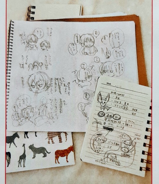
I tried to decipher these but the picture was too small to read much sadly agdjsdvhs
The bigger page seems to be some Kudou bros goodness? They seem to be talking about Shinya having Kenya's piercings (and maybe about Anya getting piercings as well, considering his very resolute "I don't want to." lol) and they're also mentioning ramen at some point from what I can decipher
And the bottom right looks like some kind of character relationship chart / worldbuilding notes,,,
#osora#the ones within#naka no hito genome#nakageno#boku to senpai no tekken kousai#translation#mangaka#mangaka interview#I feel dread knowing that Osora has the ending planned and might drop it on us some day after this hiatus lmao
4 notes
·
View notes
Text
LGBTQ Manga Review - All You!!

As I started reading All You!! I was expecting a typical school love Yuri. When I realized that the primary couple of the story is two of the teachers and my interest skyrocketed. Any school story focused, at least partially, on the teachers is something I am interested in.
All You!! is a yuri manga series by Ruri Hazuki which focuses on Mato Oono, a fifteen-year-old first-year student at Sakura Hill Women’s Academy. Sakura Hill prides itself on having the students complete teacher evaluations every semester so that the teachers may improve. While working on her evaluations, Mato overhears two of her teachers, Minato the chemistry teacher and Takita the geography teacher, arguing and decides to get to the bottom of it.

On a quick note, teacher evaluations by students are something of a hot and contentious topic in education circles, especially in K-12 schools. While there are benefits to these evaluations there can also be determinants for both teachers and students when implemented poorly. One of these drawbacks is the anxiety and rush that Mato feels about it which drives the plot forward. This is a nice, and most likely unintentional, connection to the real world.
While the evaluations give the setting a unique element it is still a private all-girls school. Such schools are a dime a dozen in Yuri and have been for the past hundred years. Often they are the backdrop to S stories which are free of both men and sexuality. Fortunately, All You!! plays with this trope. Instead of having the students engage in “practice” relationship the teachers are the ones romantically entwined. Furthermore, the relationship portrayed in the story is not platonic or fluffy, but real and queer. As shown in their argument, they get irritated at each other, such as when Takita steals Minato’s lab coat, and are physically affectionate. Although, another note, most teachers in relationships with each other do not make out in our offices!!
Despite the happy surprise of the teachers’ relationship, the story here is not perfect. The majority of Takita and Minato’s relationship, at least from what we see, is them arguing. While this does help make their romance feel more realistic and believable, it goes overboard. The healthy, positive, aspects of the relationship are not displayed with nearly as much focus or intensity.
Additionally, too much time is spent in the beginning introducing characters, possibly to set up the sequel and further entries in the series. These introductions feel rushed and sloppy, which is a shame considering that each of the characters appears to have a distinct individual personality. Finally, the plot does not exactly wrap up or have a satisfying conclusion. Sure, it ends on a satisfactory note which resolves one plotline, but overall it feels unfinished.

There is still a lot to love about Hazuki’s work. The characters are all interesting, if underdeveloped, the Yuri service is titillating without being crude, and the manga feels ripe for continuation. Finally, there is the art, which is almost perfect. The character designs shine here, particularly the teachers, who are all beautifully drawn. However, Hazuki uses a bit too much screentone for my taste, to the point where if I close my eyes I can only see dots. However, after the first few pages, it is easy to adjust to and the brilliance in the rest of the work easily outshines this small complaint.

Ruri Hazuki’s All You!! features gorgeous character designs and an exciting story that turns on some of the Yuri genre’s tropes. The plot is engaging but can feel a bit rushed at points and works too hard to establish room for continuation rather than resolving the narrative satisfactorily. I recommend it for those who want something a little different out of a school Yuri and strongly suggest purchasing the sequel alongside it so that you can see where the story goes.
Ratings:
Story – 6
Characters – 7
Art – 8
LGBTQ – 5
Lewd – 3
Sequel bait: 10
Final – 7
You can purchase All You!!, its sequel, and more Yuri works digitally at Lilyka’s online story.
Review copy provided by Lilyka
#reviews#lgbt#lgbtq#lgbtq+#yuri#manga#all you!!#lilyka#cute#doujinshi#lesbian#lesbians#school#queer#pride#pride month#girls love#gl#wlw
2K notes
·
View notes
Photo

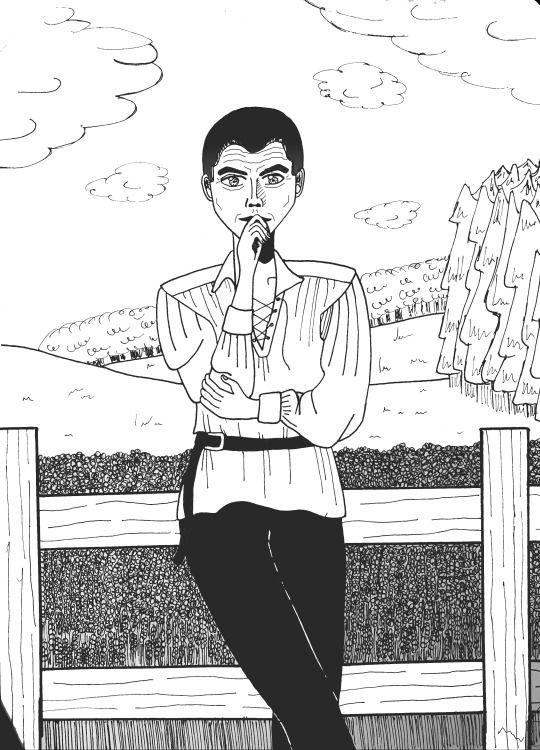

paiSo once again I had to stop drawing for a couple of days for work and other such things - I really wanted to get back to practicing but for some reason I felt like I’d lost any progress I’d made in the past few weeks. So rather than continuing to develop the side shots and finally moving onto 3/4 I decided to try a full image that I could be happy with and make me excited to carry on.
I am actually quite pleased with how this one has turned out but it just hasnt managed to hit the spot I was hoping for. Propotions for the most part seem okay, hands arnt totaly disgusting and fashion turned out alright. The lips and eyes I’m not sure about and the hair I’m really not sure about. I decided to add the age lines last minute which purhaps wasnt the smartest move but otherwise the face felt too empty.
Once again one of the things that I was most pleased with was the background. As is typical it wasnt planned, I drew the whole figure first and I didnt want to go for the default pose of rigid and totally upright so I added a recline and the crossed legs but then once it was done he clearly needed something to be reclining on and a country side fence seemed to suit his apparall. The main inspiration for the clothing in this one was actually from my own wardrobe, using a mirror to see how it all hangs - a shirt with billowing sleeves probably wasnt the smartest move considering how much I normally struggle with clothing but it turned out well enough.
Once It was finished I processed it digitally to remove paper creases and just to experiment to see what I could do. I didnt want to make the image massivley dark so I stayed away from my previous efforts of adding screentones to everything. I’m a big fan of converting it all to halftone dots at the end, the only issue is that I cant find the right balance as using a number that is too low results in seemingly no quality, but choosing a number too high leaves the image with random patterns all over it until you open the image propperly, or the other way around and the image looks fine until you open it and then it has patterns all over it? I have no clue what’s going on there so any tips or advice would be fantastic, I’m using medibang paint but definitely need to get more practice in.
Any tips or advice in general would be greatly appreciated - tomorrow the plan is to try and pick up with side shots again <3
#drawing#ink#pencil#manga#practice#tips#help#halftones#dots#image#field#background#eyes#hair#fashion#old man#lips#digital finish#medibang paint#advice
1 note
·
View note
Photo

Chrysanthemum
"Inking practice"...in which I couldn't simply give this a simple solid colour background.
1. Inking digitally is hard. I finally found a brush in Krita that I like to use for inking. It's the same brush I used for the pokemon trainer-sona thing last post. I just need to invest time developing an inking style.
2. I'll learn how to screentone nicely one day.
3. Eiji's eyes are actually brown. I bumped them up to gold for the contrast, and made him look like he was Norted in the process...
Shinu and Eiji are my characters
#finished art#digital art#digital drawing#I just want ONE good inking brush!#made with Krita#shinu#eiji#artists on tumblr#original character
1 note
·
View note
Text
9 February 2019- Saturday
2:00p-9:00p
Today Maekawa Sensei taught the group how to apply screentones to our characters in Clip studio. Screentones are the gradients of black and white used to suggest color, shading, and depth in manga. This is achieved by using sheets of transparent adhesives containing varying sizes and quantities of black dots which trick the eye into seeing shades of grey through the monochromatic contrasts of black dots on top of white paper.
Professional mangaka have used screentones since the popularity of Manga caught on in post-WWII Japan, but we in this new age of digital technology have the privilege of applying such techniques quickly and easily with a few strokes of the keyboard and tablet pen. Maekawa Sensei reminisced on using physical screentones and how messy it is to use, having to cut and apply tiny cutouts to place on a page outlined with ink. It was a time consuming process and would be made more difficult when creating 3d effects such as shading and highlight on any given panel on a page of 25 for a bi-weekly chapter. I must pay my respects to the old masters for going to such lengths for their lifework. They have left a legacy and I hope their toil never be forgotten.
The second half of the class included creating a colored landscape and clouds in Clip studio. I felt as if we were watching a Bob Ross episode of painting happy clouds and us the audience clumsily following along. With enough time and practice, I’m sure this will be an effective technique to utilize in my future projects. It is important to note that clouds are painted outward in.
Other miscellaneous items on the agenda included final designs for our group logo. I am happy to announce my design was chosen by the group to be placed on our business cards should anyone of us please. After our session I discussed possible ideas with another student, Aaron, helping his with what type of art or comics he wanted to sell at this year’s Kawaii Kon. We exchanged ideas and themes, suggesting using Hawaii as a backdrop for his works. Unfortunately it seems that no one in our group is very enthusiastic about using our home in our works. I assume because we lived here all our lives and we wish to be anywhere but here, no one really wants to think about the possibilities. Only recently have I warmed up to the idea.
0 notes
Text
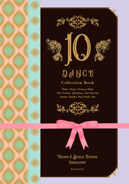
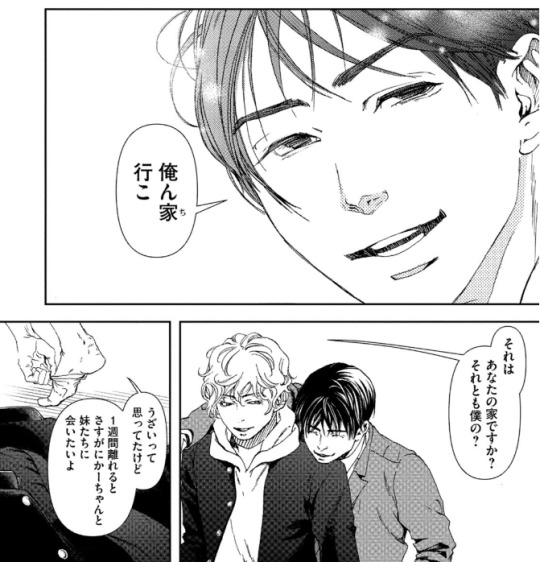
10 Dance Vol. 6 Special Edition overview
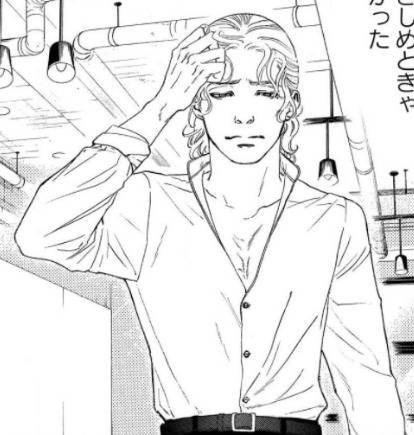
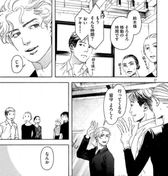
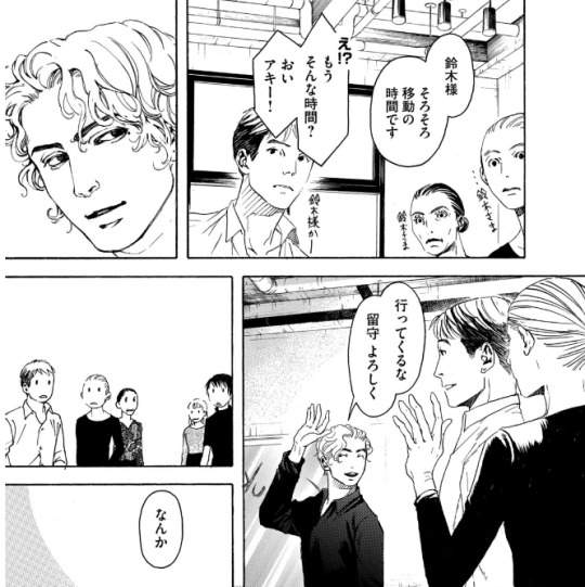
Volume 6 of the 10 Dance manga was released in Japan on March 18th, 2021. As with volumes 4 and 5, there are both regular and special editions available. In this post, I will provide an overview of the release, including observations on changes that were made to the chapters compared to how they were printed in the magazine, plus summaries and select scans of content from the special edition booklet.
It is often the case that when chapters come out in the manga magazines, they aren't always fully polished, and since I became highly familiar with this run of chapters from the summaries I made, several things immediately jumped out at me as I went through the book. First of all, though chapter 29 was split into two parts and released in subsequent months in the magazine, these two halves were combined into one chapter, with no indication they had ever been separate. I assume that they were always intended to be one chapter, but since the full chapter was not completed before the deadline (and it was a month when 10 Dance was being given the cover image, so not possible to delay its release), it was simply split over two months instead.
For visual changes, the most common alteration was scenes that originally had little or no screentone having it added in:

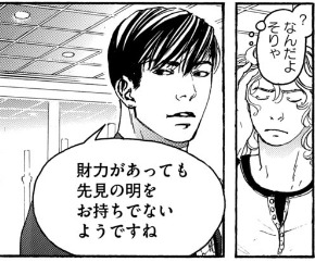
There were also some instances of either slight panel redraws, or complete replacements with new panels. None of these were from particularly important scenes, so it could just be Inouesatoh or someone on her team didn't like the look of the original panels and wanted to change them. The following example has a bit of both, with Suzuki in the upper left corner being replaced, and his eyes being redrawn in the lower panel:
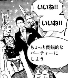
Personally, the most amusing addition I noticed was when Max was thinking about throwing a party. Originally, we didn't see what he was envisioning, but in the volume, an addition has been made in the background: the New Year's piece Inouesatoh drew with sexy men dressed as cows, except now they're bunnies!

As for dialogue, it appeared to be almost the same in both versions throughout. Some minor exceptions include a spot I found where the dialogue was put in a different order, swapping Sugiki’s lines between this panel and his first line on the following page (in addition to another altered panel example):

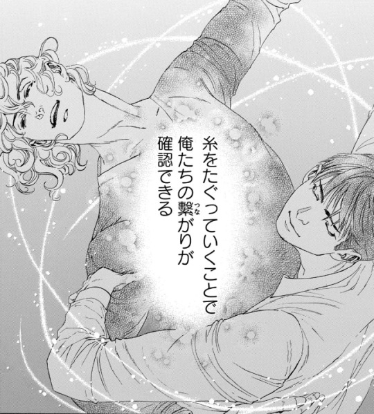
As well as in this shot of Suzuki describing how they tug at the thread that connects them through their dance. Whereas before it put the word “dance” next to the part about tugging on the thread to specify what was meant by that, it was deleted in the volume. And while it was originally described as “affirming that we’re connected”, this was also tweaked a bit to be, “affirming our connection”.

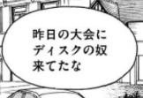
There were a couple instances of character names being different from when they appeared earlier in the story. In this volume, two characters who were last mentioned back in volume 2 (Lucas Calvo, one of the champions at the table in Blackpool, and Deeks, who Ernie said hated Sugiki because he "stole" his girlfriend), either from typos or intentional changes, weren't the same as before. Lucas' last name was written with a 'g' sound (ガルボ) instead of a 'c' (カルボ), and this change carried over to the volume. On the other hand, Deeks' (ディクス) name got transposed as Disc (ディスク) in the magazine, but was fixed in the volume.

There was a typo that unfortunately made it through to the volume (but could perhaps be fixed in future printings). In chapter 34, when Norman is testing Suzuki's skills, he flashes back to Sugiki taking the national title from him several years earlier. The text in this scene, written in English, incorrectly states that Suzuki won the championship, rather than Sugiki.

The volume also includes the usual additions that are not present in the magazine, such as the under the cover flap comic, and Inouesatoh’s notes about each chapter.
The cover flap comic (which looks very much like a sketch, compared to previous ones that have had more complete art), features the Shinyas during a practice session earlier on in the series in December, where Suzuki complains that Sugiki’s Latin just isn’t sexy. Sugiki suggests that he can practice being sexy by wiggling his butt around to write a message in the air. Suzuki worries that if he starts writing out “love” or something, he’ll have to run away and escape. Sugiki gets started, and Suzuki calls out each letter that he can make out from his elegant butt bouncing. After figuring out he’s written “M-E-R-R-Y”, Suzuki guesses that he’s writing “Merry Christmas”. Sugiki gets mad that he said it aloud before he finished writing his message, and says he’s going to leave. Suzuki says, “Wait, I love you,” as narrative text says that this somehow turned into a love story in one panel.
And here are some tidbits I found interesting/amusing from the chapter notes:
She thinks readers who are fans of pecs will like Saichi.
She’s not sure if readers will love Max or hate him, but she personally likes him (sorry Sensei, I kinda hate him lol)
As of chapter 32, a portion of the art is now done digitally.
The epic “last dance” scene from 33 was something that she had planned since the beginning of the series, and it ended up being 8 times the cost for a typical chapter.
Special edition booklet:
The special edition comes with a 48 page hardcover booklet that includes a variety of different extras, divided into 8 sections called “heats”.
Heat 1 is a newly drawn, 12 page parody manga. Back in September 2020, Inouesatoh put out a request on Twitter for fans to send in their suggestions for an erotic side story. Putting the characters in a high school setting was the most requested scenario, so she chose this idea as the basis for the story. The title is “And All That Jazz” (the premise makes this somewhat confusing to summarize, so keep in mind that I’ll mostly be describing their actions based on the soul rather than the body, but will use quotation marks if it’s about other characters and who they think they’re addressing. It’ll all make sense, I promise...I think :P)
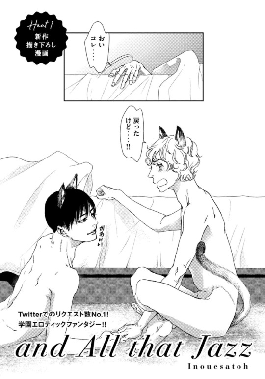
(The title page actually depicts the ending of the story, so I’ll come back to it later). It starts with Suzuki narrating his introduction, saying that he’s a transfer student to the Standard Academy. He really doesn’t get along with a guy named Sugiki, but for some reason, the two have now switched bodies with each other. Sugiki opens his shirt and inspects his new physique in front of other students, as Suzuki yells out asking what the hell he’s doing to his body. They look at themselves wearing each other’s expressions, Sugiki seeming surprised his mouth can gape open like that, and Suzuki wondering what happened to his body’s facial expression muscles. The bell rings and Sugiki heads off to class, as Suzuki is baffled that he can act so calm about this.

Sugiki perfectly reads a passage aloud in English class, something everyone (including the teacher, who looks like Norman) find unusual coming from “Suzuki”, as they wonder where his usual hearts are. Suzuki makes the decision to enjoy living as Sugiki for a bit, and is shown getting flirty with several girls. He notes that the more serious personality in his regular body is also strangely popular, though with a very different crowd.
A student named Alberko (Alberto in a girl’s uniform) shows up and says that “Sugiki” was supposed to have lunch with her(?) today. Suzuki says that he thought Alberko was going out with Dorou (a masculine alteration to Dolores’ name). Ernie and Suzuki watch as his harem falls apart with Alberko running amok. Ernie comments that both “Sugiki” and that transfer student have been acting weird all week, and he asks if something happened. Suzuki internally reflects back to one week earlier, when he was relaxing in bed in the infirmary. Sugiki comes in and accuses him of skipping class, and Suzuki tells him to mind his own business. He thought this would turn into one of their usual fights, but he can’t believe that actually happened instead...

After school, Sugiki asks Suzuki if they can go home together today. As they’re walking, Suzuki asks if Sugiki realizes what it was that made them switch places, and Sugiki says he does. Suzuki says that in that case, they know how they need to fix it, and they should go over to his house. Sugiki asks for clarification of whose house exactly he means by that.
As they start to get undressed, Suzuki says that he always thought his mom and sisters were annoying, but after a week apart he really misses them. Sugiki promises that he’ll make sure he can see them soon. Suzuki claims that he’ll be the one making Sugiki come, and Sugiki asks how he can talk like that when he was the one who looked like he was about to cry when Sugiki first touched him in the infirmary.
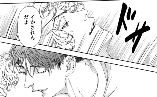
Sugiki peeks into Suzuki’s pants and wonders if he won’t get hard unless he touches him. Suzuki thinks it’d be weirder if he could get hard while looking at his own face, and wonders if Sugiki has AI in his crotch or something (Sugiki contends that it’s not his body). They fool around with each other until they finish, and Suzuki wonders why they didn’t change back yet. Sugiki suggests that maybe it needs to be just like the last time to count as a complete set, when they went at it until they fell off the bed, so both agree that they need to go for one more round. This then ties back to the title page, where they’ve finally managed to get back into their old bodies, but have now sprouted cat ears and tails.
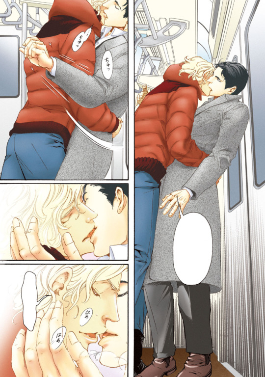
Heat 2 of the booklet is 8 pages long, and contains short comics and illustrations that were not previously included in the volume releases. The comics include “How to 10 Dance”, a one-page comic with the Shinyas demonstrating the tango. Their privates end up touching, and Sugiki seems highly amused, gleefully asking Suzuki how it feels. Suzuki says that he was the one who got all bent out of shape over that back in volume 1, and tells him to lay off the sadist mode since they’re not dancing Latin right now. The second comic is “2nd Step”, and shows a glimpse of how the Shinyas were with each other after Suzuki gave the go-ahead for kissing. In fact, Sugiki ends up kissing him so much that Suzuki’s lips get sore and swollen. Sugiki then tries to kiss his neck as an alternative, but Suzuki’s not having it. The third comic depicts Suzuki’s first time in a public bath, where he realizes that Japanese people aren’t fully shaved everywhere like he is. Some of the old guys talk to him and slap their balls with their towels, and Suzuki, seeming a bit confused, gives his own balls a slap, too. After the comics are a selection of illustrations that were never used in the volumes, including this one from a Real 10 Dance event in 2018:

Heat 3 is 18 pages, and contains a variety of colored versions of both chapter covers and scenes from the manga, a couple of which I’ll share below:

Heat 4 includes 3 pages of insight from the professional dancers who consult for the manga, in which they explain the moves shown in specific panels.
Heat 5 is a single page look at Inouesatoh’s work space.
Heat 6 is 3 pages worth of advertisements that have been used to promote the series, including things like ads that were posted in subway stations:

Heat 7 is a single page look at the storyboard for chapter 1 of the manga.
Heat 8 is a single page showing the covers for foreign editions of the manga (Taiwanese, Korean, North American, and French).
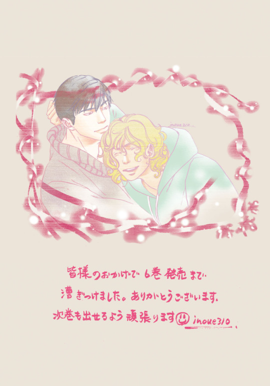
Finally, there’s one last page with a thank you message from Inouesatoh, including an absolutely precious illustration of the Shinyas in happier times.
And that’s that! This really is an incredible release, and I’d definitely recommend picking up the special edition if you can. CD Japan offers direct international shipping, and I’ve also seen that Kinokuniya lists it as “available to order” currently (though they don’t appear to have stock on hand, so might take longer).
33 notes
·
View notes
Photo


Well... I’m actually kind of speechless. I feel as though I’ve genuinely produced something of some quality. I can’t properly describe how pleased I am with this, every good peice I’ve made up till now has ended with a fat grin - this one is my proudest yet and, although I’m definitely smiling, I’m just kind of stunned.
I’ve still got to practice side and 3/4 veiws but I wanted to complete a ‘good’ full body shot first, front on, and so I chose to look at poses more natural than the upright and rigid which I normally go for and have a crack at that. Everything seemed to come together, the work I’ve done on eyes, hair, proportions - even the small amount I’ve done on hands. It’s definitely not perfect but compared to my normal work I love it. Fashion as well I went for a simple style so I wouldnt ruin it and want to hide the whole picture. I took my time with it and it payed off, when I was done it still felt empty so I looked out the window and added the veiw as the background - my perspective bits and all that jazz sure isnt great, I’ve never drawn a building before! But again I’m okay with how it turned out.
One of the biggest differences to my normal pictures is that I turned it digital once I was done; screentones are something I’ve wanted to get using for a while - I know I still need to get the basics down but I also love to get ahead of myself. Once the ink image was done I stopped myself from ruining it by trying to shade or add shadow and instead just got a decent picture, added a filter to make the lines clearer and then sent it to my laptop. The softwhere I used was MediBang Paint; as mentioned I did want to use some screentones (and I did mess around with them) but for the most part I just used a grey scale gradient and then converted it into halftone dots. I know I need to actually learn toning and probably not go over the top with it but for a first time I’m happy.
Tomorrow I’m finally going to work on side veiw or 3/4, but points from this to work on? The head I think is too big for the body (so proportions) and the although the hands are better than normal theyre still not great, landscapes and stuff need developing but I’m happy to wait on that, and also learning to shade and tone properly - but again I’m happy to wait till I’ve got the basics down.
I think taking my time is what really helped with this one, getting the pencil sketch down and adding in pencil before ink. I held myself back with the hair strands so it doesnt look too messy and yeah - I’m just insanely pleased with it.
As always, any tips or advice would be greatly appreciated! :)
*I also think using some real paper helped instead of the thin lined pad I normally draw on
#Drawing#Manga#MediBang Paint#MediBang#Halftone#dots#Pencil#Ink#Digital#Art#practice#success#First time#screen tones#shading#eyes#hair#hands#back ground#girl
0 notes
Last Seen Blogs
iolscosta-blog
Reflections Of My Heart

sunnytot
litl bat
dudeimintomonsterprom
young and unafraid (inbox open)
loneklon
PRINCESS CHADOW AWW

gvpixx-blog
GVpixx