#it’s that good red green complimentary color scheme
Photo
“Todoroki-san…”
Shouto had never cared about honorifics before, but something about Midoriya’s voice speaking his name with such careful, precise formality made him feel like he’d stepped into a fog of humid air. It was thick and oppressive and uncomfortably stifling in a way his quirk could never abate.
“It’s not Ka—Bakugou-san—it’s not him I’m avoiding. I mean,” he bit his lip in the same way Midoriya did when he wanted to slow his speech, to ensure he took the time to choose his words carefully, “it’s true that it’s weird for me. It’s not just the cousin thing. Or, I mean, maybe it is, in the end, but it’s just…where I’m from, my Katsuki, he’s always protected me. So it’s odd, being near yours. I know your Izuku isn’t me, but…well, we’re similar, right? I think maybe we have to be. So I don’t like the idea that there’s a version of me out there that a version of my cousin could hate. But more than that…Todoroki-san, more than that, the person I’m avoiding is you.”
“Midoriya.” He wasn’t sure what he was going to say and he wasn’t given time to figure it out before Midoriya was speaking again.
“I’m sorry,” he said, gripping the edges of his jacket and twisting them in his hands. It was a nervous gesture he’d seen dozens of times, performed by hands that were rough and mangled and broken and nothing at all like the pristine hands he was now looking at. “I’m sorry,” Midoriya repeated. “It’s such an awkward situation. I sort of…I thought maybe your teachers, or your heroes, or whatever it is, I was hoping they would figure things out and this wouldn’t come up. But they haven’t and…I’m so sorry, but if I’m being honest, Todoroki-san, it really hurts to look at you and it feels unfair, because the others, they say I look a little different from your Izuku, but for me, you look just the same. You look exactly like my Shouto, so when I see you, it’s hard because…because in my world, Shouto is…he’s everything, Todoroki-san. To me, I mean. He’s everything. And I know he feels the same because he looks at me like I’m everything, so when I see you and you’re looking at me like you don’t like me, and it’s with his eyes—”
“I do like you,” he interrupted. “Or him. Midoriya. The one from my world. He’s one of my best friends.”
Midoriya smiled and any words Shouto had left to speak turned to dust in his mouth. Midoriya smiled like he’d been hurt. He smiled like he wanted to apologize for his own injuries.
“It’s not that kind of like, Todoroki-san.”
Understanding bled through him like a slow-growing stain, permanently altering the fabric of his person.
“You mean…you and me…?”
“Right. And so that’s why. A Katsuki that isn’t my cousin and a Katsuki that dislikes me…that’s odd and it makes me feel a little strange, but it isn’t something I can’t handle. But a Shouto that treats me like I’m only a friend…that’s more than I can bear. So please. I know I’m overexerting myself. I know it isn’t healthy to keep practicing like this. But right now, this is all I have. So please, Todoroki-san.”
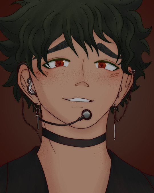
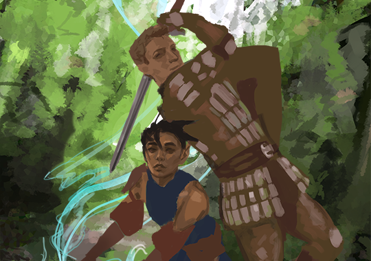
Don’t mind me, I’m just back on my nonsense. Anyone who knows me knows I love Idol Izuku, so this is just based on one of the many daydreams I’ve had on that subject. In this one, a quirk accident causes Izuku to swap places with an Izuku from an alternate universe. This Izuku is cousins with Katsuki (thus the eye color change), has a quirk that is related to increased agility (which he uses for dancing), and is dating Shouto. In this world, there are no heroes or villains, but simply law enforcement and criminals. Quirks aren’t as strong or diverse as they are in the normal bnha world. UA exists, but rather than training heroes, it’s simply a renowned school for specialized career training. Izuku is in their music academy, under Hizashi. Shouto and Katsuki are in the law academy, maybe?? Katsuki wants to grow up to be Izuku’s bodyguard, lol. Enji is a professional fighter—sort of a quirk MMA type of thing—and he wants Shouto to follow in his footsteps. Shouto doesn’t want to. I’m thinking he might want to be a defense attorney.
Anyway, I’m never going to write this as a fic but enjoy this little blurb!
#skylldraws#i mostly just wanted to draw izuku with red eyes let’s be real#it’s that good red green complimentary color scheme#and of course I’ll make any excuse to draw him wearing idol junk#you should draw idol izuku too#and then send it to me#midoriya izuku#idol midoriya#idol izuku#deku#tododeku#tddk#tododeku drabble#tododeku ficlet#todoizu#todoroki x deku#shouto x izuku#todoroki x midoriya#tddk fanart#bnha
115 notes
·
View notes
Note
Hey quick question how do you come up with the color scheme for the piece? I get stuck trying to think past what colors my characters have
oohhh, that's a hard one
It depends on what you're focusing on, the colours on a character or the colours in their background!
Backgrounds are best when they complement the figure but don't melt into them. Using opposites on the colour wheels (red/green, blue/orange, Yellow/purple) is a good place to start, as well as complimentary tones. So, for example, for the pieces below, the background contains a Lesser colour from the figure, but allows the main colours to pop! the pink/red of ahme's skin to the desaturated green, the deep but warm brown against the blue and green of the bg!
For complete pieces, full illustrations, one good way to make the character and background feel more coherent, is picking colours from the figure and incorporating them into the bg. The pink flowery dress becomes the pink of lanterns in the bg, the same yellow of the stars as the characters eyes.
And for most character designs, I find sticking to a few base colours and adding one to make it pop, works for me. Brown leather and smoky blue with Gold jewellry, Lilac silk with sage and perwinkle blue! Also, mixing warm and cool tones. All warm and all cool is borin, gotta give it a touch of the other to make it glow!
Also, make sure to look into some colour theory, my way isn't the way for eveyone, getting lots of dif info is the best way for you to find how YOU like to colour!
Hope this is helpful!!
246 notes
·
View notes
Text
Yesterday I watched "Wish" - a new feature film from Disney.
I swear, if at least someone didn't tell me that it was true from Disney, I thought that a small studio was engaged in the project, which is just trying its hand. Or even a game, it would look much more interesting if it were finalized.
But….
Seriously?
They just stuffed "references" from Snow White, Cinderella and Pinocchio with a taste of Frozen Heart???
And made the main villain a slave in the mirror?
From the very first minutes, the thought did not leave me that the color palette looks like this…insipid. And not accented.
If you look at the colors of the previous cartoons, you will notice that a certain color composition, (I forgot what it's called, the key colors in the scenes?) it can perfectly convey the atmosphere and mood in the scene.
The main character just gets lost on different backgrounds because there are too many of the same blue colors.
The emphasis on the yellow star? Yeah, great. But otherwise, if it had been placed somewhere in the crowd and the saturation with brightness had been slightly twisted, no one would have noticed it.
And where the hell are the complimentary colors (opposite in color scheme) that work so well in the very first works? The same Alice in Wonderland.
Alice - delicate blue and light shades, lightness and lightness.
The Queen of Hearts- is black and red, looks heavy and domineering. Here's a sharp contrast for you visually.
What about Atlantis or the Treasure Planet?
Good down-to-earth colors, overlaid with darker ones. The color scheme is more suited to the concept that we are used to in reality. Here you cannot predict who will be the villain. There are no very pronounced accents throughout the cartoon, only in a couple of cases perfectly suitable for narration.
The colors are played superbly. They can still be disassembled as a study for artists.
Light and shadows, tone perfectly harmonize with each other.
But here everything went to the trash can.
If this pretentious and polished male magician in a cape is a villain, then do the balancing of the colors damn it. Give him a little background, not a couple of cheap songs written by AI. Show the more repulsive side that he is duplicitous, that he has the brains to hold power for so many years. That he is obsessed with his beauty and surrounds himself with mirrors to encourage his exorbitant ego.
The simplest solution is to take the main character and make an inventive/negative of colors!
If the heroine has soft pastel lavender colors. Add a couple of color accents for the Villain in the form of yellow or green flowers.
Goddesses for the sake of not so pastel and faded! If you don't have everything in the same watercolor light colors! You're not shooting Winnie the Pooh!!
Or show his luxury in power, richer ones. Make silver shades colder, sharper, making feel prickly and heavy.
Sorry, I got carried away with the visual component.
But I absolutely did not like this cartoon.
No visual, no narration, no songs.
#san talk#I miss the good old 2d animation so much#Klaus looks more luxurious at times than this next marketing spit from a mouse
23 notes
·
View notes
Text
So I've actually been thinking about why Captain Boomerang looks better with green eyes. I mentioned here that he looks better with green eyes and while discussing this with a few friends I think I figured out why. I believe it has to do with color theory and character design.
In the case of character design it has more to do with drawing the audience upwards, specifically towards the face. Because his costume is all blue, making his eyes blue as well muddies up the design a bit. Adding things, such as a bandaid on his nose and a gap between his teeth, like in Suicide Squad (2019) issues 4 and 5, are only meant to further draw your eyes towards his face. On top of that, the further you go down on his costume, the darker it is, which is often used to once again draw your eyes upwards.
His pants are dark, his hoodie is lighter the coat has more saturation and his scarf is the lightest. As shown below his eyes are in fact green.
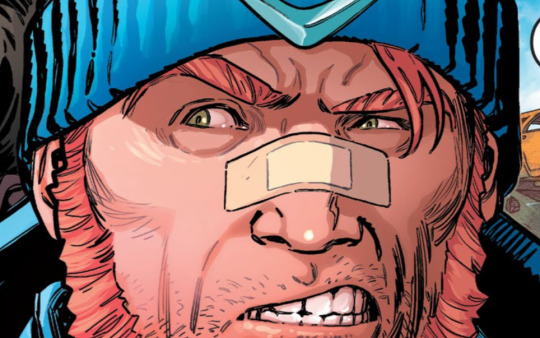
And color theory also back up why green or brown eyes work better than blue eyes. His costume follows a monochromatic color scheme. It's all different shades and tints of blue. Adding more blue on a character just makes it harder to read because it's all blue.
Green works best when his hair is a more red tone. The reason why it works is because red is complimentary to green. And then green is also analogous to blue. Making his eyes a tint of green would further add contrast to his darker hair. Plus with red and blue, they go well together because they're primary colors. Brown eyes would also work here because brown is a shade of orange, which is analogous to red.

If his hair is a more orange tone, it makes more sense to give him brown eyes. Why yes, seeing that brown is a shade of orange, it doesn't compliment his hair, but it does provide a contrast. And orange is still complimentary to blue so you do get the complimentary colors there. Green eyes still work here though because orange and green are both tertiary colors.

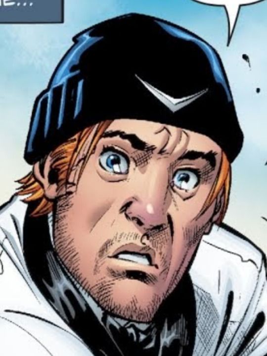
(Please excuse the fact that his eyes are a reddish brown here, there aren't a lot of comics that show him with brown eyes and orange hair.)
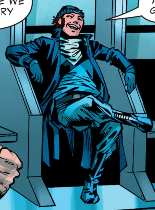
This isn't to say that giving him blue eyes never works. It can still look good when applied correctly. Issue 47 of the 2016 Suicide Squad series. Here he's wearing black dress shoes and slacks, with the color of the top half of his suit being mostly white. While yes, his beanie is still a shade of blue, it still works here because there isn't as much of it. And because his eyes are a lighter color, it further draws your eyes towards his face. And there is still some color theory at play here with his hair being an orange tone, making it complimentary to his blue eyes.

In short, with Captain Boomerang's costume, he looks best with green or brown eyes. That being said, there are cases where blue eyes can still work.
16 notes
·
View notes
Text
I DID IT I DESIGNED CHARACTERS!!!!!! SPECIFICALLY JEKYLL AND HYDE CHARACRERS!!!!!!!! EVERYBODY LOOK I DID IT!!!!!!!!
And now, for my thought process~
Dr Henry Jekyll: Man's is built like a fuckin TANK bro. Idk why everybody draws him as a twink he's CLEARLY meant to be MASSIVE(/pos). Anyways, as you've probably noticed, I leaned HEAVILY into the color coding for this one. I chose red for Jekyll mostly- uh, mostly just because I already associated Hyde with green and I wanted them to be complimentary colors? But also he has red character vibes in the musical to me. Probably because the poster is very red. I gave him tiny glasses cuz I thought it looked cool lol. I uh, I don't really know why he's the only character with visible pockets? I guess I just thought it looked best on his design or something. He was originally gonna have a ponytail but I thought it made him look to much like he was from the American Revolution so I changed it to the shorter, poofier style shown in the picture. Also his vest was originally brown but I decided I wanted more red in his design so I changed it.
Gabriel John Utterson: SQUARE. SQUARE SHAPED MAN. He's repeatedly described as like the most boring man alive so I decided to reflect that in his design by making him really rigid and almost statue-like. Hence all the grays. I wanted to add a dash of color though, so I gave him a blue tie(also the strappy thingy around his hat is blue but that isn't visible here). He's also super pale to go with the cold/stoney vibe of the rest of his color scheme.
Dr Hastie Lanyon: God this one took me FOREVER to figure out omfg. I didn't have a very good idea of what he looked like while reading the novel and until I started actually searching for them I didn't see very many fan designs for him. All I knew is I wanted him to wear yellow bcuz primary color trios RULE. But theeeeeen I started looking up other peoples designs, and picked out a couple of contants I liked (ex; short, dark skin, gray streaks), then boom! I knew what I wanted to do! Anyways yeah, once I had an idea I just went for it and uh, I dont have much else to say :)
Edit: WAIT SHIT I FORGOT LANYON HAS LIKE A MASSIVE WHITE STREAK IN HIS HAIR OMFG-
Edit 2 Electric Boogaloo: Okay so my Lanyon design was driving me SO crazy I felt the need to update the ref, so now he's a little taller and has the afformentioned white streak aornfoemdk
Edward Hyde: Fun fact, Hyde was originally going to be 4'6, but I just kept making him shorter and shorter until he lost the 6 inches entirely lol. The only description we got of Hyde in the book was that he was small, hairy and had an "unexpressed deformity", so I guess I just took that to mean he is a Creature and ran with it lmao. I made him SUPER pointy, just the sharpest man. Mostly to contrast with the round shapes of Jekyll, but also he's kinda just that kinda dude, y'know? I also made sure his silhouette was super uneven, in contrast to all of the classy characters have(mostly) symmetrical silhouettes. OBVIOUSLY he needed to have a cloak and top hat, because really, what Hyde design is complete without a cloak and top hat? There are 3 reasons I decided to make his color green: 1; the potion Jekyll uses to become Hyde is green. 2; Green, at least in my mind, means sick, and Hyde is supposed to look sickly and unpleasant. And 3; The Ghost of Mr Hyde from Scooby Doo is green and he was the first version of the character I ever saw, so I've kinda just associated him with it ever since. Speaking of the Ghost of Mr Hyde, the mud on his shoes is actually an homage to that episode! I tried to get the color as close to the weird, off redish the mud on Dr Jekyll's shoes was in that episode. Why? Because Scooby Doo my beloved <3. Also since this section is already so fucking long, the reason he has that silver tooth is because the original got knocked out in a fight. In this version, Hyde's injuries do NOT carry over to Jekyll, and vice versa, so he needs to take out the tooth before he transforms back and put it back in when he's Hyde again. Idk why I put the most thought into Hyde's design but whatever-
So yeah! Those are my designs and the thoughts behind them! Hope yall like em :)
#jekyll and hyde#the strange case of dr jekyll and mr hyde#gothic literature#gothic lit#henry jekyll#dr henry jekyll#dr jekyll#gabriel john utterson#mr utterson#hastie lanyon#dr hastie lanyon#dr lanyon#edward hyde#mr hyde#character design#drawing#art#fan art#goth lit
13 notes
·
View notes
Text
The Power of Color: How to Use it in Interior Design
When designing a venue, color is one of the most powerful tools. It can set the mood, make things look different, and define a space. But it can take time to decide on the right colors for your home. This blog post will discuss the power of color and how to use it in interior design.
Understanding the Psychology of Color
Before we dive into how to use color in interior design, it is important to understand the psychology of color. There is a wide range of moods and thoughts that different colors might prompt. For instance, blue is commonly linked to peace and comfort, whereas red is connected with energy and passion.
Here are some common associations with different colors:
Blue: calm, serene, trustworthy
Green: nature, growth, balance
Yellow: happiness, warmth, cheerfulness
Orange: energy, enthusiasm, creativity
Purple: luxury, royalty, mystery
Black: sophistication, elegance, power
White: purity, simplicity, cleanliness
When selecting colors for a space, you must consider the mood you want to create and choose colors that will evoke that mood.
Complimentary Colors
On the color wheel, colors that are complementary to one another are those that are opposite. These colors create a strong contrast when used together. For example, blue and orange, red and green, and purple and yellow are complementary colors. These colors can be used to create a bold statement in a room.
Analogous Colors
Colors close to one another on the color wheel are said to be analogous to one another. These colors create a harmonious and soothing effect when used together. For example, blue, blue-green, and green are similar colors. These colors can create a peaceful and relaxing atmosphere in a room.
Monochromatic Colors
Monochromatic colors are colors that are within the same color family. These colors can be used to create a cohesive look in a room. For example, shades of blue and pink can create a monochromatic color scheme.
Choosing the Right Colors for Your Home
When choosing colors for your home, it is important to consider the function of the room and the mood you want to create. For example, a bedroom should be a relaxing space; cool colors like blue, green, and purple are good options. On the other hand, a living room should be a space for socializing; warm colors like red, orange and yellow are good options.
It is also important to consider the natural light in a room. If you have a lot of natural light in a space, you can get away with using darker colors, but if you have very little natural light, you should stick to using brighter colorings.
Using Color in Interior Design
Once you have chosen the colors for your home, it is important to know how to use them in interior design. One way to use color is through paint. A single accent wall can add a pop of color to a room. Another way to use color is through accessories like throw pillows, rugs, and curtains. These items can be easily changed to update the look of a room.
Another way to use color is through furniture. A colorful piece of furniture can be a statement piece in a room. For example, a brightly colored couch can be the focal point of a living room.
Conclusion
Colors can set the mood, create illusions, and define a space. You can make a beautiful and functional space by understanding color theory, choosing the right colors for your home, and learning how to use color in interior design. Remember to consider the room's function, the mood you want to create, and the natural light in the room when choosing colors for your home. And always have fun with it!
Are you looking for the best interior designers in Bangalore?
‘Northwest Interiors’ is one of the many expert painting services which can be used for all your residential and commercial structures. They are currently the only painting company in India known for handling various painting services for different infrastructures.
For more information:
Phone: 7299079991
Address: No-127, Sarojini Street, Valasaravakkam, Chennai- 600087, India
0 notes
Text
How To Set Up A Gorgeous New Year’s Eve Party Under Smart Pergola
The countdown to the New Year has begun, and only one thing is more important than watching the ball drop - Celebrating the New Year under Smart Pergola with a Gorgeous Party Theme. Enjoy the perfect event with inspiring champagne toasts, dazzling appetizers, and the very best sparkling decorations at your own home. This is the perfect way to welcome a new year and new possibilities, while also having fun and getting the best view of all the fireworks. Or simply a glittering skyline, which is equally elegant. Let’s begin with the planning of this New Year’s Eve Party under your smart pergola:

Sparkling Lightings
Along with lighting, choose a color scheme that complements your smart pergola and home décor while also emphasizing the season you're decorating for. This will result in an attractive patio that matches your style, whether it's traditional, modern, coastal or something in between.
Did you know? Smart pergola lighting comes in a variety of styles, from string lights to sconces. When matched up with a ring of greens and some pinecones, seashells, or another favorite decoration, a glass jar with a string of rechargeable lights creates an attractive and cool crown jewel!
Complimentary Colors & Decorations
When it comes to color schemes, opt for deadly combinations such as orange and white, green and red, white, and blue, etc., that can be used all year! Whatever your favorite smart pergola decoration colors are, deck out your home in as many as you want.
Though fall or festive holiday colors work in any part of the country for celebrations, you should go for a more tropical color scheme if you live in a sunny warm climate. While there is no right or wrong way to decorate or add beauty to your smart pergola as certain pieces complement a pergola or space better than others.
Plantings in your Planter Boxes:
Planting in your planter boxes is another unique way to bring in holiday colors. Consider using artificial greens and blooms as smart pergola New Year's decorations if you live in a sunny climate. You can even switch it up as the seasons and holidays change.
You can also experiment with bouquets in clear vases that would look beautiful on tables in any color combination for a simple and fresh design element. Even larger arrangements would look perfect in big colorful pots hanging on the front porch or sitting on the back patio next to your smart pergola. If you go to your local farmer's market to get some fresh picnic or holiday fare, you might find some locally grown flowers or greens that match your theme.
Start Planning your New Year’s Eve Party Now!
Inculcate colors, lighting, and other design elements to make your outdoor space inviting, no matter whether it is shining or any other season. You can also set the mood with battery-operated candles or solar string lights, which can easily add a cozy glow to your smart pergola-covered dining or eating area.
Regardless of how you intend to begin, it's a good idea to choose a theme before attempting to decorate. Consider a cornucopia with seasonal produce, fresh greens, or mini palm trees with string lights for this New Year’s Eve Party. If none of these ideas inspire you, experiment with your favorite colors and themes!
Undoubtedly, you can experiment with numerous options for stylish decorations and pergola accessories, along with some tried and true ideas for live plantings that you can incorporate into your New Year’s celebrations! But you can also take expert advice from leading smart pergola developers in Dubai such as the 800 PERGOLA team to add a unique look and experience for your guests.
Read More : Pergola: The superb way to add style and modern touch to your living space
#bioclamatic pergola developers in dubai#top smart pergola developers in dubai#best motorised pergola developers in dubai#pergol#top pergola supplier in dubai#top pergola manufacturere in dubai#christmas 2022#new year 2023
0 notes
Text
Zee Architect
Zee Architect is Best Interior Designing Company in Patna. Some interior points are:
Paint color is a major factor in interior design, especially in small spaces where space is at a premium. If you have been looking for ways to spruce up your home decor without spending too much money, then choosing paint colors may be just what you need. There are some tips and tricks you should know if you want to make sure that the choices you make match well with your style.
First of all, it's important to think about the room you're going to use the paint for. You don't necessarily want to spend too much time trying to figure out what type of furniture you'll get once you've chosen a particular color scheme. When decorating a bedroom, it might be nice to choose something bright, bold, and cheerful. However, when decorating a bathroom, you probably want to go with something more subdued and relaxing. Also, depending on whether you have children, pets, or any family members who have allergies or sensitivities to certain colors, you might want to consider using pale shades instead of dark ones.
Once you have determined what kind of room you want to paint, think about how long you think you'll live in the house. If you plan on moving soon, you might want to choose a lighter shade than if you plan on staying put for many years. A great way to find out how long you'll be living in a certain area is to check with local real estate agents. It's always easier to sell a home before you move somewhere else, so having a sense of how long you plan to stay helps you determine which colors to choose.
When selecting paint colors, you want to remember to keep things simple. Choose two or three different colors that are complementary to each other rather than mixing several similar colors together. Complementary colors are opposite each other on the color wheel, so think pink and green, yellow and blue, orange and purple, etc. Try not to mix two or more colors that are close together on the color wheel, like red and orange, since they can often look garish when combined.
If you're planning on painting an entire room, then try to pick a color that works well with the existing decor. Don't forget to consider the lighting in the room. Paintings and artwork can really add a lot to a room, but if they aren't properly lit, they won't look their best. It's also important to think about what sort of mood you'd like the room to convey when you choose the right colors. If you want your room to feel warm and inviting, you might want to select warm tones like brown, tan, or gold. On the other hand, if you prefer to set a more formal tone, then you might want to pick cooler tones like taupe, gray, or even black.
You can buy premixed paint or ask your local hardware store to help you choose a color. Most stores offer free samples so you can test out various paint brands to find out which one suits you best. Remember that the paint you choose can only do half the work; you still need to apply the paint to the wall. You'll need brushes, rollers, and sandpaper to ensure that your paint looks its best. Once you have it down pat, you can begin thinking about the decoration for the room.
Color Wheel
A good rule of thumb when choosing colors for any room, including your kitchen, is to stick to colors that are complimentary. As you can see from the image above, if you were to take a color (Best Interior Designer in Patna) wheel and place the colors side-by-side you would observe that there is an inverse relationship between them. That is, one is darker than the other. So for example, if you were to chose a yellowy orange, then orange would be the complement to yellow. In turn, orange complements blue, red, violet, white, grey, and olive green.
Colors That Contrast Well Together
Another thing to keep in mind when choosing colors (Best Interior Designing Company in Patna) for a room is to consider the colors that contrast well with each other. For example, if you had a blue and a hot pink color, then those would clash with each other. Instead, select a cool blue and a warmer pink, or a light blue and a brighter orange.
Think About Mood
One last thing to keep in mind is that you shouldn't simply choose colors based upon your personal taste. Rather, think about what type of mood you want the room to convey. If you want the room to feel warm and welcoming, then choose warm colors, like yellow, orange, and brown. On the other hand if you want a room that feels cool and calm, then select cool colors like navy blue, indigo, and charcoal.
It takes a little bit of practice to learn to identify the correct colors (Best Interior Designer in Patna) to use in a room, but once you start seeing colors as individuals and think about what mood they are meant to evoke, you will be able to create a beautiful room.
Contact Us
Zee Architect is Best Interior Designing Company in Patna.
#zee architect#zee architect Patna#interior designer in Patna#best interior designer in Patna#top interior designer in Patna
1 note
·
View note
Note
Your colors are so vibrant sometimes it feels like I can step into another world just by looking at your art... I'd love to be able to make other people feel like that one day. Do you have any advice for an artist who's just starting out?
!!!!! this is genuinely the highest compliment we've ever received on our art, thank you so much!!!
as for advice, i'm not sure we have much that would be useful! we're primarily self taught, so most everything we know is just from trial and error!
i'll put a few tips we usually rotate in our head when drawing under a cut in case it helps anyone out! it's pretty wordy and text heavy, so if you want something more condensed, just say so!!
specifically regarding colors, overlay layers are your best friend. try to make the colors match the mood of the piece! if it's more happy red/orange tones are great. sad: blue or purple tones! romantic/homey/etc we do a combo of magenta/pink and orange. we try to keep away from cyan, yellow, and green overlays, but that's just a personal taste thing! test it out and put more than one on! we usually default to red, orange, and purple for most drawings
further about colors, keeping a color wheel on hand is good. we definitely don't have complimentary colors memorized, but being able to understand basic color wheel info-graphics can help! it also helps with associating colors together (see: our ocs for kapteyn usually have some sort of relation within their color schemes to their friends, if that makes sense?)
onto more general advice for drawing: references are a god send. use them for every drawing. take your own reference photos. make your friends pose for you. take pictures of stuff you see outside and draw it later. draw from life it seriously helps. its annoying as hell to hear art profs tell you that still life is important but really it is. being able to physically see how something takes up space is different from seeing it in a photo (NOTE: always share your reference if 1] you didn't create it yourself and 2] you heavily referenced it. i personally think its okay if you only glanced at a reference on occasion, but people have different morals regarding it :P)
genuinely, trace art. if there's a style you like, trace it. if there's a coloring style you like, color pick. just DO NOT POST THOSE DRAWINGS. those are purely studies, something for yourself to look back on. never claim someone else's style as your own, but being able to know how to trace will get your mind and your hand working in a way you'll want it to later on. ideally get permission from an artist if you're going to do this, but i think if you're not sharing it amongst anyone, including your friends, it's fine.
even if you want a cartoony/anime/etc style, you'll want to try realism too. we don't like this fact. we ignore this fact. unfortunately, though, learning realism has helped our art improve. knowing where something is placed on a body will make it easier for you to stylize it. if you want to draw cartoon chickens, you'll need to know how a real chicken is laid (haha) out.
onto less art things and more... getting people to think your art has other-worldly feelings to them... i really don't know how to advise you. we struggle with this a lot, and still constantly feel as though we haven't reached this. get friends who support you and encourage you to keep creating. but you can't really... anticipate anyone outside of your immediate circle even tolerating your art. it's hard to gain any sort of following, so just try to focus on how your art makes you feel.
#✨#Anonymous#not art#i want to frame this ask on my wall tho ngl...#this means a lot to us; thank you for taking the time to send this <3
0 notes
Note
out of curiosity, why does Poppin have a mainly green color palette? I'm assuming Fizzles has a mostly red color palette because you probably like the color red and Hawthorne has a mainly purple one since purple is a halloween color, so why green for Poppin?
Mostly because I'm a nerd when it comes to color theory.
The easier answer is that green is red's complimentary color; directly across from each other on the color wheel. This makes Fizzles and Poppin very very different from each other and easy to tell apart! This was so my main blog and my 18+ content blog would have a hard line dividing the two, and would be easy to tell apart (so if, on the off-case someone would stumble across the 18+ blog looking for my main blog, they would know they were in the wrong place).
There's a more complicated answer that involves Hawthorne too! Red, Purple, and Lime make a split complimentary color scheme. This means that, instead of taking the two colors directly across from each other, you choose one color’s compliment and instead take the two adjacent to it. Lime (yellow-green)'s compliment is actually Magenta, and by splitting it you get Red and Violet! You can see that visualized here:

Fizzles, Poppin, and Hawthorne look good together because they have a complimentary palette! They're made for each other!!
98 notes
·
View notes
Text
ALRIGHT BISCUITS IMMA TALK BOUT MY OCS AND DESIGN STUFF AND COLORS THAT ONLY I NOTICE BUT NOW Y O U SHALL NOW ALSO NOTICE!!!!! FRUIT DADS EDITION!!!!! (Sorry I took so long 😭)
So the fruit dads (Blondee, Goose, Ozzie, Max, & August) actually have a rainbow color scheme when they’re together!! Blondee is Red, Ozzie is Orange, August is Yellow, Goose is Green, [REDACTED] is Blue/Indigo, and Max is Purple/Violet! :> why no I totally did not just mention a character that’s important off-handedly
The colors go even MORE in depth than that (kinda lol)!!! Blondee and Goose are colored complimentary to eachother!! Same with Ozzie and Max!! (Love me some good complimentary coloration) August’s boyfriends are k i n d a colored complimentary, Pinot is the only one that is REALLY colored with that in mind (purple and yellow my guys)


Okay so now with visuals I’ll be able to talk more about features and shit
Blondee’s hair falls while Goose’s sticks up. Max’s hair falls while Ozzie’s stays up (complimentary design choices y’all)
Blondee has a prominent bottom lip and Goose has a prominent top lip (good for kissing-). Blondee has white around his mouth and Goose has white around his eyes
Max has the most colorful eyes meanwhile Ozzie has the most plain eyes ever
I also got things that aren’t couple related but involve the whole group!!
They ALL are drawn with a red/red adjacent eyeshadow!!! They all also have the same shade as nail polish :>
They all have “happy” or upturned eyes (what? Blondee doesn’t? Well he might not NOW but if u look at that one doodle of him as a high schooler, you’ll see he did! And who knows, maybe that was a conscious design choice of mine that’s hinting at smth ;> )
Imma focus a lil more on characterization stuff real quick because this post isn’t long enough-
Blondee’s baby mama left him and Pearl when she was a newborn & and Goose’s partner kinda, d i e d, so they understand each other as single dads
I don’t think I’ve ever mentioned this but Blondee eats, A LOT, he’s got a high metabolism and he’s got a dad bod so that just shows the extent at which he stuffs his face on a daily basis lmao
SPEAKING OF DAD BODS: Goose has a paunch belly that is only accentuated by the fact he stands like a question mark. Ozzie has a bit of thickness to him. August is pretty slim but has, um, some thigh lol. Max is fucking HUGE. Period
Goose and Max often stand with lil rat hands (well I guess for Goose it’s BIG rat hands)
I know I’ve never mentioned this before now but Ozzie is Vietnamese/white & Max is Japanese!! (I know you can’t tell because they’re not human wah)
Goose and his daughter live in a trailer park!
Umm,,, I think that’s all my brain can remember rn aha
#about my ocs#long post#pea art#my art#traditional art#oc Blondee#oc Goose#oc Ozzie#oc Max#oc August#artists on tumblr#artist#my ocs#ocs#oc#my oc#my characters#original character#original characters#Goose looks like a Who from Whoville#also. I will never be able to draw hands that nice again lmao#pls take the time to read this ifyouwant#I can’t believe this took six hours smh
25 notes
·
View notes
Text
Kimetsu no Yaiba Character Design: of Giyuu Tomioka, Thoughts and Breakdown
This post in a nutshell is gonna be me talking about why Giyuu's Character design deserves more love! I expected my previous post to have like, zero notes, so I’m already happy that at least a couple of people appreciated it! :) I wanted to talk more and critique about the character designs of other characters, but I’m not sure if I can cover for all them, because I’m sure there’s cultural context to their designs that I’m not fully aware of, due to my lack of knowledge about the Japanese culture during Taisho era, nonetheless Giyuu is my favorite character so of course, I have to dedicate a post just for him! So once again, I’m going to make an honest critique about his character design from a visual standpoint, as well as my own personal opinions about it!
Giyuu

-He’s got that classic samurai elegance, even if I don't read demon slayer I would already know what kind of a character he would be, strong, silent, mysterious, and responsible.
-I found his design to be really nostalgic tbh, reminds you of the 90s anime boy with spiky hair, kinda like Kenshin Himura. I think that's the selling point of his character design and why many ppl, including myself are immediately drawn to him.
-bc that's also an important part in making a memorable design, basing it on popular tropes that people already know, and creating something new out of it. For Giyuu is his shounen samurai spiky hair is iconic!(being conventionally handsome also helps)
-Though I still prefer his hair in the manga because it looks fluffier!
-His base uniform has little to no customization which shows his practical and straightforward nature, plain, as you can say, which suits his character. I still prefer his look in the manga though, because of the blue highlights on his sleeve, which signifies his water breathing.

-I also love how you just have one look at him, and you can pretty much tell that blue is HIS color. From his stance to his calm gaze, everything about him reminds me of water, and later, when I learned he is the water pillar, I wasn’t surprised because it just felt right. It shows how his design did a good job in conveying his character through very subtle visuals alone. There’s actually so little blue to his design, yet it’s noticable as accents with the combination of other complimentary colors. The most notable is his deep blue eyes, which well, reminds us of the deep sea. (I'm just weak for black hair blue eyes combo ok)
-With the consistent theme of blue accents on his design, what notable stands out about his design, is of course his iconic haori! That haori alone is easily a 12/10, an asymmetric fashion icon. It’s so iconic that I would see it someone wear it every once in awhile during school.
-What makes the haori so iconic, aside from that fashionable asymmetry, specifically, is that it clashes with his plain uniform, (in a good way!) in short his haori doesn’t suit his personality at all.
-Like why would a guy who's been establish as simple and practical would suddenly be wearing such a colorful haori? "Surely there must be some backstory to it."
This is what makes for a good visual storytelling, as we later learned that his haori didn’t belong to him in the first place. The fact that the design of the two halves are already clashing represents the two individuals that are most important to his life, Sabito and Tsutako.
-The colors of his haori are clashing, but in a good way because of the use of complimentary color scheme, red and green, where the greens are used in small doses, and are balanced by analogous colors such as yellows and orange. Gotouge seems to be really good with their use of colors in general.
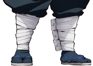
-There’s just something very “moe” about his leg wraps idk, it looks so unfashionable on him, but like, in a good way. I can’t help but find it cute how thick it is. I guess this explains why the jp fandom (and also me) really adores him for his “gap moe” qualities. We got this fairly cool looking design and then suddenly, we get to those leg wraps that are just so awkward, just like he is.
-Jokes aside, it’s an obvious visual to his connection to Tanjiro, given how they have the same leg wraps, and possibly by extension, their connection to Urokodaki. I like to think that Urokodaki gave it to them. (that would be cute)
-Some of my own complaints though, will be that, I kind of wished he had a more interesting sword design. I don’t know if it’s just a case of standard-first-character syndrome, but it’s way too plain for my liking, which is a shame because I love seeing the variety of interesting sword designs of the characters.
-Also I wish the anime kept the other blue highlights to his sleeves and his blue hair tips. (though maybe that would make his blue accents too obvious, BUT STILL) I also wish they kept his mask too.
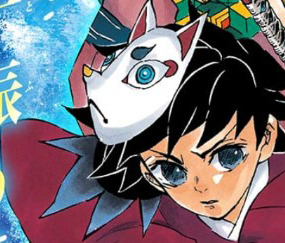
Overall, Giyuu has a simple yet iconic design. It might not be up to everyone’s taste, but it is a good design nonetheless, an 8/10 for me. I kind of wanted to make this post for awhile, because I simple wanna talk about why I really appreciate his design. I’ve seen some who say Giyuu’s design is terrible because its too simple, and while it is true where there are cases when a character is under or over designed, a simple design =/= bad design. With Giyuu, it’s clear that a lot of thought was put into making his character design, and which is why I will always have a soft spot for it.
79 notes
·
View notes
Note
For the ask game, any Devils jersey, but specifically the green and red retro ones, and the Toronto maple leafs!
hey there jay! i don't think we've officially interacted yet, so hello, and thanks for sending this in! let's get on to the jersey opinions.
new jersey devils reverse retros
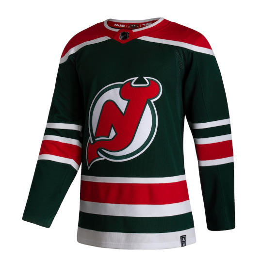
so i did a short review of this one when i did my reverse retro breakdown during the last bunch of "lara's jersey opinions," but i'll do a full one now!
the devils were one of the teams that took the “reverse retro” idea very literally, with a one-to-one color swap of red and green from their original jerseys. now, i’m really not a fan of those original jerseys, but i actually kind of like the reverse retro version. especially after seeing it on the ice, it grew on me.
let’s start with the stripes. the thin-fat-thin striping pattern is super common in hockey jerseys, and as such, it has a very classic hockey aesthetic. in my opinion, you can never go wrong with that kind of striping pattern, especially when it’s used on both the arms and waist stripes. it’s simple, but it always looks good. my one minor gripe with the striping is the other thin stripe on the arms. it’s a remnant from the original jersey set, where the little gap between the two white stripes was red on the original white jerseys, and it stayed red on the original red jerseys, so it’s green on these jerseys. however, it makes the top white stripe look a little out of place. the striping pattern would just be cleaner if that top white stripe wasn’t there.
now, to the shoulder yoke. shoulder yokes on jerseys can be a little more variable, as it really depends on the details and other layout of the jersey, but the one on this devils jersey works pretty well. it balances out the green with another pop of red, and the white stripe going around it makes it look clean. i also think it has something to do with the Adizero jersey template compared to past jersey templates as to why the shoulder yoke looks really good on these jerseys.
i don’t have much to say about the devils logo. it’s a good logo! it’s simple enough that you could probably draw it (though maybe not if you’re jack hughes), but recognizable enough that if you see it, you know exactly what it is (though maybe not if you’re my midwestern friend who asked me where my devils hat is from). it’s a pretty literal logo, a stylized N and J with devil horns and a tail for a team called the New Jersey Devils, but it’s effective. part of me wishes the devils did have some kind of alternate logo, but this jersey wouldn’t have been the place for it even if they did.
ok, i’ll stop stalling now. the most controversial part of this jersey is, of course, the color scheme. before this jersey, green never really had a concrete place in the devils visual identity. it was an accent color in the original devils jerseys that the reverse retro is based off of, and those green accents gave those original jerseys a very aggressive, Christmas-y aesthetic that i was never a fan of. the red jerseys were especially offensive, so i’m glad that it was the whites the devils brought back as third jerseys for a while. when i heard the devils were going green for their reverse retro, i’ll be honest, it made me nervous. i thought it was going to be weird, and just as aggressive as the Christmas tree jerseys. the reverse retro is definitely a little weird, especially because green hasn’t really been part of the devils visual identity since 1992, but it’s not aggressive. somehow, the green and red complimentary color situation looks a lot better when the base is green and the accents are red. it also helps that there’s a fair amount of white on this jersey to balance things out, as well as the fact that the devils logo is primarily red. i know there’s some disagreement on whether the green jersey is good or bad and i definitely understand that, because i’ve waffled back and forth on it myself. but i will definitively say now that the green jersey is, in fact, good. the green base with the red and white accents works.
moving on to the toronto maple leafs’ current home and away set! my analysis of those jerseys is under the cut.
toronto maple leafs home and away set
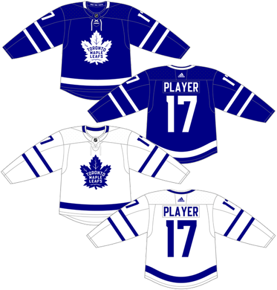
the toronto maple leafs have gone through a lot of jerseys and jersey sets over the years--15, according to hockey by design--and that makes sense, since they are an original six team. despite the many jersey designs, the leafs have overall stayed pretty consistent, maintaining their aesthetic with the same blue and white (minus some occasional st. pats green) and similar striping patterns. their current set of jerseys are easily some of the leafs’ best of the modern era, with a simple yet striking design.
as before, i’ll start with the stripes. the double arm stripes are kind of a hallmark of modern leafs jerseys, with most including them in the design in some form. with two thin stripes of the color opposite the base, they give the illusion of the thin-thick-thin striping pattern i applauded on the devils jerseys. similarly to that classic striping pattern, the two thin stripes are simple yet effective. there’s also the thick stripe at the waist. in general, i’m a fan of waist striping because i like how it breaks up the space of the jersey. even just a strip of color, like what the leafs have here, is good, because i hate it when the bottom of a jersey and the pants are the same color and they run together. while the strip of color is good, i almost wish the leafs kept an element from a previous jersey design, where the waist striping had two thin stripes to mirror the arms. i think that would have been a nicer bit of visual consistency that would have made these jerseys just a touch cleaner.
there’s no shoulder yoke on these jerseys, which is a good thing, so i’ll do a quick mention of some other details. i’m always a sucker for laces on hockey jerseys. they’re a classic aesthetic thing that always brings a touch of vintage styling to a jersey (and they’re why i love hockey-style sweatshirts with laces). less good: the collar. now, Adizero collars are weird, because they’re super thick and have these weird places for colors. i spent a lot of time in nhl20 messing around creating fake jerseys for fake teams, and the collars were always a pain in the ass. however, it is possible to make the collar all the same color! the leafs should have either stuck to making the collar the same color as the jersey base or the opposite color (for contrast), not this weird half-and-half they have going on on, which looks out of place.
and last but not least, a word on the logo! the leafs have had quite a few variations on their logo over the years, with different shapes for the leaf and different patterns with the veins, etc. it might just be that this is the one i know and recognize the most, but i think the current one is easily the best leafs logo. the leaf outline is clean and easily recognizable as a maple leaf, the veins add a little stylistic flair and have some significance to the number of them, and the text is placed nicely.
overall, it’s a clean, effective, modern jersey set for a team with a long history. it’s not my favorite jersey set in the nhl, but it sure as hell isn’t my least favorite.
send me a jersey and i’ll give my opinions!
3 notes
·
View notes
Note
Color-related bc you've done such a good job with your past explanations on the topic in a way that was really helpful, but I had a quick question regarding choosing background color(s) for a character. For a character that has multiple colors, how do you pick a background color that will complement the subject? Just as an example, if you have a chara that's, say, a girl with long red hair, peach skin, and a blue dress, how do you choose a single bg color that will work (cont-)
I think more often I overlay the background into the character/objects rather than the other way around!
This might seem a little weird, but I can’t really find an example that is the opposite. Even if I do a white bg, usually there’s an imaginary lighting that could be put in if I needed to.
So for example in this one:
these two were drawn separate (actually before) the bg. Their colors are kind of… flat? they’re not incorrect (by themselves) but they don’t fit in the picture.

This is the final, post a few gradient maps, level adjustments, and rendering on top. Everything took on a blue green tint to accommodate the bg.
You can do this without photoshop’s abilities! Its just knowing that casting a red light on blue will make it purple, yellow light will make it green, and so on. References of the materials in that light helps.
On ‘flat’ backgrounds, I sometimes switch the color a lot! The last one I did I knew I wanted ‘teal and orange’, not really how. I flip-flopped the color scheme midway through.

So my advice is to
pick the odd color out to complete a color scheme (red hair, blue dress, I’d go yellowish bg for warm, purple for cool)
decide on complimentary colors that are just going to ‘overlay’ the actual colors like the bottom example.
or match the colors of objects and figures to a predetermined ‘light and setting’, even if it’s not a full rendered bg. Everything will harmonize under that like the first example!
Hope it helps! ♥
#art ref#asks#anon#this ask was a journey in self discovery tbh#as i wailed to my gf about realizing i do it backwards#Anonymous#gif cw#long post for ts
621 notes
·
View notes
Note
Got any tips to be a better artist? I know practice is key and all that, but you really do colors well, I was wondering if you have any technique to be better at them.
Okay. I would love to make some visual guides to everything I’m saying here but I’m so wiped from work that if I tried to do that you were never going to get an answer. but feel free to send follow up questions if this doesn’t make sense!
I think a good starting point for colors is picking a relatively limited palette with colors that have a relationship with each other. Here’s a link to some different types of color relationships! The first three (complimentary, analogous, and triadic) are the most personally useful to me.
Understanding complimentary colors and analogous colors (and using them!!!) will get you pretty far, and when in doubt, grab three analogous colors and one of their complimentary colors, and you got yourself a color palette! I also use Triadic colors a whoooole lot.
If I’m drawing Booster Gold and Blue Beetle (as I’m want to do), I’ll usually fit their colors (blue and gold, obviously) into a complimentary palette, a triadic palette, or some combination of the two and analogous colors. I use analogous palettes a lot, but you can’t really do a purely analogous palette (analogous colors are beside each other on the color wheel) with blue & gold since they’re complimentary colors (which are across from each other on the color wheel).
Sometime I use a range of blues and yellows to do a complimentary palette; sometimes I throw in a red or a green, since red/yellow/blue and green/yellow/blue are triadic color schemes; sometimes I pick an analogous scheme based on one of the colors (say, gold/orange/red) and combine it with the complimentary color (blue).
If you color a lot, you’ll eventually have a mental Rolodex of color schemes you know you can work with that you can just grab and modify. Real talk, you can go scroll through my art blog and see how often I’m using some variation of a red/yellow/blue color scheme.
Also make sure your colors have a similar value and undertone. I don’t feel as confident telling you how to do that (it’s something my brain does mostly subconsciously), but, y’know, if you’re using a warm, desaturated red, pair it with a warm, desaturated blue instead of an neon blue. If your dominant color is purple, use a blue that is closer to purple than green on the color wheel. Stuff like that.
Also just study color theory. Read online, watch videos, enroll in a class, whatever you want. I Did Not get color or how to use it (so I just didn’t!) until I studied color theory in my intro to design class my first semester at college. Once I got the basics tho, it was easy to run with.
3 notes
·
View notes
Text
What Paints are Good for Historical Miniatures Beginners
(This article is credited to Jason Weiser. Jason is a long-time wargamer with published works in the Journal of the Society of Twentieth Century Wargamers; Miniature Wargames Magazine; and Wargames, Strategy, and Soldier.)
Having been a wargamer for 37 years and a miniatures (tabletop) gamer for 34 of those, I tend to get one question from a lot of novices - “What’s a good paint brand to use?” The truth is, everyone has their favorite brand, and everyone has their likes and dislikes. Some paints are, confessedly, better than others. At least, in my humble opinion, they are. But you are reading this because you did just want my opinion, right?
I am going to stick to paint brands I am familiar with. And the first thing I am going to tell you is the first rule of paint selection I learned and never forgot in 34 years as a miniature wargamer.
USE ACRYLIC PAINT!
Acrylic paints are just better all around. They mix easier, are cheaper overall, and clean up a lot easier than oil-based paint. Your cleaning solvent for acrylic paint is as close as your sink tap! However, don’t get any on the carpet. No paint is coming out of that easily! Also, another tip: Use flat paints. Gloss does not look good on historical figures, or any sort of wargaming figures for that matter.
So, with that, let’s get started.
Vallejo
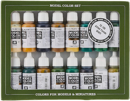
Vallejo is, to me, the best general-purpose hobby paint line out there. Most of the line comes in 17ml eyedropper bottles and are clearly labeled as to the contents. (Pro tip: Put the Vallejo stock number on the cap, as it’s a good way to know what’s in the paint bottle). The paints themselves are of a good quality, but you have to be careful how much you load your brush as they aren’t pre-thinned. You’ll need a palate to use the paints, but that’s a plus as a bottle can go a long way. Many of their Model Colors and Panzer Aces lines correspond to historical colors, which is also a plus, and many tutorials have the Vallejo Model Colors or Panzer Ace stock numbers as default color listings, so matching colors to the cool tutorial for “How to paint your Bolt Action 28mm Hungarians,” for example, is a snap.
Vallejo is my go-to brand, and I really recommend it for the novice painter. They also come in sets with everything you need for a given subject (in fact, Vallejo even markets specific sets for Flames of War and Team Yankee. A big plus for you guys!). However, be careful of the Model Air and Game Air sets, as they’re meant for airbrushes and do not take well to brush painting. That said, if you have an airbrush, they’re a good solid set of colors to start with.
One of the other things I like about Vallejo is it’s a full-service line. They sell primers, spray paints that match their Model Colors and Game Colors (Fantasy) lines, and just everything you might need. As your painting and techniques improve, they have the product for you. You just cannot go wrong with Vallejo.
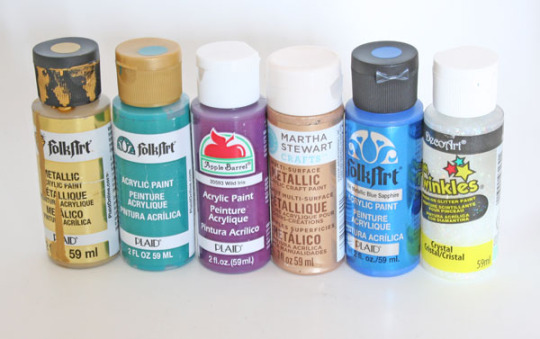
Army Painter
Army Painter is another fine beginner-friendly line. I use a lot of their specialty products (their ready mixed tones and washes and their tools), but their paints are awesome.) They offer a good pigment and also come in the eyedropper bottle, like Vallejo. I am a little bummed they don’t have direct matches (or attempts at matches) to historical colors, but I really like their reds. It’s a really vibrant color that stands out on a figure (Pro Tip: Use grey primer instead of black.
It’s a lot easier to paint red, yellow, or even white against, useful for those yellow Spanish or White Austrian Napoleonic uniforms). You also get a little more for your money at 18ml of paint in a bottle. The paint lines also come in beginner-friendly sets and tend to be a bit cheaper than Vallejo. Get the Warpaints Starter Paint Set pictured below:
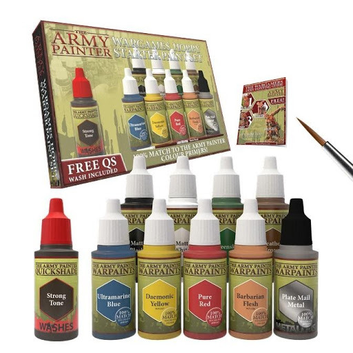
It comes with your ten basic colors, a brush, some shading which will do wonders for the looks of your models, and a very handy instruction manual. If you’re a novice painter who’s never picked up a brush, this is the set to get.
Reaper:
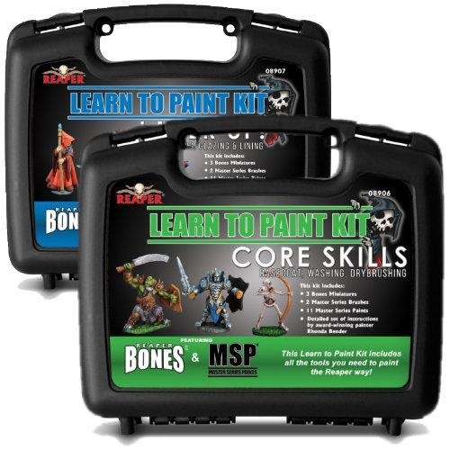
Reaper is also another line of paints where you “can’t go wrong.” I find their flesh tones very high quality and would recommend them over any paint line outside of Foundry (more on that later). Reaper also has paint sets, and it will take a lot of work to match them to historical colors, but it can be done.
Their eyedropper bottles come in a little smaller than either Army Painter or Vallejo, but the paint is also a bit cheaper in the States as Reaper is an American company (Vallejo’s based in Spain and Army Painter is mostly based in the UK). Reaper has its own beginner sets, and while they’re fantasy-oriented, the paints work as well for virtually anything. It also has its own carrying case.
They’re slightly more expensive than the Starter set Army Painter puts out though, but you do get a lot more for your money with a carrying case, 11 bottles of paint, two brushes, and an instruction guide. You also get an empty paint bottle if you want to preserve mixtures, and a few free fantasy minis (gotta practice your historical schemes somewhere, right?). It also has a very useful instruction manual that will give you some useful tips on how to paint.
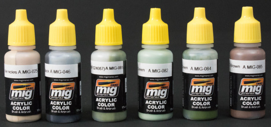
MiG/AK:
While both lines are great and have a lot of specialty options, these really aren’t paints for the beginner model painter. Heck, it took yours truly a while to crack the code on both colors. Are they good colors? Yes. They both have the nice eyedropper bottle setup and are just wonderfully pre-thinned paints that brush on or work well in an airbrush. And they both have a ton of specialty colors that match the historical wargamer’s needs (especially 20th-century conflicts). However, they’re not for beginners. But once your skills increase, give them a try. Trust me, you will love the results (Pro Tip: They look especially good with an Army Painter wash).
Foundry

I rather like Foundry, especially their non-Caucasian flesh tones. Often, their other colors are a bit off. The paint is a bit thicker than Vallejo, but if you thin it out just right, you get some really vibrant results. Moreover, I love their “Triad” system, where they sell the same color in three different shades including a base, a shade, and a highlight. While this means they don’t sell singles, or at least I haven’t seen it, it does mean you get a system that works well for a lot of subjects. They even wrote a book about it by Kevin Dallimore (who’s probably one of the best painters out there).
It’s a weighty tome, but it’s worth it, and it has a wealth of historical subjects and details on “how to paint them.” My biggest complaint about Foundry? The bottles. I really do wish they’d go over to the eyedropper model. I don’t love paint pots, though you do get a lot of paint per bottle (20ml). The cap can become hard to close the more you use the paint, which then leads to dried out paint.
Solutions to the problem include either:
Getting a pipette set, empty eyedropper bottles from Reaper or Army Painter, and transferring the paint,
This idea from Dr. Tabletop.com, where with a bit of work, you remove the cap, snap on the spout and voila! Instant eyedropper bottle.
Citadel
Many people swear by Citadel as an option for beginning painters (especially with their new Contrast system.) More often than not, though, Citadel is as hit or miss. Sometimes, like with some of the Contrast colors, you can get a really nice shade and wash pattern (the reds in the system, for example, would do well for British uniforms from the 17-19th Century, for example), but less vibrant colors, such as greens or greys, don’t do as well in the system. And, you have to prime white with Contrast colors, or at least a light grey. This means, if you miss a spot, it’s going to be rather obvious.
That said, there have been good results with some figures (especially science fiction projects, but that shouldn’t differ from Historical miniatures). The main issue is this, Citadel has two major problems. One, it’s expensive, especially the Contrast paints at $7 a bottle for 18ml. And second? The bottle design. In two words? “It stinks.” The bottle is topsy-turvy and top-heavy that spilling is almost a guarantee. Considering what you pay for Citadel paints, this wasn’t a particularly good move on Citadel’s part. I’d recommend either, again, transferring the paint, or getting Dr. Tabletop’s toppers. Either way is going to save you a lot of aggravation and money.
Also, keep in mind, Citadel is made for fantasy and gothic sci-fi, so the names of the colors are lurid, to say the least. That said, they do have beginner-friendly sets:
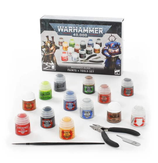
At 45$, it’s pricy, and there are cheaper, better alternatives for someone just getting into the historical side of the miniatures hobby.
Tamiya
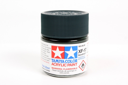
Tamiya is one of the old stalwarts of the model building community and was one of the first Japanese model makers to market kits in the US. They have a really good line of paints in rather large bottles. If you’re not going to go eyedropper, then this is the way you package your paints. Everything just fits together in terms of the bottle, including the price of the 23ml of paint you receive. The paints fill historical needs very well (especially for Cold War and Modern subjects, or WWII Japanese), and they are of good viscosity.
Like Vallejo, they also have a complimentary spray paint line, but you don’t get as much for your money, so unless you need a specific color, it’s not worth the cost. Other than that, I don’t have any complaints about them. I tend not to use them as my go-to, save for certain applications like NATO 3 tone woodland camo for 1980s American and West German Tanks. They play well with other colors as well, but they are bit pricy. I wouldn’t recommend them to someone just starting out in the hobby, but as your first paint line to step up from? You could do a lot worse.
Lifecolor
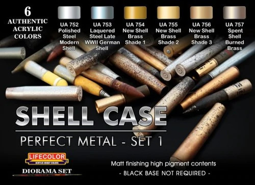
Lifecolor is an Italian company, and I only have one set of theirs. Their bottles aren’t the greatest, but I am happy with the quality of the paint. The choices of colors abound, but I would recommend Tamiya slightly over Lifecolor, even though I think the latter may have the edge in choices of colors and the breadth of historical subjects is as wide as you can imagine. If you want it, Lifecolor probably makes a set to cover it.
Surprisingly, you get 22ml of paint from their bottle, but the bottle is all plastic. The paint is pre-thinned, but slightly thicker than Ammo or MiG, but I still think it’s not really something I’d recommend to the beginner. That said, they’re a great set of paints if you’re ready to make the leap to the advanced level.
Privateer Press (aka P3)

P3 paints are a solid, workmanlike choice for the beginner. They are bright, vibrant colors, that, while flat, they go on solid and have no real sins to speak of. They come either in sets of six or individually. I have a bunch of them, but to be honest, I don’t use them as much as some of my other color ranges.
Despite their perks, P3 paints do suffer from the same problem as the Foundry paint line, where they have subpar bottles. They have 18ml of paint, which is about average for the industry, and I do like their Pig Iron color for a lot of gun barrels and other metallic items. It’s a solid set of colors for a beginner, but I really think you could probably do better with Army Painter or even Foundry.
A Word About Craft Store Paints
You can find them at Michaels, or Walmart, or just about any other craft or big box store out there. They’re cheap (ranging between $1-$1,50 a bottle, whereas your average hobby bottle ranges around $3), acrylic, and you get a lot of paint (the average craft store paint bottle is 59ml). And, you get a squeeze top, which is darn nice to put paint into the palate with. But, as they say, you get what you pay for.
I have come home with paint I was looking forward to using from Michaels only to find out the paint was separated (pigment and fluid have come apart) or it’s become rock hard. That said, I have wargame buddies who only use craft store paints, including one guy who painted some very nice 28mm German WWII Fallschirmjagers (Paratroopers), and I have to say, I can’t tell it was all craft paint. Just know what you’re buying and don’t buy some glossy glitter bomb paint by accident.
At SJR Research, we specialize in creating compelling narratives and provide research to give your game the kind of details that engage your players and create a resonant world they want to spend time in. If you are interested in learning more about our gaming research services, you can browse SJR Research’s service on our site at SJR Research.
2 notes
·
View notes
Last Seen Blogs
mr-payjay
can't a girl payjay in peace
greatalastoraltruist
Untitled
dorothylou
With love,
theregencywriter
The Regency Writer
bailonglee
チャクラ呼吸と電磁波