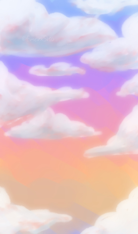
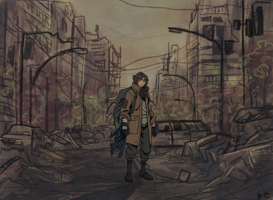
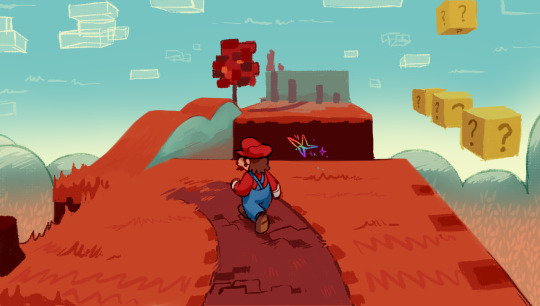
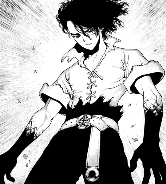
#i was considering doing a colored background and doing an actual sky and all
Text

if you’re a strong female, you don’t need permission.
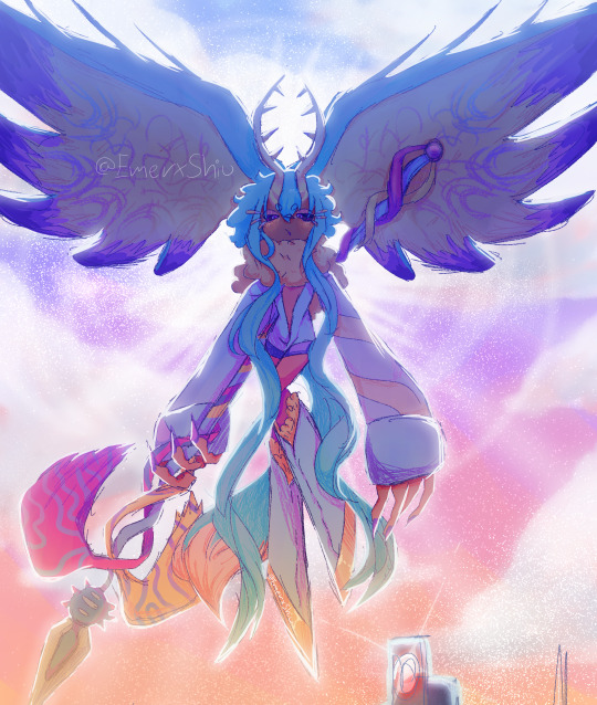
#AHHHH I LOVE HER#i was considering doing a colored background and doing an actual sky and all#but i didn’t really feel like it#plus i do enjoy a good use of negative space…#drawing her is so fun#one thing i don’t like though is her eyelashes#it’s a similar thing with gojos. they just disappear if you’re not careful enough and it’s annoying 😭😭#jjk#jujutsu kaisen#jjk art#jjk fanart#jujutsu kaisen art#jujutsu kaisen fanart#takako uro#uro takako#uro takako fanart#takako uro fanart#digital art#my artwork
173 notes
·
View notes
Text
Me? Wanting to talk about the locker room scene in comparison to the cemetery scene to make a point no one asked about? Raise your hand if you saw this is coming 🙋♀️
Anyway, this is madness written by a gifmaker/video editor who hates coloring the cemetery scene with a burning passion and who spent the better part of the past 2 days trying to make a coloring work for the locker room scene, who also did some asking around with other editors who also seem to be having issues with the scene, and who spends way too much time thinking about Buck and death (someone drown that man, please).
I'm gonna start this off by saying that I don't really believe the cemetery scene will be directly addressed on the show no matter how much I wish it would. But something about the cemetery scene besides the actual content of the scene that keeps me up at night and had me writing multiple fics dealing with it, is the fact that the sky is only blue behind Eddie.
Why is that relevant in any way, shape, or form? The colors when the focus is on Buck or both of them have this almost yellowish tone that the focus on Eddie doesn't have. The sky and colors strongly imply that they added a filter to it in post-production to ensure the colors looked like that, along with the fact that it is a scene that's really weird to color something that happens when they go too hard on the filters *cough* crossover *cough* pilot *cough*. What does that have to do with the locker room? The locker room also has this almost yellowish tone that makes it hell to color. But based on my 2 days of testing different colorings and techniques, it seems to be a hell of a lot worse when the shot has that wall over there where the sun is hitting as a background.
That suggests that they wanted the scenes to have a specific lighting that they achieved later. Considering the way that the tendency of the cemetery is that the colors get muted or weirdly blended together and that the locker room goes YELLOW, I am assuming that they messed with the colors on the cemetery to make the colors look faded, giving it that gloomy feeling, which in turn made the sky almost white, and that they needed that sunlight reflecting on the wall to look that bright, which made the scene look a lot more yellow than it should. Seriously, trying to work this out I legit make it look like Buck is a Simpsons character.
Okay, but Anna, why did you make this particular connection? Well, the word is muted when Buck is talking about starting to date Natalia and then the sun gets brighter when he talks about them breaking up? COME ON. He's calling the relationship boring and the word literally gets brighter as he says it, madness.
Buck talking about dating Natalia -> Buck talking about breaking up with Natalia (please don't judge the gifs I don't want the stress of coloring them combined right now lol)
But that's the same reaction. Dude is smiling going in, he's smiling going out.
And considering Buck's relationship with his own death and the way I strongly believe that what drew him to Natalia was the fact that she didn't think his death was a tragedy and he wasn't ready to deal with the reality of had happened to him yet, to get him to the point where death is boring is progress. Makes me fear for my Buck breakdown wishes, but it is progress for that particular aspect of Buck, considering he has a very intricate relationship with death down to the fact he was born as a hail mary to prevent it. We have multiple near-death experiences, we have him saving the lives of people loves multiple times, the first time we see him he's saving a kid who drowned, his first big conflict is the fact that he's not handling not being able to save someone's life all that well, I can keep going, but you see my point, right?
The arc with Natalia, even though we didn't see the originally planned conclusion since the actress couldn't come back, had this point of Buck looking at what happened to him through the eyes of someone who didn't know him before and was actually excited about that happening, so he could distance himself from what happened and look at it from a "safe" distance. That distance also allowed him to ignore the very important "I need to do this for myself" thing from the coma dream because Buck is terrified of being alone, and that definitely includes the fear of finding out who he is by himself. Buck is bad at being alone, from meaningless sex, to hanging on to Abby too long, to hanging on to Taylor too long, to jumping in with Natalia, the first pretty girl who looked his way, it all makes this part of him very clear (parenthesis because I just had a thought, yes, Buck latches on to Taylor out of fear of being alone triggered by Eddie almost dying, but he thought he could have died himself considering the crane and everything about it and also the way he could very much have been shot at the same time as Eddie, he latched on to Natalia because he did die, he also almost died on his first date with Abby and Abby actually reached out to him when he was feeling all sorts of bad over someone dying, and he is held at gunpoint and watched a death that deeply affected him before he started dating Ali, so we have death as a connection here too, if that makes sense, I might have to come back to this thought later).
But the thing is, when you look at 6a for Buck considering the fact that Buck is passively suicidal, in a very I'm not trying to get killed but I don't think I don't care if I do die way, and how he probably thought he was going to die in a blaze of glory saving someone, and how he actually died in a pretty run-of-the-mill call, by something no one has any control over it, Buck's relationship with what he thought death was and would be for him changed. For one, Buck was not ready for how much it affected everyone around him, he never considered what the grief of losing him would do to the people he loves, but also, Buck's main excuse for his near-death experiences/impulsive behavior that puts him in mortal danger was "but I didn't actually die" like with the blood clots or "I didn't get the worst of it" like with the shooting, I think even the tsunami a little bit with how he felt about losing Chris. But he did actually die, and considering the fact that he went up that ladder when Chimney was ready to go up and Eddie also got hit by the lightning, he also got the worst of it. So he lost his own coping mechanism.
So he arrived at a point where death is boring and he is smiling like an idiot at Eddie welcoming him "back to the world of the living" and that could have fun implications going forward. Because, one, he still hasn't dealt with a big emotion in a healthy way, and two, Bobby is in mortal danger. Considering his reaction to Bobby being dead in his coma world and the fact that he has no coping mechanism left when it comes to death anymore along with his own relationship with water and danger we could have some fun reactions to these types of triggers for him there.
And thinking about the way Oliver keeps talking about Buck learning more about himself and also about Buck leaning on Eddie, someone who had his own journey dealing with multiple layers of his relationship with death, they have a fun space to play with there, with Buck's relationship with death, Eddie's relationship with Buck's death, and everything else that could happen with Eddie fully dealing with Shannon's death, and Buck dealing with anything really, Daniel, his own death, his fear of being alone, all as someone who actually wants to live, who's not just moving because he's alive and has no other alternative.
That's it for today, as always, if you reached this I love you 💜
134 notes
·
View notes
Text


Welcome to AphidClan!
Where a bunch of brightly colorful sparklekitties live in a polluted, dull, depressing land with a hunger for blood that can’t be sated.
~ Resources ~
The AphidClan Code
AphidClan Family Tree
#aphidmoons - The tag for moons/main updates
#aphidasks - The tag for asks and answers from both me and the characters
#aphidlore - the lore tag
#aphidrefs - reference sheets for the characters
And my tag for showcasing other clangen blogs is #other clans
FAQ
Q: Is your clangen modded?
A: Nope! The actual sprites of the characters are normal, but my own creative liberties turn them into sparklecats. That’s why you’ll see Pearlstar with pink and gold and sky blue markings in the pages, but not in his sprite.
Q: Are the background/side characters available for questioning?
A: Yes!! Any and all cats that appear on this blog are available for questions, even if they’re deceased, an Outsider, or a nameless background character only present for a panel or two.
Q: Do I have your permission to create my own clan or characters inspired by Aphidclan/create fanart or animations of your characters/draw your characters as anthros or furry versions of them/etc.? What are your permissions on fan creations?
A: Yes!! You are always free to be inspired by my works, I consider it an honor! Fanart will always be an honor to me, I appreciate it very very much and all fanart will be put under the tag #fanart! Make your own sparkle kitties, make your own sparkle clan, draw Aphid cats as anthros, make whatever you want! Go be creative! The only things I draw the line at is 1. Creating fanmade humanized versions of the Aphidclan cats, and 2. Outright stealing my art or characters and claiming them as yours. If you’re reposting my art I’d prefer the post to always link back to me. The rest I don’t mind, I love the idea of sparking somebody else’s creativity. ^^
81 notes
·
View notes
Text
FORGOTTEN LAND'S SECOND ANNIVERSARY :3
I AM SOOOO BACK
I started this drawing yesterday around afternoon and finished it just a few minutes earlier.
I went with a messier type of drawing instead of more clean like the elfilin one from yesterday, i find it fun doing it like this, mostly cause i dont have to worry about making it perfectly so i dont get as frustrated as normal. Id place this one as my second best digital drawing. im pretty sure i havent posted what i consider my best digital drawing here, tho i do have it in instagram, i might post it here one day, tho these two are way too tied up, i love how this came out, its not exactly like how i imagined it but its really close to it, and also itd say that since i dont tend to play around lighting that much, this was such a joy to draw and i cant help but stare at it a lot, at least until i start hating it because i made quite a lot of errors. i also changed my elfilis gijinka just a tad bit from last time, but its not that big of a difference, mostly.
ofc i had to draw elfilis for forgotten land's anniversary, i tend to deny it in my head but yeah they're my fave of the kirby characters even tho i hate them a bit. I wanted to draw some more doodles, like, elfilis eating cake, kirby car, a bunch of other stuff (not elfilin cuz i already drew him yesterday) but when i tried i couldnt draw anything more, guess this drawing burned me out a lot, huh?
you can definitly tell i spent all the efforts on him cuz if you look a bit closer to the bottom part you'll see its almost barely detailed, but i mean, they're the focus so make sense i guess for me not add that much detail there. um also, maybe because i dunno i had OVER 130 LAYERS jeez no wonder firealpaca was slowing down so much, i need to manage my layers better next time, tho i did do something i keep forgetting, wich is naming them (most of them at least) that was a real life saver
Also, antares (fecto elfilis' spear/cadaceus), as always, was a pain to draw, but this time its probably been draw the most accurate out of every other drawing ive made with it in it, i didnt notice it was like, a little curved when it reached the blade
some close ups since his face is a bit hard to see
silly :3
fun fact! actually, this is technically a redraw, somewhere around between february and march i started a fecto elfilis drawing for the first anniversary, but i couldnt finish it in time, and i never finished it
thats...quite the improvement! (i remember being so proud of it)
also his wings are like that cuz i did not want to draw the pattern, its way too hard, i literally copy pasted it, wait, i was talking about the 2024 version but i looked at the 2023 one and i just noticed it also has the pattern copy pasted, i guess some stuff never changes since i still abuse the ctrl+c ctrl+v to this day
Also i ended up making a huge error there, i was planing to add the phantom spears from orbital pulsar (the attack he does first when you battle them at lab discovera) but theres an innacuracy, when they do the attack, they always close their eyes, i had actually sketched him (well i mean both these drawings are basically the first sketch (2023) or second sketch(2024) with some color, shadows and lighting. i didnt do lineart in the 2024 one cuz i wanted to be a bit like the og i made (too bad i sketched that one with black since the og was sketched with white due to me drawing the bg first)) with his eyes closed but them decided to make them open for a reason i cant remember, maybe i thought itd look nicer? idk
ive had the idea of redrawing this for quite some month now so it was kinda already planned
background cuz i think it came out really pretty
doesnt have the little stars since without elfilis and the structures it looks fucked up. the actual sky in game is more blue, but the clouds have some orange, in the 2023 ver. i made the sky orange, and in the 2024 ver i wanted it more accurate, but i didnt wanna loose the orange sky, so i did a gradient. pretty...
also here's a screenshot i took when i was like halfway trough it, its barely noticeable but i changed his mouth in the final drawing
I really love katfl, like a buncha whole lot, its basically almost my first mainline kirby game. 100% the demo, finished the game in almost one day, i literally play it monthly, like, every month i put the card in my switch, start it up, get morpho sword, and go shred elfilis in lab discovera. i would probably not even be here on tumblr and the kirby fandom if it werent for it. and i love it so much i genuinly cannot express how much i like it and treasure it with words or anything
Thank you for reading my unnecesarily long rambles lol
I hope i'll post tomorrow and dont forget like usual
Jambuhbye!
#art#fanart#kirby#kirby fanart#kirby gijinka#silly#digital art#firealpaca#fecto elfilis#fecto elfilis gijinka#my wife fecto elfilis and his new drip#yep changed them again#fecto elfilis lives in my head rent free 24/7#fecto elfilis fanart#kirby and the forgotten land#katfl#katfl spoilers#katfl second anniversary#kirby and the forgotten land second anniversary#katfl fanart#kirby and the forgotten land fanart#please reach a lot of people i spent way too much effort on this drawing#kirby series#kirby elfilis#kirby of the stars#:3333#:3#digital artist#artists on tumblr#small artist
44 notes
·
View notes
Text
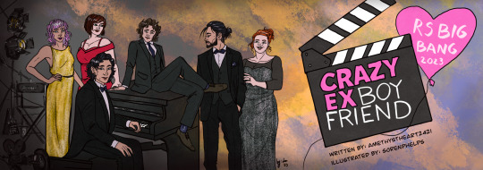
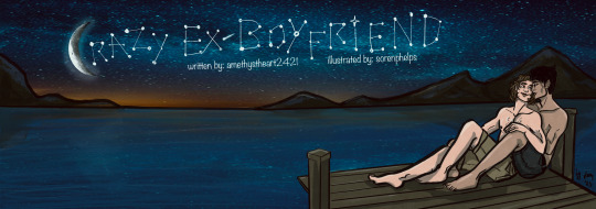

All the artwork I made for the fanfic Crazy Ex-Boyfriend by @amethystheart2421 for this year's @rsbigbang!
It was a wild run, we got paired up quite late due to our original pairs dropping out of the Bang, and even though it was already December and time was running thin, I decided to make this whole deal a way bigger challenge than it supposed to be... So I ended up drawing all 7 fantasy sequences, trying to mimic a different style for all of them, and finishing both versions of the banners I had in mind. I know, I know, but I swear even I wasn't aware that I am such an overachiever either!
Also, I usually like to hide little details as easter eggs on all of my artwork, so naturally this was the case with these too. I'm gonna list them one by one, also share a little story about each piece, sort of like a "directors cut werk", just so we stick to the screenplay motif. The numbers in brackets lists the order in which I drew the pictures.
The banners (1.,9.): I haven't watched Crazy Ex-Girlfriend the show, so I really had no idea about this whole thing, hence my initial idea of re-drawing one of the official promo posters of the show as the banner. But then Nicole shared the first scene with me when we got paired up, and also told me that her original artist wanted to draw the stargazing scene, which I also really liked. I sketched out both versions to see which one would look better, and also to warm up a bit for this version of the characters. (Nicole also shared some faceclaims, so except Sirius' and Lily's design, I tried to stick to her vision as much as I could.) The Netflix poster was considered the final one for quite a while. The stargazing banner was the last piece of artwork I finished, which I also edited to be used as Chapter dividers. I liked the idea so much I actually referenced the starry sky on the other pictures too. On the Netflix banner, Remus' socks and Sirius' suit handkerchief (how do you call those things in English, gahh) both have the starry pattern.
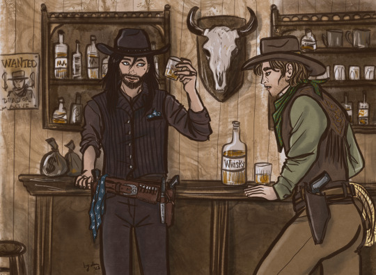
The western (3.): By this time it was decided that I'd do all fantasy sequences in a different art style, but I couldn't really come up with any specific style which could have fit the western vibes, so the characters are drawn in my own usual style, only the colouring is different. I tried to go for a sepia effect, without using a filter, I think I could pull it off well enough. I was considering to draw Sirius as a Native American for this, because I just don't see him as Caucasian in general, and also, Black Dog sounds like a badly translated indigenous name... But I discarded this idea for the sake of "historical accuracy" (and to save time, haha), as I think they wouldn't visit a saloon this way. I added the starry sky pattern to Sirius' handkerchief and... scarf? (I really should learn how certain textil items are called in English...) There is a wanted poster in the background with Voldy. And I swear I didn't mean to draw Remus looking this horny, it just kinda happened by accident! He is sure VERY fascinated by Sirius'... pistol.😜
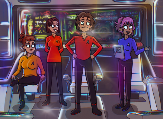
The Star Trek (6.): My original idea was to draw like usual and just add so many lensflares to the picture that it's not visible if I copied another style or not. But in the meantime I started to watch Star Trek: Strange New Worlds with my bf and also found out that there is a new cartoon too, so it was then settled. This style is very different from my own, but it was so much fun! It was weird not to draw every single strand of hair in excruciating detail, actually that was the hardest part, haha! I struggled a bit with the placement of the lensflares too, the first version had too many and too bright, it had a disco vibe rather than a spaceship. I wanted to add easter eggs to the background screen, but I was running out of time, so there's only one light blue star similar on the screen! Also now I know that the uniform colors are not really consistent in Star Trek, and Remus’ might have had to be gold as Captain…🤷🏻♀️
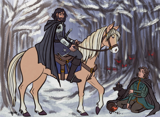
The Disney (2.): This one sparked the first idea in my head after I read all fantasy scenes Nicole kindly shared with me. When I first sketched this, I still had no idea that I will end up drawing for every chapter and the style copying was not settled either. It started with this piece, I had the vision of the wolf chasing scene from Beauty and the Beast, and we were discussing whether it's plausible to collect berries during the winter or not... I've tried to make the final piece look as classic Disney as I can, and since I could pull it off, it was not a question anymore whether I'd try to do this with other styles for the other scenes. Retrospectively, this one was the easiest to make, apparently my usual style is not that far from Disney (I grew up watching those movies, so it's not a surprise), but I had to really focus on drawing the animals, it's been ages since I last drew any! (The trick is to give them eyebrows, and bam, it's Disney style!) Sirius' armour, clothes and sword has the star, and I also designed his own "crest" with the black dog and a star on his shoulder plate. The whole concept of the picture is Sirius' side being very bright coloured, while Remus' with the scary wolves in the background being very dark. This might have worked better if it was not set in the winter, but I wanted to stick to the Beauty and the Beast vision I had.
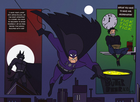
The Comicbook (4.): I was very excited for this one, I really like the looks of the old Batman the animated series, and the way some of his comics are drawn. It's such a unique style, I really like the simple shapes and bold contrasts. Well, it turned out I am very bad at this! I struggled quite a bit trying to capture what I had in mind, but I couldn't even come close to it... So I kinda cheated a bit because I just traced the lineart directly from the reference pictures of Batman comic books I found online. I tried to make Remus less buff, but it looked very weird, so I let him keep his muscular Batman body instead. I drew the wolf mask and the whole Sirius panel, and the coloring went smoothly after I finalized the lineart, even though I only realized that I switched the colour schemes of Remus' superhero outfit when I looked up the quotes for the comic panels, oops. Overall I like how it looks, but I am not that proud of it as I had to "cheat".
The Hobbit (5.): I've probably spent the most time with this one! I actually really like Martin Freeman as an older Remus FC, so I was quite excited to do this piece. My original idea was to mimic John Howe's style, as he is the Tolkien illustrator god, but his level of skill and mine are very very far from each other... and as I struggled a lot with the Batman piece, I felt like going for a smaller challenge. That's why I decided to have a go at Alphonse Mucha's art nouveau style. Turned out it was the worst possible idea! 🤣 The whole point of art nouveau is depicting attractive ladies in an ethereal way... But if you switch the ladies with a fat hobbit, the vibe def won't be the same! The first version just looks so extremely absurd, it's both awful and hilarious. By the time I could fix the pose so it wouldn't look as ridiculous, the final style looked nothing like art nouveau... I still have no idea what style it is now, not my own or any of the ones I tried to capture, that's for sure. I considered adding the star pattern to that tablecloth, but I decided that the lupin flowers in the foreground and the whomping willow-like tree are enough reference for this pic! I like how it turned out in the end tho, I think I could do justice for the watercolor-looking coloring technique, and the end result looks a bit like a fancier version of old children's book illustrations... Which is essentially what The Hobbit is, so it all sorted itself out by the end.
The Anime (7.): I like anime (I'm a little picky about them tho), so it was not a question that I would give this style a try! I am a huge fan of cyberpunk (the genre), so initially wanted to do that, I'm such a slut for Ghost in the Shell and I really like the aesthetics of the Akira posters, but after reading the actual scene, it was not really fitting. So I saved the cyberpunk AU for later, and went for the post-apocalyptic vibe instead. Obviously anime had a great influence on my art style, so similar to the Disney one, it was not that much of a challenge to mimic it. However I'm not that good at drawing backgrounds, and oh boy, I really made myself get over this obstacle with this series of pictures! Also as I was more comfortable with this piece, I actually added the starry sky pattern from the beginning to the scarf/blanket Remus has on this picture!
The Sitcom (8.): The original idea was to copy Hanna Barbera's old family cartoons' style, but as my deadline was very close and after reading the scene I realized that it will have a shitton of characters, I quickly abandoned my original plan. So this one is drawn in my own style, sort of, the designs of the characters are more aligned with Nicole's vision (sans Sirius, Lily, and partly Peter). The hardest part was definitely to figure out how I could fit 10 characters into one picture, let alone sitting in a living room! Also, I had to actually draw the living room too, considering perspective and scaling... Something I am not that good at. In the end the coffee table is maybe a little too big, but I needed that to hide the legs of the characters sitting on the sofa, haha! Also, the sofa is the Millennial Dark Green Velvet Sofa, because I also want to have one and it really emphasizes the general existential dread! (Just kidding.) Also also, I just realized that I have no idea how to eat tacos without making a mess (they are not that popular where I live). I added the starry sky pattern to Sirius' shirt, and gave a Teenage Mutant Ninja Turtles T-shirt to Peter, as he is talking about that in the scene. I wanted to squeeze in further references to the newspaper Remus is holding, but it was too tiny. The star from Knight Sirius' armour is in the background on the bookshelf. Also that globe just makes no sense but I had no better idea how to fill the empty space 😅. Molly is holding a mug with "BEST MOM" written on it, and I intentionally made Marlene's eye colour the same as Remus', who btw should have worn a bathrobe according to the original scene, but it was too late to fix that by the time I realized it. All in all, I am quite satisfied with how it turned out, it has the necessary sitcom vibes. And it is kinda a record for me in terms of number of characters drawn (the most was 12, but that one has no background, so I'd call it a tie!)!! I am very proud of myself for pulling this piece off, it really is the achievement of the year!
TLDR; (I mean really, my rambling is just too long!) I am happy that I was paired up with Nicole, working with her was such a creative process! My absolute favourite thing to do is work on AUs, and she has provided me with the opportunity to do so, I am grateful! It was truly a pleasure to participate in this (even if it's not that clear from all the complaining I just had above, haha)! If you ask me nicely I might show you the cursed first version of the hobbit picture!
#r/s big bang#wolfstar#sirius black#remus lupin#regulus black#james potter#lily evans#nymphadora tonks#molly weasley#peter pettigrew#harry potter#marlene mckinnon#dorcas meadowes#crazy ex girlfriend#lotr au#cowboy au#disney au#star trek au#anime au#sitcom au#batman au#fanart#art by lau#lau draws with a tablet#collaboration#marauders#amethystheart2421
63 notes
·
View notes
Note
so you complained about the lack of proper heart/door-to-world colorization in half the chapters
as far as i can tell the background in world 4 should have green tinge instead of blue
Okay so funny thing but Chapter 4 is one of the Chapters that I consider themed good.
Space is super duper cool and the dark blue mixed with lighter and darker stars it already has is phenomenal. I would not for the world want it changed.
This is more from art experience but green is a colour that likes to be balanced out (most colours do frankly but green is a little special). It's a hue that pops out a lot, so unless its intentional, often than not you'd want to use it controlled amounts. It's easier to stare at blue than green. The green sky would be pretty at first but soon would become very difficult to look at for an extended period of time which is something no one wants. It also helps obstacles and doors stick out. Not to mention space is often associated with dark blue in media.
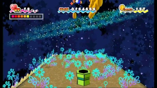

I think what makes up in terms of being Pure Heart themed, to the space part being blue/black, is: your companion, Squirps, and the colour scheme of the Whoa Zone. Squirps assists you most of the journey in space, he's neon green and sticks out in his surroundings, not to mention the floating green squares and alien doors in the moon walking part. The Whoa zone has green on the floor, doors and walls as well as a greenish-blueish tone in the background.
There's plenty enough of green in this chapter. Just the right amount really. Again theming and palette great, level design arguable...
If you're curious which chapters I consider well colour themed its: Chapter 2, Chapter 4, Chapter 7 and Chapter 8.
I've actually redesigned the first part of Chapter 1 at one point [og post here for context], I'm considering finishing it and maybe doing the same to the other ones that I didn't mention above or maybe all.
36 notes
·
View notes
Note
do you have any tips on drawing backgrounds. I struggle with them so much and can’t always make them cohesive with the drawing yk
Oh man, yeah. I do indeed know, all too well U_U Backgrounds are a STRUGGLE
Here are some things I’ve picked up, that have helped make them a little less difficult (feel free to take what you think might be helpful and then scrap the rest!):
1. Map out your Composition, Tones and Colors in a Rough Thumbnail
-I think the main thing that helps me, is planning. If you’re gonna do a background, don’t think of it as an after thought. I find it’s helpful to plan out the background at the same time you’re planning the character pose, rather that just slapping in a background, once the character is already finished. It’s like a little dance, making the environment work to accommodate the character while simultaneously making the character work to accommodate the BG.
-I usually do a small thumbnail and color key before I actually go into the drawing itself
-I like to think of the thumbnail like a little roadmap that I can always refer back to when I’m stuck. It's something that is easy to experiment with and will help me keep the big picture in mind, while working, rather than fussing over all of the small details.
-you can plan how you might want to use light and other elements of the bg to frame important things, or point and lead your eye to the focal point, or divide up the frame.

When I’m working on the actual drawing, I’ll always keep my thumbnail visible off in the corner of my workspace, just as a reminder of where I want to go with the piece, and to keep it available to color pick from, when I want to.
2. Try Sticking to 1 or 2 Dominant Colors and try not to stray too far, unless it’s an intentional accent
I usually choose 1-2 main colors and then paint bucket fill the canvas with those colors as a base, before I even start on the "cleaned up" linework. Then when I start painting, for real, I choose my colors based off how warm or cold they are, compared to the main color(s).
So say, for example, I want the dominating color of the illustration to be red, if I’m coloring an apple (that is naturally red) I would keep it the same hue, but might change the tone or saturation. However, if I’m painting a carrot (that would naturally be orange) I might just shift the hue to be a warmer red, rather than a full blown orange. Conversely, if I wanted to paint a naturally blue sky, I would shift the hue from red to be a bit colder, maybe more of a purple, but not necessarily a true blue.
*sometimes the saturation can mess around with a perceived color as well, (like how a desaturated yellow, will often look green), so I find there’s a lot of trial and error and messing around to be done with color, which I guess is half of the fun :P
(obviously this isn’t the only way to approach color, but I find it helpful for reigning myself in and keeping things a little more cohesive)
3. Add Depth
-Think of your environment as a 3D space with overlapping elements. Consider what your foreground, midground and background elements might be, to give depth to the drawing.
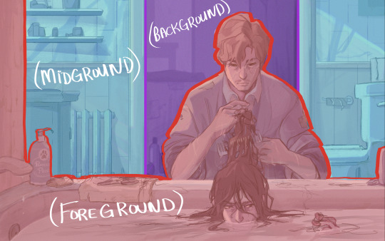
The further away something is, the less details the human eye can make out, and atmosphere will create a sort of hazy look to things that are set far away. So to mimic this effect for things that you want to recede into the distance, you can use less saturated colors, less contrast, do less detail, less line work (maybe even go lineless) and use slightly cooler colors. Maybe even add a little gaussian blur if it looks good. Conversely, for things you want push forward, just do the opposite (higher contrast, higher saturation, heavier line, more detail ect.)
4a. Study and Play with Lighting
I think lighting can be a big factor in helping make a character feel like they fit and belong in their environment. Study how light works and interacts with the world and think about how it might effect every element of your environment. How does it break apart when it’s going through something translucent? Is it going to cast harsh or soft shadows? Are there multiple light sources? Are they different colors? different intensities? Is the light source visible or not? Is it a controlled beam of light, like a laser, or more open, like the sun?
4b. Make use of Reflected Light and Color
So, when light hits an object, that is near another object, some of it’s color can be reflected onto the nearby object, if the angle is right. So for reflected light, I usually add a clipping mask layer to the affected object and add a gradient coming from the first object, using a color that has be color picked from the first object. Then I’ll turn down the opacity to my liking.
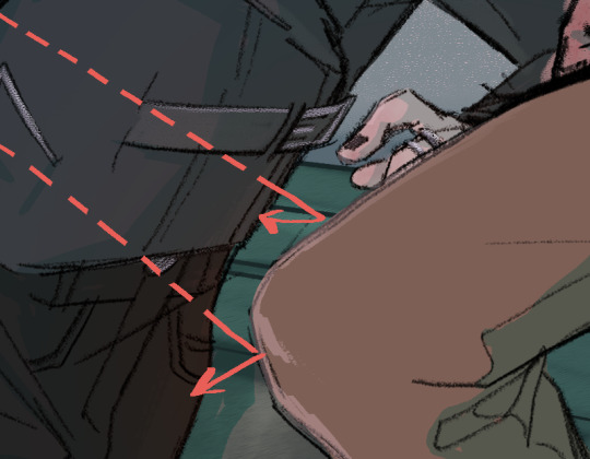

^(Ok, this first example of reflected light is super subtle on Sirius’s jacket, but it’s a little clearer to see the reflected light from the tub reflecting onto Sirius’s face and Remus’s arms, in the second example)
5. Add a Little Bit of *Spice*
If by the end of my coloring, I still want to do some tweaking, these are my general go to’s:
-Edit with filters and/or gradients. If you’re working digitally, play around with blending modes. You can make a new layer, fill it with a color or a gradient, then see what different blending modes and levels of opacities will do to it.
-Color your lines so that the black isn’t so harsh against the other colors in the scene. Sometimes I like to go completely lineless in some areas, if it's an area blown out by light, or is maybe pulling your attention away from the focal point
-You could add a little bit of grain and noise (to do this in photoshop, make a new layer, fill it with a grey colour (or experiment with other colours) then go to filter>noise>add noise>ok and turndown the fill and maybe change the blending mode)
-Adjust the levels, if you’re still not fully satisfied with the contrast, you can adjust the levels (ctrl +L in photoshop)
-Adjust the Color balance if you're not fully satisfied with the saturation and colors (ctrl+ B in photoshop)
Ok, gosh, there’s so much, but I think I’ve rambled on long enough… hope this helps and wasn't too obvious or convoluted!
Good luck!!
16 notes
·
View notes
Text
Chapter 204 Trivia
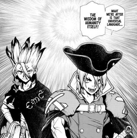
What we thought may be a politics arc may in fact become a brotherly feud…

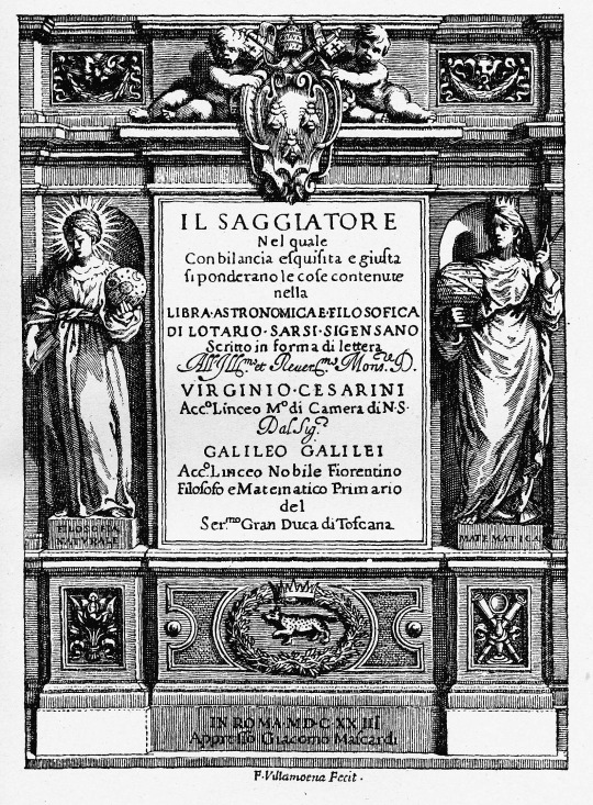
Galileo's quote is taken from his book "The Assayer", considered to be one of the pioneering works of the scientific method. At the time, most science was done by philosophical arguments rather than observation and trying to understand the mathematics behind them.

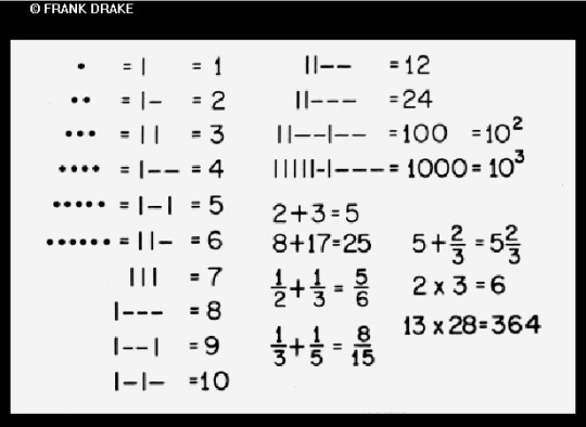
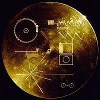
Math is the universal language because the symbols may change, but the meanings/axioms cannot. Because of this, the cover of the Golden Record placed on Voyager 1 (the probe leaving our solar system) has instructions written in math in the hopes some future beings can understand.
Ryusui wasn't wearing two swords last chapter, I wonder where they came from and why he's wearing them now…
(Maybe this is why Sai was running from him haha!)
Mathematical errors have ruined a lot of space missions: the Mariner 1 was destroyed because of a missing hyphen, and the Mars Climate Orbiter was destroyed on landing because of a failure to convert units.
Avoiding these errors was very difficult when it was all done by hand.
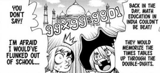
This seems to be at least partially true, however the practice has lessened over the decades. Indian-educated parents and grandparents may remember, but students these days probably only need to learn up to 19x19!
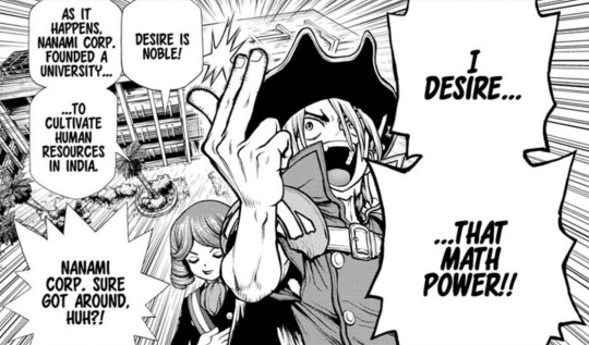
The HR industry in India is incredibly large, and are a very useful resource to have for any business looking to scale up. It's not surprising that the Nanami Corporation set up a university there!
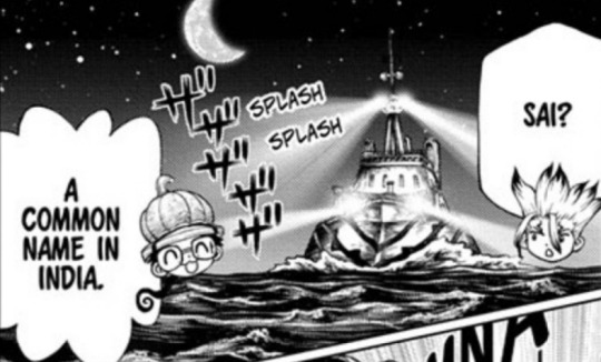
Sai appears to be the 554th most popular name in India and can be used for both genders, but it's generally a male name.
The equations in the background here I haven't identified yet, but the gamma (γ) thrust here may be alluding to the thrust equation used with rocket engines in space. The gamma is the specific heat ratio of the gas.


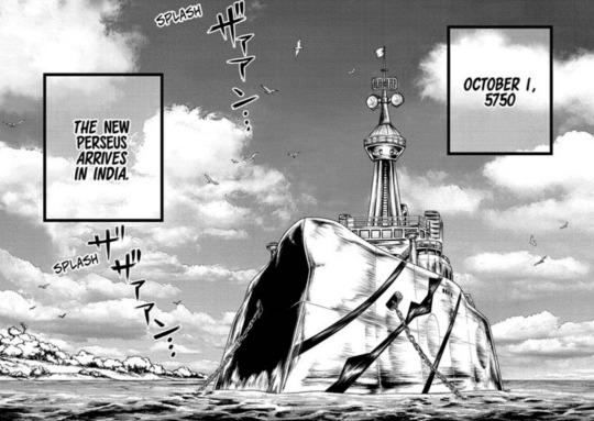
The day is October 1st, so the team likely left Spain sometime between September 15th-20th if it did in fact take them 10 days to travel the distance (with some delays because of the Suez situation).
The food here may be a somewhat generic curry as the sound effect seems to indicate, or it could also be lamb gosht based on the color, region, and spices used.

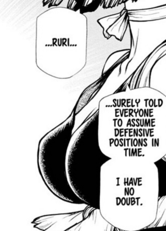
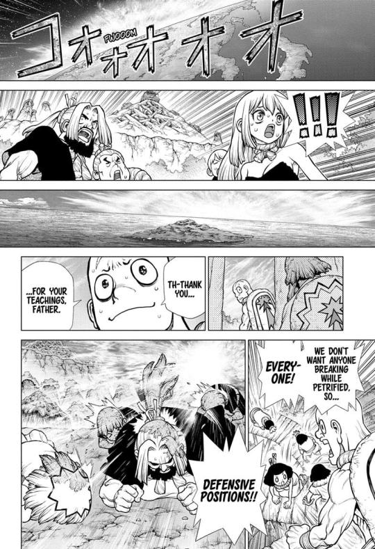
Technically we don't know that Ruri specifically called for the defensive positions, but we do know everyone in Japan is probably in them.
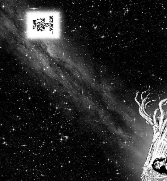
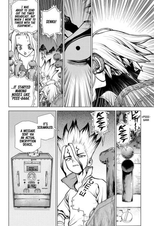
I think this is the same sky image as the one Tsukasa saw in chapter 188, but with a different star pattern.
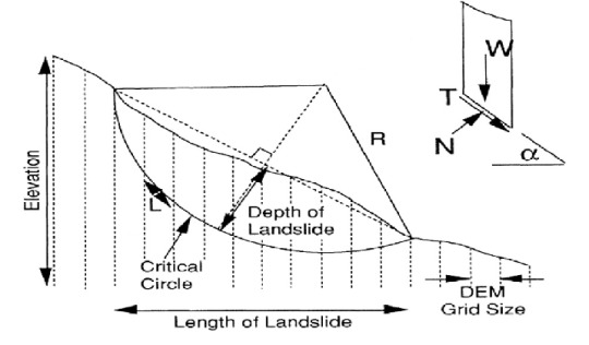
The Fellenius method and what Senku is actually doing here is dividing the slopes into segments and calculating how stable each one is using the properties of the dirt and rock. Putting the segments together should give you how likely a rock slide is. Strata are layers of rock.

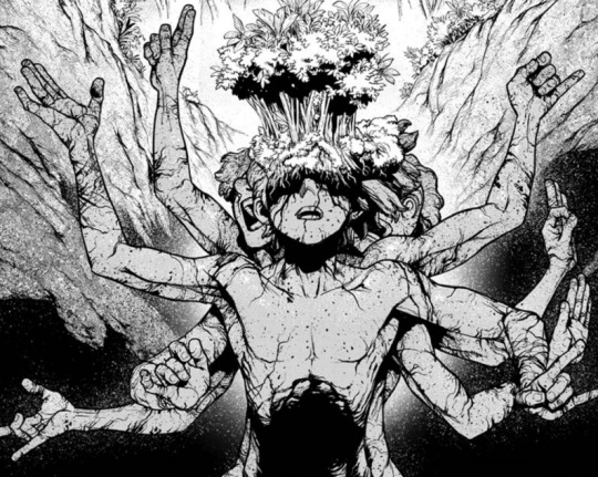
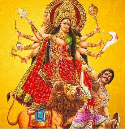
The many-armed pose Sai is found in is a reference to Durga, a major Hindu deity. She is associated with protection, strength, motherhood, destruction and wars.
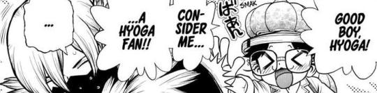
This comment I believe is Chelsea's from the "I'm not a fan" part, with the "baaad" learnt from Chrome's habit.
The meaning of her comment is confusing, but it might be because the last pretty-boy character introduced was a villain (Stanley), however shes also a fan of Hyoga…?

Sai's outfit is very simple and rather lacking compared to Ryusui's, however they share elements such as the collar type and addition of a belt.
The belt buckle is very interesting, it doesn't follow Ryusui's nor Nanami Corp.'s branding and looks like a C+.
My guesses for the meaning:
-C+, the programming language, based off the fact he was petrified on his laptop presumably.
-C, the Roman numeral, indicating 100+ because of the million-times brainpower comment (million in Japanese is 百万, 百=100).
-C, from E=mc^2, for light speed.
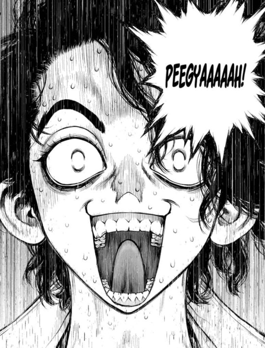
Sai's odd yell ("peegyaaaah!") may be a computer joke, as the sound effect "ピ" (pi) tends to be used for computer beeps, like pressing a button.
A similar sound has been used in the past for Xeno's encryption device.
Sai's character could go a lot of directions since he's unlikely to be one of the traditional nerds they described, nor one like Joel since Joel exists. What Ryusui did to scare off his older brother though, I'm very curious about…
#trivia#dr stone#chapters#sai nanami#204#bit of me-trivia here: i got spoiled from the leaks from someone updating ryusui's wiki page to include sai and i assumed it was a joke#until i read the chapter and was like “ah.”#i still wish there were more hints to sai's existence before he suddenly appeared out of nowhere
23 notes
·
View notes
Text
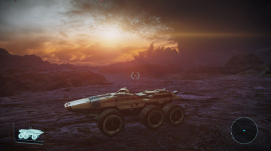
Rating Mass Effect 1 Planets (A Tourist's Guide)
Are they boring? Yeah, kind of. Did I get tired of them really fast during my first playthrough? Yeah, kind of. After 860 hours in the game, am I now spending hours just driving around the boring planets in the Mako, absorbing the vibes, exploring the desolate wasteland, and taking nice screenshots? Perhaps.
Allow me to take you on an autism-fueled guided tour of the galaxy and recommend some wonderful travel destinations for the next time you want to take a relaxing vacation in the mountains. (Because it's always fucking mountains.)
___________
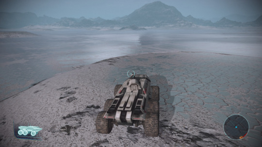
Tuntua: 10/10
I genuinely love Tuntua. This is the planet that I just drove around on for fun during my first playthrough. There's just something about driving over the salt flats and seeing the landscape around you sparkle that fills me with joy. I love the weird inexplicable pyramids. I love how snowy it looks, even if it isn't actually cold. I appreciate a good human-friendly temperature, as I'm sure most tourists will, but I kind of wish it was colder because I want to go ice skating here so, so bad. I can skate pretty fast but I am not good at turning or stopping, which is just what this landscape was made for, baby! I am going to set a new land speed record on these sparkly salt flats in this stupid wonderful brick of a tank.
___________

Asteroid X57: 8/10
I'm kind of torn on this one because I'm not a huge fan of how grey most of the place is, but on the other hand, yeah, that's a solid asteroid. You get what you pay for. Something about the atmosphere (or rather lack of), the looming planet in the background, the multitude of structures in relatively close proximity, make it feel more claustrophobic yet exposed than the other locations you can visit. The northernmost part of the map offers a truly breathtaking view of Terra Nova. Vacation-wise, I think you have two main options. You can lie in the dust and stare up at the sky and ponder your mortality and how small you are in the grand scheme of the universe for as long as your oxygen supply will allow, or you can explore a variety of abandoned structures if that's more your cup of tea. Why are they abandoned? Not relevant to your vacation! It's not trespassing if the owners are dead! ...I think.
___________
Rayingri: 7.5/10
While it seems pretty boring upon first inspection, I think it deserves a pretty high score anyway.
Some of the points are for fascinating rock formations. You've got these extremely steep, strangely pillar-like mountains, plateaus, and cliffs; the terrain is a lot more interesting than most other planets. Maybe not everyone's cup of tea for relaxation, especially considering the earthquakes and all, but I'd love to visit Rayingri with a geologist and just hear them talk about it. How old are these mountains? I wonder if they're really young and their formation was spurred by the tectonic disturbances caused by the looming planetoid that's about to crash into it? Look I dunno how this works, my degree is in astrophysics not geology.
But on the topic of the planetoid... The real draw here, I think, is impermanence. This planet will be obliterated by another planet within a few hundred years. A blink of an eye, on a galactic scale. You might not have the most fun here, but it's a cool place to visit just to say you have- especially if you're a krogan or asari and will live long enough to see it destroyed. There's something profound about that, I think, even if the planet itself is rather boring. Rayingri: experience impending doom today!
Also, my sister wants me to add that orange is a good color. So, bonus half point for good color.
___________

Antibaar: 10/10
I'm gonna be upfront: this place is snowy and cold as balls. If you don't like your vacation spot snowy and cold as balls, you should probably vacation elsewhere. However, I'm a huge fan of snowy wastelands (doing research in Antarctica is at the top of my bucket list), so if you are like me and have a rapturous enjoyment of snow and winter sports, you'll be pleased to learn that Antibaar is just warm enough to enjoy the great outdoors. Bring your sleds, your skis, your skates, we are HAVING A SNOWBALL FIGHT UNDER THE MOST BEAUTIFUL SKY IN THE GAME. Don't let the haters' talk of "low temperatures, high speed surface winds, and low visibility" stop you from having a jolly good time. High speed winds just means your sled will go faster.
___________

Casban: 3/10
I'm going to be real with you: unless your vacation goal is to isolate yourself like a monk and wreak havoc upon future generations of algae, any experience you can have on Casban, you can experience better on Earth, with the added bonus of vacationing on Earth not being illegal. Don't get me wrong, it's a stunning planet- it's just that I don't particularly enjoy sitting in the lush grass, watching a beautiful sunset, and thinking about how nice it would be if the air was breathable and I could have a picnic here. Not that I've ever done that, of course. That would be illegal.
However, if you're a rogue ecologist with no moral qualms about disturbing a delicate ecosystem, this would probably be a really cool place to hang out and do some illegal rogue ecologist research. I won't stop you, I'm not a cop.
___________

Maji: 4/10
Maji is, I think, mostly just a place to stop for a cool selfie. The sky is beautiful, but I mean, there's really only so long you can stare into the suns before you either get bored or sustain eye damage- and if you do want to look at the binary, you'll probably get a better view from space anyway. Given all this, I'd rate the planet a 3/10; however, I'm tacking on an extra point for excitement. Terminus pirates sometimes dump people here and make them fight to the death to be rescued, so if you enjoy blood sports, this may just be the perfect vacation spot for you.
___________
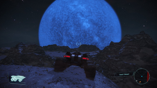
Solcrum: 10/10
If you want to feel like you're back in the early days of human space travel, when everything was new and alien and deadly, when we thought we were alone in the galaxy, when other planets were dreary and uninhabitable yet fascinating wastelands- Solcrum might be just the place for you. The roiling behemoth of a star looming over the horizon like some kind of eye and casting eerie blue light over a fragmented barren landscape... Solcrum is another good place to feel small. With the mass relays making travel across the galaxy near-instantaneous, it can be easy to forget that most of the Milk Way is vast, unexplored, empty, and impersonally hostile to life. Solcrum is a humbling reminder of that reality. You're going to want to bring your SPF 3000 sunscreen and a lot of cold water, because this moon sits at a balmy 351 °C. It isn't an easy vacation spot- but then, you're not vacationing to Solcrum because it's easy.
___________

Agebinium: 9/10
This was actually the last planet I visited, but it felt right to place it here, as the renegade to Solcrum's paragon. Blue giant, red giant. I love a planet with some mood lighting, and the mood here is a little bit evil in a sexy way. I'm into it. I'm putting it a point below Solcrum because Solcrum just has this memorable eerie dark vibe that Agebinium doesn't quite replicate, but in terms of atmosphere, it's up there. It's a bit colder, a bit flatter and easier to drive around, and kind of reminds me of a forlorn desert. An evil desert. In a good way. It's not really a place you go to do things as much as a place you go to be there, you know? Like the woods or something. I don't really go into the woods to do things, I go into the woods to be in the woods. Look, something about the vibe here just makes me want to be evil and sexy while doing it. I don't need to explain myself to you.
___________
Edolus: 1/10
Honestly, there's just not enough on Edolus to justify the risk of visiting. As you can see above, meteor impacts are disturbingly frequent, and I don't know if just another windy desert is worth the risk of being instantly snuffed from existence by a loose boulder. On the bright side, they might name the crater after you.
___________
Sharjila: 4/10
To start with the positives: Sharjila is one of a handful of explorable worlds with higher animal life, and the only visitable world we know of that supports silicon-based life! Sick! And I can guess what you're thinking; wow, silicon-based life sounds cool! Would love to see some someday! Unfortunately, the silicon animals are elusive, and I've never been able to glimpse them for myself. Even if you did come across wildlife, you probably won't be able to leave your vehicle for a closer look, as the high atmospheric pressure is deadly to everyone who isn't a volus.
The main drawback to this world, however: it's full of ammonia and sulfur. Assuming you can get your hands on the equipment necessary for a visit, your stuff is going to smell like total ass for weeks.
___________

Eletania: 9/10
Animal life, lush meadows, beautiful landscapes, a delicate ring system AND a moon, stunning skies- Eletania has it all. Which is unfortunate, because it wants to kill you so bad. It would be an easy 10/10 if the local microscopic critters would just chill the fuck out, but NO, I have to sit in my tank and gaze wistfully at the beautiful scenery and think about how much I want to frolic out there.
Look at that view. Don't you want to take a hike here? Don't you want to climb to the top of one of those mountains and have a romantic starlit picnic under the rings? Don't you want to just roll around in the grass for a bit? Imagine playing fetch with your dog here. It would be nice, right? Well you CAN'T, at least not for very long, because then you and your dog would both be DEAD. You gotta stay in your car and play safari while you watch the pyjaks roam around aimlessly in your place. Undignified. Why do THEY get to be free and I, the clearly superior ape, have to sit in the Mako like I'm in time-out?!-- Anyway, it's a nice planet.
___________

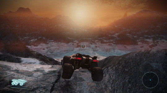
Mavigon: 7/10
"Let me guess, you like the-" YEAH I LIKE THE FROZEN WASTELAND PLANET!!! AND IF YOU DON'T LIKE IT MAKE YOUR OWN POST!
Some points taken off for having less general whimsy than Tuntua and Antibaar, and for the fact that the great outdoors cannot be enjoyed by virtue of the planet being negative 8 billion degrees. But like. I wanna look outside the window and see that howling storm while I sit nice and cozy by a fireplace, bundled up in a sweater and a blanket, drinking hot chamomile tea. Either that, or I want to sit in my tank and watch the snow and listen to melancholy music. NOT sad music by the way. It NEEDS to be melancholy. This is a planet that will give you seasonal depression.
My favorite part is just at the edge of the map though (see above screenshot), where the mountains disappear completely and give way to a flat plain that stretches out as far as the eye can see. Makes me wonder if the whole area is covered by an ice sheet and the mountains we see are just the very tips of a massive mountain range buried beneath kilometers of ammonia ice. Cool and spooky. I think if I had to pick a planet to die on, this one would be up there. Very atmospheric.
___________
Trebin: 0/10
I wish I had something nice to say about Trebin. I really don't. I don't have anything all that terrible to say about it either- which is kind of worse. This is a planet defined by what it lacks. Water. Life. Redeeming qualities. There are more dangerous places you can visit, but at least danger is its own kind of excitement. Trebin is just... eh.
You may be wondering why it is that I praise some planets for being empty and desolate, while condemning others. This is based purely off the vibes that I can objectively sense with my giant brain. I hope this answers your questions.
___________

Klensal: 8/10
I was going to give this one a 7/10 like Mavigon until I realized the entire map seems to be covered distinctly with glaciers, rather than snow. There's ripples where you can see the ice has been flowing, and valley glaciers flowing between the mountain peaks. I helped out with a little bit of glaciology research in undergrad and this tiny aspect of a planet sparked joy for me ok? The way the ice flows just feels so natural! Maybe it's on Antibaar too and I was too distracted by the beautiful sky to notice? But the other ice worlds I've seen so far are kinda just. White and snowy. But on Klensal the surface is tinted blue and looks almost iridescent. The whole landscape is awash with pastel blues and purples and greens as you drive, it looks more like blue glacial ice rather than a thin layer of snow over rocks. There's just a bunch of teeny tiny details that come together to make a subtly awesome planet.
___________
Presop: 1/10
So y'know how I mentioned Solcrum feeling like the early days of space travel? This is like that but without the glamor. The fact that you can actually see the stars and that it reminds me of Luna gives it a marginal point over Trebin, but there's just no tourist attractions here. If you're stopping at Presop, it's gonna be less for tourism and more like stopping at a gas station to use the bathroom on a long road trip.
___________
Amaranthine: 1/10
So... Amaranthine is not a particularly fun place to visit. However, my main gripe with this "tourist destination" is that it is advertised as purple. "Under the dim light of the red dwarf Fortuna, the surface of this world is lit in rich twilight blues and purples even at midday"- is what the brochure said. It was named after this supposed purple-ness. Amaranthine is supposed to be a purplish-red color, right?
Now look at my photo. I know that lighting can sometimes look different in photos vs real life, and you may be tricked into thinking the same thing I did, that surely it must look better in person. It does not. Allow me to personally assure you that this thing is blue and gray. Blue and gray are fine colors, but the important point here is that they are not reddish-purple. Needless to say, I was a little disappointed when I landed down here. Surely we could've saved a pretty name like that for a purpler planet? I'm actually trying to get in contact with the International Astronomical Union, see if I can propose a name change to something more appropriate. Cobalt? Indigo? Sapphire? Iris?
However, I'm going to give it a single point for a rather befuddling atmosphere. For some reason it reminds me of how alien planets in Star Trek TOS just looked like a bunch of fake rocks with an unnaturally colored sky in the background? Good planet to dissociate on.
___________

Xawin: 3/10
I feel like I'm betraying some personal principle by saying this, but... I'm getting a little tired of snowy wastelands. I forgot how many there are. How many planets. I have 10 more to go. I should've counted them before I started tbh. I'm running out of unique ways to get excited about the cold.
Xawin. It's cold and snowy. Not in an unrestrained winter fun way, but in a way that kills you. You want an average surface temperature of 140 Kelvin? We got it. You want ice storms? We got it. And that's about it. This world just makes me think about how Antarctic researchers supposedly get so bored that they just fuck all the time. If I were a mercenary hanging out on this rock, I'd probably do the same, and I'm asexual.
+10 points for snowiness. -7 points for being boring.
___________

Ontarom: 10/10
FINALLY A FUCKING PLANET I CAN HAVE A PICNIC ON!!!! We got everything we need. Breathable atmosphere. Livable temperature. Soft grass-equivalent. Docile space cows that you can pet, or that can provide a nice cow steak if you forgot to bring picnic food. Space beetles big enough to ride on, not that I condone or recommend it.
It's not all sunshine and rainbows- in fact it is very stormy almost all the time- but joke's on you, I'm a slut for a good thunderstorm. The terrain is shit. Getting up to the plateaus is quite a hike. It's hot as balls. But I can have a picnic. I wanna take my girlfriend on a date here so bad.
My only concern is that I seem to have lost all my credits?
___________

Chasca: 8/10
Chasca is basically Ontarom minus the beetles. 30C is a bit hot for my taste, but compared to the other planets we've seen so far, it's extremely comfortable for humans. There's some really cool pyramids for any archaeology enthusiasts!
The terrain is a bit rougher than Ontarom, perhaps a better hiking destination than a picnic one, which is great because I LOVE a good hike. There's these valleys that are basically just perfect paths through the landscape, and if you're lucky you might run into some space cows here. I wonder how aliens feel about the human habit of naming everything 'Space _'? I mean, space cows, space beetles, space hamsters... come on guys, we're better than this...
___________

Nodacrux: 4/10
This is just Chasca but it kills you. Chasca is right there. It's right next door. Just go to Chasca.
___________
Altahe: 8/10
YEAAAAA!! Look at this place. It feels like an evil wizard should live here. Or a dragon. Or a space vampire. This feels like the setting of a sci-fi horror movie. Every aspect of this planet LOOMS. Like what ARE those mountains? They look more like hydrothermal vents than mountains.
The fact that it's a double planet is incredibly cool. I did a bit of lazy digging (which is frustrating when most of the 'literature' on the subject seems to be one admittedly cool-sounding sci-fi book from 1982 (Rocheworld by Robert Forward) and a few reddit posts), and it seems like a system of two planets orbiting so close that they share an atmosphere without breaking apart falls under the umbrella of 'sort of kind of barely physically possible maybe?' Like theoretically it checks out, it sounds possible for there to be a window where the tidal forces are enough to rip the atmospheres away before the actual rocky parts fall apart, but how narrow is that window? Sadly I don't know, and I'm not quiiiite confident enough in my physics knowledge to do that kind of math, and it's going to bother me for the next 2 weeks to 12 years of my life.
So if either spooky landscapes or witnessing the laws of physics doing something really weird sounds like your kind of thing, this planet might be up your alley.
___________
Nepmos: 6/10
Is it safe? No. Is it beautiful? For the most part, not really. If you've ever looked at an active volcano and thought, 'wow, I wish I was there!', Nepmos might be the place for you. (The fact that I have thought that is why it scores as high as it does.)
The sky is absolutely stunning. Cool volcanic rock, you can see the flow of lava and some places where you can see the rock is only a thin layer with magma flowing just beneath the surface. Explore at your own risk; assuming you don't lose a limb to stepping in some rock soup, your friends will think you're either an idiot or a total badass.
___________

Binthu: 0/10
I'll just save myself the trouble and quote the travel brochure here: "Data about the world is surprisingly brief and generic, painting a picture of an unpleasant and uninteresting place." Sadly for this vomit-colored world, we are after pleasant and/or interesting.
___________
Nepheron: 9/10
I forgot this one existed, probably because I usually only come across it relatively late into a playthrough, which is a damn shame because it's really cool. The mountains sparkle. Bitch the mountains sparkle! And there's salt flats! It's like Tuntua but with cooler mountains and a complimentary color scheme, which I'm a big fan of. The only thing separating Nepheron and Tuntua by a point is personal preference, honestly- I like the brighter atmosphere of Tuntua- and the fact that it's a bit difficult to drive around, with much less opportunity to enjoy setting land speed records on salt flats. The travel brochures weren't kidding about geological beauty though. If I had a geologist with me to talk about the cool mountain ranges (and they are quite cool- most planets seem to have hills or disconnected mountains, but the landscape here is very much mountain ranges) I would probably have a really fun time here.
___________
Aaaand that's it ladies and gentlemen. This took me like? 4 days? Ish? I had to do Noveria, Feros, and some of the Cerberus side quests in order to unlock all the planets (except Chohe or Nonuel, the ones you get once you get a certain paragon/renegade score, I'm just too lazy), and speedrunning the main missions to get to the boring side quest planets was certainly a unique experience. Not one I'd recommend. I DIDN'T EVEN TALK TO GARRUS. It was weird. But fun! The apocalypse can wait. We were busy sightseeing, bitch!
#mass effect#this is so fucking stupid literally why did i do this#i had fun though! i think. yes.#posts that make me want to grab me by the collar look me in the eyes and ask “but... why”#officer the autism made me do it#straka's shitposts
14 notes
·
View notes
Text
Okay, so Ford and Stan's dreamscapes probably change when they start sailing (or after they've been sailing a while). This is sort of a headcanon for how exactly I think they change.
(Should probably note: the wheat field and stuff definitely have symbolism, but I didn't look extensively into anything like that when I made this. I was more interested in stuff like the swings and broken shack and what that all means...stuff you can figure out without having to google anything.)
Anyway, the actual headcanon stuff:
Stan's dreamscape is originally shown to be the shack, all messed up and hanging partly over an abyss. It's greyscale and has a sort of tv-static thing going on. There's an 8 ball moon in the sky.
I like to think that the forest changes to be a dock or something. Instead of the broken shack, you've got the Stan O' War II. Definitely not pristine or anything, but also not falling apart at the seams. The Stan O' War II isn't in danger of falling into the abyss and being lost forever. It's something that can be used to traverse it probably.
It's still got a monochromatic, tv-static thing going on, but there's a slight sort of color filter over everything now. Blue, red, some other color? I'm not sure. Red is more stan's color, but (especially considering weirdmaggedon) it doesn't tend to be associated with good things. Maybe just a warm color in general.
The moon is now a sun. It's to match Ford, among other things. You'll see what I mean in a second.
Oh, also the swings are still there and they've been fixed up :)
Ford's dreamscape is a seemingly endless field of wheat. You've got a massive (emphasizing that its bigger than it is in reality because woah isn't that interesting) broken portal looming ominously in the distance, plus swings and the first Stan O' War. The atmosphere has dirt or smoke in it. You can tell because the sun in the background is tinted reddish orange.
(Bonus: the field also has an image of bill burned into it. Considering how dreamscapes work, it makes me wonder if that had any effect on Ford's actual mind.)
Anyway- all that grime in the air probably clears up at least a little bit. The sun looks pretty harsh in Ford's original dreamscape, so it probably isn't as horribly blistering as before, if it's even still there. Maybe the sky changes.
Breaking my rule here- a starry night sky can represent a revelation and be "an expression of pure joy". Of course, it wouldn't be "pure joy" in this case, but he's definitely a lot happier than he was before. The revelation could be that he has a family that maybe (definitely) cares about him and he's not alone anymore.
Tiny bits of wheat are starting to regrow where bill decided to just. Burn a wonky crop circle into it.
The wheat field is still there, but it's not endless like before. It's more of a really big forest clearing, with trees surrounding it (I also broke my rule for this one- forests represent endurance, resilience, and hope). You got some nice green in there now.
Portal's still there, it's probably never gonna leave. But it's not hovering terrifyingly in the background anymore, it's more broken down than before. Probably looks like those pictures of abandoned buildings and such being reclaimed by nature.
Swings are still there. The Stan O' War is replaced by the Stan O' War II.
Those are all my thoughts (I'll be honest. A lot more than I was expecting to write). If you also have thoughts, I'd love to hear them (not pressuring of course, don't do anything you don't wanna do. I just like discussion, and this seems like something that could be real fun to talk about).
#i wasnt planning on tagging them but this uh. turned out to be a lot more than i originally intended.#ford pines#stan pines#the full first name tags always seem to be where the deep analysis stuff goes so i guess this belongs in those tags too#stanford pines#stanley pines#all the writing is stans dreamscape is in code. is that an 'oh you cant read in dreams' thing?#is that a dreamscape in general thing?#is that stan specifically. does he just. dream in code.#has he been staring at the journals too long (yes) and now his brain is filled with codes?
31 notes
·
View notes
Note
Random question but do you have a fav anime/manga art style? Or a least fav?
Keep in mind idk art terms (I only recently got into sketching and watercolor and idk WHAT the fuck I'm doing lol)
So I really love the shading in older stuff like Cowboy Bebop and that era of anime. I can't describe it but the muted color palette and way backgrounds were done back then especially make my eyes happy.
Also speaking of more muted subtle color palettes, I like Naoki Urasawa's art style and I love the anime adaptation of Monster. I also like Pluto but the fire effects look so fucking stupid, I get the effects are meant to clash with the 2D style but I hate it so much, it looks like someone making a YTP and using Adobe Premiere for the first time and it almost ruined the anime for me. All the tension in a scene crumbles when I see those stupid CG effects. But Monster is so pretty to me. I also appreciate Urasawa giving his women actual noses and like. Personalities. Eva Heinemann is one of my favorite female characters in anything, and it helps that she's a bitchy trainwreck who flips the gender dynamics of mysteries by giving HER *SPOILERS* a murdered significant other that fuels HER story as opposed to a women fueling a male character's manpain.

I like the weird wonky art style of Mob Psycho 100 and Chainsaw man, where the wonkiness kind of works to its advantage and can convey expressions just by being drawn Like That. It isn't bad but there's something about the weird expressions in CSM especially that kill me when something funny is happening.
Mob Psycho's anime and the first season of OPM are beautifully animated and MP100 perfectly adapts the original manga style. It keeps the spirit of the original panels but also adds so much stylization and all of the action sequences are gorgeous.
I also like the weird/wonky style of FKMT'S comics like Kaiji and Middle Manager Tonegawa, and the anime adaptations are also examples of great adaptation imo.
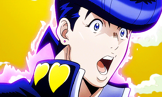
Sometimes I'm annoyed by the dehydrated look that JJBA has in the later parts, especially around the arms, but Araki's colored panels are so gorgeous to me. My favorite parts are 4 and 6 and I'm not in love with the manga style he had for faces in Part 4, but the anime looks perfect to me. Look at this boy. His face is perfect.
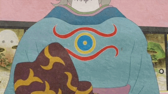
And yes this includes the piss-yellow sky because I like the color palette of the DiU anime a LOT. Since a lot of animators work on the Jojo anime, characters can look really different between episodes and even between scenes, but I love the way Jolyne looks in almost all of Part 6 when she has a fuller face. And the color palette of Stone Ocean's anime took a bit for me to get used to since the colored manga has a vastly different shade of green for her, but I really like Yellow-green Jolyne and how she stands out while complementing FF and Hermes's green shades.

You can tell by this list so far that I usually like wacky bullshit and artists that just do whatever they want. As far as pure lovemaking for the eyes, I adore shit like Mononoke where texture is king and every shot is pure ecstasy.
I also love Berserk's art style and I'm lowkey amazed Miura's assistants are able to replicate it so well considering his insane attention to detail. Even when displaying grotesque and sometimes misogynistic horrors, every spread of this series is a masterpiece. I also can't believe that he was able to give a skullfaced character so much emotion and expression (subtle, but still there) despite the fact that because he is a fucking skeleton, Skull-King's face can't actually change. This page makes me choke up just looking at it. I choked up while searching for it on Google for fucks sake
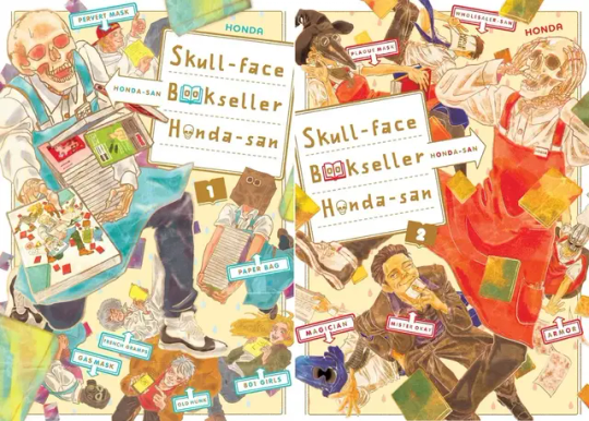
Speaking of skeleton characters I love, I like the flatter look of Skull-Faced Bookseller Honda-san, one of my favorite manga of all time! The way the mangaka personifies all his employees is just so cute looking to me, and I love the color palette of the covers and the anime.
And while I give Ohba's writing a metric ton of shit, Obata's art is so pretty. When I think of the trinity of "Mangaka who draw peak fashion", it's Araki, Obata, and Tite Kubo. If I was not a suburban white woman, I would say that they give their characters tons of drip.
8 notes
·
View notes
Text
Werewolf (WIP) Wednesday
I’m on my lunch break right now and I figured I would share a little bit of the original thing I’ve been working on <3 it’s been a long time since I last wrote anything original, so we’ll see how this goes, lol.
(TW for emetophobia)
Lauren Huntley wakes the same way she does about once a month, which is to say she wakes sore, with her head at an angle that sends pain shooting up the back of her skull, and covered in something that is sticky. Or was sticky, once. It’s dry now and tight across the exposed stretches of her skin, like a second epidermal layer.
All of these things are not unusual. They are not unusual on their own, anyway. Desperate, Lauren can handle them, like tasks to address and cross off on a list one at a time. All at once is an entirely different story. She pries her eyes open and then shuts them closed again when her ailments bombard her, as if doing so will make them go away, like they had before she first woke.
It doesn’t work like that, her brain says idly. Technically, it was all still there before you opened your eyes. You just weren’t away for that.
To which Lauren tells the lump of fat in her skull, Thanks for that.
It occurs to her a second later that she actually has a brain to have stray thoughts again in the first place. Maybe she shouldn’t be so hard on her wandering mind, after all. Having actual, coherent musings is a luxury she’s learned to appreciate after all these years. Most people wouldn’t consider it to be a luxury at all, and rather a normal part of everyday life, and being—you know, human—but then again, that’s most people. Lauren stopped being a part of the majority a king time ago. For better or worse. And usually it’s for the worst.
As nice as lying in place for the rest of forever sounds, she knows she has to get up and start moving at some point. Might as well get it over with.
Light overhead blinds her when she opens her eyes a second time. She has to blink it away before they can adjust, but she already knows what it is. The source can only come from one thing. Besides, the rest of her senses already have enough information gathered to put together a general picture of where she is. More or less.
The sunlight is warm and early-morning yellow, pale like the shade of a child’s bedroom wall. (Lauren’s was never that color, but she had a friend whose room was, and it reminds her of fresh days and cereal bowls after late-night sleepovers.) She is flat on her back and facing the sky, and it would be almost pleasant if it weren’t for the mud under her. And all the other things that are already bothering her. The bubbling of a river at her side is a nice touch, though. She’ll have to thank the other her for choosing such a nice place to black out after… all of it. Even if she ended up deciding to use a rock as a makeshift pillow.
As wakefulness returns to her, she finds she’s grateful for the moving water more for than just the soothing background noise it provides.
Lauren fights against the aching in her bones so that she can haul herself upright and into a sitting position. There is a—a taste in her mouth. She recognizes it in a sort of twofold way. There is the other her, the one who was responsible for it. That version revels in the gamy lingering on her tongue and the tang of iron. But unfortunately, that one is not at the forefront at the moment, or in charge of all the controls. If she was, Lauren wouldn’t be here, in this physical form, gagging at the persistent flavor of raw, massacred—is that elk?—still in her mouth. And because it’s this version of her, she lurches to her knees so she can make for the undergrowth by the riverside, where she promptly empties the entire contents of her stomach onto the forest floor.
Elk. It’s always elk. Lauren hates elk.
17 notes
·
View notes
Note
Hello there! I've been reading The Darkening Sky, and absolutely adoring it so far - as well as marveling at how well you develop each of the women! I think I once saw you mention that you have a spread sheet for your characters, and I was wondering if you had any advice for setting one up/organizing one? I'd love to do a fic with a lot of characters, but I am the most unorganized person I know and have no clue where to start. Thank you! (Both for your help, and for sharing your lovely writing with the fandom)
Aw, thanks, Dove! (And thank you for your comments on TDS, they've been so sweet.) I DO have a spreadsheet, mainly because I could. Actually, I have two. I'll talk about both.
The Character Spreadsheet served two purposes. One - as you may or may not know, some of the characters were crowdsourced at the beginning of this project, at least in concept, from friends and internet neighbors, and I wanted a way to keep track of everyone and simple biographic details as I was first starting out. A cast of...I think it was fourteen when I started? is no small feat, and I didn't want to mix people up until they really took root in my mind.
Two - I wanted to see what gaps existed in backstories and biographical details. A lot of people have commented how real some of these characters feel, and I think (I hope!) that's because I really did sit down ahead of time and say 'does this person have siblings? does this person talk to their family? What job did they do before the war?' because all of those things build them out as people, inform their choices, and provide some filler background chatter when they're in a scene.
(In reenacting, this is called 'pocket filler' - as in, the random and historically accurate things you throw in your pockets that you could pull out and talk with visitors about - because your 1943 pockets, or pocketbooks as the case may be, are going to be very different from your 2023 pockets.)
Did I use or reference all of these details? Nope. Did I forget some of it? Absolutely yes. Did some of it change over time? Also absolutely yes. But it was there if I needed it, or got stuck, or needed to brainstorm a little. Headers in the character spreadsheet are as follows, with some editorial notes about why.
LName
FName
Age in 1942
Birthyear
Hometown
State
College? (This was a rarity in the 40s, especially for women. This is officer candidate material)
Family? (Do these people write them letters? Are there expectations here? Do they like this choice for them? Does this character care?)
Easy Friends (Who are they most often seen (and scene) with?)
Boyfriend? (Same questions as Family.)
Pre-War Job (Skills and experiences and stories)
Faceclaim (this was the last column I added and my characters didn't get faceclaims until I'd been writing for a year. Unimportant.)
Haircolor
Personality?
Family in military? (What is the family expectation or story here?)
On loan from (Who do I need to acknowledge?)
The Context Spreadsheet was something that I used to keep the story moving and anchored both in what's going on in the show as well as the wider war. I have a column for the real Easy Company history cribbed from Muccamukk, a column for the war at large, a column for episode numbers, and a column for my chapter numbers.

I am a person who loves spreadsheets in her professional life, so this model came very easily to me - it may not for you, and that's okay! I do think that considering backstory (rather than, say, a characters' favorite color or a lot of other character askbox meme fodder) will always be helpful to you in the larger life of your story.
13 notes
·
View notes
Note
long ago you wrote a pride and prejudice one shot/drabble could you do a second part - the confession scene-?
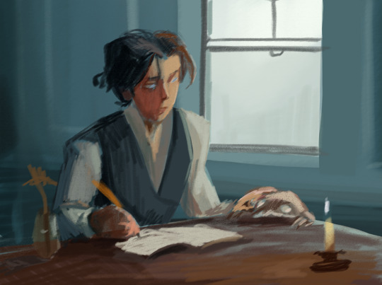
Hange never thought she'd see something like that, didn't dare to even hope, but right in front of her, so close that she could touch, that she was almost touching, was Mr. Ackerman. With clothes and hair disheveled, soaked to the skin, eyes wide, cheeks flushed and breathing too labored, he clearly was in a state of distress, his famous composure missing, thrown to the wind, abandoned in the harsh, cold rain.
His breaths were coming out of him in form of heavy pants, he must have run here. After her, to her. Why?
Hange stared at him, searched for the answer in his eyes. They were pretty, she realized with a start. No, not just pretty - sharp, but lucid, so rare in color, with a line between silver and blue wiped out, his eyes were beautiful. How did she not see it before?
Another remarkable thing about him, something that Hange too had failed to notice about him, was his mouth. It was no wonder that this part of hin got overlooked by her, considering how often that same mouth spouted opinions that enraged Hange, but now she could see clearly - his lips were pretty too. Thin but rosy in color, they captured her attention. Made her wonder if they really were as soft as they looked. They enticed her, tempted.
What was happening to her?
The silence that was hanging over them was to blame, Hange was almost sure. Silence forced her to start overthinking, and overthinking led her to... This. And this - along with silence - had to be stopped.
"What can I do for you?" she asked, and despite her words - managed to make that question sound like a demand it actually was.
"I wish... I wish to talk with you. About my feelings."
"Feelings?" Hange nearly laughed; the only thing stopping her from it - the sliver of whatever good manners her father had managed to give to her. "What feelings can you have towards me? Did you run up here just to tell me how much you loathe me? You shouldn't have bothered, sir."
"If... if that was the impression that I've given you, I apologize. For nothing could be further from the truth. You see, I..." his hand flexed, twitched towards hers, as though... he wished to take a hold of it, and his eyes... if Hange did not know the man before her better, she'd say that he looked at her, like starving looks at bread, like a prisoner looks up to the sky, like one... looks at someone dearest to them. But she was wrong, she must have been. She knew Mr. Ackerman, knew how arrogant, how flippant and aloof he was, how little he cared about feelings of other people. A man like him wasn't capable of feeling anything, especially to someone as beneath him as Hange Zoe was.
"I love you," he said, murmured softly. "Most ardently."
A moment passed, then two, then three, thunder roared in the background, yet Hange remained lost, so aghast by his words that she couldn't even laugh. Was he... was he serious?
"Pardon me?"
"I understand that it may come as a surprise, considering your opinion of me. But I do love you, and... perhaps, against my better judgement, I hope you will consent to marrying me."
"Against your better judgement..." Hange spoke lowly, close to hissing. Her confusion started to fade, giving way to rising anger. "And what that might mean?"
"You're smart. Surely you're aware of a difference between our social standings. Your family..."
"I see." Hange spoke, cutting him off. She knew what Mr. Ackerman had to say about her family. She did not wish to have him voice it all out. "I'm honored by your proposal, sir. But I must decline it."
"Decline? So flippantly? You barely gave it any thought."
"I'm smart," Hange shot his words back at him. "And my judgment doesn't allow me to even entertain the idea of marrying a man who ruined the happiness of my dear brother."
Mr. Ackerman's face sharpened, his jaw clenched. "I did that," he said levelly. "To protect the happiness of my friend Erwin. The nature of your brother's feelings towards him was unclear, and it concerned me. I merely voiced out that concern."
"And broke two hearts in the process. How can you be a judge of the nature of my brother's feelings when you do not know him? When you know so little about love?"
Her words hurt him, he appeared struck. A cruel part of Hange rejoiced in the lost expression on his face, but another, less fierce one, controlled by far more basic urges... couldn't come up with an excuse to look away from Mr. Ackerman's surprisingly fair features. That string that always existed between them, that made itself known the very first time their eyes met, tensed up, pulling Hange closer to him. With her emotions so at odds, she didn't know what she wished to do more - to slap or kiss him.
She did either. She summoned the remnants of her resolve, clenched her trembling hands in fists, and took a step back.
The string tensed further, threatened to break. Hange wasn't sure what would happen if it did. She wasn't sure she wished to know it.
"I apologize, if I caused you any trouble," Mr. Ackerman said, his voice back under firm control, cold and aloof once again. A mask had slipped back on his face, it reflected nothing - no vulnerability, not a single sign of distress. The glimpse of someone else existing behind that facade was just that - a glimpse; there and gone again. Hange felt weirdly melancholic about it. "And also for taking so much of your time. I wish you well."
He nodded at her, slightly bowed - like a good, disciplined soldier that he was, then promptly turned around, walking back into chilly rain.
Hange stayed behind, watched him, with just one thought bouncing in her mind - what would have happened had she kissed him?
38 notes
·
View notes
Note
Ik ur inbox is prob flooded rn but
Specialists fashion style hcs and shopping tendencies..? 👀
Uhhhh UMMM
Men's fashion....ahhhhHHHHHHH
Sky:
Usually dresses like just some guy. Yeah he's some dude, please don't look at him too closely, he's normal. He promises
Jokes aside, he isn't all that fancy with his clothes. He dresses pretty boringly all things considered
He likes to dress in pastel/mid tone cool colors, generally avoiding warm colors, with lighter accents
He really likes jogging suits/track suits tho which tends to make him stand out slightly more bc jogging suits tend to have louder patterns on the than Sky usually wears
When he gets fancy he tends to dress in all white, which he looks weirdly good in. White jeans are a fashion choice he would make
There's also his royal clothes that he doesn't like all that much? Much of his childhood was a four way glaring match between himself, Diaspro, and his parents (while Brandon sighs in the background), so he tends to associate thoese clothes with tense uncomfortable situations....which might be the main reason he's primarily dresses very causally
He doesn't give that much of a shit about fashion, he does like his two tone jeans (not split down the middle like Riven and definitely not as much as Riven, but he likes to have a little fun with his pants) and his sectioned shirt
Ends up buying clothes every time he goes to the mall, there's never a moment when he really needs to go shopping bc he's kinda just constantly doing it—and he also gets gifts from Diaspo and his parents (at first) of new clothes (he does the same for Diaspro, the gifts are really petty and back handed on both of their ends but the only way you could tell is if you knew them really well)
Very slightly more interesting than usual casual wear, a jacket here and there, he's guy shaped
Brandon:
Jester. I thought we were friends. I trusted you. Why the fuck are you making me explain what ever is going on with Brandon's fashion sense this is a fucking nightmare /j
There's his prep era (s1+4??) and his actual fashion sense (s2-3)
Let's start with his prep era bc Brandon is apprently a idol who has eras jfjsne
It's like acidemia and prep fashion mixed together
Brandon would never wear a turtleneck, he's not that far gone, but he's trying his best to give rich boy
Button up shirts tucked into slightly high waisted corduroy pants with brown belts, some very unfortunate sweater vests (like truly tragic), and ascots
Imagine the shapes and clothing styles of acidemia, with the colors of the preppy style
I'm thinking he'd wear suit jackets once he realized how fucking stupid he looked in sweater vests
Brandon dresses like he wants to be punched face for being pretentious, Sky takes great offence at the implication that this is how royalty dresses
Yeah, he's just doing this bc he's overcompensating for his lack of royal training in pretending to be Sky. If he dresses like the most obnoxious rich kid ever then no one can question him right?
In my hc he'd dress a little more toned down than the original (the plaid pants, I'm going to attack him) just bc he doesn't want to push it quite that far but still
After his prep era his formal fashion goes fucking hard tho, he's figured out he looks REALLY good in trench coats and suit jackets/vests and he is not afraid to use this information for evil (flirting)
Brandon will suddenly be wearing a suit vest and pants out of fucking no where and destroy everyone on impact
As for his usual fashion, I'd decribe it as what my mom used to try and dress me in middle school—
Brandon is the hot one, that's just how everyone sees him form the characters to the fans, and fucking yet— Look at his fringe and his outfits??
Anyways I'd decribe Brandon's fashion in one word
Loud
Like jfc this man loves his bright colors and patterns, even his swim wear can't escape bright red and having a pattern on the front. He's just like that
If your wondering what loud means in this context, visually agressive, it's eye catching, visual noise, their clothes that demand attention. It also tends to mean obnoxious
If the outfit doesn't hurt my eyes, would Brandon wear it? Probably not—
Colorful men's summer wear (because Brandon is the opposite of a chill baby) that tend to be matching (there is not jacket so it's not a jogging suit but the top and bottoms usually go together, he likes two piece outfits what can I say)
And of course, crop tops. He's not crop tops all day every day (like Riven) but local man REALLY likes showing off his body ok? He's nature's gift to eyes and who is he to deny the everyday person walking down the street a chance to see him? He's not a monster
Brandon tends to be more out there compared to Riven when it comes to crop tops because Brandon has never even made eye contact with shame before in his entire life
Btw he finds out about crop top vests and goes fucking insane for a full week because he can combine his fashion styles into one monstrosity, Sky is going to physically fight him
Usually just ends up shopping the same time that Sky does bc he's there
Timmy:
Can I just call him a fashion disaster and move on?
Please look at his s1 outfit and realize that his over shirt's sleeves are nomrally drawn like it's tucked in somewhere and oh my god it looks so bad I want to commit a violence
Please look at his mess of a camping outfit. A crop top that meets exactly with baggy high waisted sweat shorts. Help him
No but I don't think Timmy even has a fashion sense out side of "I like the color green and orange" and "showing any amount of skin is terrifying"
He's just a stereo typically nerd
Musa (and Riven) got their hands on him once and turned him into an e-boy and Timmy nearly died
Timmy tends to cover up his skin and layer outfits. Not because he's easily cold but as a form of subconscious armor
He is the only one who benefited from s4 putting everyone into their prep era, getting a very dope looking glow up that I would of loved to see at the end of his character arc of being less of a coward that he didn't have
Really, why does Timmy get to escape with his shirt not tucked in. The designer of the boy's s4 outfits was a Timmy stan, smh
Of course that's immediately followed by the tragedy that is his s4 date outfit and I just *points and laughs*
Timmy is the only one who has consistent good in character outfits in every season (not including s8, bc I refuse to look at s8) good for him
Let the man vibe in his baggy white shirts and the more colorful shirt he layered on top of it. Also, shorts. Timmy really likes his shorts
And let's be real
He shops online
Riven:
Pop punk. I refuse to back down on this. Riven's weird little wrist cuffs are too alternative for most other styles. Um pop punk is (the style of my favorite band) like if a rainbow threw up on nomral punk. You get all the usual things like many belts and wrist cuffs, but you also get a fuck ton of colors.
As for shopping headcanons.... Riven's shopping is a mix of thrifting, upcycling the things he's thrifted, hunting down good deals, and saving up money for something he really wants bc Riven is one of the guys that really care about fashion. He doesn't tend to throw away clothes when he grows out of them but upcycle them, often making them more good looking (to him) in the process by mixing and matching colors
Riven really likes his colors ok?
His fashion in s1 is at his most boring half because he doesn't really wanna waste his money on clothes when he has other things to worry about (like never returning to his dad's house), half because he's low key embarrassed about how much he cares about fashion
After s1 however Saladin puts him on missions, which is amazing for him, which means he feels wayyyy less bad about spending money on clothes he likes
Still spends a lot of time just sewing his one pairs of jeans bc all the normal ones are too boring for him
I know I've been talking about his pants a lot but I need to inform you that Riven is fucking allergic to covering up his chest. He will either cut the shirt into a crop top of find a WAY to make sure his abs/pecs are showing. He's obnoxious like that
He's pretty responsible with his money but clothes are his weakness. Yes he needs that pair of bright pink jeans and he needs them right the fuck now. Like his room is pretty sparse but his closet is full...mostly with very colorful jeans
Helia:
Transmasculine that didn't change his style after transitioning
Doesn't care that much about fashion but is dedicated to his aesthetic
His flower child and Flora's flower child are very different. Flora is more high femme fitted clothing floral print, while Helia is more like flowy/puff shirts, earth tones, no prints, ya know???
Flora is more cottage core and Helia is more boho(??). Yes there is a difference, no I cannot explain it
Helia also seems like a bit of a chill baby (aka he gets cold easily) to me, so he usually wears long sleeve and no crop tops here
You'd think this would mean he'd wear more sweaters and jackets but honestly no, he doesn't like stuffing his giant sleeves onto those. He normally just wears a warmer shirt. If he can't do that, then he'll wear a flowy ass jacket
Helia also seems like the type of person to walk around in the house with a blanket over his shoulders, chill baby, I'm saying it
Many many many peasant blouses
Tends to dress more feminine? He doesn't give a fuck. Helia has gender
Helia is also fucking allergic to formal wear, he will wear a fitted shirt on his fucking death bed, fuck you. He thinks their uncomfortable and he feels like they make him look stupid and he hates them some how more than Riven (who also hates suits) which is an achievement. They might also make him feel dysphoric bc they look obviously wrong to him (and only to him)?? Idk it's the vibes
As for shopping, Helia only shops when he knows he needs new clothes and he really doesn't give that much of a fuck about fashion. He usually buys things in one trip until he grows out of them/they get destroyed then he goes out again. It is a horrible process to him
Plus, bonus Nabu:
Nabu tends to dress very traditionally until he's going out when he dresses as fashion forward as the best of them
He usually just gets clothes from his parents (traditional) and shops online (trendy)
He tries to avoid loud colors and patterns in his more modern outfits bc he usually wears those and he also looks good in dark colors thank you
He's either very traditional or chill and casual......
Wait a fucking minute Nabu (Traditional outfits nomrally, with some modern clothes) dresses the opposite of Musa (nomrally modern clothes, with some traditional outfits). What the fuck
#winx club#winx specialists#winx riven#winx helia#winx sky#winx brandon#winx timmy#winx nabu#winx headcanons#rus chatters#asks#trying to explain Riven's living situation is weird bc hes like fine. he has to support himself as soon as hes out of highschool but#hes like fine#im sorta basing him off of my parents who both moved out very young and they both made it very far#like hes fine. annoyed he cant spend a bunch of money on clothes. but fine#idk how to explain it#how fucking long is this jfc#long post
57 notes
·
View notes
Note
Hope you don’t mind me asking but…What do you think Riven is supposed to be in terms of coded Race or ethnicity?
When it comes to winx club and what race each character is supposed to be (or at least be coded as), its genrrally not very hard to guess. Like the winx are obvious because they’re directly modeled after real celebrities, but the specialists are a little less obvious, though still fairly easy to guess. Sky and Timmy are generally assumed to be white, it’s fairly certain amongst fans that Helia is supposed to be Asian, Nabu is South Asian, and Brandon…well he’s a little on the ambiguous side but I’ve seen a good amount of people headcanon him as Latino….and y’know what…as a latina, I’ll take it along with the canon rep that Flora (and MAYBE Stella??? I say that cause Cameron Diaz is of Cuban descent on one side, so it’s possible Stella could be read as a white passing/half Hispanic/Latina) gives us.
However with all that, Riven is really unclear to me. I see headcanons vary from him being asian, latino, white, or a mix of at least two of those…and Idk what to think tbh.
LOVE THIS
And honestly, this might be a disappointing answer, but the truth is that his race is fully ambiguous in every way possible. Sometimes fans say "ambiguous", but what they really mean is "definitely true, but not explicitly canon". For example, Nabu is South Asian in that kind of ambiguous way, where it is very, very clear, but not explicitly stated. (And let's be honest, the only reason some fans consider Nabu ambiguous is because he's dating Aisha, a black woman, and they can't imagine a non-black dark-skinned man dating a black woman, but I digress...)
Riven's race, however, is actually ambiguous in its true definition.

We don't know what planet Riven is from. It's never stated or even implied. We don't know where his family is from. It's never stated or implied. We don't know anything about his culture, how he was raised (outside of likely poor and single-parented), where he lived, if he had any friends, etcetc. Compared to other characters, we really don't know much about Riven's background other than his mom left him.
Sometimes people try to figure it out. Some people use his eye shape as evidence for him being Asian, despite the fact that other canonically non-Asian characters also have more narrow eyes (Flora being the best example). Some people use his hair color as evidence that he's from Zenith, but that really means nothing when it comes to his race, and Tecna being white isn't a good defense for that. Some people use his eye color being purple and Musa's eye color being purple as evidence that he is Asian, but considering Helia's eye color is blue and there are most definitely non-Asian characters with purple eyes too, that also means nothing. He never wears culturally significant or identifiable clothing. And no, I don't think his British flag shirt is anything more than Rainbow trying to make them look fashionable and trendy.
Riven's race is truly ambiguous. His racial identity can actually be read in more than one way. And honestly, I think this lends itself to a very impactful reading on his character as a whole. We know that Riven didn't have the best childhood. We know that he doesn't have a relationship with his mother, and he never brings up his father or anyone else in his family. It's very heavily implied that Riven's relationship with his family is rocky at best and nonexistent at worst.
Now obviously, in real life, someone having a bad relationship with their family doesn't just erase their genetics. That's true even in winx club - Musa has a fraught relationship with her father for the better part of season 1, but we can still tell she's East Asian. That being said, winx club is a fictional, animated show with drawn and intentionally designed characters. Just like Flora is designed to look sweet and girly, Riven is designed to look mysterious and angsty.
I truly believe that as an audience, we're not supposed to know much about his past, and in winx club, that includes his family, his planet, and subsequently, his race and ethnicity. Riven can be seen as Asian, White, mixed, Latino, Hispanic, mostly whatever you want, and that's on purpose. Whether or not that decision is Good is debatable, but I truly do think that was Rainbow's intention with him. He's meant to be seen as mysterious in season 1, and for Rainbow, that typically translates to knowing as little about a character's true self as possible.
Personally, I do prefer asian!Riven, but that is fully just a headcanon, and any "implication" I could find in canon is going to be dubious and easy to interpret differently. To bring back a previous point, I could say his eye shape is proof that he's Asian, and many people have, but that would mean that Flora, Palladium a la glow up design, Lucy, and Thoren are all also Asian. I could try to say that him having purple eyes is proof that he's Asian, but that would mean that Roxy is also Asian (which I would actually love but considering both of her parents are canonically white, she isn't). And tbh, these are the only solid, consistent things about his character that could be seen as proof of him being Asian coded, and that's not great in comparison to characters like Musa, Nabu, or Helia. Like,, there's a reason people make entire essays on Nabu's hair, clothing, parents, class, magic, etc, and not just one-off posts about the shape of his eyes. There's a lot to work with and a lot about him that actually correlates to being South Asian. Only being able to cite Riven's eye shape is pretty shoddy when you compare him to all the other "ambiguous" characters who have a lot more evidence supporting their coded race.
Trying to make any I'm Right statement about his race or ethnicity is always going to fail, at least regarding the first three seasons, because he doesn't have any significant or consistent racial coding. Even his characterization doesn't mean much when most, if not all, of the tropes he fits into are not race-specific, and any racial stereotype he could have can all be written off as him filling the angsty/minor antagonist/redeemed character tropes.
Anyway, again I realize this probably isn't the answer you wanted. I would love to do a full meta explaining the intricacies of his racial/ethnic coding, but he really just,,, doesn't have that. And again, we could totally have a discussion on whether or not this is even Okay; if Rainbow making his race ambiguous so he seems more mysterious is Wrong or Offensive in some way. But the truth is that Riven's race is ambiguous, and that's on purpose.
#answered#long post#again Personally i prefer and love asian riven#but im also asian myself and i used to think tecna and brandon were asian too#and tbh i still love asian tecna i can headcanon her as a little treat aldhg#but anyway#its very easy for me to see asian coding since ive gotten used to figuring it out#being a kid with little representation does wonders for coding interpretations aldg#but because of that i can say with ease that riven's asian coding isnt really... all that there#literally the ONLY thing people use as evidence is his eye shape#and for some people (like me) thats enough to consider him asian#but within the confines of canon it doesnt actually work like that#again other non-asian characters have that same eye shape#and the other actually asian characters have a lot more evidence going for them and fans dont have to rely on Just eye shape#riven's asian coding is very much an outlier and doesn't match up with the coding that other canonically/ambiguously asian characters have#and again i really do think this is on purpose
4 notes
·
View notes
Last Seen Blogs

sorryimananti-romantic
yumi's cyberpunk

princessthiccie
Princess Thiccie
bm-contemporary-art
BM: Contemporary Art

robotrandomness
Robot arms and randomness

annabellecane
What's up everybody I thinK DOGS SHOULD VOTE