#thank you guys for your patience!
Text
<-(Previous Part)

(The rest is under the readmore!)
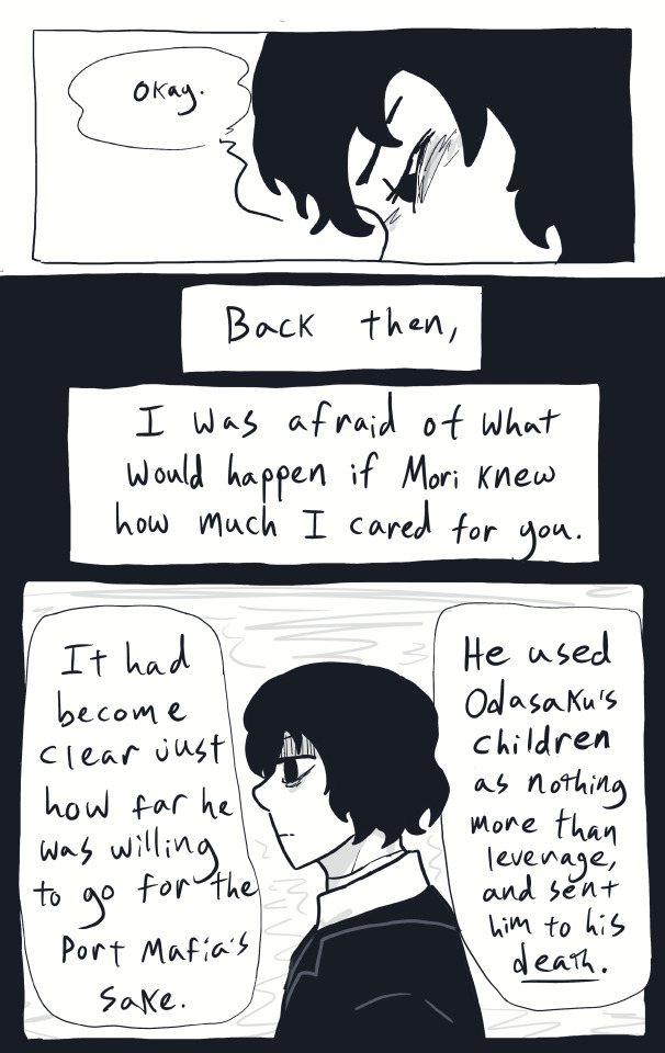
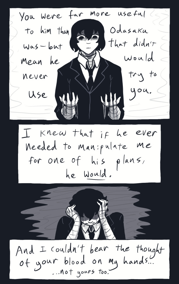
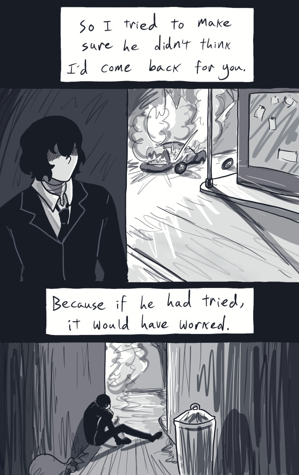
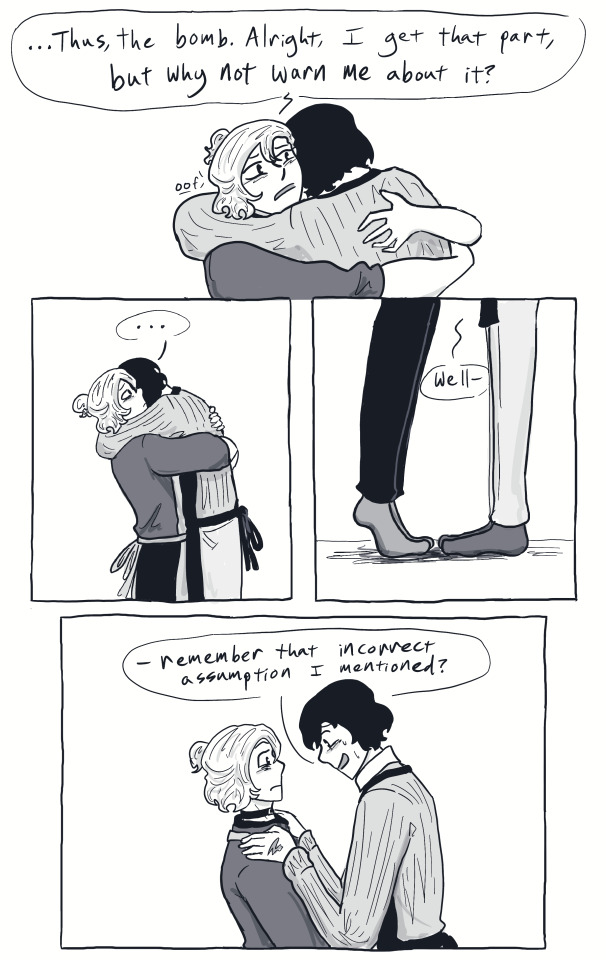
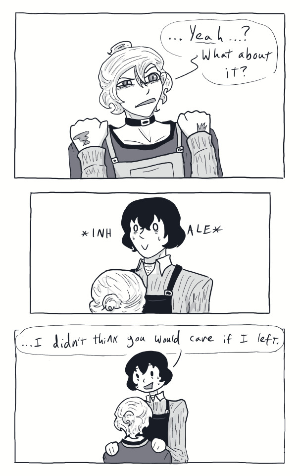
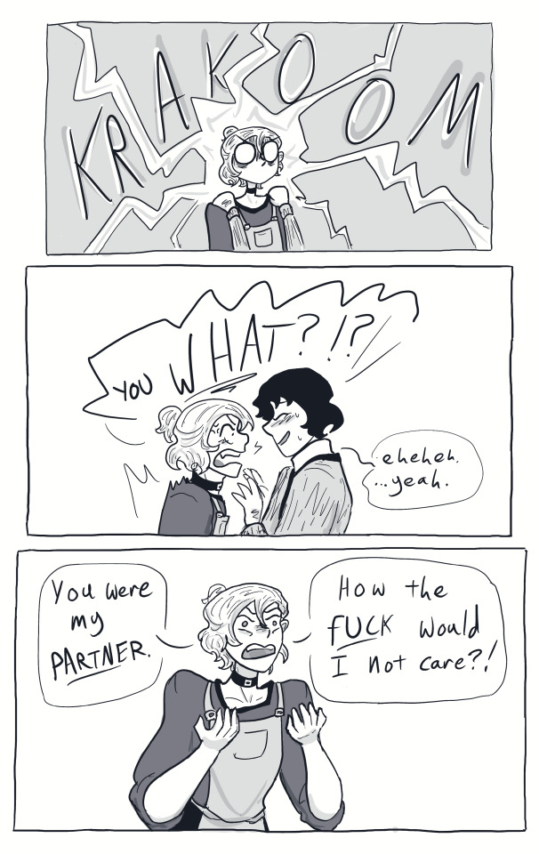
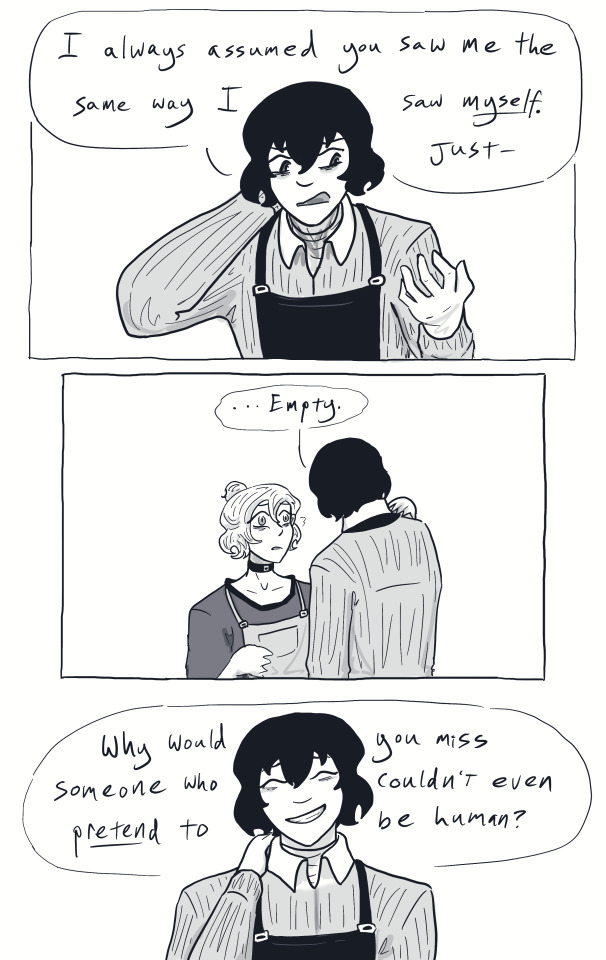
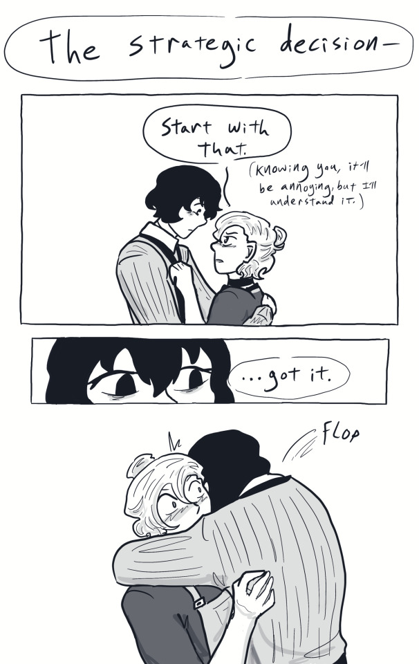
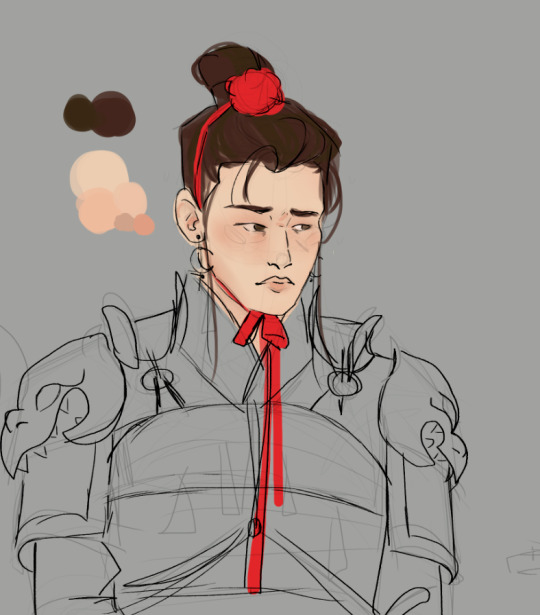
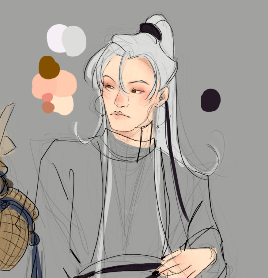
#finally got this part doneeee aksjfksdjf#really got roadblocked on this bit for some reason lol — hopefully the next one won't take as long#thank you guys for your patience!#bsd#bsd dazai#bsd chuuya#bungou stray dogs#my art#soukoku#skk
2K notes
·
View notes
Text
saying ‘i love you’ without saying ‘i love you’ dialogue prompts
@celestialwrites for more!
♡ “to me, you are perfect.”
♡ "don't you realise? you are my world."
♡ "you brought me back to life."
♡ "the only way i know how to describe what i feel around you is home. i feel at home."
♡ "it's as if my entire life i have been sinking in a storm and you came and pulled me out."
♡ "you know i stayed for you, and frankly, i don't regret it one bit."
♡ "with the whole of my heart, i believe that together we are infinite."
♡ "i never intend on leaving you. you hear me? never."
♡ "thank you for being the shoulder i always needed, even when you hated me."
♡ "i can't live without you!"
♡ "never leave me, my heart couldn't bear it."
♡ "i've spent my whole life waiting for you."
♡ "consumed in darkness, you darling, were my light."
REBLOG TO SUPPORT YOUR LOCAL WRITERS!!<3
#when i tell you guys im so sorry i haven’t posted much recently - i really am so sorry!!#writing and reading slumps suck and i’ve been so busy#thank you all for your patience !#writing prompts#writing prompt#creative writing#angst prompt#angst writing#writing fluff#fluff prompts#domestic fluff#writing inspiration#story prompt#dialogue prompts#dialogue prompt
2K notes
·
View notes
Text
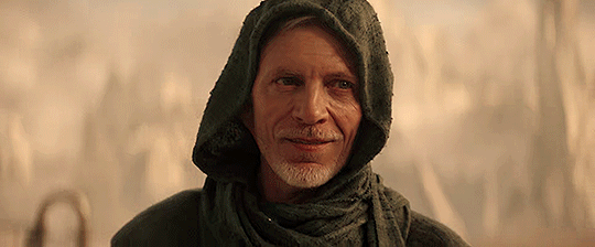


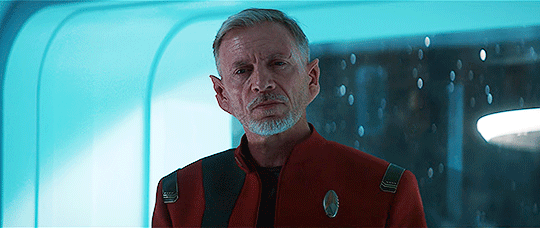
CALLUM KEITH RENNIE as Captain Rayner in Star Trek: Discovery
#when you see this and think what the fuck is that colouring and why this weird selection of moments please consider this:#i cannot gif#also you should see for yourself how yellow (and/or dark) those shots are#(not an excuse lol i've seen people colour much worse with much better results)#and i am also not sane about ckr so i don't choose moments that would look cool in an edit#it's not an edit#it's not even a gifset#it's just me going ahhhhhh! over a guy#thank you kindly for your patience#star trek discovery#callum keith rennie#rayner#itsmegiffing#c6d
483 notes
·
View notes
Text
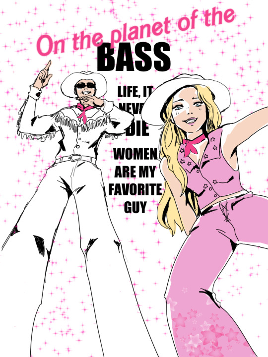
#women really ARE their favorite guy#barbie#ken#dj crazy times#ms biljana electronica#this song will not leave me#im sorry#or as barbie would say#thank you for your patience
2K notes
·
View notes
Text
Hi! I got supper busy! and by busy I mean injured.
I'm fine but hey happy trans visiblity day!
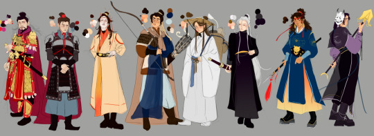
totally unrelated but I have just been laying around distracting myself so now I have decided to once again draw a cast line up. All the martial gods for now, since I got to tweaking up the QYZ and YY one I'd already done and redoing my awfully huge poster thing I started like 4 years ago now. Doing it this way is more fulfilling to me, maybe one day I'll return to it but not now.


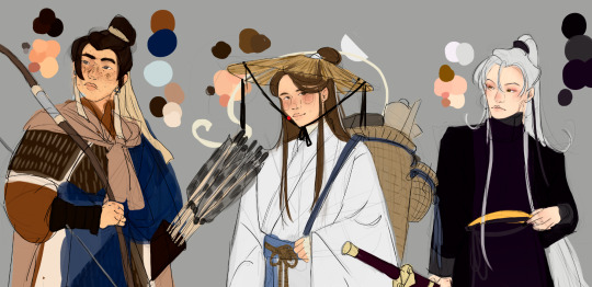
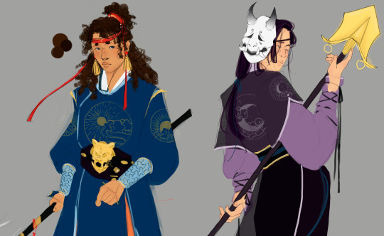


#i'm still figuring everything out thank you for your patience and support#i'm just so tired :)#sorry about the vent#my art#toasterfireart#wip#tgcf#tian guan ci fu#heaven official's blessing#tgcf fanart#back at it with my line ups because i'm unoriginal but i love these guys#pei ming#pei xiu#pei su#lang qianqiu#feng xin#xie lian#mu qing#quan yizhen#yin yu#yes I will still include yy as a god#he is so special to me#I have to say I'm obsessed with drawing everyone and xl is just there#the most powerful one there is just the homeless guy#love him
419 notes
·
View notes
Text

this is sakusa kiyoomi he has 9 counts of attempted murder via eye offending clothes
Part 1 | Part 2
#haikyuu#i love cheesefish art#haikyuu fanart#haikyuu!!#hq art#itachiyama#sakusa kiyoomi#haikyuu sakusa#hq sakusa#hq fanart#hi guys#long time no see#important stuff is coming and i gotta focus on that first#so art is taking a backseat for now#HOWEVER#i am not saying this series of meme redraws are stopped#just that im gonna be shifting my focus#ill be back soon so until then thank you for your patience!
723 notes
·
View notes
Text
KEYCHAIN PEOPLE THIS IS NOT A DRILL THE BATCH FINALLY CAME IN WITH NO OUTLINE!!!
I CAN FINALLY SHIP THEM!!
#oh my GOD thank you guys so much for your patience!!!!#this will be my project for the rest of the week#get these guys out as fast as I can!#so.. so many guys....#reminder: if you want an extra keychain lmk and ill add one in for you for free!
256 notes
·
View notes
Text

You Know What (A Homestuck Rarepair Fancomic)
(Update every Tues & Sat)
First page || Back || Continue ==>
#Thanks for your patience guys!#pregnancy exhaustion is kicking my ass#john egbert#jade harley#karkat vantas#homestuck#homestuck fancomic#art#doods#homestuck au#dirkkat fwb au#you know what#dirkkat#dnd#dnd au#alien comics#artists on tumblr#comic artist#dave strider#rose lalonde#kanaya maryam#dirk strider
104 notes
·
View notes
Text
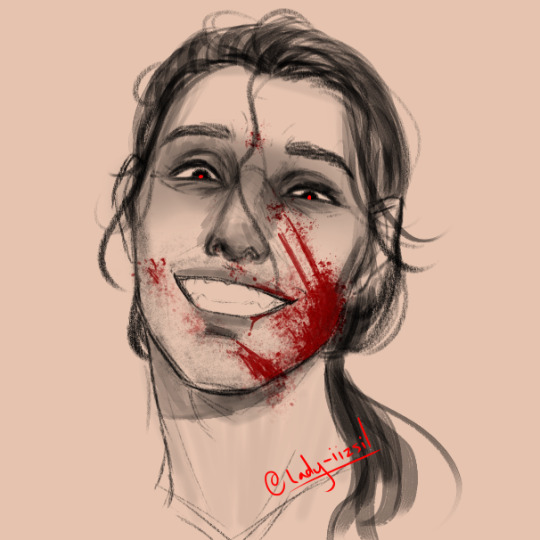
I decided to do that expression meme by @capochiino with the unhinged expressions, did the B1 face and WOW, I am not very good at expressions but this was a fun little challenge to do on a practice page.
Lucien Lachance felt like the perfect fit for that sheet! So again, another small little artwork of him!
Proud I remembered to write my signature this time lmao, sorry it was in text last time I was on my phone posting it and couldn't do it away from my art program
BUT YES, More murder dad, whom I love!
#dark brotherhood#tesblr#tes 4 oblivion#lucien lachance#art meme#doodle#my art#bloodied up aint he#thank you guys for your patience with me btw#please let me know OP of expressions post if you need me to do anything else to properly credit you to your comfort btw
556 notes
·
View notes
Note
Erik!! I keep seeing your adorable centaur OCs and I always wanted to ask what's the story behind them??
Plushi!! Sorry for the mega-late reply… 🥺I was so happy to get this ask but I didn't know how to explain my silly ocs…I will try now-more under the cut.
Dael Braam (dwarf) is a cooped up farmhand looking to see the world, but being immune-compromised from birth it took a lot of persuasion to convince her parents to let them go. They relent under the condition that she finds a capable and strong person to travel with to keep her safe… Just so happens that a strong and capable centaur knight is visiting in town…
Rembrandt (horsey) was created from a dark fusion spell by an amateur mage, who had intentions to construct a powerful warrior to do his bidding.
However, the spell cast did not result in a powerful and fully-armored warrior…. but instead a frail baby knight centaur, with only its top half made of living armor. The mage, not wanting to raise any kind of child, promptly abandons his creation. He can always try to make another one after all.
Into adulthood, Rembrandt still carries a lot of pent-up abandonment and self-esteem issues. You wouldn't know that from the proud facade he puts on though, lying about being a royal knight yet helping all those he comes across with a smile, but never staying long. When the opportunity of having a long-term travel companion (and perhaps a friend…?) arises from Dael requiring a bodyguard, his craving for companionship and affirmation outweighs his worries about her seeing eldritch elements of himself.
Dirk (beefy dragon thing) is the second (and more "successful") attempt from the same mage to create a powerful monster. Think Rembrandt's "big evil" brother. Except he's quite a bit younger. Dirk emerged fully-developed except for his wings-which remain as little nubs. Despite his brawn and warrior-appearance, Dirk was mostly a glorified errand boy, using his impressive strength to terrorize the nearby towns and their land-collecting resources for the mage.
Dael and Rembrandt meet Dirk after hearing word of a giant dragon-knight ravaging villages (and their livestock yum yum).
(I also like the idea of the mage sending Dirk to capture Rembrandt + Dael when he recognizes is his first attempt is not only alive and strong, but also quite proficient in battle.)
One way or another Dirk ends up roaming with the two. At first, Dirk is over-confident, rude, and stubborn... Overall a huge pain for them to travel with. After being shown kindness for the first time and being subject to more than a few humbling situations, Dirk allows a protective, loyal and softer side of him to emerge.
Lots of found family shenanigans and adventures occur-and yeah! This was rambly but thank you for reading about my guys! 💖
#i got rlly happy when i saw your ask but i had no idea how to explain my characters so i sat on your ask till now whah im sorryy#i have a whole 40 pg doc on these guys yet i struggled to write all of this lol thank you for your patience u are too kind plushi#I hope to see u at tfconLA next month if u are going!#also that little doodle u did of rembrandt i love and it hangs over my desk so i can see it always :]]#ALL THESE are subject to change...writing character motivations interactions and story is hard wow how do some of u do it??#my ocs#plushi#kind words#artists on tumblr#original character#all three of them come from isolated beginnings i realize
136 notes
·
View notes
Text
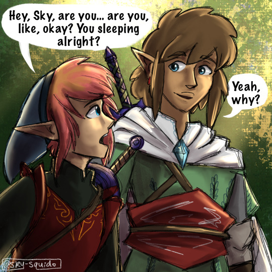


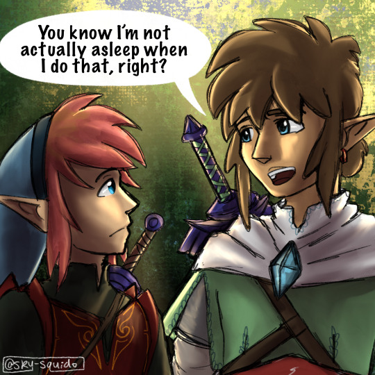

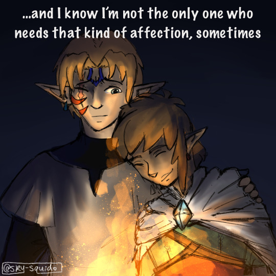

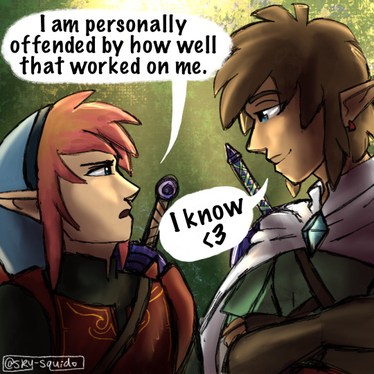
:3
finally finished illustrating this post!
#squido draws#linked universe#linkeduniverse#lu legend#lu sky#comic#also good news to isolate fans i’ve been working on it there are only two and a half scenes left#thank you all so much for your patience#i love you guys so much
2K notes
·
View notes
Text
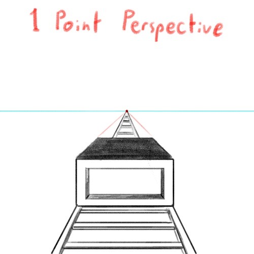
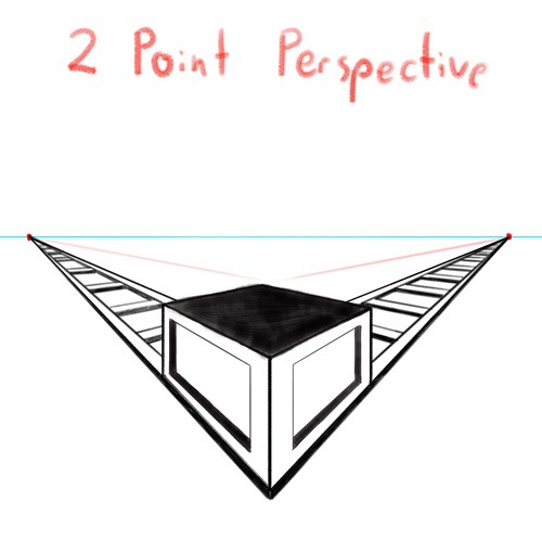
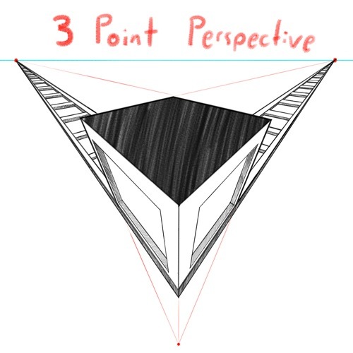
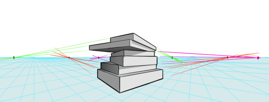
DRAWING BACKGROUNDS: TIPS AND TRICKS
So many people are afraid of drawing backgrounds and I think it's a shame, so here's some tips and tricks, because I'm not perfect at it myself but I think the hardest part is really just knowing where to start.
First off: Perspective
Yeah, yeah, that's the scary word. But I promise you, once you're familiar with the basics, backgrounds are a LOT less intimidating. Don't get discouraged if WHEN you have trouble with it. Even professional artists struggle with it. I promise you, screwing it up is good and normal. That's how you learn after all!
Now I'm not going to go into detail on how to do it here, because honestly there are a thousand and one free resources online and in libraries that can explain it far better than I ever could in a singular broad-strokes tumblr post. But I AM at least telling you you should familiarize yourself with these basics:
Important Terms:
Horizon Line: A horizontal line across your canvas, showing your viewer's eye level and providing a location for most of your vanishing points.
Vanishing Point: Integral to drawing in perspective. The sides of a 3D object get smaller as they become farther away from the viewer in space. This point is where the parallel lines of a side eventually meet.
The Basic Types of Perspective:
One Point Perspective: Good for drawing things that you're looking at straight on.
Two Point Perspective: Good for drawing things at an angle.
Three Point Perspective: Good for drawing things the viewer is looking up or down at, especially at an extreme angle.
[Click images for ALT descriptions]
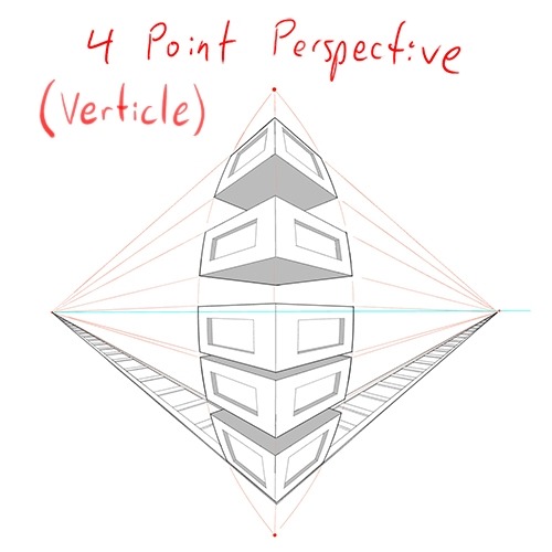
And if you're comfortable with these and serious about improving your skills for use in storytelling, I also might suggest looking up:
4 Point Perspective: Great for extra wide or tall shots and for camera tilts if you're doing an animation or animatic. I think some other names for this in animation include "banana pan" and "warp pan."
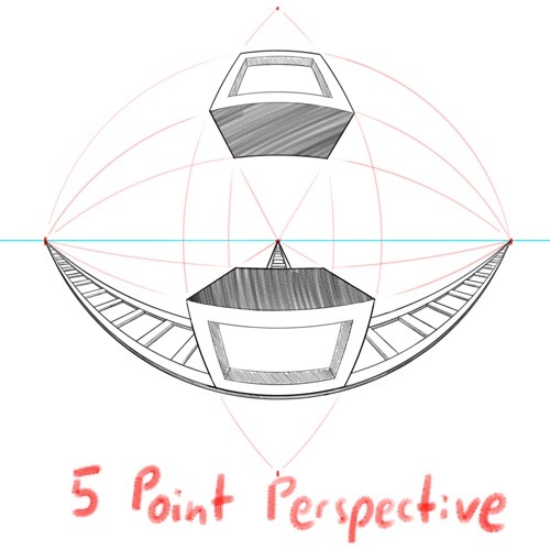
5 Point Perspective: Fish-eye lens. Good for all your angsty anime boy slipping into madness needs!
Some perspective tips I wish someone had told me earlier:
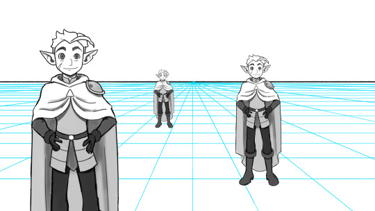
Objects' relation to the horizon line is constant.
A super helpful tip to remember when placing a character or object in space is that they will always (assuming they aren't changing in size or moving up or down) have the same relation to the horizon line no matter how far or close they are. If your horizon line is at shoulder height for your focus character in the foreground, any character of the same height in the background will still line up with the horizon line at the shoulders.
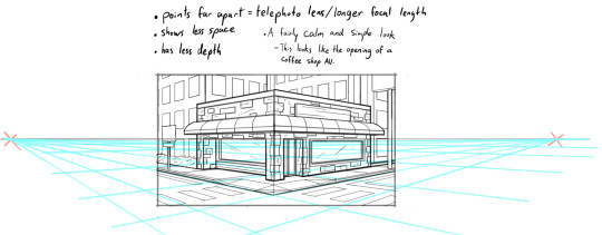
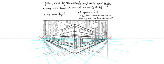
How to pick the distance between your vanishing points:
2 pt perspective uses 2 vanishing points, 3 pt uses 3, etc, etc, but how close should they be? Well, first of all, for anything that isn't one point perspective, one or more points will usually be off the canvas. Super annoying, I know, but the closer your vanishing points are, the more warped your drawing will become.
Second, a helpful thing to know is that choosing the distance between your points is basically the illustration equivalent of picking your camera lens! Photography buffs will know that wider (shorter focal length) lenses show more space and make the distance between foreground and background more dramatic, while longer focal length/telephoto lenses are flatter, and more focused and intimate. The same is true of vanishing points that are closer (shorter focal length) or farther apart (longer focal length).
2 point/3 point/etc doesn't actually mean you're limited to that many points total on your page.
this one confused me a lot when I was getting started, lol. A lot of examples will show you drawings of nice, neat cities or something, in which all the buildings are facing the same way in order to demonstrate perspective drawing. But in real life, buildings don't all face the same direction. They're at all sorts of different angles. So how do I do that??? Answer: Just because you're drawing in 2 point perspective or whatever doesn't mean you... have to actually keep your 2 points in the same spot. You can move them around, just keep them the same distance apart, so you're not screwing up your camera lens.
Other Tips:
Use reference!
The instant you try to draw a house, you're going to forget every house you've ever seen. That's just how it goes. Buildings are complicated. Do yourself a favor and collect a few reference images first, buddy!
Consider details (like architectural style, amenities, and materials)
Your building will look more like a building when you keep in mind that buildings have gutters and door knobs and light switches and paneling and stuff, and aren't just boxes with roofs on them. Again: reference! You will forget electrical sockets and baseboards exist immediately. Art brains are dumb.
Use details and texture to fill in negative space
Giant stretches of blank space tend to be boring and distracting. Put a few suggestions of wood grain or something on that wall back there, bud, just don't overdo it.

Line weight
Darker, thicker lines draw more attention, look heavier, and look closer to the viewer than lighter, thinner lines do. Take advantage of this to draw the viewer's attention to your focal points, de-emphasize less important details, and imply depth. It's up to you to decide how you want to use this and what your style is, especially once you start getting into combining or replacing it with shading, values, and color, but a helpful rule of thumb is to try reserving your thickest lines for focal foreground characters and use thinner lines on backgrounds, especially details in the far distance.
Perspective guides
If you're drawing digitally, take full advantage of any perspective tools you have access to! A lot of art programs lately have begun adding perspective guide features that let you set up vanishing points and then literally guide your hand as you draw so you stay in perspective. Some of these include Procreate, Clip Studio Paint, and Adobe Fresco. (still sadly none in Photoshop as far as I'm aware, what the heck, Adobe!). Check through the settings of yours to see if it gives you any perspective guides or other similarly useful tools. They're 100% worth it! And for god's sake, if you've got any skew or perspective warp tools, draw your complicated shapes flat and then warp them instead of spending an hour on it! Don't make my mistakes!
#backgrounds#art tips#tutorial#art reference#drawing tips#perspective drawing#the owl house#hunter toh#doodle art#doodletext#rambling topic#yes i'm using my blorbo to demonstrate art tips what about it#this took longer than i meant it to lol. i got really into the examples#thank you for your patience guys#this turned out to be a GREAT exercise for me as an artist too actually. Trying to explain things is rlly good practice#I didn't even get into values and such. I can only ramble so much I'm afraid
828 notes
·
View notes
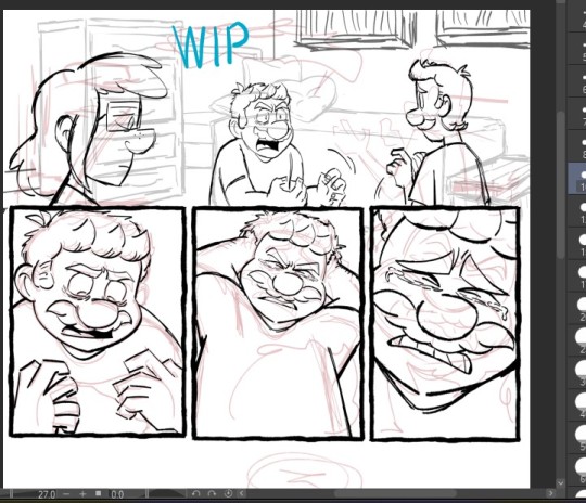
Text

…
Unfortunately they did not get burgers for Hank, but Connor at least learned a valuable lesson. I guess Nines suffers from Amelia Bedelia Syndrome.
———
Hi guys, this is actually a comic I drew and basically finished 11 months ago. And it’s been just about then since I’ve last really opened my iPad and did any drawing. There’s a ton of half-completed works on there and they’re pretty cute, so I’ll try to post them as I get the motivation. My therapist says posting to this blog will probably improve my mental health and he’s right but >:3c
So yeah! Let’s see what I can toss out this year, wooo!!
#nines is not allowed to drive anymore#actually think this came from some text post or something#if this is your text post lmk and I’ll tag you and give you credit <3#I just did not actually save anything other than the drawing rip#thanks for all the patience and also the sweet little asks#reading them takes me out of a funk and I’m grateful#love you guys#detroit become human#dbh connor#dbh nines#dbh hank#comic#again big ambition to get better at backgrounds#maybe someday lol#but you guys get the gist#i do recall that 99% of the reason I wanted to draw this was Connor's expression at the end#the bk guy was added last second but i love him too#nines is probably like: “0/10 service i demand to speak to the king”
126 notes
·
View notes
Text
pspsps--
i see all your beautiful art and wonderful messages and asks and i promise i'll get around to them; i am just slow and dealing with intense work shenanigans rn ( ´•̥̥̥ω•̥̥̥` )
#i promise i'm not ignoring you guys i'm just slow and eepy ;w;#pizza supreme's silliest soldier over here dealing with The Madness#thanks for your patience ;w;#also some of you were too close to the mark to certain plot points so low key can't answer those LOL#pastel prattling
62 notes
·
View notes
Note
flaky and spamton?
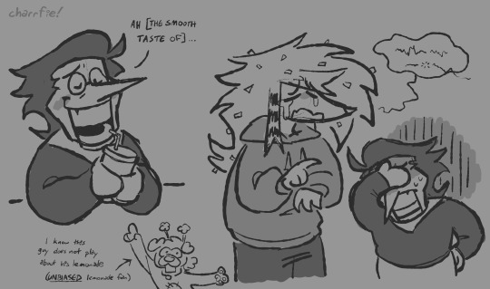
This request has been sitting in my inbox since easter, so sorry lol. He's trying to teach them how to be more assertive and it's not working.... (also included is a request from @nanstar200 asking for spam drinking some lemonade!!)
#spamton#spamton g spamton#deltarune#flaky htf#happy tree friends#my art#laika answers#THANKS FOR YOUR PATIENCE YOU GUYS ive had this art done for ages but kept forgetting to post it#smiling so big knowing people want to see my flaky more often THEYRE SO IMPORTANT TO ME!!!
57 notes
·
View notes
Text
I know it's taking a while but I wanna assure my followers that I am working very hard on the next SMU update!
#katlyn talks#wip sneak peek#the super mario bros movie#super mario bros movie#super mario universe#ive been distracted by so many aus and ideas other people have in the mario fandom that i wanna draw#but i gotta focus on getting this done!#again thank you all so much for your patience!#i never feel like you guys are ever angry for waiting#you all are the best!!#also im working on Jojo and Gang dont you worry!
150 notes
·
View notes
Last Seen Blogs

emzchaos
CHAOS LIVES HERE

my-your-shades-of-happiness-blog
my, your shades of happiness

tinybearbakeryoaf
Untitled
sobalua
Sob a Lua