#trying a new comic format
Text
why Aurora's art is genius
It's break for me, and I've been meaning to sit down and read the Aurora webcomic (https://comicaurora.com/, @comicaurora on Tumblr) for quite a bit. So I did that over the last few days.
And… y'know. I can't actually say "I should've read this earlier," because otherwise I would've been up at 2:30-3am when I had responsibilities in the morning and I couldn't have properly enjoyed it, but. Holy shit guys THIS COMIC.
I intended to just do a generalized "hello this is all the things I love about this story," and I wrote a paragraph or two about art style. …and then another. And another. And I realized I needed to actually reference things so I would stop being too vague. I was reading the comic on my tablet or phone, because I wanted to stay curled up in my chair, but I type at a big monitor and so I saw more details… aaaaaand it turned into its own giant-ass post.
SO. Enjoy a few thousand words of me nerding out about this insanely cool art style and how fucking gorgeous this comic is? (There are screenshots, I promise it isn't just a wall of text.) In my defense, I just spent two semesters in graphic design classes focusing on the Adobe Suite, so… I get to be a nerd about pretty things…???
All positive feedback btw! No downers here. <3
---
I cannot emphasize enough how much I love the beautiful, simple stylistic method of drawing characters and figures. It is absolutely stunning and effortless and utterly graceful—it is so hard to capture the sheer beauty and fluidity of the human form in such a fashion. Even a simple outline of a character feels dynamic! It's gorgeous!
Though I do have a love-hate relationship with this, because my artistic side looks at that lovely simplicity, goes "I CAN DO THAT!" and then I sit down and go to the paper and realize that no, in fact, I cannot do that yet, because that simplicity is born of a hell of a lot of practice and understanding of bodies and actually is really hard to do. It's a very developed style that only looks simple because the artist knows what they're doing. The human body is hard to pull off, and this comic does so beautifully and makes it look effortless.
Also: line weight line weight line weight. It's especially important in simplified shapes and figures like this, and hoo boy is it used excellently. It's especially apparent the newer the pages get—I love watching that improvement over time—but with simpler figures and lines, you get nice light lines to emphasize both smaller details, like in the draping of clothing and the curls of hair—which, hello, yes—and thicker lines to emphasize bigger and more important details and silhouettes. It's the sort of thing that's essential to most illustrations, but I wanted to make a note of it because it's so vital to this art style.
THE USE OF LAYER BLENDING MODES OH MY GODS. (...uhhh, apologies to the people who don't know what that means, it's a digital art program thing? This article explains it for beginners.)
Bear with me, I just finished my second Photoshop course, I spent months and months working on projects with this shit so I see the genius use of Screen and/or its siblings (of which there are many—if I say "Screen" here, assume I mean the entire umbrella of Screen blending modes and possibly Overlay) and go nuts, but seriously it's so clever and also fucking gorgeous:
Firstly: the use of screened-on sound effect words over an action? A "CRACK" written over a branch and then put on Screen in glowy green so that it's subtle enough that it doesn't disrupt the visual flow, but still sticks out enough to make itself heard? Little "scritches" that are transparent where they're laid on without outlines to emphasize the sound without disrupting the underlying image? FUCK YES. I haven't seen this done literally anywhere else—granted, I haven't read a massive amount of comics, but I've read enough—and it is so clever and I adore it. Examples:


Secondly: The beautiful lighting effects. The curling leaves, all the magic, the various glowing eyes, the fog, the way it's all so vividly colored but doesn't burn your eyeballs out—a balance that's way harder to achieve than you'd think—and the soft glows around them, eeeee it's so pretty so pretty SO PRETTY. Not sure if some of these are Outer/Inner Glow/Shadow layer effects or if it's entirely hand-drawn, but major kudos either way; I can see the beautiful use of blending modes and I SALUTE YOUR GENIUS.
I keep looking at some of this stuff and go "is that a layer effect or is it done by hand?" Because you can make some similar things with the Satin layer effect in Photoshop (I don't know if other programs have this? I'm gonna have to find out since I won't have access to PS for much longer ;-;) that resembles some of the swirly inner bits on some of the lit effects, but I'm not sure if it is that or not. Or you could mask over textures? There's... many ways to do it.
If done by hand: oh my gods the patience, how. If done with layer effects: really clever work that knows how to stop said effects from looking wonky, because ugh those things get temperamental. If done with a layer of texture that's been masked over: very, very good masking work. No matter the method, pretty shimmers and swirly bits inside the bigger pretty swirls!
Next: The way color contrast is used! I will never be over the glowy green-on-black Primordial Life vibes when Alinua gets dropped into that… unconscious space?? with Life, for example, and the sharp contrast of vines and crack and branches and leaves against pitch black is just visually stunning. The way the roots sink into the ground and the three-dimensional sensation of it is particularly badass here:

Friggin. How does this imply depth like that. HOW. IT'S SO FREAKING COOL.
A huge point here is also color language and use! Everybody has their own particular shade, generally matching their eyes, magic, and personality, and I adore how this is used to make it clear who's talking or who's doing an action. That was especially apparent to me with Dainix and Falst in the caves—their colors are both fairly warm, but quite distinct, and I love how this clarifies who's doing what in panels with a lot of action from both of them. There is a particular bit that stuck out to me, so I dug up the panels (see this page and the following one https://comicaurora.com/aurora/1-20-30/):

(Gods it looks even prettier now that I put it against a plain background. Also, appreciation to Falst for managing a bridal-carry midair, damn.)
The way that their colors MERGE here! And the immense attention to detail in doing so—Dainix is higher up than Falst is in the first panel, so Dainix's orange fades into Falst's orange at the base. The next panel has gold up top and orange on bottom; we can't really tell in that panel where each of them are, but that's carried over to the next panel—

—where we now see that Falst's position is raised above Dainix's due to the way he's carrying him. (Points for continuity!) And, of course, we see the little "huffs" flowing from orange to yellow over their heads (where Dainix's head is higher than Falst's) to merge the sound of their breathing, which is absurdly clever because it emphasizes to the viewer how we hear two sets of huffing overlaying each other, not one. Absolutely brilliant.
(A few other notes of appreciation to that panel: beautiful glows around them, the sparks, the jagged silhouette of the spider legs, the lovely colors that have no right to make the area around a spider corpse that pretty, the excellent texturing on the cave walls plus perspective, the way Falst's movements imply Dainix's hefty weight, the natural posing of the characters, their on-point expressions that convey exactly how fuckin terrifying everything is right now, the slight glows to their eyes, and also they're just handsome boys <3)
Next up: Rain!!!! So well done! It's subtle enough that it never ever disrupts the impact of the focal point, but evident enough you can tell! And more importantly: THE MIST OFF THE CHARACTERS. Rain does this irl, it has that little vapor that comes off you and makes that little misty effect that plays with lighting, it's so cool-looking and here it's used to such pretty effect!
One of the panel captions says something about it blurring out all the injuries on the characters but like THAT AIN'T TOO BIG OF A PROBLEM when it gets across the environmental vibes, and also that'd be how it would look in real life too so like… outside viewer's angle is the same as the characters', mostly? my point is: that's the environment!!! that's the vibes, that's the feel! It gets it across and it does so in the most pretty way possible!
And another thing re: rain, the use of it to establish perspective, particularly in panels like this—

—where we can tell we're looking down at Tynan due to the perspective on the rain and where it's pointing. Excellent. (Also, kudos for looking down and emphasizing how Tynan's losing his advantage—lovely use of visual storytelling.)
Additionally, the misting here:

We see it most heavily in the leftmost panel, where it's quite foggy as you would expect in a rainstorm, especially in an environment with a lot of heat, but it's also lightly powdered on in the following two panels and tends to follow light sources, which makes complete sense given how light bounces off particles in the air.
A major point of strength in these too is a thorough understanding of lighting, like rim lighting, the various hues and shades, and an intricate understanding of how light bounces off surfaces even when they're in shadow (we'll see a faint glow in spots where characters are half in shadow, but that's how it would work in real life, because of how light bounces around).
Bringing some of these points together: the fluidity of the lines in magic, and the way simple glowing lines are used to emphasize motion and the magic itself, is deeply clever. I'm basically pulling at random from panels and there's definitely even better examples, but here's one (see this page https://comicaurora.com/aurora/1-16-33/):

First panel, listed in numbers because these build on each other:
The tension of the lines in Tess's magic here. This works on a couple levels: first, the way she's holding her fists, as if she's pulling a rope taut.
The way there's one primary line, emphasizing the rope feeling, accompanied by smaller ones.
The additional lines starbursting around her hands, to indicate the energy crackling in her hands and how she's doing a good bit more than just holding it. (That combined with the fists suggests some tension to the magic, too.) Also the variations in brightness, a feature you'll find in actual lightning. :D Additional kudos for how the lightning sparks and breaks off the metal of the sword.
A handful of miscellaneous notes on the second panel:
The reflection of the flames in Erin's typically dark blue eyes (which bears a remarkable resemblance to Dainix, incidentally—almost a thematic sort of parallel given Erin's using the same magic Dainix specializes in?)
The flowing of fabric in the wind and associated variation in the lineart
The way Erin's tattoos interact with the fire he's pulling to his hand
The way the rain overlays some of the fainter areas of fire (attention! to! detail! hell yeah!)
I could go on. I won't because this is a lot of writing already.
Third panel gets paragraphs, not bullets:
Erin's giant-ass "FWOOM" of fire there, and the way the outline of the word is puffy-edged and gradated to feel almost three-dimensional, plus once again using Screen or a variation on it so that the stars show up in the background. All this against that stunning plume of fire, which ripples and sparks so gorgeously, and the ending "om" of the onomatopoeia is emphasized incredibly brightly against that, adding to the punch of it and making the plume feel even brighter.
Also, once again, rain helping establish perspective, especially in how it's very angular in the left side of the panel and then slowly becomes more like a point to the right to indicate it's falling directly down on the viewer. Add in the bright, beautiful glow effects, fainter but no less important black lines beneath them to emphasize the sky and smoke and the like, and the stunningly beautiful lighting and gradated glows surrounding Erin plus the lightning jagging up at him from below, and you get one hell of an impactful panel right there. (And there is definitely more in there I could break down, this is just a lot already.)
And in general: The colors in this? Incredible. The blues and purples and oranges and golds compliment so well, and it's all so rich.
Like, seriously, just throughout the whole comic, the use of gradients, blending modes, color balance and hues, all the things, all the things, it makes for the most beautiful effects and glows and such a rich environment. There's a very distinct style to this comic in its simplified backgrounds (which I recognize are done partly because it's way easier and also backgrounds are so time-consuming dear gods but lemme say this) and vivid, smoothly drawn characters; the simplicity lets them come to the front and gives room for those beautiful, richly saturated focal points, letting the stylized designs of the magic and characters shine. The use of distinct silhouettes is insanely good. Honestly, complex backgrounds might run the risk of making everything too visually busy in this case. It's just, augh, so GORGEOUS.
Another bit, take a look at this page (https://comicaurora.com/aurora/1-15-28/):

It's not quite as evident here as it is in the next page, but this one does some other fun things so I'm grabbing it. Points:
Once again, using different colors to represent different character actions. The "WHAM" of Kendal hitting the ground is caused by Dainix's force, so it's orange (and kudos for doubling the word over to add a shake effect). But we see blue layered underneath, which could be an environmental choice, but might also be because it's Kendal, whose color is blue.
And speaking off, take a look at the right-most panel on top, where Kendal grabs the spear: his motion is, again, illustrated in bright blue, versus the atmospheric screened-on orange lines that point toward him around the whole panel (I'm sure these have a name, I think they might be more of a manga thing though and the only experience I have in manga is reading a bit of Fullmetal Alchemist). Those lines emphasize the weight of the spear being shoved at him, and their color tells us Dainix is responsible for it.
One of my all-time favorite effects in this comic is the way cracks manifest across Dainix's body to represent when he starts to lose control; it is utterly gorgeous and wonderfully thematic. These are more evident in the page before and after this one, but you get a decent idea here. I love the way they glow softly, the way the fire juuuust flickers through at the start and then becomes more evident over time, and the cracks feel so realistic, like his skin is made of pottery. Additional points for how fire begins to creep into his hair.
A small detail that's generally consistent across the comic, but which I want to make note of here because you can see it pretty well: Kendal's eyes glow about the same as the jewel in his sword, mirroring his connection to said sword and calling back to how the jewel became Vash's eye temporarily and thus was once Kendal's eye. You can always see this connection (though there might be some spots where this also changes in a symbolic manner; I went through it quickly on the first time around, so I'll pay more attention when I inevitably reread this), where Kendal's always got that little shine of blue in his eyes the same as the jewel. It's a beautiful visual parallel that encourages the reader to subconsciously link them together, especially since the lines used to illustrate character movements typically mirror their eye color. It's an extension of Kendal.
Did I mention how ABSOLUTELY BEAUTIFUL the colors in this are?
Also, the mythological/legend-type scenes are illustrated in familiar style often used for that type of story, a simple and heavily symbolic two-dimensional cave-painting-like look. They are absolutely beautiful on many levels, employing simple, lovely gradients, slightly rougher and thicker lineart that is nonetheless smoothly beautiful, and working with clear silhouettes (a major strength of this art style, but also a strength in the comic overall). But in particular, I wanted to call attention to a particular thing (see this page https://comicaurora.com/aurora/1-12-4/):

The flowing symbolic lineart surrounding each character. This is actually quite consistent across characters—see also Life's typical lines and how they curl:

What's particularly interesting here is how these symbols are often similar, but not the same. Vash's lines are always smooth, clean curls, often playing off each other and echoing one another like ripples in a pond. You'd think they'd look too similar to Life's—but they don't. Life's curl like vines, and they remain connected; where one curve might echo another but exist entirely detached from each other in Vash's, Life's lines still remain wound together, because vines are continuous and don't float around. :P
Tahraim's are less continuous, often breaking up with significantly smaller bits and pieces floating around like—of course—sparks, and come to sharper points. These are also constants: we see the vines repeated over and over in Alinua's dreams of Life, and the echoing ripples of Vash are consistent wherever we encounter him. Kendal's dream of the ghost citizens of the city of Vash in the last few chapters is filled with these rippling, echoing patterns, to beautiful effect (https://comicaurora.com/aurora/1-20-14/):

They ripple and spiral, often in long, sinuous curves, with smooth elegance. It reminds me a great deal of images of space and sine waves and the like. This establishes a definite feel to these different characters and their magic. And the thing is, that's not something that had to be done—the colors are good at emphasizing who's who. But it was done, and it adds a whole other dimension to the story. Whenever you're in a deity's domain, you know whose it is no matter the color.
Regarding that shape language, I wanted to make another note, too—Vash is sometimes described as chaotic and doing what he likes, which is interesting to me, because smooth, elegant curves and the color blue aren't generally associated with chaos. So while Vash might behave like that on the surface, I'm guessing he's got a lot more going on underneath; he's probably much more intentional in his actions than you'd think at a glance, and he is certainly quite caring with his city. The other thing is that this suits Kendal perfectly. He's a paragon character; he is kind, virtuous, and self-sacrificing, and often we see him aiming to calm others and keep them safe. Blue is such a good color for him. There is… probably more to this, but I'm not deep enough in yet to say.
And here's the thing: I'm only scratching the surface. There is so much more here I'm not covering (color palettes! outfits! character design! environment! the deities! so much more!) and a lot more I can't cover, because I don't have the experience; this is me as a hobbyist artist who happened to take a couple design classes because I wanted to. The art style to this comic is so clever and creative and beautiful, though, I just had to go off about it. <3
...brownie points for getting all the way down here? Have a cookie.
#aurora comic#aurora webcomic#comicaurora#art analysis#...I hope those are the right tags???#new fandom new tagging practices to learn ig#much thanks for something to read while I try to rest my wrists. carpal tunnel BAD. (ignore that I wrote this I've got braces ok it's fine)#anyway! I HAVE. MANY MORE THOUGHTS. ON THE STORY ITSELF. THIS LOVELY STORY#also a collection of reactions to a chunk of the comic before I hit the point where I was too busy reading to write anything down#idk how to format those tho#...yeet them into one post...???#eh I usually don't go off this much these days but this seems like a smaller tight-knit fandom so... might as well help build it?#and I have a little more time thanks to break so#oh yes also shoutout to my insanely awesome professor for teaching me all the technical stuff from this he is LOVELY#made an incredibly complex program into something comprehensible <3#synapse talks
743 notes
·
View notes
Text

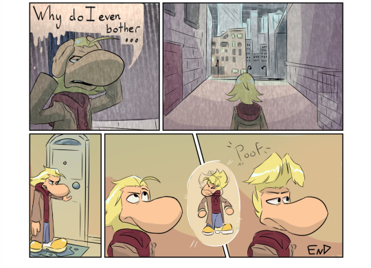
another Raymania comic so soon??? And all about Rei! Nothing else! And some rain. (Sorry Remy I’ll get to you eventually bud)
this is mostly to answer what Rei does all afternoon if he’s not at home or with one of the guys in the beginning months. He’s out hunting for a job! Sometimes he gets one! But the date for a shoot or whatever he’s doing gets pushed back, so he ends up trying to find more work anyways. He misses his old job that’s for sure…
Full comic not chopped up under the cut!

#raymania#rayman#rayman au#rayman fanart#rayman art#captain laserhawk rayman#cl rayman#kats art#rayman captain laserhawk#ramon captain laserhawk#Trying out new comic formats for easier reading#Aka plan ahead to split in half#Also Rei’s hair gets wet#Nothing special or anything#The rain gets to him#And his shoes :(#Those were NOT built for walking#Raymania comic#Rayman comic
373 notes
·
View notes
Text


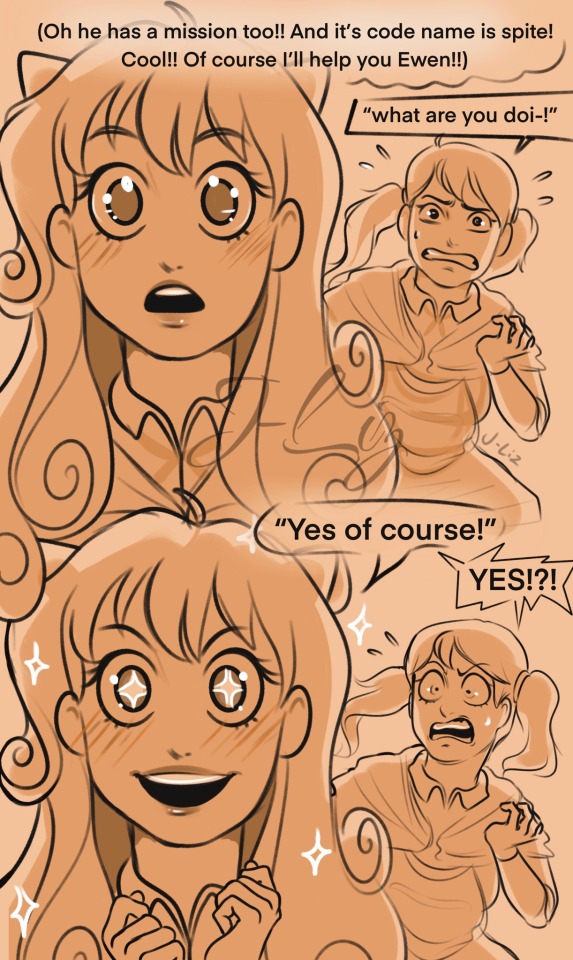
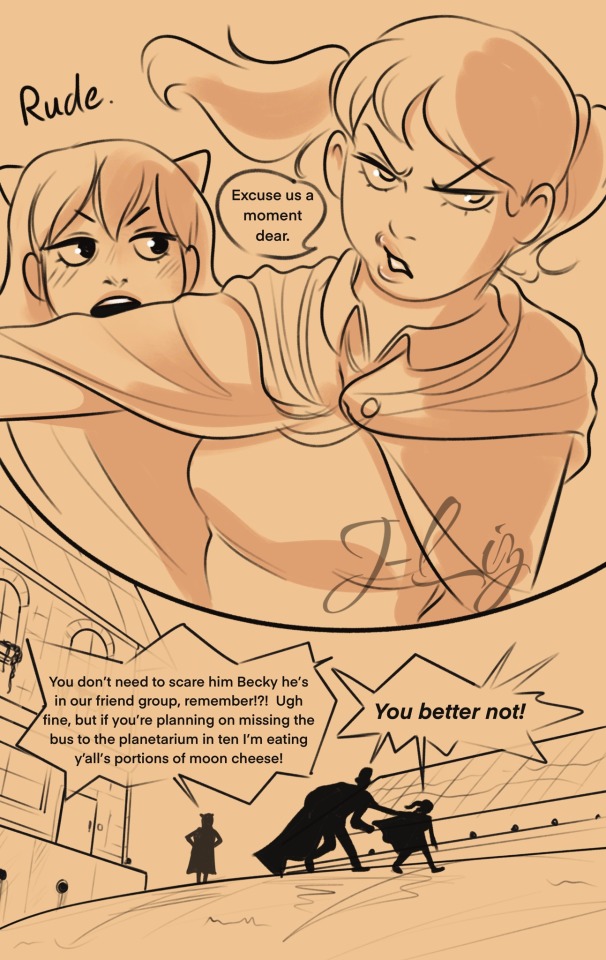
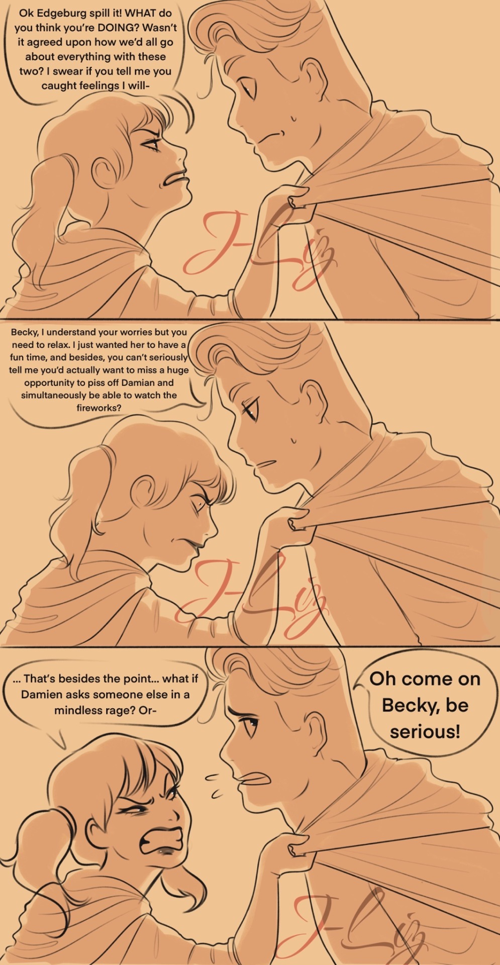

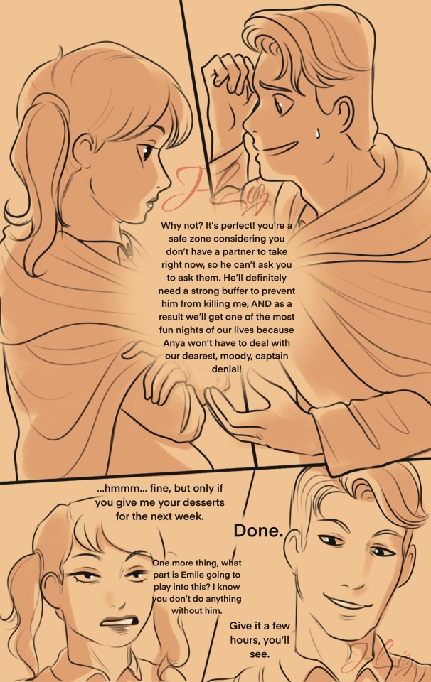

Here you go @discocandles you genius bastard. The spite saga continues. Anya sees another mission and says absolutely.
Bonus:
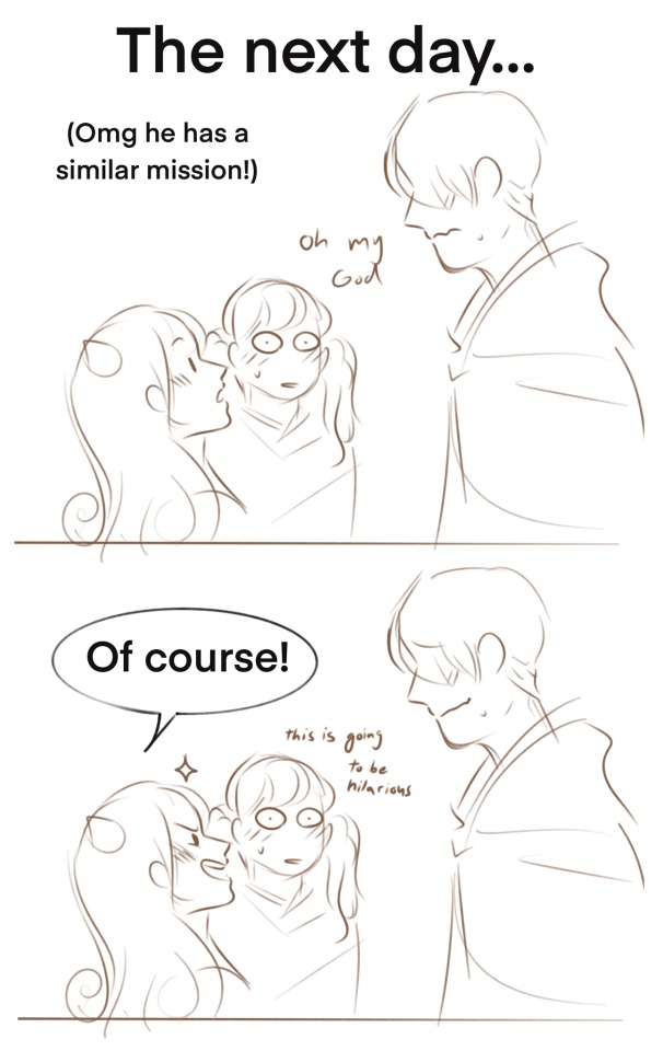
Part 1.5 of 3
Part 1
#myart#my art#art#sketch#spy x family#spy family#fanart#sxf comic#becky blackbell#ewen egeburg#emile elman#damian desmond#anya forger#sxf#sxf au#future au#Becky is all in on the bullshit#Anya respects peoples boundaries until it’s convenient for the plot#my comic#I’m also developing my style a little bit and trying a new format aside from stacking blocks because I don’t sleep#damianya#spite saga
2K notes
·
View notes
Text


#trying smth new#i think this comic format works for short asks#might change how the speech bubbles work in the future tho 😳#kirby nintendo#my art#digital drawing#comic#mage sisters#Zan Partizanne#Flamberge#Francisca#ask-magesisters
71 notes
·
View notes
Note
Draw Caligura eating a hamburger /j
How dare you!!! It’s the world without murica, so no burger. Only that Italian sandwich I found, Wikipedia says it’s called panini lol.
Day 44. Eating panini.

I’m suck at drawing food sorry.
#fear and hunger#caligura#he’s be like#^O^ *om* ^~^#but with angry eyebrows above#btw I skipped yesterday because I was doing little comics#today I’m late as fuck because I decided to write a little fanfic lol#randomly gone into trying new formats thing#hope it’s end soon bruh
52 notes
·
View notes
Text

beware my wine rants
#hi im back and experimenting#ive had the gnarliest art block for the past like month and a half sorry! i made this to try to break out of it#for more context this happened on the night we got drunk and watched spiderman 2 (2004) and i looked up the soundtrack afterwards#and fell down a rabbithole bc switchfoot is on it#my dad used to listen to contemporary christian radio (probably still does) so i heard a lot of the more popular Christian hits of the 2000s#also christian stations will play what the fuck ever sometimes if a song can be read in even a little bit of a christian way#idk how christian the fray is (ig they did make 'you found me' but.) but ive heard 'how to save a life' on christian stations#and theres plenty of like. really lowkey christian bands. like switchfoot! and relient k!#most ppl alive in the 00s have probably heard 'dare you to move' just in nature. and christian stations loved that one#newsboys is on that spectrum somewhere i think. they did 'belly of the whale' for the Jonah a veggietales movie#and the dvd bonus features include the music video for that plus the video for 'a million pieces' which doesnt feel overtly christian to me#anyway! i hope everyone likes this vertical format! and the coloring. im still trying to adjust my style for that part#when csp says 'brightness' it does not nean 'color value' which is an issue for my new method#but yknow its a learning curve#furry#queer artist#smth smth#queer comics#trans artist
32 notes
·
View notes
Text
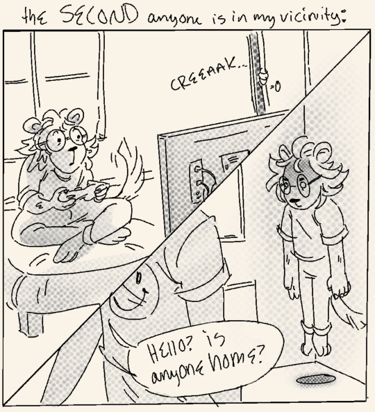
Mini comic about how my brain reacts to being in a room with literally ANY other human being !!!
#trying a new style to get little daily comics out faster to practice panel formatting and such :)#my art#my comics#comics#comics on tumblr#artists on tumblr#daily comic#digital sketchbook#art#illustration#sketch#sketches#doodles#comic artists#web comics#comic strips
49 notes
·
View notes
Note
akihiro/daken/fang/dark wolverine vs jason todd/red hood/robin
both of them are "darker versions" of their superhero fathers (jason being the red hood which is also a vigilante but a vigilante who kills, and akihiro was literally "dark wolverine")
#trying a new format we'll see#this does save me a lot of time#dc comics#dcvsmarveltournament#poll tournament#tournament poll#tumblr tournament#dcau#dcu#marvel#marvel comics#poll#polls#red hood jason todd#robin jason todd#robin jason#jason peter todd#jason todd#red hood#robin#dark wolverine#daken akihiro#akihiro#daken
11 notes
·
View notes
Text


Do you know the thing called "swimming"? So, I am a Water-type, so I CAN swim long enough. Took me hours without break... Now I'm tired...
While Walt sits near Eevee, he is trying to say something, while Nate still in his shower.

WHAT THE HECK? I'M STILL CAN'T RECOVER FROM THIS!!!
Sigh... let's go outside...
[ @askvekpa ]
/ There'll be another post about Colress Lab, so stay tuned.
#/ just trying the new comic format#/ also reupload because I forgot his ears#Answered#Nate's Story#NS: WaltDewott#NS: Nate#OTHER: BingoEevee#NS: Chrono#Pokeask#Pokemon
13 notes
·
View notes
Text


Day 21 of Lotftober!
Yes, I know that’s it’s over now but I was planning on posting this for Day 21 a while back (I even posted a WIP a while back) but due to me being constantly busy, I couldn’t post it in time 😭 So I figured that I’d post it now
When I first read Lord of the Flies, I found this scene to be really sweet. Before, I wasn’t really understanding the book (it’s way too descriptive at times 😅) but when I read this scene, I really liked it. Ralph and Simon were the characters I liked the most, so I figured I’d draw this scene for the day
I really wish I could have finished this in time but it’s here now and that’s all that matters I suppose
I'm writing this because I just wanted to say that I truly appreciated being able to have the opportunity to post my art <3
I don’t have a problem with my artstyle but I always think it’s too cutesy and I get shy whenever sharing it with people I don’t know. So sharing a piece of art of the boys was definitely a big step (especially since I had drawn the 4 boys in one go)
But people actually liked it, so it made me want to create more and the more I created, the more people liked it. It was a bit of a surprise for me. I know that 15 or 21 likes isn’t a lot to others but for a small blogger like me, it’s huge. I’m pretty sure the gender bent one I made is the one that has the most likes thus far
Even though I was constantly busy, I still had so much fun drawing the boys and participating in this event. I just wish I could have participated more! It was nice seeing the official lotftober account reblogging the artwork I made. Even one of my favorite artists reblogged my art! (When I got the notification that they reblogged my genderbent artwork, I was so happy!)
It really helped me gain more confidence in my cutesy artstyle and made me see that people do indeed like it. I want to improve of course, but I’m now more content with the way I draw
I don’t know if I’ll ever post more art soon, but I’d definitely love to post more in the future!
From the bottom of my heart, thank you to everyone who liked my art and gave this little blogger some attention 🩷🩷
Also shoutout to my recent followers who came in during the lotftober event, you guys are awesome! Also shoutout to the people behind lotftober, you guys are awesome as well!
Once again, thank you all ❤️
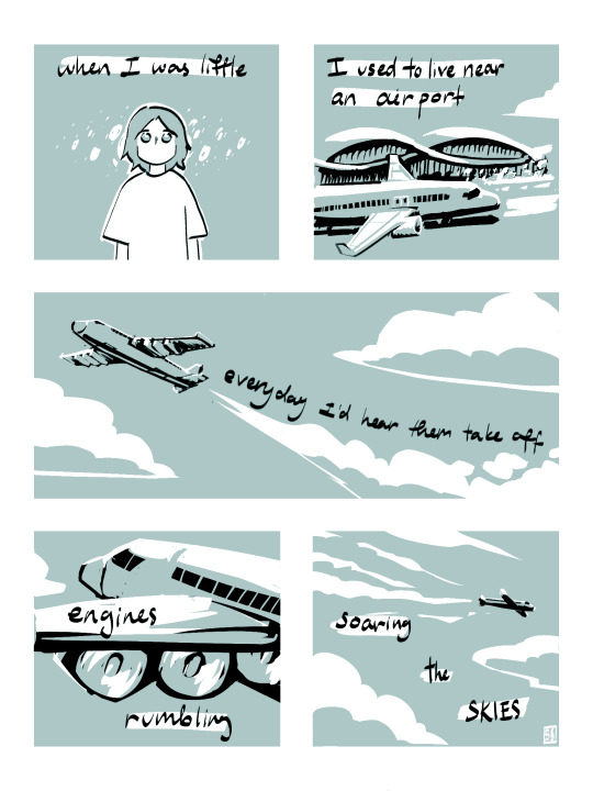
#lord of the flies#simon lotf#ralph lotf#day 21#artwork#digital drawing#digital art#thank you guys#ps sorry about the weird panel at the end#I tried reframing the canvas but it just made Ralph and Simon look weird kind of#so I kept it the same size#hope it doesn’t look too weird#i love these goobers#fanart#I also hope you guys can read the comic#this is my first time trying a comic format so sorry if it looks weird#hope you enjoy it!#I really need to get a new lord of the flies book#I used to have the book but I had to return it#I had to find an audiobook and search online in order to draw this scene 😅
10 notes
·
View notes
Text
Haha. Well. I meant to have the next Alphatale page done before the new year, but I haven't even gotten the backgrounds. All I have are excuses, and only a handful are legitimate. For anyone going "Oh it's fine, I'm sure you have good reasons!", I appreciate you, and I want to make clear that this isn't a matter of being unnecessarily pressured by myself or an audience. This is a very personal story to me that I really want to share, so I'm just disappointed I didn't make the time for it.
I don't have any news or promises to do better in the future, but for anyone who's been actively reading/waiting, Thank You. I felt you deserved an update, as minimal as it is right now. 💛
#alphatale#undertale#undertale au#alphatale update#my post#well okay#I guess there is some other news#hopefully leaning on the “good” end of the spectrum#but I may have a new technique that *might* make it easier and faster#it's what I used for the animatic#but no promises that it'll actually fix much#because I haven't actually tried it on the comic#and the vastly different format#it might actually end up overcomplicating things#or it'll make things faster#but in any case I'll try it out!#and see what happens!
4 notes
·
View notes
Text
UPDATE || Monday, Feb 6 || 2023
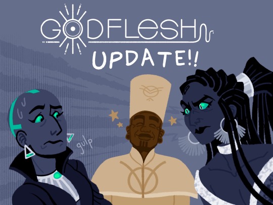
You do NOT want to be on the receiving end of a Jathara death glare.
Tapas | Webtoon | Patreon | Themesong
G O D F L E S H is a comic about gods and prophets, sinister happenings, and royal bloodshed…and a king and his new bodyguard who are caught in the middle.
Reblogs are appreciated!
#godflesh#godflesh comic#my art#artists on tumblr#update#comic update#webcomic update#tapas#webtoon#webcomic#webcomics#comic#comics#trying a slightly nwe format let's see#*new
34 notes
·
View notes
Text

→ AIM FOR THE BEST — NEW PAGE
start from beginning || current page
AIM for the Best is paranormal fiction that follows young Michael Josephine in his adventures to prove the existence of the paranormal, a slow-going business he has named "Anomaly Investigation and More". A fateful series of events will lead him to find out more about the oddities of his hometown than he had ever seen before.
#aim4thebest#cryptidcore#webcomic#original art#indie comic#artists on tumblr#paranormal#i'm trying a new comic posting format so bare with me here#i think i'm gonna direct comic traffic to my website from now on#wooh yeah fun
2 notes
·
View notes
Text
Patient Interview #1
“First Meeting”
Real Name: Corvus
Occupation: Professional Criminal
Base of Operations: Gotham City
Hair(Feathers?): Black
Eyes: Black
Height: 6 ft 3 in
Weight: 180 Ib
[BEGIN TAPE]
Dr. Tibbetts: This is Dr. Emily Tibbetts, this is my first interview with my first patient within Arkham Asylum. The date is January 20th, 20XX, at 2:36 p.m. Let's get this started.
Dr. Tibbetts presses a button on her desk.
Dr. Tibbetts: You can let them in, Mr. Bolton, it's alright.
The heavy steel door is opened, locks unlocked, and with a harsh shove, the patient is taken through. Corvus, comes through the door in chains, being dragged by Chief of Security, Lyle Bolton. Both seem unwilling to be in each other's presence.
Corvus: Oh no, doctor, let the man keep dragging me. Let the last bits of my dignity fade away to keep this man’s ego up.
They stop, Lyle Bolton’s grip on the patient tightens yet Corvus does not reach.
Lyle Bolton: You want me to throw you in like trash?!
Corvus: Are you implying that this poor doctor is the trash can, Lyle? How rude...
Lyle Bolton raises the patient by their collar.
Lyle Bolton: YOU-
Dr. Tibbetts stands up from her chair.
Dr. Tibbetts: Mr. Bolton, please-
Corvus: Nonono, let him speak, doctor, we may be going through a breakthrough here!
Bolton is fuming.
Dr. Tibbetts: Bolton-
Lyle Bolton plants Corvus onto the chair, roughly.
Lyle Bolton: Stay there! Don't move a damn muscle until this session’s over.
Corvus: Don’t worry, I don't plan to do much with you around.
Lyle Bolton leaves the room, still fuming. Once the door is closed is where Dr. Tibbetts sits down and resumes her work.
Dr. Tibbetts: You must forgive Mr. Bolton, he needs more confirmation on how not to handle patients. Especially patients in my care.
Corvus: It’s no problem, really. You’ll, unfortunately, get used to it as the years go by. You’re new, doctor, you wouldn't know.
Dr. Tibbetts: You can call me Dr. Tibbetts.
Corvus: Doctor it is.
Dr. Tibbetts takes a moment before looking through her files.
Dr. Tibbetts: Well, Corvus, it seems that. you've been moved to my care!
Corvus: Yes, I can see that.
Dr. Tibbetts: And as far as I'm aware, it seems that due to an incident last month is what may have caused it. Would you care to explain what happened to Dr. Martin?
Corvus: Don’t you mean last year?
Dr. Tibbetts: Pardon?
Corvus: Last year. The month before January is December. Thus making the incident last year.
Dr. Tibbetts: Well, uh, I suppose that's what I was going for.
Corvus: And going for you did, Doctor! You must be detailed about the topics you share with me, otherwise, I’ll be confused. I have an awful tendency to not understand social cues from humans.
Dr. Tibbetts: Well, that's where I'm here to help! I’ll guide you through our sessions and help you heal to the best of my abilities. No matter what!
Corvus: Wonderful!
Dr. Tibbetts: Alright, since we got that out of the way, let’s start from before. What happened between you and Dr. Martin last year?
Corvus: I don't want to talk about it.
Dr. Tibbetts: Corvus, you know that the most important part of our sessions is your cooperation, no?
Corvus: Well, I just don't see what is there to talk about! I killed the woman. Rather brutally if I remember correctly. It's not exactly the kind of thing to talk about right away, you know.
[TAPE ENDS]
#trying a new writing format#it's a lot of fun#batman#dc#detective comics#corvus#dc oc#batman oc#lyle bolton#arkham asylum#patient interview#my writing
11 notes
·
View notes
Text


A conversation with @mc-gem that sprouted wings and took off on it's own.
#secret_arts#ss:jewels#once again#gem#this is for you#ugh im still not over the plane line#i love#planes#comic#trying something new#this looked nicer in the left to right printed format i had in mybrain#like#compared to tumblr's top down#but thats alright#anyways yeah
14 notes
·
View notes
Note
oooo also al or mar if you havent yet
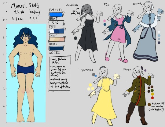
Mariel for the people!! Al’s is in progress, too! It’s so nice to have a new ref for them!!
#I’m happy with my new format too#gottta type fast Nikon is trying to eat the iPad lol#my art#queue be or not queue be#to victory comic#ask box#mariel syng
3 notes
·
View notes
Last Seen Blogs

rootandrock
Root And Rock

sushinivak
Sem título

bratzdotcom
Untitled
bitter-lover
broken veil of tears
reginarossa
― a small Light in a great Darkness ―