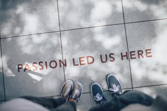
#Half realism half cartoony is so hard
Text


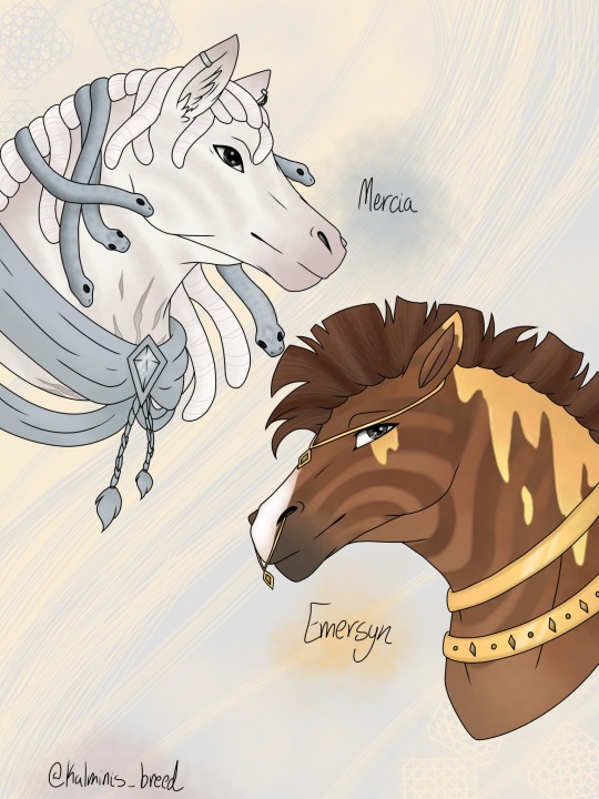
Some more realistic style horse art payments!
Just got to the hotel for vacation. Today has been very long 😭
#My art#Not my ocs#Horses#Half realism half cartoony is so hard#I don't love how these came out but they are a few months old#I really need to work on backgrounds
7 notes
·
View notes
Text
DEATH NOTE HEADCANONS
bc i need to get this shit outta my brain
if/when these conflict with canon i simply do not care
L is Asian, Mexican, and English, to varying percentages (see above sentiment)
Light is half siblings with Sayu- Soichiro is his biodad and Sachiko is his stepmom. Soichiro and his first wife (Light's mom) separated very early in Light's life and she didn't keep in touch, so he regards his stepmom as his real/only mom
Rem uses they/them pronouns. Ryuk uses he/they.
Misa is a tech geek (this is practically canon but im explicitly saying it)
Matsuda and Naomi would've dated if they met, and he would've thought she was such a cool badass and she'd feel appreciated for her abilities/passions. Matsuda would be a housewife for her, working part time when asked to come in
L is vegetarian
L is autistic, Misa has a cluster B personality disorder, and Light has both
Watari is a lowkey sybarite
Light has a praise kink, but Not a worship kink. sure he wants to be a god and be worshipped, but that's not the kink, that's just mental illness.
During the Yotsuba arc, Ryuk and the others in the shinigami realm were constantly gambling on different events unfolding. it was riotous and everyone was bummed when Ryuk got summoned back by Misa, bc he was the ringleader for it all
Misa suffered muscle atrophy and malnutrition from her confinement period, and it had a real impact on her for a while afterward. She had an entire floor to herself in the KTF HQ because the stairs to get to other floors/amenities were hard for her. Mogi and L were the two people to primarily assist in her recovery.
Misa would be responsive to therapy, Light wouldn’t be, and L simply would not go
Matsuda is undiagnosed neurodivergent and literally everyone else in the room knows but him. he also has an anxious attachment style, originally just to Soichiro but grows to the others as well.
Misa loves music, L has not heard a new song in at least 3-5 years, and Light can recognize top hits as they're circulating but has never invested any time in really paying attention to music. this is depressing to me and Misa.
Light doesn't like abstract art. He thinks it's silly. L likes it equally to realism, although he isn't, like, deeply passionate about it. Misa draws in a cartoony style
Ryuk and Rem are related in some way. i believe this bc of their similar builds, compared to some other shinigami types/builds
Matsuda and Misa like romdramas and romcoms. They require tissues in case of tears. L and Light like thrillers/mysteries/psychologic horror. They race to be the first to figure out the resolution/mystery presented. L is winning
#death note#ryuzaki#l lawliet#misa misa#misa amane#light yagami#matsuda#soichiro yagami#rem death note#ryuk death note#antisocialsocialite#thinking out loud#headcanon#death note headcanons#l is autistic#fuckin uuhhhh#idk
137 notes
·
View notes
Note
Half assed?? Oh my goodness no! Idk about anyone else, but for me personally you're an inspiration! You inspired me to branch out, and not confine myself to stylized realism. You've helped me realize that I can do cartoony art and enjoy it, and you've been such a big inspiration for me and my art. Please don't be hard on yourself, you're an amazing artist and your shapes, your line work, your color theory, and your anatomy make for such wonderful and cohesive pieces. I know it's hard dealing with imposter syndrome, I promise you deserve all the love and appreciation we give you. You deserve more, frankly. Please don't let anyone get you down. We love you :]
gosh that's :'( that's so cool you're so cool for trying new things ,,, idk how i helped with that but i'm glad that i could ;-; <3 <3 thank you you're really really really sweet,,,,
10 notes
·
View notes
Note
Weird question, but I've been trying to improve at diversity.
If Genesis and Aeron were in a different art style do you have any particular thoughts on what their noses and skin tones might look like?
In the past I've tried to guess by referencing pictures of people in the regions they're "from" but the features of the people are really diverse.
In that computer meme I gave Genesis a warm skintone, kind of golden to complement his eyes and hair. Afro-Turks have always existed and his hair has some texture (I forget which again and search will not smile upon me) so for his nose I made it a little wide, rounded and upturned with a low bridge. Kind of a cute mischievous button nose without making it small. (His lips are still full. They look smaller because Genesis is pursing them, half suppressing a smirk.)
Aeron got cooler toned darker skin to contrast the hair, plus accidentally very textured hair because I really haven't nailed drawing their hairstyle yet. A longer more aquiline Arabic nose because it gave off an older, more elegant intimidating look. I get a feeling that despite causing unintentional chaos Aeron is kind of the defacto leader or at least the eldest/most powerful?
But pictures of Turkish people also show a more prominent rectangular nose that would also look really good on Genesis (the button nose might look a bit young on a dad), and the noses of Jordanian people aren't all as slim and exaggeratedly downturned as I made Aeron's.
Also completely random, but what are everybody's teeth like? (Even just the Galleria trio and Dorian.)
Sorry if this is inappropriate to ask, a loaded question, or puts you on the spot. You're free not to answer, or not have thought about it much.
I'm just thinking about art styles, realism, and improving on drawing non-white features. Because there are PoC characters in the VN community, and you can get a lot of character out of specific features.
Do I just like, pick a headcanon and stick to it, or draw it different each time? I guess sticking to semi-realistic cartoony I can just kind of fudge it and just barely suggest impressions of differing features.
These are demons and not tied to hard rules of appearance.
Plus I think Aeron would subtly shift their appearance if they noticed you trying to draw them, just to fuck with you. And Genesis changes bodies so many times nobody really knows what he looks like anymore, not even him.
There you go, that's it. My art isn't inconsistent. The demons are just trolling me 👍
my art style could and should be improved upon concerning facial features and hairstyles. i want to give pointers, but you also make a point that i hope resonates with other people: you can also do whatever the fuck you want.
do not erase skintone, do not erase what makes them who they are. but if you want to draw characters with different hairstyles, different facial features, different outfits, different body types, whatever, do it. but let the characters serve as a guideline. they all have, for one reason or another, changed their bodies over the years. maybe they're one way, maybe they're the other.
what matters to me is that you, to some degree, connected with the characters while drawing them. i put a little bit of myself into each of my ocs. that shouldn't stop at me.
so....do what you think fits. do whatever the hell you want, just as long as you're respectful in the process!
6 notes
·
View notes
Note
So if I'm remembering things right in the show Sasha was still able to slice clean through robots despite of being disconnected from her gem at that point.
Since your fic seems to tend more towards realism and to downplay some of the more... ah... "cartoony"? parts of the show a bit, will the girls being able to cleaving through metal and machinery without calamity powers be something they'd be capable of here?
Oh, good question. I have thought a bit about it and I think I do have an explanation as to why the frobots were as fragile as they were.
Amphibia is likely a mined out planet. While yes it did conquer other worlds to feed its war machine, I highly doubt they neglected their own stores of metal ore.
My headcanon is that the baseline frobot we see getting busted like they're an orc in the Hobbit movies is because they are made of a fairly weak alloy, a compromise that needed to be made for the first leg of the invasion on earth because Amphibia's natural resources are likely fairly depleted. So this first wave of frobots were made to secure an area with easily accessible strong metals (like say, a metropolis filled with skyscrapers and cars) which would be scrapped and recycled into proper imperial era spec frobots.
For an idea of what those would be capable of, I think we can get a good idea of what they are capable of from the infiltrator bot who went after Anne.
This thing put up a fight and took massive amounts of damage and continued to fight on and adapt despite heavy damage. These were likely made with left over strong materials after they had built the scrapper factories (the smaller ships that fly around the castle)
Or, for that matter, Frobo, who was likely a frobot made to imperial specifications and pretty god damn strong. I don't think we see him take a hit before he's crushed beneath a half ton newt.
In my headcanon if Andrias had just chosen a easier target for his first conquest to get the proper materials he probably could have conquered Earth easy (in the show it seems pretty iffy if he could have won, even if Anne wasn't there.) But, well, when you've been stewing on a conquest for a thousand years, and are as spiteful as Andrias seemed to be, well hard to put it off any longer.
16 notes
·
View notes
Note
Ok not to bring up old ridiculous accusations but I’m wondering if that original anon who accused you of whitewashing (without being able to explain what exactly they thought they saw) was seeing the brow bones in your clone art being less pronounced than tem’s. I don’t think that’s really whitewashing but it is a significant facial feature that I do think is different in your art! I like your art the way it is but if you were still wondering about new things to try you could consider it. But again to be clear I already love your art and I don’t think you need to change <3
Can I be really honest with you for a moment, anon?
Art is fucking hard. I know looking at other artists it sometimes feels like they can do everything effortlessly, but trust me, every artist has something (or more) they always struggle with.
For me that's faces. Which is funny because I love drawing faces. Half the time I'm already happy when I have a nose or an eye that at least looks decent, let alone in a very specific shape I want. But I try, boy do I try. And if you compare my first sketches of the clones to my recent ones I think I can safely say I've managed to bring quite some Tem into it, but still retaining my style and I'm definitely working on making it even better. So thank you for the (polite) tips on what I could improve.
But I do want to say something on this subject that has been bothering me for a while. (Not talking about you here, anon)
There's the stylization part. I know this can be a touchy subject, but I'm gonna say it anyway. I don't think every iteration of the clones needs to look like like an exact copy of Tem because there is such a thing as an art style. And by that I don't mean whitewashing, by that I mean style. So you pick out the elements that make Tem look like Tem (skintone, wide nose, expressive eyebrows etc) and then give it your own twist. We're not all realism artists here. Some of us have a sharp, chonky style, you don't tell them they can't draw clones because it wouldn't fit the 'soft jawline' Tem has. If an artist's style is more cartoony, you can't tell them never to draw clones because Tem doesn't look a cartoon character in real life. It doesn't work that way. The beauty of art is that you take the core of something you love and turn it into something new, giving it a part of yourself.
And going around telling artists (that are clearly doing their best not to whitewash) they're racist because they don't draw a hyper realistic carbon copy of a real life actor is just ignorant and unproductive.
And that is all I'm gonna say on this.
Any asks coming in after this that are anything less than polite or that I feel are just looking for confrontation will be blocked, thank you.
119 notes
·
View notes
Note
yo bridget!! i love your art tutorials,, they help a lot :D do you have any tips on general proportioning of the face and body? thanks!!
Face and body are HARD! That’s why they call it bath and body hurts.
A lot of these are like, random.
Body-ody-ody-ody-ody-ody-ody-ody
Let’s pull up Alden and Elaine really quick to be my models (because they’re the first two people in my WIPs folder)
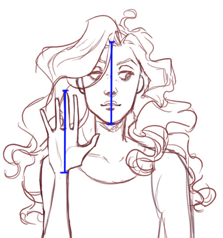
1. "The average human is 7.5 heads tall.” (Children are less, but I am sure you know this one; ‘tis the bread and the butter of figure-drawing)
Why is Alden 7 heads tall here? Because I’m drawing in a more cartoony style that features a bigger head, that’s why. If you're not shooting for realism, that’s fine. Fashion illustrations are usually 8 1/2. Idealized figure is usually 8.
2. If you hold your hand up to your face, your middle finger touches your hairline.
Try it! This isn’t true for everyone (congrats on the tiny hands) but should give you an idea of how “big” the hands should be
As you can see, Elaine’s hand is a little too long for her head. I like long hands. Oops
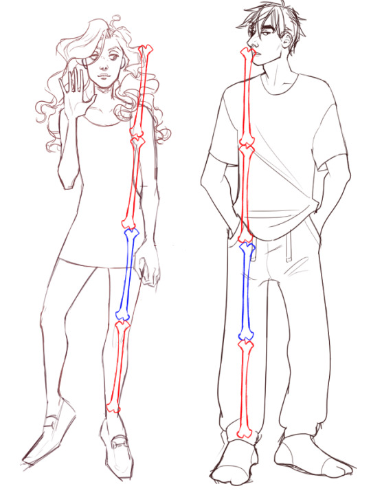
3. LEG LEG LEG. Leg is three-and-a-half to four heads long.
You measure from the perineum (I know, I know) to the foot.
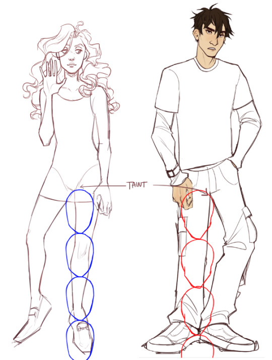
I tend to draw shorter legs, because I have a proportionally longer torso, and I am my own favourite reference.
After finding this out, I’d probably extend the legs out a little. Elain’s supposed to be long-legged, and Alden’s 6″ and lanky, so he should look a little longer... shit ... This is probably why Alden measured out at only 7 heads...
4. Your femur bone is roughly 1/4 or 25% of your total body height.
KINDA??????????? I’ve never taken a medical anatomy class, and it shows in my funky femur bones
5. Foot... is suffering
In general, the taller you are, the larger “base” you need for support - but my cousin and I share a size 5 shoe, despite her being 5′11″ and me being 5′1″. You figure that shit out. This is why most ratios on this list are general guidelines, not be-all end-alls. Humans are weird.
OK scratch that. I did a fucky wucky. I looked it up, and the human foot is supposed to be the same length as their head. Elaine is Bigfoot McGee by accident.
OK, THAT’S ON ME. JUST BECAUSE I KNOW THE RULES DOESN’T MEAN I’M OBEYING THEM UNFORTUNATELY
Once you fall down the rabbit hole, you can keep going for a loooong time. You can look at waist:hip ratios, waist:chest ratios, golden ratios... and before you know it, you've been tricked into doing math.
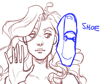
LET’S TAKE THIS TO THE TREADMILL (THE FACE)
Eyes are always going to be at least 1 eyeball’s width apart. Eyes are halfway down the face. I know! Nobody wants to hear this! But I’m right! I always put those bitches up higher and then wonder why my drawing looks off
Yeah okay let’s draw a new face for this one I don’t have faith in the other hoes
2. Follow the line down from the eyebrows to find out where the tops of the ears are (doesn’t apply if your person has big ears)
3. Corners of the mouth will line up with the pupils of the eyes.
4. Nostrils line up with the tear ducts of the eyes.
OK, so this is where things are starting to fall apart because I draw everyone with big, wet doe eyes. I... anyway... here’s how it’s SUPPOSED to look.
The head is usually five eyes wide.
I know! We don’t wanna hear this shit either! We just wanna live deliciously and draw anime! Ma’am, tell me about it! But that’s the facts.
...
Okay fuck this I’m not drawing anymore TAKE THIS SKETCH BY LEONARDO DA VINKY
FUCK IT! LISTEN! HE KNOWS BETTER THAN I DO. I’M NOT A WORLD-RENOWNED RENAISSANCE PAINTER. WHO AM I KIDDING? I’M JUST SOME HACK ON THE INTERNET
In conclusion: humans are stupid. Math is fake! As always I try to disclaim these with a big speech about how drawing from life is one of the best, fastest, and easiest ways to improve your “eye” and sense of body proportion - but let’s be real, we don’t have friends to go draw naked people with right now, and using reference sites can be really hard.
27 notes
·
View notes
Text
Saturn in Aquarius: 2020-2023
Beginning on March 21, Saturn entered the revolutionary sign of Aquarius for a brief month and a half preview and will retrograde back into Capricorn until the end of September. On December 17, it will re-enter Aquarius until March of 2023. Saturn is known as the planet of limitations, boundaries, responsibilities and hard lessons, and up until now has been making its way through the restrictive and authoritarian sign of Capricorn since the beginning of 2018. Though Saturn is the ruler of earthy Capricorn and identifies well with that controlling energy, it doesn’t always do its best work in this sign. Traditionally, Saturn also rules the airy free-flowing sign of Aquarius and tends to be very comfortable in this sign, despite how different they may seem. When Saturn enters this humanitarian sign, it evolves into a higher version of itself, capable of bringing much needed equality and change into the world. How do we know this? Well, let’s take a look at the last few Saturn transits through Aquarius – from 1991 to 1994, and before that, from 1962 to 1964.
Let’s begin with Saturn’s transit through futuristic Aquarius back in 1962. Right off the bat, as Saturn entered the sign, the first automated (unmanned) subway train in New York City began running. Aquarius rules technology and automation, so this stood out to me as a very modern Aquarian development already. Also in 1962, Spacewar! was developed and released as the first computer game, featuring two spaceships fighting it out. Each spaceship was controlled by a player, meaning it was not only the first computer game, but also the first multi-player game for computers. Fitting, as Aquarius rules groups as well as spaceships and technology.
In the early 1990s, there were also some major technological advancements, specifically related to the internet and computers. In 1991, at the beginning of Saturn’s transit through Aquarius, Apple released the PowerBook, the first modern laptop computer, which was a huge development in the computer world and has influenced our modern computers significantly in their portability and design. The WorldWide Web was technically invented in 1989, while Saturn was transiting Capricorn, and it was exclusively meant for information-sharing between scientists in institutions around the world at that time. However, in April of 1993, after Saturn had entered Aquarius, CERN made the “www” software public, accessible to anyone with a computer. This is significant because Aquarius represents freedom and equality, and though it was still mainly the upper class that could afford computers at the time, this movement away from intellectual elitism essentially opened the internet up for free public use like we have today. In 1992, ViolaWWW was released, and was the first web browser to become popularized by users. It was also the recommended browser by CERN until it was replaced by Mosaic in 1993, the first web browser to display images with text rather than in a new window.
In the upcoming transit of Saturn through Aquarius, we can expect to see even more advanced technology developments. Many people are expecting Artificial Intelligence to really take off in the coming years, as well as 5G technology and space travel on a grander scale. Smart devices and appliances are becoming more readily available and more advanced.

The future of technology was on the minds of many in the early 1960s, reflected in ABC’s first color animated TV series, The Jetsons, premiering in September of 1962. Not only does Aquarius rule color television and cartoons, but the futuristic utopian vision held by The Jetsons is also very Aquarian in nature. Television also welcomed the eccentric and beloved Addams family in 1964 with ABC’s premiere of The Addams Family. This television classic questioned social norms of the time, specifically the values of the traditional mid-century American family, which were quite conservative at the time. This series became a symbol of the counterculture in television, a typically Aquarian concept. Another incredibly popular futuristic TV show that technically started during Saturn’s transit through Aquarius, Star Trek began filming in November of 1964, during the last couple months of Saturn’s journey through this sign. Star Trek is also notable for this transit due to the fact that it was one of the first television shows to give women, especially black women, prominent and respected roles. The character Lt. Uhura, the ship’s communications officer, was played by Nichelle Nichols, a black actress. At that time, black women typically only appeared in television as servants and maids, so this was a revolutionary change not only in television but in the civil rights movement as well. In fact, when Nichelle Nichols considered quitting the show to pursue a career on Broadway, Dr. Martin Luther King Jr. met with Nichelle, convincing her to stay on the show as a part of history.
Television in the early 1990s during Saturn’s next transit through Aquarius was just as influential on culture as the television of the early 1960s. One of the first TV shows that comes to mind when I think of the 90s in television is the classic sitcom Friends. Though this show technically didn’t air until Saturn had moved into Pisces in 1994, the concept of the show resonates very closely with Aquarian themes. For one, the name “Friends” is representative of Aquarius, the sign of friendship and camaraderie. David Crane and Marta Kauffman, the show’s creators, began developing Friends in late 1993 under the early title of Insomnia Cafe, as Saturn made its way through the last 10 degrees of Aquarius. Though it initially had mixed reviews, Friends grew to become one of the most popular and beloved television shows of its time. Another well-loved show of the early 90s, though aimed more towards a younger audience, Bill Nye the Science Guy first aired in 1993, and embraced the forward-thinking Aquarian scientist archetype. Science in general is ruled by Aquarius, sign of innovation and discovery, and this show was designed to teach children about the realities of science and observation. One TV show I thought I should mention here as well is The Real World, which first aired on MTV in 1992, and is credited as being the birth of the “reality TV” genre of television, though it was edited quite often in favor of certain situations and reactions that didn’t quite reflect reality. It received a lot of criticism as well for not ever casting an Asian man in nearly 30 years on television. Reality TV is also very much a Saturn in Aquarius concept, as Saturn rules realism, and Aquarius rules television in general.

Aquarius is also the ruler of cartoons, as I touched on earlier, so it’s only fitting that I discuss a few cartoons of the early 90s. The trend of “cartoons for adults” was beginning to take off around this time, after The Simpsons paved the way in 1989 with its adult humor and hidden messages about adult life. One of the more “mature” cartoons that comes to mind when thinking of Saturn’s transit through Aquarius in the early 1990s is The Ren & Stimpy Show. This show first aired in 1991, and was quite grotesque in its animation style, featuring detailed animated close-ups with which other shows later followed suit. It was especially adored among college students due to its bizarre animation style and dark yet quirky humor. Another “adult cartoon” that began while Saturn was making its way through Aquarius is Beavis and Butt-Head, which first aired in 1993. This cartoon had mixed reviews and stirred up a lot of controversy with its seemingly idiotic social criticism, but became a staple of early 90s adult television nonetheless. The social criticism in this show is representative of Saturn in Aquarius as well, as Saturn portrays a harsh, critical nature, and Aquarius is a sign of society and social groups. Rocko’s Modern Life was yet another cartoon series that was aimed for young adults rather than children, and achieved moderate success after its initial release in 1993. This show was known for highlighting adult situations through cartoon animation- combining the adult responsibilities and themes of Saturn with the off-beat cartoony Aquarian personality. One last cartoon I’d like to mention in this segment of adult cartoons is Animaniacs, which first aired in 1993, and quickly became a hit with both children under age 11 and adults over 25. The large following among adults even led to one of the earliest Internet fandom cultures, another Aquarian concept.
Television in the coming years will likely circle around again to some of these rebellious Aquarian ideas, and it’s likely that TV will become even more entwined with the Internet over the next few years, as online streaming is more common these days than watching cable TV.
Saturn’s movement through Aquarius was a big part of the civil rights movement of the early 60s as well. The sign of Aquarius is a sign of freedom, equal human rights, and disrupting the status quo, which essentially were a few of the main goals of the movement. In fact, Dr. Martin Luther King Jr. had a 10th house Aquarius Mercury, which is why we remember him best for his “I have a dream” speech, which he delivered August 28, 1963 in Washington D.C. for the 200,000+ people who gathered in front of the Lincoln Memorial for the March on Washington. During the time he was writing and revising this speech, Saturn was transiting his Mercury in Aquarius as well. Later in 1963, on October 22, roughly 200,000 students stayed out of school in Chicago to protest segregation of African-American students in schools. This was a major peak of an ongoing battle to desegregate schools across America, again acting out the Aquarian values of equality and social justice.
In the early 1990s, this theme re-emerged through the Rodney King riots in Los Angeles. A video went public in 1991 of five white Los Angeles police officers severely beating Mr. Rodney King after pulling him over for speeding. The riots began on April 29, 1992 after a trial jury acquitted four of the officers, enraging thousands of Southern Californians who took to the streets in anger. By the end of the riots, in early May, sixty-three people had been killed and thousands more were injured or had been arrested. The 1992 Rodney King riots went on to inspire the folk song “Like a King” from Ben Harper’s debut 1994 album Welcome to the Cruel World, which was released just after Saturn transited into Pisces; therefore, the songs were written and recorded while Saturn was in Aquarius.
In the coming transit of Saturn through Aquarius, we can expect to see another revolutionary movement, particularly watching the Black Lives Matter movement, because the hashtag was born while Saturn was in Scorpio, meaning Saturn in Aquarius will be coming up on a Saturn square for the birth chart of the movement.
Furthermore in music, there were a few major developments in the early 1960s while Saturn was in Aquarius that stood out to me. First, in the early to mid 60s, Joan Baez was beginning to make a name for herself in folk music during the American folk revival. Then in 1962, Peter, Paul & Mary released their debut album, which reached #1 on the US album charts. During the same year, Bob Dylan released his self-titled debut album of cover songs, and later went on to release his first original album The Times They Are a-Changin’ in 1964, towards the end of Saturn’s journey through Aquarius. These politically-charged folk artists all peaked with the folk revival during Saturn’s transit through Aquarius, which makes sense, as folk music is Aquarian in its nature, typically discussing issues of politics, inequality and other “radical” ideas of change. In fact, these artists also all performed “We Shall Overcome” at Dr. Martin Luther King Jr.’s March on Washington in 1963.
Another emerging group that stood out to me from this Aquarian transit was The Beatles. This incredibly successful rock group released their first couple of songs, “Please Please Me” and “Ask Me Why,” in January of 1963. By the next month, their single “Please Please Me” was topping the British rock charts. The Beatles released their debut studio album, Please Please Me, in March 1963, and by May had landed on the top of the UK album charts, staying there for 30 weeks, only to be replaced by their second studio album, With The Beatles. By October of 1963, the media began using the term “Beatlemania” to describe the frenzied behavior exhibited by Beatles fans across the globe. Many of their live performances were accompanied by the sounds of screaming fans and general hysteria. Fanatics, by the way, are also ruled by Aquarius. In February of 1964, The Beatles made their first appearance on The Ed Sullivan Show, drawing a record 73.7 million viewers. The crazed audience clearly depicts the “Beatlemania” phenomenon in full swing. But how do The Beatles relate to Saturn’s transit through Aquarius? First off, The Beatles were one of the first mainstream groups to market to the younger generation of teenagers rather than to their parents. This was a big shift in the music industry, as typically it was the older audience with all the spending power, whereas now, young teenage girls were a powerful force in the music market. Though their earlier songs avoided heavier social topics, it became obvious later in their career that The Beatles were a huge part of the birth of counterculture and anti-establishment ideas. In 1964, when the band was informed that a venue they were scheduled to perform at in Florida in the US was segregated, they refused to play unless the audience was integrated. Many more conservative countries refused to allow The Beatles to perform at all, in fear that their progressive counterculture ideas would “infect” their younger population. Even the United States attempted to ban all British acts in 1965, as they saw their emerging rock ‘n’ roll culture as “dangerous” to the youth of the nation. The Beatles were also highly progressive in their music style, and incorporated many new and unusual recording techniques into their albums. This ongoing theme of progressive thinking and “peace and love” apparent in the music of The Beatles is very in line with the nature of Aquarius.

Later, in the early 1990s, grunge bands were the new emerging music trend. A number of grunge rock bands all released major hit albums around the same time: right around Saturn’s transit through rebellious Aquarius. In 1991, Pearl Jam released their debut album Ten, followed by Nirvana releasing their second album Nevermind, and then Soundgarden with Badmotorfinger– all within a span of two months! All three albums were incredibly successful, and resonated strongly with the Aquarian counterculture and anti-establishment ideas brought out by the earlier generation in the early 1960s. Then in 1992, Alice in Chains released their second studio album, Dirt, which is considered by many to be their best work. Also released in 1992, Stone Temple Pilots debuted with their first studio album, Core, which received mixed reviews, though it went on to win a Grammy in 1994 for Best Hard Rock Performance. Nirvana received a lot of attention and success in the early 90s as well, and Kurt Cobain was dubbed “the voice of a generation” by many. Similar to The Beatles influence on counterculture, Kurt Cobain’s darker lyrical content touched many listeners’ hearts on a deeper level than the earlier hair metal had been able to.
In the next few years in music, we’re likely to see younger emerging artists, similar to Billie Eilish, who has an Aquarius Moon, taking over the scene with some revolutionary new ideas and social commentary in their lyrics.
Though Aquarius is a masculine sign, I’ve also noticed a pattern with emerging feminist movements during these transits due to the focus on equal human rights. The second wave of feminism began picking up speed around 1963, when two major works of feminist writing were published: The Bell Jar by Sylvia Plath and The Feminine Mystique by Betty Friedan. Both works were largely critical of the typical role of a female as a domestic housekeeper/mother figure in 1960s society. These works encouraged women to pursue careers that they felt passionately about for the first time. Also in 1963, journalist Gloria Steinem became a prominent figure in feminist culture after going undercover as a Playboy Bunny and revealing the poor treatment and underpayment of the waitresses at the Playboy Club.
In the early 1990s, during Saturn’s next transit through Aquarius, the third wave of feminism began to emerge. While second-wave feminism dealt primarily with issues surrounding equal opportunities for [predominantly white] women in the workplace, this third wave of feminism dealt with issues regarding intersectional feminism, violence against women and reproductive/sexual freedom. A trend of reclaiming “derogatory” female terms (for example: bitch, slut, whore) began largely with the Riot grrrl movement in punk music, popularized by female-constructed bands like Bikini Kill and Bratmobile, as a way of expressing feminine identity on their own terms.
Feminine power is already on the rise again, with Uranus having moved into feminine Taurus a couple years ago and still having several more years to go on that transit. Women in power will do great things with that power, and more women will come to be in power over the next few years with Saturn in this sign. Whether it be individual political power, or power in numbers, women around the world will come together and rise to power from now until 2023. Another trend I expect to see play out while Saturn transits Aquarius these next few years as well is that of gender revolution. With the gender roles of the past melting away, a revolution is roaring around the corner, and gender queer/LGBTQ+ identifying people will likely score a few big victories in the upcoming Aquarian transit.
Another theme I noticed through Saturn’s transit of Aquarius in the early 1960s was a theme of national independence and freedom. In August of 1962, the colony of Jamaica became independent, freeing Jamaicans from the United Kingdom after 300 years of British rule. In October that same year, Uganda also became independent from the UK. Then, in 1963, Kenya declared independence from the UK as well. Meanwhile, the Dominican Republic and Zanzibar both experienced major revolutions during this time frame in search of freedom. This trend continued in the early 90s, with many countries, including Lithuania, Ukraine, Latvia and Estonia, all declaring their independence from the USSR in 1991.
It’s likely that we will see many more uprisings and movements towards independence, including the United States’ Pluto return in 2022/2023, which is expected to be a revolutionary moment for the history of the country.
These are the kinds of themes we are likely to see re-emerging until March 2023, while Saturn roams through free-spirited Aquarius. Technological innovations are going to be increasingly involved with our lives, as the internet of things develops further. Television will trend towards witty humor and social criticism, as it did the previous few times Saturn was in Aquarius. Civil rights movements will be center-stage, writing more groundbreaking history into our textbooks, while the future leans towards figures who are genderqueer, females, diverse, and/or of color, rather than in favor of the cis-gender/heterosexual white male. Mainstream music will take on its own social commentary within the industry. Independence of the individual as well as the nation will be stressed in the coming years. Saturn feels confident in this sign, and we should too, moving forward into Saturn’s “Age of Aquarius” with hope for a better future.
#witchblr#witch#witchcraft#witches of tumblr#pagan#paganism#pagans of tumblr#wiccablr#wicca#wiccan#wiccans of tumblr#divination#astrology
295 notes
·
View notes
Text
Let me type some things up quickly on my phone about Netflix' Cowboy Bebop (lots of typos and half-thoughts incoming)
Overall I enjoyed it. It's a different version of things that never lets you forget its roots. Which is good and bad. They kept a sense of anime, a cartoonish feel, opting for style and looks (and dutch camera angles) over realism. So it never feels like a standard tv show. There is something artificial about it and if you've seen the anime you recognize so many shots (and sometimes you wonder why they didn't go for a 1:1). It's a choice and after a while that sucked me in - nice. It will turn lots of people away for sure.
Now I honestly never cared too much about Vicious and the Syndicate. It's important to understand Spike, good tragic backstory and all. I get why it's use as the red thread in the background, the overarcing plot, but personally I don't give a shit. I'd rather spent more time with Jet, Spike and Faye bowling or arguing about dinner. That's what I'm here for.
But I get it, my desire for x-of-the-week plots and the least amount of a continous narrative is not comparible with today's tv. *sigh* Well, at least it's different. Even though Vicious is now weirdly the most cartoony character, sticking out (well, s2 will change that with Ed... ... ... you know what, gonna ignore the last minute for now, as much as I laugh anime Ed I felt that hyperactive energy could easily break a live action adaption and... ... ... huh... let me skip that hornet's nest now...)
I don't know how to feel about Vicious not being the hyped pretty villain who shits ice cubes. He's like a parody Bond villain now?? It's kinda funny. But also Julia... holy fuck, she has agency. So much. And I hate to admit that it makes sense here. Her resentment towards Spike? Years with Vicious as a trophy wife, denied any freedom, wanting out, but plotting so hard she takes over? Wow.
I'm sorry for everybody who loved her character, because they will feel betrayed. She was so important as the unobtainable tragic romance for maximum angst. Now she is a pissed off... guess crime boss now. Her grab for power and control.
Funny enough I never liked the Spike/Faye pairing as a ship. In the anime it felt like if Spike ever fell for somebody else it would diminish Julia's existence (and with little to no agency there wasn't much else to her). But if Julia now divorces Vicious for being a coward and her captor, while also saying no to Spike since he never tried to rescue/free her... it's funny I just saw someone complaining that Spike/Faye is dead in the live action, because of their sibling vibes, but to me I can see this Spike move past Julia for the first time at all.
Faye. My beloved. I was sad we didn't get to see her leveling something with aachine gun as an intro. But hey, she showed up at the church in spectacular fashion. I would've given some more screentime to her trust issues and feeling insecure, ro dive into what it means not having a past. I also think the femme fatale trope she embodies should be used in the future. But having her as a competent bounty hunter (who did use her feminity like with the tango) is up my alley. Even though you have to wonder how she got those skills in the two years since waking up. The natural con artist moments with now "Mom" Whitney were great.
I do like that it didn't take long to get on Jet's and Spike's good side. If she had been in eps2+3 in at least one scene as a little annoyance, they could have captured a slower progress. This way, how she turns around to save them and gets a cabin and also a bonding moment with Spike... I enjoyed that. Spike, Jet and Faye genuinely like each other quicker and see above, them bowling was one of my fav moments. That and the lufa on a stick. XD
Out of the three Faye is the most different. And not just because of the random hook-up with the mechanic. I wonder how it feels like to first time viewers with no anime knowledge. In the simulation we got a good shot of a memorial for the gate explosion and we did see the destroyed moon. But the characters know and son't comment on it. There is a reference to the evacuation and rich people taking dogs over humans. The worldbuilding left a big gap. And I wonder how Faye's backstory will play out from here.
I like Jet, keeper of the braincell nobody listens to. His fatherly ambitions shine through and I was really glad he made it to the recital (in hilarious fashion with Spike fighting in the background, thanks for making me laugh).
Ein is a good dog. :3
Oh, right, Ana. A+
I felt like John Cho had the time of his life with this and well, good for him. A lot with the acting falls into this style of creating memorable, heightened shots over natural conversations. So... *shrug emoji*
Friday evening I wasn't that in the mood, watched the first two eps. Saturday I wanted to do something else, but started ep3 and then didn't go back to the plan and rather watched. It was entertaining! Not my ideal live action version, but I also don't hate it. There are pros and cons and I take the sibling relationship anyday. But I have learned long ago to not hype my own expectations with adaptations, I'm super mellow in that regard and accept alternative takes.
4 notes
·
View notes
Text
Saturn in Aquarius: 2020-2023
Beginning later this month, on March 21, Saturn enters the revolutionary sign of Aquarius for a brief month and a half preview before it retrogrades back into Capricorn until the end of September. Then at the end of the year, on December 17, it will re-enter Aquarius for the long-haul until March of 2023. Saturn is known as the planet of limitations, boundaries, responsibilities and hard lessons, and up until now has been making its way through the restrictive and authoritarian sign of Capricorn since the beginning of 2018. Though Saturn is the ruler of earthy Capricorn and identifies well with that controlling energy, it doesn't always do it's best work in this sign. Traditionally, Saturn also rules the airy free-flowing sign of Aquarius, and tends to be very comfortable in this sign, despite how different they may seem. When Saturn enters this humanitarian sign, it evolves into a higher version of itself, capable of bringing much needed equality and change into the world. How do we know this? Well, let's take a look at the last few Saturn transits through Aquarius - from 1991 to 1994, and before that, from 1962 to 1964.
Let's begin with Saturn's transit through futuristic Aquarius back in 1962. Right off the bat, as Saturn entered the sign, the first automated (unmanned) subway train in New York City began running. Aquarius rules technology and automation, so this stood out to me as a very modern Aquarian development already. Also in 1962, Spacewar! was developed and released as the first computer game, featuring two spaceships fighting it out. Each spaceship was controlled by a player, meaning it was not only the first computer game, but also the first multi-player game for computers. Fitting, as Aquarius rules groups as well as spaceships and technology.
In the early 1990s, there were also some major technological advancements, specifically related to the internet and computers. In 1991, at the beginning of Saturn's transit through Aquarius, Apple released the PowerBook, the first modern laptop computer, which was a huge development in the computer world and has influenced our modern computers significantly in their portability and design. The WorldWide Web was technically invented in 1989, while Saturn was transiting Capricorn, and it was exclusively meant for information-sharing between scientists in institutions around the world at that time. However, in April of 1993, after Saturn had entered Aquarius, CERN made the "www" software public, accessible to anyone with a computer. This is significant because Aquarius represents freedom and equality, and though it was still mainly the upper class that could afford computers at the time, this movement away from intellectual elitism essentially opened the internet up for free public use like we have today. In 1992, ViolaWWW was released, and was the first web browser to become popularized by users. It was also the recommended browser by CERN until it was replaced by Mosaic, the first web browser to display images in line with text rather than in a new window, in 1993.
In the upcoming transit of Saturn through Aquarius, we can expect to see even more advanced technology developments. Many people are expecting Artificial Intelligence to really take off in the coming years, as well as 5G technology and space travel on a grander scale. The Internet of things is also on the rise, with smart devices and appliances becoming more readily available and more advanced.
The future of technology was on the minds of many in the early 1960s, reflected in ABC's first color animated TV series, The Jetsons, premiering in September of 1962. Not only does Aquarius rule color television and cartoons, but the futuristic utopian vision held by The Jetsons is also very Aquarian in nature. Television also welcomed the eccentric and beloved Addams family in 1964 with ABC's premiere of The Addams Family. This television classic questioned social norms of the time, specifically the values of the traditional mid-century American family, which were quite conservative at the time. This series became a symbol of the counterculture in television, a typically Aquarian concept. Another incredibly popular futuristic TV show that technically started during Saturn's transit through Aquarius, Star Trek began filming in November of 1964, during the last couple months of Saturn's journey through this sign. Star Trek is also notable for this transit due to the fact that it was one of the first television shows to give women, especially black women, prominent and respected roles. The character Lt. Uhura, the ship's communications officer, was played by Nichelle Nichols, a black actress. At that time, black women typically only appeared in television as servants and maids, so this was a revolutionary change not only in television but in the civil rights movement as well. In fact, when Nichelle Nichols considered quitting the show to pursue a career on Broadway, Dr. Martin Luther King Jr. met with Nichelle, convincing her to stay on the show as a part of history.
Television in the early 1990s during Saturn's next transit through Aquarius was just as influential on culture as the television of the early 1960s. One of the first TV shows that comes to mind when I think of the 90s in television is the classic sitcom Friends. Though this show technically didn't air until Saturn had moved into Pisces in 1994, the concept of the show resonates very closely with Aquarian themes. For one, the name "Friends"is representative of Aquarius, the sign of friendship and camaraderie. David Crane and Marta Kauffman, the show's creators, began developing Friends in late 1993 under the early title of Insomnia Cafe, as Saturn made its way through the last 10 degrees of Aquarius. Though it initially had mixed reviews, Friends grew to become one of the most popular and beloved television shows of its time. Another well-loved show of the early 90s, though aimed more towards a younger audience, Bill Nye the Science Guy first aired in 1993, and embraced the forward-thinking Aquarian scientist archetype. Science in general is ruled by Aquarius, sign of innovation and discovery, and this show was designed to teach children about the realities of science and observation. One TV show I thought I should mention here as well is The Real World, which first aired on MTV in 1992, and is credited as being the birth of the "reality TV" genre of television, though it was edited quite often in favor of certain situations and reactions that didn't quite reflect reality. It received a lot of criticism as well for not ever casting an Asian man in nearly 30 years on television. Reality TV is also very much a Saturn in Aquarius concept, as Saturn rules realism, and Aquarius rules television in general.
Aquarius is also the ruler of cartoons, as I touched on earlier, so it's only fitting that I discuss a few cartoons of the early 90s. The trend of "cartoons for adults" was beginning to take off around this time, after The Simpsons paved the way in 1989 with its adult humor and hidden messages about adult life. One of the more "mature" cartoons that comes to mind when thinking of Saturn's transit through Aquarius in the early 1990s is The Ren & Stimpy Show. This show first aired in 1991, and was quite grotesque in its animation style, featuring detailed animated close-ups with which other shows later followed suit. It quickly became a cult classic, especially among college students, who adored its bizarre animation style and dark yet quirky humor. Another cult classic "adult cartoon" that began while Saturn was making its way through Aquarius is Beavis and Butt-Head, which first aired in 1993. This cartoon had mixed reviews and stirred up a lot of controversy with its seemingly idiotic social criticism, but became a staple of early 90s adult television nonetheless. The social criticism in this show is representative of Saturn in Aquarius as well, as Saturn portrays a harsh, critical nature, and Aquarius is a sign of society and social groups. Rocko's Modern Life was yet another cartoon series that was aimed for young adults rather than children, and achieved moderate success after its initial release in 1993. This show was known for highlighting adult situations through cartoon animation - combining the adult responsibilities and themes of Saturn with the off-beat cartoony Aquarian personality. One last cartoon I'd like to mention in this segment of adult cartoons is Animaniacs, which first aired in 1993, and quickly became a hit with both children under age 11 and adults over 25. The large following among adults even led to one of the earliest Internet fandom cultures, another Aquarian concept.
Television in the coming years will likely circle around again to some of these rebellious Aquarian ideas, and it's likely that TV will become even more entwined with the internet over the next few years, as online streaming is more common these days than watching cable TV.
Saturn's movement through Aquarius was a big part of the civil rights movement of the early 60s as well. The sign of Aquarius is a sign of freedom, equal human rights, and disrupting the status quo, which essentially were a few of the main goals of the movement. In fact, Dr. Martin Luther King Jr. had a 10th house Aquarius Mercury, which is why we remember him best for his "I have a dream" speech, which he delivered August 28, 1963 in Washington D.C. for the 200,000+ people who gathered in front of the Lincoln Memorial for the March on Washington. During the time he was writing and revising this speech, Saturn was transiting his Mercury in Aquarius as well. Later in 1963, on October 22, roughly 200,000 students stayed out of school in Chicago to protest segregation of African-American students in schools. This was a major peak of an ongoing battle to desegregate schools across America, again acting out the Aquarian values of equality and social justice.
In the early 1990s this theme re-emerged through the Rodney King riots in Los Angeles. A video went public in 1991 of five white Los Angeles police officers severely beating Mr. Rodney King, who was black, after pulling him over for speeding. The riots began on April 29, 1992 after a trial jury acquitted four of the officers, enraging thousands of Southern California residents who took to the streets in anger. By the end of the riots, in early May, 63 people had been killed and thousands more were injured or had been arrested. The 1992 Rodney King riots went on to inspire the folk song "Like a King" from Ben Harper's debut 1994 album Welcome to the Cruel World, which was released just after Saturn transited into Pisces, therefore the songs were written and recorded while Saturn was in Aquarius.
In the coming transit of Saturn through Aquarius, we can expect to see another revolutionary movement for POC, particularly watching the Black Lives Matter movement, because the hashtag was born while Saturn was in Scorpio, meaning Saturn in Aquarius will be coming up on a Saturn square for the birth chart of the movement.
Furthermore in music, there were a few major developments in the early 1960s while Saturn was in Aquarius that stood out to me. First, in the early to mid 60s, Joan Baez was beginning to make a name for herself in folk music during the American folk revival. Then in 1962, Peter, Paul & Mary released their debut album, which reached #1 on the US album charts. During the same year, Bob Dylan released his self-titled debut album of cover songs, and later went on to release his first original album The Times They Are a-Changin' in 1964, towards the end of Saturn's journey through Aquarius. These politically charged folk artists all peaked with the folk revival during Saturn's transit through Aquarius, which makes sense, as folk music is Aquarian in its nature, typically discussing issues of politics, inequality and other "radical" ideas of change. In fact, these artists also all performed "We Shall Overcome" at Dr. Martin Luther King Jr.'s March on Washington in 1963.
Another emerging group that stood out to me from this Aquarian transit was The Beatles. This incredibly successful rock group released their first couple of songs - "Please Please Me" & "Ask Me Why" - in January of 1963. By the next month, their single "Please Please Me" was topping the British rock charts. The Beatles released their debut studio album, Please Please Me, in March 1963, and by May had landed on the top of the UK album charts, staying there for 30 weeks, only to be replaced by their second studio album, With The Beatles. By October of 1963, the media began using the term "Beatlemania" to describe the frenzied behavior exhibited by Beatles fans across the globe. Many of their live performances were accompanied by the sounds of screaming fans and general hysteria. Fanatics, by the way, are also ruled by Aquarius. In February of 1964, The Beatles made their first appearance on The Ed Sullivan Show, drawing a record 73.7 million viewers. The crazed audience clearly depicts the "Beatlemania" phenomenon in full swing. But how do The Beatles relate to Saturn's transit through Aquarius? First off, The Beatles were one of the first mainstream groups to market to the younger generation of teenagers rather than to their parents. This was a big shift in the music industry, as typically it was the older audience with all the spending power, whereas now, young teenage girls were a powerful force in the music market. Though their earlier songs avoided heavier social topics, it became obvious later in their career that The Beatles were a huge part of the birth of counterculture and anti-establishment ideas. In 1964, when the band was informed that a venue they were scheduled to perform at in Florida in the US was segregated, they refused to play unless the audience was integrated. Many more conservative countries refused to allow The Beatles to perform at all, in fear that their progressive counterculture ideas would "infect" their younger population. Even the USA attempted to ban all British acts in 1965, as they saw their emerging rock 'n' roll culture as "dangerous" to the youth of the nation. The Beatles were also highly progressive in their music style, and incorporated many new and unusual recording techniques into their albums. This ongoing theme of progressive thinking and "peace and love" apparent in the music of The Beatles is very in line with the nature of Aquarius.
Later, in the early 1990s, grunge bands were the new emerging music trend. A number of grunge rock bands all released major hit albums around the same time - right around Saturn's transit through rebellious Aquarius. In 1991, Pearl Jam released their debut album Ten, followed by Nirvana releasing their second album Nevermind, and then Soundgarden with Badmotorfinger - all within a span of two months! All three albums were incredibly successful, and resonated strongly with the Aquarian counterculture and anti-establishment ideas brought out by the earlier generation in the early 1960s. Then in 1992, Alice in Chains released their second studio album, Dirt, which is considered by many to be their best work. Also released in 1992, Stone Temple Pilots debuted with their first studio album, Core, which received mixed reviews, though it went on to win a Grammy in 1994 for Best Hard Rock Performance. Nirvana received a lot of attention and success in the early 90s as well, and Kurt Cobain was dubbed "the voice of a generation" by many. Similar to The Beatles influence on counterculture, Kurt Cobain's darker lyrical content touched many listeners hearts on a deeper level than the earlier hair metal had been able to.
In the next few years in music, we're likely to see younger emerging artists, similar to Billie Eilish, who has an Aquarius Moon, taking over the scene with some revolutionary new ideas and social commentary in their lyrics.
Though Aquarius is a masculine sign, I've also noticed a pattern with emerging feminist movements during these transits, due to the focus on equal human rights. The second wave of feminism began picking up speed around 1963, when two major works of feminist writing were published - The Bell Jar by Sylvia Plath, and The Feminine Mystique by Betty Friedan. Both works were largely critical of the typical role of a female in 1960s society - that of the domestic housekeeper/mother figure. These works encouraged women to pursue careers they felt passionately about for the first time. Also in 1963, journalist Gloria Steinem became a prominent figure in feminist culture after going undercover as a Playboy Bunny and revealing the poor treatment and underpayment of the waitresses at the Playboy Club.
In the early 1990s, during Saturn's next transit through Aquarius, the third wave of feminism began to emerge. While second-wave feminism dealt primarily with issues surrounding equal opportunities for [predominantly white] women in the workplace, this third wave of feminism dealt with issues regarding intersectional feminism, violence against women and reproductive/sexual freedom. A trend of reclaiming "derogatory" female terms (for example - bitch, slut, whore) began largely with the Riot grrrl movement in punk music, popularized by female-constructed bands like Bikini Kill and Bratmobile, as a way of expressing feminine identity on their own terms.
Feminine power is already on the rise again, with Uranus having moved into feminine Taurus a couple years ago and still having several more years to go on that transit. Women in power will do great things with that power, and more women will come to be in power over the next few years with Saturn in this sign. Whether it be individual political power, or power in numbers, women around the world will come together and rise to power from now until 2023. Another trend I expect to see play out while Saturn transits Aquarius these next few years as well is that of gender revolution. With the gender roles of the past melting away, a revolution is roaring around the corner, and gender queer/LGBTQ+ identifying people will likely score a few big victories in the upcoming Aquarian transit.
Another theme I noticed through Saturn's transit of Aquarius in the early 1960s was a theme of national independence and freedom. In August of 1962, the colony of Jamaica became independent, freeing Jamaicans from the United Kingdom after 300 years of British rule. In October that same year, Uganda also became independent from the UK. Then in 1963, Kenya declared independence from the UK as well. Meanwhile, in the Dominican Republic and Zanzibar both experienced major revolutions during this time frame, in search of freedom. This trend continued in the early 90s, with many countries, including Lithuania, Ukraine, Latvia and Estonia, all declaring their independence from the USSR in 1991.
It's likely that we will see many more uprisings and movements towards independence, including the USA's Pluto return in 2022/2023, which is expected to be a revolutionary moment for the history of the country, over the course of the next few years.
These are the kinds of themes we are likely to see re-emerging until March 2023, while Saturn roams through free-spirited Aquarius. Technological innovations are going to be increasingly involved with our lives, as the internet of things develops further. Television will trend towards witty humor and social criticism, as it did the previous few times Saturn was in Aquarius. Civil rights movements will be center stage, writing more groundbreaking history into our textbooks, while the future leans towards gender queer/female figures of color, rather than in favor of the cis-gender/heterosexual white male. Music will take on its own social commentary within the industry, perhaps birthing a new genre of sorts. Independence of the individual as well as the nation will be stressed in the coming years. Saturn feels confident in this sign, and we should too, moving forward into Saturn's "Age of Aquarius" with hope for a better future.
If you enjoyed reading this post, feel free to buy me a coffee here!
https://ko-fi.com/andromeda_sapphire
#saturn#aquarius#2020#blog#astrology blog#astrology#astrology readings#astrologer#me#mine#witchblr#astro witch#astro#saturn in aquarius
107 notes
·
View notes
Text
Slackin’ with the Sleuth: reviewing Netflix’s “The End”

There were many goodbyes, and there were many beginnings.
“The End” is perhaps the strangest and most controversial episode to date. It’s difficult to assess the actual quality of the episode as we are constantly reminded of all the ones which preceded it.
At the risk of sounding like a fool rather than a prophet, it’s possible that Netflix’s version of “A Series of Unfortunate Events” will go down in the history of adaptations. We’ve never had quite a literary retranscription like this one: no one has dared to go as deep into the source material, its themes, its inspirations, since, perhaps, Peter Jackson’s recreation of “The Lord of the rings”. The amount of mindwork necessary to make the imagination of the original author fit the screen is absolutely comparable. Let’s wrap up the series after the cut.
Let’s get the elephant out of the room: why would you give the longest book in the series less screentime than the others? The only other example which comes to mind is David Yates’ attempt at adapting “The Order of the Phoenix”, an achievement in shoppy editing, lighting mistakes, script derailment and overall cinematographic incompetence. That is not a strong pitch. Worse of all is the fact that the idea apparently came from Daniel Handler himself! In his words, “The Penultimate Peril” is the real ending while “The End” serves as more of a coda. Even though the ending, by classical tradition, is only supposed to come after the denouement. It’s right in the name of the hotel, for crying out loud. As moving as the montage to “There’s no happy endings, not here, not now” is, its inclusion could have worked just as well in the final episode. In fact, it already worked as the conclusion of the first season!
The reasoning behind this choice is quite skewed, because "A Series of Unfortunate Events" already had a coda: it's called "Chapter Fourteenth". It's short, it's sweet, it's symbolic, it serves as a moral compass for the entire series. It's the only epilogue the series deserves. On the surface, of course, the decision to fusion "The End" with "Chapter Fourteenth" is perfectly reasonable; even the fans don't know whether to classify "Chapter Fourteenth" as a chapter of "The End" or as a fourteenth book which just happens to be published in the same volume as "The End". It's also doubtful that Netflix would allow the showrunners to release a 10-minutes episode as a conclusion. We get it. But somehow, the show writers have convinced themselves that fusioning the last act of the story and its coda turns the entire final act into a coda, and... that's simply not how narration works. There's simply too much going on in that book in terms of plot, character development and themes to adapt it in less than an hour without something missing.
There may be several reasons behind this change. One might be a personal dislike for that particular book, a reluctance to certain chapters of it, a desire to get it over with as soon as possible. But it's unlikely given that the screenwriters adapted the story rather faithfully (the deaths of Kit and Olaf, in particular, are pretty much verbatim) in spite of the time limits. We personnally believe that budget may have had something to do with it: "The End" was always supposed to be filmed last, at a time where budget may be scarce. Recreating the illusion of many exterior shots when the series is filmed mostly on soundstages can't have been cheap, and most of "The End" happens on the outside, in a tropical location. So condensing the book could work as an excuse to cut corners when it comes to money: less screentime, less sets to build. What makes it believable is the fact that "The Penultimate Peril" was officially the most expensive episode to film because of the large crowds and the many returning cast members. Prior to the season, screenwriters had sold this format to the fans as a "mega-episode", which would be longer than the others. But in reality Netflix"s version of "The End" lasts 52 minutes, while the first part of "The Penultimate Peril" stands at a whooping 55! Unless official sources deny it, there's a strong possibility that the showrunners had originally planned a hour-and-a-half episode and had no choice but to "trim the fat" as buget ran out. As we explained in our review of "The Slippery Slope", production of Season 3 was more troubled than we were led to believe, and the final episode could be its greatest casualty yet.
So what did we lose exactly? Well, namely plot elements which drive home the most important themes of the book. The island of "The End" presents the fantasy of an utopia: an opportunity to flee society and regular contact with other human beings, as well as all your problems. But as the history of the island unfolds, we see that this utopia is impossible, nefarious, even. Society inevitably recreates itself, and schisms occur. Beatrice and Bertrand tried to turn the island into a force for good in the world, but that scared the refugees who only wished to be left in peace, away from the rest of humanity. So the Baudelaire parents, who had worked so hard for the happiness of the islanders, had to be banished. And there lies the contraduction: in their effort to flee from oppression, the islanders had to resort to exclusion themselves. The Baudelaire parents tried to break the schism only to create another. And the worst part of all that is that it didn't even work. In their desperate efforts to disengage from the world, the islanders installed Ishamel as a tyrant... only for a second schism to occur when he killed them all as he started to lose power. And even before that, islanders had started another schism by aligning themselves with Olaf and freeing him from his cage. The island is not an utopia, it is just a microcosm of the world at large and a poetic recreation of VFD's tragic history. A failed experiment which only reinforces the issues it tried to solve. And that's the real reason the Baudelaire orphans decided to leave the island at the end of "Chapter Fourteenth": they know that safety and neutrality are an illusion. Had they stayed there, chaos, dissession and conflicts would have occured eventually. Accepting our inability to control things is all part of growing up.
Therefore, the question is: did Netflix's version of "The End" manage to convey that philosophical discussion? Not really. There's simply too much going on in these 52 minutes for anyone to stop and think for a moment about the moral consequences or thematical implications of staying on the island or leaving it. What we get on a screen is a mostly plot-focused adventure where characters do the things they do in the heat of the moment, because they're forced to react to other brisk events. It's not badly written, as their decisions make sense, but it's undeniably a lesser product than the original. A story of this quality needed some room to breathe and explore its symbolism.
Then again, there is another point of adaptation where Netflix's version is actually superior to the books. You see, alongside "The End", a supplementary material called "The Beatrice letters" was released, detailing the actual ending of the Baudelaires' story. It focuses on Lemony, years after the events of "The End" and now famous for writing the books, being chased by a mysterious "Beatrice". He eventually realizes that this Beatrice is actually his niece, who was raised by the Baudelaire orphans, and who is tracking them down once again. This fundamentally changes the ending of the series as 1) Beatrice's survival strongly implies that the Baudelaire orphans are alive too, 2) Lemony, after losing so much of his friends and family members, once again has someone to care for. This is in stark contrast with Lemony's depressing "rock fall, everyone dies" conclusion to "The End". Most readers will never read "The Beatrice letters" or even know it exists, which is infuriating as it contains the "real" ending of the books, one that the author very much intended. So one has to applaud the screenwriters' decision to end the series with the reunion of Beatrice and Lemony. They had obtained a deal to adapt "A Series of Unfortunate Events", not "The Beatrice Letters": they were under no contractual obligation to do so, but we're glad they did. It prevents the series from devolving into mere nihilism, and instead proposes something more interesting.
But more impressing is this episode showing how the TV series has truly come into its own in two aspects. The first one is the aesthetic, as the overly-saturated scenery engulfs the actor. The show has always dismissed realism as a passing craze, but this is the most extreme example of how cartoony the world of Lemony Snicket would look: it’s so fake, it’s real. As the island is a pretty good allegory of purgatory, it makes sense that the story would take place in a completely surreal atmosphere. The care taken to the production design remains, in our humble opinion and careful hypothesis, the real reason “The End” was cut so short, but that money is well-spent. As your eyes get used to the CGI, it becomes increasingly difficult to distinguish what’s real and what’s not. However even this exploit has its limits: the arboretum is a far cry from the biblical majesty of the scene as depicted in the books, but it will have to do.
The second aspect where marked improvements are to be mentioned is the acting, mostly that of Louis Hynes and Malina Weissman. We were lucky enough that they were decent at all in season 1 (casting child actors is a pretty hit-or-miss line of work), but as of season 3 they really stand head and shoulders with the rest of the cast. They deliver the right emotion in every single emotional scene, in spite of the challenge. Klaus and Violet have come alive. Their recollection of their own tragic existences in the trial scene of “The Penultimate Peril” is particularly impressive.
But the real standout of “The End”, of course, remains the death scene of Kit and Olaf. For a moment, everything goes quiet and we forget that we are watching an adaptation. It was perfect in the books and it’s perfect here, to the letter, although letting Olaf look intently into the Baudelaire orphans’ eyes as he mutters his last verse is a welcome and tasteful addition. We were all wary of the way the showrunners were going to adapt the end of “The End”: the Netflix series has taken a comedic approach and this is the least comedic scene imaginable. It should have been a monumental failure, but judging by everyone’s reaction, it seems to have worked. So bravo to the production team for having the nerve to take a risk and deliver the tragedy of it all in spite of tonal dissonances with the rest of the show. Hard work pays off.
So is this the adaptation of our hopes and dreams? Of course it’s not. But is it the best possible story we could have hoped for in the Hollywood system? No, it’s much better than that. There’s something particular about the age of streaming television which somehow allowed this adaptation to happen. We hope it’s no a fluke, and we hope the success of Netflix’s homage to “A Series of Unfortunate Events” will give inspiration to many other creators. It’s a teachable moment on how to nail down the emotion and message of an original work. And that’s perhaps why the end of the TV series is a tad more hopeful than its book version: because its showrunners were happy, so happy they could complete this project the way they had intended, in spite of impossible things. So of course they put a few less deaths into the conclusion of the overall story. Happy people write the most frightening horror stories, and, in spite of its reputation, horror loves a happy ending. After all, the publication of the books was an anomaly, a miracle in and of itself. Daniel Handler has confessed many times that he’s still dumbfounded at their success.
So for now on, and in spite of our many gripes and nitpicks, let’s be grateful. There are so many fans of other works out there who have it worse than us, guys! But not us. We had the books, we have the show, and we will have each other. At long last... we’re the fortunate ones.
#0551#review#ASoUE#a series of unfortunate events#Lemony Snicket#asoue netflix#violet baudelaire#klaus baudelaire#Sunny Baudelaire#count olaf#neil patrick harris#patrick warburton#malina weissma#louis hynes#kit snicket
823 notes
·
View notes
Text
Art Direction of Tabletop RPGs
Dungeons and Dragons is good at being Dungeons and Dragons.
That shouldn't be a controversial opinion, and it's not worded as one, yet I have one friend who derisively labels it as a war game, and another friend who believes D&D is all you need in regards to TRPGs. These two are from distinct eras of my life, and have never met.[1]
My moderate view is such: Dungeons and Dragons is good. It's not the ultimate system, but if you want a western fantasy built on the framework of Tolkien, Fifth Edition is the way to go. You could use a different system, in theory, but no other system has the same reach and stability. Everyone knows D&D, which is valuable.
Its combat and mechanics are a good balance of grit and function, and it's mostly teachable. My friend's 'wargaming' derision is because he believes it doesn't support role-playing well. Something about the guy who wrote Dungeon World saying if it's not in the rules, it’s not in the game.[2] But I've always felt that D&D makes the right decision in not bogging it down with structure and dictating the 'correct' way to role-play.
However, if you want to do anything else (Sci-fi, non-european fantasy, superheroes, Slice of Life), best case scenario the seams will creak in the attempt. D&D is good at being D&D, and that's the limit.
I appreciate D&D. I'll play D&D, happily!
There's a reason I bristle when “DM” is used as the generic term.
That said, I've always had a sort of tonal disconnect when I play D&D, and it's because of the art.
Fair warning, what follows is a lot of personal interpretations and vague mumbling trying to relay a point. I’m not actually an authority on anything.
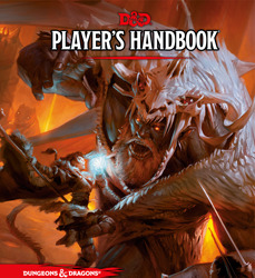
(Dungeons & Dragons owned by Wizard of the Coast . Image sourced from Wikipedia)
Dungeons and Dragons does not have pretty art. It’s technically well done, and far from ugly, but it’s not actually inspiring. Above we have the cover of the Player’s Handbook, the first thing most new players see. Setting aside that the focus of the cover art for what should be the book about Player Characters is a giant monster man[4], the cover is very orange. The actual people are composed of muted, neutral colors, and the background is vague and out of focus.
It’s not really conveying an air of fantastic worlds and larger-than-life characters (giant wearing a dragon skeleton aside). It coveys oppression, monotony, and “realism”.
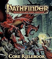
(Pathfidner owned by Paizo. Image sourced from Wikipedia)
Pathfinder’s core rulebook, on the other hand, is colorful. Look at that big, bright dragon![5] Sensibly dressed Fighter Man’s brown clothes are still bright enough to pop him out from the green-grey dungeon background[6], and Fantastic Sorceress’s red dress is also bright and helps frame the Fighter as her hand glows with magic.
While both covers feature a woman with an orb of magic, D&D’s cover shows magic as contained and lighting a small space, while Pathfinder’s magic is big and trailing, hinting at movement.
Actually, D&D’s mage girl doesn’t have a cohesive movement. Is she falling from above? Jumping in from the left? Where is she going? It doesn’t really follow in a meaningful way.
Anyways: color. Yes, yes, I know the plague of brown and and muted tones is a much whined about criticism, and it might seem odd from someone calling himself SepiaDice, but neutral tones have their place; usually as background and supporting other colors to pop more.
Besides, Sepia has a noble history in film, the brown range isn’t a common image color, and Sepia is fun to say.[7]
Color choice is very important. Bright colors draw the eye and make visuals more distinctive. Bright colors also denote and bring energy to things. Dull colors are used for locations meant to be calm and sedate. If you want the characters and locations to seem fun and full of life, you fill it with bright colors.
Everything breaths, adventure can strike at anytime!
Dull colors, and it’s hibernation. People are around, but they don’t seem to enjoy it.
But let’s turn to the visual storytelling: what does each cover tell you about life in their setting?
D&D: lots of posing to look fancy, but there’s no real sense of energy. Jumpy Magerson’s weird Megaman hop has been mentioned, of course. The Giant has a look of dull surprise as he drops Jumpy Magerson,[8] as he holds a sword in the non-active hand. Foreground fencer man is wide open, holding his own foil up and away from where it might accidentally jab anyone. The locations is… orange? Looks like there might be lava geysers?
Patherfinder: A dragon roars at its enemies! Teeth bared, tongue coiled, tendons on display! Wings unfurled to make it seem larger! The fighter is yelling back at the dragon, his weapons mid-swing! Shoulder forwards to defend the rest of the body! The Sorceress is holding a firm stance as she casts a spell that crackles with arcane energy!
Pathfinder’s cover tells a story of epic combat, fizzly magic, and energy. D&D’s cover tells a story of two adventurers existing in a space also occupied by a giant.
Now, both of these systems have the same ancestry, as Pathfinder is an iteration on D&D 3.5.[9] But one sparks more joy when I look at it.
But let’s do another case study. I’ll need an audience volunteer, and my brother’s the only person immediately on hand.
I’m going to make him list three qualities of goblins real quick:
Green
Wimpy
Sneaky
Awesome. Don’t know if the green text translated, but those are what he wrote. Give him a hand!
So, with those three traits in mind, let’s look at a goblin picture from D&D Beyond:
(Owned by Wizards of the Coast. Source here)
Like, you can’t say D&D doesn’t call that a goblin, it’s literally on the goblin page.
This guy is yellow. He’s built like a four foot tall WWE Wrestler. He’s defending with his advancing arm as he rears up to smack ya!
(Okay, “Sneaky” is a hard one to argue.)
Moving on, what does Pathfinder call a Goblin:
(Owned by Paizo. Source here)
Look at this charming miscreant! Green. Big ole head. Good mix of of ugly and oddly adorable. Probably two feet tall, and happens to want your two feet, please, but you could step on him if you’d like.
He also looks like a Gremlin
(An adorable little chaos monster owned by Warner Brothers. Source)
Point is, Pathfinder’s more cartoony take on the classic monster feels more in the spirit of the thing. Every time I see one of those goofy faces, I feel like I’m in for an enjoyable time.
Bringing us back around to the point of this essay: the art direction of D&D bogs down my theater of the mind. The art in the rulebooks don’t inspire creativity or fantastic visions. It inspires… dull, lifeless people walking through dirt roads flanked by dead grass.
I don’t enjoy looking at D&D’s art. Relatedly, I don’t like looking at the art of Magic: the Gathering, whose style I can’t help by see in every D&D sourcebook cover I see. Neither game invokes an inviting world, but utilitarian ones that exist to give quick, forgettable visual flair to represent mechanical card effects.
To save making this long essay even longer and unfocused, I’ll save talk of actual ‘canon’ lore for another time.[10]
So why do I, a semi-professional funny man and sad dreamer who can’t actually draw, want to talk about rulebook art?
Well, I’ve always felt a disconnect when I play D&D. I make the characters, I roll the dice, I attempt to role-play, but I’ve always had an emotional gap between me and the character I’m playing. I like the concept, but when I use my theater of the mind, the character feels stiff and divorced from everything. Kind of like the 5th Edition rulebook.
Then I saw this:
(Source tweet. All of this artist’s work is great and I wish I could hire them.)
This half-elf showed up on my twitter timeline, and my first thought was ‘How come my characters don’t look like that?’
Soon followed by ‘Why couldn’t they?’
Then I completed the trilogy with ‘Why haven’t I imagined my characters in a style appealing to me?’
As I was deep into contemplating what sort of aesthetic I consider my “brand”,[11] it was entering a mind primed to start overanalyzing.
So, how do I imagine my characters? In the neighborhood of the D&D art, if I have firm concept. Micah Krane always was mentally nebulous to me, just kinda being a generic half-elf dude. Trix (who was created for the brightly colored Pathfinder) is green-haired and wears a tail coat, but otherwise is also normal looking in my mind’s eye. In the last two D&D campaigns, Tybalt was also vague in appearance, and Teddi had Goat horns, but those were meant to stand out on a generic rogue character.[13]
But you know what I’ve never put on a character I’ve played? Glasses.
I hope that those who read my various media reviews[14] don’t need this overly explained, but I like glasses. I, myself, don’t wear glasses, but I find them to be great accessories in character design. Frames the eyes, come in a variety of shapes, adds bit of extra visual interest. I always point out Meganekkos and pay them extra attention.[15] I really, really like girls with glasses.
But I’ve never made one. Because there’s no cute design in D&D rulebooks. Just a range of handsome people to ugly halflings.[16]
That is the effect of art design in a system. It sets tone, expectations, and aesthetic for the players. It’s so ingrained that everytime I see art of players’ characters that break the standard, it always takes me aback. It’s inspiring to see artists who manage to divorce D&D the game from D&D the art.
I want to imagine fun, personally appealing characters. But the subtle direction of the insert art as I look through to rulebook, or the provided character portraits of D&D Beyond does not suggest things I like to see. It infects the mind, and leaves specific molds. People in practical, mundane clothes, walking down drab, uninteresting roads.
It’s the same lack of escapism that makes Western (Video Game) RPGs super unappealing to me.[17] Dark Souls, Elder Scrolls, Bioshock don’t look like fun places to be, they look tiring and full of splintery furniture waiting to do 1d4 nonlethal damage.
So I have to talk about anime now.
My mother was staying at my home a little while ago, and I turned on My Roommate is a Cat. This prompted her ask me about what about anime was appealing. I couldn’t form a competent answer for the question at the time, but it’s had time to churn in my head.
Anime is a good middle ground between cartoon and realism. It can broach deeper topics and more mature storytelling than children’s cartoons,[18] without sacrificing a light visual tone and fantastic imagery. Also, the fact that it’s produced by a non-American, non-European culture lends a degree of separation with cultural expectations and tropes. Enhances Escapism.
Luckily, in (very) recent years, after generations of exchanging video games and animation back and forth, Japanese Tabletop RPGs are starting to join in on the fun.
Which means I can look at Ryuutama.
(Image copied from DriveThruRPG. Brought over the pacific by Kotodama Heavy Industries. Buy this book.)
I love this system.
Watercolor art direction. Layout evokes a spellbook. Two Characters and a Dog take the focus on the cover, while the road signs and tiny shrine in the background invoke the emphasis on travel and wonder.
The interior art?
(Taken off the Ryuutama (english) website. Buy this book.)
Well, that makes the game just look like fun. Cartoony characters fighting cat goblins. Conflict, but it doesn’t make life feel like a constant struggle. A world I wish to inhabit. There’s also more detailed images of dragons and other world-establishing pictures mixed in to give the art range, but it’s this sort of charming that makes Ryuutama the first rulebook I actually sat and read cover to cover.[19] It’s a good system I already reviewed. Buy this PDF, maybe they’ll reprint the physical book.
Anyways, I’ll admit, the art’s a little too simple for D&D. Perfect for Ryuutama, and the end of the scale I want my mental image to be, but overshoots the sweet spot. And it’s difficult enough to find players for the much more popular 5e, so Ryuutama exclusivity would grind my playtime to zero.
Still, Ryuutama does a great job of setting it’s light, fantastic tone, where D&D has failed me. The art direction of the books, and years of exposure and defaulting to what I assume D&D should look for establishes a mental habit that’s hard to break. Wizards of the Coast has drowned nerd spaces with its particular kind of art, especially with MtG plastered all over hobby stores, deck boxes, dice, playmats, and even D&D sourcebooks.
That’s not even accounting for fanworks and the speculative fiction art in online spaces.
So what do I want to look like? Were I blessed with talent or with patient to actually learn to draw well, what would I be referencing?
What about what set my expectations of fantasy years before IndigoDice invited me to that fateful Traveller game?
(Screen cap of Tales of Vesperia grabbed from here.)
Well, okay, what I’m actually thinking about is Tales of Symphonia, but Vesperia’s graphics are kinda what nostalgia tells me Symphonia tooked like, as opposed to what it actually looks like.[20]
Look at that verdant town! Warm lighting, bright characters, leaves growing to depict life. A hotel built into a tree. This is a fantasy world that is unashamed about life thriving.
Forget solarpunk. This is my aesthetic.
As for the party members…
(Okay, Judith’s a little gratuitous, but The Definitive Edition lets me put her in a suit, and she’s awesome. Art stolen from here.)
Oddly enough, as far as JRPG outfits go, these are pretty tame with details.[21] Mostly bright, popping colors, even Yuri’s dark clothes are done in such a way to not feel grim and edgy, hints of personality, and I just enjoy looking at them.
The Tales series as a whole does a good job of taking European fantasy and applying Japanese whimsy to the design. Also yukatas. Every member looks like the hero of their own story, while still being part of a cohesive whole.
Which is, you know, the ideal way to operate as a TRPG party.
So, what’s the take away?
Artists, keep being creative. Pull inspiration in from things besides the rulebooks and Critical Role. Look at the other things you love and bring visual flare and whimsy to your art. Then share it. Ignite the passions of those of us who can’t do the draw-good thing.
Players, play with the tropes. I love doing it narratively and mechanically. My favorite rogue is still my neutral good stage magician who would never do a crime. Explore what’s possible in the freeform world of tabletop games, both in play and your Theater of the Mind.
Game designers, branch out with the art. And stop using Powered by the Apocalypse as a crutch.[22]
Hope this long ramble was enjoyable and cohesive. If you want more of this, my other works, and maybe to allow me to make an actual play podcast, consider supporting me through Patreon or Ko-fi.
Until next time, may your dice make things interesting.
[1] Though I would love to read a transcript of the two discussing it. It'd be a fun debate.
[2] I don't like Powered by the Apocalypse for precisely this reason. Every actual play I've heard with the system has players talking about their characters in the abstract, because they're just pressing the buttons on their character sheet.[3]
[3] I maybe should do a breakdown of PbtA one day.
[4] Which is pretty poor direction. Do an epic group shot of characters battling a horde around them.
[5] None of the D&D core books has a dragon on the cover. Come on, that should’ve been a gimme!
[6] Similar note as footnote 5.
[7] Also CornflowerBlueDice is too long to be catchy.
[8] I figured it out!
[9] I haven’t looked at at Pathfinder’s forthcoming second edition. Fifth Edition reclaimed it’s throne as The ubiquitous system after fourth lost its footing, so I don’t think there’s much point.
[10] TL;DR: I ignore it.
[11] Pulp Fantasy is too mundane. Steampunk is too victorian-y. Sci-fi fractals into so much. Solarpunk has appeal, but isn’t quite right.[12]
[12] Haven’t really found the term.
[13] Let’s not examine that I put more thought into female character design than male for the moment.
[14] Which you should. Validate my efforts!
[15] And desperately pray it’s considered innocent enough of a fetish that I don’t have to stop.
[16] Never liked halflings. Gnomes are fine. Halflings, in art, have always been off-putting and malformed.
[17] That and the emphasis of character customization kneecapping the Player Character’s narrative involvement. Can’t give them a personality if that’s the end user’s job!
[18] Even Avatar: The Last Airbender felt like it had to sneak the narrative depth it achieved past corporate.
[19] I do need to give it a reread, though. Relearn the system.
[20] It still looks good, especially the environment, but the characters are kind of… leaning towards chibi.
[21] This, specifically, is why I chose to highlight Vesperia over Rune Factory.
[22] Technically nothing to do with this essay, but I can’t stress this point enough.
2 notes
·
View notes
Text
Get Out of Your Box: The Piece of Art Advice Everyone Is Afraid to Tell You
This has been on my mind for a VERY good while.
By that I mean at least a YEAR.
DISCLAIMER: This is coming from someone whose art improved at an alarming rate (according to my art major friend who gave me this advice). I also doesn’t know when to stop sometimes, so I apologize if this sounds a little insensitive or condescending. But the ONLY reason I am doing this is because it is the single most influential piece of advice I ever received and I would not be where I am today had it not been given to me.
I’m just kind of frustrated here because I have seen the exact same thing happen to so many people, and it’s always due to the same epidemic that so often plagues beginners. And I almost got caught in it, if it weren’t for aforementioned art major friend.
See, the problem starts with beginner artists looking at fun, cartoony styles and falling in love with them. This is not a bad thing! It’s great to find stuff you like and want to emulate!
The problem starts when they immediately dive into these cartoony styles, thrilled by the notion that they can skip doing hard realistic stuff and just stick with a minimalistic art style without having to learn the basics or how things look like in real life. Because either they shy away from hard stuff, or they have already decided that’s not how they want their art to look.
This is a mistake. They are unknowingly locking themselves inside a box. That is not how style development works.
Do you want to know the secret to how I improved more in the past two and a half years than I did from second grade up to freshman year of college?
My friend told me I could not have my own style without learning and mastering the basics FIRST. And I ACCEPTED AND HEEDED her advice.
I was not advanced enough to have my own style. Not even close. So I sought advice from every source possible. I looked up references. I ditched my cartoony style and focused on how things look in real life. I sent pictures of all my work to my friend and listened to her critiques. I rigorously studied the human anatomy and proportions. I changed and evolved. I tried new things, but never planted myself in a particular style.
This is my first digital piece of art. I am ashamed of it but I will not use other people’s art as examples because it’s beyond cruel.

This was before I accepted I did not have the tools to have my own style.
More early art:

Yes right when I finished Undertale I had a weird obsession with drawing Sans. How is that any different from the next guy?
Now here are some of my more recent pieces, long after I accepted I did not have a style yet:


As you can see, I now have an obsession with lighting I have improved immensely.
The reason no one tells you this (or seems not to, I’m not sure, I just see a lot of people with this problem), is because they don’t want to hurt your feelings. They are afraid that they will sound mean and you will be discouraged and stop drawing. Which is a valid point, but at the same time, the problem remains unsolved. The artist remains in their box.
Now, I have tried to tell people this information in the nicest way possible. I notice, however, that so far it has only been in vain. No one has gotten mad at me yet, but whenever I say, “Well maybe you should try this,” the response is almost always “I’m happy with the style that I have, but thanks!”
Okay, that would be all well and good, but as a person who has been at that stage and surpassed it by heeding the advice of others, it’s kinda hard hearing the same response again and again, watching beginning artists trap themselves in this box that they have no idea even exists. They have so much potential, but ironically they deny themselves fast, substantial improvement because they think they don’t need it. This isn’t to say that improvement doesn’t exist, it’s just that the things that need to be fixed either aren’t getting addressed or are being ignored.
I know change is a scary thing. I know the thought of trying new things is unappealing. I know switching from sticking to cartooning to learning realism is a long and tedious process. And it sucks. It really does. But it’s worth it, I promise.
If anyone has made it this far into this accidental essay, I ask you to take a look at your art and ask yourself, “Have I locked myself in a box?” If the answer is yes, I highly recommend you to go back to the basics. Practice drawing how things look in real life, even if you don’t want your style to look like that. Accept critiques, even harsh ones. Step out of your comfort zone and try new things. Look at other people’s art; try to incorporate something you think they did well into your work. Punch a hole in your box, let the light of possibilities shine in. You might be surprised at where it takes you. I was.
#art tips#art advice#art#illustration#my art#my fan art#fan art#digital art#art improvement#cartooning#cartoon#realism#long post#rant#drawing#undertale#ninjago#glitchtale#ninjagotale#art collab#collab#comics#comic#art style#style#art style advice#style advice#coloring#coloring advice#shading advice
102 notes
·
View notes
Note
When it comes to reading/writing Fanfiction about Eddy’s Brother what sort of stories do you look for? Is there any good Bro fanfiction stories?
I don’t think I’ve read too many that I’ve liked but I’m definitely about to read yours in a sec! Most everyone said what I was already going to say, but yeah, most fanfiction writers tend to make him unnecessarily abusive to extreme levels of realism. Though he IS undeniably abusive, the violence in the actual cartoon is really more slapstick violence. Bro doesn’t hold Eddy at gunpoint or anything. He twists his leg in an extremely cartoony fashion, then unwinds him like a toy. It’s still hard to watch him slam his baby bro against a door like a dodge ball, giving him two black eyes, but it’s nowhere near to the extent of realistic torture. I think a lot of people forget this. IT’S A FLIPPIN KID’S SHOW. If it ever seemed like it was getting too real, they always made sure to pull it back to comedy. Every time. They never strayed too far from taking advantage of cartoon mechanics. Half the shit the characters are put through would kill them in the real world. IT’S NOT THE REAL WORLD IT’S A CARTOON.
That being said, I don’t expect writers to make him completely out of character, he DOES have to maintain those qualities that we saw, but creep factor aside, like someone else said, it’s better to make him more nuanced. That’s why chilling , calculating villains leave a much better impact than ones that are too obvious. When we first meet Bro, he’s kinda teasing Eddy and joshing around with him. Then in a split second, he turns sadistic. We think he’s going to protect Eddy from the kids, but then he starts beating the shit out of him for ‘‘old time’s sake’‘. That was kinda unexpected. Sure, after witnessing that, we expect if from Bro now, but I would prefer writers to play up to that reveal. He presents himself as an entirely different person to other adults, probably. It’s only around kids that he reveals his true colors. I like writers that work with that.
There was one fanfic from a really long time ago called ‘’Memories’’ that unfortunately doesn’t exist online anymore, but it was from Rolf’s perspective (I like any fanfic from his POV since there aren’t too many) and he was basically trying to figure out why, if Eddy is his brother, he could do such things to his own flesh and blood. The portrayal of Bro, however, was slightly redeemable but also not entirely sympathetic either. He was more vaguely abstract, like part of him cared for his brother but also part of him couldn’t come to terms with it either. Bro wasn’t so viciously violent but you still, as a reader, had to walk on eggshells every time he was on the page because he was so unpredictable. Sometimes he would do something, and sometimes he wouldn’t. I like the idea of danger lurking underneath, and forcing us to be constantly on guard. I also liked the scene where Rolf confronted him at the end, because though he despised Bro, he really wanted to understand WHY he did such things. And because it was through Rolf’s eyes, he related everything to metaphors and animal imagery. There was a lot of comparing Bro to wolves and such. It was such a good fic, too bad it was removed by the author. :/
16 notes
·
View notes
Text
BtT Light Novel Club, Chapter 2: Walking My Second Path in Life! (Volume 1)
The second meeting of the Beneath the Tangles Light Novel Club has officially begun! We’re already doing something a big different with this session. Last time, we stayed with the tried and true by starting with a classic light novel, but today, we’re trying out Walking My Second Path in Life, a series published by the J-Novel Club that has already earned some strong reviews in its tale of Princess Fie disguising herself as a boy and becoming a squire. But what did our members—Frank, Teresa Christina, Samuru, and me (TWWK)—think of it? Read through our discussion below to find out, and then chime in as well by giving your opinions or answering the questions at the bottom of this piece!
TWWK: So that was completely different from our last selection…what did y’all think of the first volume?
Samuru: I haven’t finished the book, but so far I have enjoyed it! It was very different than any fiction I have read. I liked how they setup Fie as a stranded princess. As for the negative of the novel… It’s hard to describe, and I am not sure how to write it in words, but I feel that the book has parts that aren’t written well. For example, there are times where the story is just flung into some situation without any preparation or description. For example, during the fight with Gormus (I think that’s his name), the dialogue announced that the fight was over, then they continued fighting? I thought it was over…and there was no line that got you back into it. It’s just weird, I notice that throughout. Not enough setup to the next scene.
TWWK: You’re right, especially for the first half. It took a while for the writer to find his way.
Teresa Christina: I agree with Samaru, too. There didn’t seem to be a clear direction to the story; it wasn’t terribly written well. It couldn’t decide what it was going to be about. It followed a girl who didn’t act like a girl at all, so the element of her secret gender wasn’t as powerful as it could have been. The plot was more of a collection of stories of things that happened to Fie instead of one feat she had to overcome. That made the story drag on terribly.
Samuru: I wish there was more details, background, setting, even character development of Fie. I know she’s a princess, but I feel that her character is written like a guy. I sometimes forget that she’s a girl from the way she is described.
TWWK: It definitely was less a “novel” and more, in my mind, an anime on paper. The book read like season one of a series, with each chapter having and ebb and flow that felt like an episode.
Teresa Christina: It did feel more like an anime then a story, and I suppose that in itself is not a bad thing—I just didn’t expect it. I don’t tend to like stories that have no destination. Some anime are like that and can get away with it. I thought Sweetness and Lightning was a very cute anime that didn’t need a real story; it was just character development. If the light novel focused on the characters a little more like Sweetness and Lightning did, then I think I could appreciate it more. I really want to be fond of it since I loved the setting and catalyst, but as a writer myself, I couldn’t let go of being irked by the lack of plot.
stardf29: While I do agree that the plot never really goes anywhere in particular, I actually kind of liked that about the story. It gives more of a “slice-of-life” feel to it, and I think that works well with the story’s overall theme of a “second path in life.” Fie isn’t taking this path because there’s a particular destination she wants to go; she’s taking it because the journey itself is more fulfilling than what her life had been before.
TWWK: I definitely feel the same as you, stardf—I thought it was actually pretty ingenious how the format of the light novel fit Fie’s personality and her goal. I know people like Fie, who are at once serious and fly-by-the-seat, and the book took on that same personality and added to it. I don’t think I would have had any interest if the story was more straight-forward. That meandering, slice of life feel is refreshing. The story takes its time to develop, and I think that’s a strength. Any other thoughts?
stardf29: One thing about the setting that I found interesting is that while it has many of the trappings of a fantasy setting—medieval castles and society and whatnot—as far as we know, there is absolutely no magic. In a way it’s almost more of a historical fiction story, albeit with made-up places.
TWWK: That’s an interesting point—the lack of magic. I think that, along with the setting, adds this layer of realism to a story that doesn’t feel like it’s meant to be realistic. It’s very anime-ish, very fairy tale-ish, very suspend-your-realism-ish, but the grounding in reality keeps it from being too cartoony, and I appreciate that.
It’s also interesting that you bring up magic because I felt a Harry Potter vibe, minus the magic. The dormitory is the squires’ Hogwarts, and Fie is developing a wide range of friendships, has a few teachers, and several mentors in the 18th. But it was definitely hard to get to know the other squires…they started kind of melding into the 18th knights for me (I think the author realized this because at one point, she specifically compares one of the squires to one of the knights to differentiate them), except for Gormus, whose developing relationship with Fie was a high point for me, too. I think he was my favorite character in volume one.
stardf29: I particularly like the friendship she’s built up with Gormus after their tryout battle, with Gormus coming to respect her even though she lost. And then there’s Fie and Queen… I’ll admit, I was kind of uncomfortable with how she basically blackmailed him into being her servant. Unfortunately, since it happened pretty much right at the end of the volume their relationship doesn’t get much chance to develop past that, at least here, but it does mean that there’s plenty of opportunity for improving their relationship in volume 2.
Her relationships with the 18th Platoon are fun, too, with Crow taking her as a “little brother,” and seeing what he thinks of “him” from his journal entries… and there’s Yore, who has taken well to her, not knowing she’s technically one of his wives. If we ever get to a point where that fact gets revealed to him… that’s going to be fun.
TWWK: Also interesting that you brought up Queen—in the final few chapters, we shift from Fie’s point of view towards those of others characters like Queen, Cain, Lynette, and even the chef! I thought that was so smart, and it helped develop Fie’s character all the more. What do you think of Fie as a character?
stardf29: While she’s definitely a lot of fun, she also has some notable flaws, and in particular, she’s not exactly the most “noble” character and has a side to her that is willing to do some questionable things to achieve her goals. I do think, though, that while that might make her less “likable,” it does make her more interesting.
TWWK: That’s a good point—in media, and especially in books, the less admirable some characters are, the more interesting they end up being.
stardf29: Whatever I might like or dislike about Fie as a person, I do think she’s a great protagonist, story-wise. It plays into a certain schematic I have for fictional characters, in that they can be likable, interesting, or relatable, or some combination thereof. Any given character will have some degree of likability, interesting-ness, or relatability, and that makes me see that character in different ways…(…actually, you know what, maybe I’ll talk about this for my next blog post. I need something a bit more fun to talk about next month.)
TWWK: For what’s been thus far a very breezy story, there’s some depth to Fie’s characterization. We didn’t even get to the swap in gender role in the story!
Teresa Christina: I could see the direct correlation to Milan and Joan of Arc. There is something fascinating about challenging gender roles.
Samuru: Ahhh I hadn’t thought of Joan of Arc good point!
TWWK: What of the other characters? If you could switch Fie out and make her a side character in this volume, who would you like to see at the protagonist instead?
stardf29: Hmm… one choice would definitely be Yore, basically putting him in the position of “guy who gets along with another guy, unaware that said guy is actually a girl and someone he knows.”
TWWK: That would be fun! And you wouldn’t even have to change the title to the series, hehe.
As you can see, we barely scratched the surface with our discussion—we want to hear from you, dear readers! What were your impressions of volume one of Walking My Second Path in Life? Did you agree with our assessments? Disagree entirely? Let us know! And if you need more kindling, here are some questions you might answer about the volume—we talked about the first but didn’t get a chance to dive into the others:
If you could switch Fie out and make her a side character in this volume, who would you like to see at the protagonist instead?
Did this light novel remind you of any other stories? Perhaps another anime or a fairy tale?
We spoke of some of Fie’s questionable qualities, but what are some of her redeeming ones? What did you think of her as a character?
The first volume had quite a large cast—did you enjoy getting to know the supporting characters or were there too many?
Where do you think the story is headed?
If you could cast a movie based on this volume, who would want to fill the roles?
That’s it for this edition of the light novel club! Thanks for reading along and be anticipating our next selection—we’ll let you know the title very soon!
#Light Novels#BtT Light Novel Club#Walking My Second Path in Life#Watashi wa Futatsume no Jinsei wo Aruku!#Articles
2 notes
·
View notes
Text
for the past few weeks i've been trying SO hard finding the art style that i wanted (which is kinda a lil cartoon-ish / anime that i liked) BUT THEN
i pull stuff like this at 11 30 half-asleep.
am i ok? will i continue to ignore that maybe i do better with realism? will i still slave over finding that cartoony style that i clearly suck at?
probably.
0 notes
Last Seen Blogs
suntwined
From the Ground

ilhamfadil-blog
Editor

farrellplumbing
Untitled

stubborn-string-bones
there is this