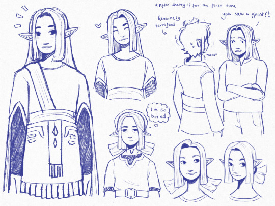
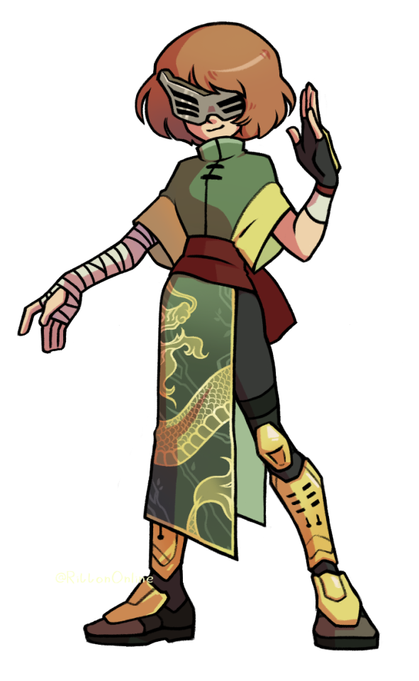
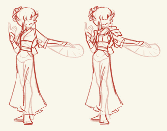
#also her outfit was based off of concept art!
Text
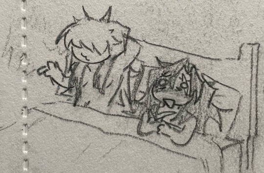
karane :]
#shes so cuuuuute#skyward sword#karane#link#the legend of zelda#tloz#loz#my art#the interaction with link is canon btw if u talk to her while chasing fi she reacts as though he told her he saw a ghost LMFAOOOO#she thinks he was stressed and imagined it 😭😭😭#also her outfit was based off of concept art!#this was meant to be me practicing drawing her but it turned into me drawing her a lot for real#forgot her hat the first time whoops#skysword
717 notes
·
View notes
Text


Nox has new expressions! The angle on the outer hand hurt me emotionally!
#i also finally prepared her Halloween/October outfit!#I kept putting it off lol#next on the model list is male!nox#I've been putting off drawing a whole other base model ngl#but I have no excuses now#oc: bunnox#oc: luna#vtuber#vtube#art#vtube model#pngtube#i love her design :( i know I made her but :(#I'm super excited to share her halloween outfit too#but I want to do a proper illustration for that too#so people can see the whole concept#only the poncho will show in a video after allll
0 notes
Note
Heya! Really love your art style, especially your Circe design. I was wondering what inspired her (Circe's) design, like the clothing style and all that good stuff, the reason I'm asking is because I also love to design characters and Circe's design really intrigued me, it's really simple yet still very elegant and feminine. So I was wondering what the reference and concepts were :D
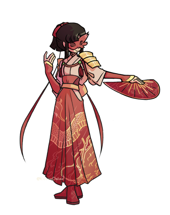
Thank you! I don't really have references for Circe, but I can explain some of my choices for her. Hopefully that's helpful! :D
Circe was probably the first EPIC character I drew actually. I remember getting immediately excited for this musical when I noticed she would appear, because at the time I recently finished the Madeline Miller book Circe. So when I started doodling her I was basing mostly on the book interpretation of her character, and because of that, you'll notice that in these drawings she looks way more young and friendly than in the current design.

(also sorry for the quality on the second image, I sneezed when taking the picture and got too lazy to redo it)
Needless to say, the crop top and the long skirt starting at the hips aren't accurate to the period at all, but that was intentional! I think it fits that she looks so exotic and out of place, as her character in the musical is seen as this foreign threat to Odysseus' crew. She has this unfamiliar, yet seducing aura. Plus, the revealing outfit also represents how freely Circe and her nymphs live in Aeaea. Free of worries and men.
Still, at the time I wasn't really seeing Circe on these drawings. It's hard to explain, but something about her was a little bland, too elegant. Normally when I'm not "feeling it" with my character designs I try associating the character to an animal! I go over in my mind what feelings I want this character to pass off, and which animals better represent said feelings. You can see this pattern in some of my characters, how Athena has owl-like features (owls represent wisdom), how Hera's face resembles a peacock (they represent vanity), and, as I would figure out later, Circe matches with a lioness.
That's the thing that made Circe for me. What was missing on her old design was this feline, wild, but still imposing look. I gave her sharper features, lioness eyes, hair over the face, and shapes to represent various parts of a lioness. And there she was!

Very proud of her, I think I translated the image I had in my head for her as best as I could. Hope that was helpful in any way! :D
#gigi's asks#digital art#art#epic the musical#greek myths#animatic#epic: the musical#character design#circe#epic the circe saga
327 notes
·
View notes
Text
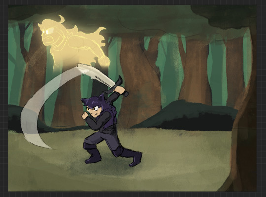
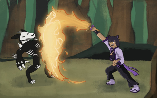
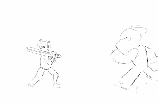
HOWDY EVERYONE- so excited to FINALLY be able to show off my piece for this year's Bumbleby Big Bang!
Unfortunately no accompanying story as of yet- but I really hope you guys get to read it someday! The premise involves Yang cursed to be trapped inside a sword, which was an idea I KNEW I had to make move.
Details and development stuff under the cut!
Lots of fun collaboration with the author, Celeste! We worked together to find the look-of-picture, Blake's outfit, how the Grimm look, the style of the sword, the whole shabang! I'm really happy with how it all turned out!
When I first saw all the prompts, even before claims opened, I got to work on a handful of exploration pieces based on some of the summaries, to decide which of the stories I was interested in would be the best fit. Here's the initial idea for this one I put together over a lunch break:
After showing Celeste, we got to work finding the look we wanted! Went back and forth a bit and found this great look for Blake! Also shoutout to Pinterest boards for visdev inspiration I love you Pinterest boards.

Just about everything stayed to final anim, with the simplification of getting rid of that purple cloth hanging from her belt, (since I already had the rope ends to think about working with), and the light purple strap across the chest, since leaving it out would simplify the linework on her chest.
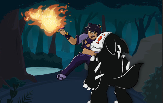
The sword also went through a bit of change! Celeste had the idea of Yang making the sword catch on fire, which I LOVED. I went with a split design so we can see the fire more clearly start from the hilt and grow to cover the whole blade.
And from there we brainstormed animation ideas! I went all over Youtube for video reference of sword work (that would be complex enough to be interesting, but short enough to be manageable). I found something we liked from Motion Actor Inc., a channel I've used LOTS for both personal and professional work (I work in 3D Animation, for those who don't know). I edited this together, to see the action from multiple places at once, which gave me the idea for that camera move that's in the final anim!
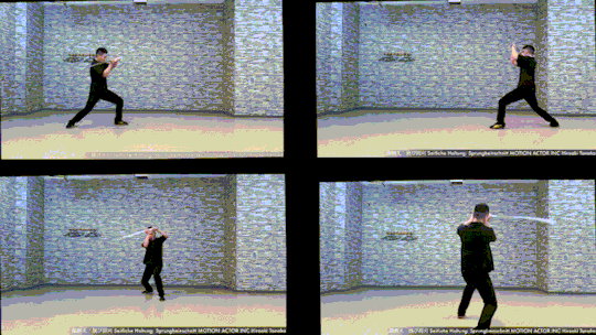
Now for the fun part! Make that badboy MOVE. For the cam turn, the first frame she's in the air I'm referencing the top left video, and the frame she lands I'm referencing the bottom left one. While she's airborne I'm just inbetweening that! No reference for the Grimm, just wanted it responding to her attacks, but I end up tweaking the roughs later on to make the block feel stronger.
Then from there we had to actually figure out Grimm designs! Nimona had just released, and Celeste and I loved it, so she asked if I could take some inspiration from Nimona's shadow form! GLADLY. Here's what I came up with!

I was going between how the movies and comic designed Nimona, really loving the almost liquid shadow of the movie, but also how the comics had this broken up/held together rougher form. Celeste liked the second to last one the best! The original plan was to have it leave a wispy shadow trail like the concept art, but to simplify the animation we left it solid instead!
Next up is tiedown! Basically just getting the roughs more on-model, so the lineart comes out nice and clean. I've also transferred the new Grimm design to the base from earlier, and fire's also outlined orange so it reads clearer. (SPOILER- if you look REAL close here, you can see Yang visible in the fire! I liked the idea of Blake's slash also doubling as Yang throwing a punch. The idea is in the concept art earlier but now it's working with the action.)

Next step- final look of picture!! I asked Celeste for sources of inspiration to draw from when thinking about environment design, and we got Nimona, She-Ra, and Owl House! Used each of those as springboards for shading style, colour palettes, and how the fire would look!

From there, we kept the straight trees/bush/lake/foreground greenery from the first one, the blues from the second, and the fire from the third!
Once I had this frame, it was a matter of working backwards and making the background work pre-camera turn (which was ABSOLUTELY the most challenging part of this process). Learned a lot doing this! Procreate isn't quite equipped to make something like this efficient, but I'm pleased to say that Dreams would make something like this easier in the future (keyframing objects instead of hand-drawing/spacing duplicates by hand, for example).
From then on it was just colouring the lineart, adding shading, and finishing up the background! Beginning-to-end this whole process was beginning of July to end of October!
I had an absolute BLAST putting all this together. Here's to next year where I find a way to do something even more ridiculously complicated!! It's fun!!!
#rwby#bumbleby#bumbleby big bang#bbb2023#blake belladonna#yang xiao long#(technically!!! look at the fire!!)#officialrocketart#officialrocketanimates#greatest hits#HOOO WHAT AN UNDERTAKING#so glad I came up with an idea pretty outside of my comfort zone but having the CLEAREST idea on how to execute it#means things went smoothly it just took a Long Time#AND I LEARNED LOTS#hope you guys can read the story one day!! its dope!!#bonus bonus fact for tag readers i didn't put in the post proper: i showed the rough pass to ANIMATION INDUSTRY COLLEAGUES for feedback#shoutout to ioana and v love you both lots#ioana for tightening up the rough pass and suggesting i smear the sword#and v for notes on my sword smears#okay i hope you guys enjoy!!!#it has been true for ages now but The Bees Motivate Me To Create#and in these trying times i thank them for that
387 notes
·
View notes
Text
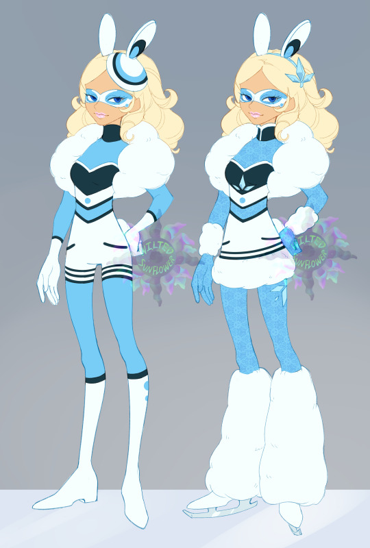
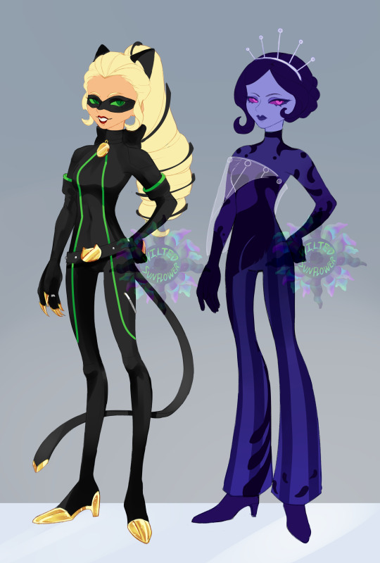
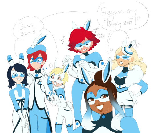
i based chloe off of an angora rabbit which are very fluffy and prestigious and with a rich girl like chloe i know she'd enjoy fur.
also feat the old duchess noir look and her peacock look that i had shown ages ago but never fully drawn up
of course i also had to include all the rabbits ive made together
i'd say rabbit are the miraculous are the most like opposite to the core of who chloe is [theres one more miraculous thats even more opposing to her but i havent finished ironing out that design for her]
with the rabbit miraculous she has to witness over and over again, she's not the main character. She's not the important one, she'll never be ladybug or be as iconic as ladybug.
That Adrien is not just her childhood friend and beloved prince but is chat noir, that dupain cheng of all people is the ladybug she's respected. Maybe she should have seen it coming. Something karmic always had to happen to her of all people!
That to be confronted with the past of her showing in the burrows of all her own causing of akumitizations that she also could see snippets of others talking poorly of her-
Is this really her legacy she wants?
She knew she was more stand off-ish and prioritized herself but truly no one actually likes her or tolerates her or finds any admirable quality in her- even Sabrina gets upset with her.
She can't even go back and fix it, sure her power could allow for that but I think if it happened it'd create bigger butterfly events that'd shed need to go back and correct even if she didn't want to. That if she really wants to keep a miraculous this time... she can't mess it up.

Of course I wanted Chloe draped in furs to mimic how fluffy an angora rabbit is and how their wool can actually be used in fashion as an expensive and more niche fur.
Her 'shorts' on the bodysuit [its just a design of it not actual shorts] to reference back to her beta design which i found was very cute
I decided her top to reference her Queen Bee outfit - In this I would place Chloe as another [accidental] holder of the rabbit very soon after her time as queen bee ended. She's desperate to get back out there, be a team member, to be fighting by her idol ladybug and getting to be a hero. Before the whole regression arc started in miraculous ladybug
even in the queen bee concept art taking the hat again to attach ears to.
she was very close to keeping her signature ponytail but the fluffed out hair is much more close to the image of a fluffy rabbit i wanted to keep
#miraculous ladybug#kwami swap#ml chloe#chloe bourgeois#marinette dupain cheng#alya cesaire#alix kubdel#nathaniel kurtzberg#rose lavillant
966 notes
·
View notes
Text
For @rose-tea-and-strawberries
{Concept art for a spider-girl Yuu someone brought up, but since I don't wanna fully put my own image of spider Yuu in case others imagined them differently, this is heavily based more on astv instead of just a general spider-man/woman Yuu}
TW: Mention of death {Yuu's Canon Event}
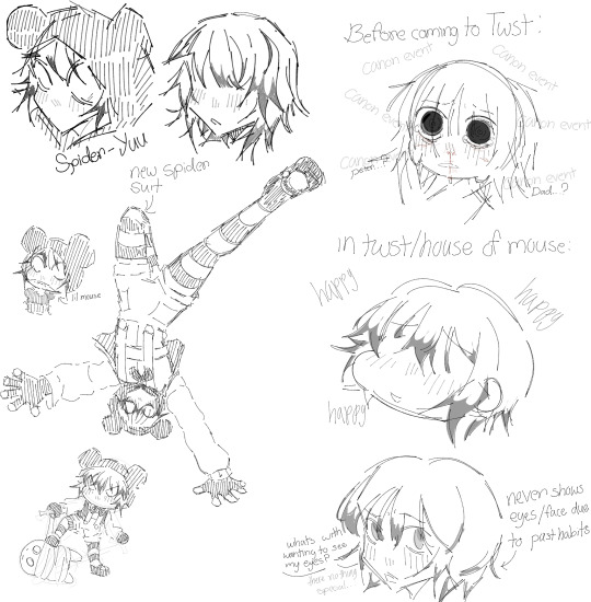
{In case you can't tell I added a bit of spider-Gwen [ghost-spider] to this Yuu [with the slight colored hair, losing their best friend and soon father, also this Yuu has a more Micky inspired suit since their old one got torn from their canon event and Micky felt bad so he made one for them that goes with the waiter outfits.}
I can honestly see the staff at House of Mouse along with the guest {mainly the great seven} being pretty concerned and curious of this Yuu's world/dimension since I'd be pretty understandable this Yuu has trust issues not because their villains/magical people but because they don't want to possibly lose them like how they lost their Peter/Gwen/father.
And to go deeper on the topic of spider-Yuu {mainly with canon events and more connected to the atsv plot} I like to image that before arriving at Twisted Wonderland and working at House of Mouse they just went through their canon event of losing their dimensions Peter/Gwen or father.
Along with that, since this Yuu is from another dimension and arrived in a different world {twst} they'd technically be an anomaly, since it's theorized/hinted that the spider society can only go to dimensions/worlds WITH a spider-man/woman in them. So they may tend to glitch a lot {which is canonically very painful} due to their body's genes not being from that place unless the more powerful/magical guest or staff at NRC and House Of Mouse placed a spell that prevents them from glitching.
Bonus: I believe maybe the NRC boys {especially the dorm leaders and our boy Jamil} would be a little jealous of Yuu's Peter/Gwen since they were the first ones to get close to/love Yuu, but feel bad for being jealous since you know, Yuu's first friend/lover is dead {rip Peter/Gwen but I prefer to make Peter's death this Yuu's canon event since Gwen already went through it in most other worlds}. Idia would most definitely be jealous of Yuu's Ganke though lol.
{Anyway here's Yuu's Canon event, similar to spider-Gwen's canon event since I'd just get sadder thinking of more brutal ideas for Yuu's Peter}
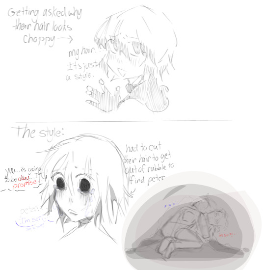
{So to explain this in short, Yuu's Peter was similar to Gwen's Peter and turned himself into a giant lizard, so they fight without Yuu knowing it's him and then the giant rubble crushes him and turns him back into his human form, Yuu hears his slow breaths {since he's literally dieing from being crushed} and realizes it's him but got trapped in rubble as well so they had to cut their hair off with the sharpest rock/shard of glass they could find so that's why their hair looks so messy and choppy at the bottom due to the panic and want to find and save her friend Peter, but he dies in their arms obviously. So in memory of him they keep their hair the same and never let it grow longer since they feel like they'd lose him again in a different way {+they dyed their hair his favorite color at the end, or just your favorite color in general}. Tragic.}
I'm feeling angsty 🥀💔😏.
{Honestly bonus points if Yuu was destined to die like Gwen in other dimension versions of them, everyone is going to freak out.}
#house of mouse au#twst imagines#twst yuu#twst au#twst#twst mc#the great seven#house of mouse#twisted wonderland x reader#across the spiderverse#atsv
149 notes
·
View notes
Text
EMIL SINCLAIR from LIMBUS COMPANY


JUSTIFICATION:
"The unhatched egg metaphors. The constant anxiety and insecurity. The Zwei ID art where she looks like a gay librarian. The scene in Hell's Chicken where Ryoshu's team is all women oh and Sinclair too. The cute little Faelantern dress... it is my belief that Sinclair will only reach full self-actualization once she realizes she's a girl. This goes for the Sinclair from Demian (1919) too but I don't know as much about that one." - Anonymous
"okay. where the hell do I start.
Sinclair (Limbus Company) is based directly off of Sinclair (Demian - this will come up in a minute), and is a largely withdrawn, melancholic "boy" whose associated imagery is an egg and breaking out of a shell (again - more in a minute), and characters comment sometimes that she seems like she has an inner turmoil/darkness to her. a couple of her outfits just straight up look like mid-transition fits. her appearance in the album art for the song used in her chapter (itself based on the painting described below) is one of the most #girl things imaginable Sinclair from the source text (Demian)
1. struggles with her parents' expectations for her, and her increasing betrayal of those expectations (leading to such lines as "-at times I didn't want the Prodigal Son to repent and be found again. But one didn't dare think this, much less say it out loud.")
2. becomes friends with Demian who, aside from representing a more nuanced take on the black/white logic of point 1, Sinclair regularly remarks how cool it is that Demian's face is kinda feminine
3. begins to view herself as destined to live between two worlds, the light and the dark, human and inhuman, and, interestingly, "man and woman in one flesh". for all this is treated as a fear it's also explicitly stated to be something she desires
4. stops and thinks one day in college "perhaps I am not like other men?"
5. sees some random pretty girl one day and decides the concept of that pretty girl must be the path to return to the world of light/salvation. she learns to paint just to paint this girl and doesn't get it perfectly accurate but is pleased nonetheless. she becomes obsessed with this painting and stares at it while falling asleep before eventually realizes that the painting actually resembles herself, not as she feels she is but "-what determined [her] life, it was [her] inner self, [her] fate ... what the woman [she] would love would look like if ever [she] were to love one. That's what [her] life and death would be like..." - she eventually burns the painting and eats the ashes, y'know normal "girl who hasn't realized it yet" behavior
6. throughout the entire book she has visions relating to and is tied to imagery of eggs and birds escaping their shells to take flight" - Anonymous
Reminder: Submissions are always open! Submit here!
Did you make your daily click today?
#could transition have saved her#emil sinclair#limbus company#transgender#trans hc#anonymous submission
99 notes
·
View notes
Text
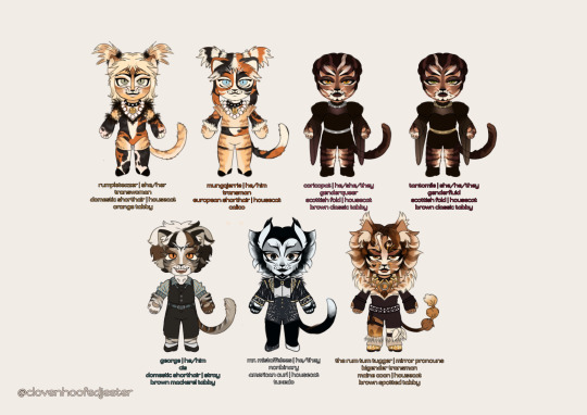
jellicle lineups; part 2/4
MOREEEE !!! MOREEEE !!!
rumpleteazer | 💰 🍹 🃏
PIGTAILS RUMP! PASTEL RUMP. blond rump. that is all. i really love that design. so i use it. the face markings are also meant to look like a stereotypical robber mask. i realized she looks a little fox-like while drawing her, which i didnt mind ! its fun !
her clothing design was already laid out for her so i left it virtually unchanged, asides from the pattern itself. imagine wearing clothes w a print of your best friends hair . that is rumpleteazer
even though 1 of her 3 words are impressionable, i think she is smarter than she lets on. i also think skimbleshanks is her dad. she'd be about 21 in human years
mungojerrie | 💸 🎰 🍾
PIGTAILS JERRIE AS WELL, BITCH ! i saw a jerrie w pigtails after i drew this and i felt so vindicated. i also based his design directly on 2019 mungojerrie because ommgggg transgender calico? trans little calico? i thought he deserved some pearls too. as well as a bell collar! it makes cats sneakier.
his clothing design is left unchanged too, asides from some fluff. he is also wearing a print of his best friends hair . smile 😃
hes just a funny fella. he totally doesnt have a history or anything. hed be 21 in human years
coricopat | 🍷 🔮 ♟
coricopat is pretty close to their replica design—the biggest difference being that the red in their design is warmer/purpler. that and the silver collar! i also had no idea what i was doing with her fit, so expect it to change in the upcoming art i do of him. i just wanted something gothy and flowy
hes also based on thalia, the muse of comedy. to keep the greek mythology theme going, and because i thought it was funny, and because (2x) i like... The Gimmick
i swear to god this cat knows things we dont. hed be like 22 in human years
tantomile | 🎭 🍩 🗝
tantomile is also close to his replica design. she has a gold collar. like i said w/ coricopat, the outfit is subject to change
as she was based on melpomene, the muse of tragedy, i decided to sacrifice identical makeup for the white mark on their muzzle being downturned like the frown of the tragedy mask :] giggle. smile
listen to all advice tantomile gives you. shed be also like 22 in human years
george | 🥏 🧋 🛹
i just had to give this (technical) swing some love. bless this happy background cat and his little :D smile. i decided to give him a simple little fit and made his fur/markings less plain white w some stripes. i think i also based his makeup off a victor costume ??
i think hes pouncival's older brother. hed also be 23 in human years
mr. mistoffelees | 🪄 ☕ 🌬
my silly, my funny. my little guy. i based their general Vibe on his john napier concept art, obc mistoffelees, 1990 paris mistoffelees, 2019 mistoffelees, and like. a fairys kiss of brentoffelees. i wish id have given him a bit of that il sistina style but i already had so many things going on LOL
it was definitely a very fun challenge to balance all of these. i also draw attention to the single white shoe—the cutest detail of timmy scotts misto
i definitely prefer a more visually unnerving, grown misto. and absolutely torn between portraying him as mute or verbal because on one hand... mute misto is so good. on the other hand.... oh my god. timothy scotts voice.jesus christ . i think hed be 23 in human years
the rum tum tugger | 🎤 🍽 🪞
WELCOME TO MY TWISTED WORLD. i really tried to keep tugger as cis guys i really did. but the thrall of a visually transgender tugger was too much to ignore. i already explained a lot of his design choices in my first posted drawing of it but like... blauhh... thigh garter, heart, golden whiskers/lashes. they are there. i also made his makeup a wee more theatrical w/ white on the chin to visually separate him from partridges tugger
i also decided to base his fur more on his obc design. like. terrence mann tugger. platinum blond spotted mane and head fur and such. i think it looks really good
im trying to hit the sweet spot between the goofy/serious/whiny/promiscuous portrayals of the him..... the man contains multitudes, you see. hed also be like 24 in human years and it goes without saying that hes one of deuts sons
AND THATS IT. stay tuned for more !
#cats the musical#cats musical#cats 1998#character design#chibi#sfw furry#rumpleteazer#mungojerrie#coricopat#tantomile#george#mr. mistoffelees#the rum tum tugger#my art
63 notes
·
View notes
Text

"I want to be an admirable person. Like Mother Fortuna, who’s my role model. Or Geuse, who’s so kind and strong. Like Archi, who kept smiling until the very end, just so I wouldn’t be scared. Or Puck, who always protected me and never left me alone. Like Ram, who wished to do the one thing that would be the most helpful for someone who’s truly precious to her. Like Otto, who does his very best for his friends. Or Garfiel, who never once uttered a word of complaint. Like Subaru, who says he loves me, and does reckless things even when he’s wounded and hurting. I want to earn the respect of each of them. From now on, I want to be the one reaching out to help someone.”
It’s Emilia!
I don’t really have much to say about her in regards to what her powers or wish would be in relation to her design since in my au she hasn’t made a contract (yet… ;) and talking about it here would be spoilers lol), but what I can say is that I wanted her outfit to be very reminiscent of Madoka’s magical girl form (you know, for the Homura x Madoka / Subaru x Emilia parallel) (also some Satella elements like the roses because, you know :) ). I also took note of the spin-off magical girl event in the game Lost in memories where they have magical girl designs for some of the characters, and they happened to have one for Emilia, so I took a lot of inspiration from her outfit used there. Since the majority of y’all voted for her to have the main color in her outfit be white, I went with that for her top and boots and made most everything else a different shade of purple.
A quick aside, I really want to thank all of you who voted on the poll and gave positive comments/ feedback on not just the designs that I’ve made so far but on the art that I’ve been posting here since last year. I know saying this is cliché (and even saying it’s cliché is too) but it really does mean a lot seeing so many people like my art and my ideas. I have been posting art for a while now (on Instagram but I’m pretty new here so bear with me 😂) but I have never really seen as much engagement with my stuff as I have on other platforms and I’m really happy about that :) I have a hell of a lot more to make and show you not only about this au but in general, and I am so glad all of you will be able to see it and I hope you like it to. Thank you for everything so far!
Now with the sappy shit out of the way, I’ll go over a few last thoughts I had about Emilia’s weapon and soul gem.
I didn’t know what to give her for a weapon since in canon she makes a lot of her weapons out of ice, so I just decided to give her a typical magical girl wand/staff since I thought it would fit her and it’s what she wields in the Lost in Memories spin-off. I made the staff look similar to Madoka’s bow (again, parallels) with elements of the concept art for the magical girl rings in pmmm and of Madoka’s soul gem at the bottom. The crystal star shape on top of the wand is also a Madoka reference because it’s the same star on her grief seed and Law of cycles symbol / witch kiss. I also made it crystal sort of call back to Puck’s crystal.
Now for Emilia’s soul gem I made it look like a certain key that appeared in season two… It was based on the comment by a certain someone that said something along the lines of “imagine you are the key.”… This character is very important to this au not just in the world of Lugunica… :)
#re zero#re zero kara hajimeru isekai seikatsu#re zero starting life in another world#re zero fan art#pmmm#puella magi madoka magica#madoka magica#pmmm fanart#puella magi madoka magica fanart#madoka magica fanart#emilia re zero
39 notes
·
View notes
Text

Oh yeah! Since I have no clue if/when I'm ever finishing these and I've had them laying around for forever by now- here's the adult IT metaverse outfits I've made! They're all based on their ultimate personas and the concept of heros! Since these were made for an aged up p4 cast, these aren't quite what I'd put their during p4 time selves in- some changing more then others- but if you wanna follow me into design details, that'll all be under the cut!
First off to get em out of the way- Teddie is very largely the same as his p4 time metaverse outfit I made for him back here . The design is still meant to be inspired by magical girls, but the biggest change is that while the old one was meant to look like a magical girl protagonists outfit, this one I tried to lean a bit more into the older/more experienced cast member of the magical girl group type design. Overall a pretty minor change (and I will admit, largely because I'm still incredibly happy with that old design) but it felt fitting!
Chie and Yukiko were, as always when I work on them, designed to match. Their masks specifically mirror eachother with the opposites sides sticking out, and they both have a golden dragon pattern on their clothes as a reference to the twin dragons move!
Chie was... honestly one where I had to sacrifice my goals a bit. Like mentioned before, these were meant specifically for an aged up cast. And while p4 era Chie I would absolutely imagine in a kung fu Chung-Li type outfit, we know what a more mature version of her action hero dreams look like; the police! And I.... really did not want to put her in a cop outfit, Ill be real. Instead I just tried focusing on making the outfit look more mature. Also tried to combine a practical and strong look with a more feminine aesthetic, since she struggles pretty badly with her femininity in p4 and I like to think she'd grow more comfortable with her own brand of it over time!
Yukiko is perhaps one of the most drastic one for changes compared to her younger self- if you asked me to design a p4 era outfit for her, it would look nothing like this, hah.
Anyways, she's definitely inspired by onna-musha! Compared to Tomoe who was a full on commander of an army going out there, for Yukiko the idea was more the women taking up arms to protect their home when the battle comes their way. Fully having embraced the role she has as the next owner of the Amagi Inn and the responsibility and want to protect it, it's meant to be somewhat of an outing of that!
Fun fact: She has two color schemes! Because uhh I did not know what to go for at all. Her ultimate persona is like a single solid color and I kind of panicked and just ended up winging the colorscheme. One is more red since, y'know, thats her color! The other is more white gold to match her actual persona better. Included at the end of this post for the curious
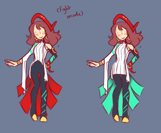
Rise was based on a greek goddess- though not any particular one, moreso how they're commonly depicteed in art and old statues. Pretty, holy, someone you'd go to for advice and help (someone just out of reach from the general public) It just felt like a good combination of something she'd like to be seen as and percieved as as well. She gets two outfits- for scan and fight mode! Kouzeon has no canon fight mode, thats just for Himiko, but man it exists in my heart. The transistion between the two is literally just her throwing off the long overskirt, hah.
How does her mask work? Excellent question. The p5 idea of having it there when vibing but gone when the persona is out feels a little awkward when her persona's whole thing is putting a visor over her face. Quite frankly I have no idea. Sorry folks. Have all concept sketches for the outfits I've done as compensation with a bonus Noot in there that I never continued on and finished.


#persona 4#persona 4 golden#p4g#rise kujikawa#chie satonaka#yukiko amagi#teddie hanamura#naoto cameos in the concept sketches but dont percieve them too hard#they were in the very early stages of being made before i got distracted by new projects#i feel like i explained the concepts kind of badly above here i have a really hard time putting into words what i think about#when i make outfits designs#sorry if it sounds awkward or slapped together. i promise each of these took an embarrassing amount of time to think out#also on a note not disclosed in the text above here. teds adult outfit is also meant to be a combination of the girl and boy seperate#outfits he has for p4 era. this is headcanon galore land however so dont worry about it. shh. it is a treat for me
300 notes
·
View notes
Text
Why Cassandra's Moonstone Armor Sucks
*cracks knuckles and dusts off keyboard*
It's time to finally rip this armor to shreds...figuratively because it's indestructible XD
And big shoutout to @whosbex @archivedwoods @th3p0rtalmaker @the-reverse-mermaid @aziraphalesbookkeeper and @majorabbey who all wanted to see this. I thank you all so much for your patience 🥰
Don't get me wrong there are some elements of this that absolutely work. The blue and black is a wonderful color scheme, especially that blue swirl that goes down and around Cass's body. And the spikes on the shoulders, forearms, and calves looks super cool and gives off a more black rock feel and a very intimidating silhouette. But...that's about all it does right.
1- It doesn't fit Cassandra's sense of style at all

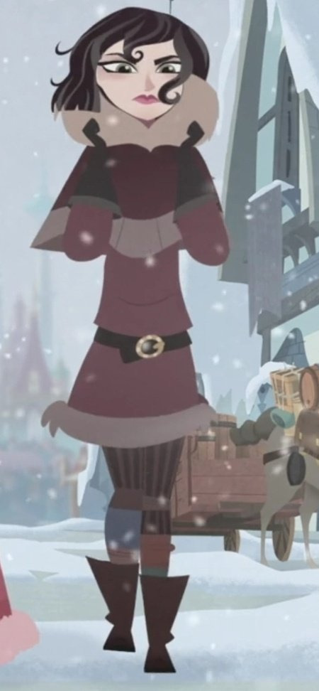

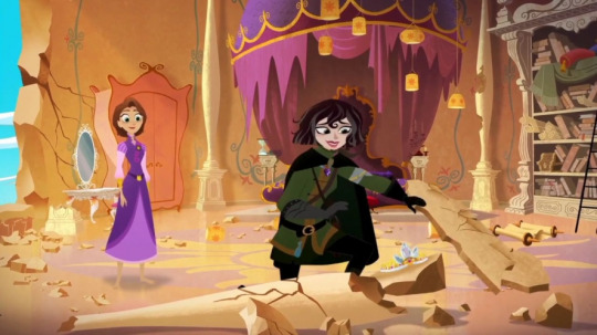
In all the outfits we can see Cass wear throughout the show, we can very easily get a sense of exactly what her style is. It’s very clear that she dresses conservatively. And especially in armor she values practicality above all else. Her clothing has to serve its respective purpose. And up until season 3 the only revealing thing she wears is her island outfit and even then that’s pretty modest. And the moonstone armor comes along and completely disregards her established sense of style.
2- It undermines the moonstone's capabilities
We get it very explicitly confirmed that the Moonstone made the Dark Kingdom, and made Cass's tower as well. We see the amount of detail it puts into buildings. Even the rocks, the most simple thing it can make, are magically complex enough to know to seek out the Sundrop. And you're telling me that this thing can't make better armor than that?? Nuh uh, no way. I don't buy it. There’s absolutely no reason for the moonstone to provide a skin tight catsuit with a few spikes when we know its power can be much more sturdy and intimidating.
3- It's Chris Sonneburg's fantasies showing through
Those of you who have been in this fandom know the crush that Chris, the director, has on Cass. She's supposedly based on his college crush or something, and from day one he always wanted Cass to be the villain and plan to betray Rapunzel even as far back as the very beginning of the show. And of course, don't you want to see your crush in something hot? Therefore, I'm certain that the retaining of the catsuit was his idea. Because if you look at the moonstone concept art you can see more and more the visual leaning into a catsuit rather than actual armor

4- It's not at all practical or historically accurate
For reference, THIS is what armor has typically looked like throughout history
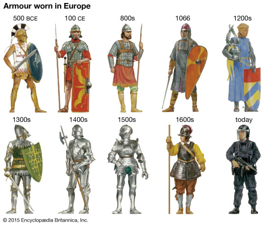
And even in works of fantasy you still have some version or variant of armor like this. Throughout the middle ages you can see just how tanky armor used to be. But as you can see, the moonstone armor looks nothing like that. It doesn't at all look like it could realistically defend a person.
Granted Cass's guard uniform is also kinda form fitting like the moonstone armor, but there’s still protective elements of it. The helmet, the breastplate. You could still believe that that is practical armor. Despite it being indestructible, the moonstone….is not at all practical armor. It doesn't look like it belongs in history or even fantasy. It is so obviously modern it’s almost painful.
5- It makes her disappear.
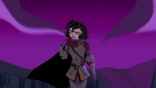
This is actually something that @moltenhair pointed out a while back that I never realized. There's too much black in there. A lot of the time we see Moonssandra at night and because there's so much black on her armor it makes her fade into the background to the point where she looks like a floating head and hand because the blue is all that really catches your eye about the design. Granted one can make the argument that this could have been done on purpose because taking and using the moonstone isn't actually giving Cass the spotlight she thinks it is but...eh...it's a loose argument.
#tts#rta#tangled#tangled the series#rapunzel's tangled adventure#nerd talks#cassandra#moonstone#analysis
52 notes
·
View notes
Text

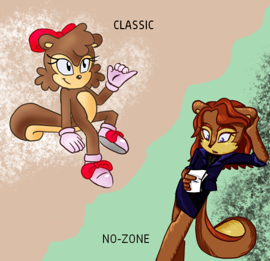
I can never decide which sally design I like best, so I decided...why not have them all!
🐿
Prime/Mainline Sally - This is the definitive Sally, taking inspiration from both her pre & post genesis wave designs. I can't decide which hairstyle I prefer tho 1. the classic swoop bang or 2. mohawk.
Anti Sally/Alicia Acorn - Pink sally is the perfect design for anti sally, as the dark hair and pink fur give her a much more serious and girly look compared to Prime Sally. I also had her outfitted in purple as a reference to the sally doppelganger that appeared in the princess sally mini series.
Boom Sally - Blonde sally would fit right in with the Boom universe, she has such beachy vibes. I styled her from some satam concept art and repurposed an outfit she wore in the comics. Honestly one of my favourite designs.
Classic Sally - Since the classic era has become a whole separate dimension in the games, it only seemed right to design a sally that could fit in with the chibi style of the classic characters. Heavily inspired by her design in the fleetway comics. Probably the most feminine of all the sally's.
Zally Zacorn - The No Zone from the archie comics is honestly so cool and unexplored, so I thought why not design one final sally. This variant has a muted color palette as she is rather ordinary compared to the other sally's. I again based her off a pre-existing character from the comics, Sally McAcorn - who was a lawyer, I felt that fit perfectly into the dimension of the No Zone.
Below is my design moodboard with all the references I used

#kaneni post#kaneni art#sally acorn#archie sonic#sth#sth fanart#sonic redesign#sally acorn redesign#anti sally acorn#alicia acorn
25 notes
·
View notes
Text


Castlevania Dracula’s Curse and I have a love hate relationship; I love it and it hates me (I am stuck on a level it is so so hard) . But yeah :3, the gang, the group, the travel companions.
Explanations and text under a cut as per usual:
Grant my bestie he is so cool and fun to draw, I love combining elements of his designs. I also think the fun little ponytail and a little stubble looks nice on him. Just a little side profile study :3
Trevor before the eye scar whoah no way :O! I love drawing him smiling, he radiates pure trustworthiness. His CV3 outfit also looks very comfy ngl, especially the cape—
Another Grant, this time in 3/4 view. :D
Full body Grant doodle >:D. The Grants are taking over oh no— Did you know the cool looking knife he has in a couple promotional artworks is an actual specific type of knife? I looked it up and the closest match is a Polish bandit knife, which is a type of knife that has a lot of variation in shape but always has a distinct curve downward towards the end, it’s pretty cool!
Chibi Grant :3
Sypha got rizz lol—
Some of the only Alucard doodles on this page alas, there wasn’t anymore room for more of him (T_T ). I like depicting him with shorter hair in CV3, it mixes his CV3 and SotN designs really nicely. I also think it’s funny making his outfit kinda Kid Dracula inspired lol. I’m pretty sure there is one CV3 concept art that has some similar elements augh it’s been a while since I’ve looked up CV3 Alucard arts. There’s also one Sypha doodle here too :3.
The next two are based on a couple like draw your ship memes I ran into, the second is specifically based off of that one “hot yaoi base” lmaoooooo. Anyway, I love Sypha she’s so cool. I need to draw her more often, I have too many design ideas aaaaa—
The text says “mercenary, knight, priest, outlander”, but I spelled mercenary wrong alas. Shout out to you if you know what that’s a reference to hehehehehe >:3c
Alright, goodnight guys, hope y’all appreciate ( ^3^) <3
#castlevania#castlevania games#Castlevania Dracula’s Curse#castlevania iii#Dracula’s curse#akumajou dracula#akumajou densetsu#Trevor Belmont#castlevania alucard#alucard#grant danasty#sypha benaldes#art post#the group ever#they feel like a silly dnd troupe to me but they’re all playing some kind of good alignment#silly goobers the lot of them#Trevor gives me not golden retriever friend vibes but like husky vibes if that makes sense#weirdly moody sometimes and extremely stubborn? piercing eyes that stare into your soul and mildly intimidating? yeah#but also generally pretty nice and good at making friends wants to lead and all those generally ‘dog friend vibes’ qualities? also yeah#does that make sense#aaaaa I’m trying to think of other things to say but it’s getting late oh no#Alucard 100% gets got by ligma jokes from everyone else in the group he falls for it most times and gets so confused#I am getting very tired tho ok that’s it goodnight
36 notes
·
View notes
Text
Diverse Stardew Valley 4.0 Sneak Peak!
Hey everyone! DSV 4.0 is getting close to being done, so I thought I’d show off some of the cool stuff that’s gonna be included! 😊 I’ve also been sharing little snippets in the DSV Discord server recently, so if you’re not already a member, check our website for the link.
It’s pretty long and has a lot of images, so click through to see them!
The big news is that DSV 4.0 will move back to an all-in-one download (and will also be hosted on Nexus again) with a SMAPI component, DSV Core, which will consolidate all of the config options for more convenience. DSV Core is the hard work of KediDili from a concept originally by Nuztalgia!
It’ll also mean that other mods will be able to read your DSV config choices, which opens up a lot of potential for compatibility! Platonic Partners and Friendships users may be familiar with how this works, since PPAF has a similar feature and DSV is able to automatically provide compat depending on your PPAF config.
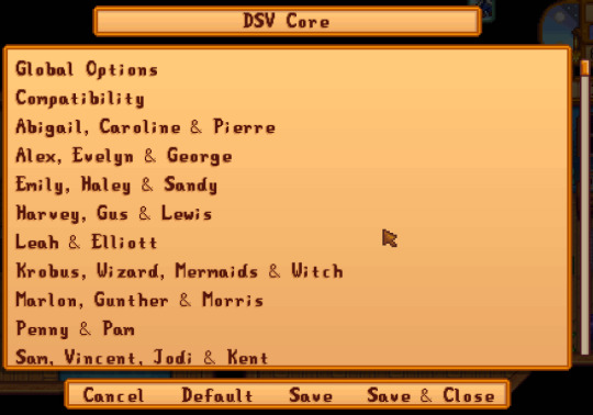
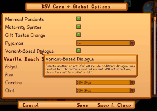
[image id: two screenshots from DSV Core showing a selection of configuration options. The first is a table of contents and the second shows some of the options available in the Global Options page.]
Options will be divided into different pages so that it’s not an overwhelming list of choices, and DSV Core will also automatically disable compatibility options for other mods if you don’t have that mod installed, so it’ll reduce some of the option clutter. We’ve also future-proofed the config so that you also won’t need to redo your config settings when we add more options in the future and added a function to automatically fix common typos in manually-edited config.jsons!
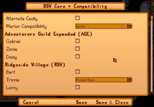
[image id: a screenshot showing DSV Core’s page of Compatibility options.]
As you can see in the screenshot above, 4.0 will also add dialogue for many characters related to DSV’s variants! This feature has been much requested and a lot of people have contributed dialogue, so thank you to everyone who wrote some lines for us 💖 If you’re interested in helping out with dialogue as well, feel free to join the DSV server and chat to us about it!
Another major content update will be DSV’s swimsuits! We’ve updated all of the swimsuits to have fresh new designs, and there’ll be a new option for every character with a beach swimsuit in the vanilla game to use either the vanilla design (with some minor tweaks to clean up art issues & match DSV’s bases) or the DSV design.

[image id: a selection of portraits from DSV showing the characters’ vanilla variants wearing the DSV Style swimsuits]
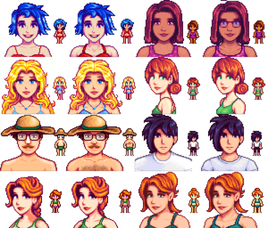
[image id: a selection of portraits and sprites from DSV showing the characters’ vanilla variants in a before and after of the default swimsuits on the left versus the updated Vanilla Style swimsuits on the right.]
Other stuff being included is a skintone saturation boost for modded Harvey and Black Emily and Haley, after feedback from our sensitivity checkers...
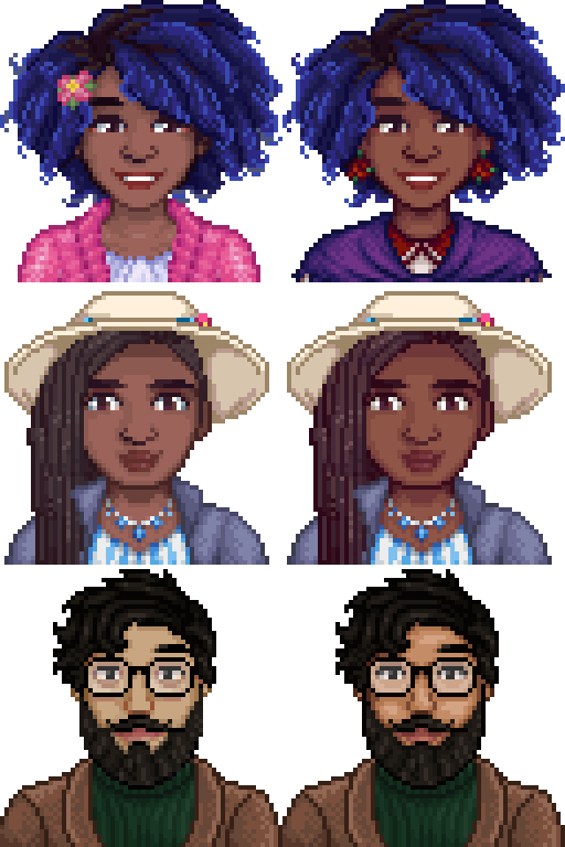
[image id: a before and after of DSV’s modded Harvey and Black Emily & Haley showing the difference in skintones.]
...new & updated outfits for some characters (Emily’s outfits are by Meowpix while Sebastian’s ao dai is by Elaho)...
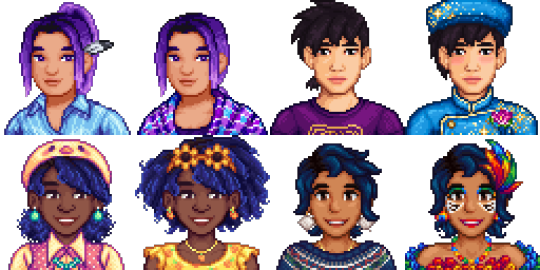
[image id: a selection of portraits from DSV showing updated outfits for Abigail, Sebastian, and Emily.]
...compatibility with Life Cycle and other mods...
[image id: portraits for DSV’s modded Caroline, Emily, Kent, and Demetrius showing new formalwear.]
...options for small immersive features...
[image id: portraits for DSV’s modded and vanilla Abigail wearing a variety of goth makeup looks.]
...and saving the best for last, DSV’s best girl Marigold will be making a return with updated art! She’ll be a non-friendable NPC and will require Sprites in Detail as a temporary measure until SDV 1.6 is released, but she’ll also have more dialogue, including dialogue from Linus about her, and new animations 🐕🦺

[image id: a screenshot of Linus’s tent showing his service dog Marigold with larger updated sprites.]
Thanks to everyone that’s supported us and I hope you’re all hyped for DSV 4.0! 💖
169 notes
·
View notes
Text
FLOWER HUSBANDS FIC: Coral Reefs and Cigarettes (working title) Prologue designs!
ALRIGHT! Hello everyone, in this post I’ll be sharing (and talking!) about the development of my multi-chapter fanfiction flower husbands au, based on @vyeoh ‘s punk x prep au! I’ll be starting off with the characters we meet in the prologue; the divorce quartet!
We open the prologue at the tail-end of last life, aka one of their school years. I wanted to focus on this, as while the fanfic is on the re-budding relationship between Scott and Jimmy, the side plot focuses on friendships, and of course, the friendship in mind are on the Divorce Quartet.
Without further ado, let’s take a look at these designs!

(I used a more simpler style so I can get these concepts across!)
The designs of the Quartet as a whole are supposed to mimic their soulbounds/ besties and with each other! I wanted each of them to have a distinct style but also keep them connected. It’s a tough challenge (considering I always do fantastical designs) but I think I did pretty well!
Moving unto them individually, I can talk about their character and designs! Starting with
Scott S. Major.
The richest and smartest kid in school
Has a reputation (family) in the area
Studies marine biology + gardening
He’s usually sweet, but approaching him is a nightmare. Imagine a Regina George-type character but a lot more sassy and open with his remarks
He loves to spoil his friends
DESIGN
Cold colors with a red and gold contrast
Keepsakes of his “alliances” (important relationships) as accessories (Jimmy’s poppy, Pearl’s moon necklace/belt chain), has yet to receive something he could use from Cleo and Martyn
Feminine outfits + heels are a go-to for him (is still a bit short)
The preppiest looking one out of the four
His body type is petite! (He’s still the dominant one in the relationship tho)
Pearl Moon.
The “newest” of the four (a nod to her being introduced in Last Life)
Has been friends with Scott before high school online
Art student
Loves studying the stars/ constellations
Lanky and tall

DESIGN
Muted red tones with a dark blue and green contrast
Heterochromia eyes
Lesbian + graphic design is my passion pins (from Cleo) on her polo shirt (mimicking Scott’s blazer(?) )+ moon hairpin (from Martyn)
Hoodie has a wolf skull on it ;)
moon/star-inspired makeup (done by Scott!)
Cleo Zombie
The one who hypes up the chaos/ also the most grounded
Could kill you, doesn’t hurt a fly
Not entirely sure what they’re studying
Sportsy! Probably basketball
Interested in zombie-type fiction

DESIGN
Green (mimics Martyn) with blue and orange contrast
Nonbinary choker and pendant + dog tags from a relative
The most “jock” out of all of them, the black shirt has a ribcage design
Blue orchid from Scott, jacket from Martyn, piercings from Pearl (well, scheduling them to get it)
Large/ bulky
Martyn I. Woods
The friendliest and most sociable
Theatre kid (obviously), loves the dramatic
Jokester/ class clown
Loyal to a fault
Has information on every student due to his social skills

DESIGN
Green with white and black contrast
Dogwarts (his theater group, now disbanded) bandana ;)
Studded white belt and chains from Scott, white boots from Pearl, and hasn’t received anything from Cleo yet
Mimics Cleo with the vest
Average, some muscle
STOKED to introduce you all to the beginning of this story, who else is excited? >:D!
(ps, if y’all have ideas for the title of this work I’d love to hear some!! I need it lol)
#flower husbands#scott smajor#jimmy solidarity#pearlescentmoon#zombiecleo#martyn inthelittlewood#inthelittlewood#smajor1995#flower husbands fic#coral reefs and cigarettes#third life#limited life#last life#limited life smp#divorce quartet#double life#prep x punk au#punk x prep au
152 notes
·
View notes
Text
Hey all! Sorry to post something that isn’t the reference sheets again, but I’ve noticed some hate and misinfo going around and even got a snarky + hateful Anon myself (which I’ve deleted, I don’t want it being physically on my blog to drain me of my creative spirit)
But! For the sake of calming my own Paranoia I wanted to try and clear some things up!
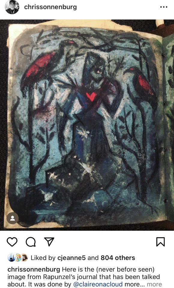
I’ve seen folks bring up the concept art of Star being a young Sabino being thrown around as a way to frame Wish Rewriters who write Starsha as creeps. But if you read the full page, it clearly states that was ONE of MULTIPLE concepts they played around with.

Theres even more concepts than just the ones mentioned above! Multiple different forms, human, not human, child, teen, adult, animal, abstract…
But most importantly for this post— There’s concept art of Star as a Peter Pan - esque character who is not related to Asha and (based off appearance) is close to her age.
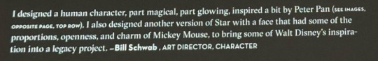
While the art book (from what I’ve read of it) doesn’t posit they were going to be romantic, it’s not a crime to play with that in a rewrite. It’s not morally reprehensible just because they had more than one idea for Star. And it’s certainly not fair to the artists or does justice to the concept art if you only ever drag it out to bring others down (this goes for both Canon Movie Fans AND Rewriters, of course. But I’m specifically talking about Canon Movie Fans who only bring up the Sabino Star concept art to cause drama in this instance)
Anywho, that’s all! I don’t want to spark drama, and I certainly don’t want this blog to become full of it. So don’t expect posts like this often please! I just wanted to post this to try and clear some air around the fandom a bit. Its really disheartening to see some much negativity thrown around.
Whether you like the movie, dislike the movie, prefer the concepts, hate the concepts … We’re all here because we have a passion for Wish, aren’t we? Is it not enough that we all get something wonderful out of this movie, regardless of if it was a new creative outfit or not? Is it not sort of weirdly wonderful that Wish has inspired others to create and dream and write and make art?
Remember to be kind to each other, that you don’t need a moral reason to dislike something, that the block button is not reserved for just bots and bigots, and that at the end of the day- None of the concept art is canon!
Also. If it needed to be said: If you ship incest or pedophilla, you aren’t welcome here! That’s all!
#Disney Wish#Wish 2023#Wish Rewrite#Wish Asha#Wish Star#Wish Sabino#Also btw. if anyone ever does write a rewrite with Sabino Star I’d love to read it!#it’s such a cool concept! it’s a shame it only ever gets brought up to bring other fans down
20 notes
·
View notes
Last Seen Blogs
chinaism
茶目貓
jacquelinewieserphotography-blog
Jacqueline Wieser
prostreetgroup
PROSTREET

curryjacobsen4
The Journey of Milne 025

starstruckzombiestudentthin-blog
Starstruckzombiestudentthings