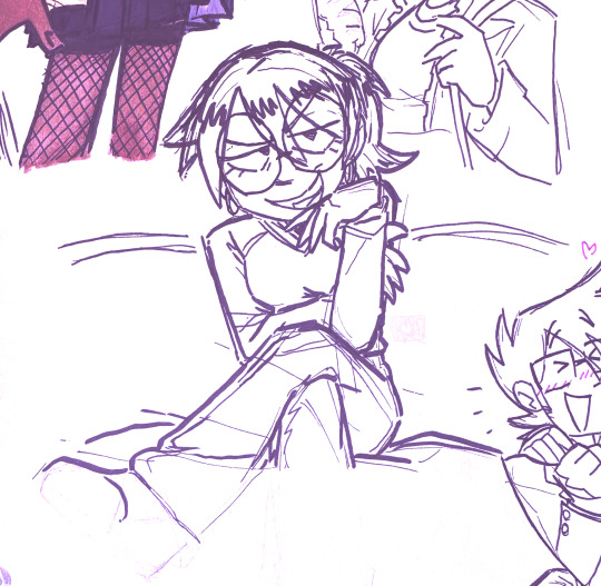
#my fav part tbh
Text
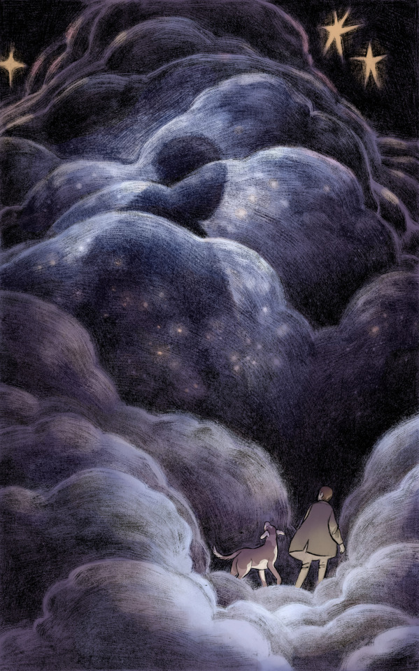
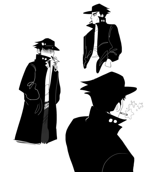
Figures in the fog.
#illustration#art#artists on tumblr#pentel brush pen#clip studio paint#dry brush#clouds#fog#tbh my fav part of drawing this was the silly dog ears#the rest was fun too but that was the most fun
3K notes
·
View notes
Text

I know a lot of people like to use moths in wc art to resemble eyes and such but I thought hm. moth wings also could look like ears so I did both
alternate mothless version under cut bc you know I had to keep her scars <3
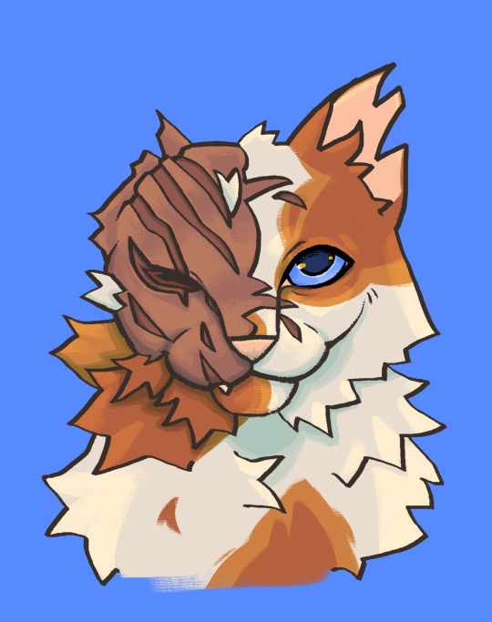
#art#erin hunter warriors#warrior cats#wc art#brightheart#brightheart wc#atlas moth#for sure my second fav cat in this series#she deserves the world#also I know I did not do the eyeball thing with the moth like most would but I was more focused on the ear part tbh#I still like how it turned out
890 notes
·
View notes
Text
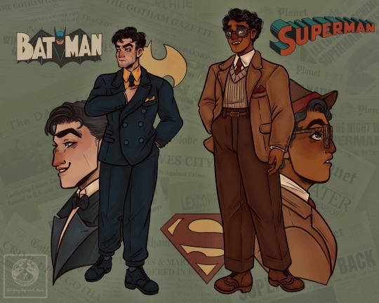
Experimenting with how I wanna draw Clark and Bruce, decided it would be best to draw them side by side to make sure they don’t look too similar *cough cough* Dc *cough*, also been wanting to draw them in 1940’s suits so combined them into one.
As always click for better quality
COMMISSIONS OPEN
+ Underwear version so that I could actually see their body types for reference later
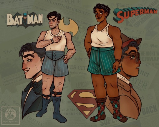
Bonus; Clean profiles!
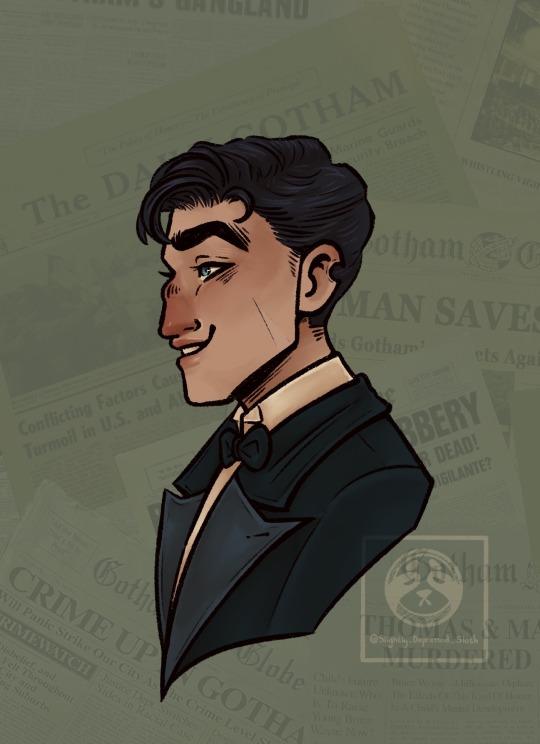
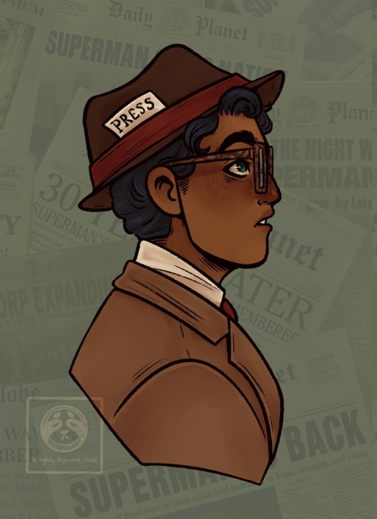
ID + refs under cut;
[ID; Digital drawing of Bruce Wayne and Clark Kent standing, both are dressed in 1940’s clothes. Bruce is on the left in a dark navy double breasted suit, with a black tie and yellow shirt, he has a five o’clock shadow and a scar on his cheek and ear. Clark is dressed in a brown suit, with a mismatched jacket and trousers, his trousers are darker and high waisted with a thin belt, his jacket is open and underneath he’s wearing a beige knitted sweater vest with a red tie and white shirt. Clark’s glasses are thick and tortoise shell in pattern. There’s a second drawing, which is in the same poses as the first but both men are in boxers and vests of the period. Behind each of them is a drawing of their face at profile view, Bruce is in full Bruce Wayne persona in his, clean shaven, properly washed for once and with makeup to cover his eye bags, he’s in a black tuxedo and smiling. Clark in his profile is in his above suit plus a fedora with a red band holding a press pass in his hat, he’s looking up in interest. The background to both is faded newspaper clipping of the Gotham gazette and the daily planet along with the superman and Batman symbol. End ID]
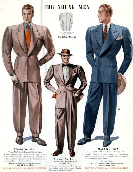
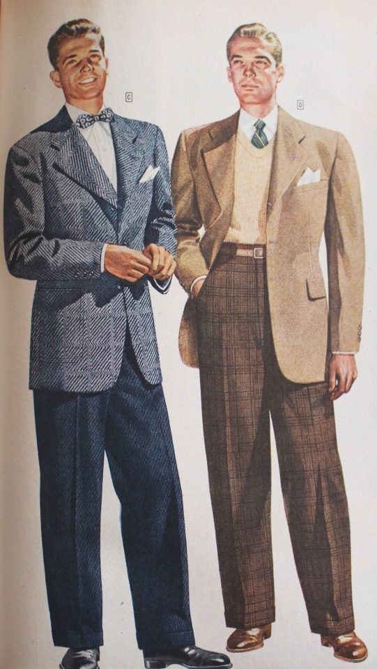
Here’s the references I based their clothes on btw, in case you’re interested!
#outing myself as a kryptonians have little fangs hc enjoyer#dc#batfam#superman#ngl their permanently in the 40s to me like I read comics set in contemporary modern day all the time but part of my brain registers them#more like modern au 💀💀#I think it’s cause my fav adaptions are either set in the past or were just created then tbh#also would 100% wear Clark’s suit grandpa librarian core#dc comics#slightlyslothdraws#fanart#digital art#batman#bruce wayne#clark kent#superbat#I mean not really but they’re both here#art#also the way Bruce deaged like 10 years in the Brucie Wayne profile just for having a wash shave and nap 💀💀#accidentally gave Clark a bit of T boy swag bc i am physically incapable of drawing cis ppl
381 notes
·
View notes
Text


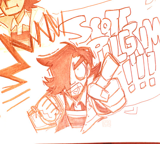

Scott pilgrim art dump!!!! I started working on these like a fucking month ago and just have not been able to finish them cuz life has been so fucking busy… but I FINALLY! I finally managed to finish them now!!! So behold!!!!!! My blorbos! My favs…. I rlly enjoyed every scene w these 3 they were adorable and awesome and cool…. I hope u guys enjoy my art of them even if it is super freaking late ghgh
#scott pilgrim#scott pilgrim takes off#gideon graves#gideon gordon graves#matthew patel#julie powers#gordon goose#doodles#patelgraves#suggestive#for the last one lol#but yeah… here’s wonderwall ghgh-#gravespatel#I guess Julie x Gideon doesn’t have a ship name lol#I tried looking for one but could not find it#but yeah!!! these 3 rock… they r a delight#definitely my fav part of the show. I loved all the other evil exes too! and like. most of the other characters ghg#tbh this was just a generally fun show I enjoyed it#idk if I’m gonna draw more stuff for these 3.. when I started on this art I was planning to draw more stuff#but then it took so long…. and I’m like.. 1 I might have lost the drive. and 2 I’m so fucking late to the party ghgh#but! we shall see! who knows…#the fact all 3 of these guys are like seemingly the same fucking height (SHORT AS HELL) is.#it’s adorable! and I love it! but also it’s killing me ghgh I need some sort of height diff somewhere!!#but not a single one of these bitches drank there milk they’re ALL short!#so yeah.. if any of them looks taller then they should I’m sorry ghg- I was trying! but I was also struggling#but anyway! yeah… I like them they’re cute! and fun!#I hope u guys like my art of them!
357 notes
·
View notes
Text
I try not to think too much about the fact alma is so emotionally distant from everyone that the last time mirabel was hugged was before her ceremony

which just makes almas affection in dos oruguitas even more profound because we see how rarely she does show physical affection to her family!

#encanto#encanto disney#disneys encanto#mirabel madrigal#mirabel encanto#disney’s encanto#abuela alma madrigal#alma madrigal#I really would love to see the idea of alma being emotionally distant discussed more#she was isolated from everyone even her own family#dos oruguitas being the best scene part 500#also tale of three sisters book is my fav#like the encanto Bible tbh
69 notes
·
View notes
Text
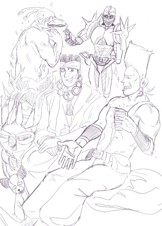
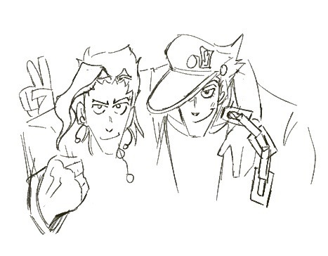
Old stardust crusaders art now that I feel safe 😊
#jjba sdc#jjba#jjba part 3#jean pierre polnareff#mohammed avdol#noriaki kakyoin#jotaro kujo#kinda gay if u study hard#my fav hyperfixation tbh#Apple Pencil try not to die challenge level DEAD
88 notes
·
View notes
Text

chonny jash when he talks to a woman or smth idk
#chonny jash#cj wwph#wwph#HELO THERES SO MANY THING SIN TJE VIDEO#one of my fav parts was like. The guy who was gonna get hit by the car but the car was just slowly moving back and forth#real tbh#- 🌗
109 notes
·
View notes
Text
Me going to AO3 write a 200,000 word fic over the line "Why didn't I drown instead of my brother"

#oxenfree#oxenfree 2#oxenfree ii#lost signals#alex oxenfree#oxenfree 2 spoilers#literally the saddest but of the game for me#alex is my fav#i feel so bad for her#tbh a part of me knew that she would definitely say that line at some point#because it's so in character
291 notes
·
View notes
Text
My fav tags/comments on round one of Disney Animatronics tournament with no context, part 1:


#yall kill me🤣#these are my fav parts of running the tournaments tbh🤣#animatronics#disney animatronics#tournament#disney world#disney#disney parks#tags
50 notes
·
View notes
Text
i think my favorite part of IT chapter two is when eddie crashes his car. like it kind of has everything. eddie insane road rage <3. eddie being a bit of a dick "it's my job to assess risks", it has "i love you mommy" which makes me want to jump off a bridge. eddie gesturing wildly instead of holding onto the wheel. his stupid fucking "edward kaspbrak speaking" <3 the face he makes when he's talking to mike lol. like he's expecting the car display to change. "EDDIE! are you okay?" "yeah! i'm pretty good."
#this of course isn't even mentioning how the phone calls might be my favorite part of the film in general...#richie being a loser <3#patty <3#bev throwing shit at tom <3#ben in his fucking zoom meetings... <3#bill being kind of the worst guy in the world and also bad at his job <3#its hard to choose a fav scene tho... i'm still not over “probably like he was as a kid... the best” and the jade o h my god the jade#and when richie kills henry and when eddie stabs henry#also incredibly normal about the leper scene tbh...#also enjoyed when mike drugged bill and also their stupid “i love you”'s at the end#this movie has a lot of duds for me (i fucking hate adrian's death scene but thats more of an issue with king than the film#i also hate the barrens scene and the two dead children scenes are very meh to me. also not a fan of the pennywise fight because my EYES#why are there so many flashing lights... i have to close my eyes for half that scene because it gives me a headache)#but is overall sooooo silly <3
33 notes
·
View notes
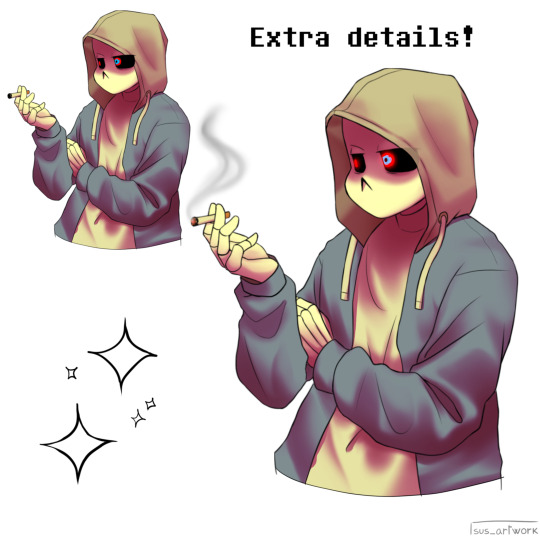
Note
uh hi can you give some shading tips? pls?
Sure! :DD
I think the easier way to give some tips is by showing my own process.
(I won't explain here the basics of shading, but if you want I linked a tutorial down at the end of this.)
First off, the program I use is Krita (but any program is ok 👍✨)
And here's the brushes I use:

I'd say use at least two brushes. A soft one and a harder one.
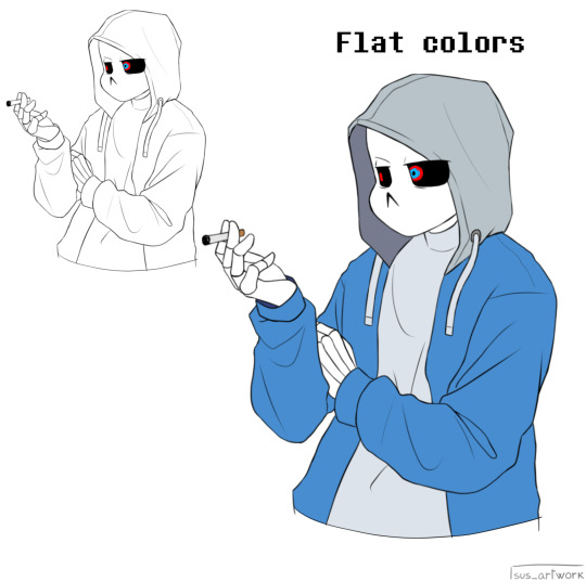
To show you I'll use this doodle I did of Murder!Sans (by @/ask-dusttale)
First, flat colors.
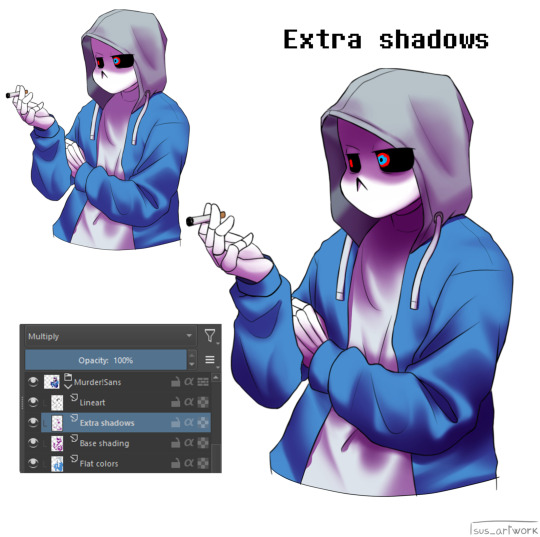
Then start shading on a new layer and put it in Multiply mode, then change the opacity at your liking.
Don't use black for the shadows! Use a dark color.
I usually use a purple or a brown.

Now with the same color, go on a new layer (Multiply mode), and add extra shadows where light has trouble reaching.
This gives more depth to the drawing.
(To make this process easier I use the Select Opaque option, by right clicking on the Base Shading layer, down in the menu, and then paint on the new layer)
Now fill the canvas with the light's color (or do like me and duplicate the Flat Colors layer, and recolor it if you want the light to be only on the subject).
I'm using yellow since it makes a nice contrast with the purple.
Put it in Pin Light mode and change the opacity at your liking.

Aaaand
You could say finished!
We could stop here, but if you want some extras, go under the cut:
-EXTRA-
Now I-
I can't explain what "Bouncing Lights" and "Sub-Surface Scattering" are, so... go see on internet :''D
Basically slap some red and blue over the shadows layer in Overlay mode and voilà
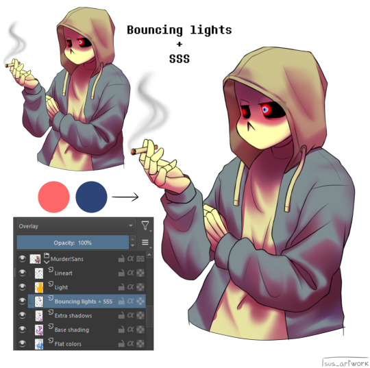
It'd be more noticeable with less light but trust me, it's good
Now let's talk about ambience.
We can create many different scenes just by playing with the light and shadow layers!
Change their colors, change the blending mode, play with 'em and see what you get:
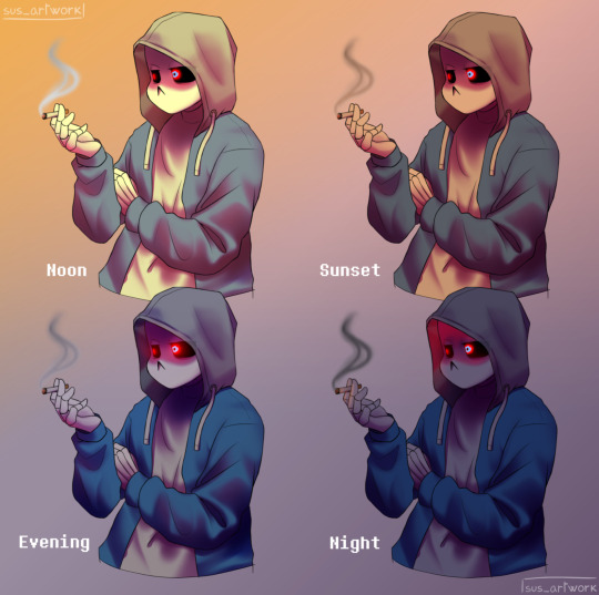

Also I suggest studying how color schemes work (I'll link you a video down below).
I uhh actually kinda suck at color schemes XD but having at least a basic understanding of them it's useful.
And, here's some tutorials that personally helped me a lot:
Shadows and lights tutorial/tips <- great for learning the basics of shading
Time saving shading solutions
This great rendering tutorial by @/licollisa
Different color schemes
For any questions don't hesitate to ask me (^w^)
#ask answered#miramoonli#undertale#undertale au#dusttale#sans#murder!sans#dust!sans#art tutorial#drawing tutorial#art tips#drawing tips#shading tutorial#coloring tutorial#rendering tutorial#This was oddly fun to do :D#maybe cause I LOVE shading. It's my fav part of drawing#Also Murder is fun to draw-#You know whose fault it is XD#This doodle was to practice drawing hoods tbh.
118 notes
·
View notes
Text
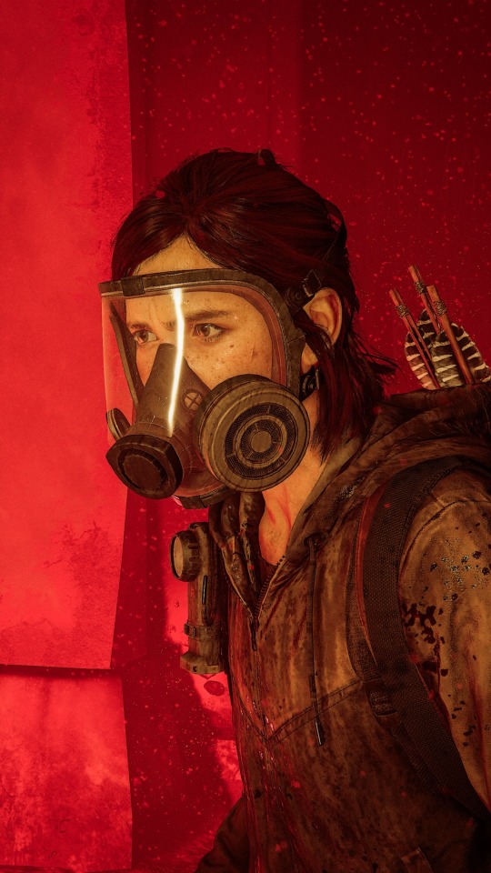

Ellie Williams | The tunnels
#click for better quality#I think the first is my fav I ever took tbh#the lighting was perf#ellie williams#Ellie Williams icons#the last of us#the last of us icons#tlou#tlou icons#tlou wallpaper#the last of us wallpaper#Ellie Williams wallpaper#ellie williams x reader#ashley johnson#tlou hbo#the last of us part 2
79 notes
·
View notes
Text
youtube
Ngl I’m tempted to animate something from that one canon au where Kusuo dies with this cover
#I will never not take an opportunity to post about Will Stetson#I typically don’t care for English covers or dubs or anything but holy shit man he’s an exception for me#I’m a little ashamed to admit he has some covers that I actually prefer to the original#Like “nothings working out”#Which is also a very Saiki brothers coded song tbh#Specifically Kuusuke coded#WHY DID TUMBLR TAG THIS YOUTUBE DONT DO THAT WITHOUT MY PERMISSION ??#Oh actually speaking of English covers (I really like the art of song translation sorry) there’s actually one that’s not by Will Stetson#that I really like#The rolling girl cover by lollia#she makes it like? Rock? It’s so cool#and back to Will Stetson he does a cover of hated by life itself that has rap and when I first saw that I was like hmmmm how is that gonna#work out yk#BUT ITS SO SO GOOD? AND IT KIND OF ENHANCES THE EXPERIENCE ACTUALLY#That song (the original moreso) is also imo saiki coded#Hey can u guys tell my brain is rotted#i love translation one of my fav external/non story parts ab the saiki manga besides Asous ramblings is the translators notes#Like them explaining how the joke works and the context behind it and why a joke might be hard to translate#its so interesting to me
59 notes
·
View notes
Text

My predictions for axels outfit
#fanart#holotempus#lottyart#holostars#tempus hq#axel syrios#so so hyped#and love seeing everyone elses predictions too#my fav part about fit reveals tbh lol
22 notes
·
View notes
Text
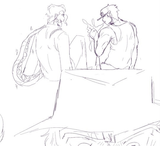
The guy
#his part 3 look isn’t even my fav but I always find myself drawing him in it#4taro and 6taros look are tied as my fav tbh#something about the snake pants in part 6 makes me run around and chase my tail like a dog everytime i think about it#anyway this one’s another oldie just wanted to draw him standin around#queue#also been thinking about changing my username but I don’t even know to what#I’m lame#anyway here’s the tags#my art#versacebong art#digital art#artist on tumblr#character art#doodles#jojos bizarre adventure#jjba#jotaro kujo#jotaro kujo my beloved#stardust crusaders#jojo part 3#jjba jotaro#love you bye#tw smoking#smoking
114 notes
·
View notes
Note
i've never read Eyeshield 21 but I took one look at this spiky sharp bastard and I've decided that I love him
so spiky
AND YOU'RE CORRECT lmao. That's Hiruma Yoichi, he's a menace and I love him. Every manga should have a dangerous weirdo with a book full of blackmail who drives the plot forward by being an absolute crazy person. Eyeshield 21 is a football manga, and he's just out here blackmailing and scheming and being an audacious chaos gremlin.

ALL THE OTHER PEOPLE IN THIS MANGA MIGHT HAVE OUTLANDISH PROPORTIONS OR FEATURES BUT AT LEAST THEY LOOK LIKE HUMANS!! Hiruma why are you like this?!?!
#Eyeshield 21#Hiruma Yoichi#The only part of his appearance that's artificial is the blonde hair which he bleaches and otherwise he just looks like that#anyway highly recommend ES21 it's legit I would say the best sports manga I've ever read#disclaimers: like a lot of sports media from japan it is occasionally very weird about black people hahaaaa QuQ#not in like a negative way in fact very much the opposite but boy there are one or two chapters that i just kind of shake my head through#and tbh the World Cup arc is kind of a weird fever dream of country cliches altho also I find foreign stereotypes of america very funny#other than that it's just a damn good time and a great sports manga full of characters that I still intensely love to this day#Time Stop Magician still makes me hold my breath ahhh the tension.... not that I'm biased because the Shinryuuji match is my all-time fav#(robert downey jr meme voice: they are biased because shinryuuji is their all-time fav)
145 notes
·
View notes
Last Seen Blogs

congtydktech
Công ty thiết kế Website & App DK Tech

yooo-lets-go
Yeah
playhouse305
Digital Art Coloring Pages YouTube Channel. New Videos Every Day
pidzets
chicacrow