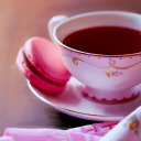
#oh also i made this :3
Text
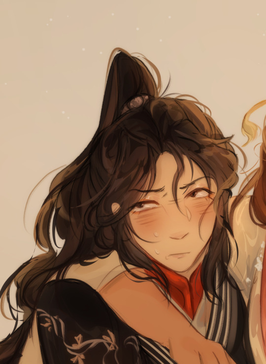
the blooper video makes me look at league like how a dog begs for food....... it's getting hard not to get it..... just look at this guy........
#heartsteel is my one direction#sigh#i love these cringefails but i am NOT getting league just to pay for skins#oh also i made this :3#brainrot brainrot brainrot#i am not normal#heartsteel#kayn#league of legends#stupid kayn...#this is me btw :3 if you even care.. ^_^
57 notes
·
View notes
Text
xianle trio,,,,,,i love them dearly,,,,
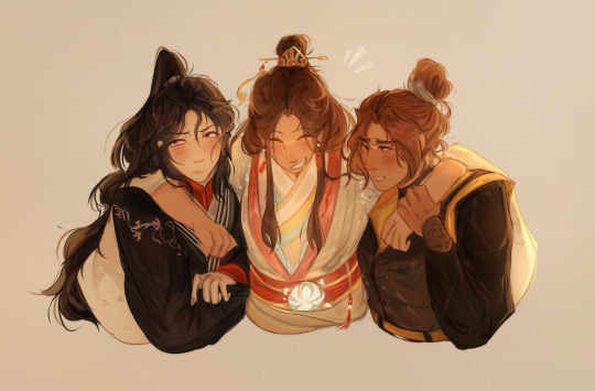


#first actual tgcf fanart i've made in a while oh boy#maybe i'll make more :)#ANYWAY SCREAMING AND CRYING AND THROWING UP I LOOOOOVEEEE THESE IDIOTS#THEY'RE SO. MWAH#also im ngl i didn't really know which designs to use so i kinda just. did a fusion + my own thing LMAO apologies if it looks off#<3#art#my art#tian guan ci fu#tgcf#tgcf fanart#heaven officials blessing#heaven officials blessing fanart#fanart#xianle trio#mu qing#feng xin#xie lian#mxtx
6K notes
·
View notes
Text
dance of dreams
#THEYRE SPINNIIIING THEYRE TWIIIIIRLING JUST LIKE IM TWIRLIIIING MY HAAAAAIR blink blink blink blink. hi :3#im not taking back the :3 its how i feel dammit. its REAL RAW EMOTION u gotta accept it. en ee wayz#so 7.3 eng drop huh. yea so um. i . so u remember how the initial drop made me go insano mode and i drew 5 pieces in 4 days?#so it wasnt done. the second drop gave me one more to draw. its the THEM chapters its mals rage when hes like 'YOURE AWAKE??'#the TENSION!!! the DRAMA!!!! oh i am SICK my heart SKIPS!!! the two guys with dream powers fighting ougughh made just for me#made in a LAB for miss cartoons!!!!!! made in a lab for ME!!!!! silver's eye is a lil bit open if u look close. mal will find out soon#IM SICK SICK SICK SICK AND TWISTED MY BRAIN IS RATTLING LIKE A JUNKER CAR U BOUGHT AT 16 FOR 400 BUCKS#twst#twisted wonderland#twst silver#malleus draconia#the overblot fit still sucks to draw but goddammit ill do what i must. also yippee i dont hafta tag spoilers for once FGHJD#suntails
649 notes
·
View notes
Note
The Floyd JD and Branch sitcom in your head is the funniest show I’ve never seen
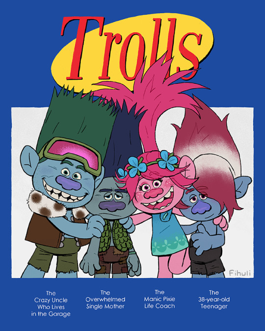
can the third movie's spin-off series just be this please?
#someone put branch out of his misery#he can't take much more#(lying. he's actually enjoying it (sometimes))#trolls#dreamworks trolls#trolls band together#trolls 3#trolls branch#trolls john dory#trolls poppy#trolls floyd#my art#answered#i just realized i called branch single#sorry king. broppy for life#but poppy is also his life coach on how to be a normal troll sooo#also kjfdjhf i made him so small lol. short king. i guess he's slouching#oh and#would anyone want to buy a print of this? because the original file is pretty big and i think it looks nice even from up close#there's textures and stuff#and everything is handwritten which you can't really tell in this smaller image
758 notes
·
View notes
Text


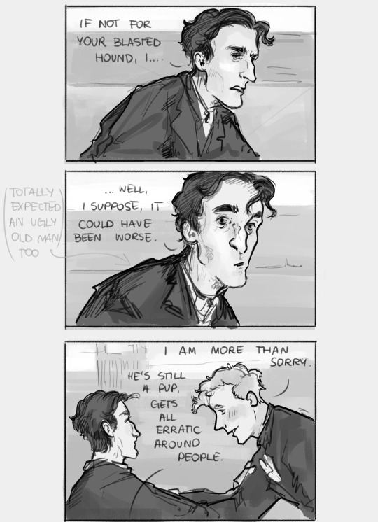
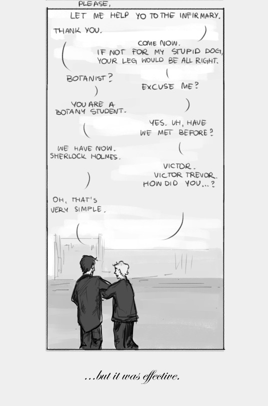
I have had a lot of thoughts on the original story after listening to the Sherlock&Co "Gloria Scott" and a new headcanon just dropped.
Chapter 1: part 1 - part 2 - part 3 - part 4 - part 5 - part 6
Masterpost (Index)
AO3
thoughts, if you're curious:
As far as gay Victor Trevor absolutely got me, I don't think there was anything serious between him and Holmes. This all comes down to my reading of Holmes, who is (to me) too aroace-spec to get involved in a regular relationship (althouuuughh about Holmes, his sexual and romantic orientation and him discovering it I have had so many thoughts I could write a whole essay). He likes to have a default person though, someone who will take him as he is, and maybe even admire a little - now that's Watson, earlier it was Trevor.
And yea I think Victor got a crush straight away after their first meeting, maybe they even talked about this at some point. Maybe Holmes said that he won't be able to reciprocate this affection but if Victor is fine with keeping things as they are, then he is too. I like to think they stayed pen friends even after Trevor's leave.
I feel like I should emphasize this? My intention in the comic was to make Trevor visibly flustered because he didn't expect a young attractive boy (he's hopeless in my head), while Holmes simply didn't expect to see someone his age and so sincerely sorry.
#i feel like i lost the ability to write meta for my drawings you know#the irrational feeling that i'll get misinterpreted if i don't explain everything thoroughly is taking over#truly horrible#also my imposter syndrome is full on lately in terms of my art so ughh it's so hard to share anything#at least i don't think anyone even sees my sh art so i may ramble in the tags here an noone notices :3#my art#sherlock holmes#victor trevor#acd holmes#acd canon#sherlock holmes fanart#i am rotating young holmes in my mind lately#oh yes and i made victor a botanist and named his dog dante for no apparent reasons#holmes collage adventures
454 notes
·
View notes
Text
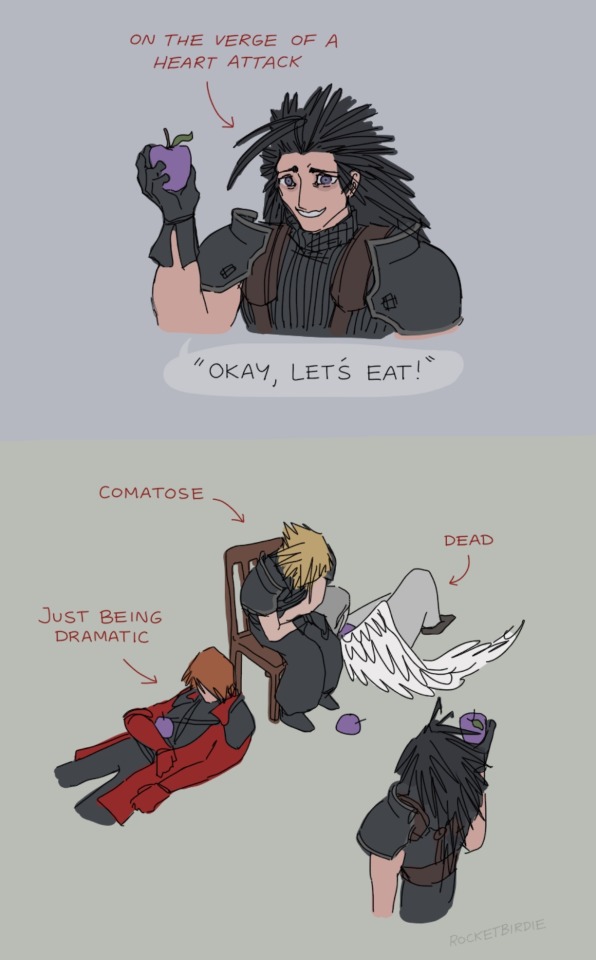
deranged picnic
#obsessed with how this game manages to maintain a consistent utterly unhinged vibe for its entire runtime.#this scene is immediately followed by him receiving a letter from his girlfriend saying she's breaking up with him.#he gets the letter from an eldritch abomination in the form of his mentor's face on the body of dead dog as it turns into magic dust.#also his gf broke up with him because he wasn't returning any of her messages while he was being tortured in a dungeon for four years.#which is actually how he finds out it's been four years. he's been under the impression that it's been like. 2 weeks lol#the guy on the left is perfectly alive and monologuing the whole time.#and he happens to be the same guy that made clones of himself and went on a crusade to eat chunks of the protagonist's hair.#sighh..... crisis core my beloved........#(derogatory)#my art <3#ffvii#crisis core#oh god i forgot his scar. nobody look. don't look. you don't see shit.
792 notes
·
View notes
Text

the eternity you seek
id in alt
#my art#revolutionary girl utena#rgu#utena tenjou#anthy himemiya#utenanthy#ITS FINALLY DONE#did a full drawing of those dream redesigns i made and.... oh man this took a while#not to mention the file itself was so big it was starting to lag out csp#the csp file is over 2 gb in size and the timelapse is 8 and a half minutes long so. yeah. big boy.#im really proud of this but also glad its done bc i dont want to wait 5000 years everytime i want to save this thing#also was messing around with halftone dots which i think look nice :3#anyways. glad this is done. lagging file begone#2023
1K notes
·
View notes
Text
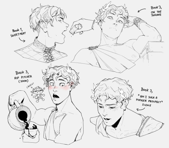
oh damen we're really in it now.mp4
#captive prince#damen#damianos of akielos#damen of akielos#kings rising#prince's gambit#ITS HIM ITS MY GUY#also can i just say#i know i made him blush in the rip pitcher sketch because thats the correct interpretation of that scene. cuz he saw his thighs#but can we all agree that those must be the palest pastiest legs a man has ever put in direct sunlight#diogenes said to plato “this is a man” about that peeled chicken because he mistook it for Laurent in a chiton#i bet he burns like a lobster#you leave him in direct sunlight for too long and he starts heaving like an office laptop from 2016 booting up Baldurs Gate 3#i am still in the middle of book 3 and when i tell you i am in DIRE NEED OF SOME LAURENT POV DECRIPTIONS OF DAMEN#TELL ME HOW LOVELY HE IS I NEED YOUR PASTY ASS TO SAY IT#I want to hear those rapid fire thoughts because you just know he is extinguishing them like summertime mosquitos#if the govart dies chapter is anything to go by#damen oh damen you really thought ancel was gonna shove that stick up his ass during that one performance. i love you.#you are THE funniest motherfucker in that book and your obsession with that blue eyed featherless biped only adds to it#who drops a pitcher when they see a white boy approach#god out of fear maybe#i would never live it down straight up never#that memory instantly became damen's dark horse in the championships for the most embarrassing shit that he will think about in bed at nigh#caprisun
862 notes
·
View notes
Text
why Aurora's art is genius
It's break for me, and I've been meaning to sit down and read the Aurora webcomic (https://comicaurora.com/, @comicaurora on Tumblr) for quite a bit. So I did that over the last few days.
And… y'know. I can't actually say "I should've read this earlier," because otherwise I would've been up at 2:30-3am when I had responsibilities in the morning and I couldn't have properly enjoyed it, but. Holy shit guys THIS COMIC.
I intended to just do a generalized "hello this is all the things I love about this story," and I wrote a paragraph or two about art style. …and then another. And another. And I realized I needed to actually reference things so I would stop being too vague. I was reading the comic on my tablet or phone, because I wanted to stay curled up in my chair, but I type at a big monitor and so I saw more details… aaaaaand it turned into its own giant-ass post.
SO. Enjoy a few thousand words of me nerding out about this insanely cool art style and how fucking gorgeous this comic is? (There are screenshots, I promise it isn't just a wall of text.) In my defense, I just spent two semesters in graphic design classes focusing on the Adobe Suite, so… I get to be a nerd about pretty things…???
All positive feedback btw! No downers here. <3
---
I cannot emphasize enough how much I love the beautiful, simple stylistic method of drawing characters and figures. It is absolutely stunning and effortless and utterly graceful—it is so hard to capture the sheer beauty and fluidity of the human form in such a fashion. Even a simple outline of a character feels dynamic! It's gorgeous!
Though I do have a love-hate relationship with this, because my artistic side looks at that lovely simplicity, goes "I CAN DO THAT!" and then I sit down and go to the paper and realize that no, in fact, I cannot do that yet, because that simplicity is born of a hell of a lot of practice and understanding of bodies and actually is really hard to do. It's a very developed style that only looks simple because the artist knows what they're doing. The human body is hard to pull off, and this comic does so beautifully and makes it look effortless.
Also: line weight line weight line weight. It's especially important in simplified shapes and figures like this, and hoo boy is it used excellently. It's especially apparent the newer the pages get—I love watching that improvement over time—but with simpler figures and lines, you get nice light lines to emphasize both smaller details, like in the draping of clothing and the curls of hair—which, hello, yes—and thicker lines to emphasize bigger and more important details and silhouettes. It's the sort of thing that's essential to most illustrations, but I wanted to make a note of it because it's so vital to this art style.
THE USE OF LAYER BLENDING MODES OH MY GODS. (...uhhh, apologies to the people who don't know what that means, it's a digital art program thing? This article explains it for beginners.)
Bear with me, I just finished my second Photoshop course, I spent months and months working on projects with this shit so I see the genius use of Screen and/or its siblings (of which there are many—if I say "Screen" here, assume I mean the entire umbrella of Screen blending modes and possibly Overlay) and go nuts, but seriously it's so clever and also fucking gorgeous:
Firstly: the use of screened-on sound effect words over an action? A "CRACK" written over a branch and then put on Screen in glowy green so that it's subtle enough that it doesn't disrupt the visual flow, but still sticks out enough to make itself heard? Little "scritches" that are transparent where they're laid on without outlines to emphasize the sound without disrupting the underlying image? FUCK YES. I haven't seen this done literally anywhere else—granted, I haven't read a massive amount of comics, but I've read enough—and it is so clever and I adore it. Examples:


Secondly: The beautiful lighting effects. The curling leaves, all the magic, the various glowing eyes, the fog, the way it's all so vividly colored but doesn't burn your eyeballs out—a balance that's way harder to achieve than you'd think—and the soft glows around them, eeeee it's so pretty so pretty SO PRETTY. Not sure if some of these are Outer/Inner Glow/Shadow layer effects or if it's entirely hand-drawn, but major kudos either way; I can see the beautiful use of blending modes and I SALUTE YOUR GENIUS.
I keep looking at some of this stuff and go "is that a layer effect or is it done by hand?" Because you can make some similar things with the Satin layer effect in Photoshop (I don't know if other programs have this? I'm gonna have to find out since I won't have access to PS for much longer ;-;) that resembles some of the swirly inner bits on some of the lit effects, but I'm not sure if it is that or not. Or you could mask over textures? There's... many ways to do it.
If done by hand: oh my gods the patience, how. If done with layer effects: really clever work that knows how to stop said effects from looking wonky, because ugh those things get temperamental. If done with a layer of texture that's been masked over: very, very good masking work. No matter the method, pretty shimmers and swirly bits inside the bigger pretty swirls!
Next: The way color contrast is used! I will never be over the glowy green-on-black Primordial Life vibes when Alinua gets dropped into that… unconscious space?? with Life, for example, and the sharp contrast of vines and crack and branches and leaves against pitch black is just visually stunning. The way the roots sink into the ground and the three-dimensional sensation of it is particularly badass here:

Friggin. How does this imply depth like that. HOW. IT'S SO FREAKING COOL.
A huge point here is also color language and use! Everybody has their own particular shade, generally matching their eyes, magic, and personality, and I adore how this is used to make it clear who's talking or who's doing an action. That was especially apparent to me with Dainix and Falst in the caves—their colors are both fairly warm, but quite distinct, and I love how this clarifies who's doing what in panels with a lot of action from both of them. There is a particular bit that stuck out to me, so I dug up the panels (see this page and the following one https://comicaurora.com/aurora/1-20-30/):

(Gods it looks even prettier now that I put it against a plain background. Also, appreciation to Falst for managing a bridal-carry midair, damn.)
The way that their colors MERGE here! And the immense attention to detail in doing so—Dainix is higher up than Falst is in the first panel, so Dainix's orange fades into Falst's orange at the base. The next panel has gold up top and orange on bottom; we can't really tell in that panel where each of them are, but that's carried over to the next panel—

—where we now see that Falst's position is raised above Dainix's due to the way he's carrying him. (Points for continuity!) And, of course, we see the little "huffs" flowing from orange to yellow over their heads (where Dainix's head is higher than Falst's) to merge the sound of their breathing, which is absurdly clever because it emphasizes to the viewer how we hear two sets of huffing overlaying each other, not one. Absolutely brilliant.
(A few other notes of appreciation to that panel: beautiful glows around them, the sparks, the jagged silhouette of the spider legs, the lovely colors that have no right to make the area around a spider corpse that pretty, the excellent texturing on the cave walls plus perspective, the way Falst's movements imply Dainix's hefty weight, the natural posing of the characters, their on-point expressions that convey exactly how fuckin terrifying everything is right now, the slight glows to their eyes, and also they're just handsome boys <3)
Next up: Rain!!!! So well done! It's subtle enough that it never ever disrupts the impact of the focal point, but evident enough you can tell! And more importantly: THE MIST OFF THE CHARACTERS. Rain does this irl, it has that little vapor that comes off you and makes that little misty effect that plays with lighting, it's so cool-looking and here it's used to such pretty effect!
One of the panel captions says something about it blurring out all the injuries on the characters but like THAT AIN'T TOO BIG OF A PROBLEM when it gets across the environmental vibes, and also that'd be how it would look in real life too so like… outside viewer's angle is the same as the characters', mostly? my point is: that's the environment!!! that's the vibes, that's the feel! It gets it across and it does so in the most pretty way possible!
And another thing re: rain, the use of it to establish perspective, particularly in panels like this—

—where we can tell we're looking down at Tynan due to the perspective on the rain and where it's pointing. Excellent. (Also, kudos for looking down and emphasizing how Tynan's losing his advantage—lovely use of visual storytelling.)
Additionally, the misting here:

We see it most heavily in the leftmost panel, where it's quite foggy as you would expect in a rainstorm, especially in an environment with a lot of heat, but it's also lightly powdered on in the following two panels and tends to follow light sources, which makes complete sense given how light bounces off particles in the air.
A major point of strength in these too is a thorough understanding of lighting, like rim lighting, the various hues and shades, and an intricate understanding of how light bounces off surfaces even when they're in shadow (we'll see a faint glow in spots where characters are half in shadow, but that's how it would work in real life, because of how light bounces around).
Bringing some of these points together: the fluidity of the lines in magic, and the way simple glowing lines are used to emphasize motion and the magic itself, is deeply clever. I'm basically pulling at random from panels and there's definitely even better examples, but here's one (see this page https://comicaurora.com/aurora/1-16-33/):

First panel, listed in numbers because these build on each other:
The tension of the lines in Tess's magic here. This works on a couple levels: first, the way she's holding her fists, as if she's pulling a rope taut.
The way there's one primary line, emphasizing the rope feeling, accompanied by smaller ones.
The additional lines starbursting around her hands, to indicate the energy crackling in her hands and how she's doing a good bit more than just holding it. (That combined with the fists suggests some tension to the magic, too.) Also the variations in brightness, a feature you'll find in actual lightning. :D Additional kudos for how the lightning sparks and breaks off the metal of the sword.
A handful of miscellaneous notes on the second panel:
The reflection of the flames in Erin's typically dark blue eyes (which bears a remarkable resemblance to Dainix, incidentally—almost a thematic sort of parallel given Erin's using the same magic Dainix specializes in?)
The flowing of fabric in the wind and associated variation in the lineart
The way Erin's tattoos interact with the fire he's pulling to his hand
The way the rain overlays some of the fainter areas of fire (attention! to! detail! hell yeah!)
I could go on. I won't because this is a lot of writing already.
Third panel gets paragraphs, not bullets:
Erin's giant-ass "FWOOM" of fire there, and the way the outline of the word is puffy-edged and gradated to feel almost three-dimensional, plus once again using Screen or a variation on it so that the stars show up in the background. All this against that stunning plume of fire, which ripples and sparks so gorgeously, and the ending "om" of the onomatopoeia is emphasized incredibly brightly against that, adding to the punch of it and making the plume feel even brighter.
Also, once again, rain helping establish perspective, especially in how it's very angular in the left side of the panel and then slowly becomes more like a point to the right to indicate it's falling directly down on the viewer. Add in the bright, beautiful glow effects, fainter but no less important black lines beneath them to emphasize the sky and smoke and the like, and the stunningly beautiful lighting and gradated glows surrounding Erin plus the lightning jagging up at him from below, and you get one hell of an impactful panel right there. (And there is definitely more in there I could break down, this is just a lot already.)
And in general: The colors in this? Incredible. The blues and purples and oranges and golds compliment so well, and it's all so rich.
Like, seriously, just throughout the whole comic, the use of gradients, blending modes, color balance and hues, all the things, all the things, it makes for the most beautiful effects and glows and such a rich environment. There's a very distinct style to this comic in its simplified backgrounds (which I recognize are done partly because it's way easier and also backgrounds are so time-consuming dear gods but lemme say this) and vivid, smoothly drawn characters; the simplicity lets them come to the front and gives room for those beautiful, richly saturated focal points, letting the stylized designs of the magic and characters shine. The use of distinct silhouettes is insanely good. Honestly, complex backgrounds might run the risk of making everything too visually busy in this case. It's just, augh, so GORGEOUS.
Another bit, take a look at this page (https://comicaurora.com/aurora/1-15-28/):

It's not quite as evident here as it is in the next page, but this one does some other fun things so I'm grabbing it. Points:
Once again, using different colors to represent different character actions. The "WHAM" of Kendal hitting the ground is caused by Dainix's force, so it's orange (and kudos for doubling the word over to add a shake effect). But we see blue layered underneath, which could be an environmental choice, but might also be because it's Kendal, whose color is blue.
And speaking off, take a look at the right-most panel on top, where Kendal grabs the spear: his motion is, again, illustrated in bright blue, versus the atmospheric screened-on orange lines that point toward him around the whole panel (I'm sure these have a name, I think they might be more of a manga thing though and the only experience I have in manga is reading a bit of Fullmetal Alchemist). Those lines emphasize the weight of the spear being shoved at him, and their color tells us Dainix is responsible for it.
One of my all-time favorite effects in this comic is the way cracks manifest across Dainix's body to represent when he starts to lose control; it is utterly gorgeous and wonderfully thematic. These are more evident in the page before and after this one, but you get a decent idea here. I love the way they glow softly, the way the fire juuuust flickers through at the start and then becomes more evident over time, and the cracks feel so realistic, like his skin is made of pottery. Additional points for how fire begins to creep into his hair.
A small detail that's generally consistent across the comic, but which I want to make note of here because you can see it pretty well: Kendal's eyes glow about the same as the jewel in his sword, mirroring his connection to said sword and calling back to how the jewel became Vash's eye temporarily and thus was once Kendal's eye. You can always see this connection (though there might be some spots where this also changes in a symbolic manner; I went through it quickly on the first time around, so I'll pay more attention when I inevitably reread this), where Kendal's always got that little shine of blue in his eyes the same as the jewel. It's a beautiful visual parallel that encourages the reader to subconsciously link them together, especially since the lines used to illustrate character movements typically mirror their eye color. It's an extension of Kendal.
Did I mention how ABSOLUTELY BEAUTIFUL the colors in this are?
Also, the mythological/legend-type scenes are illustrated in familiar style often used for that type of story, a simple and heavily symbolic two-dimensional cave-painting-like look. They are absolutely beautiful on many levels, employing simple, lovely gradients, slightly rougher and thicker lineart that is nonetheless smoothly beautiful, and working with clear silhouettes (a major strength of this art style, but also a strength in the comic overall). But in particular, I wanted to call attention to a particular thing (see this page https://comicaurora.com/aurora/1-12-4/):

The flowing symbolic lineart surrounding each character. This is actually quite consistent across characters—see also Life's typical lines and how they curl:

What's particularly interesting here is how these symbols are often similar, but not the same. Vash's lines are always smooth, clean curls, often playing off each other and echoing one another like ripples in a pond. You'd think they'd look too similar to Life's—but they don't. Life's curl like vines, and they remain connected; where one curve might echo another but exist entirely detached from each other in Vash's, Life's lines still remain wound together, because vines are continuous and don't float around. :P
Tahraim's are less continuous, often breaking up with significantly smaller bits and pieces floating around like—of course—sparks, and come to sharper points. These are also constants: we see the vines repeated over and over in Alinua's dreams of Life, and the echoing ripples of Vash are consistent wherever we encounter him. Kendal's dream of the ghost citizens of the city of Vash in the last few chapters is filled with these rippling, echoing patterns, to beautiful effect (https://comicaurora.com/aurora/1-20-14/):

They ripple and spiral, often in long, sinuous curves, with smooth elegance. It reminds me a great deal of images of space and sine waves and the like. This establishes a definite feel to these different characters and their magic. And the thing is, that's not something that had to be done—the colors are good at emphasizing who's who. But it was done, and it adds a whole other dimension to the story. Whenever you're in a deity's domain, you know whose it is no matter the color.
Regarding that shape language, I wanted to make another note, too—Vash is sometimes described as chaotic and doing what he likes, which is interesting to me, because smooth, elegant curves and the color blue aren't generally associated with chaos. So while Vash might behave like that on the surface, I'm guessing he's got a lot more going on underneath; he's probably much more intentional in his actions than you'd think at a glance, and he is certainly quite caring with his city. The other thing is that this suits Kendal perfectly. He's a paragon character; he is kind, virtuous, and self-sacrificing, and often we see him aiming to calm others and keep them safe. Blue is such a good color for him. There is… probably more to this, but I'm not deep enough in yet to say.
And here's the thing: I'm only scratching the surface. There is so much more here I'm not covering (color palettes! outfits! character design! environment! the deities! so much more!) and a lot more I can't cover, because I don't have the experience; this is me as a hobbyist artist who happened to take a couple design classes because I wanted to. The art style to this comic is so clever and creative and beautiful, though, I just had to go off about it. <3
...brownie points for getting all the way down here? Have a cookie.
#aurora comic#aurora webcomic#comicaurora#art analysis#...I hope those are the right tags???#new fandom new tagging practices to learn ig#much thanks for something to read while I try to rest my wrists. carpal tunnel BAD. (ignore that I wrote this I've got braces ok it's fine)#anyway! I HAVE. MANY MORE THOUGHTS. ON THE STORY ITSELF. THIS LOVELY STORY#also a collection of reactions to a chunk of the comic before I hit the point where I was too busy reading to write anything down#idk how to format those tho#...yeet them into one post...???#eh I usually don't go off this much these days but this seems like a smaller tight-knit fandom so... might as well help build it?#and I have a little more time thanks to break so#oh yes also shoutout to my insanely awesome professor for teaching me all the technical stuff from this he is LOVELY#made an incredibly complex program into something comprehensible <3#synapse talks
743 notes
·
View notes
Text
Y'know what, you can also have this
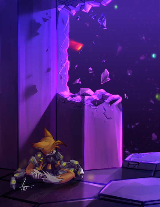
It was meant to go in tandem with my Prime bros fic but because since I drew this I rewrote the draft of the first chapter so many times it doesn't fit anymore
#sonic prime#this is also that image rhat was over 60MB#i has made the mistake of adding filters to it in the drawing program instead of afterwards in an app on my phone#so it was a fight to compress it but not make it look like absolute ass#also!! concidering I drew the placement of the shatterspaces purely from memory id say i was close enough#no place and boscage should be switched but oh well#miles nine prower#nine the fox#sonic prime season 3#mah art#me does arts#actually finished doodl#also ignore the reflection looking weird!! i no longer has any power to edit that!!!
408 notes
·
View notes
Text
Being a batfam fan is funny because people will make a post like “here’s my headcanon-“ and it’s just something that’s directly canon to the story then post about major canon events and get everything wrong.
#this post was inspired by me remembering the experience of reading death in the family#after only knowing the fanbase version and realizing oh none of that shit happened okay#like girl you don’t understand it’s so bad#Jason wasn’t even fired as Robin#He’s not accused of murdering anyone by Bruce#He’s not trying to prove himself at all he’s just looking for his mom#The reason Bruce didn’t go after him right away is because he was tracking down a goddamn nuke the Joker stole#Then after he finds it and handles the problem he helps Jason track down moms 2 and 3#Also Jason died in like 20 minutes?? even less??#He died in less time than it took his mother to smoke a cigarette#Bruce literally went ‘wait here I’ll be right back’ and was gone for less time than a trip to the grocery store#and then you go into the Jason Todd tag and they act like Bruce pulled the damn trigger on him#Like besties I don’t know how to tell you this he basically did everything right he possibly could have#Even him benching Jason from Robin temporarily happens so that he can get Jason into therapy about his trauma#Like the whole point is that neither of them did anything wrong bad shit just sometimes happens#That’s the tragedy. The drama.#Bruce couldn’t have made better choices in the position he was in and Jason was never going to make different ones#It was inevitable#Anyway rant over please read death in the family before I lose my mind#batfam#batman#jason todd#tim drake#dick grayson#damian wayne#bruce wayne
228 notes
·
View notes
Text
no thoughts just Heiji Hattori (HD)
#detective conan#case closed#amv#my amvs#eye strain#heiji hattori#harley hartwell#conan edogawa#shinichi kudo#funimation english dub script#video#happy two-year anniversary to 'no thoughts just heiji hattori'!#while it's not my first amv (it's maybe my... fifth?)#it was the first one i made with davinci resolve and the amv that really got me into editing amvs for real#it's the amv that made me believe i could make amvs 🥺#and in remastering it i deeply understood how ambitious it was! i thought i did a lot of audio mixing for 'messed up'#but that's not even close to all the audio mixing i did here--cannot believe that i did all this for my first big amv project#it took about 20 hours *just* to remaster!#which is something i've been meaning to do for a while now so i'm very happy to finally share the results!#to make this a 'remaster' and not a 'redo' the only changes i tried to make were to the source footage and audio#video now uses almost entirely hd remastered footage from my blu-rays or netflix rather than my dvds#but oh gosh was it *hard* not to touch anything else! i'd do so many things differently now#but this video will always be really special to me (and i can't believe i did it at all tbh!)#i hope seeing it in hd is fun too! i'm so blown away by all the love this vid's gotten#and that it helped increase interest in funi's old english dub is amazing and 100% what i was trying to do with it!#thank you everyone for all the support <333 i wouldn't be the video editor i am today without this vid or your encouragement for it <3333#like the original the sources used are mostly from what funi dubbed (but mixed in hd by me!): eps 48-49 57-58 77-78 117 and 118 and movie 3#but i also used episodes 141-142 174 189 239 263 277 291 293 345 479 491 517 and 522#and ova 3 and tv special 6 (episode one) and movies 10 and 13 and ops 27 31 and 33 and the funi 5.2 dvd blooper for the one line lol#i'm sorry i've been so absent lately! i hope to be more active now... and there are 2 completely done amvs that i'm just waiting to post...
290 notes
·
View notes
Text
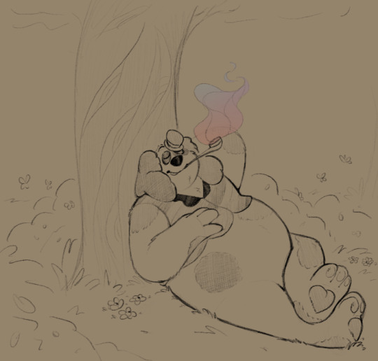
i can't stop scribbling him. Help
#oh to relax under a tree smoking That Good Stuff....#my brain this entire week: Yea. Barnaby Upon Ye#hes so relaxing to draw <3#scribble garnish#welcome home#he won't leave my brain....#im not mad about it! hes Very welcome! but also hey i'd like to draw other things too yk yk#before i knew what was happening barnaby shoved his way in. made himself cozy. and refused to budge#oh wait no wonder he's sticking around so much#its international clown week right??? its His week!!!!
727 notes
·
View notes
Text

"my oshis graduated" outfit swap
#yeah this one was for me#tsukumo sana#magni dezmond#vtuber#holofateswap#hololive#holostars#holocouncil#holotempus#it's funny bc after they graduated I was like#oh I won't draw them anymore out of respect ^_^#but unfortunately I missed them too much so here I am. drawing them still#I should reiterate that I'm happy that they're taking care of themselves#and that they're happier now!#I just cherish the memories we made together also#I think that's the best way to put it#BLOWS THEM A BIG CHEESY KISS#vespy is also my oshi but I cannot draw big buff men in tight outfits for the life of me. NEXT TIME MAYBE#I already struggle with axel and he's like. not even that bulked up#I'M TRYING MEN </3#oh that tag sounds fucking weird out of context#i'm leaving it though
326 notes
·
View notes
Text
thinking about the "perfect court" again. honestly; just how fucking unstoppable it would be, if they had riko, kevin, jean, nathaniel and andrew?! it would be GENUINELY terrifying.
#yeah yeah i know riko wanted nathaniel for 3 not jean but hes there so he gets to stay#he is worthy of perfect court suffering too?!!#i just see fan art and think fuck they would be unstoppable and petrifying and it would be hard too bc noone could do anything else with#- them they would be so useless in everything else in life#bc im such a biiiig fan of nathaniel i think thatd be so fun but also if they actively made andrew ✨✨✨ worse ✨✨✨#uncaring heartless andrew and sadistic riko and vicious nathaniel and masochistic kevin and feral jean#oh goD THE THERAPY BILLS#anyway im so sorry#aftg#all for the game#neil josten#andrew minyard#the foxhole court#mine#nora sakavic#andreil#aesthetic#kevin day#riko moriyama#jean moreau#the raven king#the kings men#exy#nathaniel wesninski#the perfect court
313 notes
·
View notes
Text
HoO is so funny to me when you actually think about the ages of all the characters. Octavian is 18. Percy and Annabeth are 16, almost 17. Reyna is presumably 16. Frank just turned 16, Jason’s about to turn 16. Leo and Piper are like 15. Hazel’s like 14 and a half, and Nico is 13.
The Death Sibs are both the youngest and oldest on the Argo II. Octavian is a college freshman getting into petty drama with a bunch of high schoolers. He gets told to shut up at one point by a random 8th grader. Everyone is scared of the 8th grader. We Sent A 13 Year Old To Superhell and he came back weirder, Just Like Middle School. TLH was just three high school sophomores being sent to do a task and it going Exactly Like You’d Expect. Percy’s the only demigod on the ship who can legally drive (though Reyna gets her drivers license at some point before TOA). What Is Happening.
#pjo#hoo#heroes of olympus#riordanverse#my second favorite thing related to this is like every time Hazel references someone's age especially in SoN it's just. blatantly incorrect.#she goes into very specific detail about how she's 14. detailing like exactly how many months it had been since her birthday#and when she died and when she was brought back. just like ''okay. im 14 and a half. got that? good.''#''anyways here's Frank. he's 3 years older than me'' like literal next chapter. we are told Frank is not 3 years older than her.#Hazel: Here's my older brother! [Nico is younger than her in literally every way feasible]#ive just decided Hazel is an unreliable narrator who is just really bad at guessing/remembering how old people are#which like. adhd mood. forgetting how old everybody is.#and she has the bonus excuse of saying her sense of time is skewed from being a ghost for so long#but it's just so funny every time she's just. with the upmost confidence. blatantly the wrong answer.#i want a scene of Hazel looking at Percy and just going ''hm. I bet he's like 20.'' and then learns he's 16#and she's just [surprised pikachu]#also we know it isn't an error that she's 14 cause in TOA she's like ''oh yeah im learning to drive!''#so she's 15 by then#it is however an error that *Nico* is said to be 14 in hoo cause he's 12 in TLO and 14 in TOA#but we know in HoO the reason that error was made was cause Rick hadn't figured out Nico's birthday yet#and he was flipping it between January or March#so he just forgot how old Nico is for a series and then we went back to normal
1K notes
·
View notes
Last Seen Blogs
avinwrites
~avin ~
mikadesigns
Mika Design
twenty-orange-balloons
ฅ^•ﻌ•^ฅ…ᘛ⁐̤ᕐᐷ
wasabi421
Homemade Dish
intentandoutopias
Utopía posible