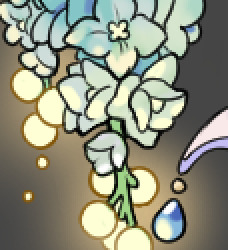
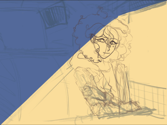
#or more like a gradient of different shades of orange
Text
A couple days ago I had the INTENSE urge to get (part of) my hair colored, which is something I haven't considered in years, and even then not very seriously. I'm also just generally averse to even temporarily modifying the natural state of my body in any way? But, like, I even un-archived a years old Pinterest board lol.
Anyway, considering what else was happening with my body at the time, it was probably hormones. I haven't completely rejected the possibility of actually doing it, though.
#one of the big issues of course is that i am Ethnic and thus have dark hair which would require a lot of bleaching#the idea i had was...i think it'd be called under dye?#with my favorite gradient hiding under there! red/orange/yellow#or more like a gradient of different shades of orange#i started looking at other color possibilities too though#for a long time i was convinced i wanted the ends of my hair forest green#I'll probably never consider doing something that requires regular upkeep#or drastically changes the way the color of my hair relates to my face#my life#my feelings#by elise
1 note
·
View note
Text
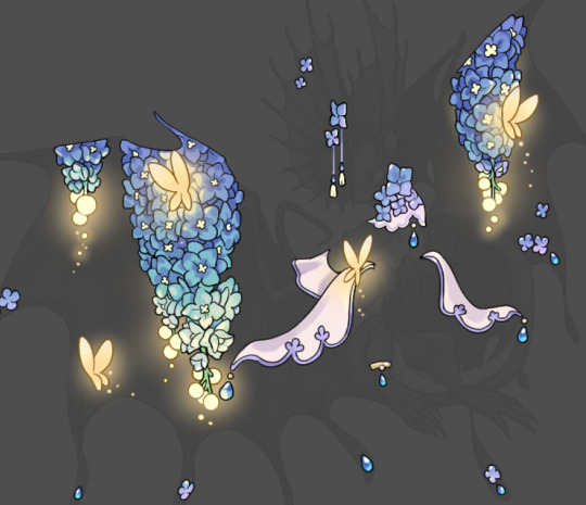
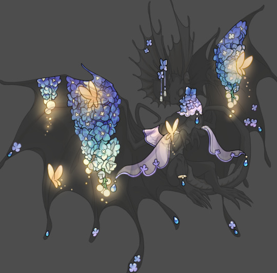
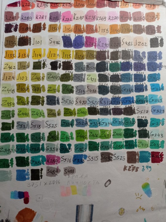
full breakdown of the daycare attendant's color scheme & minor design details throughout their apperances
bc im mentally ill abt them lol
warning: this is a very long post and will probably only interest a very specific audience of people
3d model

(source)
their body follows the pattern of having a "primary" color, a "secondary" color, and an "accent" color. this pattern shows up for all of their apperances.
the primary color is the one applied to the crescent moon on their face, the right half of their torso, the upper half of their forearms, the middle "in between" sections of their fingers, and their legs.
the secondary color is the one applied to the other half of their face, and the other half of their torso.
the accent color is applied to their lower forearm, their palm, and their finger tips.
sun's color scheme is a pale tan color(primary), a light orange color(secondary), and a light grey(accent). notably, sun's 3d model's palms are colored with their primary color instead of their secondary.
moon's colors are a pale white, a blueish black, and bright dark blue respectively. also the white of their upper arm fades out into the blue of their lower arm before ending at the elbow, but this doesn't show up on sun's arm. (also also, moon's eyebrow & eyelash are colored in with their secondary color, while sun's isn't colored in at all.)
the buttons on their chest tend to fall more in line with the main colors of their clothes, except for moon's 3d model which is their body's secondary color instead.
nothing major to say about their clothes, so here's a thought about their color schemes: even though moon shares a lot of colors with sun (red, orange, and yellow), sun's design doesn't have any of moon's blue. (though sometimes sun is shown with blue eyes? so who knows.)
their ruffles and ribbons all tend to stay the same color (red), all except for the ruffles on moon's neck which turn blue. this is a consistent detail throughout all of their designs.
their little elf shoes are orange and stay the same color regardless of which form they're in. there's a crescent moon on the inner facing side and a star on the outer side. the crescent moon's two pointy parts(?) are pointed towards their heel.
i will not talk too much about their head/face, but here are some details that are different in other iterations: their eyes do not move, sun's rays cannot rotate and can only move inwards and outwards, and moon's hat goes over their forehead.
also their ribbons have no physics in this game LOL
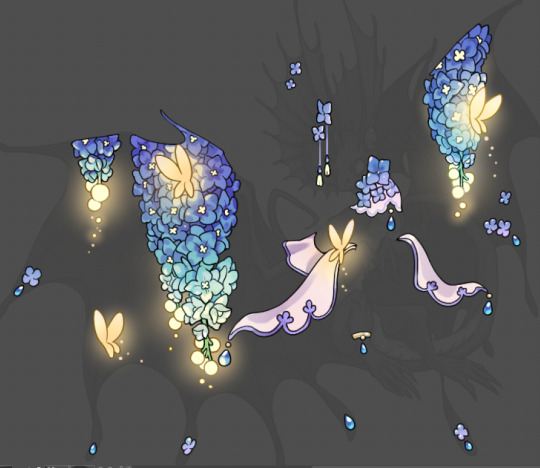
concept art
(source)
covering this first because the general color scheme and the placement of those colors is nearly identical to their in game model (albeit with brighter, more saturated colors). the overall design is also highly similar, but with a few notable discrepancies:
one major detail that's different in all their drawn iterations is that their torso is one solid piece instead of two separate parts like it is with their 3d models.
moon's arm gradient is still present on their concept art, however sun now has a lighter colored gradient on the end of their arm to match moon's coloration! (this could always be shading but it feels too specific for this to be the case). (also, moon's arms, fingertips, and stars seem to almost glow? which is potentially what their unused emission textures are based off of.)
sun's palms are colored grey! also, the middle sections of moon's fingers are colored dark grey on the concept art (pretty much everything with their primary color is colored like this ((except their face)), but it's probably just due to shading this time since it's not present anywhere else but here.
they seem to have a little circular panel near where their arm bends that isn't present on their 3d model. same with a rectangular panel on their leg.
their clothes, ribbons, and shoes are mostly the same except for a couple small things: moon's pants have faint lines on them to match sun's, their shoes have no symbols on them, and the bit of ribbon on the ends of their pants is colored yellow instead of red. (also moon's shoes are colored darker.)
their face has a lot of notable differences too, but one of the biggest ones is that they have no left cheek! their grin stretches a lot farther up on that side of their face because of this (they have no lips on that side of their face either!). the circular indent on their cheek is colored in on sun's face, their eyes aren't being squished by their cheeks anymore, and they also have a lot more teeth (which don't stretch into the corners of their mouth, and are colored differently than the rest of their face.) lastly, they share the same color for their eyebrow and eyelash!
official art work

something important to note is that all of the dca's (current) official art will have this color scheme and all of the same details due to them either being drawn by the same artist, or because all other current official artwork of them is based off of this design and/or the concept art. (any and all additional artwork i mention can actually be found on their wiki page, but i'll link to it here if i feel it's important.)
one of the most notable details of their official art is that their accent color has been changed to a light grey color for both of them (albeit slightly warmer or colder to match their respective color schemes). though, interestingly enough, moon's palms (similarly to sun's 3d model) are colored with their primary color instead, despite both designs having this detail in the concept art.
additionally, something that was changed from the sketch for this drawing, is that (like their concept art) their shoes lack the little symbols on them, and the ribbon tied on the end of their pants was colored yellow instead of red. something that wasn't changed though is their lack of a left cheek.
moon's button aren't visible here, but other artworks (such as their claw machine artwork) show them as a blue color to match with sun's red.
sun's arm still has the little circular panel near their elbow that can be found on their concept art.
their face has a lot of similar details to their concept art, while still being stretchy and cartoony. they have a lot more craters spread around their face, and sun has consistently been shown to have a chipped tooth... it's cute.
before i move on, i'd like to talk a little bit about their various eye colors! there are several instances of sun with golden colored eyes (e.g. this drawing here, their in game plush, their claw machine art, their piñata from ruin, their actual design from ruin, and an exclusive design from steelwool's store.), while there are only two instances of sun with blue eyes (the sunnydrop candy poster and their icon on the daycare pass).
moon's eye color (when their eyes aren't just... closed) tends to just be red, but there are still a few instances of them with a blue right eye (their plush and piñata, with their claw machine art's eyes being entirely blue).
there's actually even a few specific instances of their eyes being black (their 3d model, the golden moon plush, and the golden sun plush... however that one is more brown than black.)
there's also that one book cover of moon with the pink spiral eyes but that was more of a one off thing.
ruin
this is where my bitching session starts
very noticeably, their eyes move around in this game. did they finally get the glitter glue out of their eyes after the earthquake or something? does no one care about their dead fish eye swag...
speaking of eyes it's actually kind of lame they have yellow eyes instead of blue. the blue eyes actually have some additional meaning to them when you consider moon, but the yellow eyes are just... well, they're already super yellow. what makes them so special. make moon's eyes yellow for a change.
ok actually relevant: they use a mix of both sun and moon's primary colors, while using exclusively moon's secondary colors... both of their accent colors are used too with sun's on their right and moon's on their left.
suddenly their unused emission textures decide to join the party... this was a weird decision for them to make when those textures weren't even visible before. but ok.
all things considered they're actually not even that damaged. the most major damage is to their outer casing and their leg... like, compared to the others this is pretty good? even compared to the original shattered animatronics this is good??
wait is their hat just sitting on the very top of their head? is that because of the rays? are they holding it up? why was this a thing that was changed.
hw2
ok well the hat is even farther back now. what the hell. why
iirc their eyes don't noticeably move around as much as they do in ruin, but they do still move around sometimes (iirc they spin around after sun's cartwheel?) which i guess is fine. whatever. im the only bitch who would care about this anyway
they nerfed moon's ultra bright high beam eyes in this one... sad!
this is such a non problem but sometimes (especially in sb) when you shine a light on moon their pants have this little purple shaded section on the inner thigh parts and it looks. weird. in this picture it's not visible due to the shaders but it's very noticable in the daycare section of sb when you get a good look at them with the flashlight.
actually you ever realize how their design literally makes no sense whatsoever. how does their casing change color, and why is their coloring so inconsistent between the two without visibly affecting the other? how do their CLOTHES change color like that?? where the hell does the hat come from??? why do specifically and only the neck ruffles change color???? where do their pupils come from????? i will stop talking about this now
jack o' moon

they do have moon's color patterns, they're just shifted around a little. they even sort of have the lack of a texture on the sun rays that moon's model has! but this time it's actually intentional.
their face has the world's shittiest paint job which i think is really funny. i guess it does sort of look like a pumpkin yeah.
idk how the hell their glowing mouth overlay works but it's certainly a thing they have. the glowing eyes are also pretty cool looking admittedly. and the insides of their eyebrow, eyelash, and craters glow a little bit too.. that's cute.
the ruffles on their neck and waist, and the ribbons around the bottom of their pants are green, while the ribbons around their wrists are purple (but a small part of the ribbon on their right wrist is still red)? their shoes are similarly purple.
potato sack pants ♡ it's a really good part of the whole look actually
basically their design is like if bbw eclipse was stupid. but like in a funny and endearing way WAIT ACTUALLY SPEAKING OF THAT
balloon world eclipse
bitching session is officially OVER
first off: sun's faces! so the first face very obviously takes inspiration from their in game artwork while still having the general face shape for their regular look. the scattered look of the craters on their face and the color of their eyebrow reflect this as well. sun doesn't have their trademark chipped tooth but overall it's a very nice look and it serves it's purpose very well.
since sun's 2nd face and moon's are the same i'll go over them both here... this look is very much based off of their concept art look! but it's more noticable in the shape of their eyes and the way their teeth are drawn this time, because they actually do have a left cheek... but the corner of their mouth still stretches up the same way it does when they don't have one! also, the base color for moon's eye is a little purple here which is always fun.
now ECLIPSE... brightly lit yellow eyes with red flickering pupils... the light being pushed out between the cracks of their teeth... a menacing color scheme too dark for sun but too bright for moon... the faint color of the illuminated crescent moon hidden inside the darkness of their face... their complete and utter lack of a left cheek because it never got added onto this sprite... this is PEAK eclipse design
also, this isn't about their design but i edited these sprites for something a while back and noticed that some of the pixels were just ever so slightly off color? which leads me to believe this was done in a regular art program not made for pixel art, and that whoever made these isn't super experienced with it.. however that honestly just adds to the charm for me. i really love these sprites.
harvest moon
oh mmy god look at it
#my post#daycare attendant#dca fandom#sundrop#sunnydrop#moondrop#this is the cumulative effort of an entire year of hyperfixation on absolutely useless shit#do lmk if i missed something!! i had to rewrite half of this post cause tumblr didn't save my draft -_-
422 notes
·
View notes
Text
Okay finally
Small lighting tutorial (very long post, lots of images)

First of all I work on PS but if you have basic knowledge of your program of choice this will be easy to follow.
Second I use a different layer for everything. So assume that each screenshot is a new layer.
Third I've seen people not knowing how to choose colors for light and shadow and for me it comes out naturally so I don't put that much thought in it, but picking the neighboring color in the color wheel never fails, so lets say you use a red for the lighting, then pick either orange or pink for the shadow. The shadow should be fairly desaturated. However if the lighting is the desaturated you can go wild with the shadow saturation. But this is subjective and it's very dependent on your goals and art style.
Okay let's start:
Line art
Base color
Now for the shadow layer. The layer blending mode is in hard light mode

I use the quick selection tool on the previous base color layer, and in the new shadow layer with the hard light mode set I fill the selection with the paint bucket tool.
The lighting layer is on the linear dodge (add) mode.

I use the lasso tool to select the lighting parts, then I fill it with paint bucket tool.
Then once I have everything, I use the quick selection tool on this lighting layer, and in a new layer also on linear dodge mode I use a radial gradient, drag it from the direction of the light source, you have to try it out on it's own but it usual takes me a couple of tries to get the desired intensity.
Also tbh you can just leave it like that no gradient, if pure cel shading is your goal.
I add all the extra shadows, this layer is also on hard light mode, I use the lasso tool and a normal round soft brush.

This next part is something that I sometimes do and sometimes it's not necessary, in this case since the light source is moonlight the light on the clothes should bounce off on the face so I do an extra gradient. (or just do this if you want to make it lighter lmao)
With the quick selection tool, I select either the base color or the shadow layer, and in a new layer with the linear dodge mode, I use a gradient, it has to be either a fairly dark color or a very soft gradient.

And lastly in a new layer, with linear dodge mode I use a soft edge brush on top of the lighting areas, to give it that glow.
Sometimes, like in this case, I have to use some color balance adjustments, more contrast or brightness.
And that's it. Good luck and hope this helped you, if you have any questions my inbox is open 😊
If you think oh I cant believe this creature just gave me great knowledge for free, and you want to drop a few coins in my direction here's my ko-fi
#tutorial#my christmas present to all of you 😘#actually this is a present for myself because when the inevitable question about lighting comes up I can just point to this
635 notes
·
View notes
Text
Guess what time it is…….
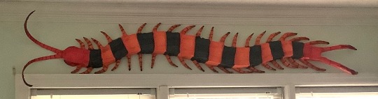
CENTIPEDE TIME !!! she’s finally real,,,,,,,, based off Scolopendra hardwickei or the Indian tiger centipede
Before I go about the process I just want to say you guys have been soooo incredible and I love reading your reblogs and I love the idea knowing I’ve inspired a lot of people,,, the project, although it was a lot of work and I’m feeling not so great as of posting this, still motivates me to want to make another.
(Art process below)
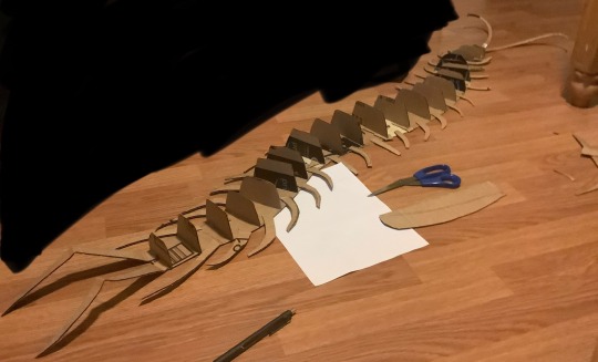
This was entirely freehanded! I have a lot of experience working in 3D art settings that this part came easy to me but I started with a flat base shaped in the pose I’d like the creature in. I used one whole piece cut from a shipping box and filled in the gaps with tape; you don’t need a single piece for the base but for structural integrity it helps a lot. As you can see here I also cut the legs separate and glued them on using hot glue. The vertical cross sections are to give an early support for the structure of the creature, think about the frames of aircraft or boats. During this part I used a pen to mark the width and height of the previous section to get a gradual flow of shapes.
This next part I wish I got more documentation on but after the vertical cross sections I used soda boxes for the thinner and flexible cardboard to add contour lines along the length of the creature, gluing them on the cross sections. I did about 2 strips of this on either side to fill in the space and then I continued to use soda boxes to fold and shape the top of the creature, gluing onto the strips rather than the cross sections (this part was a mistake but I quickly adapted, no issues happened but it did make it slightly less secure). I also gave the legs vertical cross sections as well to shape them for the masking tape.
The worst part, taping everything. I used tape to further shape it how I wanted but that meant going over parts several times. I used 2 different widths of tape for this for efficiency but it doesn’t matter. The legs were very loosely taped and if squeezed then they’d lose their shape; I didn’t bother filling them in because I don’t have materials for that and I let the paper mache help support them instead. Tape was also used to fill any holes and gaps left by the cardboard skeleton.
The next phase is paper mache of which I haven’t done since 5th grade… I was not confident in this step. I used mod podge and a brush to smooth down the paper. Because I lacked materials I used fast food napkins instead of newspaper which worked totally fine, it just tended to tear a bit easier. Some areas required me to get hands on and I don’t really like the texture during this stage so that was fun (lie). I didn’t do too many layers, one for the body and 3 for the back and legs but some projects might demand more. I used half of a 16oz bottle of mod podge btw so please get more than you think you need.
Finally, texture hell!!! I did a base coat of white spray paint and painted everything else with acrylic. Start with your lighter colors first before doing darker ones! I originally mixed some yellow and orange for the body and realized it was too bright and so covered it with orange instead. It also wasn’t until later I realized I could’ve been smarter with my paint so I skipped over the segments that were going to be fully black, saving the orange for the rest of the body. I wanted my centipede to stand out and not look 2D color-wise so I also used the red for the head and tail to give gradients and edges to the orange segments and legs, later going back with burgundy to further darken them but not too much. For the black segments I also used a very watered down layer of sky blue to give a fake shine and show the intended structure of the segments. Do not be afraid to use your hands! I used mine to smudge my detail paints like the black fade on the legs and the back shading. To top it all off I sprayed a clear coat and punched two holes in the underside to hang it up, using thumbtacks angled upwards.
617 notes
·
View notes
Text
I'll wait forever if I have to

synopsis:you're worried Satoru's teasing has gone a bit too far. There's nothing wrong with saving your first kiss for someone special, right?
content: Suguru Geto x gender neutral reader. Fluff! Comes off a lil angsty in the beginning but its fluffy and sickeningly sweet. Around 1k words. Written with hidden inventory arc in mind so you'd be in the same grade together, but read it however you want♡.We are all a little lovesick for Suguru and he's a lil lovesick for you♡ eng is not my first language so i'm sorry for any mistakes♡ enjoy!!
Based on Satoru's version of the fic♡

"Does it bother you that Satoru teases you so much?" The question breaks the comfortable silence you had as he walked you home. Sky fading from pink and orange cotton candy clouds to a clear and deep navy gradient canvas clustered with stars and moonlight.
Suguru is Gojo's bestfriend. You're sure he's used to his antics. Still, Satoru can take it a little far sometimes. Being oblivious to or ignoring the line completely. Crossing over it with a skip in his step and a smirk on his face.
"There's nothing wrong with waiting for the right person, you know." You reassure. Perhaps a little to yourself too. You'd wait forever for him, not that he knows.
(You kinda wish he did.)
You keep your voice soft, and soothing even with the unintentional undertone of worry. But Soothing enough to dulcify if Satoru's teasing did leave some cracks in his heart.
He lets out a low amused hum in agreement. Smooth as warm honey. Its drum startling the butterflies between your ribs awake. Not that he has to do much anyway to awaken them. It seems like they are always fluttering around when he's near. A bit smothering at times. Making your head fog over with images of liquid golden eyes and sickeningly sweet smiles.
You reach the traffic light before he speaks again. Filling the silence of waiting until the red light turns green.
"You don't have to worry about that, y/n. It's not hurting my feelings. I'm more than content to wait for my person" he answers sincerely. Not an ounce of impatience dripped from his voice. He means every word.
My person. his words weigh a little heavy on your heart. My person. Does that mean he already has his eyes set on someone? You're pretty sure a few of the butterflies have lost it's wings. Wings Shriveled and shattered at the thought. Broken bodies wriggling uncomfortably in your gut. Anxious and mourning as you think over who it could be. Would it be different if you'd just confessed already? Did you miss your chance or was there never any to begin with?
(The thought of him making someone else's heart race the way he does yours makes you a little sick)
You don't look at him. He's always been good at reading you, so in tune with your well being. You're an open book to him and usually, you're more than happy to let his fingers glide over the pages. Break you open to study you up close. Hoping that one of the words, one of the chapters in there is enough to lure him in, like a sirens song. Enough to steal his heart ...damn, how dare he fall for someone else.
"Sounds like you already have someone in mind, then". It comes out forced as you swallow down what you really want to say. Unable to decide between cursing him out or confessing to him on the spot.
You keep your gaze at the light ahead as if the force of it can will it into turning from this horrible shade of red to green, so this conversation can be over. So you can continue to walk in silence, so he can drop you off at the front door, wait until he hears the lock click from inside as he always does and you can dive into the comfort of your bed, dream of what could have been and try your best to move on
(You don't think you can if you're honest)
But again, you're an open book to him. He almost looks proud as he glances you over. Standing up a little straighter, failing to suppress a smile. A horribly beautiful smile that does not at all fit the turmoil inside your head. As if you're reaction solidified something in him.
God, how long does it take for a light to switch?
Your gaze doesn't falter as he steps closer to you. His warmth, his cologne enveloping your senses, wrapping around you like a spiderweb. Fitting as you feel like your heart is going to be torn out at any moment. Waiting for the words that will fracture your hopes. you think of just booking it through the red right at this point and leave him to choke on his rejection.
"Will you look at me, please"
He's replicating the soothing tone you used on him. Only he's so much better at it. Smooth like warm butter and sweet as syrup. How could you possibly deny him when he sounds this heavenly.
He's a patient man, he is. But he doesn't want to hurt you. Doesn't want you to shatter your own heart even more by thinking he could ever love someone the way that he loves you. As if he could ever want anyone else when it's always going to be you that captured his heart.
His fingers slide under your jaw, grip delicate as can be as he turns your head to meet his eyes. You're a little embarrassed at the lack of resistance on your part.
His face is kind. And despite your hesitance, his eyes are easy to hold. Feeling like sunsets on a warm summer evening.
"I'm just waiting for you to be ready too. However long it takes."
A timer goes off. The light has finally turned green. you both stay unmoving.
You feel like you've been staring into his eyes for hours when really it's only been a few seconds of silence after his words. Then you half-heartedly push him off. A laugh bubbles up your throat, relief evident in the melodic tone.
"you're awful, you know that?" not a sliver of actual malice in your words. He knows that too. continuing to stare at you fondly, eyes soft and a little love-sick. Smiling brightly at your words as if you complimented him.
"And you're beautiful" the timer of the traffic light is sounding quicker now, similar to the beating of your heart. Indicating that it will soon turn red again.
You have a moment of bravery. confidence, as you intertwine your fingers with his and pull him across the street before the light turns red. His grip is nice and firm, tracing heart shapes on the back of your hand with his thumb. Doodling silent I love you's into your skin.
you continue to walk to your home together. Hands now interlaced. Hearts intertwined. Crisp evening air kissing your skin and calming the heat blooming in your body.
"I don't want to have my first kiss at a traffic light. You deserve something more romantic than that too," you begin. swaying your hands back and forth. Focusing on the street infront of you. You see your front door coming into view.
"But if you feel the urge to kiss me as you drop me off at my doorstep," you see him begin to grin in the corner of your eye. It tugs at the corners of your lips too
"I'll let you"
thank you for reading, angels!! I'm havinf such Suguru brainrot atm😩🩷 he's so cute.
Also I thought his eyes were brownish/ gold because I always just imagine him with that but they are purple....🔪 YOU🫵 ARE GOING TO IGNORE THAT FOR NOW AND IMAGINE THEY ARE GOLD AS WELL. Thank you🩷
#jujutsu kaisen x you#jujutsu kaisen fluff#geto suguru#geto suguru x reader#suguru x reader#geto x reader#suguru x gender neutral reader#jujutsu kaisen x reader#jjk fluff#jjk x gender neutral reader#jjk x gn!reader#jjk x reader#geto suguru fluff#geto x gender neutral reader#jujutsu kaisen x gender neutral reader#jujutsu kaisen#jjk#suguru geto x reader#suguru geto
209 notes
·
View notes
Text
Chapter 1 episode 1
←Previous episode
Next episode→
Index

---
Let's start with a familiar face, shall we!
CW: violence And the mention of blood and injury
Read below↓
Or AO3
The heat is unbearable. Scar wakes, wheezing out a hot breath that circles in his sealed helmet, fogged by the last of his moisture. A building headache pulses behind his eyes. He reaches up to rub the soreness out, but his gloves clank uselessly against the visor. He blinks, squinting through the harsh light. His first instinct is to rip the helmet off for the relief of fresh air, but as his eyes adjust, he doubts it’ll make a difference.
He’s in a desert. The dusty and cracked ground stretches all the way to the horizon. Nothing about this place feels familiar, in fact, the bright orange gradients in the sand look alien. He has no way of telling if the air here is breathable, and though it’s tempting, testing it isn’t worth the risk. The sheer lack of life in the landscape certainly doesn’t bode well in that regard.
He tries to think back to how he got here, but there’s nothing. He doesn’t remember falling asleep outside. Definitely not here, and definitely not with his helmet still on.
Reflexively, he reaches for his communicator, but it’s not there. With rising anxiety, he pats down the rest of his person. His gun, enderchest and communicator are all gone. The only useful thing he still has left on him is the helmet on his head.
That’s concerning. He keeps those things on him at all times. It’s mandatory. As much as Scar would push the rules, he can’t deny the sense in keeping his gun, enderchest and communicator at all times. Even with his reputation, he wouldn’t just wander into the wilderness with none of his gear. He’s more competent than that at least, right?
There are no constructed landmarks nearby to use to figure out where he is, and he won’t be able to figure out the star system he’s in until the sun has set. At least whoever left him here had the decency to leave him with his helmet on. He can panic about being stranded, while puffing recycled air.
He thinks for a moment that maybe if he stays put the Vindicators will come looking for him, but that idea is quickly squashed by the realization that he’ll probably die of heatstroke before they realize he’s gone. His best bet is to walk until he finds some sign of intelligent life… or run out of oxygen in the process.
Not the most optimistic reality, but nevertheless Scar picks himself up, bushes the desert dust off his clothes, and scans the horizon for the most promising direction. Hoping, desperately, that he's not about to get himself even more lost than he already is.
With a sigh, he squints at the horizon with his hands on his hips. He finds cracks and grooves in the sand that open up beneath him to form long ravines. The gouges in front of him seem to open up into larger trenches that follow a relatively straight path, a much better scenario than splitting into maze-like passages. He nods approvingly. It’s his best bet to make his way down into the ravine. It’s depth is about double his height, which should still provide some shade from that glaring sun.
He spots a relatively safe way to get down— a sandy slope built up against the otherwise harsh stone. He walks tentatively towards it, but stops at the sound of a beep. Looking around for the cause of the noise, he sees a collection of rocks protruding from the sand, but no movement. He checks the soles of his boots too, in case he stepped on some kind of device hidden in the sand, or maybe a small creature, but he sees nothing there, either.
He’s probably just imagined it. Continuing on, he hurries down towards the slope, desperate to escape the heat. The sound of sand scrapes against his leg braces as he slides, and he keeps a hand pressed into the sand behind him to stay steady. He manages to avoid slipping as the sand shifts below his feet, but only barely.
The shade cuts the temperature in half, and Scar sags with relief. The ravine is just as lifeless and empty as the surface, albeit far more claustrophobic. The curving, orange walls hide the vastness of their expanse from view. Scar’s footfalls echo down the chasm. He’s not sure if he prefers the company of the extra sound or if it just makes him feel more exposed. Everything is so empty and open, and an almost perfect mirror to the clear sky. The entire atmosphere radiates with a yellow glow, as if the sun takes up the whole sky. Maybe it does. Out of the corner of his eye, Scar finally detects movement— a shadow across the dusty scenery, but he reacts too late, and looks up to see the shadow is gone, and the sun’s still bright.
He walks for at least five minutes before another beep is heard again, except this time it doesn’t stop there. Quickening, it takes about thirty seconds untill the next one, forcing Scar to accept he hadn’t imagined it.
He listens, face wrinkled with concentration. The beep isn’t coming from anywhere around him. It feels like it’s in the back of his head. Whatever it’s trying to tell him, he can’t figure it out.
He turns to his left, kicks a few stones, tests if the sound reacts. Maybe it’s something hidden in his jacket pocket. He rifles around in them, remembering they’re all empty, and goes back to struggling to understand the pattern of the beeps. It keeps slowing and quickening— even when Scar is walking in a straight direction, so it can’t possibly be leading him to a fixed place, and he tried waiting a few minutes after each beep, just for nothing to happen, so it can’t be warning him about anything.
Frustrated, Scar tunes it out eventually, and focuses instead on making his way through the desert. He'll be glad to find anything other than rocks, sand and the sourceless beeping at this point. At one point he sees movement again, another shadow darting across the ground. It looks almost like a bird, but Scar can’t be sure, the shape vanishing almost as soon as he notices it. It’s like it’s evading his view, like it’s trying to make him second guess himself.
Scar groans. It’s been a long trek through the winding canyon. The sweat drippin into his eyes taunts him— he wishes more than anything to be able to wipe it from his brow, but alas, Scar’s not quite desperate enough to risk removing the helmet.
Almost on autopilot, he trudges on, trying to think through the heat about what it could mean. He racks his melting brain for more things that might cause beeping in your head, or what it means. Scar’s so caught up in his thoughts that he almost misses the beeps getting faster, faster than they had gotten before. When he finally notices, he stops in his tracks, snapping to attention as it continues to speed up.
He doesn’t notice the winged figure swoop down until the impact pushes him to the ground.
Scar screams, head ringing as his visor smacks into the earth. He struggles, trying to roll over to face his assailant, but he’s immediately pinned to the ground by long, dark talons. The figure stares at him through their own helmet, like his except for the visor, which is split into two deep, dark, void-like eyes. They make no sound as their wings spread out, blocking out the sun with their feathers. A glowing blue knife held above their head.
"No wait- wait!"
The figure ignores his pleas, bringing the weapon down. Scar barely manages to deflect the stranger's aim, the knife sinking into his shoulder instead of his heart. Choking back a yell and instinctively shutting his eyes to the pain, he didn’t feel the blade being pulled out, nor see the figure grabbing their own shoulder in confusion.
"What?“ Head swiveling wildly, they balk. “Where?"
Scar shifts on reflex under the weight of the stranger, but this only brings the attacker’s attention back to him, their grip tightening. Without anything to defend himself with, his gun missing and this stanger holding a clear advantage, Scar scrambles for leverage.
He wasn't given time to collect himself as the stranger brings down the hilt of their weapon into his visor, shattering the thick glass.
Scar flinches back as the glass slashes into his cheek, but by some miracle misses his eye.
He pants, unable to catch his breath,helplessly expecting another hit— but the stranger stops. Scar is finally given a moment to reign in his panicking senses, and focuses on the vacant eyes of the stranger’s helmet. Thoughts swim in his slightly concussed mind, and he fishes one up at random.
"...Are we done fighting now?" Scar asks with a nervous laugh, trying to keep eye contact despite one eye now being exposed to the desert sun.
The stranger doesn’t answer.
They’re no longer putting all their weight on him, and eventually slides backwards to a stand, gaze still locked on Scar.
Grateful for the temporary relief, but still cautious, he shuffles slightly to check how the stranger will react. Once he’s sure he isn’t about to be whacked again, he shakily folds his legs under himself to stand, only slightly wobbly, wincing from his injured shoulder.
"So…” Scar tries again, “I think it’s fair to say the air is breathable here."
Scar coughs as he pulls off his helmet, doing his best to avoid the broken glass. The stranger, eerily quiet, considers Scar for a moment, then reaches to take off their own helmet, revealing eyes as deep and dark as their visor, with the same soulless look.
The person in front of Scar is painfully familiar, but he doesn’t skip formalities.
"Well, hello there!" He puts his hand out, but the stranger does not shake it. Their eyes remain locked onto his own, like they’re studying them.
Scar meets the gaze for a while, then his eyes wander to the blood on their face.
"Oh, your cheek-" he gasps, pointing towards it.
They do not move to check their face, pointing to Scar instead.
"Well, same." the stranger mumbles, their voice strained.
"Oh!- " Scar reaches for where the visor had cut him. He'd almost forgotten.
He looks back up at the stranger, to find him pulling a very uncomfortable face. And it clicks.
"Wait- I recognise you."
430 notes
·
View notes
Text
Tutorial: How I Render Accents
PART 2: COLORS
I usually do not recommend 'pixel hunting' aka going over your work with a fine tooth comb and picking out stray pixels to erase. However, for setting up a proper base layer for accents it is imperative to do so.
To explain my method of color blocking: I select everything outside of the lines, invert that selection, then fill in. This does a more accurate job than going into each and every section and filling them all in individually, and is also significantly faster. Only downside is small sections like above where you can see bits of the green (which I use bright green against a dark grey background to contrast the base color, lines, and background) poking out, as well as the inner section where it filled in a spot I did not want filled in. Getting all of this right in this stage will make your life easier as you go. (It's also the method I use to color block all my work, even beyond accents)
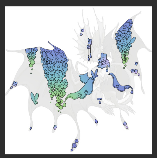
Now this where my style of rendering color may come off intimidating and, tbh it might be. I do gradients first and then I color over them with "normal" blend layers. I typically don't use multiply layers unless I'm shading something that has a lot of textures. If this scares you, it's okay I'll keep walking you through it. Here, my gradient goes from a pastel but deep periwinkle, to a soft more cyan blue, then to a lighter pastel green. Skipping steps and going from the periwinkle to green will give it a different look. There's also hints of a pinkish tone as an accent color.
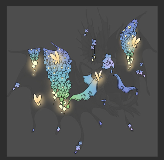
So as I said, these additional layers are done with regular "normal" blend mode layers. I've placed one in between the butterfly line art and the line art for the rest of the flowers, and then an additional layer under everything else. This allows me to create a glow effect specifically around the butterflies, and then specifically under the flowers. Going back and forth with the proper amount of opacity (by using the airbrush transparently) helps to make it glow but not be Too Loud. Also checking it against a dark background can help to check for spots where it spills past the borders, as well as really gauge how Bright it is. I've also color matched the butterflies with the flower pits and the bulbs. This adds extra cohesion and makes them all look uniform but different enough with the gradients.


The stages of how I render gems/dew drops. Take the base color, make it a bit darker and less saturated (as well as changing the hue a bit depending on what the default color is. For yellows I go more orange/red, for blues I go more purple or even pink. It depends), add a small drop light at the bottom thats a fairly saturated version of the base color, and then a stark white/ near white highlight. That's it. Don't over complicate it, it will not matter when it gets shrunk down. Note that I do not use multiply/overlay/screen layers for these types of things as it adds too much bulk to the files and doing it manually helps to strengthen your color theory skills.
For shading and rendering, again, I create a "normal" layer and simply. Draw over what exists. Color picking and hand blending allow me to create the exact shades and effects that I want that multiply/screen/overlay layers may not be able to achieve. (which isn't to say I dont use them! i just don't use them for the main meat and potato part of my coloring) All of what is shown here is also achieved with the CSP asset SOIPEN (which can be found for free in the asset store)
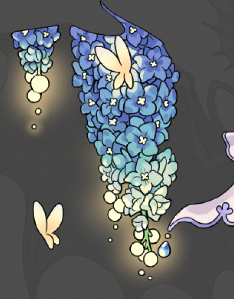

another example. The one on the right is showing how the layer looks without the gradient base layer under it. All of this is rendered by hand. I also specifically put a highlight color around where the butterfly is sitting to give a better illusion that it is properly sitting on the flowers rather than just in front of them.
Next is changing the color of the lines, if needed. A method i'll use is I color just the sections I want (on a separate clipping layer) then lock that layer's alpha setting to them add in a gradient. It's a small and subtle effect that adds more depth without doing a lot of effort. (work smarter not harder)
Now we get to the Polish Layers!
first image is how it looks as a base. second image is with an overlay layer applied. I've used some dark purples and mid tone desaturated greens to push the values a bit further (especially evident on the top left wing) Third image is with a screen layer applied, highlighting the inner most part of the flowers and adding some additional bounce light.
An important thing to note about making accents vs making full coverage skins: OPACITY AND LAYER TYPES MATTER OVER TRANSPARENT SPOTS. What I mean by this is that if you use a soft, light grey to shade with a multiply layer, don't clip it to anything, and have it go outside the lines - that will no longer appear as a 'shadow' when it comes to the final result. Instead you will have a section of soft light grey that is simply laid on top of whatever the image under it is. The same applies for overlay/screen/add layers and so on. If i use a very dark color on a screen layer (to give a soft highlight) and airbrush it over a bunch of stuff and don't clip it, it will end up with this horrible dark splotch over everything that isn't opaque. To this end, mastering normal layers is imperative to having well rendered and convincing accents.
Another thing of note: when it comes to sparkles/small details, note how 'large' the sparkles behind the butterflies are. They seem a bit chunky, yeah?
this is what they look like at proper size. If anything, I could have gone larger on the small metal beads connecting the dew drop jewels to the lace.
Another trick I also like to do is this:

a slight hint of transparency! It's just enough to let the dragon's lines underneath show through but not enough to be super noticable. I like to do this a lot when it comes to sparkly and magical effects.
Next is the worst part of all: destroying all that beautiful hard work with the shadow and line art layers! (sobbing)
This stage always agonizes me. This is my first pass of the shadow/line layers and let's hope it's dark enough.
But yeah that's a start to finish look at how I create my accents. Unfortunately a lot it devolves into needing to know, yknow, line weight and silhouette importance, color theory and the ways that drawing applications actually apply color to a png vs how its rendered in app. All of these things impact the finesse of the accent, and are things you do have to learn gradually over time, but hopefully this has given yall some additional insight and perhaps some helpful tips.
And this should also explain why I get so mad when people go 'hey can I get this accent in another color' no! no you literally can't!
133 notes
·
View notes
Text
Art Advice: The Misconception Behind "Study Realism"
Most people who draw anime/cartoons have, while asking for ways to improve, at one point or another been told to "study realism." A common response to this is, "But I don't want to draw realism!"
But, did you know that the purpose behind this suggestion is NOT so that you draw realism? They're not suggesting you change to a more realistic style. What, then?
Let's look at this through an analogy:
Say you don't know music yet and decide you want to learn how to play the Happy Birthday song. You're not interested in playing anything else, just the HB song, and you haven't started learning anything related to music at this point. OK, that's fine, and now we have our situation set up. Once you've decided this, you set yourself to learning the sequence of notes to the HB song. You practice and practice, and, after a while, you can play it really well without a hitch.
After a few years, it starts feeling bland to you, and you ask, "How can I make my HB song better?" And someone tells you, "Learn all the other music notes," and "Study classical and other genres of music." And you reply, "But I don't want to play that type of music; I want to play the HB song!" (And that's FINE! It's valid; it's what you want to do.[*Footnote 1])
But without having learned all the other notes and other types of music, you can't make a remix of the HB song, or an "epic version," or a hip-hop-fusion version; you've capped at the end of the first paragraph of this story.
So drawing anime or cartoons is like playing the HB song, or any one song in our example.
And here's where our misunderstanding comes in:
"Study Realism" DOES NOT MEAN "Draw Realism"
Yes, you'll have to draw it to study it (not only your brain, but also your hand needs to learn the skill), but it doesn't mean that's what all your artwork will look like. It is meant to give you more tools to make your anime and cartoon work stronger, more appealing, and more unique.
How will it do that? The more music notes you know, the more types of music you understand and can play, the more original a remix /version of the Happy Birthday song you'll be able to make - and it will be unique. Because you will be able to take all that diverse knowledge and apply it to your song, making it stand out, and the next time you play the HB song, people will go, "Wow! This is a really cool version!"
So now we can be clear: There is a difference between learning something and performing it. You can perform whatever you choose, but by learning all the things, your performance of your "Thing of Choice" will be stronger.
What, Exactly, Will Studying Realism Teach You, Then?
I. VALUES
If you learn how to paint/shade with a full range of values (by learning realistic shading) that properly depict both volume and lighting, you will have no trouble simplifying that to cel-shading or gradient-shading in your anime or cartoon drawings, because you will at once spot when something is undershaded or the shadows are in the wrong spot.
On the other hand, if you try to do cel- or gradient-shading first, you are way more likely to a) undershade, and b) have an inconsistent light source. And when these things happen, you won't be able to tell *why* your drawing looks "off" or bland.
II. COLOR
By studying realistic coloring, you'll be able to learn how color varies across an item (say, a shirt) that is a "solid color." Example: you're drawing a character with a pink t-shirt, standing in the sun, at the end of the school day. The t-shirt is solid pink, however, the colors on it will vary from orange-ish to purple-gray, with some areas almost a bright red (and that's not even considering items around the shirt that would bounce light back onto the shirt and change its color). But you'll only know this (and how to do it) if you study realistic coloring.
Then you can apply that knowledge to your stylized artwork and make it stand out more.
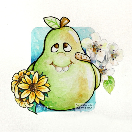
Painting of a stylized pear, where I studied real pears to understand their coloring and texture. See how studying realism can enhance your cartoon work.
III. MAKE BETTER STYLIZED ANATOMY
By studying and learning realistic anatomy, you will be able to make stylized art that, for example, doesn't have one arm longer than the other, because you will have learned how to measure proportions, even if you don't draw realistic proportions. So that if you decide you want to draw unrealistically long legs (eg: Sailor Moon), you'll be able to make them look good and keep them consistent.
You will also be able to draw figures in any position, because you will have learned how body parts are made up and how they move, as well as foreshortening/perspective. Then, when you go to draw a pose you haven't drawn before, it will be WAY easier.
IV. UNDERLYING SHAPES
Although this is one of the least-mentioned aspects of art-learning, it is, in my opinion, one of the most important, because when you learn to see underlying shapes (the quasi-geometrical shapes that build up a figure), coupled with learning how to measure a form using other parts of the same form as reference (measuring the length of one body part by the number of times another body part fits in it, as mentioned in Section III, above), you will be able to DRAW. (Period.) You won't be able to draw just people. Or just wolves. Or just cats. You will be able to break down a new subject into its building blocks and come up with a very reasonable likeness. And whatever's different, you'll easily be able to make relative measurements to spot why and fix it.
Once you learn to identify underlying shapes and how to measure proportions in anything, you will also be able to pick up and reproduce any existing style without much trouble.
[link to Tumblr post with this artwork]
For example, this was my first time drawing anything Peanuts. I didn't have to do practice sketches for it (though there's nothing wrong with doing that). But I knew, from realism, that to achieve a good likeness, you need to measure body parts relative to other body parts, so I looked at Schulz's drawings and was able to determine: OK, Charlie Brown's head is roughly this shape, his body is so many heads tall, his eyes are this % of the head, the ears are this far in, the arms reach down to here, etc. I knew what to look for.
V. FOR THOSE WHO WANT SEMI-REALISM
If you want to do "semi-realism," you'll have a way easier time of it by learning realism and then stripping it down as much as you like, than by starting off with "100% anime" and trying to build it up without knowledge of realism. People think the latter is easier, because it *seems* less intimidating, but it's like trying to drive to a store you've never been to without knowing its address: you'll be driving around forever trying to find it, and it will be frustrating. What people call "semi-realism" is stylized realism, and you can't really hit it without knowing how realism works.
CLOSING NOTES
It also doesn't mean you should stop drawing anime/cartoons and focus solely on realism for X amount of time - you can do both concurrently. In fact, the most fun way to study realism is to do so on your favorite subjects; you can even turn your reference into your favorite character!
Studying realism is also one of the best ways to help develop your OWN, unique style; one which, when people look at it, say, "Oh, that's [your name]'s work!"
[*]Footnote 1: It is fine as long as you are drawing for yourself. As soon as art is a job and you're drawing for an employer, you have to draw in the style they tell you to. So, in this case, it's to your advantage to be flexible.
I hope this was helpful and helps clear up a common misunderstanding people go through when receiving feedback. 💞
MORE ART ADVICE ARTICLES
You can find the index to all Art Advice Articles [here] including:
How to Deal with Art Block
How to Have a Positive Outlook
How to Develop Your Own Style (coming soon!)
etc.
#art advice#art tips#art help#art resources#art learning#artists on tumblr#art#how to#art tutorial#anime art#cartoon#semi realism
84 notes
·
View notes
Text
Tutorial for @mimssides
How I draw with alcohol markers. Beginner edition
First off all I want to specify: this is based on my experience only, so take it with caution. This is also my first tutorial ever.
1) Have an underpaper.
Unless you use some really thick paper, markers will bleed on your next page or table ( depending if you're drawing in a sketchbook or not). I recommend to have one list of some decent paper under the page you're drawing on. Decent means thicker than office paper, can be watercolor paper, it usually perfect for it. It's reusable and over the years mine two look like this:
( you can see there's a lot of stuff going on there)
2) Always, and I mean ALWAYS erase your sketch.
If you're doing a quick try out of color combinations you can skip this step, because you don't need the aesthetic or anything. I'm not sure how useful this tip is for colored pencils ( cuz I never sketch with those), but with regular graphite pencil it's very much important. Graphite smudges your markers, and not only that. It also gets trapped if you go over it with a marker, meaning you wouldn't be able to erase it and it's going to leave you with gray smudges all over. Truly awful.
3) Have your pallets on the same paper you draw on. Or simply - have pallets!
Colors can show differently on different paper, that's why it's important to do color swatches once you buy your markers. They are designed for specific paper, and on your paper they can look a lot darker or really pale. I recommend testing colors before you buy them, it's usually an option in the most craft stores. If you're buying a set just take 30 minutes to do all the swatches and naming them. It also helps visually to see what colors you have.
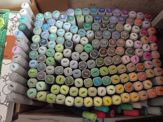
(I have a lot, but you don't need as much, there's like 60 colors I use usually and the rest are on rare occasions. Build a set you're comfortable with)
4) Make sure your materials all work together.
We already talked about graphite swatches, not the worst thing that can happen to you. Mainly you need to make sure how your materials work together, how they lay on top of each other. Make sure your lineart won't react to your markers, there's special waterproof liners and those are the best for markers ( mine are Pigma Micron from Sakura). See how your pens and liners act before and after you apply markers.
Decide which is better to use before and which after markers
5) No black.
I don't use black in any of my drawings. All you see is different shades of gray. It looks much more pleasant with the rest of the colors and it allows for my lineart to be visible underneath. Sometimes even those grays are too dark and I need to add more shades or white lineart to fix it

6) How to shade.
This is a very subjective thing to talk about. You can shade how you want. I will talk about two ways I shade.
1. Same marker. Markers dry. And when they do you can go over them another time. Usually that makes a darker shade of the same color and it's a pretty safe way to do the shading if you don't know which colors can go together. It doesn't work as well on the light colors and difference can be barely noticeable. It's a nice way to get soft shading
2. The pure chaos. Just kidding... Different color marker. It's hard to explain, and yo always need to test what works for you. If you want sharper shade you need to grab a different color, can be from the same hue ( for yellow - orange, for red - burgundy) or something a little more spicy. You can add different hues to your colors with different shades ( your black with red shades is suddenly looks burgundy, or purple, or blue). Experiment! Fail! Find out which combinations work and which don't!
If color seems a little darker than you expect you can go over it with original color, which might lighten it up. This tip doesn't always work

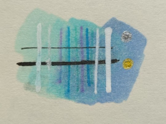
7) How to do gradients.
1. Choose your colors beforehand, see how well they work together. It's easy to do a gradient from red to pink, but not so much from orange to blue. You might need to choose lighter colors, because if you want smooth transition from one color to another you will need to go over them a couple of times and that will darken them.
2. Add a middle color. Not every gradient needs a middle color, but with it you can make your gradient much smoother, it will be more noticeable the bigger aria you cover. The more middle colors you have the more harder gradients you can do

( without and with a middle color)
3. Act quickly. Markers dry relatively quickly so you need to add colors one after the other, you can't go away before you're done.
4. Blend with the lighter color. You can also start with this color as a base but that doesn't work for all color combinations. Lighter color will go in top a darker and flow into it making it lighter and transition smoother. ( example: you go from red to purple to cyan, you will need to start with red, then purple going over red to soften it, and finally the lightest cyan going over purple and maybe even a little red). You always put darkest first and go over it.
There's other methods of doing the gradients. They are very similar actually, but for second one you will need a blender. For the first one grab two markers you want to use ( more if you're feeling risky) turn one of the markers upside down and touch their tips. Now use your understanding of gravity. Color from the top marker will go into the bottom one. The longer you wait the longer the gradient will be. Usually I don't need to wait longer than 3 seconds.
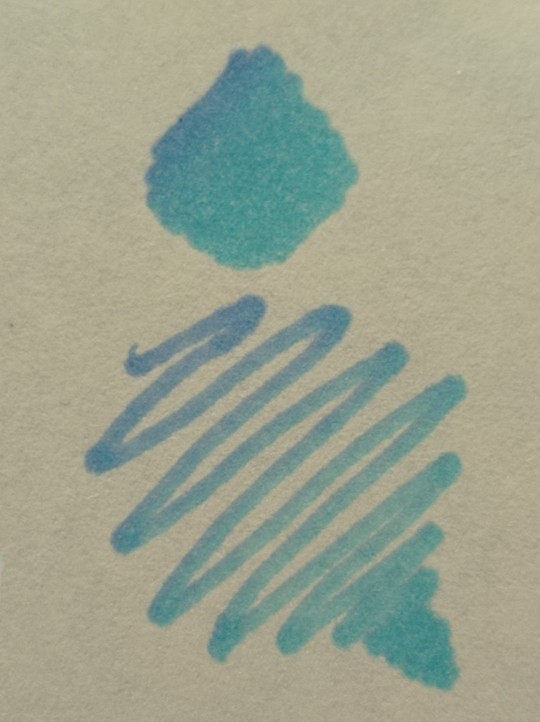
And you can do the same with a blender
8) How to use a blender.
Blender is a marker with no color. Usually it's named B000 (I recommend buying a blender with brush tip). There are many ways to use it.
Gradients: you can use two markers technique with a blender making gradient fade on one end, or you can mix colors inside the blender.
Fixing mistakes: blender will make a white show through your color, you can use it to get rid of the wrong color. But it doesn't work without some problems. Of course darker colors will likely stay, even if much lighter, and your previous color will try to flee ( likely to other sides, if you're lucky it will go on your underpaper)
That's all I have for you today. Experiment and learn something new. Hope that helps
112 notes
·
View notes
Text
Filipiniana inspired by the Entities (the Eye, the Vast, the Dark)
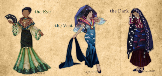


[ID: Three drawings of three modelled Filipinianas against a shared background which looks like aged paper. Each one is labelled a different entity which goes, from left to right, the Eye, the Vast, and the Dark. All the models are faceless. Three close ups follow the main image.
The Eye Filipiniana is an 1890s traje de mestiza featuring a brown panuelo with green embroidered trimming resembling ink pen tips and green strips resembling eyelashes at the opening, a translucent wide-sleeved striped baro in alternating off-white and green with green embroidered eyes for trimming, a dark cyan tapis with rows of books patterned on, and a silky striped saya in alternating yellow and green with an eye where the saya and the tapis meet and embroidery of people walking at the hem. Finished with accessories of a silky green necklace with a hanging realistic eye and a dark blue folding fan with an eye pattern. The model has brown skin and straight black hair up in a bun.
The Vast Filipiniana is a Commonwealth Era Style Baro’t Saya featuring a violet umbrella with a bright galaxy on the inside that the model holds on her shoulder, a magenta panuelo with yellow and orange stripes held together with a bright yellow star-shaped medallion, wide translucent butterfly-sleeved baro with a sunset to sky blue gradient from top to bottom with embroidered white clouds on the sleeves, a tapis with different shades of blue going from a light blue to dark blue top to bottom with embroidered silver fish of differing sizes, and a silky dark-blue-to-deep-blue saya with a long saya de cola with dark silhouettes resembling tentacles creeping up the sides. The model has pale tan skin and wavy hair held up in a loose lower bun.
The Dark Filipiniana is an 1840s Baro’t Saya styled for church-wear featuring a translucent plaid-patterned magenta panuelo, a striped straight-sleeved camisa in alternating dark magenta and off-white, a dark purple tapis embroidered with hands in alternating red and blue gripping each other by the wrist, a plaid-patterned magenta saya, and dark purple sandals. The models holds a dark purple hood over her head, the outside is a dark purple trimmed with white embroidery meant to look like closed eyes, the inside is a dark mass filled with open white eyes in strange positions, the dark mass drips down the edges of the hood, some eyes following. The model has ashy tan skin and combed back brown hair.
./.End ID]
Finally finished it! I’ve wanted to do this for a while but pushed it off until now. The Entities as a couple versions of the Filipiniana. I don’t have plans rn to make the others since I suspect I will soon be busy again. Still, I have some ideas, particularly for the Web. Have a favourite?
My inspiration+info under the cut! :D
1) The Eye
I based the Eye’s Filipiniana off of the “traje de mestiza”, an aristocratic ensemble popular during the 1890s near the end of Spanish colonial rule. It’s also known as the “Maria Clara” gown due to association with the main heroine of Jose Rizal’s novel “Noli me Tangere.”
Ngl I struggled to add more motifs than just “Eye” but I tried to be creative with it. The panuelo (the cloth around the shoulders) is supposed to look like eyelids which is why there are eyelashes. The embroidered trim is supposed to be the tips of ink pens. The trim of her sleeves are eyes. The tapis (the dark cloth around the lower area) features shelves of books. The bottom of the dress is supposed to be the Eye Watching people suffering at the hem. I got extremely lazy though and just got a “people walking” brush from the csp asset store and stamped them on. Didn’t get me the effect I intended but I was too tired to change it.

[ID: A sepia photograph of a woman looking to the left while wearing a traje de mestiza and holding a closed fan. /.End ID]
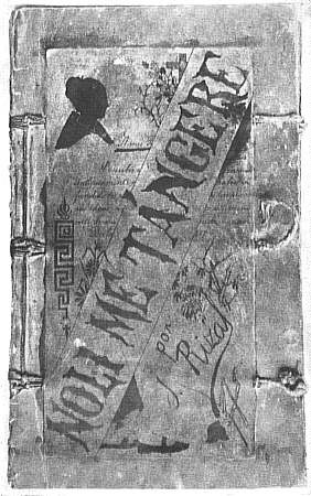
[ID: An image of the original front cover of Jose Rizal’s Noli Me Tangere manuscript./.End ID]
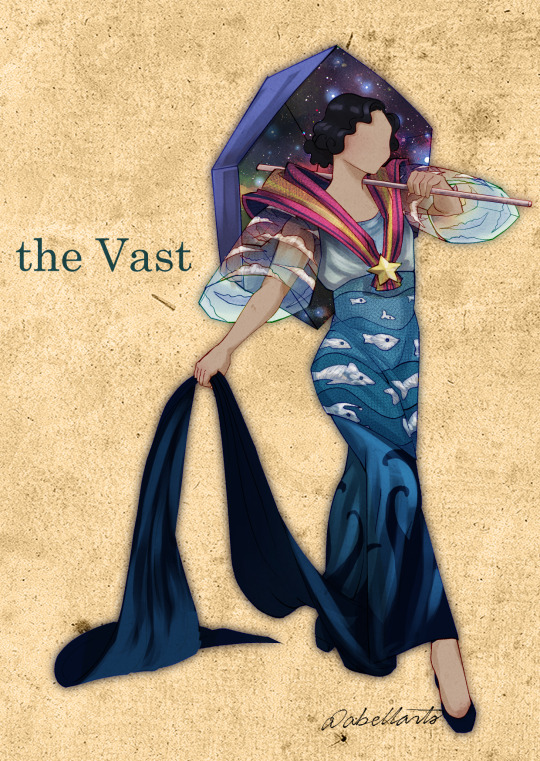
2) The Vast
The Vast’s Filipiniana I based off of the style popular during the 1930s-1940s Commonwealth Era. Honestly I only chose it because those sleeves are the very definition of vast.
The design has a simple concept but I ended up liking the end result a lot! It’s supposed to be a top to bottom gradient of aspects of the vast. Starting from space, going into sky blue, then ending in the deep abyss of the ocean.
[ID: A sepia photograph of a seated woman wearing a Commonwealth Era Filipiniana. /.End ID]

[ID: A black-and-white photograph of three young women wearing Baro’t Saya in the Commonwealth Era style in a forest setting. All three have their panuelo wrapped around their heads. The girl farthest in the back carries an open umbrella./.End ID]
3) The Dark
Lastly, the Dark’s Filipiniana is based off of 1840s church-wear. I thought I could do something with the hood and the church theme suited the Dark well.
I’ll admit the Dark gave me trouble. Dark is a very vague theme. The hood is the main focus of the dress I think as everything else is pretty standard/I ripped off from the original whoops. The trim is supposed to look like a bunch of closed eyes. The inner hood is a dripping black mass with eyes from who-knows-where. The tapis has a pattern of several hands grasping each other by the wrist because something unknown gripping you from the dark is terrifying. “The blanket never did anything” anyone?
[ID: "A damsel going to early mass," by Justiniano Asuncion, 1841. The painting features a woman looking to the left, wearing darkly coloured 1840s church-wear with a hood, she holds a white cloth in her right hand./.End ID]
[ID: "A señorita walking to church in the daytime," by Justiniano Asuncion, 1841. The painting features a woman looking to the left, wearing brightly coloured 1840s church-wear with a thin gauzy white hood. She holds a small book, presumably a bible. ./.End ID]
#tma#The Magnus Archives#MagnusPod#MagPod#The Entities#The Eye#The Beholding#The Vast#The Dark#Abellarts#i worked hard on this don't flop/j
629 notes
·
View notes
Text
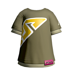
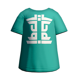
Investing in T-shirts! The biggest beneficiaries of Gear Adjustments!

For fashion aficionados like myself, Gear Adjustment is the most exciting part of the upcoming Season. Being able to make small changes to the way your gear is worn is something that opens up a ton of customization while requiring less new stuff (though I'm sure it required a lot of work to add). With that said, for the moment, it is looking like they are limiting the feature to caps and t-shirts. I don't personally think caps are changed very much by the ability to flip them, they're all pretty good as they are, after all. But for t-shirts, being able to oversize them is actually really big. Pun unintended.
T-shirts have the tendency to be modeled in a way that makes them cling really tightly to your character's body, and it is has never looked right to me. Looking at the clothing choices I see in my multiplayer games, I get the impression that is the general sentiment, as well. Oversizing shirts solves their central problem, loosening them up and giving you a less constrained silhouette. In this post, I wanna highlight what I think are the biggest winners of this change are. Shirts I think you should pay attention to once the patch hits.
That said, I should highlight that since we don't have the patch yet I am only assuming these will be Adjustable. We cannot know for sure until the we get the update.
I've picked out ten T-shirts I think are the standouts, split into a couple of different categories, starting with the ones I think you all expected to see here:
Annaki Accessories!
I have to imagine that the Annaki Bracelet Tee and Annaki Choker Tee were some of the first shirts that came to mind when you think of noteworthy T-shirts in this game. They've got nice, dusty colors, the big Annaki A in slick silver, and of course their signature accessories. Oversizing these I think will amplify their punk aesthetic even more, because there's nothing punk about tight-fitting clothing.
Unless it's leather.
And leather these are not.
High-fives for Tie-Dyes!

Tie-Dyes are really fun with their bright, trippy patterns, so it's no surprise that the Takoroka Rainbow Tie Dye and the Takoroka Galactic Tie Dye are some of the better T-shirts in the game. We did see the Rainbow Tie Dye get Adjusted in the reveal trailer, and is it just me or does that just seem right for these kinds of shirts? Something about them screams "wear me at one size larger."
Ride the Wave!

Next up, we've got the Firewave Tee, Icewave Tee, and the Vaporwave Tee. There is also a Duskwave Tee, but I am personally not a big fan of the shade of orange they use for the bottom half of that shirt. That said, I think the gradient on these shirts them really make them stand out from the rest, and their color palettes are just very nice and evocative.
Assorted Graphic Tees!
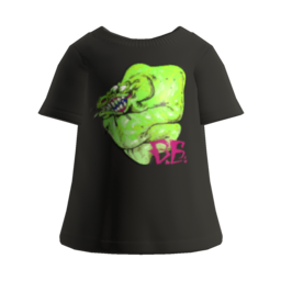
These three don't have a common throughline aside from all being graphic tees, but I think they all have something to recommend them by. The Eelzebub Tee has a really gnarly, radiation-green design that is just really cool, giving an outfit something really eye-catching while still staying nice and simple.
The Green Tee is interesting because its big bold graphic lettering actually extend across the side and even a bit onto the back of your character, which gives it a really unique look I don't think any other clothes can replicate.
Finally, I just think the Mint Tee looks nice. Its color is pretty unique amongst shirts, and the white print design is decorative without being overbearing.
And these were my picks for the T-shirts to keep in mind come Drizzle Season 2023. Were there any others you feel I missed? If so, please tell me in the notes!
105 notes
·
View notes
Text
KAREN (DIALTOWN) DRABBLE!!
Karen loved when she was able to paint near Norm’s shack. There were plenty of different subjects to choose from; the multitude of greenery, the lakes scattered throughout the forest, even a few animals on occasion. Even a few wild horses popped up from time to time. She kept her distance from them, of course, but she couldn’t help the excitement that popped into her mind when she saw them. Today, she was in the spot where she was fairly certain the horses showed up from. She saw a few tracks left behind, faint but obviously the animal she was looking for. Well, more like the animal she was hoping showed up.
She set up her easel, took out a few paints and grabbed a set of paint brushes out of her bag. Birds chirped in the distance, setting her focus into different directions but she knew the moment she started painting it would fade into the background. Just some noise that blended in with the others, much like her art’s colors did in the end. A gentle sigh left her, she picked up a paintbrush and carefully dipped it’s end into a delightful shade of green. She loved and hated how when she worked with green the thought of Gingi soon followed. She had grown quite fond of the cryptid at some point. She set off painting. Brush, back into paint, brush some more, rinse off in water, choose a different color, repeat.
She was finally done by the time the sun was setting, mixing the sky into a beautiful gradient of yellows, oranges, reds and pinks. The snapping of a twig behind her caused her to turn around, a quiet gasp falling out of her before she could think to stay quiet. There, in the path where she had been painting, stood a horse. It’s silvery, gray coat looked as though someone had splattered ink onto it but that paired well with the whirring engine it has for a head. It looked at her for a moment before galloping off into the distance, the humming from it’s head lingering for a moment before fading away as it grew more distant. Karen’s mind raced in joy, her hands were moving before she could tell them too. Fists waved around in wild, frantic movements as she tried to shake off the energy from her excitement. Rotary-christ, she loved it out here.
(oh and this was requested by @vincentbeloved!!! hope i did your idea justice little bro :3)
#writing for dialtown!#writing for others!#dialtown fanfiction#dialtown fanfic#dialtown#dialtown phone dating sim#karen dunn dialtown#karen dialtown
22 notes
·
View notes
Text
Nagito Color Study | Please do not repost, reblogs are welcome though! Brushes & Techniques & a progress pic below the cut
Uhhhh okay, how to explain this one. I was rereading “Logically Lucky” by PinkSweetSmoke and some of the visuals in the earlier chapters really struck me. The way that they write this relationship is pretty dynamic, and I wanted to see if I could use colors to talk about how Hajime and Nagito feel for each other and what they’re going through emotionally? So this is fanart for that fic, directly inspired by that fic based on the established vista(s) and also the style of writing their relationship, but it doesn’t really make sense unless I say all of that lol? But it wouldn’t exist if not for that fic, so I’d feel weird not mentioning it.
Brushes used (Clip Studio, Free):
Main: “ラフペン” from gyuukotu’s “Fill Set (塗りセット)”, content ID 1695210
Fill: Default India Ink brush pen - the rough pen is a little unpredictable, so I used this to flat the image and make sure that there were no gaps
Cloud Flat: "荒筆" from gyuutoku's “Fill Set (塗りセット)”, content ID 1695210
Cloud Blender: I downloaded it from the internet instead of the app 2 years ago and cannot find, with certainty, where it came from, since I get rid of everything on my hard drive that's not art every year :( there are lots of good cloud blending brushes out there for free, though, and I typically use the gouache blender
Misc. Techniques:
Screen Distortion: I used CSP's free cloth texture clipped above the "blue" layers and then liquified it in places for the screen distortion effect
Gradient Mapping: I cannot overstate how helpful gradient maps were for minor color corrections, you guys PLEASE try them on a finished piece of your own if you haven't used them yet. Click Layers > New Correction Layer > Gradient Map and then choose from the premade gradients before adding your own so you can see how they worked. I used a few different ones clipped to specific areas w/ lowered opacity & hard/soft light settings where I felt like the color was falling flat and it was SO helpful at giving it just that little bit more depth.
Hearts: I've discovered that you can cheat at hair and clothing rendering by just making hearts. Try and see how many you can find lol
Color Theory in General: The whole point of this piece, after it stopped being fanart (lol rip), was to be a color study focusing on the contrast between shadow and light and what I could do within the blues & the yellows to make them appear as if they're actually different colors. In the blue section, everything is p much blue, nothing is any other color. In the sunny section, a lot of the stuff is warmer variations of the standard colors, since I wanted it to be more vibrant and didn't feel like I could achieve that if everything was shades of yellow and orange. That being said, I stuck as closely to that as possible. But ANYWAY, juxtaposing the two starkly different color profiles also helps the blues in the blue side read as colors that they aren't, which was part of why I did this study.
Sneaky sneaky: I just modified the diner a bit in order to get the colors I wanted, i.e closing the blinds bc I can. As an artist it's important to remember that YOU have full control over every single part of the piece, you just should ideally have a reason to create inaccuracies/ break rules or else it can end up being a bit messy and disorganized & details/ your vision can get lost.
Aaaand finally, the sketch from TWO AND A HALF MONTHS AGO:
#trusttheprocess 😭😭😭
#nagito komaeda#sdr2#color study#super danganronpa 2#nagito fanart#my art#october 2023#jesus I started in july#but I also like let it sit for a good 2 months after the mockup#so shhhh#fav#komaeda nagito#character study#fanart
70 notes
·
View notes
Text
Okay! So! This post is factually inaccurate. I'd been told the creator of the sunset aroace flag was a nazi, turns out that's a baseless accusation and comes from another untrue rumor. So. I won't delete this post, because it was a fun exercise to create a flag, but take every claim about the morality of the og artist with, like, negative one grain of salt.
I've heard about the whole controversy regarding the aroace flag, and I do get the sentiment- we shouldn't be using a flag created by a nazi. However, it's so widespread and recognizable a flag that it's hard to change it without backlash. Makes sense, if people are used to a certain flag to mean their identity, they'll probably resist changing the flag- it may make it feel like you're replacing their identity.
Therefore, I propose we do indeed change the flag, but make it highly reminiscent of the widespread flag, so the transition between the two is easier and less significant. Yes, it's still using a similar design to a nazi's, but it might be the best we can do- and who says we can't reclaim a symbol?
I've made my own take on the flag. I'm not saying this is the best one, just the best I could do.
As with any flag, the stripes have meaning.
The orange represents love, in a platonic/familial/aesthetic way, all the aspects of love- excluding romantic and sexual. This is why it's not red, the main color for love, because it can be different for us than it is for others. It's also reminiscent of a sunrise, and due to that it can represent the beauty inherent in love. It's meant to symbolize how though aroace people may not experience romantic and sexual love, but we sure as heck still feel love.
The tan represents unity, not only between those who are aroace, but with the queer community as a whole. Though we are not allo, we are still queer, and we are part of the whole.
The white is, actually, not in fact white- it's a very light warm grey. This is to represent the spectrum of identities under the term aroace. The white isn't actually white, but that's okay, it makes the flag more cohesive. The aroace term might not quite align with your identity, but that's fine. Words are what you make them. Colors don't always fit in rigid boxes, and neither do people.
These are going to be out of order, just because it makes more sense to read it this way. I would do it in this order on the flag, but I both want it to look like the widespread one and want it to look like a gradient.
The darker turquoise represents the joining of aromanticity and asexuality- residing between the two colors in the color wheel. It's not a direct mixture between the shades, because when the two identities combine, they form a whole new identity, while still reflecting the original. Also, it's more vibrant.
The sky blue represents the variety ever-present within the identity. It represents the aroacespec people. It's lighter than the color between aro's green and ace's purple, because attraction can vary. Demi and auto and flux people exist, and they're still in the flag- because they're still part of our community.
This flag is very similar to the more common aroace flag, but that's not really a great flag to use. None of the colors are the exact same, intentionally. It's unique enough to be separate, rather than just a redesign of the same flag, but it's still recognizable as aroace. Here's a comparison:
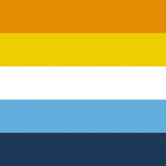
In my opinion, at least, it looks better. The top is a more cohesive gradient rather than a yellow coming from nowhere, and the bottom band isn't as contrasting. The duller band in the middle just makes it look nicer in general imo, but it's mainly motivated by the meaning.
This isn't perfect! This flag is just my little experiment, since I always liked how the flag looks like a sunset, yet didn't want to use a flag designed by a nazi. Feel free to use this flag anywhere you'd like, as long as it's, like, a good use. Like, no oppression or exclusion. Keep the original meanings in mind. We are all a community.
Finally, a call to action: try and use this flag rather than the original! Or, if you don't like this flag that much, make your own! Try to come up with your own meanings, it's harder than you think. This is our flag, and we choose what we use and what we value. Or just inform people on the history of the flag, I personally had no idea it was issue-laden until recently. Either way, let's go out there and love.
#pride#queer#flags#pride flags#aro#aromantic#aromantism#aromanticity#aroace#aromantic asexual#asexual aromantic#asexual#asexuality#ace#acespec#arospec#aroacespec#demi#demisexual#demiromantic#autosexual#autoromantic#auto#aceflux#aroflux#aroaceflux#long post#pride flag redesign#pride flag#existenceunrelateds
49 notes
·
View notes
Note
Weird question, is the part of Ren's hair that isnt pink, like, white or light blue? I thought it was blue because of official and fanmade art, but it was described as white on one of the asks. I'm not too sure now if it was the way Ren is shaded/highlighted that made me think it was blue or if it was just my vision, since I sometimes see colors a bit differently depending on which eye/side is seeing more of it. (One of my eyes sees worse, and often sees slightly more pink/orange tinted than the other)
✦゜ANSWERED: Technically speaking, Ren's hair is all pink! It was another stylistic choice I made alongside Violet having purple, Elanor and Olivia having blue, and one other unreleased character having green accent colours in their hair, and I honestly didn't think much of it at the time. But everyone (understandably) assumed Ren had a pastel pink and blue gradient going on, so I decided to make it canon!!
Haruko now has the same blue in his hair, and it's become a reoccurring statement in all of Ren's official artworks ;v;
#If I can find the art of Haruko on CC I'll add it here#But it's like 2am RN and I'm eepy shjdgdsjg#💌 — answered.#💖 — 14 days with queue.#💖 — about ren.
97 notes
·
View notes
Text
Was seized by the supernatural urge to redraw some of my old nkotr art (mostly based on my own fics/aus because that's uhh pretty much the only time I drew them in an interesting way heheh)
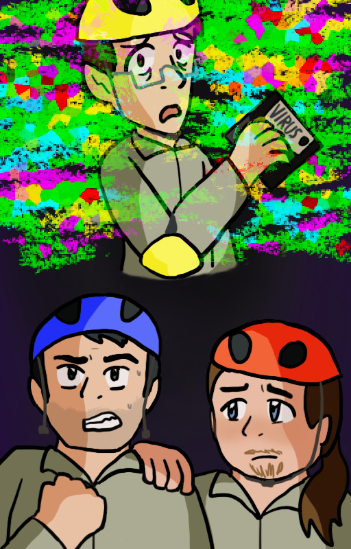
[ID: two versions of an alternate cover image for Your Computer has a Virus, and it's Killing Your Online Friends. The new kids are in their jumpsuits from Computer Fighters. Neil is holding a floppy disk labeled "virus" and looking over his shoulder with a scared expression as multicoloured glitch effects surround and overtake him. Below this, Kevin grits his teeth and makes a fist while Ryan sadly puts a hand on his shoulder.
The colours in the new piece are more saturated and the glitch effects are done differently, and there's shading. Neil has his helmet, which was missing from the original, Kevin is visibly sweating and his fist is on the other side, and Ryan looks more resigned whereas in the original he has his mouth open. End ID]
[ID: two versions of a piece featuring fantasy versions of the new kids standing in front of a colourful roulette wheel marked with ominous symbols. Kevin is a human fighter, Neil is an elf bard, and Ryan is a tiefling warlock. The dark purple background is lit up with hot pink at the top and bright orange, purple, and green behind each of the guys to contrast their respective colour coding.
The old piece was done in an attempt at a realistic style, while the new version is in the artist's usual more cartoony style. The new kids' poses, expressions, and outfits are all changed to varying degrees; most notably, Neil's elf ears are bigger and Ryan's skin is red rather than a human skin tone. Ryan also has a cape instead of a jacket this time. In the original, they all look rather apprehensive, while in the new version they look more excited. Text has been added above them reading "The Only Lich Lair... With A Wheel!!" End ID]
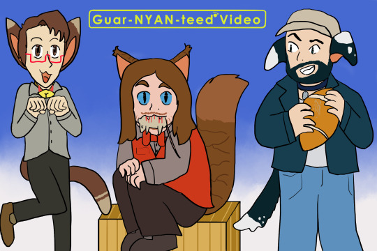
[ID: two versions of a piece where Neil and Ryan are catboys and Kevin is a dogboy. Neil is in a cutesy pose with his hands raised like paws, Ryan is sitting or crouching with a dead mouse in his mouth, and Kevin is holding a football with scuff marks on it. In addition to the regular clothes they're wearing, Neil and Kevin have collars; Neil's has a bell in the shape of the lemon demon logo.
The colours in the original are washed out and there's a little dog logo on Kevin's football which is missing in the newer version. The colours of Neil's outfit are different and his leg is bent more, Ryan now has a box to sit on and has cat pupils while the others still have human eyes, and Kevin is now wearing a baseball cap. A gradiented blue background has been added along with yellow text at the top reading "Guar-NYAN-teed Video", with a paw print in place of the G*V logo's asterisk. End ID]
+ a couple bonuses:

[ID: a follow-up to the "Only Lich Lair" piece. The new kids are now injured and look miserable. Kevin has grown a beard and lost his hair, and is wearing a blindfold over where his eyes would be. He's also lost his armour. Neil's hair is frazzled and he's covered in singe marks, and he's lost a hand and got a chunk taken out of one ear. His instrument is also missing. Ryan has an eyepatch, has the tip of one horn taken off, and is frozen. He's also lost his wizard hat and the clasp for his cape. The bright lights in the background are gone save for the pink at the top, which drips down like blood; the text is also removed. End ID]
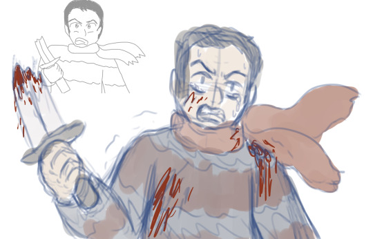
[ID: a sketch of Kevin wearing a sweater and scarf, holding half a broken sword shouting angrily, based on a scene from I'm Gonna be the Anti-Hero. An old version of this doodle is shrunken down in the upper left corner. Colour has been added to the new version, as well as blood spatter on Kevin and tears in his eyes. End ID]
#all these redraws are from over the course of the past week and change. scary.#idk what forces have got ahold of me but once i started it's like i couldn't stop#i don't think most people will recognize all of the originals especially since i didn't even post all of them in the first place?#the catboys is the only one where you can find the original in my art tag#i think the likenesses might be better in some of the originals but to me at this specific moment in time that's not what's most important#nkotr#new kids on the rock#my art
15 notes
·
View notes
Last Seen Blogs

drawnfamiliarfaces
cartoon nostalgia
alpacaramel
Alpacaramel

roses-r-redd1
Red
mythicalmagick
Mythical Magick

obeyme-spam
Obey Me!