#Web interfaces
Text
Harmonizing Form and Function in Design
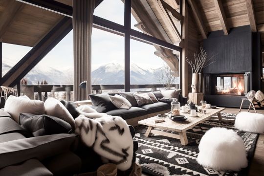
Combining elegance and ergonomics in design is a balancing act for merging visual aesthetics with practical functionality. This approach seeks to create products, environments as well as experiences which look refined and sophisticated yet prioritizing user comfort, usability, and well-being.
To achieve a harmonious blend of form and function, seamlessly integrate ergonomic principles into elegant designs. This way, every element serves a purpose and enhances the overall user experience. This can be manifested in;
Office Furniture with sleek lines and ergonomic contours,
Interior spaces optimizing circulation and lighting for comfort
Digital interfaces that are intuitive and user-friendly
Embracing Elegance with Ergonomics
Balancing elegance and ergonomics elevates design to new heights as well as enriching lives and enhancing quality of life. Ultimately, embracing both elegance and ergonomics creates solutions which are visually striking yet deeply satisfying as well as enriching for users.
#form and function#Elegance and ergonomics#Space Optimization#office furniture Dubai#Web interfaces#user friendly
0 notes
Text
check out my sad cyber girl instagram
#00s#old internet#old web#2000s#cyber y2k#cybercore#moodboard#y2k#cyber core#tech#user interface#vaporwawe#y2k nostalgia#nostalgia#techcore#microsoft#old windows#windows 95#y2k blog#gif#curators on tumblr
1K notes
·
View notes
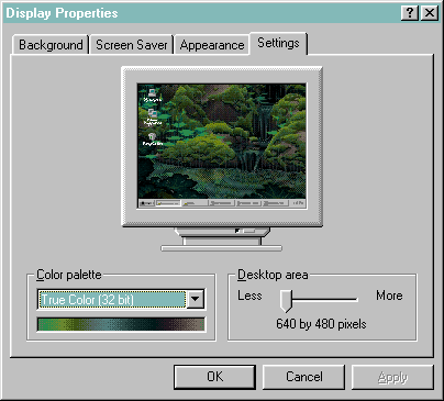
Text
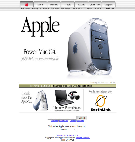
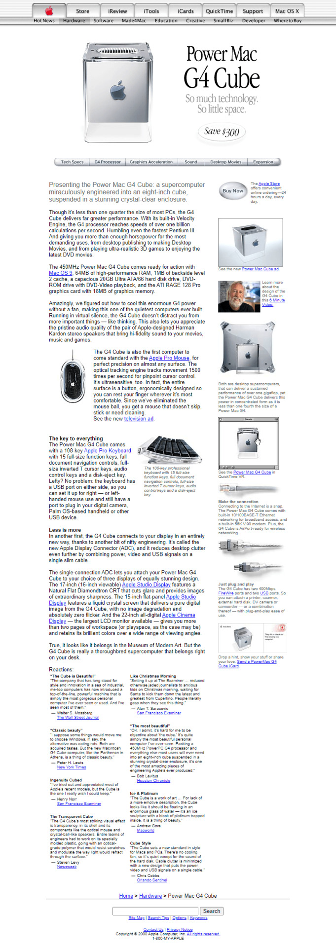
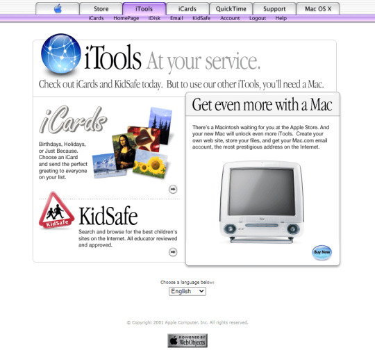
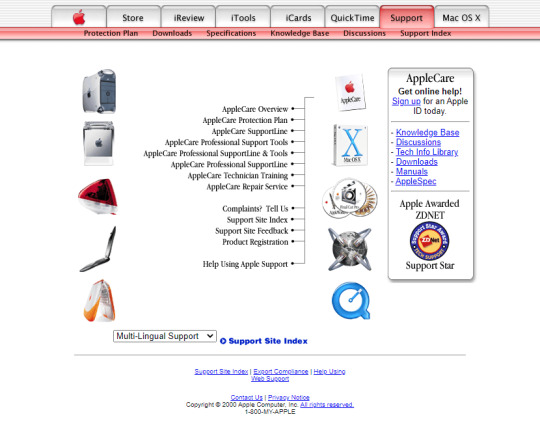
Apple in 2000
#2000#2000s#00#00s#apple#computer#cybercore#cyber y2k#design#graphic design#kaybug#laptop#long post#old web#photos#screenshots#technology#techcore#tech#user interface#y2kcore#y2kore#y2k aesthetic#y2k core#y2k cyber#y2k design#y2k futurism#y2k graphics#y2k
232 notes
·
View notes
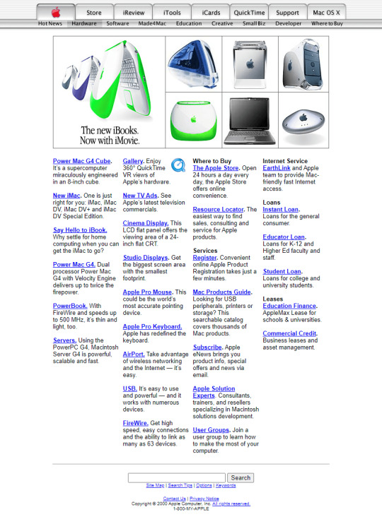
Text
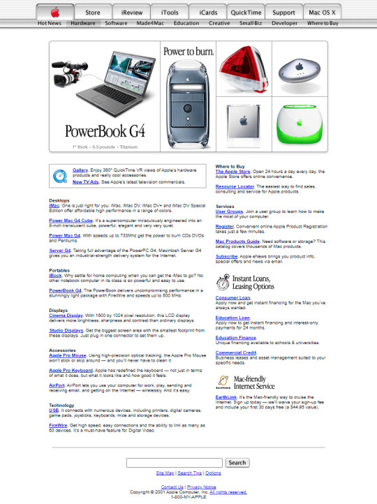
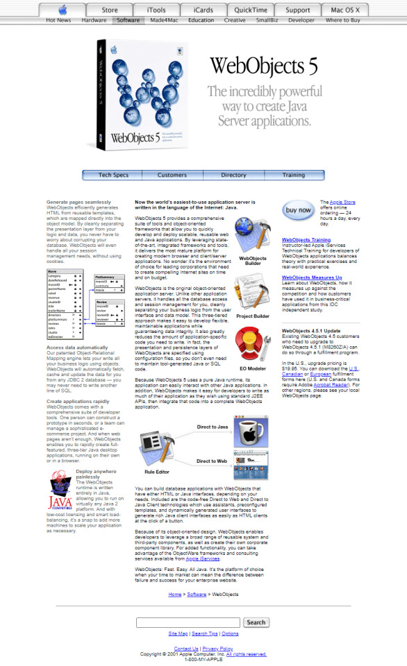
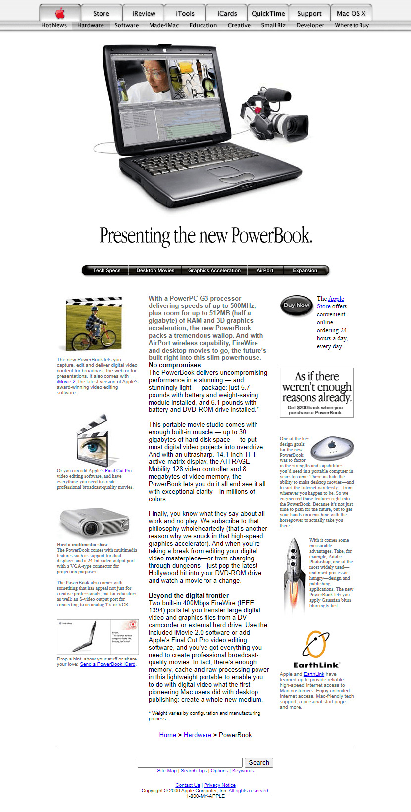
Apple in 2001
#2001#2000s#01#00s#apple#art#cgi#design#frutiger aero#graphic design#graphics#icons#illustration#old web#screenshots#skeuomorphic#skeuomorphism#technology#user interface#vector#website
114 notes
·
View notes
Text
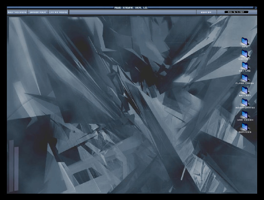
#weirdcore#oddcore#strangecore#nostalgiacore#nostalgia#2000s web#old web#old web edit#fmv aesthetic#old web aesthetic#old internet#retro game interface#unreality#dereality#creepycore#unsettling#euclideanedit
194 notes
·
View notes
Text

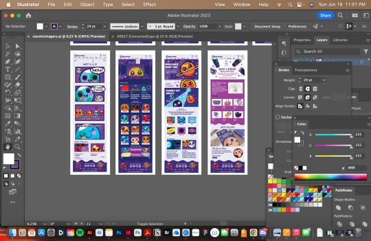


As part of the cosmic funnies redesign, this was the final project. As a result, I received an A, and I expect the website redesign and rebrand to be online by the fall.
#cosmic funnies#astronomy#space#cute#science#kawaii#reblog#blog update#stars#educational#school#web design#ui ux design#ui ux development services#interface
65 notes
·
View notes
Text
In a Shopping Cart Going Downhill Very Fast
Creative projects all,
Each one of us, stories
Written in real time
Edits made in pencil
Terribly, wobbly wheels
#poem#writerscreed#twcpoetry#poets on tumblr#goatsmell#this new web interface is quite gnarly#i mean with the tags and all#makes me want to post more#because I wrote a ton while I was away#on the backs of envelopes#and scraps of body bags#been busy out here in the weeds#and I have many travel notes
12 notes
·
View notes
Text

Metalab
#Metalab#design#studio#interfaces#digital#portfolio#black#blue#typography#type#typeface#font#Basis Grotesque#PP Eiko#2024#Week 10#website#web design#inspire#inspiration#happywebdesign
9 notes
·
View notes
Text

NOW ON NEBULA!
If you’ve encountered Justin Tomchuk’s Interface series before, you probably have one question: what IS this? Let’s explore this oddly familiar fever dream together!
#tale foundry#youtube series#umami#interface umami#Justin Tomchuk#interface#animation#animated series#surreal#surrealism#surrealist fiction#surrealist#surrealist art#dystopia#dystopic#dystopian fiction#science fiction#sci fi#scifi#scifi series#scifi animation#youtube animation#web original#web series
9 notes
·
View notes
Text
This is better(?) than the minimalism plague infecting modern web design, but not by much!
I do not like the mobile appification of web sites either! Looking at you as well, tumblr! By all means, get experimental with it (please do), but don't make everything look & function like a mobile app!
Hey, all supposed 34,175+ followers...
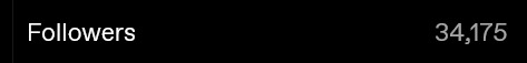
Can you do me a favor & go @ (or tag) Neal Mohan on twitter & tell him to have the YouTube video page layout changed back? I'm so serious, go bother him about it. If enough people do this & this gets around enough, resulting in more people to asking it be rolled back, it should at least get him to ask it to be changed!
#Neal Mohan wtf are you doing bro; whose idea was this?#why do the video recs & comments use the same scroll?? wtf? change it back youtube#the new youtube layout is trash & whoever asked for this from higher up at google should feel bad#why is everything so obnoxiously big; I mean that would be more okay if I could look through comments & recommendations separately#this is bad web design & whoever oversaw this should be ashamed of themselves & their poor design choices#I literally don't know anyone who prefers the new layout so far; which is very telling#obnoxious user interface choice; we now are forced onto just one scroll; this is literally a downgrade#mun heila & I who aren't “industry professional” web programmers could make a better layout than whoever requested this#I'm so serious; we absolutely could given the time & resources; this was probably rushed too or it looks rushed anyway; maybe I'm wrong#bothering Susan Wojcicki enough used to work; especially if popular people did it#mine#op#youtube
5 notes
·
View notes
Text
Why do websites only use a limited width for the important part of their content?
Facebook, Tumblr, Twitter, etc all have sidebars on both sides with the content in the center. I get that it's a popular way to do things, but when I'm trying to take screenshots or read without scrolling every few seconds, it's wildly inconvenient.
Is there a way to change the code on my blog so that it fills the screen/adapts to the screen size?
Every single site has so much wasted blank space; and when the window is made smaller than full screen, like when I have windows next to each other, the formatting is still fukt and often the actual content is the part that is sacrificed rather than the damn sidebars.
I know I can't fix other sites like facebook and twitter, but how can I get my personal tumblr blog to have an adaptable width?
#help#ask tumblr#blog help#html#css#web desin#blog layout#blog design#code help#codeblr#web design#user interface#ui help#thank you#i love you goodnight
7 notes
·
View notes
Text
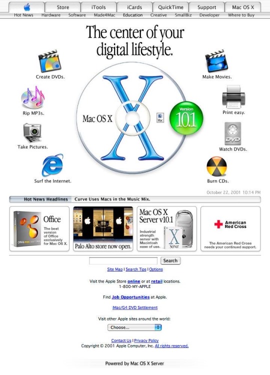
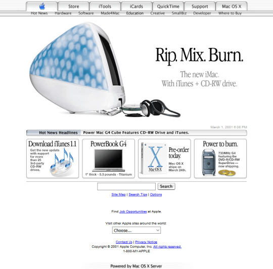
Homepage of Apple, 2001
instagram: cheri.png
#wanna make a website like this#apple#old apple#cybercore#y2k#cyber y2k#old internet#old web#00s#2000s#tech#moodboard#cyber core#vintage apple#user interface#early 2000s#y2k tech#y2k aesthetic#y2k nostalgia#nostalgiacore#nostalgia#techcore#tech blog
200 notes
·
View notes
Text
Wapdrom in 2003
#2003#2000s#03#00s#art#cybercore#cyber y2k#design#flash website#graphic design#graphics#internet archive#internet#kaybug#metalheart#old web#screenshot#technology#user interface#website#wapdrom#y2kcore#y2kore#y2k aesthetic#y2k cyber#y2k design#y2k graphics#y2k
123 notes
·
View notes
Photo
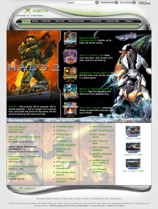
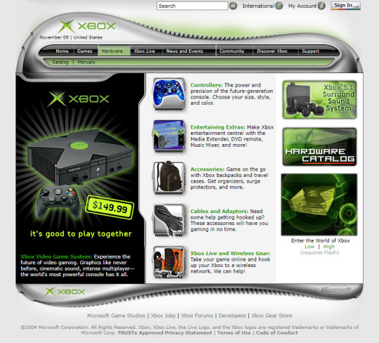
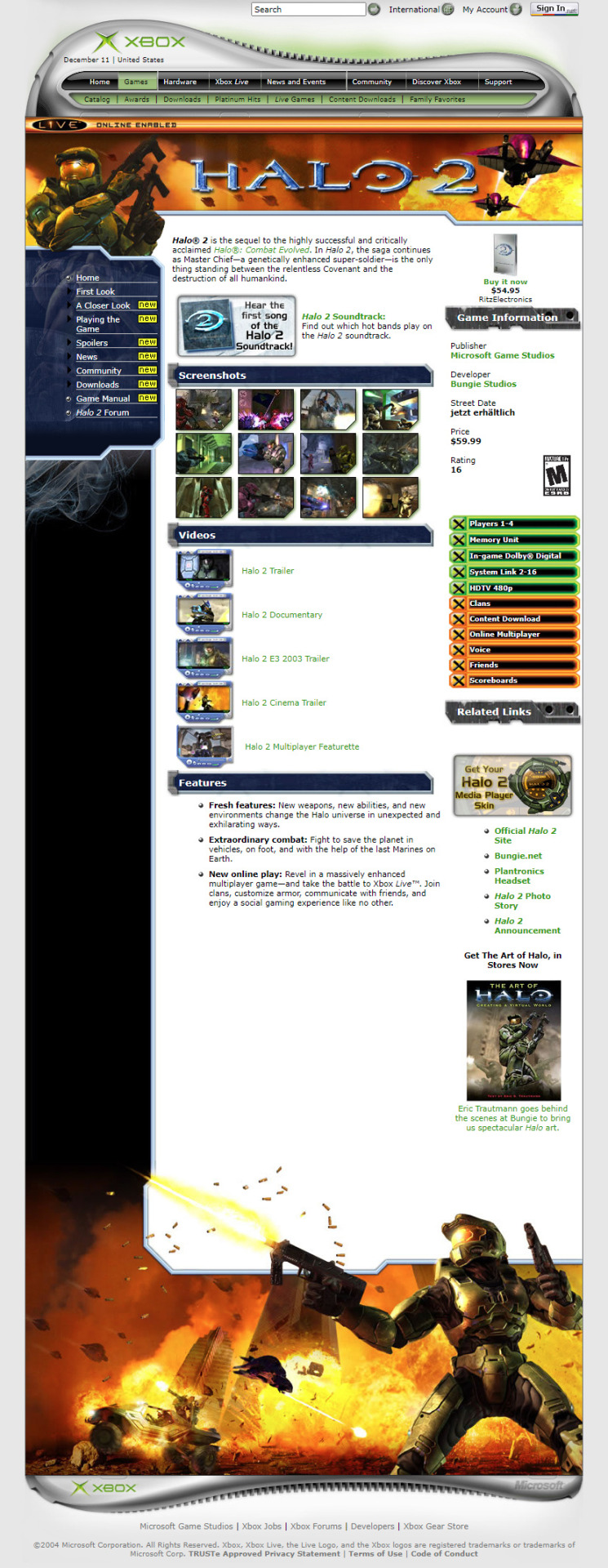
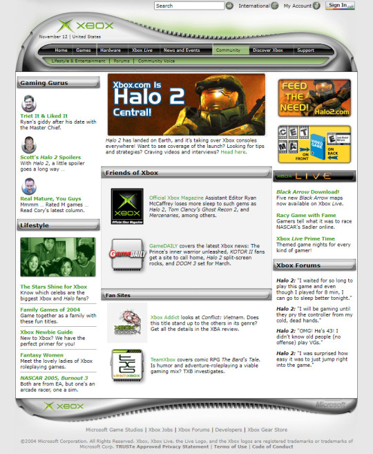
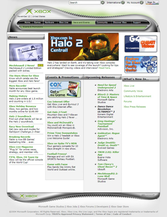
Xbox in 2004
#2004#2000s#04#00s#art#design#frutiger aero#gaming#graphic design#halo 2#halo#internet#long post#microsoft#old web#screenshots#technology#user interface#video games#website#xbox#y2k#y2k aesthetic#y2k design#y2k graphics
128 notes
·
View notes
Text
why is there an ao3 scandal every 6 months where it comes out that people are getting scammed by unofficial apps making them pay to read fics. how do you fall for that for a 4th time
8 notes
·
View notes
Text
Lambdas, Functional Interfaces and Generics in Java
I wrote a little blog post on lambdas, functional interfaces and generics in Java, check it out on my dev.to blog here:
#coding#codeblr#development#developers#ladyargento#code#web development#webdev#dev.to#lambdas#functional programming#generics#functional interfaces#lambda#programming#dev
8 notes
·
View notes
Last Seen Blogs

z1sung
z1sung

mysterious-matcha
Amami Rantarou Protection Squad

xxx-und34d-m3lod1c-xxx
Just anot)(er scene girl 38D

cutest-bunny-writings
Bunny's Library