#high quality layouts
Text

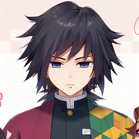
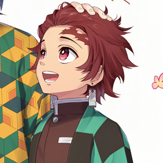


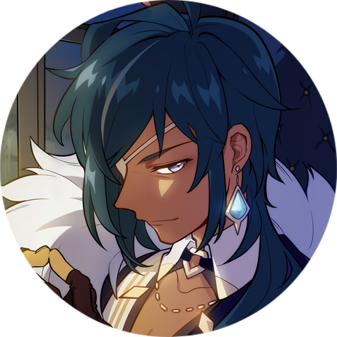
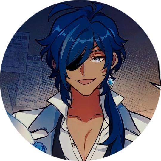
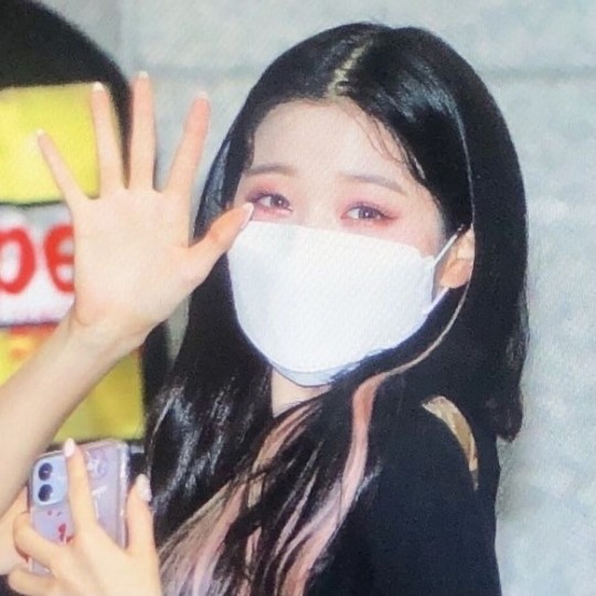
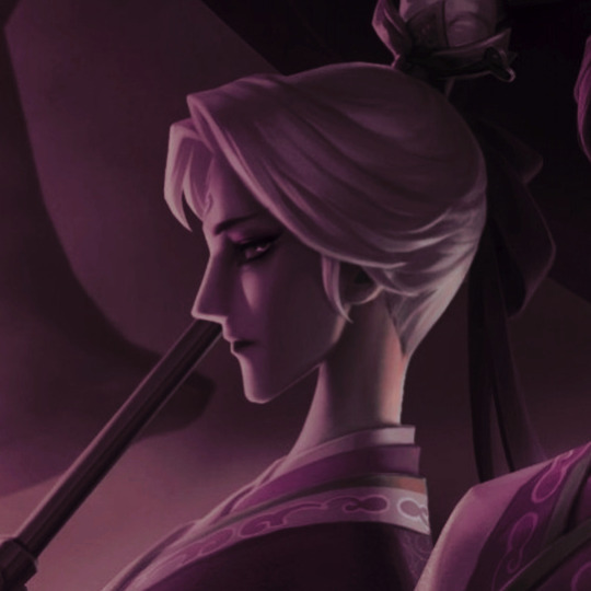
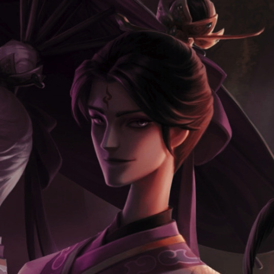
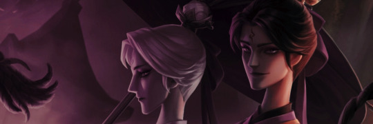
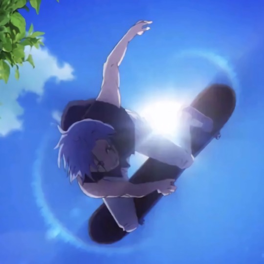
• 𐚁 ͏͏ ᳝˚ ( G ) iyu + Tanjiro + Nezuko Layouts ⁺ 𖹭
✰﹒🗒️ reblog or follow if you save ᰋ

#layout#layouts#kny layouts#demon slayer layouts#kimetsu no yaiba layouts#high quality layouts#giyu layouts#tanjiro layouts#nezuko layouts#tanjiro kamado#nezuko kamado#hd layouts#kimetsu no yaiba#demon slayer#giyuu tomioka#giyu tomioka#giyuu layouts#matching layouts#matching icons#pink layouts#blue layouts#green layouts#soft layouts#random layouts
42 notes
·
View notes
Text


ʢ-̫͡-ʔ͏ KAEYA TRANSPARENT ICONS
reblog if you use!!
#kaeya icons#kaeya layout#kaeya layouts#kaeya icon#genshin icons#genshin icon#kaeya#kaeya alberich#genshin kaeya#genshin#genshin impact#genshin layouts#icons#genshin headers#kaeya alberich icons#aaaaah i can't believe i never made icons for him#also i couldn't find some images in high quality :(
154 notes
·
View notes
Text


wonyoung details
like or reblog if you save
#wonyoung lq icons#low quality icons#gg icons#izone icons#ive icons#preview icons#details icons#girl groups icons#ulzzang icons#messy icons#colorful moodboard#kpop layouts#soft icons#pink icons#pink moodboard#kpop icons#matching icons#grunge moodboard#monster high icons#aesthetic moodboard#cute icons#messy moodboard#carrd material#carrd theme#dark moodboard#ive layouts#ive packs#izone packs#izone layouts#random icons
457 notes
·
View notes
Text


I LOVE YOU DENJI
#denji#makima#chainsaw man#messy#icons#anime#moodboards#layouts#soft#edgy#dark#cw: gore#low quality#high quality#gifs#pochita
207 notes
·
View notes
Text

ㅤ──┈⠅ WU CHANG FROM IDENTITY V LAYOUTS ꩜̲%! like&reblog if saved ¡! don’t repost . . . ⌗
#with psd#icons#random#twitter#high quality#random icons#high quality icons#twitter icons#icons with psd#goals#goals icons#random headers#dark headers#twitter headers#layouts messy#messy layouts#layouts#idv#idv icons#idv wu chang#identity v#wu chang#wu chang icons#xie bian#xie bian icons#fan wujiu
151 notes
·
View notes
Text
wehhhhh...
i dont wanna change computers :[
#Staijey Speeks#shit vent#my school is taking back this chromebook cause im doin homeschool now#which means i have to tranfer all my files#AND all my accounts onto my other computers#but both of em suck because#1 just because their high quality doesnt mean its easy to navigate#2 my main home computer has touchpad/mouse issues and its just a pain in the aft#3 i cant add my new email to my main computer because its watched and while i can use it on my other one its layout is really weird#4 im still far from used to the other art programs and i feel ibis is just better for me anyway#or i might go back to using scratch and pixlr idk#and 5 I have a LOT of unfinished projects on here that i'd like to finish but now i might not be able to anymore#im realy just not happy but i think its for the better i leave that hellhole behind#dont have many positive relations there anyway so meh
2 notes
·
View notes
Text
7 MOST POPULAR TYPES OF WEBSITES AND WHAT THEY INCLUDE

According to research, 38% of people will stop interacting if a website is poorly designed. This means that you should make sure that your website layout sends the right message and answers all your target audience’s questions.
There are several types of websites that you can go for if you want to establish and improve your online presence in the market. Each one of them is designed to satisfy a specific purpose. So, which one should you go for? How can the right website design and layout help your business boom?
This article will explain the 7 most popular types of websites, their purposes, and features. Keep reading to learn more about them.
7 MOST POPULAR TYPES OF WEBSITES
There are currently more than 1 billion websites on the internet, and the number increases all the time. Some of them are definitely more successful than others, so it’s essential to pick the right website design for your business.
Today, web development has become easier, so you can just log into a free website builder and have a functioning website. However, this doesn’t mean that you’ll be able to use the website to elevate your online presence.
You should ask yourself questions like what should my website tell my target audience? How can I use my website design and layout to send a message to my prospects?
Each type of website has specific features and purposes. We’ll discuss the most popular ones in this section.
1. Business Website
Purpose
Tell your target audience why they should work with you
Features
List of products and services
An About Page to tell the customers about your company
Contact information
A call to action
This is one of the most common website types. The company will share examples of past work and customer feedback and explain how to make an order or contact for more questions. In this type, visual branding is crucial, as the website layout should tell your target audience what your brand is all about. The design should be simple to answer as many questions as possible, making sure that the logo and typography complement the company’s message. Customers should be able to get the information they need without scrolling various pages.

2. eCommerce Website
Purpose
Sell online products and services
Features
High-quality images that show the products and services
Easy to navigate with clear sections
Details about your business, shipment, returns, and refunds should be clearly listed
Secure checkout and transactions
eCommerce websites are quite popular because the company sets up a website to sell its products and services online. Once you have an eCommerce website, you’ll have a functioning online shop that you can use with the physical store to increase your sales.
There should be a section for customer service and an About Us section that tells your potential customers more about your business. Just like a business website, sticking to a consistent visual branding strategy is extremely important. Moreover, it should be simple so it doesn’t confuse users.
3. Blog/News Website
Purpose
Provide valuable information about the industry or company
Features
Article lists
Tags for easy navigation
Updated posts
Can lead to an online store
Messages section for more information
The blog or news website should be related to your company’s niche and market, and it should be updated regularly with new posts or the latest news in your industry. The purpose of this website is to deliver valuable content that your target customers will appreciate. Think of what your target customers ask about, how to use your product, and what other products they can use to have a better experience. All these topics can provide excellent content for your blog.

4. Portfolio Website
Purpose
Display samples of work to attract customers
Features
High-quality images
Work samples
Contact information
Creating a portfolio website involves listing information about past projects to promote someone’s business. It can be used by individuals, especially those who work in a creative field, or by agencies and companies. This type of website can lead to an online shop or just display the contact information that customers need to get to the physical store or to contact the website’s owner.
It should be easy to navigate and needs consistent updates. Your target audience should see that you’re engaging in successful projects to consider you for an upcoming one.
5. Service Provider Website
Purpose
Offer an online service
Features
Easy to use
Payment options for subscriptions
This website will work for you if you offer an online service, like converting files to other types, a photo editor, or a grammar checker. The website should be easy to understand, and visitors should be able to access the tool instantly. In most cases, you can offer a limited version of your service that users can try for free. After that, they should be able to pay a subscription to access the tool’s full potential.
6. Landing Page
Purpose
The main part of a marketing campaign that leads to other pages where customers can learn more about your brand
Features
A single call to action
A brief description of the products and services
A clear visual brand
The landing page is a one-page website that your target audience reaches when they click the company’s link. Therefore, the website’s design should stick to the brand’s visual identity and should be simple and to the point. The landing page should work for lead generation, so customers can download an online catalog or learn more about the company’s products through a newsletter.
7. Wiki/Database Website
Purpose
A reference or index that provides a lot of information
Features
Easy search functions
Lots of linked pages
Ability to add comments or edit
This website serves as an index that shows a lot of information. When your target audience clicks any link, they’ll get transferred to another page that shows detailed information about your products or services. A database website can also be accessible to users who can contribute to the added content.
LET THE EXPERTS HELP
Are you wondering about how to build a website that serves your business purpose? Let our experts help you build the one that will improve your online presence and attract the right audience. A successful website starts with a successful web design, so click here to get yours today.
#website design#Types of websites#Popular website categories#Website purposes#Web development#online presence#Website layout#Target audience#Business website#eCommerce website#Blog/News website#Portfolio website#Service provider website#Landing page#Wiki/Database website#Web design and layout#Online shop#High-quality images#Customer feedback#Visual branding#Call to action#Easy navigation#Valuable content#Industry news#Marketing campaign#Lead generation#User engagement#Reference website#Information index#Search functions
1 note
·
View note
Text
#Simple and easy deposit/withdrawal with UPI/Net banking#Brilliant site layout – high quality & easy to navigate#Competitive betting odds - no hidden or in-built costs#Play now at :-https://www.pro-cric.com
2 notes
·
View notes
Text
i work alongside a pro choice group and i order their stickers for them and help ship them out and the sticker company emailed me and told me the stickers are too controversial for them to keep printing l m a o
#like the layout is so simple but the words are just too cOntRoVeRsiAL lmao#now i need to find high quality stickers elsewhere. people pay for them and they're not getting crap quality#i get them for free and i want good quality too 😂
0 notes
Text
PCB Designing Company in Gujarat
Innovative PCB solutions in Gujarat! Leading design company, expert in precision layouts for optimal performance. Elevate your electronics with us.Get more info and contact details in India.
#PCB Designing Company#Printed Circuit Board Design Services#PCB Layout Experts#Electronic Design and Manufacturing#Custom PCB Design Solutions#High-Quality PCB Prototyping#Gujarat PCB Fabrication
0 notes
Text
I’ve just realized. It’s time to tell you all. The story of the Great Dildo Heist.
I’ve mentioned before that I used to work at a sex shop. It was basically your average retail job except you’re selling sex toys. Aside from selling skills our most valuable asset was not giggling about the products.
When I was hired the manager at the time plopped a 20lb hyper realistic ass on the counter and said I must slap it with a straight face to work there.
I passed.
Now, our story begins a few years later with a new manager. You need to understand the store layout somewhat, so from left to right here are the zones:
A: Porn DVDs
B: Run of the mill sex toys, $10-50
C: High end sex toys, $150-300
D: Checkout
E: Lingerie
Before I go in to work I get a call from my manager. She tells me not to come in for two extra hours, because we’ve had a break in. This is especially surprising as we had really good security.
There’s cameras, motion sensors, alarms on the doors, and our store was really close to the local police station.
But our mystery thief was extremely savvy! They broke a window on the ground level near Zone B, sliding in amongst the safety glass. The alarms only activate on upper windows and doors, so our thief now had the run of the store.
We suspect that our daring robber intended to steal a whole lot of porn DVDs. But they, like you dear reader, were unaware of a crucial detail. We remove all discs and sleeve them up in a huge locked filing cabinet in Zone D.
So, foiled in the pursuit of a million hours of porn, our thief was left with the rest of the store at their disposal. And instead of proceeding to snag thousands of dollars of high tech, waterproof, rechargeable, high quality Ferraris of sexual pleasure, instead our intrepid interloper set their sights on something else.
In all the time they spent in the store, they were never once caught on camera. Between that and not tripping the alarms our robber was all set to emulate Danny Ocean in this magnificent heist. It was only on their way out that they happened to graze one of the motion sensors.
Now, right by our store was a 24hr Starbucks. Our thief could have strolled in with a backpack full of stolen goods and calmly sipped a latte while waiting for things to cool off.
But that’s not what happened.
What happened was that the cops found him a block away, sprinting as if his life depended on it with stolen sex toys flying out from his partially zipped backpack leaving fallen dildos in his wake like the most deranged trail of breadcrumbs imaginable.
When apprehended it turned out he’d stolen a backpack full of the foulest cheapest dildos money can buy, totaling not even $100.
Oh and also several tubes of a product called “Anal-Eze” which is a topical numbing agent to facilitate cramming stuff into your butt. (Don’t ever use it by the way, that’s how you end up in a hospital.)
He sobbingly confessed, “It was MeEeEeeE! I stole the diLDoS!!!”
And that’s the story of how I got to come into work two hours late.
3K notes
·
View notes
Text
DCA Fan Zine - Organisers needed
(Please help boost this even if you can’t personally sign up as we very much need a mod team in order to make a zine happen - especially a physical zine which I know a lot of people were interested in! <3 Thank you :>)
Sooo the results of the initial interest check are IN and it seems like people are incredibly interested in the making of a DCA fan zine for artists and writers (thanks for all the DMs so far too, I will get back to everyone)!
Now me and @flinxypie are looking for proactive mods who are happy to actively contribute to the zine’s organisation and production!
(Note: Please bear in mind a fan zine will take several months to organise and put together so these will be ongoing roles requiring active participation and joint decision making as a team throughout this time period. We are only accepting applicants for moderator positions who are 18+ due to the responsibilities involved.)
Mods will be required to help pitch in and check details, review and approve contributor applications, and offer insight and suggestions to help with the schedule and organisation of the zine where necessary.
We are specifically looking for:
- Graphic designers who can help with arranging the zine layout, editing, and providing advertising materials for the zine
- A Social media mod who can help run our social media accounts and assist with marketing
- A Finance mod who can help with bookkeeping and shop running (this will be absolutely mandatory if we will be making a physical zine)
- A Shipping/printing mod who will be responsible for the printing and shipping of the physical zine as well as any merchandise if this is produced, including sourcing a supplier we can trust to make high quality products (US-based preferred - this will also be absolutely mandatory for making a physical zine)
Previous zine experience would be great but isn’t vital for all roles. It is vital however that we have a strong active mod team pitching in in order for this zine to work!
Please apply using the linked form if you are interested: https://forms.gle/Pvj3n2DXB8dsvGg57
Applications will close on March 5th at 10pm GMT/4pm CST!
#DCA fandom#DCA fan zine#DCA fanzine#fnaf daycare attendant#zine#mod apps#sundrop#moondrop#fanzine#reblogs appreciated guys thank you
557 notes
·
View notes
Text

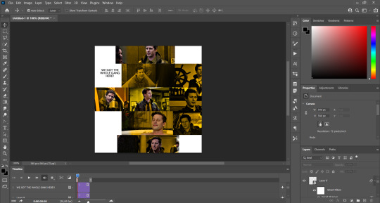
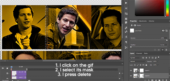
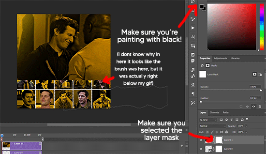
GRID + TORN PAPER + RAINBOW LAYOUT TUTORIAL
(yeah, i'm sorry, but that is the title i came up with)
Hi everyone! This tutorial was requested by an anon, and we're going to make a gifset like this. You need, as usual, basic gifmaking skills and basic photoshop knowledge, but i'll try to explain this as easily as possible!
You'll also need a torn paper brush, which you can download here.
And here are the links to download the fonts used in my gifset: x, x
Okay let's start!
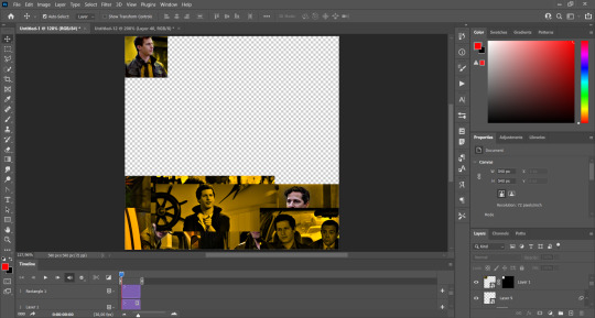
→ First you're going to create a new canvas, and it will be 540x540 px. Make sure to click on create video timeline (if you dont have a timeline, go to window > timeline. We'll leave this canvas there waiting for us :)

Then, onto our first gif. We're going to make the small square gifs first. All i do is resize the image and make it 120 px high, and you'll see why in a moment.
Make sure to remember the number of frames of this gif!! All the gifs we're going to put in the same canvas should have the same amount of frames.
Okay, so we have our first small gif:
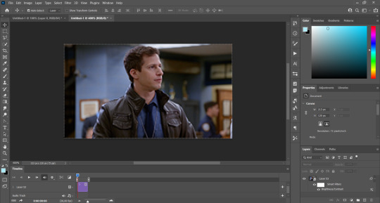
As you can see it's a smart object, and I added some brightness, but so far that's all. You can sharpen it, but i like to sharpen until i've colored it. Now onto the important part:
Most of the gifs i worked with were mostly blue (aside from the skin color), which is recommendable, because you can create lots of colors starting from blue, using the hue/saturation adjustment, or camera raw filter. I also recommend you to use a gif that doesn't move a lot, so it'll be easier to color the background:
For the tutorial, we have our predominantly blue gif, but we are going to make it yellow, which is the opposite color, so it's the hardest to get. I hope you can see how i manipulate colors, and do it yourself :)
Here, you can use camera raw filter (filter > camera raw filter) to turn the blues and purples greener, like this:
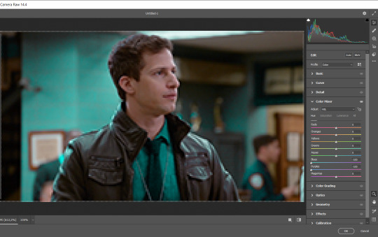
And click ok to exit the camera raw filter. Then, we're going to use hue/saturation (image > adjustments > hue/saturation) to turn it yellow:

Since it was cyan, i changed the cyans, but if you got a much greener result you'll have to use green (duh, right? i dont know i just dont want anyone to get confused akjsdhs)
And you can also add a selective color adjustment to make those yellows more yellow:

The reason i don't directly use hue/saturation is cause it might look ugly and lose quality, or it wont pick up all the colors i want it to but they're also very small gifs so if you wanna do that, do it :)
I sharpen it until this point, but if you already have that's okay.
Now we're going to color the background! For that, you just add a new layer, and set the blending mode to color.
Then you'll use your brush, set it to 20px and 0% hardness, and pick the color you're using for this gif, you can use the eyedropper tool. This is why it's important that the gif doesn't move a lot, so you can color the bg like this:
I colored carefully around the edges, and that's the result. In some gifs from my gif set I colored Jake's jacket too because i was too lazy, but this looks cleaner :)
You might want to select the color layer and the gif layer to convert them both to a smart object, just to make everything easier. So, be careful, because after that you won't be able to change anything!
But let's say you have a scene that you want to include, and it moves too much and has no blue and it's going to be a nightmare to color it.
Well, don't worry, you can! Simply, instead of manually coloring everything, you can just choose to add a gradient map to it (image > adjustments > gradient map), like this:
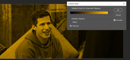
And this is the result:

Just remember, it has to be the same amount of frames as the other ones!
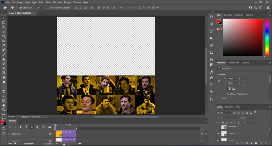
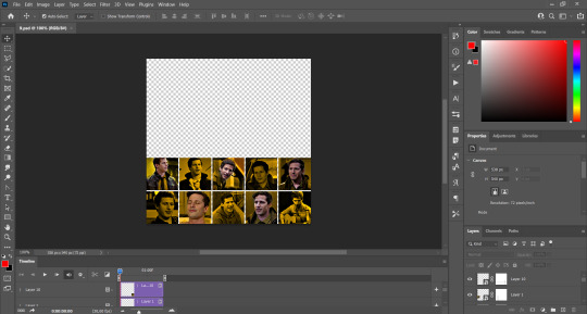
You repeat the process, until you have 10 small gifs. I made around 5 manually colored gifs, and 5 gifs with gradient for each gif. That's a confusing sentence but i hope you get it.
We are going to start pasting the small gifs on our first canvas.
(You can paste them one by one but i did this so you can see my 10 gifs)
You're going to create a square that has to be 108x108 px, using the rectangle tool. You can remove the default white background.

And you may be wondering, why did we not just crop the small gifs into those dimensions? Well, you can do that, but to me it's much easier this way, because sometimes cropping isn't accurate, or it's tedious.
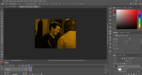
Place the small square on top the gif you're going to crop, right where the face of the character is (or whatever objects you're giffing), and while holding ctrl, click on the square. It will select it:

You're going to create a layer mask:

And then drag that layer mask to the gif:

And voila! It's now the same size as the small square. Once that's done, right click on the layer and convert it to a smart object, because we have to remove that mask. Make the square layer invisible, and start placing your gifs where you want them:
You're going to repeat that process with the rest of the gifs, and then place them all together. Don't forget that if you're making the first gif, they will all be at the bottom of the canvas, if it's one of the middle gifs, one row should be at the top and the other one at the bottom, and when you're making the last gif, they should all be at the top. Here we're making the first one, so they will all be at the bottom:
If you forgot to check that all the gifs had the same amount of frames, you can fix it here, just make sure no gif is past this little guy:
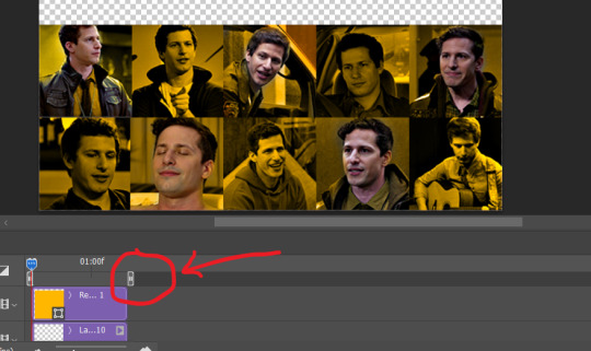
Okay! Now, to create the gutter, we're going to add a layer mask to each small gif, so that we can cut some of it.
The gutter has to be 4 pixels, (i recommend you to REALLY zoom in). What i do is make sure the width of the gutter takes 2 pixels from the edges of the gifs, since they are all together. As you can see in the image above, there's no a single empty pixel between the gifs.

This is a close-up of what i'm talking about. I select two pixels from each gif, and go all the way down to create the gutter:
(I hope I'm not over or underexplaining)
I usually use this tool when i have to make so many selections:
But that was just an example :)
(Another way you can do this, is by changing the size of the small square from the beginning and make it be 104x104 px, but i don't know why that seems more complicated to me ajsdks)
Anyway, this is what we have so far:
Now we're going to create the big gif. Its normal dimensions are usually around 1920x1080, unless you have different dimensions and have to crop it, but whatever it is, we're going to resize it and crop it to be around 550 px wide, and 400 px high:

We'll do the same thing of adding an adjustment of gradient to it to make it the color we're using. For this, i usually add a brightness layer before, because sometimes the gradient is a bit dark.
And using a 600px brush with 0% hardness, you can add some "light" on a new layer, like this:

Selecting all the layers, right-click on them and convert them to a smart object. Again, be careful, because once its a smart object, you wont be able to change any of it!
Then we paste our big gif on the canvas with small gifs, and add a layer mask to it. Using the torn paper brush at 600px, remove some of the gif to shape it like the torn paper. Make sure you're using black, otherwise it won't work correctly:
To make the effect better, add a layer UNDER the big gif, and using the torn paper brush, with the same size, you can paint under it:
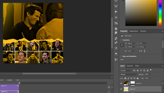
Yeah, I covered some of jake's face, but that's how it supposed to look so the effect works!
And finally for the text! I used Granesta, at 150 px, and at -10.00º to make it a bit askew.
We're going to double click on it and give it a color overlay, set to normal, and give it a solid shadow if you want, then place it right here on the corner:
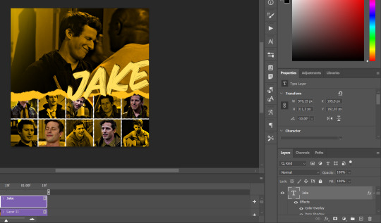
But as you can see, it's too big for the gif. So we're going to add a layer mask to it, and again, shape it the same way that we did with the gif. Make sure they're exactly the same shape, like this:

And that's it! This is our final result:

As always I'm sure there are easier ways to do many of these things, this is just how i do it but if you know an easier way to do it, go ahead. I hope this was at least understandable enough so you can apply the logic of it any way you want :)
If you have any questions you can send me an ask and i'll clarify!
If you found this helpful i'd really appreciate it if you left a tip on my ko-fi!
Happy giffing!
#will i ever learn how to properly explain things 😭#tutorials#uservivaldi#userraffa#userbuckleys#userhallie#tuserheidi#usertina#userfern#usersole#usercera#userzaynab#userisaiah#usernik#userpriyas#usertj
210 notes
·
View notes
Text


pretty boy👥
#langa hasewaga#sk8 infinity#messy#icons#anime#moodboards#layouts#soft#low#quality#high quality#blue#boys#man#skate#beach
44 notes
·
View notes
Text

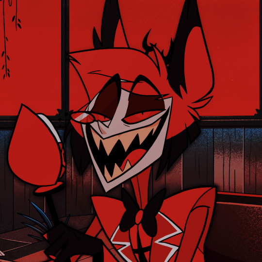


ㅤ──┈⠅ ALASTOR, ANGEL DUST AND CHARLIE FROM HAZBIN HOTEL LAYOUTS ꩜̲%! like&reblog if saved ¡! don’t repost . . . ⌗
#with psd#icons#random#twitter#high quality#random icons#high quality icons#twitter icons#icons with psd#dark icons#layouts#messy packs#messy icons#messy layouts#messy headers#red#hb#hb icons#hb layouts#hazbin hotel#hazbin hotel icons#hazbin hotel layouts#alastor#alastor icons#charlie#angel dust#angel dust icons#charlie icons
193 notes
·
View notes
Note
how to describe? Houses, rooms, interiors, palaces, etc?
Creating immersive descriptions of indoor spaces is more than just scene setting—it’s an invitation to the reader to step into your world. Describing the interior of buildings with vivid detail can draw readers into your narrative. So let’s explore how to describe interiors using multiple sensory experiences and contexts.
Sights
Lighting: soft glow of lamps, harsh fluorescent lights, or natural light.
Colour and textures; peeling paint, plush velvet, or sleek marble.
Size and scale: is it claustrophobically small or impressively grand?
Architectural features: high ceilings, crown mouldings, or exposed beams.
Furnishings: are they modern, sparse, antique, or cluttered?
Style and decor: what style is represented, and how does it affect the atmosphere?
State of repair: is the space well-kept, neglected, or under renovation?
Perspective and layout: how do spaces flow into each other?
Unique design features: describe sculptural elements, or things that stand out.
Spatial relationships: describe how objects are arranged—what’s next to, across from, or underneath something else?
Sounds
Describe echoes in large spaces or the muffled quality of sound in carpeted or furnished rooms.
Note background noises; is there a persistent hum of an air conditioner, or the tick of a clock?
Describe the sound of footsteps; do they click, scuff, or are they inaudible?
Include voices; are they loud and echoing or soft and absorbed?
Is there music? Is it piped in, coming from a live source, or perhaps drifting in from outside?
Capture the sounds of activity; typing, machinery, kitchen noises, etc.
Describe natural sounds; birds outside the window, or the rustle of trees.
Consider sound dynamics; is the space acoustically lively or deadened?
Include unexpected noises that might be unique to the building.
Consider silence as a sound quality. What does the absence of noise convey?
Smells
Identify cleaning products or air fresheners. Do they create a sterile or inviting smell?
Describe cooking smells if near a kitchen; can you identify specific foods?
Mention natural scents; does the room smell of wood, plants, or stone?
Are there musty or stale smells in less ventilated spaces?
Note the smell of new materials; fresh paint, new carpet, or upholstery.
Point out if there’s an absence of smell, which can be as notable as a powerful scent.
Consider personal scents; perfume, sweat, or the hint of someone’s presence.
Include scents from outside that find their way in; ocean air, city smells, etc.
Use metaphors and similes to relate unfamiliar smells to common experiences.
Describe intensity and layering of scents; is there a primary scent supported by subtler ones?
Activities
Describe people’s actions; are they relaxing, working, hurried, or leisurely?
Does the space have a traditional use? What do people come there to do?
Note mechanical activity; elevators moving, printers printing, etc.
Include interactions; are people talking, arguing, or collaborating?
Mention solitary activities; someone reading, writing, or involved in a hobby.
Capture movements; are there servers bustling about, or a janitor sweeping?
Observe routines and rituals; opening blinds in the morning, locking doors at night.
Include energetic activities; perhaps children playing or a bustling trade floor.
Note restful moments; spaces where people come to unwind or reflect.
Describe cultural or community activities that might be unique to the space.
Decorative style
Describe the overall style; is it minimalist, baroque, industrial, or something else?
Note period influences; does the decor reflect a specific era or design movement?
Include colour schemes and how they play with or against each other.
Mention patterns; on wallpaper, upholstery, or tiles.
Describe textural contrasts; rough against smooth, shiny against matte.
Observe symmetry or asymmetry in design.
Note the presence of signature pieces; a chandelier, an antique desk, or a modern art installation.
Mention thematic elements; nautical, floral, astronomical, etc.
Describe homemade or bespoke items that add character.
Include repetitive elements; motifs that appear throughout the space.
History
Mention historical usage; was the building repurposed, and does it keep its original function?
Describe architectural time periods; identify features that pinpoint the era of construction.
Note changes over time; upgrades, downgrades, or restorations.
Include historical events that took place within or affected the building.
Mention local or regional history that influenced the building’s design or function.
Describe preservation efforts; are there plaques, restored areas, or visible signs of aging?
#writers#creative writing#writing#writing community#writers of tumblr#creative writers#writing inspiration#writeblr#writerblr#writing tips#writing advice#writblr#writers corner#advice for authors#helping writers#help for writers#writing help#writing quick tips#writing asks#writer#writing resources#writers on tumblr#writers and poets#how to write#writer stuff#writer's block#writers block#beat writers block#setting the scene#writing descriptions
336 notes
·
View notes
Last Seen Blogs
pentaclesandspectacles
My Garden
mskingsworld
KINGS WORLD
nialleraimehaz
PETER PAN NEVER FAILS.

wearediversidadereligiosa-blog
Diversidade Religiosa
sunshinepunzie
princess of carona