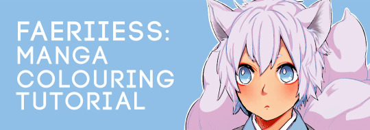
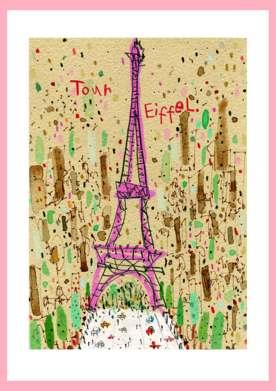
#the watercolour tool is way too much fun
Text

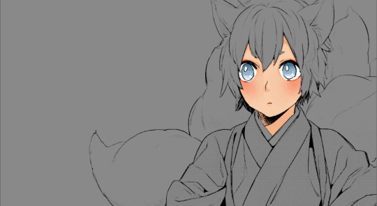
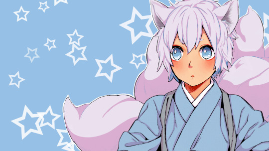
*Bolts upright in bed at 2am* Holy ShIT TMA Swan Lake AU but Jon is a fucking monster cat thing!!!!!
#this au has tormented me for weeks#also a great excuse to try out Clip Studio after biting the bullet and downloading it#TMA#Swan lake au#monster jon#moth jon#cat jon#jonathan sims#jon sims fanart#the magnus archives#au i probably won't actually get to writing#because writers block is being a bitch#the watercolour tool is way too much fun#finally a monster jon that isn't just#vaguely human shaped eye blob#not that i don't love it tho#literally just combined the 3 animals i associate most with Jonathan SIms#Cats#owls#and moths#i've spent way too much time on this considering i have no real plot#or even an idea what contrived scenario lands martin hunting down his future boyfriend#or how jon gets cursed#but god was this design fun#tma fantasy au#tma au#tagging this au as#tma swan lake au
173 notes
·
View notes
Text
hi im @jupitercl0uds and welcome to my art blog!!!!!!! my pronouns are they/them/xe/xem and you can find more about my personal stuff on my main >:D
i do not reblog others' art on this blog, all the posts on here are mine (including reblogs; those are from my alt accounts). art is tagged #art and text posts are tagged #not art (even if they're about art). i DO reblog art, however only on other blogs.
i also take requests and in the future, maybe even commissions!
i draw a lot of mario (mostly waluigi) and sonic fanart, but i also have OCs and stuff!!!
hope you like my blog ^^
FAQ (PLEASE read before giving an ask, the questions are super massive and bold so you dont have to do much reading to find your answer!):
'What programs do you use?'
for the majority of my stuff, whether it be illustration or animation, i mostly use krita!!! i highly recommend krita if you have a computer and tablet, its free, open source and has loads of great tools!!!! apparently tho, it doesnt always work on mac :((( im on windows (when i use krita) so i dont know if this issue is still big or not. still tho, highly recommend!!!
it has animation capabilities, too, but if you want to export it as anything but a png sequence youre gonna need 7-zip
alternatively, i occasionally use opentoonz, but i sometimes avoid it when its too complicated
i also like to use flipaclip and ibis paint from time to time!!! this is mostly when im on chromebook/phone ^^ these used to be my main 2 programs and i still love ibis so definitely recommend!!!!
occasionally i use ms paint or kleki, but i usually tag it as such
if i ever post any music or video editing stuff, then i use a whole load of programs for that so idk
'What hardware do you use?'
i usually use my laptop/chromebook and xp pen deco mini tablet!!! on some older posts, i've actually used my old deco fun L tablet, but that's broken now lol (not actually an appropriate use of 'lol' i unironically mourned that tablet). i recommend both, but generally, unless you want a bigger/cheaper tablet, go for the regular deco instead of the deco fun if you're doing art ^^
sometimes i use my phone and my finger tho!!! or one of those cheap styluses from time to time lol!!!!
'What traditional art supplies do you use?'
loads. at the moment, i mostly stick to daler rowney stuff, except for watercolours. i like to use koh-i-noor brilliant watercolours. they are, as they say, very very brilliant, in both ways. they arent all weird and powdery and VERY saturated!!!! they look quite generic but theyre literally so good, particularly for the cold colours. the fineliners i use are uni pin fine liners and i HIGHLY recommend!!! everyone says 'buy microns' but i prefer them to microns. something about them idk. i also like to use tombow ABT markers for watercolours sometimes, particularly seeing as the koh-i-noors dont have a pink pigment.
for the links: i did buy the majority of my products in physical shops, but i tried to find a good online equivalent NOT on amazon.
1 note
·
View note
Photo
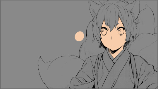
As has been requested by people here is a tutorial of how I colour mangas!!
A quick disclaimer that I am really bad at explaining things so I’m sorry if anything is confusing. Also just because I colour this way doesn’t mean it’s the right way to colour and do things. As long as you’re having fun then however you colour is the right way!! This is just my process and style of colouring.
Tutorial under the cut:
Going to start with what programs and brushes I use.
So I do all of my beginning editing and finishing editing in photoshop. Then I do the actual colouring in Firealpaca.
Considering this is a tutorial for my basic colouring style I’ll only be using four brushes/tools: a pen brush whilst cleaning line art, a watercolour brush for all of my main colouring (any kind of soft easily blendable brush will work), a textured watercolour brush for blush (any kind of easily blendable textured brush will work) and the eraser tool.
Step 1) I size my chosen panels to the dimensions I have picked in photoshop.

Step 2) Using the levels tool I fix the black to white levels of the panel and try to get rid of as much grey as I can without compromising the lineart

Step 3) Then I open the panel in Firealpaca go to ‘Filter’ and select ‘Extracting Lines’ so that I only have the line art to colour under (I use a mid-tone grey background to see colours better)

Step 4) Using the eraser and pen brush I clean up the panel getting rid of what I don’t want and cleaning up/redrawing any lines that need it

Step 5) I always colour (using the watercolour brush) the skin first and start with a base
Step 6) Taking a colour that is darker and warmer then the base I shade the skin around areas such as the eyes, nose, lips, neck and anywhere else shadow would be

Step 7) Using a textured watercolour brush I add blush which is often saturated red, pink or orange
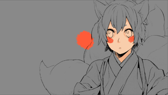
Step 8) Still using the same brush I select the base skin colour and bled the blush out

Step 9) Going back to the watercolour brush I use a highly saturated red, pink or orange to colour the lips and around the eyes

Step 10) Then add whites on eyes and anything else that needs it

Step 11) When I colour eyes I essentially just create a gradient on the eye beginning with a base colour

Step 12) Then add darker tones to the top of the iris
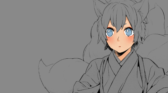
Step 11) And lighter tones to the bottoms

Step 12) Finally I add white highlights
Step 13) After this I colour in the hair (and in this case Ginji’s tails too)

Step 14) And then the clothes or any extra elements in the panel

Step 15) Following this will be shading. I create a new layer which I clip to my colouring, I change the blending to multiply and the opacity to 24%
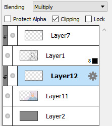
Step 16) Then using a purple colour I shade the entire colouring

Step 17) By creating a clipping mask above the line art I colour in certain sections of it. Such as using reds on the skin lines
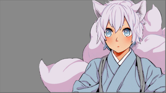
Step 18) Then I just add my background colour and some doodles
Step 19) I make final colour adjustments in photoshop. This can be anything from fixing contrast, increasing the saturation of colours or even changing the hues of some of them. It’s different for every colouring
And then there it is!! A manga colouring!!
111 notes
·
View notes
Note
Hellloooo I love your style and was wondering what program/brushes you use and if you had any tips! :D
hiii thank you!! i use medibang and my main two brushes are the pencil brush (for sketching and the occasional lineart) and the square watercolour brush for painting :]
i’m not sure what type of tips you want but i’ll include some general illustration tips (these can be applied to any program really) and some specific to my style under the cut!
General tips:
-when integrating a character into the environment, just add a clipping multiply layer, use the square fill tool to blend the character in, and play with the opacity! (gradients are fun too :D) i typically select my colour from the lower half of the colour picking tool square (darker, not too saturated) but the colour that you use to integrate the character depends on the context of the bkg!! if the general colour tones of the bkg are warm, use a brownish colour, and if the bkg has more cool tones, use cool grays! if you don’t know what i mean you can just try fiddling around with different colours but i’ll include some examples to try and explain this:

^if your lighting layers are 1.clipping and 2.below your multiply layer(s), they’ll be affected! so unless that’s the look you’re going for, keep that in mind :]
-a neat little bkg trick i do sometimes is to take the fluffy watercolour/ paint 1 brush, put some colour down on the canvas, and enlarge it! (and by enlarge i mean Enlarge) this can be an add layer, a multiply layer, anything really but it’s fun for texture and effects :] i’ve been doing this in pretty much all of my art recently but some prominent examples:
fluffy watercolour bkg
paint 1 bkg (it's just an effect here)
combination of both
^these can also be used to paint clouds
-a hard light gradient layer going from a grayish dark colour to a brighter yellowish lighting colour is cool for bkg integration too! only if your light comes from either side hahahaha if it was front or back lighting you could use a solid colour hard light layer
-gaussian/motion blur and chromatic aberration (both found in the filter menu) are fun to play with!
My style-specific tips:
-for painting, i like a more thick/gouache style so i have my colour mixing level turned down to 0 for brushes like watercolour/square watercolour! this way each paint stroke is more,, separate and defined instead of just effortlessly merging into existing colours
-for a softer blend, feel free to turn the colour mixing level back up! i have a hard watercolour brush that has a high colour mixing level (it’s usually around 50-70) so i use that to smooth out some harsh blends. i usually use this brush at areas like clothing folds (but not at the immediate source of the crease, i need those more defined so this brush is used for the aftermath of the crease if you know what i mean)
-also i have rotate along turned on for the square watercolour brush but this can lead to some unwanted corners (due to the brush pattern) when drawing in circular motions so keep that in mind! without rotate along turned on, the squares will be fixed in one direction haha
i think that’s all i’ll do for today :] i might give more visual examples in the future but my laptop is overheating DDD:
#but yeah i hope this helps!! i tried to word everything as best as i could hahaha#a lonely tatertot my beloved#asks!#art advice
31 notes
·
View notes
Text
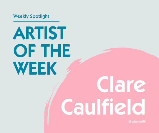
Weekly Studio Spotlight - Clare Caulfield
This week, ta daaaaa, we’re featuring the wonderful Clare Caulfield. Clare takes a lot of inspiration from her travels & different cultural designs. Her style of work is so unique to her, they really are a pleasure to look at and get lost in. WARNING: Clare’s artwork WILL make you want to go on holiday...... Just saying... 👀
We caught up with Clare for an interview, finding out about what she enjoys about her career in art, what inspires her & who she’d most like to invite to a dinner party...
What inspires you most when doing art?
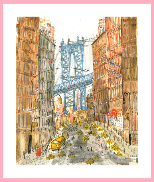
I’ve always been fascinated by architecture as I love the detail and structure of buildings, the repetition and pattern to be found within their design. Using my sketchbooks and drawings produced on location, I try to work as spontaneously as possible back in my studio when I’m working on a painting in order to maintain energetic line work.
I love the buzz of cities and visiting new places, there’s always so much happening and so much to inspire me. The jumble of apartments, storefronts and skyscrapers in Manhattan or the elegant architecture of Venice and its canals, or simply capturing Parisian life outside a brightly canopied pavement café.
I always take lots of photographs and collect interesting ephemera on my travels. Menus, postcards and local newspapers, patterned paper bags, stamps, leaflets, vintage books and packaging, anything that will help to conjure a memory or spark my imagination. Sometimes I combine small elements of these collaged papers into my pieces.
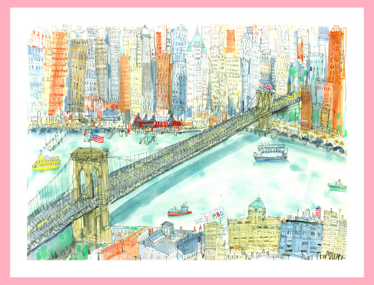
Credit: Clare Caulfield
How did you get your art career started?
During my final year at university, I won a trip to Venice as a result of a drawing project and I decided to use it as the focus for my end of year degree show. The Venetian buildings were a huge inspiration. I really developed my drawing style during that time and it pushed me into a new way of working. I was staying just a couple of streets away from St. Mark’s Square, and had an amazing view of the piazza’s basilica domes. So Venice is a very special place for me as it's where my passion for drawing architecture began. It's such a beautiful city, there really is nowhere else like it.
Immediately after graduating I worked at a textile studio in London for a couple of years designing children’s fashion fabrics before deciding to move back up to Yorkshire to set up my studio to focus on producing my own work and developing my illustrative style. Since then I have exhibited in galleries throughout the UK and beyond producing work inspired by my travels to some of the world’s greatest cities. Closer to home my collection also includes the rugged beauty and charm of North Yorkshire’s coastal towns and villages of Whitby, Staithes and Robin Hood’s Bay.
What’s your favourite piece you have created so far?
The interior view of Grand Central Station in New York. It’s one of my favourite buildings in the world.

Credit: Clare Caulfield
What art tools could you not live without?
My sepia sketching pens. I definitely couldn’t survive without these so I have pots full of them in my studio so that I never run short. They really suit my drawing style, allowing me to make quick lively marks. Black linework would be too heavy for me to work in so brown ink is perfect. They are waterproof too so I can add washes of watercolour over the top. I mainly work on hot pressed Fabriano paper as its smooth surface enables me to achieve a fluid quality of line.
Credit: Clare Caulfield
What is your biggest challenge you face when working on your art?
Sometimes a painting may not be progressing quite as I want it to. This is all part of the creative process as it then motivates me to find new ways to approach it. Something as simple as working on a different type of paper or using a new drawing tool may be all it takes. I have to feel truly inspired to create work I’m really happy with.
If you could have a superhero power, what would you want to have?
Time travel would be great! I’d love to be able to look back and watch again how I created particular pieces of work. I sense an energy within my drawing when I’m fully lost in the moment of making a picture and that’s when I feel truly creative. I really don’t remember how some pieces evolve. They just happen. I try not to over think it or plan the process, so it’d be great to see how I did it!
Credit: Clare Caulfield
Which famous faces would you invite to a dinner party?
David Hockney, Lucinda Rogers, Miroslav Šašek, Stephen Wilshire
What was your favourite class in school and why?
Art from as early as I can remember! I My love for all things creative has always been with me.
What was the first music album you remember buying?
Madonna True Blue

Credit: Clare Caulfield
If you could travel, or live anywhere, where would you go?
I’d love to visit Japan…one day!
This week’s artist interview was so so much fun. Thank you so much to Clare for taking the time to answer the questions and showcase her beautiful work. Clare is such a stand out artist within the studio, we’re so pleased to be featuring her this week ✌🏼Let us know your thoughts on this week’s artist and share some love for Clare’s work. Don’t forget you can check out more from Clare on her social media pages & her website! 😊
Clare Caulfield - Website
Clare Caulfield - Twitter
Clare Caulfield - Instagram
Clare Caulfield - Etsy
#ArtistofTheWeek#Artists#SupportingArtists#ArtistInterview#Interviews#QandA#SmallArtistsSupport#ArtStudio#Printing#dStudioUK#dStudio#ArtistLove#TravelArt#Travelling#Culture#CultureArt#Unique Art
2 notes
·
View notes
Note
allow me to rant about the only thing that has been in my brain for the past two months and that is doll customizing babeyyyyy
i know there’s a 90% chance that you wont give a Shit about any of this but here we go anyways
SO first you gotta choose a doll. preferably one with a high range of motion to avoid creating new joints or having annoying limitations like not having elbow joints for some fucking reason. what the fuck mattel. give monster high dolls back their ball jointed shoulders and elbow joints. smh
the most common dolls ive seen used as bases are monster high and ever after high. most customs ive seen are highly stylized so the stylized face molds work well for those types of dolls but dolls like barbies are good for when you want a more realistic face-ups.
once you’ve got your base picked out you gotta wipe that bitch’s face off with like. acetone or nail polish remover or something strong like that. you can also use acetone to shrink doll heads which is cool as hell imo. n e way once the face is wiped you gotta chop off the hair and remove the hair plugs from the inside. ive seen this done several ways but the easiest and most common way ive seen is to dunk the head into boiling water for ~30 seconds until it gets squishy and malleable. once you’ve got the head back, you can use pliers (i think tweezers would work in a pinch) to pull out the hair plugs which are kinda icky because theyre covered in glue and other gross shit. ew
now you must decapitate the doll. dunk em back in the boiling water to soften them back up then just tug the head off. the neck pegs look funky and are usually a different color than the body so thats cool ig
once the head’s off, you can start the face-up which is basically just giving the doll a new face using stuff like watercolor pencils, acrylic paint, gouache, and a whole lot of other stuff. hell ive seen people use person makeup on these dolls.
next,,,,, hair. there’s about twenty million ways to do hair from gluing yarn wefts to sewing to rerooting with purchased nylon doll hair or yarn wefts but i’m gonna talk about the most common one ive seen which is rerooting and gluing.
before you can reroot, you need doll hair. which, as i mentioned, can be bought at stores like the doll planet or made at home with yarn in literally any color. have fun with it! make rainbow hair or something idk
to make homemade wefts, you take some acrylic yarn, cut it twice as long as you want the hair to be (keep in mind you can cut and style the hair once it’s been rerooted), fold them in half, and tie it to something sturdy like a wire coat hanger for the next step.
once you’ve got your yarn tied to your hanger, use a pet brush and brush the yarn until it’s wispy and looks like hair. then take a straightening iron and iron the weft flat. then remove from the hanger and boom. hair wefts. ta-da
to reroot the wefts onto the head, use a rerooting tool (which can be as simple as a needle with the eye cut at angle) (just google it please i’m shit at descriptions)) to poke small sections of the hair into the head. you can use the pre-existing rooting holes for your own reroot as they’re usually pretty reliable. to reroot, take a small length of you doll hair (about 10-15 strands), loop it in half, and put the middle of the loop into the reroot tool. poke the end of the tool with the hair on it into the pre-existing hole and remove the tool. the hair *should* stay in and fill up that plug!! also remember to plug thickly at the hairline and part of the hair where it's most noticeable. it doesnt matter as much in the center of the head as that’s not usually visible on the doll. once you’ve rerooted, squeeze in strong glue through the neck hole and squish around the head to make sure it covers all the plugs and secures them in place. then pour hot water onto the head to make the hair lay flat for styling later.
also, you can reroot yarn directly into the head to make thicker, more textured hairstyles. and since the yarn is thicker, you dont need to glue the inside of the head for the hair to stay in place!!
if youre not doing body modifications (which are also cool as hell) then it’s time for clothes but clothes are boring and i like body mods more so i’m gonna rant about them instead
the material ive seen most doll artists use is apoxie sculpt, which is like play doh on steroids. it comes in two parts which you gotta mix together for some reason. why dont they sell it pre-mixed. what was the reason. also once it’s dry it’s super super strong and you can sand it, drill into it, paint it, and all kinds of stuff. very nice and i want some for myself.
you can use hand saws and drills and shit to whack off doll limbs to make stuff like digitigrade legs or new joints. also dont be afraid to use other mismatching doll parts when customizing like heads and bodies and forearms and hands and shit. it literally does not matter if youre gonna recolor the doll anyways so have fun with it. make frankenstein’s doll if youre feeling spicy
accessories my beloved. stuff like tiny beads and clay baubles and shit will literally transform the entire doll plus they’re adorable and multi-purpose
i suppose i must talk about clothes now. ah well. you can find great clothing patterns if youre new to customizing on other customizer’s etsy shops and probably google although those will probably be lower quality than paid pattern pieces. and keep in mind that if it exists as clothing irl, you can likely make it doll-sized. there are literally no limits to your clothing options as long as you can execute your idea.
the once all your components have been made, you can assemble the doll again!! and finally see what all the parts look like together!! very cool 10/10 stars.
ight that wraps up my doll rant. i could really go into more detail on certain parts but thats a whole other rant for a whole other day smh. sorry for fucking flooding your inbox ender ahaha……………. you asked for this
little did you know that dolls have been one of my favorite things since like ever. if i can read a 25 chapter long fanfic i can read this B)
mattel definitely fucked up by completely ruining MH doll designs and just stopping EAH, alot of their profits most likely came from people who collect and customize dolls and by changing MH doll designs/Stopping EAH dolls they 1. most likely lost a small (or big if we're not jus talking people who customize dolls) part of their profit and 2. made it harder for doll customizers to make dolls/get commissions out rather quickly because they probably have to waste more time making joints or learning how to make joints.
EAH/MH dolls (specifically MH dolls) had AMAZING MODELS because there was so much variety with height, face shapes, etc (my favorite molds had to be the short/tall dolls and the cat molds because of the tails) and doll customizers really went all out with enhancing a molds unique features. The only "downside" abt MH dolls is that they (or atleast most)(from what i remember)) had slimmer faces but wider eyes while EAH dolls have wider faces with slimmer smaller which left a canvas for the face and not the eyes (and vice versa for MH dolls)
I've never seen any videos where a barbie is customized (maybe because i absolutely despised barbies at the time) so I'll definitely have to check those out but they seem to be good for realistic makeovers. I've seen like like semi realistic makeovers for EAH/MH dolls that were pretty good too tho (pretty sure mostly EAH dolls since yk MH dolls were used for creature makeovers while most EAH dolls weren't)
yeah i was always amazed by the head shrinking with acetone. honestly i still am?? idunno i have no idea how that chemical bullshit works. Ive seen a few of uh makeovers that just pain over the face (in multiple layers ofcourse) but that's usually when they're painting the entire body a different colour (again usually when they're turning a doll into a funky little baby man). I've also seen a few that just chop the hair off and take out the hair plugs yk without uuh like softening the head or just go straight for the hair plugs after taking off the head (i used to do that it was funny to me??). i always really liked when they used watercolour pencils or just colour pencils in general to draw/sketch on the face cause like wow ur drawing on ur doll without ruining it?? kinda epic maybe even poggers and pogchamp?? oh god my brain is failing wjshsmsj.
Watching them putting the hair back on the doll was, other than the face stuff, was the BEST part for me. Favorite type of hair was iuuuuuh was either thick yarn or brushed out yarn. Literally worship the people that would reroot the hair, theyre the most patience people on this earth!! it's literally insane but i guess that's what happens when you've been doing that for years? you guess kinda get used to it. when they put glue into the head does it just become stiff?? like it's just a clump of dried glue or does it like..hollow out again??
dude you literally cannot convince me most of the supplies used for doll makeovers. APOXIE CLAY LOOKS SO FECKING GOOD. its edible and i will die on that hill. The body mods are literally so amazing!!!!! it's so impressive how theyre able to imagine certain features THEN LIKE ACTUALLY MAKE IT LOOK ACCURATE TO WHAT THEY WANTED TO LOOK LIKE AFTER LIKE ON TRY (or many yk trial and error is very necessary for..everything). Absolutely loved when doll customizers would saw off a dolls legs and use different ones or just completely get rid of the torso to use a different one. it's like uuh that one big guy that's mismatched and sewn together. very cool. The accessories are so fun!! just small little details you seen really need but can add because it's your feckin doll!! I used to be absolutely obsessed over the doll clothes i would find on etsy, so much so that i started sewing shitty shirts and dresses for my uh "customized" dolls (they were absolute HORRORS idk WHY my mom let me feck up my dolls like that).
Thank you for this!! i haven't been able to talk about any of my interests for a while and this just really made me happy!!
Question fer u my fellow MH/EAH enthusiast: what was your favorite MH/EAH movie/episode and doll series. Mine was The fusion dolls (MH obvi) and that MH movie "Haunted" cause we got to know more about Spectra :D
#YOOOO LONG POST?!#long post#:) hehehe#this was very fun to read cant wait for ur next fanfic length ask#asks :D#theoreticallyjasper
2 notes
·
View notes
Text
Rain, Forever | Namjoon ☁


⤑ Pairing: Namjoon x Reader
⤑ SUMMARY: Since the lack of rain and the coming of Winter, Namjoon hadn’t been the same. He didn’t seem to smile much and his grin never quite met his eyes. He’d lost passion for everything he once loved. Well..everything but art. Specifically that one black and white watercolour painting in the Seoul Art Gallery that resembles a lonely figure standing in the rain..
⤑ Genre/AU: Fluff + Angst / non!idol Joon + alt!universe Joon
⤑ Warnings: The main component of this story mentions depression and suicidal ideation*, swearing, burglary, suffocation and a sprinkle of magic
⤑ Word count: 7.4k
⤑ Rating: +14
*This story, in no way, attempts to romanticize or idolize mental health issues. I can only say it comes from a personal perspective which is somewhat unique and subjective to every individual.
A/N: A song that touches the crest of my soul and speaks to so many others. I hope this helps, heals and warms many people who, like myself, miss the rain.
☁
“I don’t know whether I should take you seriously or not..”
“C’mon it’ll be fun!”
“You’d better not make me regret this, Kim Namjoon.”
“As long as you trust me, it’ll be fine.”
It was October of last year and you and Namjoon had found yourselves in Haneul Park.
Standing under the shelter of a bleak cafe, he had been tugging at your sleeve, urging you to run out into the open with him. But you hadn’t the slightest clue why you’d want to be anywhere else but under the shelter. It was cold enough in the cafe, but outside it was completely meek. It had been windy yet pleasant just an hour ago, but now the wind was just pelting rain drop after rain drop at the windows.
In a light cardigan and an impractical corduroy skirt, you dreaded the prospect of having to run through the rain to get to your car. You’d taken shelter, narrowly avoiding the rain, and now you’d practically holed yourself up in the cafe after downing two mugs of tea and a triple chocolate cookie. Namjoon, however, was quite the opposite. For the past thirty minutes, his eyes had been glued to the window. Despite his lack of warm-clothes, he seemed more desperate than ever to get outside. While you had finished your cup of tea in just over ten minutes, he’d simply downed his, pouty cheeks sloshing with liquid before swallowing the beverage in one ecstatic gulp.
Now he was standing right by the window to which you’d hesitantly joined him. The rain fell harder that day than it ever had before. Namjoon absolutely loved it. You never quite understood his thinking, but he’d always be willing to explain it to you. He’d said tt was the way the trees moved to the sound, the way the clouds gathered, watched, hovered over you, better than any shelter. It was the way the grass leaned, succumbing to its force, the way the pavement shimmered in its grasp. It was the way it felt to be amongst it all, like an unknown spectator, just a pair of eyes. It satisfied more than any drug could, oxytocin soaking through your pores, melding flesh and bone like a soldering iron.
You wished you could feel just as excited about all these small droplets of h20; you were desperate to make sense of it. Especially when it came to Namjoon.
“Well..I do want to understand.” You spoke, leaning into his pull. At that he only tugged your sleeve further.
“C’mon then, Dew-Drop!”
He walked you toward the door with an overwhelming sense of eagerness. You thought yourself to be mad, but still your hand remained in his.
“So we’re running to the car?”
“Running, walking, admiring the view; whatever you want to call it.” He said, pulling the door open, taking you with him.
“Ah!” You yelped as the first draft of rain lashed out on you “I’d much prefer to just run Joon.”
He couldn’t hear you though, almost dancing ahead. Namjoon was fervent in the rain; he always had been. You remembered meeting him like that, when you used to teach and he came in as a motivational speaker to talk about his career as a musician.
After his speech, you’d been given the duty of cleaning the chairs in the school hall. Eager to finish, you began to stick them out in stacks in the courtyard, and that was when you saw him, far off in the distance, leaning against the rails of the basketball court, rain pouring down his face.
Like the feeling you felt looking at him now, you were magnetized, curious.
“It’s fucking freezing!” You began, clenching at your sides, hopping on the spot “Can we run now?”
“You, miss l/n, are no fun.” He chimed.
“And you’re a polar bear!”
“An endearing term, but i find my pace akin to a cheetah.” He joked “Now chase me!”
Before you could blink, he had bolted across the grass, down towards the car park.
Now, you not only had to fight the rain, but focus on keeping up with your long-legged boyfriend.
They say girls are good at multi-tasking - and they are - they just struggle with things like this because it involves the tedious process of thinking and being sensory-aware all the time; something which lengthy boys like Namjoon don’t take into account.
“A fucking polar bear isn’t this fast!″ You puffed, circling a bed of drooping flowers to further keep up with him,
As the rain pelted heavier, giddiness overcame you. You couldn’t help but laugh, thinking of yourself (merely a few years ago) watching this man, as a primary school teacher, from the playground - almost untouchable, unreal - now encouraging you to chase him, soaking wet, through the rain like lovestruck youth.
“Catch me if you can.” He laughed.
☁
That was three months ago..
Today was March 13th. 2020.
Friday the 13th...
The balcony of your third floor apartment was glowing that day. As you sat on its cobblestone base, dusting your plant pots, you felt the sun cast warm rays on your neck.
Friday the 13th, that one day that came up so seldom, never seemed to hold any negative connotations for you. Every day you felt lucky: to have a quaint little flat, thriving plants, an endless supply of herbal tea at your feet, and of course Namjoon.
Right now you were tending to his favorite small bonsai, gently seated between two lucky bamboo plant pots, shaded by a leafy green hanging plant. You polished its black base, sprayed some water on its soil stones and gently trimmed any stray stalks growing from its arms. Namjoon had called him ‘peet’, an affectionate name that often made you forget that this plant was more an inanimate object than a human body with full-functioning organs. You were often reminded of this when he’d catch you in lengthy conversations, strewn across the balcony floor at night, bonsai leaves tickling your cheek as you tried to lean back further to watch the stars. But these plants were a huge healing tool for you; something that kept you occupied, just as well nourished as them, and excited to see how they’d blossom each day.
Finishing off by cutting the last wandering stalk, you gently got to your feet and headed for the kitchen. Only 11am, you’d had your breakfast but felt slightly parched for a drink. Fortunately enough, when the clock struck 11.10 every day, you’d find yourself coincidentally hunched over a mug of steaming green tea; you knew there was no coincidence, just the pure, unrelenting fact that you loved the warm, floral taste it brought you. It gave you just the right amount of energy each day, and it was always a wonder to watch Namjoon puff his cheeks like a hamsters as he’d swallow a cup whole in one go.
You’d left him asleep this morning, waking at 9am to grab some groceries and sort yourself out. You hadn’t disturbed him since, knowing he was a heavy sleeper and knowing he really needed some rest since working the past few weeks. Night after night he’d been slaving in front of a laptop, attempting to draft and file possible lyrics for his upcoming album. It wasn’t helping that his producer had him on a leash and under a constricting time limit. What could you do but give him the time and space he needed to get things done.
Sealing the kettle and the tea bags, you lifted Namjoon’s mug and carried it over to your bedroom. Approaching the door, you listened carefully for the sound of snoring, aware that waking Namjoon wouldn’t do any good for the level of guilt you felt entering the room anyway.
When all you heard was silence, you decided to nudge the door open and slip through into a darker room.
“Joon, I've made some tea for you.” You approached the bed and placed his mug on the bedside table, anchoring it away from him so he wouldn’t hit it off with his elbow when turning; he was clumsy like that. You watched as he shuffled in response to your entrance, the caramel of his skin sliding against the sheets as he adjusted his neck to gently turn to you
“Mmh Morning.” He yawned, his eyes forming crescent moons as they squeezed shut before opening to clear the haze from his vision. He was a beautiful little shape of a human, shrouded in cosy bedding as he watched you in the dim light.
“You coming out today Joon? I’ve got some exciting things up my sleeve.”
“I can’t..I'm sorry.” He replied, a certain lifelessness in his tone.
“Are you sure? I can make us some cake and we can go to some park. It’ll be nice.”
“I don’t feel like it.”
“Oh, okay..”
“I’m sorry.”
“No, no, it’s fine!” You whispered, bringing your palm to his cheek, feeling its heat coarse through your fingers. “We’ll try another day. Don’t feel bad about it at all. Have a nice rest Joon.”
With that, you slowly turned from him and made your way back out into the living space. You let a sigh wash over you and attempted to rejoice in the fact that at least you had a warm mug of tea ready for you. Swigging it down, you sat in silence, watching the outdoors from the distant balcony window. It was still just as bright outside, much brighter than the bedroom, clouded by dark curtains. You felt sad for Joon, powerless even. How badly you missed even the simple things like swigging tea with him. How long had it been since you’d done that?..
Too Long.
☁
The rest of the day painted itself in a slow and monotonous fashion. It wasn’t unbearable - you got things done - but it all seemed watered into the same actions, the same meaning, the same routine.
It started with finishing your tea, slower than you had intended. Lost in monotonous thought, before you knew it, it had gone cold so you had ended up pouring the remaining portion down the sink. You then went on to finish the laundry, have lunch, check on your beloved plants, read a book, watch TV, yawn and sigh a countless number of times, and take a quick nap.
Before you knew it, the room had darkened and the sky had taken on a delicious yellow tone. Before you knew it, the whole day had almost passed.
You didn’t want to lie to yourself, this is the way the days had gone for the past few weeks. It was just you, the sun, a cup of tea and the rest of the world. Namjoon, every day, had been stuck in the bedroom, occasionally popping out each evening to say hello. Now that was something you had a problem with confronting. You felt it was appropriate for him to get some rest, especially after the few weeks he’d spent finishing up his work. But it had reached a turning point now. One which you didn’t know how to address.
You weren’t too happy about it, but Namjoon was clearly broken. Were you scared to face the extent of his unhappiness? You never wanted to see the one you loved so much feel so hollow. At least that’s how you assumed he felt. You’d felt a similiar emotion before, but never to the extent Namjoon was experiencing. How badly you just wanted to rip the shreds of dread from him like a stuffed toy, or hug him to death and fill him full of love, stitching him back up to like he’d been before.
What could it be that made him feel like this? Perhaps it was nothing at all, just a fragrant aroma of unease that settled upon him - something he couldn’t shake off. When would you build up the courage to ask him? Talking to someone might free him from his bonds, but you couldn’t force him, you just couldn’t.
He had to be the one to make that choice.
Shifting on the sofa and taking a rather taxing stretch, you moved from your napping position and onto your feet. You stepped out onto the balcony, greeted by a golden radiant light, seating yourself on the heated stone floor, your feet nudging blooming plant pots.
You watched through the rustic balcony bars as the air grew wispy and chill around you, a harsh brick wall supporting the stability of your back. The clouds were starting to fade into the distance as stars pushed forth through the air. Was it time for another cup of tea yet? Probably. You felt spurred to go and get one.
“Morning.”
“N-namjoon.” You turned in surprise from the gruff voice to be met with his tall figure slouched against the door frame. “Evening, sleepy-head.”
He yawned in response, ruffling that luscious hair of his that now seemed so tangled through his fingers.
“Come sit down.”
Shuffling, he came to a seated position, one knee bobbing against yours, the other scraping the soil surface of his bonsai. Another yawn again, and his knee was now fully perched on your thigh, his back hunched over, shoulder nudging yours. You watched him as he shook out his tawny hair and took in his features in the setting sun.
“What’s up?” You smiled, your hand resting on his leg.
“Wanted to see you, dewdrop.”
“If you aren’t the biggest charmer.” You grinned in response “I’ve been missing you all day.”
“Yeah..i know.” He whispered.
“Then what’s up? I’m always here for you Joon.”
He sighed, fingers now raking into his scalp. Moon pools, darkened and tenebrous sat under his eyes, his thick lips chapped and his face a starker cream against the fading light. You turned to him, watching more closely, waiting for him to open up, praying that he would just open up.
“If you’re not ready that’s fine, i don’t -”
“No, no..I need to.” He shuffled nervously “I know things haven’t been the same since a few weeks ago. I’ve been pouring all my energy into my work and now I've been pouring it all into sleep and it feels like I've finally used up all my resources - like i’m at a dead end for solace, for what to do.”
“It started a few weeks ago. Things were fine, then all of a sudden, it stopped raining. It was probably just one of those years where the weather just wanted to let up and stay sunny, but for me, it felt like the first. It really did feel like the first time it hadn’t rained. I didn’t know what to do. I was at a loss. All my fondest memories, all my comfort and all my shelter came from the rain - it was a thing I could not deny, and I'm still desperate to get it back.”
“I just..I wish it rains all day. Cuz i’d like someone to cry for me. Cuz then people wouldn’t stare at me. The umbrella would cover the sad face, people would be busy minding themselves. I felt like i just needed to stop, I needed to breathe a little slower because my life and my rap, they’re usually too fast.”
“Yeah..that’s it..”
He let out a strong exhale, letting the air around him encourage the entire earth to fall silent. With that breath, his hand found yours on his thigh, his fingers lacing into your own. A strong thumb pawed across your palm, pressing softly into the flesh, the ultimate grounding tool.
But it wasn’t you needing to be grounded, it really wasn’t. It was him, the friendly giant who had lost all hope and solace to the power of the rain.
“Thank you for telling me. Really thank you.” You squeezed his hand “It’s you i want to protect. If I could hang clouds in the sky and make it rain for you I would..you know that.”
“If only I could find something else to make me just as happy..”
“Hey..” You chirped, a thought springing to your head. “You know i checked on you this morning to see if maybe you wanted to do something? Well..maybe we could go to the Art Museum on the waterfront tomorrow?”
“Okay. Sure.”
“It might help. And maybe we could get a coffee as well and see if we bump into any visiting artists.”
He grinned at you, a sense of adoration and respect filling the lakes of his eyes and the hollows of his dimples. You smiled back, a slow and affectionate grin that you hoped could transcend from your heart, right into his to fix him completely.
“Cool. Well, lets get some dinner on and look forward to a beautiful tomorrow.”
☁
That night, with full stomach’s and a coruscating sunset washed over your bodies, you lay in your bed, arm in arm, the night falling into the next day. You slept on your side, your arms crossed over your chest. Namjoon rested behind you, his stomach against your back, hands set in the violin crests of your waist, his head latched against your neck. Perhaps this was the first time, you thought, in weeks that you’d layn like this. The past few days, you’d been laying in bed alone, or an oceans distance from Joon, leaving him to get the best rest possible without your heat leaching onto him. This felt nice. It felt so much more than natural. He smelt of vanilla, and long nights and restless days. It reminded you of the angel you’d met so long ago.
The only thing you missed was his damp, fresh, rain water scent.
☁
“Catch me if you can.” He laughed.
Running further down the hill of the park, you felt your feet race ahead of you, almost slipping, as you begged yourself to catch up to him. Oaks, maples, alders, zelkovas, and birches all fade into one collective tincture as Namjoon dominated your vision. Despite your distance, his smell, his touch and his colours blocked out all sensory notion and summoning around you. You would not be held by the bounds of nature, he was yours and you were his, and in this race all there was, was blank space and the two of you.
“We’re nearly there!” He yelled again, bringing you from your thoughts.
“I’m -” You huffed. “I’m. So. Close.”
“Ah. So now it is about the race and not the rain. Perhaps you have a newfound love for it?”
In response, you slammed the brakes, watching him as he skipped into the car park, unlocking the doors to your vehicle and climbing in, beckoning you over.
“In your dreams.”
☁
“For this week, to celebrate the Seoul Arts Festival, we are holding a two for one deal for all art lovers. Therefore, your ticket entry to the art museum is only half price! Enjoy your visit.”
The gallery was lit with stars this afternoon. In awe, you walked through the reception and into the main hall to peer at the strings of golden paper in the shapes of stars decorating the ceiling and the walls. Clearly, this week was a week to be celebrated in the arts community.
You hoped Namjoon felt as excited as you to spend this time with him and on such a special day. You watched him, a small smile poking at his cheeks, not giving away whether he was displeased or not. You took the nervous drum of his knee to be the latter.
You always spent a lot of time in each room when you were with Joon. In love with his adoration for exhibitions, each time you joined him, you simply stuck to his side, viewing every single detail of every single painting.
At first, you felt the visits to be somewhat taxing - much preferring living, breathing art such as himself. Eventually, however, you succumbed to his ways - finally realizing that all exhibits were living things with their own lives and stories behind all their individual brush strokes. Like most things, it was him who taught you that, with his silent yet ethereal way of just being and learning and loving.
“Okay..wow, so this is the central room for this real highlight exhibits.” You breathed, Namjoon echoed your awe with a slow nod.
Now this was a room you felt you could really spend hours in. From Eunho, to Hye-Sok, to Eungro, to Jiho, you span around in a flurry of colour as you attempted to absorb the true joy of being amongst all this art at once. You knew Joon felt it too, immediately joining him by the first exhibit to gape at the thatched lines and geometry sitting on the canvas before him. You wondered how long he’d felt this way about the things before him: from paintings, to people, to the rain itself. Had he always been so sensitive and in-tune with his environment? Did he always care so much concerning the life buzzing around him?
After crowding around a few of the exhibits, you decided to head to the bathroom and grab a drink for the two of you. Almost ten minutes in, you’d realized you would probably need a drink to support your long and meticulous visit. Now was the perfect time to head off and grab one.
“Joon, I'm going to grab us a coffee, okay? Don’t go too far.”
“You know i won’t.” He chuckled “This room is way too fascinating.”
Almost fifteen minutes later, and a large queue for the cafe, you hurried back to the central room with two piping cups of pure vanilla fuel. Walking through the doorway, you searched for him in the crowd, but to no avail. You’d told him to stay put, and you were convinced he would do so, but now he’d ran off, almost as if your exit was the perfect opportunity to get away from everything that bound him. It was the perfect inconvenience.
Walking through the room, you decided to take the door to the next section of the exhibit and see if he was there. Entering into a more low lit space, you squinted your eyes, looking for him in every corner of the room. After a short amount of time, you came across his figure, hunched by an exhibit in the far left hand corner.
Positioned diagonally, you could see the features of his face in pure scrutiny. His eyes, wincing, paced back and forth across the painting, his teeth sandwiched between his lip, chewed at it gently.
You’d watched him before like this, staring at paintings, watching life go by on the apartment balcony, tending to his plants, but it had never quite been like this. You stood there for (what?) ten to fifteen minutes, simply wondering when he would stop staring at the canvas..if he would move on. Was he waiting for you to join him? Was the painting simply that jaw-dropping?
“Joon..”
He turned in surprise, immediately standing straight. You smiled at his action, and approached him to look at the painting further. From a distance, in the dim light of the room, the painting was a monochromatic smudge with the tall figure of Namjoon shading its central half. Now, up close, it looked much different.
A figure in a long white trench coat and cap stood in its centre. Beneath him, a flowing stream of black ink submerged the better half of his shoes, meandering forward through the painting and toward a large black hole hanging in the sky ahead. Black arcs of rain shot through the surrounding sky like hasten sparks, falling into the reflection of the figure wavering below in the light of the tenebrous stream. The painting, as a whole, had been crafted in monochromatic watercolour, its brush strokes melting down the canvas like tears to paper. It was a sad yet inspiring vision, you thought.
“It’s beautiful.” He answered, a tear pooling down his cheek.
☁
That night you lay awake for a while.
A long while.
At 9pm, you turned to your side, and slipped out of your bed to sit on the balcony. The weather was tinged with cold, but you brought a blanket to shawl across your shoulders and drape under your naked toes.
You’d tried getting to sleep that night around 8pm. Joon had huddled against the corner of the sofa before bed and downed a mug of green tea, before watching you finish yours, lacing your hand with his and heading for dream-land.
But as soon as you hit those warm, delicious covers, you knew there was something much more pressing calling your name.
Ever since leaving the museum that afternoon, you couldn’t draw your mind from that watercolour painting. Like an obnoxious poster of propaganda, or an inviting store-front display, the picture sat in your mind, a prized possession, and mocked you your entire journey home. You thought about Joon’s face viewing the canvas, the time he spent simply looking at it and the silence and serenity that followed him afterward.
He wanted the rain, he yearned for it, he called for it ever since its disappearance. You only realized this last night, once he opened up to you, but it had made sense. The long showers he took when you were distracted at the grocers and would come home to him singing away to the sound of the running water in the bathroom. The way you would sometimes wake just as he was heading to sleep and watch him kiss the sky goodnight with a certain desperation for the rain to come. Even the long, delicious sips he took of green tea, feeling the liquid wash down his throat and cleanse him of his doubt. It all made sense.
He was waiting for the rain to answer him and it was that singular painting that seemed to pick up his call.
It was that realization, again, on the foot of your balcony at 9pm at night that made you stoop through the house, throw on your shoes and run back to the museum to bring home that painting.
Racing down cobblestone streets and narrow lanes, you found yourself driving all the way back to the museum with only yourself and the headlights of the car to guide you.
All your life, you’d learnt better from the mistakes you’d made and soon realized it was best to follow a calling and take an opportunity when it came to you. Even if it ended up failing. This particular calling was stronger than ever, a migraine in your head, an instinct that screamed that there was more to this painting than what meets the eye. You knew it would help Namjoon.
On special events, the museum closed at the ripe hour of 10pm: in just fifteen minutes time. What on earth were you doing? You didn’t know. You would enter the museum, visit the catalyst that stuck itself in your mind and hopefully the answer would come to you.
Jumping out from the car, you ran toward the entrance, bursting through the doors like some crazed artist, desperate for information.
A man halted you just as you were headed through to the main hall, his gentle touch on your shoulder.
“Ma’am, this gallery is closing in ten minutes time.”
“I-i understand. I just need to take a look at one of your exhibits.”
He nodded, an uncertain look crossing his features “Of course..go ahead.”
And with that notice, you sped walk to the dim lit room without a single thought but of the canvas in your head.
“Good evening, this gallery will be closing in five minutes time. Can all remaining visitors please make their way to the exit on the lower floor. Thank you for visiting.”
With the echo of the final closing announcement following you into the dark exhibit room, you had to make a decision. A dangerous decision.
With no rational thought, plan or hope in mind, you would decide to stay at the museum past its closing time. Searching the room, you peered for somewhere to hide. Unfortunately, galleries never really delivered in this particular apartment, often baring clean white walls and flat floorboards. In your case, frantically scouring the room, you had found an exhibit sitting on top of a white box with a possible way to unfold itself and hide you in it. With urgency, you got to your knees and tugged at the side of one of the corners, digging your nails in, in an attempt to open up one of the sides and slide inside.
And just as if it really was your calling, one of the sides slid open - albeit with a tremendous screeching sound against the floor - but it still very much opened. With that, you were asking no questions, simply bending yourself into a rectangular shape and sliding back into the box, closing the side behind you.
Now to wait.
For a few minutes, you sat in silence, wincing at a cramp in your ankle. Suddenly, you were hearing footsteps and jangling keys announcing themselves in the room. With a held breath, and extreme concentration, you sat rock solid as the steps circled, stopping occasionally to scent out a visitor, and continuing before finally click-clacking goodbye. If there was any time you thought you would be in need of an oxygen tank (surprisingly not in 50 years time) it was now. You were never one to break the rules or to find yourself being ridiculously spontaneous, so this was really a first. You felt on edge, yet devious and buzzing with an electric pulse of energy. It really was time for you to try something new, and for Joon to finally get his dose of happiness.
In a succession of fox-like footsteps, you peeled yourself from the box and made your way over to the painting. You thought, standing still, that the answer of what to do would just come to you.
Certainly nothing had happened straight away, but you were definitely taken aback by the painting in this light. With only the back-up lighting on, a shadow was cast on the canvas before you, washing the monochromatic tone over in a blue haze. Things looked even sadder from this angle, but ever more fascinating. Almost unconsciously, you leaned forward and traced the painting with your finger, letting your palm slide flat against the cold canvas. So melancholy and so mysterious, the longer you stared, the more you fell. Before you could even comprehend your actions, you were again applying another hand to the canvas, feeling its ridges and bends. Slowly, you came closer to it, pushing forward past the small rope barrier to reach nearer in its gaze.
Black, white, grey, it all melded into one in a romantic and tragic spiral of colour. Your eyes fell onto its detail, its strokes, its edges, and soon you couldn’t even tell what you were looking at anymore - simply a puddle of water absorbing your interest, absorbing all consciousness.
☁
“Hello”
“Hello..”
“Are you okay?”
In a buttery, and gooey, and delicious state of silence a voice filled your ears. Slowly you felt your touch, your scent, your taste and everything return to you. You were a warm body on a cold floor, palms clawing roughly at its spongy surface. You were a clouded head, lost in direction, coming to your senses with the figure above you.
Eyes squinting and pleading to open, you heard his voice again. It rang a deep, husky, baritone chill through your spine and reminded you of someone oh so familiar. As you squeezed your eyes open again, everything came into view.
The figure above you was a tall, looming shadow. Dressed in a long white trench coat and cap, with loose trousers and messy black hair, he stared ominously into your eyes, confusion and worry painting the slight lines smudged across his face.
It only took you a second, but before you knew it, you were free of numbness and doubt, standing to your feet and cradling the shadow in front of you.
It was your Joon.
Well, it was him, but rather a slightly altered version of him. A small wedge of his collective person so to speak. In fact, to put it definitely, it was the figure that stood central in the watercolour painting.
And now you were in the painting itself. Standing with him as if you’d never left the house, as if you hadn’t ever had a care in the world. But you most definitely had; in fact, the biggest question shrouding your brain was how on earth did you end up inside the canvas? Was this a dream?
“I’m sorry.” You whispered into his shoulder.
“Hey, hey. It’s okay Dewdrop.” He replied, leaving you frozen with the familiar nickname. “I missed you.”
“Joon..” You mumbled, a hand lacing itself against his collarbone “Hey..this isn’t some weird calling is it? Or some nightmare that will leave me on my knees in penance?”
“No, no. I know this feels weird and I know this was the last place you expected to be in order to help the one you love..but it is. And you won’t be here forever, don’t worry, I just need to explain things.”
“Okay okay.” You nodded, pulling back from him to fully process the situation.
Viewing him from such a close perspective, and viewing the strange yet ethereal world floating in your peripheral wasn’t even the weirdest thing. The weirdest thing was how quick you had been made to suddenly process this all, as if it were foreshadowed in the flecks of your bloodstream.
Always one for make-believe and skipping class in favor of daydreaming dungeons & dragons, this would seem custom for you. And it was in a sense. Crossing that initial bridge of fear and the unfamiliar, you felt strangely calm in this new world’s clutch.
“Y/n? Are you alright?”
“Sorry.” You pulled yourself from your sudden thoughts. “I was just..i’m just a bit taken aback that’s all.”
“It’s fine, honey. Come here, let’s walk.”
In the still slight state of shock, you took his hand and walked. Before, the world feeling silent, you could now hear rain. Long flecks of it smashing against the ground like fireworks bouncing beyond the stratosphere. In some strange way - like everything that had happened to you this evening - you felt calm.
In the weeks it hadn’t rained, you forgot what it had felt like to hold Joon’s hand, to hug him, to really feel him near you. In the early hours of morning, you had missed his warmth, his feathery kisses, his pleasure that was true sin of the flesh. Feeling him here, being next to him now, you had a hope that his more unfortunate, lonesome counterpart would soon be reunited with his true-self again.
“It was a few weeks ago, when the rain halted all action. When the skies fell to rest. A part of me left and found itself here, a strange deity of happiness, an outlier in a world of strangers.”
Looking around, you felt his words. To your left, and to your right stood figures masked with umbrellas, floating in the inaudible wind. Some figures had their umbrellas angled so you could see their faces. Strange features marked the upper half of their torso: hollowed cheeks with eyes sitting in the banks of their flesh, botanical hair, melding into faces, blossoming into sharper spikes. Some figures were full of expression and stories, others were simply black smudges, scribbles atop slouched shoulders moving with the current.
“When it rains, I get a little feeling that I do have a friend. Keeps knocking on my windows; asks me if I'm doing well. And I know that when Namjoon’s at home, writing his music, waiting, he will answer: ‘I’m still a hostage of life. I don’t live because i can’t die, but i’m chained to something.’” Joon responds, talking about the physical side of himself, the man you’ve left sleeping at home, dreaming of the rain. You sense a sadness in his tone, a longing to be reunited with his other half. To make him whole again.
“What can i do? Please tell me?”
“We need to get out of here; but i can’t do it without your help. You need to help pull me out through the other side, to set me free, to help me reach him.”
You take a fresh gulp, anticipating instructions, waiting for an order of where to go, something to help you complete your task. But nothing.
“Where do i take you?”
“Through..through that black hole over there.”
With an unsteady, ghostly white watercolour finger, he points ahead of himself, toward a tenebrous pool of ink, hanging in the sky. Walking with hope, an inkling of dread at your side, you tug further on his hand to approach the crevice, the tear in the seams.
Approaching nearer, you feel your feet start to become submerged in a tar-like substance. Upon looking down, you notice that your wading further out into a lake of ink. But there’s no way out. Stepping to the side to try and climb out of the stream is no use. You are not the floating figures around you, you never will be and neither will Joon; you are simply grounded, falling deeper, yet becoming more assured of the goal you must now reach.
Before you even comprehend it, your right up against the hole, your vision shrouded in darkness and dripping ink, like a fountain from the devil himself. But you know on the other side that there’s the gallery room, and you know that a stone's throw from there, is your home, and your safety again.
“When i count to three, we’ll jump in.”
“Okay..” You breathe.
“Just help me through once you're safe and sound.” He grins, dimples kissing his cheeks.
“Of course I will, silly. We’re in this together.”
“Okay. One..”
“Two.”
“Three!”
The first thing you feel is damp wet sludge, then the tugging sensation of being pulled through a tumble dryer.
The next thing you know: you’re out the other side, and he..
..he’s gasping for air,
tugging onto your arm,
and gurgling.
And - oh god - you don’t think you’ve heard such a sound before, but it terrifies you and leaves bile pooling against your gums.
Against the arcs of rain spilling from the painting, his arm shakes further, fingers gripping so hard you’re afraid they’ll simply shrivel to bone. He’s screaming now, low and hollow and you’re teetering on the decision to just denounce this is a bad dream, pinch yourself and wake up. But you know this isn’t.
You feel you’ve had nightmares similar to this one before. Visions of losing him to a pool of ink, watching him fade into just an image. You’ve tried to imagine life without him, taking long walks and cold showers to prepare for the worst, but you had never wanted this.
“H-elp, PLEASE, he-”
“It’s okay!” You felt breathless “Joon, stay with me, please!”
What on earth would you do if you couldn’t get him out of here? Would the Joon at home you knew so well forever lose his spark? Would you get to try again the next day? Or would the love of your life simply fade away forever..
With that thought you tugged harder, putting all of your energy into the pull. Grounding one foot in front of the other, you leant back against the rope barrier of the exhibit and fastened your grip further up his arm. With excruciating strength, and the need to make sounds akin to an engine revving, you pulled further and further. Further and further, until you could see his shoulder, then his neck, then his head, the waist, the thighs, the knees, the ankles..
All of him.
In an instance, he was falling into your arms, your grip fervent and desperate on him, cradling his body as if he would melt away.
Little did you know, he would melt away if you weren’t fast enough.
“We need to be quick. I’m so so sorry. You need to hurry before i gradually fade; i can’t exist in this world normally as a painting, you need to get to him. Now”.
☁
Racing down empty streets, steering near desolate corners, your car drove with the solid ambition of getting to him.
The longer you rode, the harder you found it to look across to the passenger seat at him. Every single minute, he was fading away. First it was his shoes when you first fastened the seat belt, then his ankles, and now the evanesce was reaching toward his thighs. There was no point in looking a little further or breathing a little faster or thinking a little longer. It was your eyes, ahead, on the road. Just you and the world.
And soon it would be you and him.
Turning another corner, you felt the engine stutter and pool to a stop. With a long, steady breath, you pushed at the pedal again, urging it to move,
“C’mon just a little more -”
But to no avail.
Again you pushed and pushed, just like how you pulled and pulled earlier, but life could only give you so much, it would only give you so much.
A feeling of despair overcame you, throwing you instantly onto the bed of the steering wheel. You lay there silently for a while, face nested against the cold fabric, questioning it all.
Did you do enough? What would Joon think of you? Why were you so hopeless? Did you really think you could finish this on your own?
You had to finish this on your own.
...
....
......
*pit*
*pat*
*pit-pat*
You blinked, lips brushing the wheel in an attempt to shut your mouth and hold your breath.
*pit-pat*
*pit-pat pit-pat pit-pat -*
It was raining.
Looking up, flecks of water were falling from the sky. They were landing like confetti and surging through the air in the trillions. The ground, in seconds, had become a stone riverbed, and the car windows a submarine tanks.
You’d be damned if this rain wasn’t going to turn into the most magnificent storm you’d ever seen.
“C’mon Joon, we’re nearly there!”
With a thrust, you pulled yourself out of the car and up into the rain. Following your steps, he trailed behind you as you stepped out into the cold, exposed to an onslaught of flood.
Out in the open, and with one more step to complete, you took your hand in his and began to run.
If tears were rainy days, you think you’d have experienced a drought. But now, you were crying, crying like there was not enough rain in this world, like there couldn’t ever be enough.
Ushering a melting figure through the torrent of rain, you’d become desperate to reach home. Looking back, you saw the rain was having its effect on him. Every second now, he was simply being washed away.
You turned the final corner to your apartment, readying yourself to rush down a long street to reach the end of it and enter dry-land. To run back home with the risk of turning back and no longer seeing a figure following behind you.
But was it luck, or the final piece in this discombobulated puzzle, that Namjoon was standing right there, at the end of the street, waiting for you?
Now you were running even faster, your legs pacing ahead of the rest of you before you could even think.
Closer and closer and you could start to feel Joon’s grip in your hand fade away, only urging you to hold on stronger.
With watery, shut eyes, you made the final distance and collided with a strong chest, sending Joon forth into his physical counterpart.
Pulling apart from him suddenly, you watched to see his watercolour other-half melt into the crest of his heart. With no urgency, he was sucked in, and you stared in awe as Joon slowly stood straighter, grew brighter, felt happier.
It was a gasp of air that finally brought him back to you. You saw it before you truly felt it: lips on your own like soft, rubbery buds. He kissed you with tenderness, with concern, with desire. Kissing you further, the light poured into you too. You felt it in the way he held your waist, in the way he held your face, in the way he made sure the both of you were never ever ever displaced.
He sang against your lips,
“Please don’t ask any questions.”
“But do keep pouring forever.”
#ficswithluv#luv library#btswriterscollective#bts#bts fanfic#bts oneshot#bts fluff#bts namjoon#namjoon x reader#kim namjoon#kim seokjin#bts imagines#jung hoseok#min yoongi#park jimin#kim taehyung#jeon jungkook
92 notes
·
View notes
Text
Colouring/ Shading/ Lighting for Digital art
HI! Hello~ I’m here and I have a teeny tiny tutorial for you today (courtesy of dear Melito who actually wants my help??? I’m??? Blessed??? I realise that there’s a lot of you who have no clue who the fuck this person I’m referring to is, oh well, not my problem — ur missing out on hella great cake.)
So I have a timelapse of everything (below, duh, in case you can’t scroll) and I’m also gonna make comments on it cus ya know, these vids are only a minute long and thirty fucking megabytes like Jesus Christ.
So without further ado-do!
Should I have added music? Probably??? Ehhh the deathly silence can comfort you. (Wow what a mood.)
The Run Down:
Is rundown one word or two??
When colouring, I break it up into three main steps: base, line and “Hiding All My Fuck Ups”
(First) Base
I’ve never made it to first base... or any base
When colouring, use a non translucent brush to colour in everything. As in, so it’s completely solid??? Where’s my English today?
For every different colour, put it on another layer! I tend to do the skin colour first. You can go over lines that will be covered with another colour... did that make sense?
That’s it, I just felt the need to have three steps at least.
Line
As in... line art.
What I do is I lock my layer — that means when I try to add colour, colour will only be applied to the area that’s been drawn on.
I usually colour pick the colour I used for the base, and the line looks very pale when done (I do this with a non translucent brush too)
I then adjust the layer with lineart so the colour looks darker and more saturated. For my program (Medibang) I go Filter > Hue > Max out the saturation and lower the brightness > save. Sometimes I may do it again if it’s not dark enough.
If you can’t edit the colour then there’s another way! Duplicate your lineart > select the layer on top > change blending/ layer type to “Multiply” (it multiples the colour... duh)
If THAT doesn’t work I have one last suggestion before I sadly admit idk — duplicate line art > select top layer > colour the entire think a dark colour or black > lower the opacity
Line art done! (This time I wanted six steps — 6 is my fav number)
“Hiding All My Fuck Ups”
I rely on this too much okay?
I can actually further split this into two; shading and “I’m Kidding Myself” — let’s begin!
Shading
To shade, I work from bottom layer up!
What you’re gonna do, is select your bottom colour, (or any really but ORDER HELPS) and lock the layer.
Why? That way it’s easier to colour without going over the lines! (Your building on the foundation you set essentially)
With a semi translucent brush (FYI, translucent brushes are thinks like “blur” or “smudge” that purely affect what’s there and do not add anything) I use the watercolour brush set at 15-20% opacity.
I’ll eyedrop the base colour that I’m shading, and with the colour wheel, tru and find a darker version of that. NOTE: when looking for a darker colour, I don’t go to the black, I try and find a more saturated colour OR a darker HUE — black is a curse, I don’t ever use pure black or pure white — give your work the colour it deserves UwU
With the watercolour brush, I literally run the darker colour over all lines that indicate a shade (imagine a light somewhere and what that light touches is what you mainly focus on)
For clothes, I follow the creases I’ve drawn
For hair, I tru to imagine the hair in three main shapes and run the colour over the perimeters of those
Then it’s time to blend! I usually just eye drop the base colour again for this, and trace (lightly, our tablets have pressure sensitivity — same going for steps 1-8) the line that divides the light from the dark, adding a middle ground since the watercolour brush is only semi transparent.
For adding blush to skin: create new layer above skin layer > set to multiply, again, if you can’t do this then you follow same steps as before with line art) > using an Airbrush like brush (soft, no sharp edges, kind blurred), colour the skin areas that need blush.
Skin areas that need blush; areas with LOTS of blood vessels (head... the OTHER head...) areas with thinner skin (elbows, knuckles, knees)
If your skin layer was on the bottom, your blush will only appear on top of the skin and not the other layers!
Just be careful about the areas outside the drawing — you may need to do some tiny erasing
Finally, merge all the colours together. Sometimes different layer types don’t like to merge together without screwing up your other layers, to avoid simply merge them one at a time from bottom up.
As in, second last one and last one merged together, then the one above that merged with the last one — merge everything with the last one... AM I MAKING SENSE?!
I’ll usually merge the lineart with the colour too — I just didn’t here for some reason
“I’m Kidding Myself”
Here we add stuff that hides flaws and merges the character with a background if you have one!
I use three types of layers for this, if your program doesn’t use these then see if they have similar functioning ones (I’m always experimenting so this isn’t set in stone) if your program has nothing then... this will be a little harder, you’re gonna have to do this by hand somehow.
I use these kinds of blending layers; Multiply, Overlay and Add
First I prevent getting the colour on anything BUT the character; magic wand tool > select the empty space > hold ctrl/shift and keep tapping to add or remove areas > invert if you need in order for the art piece to be selected
You can see this when my background when blue, I’m basically highlighting my art of Yuri
Colour this entire space on a new layer. The colour I use doesn’t change here on out (except in the video I do cus I lose the colour but that’s aside the point). When choosing a colour, consider the colour of light — I use human colours??? Colours you find on a person essentially.
As a general rule of thumb; for every new thing, new layer, it gets a little harder here. I also use a semi translucent (watercolour) brush again for everything!
Now we have a silhouette of Yuri — I set this to multiply, it’s essentially like a highlighter marker pen but darker?? This is so that I may adjust the entire colour to fit the lighting colour
New layer (NL), I set to Overlay. Overlay is like multiply except bright! Remember what I did when shading? Yep, rinse and repeat! Afterwards, adjust the layer’s opacity setting so that it fits better with the image.
I’ll also make the brush really tiny and go over hey areas to highlight such as the edge of the nose, chin and jaw — I’ll also add shine to the eyes.
NL, set to Add. I only ever use this layer if I want to achieve “blinding lights” sort of looks. So when the lighting is immense, I have a white background, or the background is incredibly bright.
I use add layer scarcely, to blemish any lines and make it look more refined. I’ll also adjust opacity if need be.
NL, I’ll use the airbrush set too REALLY BIG (1000 usually) and if I have a background, will try and add light to it by making this layer multiply too. I’ll add darkness in the side or corner of the background etc.
NL do the same thing with Add except also make a point for where the light is coming from.
NL, I’ll use a mix of Add and Overlay to add sparkles, fragments, light spots etc depending on image type of need be
Using a Fluffy pastel brush (it’s textured) I also use pure white. This is the only time I ever do.
I’ll add reflection to eyes, jaw and nose. For hair, I’ll pick out a few strands of hair where it’s darker and throw in some loose lines. Clothes are rarely outlined and only where light touch. I use this limitedly.
Ctrl + D ;) to deselect the lasso tool — I don’t usually merge the layers after this because it’s usually too messy and I’m done anyway so I save it, however you CAN put them all in a FOLDER if need be. (I have a few in my vid, the entire thing is in a folder tbh)
Voila! That’s it!
I hope this has been of some help or use! And that this makes SOME sense... I’m absolute shit at explaining everything...
This was incredibly fun to do tho and I spent two hours typing this all! Wow!
Okay thanks for reading! (Hope this helped Melitooooooo, don’t forget the wedding cake ~ v/ important part of marriage you know)
#art#digital art#yoi#yuri plisetsky#art tutorial#tutorial#colouring tutorial#how to colour#colour and shading#how to draw
47 notes
·
View notes
Note
How did you get the hang of using watercolor, and what supplies do you suggest for it?
(I’m not sure if you directed this at the right person because I have never posted traditional watercolour drawings on here??? at least I think not???)
but even if I have no proof of it lol, I did use to do the watercolours quite a bit
under the cut
honestly the last time I used watercolours was in high school so forgive me if my knowledge is a bit faded lol. for my art class the supplies were pre-selected so that’s what I used simply because it’s the only thing I had. after high school I never actually bought those types of art supplies for in my spare time, even though it’s still my favourite method of making art, but good supplies are sooo expensive and this type of art requires so much time and precision and is really hard to fix when things go wrong and get messy aaa. tablet was cheaper lol
anyway,,, I would use coloured pencils that are water soluble (pencils that have that feature should have it mentioned on the case) to colour a drawing like a you would a regular pencil drawing, but a bit lighter I guess, and leave enough empty space open on the edges. then I would use a regular thin paint brush to add water (just a teeny tiny bit otherwise the paper will DROWN; sturdy paper is definitely another requirement) and turn the pencil colouring into watercolour and spread the colours. it’s tough to get the hang of at first cause you’ll always use waaay too much water even if you’re trying not too, or spread a colour out too far. but it’s a really fun learning process. after colouring I would let the watercolours dry, and then afterwards do the line art with a dip pen and east indian ink (very expensive and tedious, would not recommend) and then have that dry as well and then pray to god the paper wouldn’t stain or shrivel up
tbh, looking back this method is definitely not the most practical. there’s supplies out there that are much more useful and easier to use. there’s special watercolour brush pens that allow you to paint with watercolours right out of the pen, akin to copic markers. I never owned those types of tools myself because they’re waaay expensive but they certainly have a lot of potential; I’m pretty sure there’s methods to create watercolour effects with regular copic markers as well. but I guess water soluble pencils are a solid option if you don’t want to rob your own bank account or you just want to test the… waters
also forget about using a dip pen and a bottle of ink; that shit’s outdated af. a regular ol’ black fineliner should do the job just… fine. better even than the dip pen, since that’s way messier and much more expensive. no need to be fancy
last option is be a pussy like me. become afraid of traditional art because there is no ctrl + z key irl. don’t forget, every art program has that watercolour tool 🤷
tl;dr if ur loaded buy watercolour pens; if not, buy water soluble colour pencils
18 notes
·
View notes
Note
Hi do you have maybe some tips for someone who is learning how to use water colour? What brand of water colors to use etc. ??
Hi! Sure i guess.♡ Keep in mind that while i wouldn't say i'm a beginner i'm definitely still learning too.
I will uh.. i'll edit this post this afternoon with some tips lol (note to self to not use the tumblr app in the morning lest your thumb slip and post an unfinished post XD)
((Or maybe i am still a beginner, idk. Okay yeah i'm a beginner but i can give some tips.))
Okay so, i'm home. Been a long day. Here are some tips.
Honestly though, i'm Definitely not an expert when it comes to watercolour specifically. I've used it since i was a kid but i only really got the hang of it resently and i'm definitely still learning.
1. So honestly my first advise is to just look at a lot of different tutorials and ask a lot of different people. This goes for most mediums, but there are a lot of different ways to use water colour to achieve the look that you want and a lot of people do it differently bc it's so versitile.
2. This is a given, but honestly, there's no better teacher than experience. The more you try something out and try doing it in different ways, the more you'll be able to find what works for you. That's really important i think.
This is a tangent, but I took a water colour summer course once and i learn a lot of cool stuff, but i also learnt through a lot of trial and error that my style of water colour was very different from how it's traditionally taught here. Partially because i'm impatient and can barely wait for the layers to dry (this, btw, is honestly a must in water colour tho so that's really gotten better on my end with practice) and partially because a lot of the techniques i learnt were good for landscape painting but dificult when drawing more complicated pieces in my opinion. They're still great techniques but i also learnt to take inspiration from other sources that more closely match what i like to paint.
And the more i learn the more i find that i am also able to incorporate traditional techniques that before seemed very dificult for me.
3. As for art supplies, i honestly wouldn't worry too much about it. Especially as a beginner. I always say that the tool doesn't make the artist, the artist makes the artist. In the end, the most important tool you will ever need is your mind.
I'm also not very good with what brands are high quality and which aren't so there's that frankly.
I'd say ask around and look into what brands are available to you. Most standard water colour sets are good and last a long time. Then you can of course expand your tool arsenal. I'd recomend a bigger pallet just because i'm the kinda person who really enjoys mixing and trying out a lot of different colours and therefore need a lot of space to mix colours.
Also i'd say look into what type of brushes you prefer, and pay attention which brushes are water colour brushes and which are acrylic brushes bc they're pretty different.
Really high quality brushes are usually made with animal hair, which makes it able to hold a lot of water and pigment. I don't like them much personally bc i don't use a lot of water for my drawings as a general rule (mostly because they're doodles and the paper in my sketch book doesn't hold water all that well). (And also sometimes the hairs fall off from the brush and get stuck in my drawing 😬... they're worth checking out though.)
But try out different types of brushes and see what you like. It might be tempting to get a very tiny brush for tiny details but honestly, a medium size does the same work just fine with a light hand in my opinion. And depending on wether you want to paint big or small, what size brush you need will vary. I know that art supplies can be expensive though, so don't feel like you Have to get the most expensive thing when you're just starting out.
4. Speaking of just staring out... honestly, don't even worry about using up your supplies and feeling like every single thing you make has to be perfect. It's not going to be perfect. And not only is that okay but it's nessesary. Not to mention that perfection is wholy a myth and can't be achieved so don't even worry. Quantity over quality i always say. The quality will come with time and work. Which is why i always recomend cheaper brands anyway because you will be painting A Lot to git gud, as they say, but that might just be me.
5. Back to brands
Honestly Please invest in a good paper at least once. It doesn't have to be Fantastic, it just needs to hold water. I'm not even joking, the quality of your paper does wonders for the quality of your drawing. Can you make water colour look good on normal paper? Sure. Case in point, all of the things i paint. But honestly, if not for the sake of a result, then try it out for the sake of experience. Try different things. See what works for you. I honestly do recomend starting out with a good water colour paper since the result will be miles better and you'll feel way more encurraged to continue. That's the one supply i'm adamant about trying honestly. But again, budget wisely young padawan. And if you ever feel scared to use your supplies bc they were expensive and you don't want to waste it.. again nothing is a waste, everything you draw is stored as knowlege in your brain that you'll use to make better art in the future. Nothing is a waste. But if you're like me and the anxiety really hinders you, just get a cheaper paper. I like to paint in my sketch book bc it feels like a diary to me and it doesn't have to be perfect and if i screw up it's still fine. I'll tape it over and start again.
Okay so.. i realise that this is rambly and maybe a bit preachy and not very specific. Starting out can be scary and you want all the things in the right place and you want things to go well every time you paint even though you know it's not going to at first. But you just have to start somewhere and keep going from there. Bc if you never start, where will you be?
So honestly, if you don't have any supplies on hand, just go to the nearest place that sells art supplies and get yourself some good paper and a water colour set and just go ham trying out the colours.
Here are some of the water colour things i've watched over the years to help me in geting started.
youtube
youtube
youtube
youtube
This last guy i only found the other week. He does a more trafitional style, more in line with how i was taught at that one summer class thing. So it's always nice to look at different ways to do the thing you want to do.
6. Water colour to me has always been tricky. It's water so it flows, and for a while, that was frustrating because i wasn't able to control it i thought. I prefered using markers but honestly, markers are way more expencive than water colours and you can't mix them and get as much if a clean finish, so now i only use water colour to colour my drawings.
But for a while i avoided water colour and instead opted to use guache. Guache is mostly used in illustrations bc they're easy to layer since the paint is opaque. It's much more forgiving than water colours, so if you want, buy a couple tubes of guache and try that. You don t need that many. I use cyan magenta and two types of yellow as well as white. Any art teacher will tell you that with practice you can mix almost every colour from those colours. I almost never use blacj anymore. Unless i'm lazy, in which case i'll jusr add a layer of black water colour on top of the guache. (GUACHE CAN BE EXPENSIVE THOUGH, DON'T FORGET TO BUDGET)
There are opaque water colours but most aren't i believe. That's where the main difference between guache and water colour comes in. See, in water colour, traditionally, you aren't supposed to use white to lighten a colour. Instead you use water to dilude the pigment. This gives a much more clean and crisp finish. You can do this with guache also, but since quache is already opaque it will still have that same grainy look wether you dilude it with water or mix it with white or both. I mean... i personally love the grainy look so... it's very story book-ish.
With guache bring opaque that also means you can paint over mistakes and start over pretty much, so again, guache is much more forgiving. Once the white of the page is gone when you use water colour, you can't get that back without adding white guache on top, which honwstly just looks messy imo. So be aware of that.
7. Let layers dry before adding another one or the colours will bleed together. Learning to be patient is key. But if you're like me you can just use a hair dryer tbh.
8. If you're using a good paper, you can experiment with a lot more water. Taping down the paper helps bc the paper will swell a lot and buckle when you add a lot of water. (Press it between a butt load of books to get it somewhat flat again).
You can try taking a spunge or a wide brush and add a layer of water before adding the pigment. It can have some interesting results.
You can also leave the paper dry and just paint layers like you would with markers. Both work. Water bleeds more but that's really cool in landscape painting so if that's something you want to try, def experiment with letting the colours bleed together.
9. Oh and don't forget to swatch out your colours when you get them. Water colour dry lighter than it looks when you put down the colour, so swatching helps with determining what colours you want where.
There are So Many videos on the subject honestly. I like to watch videos while i paint. It's fun.
Okay so this is long enough i think. I barely grazed the tip of the proverbial iceberg but i hope it helped.
I really encurrage anyone who knows their stuff abt water colour to add on to this. I really don't want to spread false info. These are just my two cents on the top of my head.
Which basically just boils down to
JUST DO IT

I honestly tell myself this every day. And if i can do parkour then you can paint.
Good luck and have fun! 👍👍👍
#water colour#watercolor#guache#tips#muffin rambles#ask a muffin#sorry this took so long#i'm never on here lmao#check out my instagram lol#i post every month there#..... it has new kl art lmao#shameless promo#but seriously#live your dream#water colour away
14 notes
·
View notes
Photo
@logicheartsoul Thank you so much for the kind words ^^ And certainly - thank you for your interest and for asking! I love working with ink so I’m happy to talk about it :D
How I got into it
It's only been in the last maybe five or so years that I've actually started to pay more attention to art supplies. In the case of ink, it really started with fountain pens. Long story short, one of my professors was really into them and let me try one of his vintage pens, and I was vaguely interested. Then my best friend really got into them, and I tagged along to a fountain pen show (shoutout to Scriptus Toronto!!). From there it was a slow burn over a period of months from “this is neat” to “WOWWW OKAY I GUESS I’M REALLY INTO THIS NOW”. It was a (relatively, for me) quick entry once I discovered the online fountain pen community. These people are incredibly passionate, highly articulate, and best of all, document EVERYTHING. I found the ink reviews especially spectacular and that’s probably what hooked me the most.
A few other things that helped in the appeal factor:
I have a tendency to grip writing implements excessively hard and exert a lot of unnecessary pressure when writing or drawing with more conventional pens (ballpoints etc.) A number of people mentioned that fountain pens helped them to alleviate this because generally you don’t need/want to apply pressure when using them. I’ve found it has helped.
I've always been interested in forms that combine words and images, and this merges literary and artistic worlds in a very clear way.
I’ve been on a long personal journey of wanting to incorporate much more Chinese/Taiwanese/East Asian heritage and cultural traditions into my work. Thus, I've been gravitating towards things emphasizing brush, ink, water, elements of calligraphy and... not sure if spontaneity is the word I want, but things that help me overthink less when I draw, and get better at letting go.
How I work with ink
My (main) tools
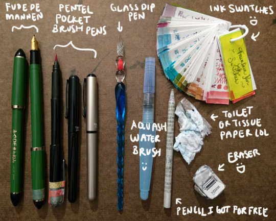
Fude de mannen: This is basically a fountain pen that mimics a brush for Asian calligraphy. It has a bent nib that enables you to change stroke thickness by varying your hand angle. I love this pen so much I got a second one so I could have a different colour; the washi tape helps me tell which one it is. You can see more of it in the video interview I did with PindotPress.
Brush pen: A pen that is a brush. lol. A number of companies make them; I use the Pentel Pocket Brush because it's the first one I tried and I liked it a lot. It's smooth, has great line variation, and the tip has yet to fail me. (Although the cap started falling apart, hence all the tape on my first one lol.) I currently have three: one for permanent black, one for permanent red, and one because I couldn’t resist buying a coloured version of the pen (I have Diamine Earl Grey in it right now).
Glass dip pen: These dip pens are pretty but what is super awesome is that they are super easy and fast to clean. I can quickly switch between multiple colours of bottled inks. The grooves in the nib hold ink, so you need to slightly turn the pen as you go to access all the ink. You can also get a wider stroke by slanting the pen and using the side of the glass nib. It's not that easy to control your lines, but I actually like this because it creates a lot of happy accidents. And “oops well damn" accidents, but like I said I’m trying to cultivate the whole “learn to let go" mindset.
Waterbrush: Basically a brush that carries its own water reservoir. I’ve used a few different brands but I find I like the Pentel Aquash small the best. Some people fill them with ink like a brush pen, but I’ve not really done that. (I did it once with a different brand that was harder to open/refill and I got mad.) I use it to paint with the inks.
Pencil I got for free: Unless I really am just doodling, I usually draw base pencils of some sort, even if it’s just a very rough, light sketch or a quick thumbnail on another sheet of paper. Every so often I get an inquiry asking what special kind of pencil I use, but I’m afraid they’re just normal pencils rolled with recycled newsprint. I got free samples like a million years ago and I have been using them forever. (I think I’m finally down to my last three.)
Eraser: I’ve been trying a few different ones but it takes me forever to work through an eraser. You want it to be able to pick up the lines without requiring you to scrub and take the ink too or destroying the fibres of your paper. This one actually works pretty well. If you’re really curious you can see the non-destroyed packaging here! lol
Toilet or tissue paper: Something to pick up the water. This is my "undo button” in real life when I’m painting/using the waterbrush. Also I drown everything with water so it’s very important.
Ink swatches: Every time I get a new ink I make a sample and add it here. It’s great for colour palettes and when I’m looking at other inks and trying to decide whether to get it or not (e.g., is it different from everything I already have? My definition of “different” is very generous...). I don’t actually have all these inks; some were samples from friends. I’ve found I tend to gravitate towards very complex, nuanced neutrals. (This sounds so sophisticated but when you see them all it once it's like. Oh. Apparently I like shades of grey, brown, and other hard to classify "muddy" or in-between colours lmao. But more on that in a bit.) Lately I've been getting glittery inks because they're fun and they add a magical dimension to the physical piece.
Here is my current selection of inks - on the shelf to the immediate left of my laptop and my head as I am typing this right now. The box at the bottom left is all the samples.
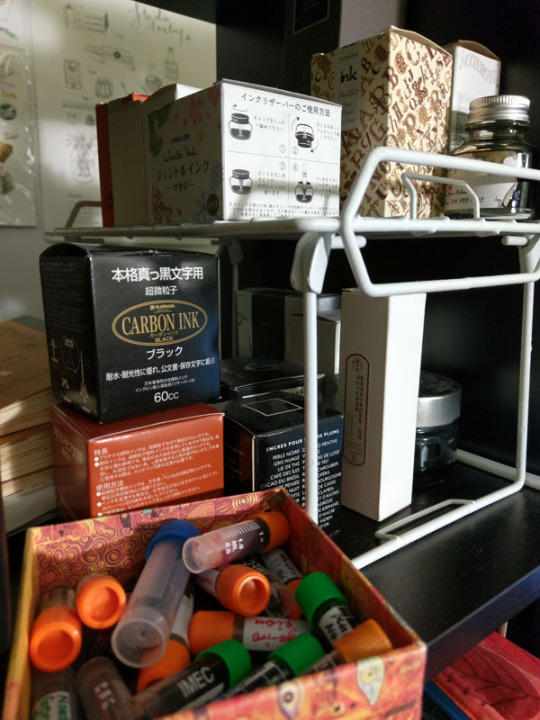
My approach
In my mind, I broadly classify my approach into two categories: “dry” and “wet”.
"Dry" - ink only, no water. I have pretty unsteady hands and hate "inking" - if we think of inking as an exercise in achieving a "clean", controlled line drawing with consistent line width/stroke thickness, neatness, etc. So I love pens that support me in what I think of as controlled loss of control - wide variations in brush width and stroke character. Brush pens and fude de mannen pens are perfect for this. They have lines that offer a wide range of dynamic, organic, and textural opportunity. My Inktober illustrations fall into this category. A few examples below, followed by links to the full set.
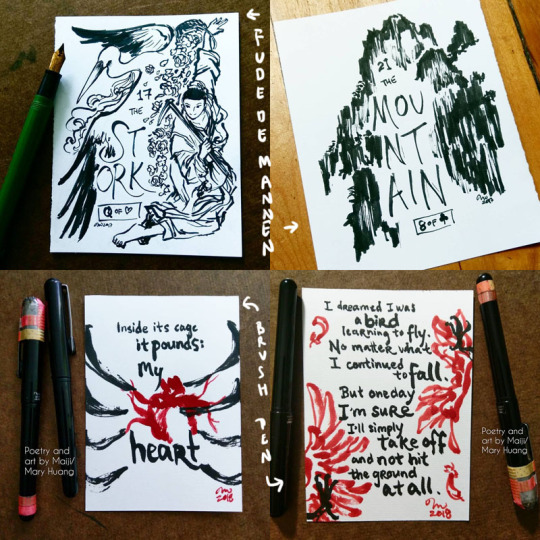
Inktober 2017 - fude de mannen
Inktober 2018 - brush pen
"Wet" - Basically I blob water around. Depending on when I do it (before, with/during, after the application of the ink), you can get different results. The water causes the ink to bleed, semi-watercolour-like, and can be used for shading, environmental effects etc. For obvious reasons, this works best with non-waterproof inks (which the vast majority of fountain pen inks are), but you can do this even with waterproof inks. Just let the ink hit water before it has a chance to soak into the paper and you can get cool effects :D. And you can also do it with other pens too, not just fountain pen inks. Examples:
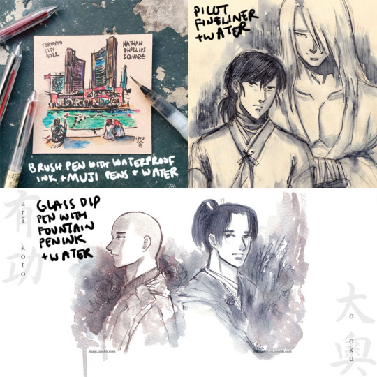
Tiles of Toronto urban sketch series
Raizen and Hokushin doodles
Arikoto from Ooku
As you might imagine, this is really great for on-the-go drawings, because you just need a pen (or a couple of pens) and a waterbrush.
The “wet” approach is also where the very complex inks that look "boring" (greys, taupes etc.) are just complete magic. When the dye elements separate, other colours emerge, and you get really wonderful textural effects and rings of colour where the ink pools and dries. Diamine Earl Grey is a colour I've mentioned several times that I LOOOVE because it separates into blues, browns, purples, even pinkish tones. It's a gorgeous ink. You can see some examples and closeups here.
Another colour that does this really powerfully is Sailor Rikyucha. It’s a dark tea brown-green that separates very easily into pale blue-greens and more and has amazing tonal and textural qualities. The Tendril Wreath illustration here really shows this.
For the most part I look at things I like and then experiment to figure out what happens. After working with the same tools for a while, you get a sense of how the different elements might react and respond naturally. The Genjimonogatari series employs both dry and wet extensively and is an example of the experimenting and playing I’m doing - I keep finding new aspects to the inks I thought I knew, and making “interesting” mistakes. And trying to fix them as I go with varying levels of success, haha. But I’m always learning!
One more thing about this hobby
I feel compelled to finish with some talk about the pure aesthetic appeal, or the MULTIPLE LEVELS OF FUN I get out of these inks. Not just the colour, not just how the ink behaves, but... the name of the ink as well! Some inks do this more effectively than others. Similar to how the presentation of a dish is part of the experience, the name of an ink adds so much to my enjoyment of it. My least favourite ink names are [standard adjective]+[standard colour name]. My favourite ones are really convoluted with literary and poetic references, I just love them hahaha. Asian fountain pen inks I find tend to do this especially well - partly because of how much you can pack into how few syllables, I suppose. It makes me sad that a lot of sites don’t include the original names, often referencing them with just a number, though I understand it is difficult to translate. But I learn a lot with these names as a starting point! For example, Zhenjing, which I mentioned recently in the Kurama “Light” illustration, took a bit of back and forth with my parents to look up the source and then to interpret the complex line of poetry. It was a fun and fascinating exercise.
A great name can’t save an ink I don’t like, but a good name elevates an ink I do like even more, and it can be really inspiring for making stuff. For example, take Pen BBS Mirrorflower Watermoon. I adore the colour of this ink - it's a very subtle grey-pale green with silver flakes. I used it heavily in the Hokushin fanart “Northern Deity” (you can see it here with photos of the sparkly).
The name is actually highly recognizable if you're familiar with classic East Asian literature/poetry. I read it out loud to my parents with no context other than "this is the name of one of my favourite ink colours" while they were eating dinner and they both said at the same time, "I know this! DREAM OF THE RED CHAMBER!" lmao. It's a very Buddhist idiom or phrase referring to the illusory nature of things, likening it to the reflection of a flower in a mirror or the reflection of the moon in water.
I hope this was interesting and helpful! ^^
#art supplies#logicheartsoul#replies#reply#fountain pen ink#ink#waterbrush#brush pen#fude de mannen#art by Maiji/Mary Huang#how I work#process
21 notes
·
View notes
Note
Your colours always look so vibrant and saturated, I wonder how you achieve this with pencils. Do you use regular pencils or pastels? Also it looks like you mix a lot of colours together to have another one, is this true? It always comes out so good, I want to be able to colour like you one day!! ^__^
Th ANK you!! Apologizes for being slow to respond gjkfd I appreciate it, sometime I think my colours get a bit muddy but hey that’s half the fun of experimenting! You can only get better with practiceUm I’ll answer this under a cut so I can show some pictures? I’m not really a good teacher but I’ll sort of explain what I do
For pretty much all my layton work I use woodless colour pencils (I believe the brand is koh-i-noor?) that I’ve had forever, but also random pencil crayons if i want specific colours (truly I need to organize them more lol - I sometimes use stumps/smudge tools (those little paper pencils) to help smooth out surfaces on the paper, or honestly just my fingers very gently. Or a light watercolour wash helps to just give the entire image/the background or foreground one toneTake everything I say with a grain of salt because this isn’t like THE way to do it - in fact I’m sure there 100 more easier ways to do this, but this is just how I’ve always worked… (which has its advantages and disadvantages)
I do layer colours to get another one! Nothing is really just one colour and it looks really flat to me if you just colour an entire surface with one colour and then one for shading… so for example on the last pic I posted this is how I colour layton’s skin (excuse my crappy phone pics)


So, basically building up warm (or sometimes cool) tones to have the surface look dynamic and more alive? Yellow undertone, light brown to build skin tone, red to add blood to the face, then dark brown to create the desired skin tone… I follow a similar pattern for colouring most things - but often I’ll go back and adjust colours all over the drawing as I go so everything looks right next to each other - like my darks are dark and lights are light and shadows are where they need to be
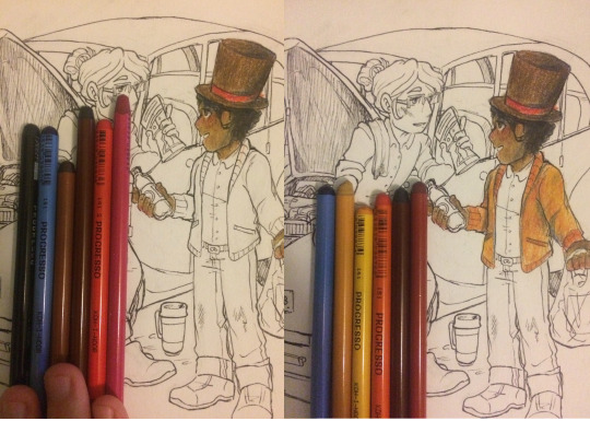
and so on and so forth….then when the pictures done I tweak it digitally because my scanner rips a lot of the saturation out of my colours - I usually exaggerate them a little more too because these images are going to exist online and mostly be seen by people online so I think it’s important to consider that more instead of “does this look EXACTLY like the original drawing”So I scan it and it looks like this:
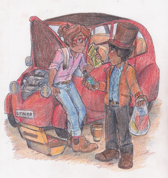
So adjust it digitally (I just use a free version of Photoscape X for mac and like the basic editing software already installed for final tweaks…) and if I left it looking closest to perhaps what the drawing looks like in real life it’d look like this

but that looks a little flat and lifeless compared to how you can see it in person and see it in different light/up close/without the filter of the computer screen so I adjust temperature, contrast and saturation until it looks good as a piece
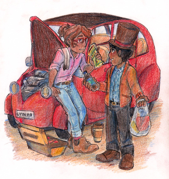
and yeah! I’m sure I didn’t really explain that super clearly but I hope this was some kind of helpful or at least interesting to look at hgkjfds thanks so much for your super kind message I tried hard to answer this best I could
46 notes
·
View notes
Text
81/100 - Giving ourselves focus and love by choosing one word for the year
This is very exciting for me to write about : I’ve never really done it.
A little bit more than five years ago, I just had discovered the incredible work of Dr. Brene Brown on vulnerability and courage, and it simply blew my mind. I felt like I was reading about one of the most important things I could ever educate myself on.
The books and her TED talks already had changed my daily life in subtle touches, but I wanted more. I also knew I needed more. I was afraid to forget about it in the next few months and hated the thought. So, I took some time to reflect, and over a couple of weeks, came to a big decision (especially for me who used to be commitment phobic in so many ways).
I would spend a year learning courage.
It became one of the most exciting years of my life. For me, learning how to be brave was essentially about saying yes to a lot of things I would have usually say no to out of fear, and no to a lot of things that would bring me comfort in the moment, but preventing me to do things that really mattered to me in the long run.
I tried out a lot of activities I had never tried, but felt curious about like climbing, sewing, baking pastries...
I paid a lot of attention to those moments where I would feel afraid, ashamed or uncomfortable, and pushed myself to be brave in my way of dealing with them.
Choosing to tell a friend that I was feeling hurt and set a boundary rather than silencing myself in hope it doesn’t happen anymore.
When really down, channelling more energy to do anything that would bring myself self-loving comfort rather numbing comfort.
Breaking off relationships that felt depleting to me.
It was a tiring year, sure. But it was also one of the most empowering ones. Each time I would choose the brave path instead of the comfortable one, I would feel stronger and more centred. Embodying the experience of bravery, training those courage muscles.
I realised at the end of the year, when I was feeling really sad about seeing what I called my brave year coming to a year, that I didn’t want to give it up, but I also didn’t want to repeat it as is either. I also noticed that overall, being brave for me had a lot to do with exploring my creativity.
So I decided to make the next year my creative year. I had so much fun!
I started taking way more photos, tried to learn guitar and piano for a while, spent a few months sewing like a crazy person, I wrote more that year than in the decade before, and towards the third trimester of my year devoted to creativity, started to paint with watercolours and do the lettering you can now see on my artsy Instagram account.
Both activities were those bringing me the most joy while allowing me to let my guard down : when painting, I was less attacked by the voices in my head trying to bring me down and discourage me. (ah, the joy of defence mechanisms bullying us...) I was finding more easily ways to bypass them than in any other setting.
I noticed that creating (and doing anything that mattered to me in my life) was only possible for me when I would take good care of myself. When I would commit to loving myself everyday by showing up. But self-care was so hard for me...
So... Yeah you guessed it, I took my practice to a new ground by declaring the following year my self-care year.
I had just discovered the existence of the Find what feels good channel on Youtube a few weeks before, I had ended my creative year with The artist’s way, a 8 weeks program using Julia Cameron’s wonderful book to discover or recover our inner artist, which had taught me how to journal in a way that would connect myself to my heart better than ever. And I had dabbled for a few years on and off with meditation. I had all the tools lying before me already.
As often when we live an intentional life, the Universe (or call it luck if you’re more comfortable) was helping in subtle ways that can only be noticed when we pay attention to the opportunities we are presented with, and allow ourselves to take them.
So I did just that. I finally found the courage to take better care of myself and making it a priority. That year was full of softness and whole heartedness. It felt like discovering the essence of who I was.
Since I was struggling with commitment (still), I focused on one self-loving activity at the time. A few weeks mostly meditating. A few weeks mostly doing yoga. A few weeks getting back to journaling. I thought I could choose which activity I would keep, but realised they all were giving me so much, and yet so differently that I wanted to keep them all.
I would still create more and more, and take my work as a psychologist to another level, and was struggling to make everything fit in my daily time. Now that I knew better what kind of life I wanted, I felt stuck at making it work as a whole.
So I dedicated last year to finding Balance. I loved it so much. It was like deepening everything I had built in the previous three years. The courage, the creative energy and the love.
It taught me how to be more flexible and finding way to make things stick, one step at a time, one day at a time and to honour my pace. I set up a few challenges to help on the way. Strengthened my morning routine that felt easier and more necessary than an evening one (currently working on that).
I explored how my love for art, psychology and writing could be intertwined. It felt like coming home to myself.
This “year” actually took a little bit more time. I used to choose my word of the year at the end of summer. But last September, I felt stuck. I had just moved to the other side of the globe (another marvellous consequence of all that personal inner journey), felt completely thrown out of balance and quite depleted.
Then, a few weeks ago, after a few months finding my footing back, it was suddenly obvious. What I struggled with and had to practice the most lately was letting go : finding ways to trust myself, my intuition and the process. I’d say in short : trusting the universe and finding the flow.
So this year will be my year of flow.
I started by deciding that my practice could now fit better at the beginning of the year rather the school year, the end of the year being a perfect time to reflect and gather our bearings, taking stock.
When I’m down, finding flow is about giving myself the time and space necessary to heal, letting go of the shoulds and musts.
When I’m really happy, it’s more about finding pace, not over doing it.
It is already teaching me how to let go of things, people and spaces that were really important at a time, but became depleting over time. I have never ever felt as free and can’t wait to see more of what this year is going to teach me.
Choosing one word to devote every year to has with no doubt changed my whole life from the inside out.
Like a soothing lighthouse in the dark, it gives me a focus point to always rely on.
I am never feeling like time passed by without my awareness anymore, being intentional makes time pass more slowly and mindfully. It is helping me to remind myself over and over what is important, and what gets in the way and distract me. It is teaching me more about myself than I ever felt possible. It is allowing me to create the life I really want.
If reading that essay inspired you to find your own word, I would love nothing more than to know which one you chose and maybe why f you would feel comfortable sharing.
Here are a few questions that can help to start :
What are you feeling like you lack of?
What would your ideal 2019 be devoted to?
What is preventing you from living your best life right now?
Write your answers down and any word that come up too : it will help you a lot to make it real, tangible.
The right one for you will spark something in your body when you write it or if you start making art around it. Let yourself feel it, and trust it. Your heart knows.
See you soon,
Love,
L.
#intention#meaningful#personal#personal journey#focus#100 days project#100 days of writing#the happy mess project#psychologist#counselling#therapist#bravery#creativity#self learning#self care#balance
2 notes
·
View notes
Note
I saw the cleaned version of eden zero that u did and I was wondering if you can make a tutorial on how to remove all the texts and other stuff please
ohhh cool?? yeah dude! this was my first edit, so i’m by no means an expert? there’s probably a much better (and easier) way to do things. i kind of wish i recorded my process now bc 90% of the time i was just winging it and hoping for the best.
btw thank you for the ask! man, if tutorials are something you guys are interested in maybe i’ll actually start recording my process? idk. let me know!
ps: this got so long i’m so sorry.
1. think about changing your phone’s lock screen and decide to make your own from a magazine cover. get upset that a bunch of text covers the pretty art and bE VERY DETERMINED TO FIX IT.

2. open it in your art program (mine is clip studio paint! highly recommended) make a duplicate layer of the cover. use one layer to work on and the other to keep tabs on all the changes and see the progress you’re making!
3. hide your reference layer and erase all the obvious text and disrupted background on your work layer. i used a large, hard edge eraser and roughly took out a big chunk.

4. then you’ll need a steady hand, lots of guesstimating and a small eraser along the lines (or where you think the lines would be, like i had to guess where shiki’s hair lines were). this might require a lot of crtl+z and patience hahah! get between all the little gaps too.
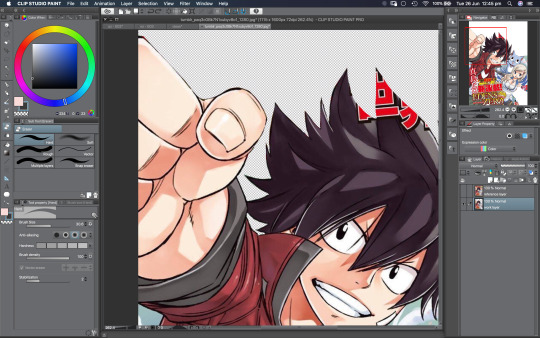
5. i had to make the decision of whether i wanted to keep this background or make an entirely new one. but i loved the gradient and clouds; i wanted to keep it as close mashima’s original as possible. so this is what i was working with. i was able to keep parts of his background where it didn’t have any text.

6. a blank background was kind of distracting to me, so my next step was to match the gradient. make a new layer underneath your work layer and use the eyedrop to match the colours.
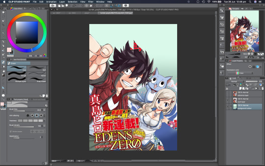
7. now get ready. the next part is a little difficult? bc you have to try and match mashima’s brushes and pen strokes? i used a thin G-Pen for the lines. and used the eyedrop tool to match the line colour.

8. make a new layer! in the screenshot below you can vaguely see my line work over the text. i have no advice on this. you just have to guess where the lines will go. hope for the best. pray.

9. add another new layer! again, use the eyedrop tool to match the colours. use a hard brush to make a base layer for the colours to cover the text. attention to detail is key.
10. make another new layer over the base colours and you can add mashima’s watercolour(ish) shading style. it makes his highlights and shadows look a little softer.

11. add another layer over your background colour. add your clouds. this requires a lot of experimentation. this part took me the longest tbh.
12. add a few more details and fix up parts you might have missed (like that red text near shiki’s arm i literally almost forgot till the very end lmao).

13. another layer! add your cherry blossoms. beautiful.

done! don’t forget to add your signature.
have fun, anon! i hope this helps you out a little!
45 notes
·
View notes
Text
2018: My Favourite Tools.
I’ve reviewed my 2018 planners and explained what I have lined up for 2019 in my recent posts and this got me thinking about all the tools I have used this year. 2018 feels like a year of consolidation. I’ve acquired less stationery and tried to focus on using what I have stored in my drawers and cupboards. Today’s post is reflective and about sharing my year in stationery.
My paper use.
I use a lot of paper and I always feel like I have too much paper on the go. I enjoy trying out new notebooks and paper stock but I also like what I like.
Baron Fig notebooks have become a staple in 2018. I use one Baron Fig Confidant as a journal, at the moment this happens to be the big Fig, or the Baron Fig Plus (small side note, I really wish Baron Fig had called this the big Fig). I also use one of the Confidants or the Vanguards for work because the paper works so well with pencils, ballpoint or rollerballs as well as fountain pens. I like that I don't have to consider my writing tools at work.
I thoroughly enjoy using the Travelers Company notebooks. Their paper is high quality and is perfect for pairing with fountain pens. I enjoy the cream paper, which is not to everyone's taste.
I have used a lot of Field Notes notebooks this year but this is because I have a lot to get through and not because I am a super fan. My love of Field Notes has waned over recent years. I buy what I like, the Coastal edition was a favourite of mine this year, but I am no longer concerned with acquiring any notebook that they release.
Finally my exploration into sketchbooks has expanded my experience with paper. Finding what I like to sketch on, what paper works best with watercolour and coloured pencils has all been part of the journey. Currently I am using a pocket Baron Fig Confidant as I am mainly sketching with pencil and black pen and I was interested to see how I fared with a small sketchbook. I think as I go into 2019 I will only increase my knowledge in my sketching materials and really find what works well for me.
2018, the year of pencils?
My pencil use has increased a lot in recent months. I use these mostly with my pocket notebooks for daily note taking but there is also sketching use in there too. I tend to use one pencil for a while and then rotate when I fancy a change. Lately I have been really enjoying the Tombow Mono 100 2B. The softer graphite is not usually a pencil I am drawn to but this pencil is so smooth to write with.
I have loved using the Blackwing 54 in part because of the colour choices with this pencil and the hard graphite that makes it a great note taking pencil.
The Craft Design Technology pencil has been another favourite. The mint coloured barrel is just beautiful. And finally the Staedtler Mars Lumograph in H, I love this pencil for its simplicity and its ability to hold a point. It’s an old reliable.
Fountain Pens and Ink.
This is one category where I’m happy with what I’m using. Unusually, I don't feel a pull to acquire more pens or inks and find joy in using the pens I have.
The Lamy LX with Sailor Blue Black is my go to fountain pen. I have been using this combination for most of the year, it just works.
The Pelikan M400 and Sailor Wagu-Uguisu is a great match. The gold nib, and the softness when writing means I get a good view of the green Sailor ink and can appreciate the shading. It’s so much fun writing with this pen and I usually admire my scrawl once complete.
Finally the Kaweco ART Sport inked with Pilot Iroshizuku Ina-Ho. I love this combination as the colours work so well together.
Drawing Pens.
The final category that I felt was worth a mention was drawing pens. In my effort to learn how to draw, drawing pens have been vital tool that I now use more than I ever have. They are so versatile and useful to have as part of any stationery nerds toolkit, but for drawing they are a dream. I have used fine tip drawing pens and brush pens to experiment. The Tombow brush pen has been a personal favourite and the Faber-Castell PITT Artist pen continues to be my preferred sketching pen. Recently I have tried a Pentel marker and the Pilot Finerliner to experiment with line width.
Overall thoughts.
My tools of choice have changed a bit this year which is down to a shift in the way I use my analogue tools. I used to be fully immersed in fountain pens and ink and couldn't get enough, but now I happily use other tools alongside my fountain pens. They all have a certain purpose. I’ve been most surprised by how much I have used pencils and that’s in part as I am sketching more now, but also because they’re so easy to use with a pocket notebook. It makes my daily carry easy.
2018 has been less about acquiring new things, although I have done a bit of that, but more about finding what I like and using it more and more. In 2019 I want to continue this and really hone down the tools I enjoy using.
Finally I would like to say a big thank you to everyone who reads, shares, likes and comments on my posts. I really enjoy sharing my thoughts on stationery and hope you enjoy the content. I'm looking forward to sharing even more in 2019!
#Baron Fig Confidant#Baron Fig#Travelers Company#Field Notes#Blackwing#Tombow#Faber-Castell#Staedtler#Lamy LX#Pelikan#Kaweco
1 note
·
View note
Text
R Sweathha Final Project Commentary
Our final project for this module was a branding project – either rebranding the CNM department or creating a personal branding. I was immediately drawn to the option of creating a brand from scratch based on my self-identity. I thought it would be a fun challenge for me to break myself down to analyze what made me ‘me’ and designing a brand for myself.
The first step was brainstorming. I decided to jot down any words that came to my mind when I thought of myself. They were any words that portrayed my personality, my values, my likes, my passion and hobbies and even aesthetic. Drawing inspiration from the way I decorated my room and the type of designs I gravitate towards online/on Pinterest, I also briefly wrote some words to describe the style and colours I preferred.

Jotting everything down helped to make the process so much easier as I was able to see the ideas and concepts that I was more drawn to. Soon, I decided on the main concept that I wanted to portray.
I have an extremely sweet tooth and I love anything chocolate, cookies, cupcakes, muffins, and the list can go on. Something I enjoyed just as much sweet treats, is to bake for my loved ones. Not only does it give me so much joy to put in my time to make something with love for the people I care about, but baking has also been a great stress-reliever for me these past 8 years. Hence, I wanted to portray this in my design in order to highlight my love for sweet things, my inner child as well as my creative side. I wanted to incorporate this concept with a design style that would portray my calm, soft and friendly side as well.
Logo
I knew I wanted to try playing around with my initials, S and R, as my name is a bit too long for a logo. With that in mind, I began by sketching out some ideas.

For the cupcake sketches, I found that the focus was entirely too much on the food and the logo looked like a bakery’s logo rather than a personal branding. Finally, the winner was the fusion of the letters S and R vertically with the two legs of the R forming a part of a cookie, as seen below.

To make the logo, I used Illustrator. I used the Text function to create 2 separate text boxes with the letters S and R respectively to use them as a guide. I then lined them such that they overlapped vertically first. In order to customize the letters as much as possible, I first used the Glyph function to find a variation of the S with a little hook on the top. Then, I used the Eraser Tool to erase parts of the letters that did not fit well and that I wished to manually adjust. Following this, I used the Paintbrush Tool (Calligraphy Tool) and Pen Tool to manually redraw these areas. I was still not satisfied with the way the R was turning out. Thus, using the lines I had drawn using the Pen Tool as a mere guide, I used the Paintbrush Tool (Calligraphy brush) to once again manually redraw the strokes of the R as well.
To jazz up the S a little more and add some elegance, I chose a Glyph of the letter S from the font ‘Vladimir Script’. I grabbed the Eraser Tool to erase off almost 90% of the letter and was left with just the tail end. I then joined the tail end to the S and used the Width Tool to adjust the thickness in different parts accordingly until I was satisfied with all the widths in the various parts of the letters.
After this, all that was left was the circle encapsulating the initials and the cookie bit. For this bit, it was just a lot of exploring. I learnt that it was really just a process of trial-and-error as a lot of times doing up the design helps me see what works and what does not. I mainly used the Ellipse Tool to form the circle in some of the designs, and the Paintbrush Tool to manually draw out the cookie portion. As seen below, I came up with many variations, each working from the previous design. I also explored some designs using the Paintbrush Tool in the Watercolour paint stroke.
After much trial-and-error, the image below is the final logo that I settled on as I felt it best presented the concept I wanted to. Based on some feedback from Week 11’s tutorial, for the cookie, I drew it with a bite taken out of it as some peers said that without a bite, the cookie might look like a pizza slice. I also ended up going for a watercolour brush stroke for the circle as I felt that I portrayed the soft and minimal look I was going for very nicely.

Colour Palette
I knew I did not want bright, loud colours. The colours should also match the theme of sweet treats – in this case the cookie. In addition, I wanted the colours to also be friendly and give a down-to-earth feeling.
The primary colour palette are colours that are predominantly used in all the designs, collaterals and assets.
I also included a secondary colour palette so that these colours can be used for any additional or alternative collaterals, or to make any assets to be included in collaterals.

The off white, beige and baby pink shades convey peace, simplicity and softness respectively, which is aligned with my branding. The various shades of brown not only are appropriate to represent cookies and chocolate, but also portray earthiness which can be tied to portraying a down-to-earth personality. The pure black acts as a nice contrast colour that is appropriate to be used for any important or lengthy texts in collaterals, for simplicity, elegance and easier readability.
Typography
Deciding on the typography was an arduous task as it was necessary to pick typefaces that complement each other well whilst portraying the brand identity well. I learnt just how important choice of typeface is in any design. I went with the Segoe Script as the primary typeface for headers. This script font looks very elegant, yet not dramatic hence looking friendly and approachable. For the subtitles, sub headers and body text, I wanted to go with a San-serif typeface to complement the script typeface. Thus, I chose the Segoe UI – its four variations of Regular, Semi light, Semi bold and Italics in accordance to the needs of the collaterals.
Name card and Resume Sketches
I sketched out a few sketches of what I envisioned. I knew that I wanted to include cookie designs to add some creativity to my name card and resume.
Name card
For the cookie, I started with the Ellipse Tool to draw out a circle for the shape. Then, I used the Warp Effect to get a cookie shape that was more realistic looking – an irregular circle that has a bulge.
I followed similar steps to achieve the chocolate chips on the cookie. For cookies with a bite taken out of it, I used the full cookie I had created as a guide, while using the Paintbrush Tool to draw a few variations for me to choose from.
Following this, I arranged a full cookie and a bitten cookie in an alternating order on a vertical line, around the 1/3rd mark of the name card. Then I used the Text function to add in the textual information I wanted to add in the name card and in the image below you can see the front and back of the name card.
Resume
I first made the different assets I needed – different cookie designs to act as the bullet points and to display skills level, as well as the phone and mail icon. For the cookies in the various sizes and styles, I followed the same method that I had used to create the cookie design for my name card. For the phone and mail icon, I used the Shape Tool, Pathfinder Tool and Curvature Tool to form the shapes, combine them and adjust the curvature points for smoother gradients and connecting lines.

Then I placed the phone and mail icons I made on Illustrator in my InDesign Resume file under the header section.
Following this, it was pretty much just arranging the information neatly in the way I had planned. To showcase the skills, I was inspired the ‘5-star rating’ concept and translated that in the form of cookies. Therefore, if 3/5 cookies were filled with colour, it meant I was rating myself 3/5 for that particular skill.

Through making the resume (and the final Brand Style Guide), I was really able to explore the functions of InDesign and I especially found the ruler guides extremely useful in ensuring neatness. By the end my file pretty much looked like this with guidelines everywhere but it also ensured alignment.
Brand Style Guide
Finally with all my assets and collaterals done, the final step was putting it all together in the form of a Brand Style guide. This process was mostly a trial-and-error process of trying different variations of presenting the information to figure out which was satisfactory.
Critique and Feedback
After the Week 13 Final Pitch, I had received some valuable feedback from my peers and tutor.
Firstly, Merlin had pointed out a small “white” gap in the watercolour brush stroke around my logo. I zoomed in as much as I could to double check on this and found that the “gap” was in fact not a hollow white gap but it was merely a lighter shade of brown/beige (as seen in contrast with the white background) as the brush stroke is imitating how a real watercolour paint stroke would look like.
Therefore, I did not feel that there was a need to go over that area to purposefully fill it in with colour and hence left it as it was.
For the name card, the first feedback I had received from a peer was that the logo and name on the front was a bit disproportionate. Taking this into consideration, I played around with making the logo smaller in the name card. I did find that it looked better now and hence finalised this. The second feedback was that the excess design of the cookie was hanging outside of my name card. As it was such a small part, it was a mishap on my part and I went I correct that as well for my final name card.
For the resume, I had received feedback that it was looking a bit too cluttered. To address this concern to make it more comfortable on the eyes, I first removed skills that were not high. For instance, initially I had included Premier Pro with a 2/5 cookie rating. Realistically in a resume we will not add skills that are not as good as we do not want to highlight them. Hence, I removed this skill entirely from the resume and this gave more room in that section as I redid the spacing between the different lines. Following this I also reduced some of the font sizes that were initially at 15 or 16 points as they did look too big. After reducing some of the sizes and moving around to better adjust the spacings, I feel that the final prototype looks significantly less cluttered and more comfortable. I had also received feedback that the headers (“Experience”, “Education”, etc) did not stand out enough. Hence, I changed the font from Regular to Bold for the headers and went with the darker brown colour from my colour palette.
Overall, all the feedback I had received were very valuable in pointing out certain things that I may not have considered or may have even missed out. Using the feedback to play around and figure out what works for me also allows me to go through another round of self-critique. These processes allow for the valuable refinement of work to produce the best version as the final prototype.
Final Thoughts
Through this project I was also able to experience what it would be like to go through the process of branding from start to the end prototype, and this is especially useful and insightful to me as a marketing student. This will definitely come in handy when I work in marketing/publicity/public relations role for future internships or full-time job. Various companies go through rebranding processes and I am now better equipped with the knowledge and I am confident in my ability to contribute.
While this project was extremely intimidating and pretty exhausting due to the amount of assets and collaterals that were required, it was truly a rewarding and fun experience. As this final project was also a lot more extensive than our Assignments 1-3, this really allowed me to dive deep into the Adobe applications and the various features/tools as I explored them while designing my assets. This has only piqued my interest even more as in the process of exploring, I have had questions that emerged that are still unanswered. Designing takes times and a lot of practice, and I know that through this module I have only scratched the surface. I look forward to exploring and self-learning more about these applications in the near future!
0 notes
Last Seen Blogs
fistfigght
Don't Give Up
bwtmibuchireo
Boardwalk Territory

hooligan74
Untitled
scarlett-starr
Court of Darkness Fan