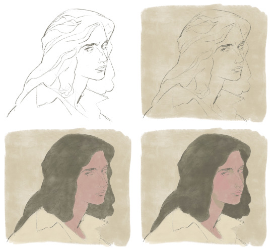
#the image is like.. super simple and basic. but it's fine.
Text
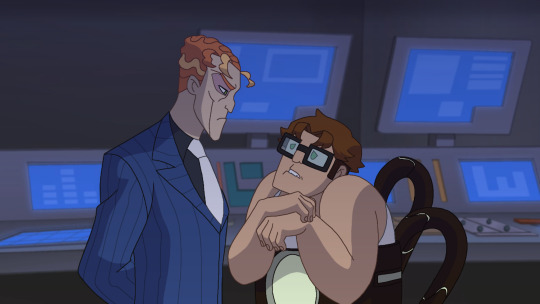
"Doctor Octavius."
Ah. His boss, Norman Osborn.. What was he doing here? He hardly ever came down into the labs himself.. He sounded eerily calm compared to his usual bitter tone. That was.. not a good sign, to say the least. This put Otto on edge in an instant. Especially so as he was still wearing the arms, he began to panic, trying to find a place to hide to remove them, but there was no place in sight to run as Norman came into view. Otto jumped as soon as he saw his boss behind him.
"Oh no.. M-Mr.Osborn..? H-Hello, ah.. What, uhm, Wh-What brings you here? I-I thought.."
"As smart as you are, you hardly do think at all," Norman spoke, tired, stern eyes drop from the scientist's face to his twiddling hands, "A smart mind, you have, Otto. Although clever you are not if you think me stupid to not notice."
"..N-Not notice what?"
"Don't play dumb with me, doctor." the man turned his attention back to Otto, stepping closer and causing the other to shuffle back, “You must know why I’m here, surely.” He watched him, eying the way he trembled, eyes darting around behind thick, square frames as his mind raced to register what the man was referring. It was clear what it was even before he said it aloud, reaching a hand down and around to grip and raise one of the objects in question.
“Those funny little arms, Otto.”
Otto was sweating now, heart racing, although not nearly as fast as his mind. Didn't plan for this. He didn't think Norman would ever come down like this.. and find the actuators he did so well to hide every time he was done working. He was caught off guard, trapped in a checkmate.
“Th... S-Sir-- I--” Otto sputtered, bringing his hands up defensively as he backed up, heart racing as he rounded the table, all the while his boss had followed with that unchanging tense expression, the actuator limb in his hand. Otto's eyes darting from Norman to the actuator and back a few times, a clear desperate panic in his voice and face, “O-Oh dear.. L-Listen I-- I-I couldn’t have done all this work without them! You-- Y-You must understand! Th-There was too much for one person-- I-I needed those to--!”
“You need them?” Otto was cut off, bumping into a sizeable computing device. Parts that hung from it rattled in response, one falling off as Norman continued, Otto being forced to press into the console of the machine, “Need? Really? I beg to differ, Doctor.” stepping closer now, "I don't believe you ever needed them--”
Norman swiped another actuator, on the opposite side this time, yanking as hard as he could on them to get Otto up off the machine. He caught the scientist with his foot slamming harsh into the harness around his gut. Otto groaned and Norman leered down above him, hissing out his final words before releasing the arms and kicking Otto back into the machine with all the force he could muster.
“--and I don’t believe you’ll ever need them again."
#my art#phone art#doc ock#doctor octopus#otto octavius#tssm doc ock#tssm otto#norman osborn#tssm norman osborn#draw over#redraw#screenshot redraw#//long post#I wanted to do a little screenshot redraw thing again and this is the first one#also a snippet of my rewrite of the first chapter of the fic I was writing#the image is like.. super simple and basic. but it's fine.#I am not a writer but this is pretty good for a reworking of this scene
82 notes
·
View notes
Note
Fic request idea baby: what about Eddie with a gf who used to have an ED but she's doing better now but he notices that she's starting to relapse like skipping meals and he brings it up to her and just angst to fluff
+ Hey if ur taking requests:
what about if Effie's gf randomly stops changing in front of him like she's getting into pj and she goes to the bathroom and then starts asking for the lights to be off during sex and he's super confused and asks her about it and basically angst bc she's trying to hide it but may be she had a slip during ED recovery?
+ Hi lovie a lil request! What about Eddie with a gf whose in eating disorder recovery like she used to struggle but it's been a few years since then and she's don't just fine but he notices she's starting to relapse?

These three requests seemed to overlap just perfectly. The beautiful and talented @munson-blurbs was kind enough to write these with me so go shower her with all the love 💚
Warnings: eating disorders, body image issues, relapse struggles. Please, if you want or need to talk to somebody, I'm always here.
Words: 1.5k

You’re fairly certain you’re living on the sun’s surface.
Logic would say that you haven’t left Hawkins, but the temperature outside begs to differ.
“Christ, it’s like 1,000 degrees in here,” Eddie mumbles, cracking open a cold can of Pepsi and taking a swig. He plants a kiss on your forehead, careful not to disturb your reading.
You smile but keep your nose buried in the bridal magazine Nancy had bought for you. Page after page of wedding dresses had you swimming in a sea of white, each more beautiful—and expensive—than the last.
Oh, well. At least it would give you an idea of what to look for at your bridal appointment in a few weeks.
What truly caught your eye was an article tucked towards the back of the magazine. Its title boldly declares, “Shedding for the Wedding: Lose that Weight and Look Great!”
You shouldn’t read it. It’ll only upset you, only bring back the bad thoughts and routines and restrictions that you’d fought so hard to overcome. And yet you’re drawn to it, eyes scanning each fad diet for one that might help you.
No. Yes. No. Yes. Put the magazine down. Stop reading the diet tips and comparing yourself to the models.
But they’re so pretty and so skinny. If Eddie saw them, he might not even want to marry you anymore. Not when he saw how beautiful women were supposed to look in wedding dresses.
Maybe losing a few pounds wouldn’t hurt. One diet couldn’t be so bad. It would be temporary, just until the wedding.
It was totally fine.
“What are we thinking for dinner tonight, babe?” Eddie rifles through the pantry and pulls out two boxes of pasta. “We have bowties and rigatoni. I’m personally more of a bowtie man myself, but it’s your call.”
You shake your head. “I’m good. Just gonna have some soup.” Reaching around him, you pluck a can of Progresso off of the shelf.
“Soup?” Eddie wrinkles his nose in confusion. “It’s hotter than Satan’s tits outside.”
You shrug, trying to play it off casually. “Period craving.”
“You’re not on your period.”
“Well, PMS.”
Something nags at you—if you have to hide your new soup diet from your husband-to-be, maybe it’s not a good idea. Maybe you should put the can away and make pasta instead. But then you remember those gorgeous models, so svelte and sculpted and perfect.
Soup it is.
It’s harder to ignore the problem as more symptoms of the illness start to return. The first time you’d gathered up your pajamas and taken them into the bathroom with you, Eddie just assumed you were going to take a shower. When you emerged with bone-dry hair not two minutes later, he was puzzled. But he didn’t say anything, not wanting to come across as overprotective or overbearing. Maybe there was some simple excuse and he didn’t want to make you feel like you have to answer to him about every little thing.
Eddie can’t ignore that there’s a problem anymore when you slip back into one of your old habits that has always broken his heart. Sex was now lights off and you kept your shirt on. Eddie wanted to see every part of you, touch every part of you. He was going to be your husband and the fact that you didn’t want him to see this part of you—that he has made very clear in the past that he fucking loves—disheartens him.
Stress begins to build up within Eddie. He feels like he’s toeing the line because he doesn’t want to sound accusatory, but he also knows something is going on with you. And he has a pretty good idea of what it is. You try to hide how you pinch at your stomach and thighs, but he sees. The way you measure your wrists with your fingers all throughout the day. He wonders if you even realize you’re doing it, or if it’s reflexive at this point.
Though you never mention it, you always have your green journal around the kitchen. Eddie respects your privacy enough not to go through it, but reaching for the keys over your shoulder one evening he notices that you’re making a list of what you’ve eaten that day. His stomach sinks as yet another familiar pattern emerges from the days when your disorder was at its worst. Your fiancé is coming closer to his breaking point and he still doesn’t know what to do or even who to go to about this.
The final straw though is when you turn down girls’ night with Nancy and Robin at the Cheesecake Factory. You lived for nights out with your two best friends. They knew you almost as well as Eddie did though, so he knew you wouldn’t be able to sit down at a restaurant with them and bullshit your way out of not eating a proper meal like you should.
Eddie knows now he has to say something. Anything, really. When you walk out of your shared bedroom in sweatpants and a baggy t-shirt, Eddie chews on his bottom lip as he mentally prepares for the conversation he knows needs to happen.
The moment you sit down on the couch, Eddie sits next to you. You reach for the remote but your hand doesn’t even make it to the piece of plastic before Eddie speaks.
“Can we, um, talk?”
“About what?” you ask, sitting back against the couch cushions.
Your fiancé leans forward, his elbows resting on his knees. He rubs his hands together and his tongue pokes out of his pouty pink lips like it does whenever he’s concentrating on something.
“I’m worried about you, babe,” he finally says. “You’re not yourself.”
Eddie doesn’t miss the way you reflexively shrink in on yourself.
“I’m just stressed with wedding stuff,” you say.
“That’s why you didn’t hang out with Nancy and Robin?” Eddie asks, raising his eyebrows.
“Mhm.”
“And all the pinching and not eating and not wanting me to see you naked? Is that because of wedding stress, too?”
You turn away from him and pull your knees to your chest, but he moves to face you again. “Baby, I know something’s wrong. And the last time I saw you like this, it was because…”
“I told you, I’m fine,” you snap. “I’m just stressed. Maybe if you spent more time helping me plan and less time planning stupid campaigns for a game you played back in high school, you’d understand.”
The accusation is unfair, and you know it. Sure, you’ve been doing most of the planning, but he’s been there every step of the way.
Eddie winces at your harsh tone. He looks like he has a rebuttal but gives up after a moment “Fine. Let’s just go to bed.”
Guilt from your outburst wracks your body and holds sleep hostage. After tossing and turning for a little while, you hear soft cries coming from Eddie’s side of the bed.
“Eds?” Your heart leaps into your chest. “What’s going on?” You give him a hug from behind, latching on like a koala to a tree trunk until he turns to face you.
Even in the darkness, you can see the way his eyes shine with tears. “I know you relapsed and…and I don’t know what to do,” he manages through his sobs. “I don’t know how to help, so I just stand there like a goddamn idiot, but I can’t keep pretending like nothing’s wrong! I can’t keep pretending that you’re not hurting yourself!”
He knew. The whole time you thought you’d been protecting him from the truth, and he knew.
You wipe at his cheeks, feeling the moisture on your palms. “I’m sorry.”
Eddie shakes his head. “‘S not your fault, I know it’s not, but…you need to get help for this. I can’t lose my girl.” He presses his lips to your forehead and lets them linger there, holding you as tightly as he can. “Please. Please.”
No. You need to lose weight. You need to look good; no, perfect in your dress. All eyes are going to be on you, and you can’t show a single flaw.
The argument sits on your tongue, defensiveness ready to spring into action. But then you see his brokenness, his vulnerability as he unabashedly wears his heart on his sleeve.
Skinny. Skinnier. Skinniest.
But then—Eddie.
Eddie, who laid his heart out for you. Who let down the walls he’d spent years building just so he could receive your love. Who felt your pain despite your best attempts to shield him from it.
Maybe you weren’t ready to get better for yourself, but until you were, you could do it for him.
You nod, pulling back and kissing him softly. “I will. I promise. First thing tomorrow morning.”
“I’ll wake you up the moment the sun rises.”
At this, you have to let out a small laugh. “The therapy clinic doesn’t open until nine.”
Eddie cradles your face in his calloused palms, leaning in to gently kiss your nose. “Then I’ll wake you up at nine.”

#eddie munson#eddie munson x reader#eddie munson x you#eddie munson x y/n#eddie munson imagine#eddie munson fanfic#eddie munson fan fiction#eddie munson fic#request
539 notes
·
View notes
Text
Theory on how a TVman/woman's abilities work
Okay, we're just gonna be looking at the screen abilities, as their other stuff e.g. hand knives are self-explanatory (well, maybe not teleportation, but I've no clue about that).
-○-
First, we're gonna look at the "anatomy" of a CRT.
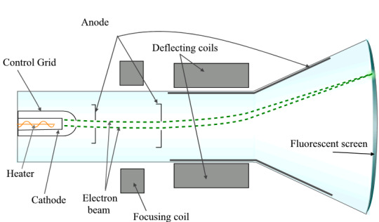
To my highly simplified understanding, the Electron Gun sends out a ray of light which is expanded into video by the screen (I am likely wrong, this is just the gist).
Now, I'd say that there's a couple different gadgets at the Fluorescent Screen, which ill explain here.
-○-
Red Screen of Death
[TW: Suicide. Skip to the next one if you don't like that.]
Im going to get this one out of the way first as its the most simple and boring:
Firstly, this has nothing to do with CRT's. We have seen that the RSOD is only capable of being created on flatscreen TV's, whether that's LCD, OLED etc.
I think that it's literally just an EXTREMELY bright red light. It's brightness is just low enough to be as bright as possible without causing instant blindness while also causing excruciating pain and burns to the retinas. The pain is so excruciating that all rational thinking is abandoned. Only one objective goes through the mind of the victim, and its to suicide by any means necessary. There's only one method of escape they can think of, and it's death. Very disturbing, but also really basic.
[Polycephalies' White Screen is basically the same but less powerful: just a really bright light.]
Purple Screen of Hypnotisation
My theory is that this is a combination of light and sounds that transmit signals to the brain/CPU of the target.
The screen creates an inviting, eye-catching glow, which gets the target to look at it. From there, a small circuit (We will call it Circuit 1) sends a signal to the CPU of the TV person saying "Hey! We're hypnotising someone! Tell Circuit 2 what you want them to do!" and the CPU / brain of the TV says "Got it. Circuit 2, I want you to make them do a dance."
Circuit 2 gets the signal and tells the hidden speakers in the TV "Hey! CPU says this has to make them do a dance!"
[Now, I'm going to briefly interrupt here and admit that I got heavy inspiration from this video on the (quite possibly fake) virus BadBIOS, that advertises itself as being able to spread through the air. It does so by emitting a frequency for other nearby computers to pick up that creates a spectrogram image of malicious code that infects the computer and spreads the virus further. Check out the video for more info, its actually super interesting.]
The hidden speakers in the TV then emit a frequency depending on what the the target is:
-If its an organic/skibidi, the frequency is designed to mess with it's brain in a way that stops its thought process and makes it focus on the sole objective that is carried through the frequency. (This frequency is achieved using new technology that would've been discovered by the time of the apocalypse, this is impossible with today's advancements.)
-If its a hardware head/non-organic, it does the same thing as BadBIOS: sending over code which completely overrides the hardwares free will to use its body. Its similar to being controlled by a parasite: the hardware can see what its doing (e.g. TCam would've been able to see he was beating up TSpeaker even though he didn't want to) but its body is being moved against its will. Pretty disturbing if you think about it.
All of this goes on until the light is turned off and the frequency ends.
Orange Screen(?) of Inferno
Now, I put that question mark there as I actually think this screen has nothing to do with cathode ray tubes.
Please watch this video of a solar death ray:
Source: edmundoptics On YouTube
Now, the logic behind this is that the sunlight is concentrated into a ray by the lens which gets thinner and thinner until it reaches a fine, concentrated point and expands outward in radius again. Even rocks that are put under this crack and melt.
Now, my theory is that TV's that can make a OSOI (TTV and TVwoman) have a little slider mechanism inside. Basically, they can alter between the standard Cathode Ray Tube which let's them do the other abilities, or a VERY strong and burning hot light, like a very small sun. It uses the screen as a lens and scorches victims unlucky enough to be caught within its radius. If you're even more unlucky, you'll be in the thin but extremely concentrated part, which will completely crack any metal or porcelain and melt skin.
Extra Notes:
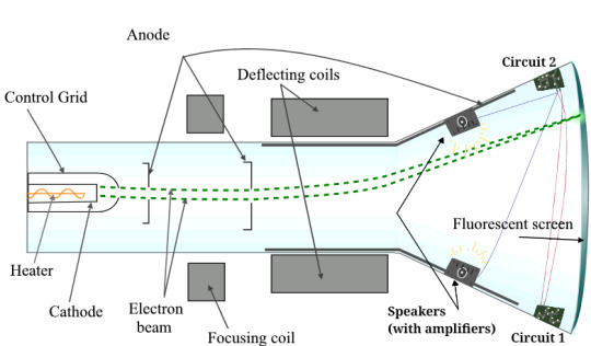
-Diagram of a TV person's CRT.
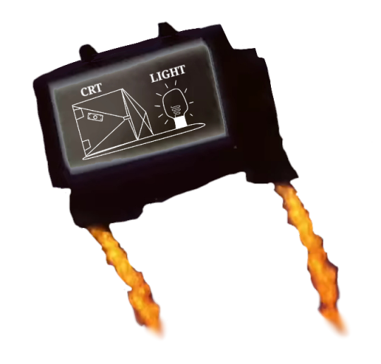
-Diagram of the OSOI Screen (using a shitty image I grabbed off the wiki)
-Black Screen and Pink Screen are left out intentionally as 1. I have no clue about teleportation and b. The pink screen doesn't really do anything??? idk lmao
#eratags: skib#eratags: analysis#skibidi toilet#nrrrgghhh this took so long. Really happy with how it all came together tho :))#Take all the sciencey stuff I explained with not a grain but a whole shaker of salt. I (in some instances) am freestyling with no research
37 notes
·
View notes
Note
please post a tutorial or walkthrough or even just a longer process video talking about how you draw!! im obsessed with the textures and colors but i cant seem to wrap my head around it!! (i would pay money for a whole mini course tbh if you were interested in uploading one to gumroad or wherever 😵💫)
thank you, i'm flattered :') texture and colour are really important to me so i'm always fine-tuning them to find what works. to be honest i feel like i'm not qualified to teach others since i haven't really even settled on a process, i just kind of mess around until i like what i'm looking at. there are certain things i do much of the time but it's definitely not a linear process!
that being said lately i've been experimenting with traditional media and i've found i really enjoy how gouache behaves so i've been trying to replicate the process in digital. i'll try and explain how i've went about it recently using this super boring piece of a random person...
i'm using a basic pencil brush and a default procreate brush called gouache. i picked it for the name when i was looking for something similar to the paints i'd been using but honestly it looks more like a marker to me.


i find trying to do separate inks on top of a sketch distracting so i just erase what i won't need. i'll add a darken layer on top of the sketch and go over it with a single colour as a kind of underpainting. i did the flat colours on a separate darken layer here but generally i'll just work on one layer.
we'll add some colour variation and shading, it looks super subtle here but i'll punch it up later. i think the critical thing with this kind of brush is working with transparent layers so you don't lose the texture and you can play with mixing colours.
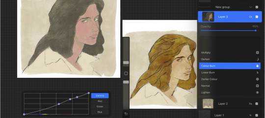
i'll often mess with the curve tool a lot but this piece is pretty simple and i ended up only using it once or twice. when i'm happy i'll duplicate the colour layer and see which blending mode i like, testing stuff out at different levels of opacity until i find something cool. i think i went with a transparent overlay layer here.
the lineart is getting buried so i duplicate that layer as well, drag it to the top of the pile and repeat the process of stacking blending modes. something i like to do is add one layer with the lineart blurred to give it a softer look.
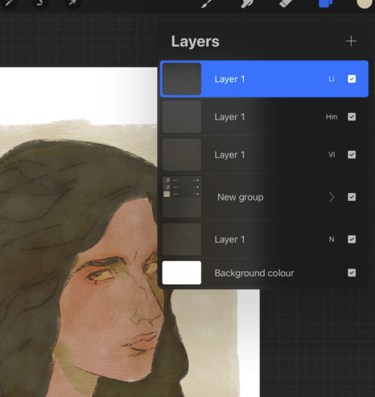
i'll fill a new layer with a dark colour, add about 80% noise scaled up a bit and set the layer to saturation. again you can experiment with the blending mode but i've been using this one recently.
this next part might be pointless but i save the image, open the new file and resize it without actually changing the resolution much, then sharpen it to bring back the detail. maybe it's in my head but i feel like this makes the image look a tiny bit more finished and adds some crunch.

finally i duplicate the whole thing, blur the layer on top and set it to luminosity on low opacity to create a soft glow effect.
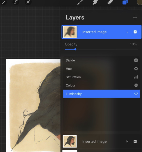
final touch-ups and you're done!
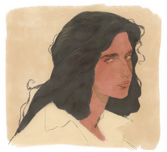
sorry for the convoluted explanation! my process tends to messy, i get distracted and don't often work in distinct steps but i think i managed to describe some of the things i do the majority of the time. i hope it's even a little helpful :)
98 notes
·
View notes
Photo
allelitewrestlings’ gifmaking tutorial #1
hey there! this is a brief tutorial with technical tips for making wrestling/aew gifs. i won’t go through the basics of gifmaking, so some photoshop knowledge is expected. i hope this will help any new gifmakers in the wrestling fandom, or anyone who is interested 😊
tutorial content:
choosing the footage
gif dimensions
duplicated frames
sharpening and timing
colouring*
the full tutorial is under the cut! enjoy!
intro. as i mentioned, this is a very basic, very simple tutorial that goes through issues i have encountered since i first started giffing wrestling stuff. keep in mind that i am by no means an expert, and there must be better/easier ways of doing the things i do, but these are my methods.
*note: i will not be talking in-detail about how to colour aew gifs because it’d take most of the tutorial. but if anyone’s interested about a veeery basic colouring tutorial that focuses on aew, let me know 😊
1. choosing the footage
when it comes to making gifs, the rule of thumb is to always choose 1080p footage or higher. this makes your gifs look more hd. when it comes to wrestling/aew (in my personal experience) even 1080p can look pretty terrible sometimes.
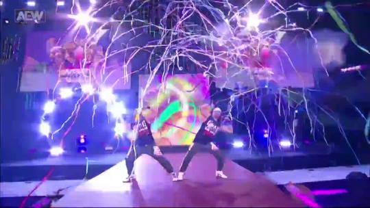
this is a screencap from a young bucks entrance. you can see how even when the video “is 1080p”, the image looks super pixelated and blurry. to me that’s a no can do, sorry young bucks. i often try to go for clear frames, but it’s a challenge when it comes to aew 😅 (unless it’s close-ups or backstage segments).
once you have your footage and once you’re exporting your video to frames on photoshop, remember not to limit the frames (unless you’re working with 1080p60, in which it’s totally fine to limit 2 frames if you don’t want your gif to look too “smooth”).
for the purpose of this tutorial, i will be working with backstage segments.
2. gif dimensions
now that you have your footage, you have to decide what kind of layout you’ll be working with. most set layouts consist of one, two, or three columns. depending on the layout you choose, the width of your gif will be different (the height can be whatever you want, just remember to keep the proportions). as of 2022 the tumblr width dimensions are as follow:


i usually crop my gifs using the crop tool (but there are other methods for sizing your gifs). this time i’ll be making a 540x450 one column gif
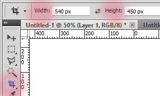

personally, i never fully select the bottom 3-4 pixels because (for some reason?) you’ll find a black line at the bottom of aew footage like 80% of the time. but feel free to crop the gif as you please! there are other ways of cropping and sizing your gif, this is just one :)
3. sharpening and timing
once you have your gif cropped, it’s time for sharpening. it’s important not to skip this step! i’d say that sharpening is as important as selecting the correct width/colouring your gif. there are many ways to sharpen your gif and it all depends on whether you work with timeline/smart object or you choose to sharpen each frame individually. both of these can be achieved through actions or manually. personally, i prefer actions. there are many great action packs available here on tumblr for free! they’ll make your life easier. one of my favourite action packs is @anyataylorjoy’s action pack #1. this action pack has two different sharpening actions and they’re both quite useful (and look good on my dated photoshop), but what i love the most is the save action.
this is when we need to talk about timing. i’ve been making gifs for a while, and it took me a long time to realise that 95% of the time, the correct timing for gifs is 0.05. the issue here is that when you save your gif and you’re still working with it as timeline/smart object, 0.05 is converted to 0.07, so it slows the gif down. sometimes it doesn’t seem like a big deal, but fixing the timing makes a huuuuge difference in what your gif will end up looking like. by using the save action, your work will automatically be converted back into frames and the timing will be fixed.
let’s look at examples.
this is what happens if you change the speed to 0.05 before converting the frames to timeline/smart object to sharpen it. (when you save it, the gif will automatically be 0.07. we don’t want this).
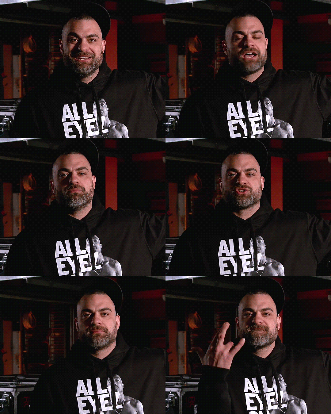
what we want is to convert the timeline back into frames and change the speed to 0.05 (so you can use the save option for this and save yourself some time!). after that, your gif will move way smoother/better:

4. duplicate frames
i didn’t know whether to talk about duplicates or sharpening first, but i decided to leave this for last. something that no one told me/i didn’t really notice when i started making gifs is that there can be a lot of duplicates in the footage you’re working with. if duplicate frames don’t bother you, you can just ignore this bit! it’s mostly a preference.
so, with aew/wrestling footage, you’ll mostly encounter duplicate frames in two occasions:
- backstage segments: this is the most common way of finding duplicate frames, and 98% of the time it’s a 1 in 5 duplicate frame. i usually fix this manually, but i know that avisynth has a very fast, very effective way of removing these duplicate frames. (i found this avisynth tutorial if anyone’s interested!). so, these kind of duplicates will show once every 5 frames. i’ve...memorised? by now that if the 1 and 2 frames are duplicated, then the 6 and 7 will be. so i manually delete every frame that ends with 1 and 6 (or 2-7, 3-8, 4-9, 0-5). it’s... complicated to explain haha.
most of the backstage segments and slow-motion videos found in, for example, all the roads to and countdowns to are likely to have 1-in-5 duplicates. “hey ew”, and those kinds of videos also have duplicates. as an example, let’s take a look at these:
this is a gif with 1-in-5 duplicates (which has been sharpened, and its speed is 0.05).
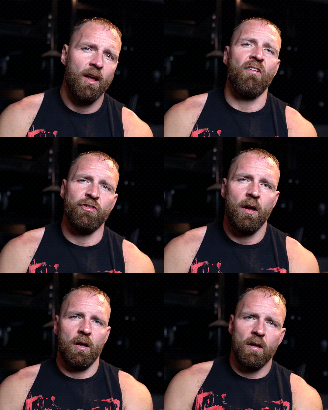
and now this is what the same gif looks like once you fix the issue with the duplicates.

- screen recording:
now when it comes to screen recording, it’s very likely that you’ll have duplicate frames. in my experience, unless you’ve just turned your computer on and you don’t have too many tabs/apps open, you’ll find random duplicates throughout the footage you’re working with. sometimes screen recording can also lead to skipping frames, so keep that in mind. to know whether or not your screen recorded footage has duplicates, it’ll look something like this even after you’ve sharpened it and fixed the timing:

the only way (that i’m aware of?) that you can deal with this if you’re using screen recordings is to manually delete the frames. that is, go one by one trying to spot duplicates and delete them. (yeah i’ve done it and yeah it’s a nightmare). so... my advice here is to try to download your footage whenever you can or try to screen record without having too many tabs/apps open 😅
5. colouring
the last step for me when i make gifs is deal with the colouring. some people prefer to do colouring before converting timeline to frames, but it’s just a preference (unless you’re making a gif that requires you to use timeline, etc). what’s important to know if you’re going to add your colouring when working with frames is that you have to always edit the layers on the first frame (so that the changes apply to the rest of the frames).
in-ring action is definitely a nightmare to colour because every shot will look different and aew does a very bad job when it comes to offering contrasted/colour balanced footage. as i mentioned earlier, i’m not gonna spend too much talking about colouring this time. if you struggle with your own colouring, we have shared a couple of psds in the past, which you can use as bases if you’re just getting started or if you find them useful! but there are a lot of good photoshop resources blogs where you can find brightening/base psds as well.
these are the two gifs i have been working with, now with a very basic colouring:
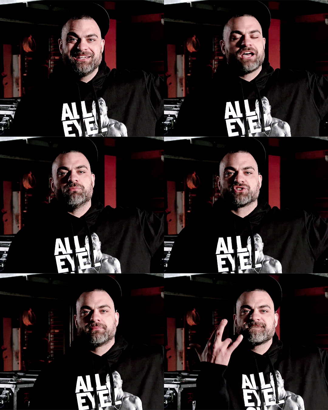
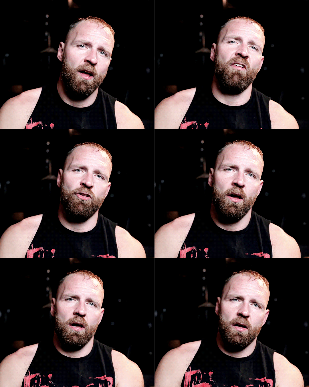
****
now the only thing you need to remember when saving is that your gifs need to be under 10mb! most of the time my saving settings are adaptive - pattern - bicubic sharper.
and... i think that’s all! 😊 hope this can help someone. and feel free to message us (or me @jonmoxleys) if there’s anything you’d like to ask.
#gif tutorial#resources#completeresources#wrestlingedit#aewedit#aew#ours: resources#ours: tutorials#*
371 notes
·
View notes
Text
QUICK READING RECAP
27th to 30th of march 2023
💌✨🍓does justin bieber love hailey bieber?
↳ 3oS,KoP, frog rx
it’s hard to explain because the answer is yes and no. i don’t think he married her because he was deeply in love with her. she was just there, convenient and compatible with him so he considered her a good longterm option. he always had affection and love for her (it just wasn’t “in love”) and he’s grown to love her more over time. she’s a good wife on paper and there’s a sense of being comfortable but i don’t think he’s been faithful.
💫🍄🫧does justin bieber miss selena gomez?
↳ 4oC, 10oC
yes, he reminisces sometimes and misses her. when he’s bored or upset with how his life is he does wonder how it could have been but i don’t think he wants her in a serious way, so in that sense he doesn’t miss her.
🍇🧸💭what makes someone romantically desirable (personality) to nct’s jaehyun?
↳ heart, stars
when someone wants simple, classic romance. someone who’s compassionate and gentle. he naturally likes someone who’s more on the optimistic side and is peaceful and happy.
🏮🦒💡how does ryujin feel about her masculine image?
↳ stars, 6oW, plantain
she is fine with it but she doesn’t see it as “masculine” herself and wouldn’t appreciate being called manly or anything male-adjacent you could say. she thinks she’s just being her most comfortable self, so she’s not trying to present a masculine image and nor is she trying to present a feminine one. she basically just sees her masculine image as “non-idol ryujin” in her mind, it’s not super deep to her.
🍊🥭🥬how is crush and red velvet joy’s relationship currently?
↳ wheat rx, star, QoC
they’re out of the honeymoon stage for sure so there’s a need to be proactive and for them to add spice to the relationship themselves, they also have to deal with conflicting schedules but it’s pretty solid. they have fun together and feel emotionally fulfilled.
🧁🍡🍬how does aespa’s winter see giselle?
↳ house, tower
winter sees giselle as someone who’s out to get something or achieve a goal but doesn’t quite have the ability to yet (ambitious), though winter sees she is working steadily. she thinks giselle is consistent and doesn’t expect too many surprises from her. she sees giselle as well-connected (most likely through family) but that despite this she is actually pretty lonely and sort of an outcast.
🎂🥞🍰is nct’s taeyong dating right now?
↳ mandrake, 6oP, emperor
yes. could be in the early stages currently because i get he’s still in the phase where he’s showing off and doing his best to put his best foot forward to impress the other person. strong physical attraction.
🍸🥡🍾how will aespa’s comeback do?
↳ cow, 10oW, 7oC
bit confusing because it seems sm will be satisfied with the result and they are being protected and helped in many ways (idk if it’s about past scandals or if this comeback will involve more scandals happening such as plagiarism or even from the members or something). however, the members themselves will be really upset with this whole comeback once it’s over… i’m meaning almost wishing they never debuted in this group sort of upset. this could be a sort of filler comeback in the company’s eyes, so it gives the girls enough exposure and the company enough money while they focus on the next new thing, but it’s not exactly spectacular or what aespa thought they were going to be doing.
🍂🎍🍁random prediction for aespa within the next year?
↳ 8oC, 5oS
new concept or way of approaching their image. reminds me of embracing simplicity, so i think they will try a more tried and true og girl group method and it will be a good move for them overall. however, there is some sort of interruption coming up for them that will likely also affect their reputation in some way - a scandal, losing someone or something, someone leaking something, a cancellation, sabotage etc. but they will overcome this and are protected.
🎏🎁🧸something random about ive’s wonyoung right now?
↳ 8oC, 6oC, QoC, 9oS, mistletoe rx
she has a lot of anxiety about having to grow up. she isn’t happy about not being a minor anymore and is worried about what people are going to expect of her now, personally and professionally. she is afraid of dating for this reason too, i don’t think she has ever been in a relationship and likely even avoids crushes and gets nervous about people approaching her.
🥂☕️🍪is starship mistreating ive’s liz? is it because she gained weight?
↳ lady’s mantle, KoC, judgment
no, they’re not technically mistreating her nor are they too concerned with her weight gain. they’re actually worried about her mental health and confidence and liz herself may have even requested to not have so much attention on her after becoming insecure from reactions to her in previous comebacks. i don’t think it’s that serious in the sense that she’s going to be super hidden in this comeback* but realistically she would probably even go on hiatus if she could. however, starship did think they could twist this to their advantage and get some attention from it, all press is good press sort of thing. they think the sympathy for liz and marketing her as an underdog is actually beneficial to them. so in this sense they are not really looking out for her.
*as in she’s not actually going to be super hidden.
💐🍄🍃is twice’s sana bisexual?
↳ clover, celtic bean, KoC, justice
yes! but when it comes to serious relationships may focus on men, at least currently.
🥂🪷✨what did sullyoon think of jinni leaving nmixx?
↳ star, devil, empress
she was genuinely a bit sad but she mostly viewed it in a very objective way from a work perspective. she thought it was a good thing because she didn’t trust jinni to behave and she thought about how there’s less people to share their pay between now but she was upset about the fact that jinni was one of the prettier and more talented members (in her eyes) so she was worried people wouldn’t like the group as much anymore. mostly, she just did her best to be optimistic.
#kpop tarot#melody tarot#tarot#kpop#celebrity tarot#quick reading recap#nmixx#wonyoung#ryujin#twice#nct#justin bieber#hailey bieber#selena gomez#jaehyun#red velvet#joy#blackpink#aespa#ive
64 notes
·
View notes
Note
uhm can i ask how you got so good at character likeness? as in how do u practise/what steps do you take?
Omg?! Thank you!!! I’m still asking other people for the same advice, I don’t know how I’m on the other side of this question.
My explanation might not answer ur question properly, or even be comprehensible but I’ll do my best
Learning about your subject is the best way to understand how to draw it. So here some thoughts on how to do that
Blur your eyes when looking at your reference. What things that pop out the most?
Study different angles of their face
What makes them unique to others?
Look at different expressions they make
Is there a way they usually present themselves?
It’s easier if you know how to draw anatomically correct, or even just believable characters. And by that, I don’t mean muscles and bones. I mean placement and perspective.
But everybody starts somewhere. If you don’t know how to do that it’s ok. I didn’t know jack squat when I started, and I’ve learned a lot since then.
For starters, everyone has different strengths and weaknesses, so what applies to me may not apply to you. Seeing as I don’t know where ur at, I can’t help you with specifics
how do i practice?
Answer: Honestly I don’t. Either that, or all my work is practice. If I’m not feeling super involved, but still want to draw I’ll do “warmups” but it’s just me doing low effort work.
what steps do I take?
I have good Pinterest algorithm, so when I like a character, their pictures will flood my feed. When I see an image that looks, for a lack of a better word “catchy” I’ll screenshot it.
It usually has a well defined light source shadows lines etc. and I don’t even have to draw it (I try to though) but even if I just look at it for a while, I can visually break it down to simple shapes/shadows.
That helps me to understand the picture for what it actually is, and not what I think it looks like. 5 times out of 10, I do end up drawing what I screenshot. But I don’t always post it. Sometimes it turns out bad, sometimes I just don’t feel like completing it. And that’s fine :) having fun is the best motivation to keep going, and getting better.
When I do post art, it can vary from a cartoonish line art, to ¿almost? Realistic. But in both situations I’m trying to simplify my subject into the most simple form.
This isn’t a great example but you get the idea


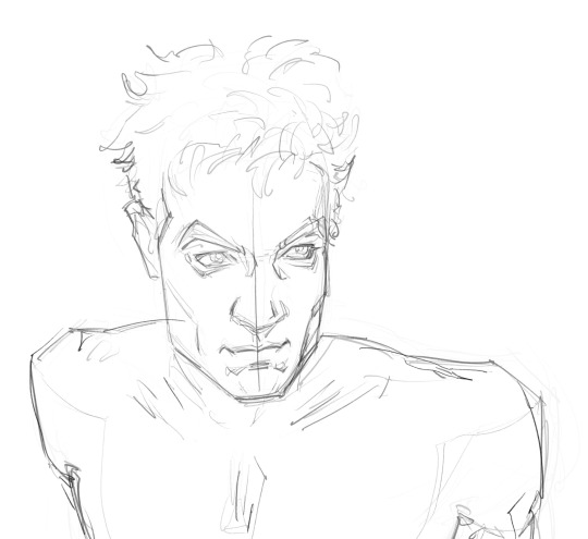
For my line art, I:
keep the shapes, basic, big and blocky. Just so I have an idea of where everything is. if things get too confusing, you can honestly just make a silhouette and go from there. REMEMBER TO KEEP IS SIMPLE, DO NOT GET CAUGHT IN THE DETAILS you can do that later
Once you’re done with the VERY LARGE SHAPES, then map out the features. Let it look ugly cuz heaven knows it will be. And that’s ok too. You just gotta get it down.
Then focus on perspective. Like if his head is facing right, the outside corner of his eye will look round instead of sharp. And in his nose will be touching/covering part of his eye
Then, lastly, and most importantly look at the shadows. Your lines on the line art will look heaviest where the shadow is the darkest 
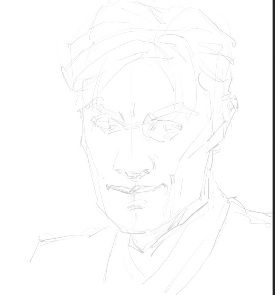
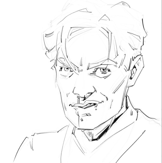
And remember, the brain will fill in information, so just focus on the shadows. Look at kaz’s hair. I have a couple triangles to show the gaps. I hardly even touched the top. I only drew the bottom of his nose, but you know the whole nose is there
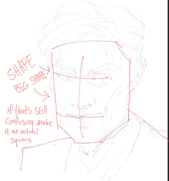
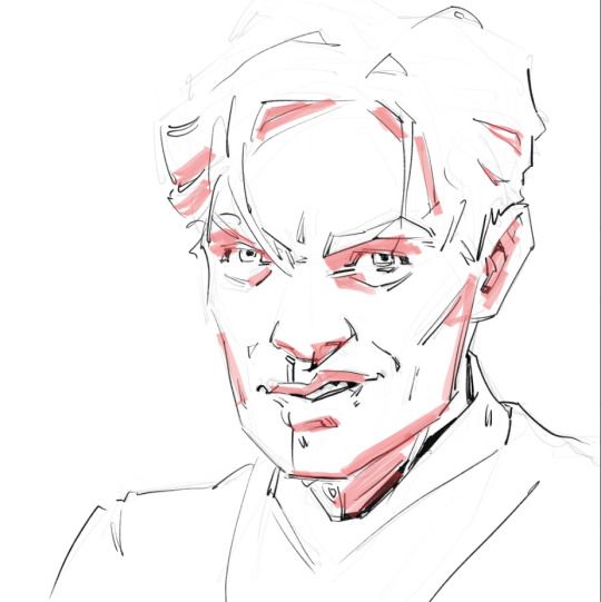
+Never underestimate the power of multiple references.


OH!!! I’m revising my previous statement, this is the most important rule. The non-conventional features are what make or break your character. Don’t try to avoid them, make them work with your subject.
If you don’t draw them, your style might turn out looking like the “anime” style new artist try to avoid.
And if your wanting to go more realistic there are no lines. The only way to tell anything apart is value.

Not saying this is realistic, but all the “lines” are actually just value contrasting between shadow and highlights. So generally the only things that should look dark have the most depth.
And then there’s the whole deal with expressions. They have a huge part to play in character likeness. If you know how a face functions, you can add so much nuance to your art. But I’m just starting to learn that so I can’t help you yet.
Any way GOOD LUCK!!!! GO FORTH AND DRAW
#wish I could communicate this telepathically#idk if I explained this good enough#bc likeness is all about the specific person#so everything I’m saying is generalized#if there’s a specific person you want me to break down I can do that too#love u anon have a good day#ask box
14 notes
·
View notes
Text
GIF Coloring Guide: An Introduction to Adjustment Layers in Photoshop
This is going to be a super basic guide meant to show you the power of Adjustment Layers in Photoshop. It’s not going to be a step-by-step tutorial, though, in which I dictate what exactly you should do because it will always be different for every gif.
I’ll be turning this Isagi gif:

into this:
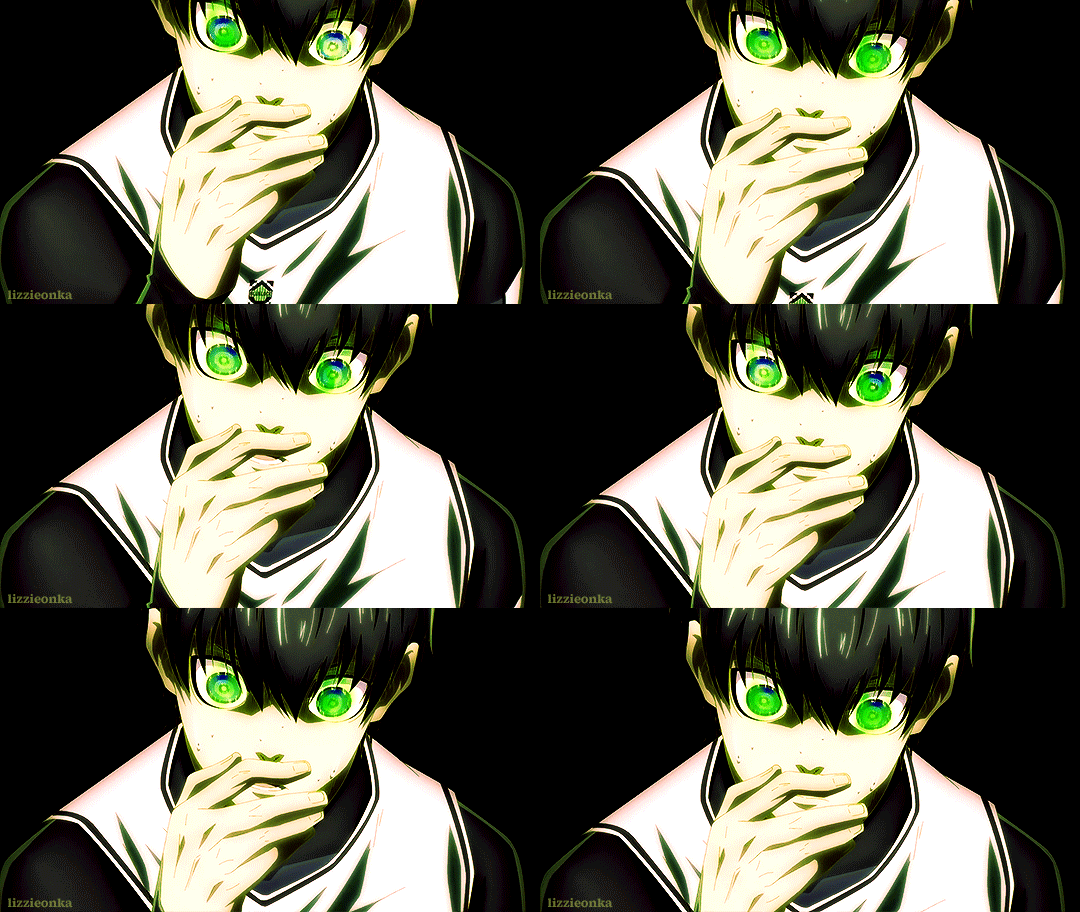
What you need:
Adobe Photoshop (any version should be fine. I use CC v23)
Basic gif-making knowledge using Photoshop
Basic Photoshop knowledge in general
What this guide is good for: A simple gif where the brightness and colors of each frame are about the same.
I’m writing this guide for those who already know how to make a gif in Photoshop. You’ve imported your frames, deleted the ones you don’t need, and you know how to save it as a gif. I will only be teaching you how to color, so I’m not gonna walk you all through the Photoshop basics. You can google that yourself.
Now, first things first, I want you to keep in mind that the GIF file format can hold only up to 256 colors. Thus, when coloring gifs, I try to “reduce” the colors by making the blacks blacker, the whites whiter, removing color noise, and de-emphasizing colors that are not essential to the overall scene. Otherwise, the final image will just look noisy or muddy because of the gif trying to compensate for all those extra colors—which is not bad in itself, by the way, if that’s the look you’re aiming for. I just prefer my GIFs to look HD.
And from what I’ve noticed, noisy and muddy gifs will also have a larger file size. The uncolored gif above, for example, is at 6.69mb. Meanwhile, the colored gif is at 4.96mb. Both were exported using the same settings. Although we have a 10mb file size limit for gifs here on Tumblr, I still like to keep the file size down as much as I can.
Now, with that out of the way, let’s get to the actual guide—
In the Isagi gif I’m using as an example, I made him look like he’s glowing in the dark and also partly blended him into the background. Here’s a screenshot of all the adjustment layers I used to achieve this effect:

All these layers should be on the very top of your gif layers. I grouped them together for convenience in toggling all changes on and off, allowing me to quickly check the “before and after” of the gif.
Before I explain what those layers do, I just want you to know that the order of those layers matter. I purposely put one Selective Color at the bottom, and that second Selective Color is no mistake. More on this later.
Selective Color 1
Selective Color is my favorite, and it’s also the most important. It lets me fine-tune individual colors without affecting the other colors much. It’s also usually the first thing I add as it lets me pick which colors to emphasize and which to de-emphasize.
Now, let’s look at our unedited Isagi:
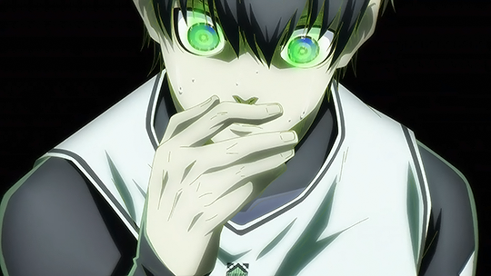
(Above is a still image and not a gif. From hereon, I’ll be using still images coz the gif looks about the same in each frame anyway)
The colors on Isagi look too gray and cold to me. I want to make the black of his suit darker, remove a bit of that green tinge on his skin, make the blue of his eyes bluer, and just give him an overall warmer look.
Here are my settings for Selective Color 1:
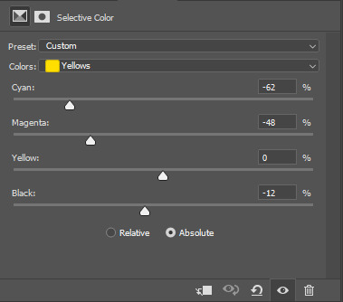
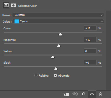

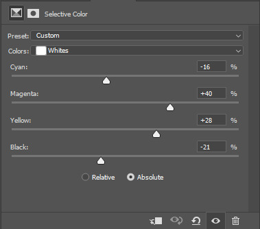


Unedited vs Selective Color 1:


Although I said I wanted to remove the green tinge on his skin, I did not touch the “Greens” at all in my Selective Color 1 layer. That’s because doing so would also reduce the greens in Isagi’s eyes, and I didn’t want that. Instead, I tried to counter the green on his skin by adding some Magenta and Yellow on the “Whites” to make it appear warmer and more reddish instead.
Of course, I didn’t come up with the final settings above in one go. As I added more adjustment layers on top, I would go back to Selective Color 1 and play around with the different sliders until I was satisfied. Gif coloring doesn’t have to be a one-way process. With adjustment layers, you aren’t affecting the pixels of the image itself, so you can always go back and tweak your settings.
Dragging the slider to the right for positive values would return darker colors, while dragging it to the left for negative values would return lighter colors.
I want my Isagi gif to be vivid and for Isagi to look like he’s glowing in the dark, so I dragged the sliders in “Blacks” up to the positives. Then in “Whites,” I dragged the black slider down to the negatives.
However, if you want a more muted look like this Isagi gif 2:

...You can slide the black slider under “Blacks” to the negative values instead.
Curves
Curves, along with Levels, is usually the first thing a gif-maker learns to use. It’s good for quickly getting some nice brightness and contrast on your image. I’ve seen some gif-makers refer to Curves as the better version of Levels, but I disagree. Curves and Levels, though both affect contrast in an image, go about it differently and achieve very different effects.
In my Isagi gif, I used both Curves and Levels. But in some of my other gifs, I used only one of them.
Curves is what I usually add in the beginning stages of coloring (i.e. the layer is placed lower) when doing complex coloring. Although I never make Curves the bottom-most adjustment layer, sometimes I add it first just to give the image a burst of brightness or to quickly darken an image that may be too bright. I would then put a Selective Color underneath to make necessary adjustments.
Our Isagi gif, on top of being still muddy, is now also too reddish. I had only added those reds to get some warm undertones in our gif, and now that we have that, it’s time to reduce those reds. We’re not gonna do this via adjusting Selective Color 1 because doing so would only bring back the greens we wanted out. Instead, we’re gonna subtly bring in some whites to the gif by making it brighter with Curves. And while doing so, we can also enhance the contrast on the image.
Here are my settings:
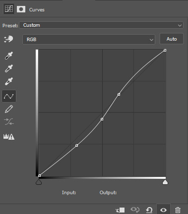
The more S-shaped that curve is, the more contrast and saturation you’ll get. I just want a subtle change, so the curve is nearly flat.
Unedited vs Selective Color 1 vs Selective Color 1 + Curves


See the difference? Now there are darker blacks and less green on Isagi’s skin. The colors are also starting to pop, and the gif looks less muddy.
If you want colors to look muted instead, like in Isagi gif 2, you can do a reverse S curve instead. Well, actually, feel free to play around with Curves. It doesn’t have to be S or reverse S. You can add as many points there as you like and form whatever curve you want.
Selective Color 2
Remember when I said that the order of adjustment layers is not random? I’m now going to explain why.
When we added Selective Color 1, the image that layer is editing would be our unedited Isagi with all those greens and grays.
However, when we added Curves on top of Selective Color 1, the image we were editing was no longer the original Isagi but the Isagi + Selective Color 1.
Layers build on top of each other. It’s like when you’re painting. If you add red paint and then put blue above it, you get violet. If you want to put another color on top, you’ll have to work with the violet and not the red that’s no longer there.
That said, our Selective Color 2 here is not going to be redundant. Selective Color 1 was coloring the unedited Isagi, but Selective Color 2 will be coloring the version that has Selective Color 1 + Curves.
Now, I intend to use Selective Color 2 to enhance Isagi’s green aura as well as the blue of his eyes. We weren’t able to increase the “Greens” in Selective Color 1 because doing so would also make Isagi’s skin green. But now that Isagi’s skin is more red than green, we can play with the “Greens” of his aura safely.
Here are my settings:
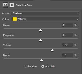

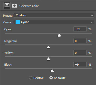
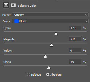
Unedited vs SC 1 + Curves + SC 2:


Levels
Now, time to make our gif bright and vivid. You can use another Curves layer here or a basic Brightness & Contrast layer, but since the colors of our Isagi gif are predominantly black and white, I’m gonna go with Levels since it works really well with black and white images.
Here are my settings:
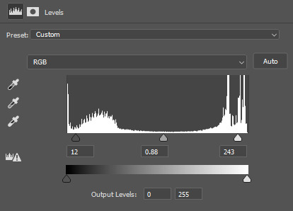
See those 3 sliders under that graph? From left to right, those are sliders for Shadows, Midtones, and Highlights. If you slide them to the right, said shadows, midtones, and highlights would turn darker. Slide them to the left, and they become lighter.
I often get carried away the first time I add Levels, resulting in extra vivid/saturated images which I later have to adjust. So yeah, try not to overdo it. It’s like vanilla extract. A little goes a long way ;)
Unedited vs SC 1 + Curves + SC 2 + Levels:

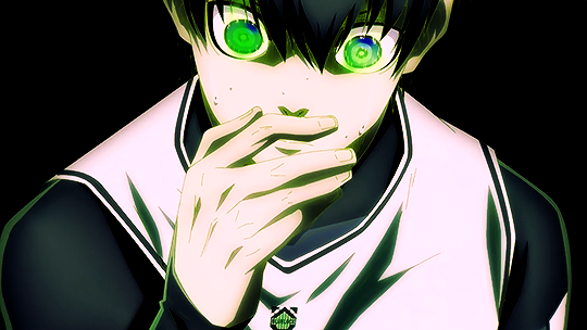
Beautiful ✨
The image is no longer muddy, but we’re not done yet!
Color Balance
I haven’t used Color Balance much in my gifs because Selective Color often does bulk of the job for me. However, the Isagi we have right now hasn’t quite yet achieved that glow in the dark effect I wanted. I also want to give Isagi that techy Matrix vibe by really emphasizing his green aura, so for that, we’re gonna add Color Balance for the finishing touches.
I think the midtones of the image look okay, so I’ll just tweak with the shadows and highlights. Here are my settings:

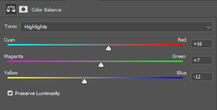
....And with that, we are done!
Before and after:


Compared to pre-coloring, the gif is now more vivid and not at all muddy. We also made his green aura brighter without making him look like Shrek uwu.
I actually also went to all of the 104 frames of this gif and manually reduced the noise for each one so we can have a more HD-looking gif. That’s outside the scope of coloring, though, so I won’t be including it in this guide. I’ve also reached the 30-image limit for posts, so I couldn’t include it even if I wanted to 😩
Anyways, I hoped this guide helped! There are many more Adjustment Layers that were not covered in this guide, but they should be easy to learn once you get the hang of working with multiple adjustment layers. You’ll probably never even need to use every single Adjustment Layer out there, anyway. The ones I mentioned in this post are often more than enough.
Now tagging the mutuals who may be interested in this: @usagi-yoichi and @gachagon
#gif tutorial#gif making#gif coloring tutorial#gif coloring guide#blue lock#isagi yoichi#dailyresources#allresources#photoshop tutorial#coloring tutorial#completeresources#photoshop resources#photoshop adjustment layers#usergif#tutorial#resource#photoshop#miyamiwu.tut#lznkgifs#miyamiwu.src
66 notes
·
View notes
Text
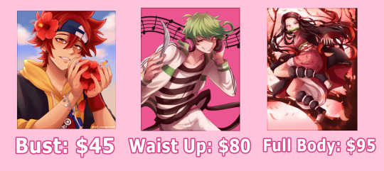

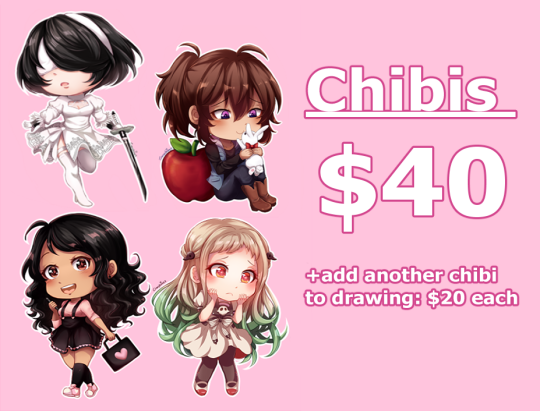
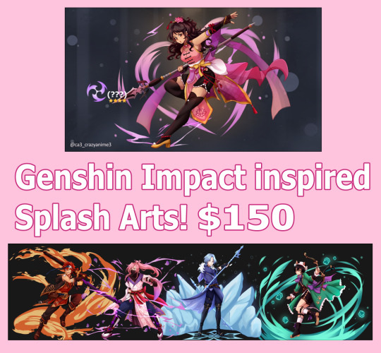
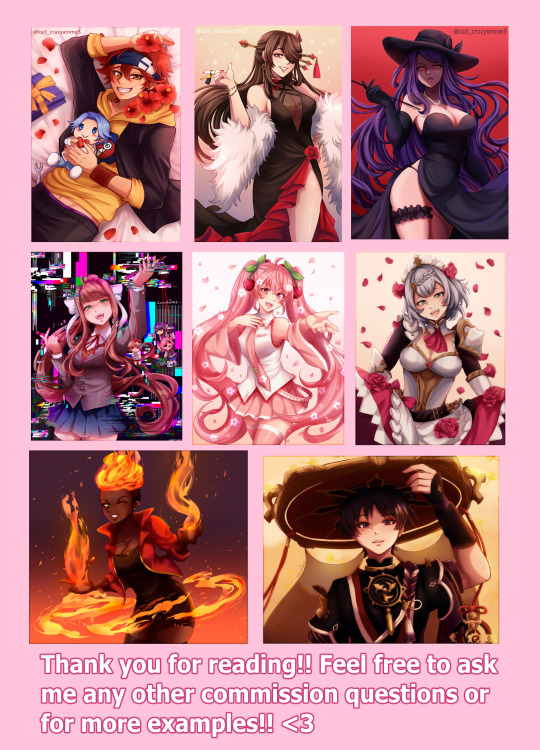
Taking very limited slots,, but doing commissions again so I don't worry about rent this month!! If you can't commission, reblogging this post helps a lot too!
♡ Bust: $45
♡ Waist up: $80
♡ Full body: $95
♡ Chibis: $40
Want to add more characters?
- Add Character to Bust: +additional $20
- Add Character to Waist Up: +additional $40
- Add Character to Full Body: +additional $45
- Add Character to Chibi: +additional $20
♡ Genshin Splash Art: $150
(Sorry! Only 1 character per splash art so the base price is the same as above)
🌸WILL DRAW 🌸:
OC’s (original characters)*
Ships
Fan art
Self ship
Kemonomimi*
*Please provide references for OC’s!! I work way better if I have an actual image to look at. Also please clarify what kind of expression/body type etc. You would like for them! Also so no reference is “too simple” or “too crude.” You can also give me several pic crew references too!
("What is Kemonomini?" - Basically I can't quite do "furry" art, but adding animal features like ears and a tail on a human character is fine.)
🚫 WON’T DRAW 🚫:
NSFW (Nothing too graphic at least… it can be a little risque or steamy but that’s it. It’ll have to be discussed and I’ll let you know I’m comfortable with it or not.)
Intense Gore (A bit of blood is okay, just nothing super graphic please!)
Mecha or Furry/Anthro (Sorry, I have very little experience with those.)
Super muscular characters or elderly characters. (I still need practice with that too…)
Anything that promotes hate or any hateful symbols, any ships containing any minor x adult, inc*st, and basically anything that would make me super uncomfortable to draw. I mean no disrespect, but sorry that’s just how I feel.
These commissions are meant for personal use only.
If I also feel like a commission too outside my skill level I might reject it. I apologize, but I’ll be thankful you even considered me for a commission and hopefully I can redirect you elsewhere!. ;w;)
That’s all the rules I have right now, anything else can be discussed if you need further explanation/information about something. No need to hesitate!! ❤
Also during the creation process please don’t worry about asking to see a sketch or any progress on your commission! (For example, if you’re not sure what you want the pose to look like I can send you a rough idea/sketch before I continue to the final line art and coloring ^^) This is only upon request! So please communicate with me if that’s what you want ❤
If you want or need a commission by a specific date PLEASE let me know when that is so I can make yours a priority. If you don’t mind waiting then I will simply just be going down my list in order.
I will be using Venmo, Paypal, and Cashapp as my use of payment!
Payment must be made upfront before I can start your commission.
If you can’t commission now or can’t afford the full price I do have a Ko-fi where you can leave small tips/donate too if you wish! Thank you!!
KO-FI HERE
Thank you for reading and please share!
#commissions#genshin impact#ca3 art#commissions open#art commissions#commission sheet#commission info#art#artists on tumblr#sk8 the infinity#kimetsu no yaiba
66 notes
·
View notes
Text
Remote meetings trick:
If you're using a virtual background, take it into any editing software (powerpoint will do fine) and blur it a bit. One problem with a lot of backgrounds is that they're too sharp, like they're 100% in focus. However, unless you have an exceptionally good camera, your image is going to be blurry and imperfect. If you superimpose them, you end up with the background being much sharper and out of place, and it feels very unnatural.
Here's a blurry photo of Kit Harrington. It's been digitally modified to look worse than it is, but it's slightly pixelated and slightly blurry. It's not a terrible webcam image, but it's not great either.
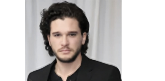
Then we use background removal and put it against this very fancy zoom background of a house:

and we get this:

Kit looks especially blurry now against the super sharp lines behind him The house is now the main point of interest. And further, it doesn't look remotely like the same camera took his picture (he's more washed out than the house is.
But, using super basic tools in powerpoint, I blurred the background and took the saturation down by about 40%, and got the following:
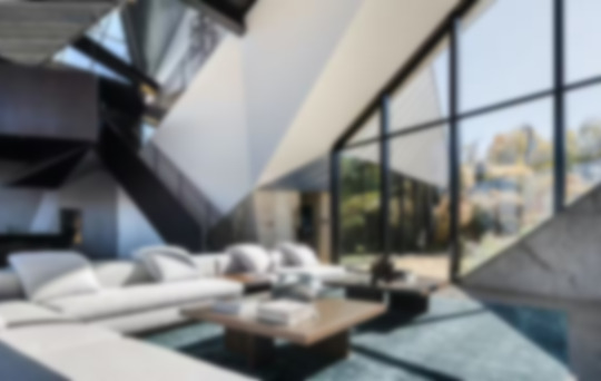
Adding the photo of Kit Harrington back gives:

It still doesn't look amazing (the cutout around the hair remains too sharp, for one thing). But if you're not paying attention, it looks like the two could have been captured by the same camera. Kit is now more in-focus than the background, and the overall saturation matches more closely. Here they are side-by-side

And here's a side-by-side with a bookshelf background.

With the blurred backgrounds, like the ones on the right, the problems with the camera aren't nearly as obvious, because there is no longer that contrast. That's why, even though the images of Kit are completely identical in all four images, he looks less blurry on the right-side ones, because he isn't contrasted against this over-sharp background.
TLDR: take a really simple blur to your zoom/teams backgrounds and re-upload them. It makes it feel much more natural.
8 notes
·
View notes
Note
Apologies for the spam but! tell us a bit more about the world building?? which countries are there?? are there dragons?? whats the technology like??
DON'T APOLOGIZE! It's been super fun to answer your questions!! Warning, this'll be a longer post!
As of now (this is still something I'm working to fully flesh out, lol), there are about six different countries/kingdoms, one of them being Elubeth (where most of the book takes place).
-Neakoth, in the north.
-Falith, in the south
-Lorigothia, in the east.
-Elubeth, in the west.
-Streac Strana, an island nation in the east.
-Raew, a small, quiet southwest nation known for its delicious fruits.
The Eerini Desert in Falith is known for its gorgeous sun-colored sand and its adorable Oasis Chameleons (teeny tiny blue chameleons that also glow in the dark!) The Eprus Desert in Lorigothia is where one of my characters, Josep, is originally from! Most of his familiy still lives there, but he lives in Elubeth with his husband, Adler (Adler is originally from Neakoth!) And yes, there are multiple languages throughout this world, but I'm not Tolkien, and I haven't actually CREATED those languages yet.
Elubeth is basically its own small continent, lol. The only way in or out of the kingdom is by sea, which wasn't a problem until Queen Hortensia put all ships on lockdown. No neighboring kingdoms were allowed near Elubeth unless given strict permission, and even then, they were not allowed to stay for long. Any ships or boats leaving Elubeth are only allowed to go so far out before the Elubithian Navy is after them. Ships must be registered, and the Navy can board and search ships/boats at any time for any reason. Ports always have Royalists and such stationed to keep an eye on things. We wouldn't want people sailing to Lorigothia and trying to escape, would we?
Elubeth is crawling with strange and fantastical creatures (which I love coming up with!) Here are a few images from my Pinterest as examples:
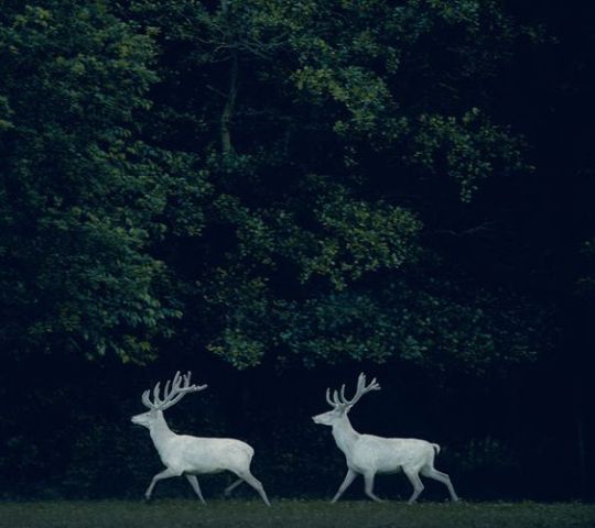
Birch Elk
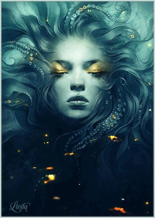
Siren's (not my art!)
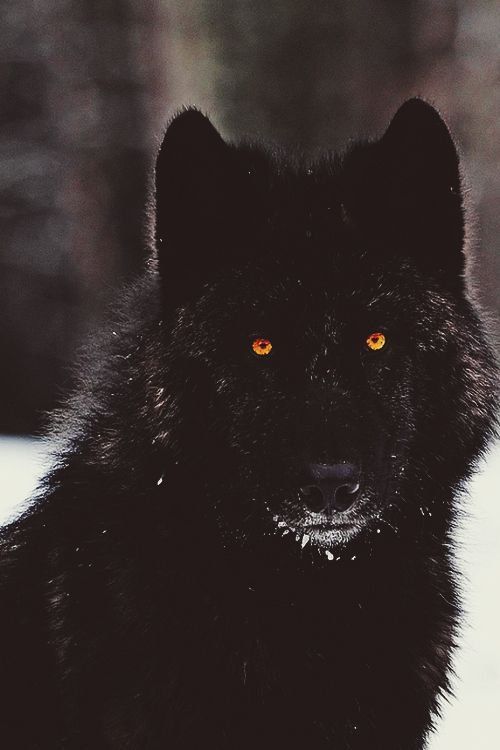
Ember Wolves


Totally Average Horses (ok fine, MAYBE its MY take on a unicorn. Not my art though)

Armayan Sea Monster (found in the Armayan sea that lies between Elubeth and Lorigothia. Terrifying, but not my art.)
There are also Fire Toads, Emerald Crested Geckos, and Feathersnakes (which are VERY cute)
In Elubeth, each town/village/city has differences in clothing, food, and way of life. Lorport is a port town full of Royalists, pirates, and poor fisherfolk just trying to scrape by. Rye, like Gilamoore, is a simpler town full of farmers. Caelfall, near the Royal City of Bowes, is a prim and proper city full of people who totally love the Queen. Definitely. They're 100% not just scared into falling in line. No way.
As for technology, I'd say its very much your typical medieval schtick, though I'm still adding onto it! There are a lot of swords, wooden ships, and things like that. But there's also crossbows and knuckledusters, and carriages that aren't pulled by horses but rather run on magic power. There's also the use of gears and simple mechanisms. I really need to sit down and work more on my tech. Any ideas? Throw 'em my way!
Finally, dragons. As of now, there are not really any dragons that we actually SEE in the book, but there are passing mentions of them, and there's even a mention of a giant, ancient dragon skeleton just off the southern shore of Lorigothia, near Little Island. Perhaps dragons will gain more of a spotlight in the book, but as of now, they're just sort of THERE lol.
Thanks for coming to my Ted Talk. If you notice something that doesn't make sense, let me know! Fallen Magic is still a work in progress so things aren't perfect yet lmao <3
#fallen magic#worldbuilding#fantasy#kingdoms#fantasy creatures#dragons#magic#technology#languages#writing#book
4 notes
·
View notes
Note
Hey dear! How long since I wrote to you, I don't know if I can ask but could you give me some advice on how to edit/theme/customize your blog in an aesthetic way?
Idk, even basic tips are fine, I really love seeing your blog and I think you have really good taste in aesthetics ❤️
hey lovey! it would be my pleasure to try and help you <3. i say try because my explaining skills are the absolute worst but i will do my best lmao. gonna do this in bullet points ok:
have an idea / inpisration / a crumb of what you want your blog to look like! you can find inspo literally anywhere, a friends blog even (but please remember to always ask and don't take it harshly if said person declines you doing so). pinterest is also amazing for this, looking up graphics, different aesthetics, templates, i literally have a board on my pinterest i've had for years now where i get graphic inspo or where i go when i just need to feed my creative juices to put me in the mood to create something. canva is also great, i literally go on there and look up headers, moodboards, etc and just star them for later. keywords are everything as well, so like 'aesthetic here + color, vibe, look, graphic, template' helps sites like canva and pin lead you in the right direction. same with just typing things like 'green, grunge, lovecore, etc'.
edit on desktop! now i know not everyone has a laptop or ipad or the ability to do this but i highly rec it over editing on the janky mobile app where sometimes things save and sometimes they don't. plus i always use one of the random saved user blogs i have to make a test layout / theme so if i don't like it everything on my main blog is fine, didn't change, and i didn't waste all that time on a theme i don't even want to look at lmao. so making a side blog where you do that is also great cause you can just copy and paste your nav post over, you can take the graphics you've already made and upload them onto your main without second guessing if they look good because you've already seen what it all looks like!
start small! by that i mean start with a simple theme or idea and build up from that. don't just start with seven graphics and ideas and overwhelm yourself. sometimes i just think of a color and be like yeah i'm make something with this color or wrapped around that color and i create something great.
ask a friend for help! i can't tell you how many times i've asked friends if this theme looked good or to send me inspo pics or what theme they think i should do, or even asked them to help me find resources. utilize your besties and mutuals.
not everyones aesthetic is the same! some people like messy themes, some like overdone, some like super simple. don't compare yourself to anyone!!!! everyone creates differently, everyone sees colors and aesthetics amd themes differently. no matter what you decide to go with is all your own and great and special.
etc: putting all your most important links in your nav is always a good rule of thumb (anything you really want to highlight as well), if you use pngs they're all over tumblr and pinterest 'transparent' + 'png' at the end or beginning of what you're looking for will always lead you in the right direction, and when it comes to pngs i highly rec adding them to a white background or transparent one and make the size of the background 500px and move the png halfway / towards the bottom (centered) of the background so tumblr doesn't make your header all the way at the top and ugly, don't make your nav post too long, take colors from your images / aesthetics to incorporate throughout the whole theme so everything meshes well together, don't use flashy dividers because it's not good on a lot of users eyes and unless you state a tw in the tags it's just not as cool as some people think lol.
that's all i can think of but if you have any more questions bby my pms are open!!
10 notes
·
View notes
Text
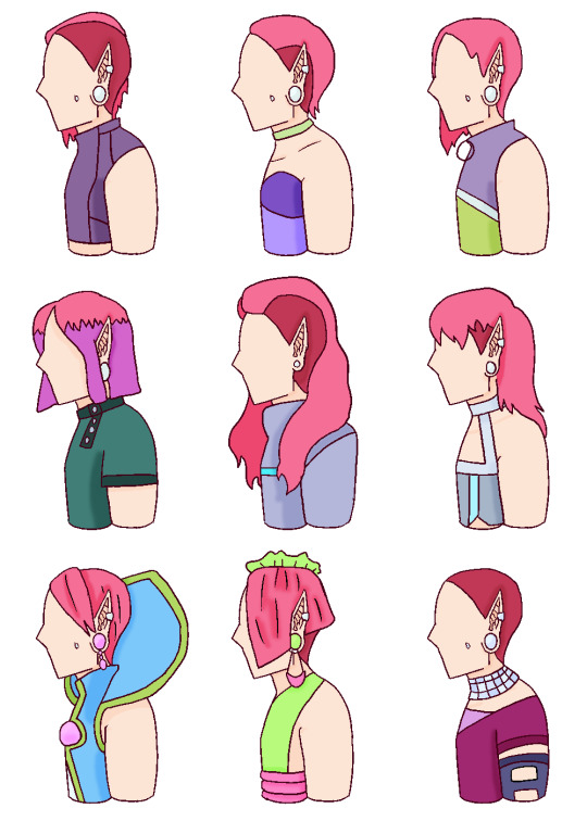
⚡ Tec hairstyles ⚡
Oh my god this one was so hard. There are only so many ways to shave your head and long hair on Tecna is the devil speaking. I will only tolerate it on pre-highschool Tecna. Yeah, that middle row is just Tecna though middle school. You can see her gauges get bigger. Piecing like this are super common on Zenith, and I don't think earlobes would be hard to repair with magic. So her getting them wouldn't be a big deal me thinks
Anyways on to my thought process
Standard Tecna: the way I usually draw Tecna with the shaved head. With a simple cyber top. Fun fact! At first I thought her head was shaved and her earrings were gauges before I really looked at her, and I thought the shaved head and gauges looked cooler so I kept them. Another fun fact, I was originally going to give Tecna cyber bite piercings, but I decided they didn't look all that good on her so I settled for the far weirder looking dimple piercings
Alternative: This one was also called "Misses steal yo girl". Hide your girlfriends and wives
Classic Tecna: Tecna's canon hairstyle. Nothing against this beauty. She's sleek, pretty, and classic for a reason. Hats off to you ma'am
S8 hair color: I've made it no secret that when making Tecna's hair violet or pink from her originally magenta, I'll pick pink every time. So I thought it would be funny to include the later seasons shade of purple hair that Tecna has as dyed hair for Tecna. This is baby baby Tecna right here, with the classic Tecna earrings, and no interesting piercings bc she's literally a baby. Outfits based on the Zenith outfits that one of my followers forcefully decided to shove at my eyes, whyyyyy
First shave: the one time I will allow long hair on Tecna. She's a baby and she's still learning her style, she's trying it out before she decides she hates it. This is her first time shaving her hair, and those are her step one gauges. Baby's first foray into being alt and she will never look back. Bonus extra shoulder outfit, for the vibes
The mullet: THE MULLET!!!!! this is right before she went to Alfea and got her signature style, bc she didn't think the mullet fit her personality well as a standard look but she loves the way it looks so dearly. Which is why her beloved mullet comes back in her Enchantix. The horrible mullet will never leave no matter how much you want it gone, she loves it and thats everyone else's problem. I had to include her amazing back to school outfit somewhere. Made it blue tho
School formal: the pixies cut I've always wanted to put on Tecna. It looks a amazing. Like I prefer the asymmetrical look bc it's more girlie looking??? Can't explain. But this is still super pretty. The flat side swept bangs is because I thought it would be funky to give Tecna bangs. It's a litt odd looking on her bc I'm used to her not having them but they don't look bad
Eraklyon ball: Extra pointy Tecna. I actually really like this for a fancy Tecna hair cut. But it's a whole new shaved hairstyle. Ig that wouldn't hard to deal with? Bc she could get her hair magically lengthen, reshave, and then do it again to put her back?? But that's a ton of work. It still looks p good imo tho
Shaved Tecna: I uh didn't have anymore hairstyles ;-; I had one final fucking hairstyle, and I didn't wanna do a pixie cut because I had already basically done that for the school formal or a undercut bc I wanted that one to be exclusive to Musa. So I gave up and shaved it. Plenty of alt bitches shave their head, it's fine, it's fine. Also yeah this space outfit from s8. Every now and then my eyes are assaulted with s8 images, wow images, and fate images, and I thought this outfit looked dope on Tecna so it can stay. She probably fucked up her hair in some way and decided to shave it all off. It will grow back soon
33 notes
·
View notes
Text
I did a tier list of the Markiplier Egos, so I thought I’d share it here – and, yes, perhaps some of these ratings indicate who I like to write, sue me. So, bottom to top, here it is:
Actor: Super Hell
I goddamn hate Actor, as you could probably figure out. He’s a prissy bitch, who deserved everything that came to him. Okay, that might’ve been a bit of an exaggeration, but Jesus Christ do I hate him, mainly for causing Damien’s death, plus everything else, but mainly that. He deserves less than Super Hell, but that is the bottom of the barrel.
E-Boy Mark: F
Reminded me too much of my boy Bing, and I did Not like it. Plus, I have the same tiger pattern on one of my jackets, and I did not want to be associated with this E-Boy. So, F tier.
Ed Edgar: F
I hate babies. Simple as that. Props for being a cowboy aesthetic, but that mustache knocked him back down into F tier.
Derek Derekson: F
Need I say anything? He’s abusive and a bitch, and I care too much about my baby Eric to put him any higher. I would put him lower, but Super Hell is reserved for Actor. F.
Silver Shephard: E
I haven’t seen anything about him, except for the skit with all the other egos, in which I also did not see much. Cool costume, but no clue. E.
Dr. Iplier: E
Again, not much. To be honest, both of the Egos in the E tier are ones I haven’t seen much of but know about. Hence, the doctor is here. Nice catchphrase, E tier.
Yandereiplier: D
The animation is cool, I’ve always liked horror-blood elements, and the pictures of Yandere have the red hair, which I am a fan of. However, the game itself is a point down, and he is only for the sim, so D tier.
King of the Squirrels: D
A classic start to the Ego train, so points given, but points taken away because I am not a huge fan of peanut butter. Squirrels I love, though, so again. Hence, D tier.
Bill: C
Okay, so I haven’t seen the video he comes from actually, but I did see one clip of him saying ‘Oh, honey, no’ and, boy, did I feel flustered, and I don’t even know why! It was just weirdly sweet and reflects the kinda stuff you see in my S tiered Egos. But, alas, he’s not all that common in videos, so C.
Bim Trimmer: C
I don’t know either, man, he’s just a funny guy. The image I have for him is so stupid, and he’s Bim Trimmer??? C’mon. C tier.
The Colonel: C
Being separate from Wilford, he’s kinda lacking in substance compared to him, but I get it. Cuckolded a dude, which isn’t a great start, but it’s Actor, so I don’t care. Says ‘bully’, which is fun, but he does kill the viewer, so points off for him, putting him in C.
Google(s): C
Might be influenced by my having a fic in the works for him, but I am also a sucker for AI, android stuff. Plus, the fanart I see for him is always cute. Him being rude to Bing takes him down a notch, though, so C.
Heehoo: C
The concept of this guy is so funny to me – like, Jesus Christ, the Markiplier runs into the wild, completely naked, save for maybe shoes, of all things, and is fine??? The long hair pushes it over D, but the lack of a voice keeps him in C.
The Nightguard: C
It’s mainly for the musical itself, and that one moment when he leans in and says ‘I killed a guy’ because obviously. Not to mention it’s Mark singing. However, this one can be excluded from being an ego because it is basing off of a pre-established character. So, C tier.
Captain Magnum: C
I haven’t gone through his ending yet in AHWM (sue me, I got Yancy first), but I do love pirates ;) but I don’t love beards. Personal preference, it just takes away from the face. Basically, the aesthetic alone brings it into C tier.
Annus: B
Now, I did watch, uh, [redacted] – catch my favorite video being the A.I generated basically fanfictions – and I loved the whole concept of it! The ending, especially during covid, kinda helped me get used to death and the idea of having to die in the end. However, some of this does not extend to the ego of Annus. I feel like there was a lot more they could have done with both Annus and Unus, but I understand that most of the audience would not have wanted it to be fully cryptid and ARG-esque, so B is both the lowest and highest I can go with him. I do love suits, though.
Eric Derekson: B
I have seen next to nothing about this boy! And I love him :D! He’s just so cute in everything I’ve seen and read. Solid B tier for the cute side, anyway.
The Jims: B
Honestly, it’s a goof ego, and I like that. The stupid movements and the little side bit about WKM made me happy after the sad events, and I saw them in Space, so I’m happy to put them at B, as a collective, of course.
Monster Gulch Mark: B
I’m a sucker for apocalypses, man. The casual murder plot caught my eye, and then the second song was a banger, too. I was super disappointed when nothing ever came out from Monster Gulch again, and I appreciate the running water thing, if you know what I mean by that. So, for both Mark in this and the musical in general, B tier.
God of Night: B
Dope aesthetic and I am a sucker for deity-stuff. However, I do not have the attention span to watch a 3+ hour video where he is not in all of it, and was, maybe, recorded without a hard script? I don’t know, but I know I should watch it considering I have a fic queued for him. Cool concept, but I can’t watch so much of that in one go. B tier.
Noir: A
You remember that I said I love suits, right? Well, this guy, in a disheveled suit, the noir aesthetic – one that I loved since I saw Into the Spider-Verse – and the voice over??? A tier, and I will take no comments. Also, there’s something to be said about how the lower tiers tend to have the cocky-know-it-all egos, and the higher tiers are soft guys. This, the A tier, is a weird exception.
Murdock: A
No. 1, the murder – no. 2, the vibe – no. 3, the outfit! The moment I saw Murdock, I had to put the screen down and go for a walk. You’ve seen this man, you understand what I mean. A tier, for everything he’s involved in.
Dark: A
This is probably lower than a lot of people would put him, and I’m still debating putting him higher, but A tier is the least I will go. Again, there’s the suit, plus, I’m a fan of the glitchy, multi-emotion thing he has going on. However, as many of you will remember, he did shove the viewer into a mirror and steal their body. Not great on his part, but he is against Actor, and the enemy of my enemy is my friend. Hence, A tier, plus he does stage himself sexily on that desk, so…
Engineer: A
This guy is plain cute. He’s devoted, he’s hard-working, he appreciates the aesthetics! He really should be in A+ tier, considering I have a sticker of him, too, except for one tiny snag. Actor. He is the source of all my trouble and complicates things in the theory sense. Is Engineer actually Actor? We don’t know, and I don’t like to think I would put anyone related to Actor in A+. So, sorry, my dear boy, he has to be in A tier.
Bing: A+
If you’ve seen my other posts, you may already understand why he’s here, but I will reiterate for every who doesn’t know. I don’t know what it is, but the dumb, skateboarder-bro, with a heart of gold is a thing I love. The glasses are cool, the orange I adore, and an android? C’mon, I can’t put him anywhere but A+. (I also have a sticker of him on the laptop I am currently writing this on)
Host: A+
I had to go searching for Host after the sketch with all of the egos in it, and, boy, was I overjoyed to find him. The blind-fold and narrator bit, and a couple of fics I’ve read influenced this decision. A+ tier, but it’s a controversial one. (Another that I have a sticker of)
Wilford: A+
Yeah, this is just where he belongs. S tier is reserved for two egos here, and so Wilford is a banger in A+ tier. The whole fruity-bisexual-timelord thing is amazing, and, as far as character design goes, oof, the fluffy hair, slightly unbuttoned shirt? I am swooning. A+ tier. (Also, a sticker)
Illinois: A+
This guy has two belts. What a dude. And the flirty thing I appreciate, the whip cracks, as well. Him walking backwards through a bunch of traps is pique douche, but in an oh-my-god-he’s-going-to-get-himself-killed-better-help-him kind of way. Like pulling a drowning dog out of a pool and them shaking off. A+.
Can you guys guess who’s at the top of this list? If you can’t, lemme tell you.
Damien: S
Damien is my comfort character, and that sucks because – spoilers – he is dead. I forgive him for shoving the viewer into a mirror, solely for his adorable personality and all of the fics people have for him prior to poker night. The ‘little monster’ nickname has me squealing every time I hear it, and I could fully write an essay on his character. Fuck Actor for killing him, and fuck anyone who doesn’t think he’s amazing. Solid S tier, no questions.
Yancy: S
Objectively the best character. He was my first ending in AHWM, I love his song, he applied for parole??? Look at that man, listen to him talk – the accent omg – and tell me, genuinely, that you would not do anything for him. Look me in the eyes and tell me that he isn’t the light of your life. ‘Free as a buird’ – gods, he’s adorable, and a sticker that I have on the inside of my laptop, to boot!
And that’s it! Feel free to reblog or send me an ask telling me your opinion, but know that I will fight you if you disagree on my S tiers :D
Have a good day everyone!
14 notes
·
View notes
Text

I don't remember if I already posted this but I'm posting it anyway.
In case anyone doesn't know, I have Flight Rising size and proportion art commissions open. If you've looked at some of my more complete bios in my Flight Rising clan, you'll see that I have art of my dragons that depicts their proportions and size. It goes with pixel size too, so when you place the images next to each other, you get a size comparison of those two dragons.
These pieces are designed to go into bios, and I only have a base for Imperials at the moment. Once I've done all my imperials, I'll probably be moving on to Fae. These will generally cost 10$, but there can be exceptions. Very simple or basic dragons are 8$, and if the dragon is super complex and/or you want me to include apparel or their skin/accent, it'll be 12$
I encourage you to also check out my Deviantart, and message me there if you can! I'm generally more likely to respond there, but messages on Tumblr or FR are fine too.
8 notes
·
View notes
Text

Today we're breaking down Peach! I dunno if I'm gonna have a whole lot to say about her, but she's another mainstay so I figure it'd be better to cover her sooner rather than later.
So I'm gonna start with how I feel about the piece this time, and then get into all her inspirations and such. I'll be honest, I'm not really all that confident in my ability to draw the Mario girls. At least, I wasn't at the time I drew them for this. Something about them, be it the proportions, or face, or even hair, just makes them really daunting to draw for me, and it's why I've rarely if ever drawn them. That being said though, I am overall satisfied with how Peach ended up coming out! I feel like I could have made her body a bit more slender, and I would if I were to draw this now, but on the whole I think she came out fine.
Now onto the piece itself. I think Peach having a more simple, less-anction-y pose suits her well, just her holding the ball and smiling. She'll definitely mess you up in competition, but she also wants to look pretty for the camera.
The outfit doesn't really have any direct inspiration. Basically I wanted to go for more of a skin-tight suit look. Initially she was just gonna have an identical look to the first Mario Strikers, but I scraped it since I wanted to give this look more identity. Not a lot more to say about the outfit itself, but I do like the hot pink gloves. They're a neat touch!
Attacks actually do have some references though. Princess' Kiss is mainly based on her special move in Mario Sports Mix, where she sends hearts around to stun players so she can make a score. It's a similar move here, only it's one heart and it moves slowly, making it more balanced as a move she can use without filling up a meter. And though her Super Spike doesn't have a direct correlation with anything she's done, I did base it off her MegaStrike animation!
(i could not find a good image of her sports mix attack lol)
And that about covers it. I did Peach really early on, but I do feel more confident I can tackle characters like her in the future. Maybe at some point I'll draw her more and see how well I improved.
5 notes
·
View notes