
Last Seen Blogs

21sharkie
SUBSCRIBE TO CRANIACS!

tistje
My Life

cutierye
Rye Oliver Morales Blog
@Iamryeblogger

mollyponkevitch
The Ecliptic

eggs-can-draw
Living In Serendipity
Photo
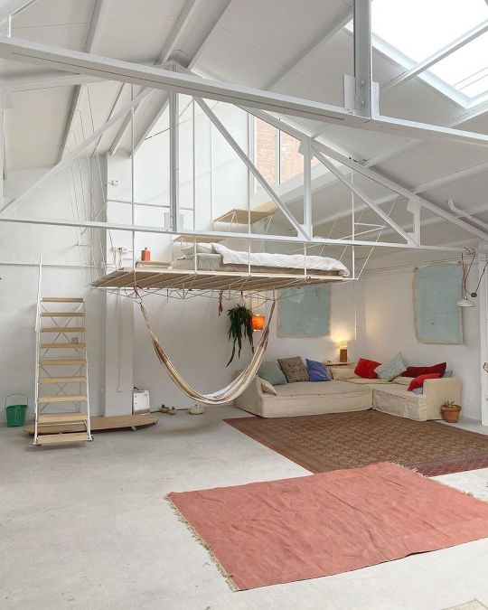

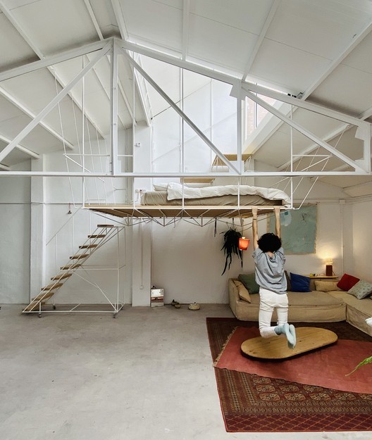

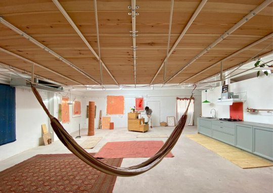

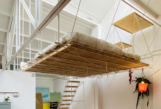

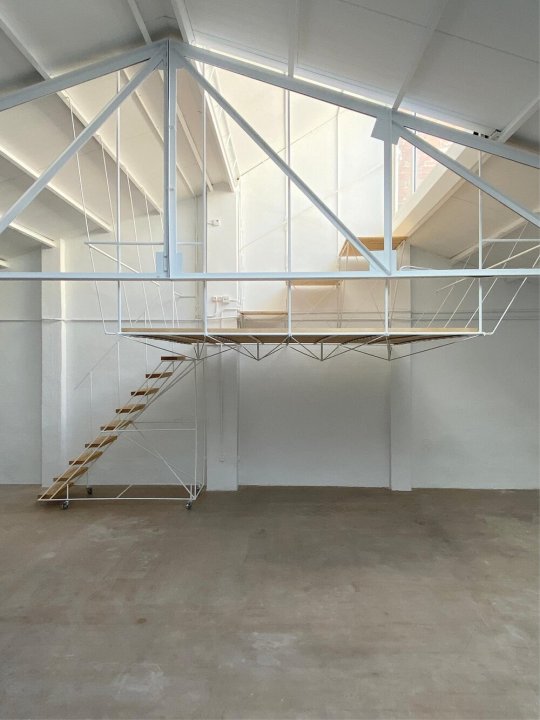

Topo’s Shed
“in madrid, spanish architect pía mendaro has designed a home/studio for her friend, artist clara cebrian. named ‘topo’s shed’, the space is a converted warehouse that measures 10 meters by 10 meters (33 x 33ft). ‘clara is an artist and does not like overly designed things,’ explains mendaro. ‘she wanted something ‘like ron weasley’s house’; something that could adapt to the needs that appear over time.’ consequently, the project was designed to be as flexible as possible — serving as a ‘basis for life to happen’.
the focal point of the interior is the elevated bed, which mendaro designed alongside manuel ocaña. capable of supporting up to five people, the lightweight, suspended platform is accessed via a separate structure — a movable device reminiscent of airplane step ladders. as well as freeing up valuable floor space for cebrian’s work, the raised sleeping accommodation also provides external views and access to an outdoor space — an element of the design that the architect believes is necessary for mental health.”
- Design Boom
#arcitecture#architect#home#house#home design#interior#exterior#product design#interior design#industrial design#furniture design#graphic design#furniture#cool bed#minimal#minimalist#minimalism#simple#modern#modernism#madrid#shed#tiny house#small space#apartment#small apartment#artist#art#art studio#artist home
75 notes
·
View notes
Photo
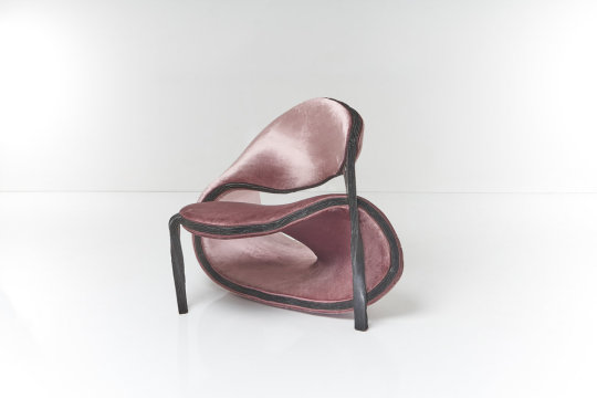

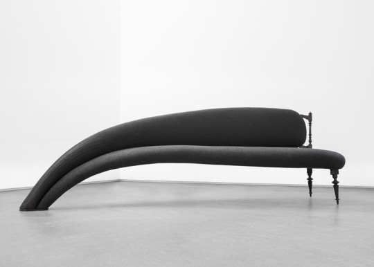

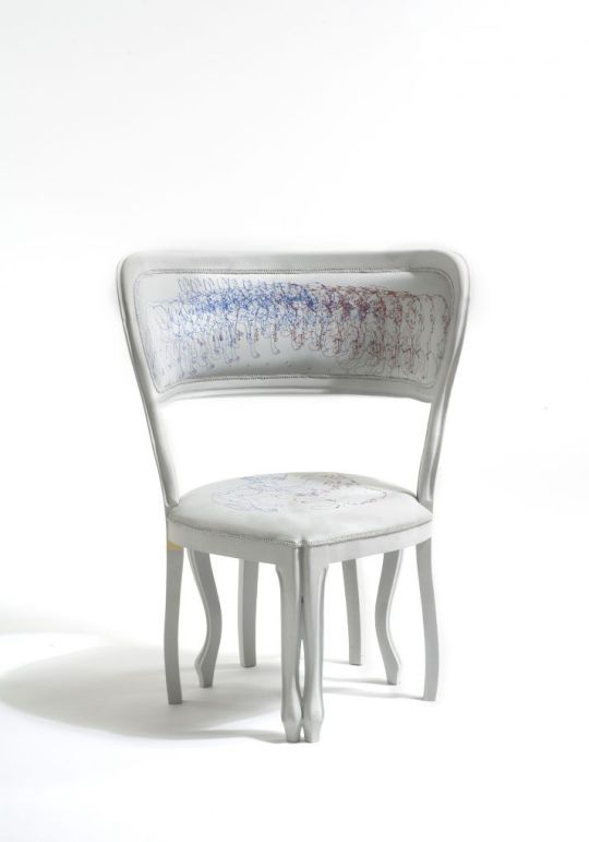
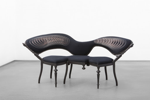

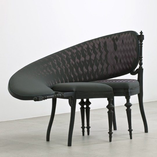
Sebastian Brajkovic Distorted Furniture
“Amsterdam-based designer Sebastian Brajkovic’s distorted sculptural forms look as though traditional French furniture has been pulled through a time loop. Brajkovic’s work—part furniture, part sculpture—explores the process of distorting interior designs and the effect his skewed pieces have on human perception and emotion.
Brajkovic ‘deconstructs’ historical designs—the patterns, detail and structure appears similar to the furniture found in the Queen’s Apartment in the Palace of Versailles. By basing his work on the patterns and form found in historical design, Brajkovic unites the past, present and future, and while his sculptures stand tall as sculptural forms, they also work as functional objects. ‘My pieces are made constructively out of bronze,’ Brajkovic explains. ‘Then there is upholstery on the bronze. I like this juxtaposed combination of hard/cold and soft/warm material. After this, there is metal (bronze or copper) hand embroidery usually on the works that might give the feeling of bronze structure that goes further into the surface of the fabric.’”
- Anna Marks
#furniture#design#interior design#home design#furniture design#product design#industrial design#sculpture#sculptural#sculptor#art#3d#3d art#artist#vintage#old#new#modern#abstract#distorted#glitch#minimal#minimalsim#minimalist#amsterdam#sebastian brakkovic#french#time loop#patterns#detail
235 notes
·
View notes
Photo
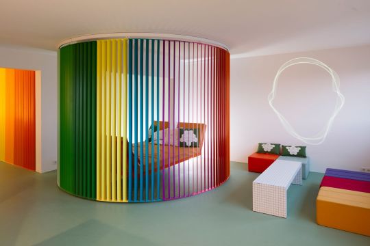
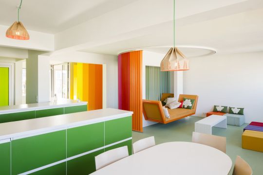

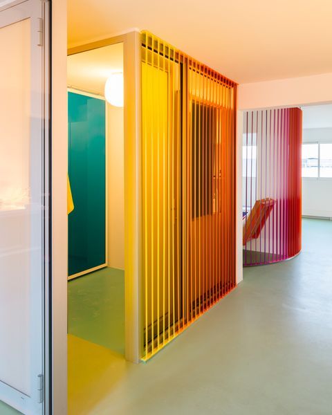
“french designer matali crasset has completed the renovation of an 80-square-meter apartment in paris for a person living between the city and the countryside. the owner — founder of le buisson, a company that produces jewelry made by artists and designers — gave crasset complete liberty to renovate the property located on the ninth floor. throughout its conventional plan composed of an entryway, two bedrooms and a living room with kitchenette, the project proves that clear choices can be made to add new logics to traditional spaces.
aptly named le rainbow et le bosquet (the rainbow and the woods) this apartment renovation by matali crasset proposes a clear, naturally-lit white space as the main background visually divided by the use of color. on one side, the rainbow area offers a feeling of openness that is amplified through the addition of low-lying furnishings. on the other, the woods weaves the same typology from the kitchen to the terrace but with a green hue that conjures a woodland.
a firm believer of color is life, crasset has used a rainbow-color configuration as the key element of the apartment — a sliding curved blind structure that gives dynamism to the space. by rotating it, the element can generate different apartment layouts: along the wall it offers an open space; when half-closed it creates several zones; and when completely turned it results in a private space where one can sleep surrounded by the color rhythm.”
- Design Boom
33 notes
·
View notes
Photo
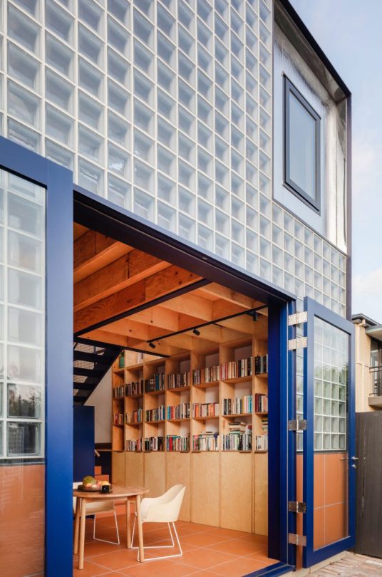

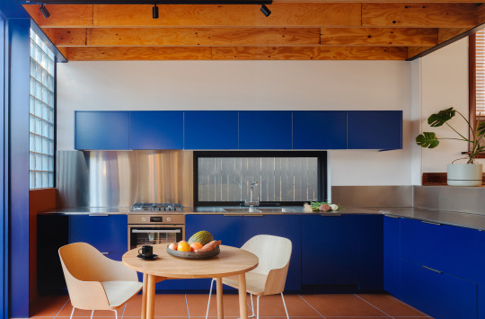


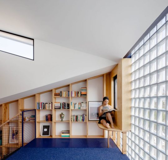

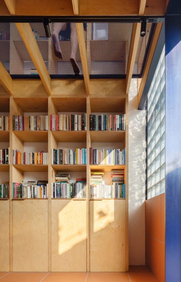
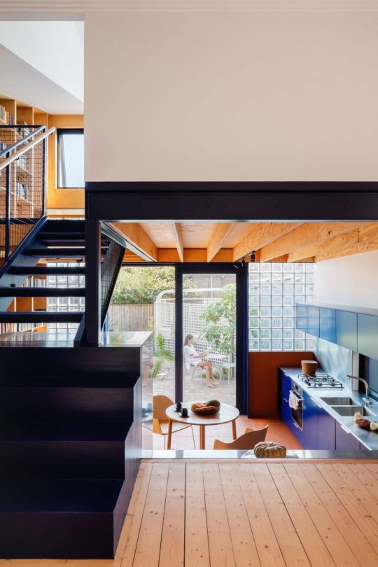
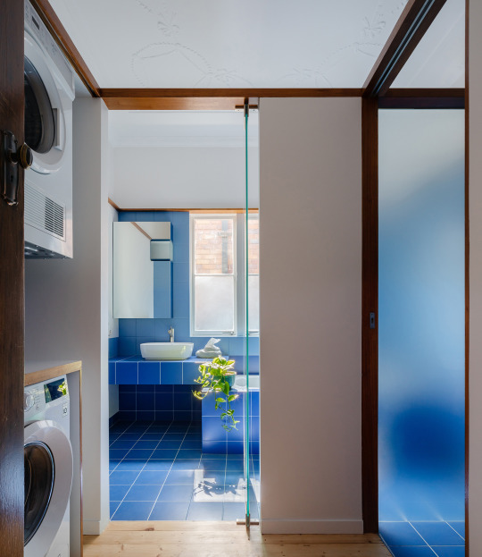
Glassbook House
“Intended as the forever home for a retiring academic of English literature, Glassbook House by Sibling Architecture is as much a home for its many paper-bound residents as it is for its owner.
Glassbook House sees the transformation of an existing cottage, following the familiar story of the removal of an ill-fitting extension and the creation of a two-story extension to the rear. Set on a steeply sloping block, the addition to the rear allows for a better utilization of the site, dropping to allow for a living area on the sunken floor in order to better connect to its rear courtyard. Sibling Architecture has brought together the functional elements of the brief and cleverly injected a rationality of form to create a voluminous and connected home that addresses its site and adds admirable amenity for its owner.
As the home of an academic in the field of English literature, the new works were intended to imbue a sense of permanence and sanctuary. Focused around the practice of reading, the library is the crucial point of the home. Set within the rear extension and bathed in natural light from the encasing glass block wall, this additional space allows for the creation of a connected kitchen and dining space and kitchen above. The original cottage meets the rear at a halfway point, and at this half level transition point a metal and mesh stair connects both upward and downward, with minimally interrupted sight lines to the rear due to the fine material choice.”
- Bronwyn Marshall
#architecture#architect#design#art#interior design#exterior design#interior#exterior#industrial design#product design#home design#graphic design#visual art#visual design#home#house#glassbook house#sibling architecture#australia#australia architecture#english#books#read#reading#literature#bookworm#library#renovation#innovation#innovate
43 notes
·
View notes
Photo

Flair Chair
“thomas gossner has introduced ‘flair’, a chair that focuses on the changing needs and requirements of public seating, allowing users to access a seat whenever they need one. through exploration of the emerging chairs concept, the designer has created the flair that can be attached flat to walls and unfolded by detaching one side, pushing the chair together.
the flair by thomas gossner is made out of a single sheet of polypropylene with four living hinges that build a durable folding mechanism. polypropylene provides the necessary fatigue resistance and flexibility for producing living hinges, as well as allowing the seat to bend in a stable, yet comfortable swing-like shape. the material thickness and measurements of the hinges are developed and tested to hold at least 200kg. apart from the mechanical properties, polypropylene is suitable for use in public spaces as it is highly durable and easy to clean.
the flair has polypropylene’s original white colour and it is covered with a matte finish in order to prevent visibility of potential scratches. being slightly translucent in its natural state, the polypropylene used partly reveals and subtly highlights the attachment of the design. the attachment consists of a metal structure with an included hanging mechanism, colored in dark canary yellow. the yellow details pop through the white body and attract the attention of the user. the visibility of the holding elements combined with a slight distance between the wall and the flat chair communicate the possibility to detach and unfold the flair when needed.”
- Design Boom
#design#furniture design#product design#industrial design#furniture#chairs#chair design#design boom#art#artist#creative#architect#architecture#graphic design#interior design#innovation#innovator#innovate#innovative#minimal#simple#modern#modernism#minimalist#minimalism#new#unique#strange#colorful#photography
11 notes
·
View notes
Photo

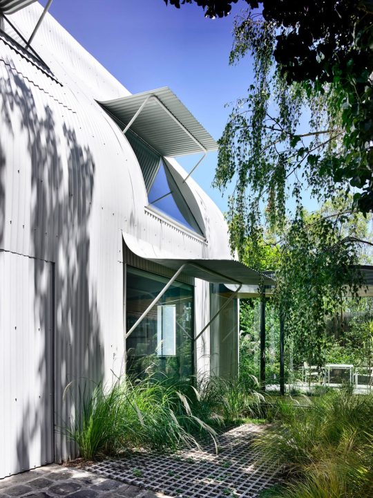
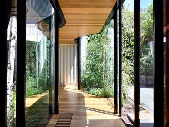

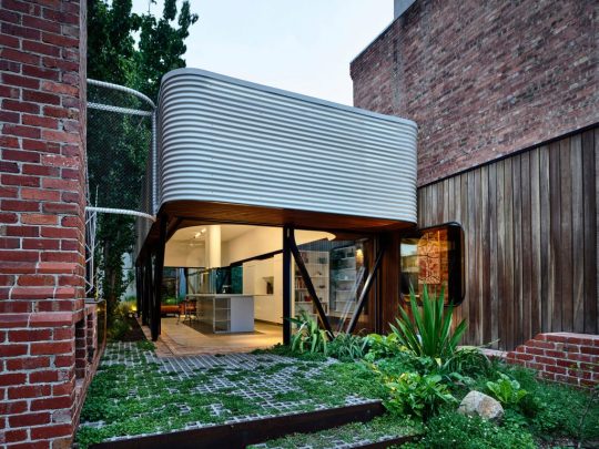


King Bill House
“Paving its own path, King Bill House is an impassioned offering from its inhabitants to the suburb of Fitzroy – where instead of densifying, they chose to give back and create a new pocket park. Austin Maynard Architects brings this love for the area to life, in a home that as generous as it is unexpected.
While many inner-urban residential projects are driven to take every inch of space and amenity offered by the site, the clients of King Bill House were motivated to give back to, not take from, the suburb they love. Through the renovation and reworking of their beloved terrace home, they wanted to express and celebrate the elements they cherished about Fitzroy’s diverse and tightly woven fabric. As one of five circa 1850s terraces, the original façade of the home is untouched, and behind lies the clients’ ‘forever home’. Observing the home and the site, its empty eastern side garden (previously a separate vacant lot) and the formerly unused stable structure at the rear, Austin Maynard Architects’ approach was to view every space on the site and every room within the house as an empty zone and reimagine its use as a starting point.”
- Bronwyn Marshall
#architect#architecture#70s architecture#1850s#fitzroy#Melbourne#victoria#australia#king bill house#austin maynard architects#design#home design#interior design#product design#industrial design#art#artistic#creative#modern#minimal#minimalism#minimalist#simple#innovative#innovation#home#house#exterior#interior#urban
35 notes
·
View notes
Photo


Frank Gehry’s House
“When Frank Gehry and his wife bought an existing house in Santa Monica, California, the neighbors did not have the slightest idea that the corner residence would soon be transformed into a symbol of deconstructionism. Gehry, however, knew something had to be done to the house before he moved in. His solution was a bold one in the 1970's that involved the ‘balance of fragment and whole, raw and refined, new and old’ and would strike up controversy.
Gehry actually did keep the existing house almost completely in tact, but not in a conventional manner. The Dutch colonial home was left in tact and the new house was built around it. Holes were made, walls were stripped, torn down and put up, and the old quiet house became a loud shriek of contemporary style among the neighboring mansions--literally. Neighbors hated it, but that did not change the fact that the house was a statement of art entwined with architecture.
Gehry's design wrapped around three sides of the old house on the ground floor, extending the house towards the street and leaving the exterior of the existing home almost untouched. The interior went through a considerable amount of changes on both if its two levels. In some places it was stripped to reveal the framing, exposing the joists and wood studs. It was repaired according to the addition, showing both old and new elements. This is especially evident when walking through the rooms of the house and passing by both new doors placed by Gehry and older ones originally in the house.
The entrance is barely discernible amidst the jutting angles of the exterior, which Gehry created from wood, glass, aluminum, and chain-link fencing. The apex of the old house peeks out from within this mix of materials, giving the impression that the house is consistently under construction.”
- Gehry Partners
#architecture#architect#frank gehry#homes#houses#design#home design#interior design#building#product design#industrial design#graphic design#construction#interior#exterior#art#found materials#unique#innovation#innovative#artistic#creative#modern#minimalist#minimalism#santa monica#california#70s#1970s#wood
19 notes
·
View notes
Photo


Felix Muckenhirn / Japanese Graphic Design
#felix muckenhirn#graphic design#japanese#design#art#minimal#minimalism#black and white#simple#60s design#1960s#typography#type#font#poster design#bold design#artist#creative#modern#red
14 notes
·
View notes
Photo

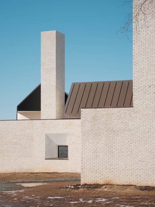
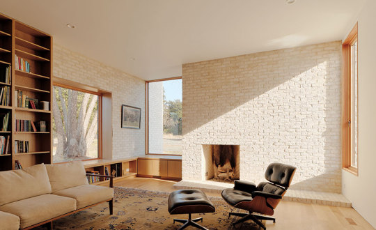

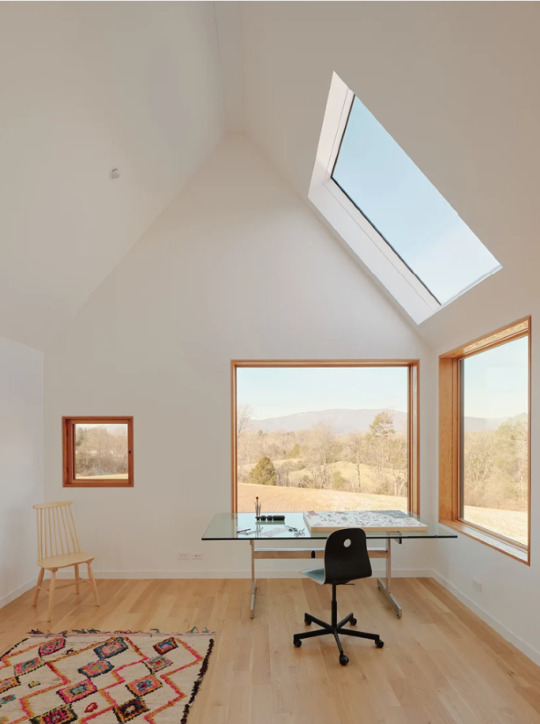
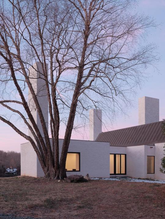
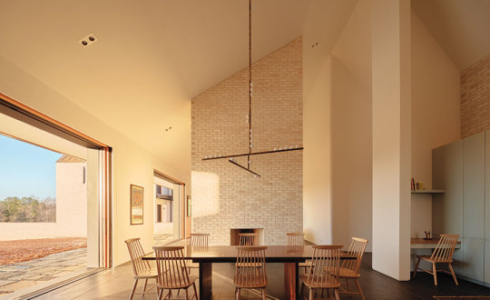
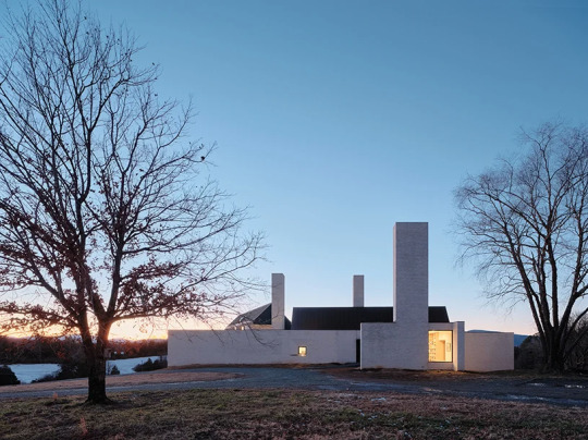
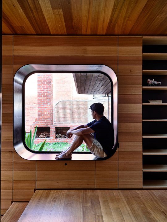
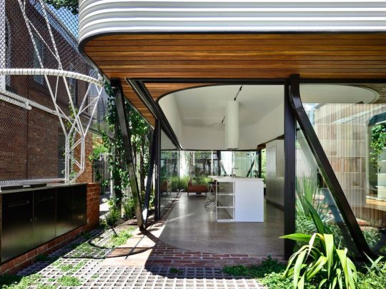
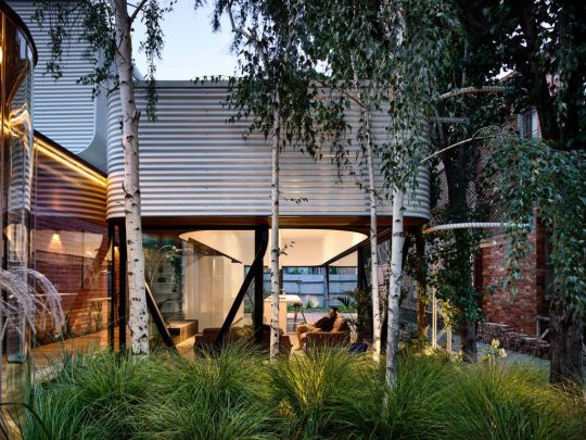
three chimney house ~ tw ryan architecture | photos © joe fletcher
3K notes
·
View notes
Photo
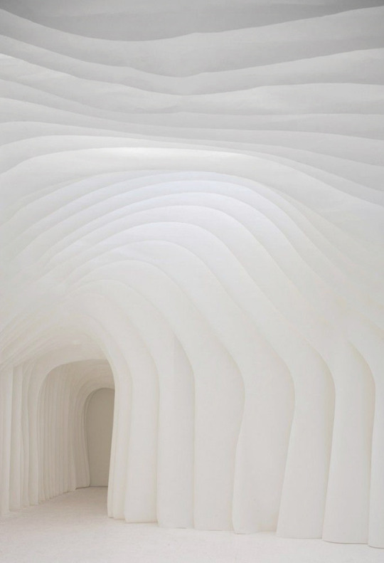
#design#minimal#modern#minimalism#simple#white#architecture#architect#interior design#product design#industrial design#art#sculpture#abstract
3K notes
·
View notes
Photo
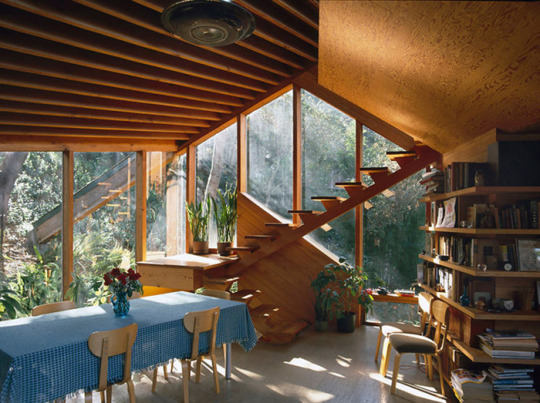
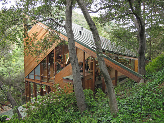
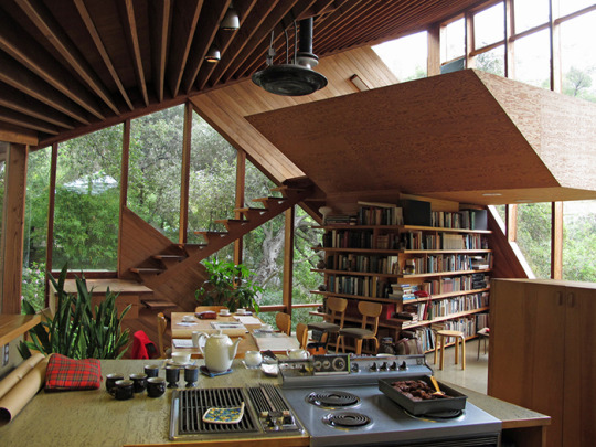
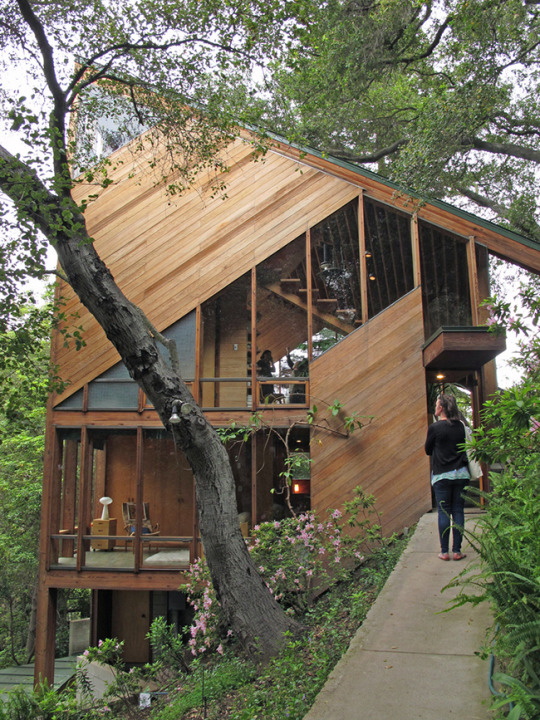
John Lautner
The Walstrom House, built in 1969, is located in the mountains of Santa Monica outside Los Angeles. California architect John Lautner creatively implements the use of wood material and asymmetrical angles. The house is warm and inviting but still stimulates interest through it’s unusual design.
#john lautner#architecture#architect#design#exterior#interior design#house#building#industrial design#product design#landscape design#home design#nature#outdoors#organic#1960s#70s architecture#vintage#1970s#plants#minimal#minimalist#modern#wood#angles#california#santa monica#la#los angeles#mountains
3K notes
·
View notes
Photo
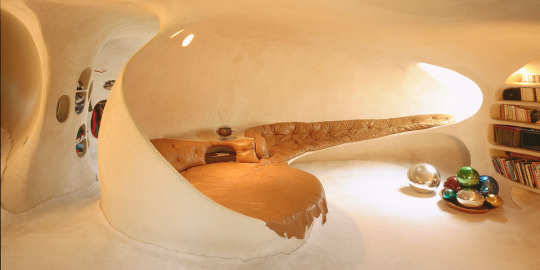
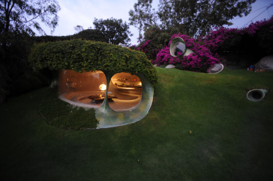
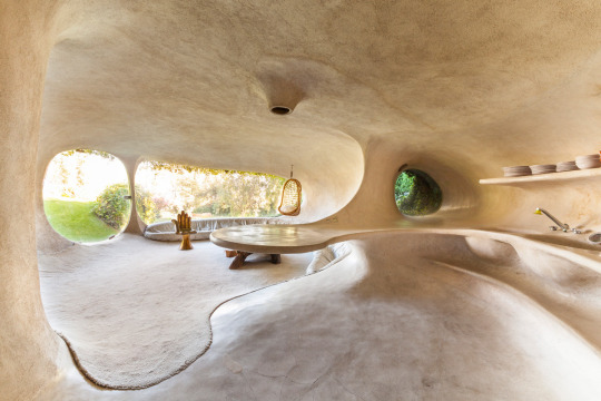
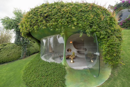
Javier Senosiain / Organic House Naucalpan de Juárez, Mexico, 1984; all images © Cortesía de Javier Senosiain.
#form#organic#nature#architecture#architect#house#building#exterior#interior design#product design#design#art#modern#innovation#innovator#minimal#minimalism#outdoors#sculptural
7K notes
·
View notes
Photo


Paul Milinski
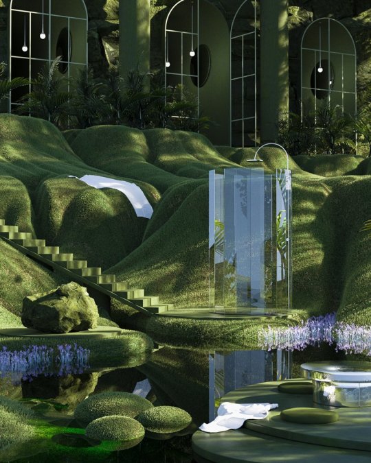
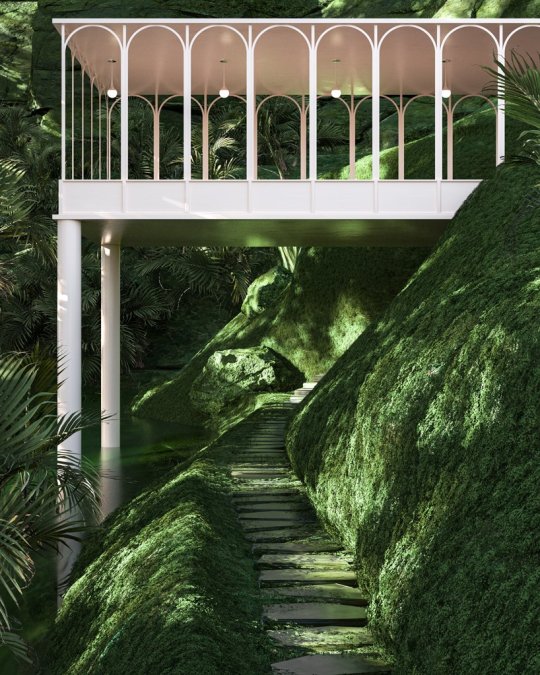
“Digital artist and designer Paul Milinski imagines a collection of spaces, each a serene hybridization of minimalist imagined architecture and overgrown nature. The series of environments are expressed with slender, white modernism and clean interiors integrated within a sea of lush plant life and green, rocky terrain. The artist entirely curates and digitally renders both the architectural spaces and their natural surroundings, including misty waterfalls and steaming glass. Paul Milinski comments on his design strategy: ‘My process always starts with a sketch. All I need is a few lines to create a spark and then I follow my intuition from there. Sometimes it’s a quick resolve and other times it’s a drawn-out battle.’”
- Design Boom
#design#architect#architecture#product design#industrial design#digital design#3d#exterior#interior design#environmental design#landscape design#art#artist#designers#innovation#innovator#creative#modern#minimal#minimalism#simple#nature#organic#landscape#wood#green#aesthetic#paul milinski#environment#modernism
36 notes
·
View notes
Photo
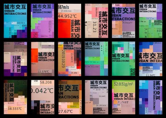
Branding for Urban Interactions, 2019 Bi-City Biennale of Urbanism & Architecture, @designeverywhere_ , 2019
#color#design#aesthetic#creative#art#graphic#graphic design#branding#marketing#urban design#architecture
26 notes
·
View notes
Text
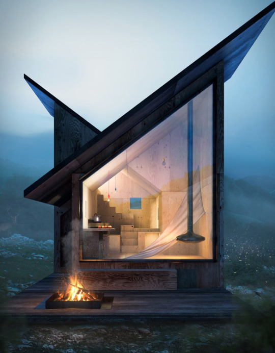
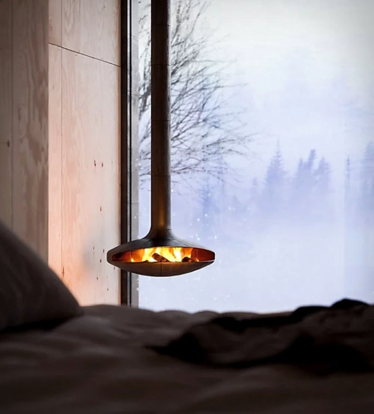


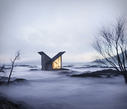
Good wood - this beauty is a modern take on the classic Italian mountain cabin, so thank God for modernity, as this is stunning. Aptly named ‘The Mountain Refuge’ by Italian architects Massimo Gnocchi and Paolo Danesi.
7K notes
·
View notes
Text
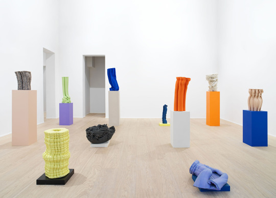
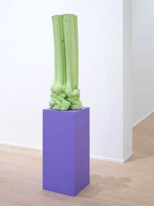

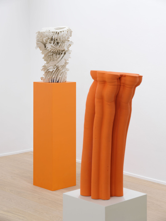
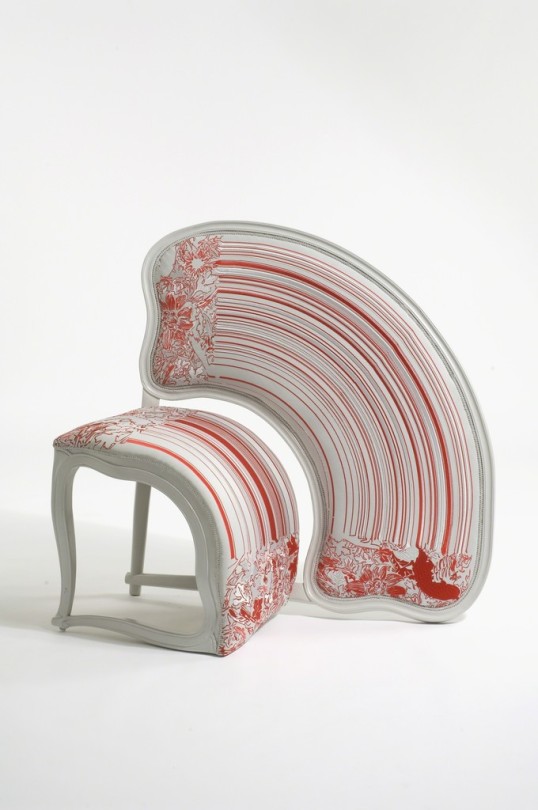
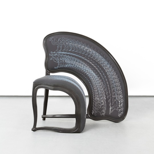
Nice colors with muddy form.
#art#design#color#sculpture#3d#3d art#industrial design#product design#interior design#architecture#aesthetic#photography#creative#innovative#modern#minimalism#museum
59 notes
·
View notes
Photo
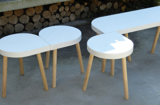
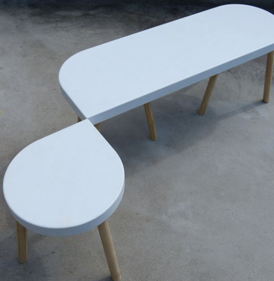

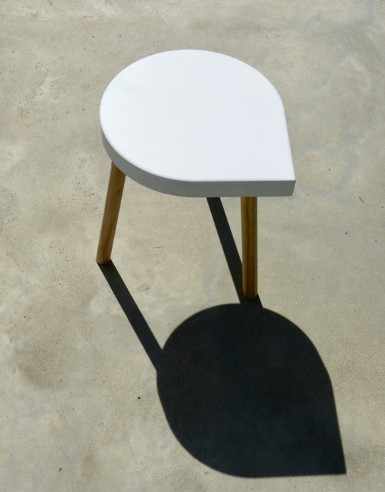
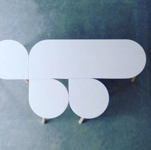

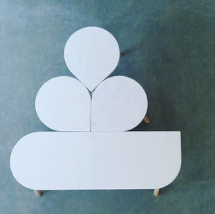

m.OnA stool and Bench by Ilona van den Bergh
The Belgian ceramic Artist Ilona van den Bergh created this m.OnA called set of prototypes of a bench and a stool that is inspired by ONA Ceramic series.
#art#design#industrial design#product design#furniture#interior design#minimalism#ceramics#creative#innovation#modern
341 notes
·
View notes