#i love the more simplistic yet elegant approach with their designs~!
Text
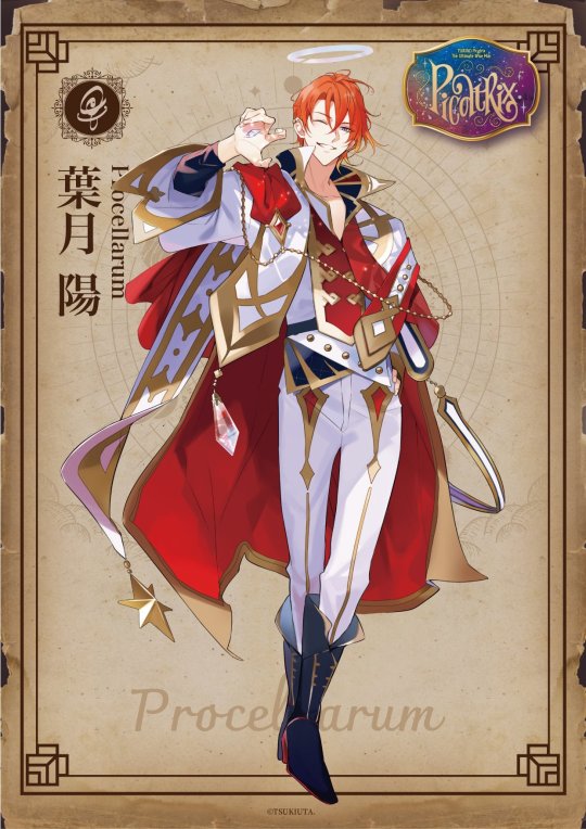
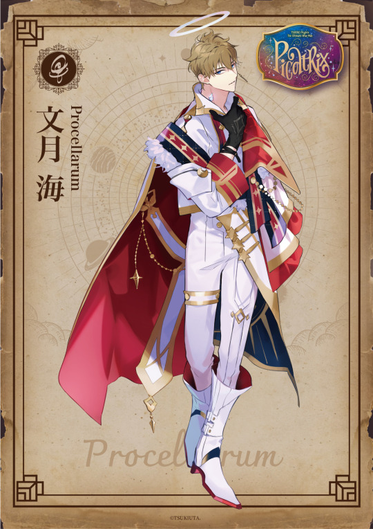
[Tsukino Picatrix] Tsukiuta Cast Introductions
Here are the cast introductions for Tsukiuta~!
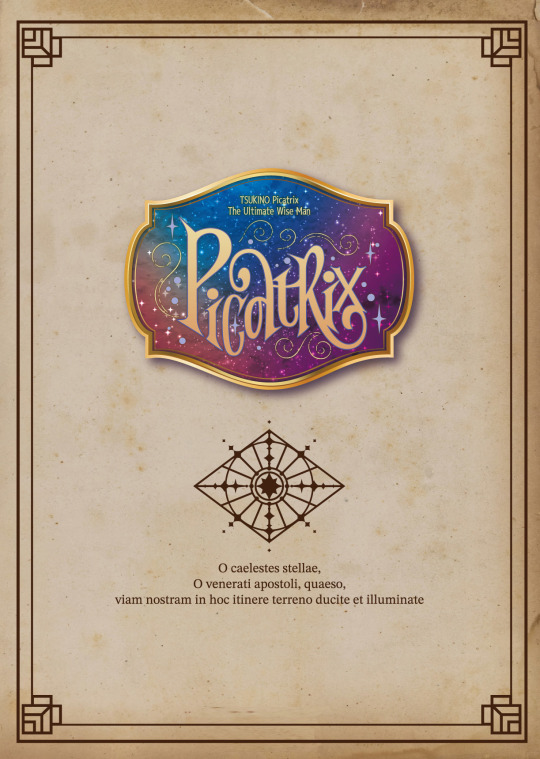
🌌 TSUKINO Picatrix 🪄
O caelestes stellae,
O venerati apostoli, quaeso,
viam nostram in hoc itinere terreno
ducite et illuminate
# TsukiPika # Tsukiuta # AGF2023
More under the cut, enjoy~!
🌌 TSUKINO Picatrix 🪄
[Six Gravity] SHIWASU KAKERU
“Welcome one and all to the Gravity caravan! We have rare goods from all over the world! … My horn…? Oh, uh~~~ It’s an accessory!☆”
# TsukiPika # Tsukiuta # AGF2023

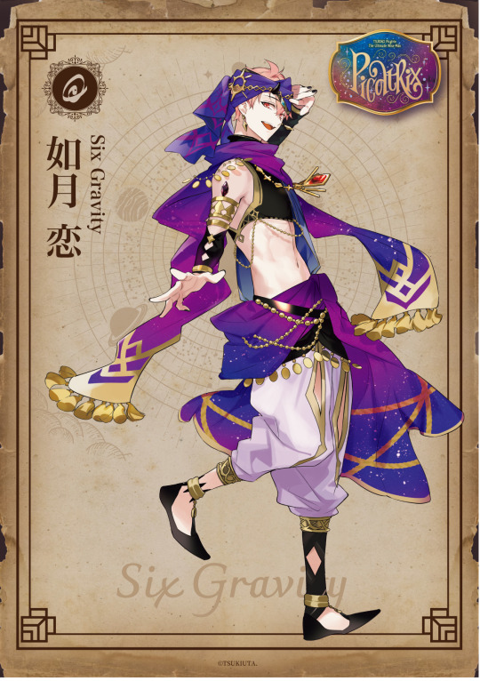
🌌 TSUKINO Picatrix 🪄
[Six Gravity] KISARAGI KOI
“Hello, hello! Gravity is here to tend to all your needs! We can handle any kind of magical problem you– WAIT– WHOOOOAAAA!!!??”
# TsukiPika # Tsukiuta # AGF2023
🌌 TSUKINO Picatrix 🪄
[Six Gravity] UDUKI ARATA
“(chuckles) Don’t you dare underestimate this desert’s Black Panther (self-proclaimed)... Rawr~🐾”
# TsukiPika # Tsukiuta # AGF2023

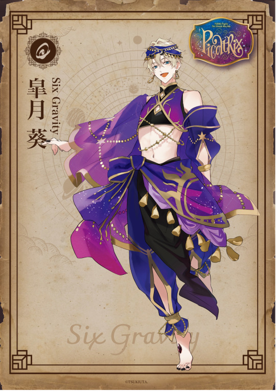
🌌 TSUKINO Picatrix 🪄
[Six Gravity] SATSUKI AOI
“Haru-san and I are the only ones working for the Union. Our relationship is civil and professional. We advocate for traveling freely without being held down by anything.”
# TsukiPika # Tsukiuta # AGF2023
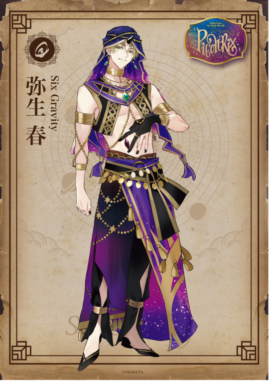
🌌 TSUKINO Picatrix 🪄
[Six Gravity] YAYOI HARU
“I started out as a slum orphan, and now look at the power and influence I have. I’m so glad I bet on you, Hajime. Ah, it’s alright~ I’ll take care of everything for you~♪”
# TsukiPika # Tsukiuta # AGF2023
🌌 TSUKINO Picatrix 🪄
[Six Gravity] MUTSUKI HAJIME
“Traveling is good. You get to meet new people, experience new things. I want to see more of what the world has to offer.”
# TsukiPika # Tsukiuta # AGF2023

🌌 TSUKINO Picatrix 🪄
[Procellarum] MINADUKI RUI
“Fuhahahaha. I am a part of Sanctus, apostles of Pluto who governs over death and the end.”
# TsukiPika # Tsukiuta # AGF2023

🌌 TSUKINO Picatrix 🪄
[Procellarum] KANNADUKI IKU
“I was once a failure unable to wield magic, but… I woke up to the Demon Lord sleeping on my lap one morning, and shortly found myself a Guardian. I know it all sounds confusing. Heck, I’m still wrapping my head around it.”
# TsukiPika # Tsukiuta # AGF2023

🌌 TSUKINO Picatrix 🪄
[Procellarum] HADUKI YOU
“Give up, old man~! That thing you’ve got there’s got my name on it. You can get lost or we can do this the painful way. ”
# TsukiPika # Tsukiuta # AGF2023
🌌 TSUKINO Picatrix 🪄
[Procellarum] NAGATSUKI YORU
“Whoa!! I–I’m so sorry!!! Are you alright!? You just touched a pendulum I just cursed, and um… I’m so sorry!!!”
# TsukiPika # Tsukiuta # AGF2023

🌌 TSUKINO Picatrix 🪄
[Procellarum] FUDUKI KAI
“Sorry about the ruckus my guys are making. (wry smile) Hm? Oh uh, I’m… I think I’ve broken the limits of being human since being given the White Demon Lord’s flesh and blood.”
# TsukiPika # Tsukiuta # AGF2023
🌌 TSUKINO Picatrix 🪄
[Procellarum] SHIMOTSUKI SHUN
“Would you care to show me the limits of a human? Play with me. Dance with me until the end! AHAHAHAHA!”
# TsukiPika # Tsukiuta # AGF2023

#tsukipro#tsukipro agf#tsukipro agf 2023#tsukino picatrix#tsukiuta#six gravity#procellarum#oh they look really cool!#i love the more simplistic yet elegant approach with their designs~!#all of six gravity looking fine tho...! O_O#arata and his cryptic energy lmao
50 notes
·
View notes
Text
the much anticipated part three in which dinner doesnt actually happen yet
part one
part two
Just inside the metal door, there was a plaque that read “TAKE OFF YOUR SHOES OR I WILL KILL YOU” in elegant, cursive lettering, and Daeron spent a long time just staring at it trying to decide whether he found the joke funny or not. At the moment, being murdered here was a genuine worry of his. The thought of Fëanor bursting into the entry hall wielding a machine gun and unloading just because Daeron had forgotten to remove his sandals felt entirely plausible. Daeron was careful to leave the shoes neatly in the row near the others.
After taking a moment to examine the gold-embroidered sneakers and a pair of dress shoes polished to perfection he finally managed to speak again.
“Is everyone in your family obscenely wealthy?”
Maglor glanced up. He’d taken a seat on a very uncomfortable-looking metal bench to unlace his boots.
“I guess so, yeah. Curufin and Caranthir have the most because they’re actually talented, but the rest of us are just kind of leeches on Dad’s fortune. He’s got more than enough.”
“Yeah.” Daeron glanced at the ceiling some thirty feet above his head. “I noticed that.”
“Once I finish recording, though, I should be able to hop off the charity line.” Maglor tossed his boots carelessly into the pile. “I’m gonna make it big.”
“I know you are, honey.” If he ever actually finished recording. Maglor was such a perfectionist; he’d been working on his album for years.
Abruptly, from somewhere deeper in the belly of this beast, came the sounds of shouting.
Daeron turned to see if he could place it. The entry hall was tucked just alongside a massive room that definitely could have fit Daeron’s entire apartment four or five times over. Slick laminate floors reflected the sunset that came in through floor-to-ceiling windows over looking the valley and the distant gleam of ocean. The furniture was of simplistic design but unmistakably expensive, and in the center of the room a massive fireplace was alight with a pale red flame. The far corner featured what seemed to be an indoor waterfall, cascading alongside an opening which Daeron assumed led down to other rooms. There was a glass and steel staircase suspended off the side of one of the walls, curling up to the second floor landing impossibly far above. Directly to his right, the floor stepped down into what seemed to be a lounge of some sort. Behind that, at the far end of the room on the same slightly lower level, there was a massive dining table set with at least twenty chairs. A couple of them were filled, though their occupants were too far away for him to make out. From this table came another shout. It was so echoey in the massive room that Daeron had absolutely no idea whether there were any words in it at all.
“Oh, wonderful.” Maglor sighed as he shucked his jacket and tossed it onto the little bench. “They’re fighting already.”
“Who’s fighting?”
“Who do you think?” The new voice was drily amused and, thankfully, familiar as it approached from the side. Maedhros emerged from the lounge wearing a tired smile, with a baby standing on top of his feet. The little one clung to his left hand and the stump where his right had once been so it wouldn’t fall as he walked it forward with short, certain steps, and when he got close he carefully lowered the baby to the ground so it could start crawling around and babbling, as babies are prone to do.
Daeron immediately gave a coo and stooped to pick up the kid. “Look at this little cutie!”
“He’s Curufin’s” Maedhros said. He stuck his hand into his pocket now that he wasn’t using it anymore, and gave Daeron a warm smile. “It’s good to see you again. I’m glad Mags convinced you to come.”
“He was the one that did the convincing, actually.” Maglor looked at the baby in mild disgust. “They put you on Celebrimbor duty?”
“No, I volunteered. Didn’t want to listen to them scream about whatever economics thing they’re upset about.”
“Good choice,” Daeron said as he wiggled a finger in front of the baby’s face. Celebrimbor had a ridiculously chubby face and a big smile that made his eyes squish down to nothing but the narrowest slits of silver. His dark hair was surprising thick for one so young. “He’s adorable.”
“He’s good company.” Maedhros smiled again. Daeron was beginning to think the expression was a trademark to him- a tired smile that looked convincing, but with nothing at all behind it. There had always been something off about the eldest Fëanorian. Personally, Daeron thought it had something to do with the hand and the scars, but it was rude to ask and Maglor had never offered any meaningful insight on the matter, so he was left to speculate.
“How long have they been going off?” Maglor glanced in the direction of the dining table and Maedhros only chuckled.
“Not too long. Celegorm started it and then bailed, as per usual. Mom should concede here soon and it’ll probably be safe to go in.”
“Big happy family,” Daeron observed absently, because he was too occupied playing with the kid to remember not to be rude. Luckily, Maedhros just laughed softly, which probably meant he hadn’t said anything too offensive.
“You have no idea.”
Daeron tickled Celebrimbor under the chin. He held the baby towards Maglor.
“When can we get one of these?”
Maglor gave a strained smile. “Must we?”
“You don’t want a baby? He’s so cute!”
“Sure, sure. You know I love kids. Nothing I love more than kids.”
Maedhros chuckled at the two of them, but before he could say anything, something buzzed in his front pocket. Hastily he pulled it out and glanced at the screen, and his face went somewhat pale.
“Sorry. I have to take this.”
He hurried from the room and bounded up the stairs two at a time in what appeared to be desperation. Daeron watched him go.
“Wow. What is that about?”
“No clue.” Maglor shrugged. “He’s a weird guy. You know, not as weird as the others, but weird.”
“Sure.” Didn’t really satisfy Daeron, but it would be a little much to ask more about it, so he just didn’t. Maybe he could pry after dinner, depending on if they had wine or not.
He looked back at little Celebrimbor and was about to follow Maglor into the lounge when they were interrupted by another yell. The voice was clearer this time, closer, and when Daeron turned he saw a dark-haired man standing just outside the dining area, looking at them.
He was speaking Quenya, which was irritating, but Daeron knew enough to understand him.
“I thought I heard you out here, Mags! Is this your boyfriend? Come in here right now!”
He had a playful tone, but it still seemed incredibly threatening. Maglor just smiled and motioned for Daeron to follow him.
“Hey, Curufin.”
As Daeron approached, the new Fëanorian gave him a shrewd, calculating type of look. He was wearing a gold chain and a flashy watch on each wrist, and his outfit was so disturbingly ugly it had to be designer. There was some sort of brand logo printed over and over beneath an obscure animal print on the shirt, but Daeron had no idea what it was. His hair was long and done up in loose, stylish locks twisted with gold.
He was definitely looking at Daeron like he was a cut of meat.
“Oh, dear.” Curufin’s lip curled. “Isn’t this interesting? Good to meet you, pal. It’s Curufin.” He held out a hand, and Daeron was disturbed by the amount of rings on each individual finger. Hesitantly, he accepted the handshake and made a reply in clunky Quenya.
“Hello. My name is Daeron.”
As he spoke, he shot a glare at Maglor. “They’ll speak Sindarin,” my ass.
“You one of Thingol’s?”
“Curufin,” Maglor said warningly. His brother only chuckled and motioned to the table.
“Welcome to you both,” he said, with just a bit of malice in his voice.
Daeron took a deep breath and turned to face the others.
#jenga makes junk#fic#modern au#daeron#maglor#maedhros#celebrimbor#curufin#celegorm#daemags#maglor x daeron#baby celebrimbor#slowly we approach actual events#mae has a secret boyfriend (hint its morgoth)#curufin is the most asshole of them all#feanorians
49 notes
·
View notes
Text
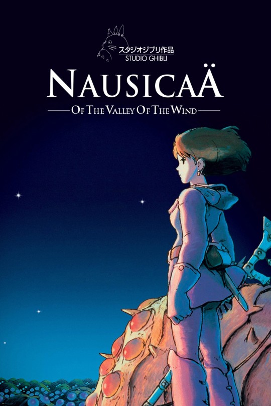
Nausicaa and the Valley of the Wind (1984)
Prayers and Salutations Cult Members! I am your mysterious minister Reverend Chainsaw and this is another nights revival service at the Cult Film Tent Revival. I bring you a special word tonight. Tonight's word is about a person who roamed the earth, in a time where people were backward and warlike. A leader emerged into a kingdom full of eschatological expectation. This leader came preaching peace, and was killed for the sins of the world, but was resurrected. In that resurrection a new hope was brought to the planet, and true healing through the power of love in the face of violence is made possible. I am talking of course about Princess Nausicaa from the Valley of the Wind.
The Message
Nausicaa and the Valley of the Wind is the film that put studio Ghibli and Hayoa Miyazaki on the map. No animated feature this grandiose and epic had been achieved by 1984, as much as Disney may beg to differ. The tale may be simple, and it may feel super 80s to us today, but Nausicaa is a masterpiece, and the fact that Howl's Moving Castle is brought up alongside Princess Mononoke and Spirited Away more often than Nausicaa is a farce and a tragedy.
The film takes place on a fantastic planet that seems to have suffered the ravages of an apocalyptic war. A war that involved gigantic warriors with powers so devastating they about made the entire planet inhospitable if not uninhabitable; save for a few areas. The fall out of this ancient war has left the earth in a state of repair, where the natural processes of a planet healing has creating giant toxic jungles.
Beyond these jungles lie two imperialistic factions, they seem almost to be city-states but it's not terribly clear. The Kingdom of Tolmekia, a militaristic proto-fascist society of almost Spartan sensibilities. Tolmekia is governed by the ambitious and cynical Princess Kushana, But I like to call her Furiosa. Just like Furiosa, Kushana is physically missing parts of herself, a visual metaphor for her metaphysical lacking and the parts of her humanity she has cut away. Kushana's world view is one of fear, a fear that can only be quelled by waging a genocidal campaign against her enemies.
Speaking of enemies, the Athens to Tolmekias Sparta would be the Pejite Kingdom. The Pejites might like to view themselves as simply responding to Tolmekian aggression, but the narrative of the film, and the story told quite visibly on the body of Kushana, is quite different. The Pejites are just as bloodthirsty if not more palettable in their approach, but like the Tolmekians, they believe only their own lives have any value. And thus, in this theatre of war, a Giant Warrior from the ages before is unearthed by the Pejite Kingdom, Stolen by the Tolmekians, before the forces of nature themselves, seem to conspire to drop the Giant Warriors "egg" right into the Valley of the Wind.
The Valley of the Wind is populated like the world of Avatar the Last Airbender, that is mostly of children and the elderly. The people of the Valley have been able to remain untouched by the ravages of war and the toxic jungles of the damaged world primarily due to geographic luck that's explained in minor exposition in the film. They are ruled by a King, and they are all deeply enamored by their beloved Princess Nausicaa.
Nausicaa is a gentle soul. She is kind to animals, she is empathetic, unreasonably patient, and bears pain and grief inflicted on her out of cruelty with a saintly understanding. She really is a thinly veiled Christ figure, scratch that. There is no veil. But she's also my favorite Christ figure. She does not preach a message, as much as she tries to save everyone from their own short sighted goals. She is not perfect, she does lash out and do some fantasy sword fight murder, but she regrets her actions so deeply that it seems to have played a part in motivating her to become even more compassionate and patient with the evils of the world.
Nausicaa discovers yet another plot by the Pejites, who are afraid of the possibility of the Tolmekians awakening the Giant Warrior, to use animal cruelty to enrage a group of almost invincible giant insects known as the Ohm. By luring the Ohm into the Valley of the Wind where the Tolmekians have become an occupying force, they hope to completely wipe out everything that threatens them. The Tolmekians DO awaken the Giant Warrior and pure pandemonium ensues. Nausicaa manages to save the Baby Ohm and calm the rage of the bloodthirsty Ohm swarm, and to defeat the warlike tendencies of both the Pejites and the Tolmekians. All the while fulfilling a prophecy fortold about a messianic savior figure called the Man in Blue.
Now that you have heard the Gospel of Nausicaa, please stand to receive The Benediction.
Best Character: Half a Person
Now that I've spent the better part of this review gushing about our Lord and savior Nausicaa. I have to admit, she's at times a bit too perfect, a bit too saccharin. Even her flaw, or her one weakness and her failing to be perfect, just adds to the perfection. I can't even say she never makes mistakes cuz she made one, and that's infuriating. It's even more infuriating that I still think she's a great character. Normally this kind of thing really kills a hero. Most Chosen Ones are the most boring and least likeable characters in their narratives. I don't know how Nausicaa avoids this trap, but she does. I'll have to do some meditating on that.
However, just like in your typical Chosen One fantasy narrative, the hero is a lot less fun than the villain. I'm going to say the best character in Nausicaa is Kushana. I want to be like Nausicaa, but I don't understand her. She's almost alien, even though we learn all about her. Kushana is mysterious, secretive, and enigmatic, yet I understand her. She barely has an arc, she doesn't really change. She's cold and cynical to the bone, but I don't need to see much of her situation to completely understand why she is the way she is. I usually hate totalitarian bad guys, but Kushana I like. Sue Me.
Also fun fact, did you that Nausicaa means 'Sinker of Ships'. That's kinda fun.
Best Scene: Spoiled for Choice
I'm going to be lazy and say take your pick. There is really not a bad seen in this movie. If the action isn't going, then there's intriguing dialogue. If there's no dialogue then you may be about to get hit with a forceful burst of whimsy. There's horror, there's swordfights and aerial dogfights. The only thing in Nausicaa I don't like to see, is the bloody tortured Ohm Baby. It's like a god damned Sarah Mclachlan commercial.
Best Creature: Foxy Shazam!
The Ohm are so simplistic yet so detailed. The number of eyes is alien, but the way they are used is expertly expressive. Who'd think you could get me to love what basically amounts to a silverfish with the intensity that I love a kitten. How did Miyazaki pull an Okja with a creature that should be haunting our dreams? I don't know.
And what about the Giant Warrior! If you are an Evangelion fan then you probably already know that Hideaki Anno designed and animated the melting goopy biomechanical beast. Surely a sight that would make both H.R. Giger and Clive Barker giddy with excitement. Just the image of the silhouettes marching amidst the desolation of the old world is burned into my brain.
So which of these is the best creature from Ghibli's first outing? It's fucking Teto. It was always gonna be Teto you idiot. Just look at Teto, he's adorable. He's too cute to exist. I'm so alone. I need a pet.
Best Character Design: Tolmekian Regalia
I originally included this category to talk some about Kushana, however, at that time I also thought I was going to say Nausicaa was the best character. I thought hard about deleting it, but I think it's a different category and you can't accuse me of playing favorites because my favorite character is clearly Teto. Just to keep it simple. It's the two costume shift from full military regalia in white and gold, to the one metal arm, warrior princess get up. It's a great costume and a great look. Get on this shit cosplay nerds. It's great for Cons in Canada, you have to think about layers, and you can't keep going as Mr. Plow. It's lazy.
Best Excuse to Talk About Patrick Stewart's Character: Lord Yupa
I just realized that I was about to write this whole review without talking about Lord Yupa. Lord Yupa is a sword saint and all around badass I think a lot of entertainment, especially in the west is lacking bad ass old men. Lord Yupa particularly shines in the early half of the film as a warrior and as a wise council to Nausicaa. If she's Jesus then Yupa is John the Baptist. He is also voiced by the elegant and eloquent Patrick Stewart. He also comes with 2 chocobos!
Worst Character: For Whom Asbel Tolls
This might also be the worst actor category as well. Actual Cannibal (haha meme) and actual monster (haha real life) Shia Labeouf doesn't so much act in the role as he read the lines and it was recorded. The good news it doesn't effect the film too much because Asbel is completely forgettable. He is a catalyst to some of the action, but besides that I don't really care for him.
Worst Aspect: To Be Fair ...
It would be unfair to completely ignore anything negative about Nausicaa. I have already mentioned in many places that there are some pretty corny, or pretty predictable tropes to this movie. But what I can't capture in words is exactly why it feels fresh when it's done in this movie. I suppose that's what makes it good. It's just so good that it's weak points are lifted up by it's strengths. Some people may bored of Nausicaa's unyielding goodness, or that she very rarely chooses to take action as much as she chases and pleads with her surroundings, but I mean, she does pay for that eventually. It's a fantasy story and it hits a lot of timeless themes that have been hit in stories for as long as human beings have been telling stories. Some people may feel that it doesn't do enough to stand out.
Summary
I have defined the S tier for myself as "near perfect and personal favorite" films. I like to think that Nausicaa and the Valley of the Wind is near perfect. Some may say that it looks like it might just be a personal favorite. In the case of Nausicaa, I'm having a very hard time telling the difference. I think it would be overly simple to claim that Nausicaa is just an ancient archetypal heroes journey with an 80s anime coat of paint. I think it's doing quite a few new and interesting things with that formula, those things are just playing out all around that narrative as opposed to being at it's center. For a first full length outing by the studio, you can really see Miyazaki's heart and the values he holds close to. I'll repeat myself so that we are completely clear on the matter. I think Nausicaa and the Valley of the Wind is a near perfect movie.
Overall Grade: S
#Nausicaa#Nausicaa and the Valley of the Wind#SciFi#retro scifi#Fantasy#post apocalyptic#hayao miyazaki#miyazaki#studio ghibli#ghibli#S#Grade S#Grade: S#1980s#1984#anime#animation#japan#japanese#(S)
9 notes
·
View notes
Text
Having Pride
Words: 4.5k
Summary: Remy and Emile take their younger friends to pride for the first time, and the boys get to experience a full day of pride and being unapologetically themselves.
Remy chuckled lightly to himself as he stared at his reflection in the mirror. He had switched out his usual sunglasses for a pair of multi-chrome aviators. He eventually decided on wearing a white muscle shirt with a rainbow mouth graphic on the front, along with some grey acid wash shorts that reached his knees and simple black converse. On his wrist sat a simple rainbow bracelet, which made him smile at his reflection. He could hear the chaos of his friends in the background, all trying to get ready themselves. Remy was ecstatic. It was June, his favorite month of year solely because it was pride month. He had been out since middle school, and he had gone to his first Pride Parade the previous year with Emile, so he was excited to bring his younger friends to experience the magic along with him.
He looked around at each of his friends, admiring all of their outfits.
Patton looked absolutely adorable as usual. He had a pastel rainbow skater skirt swishing around his legs, paired with a simple flowy white tank top with a single sunflower in the center. A rainbow flower crown sat atop his head, as well as a small rainbow striped heart pin on his shirt and simple white sneakers. It was sweet and clearly showed his pride but could also be worn as a more casual outfit in other circumstances (minus the flower crown, that might seem a bit out of the ordinary for everyday attire). The finishing touch to his look was a nice amount of blush scattered across his face and nose.
Patton was currently having an excited conversation with Roman, both boys sporting huge grins across their faces. As Remy glanced over to the other boy he noticed he was dressed much more extravagantly than usual, which made Remy smile. Roman truly did love being eccentric and bold, but his anxieties and fears of judgement often prevented him from expressing himself how he wanted to. It made Remy happy to see that he was making some progress on his confidence, especially on a day that was focused on having pride in yourself.
Roman had bleached his hair and temporarily dyed it rainbow (he planned on dyeing it back afterwards, but he liked the look of dyed hair and was considering changing his hair color again in the future). His shirt was a tank top which read the word “King” with a crown atop it in rainbow lettering. His shorts were a bit more simplistic, simple white athletic shorts with a small rainbow stripe down the side. On his feet he wore white converse with rainbows and clouds scattered across him, and he had gotten Virgil to do his makeup so that one eye was a circular rainbow that extended to the edge of his face and a red liquid lipstick on his lips.. (When he had finished Virgil had stared at Roman in awe for a moment. Roman assumed it was just Virgil admiring his own work but he actually just thought Roman looked absolutely stunning, causing a bright blush to adorn his cheeks.)
Speaking of Virgil, Remy turned his head slightly to look at the emo boy in question. After finishing Roman’s makeup (and being a flustered dumb gay for a moment) he had moved on to his own, doing a natural look with eye shadow and then creating an intricate rainbow pattern with eyeliner that covered the sides of his face. He wore a pastel rainbow tie-dye-esque t-shirt which read “I Can’t Think Straight”, in cheesy horror movie font. Above the shirt lay a simple necklace with a rainbow line down the center. His shorts were a plain black denim that reached his knees, and he ended up choosing simple black vans with rainbow soles as his finishing touch. It was a nice outfit but one that Virgil felt comfortable in, which was the best of both worlds in Remy’s opinion. He sat on Remy’s couch, scrolling through his phone and occasionally tilting it towards Janus to show him a funny meme. Janus would rarely show any more of a reaction than a smirk, but that was enough to satisfy Virgil.
As for Janus, he had also chosen a more “all-out” approach. He was sporting a truly killer rainbow vertical striped halter jumpsuit, which made him look quite elegant when paired with the solid black sun hat he wore atop his head. He had a casual rainbow eyeliner wing on his eyelids and plain black sandals. He had clearly put effort into his outfit, yet he managed to look effortlessly casual while wearing it. When he had walked in Patton had nearly choked on the pink lemonade he had been drinking, immediately running over and engulfing Janus in a hug while squealing out, “Oh my gosh you look amazing! Where did you get that jumpsuit?” While Janus’s stomach was busy swarming with butterflies the others had complimented him, quickly returning to their previous conversations. After a moment Patton had returned to his drink, making sure to tell Janus one more time that he looked spectacular.
Currently Remus was creeping over to Janus and Virgil, planting himself directly in between the two to show them some video about the “World’s Oldest Octopus” he had found on YouTube.
Remus’s laugh had almost gotten an actual laugh out of Remy upon first sight, simply because it fit him so well. He had on a pair of light-was denim overall shorts with frayed edges and a rainbow on the chest, as well as literal PLATFORM rainbow sneakers (Yes, Roman tried to warn him those were impractical for him to wear all day at a parade, No Remus did not care or change). The true gem that clearly said this outfit fit Remus perfectly, however, was his hat. It was a baseball cap which read, “I’m so gay I shit RAINBOWS”. Though it was truly a shock at first, everybody immediately agreed that Remus’s outfit was perfect.
As Remy continued to observe Remus’s attire a scream of “FALSEHOOD!” burst through the room, startling everybody and drawing their attention to the corner where Roman and Patton stood with a now blushing Logan. He swiftly cleared his throat before addressing the room. “My apologies for the sudden outburst. Patton and I had a minor disagreement, seeing as he believes squirrels are ‘adorable’ while they are in fact quite dangerous. Please continue with whatever activities you were engaging in prior to my, uh, surge of enthusiasm.” As he turned back to the pair, Remy took a moment to glance at Logan. He had a rainbow striped button-down tucked into the longer black skirt Patton had convinced him to wear. Initially he had been hesitant, but eventually had agreed as long as the skirt could extend slightly past his knees. He had a pair of converse that seemed to be dripping rainbow paint, giving him a more relaxed look than most had ever seen him in. It suited him, honestly.
Returning to his reflection once more Remy began to adjust his hair in the mirror for a moment before feeling gentle arms wrap around his waist from behind as a soft kiss was pressed to the back of his neck. Smiling, he turned around and found himself face-to-face with Emile, his lovely boyfriend. In Remy’s eyes Emile looked absolutely adorable in his outfit (Actually, Emile always looked like absolute perfection according to Remy, but today was a special day). He had switched his usual frames for his glasses out for rainbow ones, as well as an absolutely precious pair of rainbow suspenders. His shirt had a unicorn on the chest, along with the word “PRIDE”, and he wore a pair of light-wash mom jeans. As Remy reached for his hand he saw the bracelet Emile wore on his wrist, matching the one Remy wore on his own. Suddenly filled to the brim with love for his boyfriend, he pressed a quick kiss to Emile’s lips before engulfing him in a hug. They both took a moment to just breathe, relax before all the inevitable excitement they would experience throughout the day. Being in one another’s presence was always soothing, even if they didn’t say anything.
After a minute of just standing in each other’s arms, they separated. “You look amazing. Ready to go?” Emile whispered softly, looking up at Remy.
“Yeah, I think so. Come on, boys! It’s time we head out, especially since we still have to stop at Starbucks on the way!” Like a wave the young boys all ran out to the minivan Remy would be borrowing from his mom for the day, grabbing a mini pride flag each on the way out. Remy was the last to exit, locking the door as he did so.
--
Roman felt like he was about to burst. This was all so exciting! In school he always felt more like a subdued version of himself, his anxieties pressing down on him. But here with his closest friends at an event where having pride in who you are is encouraged, he felt weightless. Like he could truly be himself. He had dyed his hair rainbow for god’s sake! And he loved it! As he walked through the street with his friends in search of a decent food vendor, he turned to Remy and Emile. The two noticed and turned to look at the younger boy, who was sporting one of the widest grins they’d ever seen.
“Thank you both so much for bringing us here today! It’s absolutely amazing!” Roman gushed, feeling brighter with every word that left his mouth. The two older boys looked at the boy fondly.
“Of course, Ro! Glad you like it!” Emile replied, with more of a soft cheeriness. Remy nodded in agreement, leaving Roman to return to observing around him. Pride flags of many sorts were hung in many windows of nearby apartments, as well as people sporting their own flags along the streets. There were small booths with vendors selling all sorts of pride merchandise. As he continued to admire the sights around him, Roman was caught off-guard by a girl walking past him, stopping him quickly.
“Oh my god, I love your hair!” The girl had a dark brown pixie cut, as well as a pan flag tied like a cape around her shoulders. Her makeup truly stole the show, however. It was a beautiful design that had clearly taken a lot of time and effort, and was done in the ace colors. It matched her shirt, which also had the ace flag across it. On her shirt sat a small pin, listing that her preferred pronouns were she/her. Roman beamed at the compliment, turning to look at the girl.
“Thank you so much! I adore your makeup!” He gladly responded with a compliment of his own.
“Thanks!” With that the girl walked in the opposite direction with her friends. Roman could feel the newfound confidence bubbling within him. Such a small interaction somehow meant so much to him. Maybe it was because of how genuine and sweet the girl had been with her compliment, or maybe it was just that a stranger had taken the time out of their day to talk to him. Either way, he found himself giggling as he practically bounced over to Logan and Virgil.
“Isn’t this wonderful! Everybody here is so sweet! And the streets are FILLED with rainbows! It’s all so beautiful!” As Roman practically sang with glee he threw his arms around his friends’ shoulders, with Virgil to his left and Logan to his right.
“Yes, it is actually quite a lovely and welcoming environment.” Logan was definitely more relaxed than his friend, but you could clearly hear by his tone that he was genuinely excited to be there.
“Yeah, Princey. It’s pretty chill.” Virgil offered a small smirk, which softened into a more genuine smile when he saw the look of pure glee on Roman’s face. ‘God, how does this boy make me so soft?’ he thought to himself, though he found he didn’t really care as long as he got to see that pure joy on Roman’s face as often as possible.
“Oh, I think I see a hot dog stand in the corner. I can go order food for all of us quickly, what would each of you like?” Logan looked back at his friends.
The two boys each voiced their orders, Roman reaching into his back pocket to pull out his wallet. Logan swiftly put a hand on his wrist, stopping him.
“Oh, you don’t need to worry about expenses. I can pay for all of us.” Logan stated plainly. Roman and Virgil both eyed him with something akin to wonder.
“You sure about that, specs? None of us mind paying for ourselves.” Roman responded in a softer tone than he had spoken in practically all day.
“Of course, I really don’t mind. All I ask is that you all remain here until I return, that way I don’t find myself lost trying to find you.” Logan’s kind offer, though a small gesture, only served to further brighten the mood of the group.
“Thanks, Lo. You’re the best” Virgil piped up, with Roman quickly nodding in agreement. With a small smile of his own in response, Logan took off in the direction of the food stand, skirt swishing with the breeze and leaving Roman and Virgil on the outskirts of their small group of friends.
“Hey, Ro?” Virgil said after a moment of silence.
“Yes, stormcloud?” Roman easily returned, expecting their usual lighthearted banter or possibly a comment about the scenery.
“Now don’t get all super cheesy on me or anything, but it’s, like, nice to see you so happy here.” Virgil had begun mumbling more than actually talking about halfway through his sentence, but Roman heard him clearly.
“What do you mean?” Roman could feel his heart swelling, though he was slightly confused by what Virgil had meant.
“It’s just, you seem so worried about what people are thinking sometimes. And don’t get me wrong, so am I. Anxious thoughts are a bitch.” This got both boys to laugh for a moment before Virgil returned to speaking, his voice a bit firmer and clearer this time. “But you seem, like, happy here. Like you’re not so worried. And it’s nice to see you like that, or whatever.” he finished his sentence, scratching the back of his neck as he began to wonder if he had been overly emotional. When he met Roman’s eye, however, he found him staring back with gentle, wide eyes and his mouth formed into a small, “o” shape.
Meanwhile, Roman’s heart felt as though it were close to explosion. His friends cared! Virgil cared, and he wanted Roman to be happy! That was so sweet!
“Thanks, V.” Roman suddenly got the urge to hug the boy in front of him. Before he could talk himself out of it, he reached over and wrapped his arms around Virgil’s shoulders. Virgil froze for a small moment, before wrapping his own arms around Roman. They stood like that for a moment before Roman realized his face had begun to burn, gently pulling away.
“So, where’d you get your shirt? It fits your vibe very well for how bright and colorful it is.” Roman changed the subject easily, though he still felt a warmness within him.
“Hot topic of course. Would you expect anything else from me?” the two quickly fell into their usual antics, with their playful teasing clearly present. As Logan returned (with Remus in tow, who had offered to help him carry the food) a knowing grin crossed his face, clearly noticing the slight red tint across each of his friends’ cheeks as they continued with their banter.
--
Patton finished off the last bite of his meal, squishing the paper the hot dog came wrapped in up into a ball. He began scanning the area around him, hoping to find a trash can. After a moment of looking he spotted one, next to a booth. The booth itself looked very pastel and cute, easily catching Patton’s attention.
“Hey guys! We should go look at that booth, it seems nice!” He chirped as he began skipping over, skirt flowing around him as he did. Logan was the quickest to follow, ever alert and watching, and soon all of the boys were standing in front of the adorable pastel booth.
As Patton reached the front of the booth, he noticed that most of the items sold there were smaller accessories. They seemed to have pins, patches and stickers of many assortments (all LGBTQ+ related though, of course), as well as a few rainbows and dad caps. He could hear as his friends approached and began looking along with him, continuing to scan through the items. Almost immediately he heard a gasp from Remus, followed by a shout of, “Oh, I HAVE to get this.”
Patton turned to look at Remus and saw him holding up a hat in a very similar style to what he was currently wearing, only this one was white and had the words “Love whoever the fuck you want” embroidered in rainbow thread.
“Dear god please no.” Could be heard from Roman, which overlapped with Logan’s comment of,
“That would suit you quite nicely. It is very much your style.” Remus grinned at Logan’s response, quickly turning back to his brother.
“I’m getting it, brother dearest! LOGAN said it looked hot!” Remus cackled. He failed to notice the way Logan’s face immediately resembled a tomato, or his quiet utterance of “Those weren’t my EXACT words.”, as he handed the person running the stand a ten dollar bill. While they counted his change Patton returned his gaze to the patches in front of him, smiling and winking at Logan after noticing his current state.
‘Oh, all of these are so cute!’ Patton observed. He thought of the light-wash denim jacket he had at home, and realized it would look quite nice with a few patches added on. Plus it would allow his jacket to become gayer. As Patton knew well, everything could always be at least a little bit gayer.
The first patch he picked up had two pastel rainbow cherries with adorable smiles, which Patton immediately knew he needed. Directly next to the cherries he noticed a decent-sized rainbow lightning bolt, which immediately made him think of Virgil. ‘If I get one of these I’ll be able to remember my best friend every time I wear my jacket! That’s amazing!’ The lightning bolt joined the cherries in Patton’s hand.
After assessing his options for a moment Patton found himself with five total patches in his hand. He had the lightning bolt and the cherries, as well as an absolutely adorable-looking unicorn with a rainbow mane, a simple rainbow with clouds around it and the word “PRIDE” written in rainbow lettering. It wasn’t a huge amount, but he was happy with what he had. He could always find more patches to iron on online. He grabbed a small pin stating that he used he/him pronouns last minute before approaching the register.
The person running the stand clearly appeared to be older, with their gray hair cut into a bob. They had warm brown eyes that seemed to overflow with kindness and a gentle smile. Their shirt displayed the nonbinary flag across the front, along with the pronouns they/them. ‘It’s nice to see the older generations showing their support and being able to embrace their identities.’ Patton thought as he fished in his wallet, handing his money over to the person. They tried to give Patton his change, but he insisted they keep it as a thank you for showing support and pride and helping give LGBTQ+ people a safe and welcoming space. That was something that the older generations didn’t always understand but was so crucial and helpful in improving the mental health of LGBTQ+ teens especially, and he knew that very well.
The group stayed at the booth for around five more minutes before finally deciding it was time to leave, knowing they needed to head over to the stage that was set up nearby if they wanted to make it to the show being performed by a local drag queen in fifteen minutes. Patton secured his pin onto the front of his shirt, dropping his patches into his skirt pocket before following Remy, who was leading the way.
--
Patton felt exhausted, but in the best way possible. The sun was just beginning to set, signalling that it was time for the boys to start walking back to their van and head home. His feet felt heavy from the weight of walking around all day, and he could feel his eyelids slowly weighing down. Though he was tired, he still felt his happiness from how well the day had gone glowing within him. His first pride had been so lovely! And he had gotten to spend the entire day with his bestest friends in the entire world! And earlier on a group of kids that seemed to be around his age had complimented his outfit and said he looked adorable! All in all it had been one of the best experiences of Patton’s life.
In his daze he felt a hand lightly tap the back of his shoulder, bringing him back to reality. Janus then moved to stand within his view as they continued walking in the direction of the car, looking almost… shy?
“Hey, Jan. What’s up? Wasn’t today amazing?!” Patton found himself gushing even through his exhaustion, partially because he was just so filled with excitement and partially to calm his friend’s apparent nerves.
“Yeah, I guess it was quite… nice.” Janus seemed to relax for a second, smiling at the memory of the wonderful day he had experienced with his closest friends, before the worry crept back into his face like an infection. Patton opened his mouth to ask if he was alright but found himself stopping short as he noticed Janus reaching into his pockets, eyes cast to the street. Patton watched as Janus pulled three small items from his pockets, grasping them tightly in his hands. Patton’s face quickly morphed into one of puzzlement, confused as to what Janus was doing.
“While we were at that booth earlier I, uhm, noticed a few items that reminded me of you. You didn’t seem to notice them, so after you paid I decided to get them for you. It’s totally no big deal or anything.” Janus tacked on his signature sarcasm at the end, Patton immediately seeing through it and knowing it was a defense mechanism to hide Janus’s nerves but choosing not to mention it.
He opened his palm and Janus dropped the patches into it, with Patton almost immediately bringing them in front of his glasses to expect the items.
The first one had a truly precious shiba inu dog with a pride flag in his mouth, immediately causing Patton to coo out a small, “That’s so cute!” As he looked over to the next one he saw a beautiful blue rose, with the words “Pretty Boy” in rainbow lettering surrounding the flower. That brought a tinge of blood to Patton’s cheeks. ‘He thinks I’m pretty?’
“Oh, this flower is gorgeous!” He tried to cover up how a silly patch managed to fluster him. Janus didn’t seem to notice, so he looked over to the last of the patches in his hand. It was an adorable cartoon frog wearing rainbow overalls and the sweetest smile he had ever seen. Frogs were his favorite animal, and it made Patton happy that Janus had remembered such a small detail. He felt himself tearing up at the kind gesture from his generally more closed-off friend. He looked back up to Janus, finding the shorter boy staring at him with a look of clear false confidence masking his worry.
“I love these! You remembered my favorite animal! These will go perfect with the other patches I got once I iron them onto my denim jacket!” Janus’ eyes brightened at the praise, one of his more rare genuine smiles gracing Patton. “Thank you so much for thinking of me!” Patton reached over to give the other boy a quick hug, with the smaller boy burying his face into Patton’s shoulder for the briefest of seconds before they both pulled away.
“Oh, it was truly such a problem. It’s not like I care about you or anything.” Janus was back with his usual smirk and attitude, drawing a giggle from Patton’s throat that Janus would describe as nothing short of precious.
“Come on boys, we can’t spend all day out here!” Remy chided, prompting Patton to reach for Janus’s hand as he pulled them along the last few steps to the car.
--
Once everybody was situated in the minivan Remy paused to look back at his friends through the rear-view mirror. Patton was eagerly showing Virgil his lightning patch, with Virgil giggling along to something he had said. Roman, Remus and Janus seemed to be sharing stories about their day (it didn’t matter that they had spent practically the entire day together, those three were easily the most dramatic and any remotely special moment they had they wanted to share with each other), and Logan and Emile seemed to be in some sort of discussion about psychology. Of course those two would be able to jump right back into regular conversation, enjoying being able to talk about a shared passion for knowledge in the area of psychology together. One similarity between them all was that each of his friends looked truly happy and content, including Remy himself.
Despite still being a teenager himself, his status as one of the oldest in the group led him to be more protective and caring over his younger friends. He had really been trying to make sure their first experience with pride was amazing and unforgettable, and from the looks on his friends faces he could clearly tell he succeeded. He felt his heart swell with love for his friends (not that he’d ever mention this, he had a reputation to upkeep for god’s sake).
“Alright everyone! We need one last picture together before we head out. Lean in bitches, all 8 of us need to fit!” Remy shouted in the car, his friends quickly attempting to find a position where they could all be seen. It took a moment (there were 8 teenage boys in a minivan all trying to fit into the frame), but eventually they got a decent picture. Remy sent it off to their group chat before stuffing his phone into his pocket and throwing his keys into the ignition, starting the journey home with a smile across his face. He reached across the enter console and used his right hand to grab a hold of his boyfriend’s, keeping his left hand firmly on the wheel and his eyes on the road.
(A/N: Hi again! As always, thank you so much for taking the time to read this, and any comments are much appreciated! I had a bit of help from some people explaining their personal experiences but I’ve never actually been to Pride, so if it’s not completely accurate I’m sorry, I tried my best to do as realistic of an interpretation as I could. I’ve been planning this for all of Pride month, and I’m really just thankful I managed to finish it before the month ended lol. Remember, your identity is ALWAYS valid and you deserve to feel proud of who you are. If you ever need to talk, my messages are open. <3 Happy pride everyone!)
Here’s a link to all of their outfits btw! Also I almost forgot but I said I’d tag you once this was finished so @aegis-the-ace !
#sanders sides#thomas sanders#ts#high school au#pride month#pride fic#roman sanders#ts roman#remus sanders#ts remus#patton sanders#ts patton#virgil sanders#ts virgil#logan sanders#ts logan#janus sanders#ts janus#emile picani#ts emile#remy sanders#ts remy#cartoon therapy#prinxiety#intrulogical#moceit#remile
29 notes
·
View notes
Text
Secret Santa Christmas Fic!
This is dedicated to my wounderful secret Santa @new-noveltea I hope you enjoy this, and I hope it’s not to late. Let me know if you don’t like it so then I can re write it! It’s pretty rushed. Thank you so much for participating in this with me! And I hope you have a wonderful Christmas❤️
Word count: 4.7k
Ship: Kirishima Eijirou x Reader
You could see the beautiful snow falling outside your window, a sign of what was to come. December 24 Christmas Eve. To many, this night was to celebrate family and togetherness, drinking delicious warm apple cider or hot chocolate while sitting by the beautifully decorated Christmas tree. At least that’s what you have read in books. Although you did have quite a few Christmas trees around the palace, it wasn’t you who got to decorate them. Put in place for the Christmas ball the king and queen put on every year.
“Um excuse me miss.” You turned your attention from the decorated pines outside over to your maid Uraraka, “you’re going to need to change into your dress soon, your majesty.”
You let out a small laugh at her pleasantries, “No one is around, you can drop the ‘miss’” it was hard to miss the sparkle that appeared in the brunettes eyes.
She made a b-line to the rooms walk in closet, excitedly talking about tonight, “Okay, we have to pick out the most extravagant dress you own. People must remember that you were there!” Although you loved your friend, as she practically grew up with you, her words were starting to bug you. Just like your parents, this ball was to kick off you becoming old enough to finally be wed. Now of course you wouldn’t be forced into an arranged marriage, but the pressure was still there.
Somehow while being wrapped up in choosing your evening gown, Ochako had noticed the change in your mood, “What’s wrong hun?” Sometimes she was just too perceptive. However, you knew she really cared about you and wouldn’t let it drop until you told her. “Do you not want to do the plan anymore?” She asked with concern.
“What plan?” Dumbfounded, your interest peaked.
“Didn’t Deku tell you?” She gasped when you shook your head, “of course he didn’t… anyways our Christmas gift to you this year is letting you leave the castle and explore the town on Christmas. We’ve been planning this for months! I can’t believe him!” You could only sit and stare. You had been let out of the castle many times, but never near Christmas as you always have so many duties to attend to.
“Now hurry up, we need you out and about so it doesn’t look suspicious when you-“ Ochaco added air quotes, “retire to your room” you could almost scream you were so excited, but instead settled in giving her the world's biggest hugs.
“Thank you so much! You’re the best friend any princess could ask for!” You shout into her ear. Although you wished you could hug her till the party, it would make putting on a dress rather difficult.
Of course she had chosen the most extravagant one you owned, a cream white dress, one that had so many rhinestones on it, that it looked identical to the freshly fallen snow on the ground. A magnificent dress to say the least, although it did itch a little in the back due to the lace detailing. You would definitely stick out in a gown like this.
“Okay so I’m meeting you where at 10:45?” You questioned.
“No, not me. You’ll be meeting Deku at the doors so he can accompany you to your room.” She explained, as she guided your form to the vanity. “I’ll meet you both there once your parents are informed of your absence. Remember to mention earlier to them that you are feeling tired.”
“Then you’ll tell me how you’re going to get a well known princess into town?” You asked as she started brushing the knots out of your hair, nodding her head at your question. Flinching at a rough knot, you continued to listen to what you would have to do.
The excitement kept bubbling up every few minutes. You were finally going to do it, sneak out on the most wonderful day of the year, and experience a real Christmas. You’re heart felt like it was growing three sizes like the grinch, and it was a delightful feeling. The constant chatter between you and your maid almost made you late for the ball. But hey, it’s called fashionably late for a reason, unless that wasn’t a thing in medieval times…
Thankfully to Ochaco and your parents, you were far from being late. Already waiting for your knight Midoriya to escort you to the ballroom, which you could hear all the way from your chambers. Makeup that made your face feel heavy, hair that if you left too long up, would give you a headache, and a dress that itched in the worst places. However you did look stunning, or at least that’s what Izuku said. So what’s beauty without a tad bit of pain? Plus you’d be in and out of it within 5 hours. Then you would be free.
“Ready to go?” You cheerfully asked your knight as you saw him approaching.
“Always ready m’lady.” You laughed at the last part, no matter how hard you tried, he always had to refer to you as upper class.
“Thank you so much, both of you.” You smiled as you hugged Uraraka before allowing Deku to lead the way. Even though you likely knew more about the castle and how to get around then he did. The ball room wasn’t hard to find, down the hall, turn left, then turn right at the kitchen and keep going until you hit the grand staircase. After that take the closest left hall and it’s just down there. But anyone could find their way if they just listened for the music.
It was beautiful, likely the best band in the village. But they definitely were loud, you could probably use a headache as an excuse if the plan goes astray. But for now, you would have to push those thoughts of escape down, and socialize at the Christmas part of the year.
10:13 pm
The adrenaline was rushing through you as you waited in your chambers. The reality of this whole situation was finally hitting you, and it felt like a brick wall. Yes you were excited to leave the castle, but there were so many what ifs. What if you were caught? What if your parents found out and forced you to marry due to your disobedience? What if- A beautiful red dress snagged your eye. It was simplistic, as there wasn’t any diamonds or other precious gems littering it. It wasn’t even a gown, as it looked as if it only came up to just above the knees. Simplistic yet an elegant design.
Seeing the note Ochaco had left about putting it on, you made fast work of the itchy glitter bomb you were currently wearing. Proving to be a much more difficult task without any maids. Yet you still did it, and thankfully the new red dress was much easier to put on. Along with the addition of some very cute matching black knee high boots to keep you warm.
So there you were standing in your room, waiting for the people who would help you escape for the night. Unbeknownst to you the adventure you were about to begin.
11:27 pm
wrapped up in a cloak, you felt the slight cold nip at your nose as your two best friends opened up the door that led to your freedom. You had traveled all through the catacombs, only getting lost once or twice just to get here. The cold making the small tears in the corners of your eyes become chilled.
“I can’t believe this, this means the world to me, and I’m so thankful to have you both! I don’t know how I’ll ever repay you, but I’ll do my best!” You smiled as you bid your farewell to Izuku and Ochaco, for the next day would be yours to do as you please.
Hugs were exchanged as you made your way towards the village. The darkness and the slow falling snow, giving off an eerie yet mystical experience. Within about three minutes you were in the town square, practically alone, aside from the few people who had stayed up to enjoy the night. There was a swelling feeling in your heart as you looked around at all the lanterns and lights, they rocked in the slight breeze, but their glow was never disturbed. There were beautiful tall pine trees, no inch left uncovered. Fresh bread and peppermint followed you as you made your way around the village.
However lost in your own thoughts and wounder, you had forgotten to watch were you were going, and bumped into someone carrying about three expertly wrapped boxes. The sudden noise they made as they hit the snow covered ground brought you out of your dream like stage, and quickly you bowed your head.
“My apologies! I wasn’t paying attention to where I was going, it’s just the scenery is so gorgeous that I didn’t realize I was going to bump into someone.” A small chuckle could be heard beneath your bowing form.
“You’re right, it is quite beautiful tonight, but it’s really no biggie, no harm done.” The man smiled up at you as he continued to pick up his boxes. Quickly you sank to your knees, helping with one that had fallen nearer to you. The man looked young, probably somewhere between Izukus and your age. He was handsome, a symmetrical smiling face, framed by spikes red hair, and piercing but soft red eyes. What really drew your attention however was his strangely sharp teeth, and how they looked so harmless as he smiled at you.
With two presents, the man stood up, brushing off the excess snow from his legs. Looking around for the ministry girl he had just met, he realized you were still on the ground looking up at him. He could see the childlike wonder in your eyes, as they sparked around your breathtaking form. Snapping out of it, he offered you his hand. Surprisingly, you placed the last package into it instead. With a slight laugh, he put the presents neatly down and tried to help you up again. This time you finally accepted, and he pulled you up with ease. His strength not unnoticed by you. After brushing off the residual snow, you bowed again.
“Thank you for helping me up.” Standing back up straight to see a curious look in the strangers eyes.
“You’re not from around here are you? Do you need help finding your way back to the castle? I don’t mind-“
“NO!” You rudely cut him off, “I mean… I’m not from around here, but that’s because I wanted to see what the town is like on Christmas.”
The man in front of you could tell something was up, although he wasn’t sure who you were, you didn’t exactly scream threat. You had the same predicament, without much outside knowledge you could be naive and possibly used if the wrong person came around. But whether it was the spirit of Christmas, or some other outside force, the two of you felt no unease from the other. Even so, it was still shocking to hear what he said next.
“Well it’s not Christmas yet, and it’s getting late. If you don’t have a place to stay you’re welcome to come with me, I have a few friends who I’m with at the moment and I’m sure they would understand.” He offered, “Oh! And my name is Kirishima, Eijiro Kirishima.”
You knew it was a dumb idea to follow a stranger you had just met. What if he saw through you, and found out you were the princess, or kidnapped you! Yet the kind offer and smile on his face pushed all those thoughts away. You may have been a princess, but you could handle yourself if it came to it. As long as you kept the knife your guard gave you, your training should let you get enough time to escape.
“I happily accepted Mr. Kirishima! However, I’m afraid I won’t be able to tell you my name… for security reasons.” It wasn’t exactly lying, but it didn’t feel good either way.
“I understand.” The smile on his face never once leaving, “also just call be Kirishima, Mr. is was too formal.” You agreed as titles were something you disliked as well. They often felt overpowering, which is why you would ask your staff to never address you as princess, unless you were around company.
“I have to get two more gifts before we leave, Kay?” You nodded, unsure of where he would get them as many of the stores were closed. Nonetheless you followed him through the streets, basking in the Christmas decorations as you passed. Some houses even having snowmen in front, half melted from how warm the past week had been. If only it was that warm now, your hands had always been on the cold side, but they were starting to feel numb. Subconsciously you rubbed them together, bringing them up to place them inside your cloak. Crimson eyes watched your movements, regretting the fact he didn’t bring gloves of his own to lend you.
Instead he decided that he would do the next best thing to warm you up, “You looked cold, and my hands tend to be very warm.” He said as he grabbed your hand, noticing how soft and cute it felt within his own.
“Oh, umm thanks.” You mumbled, a little flustered at the redhead, who’s skin matched his hair. It definitely wasn’t unwelcomed as you could feel your fingers again, plus you couldn’t deny that he was cute.
It was nice walking beside Kirishima. Although the conversation stayed on more trivial things, like what was the best Christmas gift the two of you had gotten, you felt comfortable. Deeper and more personal questions played like a movie in your mind, but it seemed unfair as you couldn’t answer then if he had been the one to ask. So you kept quiet, and continued on with a question about Christmas traditions. That’s what the presents were for, Kirishima did something called a gift exchange with the other members of his group.
“Speaking of gifts, this should be it!” Pointing to a tiny house on the corner, you could make out a small bread symbol in the window. “Sero loves this place!” He smiled as you walked closer to the cute little house. You could smell the fresh pastries and ingredients even before you made it inside. Although it did pack a bigger punch the closer you got to it. Once inside you felt like you were in the gingerbread house from Hansel and Greatel, except the house was made from bread and other starchy foods. Every breath felt like you were eating something new and delicious.
You excused yourself to browse the shelves, as your companion talked to the elderly woman who seemed to own this wonderful place. Donuts to cinnamon buns, to cream puffs, to bagels, to… and that’s when you saw something. Although you never had any big Christmas traditions with your family, there was one thing you always loved from when you were a small child. The store provided little brown bags as to put your sweets in, so picking up a rather large one, you placed the baked good inside.
“Oh you’re buying something?” Kiri asked as you made your way to the front to pay.
“It’s just something I eat every Christmas morning with my family. I usually make it, but seeing as I’m spending Christmas away, I thought I would get it now.” You smiled, still keeping the pastry a secret from the man.
The woman just smiled at your exchange. It was a comforting feeling to see such young kids being respectful and enjoying themselves, “will that be everything dearie?” She asked, snapping the two of you away from each others eyes.
“Oh yes thank you.” You smiled, giving her double of what it cost. Refusing to take it back after the transaction, even though it was hard to say no to such a soft eyed woman.
“My heavens. Thank you so much hun, I hope you and your fiance have a lovely Christmas together.” Surprisingly, neither of you decided to correct the woman on her assumption. The unnoticed glint in her eye showed she knew you two weren’t together, but it would still be fun to joke around a bit. “Merry Christmas! And tell your mother that Ms. Collins says hello.”
the little bell above the door rang as the two of you exited, “Do you know her?” The red head asked.
You shook your head, “no idea, but I would be surprised if she knew who I was.” To any normal person your comment would have seemed weird, but the man beside you just brushed it off and continued to the local book store. You didn’t even know you had one of those in town. Heck you didn’t even know if they actually existed as you tended to read from the royal library, or your personal collection. You thanked your lucky stars that Ochaco told you to bring some money on your excapapaid, because you were about to blow it all on books.
If you have ever seen the part in beauty and the beast where Belle is given the castle library, then you could probably imagine exactly how the little town girl felt, as this was the exact feeling. Although it wasn’t as big as the palaces library, it was comfier and cosier than anywhere you had ever been. There was even a little postal office attached at the right hand corner, which is where Kirishima went as he left you to look around. You skimmed each book, seeing if you had it, and locating your favourites just to see if they had them in stock. Books about daring princes and slaying dragons, about horror and romance.
It was a hard decision whether you liked the bakery or the library more. This small bit of freedom from outside the castle was already some of the most fun you’ve ever had, even though you were starting to get a tad sleepy.
“Ready to go?” You felt a small tap on your shoulder.
“Already?”
“Sorry, but if we want to make it to my camp with enough time to sleep then we better start moving.” You could tell he seemed tired too.
“Alright fine, so how do we get there?” The poor boy visibly tensed at your question, glancing around frantically until his eyes landed on a man out in the street. “Oh hey! Mr. Gum, do you mind letting me buy something from your shop quickly?”
The blond just stared back, taking a second to remember who this random kid yelling at him was, “OH Kiri, how are you? Merry Christmas!” The large man smiled, “and I see you got yourself a partner! Nice to meet you!” He said tuning his attention to you, “I’ve seen you before, don’t you work in the castle?”
“Umm well not exactly…” You definitely recognized the man, he was one of the guards who would sometimes patrol the gardens of the palace, or stay at the walls to fight off any mythical beasts that wanted to kill the royal family. But he retired soon after failing to kill a horrendous dragon, or at least that was what the rumours said.
“Oh well, I figure it out soon enough.” Oh how you wished he wouldn’t, “So what was it that you needed so bad?” He questioned, pulling out the keys to his store.
“One of Mei’s inventions, the feet sword things.” Okay maybe you were hanging out with a crazy person. “Those! I need two.” He said pointing at some sort of shoe with a horizontal sword at the bottom. They looked strange, but the man agreed to it anyways. They did look pretty cool though, but the price was a bit much even for you. You could sense the boy next to you cringe, so in the heat of the Christmas moment, you
Pulled out your coins and paid for the two of them in full.
Kirishima tried stopping you, even asking the man behind the counter to not take your money, but you just simply explained, “think of this as my payment for taking me around the town for the first time in many years.” Smiling as the blond handed Kiri the shoes.
“That’s where I know you from!” He suddenly shouted. You’re smile instantly flipped, as your heart crept its way into your throat. Your eyes held a silent beg, asking the man in front of you to not reveal who you really were.
“You’re the-“ he started but surprisingly you were not the one to cut him off.
“Sorry Mr. Gum but I think I’d rather hear about my companions past and life from her. But thank you for the skates!” He quickly rambled on, grabbing your hand and signaling that you two should probably be leaving.
“Oh I didn’t mean anything like that, I simply meant that she was the little girl who once gave me a flower, long long ago when I wasn’t feeling so cheerful. Trust me, she’s a good one son.” He winked at the boy beside you, laughing as he saw his face reddened. The joking continued as the gentleman ushered the two of you outside and directed you to the frozen river. “Merry Christmas you two!” And with that he left.
It was silent as Kirishima helped you put on the strange sharp shoes, trying his best to figure them out. He had kinda figured out his own, but he insisted on helping you as it was the manly thing to do, but he still had trouble.
“(Y/n)” you whispered. The boy at your feet raised his head, tilting it to the side as if to ask what you had just said.
“It’s my name, I thought I should finally tell you.” You smiled down at him as he tried saying it a few times to commit it to memory. It felt nice to hear him call you by your name, especially since many just addressed you by some sort of title. You felt comfortable, or at least as comfortable as you could be as he stood you up on the frozen ice.
Almost falling forward, a strong pair of arms steadied you. Reaching his hand out to both help the two of you, and to continue to keep your hands warm. But mostly because you needed each other to make it like 2 feet without falling. Honestly, it didn’t take you too long to get your balance, as you’ve had to learn many new things quite quickly as a child. But poor Kiri seemed to be getting worse, especially since he had to carry the presents he had gotten for his friends. It was still pretty cute watching him try his best to stay up, even if he wasn’t very graceful.
“How are you good at this already!?” He asked as you gave him your hand to steady his form.
“I don’t know, but how did you even get to the village, and why didn’t we just take that way?” You questioned. Sadly he stiffened again, becoming ridged and losing his balance. With his hand already interlocked with yours, he pulled you down with him, and basically on top of him. It was a shock, as you stared down at the boy Beneath you in a strange position. “I guess you fell for me.” You started laughing.
“Fell hard is more like it.” He joined in, rubbing his hip that had hit the ice hard. The two of you continued to laugh, Kiri even complaining that he couldn’t breathe. But the boy beneath you stopped suddenly, fear in his eyes as he looked towards the trees on the side. Tilting your head you attempted to follow his gaze, but he quickly turned your attention back to him as he shouted “NO!”
That’s when it lunged. A huge scaly beast with piercing yellow eyes, focused on your figure. Within seconds it was millimeters from your face, yellow electric sparks emitting from the dragons form. Never in your life had you been that scared, and so of course you froze. The wind was knocked out of your lungs, but not because of the beast, but because of the boy who had flipped your positions and placed himself in harm's way instead of you. He glared at the beast, baring his sharp teeth as a warning, and somehow it worked. You could see the yellow beast returning back to the forest, but only in a blurry haze as you felt yourself drifting out of consciousness.
7:07 am
“Hey are you okay” a strange voice was talking to you. It was weird, the only person aloud in your chambers was your maid/friend Ochaco, and unless she had a terrible throat cold.
Slowly you opened your eyes, coming face to face with an attractive redhead, relief flooding his features. He pulled you into a hug, muttering something about being glad you were okay, and that he was worried. You hadn’t realized how cold you were till his body heat started to warm you up. So when he started pulling away, it’s no surprise that you didn’t let him go. But this position remained you of something that happened last night…
“What happened?” You said worried.
“A dragon showed up.” He started blatantly.
“Yes but how, how did you get it to leave us alone! It was huge and terrifying! Dragons could kill you without a second thought.” You explained, subconsciously checking over him for any wounds the beast may have left.
A sad smile crossed his face, “Do you really believe all dragons are merciless killers?”
“Well, I mean that’s like saying all humans are nasty and evil. But I have yet to meet a friendly dragon…” You stop talking noticing how each word made the man in front of you sadder, “but hey, I could be totally wrong! You probably know something that I don’t, and I’ve never had much contact with them besides from last night. But I trust you.” You took a deep breath looking into the red ones across from you, before noticing your bag. The one with your Christmas traditions.
“Let’s get to know each other over some coffee cake.” You smiled as you brought out the treat for the two of you to share. It was calm and you complimented the tree you could see outside of the tent. Decorated with what looked to be homemade ornaments, different colours, sizes and shapes, all holding a special meaning to the ones who made them.
“My name is princess (Y/n) (L/n).” And you explained why you had snuck out of the castle, why you wanted Christmas to be special, and why you valued spending time with Kirishima. “It was a magical night, something nothing could ruin. You’re the first person in my life who hasn’t been paid to be by my side!” You could feel the tears coming to your eyes, and Kiri could see them. Brushing them away, he led you outside his tent.
“Just don’t freak out please.” Now when people say that, your first reaction is usually to freak out. Yet as the man's skin turned into red scales, and his pupils became slits. Two magnificent wings sprouted from his back, as horns and a tail accompanied them. Eijirou Kirishima was a dragon, or more specifically the imaginary creatures known as shifters. The surprising thing was you never felt a hint of fear, not even when you noticed the other dragons circling around you.
Slowly you walked up to the shifter boy, placing your hand along the beautiful scales. The uneasiness on both your faces melting into an understanding comfort. “Merry Christmas Eijiro.” You smiled, as a large leathery wing came to swoop you up to his face. Holding you there as he shifted back to his human form, hugging you tightly. “Merry Christmas (Y/n), oh and Kaminari apologizes about last night, he thought you were hurting me.” He laughed and you two continued to enjoy the others embrace, as the snow fell around you. It truly was a wonderful Christmas.
#secret santa#for my beautiful secret santa#kirishima eijirou#bnha#bnha x reader#mha x reader#x reader#fluff#2019#mha kirishima#kirishima eijiro x reader#kirishima x reader
56 notes
·
View notes
Text
12 Days of Sengoku Christmas
Word Count: 1698

You examined your outfit in the mirror. You had decided on something festive, but still demure; a red knee length dress with three-quarter sleeves, a soft puff at the top, flowing skirt, sash at the waist and v neck showing off a little bit of cleavage. You wondered if it was too bold or too much, after all, you didn’t want to come off as prudish but were afraid that modern fashions in the dating sector might offend the sensibilities of the former Sengoku warlord that you were going out with.
You sighed, smoothing down the garment, staring at the mirror. You had more demure clothing, of course, but this was a date. Risque wasn’t exactly in your wardrobe but you had a couple of pieces that were daring to wear. You sighed again [I design fashion, but I have never been one to wear it..] It was just going to have to be good enough. You sat down, slipping your legs into stockings, knowing that your legs would somewhat be protected from the cold despite the outfit.
Stepping into the living room, many sets of eyes fell on you. More the the point, they fell on the red silk hugging your form. Masamune, Nobunaga, and Shingen’s eyes held praise, if Shingen’s didn’t also hold a hint of heat that had you blushing in spite of yourself. Ieyasu and Mitsunari seemed surprised at the pick, but neither said anything. Kenshin tried his damnedest for nonchalant, but even he seemed struck by your choice of dress for the evening. Kennyo firmly kept his eyes somewhere other than you. It seemed most everyone approved in some fashion of your date night outfit. All, save one.
“That is too low cut,” Hideyoshi had approached, circling you with vulture like efficiency, his eyes appraising you in a way that only a mother could, “and i hope you’re wearing a coat, because that fabric is keeping nothing warm.” He went on, your cheeks turning red at his picking apart your outfit.
“Leave her, Hideyoshi…” Nobunaga said, eyeing the motherlord. Hideyoshi apologized, stepping away from you to return to his seat. You looked downward, a bout of uncertainty attacking you, telling you that perhaps you should take his advice and change.
You were turning, when a voice breathed over your ear, “If Hideyoshi is that flustered…” you flinched, looking towards He-who-had-no-sense-of-personal-space. Mitsuhide was smirking, entirely aware of the proximity issue, continuing, “then you know you have a winning dress for the evening. Don’t change a single thing.”
Your eyes narrowed as you turned back to the room, but before you could chide him, Yoshimoto had stepped into the room. He wore a simple white dress shirt, a blue blazer over that, and basic slacks. Though the outfit was simple, Yoshimoto remained elegant and sophisticated in the clothing. [Though, I’m starting to feel a little overdressed] You fiddled with your dress as you thought about changing for the third time.
“Masamune thought I should wear this…” Yoshimoto explained. It would seem the warlord of Oshu had an eye for clothes as well as a taste for good food, taking Yoshimoto’s simple attire and flattering it up with a shirt upgrade. “Although, I’m beginning to realize that both he and I underestimated your beauty.” You brightened at that, smiling towards the calm man.
He offered his arm and out you went. “Where are we going?” You didn’t want to spoil the surprise for him, tugging his arm close to you, snuggling against him before the propriety of the public eye robbed you the chance. He gave a start, but relaxed soon enough.
“Somewhere you’ll love, I promise,” you told him, the two of you walking through the brisk winter chill. You had both boarded a train, taking you to the Minato district of Tokyo. Yoshimoto watched the lights of the city pass during your ride, his eyes looking at the wondrous world around him.
“It’s beautiful,” he commented. You smiled at that. Yoshimoto had proven early on that he had an eye for beautiful things, making this trip of yours all the more exciting for you. Outside, though, you agreed that the lights were beautiful against the darkening sky. Though it was still fairly early to be out, the winter months had made Japan’s sunset come earlier than the summer days.
Your stop came, both of you exiting the train. You stepped into the crowd, adding to the human river that was Tokyo’s foot traffic. While you walked, you both spoke of varying light topics; how he was getting used to the new world, plans for the future, living with thirteen other men, and just general life. You smiled, laughed, his melodious voice keeping you both easy. Soon, a large building loomed. Your destination was close.
“Okay,” you stopped him, prepping him for what he was about to see. He stared at you, his face growing serious. [Ok, maybe I shouldn’t have made it seem as if we were walking into something bad…] “So...I know you love art and want to protect all things artistic…” you started, excitement bubbling forth, “and seeing that it’s Christmas, I wanted to give you something special…” you were starting to trip over your words, but the giddiness didn’t abade, “but as art isn’t a skill I have-”
You were cut short when Yoshimoto replied, “Your clothing designs are art enough.” You paused, your face radiating heat as he gazed at you. He took your moment of flustered silence to continue, “You are careful with your lines, giving your figures a lovely silhouette and what facial expressions you make are always lovely and radiant. You might not think them art, but I do, that’s why…” he trailed off, leaving you to stare at him, a proverbial cat having ran off with your tongue.
Minutes ticked by as Yoshimoto’s features melted into a soft look, “But you said you wanted to show me something special…” he prompted, knocking you back into reality.
“Ah..y-yes…” you stammered, “This is the Mori Art Museum.” His eyebrow raised at the name, his voice echoing the question there. “Yes yes...after the fall of the shogunate, the Mori became real estate tycoons and the last made this museum…” He continued to eye you, making you fluster further.
“Alright, then. Show me. If the art here cannot compare to your grace…” he narrowed his eyes, you hiding your face from them as you half drug him inside.
You found the exhibit “Catastrophe and the Power of Art” and took him there. You explained that the pieces were about dealing with the major disasters that have stuck the world and how art was shown to reflect, memorialize, and immortalize those moments, while inspiring the communities affected. You walked from piece to piece, reading plaques and examining the art. Yoshimoto remained quiet the entire time, making you wonder if he was regretting coming.
“This one is by Yoko Ono,” you were attempting to engage, gesturing towards the very blue piece in front of you, “She called it ‘Add Color Painting’.” He simply nodded, you both moving further into the exhibit. Once through, you held a sigh at the exit. It seemed your attempt to show him art was a failure.
“What’s this?” He questioned, moving towards another exhibit. You glanced up, seeing art of birds on a live wire. You stepped, seeing the plaque, “Crows,” you murmured, reading, “from the MAM collection.” You looked up again, the soft texture of the birds keeping your eye.
“I like this,” Yoshimoto said, his hand lifting, a long finger pointing along the piece, “The lines are neat and the image is simplistic, yet dynamic. Look here,” he pointed, you narrowing your eyes at where he indicated, “You can see how the birds are lifting off and preparing to land, how the others are watching them,” he continued to speak, your smile returning as liveliness picked up in the warlord. You stepped back, viewing other pieces of the museum, then using your phone to look up more pieces from the artist of Crows.
“This one…” he pointed at a colorful piece depicting colorful women in varying states of gaiety, “Look at them. It’s like they’re dancing.” You flipped through more pieces, walking close to each other and exited the building. The brisk air found your face, the wind stealing your breath away as you stepped into the night.
“Thank you,” Yoshimoto found his voice first. You looked over at him, a smile gracing the man’s lips, “for this…” he waved his arm, indicating the art museum. You smiled, nodding, and you were sure you said something, but girlish cheer stole the memory of them from you. “I had fought,” Yoshimoto had continued, looking up at the large building, “to preserve all things beautiful and artistic in the world. I’m glad to have been shown my efforts weren’t wasted.”
You spent the rest of the evening exploring other museums until it grew too late for any to remain open. Taking the train home, you both chattered about the art you had seen and made plans to view more museums in the future. Just before you had entered your home, though, Yoshimoto stopped you.
“Here,” he said, taking out a box, “When Sasuke mentioned that you might be planning something, I got you a gift as well.” You took the velvety box, blushing to your ears. Would he let you open it in front of him?
You carefully opened the box, finding a necklace inside. The golden chain glittered with a single teardrop diamond. You looked up to Yoshimoto, your eyes watery with emotion.
“I had wanted something to match you exquisiteness,” he said, taking the chain out to place it around your neck, “But nothing I found could match until I realized…” he pulled back, examining his piece before looking up to your face, “it’s never the piece that makes the art, but the artist. You are my art now.”
You both entered the house, your face red and happiness making your entrance a blur. You gripped the hand of your lover, thinking on how this was the happiest Christmas you could remember.
On the ninth day of Christmas my Sengoku gave to me
Fine Arts with Yoshi
Kennyo and his Ikko Ikki
Seven gifts from Kenshin
Six konpeito eaten with Nobunaga
Five Golden Boys of Hidemom
Four walls for herbs with Yasu
Three jewels from Shingen
A two sword wielding Masamune
And a Sasuke hiding in the ceiling.
#ikemen sengoku fanfiction#Yoshimoto Imagawa#ikesen yoshimoto#ikemenfics#can you tell my numbers are failing?#an attempt was made#I need to finish playing yoshimoto's route#i started it#I know dick about this guy
56 notes
·
View notes
Text
Good Stuff - Unikitty!
WARNING: M&Ms and Honey Nut Cheerios in yogurt is the best thing you could do for breakfast. Thank you, take care out there, and enjoy.
Sunshine! Sunshine! Ladybugs awake! Positive vibes in an accurate state!
Hmm, a spicy series dedicated to a character from an amazing movie; said character is a magical unicorn kitten that is chipper, quirky, and boundlessly optimistic yet prone to short bursts of unbridled rage that rules over a vivid, colorful domain with her unicorn/puppy brother, her fox friend that is the kingdom’s staple wild scientist, her bodyguard whom is a hawk and crocodile hybrid, and her pragmatic and stoic royal adviser that is a literal grey blockhead? My god, is this not a valiant Sunday afternoon with a blessed trip to Eden full of color and style, kinks and dinks, curves and wiggles, pricks and spindly dead ends, with every flower dancing with elegance to the endearing melody of positivity under the eyes of human life’s chilling stare?

It’s an active victory road of surreal, easy-going entertainment! BUT...
I’m getting ahead of myself; I should at least present the possible cons this show could wring in the future. First, it’s upbeat, nonsensical nature can be a major turn off for those who are wanting more “serious” endeavors (esp. those who considered something like The Last Airbender on and want nothing more than for lightning to strike twice) and can find this obnoxious and loud. As a followup con, people might find Unikitty herself, a supporting, pretty minor, character from the popular Lego Movie, to be obnoxious with her generally manic demeanor; in addition to the track record of spin-off cartoon shows based on secondary characters nnnnggggnnnot being a pretty one. Now I will say, standard rule: this show won’t be for everyone, I’ll agree to that. And I have a bias towards liking gung-ho characters, won’t deny, but I can see that they’re not trying to have our main character steal the show all the time and have her in your face at all time; giving the others a spotlight. I can safely say this is better than other spin-off shows I’ve regrettably seen like [shudders] Planet Sheen, Adult Party Cartoon, or Shag and Scoobs: Get A Clue.

Like zoinks, Skooks. Where were you in 2006?
One last thing, and this has been bothering me a bit, people keep wanting to bring the Lego Movie and Teen Titans Go in when thinking about this because it’s made by people that made the Lego Movie and Teen Titans Go........[sigh] Y’know? This might be late, but I’m gonna speak small on this last part for a sec, if you mind? [deep inhale]

[exhale] A show from an existing property can provide continuity from said previous work; that is doable. However, and this might sound stupid, I see that Unikitty! takes place in its own realm, it’s own universe, so can we not judge it on its own unique merits until it actually brings ties from the Lego Movie into its show in some.......coherent way? Can we let it.....be its own thing? Furthermore, even when we’ve all had our thoughts on Teen Titans Go, is there nothing else we can compare it with to give it a....glass half full approach towards looking forward to it, since TTG is not the end all, be all for Cartoon Network? I mean, CN may have boosted TTG like the black plague, but has the show or the channel’s actions really plagued our minds with a level of pessimism that hype for new shows are met with a bleak to meh outlook?
Now I will say this could be just Teen Titans Go with Unikitty slapped on it, or it could be a more child-friendly version mixtape between...

One of my favorite online cartoons

and one of the most perfected adult cartoons imaginable.
Dick Figures and Superjail! are what I love about cartoons. I can harp and sound intellectual about the best cartoons having a strong narrative, what the writers do with arcs and such, and so on; those are important elements. But honestly, if it’s competent and entertains me, I will be hooked. And if I can tell the creators are having fun with their work, I’m there with them and these two shows are prime examples. I could argue for hours on why Superjail worked so well. The episodes may not have added to any thought provoking lesson or idea, but they didn’t need to. They were simple, hedonistic adventures that had the art and animation to compliment it.

And the color to give ‘em their uniqueness
That is what I believe is channeling Unikitty! With those behind Dick Figures and the Lego Movie working on this, a serious surprise to me, I see they’re wanting to make our unicorn feline more than just a one note character while still giving her the characteristics of her movie appearance. Like the Warden from Superjail, they’re juggling an upbeat narcissist, a reckless yet capable leader, and a quick tempered yet sensible character all around. It’s not gonna be perfect, but then again...never expect perfection. The animation’s top notch, the coloring is not a sore to the eyes, they’re making the most of the character’s simplistic designs, the lego clicking sounds from characters is a clever detail but not a annoyance to the ears, and all technicalities aside, the sunny side attitude is just a plus for me, especially when I’m in a bad mood. The new year speaks for a positive stance of change, and I say Unikitty’s the character to boost a spirit or two. That’s what she’s all about and that’s why I say, benefit of the doubt, the show’s in good hands. Fun-filled effort put into a fun fulfilling show. Do give it a shot, support it and the other CN shows if you can/wish, and remember to stay positive.

Boops For The New Year
#unikitty!#unikitty#cartoons#animation#cartoon network#Good Stuff#superjail#lego#the lego movie#kittens#reviews#roy macintosh#awesome#ye#stay positive
50 notes
·
View notes
Text
What if Love could Save Us? Chapter Two - deviation
{chapter 1} @queen-padme
Upon the dawn of the new morning, Sabé and Padmé were already awake, and readying themselves for the day. It was going to be a dangerous one, definitely, and most likely a long one.
Padmé had started brushing her sister’s hair; it was long, thick and just like her own. If only this were under different circumstances, she thought, then it would be an enjoyable moment, yet now, now it is as if this were my own funeral.
As if sensing Padmé’s sadness, Sabé gently squeezed her arm. “Sister, trust me. We will be back here within the week, the Chancellor will have given us warriors or at least a sort of help, or better yet, deemed the Trade Federation’s blockade illegal. So stop worrying now, okay?”
Padmé sighed. “Sabé, why is it that you can be so happy, yet I cannot see a way past today even? What is wrong with me?”
“There is nothing wrong with you Padmé. You are afraid for your people, it’s not a bad thing. It shows you care. You ask Rabé or Eirtaé and they’ll tell you the exact same thing,” Sabé said, her voice starting to slide into her Theed accent, clipped and slightly pretentious. Padmé couldn’t help but smile; all those nights she had spent as queen-elect with Sabé, trying to mimic the words and expressions. Now she could speak in it fluently.
“No, not quite like that Padmé .” Sabé had said, repeating the word. She would have sworn that her voice sounded just like her friend’s.
“But it was exactly like yours!” Padmé exclaimed.
“It was almost like mine,” Sabé said cheekily.
“You little…”
“Ahh now Padmé… behave yourself.” The two girls fell over laughing, all hopes of learning dashed for today.
“Padmé? Hello?” Sabé asked worriedly.
“Hello sister,” Padmé replied, confused as to what was going on.
“You stopped. Why?”
“Just a memory,” she said. Sabé raised an eyebrow. Padmé had always envied her friend’s ability to do that. “Alright. It was when I was a queen-elect. You were teaching me how to speak in a Theed accent.”
A sad, distant smile filled Sabé’s face. “I remember.”
–
It happened much sooner than they had expected. The Jedi hadn’t even arrived yet.
Nute Gunray had come for them himself.
“You,” Sabé said, in her perfect Theed accent, with a slight bit more anger than there would be usually.
“Yes, your highness,” Gunray said, accenting on the ‘highness,’ as if trying to belittle the queen. “You will come with me, and you will sign the treaty.”
“I will never take orders from you,” Sabé spat back. The Theed accent seems to have evolved for anger, Padmé thought. I suppose it did come from a time when Naboo was a war torn planet. Is history really going to repeat itself?
Nute led the them through the winding corridors of the palace. Federation droids lined every wall, patrolled every path. It was going to be very hard to escape this now.
Sio Bibble was shaking his head, muttering away to himself. “This is not good. No, we are most likely going to die.”
Eirtaé shot him a look of disgust. Padmé tried to hide a small smile. Eirtaé didn’t really like any of the council members; they talked far too much, and didn’t really do anything. Padmé’s younger self might have agreed, but now that she knew the workings of politics and the council, she just had to let Eirtaé have her own opinions.
–
Obi-Wan Kenobi was rather annoyed with Nute Gunray. Not that he’d ever admit it of course, that would be in direct violation of the Jedi code. Of course Gunray had had to take the Queen earlier than expected, and before he had arrived. But then again, Master Yoda always said to expect the unexpected.
He was sneaking around the Theed streets, trying to intercept Gunray and his hostages. Unfortunately, the Federation leader was untraceable.
Suspicious, that he knows how to mask his presence. Obi-Wan thought. It is like there is something we are all missing.
The Jedi master stopped, trying to calm his reeling mind. If I focus, I should be able to find him. Or the Queen…
Reaching his mind over the city of Theed, he felt over the force signatures of the people. They were panicking. He wished he could help, but the council wouldn’t let him stray from orders again.
After a minute or so of searching, Obi-Wan located a large group of people, who were more distressed than most. One signature felt particularly strong, but at the moment, that was no concern of his.
Creeping through the streets was surprisingly easy with the amount of decoration and overpasses the Nabooians had designed. Their architecture really is quite impressive, Obi-Wan reflected. Elegant, simplistic, yet there is more to it than meets the eye.
While lost in thought, he almost didn’t notice the parade of battle droids march past him. A chorus of ‘roger,’ and ‘roger, roger,’ echoed through the streets. This has to mean the queen is coming. Only Nute Gunray would have such an elaborate guard. Now would be his only chance to free the queen.
–
The stupid hood, Padmé thought. It covered half her vision, a half that she desperately needed. She was sure that she had seen someone hiding by them multiple times, but she couldn’t be sure because of the kriffing hood. And those droids. She wanted to go through individually strangling each one, not that that would do much good; they were droids after all.
After five minutes of walking, Padmé was utterly fed up with the hood, so gently flipped it off. Eirtaé looked at her, aghast. I suppose it is quite surprising, after all, we handmaidens are meant to remain… incognito. But it gave her a better view, and that was what mattered at the present; more than her anonymity.
Now that Padmé had full scope of vision, she made use of it. Looking at every shadow, every overpass. Anywhere that it could be possible to hide. Although if what she had heard was true, a Jedi could hide even in plain sight. Yet as Rabé said, nothing could stop Padmé if she put her mind to it. Or to phrase it like Eirtaé, as stubborn as she was persuasive.
Their group was getting closer and closer to the space-port. Every step closer made Padmé slightly more nervous. If the Jedi didn’t arrive soon, then things were not going to go well at all. Silently, Padmé prayed that they would all make it out alive.
One last street before they reached the space-port. Then Naboo would be enslaved. Her people would suffer, the peace she and her predecessors had worked so hard to keep would be lost. Their only hope was for the Jedi to come and free them.
Padmé started to see movement everywhere, anywhere. Anything could be a Jedi if she looked hard enough.
–
There they were. Obi-Wan could see them, as clear as he could feel the force moving around him. Moving into a window of the bridge, over-looking the Nute Gunray and his hostages, Obi-Wan readied himself for battle. As much as he disliked fighting, he believed it was necessary. As was carefully planned timing, which was virtually impossible given the current situation. Then I shall just have to trust that the Force will guide me.
The Queen was steadily approaching. Obi-Wan leapt down, cloak billowing and lightsaber ignited. Twirling around, he slashed through several battle droids, leaving Gunray without any defence.
“Nute Gunray… How did I know you’d be here, chasing after the Queen?” Obi-Wan asked, feigning ignorance.
“Jedi scum. I was told you would be coming. You will not be able to stop me now. The Trade Federation will take control of Naboo,” Gunray spat back.
“Enough of this pointless banter now Nute. Give me the Queen, and I’ll let you go.”
“Never,” Nute said.
“Well, then I’ll have to fight you,” Obi-Wan replied.
Why can’t the Trade Federation do anything diplomatically? He thought to himself. I don’t really need to hurt anyone though; just intimidate them. If I can send them running, that will give me time to get the queen out.
Flourishing his lightsaber, Obi-Wan Kenobi started moving towards Nute Gunray. He twirled the humming blade around, and made to chase him. Gunray, like the coward that he was, ran away, winding through the streets, trying to get as far away from the Jedi as he could.
Running back to the queen and her guard, Obi-Wan told them, “Milady, you must come with me. I have been asked by the council to escort you back to Coruscant with me.”
“Back? Master Jedi, I’m not going back to Coruscant, for my place always has and always will be on Naboo, with my people,” Sabé retorted. Padmé silently praised her sister.
“Whatever you wish to call it, we must leave now. Nute Gunray will not hesitate to come back after us, with a bigger army than before.”
Sabé looked over at Padmé, Rabé and Eirtaé. “Shall we go to Coruscant with the Jedi?” She asked them.
Rabé and Eirtaé discreetly made a motion with their hands, telling Padmé all she needed to know. “We are brave, your highness,” Padmé replied. Yes was what she meant. All the handmaidens were well trained in subtle communications and coded language. Sabé would know.
“I believe the matter has been settled then.”
5 notes
·
View notes
Text
Why You Need Webinar Landing Pages in 2020 [Best Practices & Examples]
It’s 2020. The ordinary ways we do things have been disrupted left and right, up and down. Circumstances have forced many businesses to shift their brick-and-mortar operations and real-world activities online.
So it’s fair for a marketer to ask:
“Is now a good time to be running webinars?“
The short answer is, now’s a great time.
Marketing departments are slashing their networking budgets. In some places, gatherings like conferences and workshops won’t be in the cards for quite a while. Some of us are still in lockdown, with little to do but binge-watch crime documentaries on Netflix. And others are busy looking for new ways to level up their skills.
The result? If anything, webinars are only going to blow up.
If you’re hungry for an opportunity to take a bit of that attention away from Netflix, let’s look at what holding online events can do for your business and how you can create webinar landing pages that turn visitors into registrants.
Keep reading, or jump right into one of the sections below:
What can a webinar do for my business?
Webinar landing page best practices
Inspiring examples of webinar landing pages
What can a webinar do for my business?
It’s no secret that savvy marketers and businesses love running webinars. After all, they can be an easy way to achieve multiple goals:
Webinars can help fill your funnel and generate more leads—and fast. If you’re a techy, you can automate this process too, saving you even more time. (For a concrete example, see how Thinkific took advantage of the Unbounce integration with ActiveCampaign to secure thousands of leads on autopilot for an online summit.)
Webinars give you a platform to educate your customers, build stronger bonds, and boost product engagement. An easy way to do this is to demo your product live and use it to execute the key points you’ve covered.
By educating your customers, you’re establishing authority and brand expertise. According to 99firms, “92% of attendees expect a live Q&A session at the end of the webinar.” That’s right: they expect it. They actually want you to teach them something. To demo something that might improve their lives. To sell them something that might give them value. They’re inviting you to build closer relationships and engage with them.
You’re networking and making yourself look smart via your guests’ expertise, boosting your own authority. It’s called the Halo effect. When you bring on stellar guests, their best qualities reflect onto you. Plus, your guests’ target audiences get to learn about you. Talk about a quick and easy way to expand your reach.
Affiliates and potential partners might approach you if they see an opportunity. Finally, offering to run webinars together can be a powerful incentive for partnering up, especially if you can offer the resources, know-how, and network to do it well.
When done right, webinars are an easy way to cover every stage of your funnel. With all that upside, we’re shocked more companies aren’t running online events. (How about a Netflix model? We’d tune in.)
Want to take your webinar campaigns up a notch? If you’re already using online events for your business and want a quick way to boost your registrations, try starting with a high-converting webinar landing page template.
A webinar landing page is a no-brainer
You can be the William Shakespeare of webinars, delivering brilliance, entertainment, and wisdom in one perfect package. Without a half-decent landing page to score some signups, though? Well, you’d be lucky to draw a crowd of crickets.
That’s why promoting your webinars is so important. If you have seats to fill, you’ve got three options:
You can build a stripped-down registration page that’s easy to set up but doesn’t really convince people to convert. Too often, these pages have lengthy forms with so many unnecessary fields, you might as well be filling out a tax form. You also have no ability to A/B test them.
You can get your web devs and designers together to create something with tons of visual appeal—but this option takes a lot of time and money that you may not have right now. (Totally understandable if you’re trying to get up and running quickly.)
You can use landing pages to help you avoid both these problems. Webinar landing pages can be a better option when it comes to running time-sensitive campaigns because you can literally set one up and get running in minutes. And if you’re a believer in wowing your target audience with beautiful design, creating one is still very easy, because you can use templates that have already been tested in the wild.
Photo by J. Kelly Brito on Unsplash.
Webinar landing page best practices
When it comes to landing pages for webinar registration, you could fill an encyclopedia with all the best practices out there. To get you started sooner, let’s stick to the few established and actionable practices that’ll reap some of the greatest rewards.
1. Before you can create a compelling landing page, you need a strong topic.
Choose a topic that grabs your audience’s attention. Ideally, it should be contemporary, relevant to the problems they face, and very actionable. Once the webinar is over, your audience should be left energized, since the next steps will be crystal clear.
2. Invite a guest to connect with new audiences.
Sure, you can rely on your star power to draw a small crowd. But that’s not getting the best bang for your buck. What’s an event if you show up all by your lonesome?
“But my mom says my webinar is cool.”
One amazing way to multiply your reach is by leveraging your guests’ audiences. Keep in mind, these people aren’t a cold audience either. They’re already warmed up because you’re working with someone they already trust. That means they’re more likely to buy from you.
Plus, if your guest is selling a complementary product or service, this could lead to some profitable partnerships, with many cross-selling opportunities to follow. (Imagine, for instance, an ice cream vendor teaming up with a company that makes nothing but ice cream cones. Brilliant.)
3. Get the most out of your webinar efforts by following up with your registrants.
Send them promotional material before and after they’ve signed up. With their permission, you can continue to nurture them by sending valuable (as in relevant and helpful) content once in a while—and keep strengthening your brand authority while you’re at it.
4. Don’t treat your webinar like a one-and-done.
What if—for some oddball reason—you host your event just once? Does that mean you can only send traffic to it for a single campaign?
Not a chance. Simply continue to run cold traffic to your webinar landing page, where your target audience will sign up for the recording with enthusiasm. Though they can’t ask questions, they also don’t have to wait for a specific time to watch. (Below, I’ll show you a super-cool example of a signup landing page for a recorded webinar.)
5. Repurpose your webinars for other channels.
If you know a good video editor, ask them to slice and dice your webinars into little clips that feature your best highlights. Share these on social media, embed them in your blog, and use them in your ads to continue to drive traffic.
Inspiring examples of webinar landing pages
In this last section, we look at several landing pages that have performed particularly well by following the principles of conversion-centered design.
Built using Unbounce, these examples are some of the best webinar landing pages we’ve seen across many industries. (We’ve kept conversion rates private, but all the pages here convert between 9% and 50%.)
1. Tailwind
Image courtesy of Tailwind. (Click to see the whole thing.)
Tailwind’s webinar signup page has got to be one of my favorites. Talk about getting so many things right.
The visuals immediately grab your attention, along with the clear copy and smart use of social proof. But it’s also an excellent example of the congruence principle of conversion design, since all the elements on the page are in alignment, driving toward a single goal.
Let’s start with the attention ratio, which is the number of things your visitor can do on a page versus the number of things you want them to do. The attention ratio here is a beautiful 1:1. Notice that there isn’t a menu or other external links, and all the CTA buttons all serve the same conversion goal.
Did I forget to mention there’s no intimidating contact form in sight? You’ve got to click on the button to pull it up. The contact form asks for your “best” email. (I wouldn’t blame you if you thought this is a tad simplistic, but it does tickle my fancy.)
Finally, the drop-down menu on the form segments subscribers based on their specified needs. Talk about keeping things simple yet elegant.
Tailwind also does a fantastic job of presenting their guest, a proven and well-known authority in her space. In fact, we can’t tell what Tailwind is about simply by looking at the landing page. That’s because the focus is entirely on what the target audience is going to get. Not a word about the business just yet. (No hard sell.)
And that’s how it’s done.
2. Bandzoogle
Image courtesy of Bandzoogle. (Click to see the whole thing.)
This straightforward landing page from Bandzoogle is a fantastic example of clarity. The headline uses a proven copywriting formula: “How to do X without Y”. It works because it promises to teach you something while removing a traditional barrier.
You have to love the body copy too. It’s simple, straight to the point, and opens by hitting on a major pain point shared by many musicians: the frustrations of booking a tour.
The bullet points below are also worth closer scrutiny. Each one is 100% focused on the target audience and doesn’t beat around the bush, with zero fluff. It’s clear no copywriter is showing off here.
Then there’s email capture text. It informs the target audience that the webinar has already been recorded. Sure, this statement might catch them off-guard, but I’ll bet you the target audience appreciates the honesty and will trust you more in the longer term. (Besides, the information is still relevant.)
And their contact form? You can’t even call it that. It’s only asking for your email. And note how they weave their privacy policy into the fine print underneath. Brilliant.
3. Libris
Image courtesy of Libris by Photoshelter. (Click to see the whole thing.)
If you thought short-form landing pages couldn’t do it all, one quick look at Libris’ landing page will change your mind. Libris understands that motion, more than anything, is the very first thing that captures the attention of the human eye.
But the footage isn’t showing any random attention-grabbing event. It’s a clip of two football teams walking out into the field. (Remember “sports”? That thing we used to do outside?) The focus though rests on the attendees holding up their cameras and phones to capture the event, not the actual event itself.
The powerful copy reinforces this concept throughout the landing page. What makes it effective is its focus on “you” from beginning to end, keeping it simple and hyper-relevant to the target audience.
But my favorite part about this? It’s the chatbot in the bottom corner that pops the question, “You hungry?” How could you not be tempted to answer that? (And, yes, I am hungry.)
4. Vyond
Image courtesy of Vyond.
This landing page for a weekly webinar scores leads and signups for Vyond on autopilot. (Sweet.) The headline is pretty clear, and the primary brand color is immediately recognizable by the target audience.
The 44-second video builds trust by introducing a human face, Vyond’s customer success training manager. But it quickly moves past the intro to display some striking visuals that showcase the Vyond app, as well as its ease of use.
The main CTA is “Register for the Webinar”, but there are two anchor CTAs, one sitting on each side, which both ensure that the reader stays on-page.
It’s good, but as with any landing page, a healthy mindset is to “Always Be Testing.” With #ABT in mind, I’d try switching up a couple of things here: I’d recommend A/B testing against a shorter-form variant, and using Smart Traffic to see how the page performs with fewer fields.
5. Unbounce
I hate to brag, but this last one ticks all the boxes. Yes, it’s a webinar registration landing page by Unbounce, but that doesn’t mean we can’t be impartial.
Click to see real thing (opens in a new tab).
Just look at that event logo in motion. This page is oozing confidence. And it isn’t offering a single webinar recording, no. It’s got a whole jumbo 14-pack of knowledge bombs ready to be consumed in a single sitting.
And that headline? “It’s not just you. Marketing has gotten harder.” Oh my. You read my mind. (Is it getting hot in here? Just me?)
Then comes the social proof from the big industry names. And would you look at that day-to-day event breakdown? These both help showcase established authorities who are to share insider information throughout the event.
In fact, that’s what this webinar page is designed to look like: a conference that just happens to be taking place online. Sure, we ran Marketing Optimization Week a few years ago, but it’s a relevant example of what you can do today to create exciting online events and webinars that’ll continue to pay off in the future. This page has converted nearly 7,800 times, and it continues to generate leads to this day.
Using Unbounce to set up your webinar landing page
I remember the first landing pages I tried to build by hand. I still wake up in cold sweats. I can still feel my partner reaching for my arm in the dark: “Another nightmare? Couldn’t get your elements to align again, huh?”
I wish I knew about Unbounce then. Using it to get your webinar landing page up and running is easy.
To get started, just pick a landing page template from the hundreds available. (Be sure to check out the advanced filters.) Tweak it to match your email or ad campaign if you’ve already got one running, or build the whole thing from the ground up.
Then, drag and drop and adjust to your heart’s content, all without having to write a single line of code. (But if you really need to scratch your coding itch, you always have the option of inserting custom code to fit your needs.)
Once you’re happy with your template, you can duplicate it to set up a variant or two to automatically optimize it with Smart Traffic.
And you’re all set. (Really. No more nightmares.)
Ready to answer the call (to action)?
Landing pages and webinars go together like french fries and ketchup. There are huge benefits of pairing them together to bring your events online and generate more leads and sales. If you’re convinced—heck, even if you’re not—why not start a free trial and try out one of the high-converting webinar landing pages in our template library?
Why You Need Webinar Landing Pages in 2020 [Best Practices & Examples] published first on https://nickpontemrktg.wordpress.com/
0 notes
Text
Why You Need Webinar Landing Pages in 2020 [Best Practices & Examples]
It’s 2020. The ordinary ways we do things have been disrupted left and right, up and down. Circumstances have forced many businesses to shift their brick-and-mortar operations and real-world activities online.
So it’s fair for a marketer to ask:
“Is now a good time to be running webinars?“
The short answer is, now’s a great time.
Marketing departments are slashing their networking budgets. In some places, gatherings like conferences and workshops won’t be in the cards for quite a while. Some of us are still in lockdown, with little to do but binge-watch crime documentaries on Netflix. And others are busy looking for new ways to level up their skills.
The result? If anything, webinars are only going to blow up.
If you’re hungry for an opportunity to take a bit of that attention away from Netflix, let’s look at what holding online events can do for your business and how you can create webinar landing pages that turn visitors into registrants.
Keep reading, or jump right into one of the sections below:
What can a webinar do for my business?
Webinar landing page best practices
Inspiring examples of webinar landing pages
What can a webinar do for my business?
It’s no secret that savvy marketers and businesses love running webinars. After all, they can be an easy way to achieve multiple goals:
Webinars can help fill your funnel and generate more leads—and fast. If you’re a techy, you can automate this process too, saving you even more time. (For a concrete example, see how Thinkific took advantage of the Unbounce integration with ActiveCampaign to secure thousands of leads on autopilot for an online summit.)
Webinars give you a platform to educate your customers, build stronger bonds, and boost product engagement. An easy way to do this is to demo your product live and use it to execute the key points you’ve covered.
By educating your customers, you’re establishing authority and brand expertise. According to 99firms, “92% of attendees expect a live Q&A session at the end of the webinar.” That’s right: they expect it. They actually want you to teach them something. To demo something that might improve their lives. To sell them something that might give them value. They’re inviting you to build closer relationships and engage with them.
You’re networking and making yourself look smart via your guests’ expertise, boosting your own authority. It’s called the Halo effect. When you bring on stellar guests, their best qualities reflect onto you. Plus, your guests’ target audiences get to learn about you. Talk about a quick and easy way to expand your reach.
Affiliates and potential partners might approach you if they see an opportunity. Finally, offering to run webinars together can be a powerful incentive for partnering up, especially if you can offer the resources, know-how, and network to do it well.
When done right, webinars are an easy way to cover every stage of your funnel. With all that upside, we’re shocked more companies aren’t running online events. (How about a Netflix model? We’d tune in.)
Want to take your webinar campaigns up a notch? If you’re already using online events for your business and want a quick way to boost your registrations, try starting with a high-converting webinar landing page template.
A webinar landing page is a no-brainer
You can be the William Shakespeare of webinars, delivering brilliance, entertainment, and wisdom in one perfect package. Without a half-decent landing page to score some signups, though? Well, you’d be lucky to draw a crowd of crickets.
That’s why promoting your webinars is so important. If you have seats to fill, you’ve got three options:
You can build a stripped-down registration page that’s easy to set up but doesn’t really convince people to convert. Too often, these pages have lengthy forms with so many unnecessary fields, you might as well be filling out a tax form. You also have no ability to A/B test them.
You can get your web devs and designers together to create something with tons of visual appeal—but this option takes a lot of time and money that you may not have right now. (Totally understandable if you’re trying to get up and running quickly.)
You can use landing pages to help you avoid both these problems. Webinar landing pages can be a better option when it comes to running time-sensitive campaigns because you can literally set one up and get running in minutes. And if you’re a believer in wowing your target audience with beautiful design, creating one is still very easy, because you can use templates that have already been tested in the wild.
Photo by J. Kelly Brito on Unsplash.
Webinar landing page best practices
When it comes to landing pages for webinar registration, you could fill an encyclopedia with all the best practices out there. To get you started sooner, let’s stick to the few established and actionable practices that’ll reap some of the greatest rewards.
1. Before you can create a compelling landing page, you need a strong topic.
Choose a topic that grabs your audience’s attention. Ideally, it should be contemporary, relevant to the problems they face, and very actionable. Once the webinar is over, your audience should be left energized, since the next steps will be crystal clear.
2. Invite a guest to connect with new audiences.
Sure, you can rely on your star power to draw a small crowd. But that’s not getting the best bang for your buck. What’s an event if you show up all by your lonesome?
“But my mom says my webinar is cool.”
One amazing way to multiply your reach is by leveraging your guests’ audiences. Keep in mind, these people aren’t a cold audience either. They’re already warmed up because you’re working with someone they already trust. That means they’re more likely to buy from you.
Plus, if your guest is selling a complementary product or service, this could lead to some profitable partnerships, with many cross-selling opportunities to follow. (Imagine, for instance, an ice cream vendor teaming up with a company that makes nothing but ice cream cones. Brilliant.)
3. Get the most out of your webinar efforts by following up with your registrants.
Send them promotional material before and after they’ve signed up. With their permission, you can continue to nurture them by sending valuable (as in relevant and helpful) content once in a while—and keep strengthening your brand authority while you’re at it.
4. Don’t treat your webinar like a one-and-done.
What if—for some oddball reason—you host your event just once? Does that mean you can only send traffic to it for a single campaign?
Not a chance. Simply continue to run cold traffic to your webinar landing page, where your target audience will sign up for the recording with enthusiasm. Though they can’t ask questions, they also don’t have to wait for a specific time to watch. (Below, I’ll show you a super-cool example of a signup landing page for a recorded webinar.)
5. Repurpose your webinars for other channels.
If you know a good video editor, ask them to slice and dice your webinars into little clips that feature your best highlights. Share these on social media, embed them in your blog, and use them in your ads to continue to drive traffic.
Inspiring examples of webinar landing pages
In this last section, we look at several landing pages that have performed particularly well by following the principles of conversion-centered design.
Built using Unbounce, these examples are some of the best webinar landing pages we’ve seen across many industries. (We’ve kept conversion rates private, but all the pages here convert between 9% and 50%.)
1. Tailwind
Image courtesy of Tailwind. (Click to see the whole thing.)
Tailwind’s webinar signup page has got to be one of my favorites. Talk about getting so many things right.
The visuals immediately grab your attention, along with the clear copy and smart use of social proof. But it’s also an excellent example of the congruence principle of conversion design, since all the elements on the page are in alignment, driving toward a single goal.
Let’s start with the attention ratio, which is the number of things your visitor can do on a page versus the number of things you want them to do. The attention ratio here is a beautiful 1:1. Notice that there isn’t a menu or other external links, and all the CTA buttons all serve the same conversion goal.
Did I forget to mention there’s no intimidating contact form in sight? You’ve got to click on the button to pull it up. The contact form asks for your “best” email. (I wouldn’t blame you if you thought this is a tad simplistic, but it does tickle my fancy.)
Finally, the drop-down menu on the form segments subscribers based on their specified needs. Talk about keeping things simple yet elegant.
Tailwind also does a fantastic job of presenting their guest, a proven and well-known authority in her space. In fact, we can’t tell what Tailwind is about simply by looking at the landing page. That’s because the focus is entirely on what the target audience is going to get. Not a word about the business just yet. (No hard sell.)
And that’s how it’s done.
2. Bandzoogle
Image courtesy of Bandzoogle. (Click to see the whole thing.)
This straightforward landing page from Bandzoogle is a fantastic example of clarity. The headline uses a proven copywriting formula: “How to do X without Y”. It works because it promises to teach you something while removing a traditional barrier.
You have to love the body copy too. It’s simple, straight to the point, and opens by hitting on a major pain point shared by many musicians: the frustrations of booking a tour.
The bullet points below are also worth closer scrutiny. Each one is 100% focused on the target audience and doesn’t beat around the bush, with zero fluff. It’s clear no copywriter is showing off here.
Then there’s email capture text. It informs the target audience that the webinar has already been recorded. Sure, this statement might catch them off-guard, but I’ll bet you the target audience appreciates the honesty and will trust you more in the longer term. (Besides, the information is still relevant.)
And their contact form? You can’t even call it that. It’s only asking for your email. And note how they weave their privacy policy into the fine print underneath. Brilliant.
3. Libris
Image courtesy of Libris by Photoshelter. (Click to see the whole thing.)
If you thought short-form landing pages couldn’t do it all, one quick look at Libris’ landing page will change your mind. Libris understands that motion, more than anything, is the very first thing that captures the attention of the human eye.
But the footage isn’t showing any random attention-grabbing event. It’s a clip of two football teams walking out into the field. (Remember “sports”? That thing we used to do outside?) The focus though rests on the attendees holding up their cameras and phones to capture the event, not the actual event itself.
The powerful copy reinforces this concept throughout the landing page. What makes it effective is its focus on “you” from beginning to end, keeping it simple and hyper-relevant to the target audience.
But my favorite part about this? It’s the chatbot in the bottom corner that pops the question, “You hungry?” How could you not be tempted to answer that? (And, yes, I am hungry.)
4. Vyond
Image courtesy of Vyond.
This landing page for a weekly webinar scores leads and signups for Vyond on autopilot. (Sweet.) The headline is pretty clear, and the primary brand color is immediately recognizable by the target audience.
The 44-second video builds trust by introducing a human face, Vyond’s customer success training manager. But it quickly moves past the intro to display some striking visuals that showcase the Vyond app, as well as its ease of use.
The main CTA is “Register for the Webinar”, but there are two anchor CTAs, one sitting on each side, which both ensure that the reader stays on-page.
It’s good, but as with any landing page, a healthy mindset is to “Always Be Testing.” With #ABT in mind, I’d try switching up a couple of things here: I’d recommend A/B testing against a shorter-form variant, and using Smart Traffic to see how the page performs with fewer fields.
5. Unbounce
I hate to brag, but this last one ticks all the boxes. Yes, it’s a webinar registration landing page by Unbounce, but that doesn’t mean we can’t be impartial.
Click to see real thing (opens in a new tab).
Just look at that event logo in motion. This page is oozing confidence. And it isn’t offering a single webinar recording, no. It’s got a whole jumbo 14-pack of knowledge bombs ready to be consumed in a single sitting.
And that headline? “It’s not just you. Marketing has gotten harder.” Oh my. You read my mind. (Is it getting hot in here? Just me?)
Then comes the social proof from the big industry names. And would you look at that day-to-day event breakdown? These both help showcase established authorities who are to share insider information throughout the event.
In fact, that’s what this webinar page is designed to look like: a conference that just happens to be taking place online. Sure, we ran Marketing Optimization Week a few years ago, but it’s a relevant example of what you can do today to create exciting online events and webinars that’ll continue to pay off in the future. This page has converted nearly 7,800 times, and it continues to generate leads to this day.
Using Unbounce to set up your webinar landing page
I remember the first landing pages I tried to build by hand. I still wake up in cold sweats. I can still feel my partner reaching for my arm in the dark: “Another nightmare? Couldn’t get your elements to align again, huh?”
I wish I knew about Unbounce then. Using it to get your webinar landing page up and running is easy.
To get started, just pick a landing page template from the hundreds available. (Be sure to check out the advanced filters.) Tweak it to match your email or ad campaign if you’ve already got one running, or build the whole thing from the ground up.
Then, drag and drop and adjust to your heart’s content, all without having to write a single line of code. (But if you really need to scratch your coding itch, you always have the option of inserting custom code to fit your needs.)
Once you’re happy with your template, you can duplicate it to set up a variant or two to automatically optimize it with Smart Traffic.
And you’re all set. (Really. No more nightmares.)
Ready to answer the call (to action)?
Landing pages and webinars go together like french fries and ketchup. There are huge benefits of pairing them together to bring your events online and generate more leads and sales. If you’re convinced—heck, even if you’re not—why not start a free trial and try out one of the high-converting webinar landing pages in our template library?
from Marketing https://unbounce.com/landing-page-examples/webinar-landing-page-examples/
via http://www.rssmix.com/
0 notes
Text
Why You Need Webinar Landing Pages in 2020 [Best Practices & Examples]
It’s 2020. The ordinary ways we do things have been disrupted left and right, up and down. Circumstances have forced many businesses to shift their brick-and-mortar operations and real-world activities online.
So it’s fair for a marketer to ask:
“Is now a good time to be running webinars?“
The short answer is, now’s a great time.
Marketing departments are slashing their networking budgets. In some places, gatherings like conferences and workshops won’t be in the cards for quite a while. Some of us are still in lockdown, with little to do but binge-watch crime documentaries on Netflix. And others are busy looking for new ways to level up their skills.
The result? If anything, webinars are only going to blow up.
If you’re hungry for an opportunity to take a bit of that attention away from Netflix, let’s look at what holding online events can do for your business and how you can create webinar landing pages that turn visitors into registrants.
Keep reading, or jump right into one of the sections below:
What can a webinar do for my business?
Webinar landing page best practices
Inspiring examples of webinar landing pages
What can a webinar do for my business?
It’s no secret that savvy marketers and businesses love running webinars. After all, they can be an easy way to achieve multiple goals:
Webinars can help fill your funnel and generate more leads—and fast. If you’re a techy, you can automate this process too, saving you even more time. (For a concrete example, see how Thinkific took advantage of the Unbounce integration with ActiveCampaign to secure thousands of leads on autopilot for an online summit.)
Webinars give you a platform to educate your customers, build stronger bonds, and boost product engagement. An easy way to do this is to demo your product live and use it to execute the key points you’ve covered.
By educating your customers, you’re establishing authority and brand expertise. According to 99firms, “92% of attendees expect a live Q&A session at the end of the webinar.” That’s right: they expect it. They actually want you to teach them something. To demo something that might improve their lives. To sell them something that might give them value. They’re inviting you to build closer relationships and engage with them.
You’re networking and making yourself look smart via your guests’ expertise, boosting your own authority. It’s called the Halo effect. When you bring on stellar guests, their best qualities reflect onto you. Plus, your guests’ target audiences get to learn about you. Talk about a quick and easy way to expand your reach.
Affiliates and potential partners might approach you if they see an opportunity. Finally, offering to run webinars together can be a powerful incentive for partnering up, especially if you can offer the resources, know-how, and network to do it well.
When done right, webinars are an easy way to cover every stage of your funnel. With all that upside, we’re shocked more companies aren’t running online events. (How about a Netflix model? We’d tune in.)
Want to take your webinar campaigns up a notch? If you’re already using online events for your business and want a quick way to boost your registrations, try starting with a high-converting webinar landing page template.
A webinar landing page is a no-brainer
You can be the William Shakespeare of webinars, delivering brilliance, entertainment, and wisdom in one perfect package. Without a half-decent landing page to score some signups, though? Well, you’d be lucky to draw a crowd of crickets.
That’s why promoting your webinars is so important. If you have seats to fill, you’ve got three options:
You can build a stripped-down registration page that’s easy to set up but doesn’t really convince people to convert. Too often, these pages have lengthy forms with so many unnecessary fields, you might as well be filling out a tax form. You also have no ability to A/B test them.
You can get your web devs and designers together to create something with tons of visual appeal—but this option takes a lot of time and money that you may not have right now. (Totally understandable if you’re trying to get up and running quickly.)
You can use landing pages to help you avoid both these problems. Webinar landing pages can be a better option when it comes to running time-sensitive campaigns because you can literally set one up and get running in minutes. And if you’re a believer in wowing your target audience with beautiful design, creating one is still very easy, because you can use templates that have already been tested in the wild.
Photo by J. Kelly Brito on Unsplash.
Webinar landing page best practices
When it comes to landing pages for webinar registration, you could fill an encyclopedia with all the best practices out there. To get you started sooner, let’s stick to the few established and actionable practices that’ll reap some of the greatest rewards.
1. Before you can create a compelling landing page, you need a strong topic.
Choose a topic that grabs your audience’s attention. Ideally, it should be contemporary, relevant to the problems they face, and very actionable. Once the webinar is over, your audience should be left energized, since the next steps will be crystal clear.
2. Invite a guest to connect with new audiences.
Sure, you can rely on your star power to draw a small crowd. But that’s not getting the best bang for your buck. What’s an event if you show up all by your lonesome?
“But my mom says my webinar is cool.”
One amazing way to multiply your reach is by leveraging your guests’ audiences. Keep in mind, these people aren’t a cold audience either. They’re already warmed up because you’re working with someone they already trust. That means they’re more likely to buy from you.
Plus, if your guest is selling a complementary product or service, this could lead to some profitable partnerships, with many cross-selling opportunities to follow. (Imagine, for instance, an ice cream vendor teaming up with a company that makes nothing but ice cream cones. Brilliant.)
3. Get the most out of your webinar efforts by following up with your registrants.
Send them promotional material before and after they’ve signed up. With their permission, you can continue to nurture them by sending valuable (as in relevant and helpful) content once in a while—and keep strengthening your brand authority while you’re at it.
4. Don’t treat your webinar like a one-and-done.
What if—for some oddball reason—you host your event just once? Does that mean you can only send traffic to it for a single campaign?
Not a chance. Simply continue to run cold traffic to your webinar landing page, where your target audience will sign up for the recording with enthusiasm. Though they can’t ask questions, they also don’t have to wait for a specific time to watch. (Below, I’ll show you a super-cool example of a signup landing page for a recorded webinar.)
5. Repurpose your webinars for other channels.
If you know a good video editor, ask them to slice and dice your webinars into little clips that feature your best highlights. Share these on social media, embed them in your blog, and use them in your ads to continue to drive traffic.
Inspiring examples of webinar landing pages
In this last section, we look at several landing pages that have performed particularly well by following the principles of conversion-centered design.
Built using Unbounce, these examples are some of the best webinar landing pages we’ve seen across many industries. (We’ve kept conversion rates private, but all the pages here convert between 9% and 50%.)
1. Tailwind
Image courtesy of Tailwind. (Click to see the whole thing.)
Tailwind’s webinar signup page has got to be one of my favorites. Talk about getting so many things right.
The visuals immediately grab your attention, along with the clear copy and smart use of social proof. But it’s also an excellent example of the congruence principle of conversion design, since all the elements on the page are in alignment, driving toward a single goal.
Let’s start with the attention ratio, which is the number of things your visitor can do on a page versus the number of things you want them to do. The attention ratio here is a beautiful 1:1. Notice that there isn’t a menu or other external links, and all the CTA buttons all serve the same conversion goal.
Did I forget to mention there’s no intimidating contact form in sight? You’ve got to click on the button to pull it up. The contact form asks for your “best” email. (I wouldn’t blame you if you thought this is a tad simplistic, but it does tickle my fancy.)
Finally, the drop-down menu on the form segments subscribers based on their specified needs. Talk about keeping things simple yet elegant.
Tailwind also does a fantastic job of presenting their guest, a proven and well-known authority in her space. In fact, we can’t tell what Tailwind is about simply by looking at the landing page. That’s because the focus is entirely on what the target audience is going to get. Not a word about the business just yet. (No hard sell.)
And that’s how it’s done.
2. Bandzoogle
Image courtesy of Bandzoogle. (Click to see the whole thing.)
This straightforward landing page from Bandzoogle is a fantastic example of clarity. The headline uses a proven copywriting formula: “How to do X without Y”. It works because it promises to teach you something while removing a traditional barrier.
You have to love the body copy too. It’s simple, straight to the point, and opens by hitting on a major pain point shared by many musicians: the frustrations of booking a tour.
The bullet points below are also worth closer scrutiny. Each one is 100% focused on the target audience and doesn’t beat around the bush, with zero fluff. It’s clear no copywriter is showing off here.
Then there’s email capture text. It informs the target audience that the webinar has already been recorded. Sure, this statement might catch them off-guard, but I’ll bet you the target audience appreciates the honesty and will trust you more in the longer term. (Besides, the information is still relevant.)
And their contact form? You can’t even call it that. It’s only asking for your email. And note how they weave their privacy policy into the fine print underneath. Brilliant.
3. Libris
Image courtesy of Libris by Photoshelter. (Click to see the whole thing.)
If you thought short-form landing pages couldn’t do it all, one quick look at Libris’ landing page will change your mind. Libris understands that motion, more than anything, is the very first thing that captures the attention of the human eye.
But the footage isn’t showing any random attention-grabbing event. It’s a clip of two football teams walking out into the field. (Remember “sports”? That thing we used to do outside?) The focus though rests on the attendees holding up their cameras and phones to capture the event, not the actual event itself.
The powerful copy reinforces this concept throughout the landing page. What makes it effective is its focus on “you” from beginning to end, keeping it simple and hyper-relevant to the target audience.
But my favorite part about this? It’s the chatbot in the bottom corner that pops the question, “You hungry?” How could you not be tempted to answer that? (And, yes, I am hungry.)
4. Vyond
Image courtesy of Vyond.
This landing page for a weekly webinar scores leads and signups for Vyond on autopilot. (Sweet.) The headline is pretty clear, and the primary brand color is immediately recognizable by the target audience.
The 44-second video builds trust by introducing a human face, Vyond’s customer success training manager. But it quickly moves past the intro to display some striking visuals that showcase the Vyond app, as well as its ease of use.
The main CTA is “Register for the Webinar”, but there are two anchor CTAs, one sitting on each side, which both ensure that the reader stays on-page.
It’s good, but as with any landing page, a healthy mindset is to “Always Be Testing.” With #ABT in mind, I’d try switching up a couple of things here: I’d recommend A/B testing against a shorter-form variant, and using Smart Traffic to see how the page performs with fewer fields.
5. Unbounce
I hate to brag, but this last one ticks all the boxes. Yes, it’s a webinar registration landing page by Unbounce, but that doesn’t mean we can’t be impartial.
Click to see real thing (opens in a new tab).
Just look at that event logo in motion. This page is oozing confidence. And it isn’t offering a single webinar recording, no. It’s got a whole jumbo 14-pack of knowledge bombs ready to be consumed in a single sitting.
And that headline? “It’s not just you. Marketing has gotten harder.” Oh my. You read my mind. (Is it getting hot in here? Just me?)
Then comes the social proof from the big industry names. And would you look at that day-to-day event breakdown? These both help showcase established authorities who are to share insider information throughout the event.
In fact, that’s what this webinar page is designed to look like: a conference that just happens to be taking place online. Sure, we ran Marketing Optimization Week a few years ago, but it’s a relevant example of what you can do today to create exciting online events and webinars that’ll continue to pay off in the future. This page has converted nearly 7,800 times, and it continues to generate leads to this day.
Using Unbounce to set up your webinar landing page
I remember the first landing pages I tried to build by hand. I still wake up in cold sweats. I can still feel my partner reaching for my arm in the dark: “Another nightmare? Couldn’t get your elements to align again, huh?”
I wish I knew about Unbounce then. Using it to get your webinar landing page up and running is easy.
To get started, just pick a landing page template from the hundreds available. (Be sure to check out the advanced filters.) Tweak it to match your email or ad campaign if you’ve already got one running, or build the whole thing from the ground up.
Then, drag and drop and adjust to your heart’s content, all without having to write a single line of code. (But if you really need to scratch your coding itch, you always have the option of inserting custom code to fit your needs.)
Once you’re happy with your template, you can duplicate it to set up a variant or two to automatically optimize it with Smart Traffic.
And you’re all set. (Really. No more nightmares.)
Ready to answer the call (to action)?
Landing pages and webinars go together like french fries and ketchup. There are huge benefits of pairing them together to bring your events online and generate more leads and sales. If you’re convinced—heck, even if you’re not—why not start a free trial and try out one of the high-converting webinar landing pages in our template library?
Why You Need Webinar Landing Pages in 2020 [Best Practices & Examples] published first on http://nickpontemktg.blogspot.com/
0 notes
Text
Why You Need Webinar Landing Pages in 2020 [Best Practices & Examples]
It’s 2020. The ordinary ways we do things have been disrupted left and right, up and down. Circumstances have forced many businesses to shift their brick-and-mortar operations and real-world activities online.
So it’s fair for a marketer to ask:
“Is now a good time to be running webinars?“
The short answer is, now’s a great time.
Marketing departments are slashing their networking budgets. In some places, gatherings like conferences and workshops won’t be in the cards for quite a while. Some of us are still in lockdown, with little to do but binge-watch crime documentaries on Netflix. And others are busy looking for new ways to level up their skills.
The result? If anything, webinars are only going to blow up.
If you’re hungry for an opportunity to take a bit of that attention away from Netflix, let’s look at what webinars can do for your business and how you can create webinar landing pages that turn visitors into registrants.
Keep reading, or jump right into one of the sections below:
What can a webinar do for my business?
Webinar landing page best practices
Inspiring examples of webinar landing pages
What can a webinar do for my business?
It’s no secret that savvy marketers and businesses love running webinars. After all, webinars can be an easy way to achieve multiple goals:
Webinars can help fill your funnel and generate more leads—and fast. If you’re a techy, you can automate this process too, saving you even more time. (For a concrete example, see how Thinkific took advantage of the Unbounce integration with ActiveCampaign to secure thousands of leads on autopilot for an online summit.)
Webinars give you a platform to educate your customers, build stronger bonds, and boost product engagement. An easy way to do this is to demo your product live and use it to execute the key points you’ve covered.
By educating your customers, you’re establishing authority and brand expertise. According to 99firms, “92% of attendees expect a live Q&A session at the end of the webinar.” That’s right: they expect it. They actually want you to teach them something. To demo something that might improve their lives. To sell them something that might give them value. They’re inviting you to build closer relationships and engage with them.
You’re networking and making yourself look smart via your guests’ expertise, boosting your own authority. It’s called the Halo effect. When you bring on stellar guests, their best qualities reflect onto you. Plus, your guests’ target audiences get to learn about you. Talk about a quick and easy way to expand your reach.
Affiliates and potential partners might approach you if they see an opportunity. Finally, offering to run webinars together can be a powerful incentive for partnering up, especially if you can offer the resources, know-how, and network to do it well.
When done right, webinars are an easy way to cover every stage of your funnel. With all that upside, we’re shocked more companies aren’t running webinars. (How about a Netflix model for webinars? We’d tune in.)
Want to take your webinar campaigns up a notch? If you’re already using webinars for your business and want a quick way to boost your registrations, try starting with a high-converting webinar landing page template.
A webinar landing page is a no-brainer
You can be the William Shakespeare of webinars, delivering brilliance, entertainment, and wisdom in one perfect package. Without a half-decent landing page to score some signups, though? Well, you’d be lucky to draw a crowd of crickets.
That’s why promoting your webinars is so important. If you have seats to fill, you’ve got three options:
You can build a stripped-down registration page that’s easy to set up but doesn’t really convince people to convert. Too often, these pages have lengthy forms with so many unnecessary fields, you might as well be filling out a tax form. You also have no ability to A/B test them.
You can get your web devs and designers together to create something with tons of visual appeal—but this option takes a lot of time and money that you may not have right now. (Totally understandable if you’re trying to get up and running quickly.)
You can use landing pages to help you avoid both these problems. Webinar landing pages can be a better option when it comes to running time-sensitive campaigns because you can literally set one up and get running in minutes. And if you’re a believer in wowing your target audience with beautiful design, creating one is still very easy, because you can use templates that have already been tested in the wild.
Photo by J. Kelly Brito on Unsplash.
Webinar landing page best practices
When it comes to landing pages for webinar registration, you could fill an encyclopedia with all the best practices out there. To get you started sooner, let’s stick to the few established and actionable practices that’ll reap some of the greatest rewards.
1. Before you can create a compelling landing page, you need a strong topic.
Choose a topic that grabs your audience’s attention. Ideally, it should be contemporary, relevant to the problems they face, and very actionable. Once the webinar is over, your audience should be left energized, since the next steps will be crystal clear.
2. Invite a guest to connect with new audiences.
Sure, you can rely on your star power to draw a small crowd. But that’s not getting the best bang for your buck. What’s a webinar if you show up all by your lonesome?
“But my mom says my webinar is cool.”
One amazing way to multiply your reach is by leveraging your guests’ audiences. Keep in mind, these people aren’t a cold audience either. They’re already warmed up because you’re working with someone they already trust. That means they’re more likely to buy from you.
Plus, if your guest is selling a complementary product or service, this could lead to some profitable partnerships, with many cross-selling opportunities to follow. (Imagine, for instance, an ice cream vendor teaming up with a company that makes nothing but ice cream cones. Brilliant.)
3. Get the most out of your webinar efforts by following up with your registrants.
Send them promotional material before and after they’ve signed up for your webinar. With their permission, you can continue to nurture them by sending valuable (as in relevant and helpful) content once in a while—and keep strengthening your brand authority while you’re at it.
4. Don’t treat your webinar like a one-and-done.
What if—for some oddball reason—you host your webinar just once? Does that mean you can only send traffic to it for a single campaign?
Not a chance. Simply continue to run cold traffic to your webinar landing page, where your target audience will sign up for the recording with enthusiasm. Though they can’t ask questions, they also don’t have to wait for a specific time to watch. (Below, I’ll show you a super-cool example of a signup landing page for a recorded webinar.)
5. Repurpose your webinars for other channels.
If you know a good video editor, ask them to slice and dice your webinars into little clips that feature your best highlights. Share these on social media, embed them in your blog, and use them in your ads to continue to drive traffic.
Inspiring examples of webinar landing pages
In this last section, we look at several landing pages that have performed particularly well by following the principles of conversion-centered design.
Built using Unbounce, these examples are some of the best webinar landing pages we’ve seen across many industries. (We’ve kept conversion rates private, but all the pages here convert between 9% and 50%.)
1. Tailwind
Image courtesy of Tailwind. (Click to see the whole thing.)
Tailwind’s webinar signup page has got to be one of my favorites. Talk about getting so many things right.
The visuals immediately grab your attention, along with the clear copy and smart use of social proof. But it’s also an excellent example of the congruence principle of conversion design, since all the elements on the page are in alignment, driving toward a single goal.
Let’s start with the attention ratio, which is the number of things your visitor can do on a page versus the number of things you want them to do. The attention ratio here is a beautiful 1:1. Notice that there isn’t a menu or other external links, and all the CTA buttons all serve the same conversion goal.
Did I forget to mention there’s no intimidating contact form in sight? You’ve got to click on the button to pull it up. The contact form asks for your “best” email. (I wouldn’t blame you if you thought this is a tad simplistic, but it does tickle my fancy.)
Finally, the drop-down menu on the form segments subscribers based on their specified needs. Talk about keeping things simple yet elegant.
Tailwind also does a fantastic job of presenting their guest, a proven and well-known authority in her space. In fact, we can’t tell what Tailwind is about simply by looking at the landing page. That’s because the focus is entirely on what the target audience is going to get. Not a word about the business just yet. (No hard sell.)
And that’s how it’s done.
2. Bandzoogle
Image courtesy of Bandzoogle. (Click to see the whole thing.)
This straightforward landing page from Bandzoogle is a fantastic example of clarity. The headline uses a proven copywriting formula: “How to do X without Y”. It works because it promises to teach you something while removing a traditional barrier.
You have to love the body copy too. It’s simple, straight to the point, and opens by hitting on a major pain point shared by many musicians: the frustrations of booking a tour.
The bullet points below are also worth closer scrutiny. Each one is 100% focused on the target audience and doesn’t beat around the bush, with zero fluff. It’s clear no copywriter is showing off here.
Then there’s email capture text. It informs the target audience that the webinar has already been recorded. Sure, this statement might catch them off-guard, but I’ll bet you the target audience appreciates the honesty and will trust you more in the longer term. (Besides, the information is still relevant.)
And their contact form? You can’t even call it that. It’s only asking for your email. And note how they weave their privacy policy into the fine print underneath. Brilliant.
3. Libris
Image courtesy of Libris by Photoshelter. (Click to see the whole thing.)
If you thought short-form landing pages couldn’t do it all, one quick look at Libris’ landing page will change your mind. Libris understands that motion, more than anything, is the very first thing that captures the attention of the human eye.
But the footage isn’t showing any random attention-grabbing event. It’s a clip of two football teams walking out into the field. (Remember “sports”? That thing we used to do outside?) The focus though rests on the attendees holding up their cameras and phones to capture the event, not the actual event itself.
The powerful copy reinforces this concept throughout the landing page. What makes it effective is its focus on “you” from beginning to end, keeping it simple and hyper-relevant to the target audience.
But my favorite part about this? It’s the chatbot in the bottom corner that pops the question, “You hungry?” How could you not be tempted to answer that? (And, yes, I am hungry.)
4. Vyond
Image courtesy of Vyond.
This landing page for a weekly webinar scores leads and signups for Vyond on autopilot. (Sweet.) The headline is pretty clear, and the primary brand color is immediately recognizable by the target audience.
The 44-second video builds trust by introducing a human face, Vyond’s customer success training manager. But it quickly moves past the intro to display some striking visuals that showcase the Vyond app, as well as its ease of use.
The main CTA is “Register for the Webinar”, but there are two anchor CTAs, one sitting on each side, which both ensure that the reader stays on-page.
It’s good, but as with any landing page, a healthy mindset is to “Always Be Testing.” With #ABT in mind, I’d try switching up a couple of things here: I’d recommend A/B testing against a shorter-form variant, and using Smart Traffic to see how the page performs with fewer fields.
5. Unbounce
I hate to brag, but this last one ticks all the boxes. Yes, it’s a webinar registration landing page by Unbounce, but that doesn’t mean we can’t be impartial.
Click to see real thing (opens in a new tab).
Just look at that event logo in motion. This page is oozing confidence. And it isn’t offering a single webinar recording, no. It’s got a whole jumbo 14-pack of knowledge bombs ready to be consumed in a single sitting.
And that headline? “It’s not just you. Marketing has gotten harder.” Oh my. You read my mind. (Is it getting hot in here? Just me?)
Then comes the social proof from the big industry names. And would you look at that day-to-day event breakdown? These both help showcase established authorities who are to share insider information throughout the event.
In fact, that’s what this webinar page is designed to look like: a conference that just happens to be taking place online. Sure, we ran Marketing Optimization Week a few years ago, but it’s a relevant example of what you can do today to create exciting online events and webinars that’ll continue to pay off in the future. This page has converted nearly 7,800 times, and it continues to generate leads to this day.
Using Unbounce to set up your webinar landing page
I remember the first landing pages I tried to build by hand. I still wake up in cold sweats. I can still feel my partner reaching for my arm in the dark: “Another nightmare? Couldn’t get your elements to align again, huh?”
I wish I knew about Unbounce then. Using it to get your webinar landing page up and running is easy.
To get started, just pick a landing page template from the hundreds available. (Be sure to check out the advanced filters.) Tweak it to match your email or ad campaign if you’ve already got one running, or build the whole thing from the ground up.
Then, drag and drop and adjust to your heart’s content, all without having to write a single line of code. (But if you really need to scratch your coding itch, you always have the option of inserting custom code to fit your needs.)
Once you’re happy with your template, you can duplicate it to set up a variant or two to automatically optimize it with Smart Traffic.
And you’re all set. (Really. No more nightmares.)
Ready to answer the call (to action)?
Landing pages and webinars go together like french fries and ketchup. There are huge benefits of pairing them together to bring your events online and generate more leads and sales. If you’re convinced—heck, even if you’re not—why not start a free trial and try out one of the high-converting webinar landing pages in our template library?
from Digital https://unbounce.com/landing-page-examples/webinar-landing-page-examples/
via http://www.rssmix.com/
0 notes
Text
Why You Need Webinar Landing Pages in 2020 [Best Practices & Examples]
It’s 2020. The ordinary ways we do things have been disrupted left and right, up and down. Circumstances have forced many businesses to shift their brick-and-mortar operations and real-world activities online.
So it’s fair for a marketer to ask:
“Is now a good time to be running webinars?“
The short answer is, now’s a great time.
Marketing departments are slashing their networking budgets. In some places, gatherings like conferences and workshops won’t be in the cards for quite a while. Some of us are still in lockdown, with little to do but binge-watch crime documentaries on Netflix. And others are busy looking for new ways to level up their skills.
The result? If anything, webinars are only going to blow up.
If you’re hungry for an opportunity to take a bit of that attention away from Netflix, let’s look at what webinars can do for your business and how you can create webinar landing pages that turn visitors into registrants.
Keep reading, or jump right into one of the sections below:
What can a webinar do for my business?
Webinar landing page best practices
Inspiring examples of webinar landing pages
What can a webinar do for my business?
It’s no secret that savvy marketers and businesses love running webinars. After all, webinars can be an easy way to achieve multiple goals:
Webinars can help fill your funnel and generate more leads—and fast. If you’re a techy, you can automate this process too, saving you even more time. (For a concrete example, see how Thinkific took advantage of the Unbounce integration with ActiveCampaign to secure thousands of leads on autopilot for an online summit.)
Webinars give you a platform to educate your customers, build stronger bonds, and boost product engagement. An easy way to do this is to demo your product live and use it to execute the key points you’ve covered.
By educating your customers, you’re establishing authority and brand expertise. According to 99firms, “92% of attendees expect a live Q&A session at the end of the webinar.” That’s right: they expect it. They actually want you to teach them something. To demo something that might improve their lives. To sell them something that might give them value. They’re inviting you to build closer relationships and engage with them.
You’re networking and making yourself look smart via your guests’ expertise, boosting your own authority. It’s called the Halo effect. When you bring on stellar guests, their best qualities reflect onto you. Plus, your guests’ target audiences get to learn about you. Talk about a quick and easy way to expand your reach.
Affiliates and potential partners might approach you if they see an opportunity. Finally, offering to run webinars together can be a powerful incentive for partnering up, especially if you can offer the resources, know-how, and network to do it well.
When done right, webinars are an easy way to cover every stage of your funnel. With all that upside, we’re shocked more companies aren’t running webinars. (How about a Netflix model for webinars? We’d tune in.)
Want to take your webinar campaigns up a notch? If you’re already using webinars for your business and want a quick way to boost your registrations, try starting with a high-converting webinar landing page template.
A webinar landing page is a no-brainer
You can be the William Shakespeare of webinars, delivering brilliance, entertainment, and wisdom in one perfect package. Without a half-decent landing page to score some signups, though? Well, you’d be lucky to draw a crowd of crickets.
That’s why promoting your webinars is so important. If you have seats to fill, you’ve got three options:
You can build a stripped-down registration page that’s easy to set up but doesn’t really convince people to convert. Too often, these pages have lengthy forms with so many unnecessary fields, you might as well be filling out a tax form. You also have no ability to A/B test them.
You can get your web devs and designers together to create something with tons of visual appeal—but this option takes a lot of time and money that you may not have right now. (Totally understandable if you’re trying to get up and running quickly.)
You can use landing pages to help you avoid both these problems. Webinar landing pages can be a better option when it comes to running time-sensitive campaigns because you can literally set one up and get running in minutes. And if you’re a believer in wowing your target audience with beautiful design, creating one is still very easy, because you can use templates that have already been tested in the wild.
Photo by J. Kelly Brito on Unsplash.
Webinar landing page best practices
When it comes to landing pages for webinar registration, you could fill an encyclopedia with all the best practices out there. To get you started sooner, let’s stick to the few established and actionable practices that’ll reap some of the greatest rewards.
1. Before you can create a compelling landing page, you need a strong topic.
Choose a topic that grabs your audience’s attention. Ideally, it should be contemporary, relevant to the problems they face, and very actionable. Once the webinar is over, your audience should be left energized, since the next steps will be crystal clear.
2. Invite a guest to connect with new audiences.
Sure, you can rely on your star power to draw a small crowd. But that’s not getting the best bang for your buck. What’s a webinar if you show up all by your lonesome?
“But my mom says my webinar is cool.”
One amazing way to multiply your reach is by leveraging your guests’ audiences. Keep in mind, these people aren’t a cold audience either. They’re already warmed up because you’re working with someone they already trust. That means they’re more likely to buy from you.
Plus, if your guest is selling a complementary product or service, this could lead to some profitable partnerships, with many cross-selling opportunities to follow. (Imagine, for instance, an ice cream vendor teaming up with a company that makes nothing but ice cream cones. Brilliant.)
3. Get the most out of your webinar efforts by following up with your registrants.
Send them promotional material before and after they’ve signed up for your webinar. With their permission, you can continue to nurture them by sending valuable (as in relevant and helpful) content once in a while—and keep strengthening your brand authority while you’re at it.
4. Don’t treat your webinar like a one-and-done.
What if—for some oddball reason—you host your webinar just once? Does that mean you can only send traffic to it for a single campaign?
Not a chance. Simply continue to run cold traffic to your webinar landing page, where your target audience will sign up for the recording with enthusiasm. Though they can’t ask questions, they also don’t have to wait for a specific time to watch. (Below, I’ll show you a super-cool example of a signup landing page for a recorded webinar.)
5. Repurpose your webinars for other channels.
If you know a good video editor, ask them to slice and dice your webinars into little clips that feature your best highlights. Share these on social media, embed them in your blog, and use them in your ads to continue to drive traffic.
Inspiring examples of webinar landing pages
In this last section, we look at several landing pages that have performed particularly well by following the principles of conversion-centered design.
Built using Unbounce, these examples are some of the best webinar landing pages we’ve seen across many industries. (We’ve kept conversion rates private, but all the pages here convert between 9% and 50%.)
1. Tailwind
Image courtesy of Tailwind. (Click to see the whole thing.)
Tailwind’s webinar signup page has got to be one of my favorites. Talk about getting so many things right.
The visuals immediately grab your attention, along with the clear copy and smart use of social proof. But it’s also an excellent example of the congruence principle of conversion design, since all the elements on the page are in alignment, driving toward a single goal.
Let’s start with the attention ratio, which is the number of things your visitor can do on a page versus the number of things you want them to do. The attention ratio here is a beautiful 1:1. Notice that there isn’t a menu or other external links, and all the CTA buttons all serve the same conversion goal.
Did I forget to mention there’s no intimidating contact form in sight? You’ve got to click on the button to pull it up. The contact form asks for your “best” email. (I wouldn’t blame you if you thought this is a tad simplistic, but it does tickle my fancy.)
Finally, the drop-down menu on the form segments subscribers based on their specified needs. Talk about keeping things simple yet elegant.
Tailwind also does a fantastic job of presenting their guest, a proven and well-known authority in her space. In fact, we can’t tell what Tailwind is about simply by looking at the landing page. That’s because the focus is entirely on what the target audience is going to get. Not a word about the business just yet. (No hard sell.)
And that’s how it’s done.
2. Bandzoogle
Image courtesy of Bandzoogle. (Click to see the whole thing.)
This straightforward landing page from Bandzoogle is a fantastic example of clarity. The headline uses a proven copywriting formula: “How to do X without Y”. It works because it promises to teach you something while removing a traditional barrier.
You have to love the body copy too. It’s simple, straight to the point, and opens by hitting on a major pain point shared by many musicians: the frustrations of booking a tour.
The bullet points below are also worth closer scrutiny. Each one is 100% focused on the target audience and doesn’t beat around the bush, with zero fluff. It’s clear no copywriter is showing off here.
Then there’s email capture text. It informs the target audience that the webinar has already been recorded. Sure, this statement might catch them off-guard, but I’ll bet you the target audience appreciates the honesty and will trust you more in the longer term. (Besides, the information is still relevant.)
And their contact form? You can’t even call it that. It’s only asking for your email. And note how they weave their privacy policy into the fine print underneath. Brilliant.
3. Libris
Image courtesy of Libris by Photoshelter. (Click to see the whole thing.)
If you thought short-form landing pages couldn’t do it all, one quick look at Libris’ landing page will change your mind. Libris understands that motion, more than anything, is the very first thing that captures the attention of the human eye.
But the footage isn’t showing any random attention-grabbing event. It’s a clip of two football teams walking out into the field. (Remember “sports”? That thing we used to do outside?) The focus though rests on the attendees holding up their cameras and phones to capture the event, not the actual event itself.
The powerful copy reinforces this concept throughout the landing page. What makes it effective is its focus on “you” from beginning to end, keeping it simple and hyper-relevant to the target audience.
But my favorite part about this? It’s the chatbot in the bottom corner that pops the question, “You hungry?” How could you not be tempted to answer that? (And, yes, I am hungry.)
4. Vyond
Image courtesy of Vyond.
This landing page for a weekly webinar scores leads and signups for Vyond on autopilot. (Sweet.) The headline is pretty clear, and the primary brand color is immediately recognizable by the target audience.
The 44-second video builds trust by introducing a human face, Vyond’s customer success training manager. But it quickly moves past the intro to display some striking visuals that showcase the Vyond app, as well as its ease of use.
The main CTA is “Register for the Webinar”, but there are two anchor CTAs, one sitting on each side, which both ensure that the reader stays on-page.
It’s good, but as with any landing page, a healthy mindset is to “Always Be Testing.” With #ABT in mind, I’d try switching up a couple of things here: I’d recommend A/B testing against a shorter-form variant, and using Smart Traffic to see how the page performs with fewer fields.
5. Unbounce
I hate to brag, but this last one ticks all the boxes. Yes, it’s a webinar registration landing page by Unbounce, but that doesn’t mean we can’t be impartial.
Click to see real thing (opens in a new tab).
Just look at that event logo in motion. This page is oozing confidence. And it isn’t offering a single webinar recording, no. It’s got a whole jumbo 14-pack of knowledge bombs ready to be consumed in a single sitting.
And that headline? “It’s not just you. Marketing has gotten harder.” Oh my. You read my mind. (Is it getting hot in here? Just me?)
Then comes the social proof from the big industry names. And would you look at that day-to-day event breakdown? These both help showcase established authorities who are to share insider information throughout the event.
In fact, that’s what this webinar page is designed to look like: a conference that just happens to be taking place online. Sure, we ran Marketing Optimization Week a few years ago, but it’s a relevant example of what you can do today to create exciting online events and webinars that’ll continue to pay off in the future. This page has converted nearly 7,800 times, and it continues to generate leads to this day.
Using Unbounce to set up your webinar landing page
I remember the first landing pages I tried to build by hand. I still wake up in cold sweats. I can still feel my partner reaching for my arm in the dark: “Another nightmare? Couldn’t get your elements to align again, huh?”
I wish I knew about Unbounce then. Using it to get your webinar landing page up and running is easy.
To get started, just pick a landing page template from the hundreds available. (Be sure to check out the advanced filters.) Tweak it to match your email or ad campaign if you’ve already got one running, or build the whole thing from the ground up.
Then, drag and drop and adjust to your heart’s content, all without having to write a single line of code. (But if you really need to scratch your coding itch, you always have the option of inserting custom code to fit your needs.)
Once you’re happy with your template, you can duplicate it to set up a variant or two to automatically optimize it with Smart Traffic.
And you’re all set. (Really. No more nightmares.)
Ready to answer the call (to action)?
Landing pages and webinars go together like french fries and ketchup. There are huge benefits of pairing them together to bring your events online and generate more leads and sales. If you’re convinced—heck, even if you’re not—why not start a free trial and try out one of the high-converting webinar landing pages in our template library?
from Marketing https://unbounce.com/landing-page-examples/webinar-landing-page-examples/
via http://www.rssmix.com/
0 notes
Text
Why You Need Webinar Landing Pages in 2020 [Best Practices & Examples]
It’s 2020. The ordinary ways we do things have been disrupted left and right, up and down. Circumstances have forced many businesses to shift their brick-and-mortar operations and real-world activities online.
So it’s fair for a marketer to ask:
“Is now a good time to be running webinars?“
The short answer is, now’s a great time.
Marketing departments are slashing their networking budgets. In some places, gatherings like conferences and workshops won’t be in the cards for quite a while. Some of us are still in lockdown, with little to do but binge-watch crime documentaries on Netflix. And others are busy looking for new ways to level up their skills.
The result? If anything, webinars are only going to blow up.
If you’re hungry for an opportunity to take a bit of that attention away from Netflix, let’s look at what webinars can do for your business and how you can create webinar landing pages that turn visitors into registrants.
Keep reading, or jump right into one of the sections below:
What can a webinar do for my business?
Webinar landing page best practices
Inspiring examples of webinar landing pages
What can a webinar do for my business?
It’s no secret that savvy marketers and businesses love running webinars. After all, webinars can be an easy way to achieve multiple goals:
Webinars can help fill your funnel and generate more leads—and fast. If you’re a techy, you can automate this process too, saving you even more time. (For a concrete example, see how Thinkific took advantage of the Unbounce integration with ActiveCampaign to secure thousands of leads on autopilot for an online summit.)
Webinars give you a platform to educate your customers, build stronger bonds, and boost product engagement. An easy way to do this is to demo your product live and use it to execute the key points you’ve covered.
By educating your customers, you’re establishing authority and brand expertise. According to 99firms, “92% of attendees expect a live Q&A session at the end of the webinar.” That’s right: they expect it. They actually want you to teach them something. To demo something that might improve their lives. To sell them something that might give them value. They’re inviting you to build closer relationships and engage with them.
You’re networking and making yourself look smart via your guests’ expertise, boosting your own authority. It’s called the Halo effect. When you bring on stellar guests, their best qualities reflect onto you. Plus, your guests’ target audiences get to learn about you. Talk about a quick and easy way to expand your reach.
Affiliates and potential partners might approach you if they see an opportunity. Finally, offering to run webinars together can be a powerful incentive for partnering up, especially if you can offer the resources, know-how, and network to do it well.
When done right, webinars are an easy way to cover every stage of your funnel. With all that upside, we’re shocked more companies aren’t running webinars. (How about a Netflix model for webinars? We’d tune in.)
Want to take your webinar campaigns up a notch? If you’re already using webinars for your business and want a quick way to boost your registrations, try starting with a high-converting webinar landing page template.
A webinar landing page is a no-brainer
You can be the William Shakespeare of webinars, delivering brilliance, entertainment, and wisdom in one perfect package. Without a half-decent landing page to score some signups, though? Well, you’d be lucky to draw a crowd of crickets.
That’s why promoting your webinars is so important. If you have seats to fill, you’ve got three options:
You can build a stripped-down registration page that’s easy to set up but doesn’t really convince people to convert. Too often, these pages have lengthy forms with so many unnecessary fields, you might as well be filling out a tax form. You also have no ability to A/B test them.
You can get your web devs and designers together to create something with tons of visual appeal—but this option takes a lot of time and money that you may not have right now. (Totally understandable if you’re trying to get up and running quickly.)
You can use landing pages to help you avoid both these problems. Webinar landing pages can be a better option when it comes to running time-sensitive campaigns because you can literally set one up and get running in minutes. And if you’re a believer in wowing your target audience with beautiful design, creating one is still very easy, because you can use templates that have already been tested in the wild.
Photo by J. Kelly Brito on Unsplash.
Webinar landing page best practices
When it comes to landing pages for webinar registration, you could fill an encyclopedia with all the best practices out there. To get you started sooner, let’s stick to the few established and actionable practices that’ll reap some of the greatest rewards.
1. Before you can create a compelling landing page, you need a strong topic.
Choose a topic that grabs your audience’s attention. Ideally, it should be contemporary, relevant to the problems they face, and very actionable. Once the webinar is over, your audience should be left energized, since the next steps will be crystal clear.
2. Invite a guest to connect with new audiences.
Sure, you can rely on your star power to draw a small crowd. But that’s not getting the best bang for your buck. What’s a webinar if you show up all by your lonesome?
“But my mom says my webinar is cool.”
One amazing way to multiply your reach is by leveraging your guests’ audiences. Keep in mind, these people aren’t a cold audience either. They’re already warmed up because you’re working with someone they already trust. That means they’re more likely to buy from you.
Plus, if your guest is selling a complementary product or service, this could lead to some profitable partnerships, with many cross-selling opportunities to follow. (Imagine, for instance, an ice cream vendor teaming up with a company that makes nothing but ice cream cones. Brilliant.)
3. Get the most out of your webinar efforts by following up with your registrants.
Send them promotional material before and after they’ve signed up for your webinar. With their permission, you can continue to nurture them by sending valuable (as in relevant and helpful) content once in a while—and keep strengthening your brand authority while you’re at it.
4. Don’t treat your webinar like a one-and-done.
What if—for some oddball reason—you host your webinar just once? Does that mean you can only send traffic to it for a single campaign?
Not a chance. Simply continue to run cold traffic to your webinar landing page, where your target audience will sign up for the recording with enthusiasm. Though they can’t ask questions, they also don’t have to wait for a specific time to watch. (Below, I’ll show you a super-cool example of a signup landing page for a recorded webinar.)
5. Repurpose your webinars for other channels.
If you know a good video editor, ask them to slice and dice your webinars into little clips that feature your best highlights. Share these on social media, embed them in your blog, and use them in your ads to continue to drive traffic.
Inspiring examples of webinar landing pages
In this last section, we look at several landing pages that have performed particularly well by following the principles of conversion-centered design.
Built using Unbounce, these examples are some of the best webinar landing pages we’ve seen across many industries. (We’ve kept conversion rates private, but all the pages here convert between 9% and 50%.)
1. Tailwind
Image courtesy of Tailwind. (Click to see the whole thing.)
Tailwind’s webinar signup page has got to be one of my favorites. Talk about getting so many things right.
The visuals immediately grab your attention, along with the clear copy and smart use of social proof. But it’s also an excellent example of the congruence principle of conversion design, since all the elements on the page are in alignment, driving toward a single goal.
Let’s start with the attention ratio, which is the number of things your visitor can do on a page versus the number of things you want them to do. The attention ratio here is a beautiful 1:1. Notice that there isn’t a menu or other external links, and all the CTA buttons all serve the same conversion goal.
Did I forget to mention there’s no intimidating contact form in sight? You’ve got to click on the button to pull it up. The contact form asks for your “best” email. (I wouldn’t blame you if you thought this is a tad simplistic, but it does tickle my fancy.)
Finally, the drop-down menu on the form segments subscribers based on their specified needs. Talk about keeping things simple yet elegant.
Tailwind also does a fantastic job of presenting their guest, a proven and well-known authority in her space. In fact, we can’t tell what Tailwind is about simply by looking at the landing page. That’s because the focus is entirely on what the target audience is going to get. Not a word about the business just yet. (No hard sell.)
And that’s how it’s done.
2. Bandzoogle
Image courtesy of Bandzoogle. (Click to see the whole thing.)
This straightforward landing page from Bandzoogle is a fantastic example of clarity. The headline uses a proven copywriting formula: “How to do X without Y”. It works because it promises to teach you something while removing a traditional barrier.
You have to love the body copy too. It’s simple, straight to the point, and opens by hitting on a major pain point shared by many musicians: the frustrations of booking a tour.
The bullet points below are also worth closer scrutiny. Each one is 100% focused on the target audience and doesn’t beat around the bush, with zero fluff. It’s clear no copywriter is showing off here.
Then there’s email capture text. It informs the target audience that the webinar has already been recorded. Sure, this statement might catch them off-guard, but I’ll bet you the target audience appreciates the honesty and will trust you more in the longer term. (Besides, the information is still relevant.)
And their contact form? You can’t even call it that. It’s only asking for your email. And note how they weave their privacy policy into the fine print underneath. Brilliant.
3. Libris
Image courtesy of Libris by Photoshelter. (Click to see the whole thing.)
If you thought short-form landing pages couldn’t do it all, one quick look at Libris’ landing page will change your mind. Libris understands that motion, more than anything, is the very first thing that captures the attention of the human eye.
But the footage isn’t showing any random attention-grabbing event. It’s a clip of two football teams walking out into the field. (Remember “sports”? That thing we used to do outside?) The focus though rests on the attendees holding up their cameras and phones to capture the event, not the actual event itself.
The powerful copy reinforces this concept throughout the landing page. What makes it effective is its focus on “you” from beginning to end, keeping it simple and hyper-relevant to the target audience.
But my favorite part about this? It’s the chatbot in the bottom corner that pops the question, “You hungry?” How could you not be tempted to answer that? (And, yes, I am hungry.)
4. Vyond
Image courtesy of Vyond.
This landing page for a weekly webinar scores leads and signups for Vyond on autopilot. (Sweet.) The headline is pretty clear, and the primary brand color is immediately recognizable by the target audience.
The 44-second video builds trust by introducing a human face, Vyond’s customer success training manager. But it quickly moves past the intro to display some striking visuals that showcase the Vyond app, as well as its ease of use.
The main CTA is “Register for the Webinar”, but there are two anchor CTAs, one sitting on each side, which both ensure that the reader stays on-page.
It’s good, but as with any landing page, a healthy mindset is to “Always Be Testing.” With #ABT in mind, I’d try switching up a couple of things here: I’d recommend A/B testing against a shorter-form variant, and using Smart Traffic to see how the page performs with fewer fields.
5. Unbounce
I hate to brag, but this last one ticks all the boxes. Yes, it’s a webinar registration landing page by Unbounce, but that doesn’t mean we can’t be impartial.
Click to see real thing (opens in a new tab).
Just look at that event logo in motion. This page is oozing confidence. And it isn’t offering a single webinar recording, no. It’s got a whole jumbo 14-pack of knowledge bombs ready to be consumed in a single sitting.
And that headline? “It’s not just you. Marketing has gotten harder.” Oh my. You read my mind. (Is it getting hot in here? Just me?)
Then comes the social proof from the big industry names. And would you look at that day-to-day event breakdown? These both help showcase established authorities who are to share insider information throughout the event.
In fact, that’s what this webinar page is designed to look like: a conference that just happens to be taking place online. Sure, we ran Marketing Optimization Week a few years ago, but it’s a relevant example of what you can do today to create exciting online events and webinars that���ll continue to pay off in the future. This page has converted nearly 7,800 times, and it continues to generate leads to this day.
Using Unbounce to set up your webinar landing page
I remember the first landing pages I tried to build by hand. I still wake up in cold sweats. I can still feel my partner reaching for my arm in the dark: “Another nightmare? Couldn’t get your elements to align again, huh?”
I wish I knew about Unbounce then. Using it to get your webinar landing page up and running is easy.
To get started, just pick a landing page template from the hundreds available. (Be sure to check out the advanced filters.) Tweak it to match your email or ad campaign if you’ve already got one running, or build the whole thing from the ground up.
Then, drag and drop and adjust to your heart’s content, all without having to write a single line of code. (But if you really need to scratch your coding itch, you always have the option of inserting custom code to fit your needs.)
Once you’re happy with your template, you can duplicate it to set up a variant or two to automatically optimize it with Smart Traffic.
And you’re all set. (Really. No more nightmares.)
Ready to answer the call (to action)?
Landing pages and webinars go together like french fries and ketchup. There are huge benefits of pairing them together to bring your events online and generate more leads and sales. If you’re convinced—heck, even if you’re not—why not start a free trial and try out one of the high-converting webinar landing pages in our template library?
https://unbounce.com/landing-page-examples/webinar-landing-page-examples/
0 notes
Last Seen Blogs

bloody-red-gem
Bloody_Red_Gem

thesnakeintheemptybottle
Tasty Tas

born2angie
Ella le gusta la gasolina! Dame más gasolina
princessvictoriacosmeticsca
PRINCESS VICTORIA LUXURY FASHION COSMETICS CANADA

shireyishunjian
湿热一瞬间 / shireyishunjian - 众筹互免分享