#Color Grading
Text
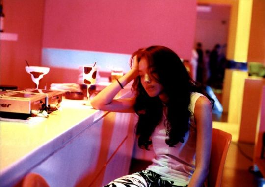
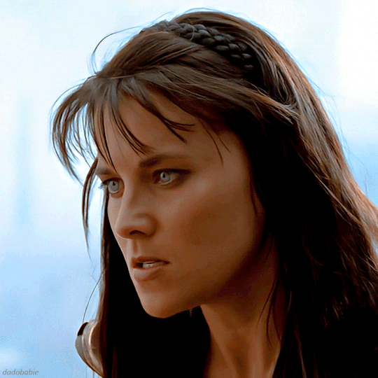
𝘣𝘢𝘣𝘺 𝘨𝘢𝘣𝘣𝘺'𝘴 𝘴𝘩𝘪𝘯𝘺 𝘦𝘺𝘦𝘴 ✩₊˚.⋆☾⋆⁺₊✧
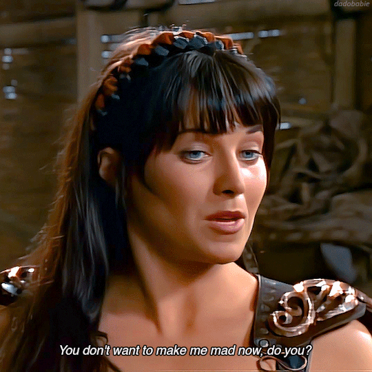
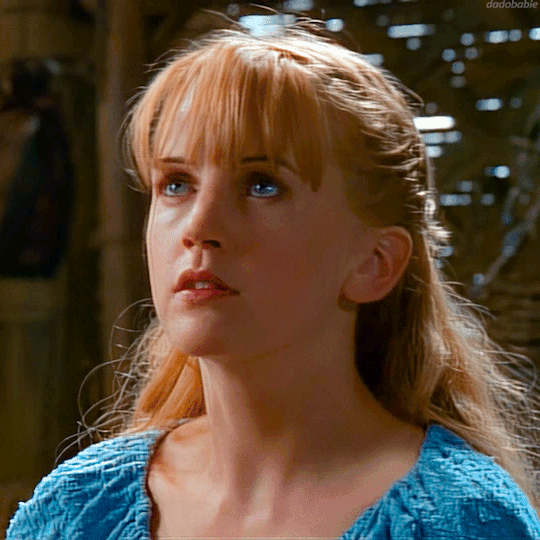
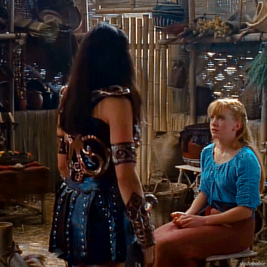
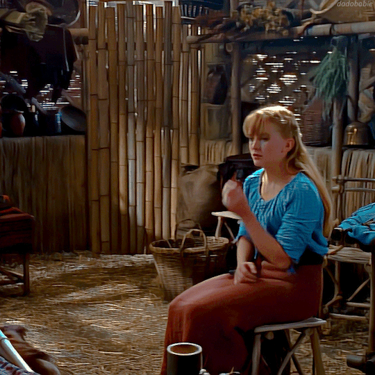
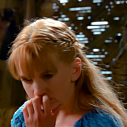
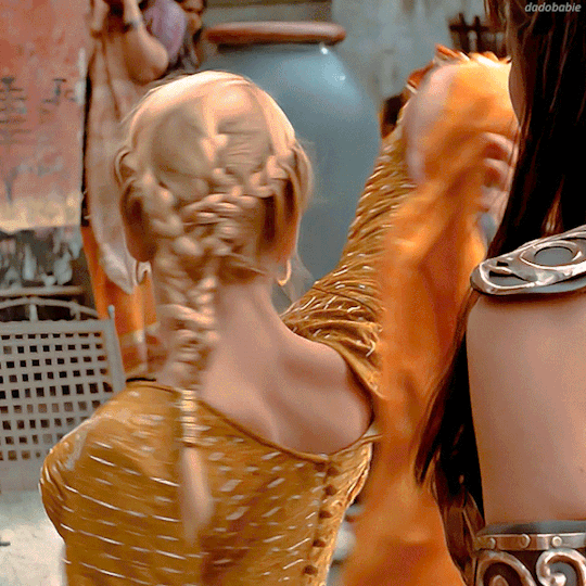
Xena: Warrior Princess - S01.E01 "Sins of the Past"
#xena warrior princess#xena#renee o'connor#lucy lawless#gabrielle#xena and gabrielle#xena & gabrielle#xwp#wlw#color grading
463 notes
·
View notes
Text
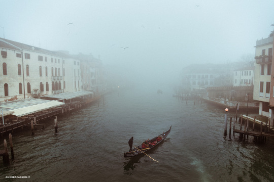
Caronte
© Andrea Passon / www.andreapasson.it
#photography#fotografia#andrea passon#art#veneto#venice#venezia#fog#nebbia#gondola#gondoliere#canal grande#fine art#color grading
91 notes
·
View notes
Video
44°58'23.5"N 6°03'54.8"E
youtube/oftwolands
www.oftwolands.com
#video#snow#france#French alps#frozen#frozen waterfall#waterfall#nature#cold#winter#europe#landscape#shot on iphone#iphone#film#color grading#outdoors#water#white#florent piovesan#of two lands
813 notes
·
View notes
Text
the colorgrading in Salaar
the coloring of salaar is very high contrast, and leans heavily towards warmer tones
and even though this may not be visually pleasing to some who don't prefer these specific aesthetics, it is very necessary, in order to frame this universe to seem as oppressive and grim as it is meant to look.

this universe (and also kgf) are universes where every single moment, whether centering around a relationship, or part of the backstory, is blanketed by the theme of sheer violence and loss.
movies with a dark storyline and vibrant colors (for example, baahubali, or rrr) can afford to be colored like that, because we're MEANT to enjoy the lighter aspects of the universe as well. the audience has to experience even the softer emotions and any festivity happening within the universe.
the effects used in salaar are required to immerse the audience in that kind of dark, saturated environment:
so the audience doesn't forget – especially in scenes with the absence of any onscreen violence – the grit of this place and the people within it.

the severity of the violence depicted and the magnitude of the world building doesn't matter – if the audience isn't able to effortlessly accept that this is a fantasy, dystopian setting.
it should also be noted that the movie has no moments where we're forced to sit through that classic mistake some movies make:
the 'night blindness' coloring.
where, in the interest of depicting a physically/metaphorically dark place, the audience's visibility of the scene is restricted
the subtle lighting of these dark scenes has been handled well:


additionally, prashanth and the actors have also specified, that the whole universe and all motives within it, rely partly, if not completely on violence – especially deva's character, whose violence is something that's an integral part of him, so his scenes in particular are very warm, tone-wise
but i do think the movie overall has been balanced well to prevent them from having a strictly monotonous look (something that guntur kaaram received criticism for):


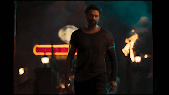

the main purpose of the film's artistic choices with coloring and contrast is to subconsciously drag the audience's perspective out of reality & into the darkness of it's make-believe world, and it does achieve that
even though consciously, it may not align with people's aesthetic preferences.
#getting technical#part 2#color grading#media analysis#salaar#prashanth neel#prabhas#prithviraj sukumaran
68 notes
·
View notes
Text
I have a lot of thoughts about how DIFFERENT this first meeting between Crowley and Shax feels, cinematically speaking...
Like, it just FEELS really weird, doesn't it?
Crowley's alone on some bench and gets a Typical Spy coming over and talking to him, then Shax right after. But something about the aggressive depth of field, the SUPER BRIGHT color grading, how we can see through Crowley's glasses with UNUSUAL ease, the weirdly central framing of the whole thing. Rainbow lens flares all over the place.
Feels weird. Something's off.
Big rainbow lens flare...
Lens flare frames Crowley in the shot even though that... doesn't make sense? I think?

Everyone in the shots for this scene are dressed VERY drably, in browns and blacks and greys, so with the color grading it makes Crowley REALLY stand out.
MANY of the shots are framed with a lot of space around them, as well, and it feels super fucking weird. Especially shots like this one, where there's a lot of dead space and just a SLOW ZOOM straight toward them.
"D'you ever think what's the point...?"
Very big dreamlike quality here, so I wonder. I wonder.
OR, it's highlighting the separation of Crowley from Hell. His jacket almost looks blue in these shots, especially compared to the vibrant reds Shax has on. It's quite stark, now that I notice it!

And then the next time she shows up, later the same day (allegedly!), like. I know it's afternoon or sundown but it still feels ABSURDLY different. Different camera work, much duller color, no weird filters or flares.

Anyway that's my brain dump for the day lol. Maybe in the first one, Crowley is dreaming but Shax can even show up there, y'know?
#good omens#good omens 2#crowley#shax#good omens meta#cinematography#or something#photography?#color grading#IneffabLeigh's Meta Tag
57 notes
·
View notes
Text


#sony a7ii#lightroom#70mm#100 iso#original photographers#photographers on tumblr#photography#color grading#warm aesthetic#cottage aesthetic#beautiful photos#nature#aesthetic#sunshine#spring#sony#sonyalpha#film look#vintage#vintage aesthetic#camera#architecture#photooftheday#photoblog#summer#cottage vibes#good vibes#happy life#cottagecore#cozy cottage
32 notes
·
View notes
Text
why do color graders hate us so bad


39 notes
·
View notes
Text


#millennium mambo#90s aesthetic#dreamcore#surrealism#cinema#letterboxd#cinephile#y2k aesthetic#cinemetography#taiwanese cinema#asian cinema#color grading#color photography#lonely people in neon cities#night photography#city lights#city photography#sadcore#neon aesthetic
29 notes
·
View notes
Text
HOW TO GET OTHER COLORS ON TUMBLR LIKE THIS, PHONE VERSION⬇️⬇️
updated version
HELLO EVERYONE horizontal gradient
HELLO EVERYONE middle gradient
HELLO EVERYONE three colored gradient
HELLO EVERYONE solid
HELLO EVERYONE random colors
HELLO EVERYONE rainbow
pls don’t mind my broken ass english, also idk why the quality is so bad??🫸🏽😵💫🫷🏽
click here for the website!!!

29 notes
·
View notes
Text

Nct Dream Na Jaemin for HOMME
21 notes
·
View notes
Text
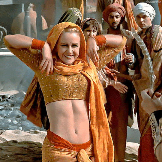
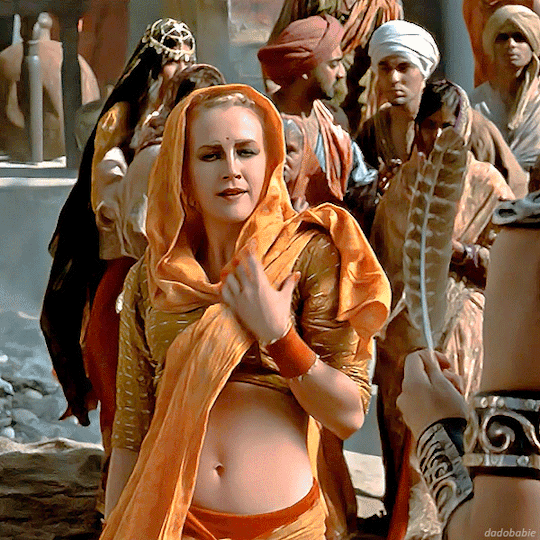
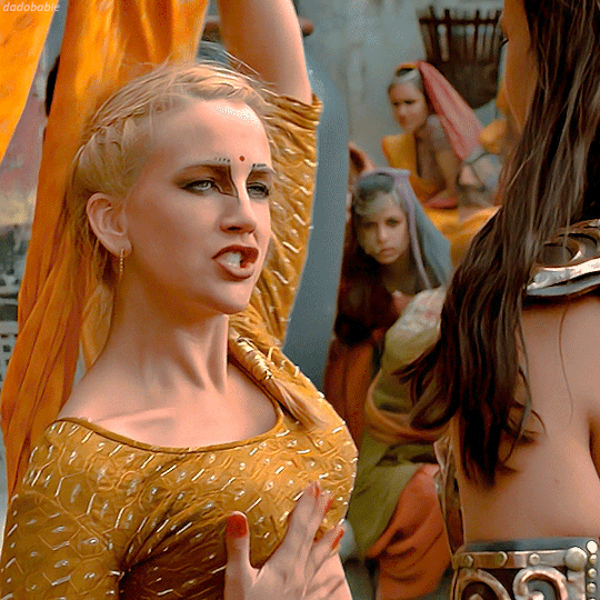

Xena: Warrior Princess - S04.E14 "Devi"
#xena#xena warrior princess#renee o'connor#lucy lawless#gabrielle#xwp#xena and gabrielle#xena & gabrielle#wlw#color grading
248 notes
·
View notes
Text
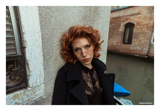
ANNA
© Andrea Passon / www.andreapasson.it
#photography#model#portrait#fotografia#andrea passon#beauty#modella#girl#art#venezia#venedig#venice#italian photography#artist#artist in tumblr#red hair#ritratto fotografico#color grading
60 notes
·
View notes
Text
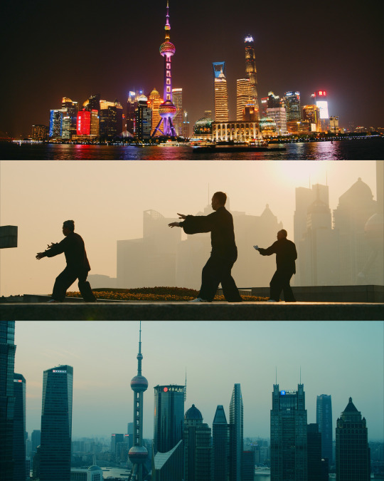

31°14'00.5"N 121°29'48.9"E
youtube/oftwolands
www.oftwolands.com
#of two lands#travel#filmmaking#frames#bmpcc4k#blackmagic design#shanghai#cinematographer#cinematography#color grading#grading#nighttime#lights#blade runner#florent Piovesan
78 notes
·
View notes
Text
Oswald Cobblepot Going Ice Skating with You (Fluff ⛸🐧🧊)
Even just putting a shoe on his injured foot is impossible.
However, he's content to watch you glide across the ice, whether that be with a warm beverage in his hand or by walking around the side fence to stay close to you. Ozzie is entranced by you - even if you aren't good at ice skating.
As much as he'd love just the sight of you, he might still try to move on the ice as well, probably by wearing a proper ice skating shoe on his better food, and by wearing slightly high heels on the other for his feet to be at the same height.
Ice skating is still something he has to re-learn after not having done it for a long time. Oswald has very happy memories of it: Gertrude loved everything to do with music and dance, so she also loved the elegant movements that can be made on the ice.
Despite his safety precautions, he doesn't have the illusion of complete safety: he needs something to hold onto, preferably not you, because he'd prefer not to make you fall.
Now comes the thing: if you've ever gone ice skating, you might have seen certain mobility aids: the penguins. The figures with two handles that are often big enough that adults can use them. Yep. Oswald might not limp on the ice but he won't get rid of the penguin-coding 😄 Here's a picture for reference:
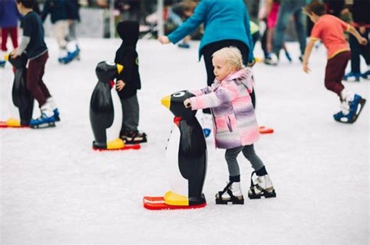
Hold on, let me change that to a more Gotham-accurate color grading:
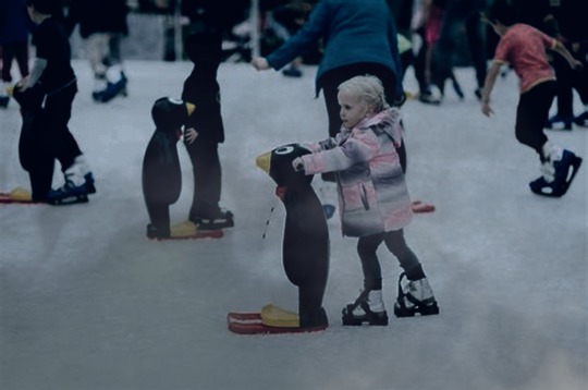
I had to 🤭😂
Despite the probably somber and not at all sparkly ambience of Gotham, you two have a great time. Managing to move across the ice might be a challenge, but it's one most welcome for someone whose challenges are usually of the deadly sort. It's also cold, which means that there will be lots of cuddles afterwards 🥰.
#fanfiction#gotham fluff#gotham#gotham fanfiction#gotham headcanons#gotham x reader#oswald cobblepot#oswald cobblepot fluff#oswald cobblepot headcanons#oswald cobblepot x reader#gotham penguin#the penguin#humour#funny#gotham aesthetic#gotham color grading#color grading#ice skating#winter fanfic#christmas fanfic#gotham tv#gotham 2014
36 notes
·
View notes
Text
The landscape around Skelmersdale
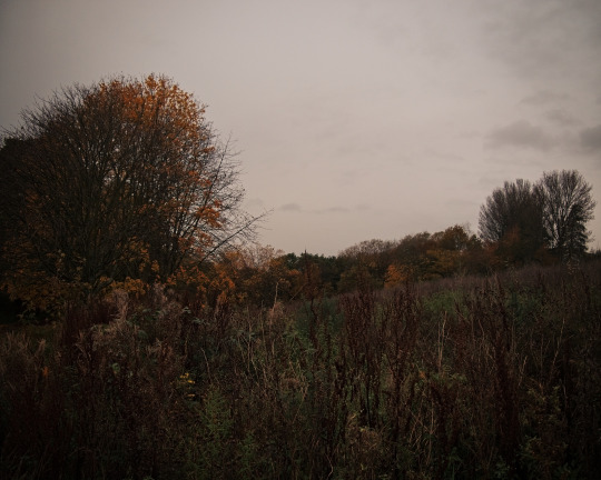
#nature#photography#landscape#landscape photography#photographers on tumblr#autumn#color grading#lancashire#uk#countrycore#countryside#cottagecore
24 notes
·
View notes
Text
Movies that are like a warm blanket on a rainy day.
Some of my fav frames from 'The Half Of It'. Perfect movie-Perfect score-Perfect comedy.
One of those movies that I can watch a thousand times and still never get enough of it. 🍁🚲📖🌮🚂🚦
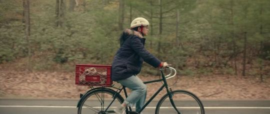
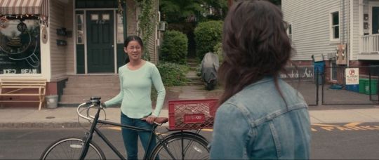

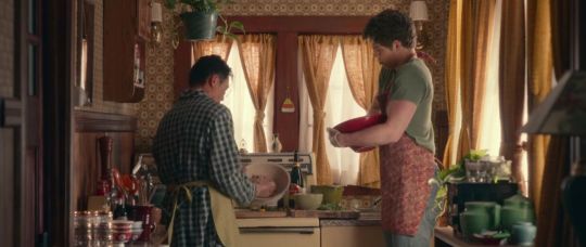

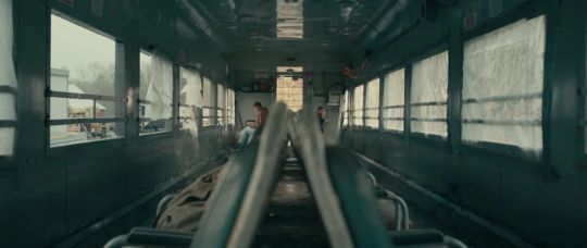


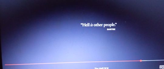
#the half of it#alice wu#leah lewis#alexxis lemire#Daniel diemer#wolfgang novogratz#Collin chou#tumblr movies#comfort movies#Movies that feel like warm hug#movie frames#color grading#Movies i can watch every day
11 notes
·
View notes
Last Seen Blogs

mrr0b0tstuff
Mr.Robot.sideblog

crowconquer
MOVED: @luxaeterna
thinkviscera
hey kirby!

shelloop
Writer Activities / シェループ

wadewade6
The Love of Pehrson 207