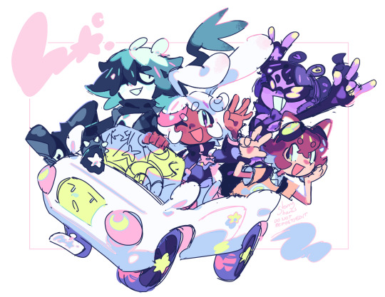
#like the green brown red color pallet
Text
Okay listen hear me out!
I know we are all freaking out over the LN 3 trailer. I know I can barely believe it myself!
But let me throw out some predictions for this game already because I have some ideas.
inhale
Guys I think this game will follow up on stories from the comics. Like the very first ones.
You cannot tell me that just after the first game came out, they make a comic that has a story set in a desert, with a wind creature that is associated with crows, only to make a game years later that is set in a desert themed area, with some strange wind and crows, is a coincidence.
Basically what I'm saying is: the North Wind will be part of this game baby!!!
Also the mirror. Remember the mirrors from the comics? Yeah remember the mirror monster? See how there is very clearly a mirror in this game that's in the literal center of the story!!!!
All I'm saying is, even if this game won't be produced by Tarsier Studio anymore (a shame really but I get that they wanted to wrap up their story with two games) it will follow story beats and lore from the universe of the LN franchise.
Do I think it will tie in with both LN and LN 2? No, not really. Those two games tell a story of Six and Mono, as well as some innocent bystanders who got caught up in their nightmares so to speak. I personally think that LN 3 will follow a new story path. A story following new characters who have no correlation to Six, Mono, the Lady, the Thin Man, the Maw, Pale City, none of it.
Obviously some aspects might be explained with events from previous games cough the Eye warping the whole world and basically distorting everything with the help of Mono's power cough.
But other than that I am more than open for a new adventure. With these two new characters. Who I can't wait to meet.
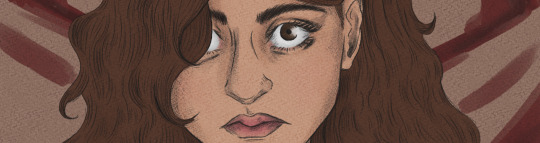
#also can we talk about for a sec how the kid in rhe bidy suit looks like one of my own LN kid OCs that I made?#like the green brown red color pallet#the twin pony tail hair?#the overall look?#THE WRENCH?#LIKE COME ON!#DON'T TELL ME I MANAGED TO PREDICT A WHOLE NEW CHARACTER FROM THE THIRD GAME!#little nightmares#little nightmares ii#little nightmares iii#rambles#no art
30 notes
·
View notes
Text
why do only some colors/shades get to be last names? why are there so many mr. browns and ms. whites but no mr. chartreuse, miss aquamarine. why are we limiting ourselves there are so many colors!!
#shitpost#grey white black brown…sometimes green#this is just like with cars#I hate cars’ color pallet#grey white red black silver#muted greens and blues#sometimes a rare yellow#UGLYYYY#give me BRUGHT OURPLE and TEAL and ORANGE and NEONS and FUSCHIS#give me COLOR YOU FUCKS
7 notes
·
View notes
Text
I have a really sick idea for eye makeup companies. Please just make a basic line of every basic color, matte and shine options, and in single 3 dollar trays. You would not believe how fucking hard it is to find a single tray of basic ass purple eyeshadow
#Walt talks#I’m not even kidding. please. just a line of single tray colors#no pallet tray#just. individual trays#red orange yellow green blue indigo violet pink brown gray black white#offer a matte option and a glitter option#please#you’d make so much fucking money#wet and wild used to have trays like this in the grocery store but I don’t see them anymore post pandemic
1 note
·
View note
Text
Venus, Art, and Feelings to Create
I wanted to make a post talking about how to use Venus to make art, since it rules over aesthetics. I tried not to focus too hard on things like painting, drawing, etc and but couldn't cover all types of art forms, so we're going with colors, feelings you can create, and some places to start if you want to give it a try.
DISCLAIMER: I'm not a pro at this, and may have explained things weirdly. Feel free to ask any questions you may have :). The pallets look different on my tablet vs phone, so tablet/computer could show up more brown and on phone it could be red etc. ALSO check your rising as well, along with aspects to placements (look to the ruling zodiac) :)
✿ 1st House - Making art revolving around yourself, personal style, and putting your personality into the art is key. Using yourself as the canvas is something you can utilize, as this is a public house. Similarly to 10th and 5th house, you are connected to your art visually, so your art and brand is associated with you, but unlike the other two houses, staying true to yourself is very important.
✿ Aries/Color Palette - Using tones of red, feelings of confidence and taking charge should be the feeling you evoke with any art you make. Empowerment is key. The viewers of your art and the things you create should be eye-catching, confident and energetic. Make people want to create art too. Don't be afraid to take the lead in any project you take part in.
• Makeup Artist
• Hair Stylist
• Creating Self Portraits
• Those body painting things
✿ 2nd House - Money, opulence, and values should be shown with your art. Whether it's expensive/shiny things, fashion, or houses, general luxury items is a start. The things you make should scream expensive, no matter how much it cost to make. Modern art reminds me of this placement. Showing what you value could also be shown.
✿ Taurus/Color Pallet - Pastel earth tones are a good place to start, along with channeling that luxurious and "stubborn" (idk a better word my bad) sort of feel Taurus gives. Pairing that with the thought of values, sticking to one practice or taking your time on one thing at a time may work best for you.
• Personal Stylist
• Antique Curator
• Value Setting art
• Jeweler
✿ 3rd House - Graphic novels, images to match poetry, or simply portraying people communicating are good topics. Causing a conversation with how you show your art is something that could appeal. Conversation starting art. Drawing people talking in a cafe or showing off your mental activity in an artistic way.
✿ Gemini/Color Palette - Yellows, light greens and complimenting cooler tones go with the themes of mental stimulation that Gemini needs, along with 2 things once - pairing two artistic mediums together would benefit this placement, like writing your own poetry and making the art for it, or commentary on mental things with the audience to bounce off of. Taking inspiration from another thing would also be nice.
• Comic Artist
• Poet
• Whatever the fuck Andy Warhol was doing
• Conservation Pieces
✿ 4th House - Family life, nurturing/cozy environments, ancestry and roots could be a main focus. Things that create the feeling of home is key. Working from or for the home works well for this native. Creating things that give warmth and love, even if it's just for you.
✿ Cancer/Color Palette - Warm and loyal blues, the depth this water sign has should be a calming one. Understanding and comfort should come from this art-even if it's though provoking. Creating comfort with even bad thoughts that this art should create (like reincarnation after death if that makes sense). Understanding yourself and others should come from this art.
• Knitting
• Family Portraits
• Home decor

✿ 5th House - Performance, romance, and showmanship is what comes with this house. Things such as theater, singer/song writing and painting should carry ego and pride with the art. This house has the opportunity to create something out of someone else's work (theater or movies and such). Showing off your skills in a physical sense could be appealing, and making sure you're the art is key. Just don't get too egoistical.
✿ Leo/Color Palette - Oranges, golds and champagnes shine here, along with glittery things. Anything that draws the eye. Under this sign, the focus is on you, and what feeling YOU create rather than what you can make. Ghostwriting and self removal and de-glamming is not ideal with this placement. Embrace any artistic qualities you may have and inspire others to do the same, or they can watch the show.
• Actor/Actress (comedy or drama)
• Singer or Songwriter
• Face of a Brand (yours or others)

✿ 6th House - Calmer and more mundane things may appeal to this house as it rules work life, health, and pets may be your style. A focus on still life, and things that remind us of the little details are the way to go. Like Cancer and Family Portraits, you may like taking photos for things like yearbooks, scrapbooks, or newspapers. Remind people of the little things they should remember. Pet portraits are also good for this placement, drawn, painted, or photographed.
✿ Virgo/Color Palette - Back to earthy tones, and more blendable colors take focus, as Virgo focuses on the little things. Curating something that shows off the skill of observation and thought is key here as it's ruled by Mercury like Gemini. But you may want less of an external conversation and more of an internal one. Don't leave out little things. People will appreciate the care you've put in.
• Pottery
• Still Life Study
• Embroidery

✿ 7th House - Marriage, business deals, and maybe even enemies leave a lot to work with in this house, ranging from a courtroom artist, painting portraits for marriages, getting business deals with any art or creating discussions on social relationships (even bad ones) are themes to work with. Anything interpersonal is up for grabs in this house, as long as it focuses only on smaller groups. Creating reflections of the viewer could work here, along with showing how to obtain balance (even with people you don't like).
✿ Libra/Color Palette - Pretty, bright and feminine colors like pink work at it's best, as to aim for as much balance and easy viewing as possible. Like Taurus, beauty oriented things shine in this zodiac. Showing the beauty in what you do is important, and creating something that means peace to you is key. No matter the medium, even though I've said it a billion times, peace and the beauty of things is what's important and works for this sign. Optimistic art.
• Courtroom Sketch Artist
• Decorative Art
• Runway Fashion

✿ 8th House - Transformations, s*x, and death are themes to work with in this house, as getting to "the bottom of things" is a key element. Do not create something that doesn't have meaning. Fake depth does not work with this placement-which is different from creating just to create. Making art to explain something or bring an intimate feeling could be something that appeals. Darker topics can easily be explored with this placement, and self exploration is needed to create.
✿ Scorpio/Color Palette - Blacks, darker reds, browns and purples are colors to use, anything that could remind you what it's like to be hidden. A sense of mystic and magnetism comes from you and the art you create, and could leave people wanting more or just pain interested. Show people it's not bad to get their hands dirty when it comes to more personal themes, and general/self investigation is always good. Leave them questioning something they always needed to.
• Horror Art
• Special Effects Makeup
• Art Therapy

✿ 9th House - Dreams and inspiration of overseas, religion and philosophy is important. Creative freedom and learning and expression is big for this house, and a releasing of any chains artistically would be good. Generally pushing people to discuss things that are important to them and their own views of life is something that comes to mind with this house. A painting, a poem, or even just teaching about religion through your art is something that could work. Keeping things as open to ideas as possible is key. Inflexibly is something to avoid.
✿ Sagittarius/Color Palette: Shades of strong purples, and general vibrant shades work for this zodiac. (Personally I do associate this color with oranges idk why just thought I'd throw that in). Freedom and foreign things are things to show off. Sagittarius are known for wanting and fighting for freedom, and invoking a feeling of elsewhereness is nice. Even in forms of things like comedy, making someone feel like they're not where they are is the goal. Putting heavy emphasis on the comedy, though. Y'all are funny lmao.
• Religious Art
• Philosophical Artworks
• Making Art Abroad

✿ 10th House - Achievement, Status and how people view you is at play here, having the public eye being the main thing to keep in mind. You may pay attention more to personal aesthetics and style, keeping a leash on how people see you and your art. You could also be very focused on art in general, maybe even wanting it to be the first thing people see when it comes to you. Display your skills as in this house, like 5th, you're connected to your skills. Hard work and displaying it is important. Staying committed to projects be nice. Even being known for how you dress, your specific style or how you wear your makeup could be appearing, so leave people in awe of your dedication.
✿ Capricorn/Color Palette - Grays, dark greens and browns are colors that may suit you. Out of all of the earth signs, to me, Capricorn screams commitment. Showing off the work you've put into anything you make, and creating stability with your craft is something you want to provide. With the art you make, show off your natural ability to make something consistent and how you evolve into something better. Self betterment and achievement is something a Capricorns may like showing off in their work, regardless of what it is. Things like pencil sketching, and single tone art could be appearing. Avoid laziness, but remember to take breaks.
• Personal Stylist (like in a Law Roach kinda way)
• Sculpting
• Fashion Trendsetter

✿ 11th House - Community, hopes and dreams, and general aspirations themes shine here, and giving hope for the future could be something you like to create. Group projects, and getting everyone to feel involved are things to work with. Commentary on life and what it's like to be a part of something works best here.
✿ Aquarius/Color Palette - Electric/darker blues and light grays work with Aquarius. Using tech for your art could be something you work with, and showing off individually and futuristic ideas to create a head of time art pieces to make people hope for a better/cooler future is something you could like. Future is the keyword to create with this zodiac, as looking forward to create something new and never seen before is something desirable, and giving a change to viewers is the goal. Things such as game design, beat creating and such is something to work with. Remember while individuality is important, you don't need to create something ENTIRELY new for it to be good.
• Game Design
• Script Writing
• Art Teacher

✿ 12th House - Isolation, mental health and things that are hidden are the themes, creating the most personal depth out of all the water houses. While 1st house is presenting your outward self, 12th could be hiding it or simply dissecting your own brain and fears. Your art could be darker, more in tune and create more personal feelings to the viewer. They may even keep their love of you to themselves, or you could also not feel the need to show off your art, and keep it close to home.
✿ Pisces/Color Palette - Light greens, and watery colors are the go to for this zodiac sign, anything reminiscent of the beach is something you may feel drawn to. Beaches, liminal spaces, and dreamy effects may appeal to you, wanting to create something that, like Sagittarius, makes the viewer feel like they're somewhere else, but in this case, it's a more watery and head in the clouds elsewhere. Dream states and a feeling of calm is something to make the viewer feel. Remember to stay grounded, don't just daydream about your art. Do it.
• Journaling
• Art Autobiography
• Ghost Writer

Kind of a long post but I hope you liked it!! Hopefully I worded it correctly, I've been thinking about this post for a minute. Let me know your placements, I'm a Libra Venus in 8th House :D.
#astrology#venus#astrology art#astrology aesthetic#astrology observations#astro notes#astrology notes#zodiac#color palette#colors#aries#taurus#gemini#cancer#leo#virgo#libra#scorpio#sagittarius#capricorn#aquarius#pisces#astrology aspects
668 notes
·
View notes
Text
my controversial opinion on knightcore fashion
or: how to dress like a knight on a daily basis without any armor
so, you're a knight just like me. you're chivalrous and noble. you want some adventures, medieval literature and a sword. maybe you even want to date a prince or a princess! that's cool
and then, you're searching for "knightcore fashion" to incorporate your aesthetic into your daily life and... there's nothing that fits quite right.
img src: Rachel Maksy on youtube
pinterest outfits are cool, but they are too much medieval-ish? historically accurate? LARP-ish? not suitable for school and office? that's bugs me a lot
and then there's amazing @/donttesstme on tiktok, that does "workspace fantasy fits" series. that's more like it, but she hasn't done a knight part yet
well, here's my take on "how to dress like a modern knight without an armor, a sword and without expensive accessories"
important note: this advices may look a little weird and confusing at first. that's okay, and I'm going to explain why:
I'm doing character design for years, and I really like fashion. armorless and swordless knights are impossibly hard to design, because their key features are... armor and sword. that's what makes them recognizable. without these components an outfit may look confusing and dull
alas, swords are expensive, and armor may look a little weird on you while studying. that's why I'm going to tell you how to include some secondary knighcore motifs into your outfit. it may be subtle, but the intention makes it all
1. gather some inspiration:
firstly, think about yourself, your current personal style and identity. this is important, because all knights are different
maybe you're a kind, noble person with a strong moral code, who prefers light clothes and golden color? then maybe paladin archetype is going to be the best for you
maybe you're a pessimistic gamer goth person, and you want to keep that. then think about your favorite gothic brutal knights from dark fantasy games
maybe you just like bright colors? search for some art of medieval joust armor, it's actually colorful
maybe your favorite knight is Link, maybe you're the Geralt of Rivia type of person. everyone is different, so gather some unique inspiration pictures.
2. learn the basics
any fashion mf knows, that there's several components of an outfit:
1. color pallete
2. silhouette
3. pattern
4. materials
5. styling (the way you put and combine items)
and that's where you gonna need your inspiration pictures. analyze them, think of what's important. ask yourself questions: do I like the dark pallete? is this knitted material reminds me of something like a chain mail? does these tall boots look adventurous to me? maybe I want a bulky scarf?
write it down and keep that in mind. congrats! this is your personal definition of what is knightcore fashion.
3. op's definition of knightcore fashion
personally, I think that "casual knightcore" is more like an adventurecore subtype. for me, clothes like that supposed to be utilitarian and sporty, because knights tend to explore, fight with monsters and go on great adventures. I would go for hiking vibes and comfortable pieces
I also would prefer to have some brown, beige and grey neutrals paired with muted green, red of dark blue. grey, metallic and silver are probably the main color for my dream casual knightcore wardrobe
I wouldn't mind to add some whimsical fantasy elements, but in a subtle way. like bulky metallic jewelry with nature motifs, accessories like chunky combat boots and belts. maybe a cool DIY-ed unicorn embroidery on a jacket or pair of dagger earrings. jewelry supposed to be like a sentimental token from a lady or an artifact from a long journey
also, ribbons, lace and fishnets are somehow knightcore to me?? like, recently I crocheted a oversized brown shrug for myself, and it screams chain mail
in conclusion: generally, I would recommend search for some muted and natural colors, metallic jewelry, comfortable clothes for hiking, tall boots, tunik-shaped oversized shirts and huge scarfs. this is my vision of "modern knight" clothes, your vision may be different
maybe I'm taking this far too serious
anyway, hope that helps
116 notes
·
View notes
Text
The Color Language of Phantomarine
At just a cursory glance at this webcomic, it is very obvious that there are strong colors and that they will be tied to themes of the story. And the impulse to discuss and dissect them is.... far too great.
So! Let's start with something general, yes?
Saturation
There are two types of color schemes in the webcomic so far. Schemes with brighter colors and additional accents, and more muted colors with much more limited value differences. Practically speaking, more saturated colors and visual interest helps to draw the eye to what is important; like black thick lines around animated characters to distinguish them from the background. But.... we have a group of characters who has changed from a background scheme to a main character scheme. Such as....


...Our Favorite Princess.
Three different color schemes for three different Phaedras. The first muted yellows and browns, almost boring against the intense lighting of the Candlelight Sea and its foreshadowing hues. The second an intense yellow and terracotta red that hold up against the maroons and deep reds of the Red Tide. The third, blues and white like the very sea she was looking down at but saturated and darkened with indigo and purple unlike any of the other sea ghosts we have seen before.
The transition from background color scheme to VIP color scheme coincide with the very critical moment of the Princess meeting Cheth, demonstrating that her death is a critical moment plot-wise. Her transition to a completely different but still VIP scheme is when she realizes exactly what has happened... and we see that it changes her outlook down to its core, all the warm colors replaced with cool tones.

So, a characters' color scheme tells us both how important they are and can clue us in to their mental states and affiliations. Nothing new. Let's see those groups!
Cheth

As the Red Tide King, it isn't surprising that his color scheme is dominated by a bright red, mixing into warmer purples with highly contrasting white and black. This color scheme overtakes the muted blues of the sea ghost, as well as marking them with his tattoos. White is the secondary color closely associated with Cheth in-story, representing bones featured both in skeletons and his original divine body the Bonefish. This sort of color pallet usually infers more sinister intentions, with red commonly being associated with aggression, but I believe in this case it implies passion. Not necessarily romantic passion, mind, but a deep level of involvement and care.
The Plume Church

Black and bright turquoise and blue with touches of white and green, Cheline and the institution worshiping her are perfect foils to Cheth in color scheme; the cool colors of the Goddess of Life oppose the warm tones of the God of Death while still being unique against The Candlelight Sea. I imagine the black represents the ashes left in the wake of her fire and the greens and blue new life growing from it, though the predominantly black robes are not the usual choice for a Life Diety. The very liberal use of black also paints a more sinister color scheme, with it's traditional use to imply 'evil' in villains. As of writing this, I do actually think that is the intention.
The Mantaluna Crew
Being Seaghosts, the group's scheme is focused around a cool blue, but with more saturation and variation than other seaghosts to represent how they still have some life in them yet. Their cooler colors also allows them to contrast starkly with Cheth, but the purple gives it just a bit more warmth than the Plume Church, showing that while the crew may follow their Church's teachings.... they are fundamentally different on some level than those who have tied themselves closer to the Church.
Pavel, Vanna, and the Lodestars

Characterized by yellow with accents of white, red, and black, the Lodestars stand out. Being the third primary color, they easily stand apart from both Cheth and The Plume Church, showing they are not tied to either. Yellow appears to be the 'neutral' side in this diefic-level conflict, with Best Boy Pavel trying to be a mediator and Phaedra from Chapter 1 treating Cheth with more empathy than in the current chapters when her color scheme was strikingly similar. They do not have a side: they simply want what they think is best and try to stand as a beacon against the dark.
The Fata Morgana

Monochromatic with only lighting and their pale pink eyes for color, these enigmas stand apart as blank voids against the rich vibrancy of the rest of the Candlelight sea. The dominant white with bone-like designs implies a closer relation with Cheth than Cheline, though the exact nature is still up for debate.
Seaghosts

Another monochromatic and muted color scheme, the seaghosts of the Candlelight sea are a pale blue with some white to outline and to fill the eyes. A traditional scheme for spirits, hostile or otherwise, and it blends nicely with their home in the ocean, truly making them feel a part of it. Their cooler color scheme also allows the Red Tide to stand out beside them.
I have a few special mentions that are not fully flung schemes of their own, yet, but that I feel need mentioning.
Silas, though we have yet to see him in different lighting, has the Plume Church's signature blues and greens catching in his hair, with the rest of his pallet being a background tone with little detail. Almost like a certain bird's words have wormed right into the head of 'some nobody' and he all too eagerly listens for the boons she promises.

Daphnie and Euphamina also share a muted color scheme, tending towards the golds with purple to show their high status. Though this is their funeral dress, Daphnie having the black on top covering her own warm and regal colors while her mother instead covers the black with yellow and dons spectacles of a familiar red seem to hint at how the Plume Church interacts with them. Daphine is being covered and almost smothered, though her pure intentions still peek through; Euphamina cannot get away from the influences, but has found ways to assert her will.

Speaking of the funeral, we have a mystery bean with their very own VIP color scheme with cool, deep blues that we have yet to see used elsewhere.

Finally, we have Amos Ellery. We also do not know much of his color scheme sans funeral, but I believe his color scheme hits at his own motivations, similar to Silas. Whereas Silas's colors were seemingly very average for persons in Saperport, save the little highlighting of his hair, Amos is all black, white, and grey. His course is chosen not because of promises, nor because he agrees with the Church... they are driven by the Church being the only thing 'correct' to follow.

I hope you have enjoyed my ramblings, the pretty colors, and any snippets of a story you saw. Do please go read and give the author all the support!
#phantomarine#color language#the long anticipated sequel longpost!#some of these likely border on crack theories but it was fun#phantomarine theory#spoilers
88 notes
·
View notes
Text
I LOVE the colors in Nimona, because they show just,,,, uuuuummmm i rewatched it heres an essay (this is my red flag) ignore the format
I really like the way this character is portrayed, because it gives off so much "oooo hes the cocky asshole" vibes before you see more from him, so when you see him it basically subverts your expectations of him just being "the golden boy"
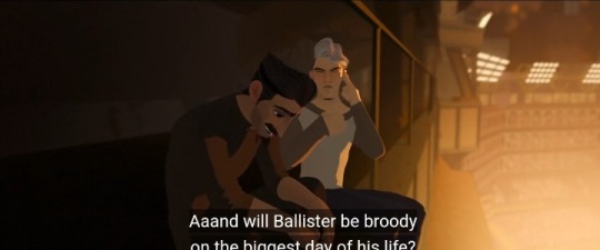
But in this scene hes wearing more muted colors, browns, dark blues; you get the idea. His hair is more ash grey and white than light blond in this scene. It gives the feeling of being more? harmounious? With Ballisters darker color pallete.
Image stuff ill fill in later
Now green is a rare color used sparingly in the film (except for trees and other things) which i personally think was a deliberate choice on the artists

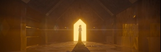
Now, blue and yellow are the only two colors used in this scene, with yellow i think showing a more "heavenly" aura to the scene, contrasting ballisters light blue cell cage, which now seems more lifeless and empty in general.
It also reminds me sort of like belos from the owl house, with the eerie light blue contrasting the warmer colors in the show.
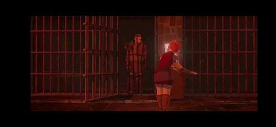
The scene then panders to a rosey-red color, which perfectly matches with Nimonas colors and reckless nature.

The movie changes to a color scheme consisting of mainly white, black, and gray, showing that Ballister is able to hide in the shadows, and camoflauges fairly well.

Nimona, on the other hand is completely out of her element, with her bright pops of pink being a major eye catching feature of most of these scenes.
She sticks out like a sore thumb in the clinical, sterile looking enviroment of the castle, (i have no idea if its a castle) which i think signifies the chaos she brings to the castle

Everything Nimona is near is mainly either one of two colors, red or rosy pink (and basically everything in between). Look at the colored lights for example
(also something to note, theres no green hanging lights which makes me think that the lack of any neon green was intentional)
#ill be posting more of this#i just find the color choices for this movie very interesting#rest of this is going in a reblog#nimona#darn you tumblr and your 10 photo limit#this is like#gonna be the only non afpr thing i post
59 notes
·
View notes
Note
I've been really surprised so far that people do not seem fond of the bright green shiny variants (espeon, ursaring). I have always really loved them. Do you have any personal favorite shiny color variants?
I really like earthy pallets, light greens and browns.
But above all other pallets, I love teal/red, like the treeko or Rowlet line. It's just so good, slap teal on any pokemon and I'm sold.
23 notes
·
View notes
Text
I’m currently writing a Bamon fic that basically reimagines TVD, starting with them starting college and with Bonnie as the protagonist. And like I have SO many headcanons I’m gonna incorporate. A lot of them comes from the show but just elevated.
1. Bonnie
My lovely, mistreated Bonnie… boy do I have ideas for you. First of all, she’s going to have some good ass hairstyles. BLACK GIRL hairstyles. I think Bonnie loves to wear curly ponytails with decorated scarves, or like some long knotless braids. AHHH I have some ideas for her hair. But speaking of style, Bonnie loves the bohemian aesthetic. So, air of half tops, waist beads, long skirts, etc (go on Pinterest and type “bohemian black girl, and you’d see what I’m talking about). She wears alot of brown, green, beige and like golden colors. She wears red when she’s feeling spicy. Bonnie is also into candles, HEAVILY, and crystals. She’s not religious but spiritual. And for college, she’s majoring in dance and minoring in occult studies. Her favorite genre of dance is contemporary. And her favorite breakfast is cereal, and she’s most likely a vegetarian. Also I wanna change her background a bit. She actually grew up being raised by her mother and her grandmother. Her father left because he couldn’t or wouldn’t handle with their witch ancestry, when he found out.
2. Damon
Damon’s bisexual. That’s it, that’s the quote. But no seriously, I firmly believe that he is, and I stand by that. And also in my fic, Damon has this kind of… “punk rocker” aesthetic going. Imagine eyeliner, leather jackets with pins, ripped jeans, black and red color pallete. With that being said, he has a SICK fashion sense. He paints his own fingernails, mainly the color black. Another big thing about Damon is that he LOVES music. He is a music fanatic. He adores all the genres and can see the beauty in all of them, and he collects records. He also loves to play various of instruments. He has mastered the piano, the guitar, the violin and the trumpet and other shit too, and he loves to sing but he never sings infront of people. He loves to cook. Whenever he’s frustrated or gets startled, he swears in Italian. And speaking of Italian, Damon and Stefan’s were born in like the late 1400s or the early 1500s in Florence, Italy. And their family portrait was actually painted by the famous painter, Caravaggio. Damon didn’t come to America till the 1920s as he began to admire the American people’s party era.
3. Elena
She actually stays pretty much the same. However, Elena really likes Britney Spears so a lot of her outfits are inspired by her. She wears alot of dark colors, but you will see her in a pink matching tracksuit and a baby blue cropped top. Elena kind of takes every moment to show her belly button. Oh, and she loves cropped jackets. Veryyyyy Y2K going on here. Elena is trynna become a doctor but she’s also minoring in writing.
4. Caroline
I gotta be honest, I have no notes for Caroline cause I think her character in the show was written perfectly enough to be memorable and entertaining. However I think her aesthetic could be boosted up a notch to rest for her image. Caroline wears a lot of bubbly colors. Very bright but also soft color palette, so imagine a lot of soft pinks, blues, whites. She loves to wear plaid skirts and cardigans and sweaters. She’s trying to be a lawyer, which I fully expect from her. Think of Elle Woods without the hot pink.
5. Stefan
Stefan is good ol’ Stefan (except in my head, the version that I like). He’s very athletic, he gives very much sensitive gym bro. And he’s actually kind of passionate about all sports, and watches them regularly. That being said, he also loves writing, specifically poetry. So therefore he’s majoring in writing. Stefan first came to America, following his brother in the 20s. They were trying to make up with each other, and as Damon was trying to teach him how to feed as a normal vampire, it caused Stefan to be the ripper of something something. Basically in the show but different timelines. Oh and Stefan wears the color red and blue a lot, kind of patriotic of him lmao.
#ugh there’s so so so much more I could add#I cannot wait to write this fic UGH#the vampire diaries#tvd#damon salvatore#tvdu#tvd opinions#elena gilbert#bamon#stefan salvatore#caroline forbes#bonnie bennet#tvd headcanons#headcanon#tvd fic#tvd fanfic
21 notes
·
View notes
Text
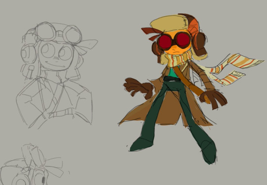
crafting an alt skin for this
really iffy about this design, I want to pull from more 60s/70s aesthetics, debating just overhauling his color palette completely from brown/green to a rusty red/grey brown??? i want this outfit to stand out from his psychonauts 2 outfit and lean into the 'agent' part of psychic agent. but green and brown are such a staple to his character so I might need to mess around with a few more outfits and color pallets because I also need to take location in consideration and see how well he compares to the setting of a modern Gurlovia.
trapper hat and scarf stay tho because of Gurlovia's weather and i like it.
157 notes
·
View notes
Text
How the Companions would decorate their homes
...and how I would lose my goddamn mind wrestling with Tumblr's formatting nightmare hellworld.
sorry to anon who requested this, I deleted your ask while fighting for my life :[
Cait; The punkest of punk design; whatever the hell makes her happy. Would take interest in things she previously never cared much for, like music, or tinkering, or model making. So, you'll have posters and vinyls of her favorite bands and artists everywhere, tools and materials strewn about flat surfaces. Lots of reds and plaid/flannel. Likes big couches you can sprawl out on and thickly-knit, chunky blankets. Think of pop art with darker colors, chaotic patterns. Loves warm, bright lighting, dim areas remind her of the Combat Zone. Her spaces are messy, but freeing and charismatic. Her style is best described as rocker college dorm room. Reminiscent of Chloe Price's room, but more mature and with less teen melodrama. Would have lots of candles. Has a statement shelf with feature lighting for unique alcohol bottles.
Codsworth; Post-modern. Modern is medium-toned, neutral colored, and somewhat minimalist. Post-modern likes colors, soft shapes, having art as part of the house itself. Bright wood paneling, one-line artwork wallpaper, multiple colors in one room. It's very birds of paradise in color pallet. Brown suede couches are a classic. Lots of plants. It's inspired by 1950s, but with bouncier aesthetics, where 1950s can feel stiff. Codsworth wouldn't want anything too out there, though. Dani Dazey is kinda close to what he'd enjoy, but tone down the amount of color, go less crazy with the decals. But otherwise, bright colors, patterns, textures—that's the vibe. Just a less plastic 1950s, and it doesn't have the Great Depression's fingerprints all over it. I would have said something Colonial, or classic British, but I didn't want to think exclusively about his accent. Codsworth is chipper, he's friendly, he invites people over. Something fun, welcoming, and optimistic is up his alley.
Danse; However he got the house/apartment, it would stay that way. Danse does not provide for himself like that. It wouldn't be until he made friends that his residence would have personality. Nick gets him an orange-patterned bedspread that's a lot more neon than it looked in the store. Cait gets him a retro CD player and wall-mounted CD case displays. Preston and Deacon team up to repaint everything minty green and install walnut wood paneling. The furniture is gone the next day, replaced with lodge-style log-and-leather. Everyone pitches in something different, something from their own tastes. As a result, Danse's space would be a constant visual reminder that he's loved, and gaudy as fuck. Nothing matches. The colors are everywhere. Textures? A nightmare. You could kill Ty Pennington with this house. There's a giant mural of cats having mimosas and he isn't sure how or when it got there. Loves it, but...who...why...
Curie; I really struggled with Curie. I first went with French Provincial, then French Farmhouse, French Country, Rustic Glam, Scandinavian, Flemish, bauhaus, pastel bauhaus...I felt like I was trying to convince myself of everything. Nothing fit her. Eventually I settled on girly vintage. The thing with vintage is that technically, 'vintage' has like 70 years of vastly different styles. So...you get a little bit of Victorian-esque, a little bit of art deco, Hollywood Regency...imagine a really nice Barbie dollhouse. That's the vibe, just make everything blues, greens, and purples instead of pink. Curie has a bit of an older grandma vibe. Floral quilts, Wedgwood china dishware and cabinets, antique paintings. I imagine she'd repaint or reupholster her furniture, if not get it new. Definitely has white or blue painted furniture, rather than open wood. Ornate vanity, seashell wallscone lighting, embroidered curtains, kidney desks, corner cupboards...Curie's style is elegant, a little outdated, cherubic, and somewhat saccharine. Would have naturalistic wallpaper with flora and fauna.
Deacon; Like Danse's, but intentional. He's extremely fond of furniture made to look like other things. Mushroom ottomans. Fried egg light switches. Wall-mounted shelving/hangers that are open, grabbing hands. Toucan table lamps. Surrealist thrifter in style. Goes to yard sales, estate sales, those sales put by storage unit owners when a tenant doesn't pay. Grabs the weirdest shit he finds. A McDonalds sign from Thailand. A taxidermied rabbit. A Bigfoot track mold. His walls are never the same color or wallpaper. The kitchen is mint green, the living room is pink and orange, his bedroom is black and blue. Maximalist. There's a story behind every item in his space and good luck figuring out which are true. The least chaotic room is the bedroom, decorated simply with space/star aesthetics. Most chaotic? The empty hallway filled with wall-phones. Only one of them is real. The others go off only when the real one does. He won't tell you this before housesitting.
Gage; You'd think it'd be a Male Living Space. No. Gage is a mean, old, materialistic [sexuality redacted] man. He has tastes. He has standards. Will act like it's a Male Living Space keep up appearances, but his place is probably one of the more expensive. It's fine, money isn't an issue for him. Favors greens, yellows, browns, lots of swampy colors. Steals streetsigns and hangs them up. Weaved and leather furniture, linens, animal pelts, mounts. Worn teak wood, cream walls, travertine floors. If this sounds luxurious, consider that Gage lives here. Unclean. Has no bed frame, only a mass of sheets and pillows. The most pristine places in his house are the coffee maker's counter, and the spaces for his pet lizard, who roams freely like a small dog. The lizard is the only thing keeping him from smoking indoors. So many fucking books everywhere, all dog-eared to death. Has stolen something from every party he's ever been to. Keeps them on display. Has a worrying amount of wedding cake toppers.
Hancock; Psychedelic culture-nerd hippie meets a grizzled ex-starlet who moonlights as a show girl. Think Whimsigoth, without the victorian influence and a lot more drippy shapes. All light sources are lava lamps. Conversation pit that you could meet God in. Many colors, most of them moody and 'sleepy'. Stereo system through the entire space. Paints on his walls whenever he's feeling creative/high, they're constantly changing. Has to scrape off the paint every so often. Collects movie memorabilia, particularly horror movies. Has masks, outfits, props. His kitchen/dining room is unintentionally Japanese-eqsue in style, in that the table is low, and you sit on beanbags. Really not into dealing with chairs in the morning. Hancock's ideal furniture is made of moldable jelly, him being a cat in spirit. His office is a complete divorce from the other rooms. It's entirely 1700s luxury Colonial in style. Dark mahogany woodwork, deep reds and blues, a (electric) chandelier. Big library.
MacCready; Eclectic. This style is defined by maximilism, mismatched everything, lots of tchotchkes. The core tenent of it is that it takes whatever looks good from other styles. It's magpie core. It's how the gremlin thief in your DnD campaign would style a home. So, lots of different kinds of fabrics, many shelves for trinkets, posters of all kinds on the wall. You ever make a wall with just the posters, signs, etc in your settlements? That's what he does. In canon, MacCready likes midnight blue and leopard print, but I can see olive greens as well. Very messy and busy. Raw wood furniture seems like it would be a good fit for him. Would have a big entertainment center, very nerdy space. I think Rodrick Heffley's and Eddie Munson's bedrooms are a good way of getting an idea. Kind of basementy, kind of glamrock. He's 22, what do you want from him? Very much "baby's first place." Duncan's room would be more child-friendly, lighter colors and softer furniture. His drawings always get hung up wherever there's space.
Nick; Also struggled with this one...I didn't want to just make him Victorian/Gothic, that felt too obvious. But...it's obvious because it's correct. It just is. His name is Valentine. He has a neon pink sign with hearts on it. This man is modern Victorian meets dingy alleyway in a Hollywood noir film. So, we're looking at victorian settees and woodwork (which is when the walls are carved all fancy, by the by), lots of dark colors, leathers, a fireplace to stare into broodily with a glass of whiskey. We'll also need a bit of industrial to blend the Modern Victorian and Urban Night vibes, so some dark brick/stone, perhaps? Or industrial light fixtures. In terms of materials, the aforementioned leather, but also velvet and dasask fabrics, marble, and rosewood, possibly treated to bring out the red, or be made darker. This space is mostly dark and black, with pops of pink, purple, and blues. Would definitely need an LED indirect lighting for mood setting. It's not as dark like X6-88's home, though, it's more intimate and warm. Heavier emphasis on coziness and inviting auras. Nick's home is an older queer man's home, so obviously it's a little extra, a little theatrical. Has a sweet cocktail bar setup, will make you a martini while you unveil your tragic backstory.
Piper; Also eclectic, but brighter and with some intellectualism. So, more vintage, but bolder and more assertive than Curie's vintage. The best thing I can do it point you towards Arianna Danielson's blog, and ask that you imagine most of those pinks to be darker, or just red. Similarly, Dani Klaric and Tay Beep Boop's viral design. That vibe of confidence, a little bit of feminine rebelliousness, and generally just spunky. A crucial item would be book paper lighting shades. It clashes but Piper would be into it. I imagine she'd want the place to be fun for Nat, satisfy that little girl urge for Maximum Colors. Piper would have a messy as hell writing room, papers everywhere, red-string corkboards, coffee cups. Collection of vintage newspapers, lots of plushy rugs and pillows, probably has weird little knickknacks hidden about. The type to have rubber ducks in her fridge and refuse to elaborate. Don't question the writing process.
Preston; Walnut, shiplap, rattan, navy blue. Reeves Connally put me on this combination and now I'm spreading the propaganda. People have feelings on rattan but it deserves more respect, just like Preston. His style is best described as hygge with a beachy edge. Hygge is all about neutrals, extremely soft and squishy fabrics and furniture, warm ambient lighting, and worn wood. Fairy lights everywhere. Cozycore, really. Blue and shiplap walls, walnut flooring, rattan furniture. Blues + white + sandy + rich brown. Best combo. Fucking fight me. Chunky wool blankets, velvet for more decorative cloths, like drapery or the fabric of the seat cushions. For decor, you're looking at handdrawn maps, paper light fixtures/shades, plants kept in colored glass vases, nature photography, a reading nook filled with historical fiction and textbooks. I can also see hanging greenery. Preston's space is refreshing, energizing, but not bombastic. I imagine he has a kitchen island with stools, but no dining table.
X6-88; Dark modernist, hands down. Crucial item is the Zaha Hadid moon sofa, in black. Steel, concrete, and sparingly, brass/brassy wood. Blacks, greys, and with the brass, an inoffensive pop of color. It's a minimalist style that, when darkened, takes inspiration from Gothic and industrial styles, but doesn't lean into them. Also has some futurism elements. X6-88's home is clean, elegant, sharp. It's designed to not be overstimulating, like the Institute's stark white plastic and fluorescent lighting is. LED indirect lighting + metal-caged hanging lights, velvet and taffeta fabrics, glass tables. There is no better kitchen for him then the Modern Kitchen 2020 from Burak LACFI on Behance. For the bathroom, Anna Kolos' work, also on Behance. His bedspread, the Ithaca Sateen set from Sleep by Sānti. I spent three years designing this man's home for a 40k word fanfic and I will hear no opposition.
#fo4#fallout 4#paladin danse#preston garvey#piper wright#nick valentine#companions react#x6-88#robert joseph maccready#porter gage#codsworth
95 notes
·
View notes
Text
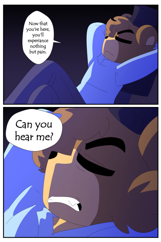
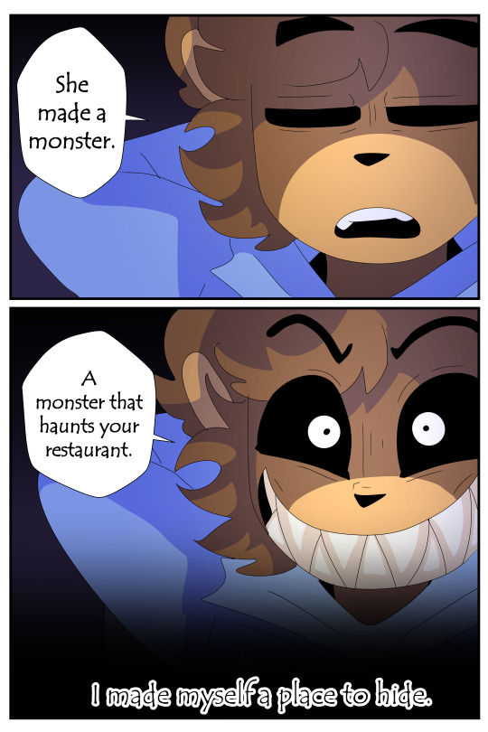
Creations AU FNAF 4, But I obnoxiously over explain it 2
Pages 30-59
The sad story of Cody and his miserable life.
I know for a fact some of these pages were lined don't remember if they colored any by @akdrawsandwrites thanks AK. ^w^
More NPC dialogue.
In FNAF 4 game: There's an oddity with the NPC with a green shirt and brown hair, he has a STRIKING appearance to one of the "bullies" older brother's friends. But the one in the green shirt in the game has blonde hair. Idk if they're meant to be the same character and the sprite was just bonked up or what. FNAF color pallets being consistent is NOT something this series is known for lmfao.
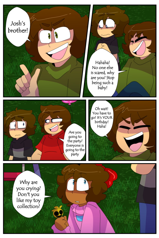
I made these two characters brothers and modified his dialogue to suit that he knows Cody by "Josh's brother". Either way this character should know this kid's name lmfao.
The party coming up is apparently Cody's.
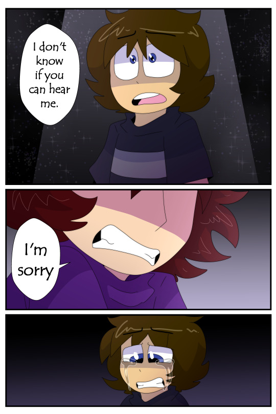
The last NPC is debated to be the character "Susie" from the games....I color picked and this girl looks black to me. (Susie is white with styled blonde hair) Like they both have bows and wear pink so MAYBE it was meant to be her but idk. This was the design I went with. Retconning design and inconsistent colors in FNAF again: Is not new.
Susie is used as a character in another place in Creations anyway and it wouldn't line up timeline wise. (This makes an animatic with her as the Chica we meet in Mike's story outdated and incorrect but there's LOTS of ideas in the animatics that were abandoned going over all of them would take hours lmfao.)

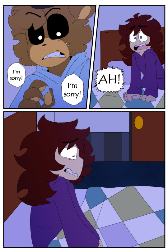
Exposure therapy, I say as a joke.


You might have noticed an itty bitty detail of Josh getting set off every time Cody starts shouting. Bro does not handle that shit well.
Yeet the child again, damn it Josh you gotta kick that habit.
Josh's main response to dealing with Cody: Lock him somewhere where he doesn't have to deal wit him.

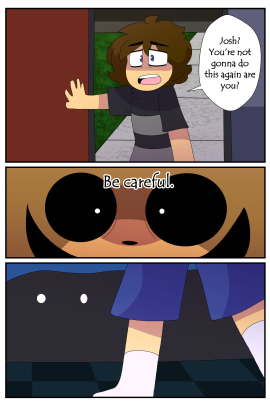
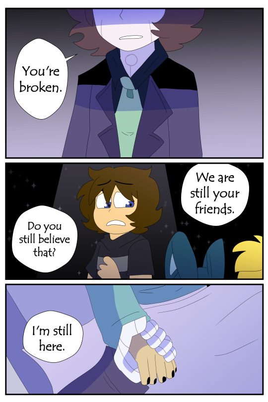
Oh dear. This looks familiar.
Creations readers and FNAF players alike know where this shit is going.

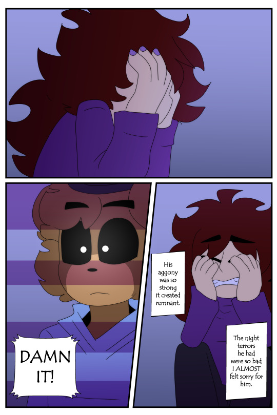
HI MIKE! ❤️ Yes that's Mike without his dyed hair lol.
Reasonably avoiding confrontation but uh, to the determent of others oof.
Dude proceeds to never stop throwing himself in danger later so I guess he decided to slam to the other side of the two extremes lmao.

HAH.
Well that explains Cody's creepy ass stalker crush on Mike.
He didn't really SPECIFY he recognized Mike verbally when talking to him in the main comic but here we get conformation he for sure did.

Again Cody/Golden Freddy doesn't consider himself a 1 to 1 with the original Cody. Rather just a robot with the kid's memories/soul.
They don't feel like his memories.
Lol. Cody and his Para-social relationship with Mike Schmidt.
We can tell this genuinely amuses him as his eyes aren't red.
Hah he says something to the same affect in thee FNAF 1 Arc...with a lot more body horror involved.

"It was just a prank bro"
Daddy's gonna make it all better.
Cody stop that. We've talked about how the faces you make are unsightly.
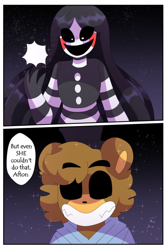
Also Puppet. She's here.

People didn't really GET Cody's reality bending abilities:
So he explains it pretty plainly here.
He's powerful as hell. X'D
Basically the most OP character in Creations much like the cannon Golden Freddy.
So I'll give ya some writing advice: If you're gonna make an OP character, just make them lazy as fuck.
Easiest way to nerf them: Make them just not care about fighting. X'D
Cody's got a mixture of laziness, apathy and fear of daddy to keep him from being helpful much in the plot.
Because if he wasn't he'd clap Afton in 2 seconds and that'd be no fun. So he's a coward lmao.

He was gonna snap that bitches neck while he slept. And not a single one of us would have blamed him. UwU
Casually hides in his brother's closet XDDD
Also I pointed it out before but Josh's room is Michael's room in main story.
Cody's cowardess is on full display: He bent to NOT killing Josh when he realized how badly Josh was coping with his brother's death.

Just like his daddy!~
Jokes aside this is my fave page in FNAF 4. It was lined by AK. I drew the sketch
I like, never draw the nightmares but the ended up so good here. Props to Ak for translating the sketches real well.
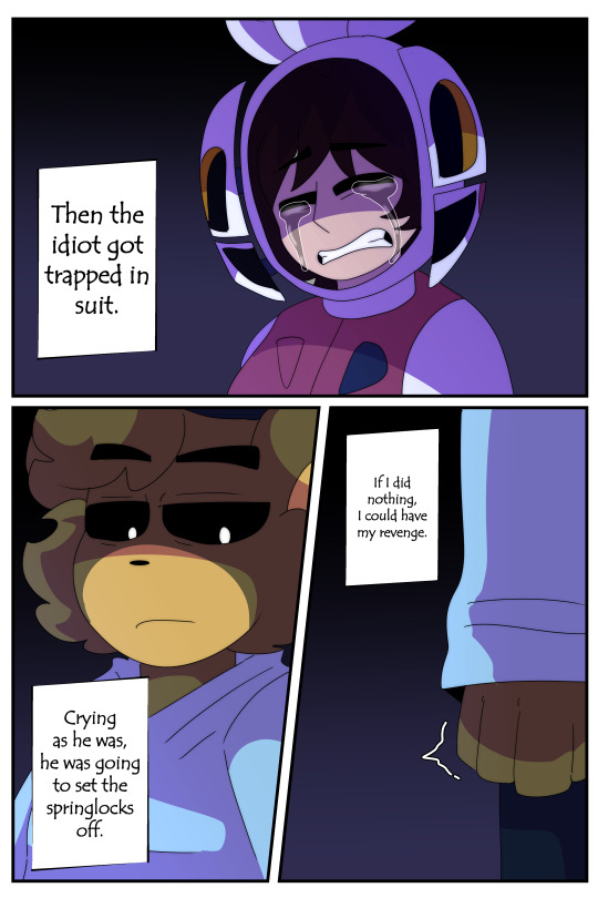
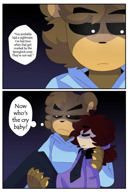
This is another instance of what I mean when I say there's no real good "Starting" place for the Creations AU.
This is smth that happens in Sister Location, but I feel Josh's character is more interesting with this context.
Buuuut this scene makes no sense. Aaaaand FNAF 4 shows more chronological events.
Agh.
Honestly whenever I get around to doing "Spring Bonnie's friends" I'd argue that is the best place to start chronologically but we'll see.
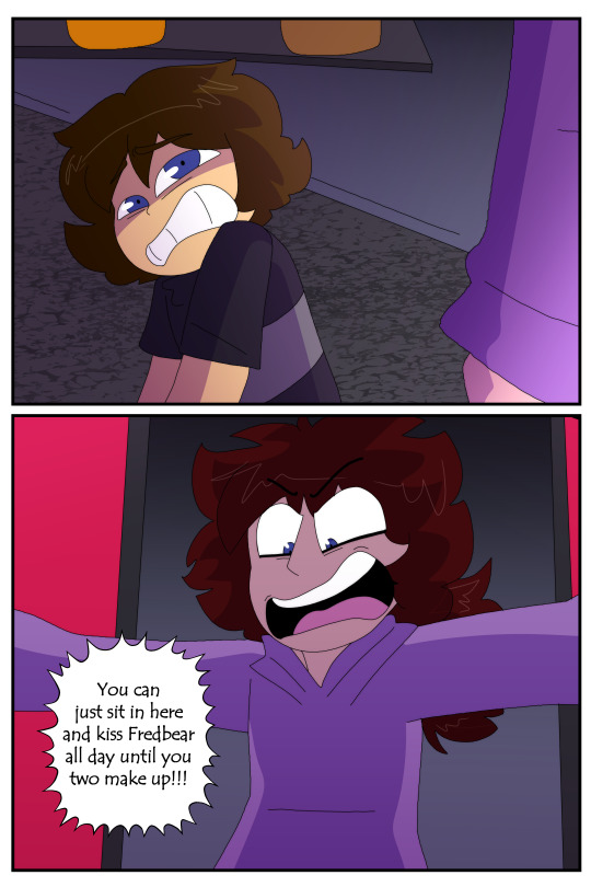
Anyway Cody saving his dumbass brother is so funny to me.
It's also really sad to think that he saved Josh because he knew how much Josh HATED the idea of dying in a springlock suit. Cody shows empathy quite often, especially towards Mike but this extends to helping Josh too.
His little "Now who's the cry baby?" is just the icing on the cake. XD
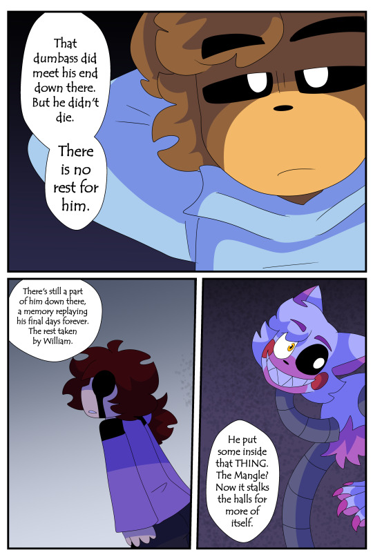
So Josh IS dead...?
Kind of?
His "remnant" is just kinda all over the place.
Will pick up in part 3 since PAGE LIMITS.
#fnaf 4#creations au comic#creations au#fnaf au#fnaf#five nights at freddys#five nights at freddy's#fnaf comic#fnaf crying child#fnaf 4 comic#fnaf 4 cc#fnaf 4 afton#fnaf 4 bullies#fnaf 4 brother#circus baby#josh afton#mangle#cody afton#nightmare freddy#nightmare chica#nightmare foxy#nightmare bonnie#springlock suit#funtime chica#mike schmidt
25 notes
·
View notes
Note
would u ever do a tutorial 4 how u color...im obsessed w ur linework and colors and shading i wanna eat it its like candy !!!!
my main technique for coloring is basically just winging it lol,,, id say pick three 'main' colors and base the rest of the pallete off that ! here are some examples:
for this art, the main colors are red, tan and brown - all the other colors are basically just different hues/tones of those colors ! (skin tone is a lighter brown, pink accents, etc)
for this art, the main colors are green, orange and yellow ! the brown skin tone makes the colors pop more i guess, idk how to explain it @_@
for art with a more varied pallete, i use a few overlays n stuff to harmonise everything ! usually only a 5-10% layer with a very specific blue-purple color (#A16EFF) and/or use a few filters (mainly brightness and contrast)

also use colorful shading :D im not very good at explaining it but that's basically it for color n stuff ! i hope that helps a bit
62 notes
·
View notes
Note
How do you go about picking colors for your characters? They're all so vibrant and good!
it depends!
usually i'll pick one color as the main color, this can either be a neutral color [typically gray/black or brown] OR especially for iterators another vibrant color. then i'll pick a large vareity of values of this color [within roughly the same saturation family] and color the majority of the character with that.
then i will pick one or two colors that contrast it heavily [ie, sparks main color pallete is gold/orange/red, so the lime green contrasts it a lot] and sprinkle it in key areas as accents [like buttons, eyes, symbols, or , in her case, the bright electrical arcs littering her body]. usually these colors will be either VERY bright or pale to contrast the main color well. generally speaking ill pair cool and warm colors for this
i also stress a lot the importance of balancing out your pallete. there should be matching dark and light values on both the top and bottom of the design, as well as sprinkling about the accents mostly evenly [this is why i often put symbol marks on the hands and feet]. and. uhm. yeah!
#its really hard to articulate when this is just. how i've been doing it for so long#but yeah !#weird guys#sky answers
7 notes
·
View notes
Text
Ambar's color pallete are completely updated!
i'm so proud of how she turned out ( mainly her feather patterns , with this mixture of reds/oranges/greens ) .
the main challenge was her main outfit, i've struggled on choosing the colors ( i tried to make the colors not to look very dull ) , checking up the grey scales everytime if it needed to change the color values , i ended up with these brown shades. ( since red + green mixing together makes brown. )
and i really like it , i added these shinning gold boards arround her large coat to contrast more her design , and another addition is another jewelry piece on her just to make the design less empty.
pd: i was feeling in mood on design an alternative outfit for Ambar ( and i have plans on design more outfits for her :) )
#karsis ocs#Ambar#oc#small artist#artist support#my oc#original character#karsis art#oc art#artists on tumblr#my characters#oc artwork#oc artist#character redesign#character ref#and mini info about her : She is 1'98cm / 6'6ft ( very tall ). she likes spicy food#digital art#artist on tumblr#digital artist
8 notes
·
View notes
Text
OHHH MY GOD THE WAY MY ASS FORGOT TO POST ABT THIS
Meet Spider-Mortis
(He/Him)
He used to be just a regular Spider-Man before his doc ock fucked up ans bombed the damn world. In the wreckage of the ruins he rose up to become a kind of Robin Hood figure, stealing from the rich in their bunkers hoarding resources to give to the survivors.
For his design I wanted to take a more apocalyptic fashion statement with the classic Spider-Man suit color and design, but also make it feel more mature, like he is going through an actual apocalypse. His color pallet consists of blues, reds, and desaturated greens for his clothes

I gave him two different logos, one a skull with spider legs coming out from it, and the other a radioactive symbol with the spider legs aswell. I decided to put the skull ver on his suit, and use the radioactive one for clothing accents (and also on his bag, not currently drawn)
I also gave him a gas mask because it’s just.. cool (and I like making everything harder for myself)
(⚠️slight gore both written and drawn ahead⚠️)
Now for his villains,
the ones I’ve already drawn are his doc ock and also vulture.
First, Doc Ock
Doc Ock was actually what inspired me to make this, after watching Tobey Maguire’s Spider-Man I had a realization about how actually terrifying it could be if the chip thingy failed. Imagine if he ended up just being a corpse piloted by a bunch of robotic arms. That, is exactly what this doc ock is.
Because of his proximity to the blast, he pretty much died instantly, layers of flesh being the only thing left behind other then his robotic arms, who quickly gained control of his body afterwards. I’m not exactly sure how I want this character to act, whether it’ll just be a slight nuisance, or an actual villain I’m not quite sure.

I quite like my idea for his Vulture.
(She/They)
I Imagine her being some kind of anti-villain. They want the complete abolishment of the upper class, and could careless if all the humans left died as long as the rich died along with them. They tend to leave behind most the supplies they come across unless they really need them, the only thing she takes is the lives in the area.
I had a lot of fun with her character design. One of the things I had fun figuring out is how I could keep that aspect of femininity while also keeping it realistic for the apocalyptic environment. I went through a lot of different versions, experimenting with corsets for bust support, and different kinds of skirts etc before coming to my final design (possibly not final design)
I gave them a more lighter color pallet, using brighter greens and browns. I have a bit of an obsession with camo patterns and I thought it would fit with her character perfectly so i gave them camo pants. I also took the boot design straight from Pinterest. (Guilty as charged.)
I added beige leg warmers to match with her top, which I’m not exactly sure how I’d explain it. Kinda like a wrap top? With a strap over stop of it. I gave them this kind of leather cape hood combo, and put it overtop of the bird skull mask (based off a vulture) I gave her. Underneath that she has a white, button up shirt, with the sleeves tucked into gloves, which I modeled after bird handling gloves.
Now here comes the part I love the most. I spend a lot of time researching vultures, and I am in love with the idea that she has a flock of vultures that just follow her where she goes. The idea that they leave behind enough bodies to where the vultures know if they follow them they’ll get food is fucking badass.
Like seriously. Imagine accidentally stumbling upon her camp and you look up and there’s just a kettle (the name of a group of vultures) of vultures watching your every move looking at you like they want to pluck your eyes out.
I also have a few ideas for some other villains
Deadpool (I think it would be quite funny in a setting where everyone is heavily dressed to avoid radiation and injury he’s just in the most revealing slutty outfit known to man)
Kraven, which I could possibly pair up with Vulture for an arc
The lizard, which could quite literally just be a radiated alligator
I’ve considered adding a black cat
Maybe some spin on vemon?
Let me know if you have any ideas I fucking love imput
#across the spiderverse#spider man: across the spider verse#atsv#spidersona#spiderverse oc#oc#character design#world building#digital art
11 notes
·
View notes
Last Seen Blogs

humbleframes-blog
Humble Frames
novinhc-archieve
MISCHIEVOUS
giraffecuddles
GiraffeCuddles

jadefyre
soothing ruffled mechanical feathers
thedragoncandraw
And She Sees Ghosts, Too