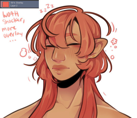
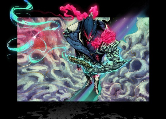
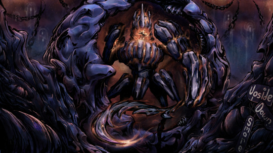
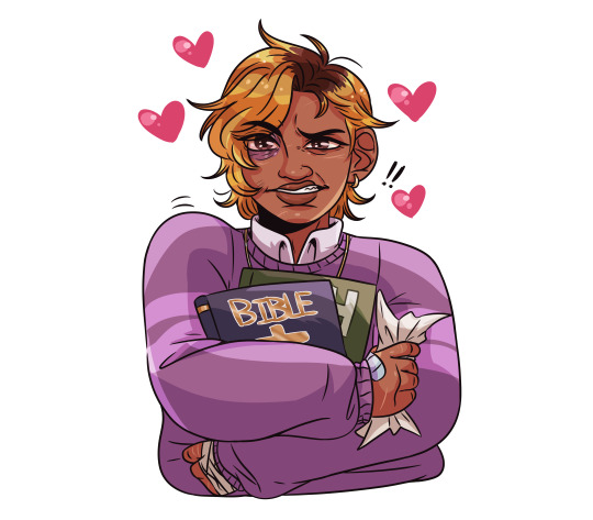
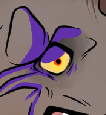
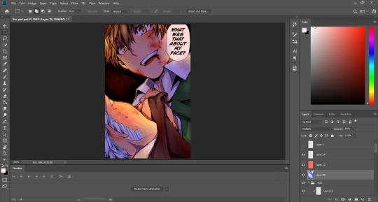
#I messed around with my shading style and other overlays
Text
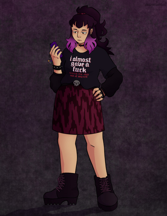
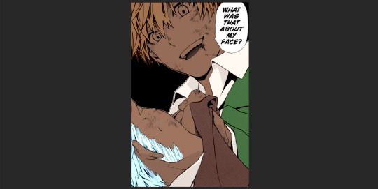
I saw a customer wearing this shirt while at work yesterday and knew I had to draw Scary in it
#dndads#dungeons and daddies#dndads fanart#dndads s2#scary marlowe#this was a lot of fun to draw#I messed around with my shading style and other overlays#also dust plugs totally come back on phones in the future because I said so#and the shirt is from Spencer’s if anyone wants to know! had some help tracking it down for the reference
146 notes
·
View notes
Note
Yo! Do you have any notes/tips for your coloring process? I've always had trouble with that part of drawings looking good lmao and I really like yours! If not for your specific style, do you have any tips with that in general?
Iv gotten a few asks about how I color but iv always avoided answering because
A) I am absolutely awful at explaining things, and
B) I am a very Very lazy artist you should probably Not do the things that I do
BUT i feel bad gatekeeping(?) my horrible technique if it helps anybody ig ill try and explain so
✨✨✨Welcome to Reegis’ Probably Not Reputable (But Very Long Winded) Art Advice✨✨✨✨


line art of a random character for the example, just pic whatever colors you have in mind for your base colors, you can try using palette generators or basing it off of existing palettes/characters/whatever I have absolutely no idea how color theory works (& this is why you shouldnt listen to me) so im solely going off of vibes. but it is Rough so onto step 2 & 3
(edit to add i usually start off with the skin hair & clothes on separate clipping layers and merge them together towards the end.. i think i forgot to say that at all here oops)
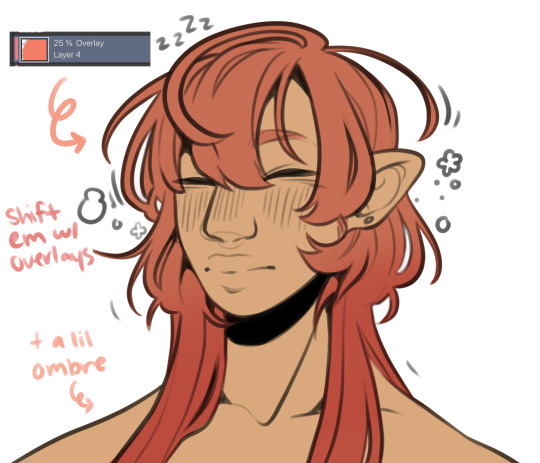

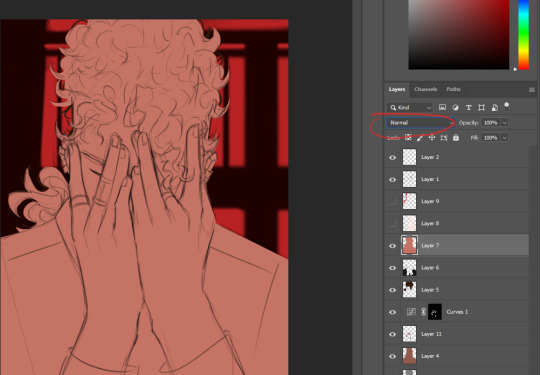
I abuse the hellll out of layer blending modes. overlay, saturation & multiply mainly, but also difference, brightness & screen. (just doodle something & try all of em out to get a feel for them honestly ik theres a Lot and they can be intimidating) for this i just wanted a more cohesive warmer tone to start with so i added a peachy overlay & a slight ombré to the hair to add a bit more interest to the character.
then just the most basic of rendering, some blush & highlights just wherever i think theyd go.


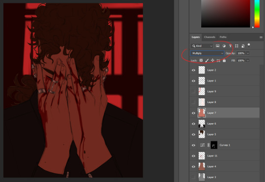
Another thing they tell you Not to do, my next step is to block out all my shading in a vaguely purpleish multiply layer!!! i cant be assed to do it any other way im sorry…. once i have the basic shading down, i lock the layer & go in with air brush eraser & also airbrush in other colors wherever I think the purple is maybe too harsh/clashing
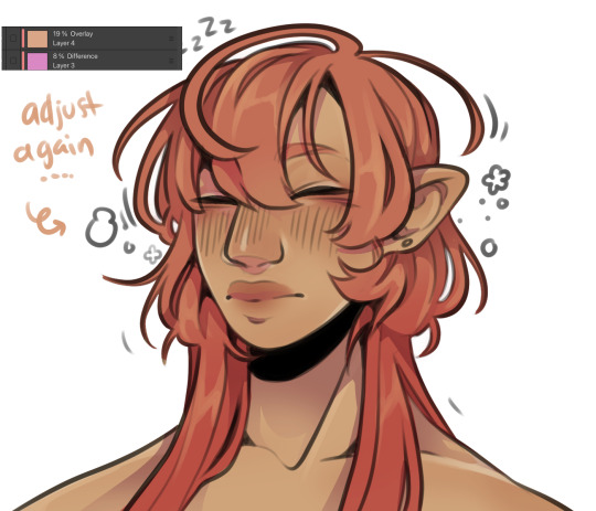
still wasnt 100% happy with the colors so messed around with some more layer filter/modes/whatever you call them then colored in my line art! i think this is honestly the saving grace for all of my art shshsdhhf color your lines people. doesnt have to be all (i dont, i like the contrast) but it usually helps to make some at least a little less harsh
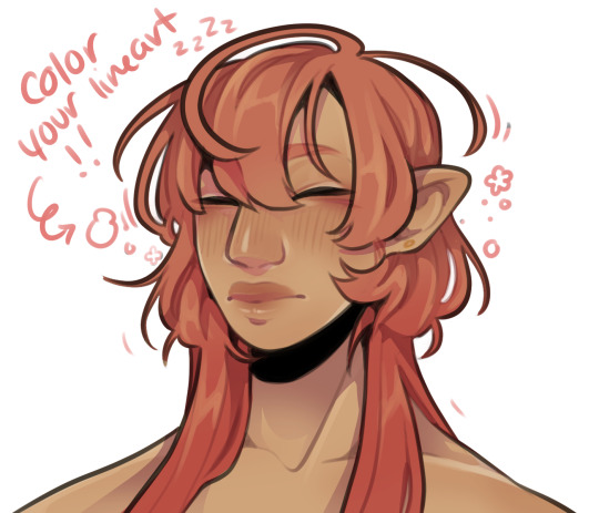
then with a little more color tweaking im done! one random sleepy dude, fully colored (by my standards)
and then if a piece needs more dramatic lighting you justttt
im so serious play around with layer settings! these are just basic multiply & add(glow), there as so many others you can abuse the shit out of & nobody will know or care in your finished piece.
was this?? in any way helpful???? I hope so.
#THIS IS A BELATED ANSWER FOR ALL OF U MY B#scrolled back to find the earliest one i could bc i mean… you asked first#if this was in Any way helpful…. im glad#and also sorry. probably dont do these things#hmu if youd like me to clarify anything ill… do my best#asks#my art
99 notes
·
View notes
Note
Seeing your art literally makes my day and inspires me to draw violentine art 🫂
Also, any useful resources for artists? Your coloring is so good!

abubububu aaa that makes me so happy to hear!!! thank you,,

coloring tips specifically? hmm here are a couple links to some videos on light and color and shadow stuff that does a good job explaining the way i approach those things. i dont always get super detailed with it but knowing how it all works will help you make your own creative choices
ive gotten kinda lazy with my coloring the last year or so. i started using blending modes to shade with instead of trying to do all the color logistics myself so now i can just throw down the true color flats and go. but the layer modes do a good job simulating light and shadow so it works enough for me aha
i use overlay layers for light and multiply layers for shadow pretty much, with the occasional glow layer for harder lights. plus sometimes either an overlay (day) or multiply (night) layer fill with the BG color to bring the flats into harmony with the BG before shading if it needs it. used a pin light layer for a night piece recently and i like how it looks (more saturated night look). just mess around with the layer modes until you like it honestly aha. but i try to use as few layers as possible since i dont want it to look over done or anything. intersecting overlay and multiply layers helps to give that saturated effect around where light meets shadow. you can see it pretty easily here (flats > multiply/shadow > overlay/light (+glow in the eyes))

its just the overlay layer painted on part of the multiply layer. warm light cool shadow (or cool light warm shadow depending on the scene). i keep the ambient light thats in the shadow cool (no overlay) to imply it as indirect from the primary light source
UHH thats really it honestly for my coloring process. i also try to use a limited palette. i look for all the colors characters share and try to pull them from the same swatch as much as i can. it helps to keep things feeling in harmony. same with using colors for light and shadow that already exist in the BG
other random tips always include DOING STUDIES AND USING REFERENCES!!!! i know studies can be sooo boring but they really do help. and even just doing a few of them can help tremendously. make it fun draw your faves instead but at least do it using some references youll improve so fast. style is all about how you interpret the world, so look at the world and try to learn from it :)
34 notes
·
View notes
Note
I have a couple of questions if that's alright.
1) you're a self taught artist right? So do you have any tips or tricks or maybe even references for other self taught artists?
2) how did you stay unique, with so much content out there how did you manage to create your own style and everything?
3) how did you name your AU I'm planning on making my own but I just don't really have a consistent themes so I don't know how to name it?
4) any general advice for someone who wants to try and make their own comic but doesn't really want to go anywhere with it and doesn't know the first thing about comic making?
Yours truly a TMNT lover and artist :)
oohh love getting asks like this <3
i am a completely self taught artist !!!!! i've genuinely just made up everything as i went lmao- i picked up a few things watching speedpaints and tutorials (unfortunately tutorials don't do much for me,, which has kinda held me back)
i think the main thing is to learn the basics as boring as they seem- you may be able to render like a god,, but if your anatomy and form is off (and clearly not intentionally as a stylistic choice)??? it can take away from the entire thing,, yk??
anyways !! aside from that, my main tip is to just mess around !! try different styles,, shading methods,, filters,,, overlay,,, etc.....
2. there's no real way to stay completely unique- with so many artists it's like,, basically impossible?? i literally found my art styling by very obviously taking style inspo from a warriors cats video (this one) and somehow,, after literal years of learning and cramming other inspiration into it,,, it turned into my current style,,,, i don't know how
3. i looked up cool words, found the word "aberrant" sent that in my tmnt discord server and someone was like "what about aberration, it means the same thing" and the rest is history
4. plan ahead- it's so tempting to just jump straight into that,, but trust me,,,, it doesn't end well- i think it's best to have a broad idea and an end goal,, and then get more specific when planning like, individual comic parts,, like a rough script
as for actually making the comic??? just kinda,, take the time to look at other artists comics,, figure out various methods you'd wanna implement into yours?? like "oh i like how this person does dialogue,,, and how this person splits up the boxes,,, and how this person shows sound effects" n stuff like that
there's really no right or wrong way to do any of this !! and don't expect perfection right out that gate !! best of luck :D
27 notes
·
View notes
Note
Hi!! I was wondering if its okay to ask what brushes u normally use in krita? I love your art!!
Thank you so much!!! I only use the ones available in Krita by default and I tend to jump around based on what I think will work best for each piece, but I can give a little rundown on which ones I use the most and what I use them for :)
Here's an image guide with each of the brushes I've used and that I recommend checking out:
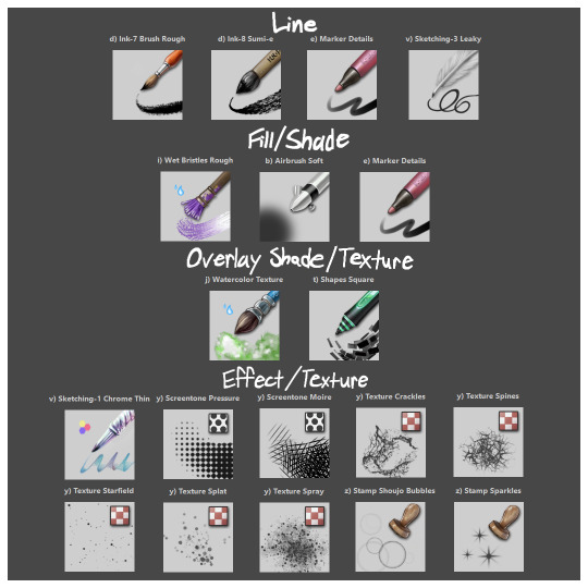
I'll highlight my favorites as well with some examples where they were predominantly used! (though in some cases multiple or even all of these brushes were used)
Marker Details:


Varying opacity and size makes this one my favorites for sketching, especially since it can easily be nearly transparent or fully opaque which helps with value range.
I also like using it for silhouette sketches!
It can also be used for final linework, but it takes more work to get to a full opaque and its lack of texture makes it a little less interesting than Ink-7 Brush Rough imo.
Ink-7 Brush Rough:
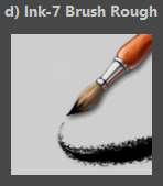
Really good for linework, especially for comic styled drawings with it's slight texture, varying weight, and opaqueness.
Also good for just filling in entire areas with a single color as well as non-smoothed shading!
Wet Bristles Rough:
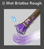
Actually just an amazing brush, its pressure sensitivity is crazy.
Blends strokes like paint and can vary in size and opacity.
Also has a nice subtle texture!
Amazing for smoother coloring and shading, especially if you want a more painterly style.
Watercolor Texture:

(hard to show examples of this, just assume that I've used it in any piece that has smooth shading lol)
Not the best for painting/drawing on its own, however I've found it to be really useful when set to white or black on an overlay layer for adding extra shading and/or highlighting on top of the shading I've already done.
I usually shade individual figures, objects, and parts separately, but using an overlay layer with Watercolor Texture (or even Shapes Square) on top of everything helps make the entire piece feel more cohesive.
Also adds a hint more texture!
Another thing to note is the importance of layer modes!
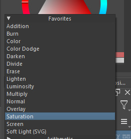
I know that you asked about brushes specifically, but many of these brushes (particularly those to do with effects and textures) work best when experimenting with different layer modes other than Normal. Overlay is generally a safe bet and most of the best for, well, overlaying multiple layers for interesting effects. But please try out all of them at any given opportunity, sometimes things like Burn, Color Dodge, Soft Light, etc can have more interesting effects!
In addition, mess with filter masks! You can even edit where they apply by drawing on the mask directly! HSV/HSL Adjustment (also accessible with ctrl+u) in particular is INSANELY useful for fiddling with the colors and balance of a piece, from individual layers to whole groups and drawings. I also really like blur filters, often times I'll duplicate a layer and make the bottom one blurred to add a glow affect to something without losing its definition.


While this latter stuff isn't about brushes specifically, its generally very important to how I use and experiment with all these different brushes!
Anyways I hope this helps!! I kinda went overboard with this post, but I had a lot of fun writing it! Thank you again for the wonderful ask!! :)
#krita#krita art#warframe fanart#art#artists on tumblr#my art#UpsideDownSmore's art#art tips#art guide#art reference#long post#ask#didn't mean to spend so much time on this but ngl i'm actually so thrilled to talk about my art processes#like man i'm so grateful to be in the position where i can make an art guide like the ones made by people i look up to#sorry if this response is a bit long winded i just had to get a bunch out there lol#love asks like this :)#scheduling this 9 hours from now cause it is currently almost 1am lmao
13 notes
·
View notes
Note
i've been following you for a very very long time (the snk askblog days !) and your art still blows me away every time. i just love your colors and painterly style. do you have some art tips, tutorials, brush recommendations etc ? i really want to improve my digital painting skills and i'm curious about your process
Oh no! Not the ask blogs..... but thank you so much for your continued support of my work 🥺♥
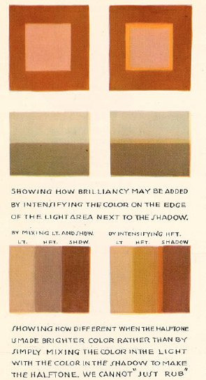
I think the most important things I always keep in mind is colour theory though I can't say im always successful each time I do it 😂 Honestly when I see guides it all never makes sense to me?? What do they want me to do even!!

These guys explain things pretty well though and much more professional than me:
Emel's Colour theory notes
Gigi's colour/lighting notes
And also this image right here
Honestly main things are
limit your palette - use a colour fill set to low opacity overlay or 10% opacity normal for the mood you want for the piece, your character might be wildly coloured but this brings it together
split/complementary palettes are great, saturate one side, desaturate the other for contrast (looks teal but its actually a grey if you swatch it )
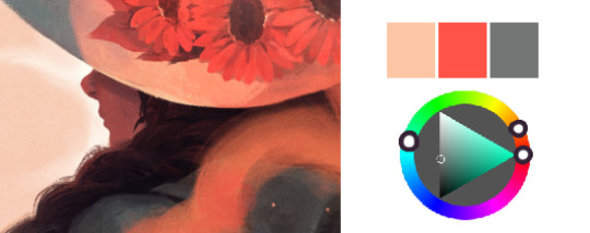
don't you dare use white grey or black to shade! dont you dare!!!!
add a slightly more saturated colour in the middle of your shading gradient for some pop
personal taste but i like to dab some colour elsewhere where it might not belong 🤷♀️
my personal pet peeve is that i dont actually like swatching from character sheets im sorry the cat is out of the bag whats the fun if you cant play around with lighting and mood
most important skill is to not be scared to try things that are hard that you think wont work out!! trust in the process!! itll look like ass the whole way through!! use colour balance at the end if you need to!!
also colour theory relies on the ryb wheel rather than rgb which really messes with you in digital settings... thats something i still need to memorise more... awful
Also tosses this out here too: Jing's brushes are my current go to since I work more in procreate now
Anyways half the time I dont even listen to myself and forget the stuff i should be doing and i have to go back and ref my own art style so who knows!!! take this all with a lot of salt
107 notes
·
View notes
Note
If you can how do you color your artwork? You're coloring style is very unique
what i've been doing as of late is that i color and shade everything in a single layer, coloring everything by section?? i lay down a base color which is usually for the skin (that being a bluish or purple gray or brown whatever) and then start putting the mid and lighter colors on top, this actually helped me alot with the shadows and where they should go but i only use that for skin for other things like clothes, shoes etc i put the neutral color and then just shade it with darker colors similar to it and sometimes add a lighter color to the shadow like a blue or green. it's difficult for me to explain bc im not good at using my words and making sense so here's a video of my process
this is the least "chaotic" one i could show bc in others there is so much flashing going on bc im just messing around with the overlays and multiply to see how its looking and if i need to change anything
#i hate coloring sm </3#im still learning im just as clueless as u#also sorry if this looks crusty as hell#doing it this way is sooo time consuming#my whole process is time consuming thats why i take a BILLION years to post art :o)#also this is art i made for a mutual on insta ^^#the brush i use to color is like so good at layering and blending the colors
54 notes
·
View notes
Note
Don’t know if you answered this already but what is your coloring process? (It’s super pretty ahhH)
- ₍ᐢ. ̞.ᐢ₎
AH hello anon, omg tysm I appreciate that a lot!!!! :'))) <33
but um, I'll use one of my recent drawings to show the process bc i'm not great w just explaining w words! lol gonna put it under the cut jic

SO, once I have the line art done I'll put in all the flat colors in. I usually keep my color choices like around the middle-ish area of color selection like these for example:


also for the eyes I'll have usually have it lineless and use one color then use the Protect Alpha option (on Medibang Paint) to color in the circle area if that makes sense? lol
another thing I like to do for lips is have them two different colors/shades! if the person isn't wearing lipstick then I eyedrop the skin color I used then go down the color selection a lil bit to a darker shade but still around the base color for the top lip, then repeat that w the lower lip
for lipstick it's the same deal but just w different shades of color!

see how the top and bottom are different? :-)
then next I start shading!

usually in general I choose colors that are either the same color range (like the purple there) or stuff like the skin and stuff I'll usually go w colors that are pink, orange, brown or red range (depending on the skin tone)

then I'll add in details and add overlays for highlights for the hair and just in general lighting, they're two different layers! I'll have an overlay layer for clothes and stuff for lighting stuff or make something shine basically
after I'll put another overlay on top of everything and edit the colors to have it a warm/redish tone! depending on the drawing on the base/flat colors I picked I'll edit it w the hue slider and just slide it more towards the red/orange/pink area. in this drawing here w the overlay I have a pinkish red color set on 20%
w other drawings I'll have this gradient effect on an overlay as well just to have this dark shade look to it
after that I just edit stuff and mess around w backgrounds and have an outline etc lol
I think that's a good enough explanation???! I have different coloring styles w different pieces esp w shading lol but that's usually my main process!! if you'd like some more explanation on something, lmk?? I just hope I explained it well enough hdgjdjhf
b u t again, TYSM for asking!!! :D i really appreciate it sm!
#ask#anon#my art#really long post lol#i was gonna put more examples but i hit a limit lmao but i got it across at the end so
6 notes
·
View notes
Photo

so i do a lot of shading like this in my art (or try to) and i asked if anyone in my discord server wanted a tutorial.... and they said yes!
so im gonna do my best to explain how i shade things under the cut....
(i use clip studio paint but honestly this should work in any art program i think)

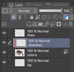
1. FIRST- have your drawing. have Layer. I usually have three layers at LEAST when im doing this- and i keep them stacked in this order: top is lineart, middle is flat colors, and bottom is the background.
the purple circle shows the icon for making a layer into a clipping layer- IMPORTANT
the pink circle shows the icon for locking transparent pixels- helpful! it makes sure you don’t “go outside the lines”

(in case you’re curious this is my csp layout)
2. create a new layer above your flat colors, and press the two little squares. this makes a clipping layer! it basically makes a mask of the layer below it, and you can draw whatever (in this case shadows) and it only follows the filled in areas of the layer below it. so if i drew a bunch of yellow stripes on the clipping/shadow layer, it would only follow the form of the werewolf flat colors and not anything else. i hope that makes sense!
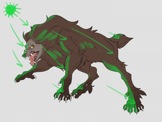
3. decide where your light source is coming from! ngl i totally draw a little sun to remind myself where the light is coming from in a piece.... in this case the green shows where i think the light would be hitting the werewolf, and therefore i would draw shadows opposite/adjacent to that. im not the best at explaining lighting though, so heres a good reference.
heres another.

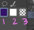
4. SHADING TIME..... so for my shading i just use the default pen tool in clip studio. g-pen, i believe. Stabilisation!!! between the two pink stars!!! use it. its so good for lineart, and for drawing smooth, non trash lines and shapes. it has Saved my life. the higher the number, the ‘slower’ your brush moves, and the smoother your lines become. i tend to keep mine around 60-70 but play around with it....
i usually shade with a bright annoying color so i can tell what im doing. (purple usually), as shown in box one. thats your foreground color. 2 is your secondary (background) color, i dont usually mess with it and leave it white. hitting box three turns your current pen into an eraser version of itself... i use it a lot! dont forget about this box

i usually tend to think of shadows as shapes.... in the werewolf’s eyebrow/spot/thing you can see where ive drawn a line.....
and then filled it in! i dont normally use the paint bucket to fill in areas... just the pen. it gets too hard
hair/tufts are the fun part!!! you can see that ive drawn solid chunks of shadow in the werewolf’s mane....

...then i click square three to turn my brush into an eraser and carve out little details


here are some more examples of that... i use it a lot. A LOT.
go wild. go crazy. sometimes i dont think my shading follows like TRADITIONAL physical rules of the laws of light but just. dewit

5. SO YOURE DONE SHADING..... if you refer back to your Layers window, you’ll see a drop down box that usually says normal and a slider.... knock that slider down to like. 50, or 30 (what i usually do). this lowers the opacity on the shadows layer so you can see through it kinda. the drop down box is the layer styles... play around with it!! you can do some really cool stuff with overlay/multiply/etc and make your shading layer super funky.....
if you hit the lock transparent pixels button, you can color your shadows differently if you want! sometimes ill duplicate the shadow layer and color it differently and run it through the gaussian blur filter... it can make it look a little softer and less hard.
usually in my art, when im done i merge all the layers together so you just have one layer left. i duplicate that layer, run it through the gaussian blur filter and drop the opacity down to like.... 20 maybe so everything looks soft. on this picture, i duplicated the werewolf layer (without the bg) and did a motion blur on it to make it look like he was moving....

.... and here he is after dropping the shadow opacity/adding other little details and running it through 5000 filters
i really hope that gave you some kind of idea on how cel shading works!! i am by no means the master, but if you have questions or tips please don’t hesitate to ask me ;a; im really not good at explaining things lol
thank you for reading!!! <3
30 notes
·
View notes
Text
idk if this is gonna be long but I chat stupid shit about my drawing so I'm putting it under a readmore so it doesn't clog the tl
I really wanted to draw the duotone skin for them even though I knowwww k4's skin is like. either all pale or pale and with gray mottle rn because it's cool and I just wanted to do it okay o(-(
the hair is definitely not as good as it might could've been(shape/rendering) but I left it like that for the style + time. also the lighting on it made me really ????? but i think I'll worry about making it better on another drawing
same with the face actually--usually I like doing blush, less angular faces etc but I was going for a Look so no blush
the shading was a mess this time around bc I basically did no painting at all and only used layer modes. general shading was two multiply layers, the highlights was an add layer and a bunch of other hard light/an overlay gradient for color correction. usually I paint but here I just took a color and erased/applied at different opacity for the look. which is why it looks kind of messy. could've merged everything down and painted from there but ehhhh yeah
the eyes are painted a tiny tiny bit but again not really
wish ibis had square brushes because the texture on this,,,oof o(-( I'm starting to really like square brushes; they make kleki(a very low quality browser program) pretty decent actually. also ibis gradient maps are locked behind a subscription because of course they are
I haven't transitioned fully to tablet art even though it notably feels like "better quality" > finger drawing > mouse pad because of familiarity and convenience. not a big fan of having to sit down at one place for a long time lol, especially my desk which is really uncomfortable for my hands. so this was a phone drawing. plus side of that is that I get the timelapse from ibis.
think I'm going to try to put my biggest projects on my tablet for my sanity and resulting texture/quality but it's still really nice to be able to draw on the go or whereever as is the case with phone art
I kind of wish there was like. a google drive for art or smth so I could work on the same projects between devices but that's just not possible probably
1 note
·
View note
Text
how i color manga: a hopefully adequate tutorial.
i’ve had a couple of people ask me recently how i go about coloring manga panels, so i thought i’d share my process in case anyone wants to learn! it’s honestly not that different from coloring ordinary things, but there are a couple extra steps i have to take!
note: this is NOT an in-depth coloring tutorial and i don’t go into detail about how to color and shade; this is just a guide for people who want to know how to color manga and may already have a basic idea of how coloring works.

we’ll be using this panel as an example; i don’t have a panel on hand to color as we go, so i’ll just be walking everyone through my process using an already finished manga coloring from my blog. also, i use photoshop to do my art and am not sure how it translates into other art programs, but if you use something with a lot of features i’m sure you’ll have most of these already!
part 1: flat colors!

there are a couple of ways you can do flat colors. the first and easiest method isn’t the method i use in this image, but it is much simpler than the way i use, so explaining it normally should be fine.
let’s call this the multiply method: with this method, all you have to do is select the color you want, create a layer ABOVE the manga panel with the blending mode set to “multiply”, and start coloring.

in case you don’t know how to change the layer blending, this is the dropdown box at the bottom right. it’ll be set to “normal” by default, so all you have to do is change it to multiply. also, keep in mind that when you’re drawing on multiply layers, anything you draw over darker colors will appear a lot darker than it is, so make sure to account for that when you draw.
i would recommend this method if you’re just starting out with manga coloring because it’s a lot easier, and you have more flexibility with colors.
now for the second method; the “linear light” method. i tend to use this for all my coloring, but it is a little risky. linear light is a difficult blending mode to use because you have to use a color much darker than the one you actually need, and it requires a bit of trial and error to get right.
here is what the same color looks like in multiply...
...and then in linear light.
so why use the linear light method if it’s more difficult? mostly, it’s very advantageous to use if you want to color lineart, as it’s the easiest way to achieve that effect in manga coloring. lighter colors will color the lines more, while darker colors will provide a sort of “burnt” effect around the lineart.
remember: it’s most helpful to have each different object on a different layer! i have four base layers for this coloring; hair, coats, undershirts, and skin.
part 2: shading!

this is where we get to the fun part: clipping masks! you’ll want to make a new layer above whatever object you plan on shading, right click on that layer, and select the option “create clipping mask” what this does is ensure that nothing you draw on the clipping mask goes outside of the bounds of the layer under it. this is really helpful when you’re shading.
the easiest way to shade if you’re just starting out is to have the same color selected as your base color and set the clipping mask to multiply; this will just darken the color. presumably if you’re reading this you already know the basics of how to shade, so i won’t be going too in-depth on that.
make sure to leave a lot of space empty for the next step: highlights.
for highlights, i like to use light colors on one of two layer styles. the first is “screen” and the second is “linear dodge/add”. using screen generally means color is less saturated, but screen layers show up better on lighter base colors. on the other hand, linear dodge is VERY saturated, but doesn’t translate very well onto lighter base colors. with this, you can honestly just pick whichever you like best.
part 3: shadows.

luckily, shadows can be very easy when it comes to manga coloring. most manga styles have built-in shadowy areas that you can just follow with your shadows.
i do almost all of my shadows using a multiply layer, but again, don’t be afraid to try new things. most often, your shadows will probably have a blue tint, so just use a relatively light blue on your multiply layer.

this is the color i use for my shadows! also, please don’t be afraid to mess with the opacity of your layers. this goes for all of them, but especially shadows. if they look too dark, just crank the opacity down to half!
part 4: extras
the rest of the things i have to share are going to go at the very top of your layers and are mostly embellishments.
one thing i like to do with my colors is put a VERY low opacity flat color over the whole image, giving it a slight tint. this particular overlay is a peachy orange color on a linear burn layer at 25% opacity, giving the picture a warmer glow.
i also added shadows and highlights above all the layers to indicate that the light source for the picture is either behind or to the side of the focus character with a saturated blue shadow in multiply at around half opacity, as well as some yellow highlights using a vivid light layer.
things like these aren’t really necessary, but i find that they make my colorings pop more, so i just like to include them!
at the end of the day, my word is obviously NOT gospel when it comes to manga coloring and you should feel free to experiment however you like with any step of these instructions! this is just a basic rundown of my process coloring to get you started :D! thanks for reading, and i hope this helps at least a little bit.
24 notes
·
View notes
Note
hello :] i looked around to see if you had a faq or anything like that & didn't see one so i apologize if this has been asked before but! your coloring style is like... actual goals. do you have hidden techniques or tips or anything like that? i'd love to hear how you do stuff!
Hi! Ihaven’t been asked that before, actually. My coloring is like, something I’ve developed pretty recently and tbh I’m still learning a lot about coloring and shading, so I don’t have that much fresh advice :/ Here’s what I can share so far tho:
- I sketch something and clean it up, then I make a gray base of the shapes in the foreground(usually a character). If I have a background, I start by coloring that, and move on to stuff in the foreground later
- When I color a character it really helps me to have a separate layer for things that don’t touch each other, if that makes sense? Like for example, if I have a character’s hair appearing on top of their clothes, I’ll put the hair on a separate layer. If I have something that’s made out of leather and then something that’s fabric, I’ll also put those on separate layers. If I start making too many layers, I separate them by groups, but most of the time it’s not necessary
- Once I separated everything, I check the colors. That’s a tricky part for me bc I usually either get it right from the start or have to spend a really long time figuring it out. If you also have a hard time with the colors, here’s what I check to try to get them right:
-- I put it in grayscale and check the values
-- I mess with the hue/saturation and curves tools on photoshop.
That usually helps me get a pretty good idea of what’s not working, and you can also change the hue and saturation of individual parts of the picture if you separated it in various layers(sometimes the problem is just one part with an oversaturated color)
- But anyway once I’ve figured out the colors I either shade it with blending modes or manually or a combination of both. I usually get a reference for the light if I didn’t already have one

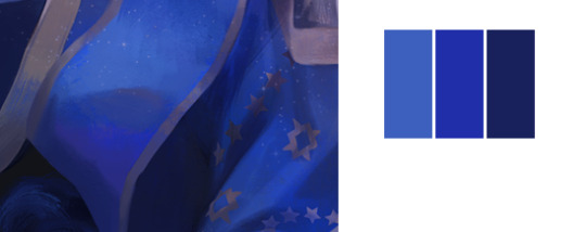
This is what it looks like at this point. The top 3 invisible layers are the ones with blending modes. I usually have one multiply layer
And I try to make the color work with the flat colors, like for example I’ve got a lot of reds and overall warm tones here, so I went with that for the multiply layer- if I had more blues I’d go with something more blue or cyan, etc.

- Then I put lights on, these are both overlay layers, which are also different shades of red. You can use whatever colors fit better with the image, but if you’re going for something that’s a very different tone from the multiply layer, I recommend erasing parts of the multiply layer where the light will go first, then putting the light on top of those erased parts. But that’s just bc I personally think that if you put different tones on top of the multiply layer your colors might get too muddy. But that just depends on what you’re going for
- I also recommend using very saturated colors very sparingly or starting with very tame colors and increasing saturation as you go(same with dark colors, if I make them too dark I can’t see the lines so I usually make them lighter than what they’re supposed to be and go darker after I’ve put lights and/or shaded it)
- I also really recommend goin nuts with blending modes, testing all of them, putting them on top of each other or using just one, see what looks good to you and go with it
I usually get a ref for all this but sometimes I don’t and just guess it, like there’s nothing wrong with guessing it if you couldn’t find a ref but if you do find one the result will usually be better
That’s basically how I do stuff right now, if I shade it further I usually put the shading layers below these layers with blending modes or just don’t use blending modes at all, but most of the time I’ve been doing stuff just like this. I’ve seen a lot of ppl do it like this and I learned a lot just from reading about other ppl’s process as well
Hope that helped!! if I missed something or if there’s anything you’d like me to go into more detail about just hit me with another ask c:
5 notes
·
View notes
Text
LAMP soulmate au were what you draw on your skin appears on your soulmates skin and they just end up with a chaotic group chat on their skin. A special thanks to @notveryglittery @hawthornshadow and @skylagamingv2 for helping me come up with this. Here’s some shenanigans this au could lead to.
Roman draws on his arms when he gets bored, Patton writes motivational messages and quotes, logan puts reminders on his hands, Virgil does running commentary of everything else on his skin.
In this au a soulmate bond can be strengthened and weakened over time. So it starts with just the skin being connected but gradually other stuff happens.
Makeup is touch and go at first but soon any makeup is sent over the bond to the others. Which can cause problems.
Whenever Roman is in a play the others have to walk around in full stage makeup.
Virgil would wear the emo eye shadow and Roman practically begged him to stop.
Roman, sniffling: A Prince has got to slay.
Virgil, cackling: Vengeance.
Then comes nails.
Pink starts to appear on Virgil's nails and he screams because his edginess is disappearing before his eyes, after discussion they find out that it's Patton who has the nail polish, and he changes his nails to darker base tones but with overlaying pastel shapes and colors, trying to find a balance they all like.
He does them all in dark purples once and everybody loves them.
Finally Roman dyes his hair. He doesn’t know it’ll affect the others, only some of the strongest bonds extend to hair, but then a few hours after he dyes it the others wake up with suddenly purple hair. Logan disapproves, Patton is excited,Virgil pretends to hate it but later in purple pen, rather than the black he usually sticks to, gives his "I actually dig the purple" line
"It took you all day to say that?"
"Listen, it's really hard to find a good purple pen!"
Roman then rights “is that so?” In various shades of purple because he has so many freaking markers and is that extra.
Roman draws a massive rainbow of purples for Virgil.
For the next day almost every patch of skin is covered in purple.
Virgil regrets saying anything.
There have also been many heated debates that end in everyone covered head to toe in writing.
One time everyone arguing and Logan gets frustrated because no-one's listening to him so he starts writing backwards on his face, the others feel something and check mirrors and he's just writing mirror-style across their foreheads and then down their faces in caps.
He's angrily writing reflected on his face, that takes effort.
The others are very impressed.
Everyone stops writing in amazement and after a while Logan trails off with a normal "thank you"
One of them makes a smartass comment and Patton writes "Cheeky" on their cheeks.
He also writes "KNUCKLE" across the knuckles of one hand, and on the back of the hand writes "down, and you can achieve anything!"
There are a lot of body part puns.
One of them gets drunk and writes BUTT across their butts in Sharpie. The others are in public and can feel something but can't discreetly check.
When Patton finally sees the BUTT, he's just like, "Well, you tried"
One day one of them just draws a mustache on their face.
They learn and create different codes for the others to puzzle through and work out when they're bored.
Roman tries to come up with a code Logan can’t break.
Keyword: tries
Logan and Virgil use one that he can’t figure out and he finds it infuriating.
Patton does word art a lot.
There’s an unspoken rule to never write over one of Patton’s drawings.
Patton discovers and shares the "9x-7i > 3(3x-7u), solve for i" problem, and of course Logan solves it first but he gets flustered by it and doesn't respond
(Patton has found the one love language he can't refute: Maths)
Logan makes a pun at some point IRL and his family is shocked and he’s just like”they’re corrupting me!!!”
Roman draws the logos of each of them over their hearts. Virgil says his heart is on the other side afterwards just to mess with Roman.
Patton talks about his brother Damian a lot and the others ask what he looks like. Patton attempts to draw him but it turns out like a 6 year olds family portrait.
Logan takes an anatomy class and puts references on his body. Patton makes a bunch of puns with the terms, Virgil makes some very dark jokes, roman helps draw stuff out.
Roman makes a countdown to his birthday.
Every year
Logan guesses what it is the first time he does it and Roman is super disappointed at first but the others still appreciate it. A few years later one of them start it before him.
When Roman and Virgil meet in person it takes Virgil less than a minute to realize who he is and it goes down kinda like this.
Virgil: Its you!
Roman: What?
Virgil: No one else talks in such a dramatic and extra way! Seriously I thought you were just writing like that for fun but you talk like it too!!! You really are that extra oh my god!
#I just really like soulmate aus ok?!?!#this is just pure fluff#thomas sanders#sanders sides#logan sanders#patton sanders#roman sanders#virgil sanders#LAMP#polysanders#moxiety#logicality#prinxiety#royality#analogical#logince#anxitey#morality#creativity#logic#soulmate au#skin art soulmate au
12K notes
·
View notes
Text
i got bored so i thought i’d share some art tips ‘cause why not!!
- start with a sketch. seriously no artist i’ve ever met starts a drawing with lineart
- construction lines like boxes and circles are a godsend and the more you use them the more you’re able to make different body types that are proportional. eventually you’ll be using them less and less as you commit different body types to memory
- study some realism first because it’s a good way to build skills in lighting and proportions. this doesn’t mean you can only draw realism obviously, but having that knowledge does help for future reference
- anime is a valid style and fuck anyone who says otherwise
- originality is a myth. take ideas and inspiration from other artists, movies, whatever and build your own style from that. it’s gonna take time but it’ll come i promise
- use references if you don’t know how to draw something. as long as you don’t trace it or claim it as your own, you are totally valid if you look at other poses online for how to draw something. if it’s heavily referenced just mention + credit where you got the pose from
- don’t be afraid to ask artists for tips and tricks. personally whenever someone asks me about brushes n stuff i get super excited and am like “yes here and here and here” and i’m p sure other artists feel the same
- flip!!! your canvas!!!!! you’ll hate it at first but it really does make your drawings 1000x better i promise
- try not to shade too much with black ‘cause it looks muddy. there are some exceptions, like light diffusion and differences in lighting, but if the object is colorful or around something colorful try to shade in a darker color similar to that one
- don’t be like @staff. learn basic color theory
- watch!! tutorials!! and speedpaints!!
- color dodge is so good for glowing. seriously. those glowy effects i use? all color dodge. it highlights the saturated colors while casting the rest in shadow
- overlay is your best friend
- use multiply for shading if you’re not sure what colors to use
- use many many layers, there is nothing worse than doing something wrong and messing up the whole thing trying to fix it because you don’t have a different layer for it
- draw what you want. no rush. no pain. it’s for you. it doesn’t have to be perfect
- practice practice practice!!! drawing is a skill, anyone can learn. y’all should see my drawings three years ago. it’s all practice.
- there’s this weird culture around filling up your sketchbook with only clean drawings and stuff which is, uh. bullshit. your sketchbooks can have whatever mess you want. that’s why it’s called a sketchbook and not a masterpiece book. do whatever you want
- don’t feel discouraged if your art doesn’t get as much attention. time zones + filters + a lot of things may be a factor and it doesn’t mean you’re not good
- don’t compare yourself to other artists unless you’re looking to learn from them because everyone’s style and level is different and you won’t get anywhere if you feel bad because you think you’re “not good enough”
- “not good enough” is also bullshit btw, art is fluid and creative and the standard is whatever you want it to be
- ignore cringe culture that should be abolished immediately anyways
- you don’t owe anyone anything. you do you.
- if someone tells you you can’t draw something, that’s a perfect motivation to draw lots of that thing to spite them
- drawing is supposed to be fun. if it’s super stressful for you, it’s okay to take a break
- experiment!!! there’s so much you can do for art, don’t be afraid to try new things!!
- ily you’re valid
- keep drawing, i believe in you
#art tips#i'll be honest i'm still learning lots abt color theory#also anatomy and body parts and expression#can't wait to get better ahh#hope this helps someone#:))
3K notes
·
View notes
Text
Two of Us (2)
Summary: Y/N’s trying to make it on her own
Warnings: angst, mentions of death
Word Count: 1436 words
The day was picture perfect. The sun was at its brightest, beating down on the backs of the visitors, dressed in black for the event. Birds were tweeting, flying in the open air against a backdrop of blue skies and puffy white clouds. The grass beneath their feet was a healthy green.
“He was a good man,” Adam said solemnly to Y/N after the service. She nodded along, a stoic expression plastered on her face. It seemed that she wasn’t even listening to the condolences being offered by his friends and family.
Y/N sat on the uncomfortable plastic chair, watching people around her pack up the four-pole tent that served as a shade. She scanned as burly men stacked rows upon rows of chairs which were sat on by his loved ones not thirty minutes after she last saw him in the flesh. The ground where he now lay, six feet under, overlay layers of soil that squatted over his body.
She watched it all in slow motion--it seemed. He was gone yet the world continued to power through as if nothing had happened. He was her world and without him, she felt lost. Y/N couldn't seem to get her legs to move from underneath-- not even when the man in charge requested for her to do so because they had to leave for another occasion. She could see that the man was growing frustrated over her immobilized body, fingers twitching at his side.
“Ma’am we need to get going,” He said in a stern voice. Y/N remained expressionless, staring at him with an empty look in her eyes that the man actually cowered back a bit.
She didn't move or speak.
The man scratched his head agitatedly, “We really need that chai---,”
“It’s just a chair!” She snapped, eyes infuriated with pain and sorrow. “I lost the love of my life today and all you care about is a goddamn chair,” For a moment, she let the events of the past few days take its toll on her shoulders, slouching against the plastic in a moment of weakness but Y/N straightened her back as soon as it touched the surface.
She kicked her body upwards, eyeing the man who sighed in relief. She headed to the car that she drove alone, seeing Anne and Gemma approaching her slowly.
“Are you going to be okay?” Anne asked, softly letting her hand graze the sleeveless part of her arm. Y/N nodded in response, her throat feeling a tad too dry to let words escape its confines.
Y/N leaned in for a hug from his mother, her eyelashes touching her red cheeks. She breathed in deeply, composing herself. Gemma patted her back gently, murmuring comforting words in her ear.
----
It was another night where Y/N woke up in cold sweat--her body shivering from how lucid her dream was. He was right there laying beside her. She could feel the warmth from his body radiate to her, she could graze her fingers lightly on the bridge of his nose, towards the tip and she swore she could sense the softness of his lips against her own. Yet as she took a slight glance to her left shoulder, she saw nothing but clean, unwrinkled sheets where no one had laid for the past couple of weeks.
She didn’t allow herself to sleep on his side of the bad no matter how much the urge in her body pushed her to. It was his side and doing so made her feel a twinge of guilt. His smell lingered to her nostrils, a little fainter each day but it was still there. A droplet splashed against the tan bedsheets, making the spot darker than the rest. Y/N flicked on the lights in their bedroom.
Y/N sat up abruptly, sheets jostling across her lap. She was trying so very hard to be strong, but every now and then the dam breaks. Tears flushed down her cheeks and she couldn’t do anything to stop the waterfall. Despite not doing much at all lately, she somehow released enough tears to fill a tub.
Sobs broke through her body, echoing from the four walls that held memories of them together and-- now, just her. It pierced her ears repeatedly and sometimes she wondered if the universe held a grudge against her or something because she couldn’t point out an action as to why she deserved to go through so much pain.
Her hair was a tangled mess and if he was here--she was sure that he would stroke the strands with his long fingers and place her head on his chest. He was so caring, so sweet and so beautiful. But now, he was gone. All that remained of him were his items carelessly discarded or clothes folded neatly in the closet--all was left untouched. The memories they shared embedded deep in her mind, securing them to the best of her ability. She didn’t want to forget him, but at the same time, she wished to rid of the pounding grief that she cannot escape.
The diamond on her finger was twisted and turned, contemplating if she still had the right to wear it because after all-- they weren't legally married. He promised her that they would wed, ensured her that they would be together and that their wedding could be the trashiest or most grandiose-- as long as he married her, he was happy.
“You promised, H,” She hiccupped, clutching her finger to her chest as if it may somehow bring him back to her. Her tears slowly escalated to one of frustration and she couldn’t help but let her anger out on him. “You promised me we would be together--that we would get married and have children,”
“A little family of our own,” Y/N glanced at the cold side of the bed, imagining his figure reassuring her that they were going to make everything come true. “What happened to that, huh?”
Snot ran down her cupid’s bow and she messily wiped it away with the back of her hand. Her eyes were stinging a bit from the rupture of the air against it, yet tears continued to develop and fall as effortlessly.
“Why did you have to go?” She questioned, looking up to the ceiling--looking for hope and courage. “Why did you leave me?” Y/N whispered the words against her lips, breaths of air wafting in the abyss. It was just her now-- there was no more Harry and Y/N.
“I wish it was me instead,”
Y/N didn’t know how she was going to get through this. She wasn’t sure if she was strong enough. Her heart was left with him and it disappeared along when he passed. She was angry with the world; angry at the vicious man who didn’t care about others’ well-being. She was angry with Harry for leaving her desolated from the world but deep inside she knew that it was only out of denial and grief why she blamed him.
He was something else; completely unique from others but somehow he and Y/N fit together. They conquered the world step-by-step, hand in hand; they were nothing without each other.
At the back of her mind, she envisioned their hypothetical family and it brought a smile to her tear-stricken face. In that scene, both Harry and her slow-danced to the harmony of Harry’s favorite song-- the same one that was supposed to be played at their wedding, but was played at his funeral instead.
---
“Flowers in the window?” Y/N raised a brow, looking at the tape he had made and given to her on their anniversary. He smiled shyly, refusing to look her in the eyes.
“Yeah, I um, I thought it would be,” He puffed his cheeks, “nice.”
---
Their child watched from her play mat, sitting on her bum and clapping enthusiastically with a big grin on her face. Y/N imagined baby angel to have the same dimples and unruly hair that Harry had.
The moon was shining through the gaps of the curtain. Y/N was hopelessly reminiscing even though she was aware that it would bring her further sadness. How badly she wished that Harry was still with her. But from now on, it’s her and baby love.
“It’s just the two of us now, bubby.” Y/N muttered sweetly with a crack in her voice. “Daddy’s gonna watch us from up there,” She pointed to the sky, grasping the tiny bump forming on her tummy. It was about the size of a grain of rice.
“We love you, H”
----
omg
permanent tag list; @ynm1505 @kissme-hs @agoddamnmango @harrys-kingdom @calums-sugarbaby @queenbeestuffs @ashkuuuu @kettxo @send-me-styles @ofpeppermintbay @littledreamybeth @trustfulhaz @harrysfeastedflower @harrystxleslx @befourep @moonandstars-xo @babebenhardy @swayingnoodlelove @mendesromano @harrystylinsince1994 @juliassgem @miscll-fangirl @little-dragon-ate-my-heart @myfangirlworld @haroldssfedora @winchesterwife27
#harry#harry styles#harry styles one shot#harry styles angst#harry styles writing#harrystyles#harry styles one shots#harry styles oneshot#harry styles oneshots#harry styles writings#harry styles angsts#harry styles imagine#harry styles imagines#harry styles blurb#harry styles blurbs#harry styles fanfiction#harry styles fanfic#harry styles fan fiction#harry styles fanfictions#harry styles fan fictions#harry styles x reader#harry styles x you#harry styles x y/n#harry styles x ofc#louis tomlinson#two of us#hes-writer#hes-writer2#writing#my writing
314 notes
·
View notes
Note
How do you draw night scenes?
Well, my process usually goes along the lines of:
Finish the character drawing. I mean everything from linework and shading to adding those final add layers to make it pop(i use a blue and a red one clipped on tip of the color layer set at about 7% opacity which is why most my drawings have a purplish tint)
Block in the background. No shading. Just slap the colors and shapes you want in your bg(you can, however, do the linework for it if you do lined backgrounds)
Clip/add a dark blue multiply layer on top of the color and shading layers and a separate dark blue multiply layer over your background. I use very saturated colors which is why even night scenes look bright, using darker less saturated colors will make your piece darker too(only to a certain point, though)
Mess around w/ the opacity until it looks kinda alright and add highlights. I do this just by erasing on the character multiply layer
Shade your background. I recommend using the same dark blue for more natural-lit night scenes or other cold shades for artificial lights(like neons and stuff. My go-to is a purple for that)
Mess around w/ the opacity again untill it's right and you're done!
Miscelanious:
For stars do dots and draw halos(ig?) around them on a separate layer set to 'add', then make them slightly blurry on both layers, so they look more real. For the moon do a circular gradient going from a really light yellow to transparency on the same add layer and then draw the actual moon on the normal layer
If you want a really dark background w/ a lighter character, but soft shadows you can do double darken layers for the background and a multiply layer on top of an overlay layer for the character. For highlights just erase on the overlay layer
If you got colored highlights add them either under the multiply layer or between the layers. I recommend using a spray brush and the add layer style
But yeah! That's pretty much how i do the draw!
2 notes
·
View notes
Last Seen Blogs
ame-archive
ame-archived
twinnnnnybbubbles
TINNY_BUBBLES
iamthehamburglar
the god of random crap...
zencinadil
zenci nadıl
nathenscott
wanderlust