
umassdillustrationclub
UMassD Illustration Club
Showing illustrators from a variety of fields. Header art by Chris Sheban.
25 posts
Don't wanna be here? Send us removal request.
Last Seen Blogs

gmaxmeltdown
Pokédump

kumomatsu
Is Kumomastsu
noratilney
my writing&oc blog
herch33rs
Cհҽҽɾ§ 🥂

pathosforabeast
PathosforaBeast.
Text
Illustration Article 24: Animation Character Model Sheets
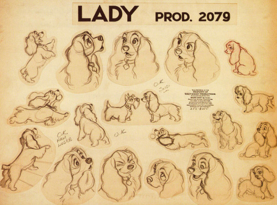
This model sheet is from the Disney movie Lady and the Tramp. Disney has worked with animal and anthropomorphic characters since its inception. An anthropomorphic character has the animal aspects, such as moving on four legs (this is optional), and basic emotions such as curiosity and content. This is combined with human traits such as speaking and more complex emotions relating to conversation (eyebrow raises, head nods/shakes). The accumulation of drawings shows the overall temperament and energy of Lady. From the drawings of sitting, running, turning, and emoting, we see Lady as a generally happy and energetic character, though at times meek and reserved. This design leans more toward a traditional dog, but the human nature of the personality shines through expression and speech.
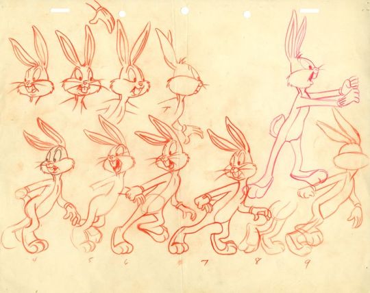
Chuck Jones was a character designer and key animator for Looney Tunes shorts. This model sheet of Bugs Bunny shows a few frames of a walk cycle, along with different facial expressions. This anthropomorphic character definitely leans more towards a human—from the walking on two legs, to moving his hands while talking. Walk cycles such as this have a complex rhythm of motion. Bugs is speaking and nodding while walking, so the mouth and head movements must be in tempo with the arm swings and footsteps.
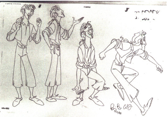
James Baxter produced this model sheet for The Road to El Dorado. Although this character has more realistic human proportions, the figure has a streamlined visual rhythm. These include the wider shoulders, narrowing at the waist, and then widening out again with the leg/foot position. Baxter also shows the character in motion with his turned face and the motion of the clothes and hair. There is a mix of straight and curved lines, which define the motion and flow of the character.
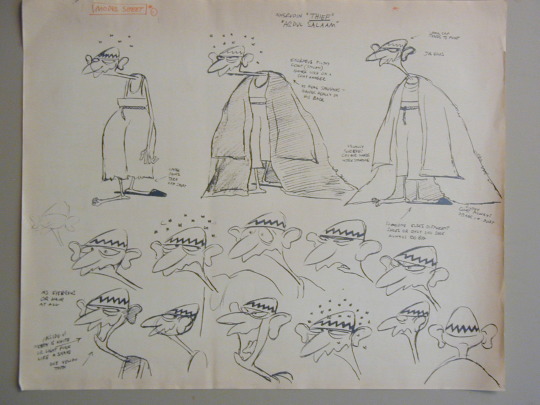
This final model sheet was drawn by Ken Harris, for The Thief and the Cobbler. He employs a looser, cartoony style than Disney or Looney Tunes characters. This is shown through the scribbled line that makes up the mouth, in addition to the baggy cape and sleeves that make up the cloak. Important details are shown such as showing each layer of the character’s outfit, as well as the movement of the jaw and neck when speaking.
#disney#lady and the tramp#anthropomorphic#dog#chuck jones#bugs bunny#looney tunes#james baxter#the road to el dorado#flow#ken harris#the thief and the cobbler#cartoon#animation#character model sheets#illustration#illustrator#umassdillustrationclub
17 notes
·
View notes
Text
Illustration Article 23: Animal/Creature Illustration
These illustrations are from artists who vary in style and subject, but they all have one thing in common: they feature an animal, real or fictional. Animals can provide interesting shapes and colors, in addition to bringing additional personality and energy into an image.

This first image of Heikala features a supernatural setting, where the ghost creatures add to the implied direction that the witch travels. The lineless white ghosts create layered contrast with the black city ground. The abstract clouds have considerable solidity, which strengthen the shadows underneath the witch and ghosts. There are also subtle complementary hues; the light from the lantern casts a pale-orange reflection on the witch and ghosts, while surrounded by pale indigo clouds. Orange dots are also seen in the city background, connecting it to the foreground.
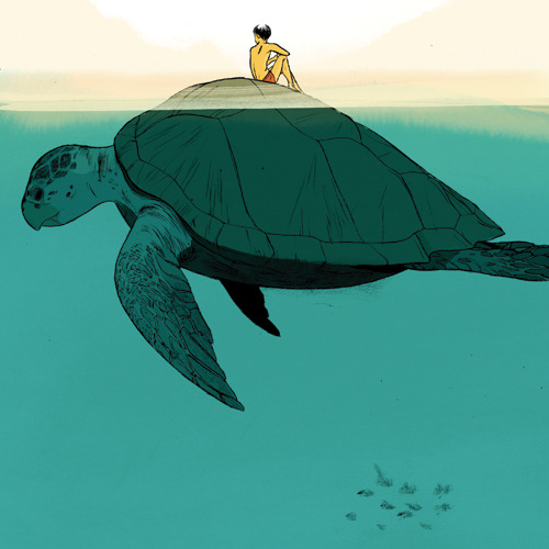
In this illustration by Jillian Tamaki, the animal in this image becomes an environment as much as a character. Despite being in a beach setting, this sea turtle resembles an iceberg. The divide between sea and sky is achieved with a strong turquoise ocean and paler oranges/yellows in the mountains. Complementary hues also divide the human and turtle; the piece of shell poking out of the water connects the two subtly. Despite the texture details and shell ridges, the overall shape of the turtle creates a pleasing silhouette.
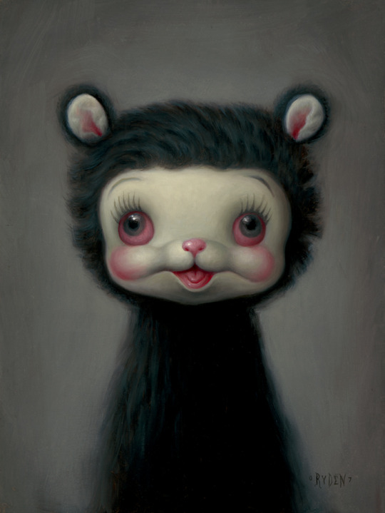
This portrait by Mark Ryden of a teddy-bear creature utilizes realistic rendering, making this character look like an actual toy. The red, dead-eyed stare and open-mouthed grin creates a deliberate lean into the uncanny valley. Ryden employs calculated use of a limited color palette, where the saturated red/pink hues mark the “fleshy” areas, such as the eyes, mouth, and ear interior. The conflicting information makes you question if this creature is alive, dead, or simply inanimate.
This final image by Koji Morimoto is more of a robot than an animal/creature, but it has enough mammalian elements and flexibility to include. The equal parts cartoony and monstrous of this robot fit right at home in this unsaturated, metallic-colored environment. The casual pose of the human contrasts with the robot’s animalistic posing. The hunched posture, clawed hands, and agape mouth imply something dangerous, but the woman’s lackadaisical pose suggest otherwise. Maybe it’s something like a guard dog?
#animal#creature#animal illustration#heikala#supernatural#ghosts#halloween#jillian tamaki#beach#turtle#mark ryden#teddy bear#uncanny valley#koji morimoto#robot#guard dog#illustration#illustrator#umassdillustrationclub
4 notes
·
View notes
Text
Illustration Article 22: Caricature Art
Caricature treads the line between realism and cartooning, and can be argued as being a form of character design. Typically, caricature is based on a real-life face (whether a relative or celebrity). Any number of features is then exaggerated, depending on whether the caricature is a portrait or a full-body piece. But the head is the most important element, bar none! All of those facial features can be shortened or lengthened, sunken in or stuck out, or even twisted. It’s not just making the eyes and mouth bigger. Taking little details and making them more or less noticeable can make large differences.
I searched a lot for artists; a lot of caricaturists can be good, but not great, because they make safer decisions. Caricature is about experimenting with the features, so you’re welcome to go a little crazy! (In an intellectual way, of course.)
Our first artist is Achille Superbi, who keeps the color, value and texture within the confines of realism. The surface details act like a coat of paint for the complex exaggerations of the foundations. Without the interesting facial proportions, the realistic rendering would look more generic.
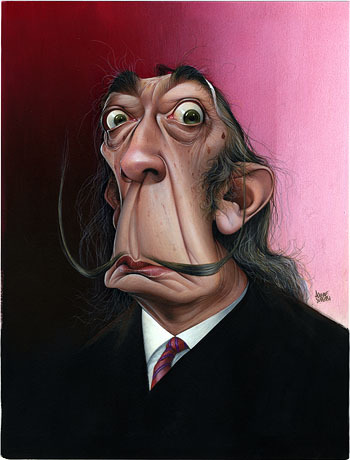
This caricature of artist Salvador Dali features an extended space between the nose and mouth, creating an interesting triangular shape. The base of the triangle also lines up with the curved moustache. The forehead has been squashed in order to emphasize the round arches of the eyebrows and eyes. Finally, the ears have been enlarged and angled to stick out from the head, making the face emerge in space.
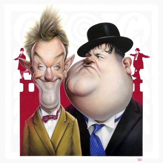
This two-portrait piece is of Laurel and Hardy, two slapstick actors from the early 1900’s. With two characters in the image, the easiest way to make each figure unique is to think of opposites, or visual contrast. Laurel (left) has his face narrowed and chin pushed inward, while Hardy’s (right) face was simplified to a circular mound with a prominent cleft chin. Laurel’s sharp, elvish ears contrast with Hardy’s round ones. Both figures have smaller eyes, but their relationship to the eyebrows alters the temperament of each character.
For another great caricaturist who uses a realistic style, check out Jeff Stahl (@jeffstahl_art on Instagram).
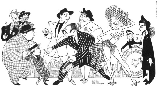
This next artist is on the opposite side of the stylistic/rendering spectrum, Al Hirschfeld (1903-2003). I’ve been a fan of his work; he has perfected iconic, simplified caricatures of celebrities throughout the 20th century. Hirschfield typically draws the full body in his works, allowing him the caricaturize the shape, pose and angle of the figure. In this ensemble of characters (most of whom I don’t know, sorry!), there are a variety of cartoonish body shapes, from round to curvy to straight to angular. Hirschfield uses pattern and flat black/white hues in order to make each character stand out.
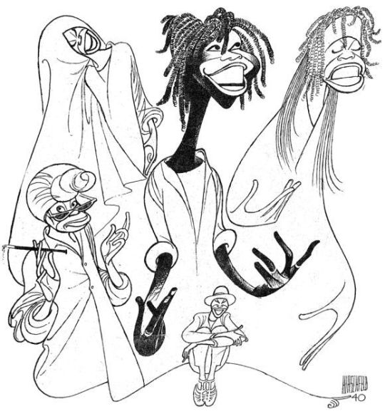
This next image features several caricatures of actress Whoopi Goldberg. Hirschfield gives attention to making the mouth—whether open or closed, smiling or frowning—emblematic of the personality and “character” of this drawing. The ruffles and curves of headscarves and jackets help to make interesting contours. Another way he shows Goldberg’s energy and dynamism is through the hand stylization. The long, skinny fingers in simple shapes give additional flow and curvature to the figure.
#caricature art#caricature#cartooning#Illustration#illustrator#umassdillustrationclub#achille superbi#laurel and hardy#jeff stahl#al hirschfeld#whoopi goldberg#Salvador dali#ink drawing#digital art
0 notes
Text
Illustration Article 21: Video Game Concept Art: Objects/Props
Our last article on video game concept art focused on character design—among the most important elements to work on. But other than the background/environment, there is still a plethora of items/objects to draw, model, and animate. Nearly all games feature objects, whether they are from collect-a-thons, inventory items, currency, minerals to build other items, and so forth. For example, many mobile games depend on large amounts of smaller avatars, assets, objects, and so forth.
One subset of objects is what I would call “props”. These could include weapons, vehicles, or any item a character/avatar uses within the game animation. Unlike currency or collectible objects, props may require more complex models, or more drawings to supplement the in-game actions.
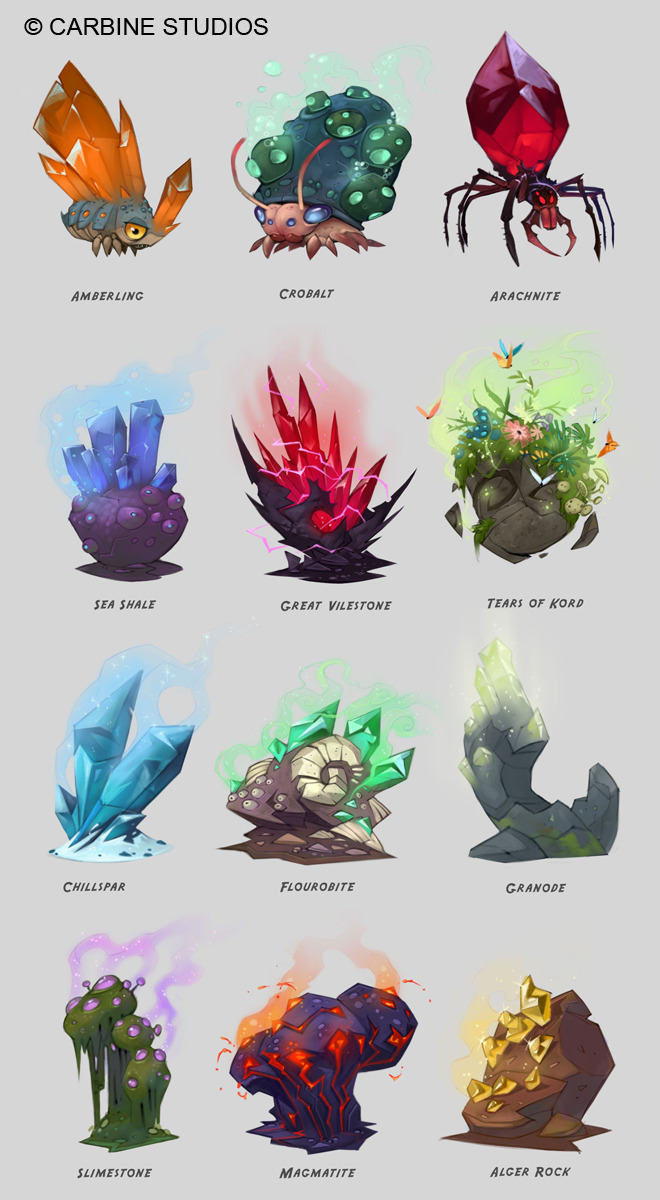
This concept art by Cory Loftis, shows the important mindset to start with when designing in-game objects: variety. Each object stands out from one another; the material, temperature, and texture of each element are distinct and recognizable. These objects may act as minerals to collect for upgrading, selling, or alchemizing into new objects. The function and materiality of each item can be differentiated by a specific contour, internal shapes, and color scheme. For example, many of these objects feature crystals. The shape may be like a more common diamond, or asymmetrical chunks; the crystal may be very reflective, or have a dull, milky appearance.
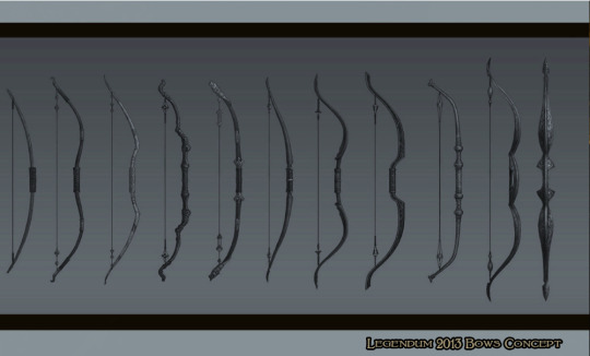
This next example is concept art for a presumed video game, Legendum. Designing differences in weapons can be difficult; unlike crystals, the shape and color palette of weapons may be greatly restricted. This artist relies upon smaller details and embellishments. Developing these differences would likely require considerable research into types of shields, bows, and so forth throughout history. Subtle visual cues of size or design changes can show contextual information, such as how durable or powerful the weapon is.
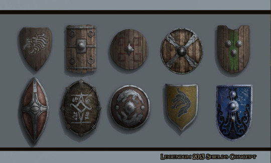
The sizes of these shields may be similar, but subtle construction can make each unique. Surface-level changes include showing the material (wood, steel), or covering it with metallic designs. Other differences include whether there is a metal rim around the shield, or if it has any steel knobs in the front.

This concept art by Vera Velichko features a motorcycle in different stages of line-art and full-color, along with different angles. The final detailed image may be used in order to create a 3D model, so drawing from multiple angles is necessary, especially if an object or prop isn’t symmetrical. A highly-rendered prop should also have a cohesive “personality” that is reflective of the society that it is used in, or of the owner that uses it.
#cory loftis#diamonds#video game concept art#props#objects#color scheme#legendum#weapons#shields#bow#vera velichko#motorcycle#concept art#illustration#illustrator#umassdillustrationclub#video game props#digital art
2 notes
·
View notes
Text
Illustration Article 20: Children’s Book Illustration (Quentin Blake)
Quentin Blake (b. 1932) has had a long career of illustrating children’s books; his most-viewed drawings were the ones in Roald Dahl’s children’s books. I was among the ones who viewed them as a child. I was drawn to them (no pun intended); his illustrations were strangely complimentary to the bizarre, fantastical, and sometimes dark stories. Blake’s art may be dismissed by some, but his work is emblematic of a looser, carefree mood, and is very palatable to younger audiences. Works with considerable detail and preparation can feel like holding your breath if you look at it. On the other hand, looking at Blake’s work feels like a satisfying exhale.
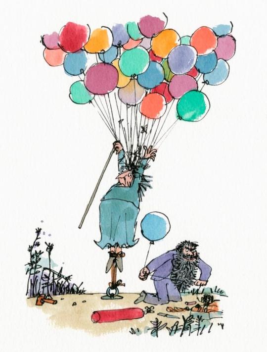
Blake’s artwork was not made to be clean or pretty; this illustration from The Twits shows that the line-work is loose, messy, and childish. His color palette features unsaturated earth tones, coupled with saturated, bright hues. The composition has symmetry in the shape of an hourglass—the top and bottom portions are filled with balloons and the ground, respectively. The sky and ground are connected by the old woman. The negative space on either side make her the focal point of the image.
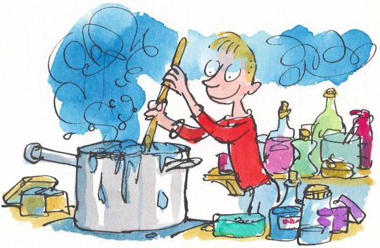
In this next example from George’s Marvellous Medicine, the physicality of the paint and paper is especially seen in the blue gas, which bleeds into the colors of the child. There are loose tonal changes in the reflective surfaces, such as the pot and potion bottles. The color scheme, while containing a plethora of hues at first glance, restricts most elements to primary colors. Notable horizontal hues include the blue gas and the yellow tables, while vertical hues of color feature the red shirt in the center of the composition.
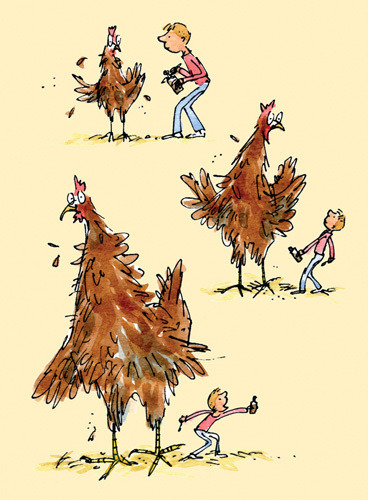
Also from George’s Marvellous Medicine, the differences in posing and scale show the simple whimsy of a growing chicken. The neutral disposition of the chicken allows the viewer to focus on the boy, whose surprise and awe turn to vocal excitement. Blake’s scribbled line work fits well with the texture of the chicken, whose rapid growth is shown through the falling feathers. The contour of each character shows a memorable use of shape and proportion, such as head-to-body ratio and uses of thick and thin shapes.
#quentin blake#Illustration#illustrator#umassdillustrationclub#children's books#children's book illustration#roald dahl#colorful#childish#childlike#imaginative#balloon#chicken#potions#feathers#primary colors#scribbles#the twits#George's marvelous medicine
2 notes
·
View notes
Text
Illustration Article 19: Album Art (Shepard Fairey)
When Shepard Fairey (b. 1970) was at RISD, he created a sticker campaign in 1989 that featured André the Giant, which has spread to numerous cities. Fairey did not plan to evoke a specific reaction, except that for people to react, whether positively or negatively. He is somewhat controversial, as some have accused him of contradicting his street/graffiti art aesthetic with his corporate and commercial footing in businesses. Fairey acknowledges this dissonance, and counters that utilizing different avenues of merchandising is a natural progression for artists that want to reach as many people as possible.
Among his politically-inspired portraits, the “Barack Obama Hope Poster” in 2008 became especially popular. His recognizable style involves bold colors and minimal gradients. Specific color schemes are used for a variety of subjects—primarily black, white, red, and blue. His work is reminiscent of political propaganda posters, from the screen-printed style and use of stark, direct imagery. Through his clean and geometric stylization, the human subject becomes an icon; his works can be perceived as an extension or development from Warhol’s pop art silkscreen prints.
Until researching art topic ideas, I didn’t realize that Fairey produced album cover art. Most of these pieces were created during the mid-2000’s, and this entry will showcase my personal favorites. (Not for the music, but for the cover… I didn’t listen to them, because I’m lazy.)
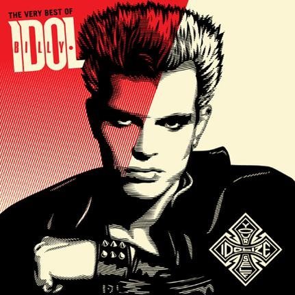
In this first example, Billy Idol’s 2008 compilation album, Idolize Yourself, has the eye-popping color scheme of half red (with gradient), half-white. This sharpness and line direction of the red makes the image resemble two pieces of glass. The contour hatching on Idol himself is a series of slightly curved horizontal lines, giving a slight distortion like an old fashioned TV (also glass imagery). Fairey also has an appealing logo-styled stamp in the lower-right corner; this layering of imagery gives a deliberately commercialized edge.
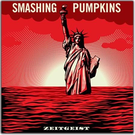
This second example is Fairey’s album art for Smashing Pumpkins 2007 album Zeitgeist. The cover uses the rule of thirds, horizontally; each third has an equal amount of visual imagery and information. The top third shows solid-colored clouds and the band title, while the bottom third features the blood-red sea and album cover. The middle third, lacking text, features the main visual element and greatest color contrast. The Statue of Liberty is the only element that has black, red, and white, making it stand out from the environment. Line patterns are used in this image as well, which leads towards the center of the image, resembling a sunrise.
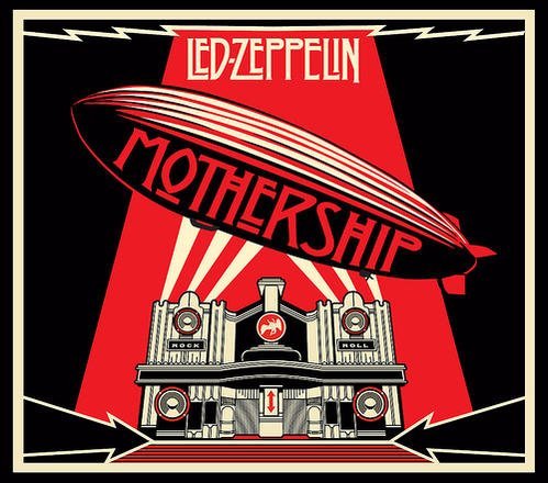
In this third example, the Led Zeppelin 2007 compilation album, Mothership, replaces the thin-line gradients with shapes and flat colors. The earthly zeppelin present in the band’s debut album is given a supernatural edge, like an alien spaceship hovering above a theatre. The qualities of embellishment and collage are seen with the black arrows, the red spotlight, and the lightning-bolt design above the band name.
#shephard fairey#album art#poster art#black#white#red#billy idol#idolize yourself#smashing pumpkins#zeitgeist#led zeppelin#mothership#supernatural#statue of liberty#logo#umassdillustrationclub#illustration#illustrator
0 notes
Text
Illustration Article 18: Detailed Manga (Inio Asano)
Inio Asano (b. 1980) is a new (or at least, newer) manga artist; his work has been renowned for being relatable and tragic, simultaneously poking fun and shedding light on humanity. His most well-known works are Solanin (2005-2006), Goodnight Punpun (2007-2013), and Demon’s Destruction (2014-present). The first two series revolve around the lives of young adults, and the struggles and traumas they endure. The latter one I don’t know much about, but it involves an alien spaceship landing in Tokyo…
In Asano’s stories, we see the inner workings of each individual, and witness the constant push-and-pull of family, friends, and romantic relationships. I read Punpun over the summer, so I’ll warn you—it’s not for the faint-of-heart. Everyone’s kind of flawed; there are moments of optimism, but there are a lot of negative moments—sad, gross, bizarre, hopeless, or desperate.
Asano draws with traditional pen and ink, but he also uses digital programs to make his art even more precise and detailed. Asano also prints out photographs of backgrounds to fill with detail on paper. He alters the contrast and levels of the photos so that it becomes a line-art foundation. Some may see this as “cheating” … but I see as ensuring realistic quality. The copious work he adds to the line art requires some level of skill in order to make all of the textures and forms work in space. He also adds additional elements into the frame: human characters, animals, and objects. It takes additional skill to make characters fit into an already-established space, keeping in mind the proportion and perspective of the environment.
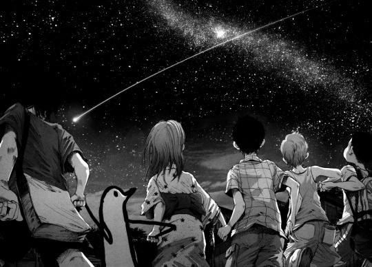
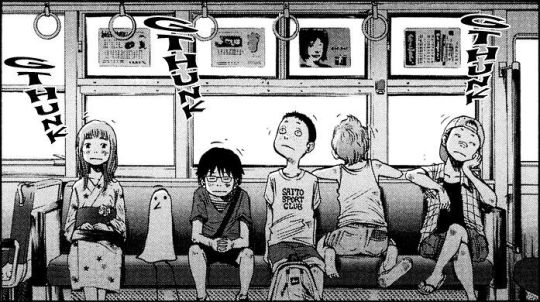
In this example, the background is likely based on a photograph, but Asano has added highlights that enrich the nature of the sky. The arc of the shooting star echoes the arc of the group of friends. Asano is exemplary at creating three-dimensionality, with or without photographs. The arch of the back, the foreshortening of the elbows, the wrinkles and folds of clothes—all contribute to solidity of form. The limited textures allow the scene to appear soft and smooth, matching the soothing tone of the scene.
The use of close-ups cropping exemplifies the tension of this scene between Punpun (boy) and Aiko (girl). In the top panel, rather than showing the whole body, the figures are cut off at the legs. The posing of the characters and the spiky texture of the grass creates a subtle tension. The close-up of Aiko’s eyes shows a complex expression; we can’t see her smiling or frowning, so her emotion is up for interpretation. She may be keeping her hopes up, or numb/melancholy. The final panel (in the lower-left panel) cuts off Aiko’s head; we don’t see her expression. Hiding her face could represent Punpun’s perception of her—a negative, dehumanizing perception.
#inio asano#solanin#oyasumi punpun#punpun#goodnight punpun#aiko#demon's destruction#realism#detailed background#mangaka#manga art#digital art#umassdillustrationclub#illustration#illustrator#precision#detail#childhood
17 notes
·
View notes
Text
Illustration Article 17: Detailed Manga (Katsuhiro Otomo)
Katsuhiro Otomo (b. 1954) created a worldwide phenomenon in the 1980’s, popularizing his work as a manga artist as well as a film director. An earlier work, Domu (1980-1981), laid the foundations of supernatural themes and cityscape settings for AKIRA (1982-1990), his most popular series.
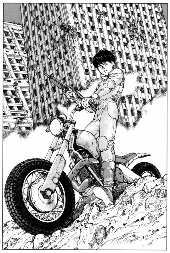
This first illustration from AKIRA shows a dramatic character presentation. Despite having considerable lines and detail, the high-contrast areas are in a few choice spots—the tires, the character’s hair, and the windows of the buildings. The white background makes these dark shapes pop out. The perspective of the image tells us a lot about the character (Kaneda, I believe) and the world he lives in. We are looking up at him; in turn, he is looking down on us. The confident stance, along with his wielding of the motorcycle and gun not only makes him look cool, but shows that he has strength and authority. However, he is dwarfed in height by the buildings in the background, which point out from the ground with haphazard abstraction.
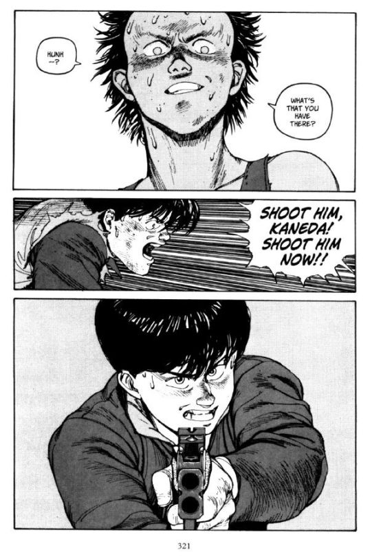
The angle of each panel in this second example shows each character’s psychological state. In the top panel, Tetsuo is shown from above, showing fearsome power; the shadows under his eyes give a monstrous quality to his face. In the bottom panel, Kaneda looks from below, showing his hesitation and tension in shooting his friend (or ex-friend). The character in the middle panel, farther away from the interaction, is seen at eye-level and in profile. Tetsuo and Kaneda face forward, showing that their attentions are focused on each other.
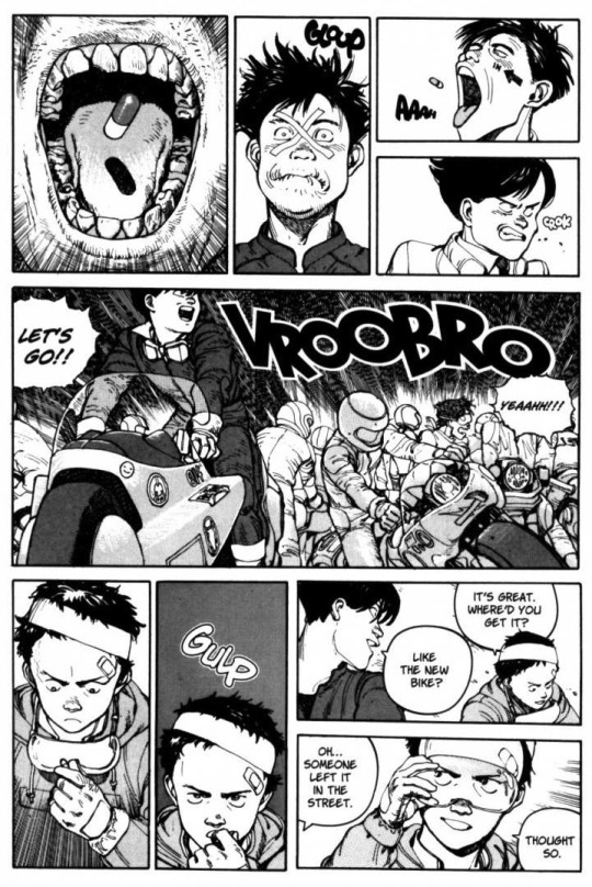
This final example (which I believe is left-to-right, for some reason), shows a chaotic scene of different characters, actions, and interactions. Through the pill-popping and motorcycle-hopping, we see a variety of emotions; the rest of the boys seem more emotional and manic in the top panels, while Tetsuo seems considerably more level-headed in the bottom panels. The most interesting image in this sequence is the first one; there is a visceral quality to the close-up of the teeth and mouth, and the shadow on the tongue that the pill makes.
#katsuhiro otomo#domu#akira#tetsuo#kaneda#neo tokyo#dystopian#urban architecture#action manga#mangaka#manga artist#futuristic#umassdillustrationclub#illustration#illustrator#pen and ink#80's manga#motorcycle#guns#pills
8 notes
·
View notes
Text
Illustration Article 16: Horror + Fantasy Manga (Kentaro Miura)
The second article in this two-part series will center on Kentaro Miura (b. 1966), and his work on the fantasy manga Berserk (1989-present).
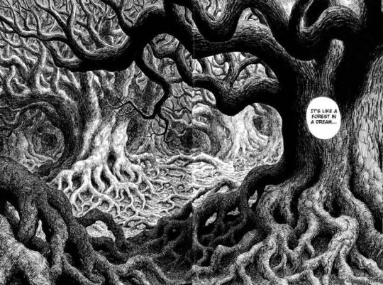
Some of Miura’s background pieces resemble the old-fashioned ink drawings found in Victorian-era magazines. Those pieces leaned toward realism, while Miura takes greater liberties with line weight, contrast, and proportion. Such liberties led to this exaggeration* of nature, solidified by the numerous roots and branches that become layered and entangled. There was a careful calculation of light and dark areas, so as not to become a confusing mess of lines. The two darker trees in the center still stand out due to the background trees being considerably lighter.
*Perhaps there is a place on Earth that resembles this image, but it would certainly be hard to find.
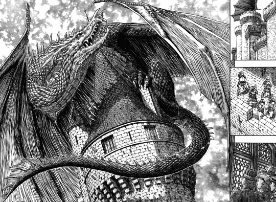
This double-page spread is another example of Miura’s love of detail… and what screams out “fantasy” more than a dragon? The preceding close-up shots of the exterior and interior of the castle shows the scale and ferocity of the dragon. Organizing the elements of the larger image comes from establishing a differentiation between scales, horns, wings, and the stones/bricks of the castle. Knowing when to add value and details to what elements is also important. Miura could have added tiny brick details into the walls, but then the shading technique would resemble the scales too much. The dragon stands out because it has a greater value range.
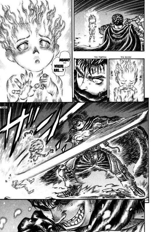
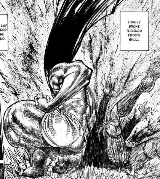
I don’t know the context of this image, but I’m sure Guts (the one with the sword) has a good reason for slashing this… fire-ghost creature? This page is compositionally interesting due to the use of contrast. Guts’ hair and outfit has many black areas; although he is the protagonist of Berserk, his appearance shows a hardened fighter. The creature has a narrower value range of whites and light greys; the hatching line-work differs greatly from Guts’ areas of black and sharp highlights. The path of the sword becomes a white arc, which also connects to the burst of light coming from the creature. The close-up of Guts’ transition from stoic (with eyes shadowed) to an animalistic sneer shows his emotional duality, a common staple of Berserk.
#kentaro miura#berserk#guts#castle#forest#fantasy world#creature#umassdillustrationclub#illustration#illustrator#mangaka#manga artist#pen and ink#detail#dragon art
0 notes
Text
Illustration Article 15: Horror + Fantasy Manga 01 (Junji Ito)
Disclaimer: This article contains drawings featuring body horror/disfigurement.
The two artists in this two-part article have each been categorized into a specific genre (Ito for horror, Miura for fantasy), but there can be considerable overlap between the genres. Ito’s narrative and framing fall into the conventions of horror stories. Sources of fear/danger in these stories can fit within two categories: the realistic, conceivable horror, or the unrealistic, fantastical horror. Ito’s works center on how deviations from reality can accumulate into something catastrophic. Miura’s work, while placed in a fantasy environment, contains physically and psychologically horrific circumstances that the world’s characters have to face.
This article will specifically focus on Junji Ito (b. 1963), who has had a decades-long career of horror comic series. His most popular works include Tomie (1989-2000), Uzumaki (1998-1999), and Gyo (2001-2002), in addition to dozens of chapter-long horror stories.
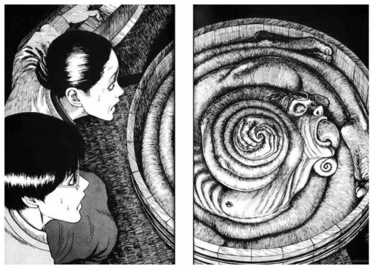
This first image is from Uzumaki, where a spiral sickness manifests into every part of existence, including the human body. Ito presents the horrific elements very slowly and subtly at first, exposing more and more until the gravity of the situation is revealed to both the reader and the protagonist(s). This first image is a two-page spread, likely showing the big reveal of a climactic moment. The floor, barrel, and spiraled figure feature close hatching lines; this gives the impression of a harsh texture. The appearance of the figure resembles the rough, ridged barrel and floor; the thought of rough or splintered skin creates a discomforting atmosphere. The spiraled figure, other than being grotesque, draws the eye to the center by virtue of the shape. This figure also has the highest contrast by leaving choice areas untouched (more notably on the face, such as the brow, the underside of the nose, and the chin).
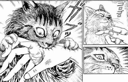
This next image (read right-to-left) is from Cat Diary, where Ito details experiences with his wife’s two cats. This sequence employs moment-to-moment transitions, going from pleasant to unpleasant in three frames. The second, close-up panel of the cat’s eyes is essential to making the cat bite (a normal experience) into something more unnerving. The cat, originally happy with its eyes closed, suddenly opens its eyes and looks downward in the next panel, as if jolted out of (or into) a trance. This pause in the second panel shows calculation and awareness, unlike the instinct of an animal. There are also changes in how the sound effects are drawn, going from small and neat to jagged symbols.
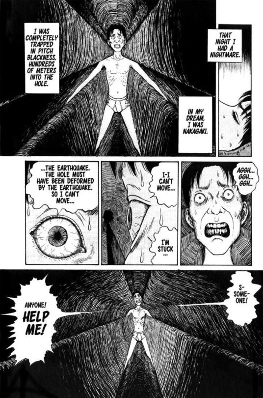
This final page is from The Enigma of Amigara Fault, depicting common fears of claustrophobia and darkness in a bizarre scenario. The feeling of entrapment is shown through intense close-ups of the face and eyes, as well as wide shots of the cave that is constricting the figure. The imagery embodies being trapped in one space, and yet aware of the unknown depths in front of you. The figure, almost like a white silhouette, stands out against the contour hatching lines of the cave.
#tomie#uzumaki#gyo#cat diary#the enigma of amigara fault#junji ito#horror manga#disfigurement#horror#mangaka#manga artist#umassdillustrationclub#illustration#illustrator#spiral
5 notes
·
View notes
Text
Illustration Article 14: U.S. Graphic Novels (Will Eisner)
Will Eisner (1917-2005) is known for a multitude of comic series, including The Spirit (1940-1952), A Contract with God (1978), The Dreamer (1985), and To the Heart of the Storm (1991). Eisner has also published highly acclaimed books on comic-making and the inner workings of sequential art itself.
A lot of his pieces revolve around the day-to-day lives of normal people—no superheroes, sci-fi or fantasy quirks. Because of this, their problems (and their reactions to their problems) can resonate deeply with readers. His work popularized the establishment of graphic novels; differing from multiple-issue comic releases that can last indefinitely, a graphic novel is a self-contained volume (though a story can span multiple volumes).
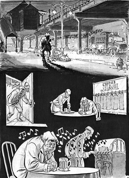
One of Eisner’s innovations in comic paneling is his choice to get rid of it at times. There are technically no panels on this page, but the changes in lighting and composition can effectively separate each scene. The first panel shows the character walking into darkness, leading to him entering a bar. The shadows of the top panel become the background space of the bar. The foreground figures and objects stand out from the darkness, flattening and isolating the space. This is complemented by the slouched posture and melancholic expressions of the figures.
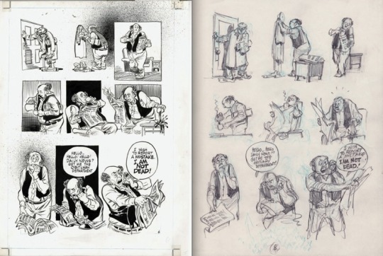
This next image shows a comparison between a final page and a preparatory sketch. Notice how the sketch is a sequence of images without panels, resembling a storyboard. Between the sketch and final piece, the image layout and composition has been carried over. But there are numerous smaller alterations that enhance the sequence. Panels were added to some images, some of which are broken by the figure or environment. The character design changed considerably—getting rid of the glasses and mustache allows facial emotions to be more clearly portrayed. To emphasize the gradual climax of the scene, each row of panels becomes successfully larger, as the context and poses become more dramatic.
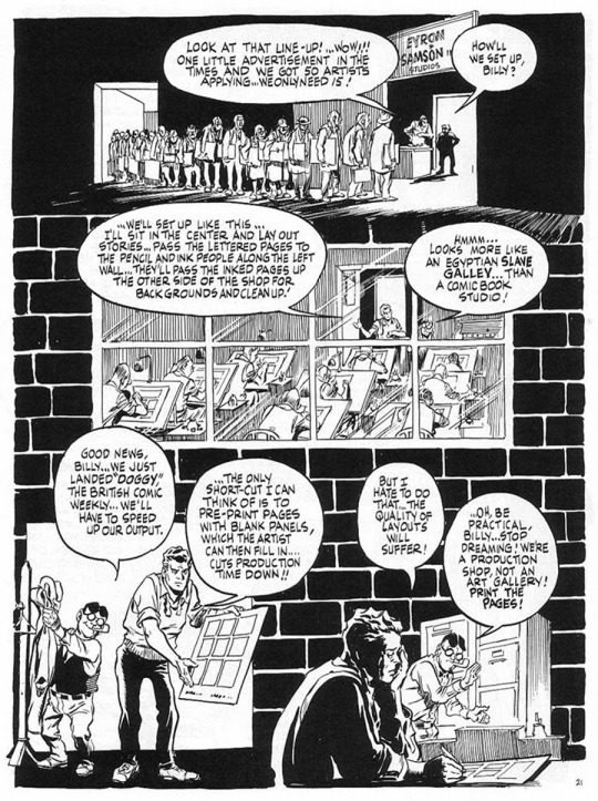
This final sequence shows the industrial-line, creatively-draining nature of this story’s comic book studio. The rigid atmosphere is shown through vertical and horizontal lines—the line of artists in the top panel, the bars on the window, and the brick pattern that travels to the bottom of the page. Eisner combines background patterns with the interior architecture, giving this page the impression of montage. This layout matches with the context of the page; each row takes place in different rooms and times. By separating the rows through patterns and paneling, the viewer can understand that the story itself is going through a “montage” of events and conversations.
#will eisner#graphic novel#the spirit#the dreamer#to the heart of the storm#a contract with god#realism#storytelling#umassdillustrationclub#illustration#illustrator#comic artist#industrial#sketches
1 note
·
View note
Text
Illustration Article 13: American Superhero Comics (Todd McFarlane)
Todd McFarlane (b.1961) is a co-founder of Image Comics, becoming most well-known for his work on Marvel’s Spiderman and his own creation, Spawn. His more recent undertakings lean towards entrepreneurial and business activities, but his establishment as an independent creator has inspired changes in the comic industry.
Compared to Jim Lee, McFarlane has greater line weight variety; he draws characters with a smoother, rounder line that gives a cartoonish appearance in conjunction with detailed anatomy and environment.
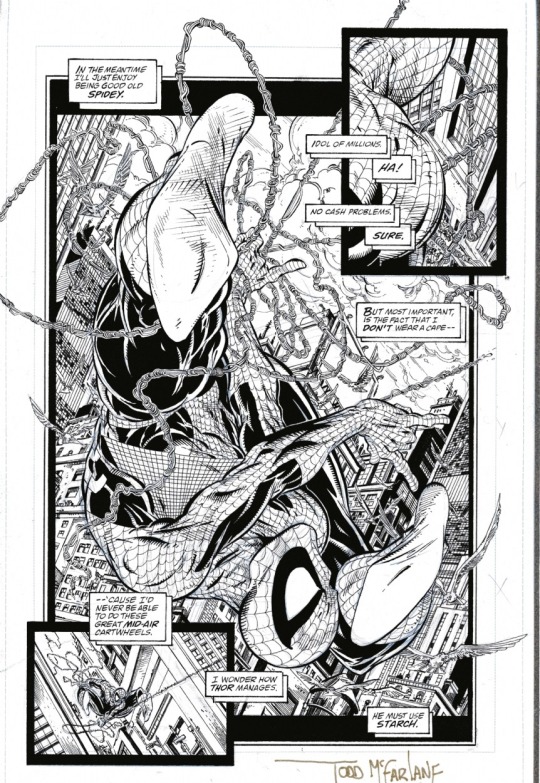
To achieve a figure with depth, this first image features highlights and shadows that pop out; the web design of his outfit follow the three-dimensional contour of Spiderman’s frame. The composition is filled with many tiny details, but the use of scale prevents the scene from being too crowded. There is only one large figure in the foreground, so it doesn’t blend into the background. As with other comics with cityscape environments, there is a pleasant variety of geometric and organic shapes.
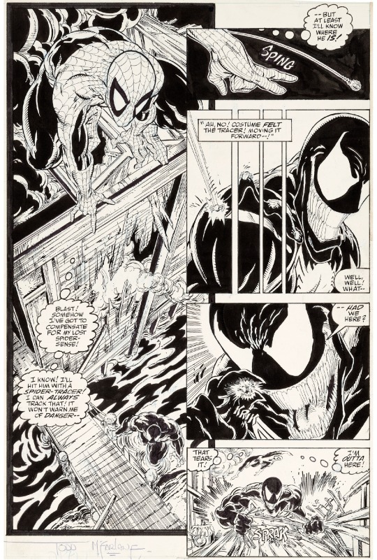
In this next image, the stylization of Spiderman and Venom’s outfits show visual contrast in their temperament, posing, and value scheme. The simpler designs of the masks can prove more memorable than the human face. In terms of layout, this two-column approach is effective in showing the “cause-and-effect” of a scene. The leftmost panel is an establishing shot, showing the environment from a distance at a dramatic angle. After showing the placement of the characters and environment, the rightward panels are a series of close-ups, ending with a zoom-out of Venom.
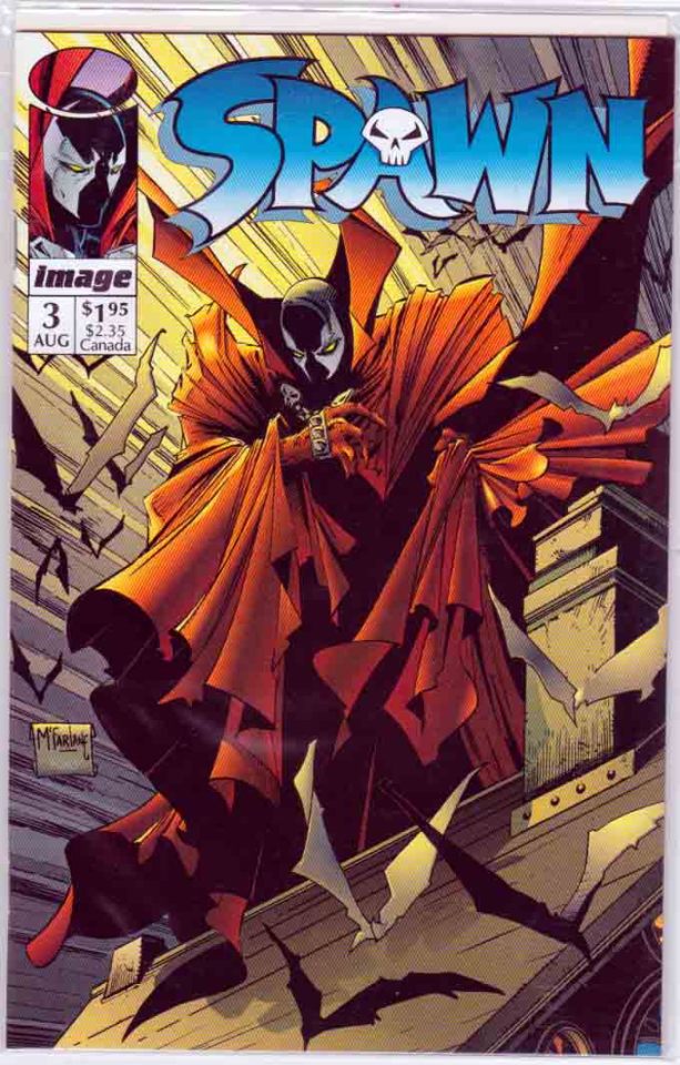
The use of color in this final image has a good balance of bright and dull hues. These areas of color divide the stark black areas of the mask, cape, and bat-wing shadows. Flat shapes of one hue can run the risk of flattening the image, but restricting these shapes to the shadows allows the line-work to present space and depth. There is an intersection of lines that lead to the center of the figure; the light from above and the triangular cape folds around the arms point toward the face.
#todd mcfarlane#image comics#spiderman#spawn#comic book#American comics#superhero comics#umassdillustrationclub#illustration#illustrator#comic books#venom
0 notes
Text
Illustration Article 12: Book Cover Illustration (Various Artists)
Book cover illustration, like album cover art, can be extremely varied… as long as it fits within the dimensions of the pages. There are exceptions with using text on albums (some covers just have the art, with no album and/or band name). However, I highly doubt that there are exceptions for book covers.
I can say pretty confidently that the book cover needs to feature the book title and the author’s name. This can influence the structure of book cover art, where this text should be formatted or framed into a design where the words fit seamlessly with the illustration.
Another exception to album to cover art is that the art does not necessarily have to reference songs within the album; they can evoke a general emotion, or they can be completely distinct from the album’s contents. Think of The Beatle’s The White Album… there’s not much to think about, is there?
Again, book covers have no such wiggle room, and for good reason. Music is a looser art form that literature. Literature is descriptive—the words can represent literal or metaphorical imagery. An artist can take artistic liberties, but it has to relate to the book’s content in some way. It can be minimalist or extremely complex; the words can be in any font or any style of handwriting. But it has to… you get the picture.
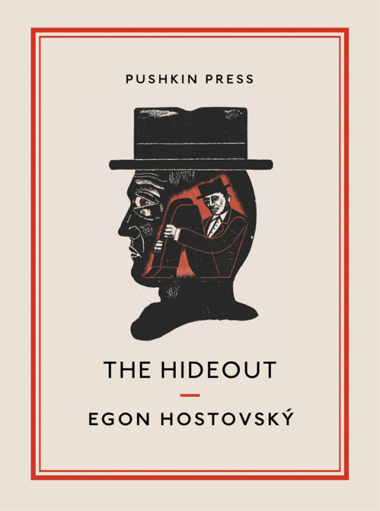
This first example is a cover from The Hideout, which was designed by Ben Jones. The format features simple shapes and limited colors. The black font and rectangular red borders implies high-contrast colors, but the effect is subdued due to the large amount of white negative space. This allows the image to take center-stage; contrasting the clean, thin text and design lines with a messier, linocut-style print. The illustration has black-colored negative space in the form of a silhouette. The “Hideout” that the title mentions is connected to the smaller man hiding inside the larger man’s head. Likely being the same man due to the hat, the man is using his own mind as a hideout.
Karl James Mountford’s book illustrations stood out to me for his sharp, cartoony style and intricate composition. He follows an effective formula for creating something that can stand alone as an illustration, while also featuring specific ideas that define the literary work. The main character is in the center of the page, but fits comfortably within the setting. Aspects of the environment are used for design elements; a popular motif he uses is floral/leaf patterns and placement of animals. The style of his artwork involves layering of flat colors, both saturated and unsaturated. Using flat colors instead gradients makes the contour of each shape stand out. In order to make the various colors and shapes readable, I imagine that there must be considerable preparation in order to separate the foreground and background effectively.
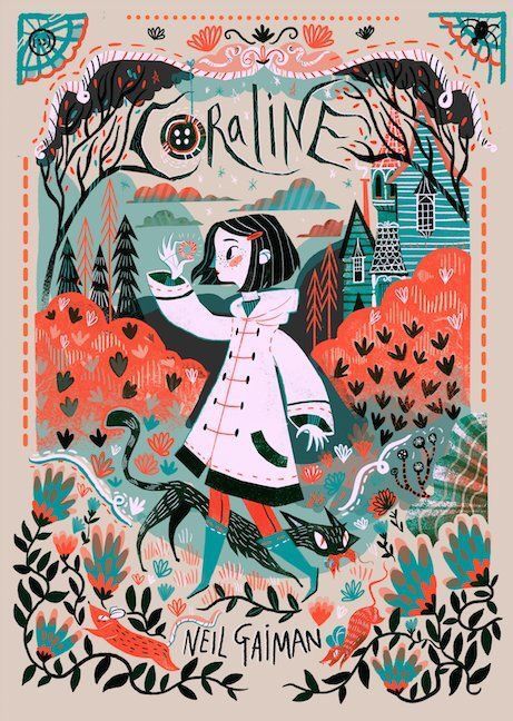
This first cover of Coraline combines the illusion of depth in the background, along with flat patterns that break onto the front plane. Standing out the most is the contrasting colors of reddish orange and turquoise; the parts where they interact make them pop (just look at those clouds!) Coraline stands out from the environment by being mostly black-and-white, but the small elements of red and green attach her to the environment. The grass and flowers look like stamped patterns; the slightly worn and faded shapes give the impression of something old-fashioned and made with care. The red rats running along the plants give a sense of movement within the static plant-life, and frame the author’s name.
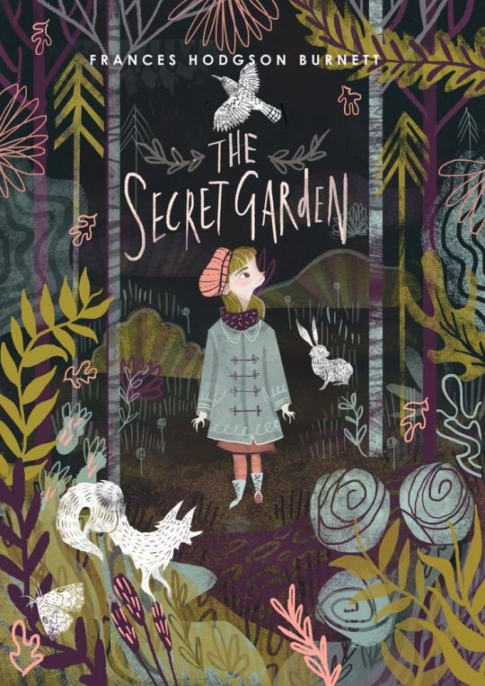
This second illustration for The Secret Garden differs greatly in terms of color scheme and framing. Instead of having negative space for designs like in the previous examples, the entire page is filled with the forest environment. There are a greater variety of colors (yellow, pink, brown, pale blue, and purple), but are all-around less saturated. The fox, rabbit, bird, and moth appear to be “stamped” onto the background, making the plants seem more real than the animals. The central character’s palette is filled with more colors from the environment, making her more immersed in the cozy setting. The two trees on either side also frame the girl, title, and author’s name.
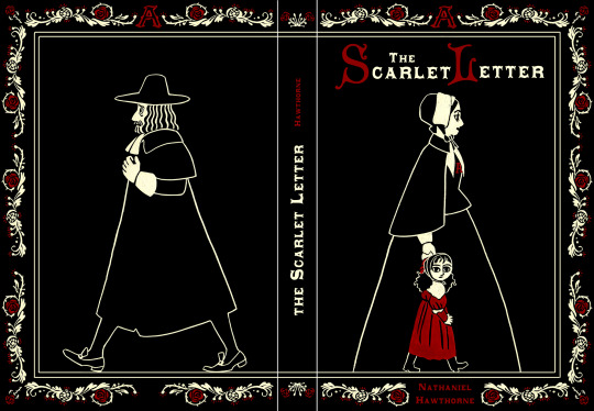
I’ve followed M. Dean for her comic pieces, but I noticed she had created cover illustrations in her portfolio. I don’t know if this cover for The Scarlet Letter is official, but it still has successful elements of book design and illustration. Black negative space refers to the conservative era, as well as the dark tones of the story. The only red featured other than on the title and border designs is on the little girls’ dress and hair-tie. (I also enjoy the Picasso-esque style of her face!) She is colored the same as the scarlet letter, connecting her to the adulterous act. The “A” on the woman’s chest is subtle and partially hidden, while the daughter is a bolder marker as a product of sin (to the townspeople).
The formatting of the two walking figures is interesting as well. If you open the book, the characters walk in opposite directions; but if you close the book, they are walking in the same direction. (Sorry I don’t refer to them by their names. I haven’t read the book since high school, so I don’t really remember the characters…)
#book cover illustration#ben jones#karl james mountford#m. dean#m dean#umassdillustrationclub#illustration#illustrator#the hideout#coraline#the scarlet letter#the secret garden
7 notes
·
View notes
Text
Illustration Article 11: Video Game Concept Art -- Characters (Various Artists)
When I typed “video game concept art” into Google, a lot of it was high-quality drawings. However, these drawings were almost exclusively photorealistic, for video games with extremely well-rendered graphics. Some of these drawings, while proportionally realistic, were not particularly polished; I’m pretty sure others were paint-overs of photographs. Now, these methods aren’t bad at all, but I wanted to examine concept art with more imaginative, fantasy-inspired, or cartoony/iconic styles. So I dug a little, and found some concept art that fit my preferable criteria. Some are from older video games I used to play, while others are more recent games that I hadn’t yet heard of.
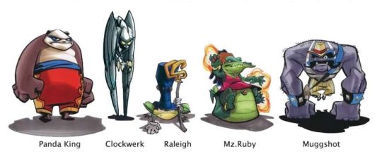
Dev Madan was the art director and character designer for one of my favorite video game series as a child, Sly Cooper. This concept art is a lineup of antagonists from the first game. The variety of animal characters allowed for great differences in each character’s shape, color, and motion. Each member of this group is extremely identifiable in relation to each other, even if these images were just silhouettes. Even their standing pose is indicative of their actions. Panda King stands solidly on the ground, hands bared aggressively. Clockwerk ‘stands’ on its wings with an almost unnatural sense of balance. Raleigh squats (froglike of course), but also supports himself with a staff, like a ruler. Mz. Ruby sits on her tail, since she uses psychic/aura powers rather than physical ones. To contrast with her, Muggshot walks with his hands to show his physical prowess. Simple actions like sitting, standing, and walking can be very indicative of a character’s… character.
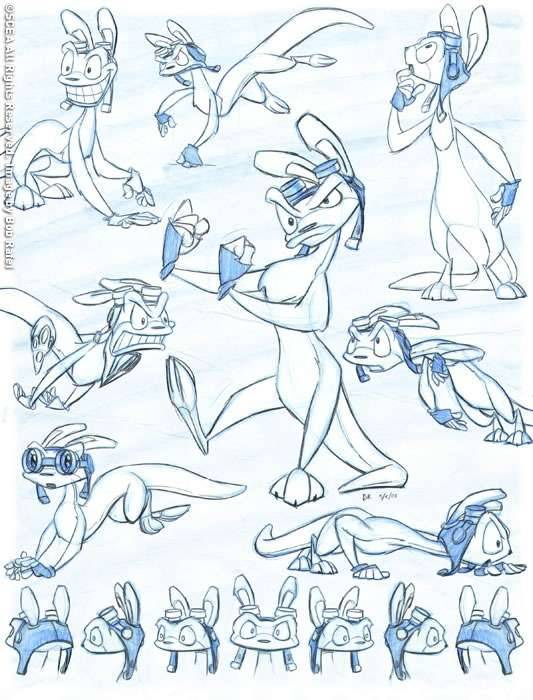
This next example is a character lineup sheet of Daxter from the Jak and Daxter series. This particular sheet was drawn by Bob Rafel. It’s interesting to note that while video games like these employ 3D models, most, if not all, ideas require two-dimensional sketches and drawings to plan out. Drawings can be produced considerably faster than 3D models; this allows for multiple drawing of different poses and emotions. Many of Daxter’s’ poses have a clear line of action, which is emphasized by the posing of his tail. Drawing a character with energy and sharpness involves identifying key shapes of the body, and filling in details later. The goggles are the most detailed part of Daxter, but his character shines through more from these lively drawings.

This third example is a character/outfit lineup by Janice Chu (I couldn’t find out whether this is from an actual video game or just a demonstration). The character is identified through the different outfits by basic shapes (round head, rectangular body) as well as smaller details (one eye, tree/branch antennae). This character demonstrates more of a customizable avatar than an individual with personality. In this case, it is the outfits that define the nature of the character, as well as their abilities and powers. The color schemes between the outfits are not considerably large (save for the demonic one in the lower-right corner), but they are rendered with enticing patterns and solid contrast.
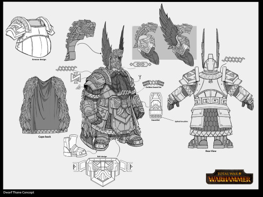
This last example was drawn by Rinehart Applah, who designed concept art for the video game Total War Warhammer. Rather than multiple outfits like the previous example, this character sheet goes into excruciating detail for this one particular medieval/gladiatorial outfit. This includes drawing out the separate elements of the armor, cape, and ornamentation/pattern elements. I don’t know for certain, but this character looks like it’s going to become a 3D model. Drawing from every angle and featuring outfit elements separately imply that these designs will be seen from any direction. The extreme detail of this character will likely be implemented into a model composed of several intricate elements. This art could be used for simpler reproductions, such as pixel art; the 2D art itself could also be used in a character selection screen.
#dev madan#sly cooper#concept art#video game concept art#bob rafel#jak and daxter#Janice chu#Rinehart applah#video games#umassdillustrationclub#illustration#illustrator#character design
2 notes
·
View notes
Text
Illustration Article 10: Children’s Book Illustration (Chris Sheban)
Whenever I think of children’s books, two categories come to mind. The first has illustrations as the main attraction, occupying full pages while the text is placed on top. They are, generally speaking, picture books. Examples include books by Dr. Seuss or the Arthur series. The other type of children’s books features multiple chapters of text, with illustrations (usually black-and-white) acting as supplementary. Examples of this include the Junie B. Jones and Bailey School Kids series.
Chris Sheban is known for his book illustrations—not just book covers, but fully-fledged children’s book illustrations as well. While most children’s book drawings are two-dimensional, either with flat or textured colors, Sheban employs a three-dimensional cartoon style. There are no hard lines—although the environments and characters can appear very soft, hard or rough textures can still pop up. In one reviewer of his books, Sheban’s illustrations are described as “glowing”, which I can definitely confirm. The sense of light and shadow is very believable, despite being a fictional setting.
He describes his drawing process on his website. On rough watercolor paper, he starts with a wash of watercolor. He then applies a pastel transfer from a line drawing to the watercolor paper. (This is done by coating the back of the paper with pastel, and then outlining the drawing on the front. This leaves a faint trace of pastel on the watercolor paper). He then fills in value, color and texture using Prismacolor pencils, and uses more watercolor for dark areas. The result is a heavily layered but cohesive image.
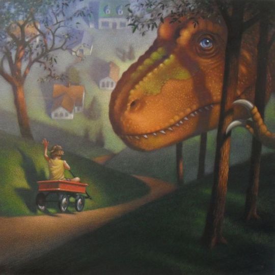
The first example is from I Met a Dinosaur, written by Jan Wahl. The trees on either side not only frame the image, but also remind the viewer of scale between the environment and the T-Rex (its claw is almost as thick as the trunk!) The child in the red wagon and the T-Rex are considerably sharp and crisp compared to the background, and have an overall warmer (red/orange) tone than the background (green/blue). I notice that atmospheric perspective is being used for the environment; the foreground grass is a yellow-green, while the grass and buildings in the background is blurrier, paler, and cooler. The colors of shadows are also different, depending on the distance.
The second example is an illustration from Red Fox at McCloskey’s Barn. The piercing brightness of the yellow light comes from framing it with an unsaturated wooden surface, as well as having complementary purple skies above it. The fox subtly pops out from the purple shadows by having yellow light reflect on the edges of the fur. Scale is once again played with—not with objective size like the previous example, but through use of perspective. The framing is so close to the fox that it takes up half of the space; we are also placed at the fox’s eye level, so that we can see from his perspective. The fox’s snout and tail pointing at the barn brings attention to the focal point: the yellow light, containing silhouettes of chickens.

This third example is from The Lonely Book, a story he illustrated in collaboration with writer Kate Bernheimer. This specific illustration is a two-page spread, and the final illustration of the book. This has a lot of imagery that I personally enjoy. Giant plant life/fungi, floating fantasy creatures, a bed… I like sleeping.
The middle of the picture is translucent and airy compared to the solidity of the sleeping child and the brighter hues at the top of the picture. Despite this being a metaphorical montage of somebody sleeping below a presumed dream-world, the pale colors and soft textures makes the transition seamless. An interesting detail is the fuzzy white light surrounding the sleeping child—it reminds me of TV static or frost on a window, which is a good representation of divided environments.
#chris sheban#children's book illustration#children's books#umassdillustrationclub#illustration#illustrator#I met a dinosaur#the lonely book#red fox at mccloskey's barn
0 notes
Text
Illustration Article 09: Album Art (Roger Dean)
Album art can feature any style or media, as long as it is printed within a square format. This can include drawing, painting, printmaking, sculpture, photography, collage, digital effects, or any combination. They can relate closely to the album title or to a specific song, or can have completely separate imagery; most of the time, we subconsciously connect cover art to the album tracks, even if they don’t logically fit. A lot of albums simply use photographs of the singer/band; this may seem simplistic or boring, but a lot of covers place the photograph within a specific composition—using collage elements, color and lighting effects, typography effects, and so forth. But I’m going to focus on illustrated album art that not only stands out as an album, but as a standalone work of art as well.
Roger Dean (b. 1944) went to college for industrial design, developing strong drawing skills in draftsmanship for objects and environments. Some of these studies included an exploration of imaginary constructions, creating building foundations and furniture designs using unconventional shapes and colors. After making interior designs for a jazz club in 1968, the owner asked him to use a portfolio piece for the band Gun’s album Race with the Devil. After this, Dean produced album cover art for several bands, including Asia, Yes, Budgie, and Uriah Heep. Cover art for Yes’ and Asia’s commercially-successful albums have become iconic; his realism-inspired fantasy environments are still marveled at for their clarity, detail, and organic ornamentation. Dean also made video game art during the 80s, and in recent years has contributed designs for futuristic architecture.
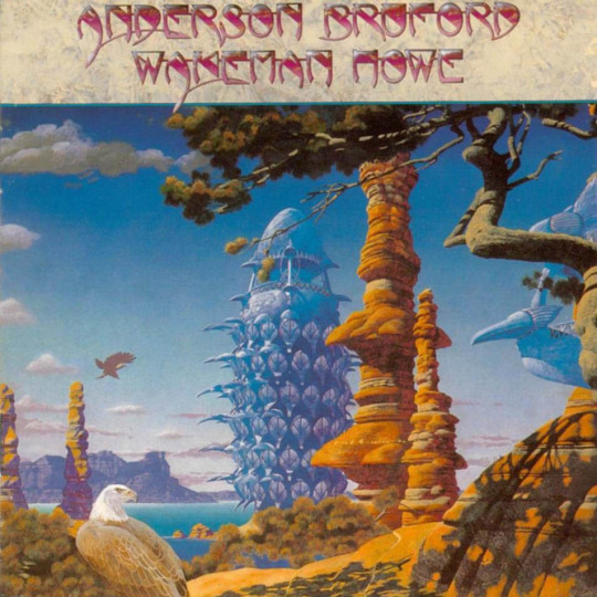
This first example is an album cover Dean designed for Anderson Bruford Wakeman Howe (yes, that is the name of the band). This band’s four members were all previous members of Yes. Their one eponymous studio album in 1989 was illustrated by Dean. There is an interesting combination of vertical and horizontal forms; the tall rocky formations and bizarre architecture intersect with the tree branches and clouds. Despite the overlapping shadows, textures, and details of the environment, the image is not overwhelming. The near-empty sky provides breathing space, allowing the foreground to shine. As you travel farther, the rocks become less saturated, and the shadows become purple. This allow the orange colors of the center-right formation to really pop.

This second example is one of Dean’s most popular album art commissions—that of Yes’ 1974 album, Relayer. I read that the background was painted with watercolor, while the foreground was painted with ink. This sharply divides the foreground and background, prioritizing different elements. The foreground’s rocks and snakes have heavy textures and patterns, emphasizing their hard surface; the background has soft, graceful lines and values, becoming very pale at the furthest point. We assume that the cave/tunnel supports were naturally formed, but the geometric segmentations and indentations suggest something carved or built; the smooth, vertical shapes bring to mind the structure of bark-less trees or fungi.

This third example is from Yes’ 1980 album, Drama. This stood out to me because of the color scheme—black, gray, blue and white make me think of ice crystals. The lined landscape in the foreground is barren, save for the white and black silhouettes of birds and animals. The lighting seems otherworldly—the bottom half of the painting has primarily darker values, but the background mountain has a punch of white and light-yellow hues.

This last example is from Asia’s 1983 album, Alpha. This was an album cover that I recognized before researching Dean. I think people may be drawn to it because of the bizarre juxtaposition in the environment. It’s obviously futuristic from the architecture in the background, but elements of nature are still thriving in the foreground. Plus the pyramid, a symbol of antiquity, is given a sheen and sharply-smooth appearance. The color scheme is primarily cool (greens and blues), but certain details of orange, red, and purple make the elements appear more colorful.
#roger dean#Anderson Bruford Wakeman Howe#yes#asia#album art#1980's album#alpha#drama#relayer#painting#fantasy illustration#fantasy landscape#umassdillustrationclub#illustration#illustrator
11 notes
·
View notes
Text
Illustration Article 08: Shonen Jump Mangaka 02 (Yoshihiro Togashi)
Our second featured artist that worked in Shonen Jump was Yoshihiro Togashi (b. 1966); his work may be similar to Toriyama in terms of genre (adventure, battle, fantasy), but his stylistic and story progression is considerably different. After receiving several awards and honorable mentions in his college years for short stories, Togashi was hired by Shueisha (publisher of Shonen Jump).
Togashi’s first large hit was Yu Yu Hakusho (1990-1994), where a high school delinquent comes across supernatural beings. At first, each chapter was a self-contained comedic short story, with the protagonist Yusuke coming across paranormal beings. Later on, the story was more battle-centered, implementing the paranormal aspect into challenges against demonic and alien foes across. Despite the likelihood that continuing this battle-style manga would be commercially successful, Togashi ended the series rather suddenly, story-wise.
His other, larger hit (in terms of quantity and perhaps popularity) was HUNTERxHUNTER (1998-present), which takes place in a world filled with fighting—both competitive and malicious. It’s hard to be specific, because there are many layers to the fighting style, the society, and the various good and bad organizations that the protagonists interact with. And each story arc contributes something new and different to the story. Personally, I really enjoy the art style for this series; the character designs are diverse and memorable, and each reacts differently to the challenging and unusual situations throughout the story.
Throughout his manga career, Togashi has been lightly controversial due to his inconsistent output of chapters, and the varying quality of the art. I admit that at first hearing, I thought Togashi was simply being lazy or careless; but looking into it, I’m more sympathetic to his decisions. The main criticism towards Togashi is his going on extended breaks (or “hiatuses”) while working on a series. Fans of Togashi’s series joke about HUNTERxHUNTER’s inconsistent release schedule. But with the high demand of pages per week, it may be difficult for artists to come up with all of the story beats and artistic decisions for characters, environments, and so forth. Togashi also suffers from chronic back pain and sleeping problems; the workload likely contributed to poor health.
An artist’s work is first published in a magazine (one chapter per week), and then 8-10 chapters are published in a volume every few months. So even though Togashi sometimes doesn’t make deadlines for the magazine publication, he always corrects the pages and fills in details for the volume publications.
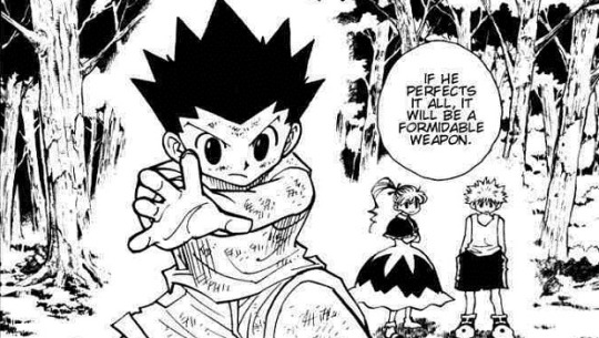
The first example is a climactic moment from HxH; the context of this image is spoiler-ish territory, so I won’t talk about the storyline. So I’ll just say that one character is punching another character… hard. Togashi’s line-work for this series is considerably looser and sketchier than in Yu Yu Hakusho. The anatomy of the figures seems semi-realistic, which are heightened through dynamic posing and shading. The left figure contains various sections of crosshatching; some contour work blends into the hatching lines, but others stand out like the sharp, thick line of the elbow. The left figure is more solidified, but the right figure’s shading is a lot more scribbled and scratched. We don’t see the actually contact of the punch, but there are elements that imply the ferocity of it. The long hair swoops downward, showing the whip-fast motion in a curved arc. And, of course, there are the blood splatters radiating from the bottom of the panel.
The second example is a panel from the third story arc of HxH, featuring a still moment of the main characters. Togashi uses a white aura to separate the characters from the busy tree designs; that’s obviously not realistic, but it’s necessary to make the focal elements stand out. I also like how Togashi draws cute, simple-designed characters; he’s also good at drawing characters of different heights and body types as well. The patterns in the background provide a good contrast to the solid colors of the character’s hair and clothes.
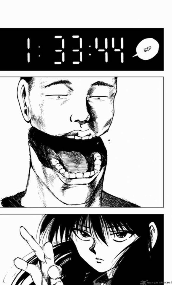
This third example from Yu Yu Hakusho is a still moment during a fight scene… there’s a lot of fighting. There are still examples of crosshatching, but the line-work is more solid and thick, but nevertheless smooth. There is another interesting detail of how Togashi can make stylized faces (like the bottom character), but also showing his knowledge of human anatomy (like the top character—look at those teeth!) The previous example shows simplistic, iconic designs for characters in the background, but he is able to bring detail and nuance to the figures during a close-up.
#yoshihiro togashi#shonen jump#weekly shonen jump#hunter x hunter#hxh#yu yu hakusho#yuyu hakusho#manga#mangaka#manga artist#umassdillustrationclub#illustration#illustrator#fighting
1 note
·
View note