#intrusive thought
Text
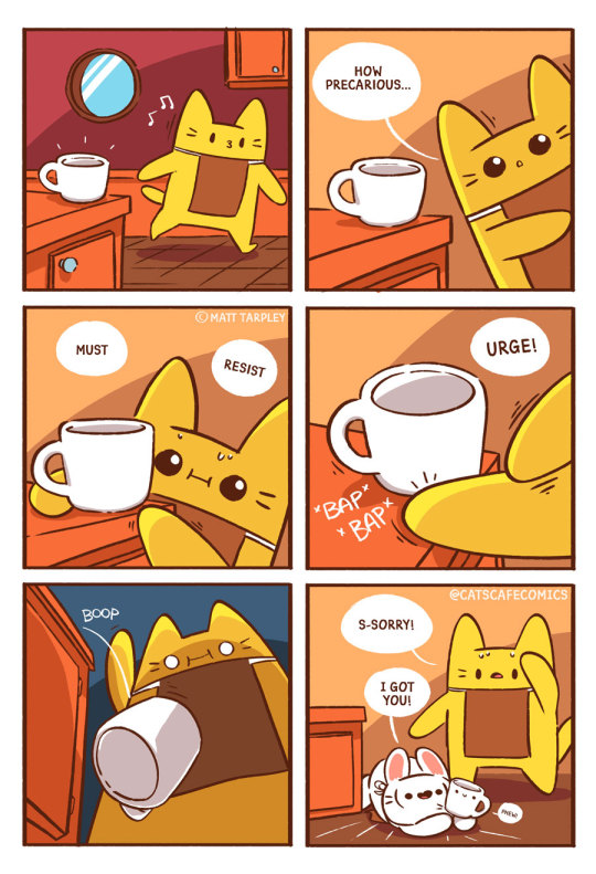
Cat's intrusive thought
1K notes
·
View notes
Text
y’all ever wonder how many smut writers are actually virgins
52 notes
·
View notes
Video
👀😈
#video#tiktok#tiktoks#funny#lmao#relatable#mood#wtf#intrusive thought#intrusive thoughts#adhd#neurodivergent#neurodivergency#sheamac96
89 notes
·
View notes
Text
Say it with me folks
Intrusive thoughts are distressing and repulsive to the person thinking them! That's why they're called intrusive!
Stop calling your impulsive thoughts "Intrusive!"
Impulsive thought: What if I ate soap?
Intrusive thought: What if I drank bleach?
Impulsive thought: What if I trip my friend?
Intrusive thought: What if I stab my friend?
Impulsive thought: What if I cut all my hair off?
Intrusive thought: What if I cut all my fingers off?
Impulsive thought: What if I jump into the lake?
Intrusive thought: What if I jump off the cliff?
Impulsive thought: What if I punch my sibling?
Intrusive thought: What if I rape my sibling?
Know the difference!
8 notes
·
View notes
Text
I wanna chew on my sims like I'd chew on my Barbies when I was 6
20 notes
·
View notes
Text
hey, dont cry. girls that dont tuck, okay?
7 notes
·
View notes
Text


forgot to post this when i made it but here is your crumb of content for the time being /lh
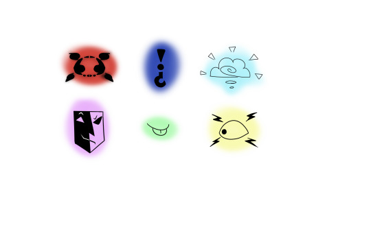
intrusive thought emojis- one expression because when i made these i was experiencing a very specific thing and i wanted to convey That
feel free to use in your server but credit me!
#ell’s emojis#custom emojis#custom emotes#discord emojis#emotes#emoji#intrusive thought emoji#intrusive thought#emotion emojis
242 notes
·
View notes
Text
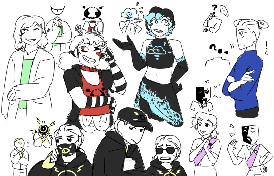
So this is from 2021, but I was on a Sanders Sides kick and had a fun idea - Sidesonas!! Seven Sides, if you will /j
I started out by making my own emblem designs, reassigned the canon colors based on associations with each theme, and then designed the sides from there! In order of the emblem keys, red is intrusive thoughts; dark blue is logic; light blue is creativity; lavender is morality; green is deceit; and yellow is anxiety!
I initially was going to draw a lot more of these guys at the time, but stalled once I discovered.... I did not match the colors to my own skin and hair tones very well orz.... So how I'll handle that going forward is tbd, but I'm very proud of the results otherwise and would love to play with this concept again! Honestly I may even oc-ify them, the objecthead alternates in particular just sounds like fun to work with...
In-depth design notes under the cut:
Intrusive thoughts:
Ironically, despite the placement on the key, Intrusive Thought's emblem was actually the very last design I came up with! It's a Rorschach-inspired blot mirroring Anxiety's emblem, to tie the two in since for me they're heavily connected concepts.
Red was a given color as for me, most such thoughts are, well, violent.
Designwise, the sona leans heavily into my more goth/guro/yami kawaii style tastes!! Pretty straightforward given my fashion and art tends to be influenced at times in this way
Logic:
For me, logic functions a lot on questions and answers, if=then statements. The question mark thus felt fitting, and an exclamation point for that 'aha!' moment felt like a good closure to it
I have to say it, Sanders's dark blue IS a very good logic color. Can't say any of the others vibed as well to me so I just stuck with it.
Ironically, this sona looks the least like me - not necessarily to divide it from me further, but just because I like leaning into that straight, angular look for such character types. I've worn that hairstyle in the past though and found it incredibly functional at the time, so it was 'logical' to use it here
Creativity:
Ironically this emblem gave me troubles - fortunately my partner suggested 'brainstorming' as the angle to use, and it all fell into place from there!
Since I used cloudy imagery, but wanted to keep the vibes bright and promising, I used light blue here!
This sona's design was Also a challenge - my creativity is broad, varied, and expresses myself in so many ways (True to the canon sides, intrusive thoughts also got a good chunk of some other ways my creativity has been channeled) - I settled on my tendency towards sleek elegance, as in outfits and in fashion/character design, this tends to be where I lean innately. I added touches of an oc I most associate with my creativity, Masafumi, and it felt complete!
Morality:
Morality for me is not an easy topic to navigate, and can be a double-edged sword in my experience - so I made the emblem to reflect that. Sanders Sides covers the good aspects of morality well, but I wanted to capture more how it can be weaponized as the focus - and how that's what has been internalized for me.
I can't honestly recall the thought process on lavender - might just have been purple was the last color to assign - but since purple is a warm and cool color mixed together, it felt right for the complexity of morality.
This sona is a (former) girl scout! That time in my life was probably the best setting for where my own practice of morality was showcased. I'm happy to say this is not where most (if any) negative experiences stemmed from, but it was where I tried to exemplify being a good, moral person the most, so the sona reflects that!
Deceit:
Had fun designing this one - the emblem is a scowling eye or mocking tongue, depending how you look at it. Both felt fitting for what my deceit often hides - namely, variations of contempt and/or a lack of respect.
If memory serves, I went for a rather artificial mint green to lean into the core of this sona's theme - an imitation of something natural (fake plants vs real ones for example).
This sona leans into more comfortable, girly looks I've worn on rare occasions - both in reference to my complicated relations to gender (and how my presentation doesn't reflect it well); and to seem as nonthreatening, polite, and soft as possible. In other words, this sona isn't so cartoonishly evil as Janus Sanders, but could be considered just as devious in their own way.
Anxiety:
Emblem took some time to sort out, but the eye imagery felt too perfect even if it was on the nose
yellow is often a happy, exciting color, but I also associate it with shock or alarm due to its bright, eye-catching tints so I applied it here
Frankly I just pulled from my high school years for this sona's look lmao. Not much to say other than it was so hard to settle on which social aversion headgear item I've used to maintain for the final design. I went for the hat since it both blocks eyesight and would hide my hair but the mask and glasses are still good alternatives imo
#art#fanart#digital art#sanders sides#sidesonas#sonas#sona#sidesona#gore cw#for intrusive thought lmao#character design#design concept#ocs#yeah why not lol#ts sides#tss#logic#intrusive thought#anxiety#deceit#morality
3 notes
·
View notes
Text
So like I know orochimaru wanted sauske specifically to be his vessel on account of his sharingan, but didn’t orochimaru also have access to a shit ton of sharingan given that he had helped with danzos arm implant… seems like a hassle to have gone through the paper work for the sound village chunin exams
#is it like an expanded upon down the line loophole thing#or am I just really tired because it’s 3am and having intrusive naruto thoughts#intrusive thought#orochimaru#danzo#naruto#sharingan
24 notes
·
View notes
Text
They call me Lil Caesar because I'm always hot-n-ready
23 notes
·
View notes
Text
My OCD: *insanely homophobic and racists shit *
Me: Could you stop that?
My OCD: You have the floor🤷
Me: Do I have the floor😤 Do I?😤
My OCD:

#this meme came to me literally in the middle of the night#intrusive thoughts be like#intrusive thought#obsessive compulsive disorder#ocd be like#who else knows it#personal#ocd meme
15 notes
·
View notes
Text
is it just me or did we all feel started being mentally ill at the age of 9-12?
#su1c1de#homoc1de#mdd#bpd#depression#social anxiety#anxiety#mania#hypo mania#manic depression#bipolar#manic posting#actually mentally ill#actually bpd#actually borderline#actually adhd#mentally unstable#intrusive thought#mentally ill#relapse#manicposting#depressiveepisodes
108 notes
·
View notes
Video
Not one of my better ideas
#video#tiktok#tiktoks#funny#lmao#relatable#mood#wtf#intrusive thought#intrusive thoughts#youthpastorryan
55 notes
·
View notes
Text
sometimes i see endowed trans women talking about their hogs
i guess i have a piglet?
#why did i write this#196#shit posting#dumb af#im sorry for making you read this#intrusive thought#dont rb
4 notes
·
View notes
Text
Maybe the real strangers were the friends we made along the way
2 notes
·
View notes
Text
The side eye won’t make me go away
You can’t blink me out of your vision
Look at me
I’m your savior and this is the thanks I get?
Next time you fall don’t expect such a familiar face
I’ll be the one to bury you
9 notes
·
View notes
Last Seen Blogs
almostarts
Almost Arts...

breastcancerucgconferencesblog
Untitled
drygrassland
thebookofjob

texasrangers
The Rangers on tumblr

yoyo-bingxue
无标题