#it used the classic illustrations from the original books and looked so pretty
Text
I bought a deck of tarot cards last year because some of the TTRPGs I got from itchio required a deck. I went with the Modern Witch deck because yay women's empowerment let's go lesbians the future is female #WomanInTotalConrol(of)Herself yay woo ♀️
But then now that copyright has expired there's a Winnie The Pooh deck and like. I want it 🥺
#'but Arctic can't you just buy an extra deck?' absolutely not it's not even a money thing it's a I'm A Chronic Horder Thing so like#evil Noah's ark where it's ONE OF EACH AND NO TAKE BACKSIES#anyway#the tarot of pooh#or something like that i don't remember what it's called#it used the classic illustrations from the original books and looked so pretty
11 notes
·
View notes
Text
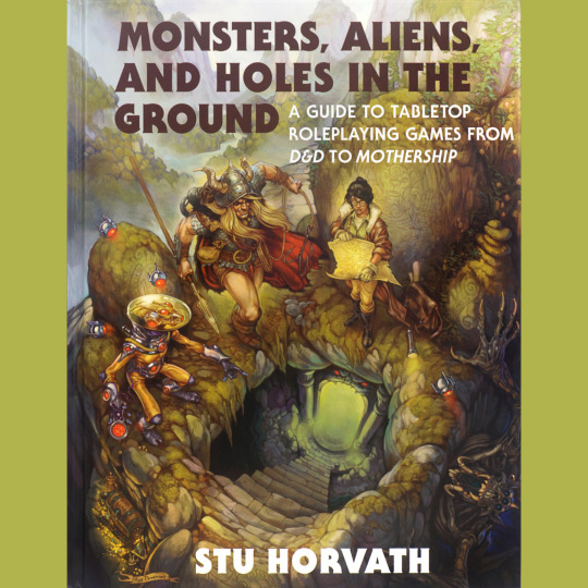
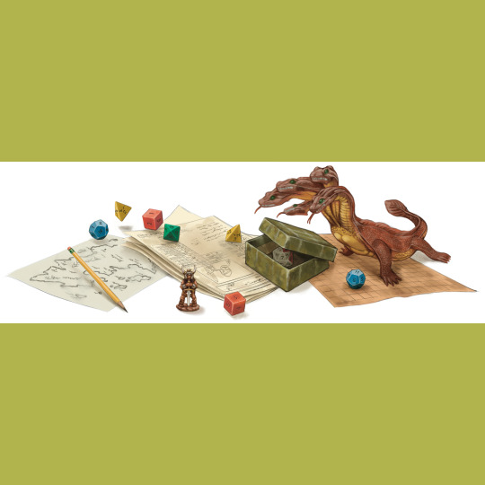

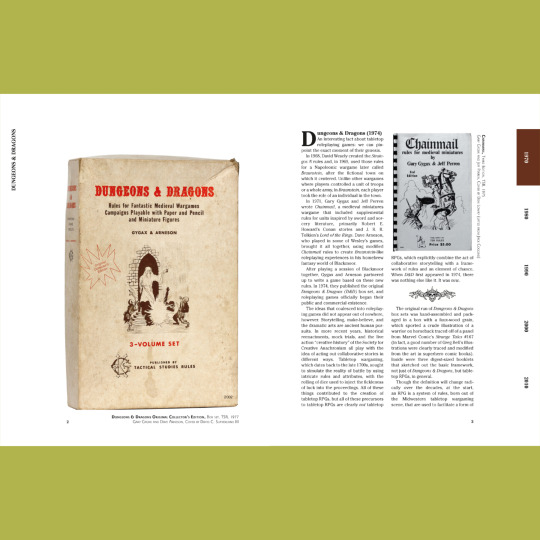


Hey! HEY! This is my book, Monsters, Aliens, and Holes in the Ground, coming to a bookstore near you on October 10, 2023 thanks to MIT Press. Pre-orders are live now pretty much everywhere, though I recommend using Bookshop.org, as I have been impressed at their packaging skillz. I have a real live copy of the book in my possession and I gotta say, it’s pretty neat.
What is the book? It’s a look at the history and development of tabletop RPGs, one product at a time, arranged in chronological order across five decades. It’s sort of like this Instagram feed, actually, but way more polished, and, you know, on paper. I covered the classics, but this is also very much an exercise in expanding horizons — I hope there is at least one game featured for every reader that they never heard of. To that end, there are lots of lesser known games, weird games, silly games, even a couple board games. All pulled from my collection, all illustrated with something like 350 photographs.
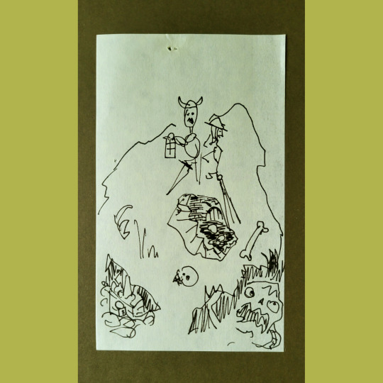
There’s original art, too. Kyle Patterson did the amazing cover, somehow transforming my deeply silly post-it sketch (last slide) into a canny encapsulation of the RPG experience. He did a two-page spread introducing each decade, and effortlessly capturing its essence. He also did a handful of gorgeous spot illustrations. All of Kyle’s art makes me low-key angry. How dare he be so talented? I’ll share more of it, and some sketches, later on. You’ll be annoyed by his talent, too, I guarantee.
We (that’s myself and Derek Kinsman, who did the layout) also filled some empty spots with rights-free art from Amanda Lee Franck, evlynmoreau and natetreme, which is pretty rad - Amanda did the wizard van in the next to last slide - and also some Giovanni Battista Piranesi, cuz that dude had aesthetic for days.
And there you go, a first taste of 450-something pages of full-color RPG goodness. Go snag a copy now, yea? (Worth noting, this is the Standard edition. I’ll show you the Deluxe edition tomorrow.)
#rpg#d&d#dungeons & dragons#tabletop rpg#roleplaying game#ttrpg#MIT Press#Monsters Aliens and Holes in the Ground
607 notes
·
View notes
Text
A monstrous tripod, higher than many houses, striding over the young pine trees, and smashing them aside in its career; a walking engine of glittering metal, striding now across the heather; articulate ropes of steel dangling from it, and the clattering tumult of its passage mingling with the riot of the thunder. A flash, and it came out vividly, heeling over one way with two feet in the air, to vanish and reappear almost instantly as it seemed, with the next flash, a hundred yards nearer. Can you imagine a milking stool tilted and bowled violently along the ground? That was the impression those instant flashes gave. But instead of a milking stool imagine it a great body of machinery on a tripod stand. [...]
Seen nearer, the Thing was incredibly strange, for it was no mere insensate machine driving on its way. Machine it was, with a ringing metallic pace, and long, flexible, glittering tentacles (one of which gripped a young pine tree) swinging and rattling about its strange body. It picked its road as it went striding along, and the brazen hood that surmounted it moved to and fro with the inevitable suggestion of a head looking about. Behind the main body was a huge mass of white metal like a gigantic fisherman’s basket, and puffs of green smoke squirted out from the joints of the limbs as the monster swept by me.
Let's talk tripods! Every artist and fiilmmaker has different interpretations of the fighting machines. It's not hard to picture a towering three-legged alien death machine, of course, Wells gives us a good picture of what they look like, but I want to go over a few depictions of them and compare them to his written description, in no particular order, because I think it's interesting, and I think WOTW might actually be a special interest:

Wells drew this one himself. It's a stick figure, of course, but this was how he pictured them. I especially like the little guy going "oo-er!" at the sight of it, almost in polite terror.
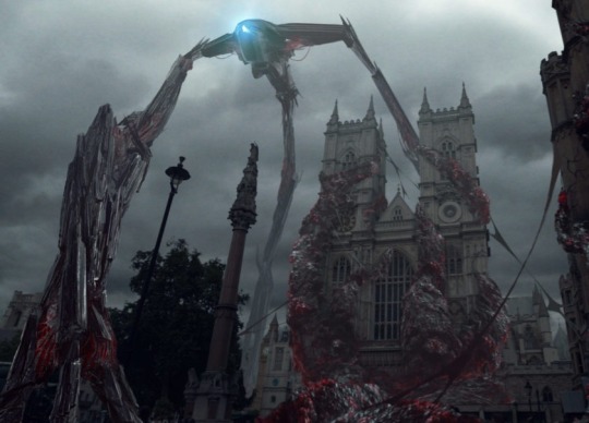
The BBC version. To me, this one owes a bit more to Transformers design-wise, and moves like the Cloverfield monster, like the MUTO, like a lot of giant monsters we've seen in recent years, terrestrial or otherwise. But they are still menacing, and they actually make a clear "aloo!" noise when calling to each other. I've got to give them that, even though the BBC screwed up the Martians, the cylinder, they kept going on about Russia, the whole "you can't marry her, you're already married to your cousin" bit. It was a mess.

The Edward Gorey illustrations. O is for Ogilvy, burned like the flag. P's for the Parson, oh, what a drag. Sorry. This is basically a flying saucer with legs. Bit silly,but the tentacles are there, and the legs aren't the stiff kind Wells hated. Which brings us to...
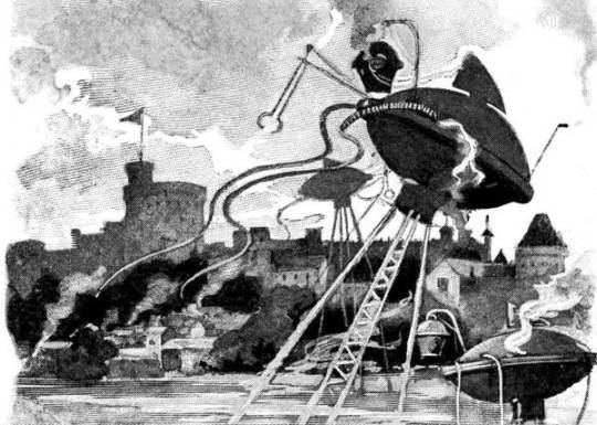
Warwick Goble's illustrations from the original publication of WOTW in Pearson's Magazine. Wells famously hated these so much that when WOTW was published as a book, he wrote a segment into the story ragging on these stiff-legged water tower tripods. I think Goble took the milking stool description too literally, his tripods are always drawn tilted.

The 2005 Spielberg tripod. Great. Massive. Scary. Everything is there. The tentacles, the Heat Ray arm (two even), the suggestion of a head, even the basket. Say what you want about this movie with its excessive amount of Tom Cruise and young Dakota Fanning screaming, but the tripods are fantastic. Damn near perfect even. I think Wells would be very pleased.
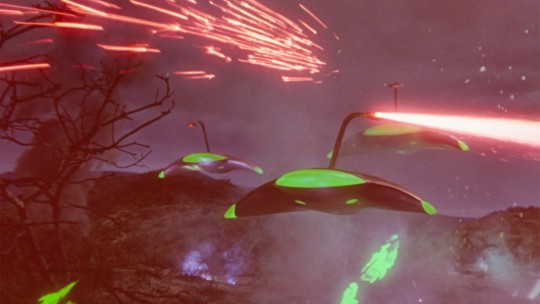
The 1953 design. I am very fond of these, they're a great classic sci-fi ship, but they're more akin to the flying machines than the tripods. The filmmakers try to loophole their way out by talking about invisible electrostatic legs (which you can see when the machines initially appear) but I'm pretty sure they went this route because the film was getting more and more expensive and the budget wouldn't extend to stop-motion for the legs. Still, a wonderful creation, the goose neck/cobra head design for the Heat Ray is a good touch and my god, the hissing, ticking noises these things made. Love them.
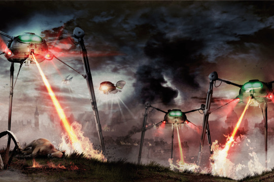
The Jeff Wayne musical design. My favourite. My beloved. My nightmare fuel. Totally iconic. I'm sure when most people think WOTW, their first thought is the legendary album cover featuring one of these monsters melting the Thunder Child's valiant heart. Doesn't make them book-accurate though. The Heat Ray is built into the chassis, it's all one unit rather than a separate head on a body, the basket was given to the handling machines, and they are stiff-legged in stills. But they're scary in motion, and their howls still give me the jibblies. OH GOD, THOSE HOWLS. Opening Horsell Common And The Heat Ray on the Highlights album with that scream isn't fair!

Henrique Alvim-Corrêa's illustrations for the Belgian publication, and Wells' favourites. The effects of the Heat Ray are chilling, and they're definitely sinister when there's a lot of them just standing there or coldly blasting humans. But I'm just not sold on those googly eyes, they make them goofier. Although when these designs were used for the War of the Worlds 1913 indie game (which I still need to play) the eyes were just blank. Redemption!
514 notes
·
View notes
Text
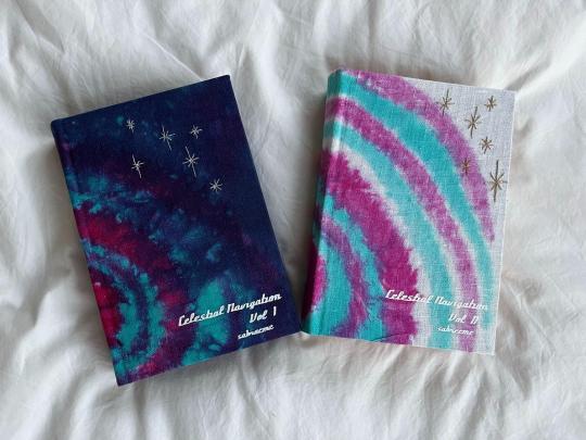
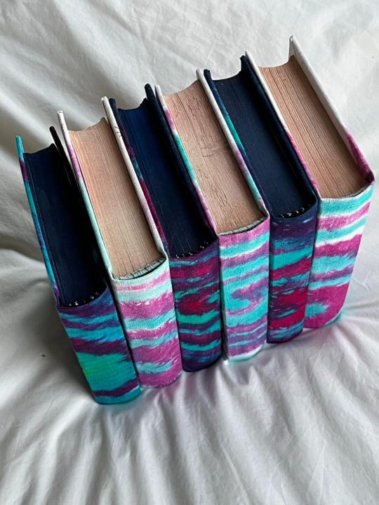
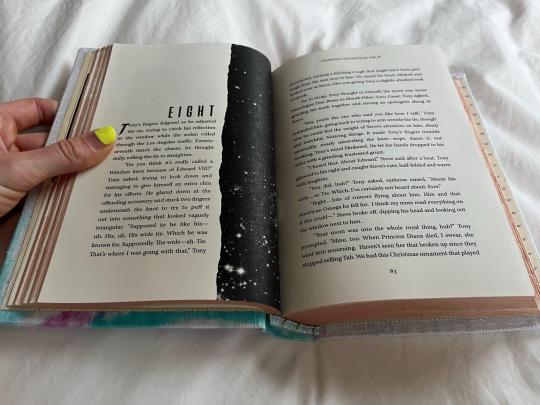
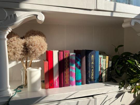
Celestial Navigation by @sabrecmc
18 year old Omega!Tony finds himself Bonded to Captain Steve Rogers. He isn't happy about it until he is.
An absolutely gorgeous story of learning to love yourself, even when you feel like you don't fit in & that you grew up wrong. I'm so happy to have gotten to bind this mammoth work for Sabre & as a gift exchange for @mourningmountainsbindery (who bound me this beautiful copy of Astolat's Let the River Run—JUST LOOK AT THAT COVER!).
Also to anyone who has @ed me lately (looking at u, em @powerful-owl & tacky @tackytigerfic particularly) & I've been derelict in responding, here is WHY.
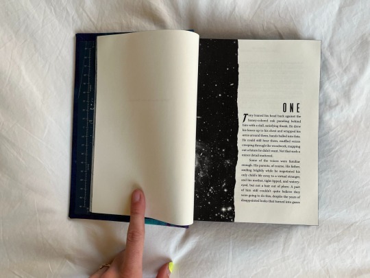
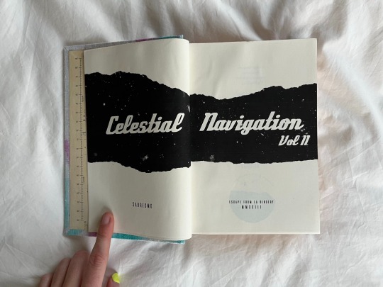
This has been the longest binding project I've undertaken, both in page count and in time. My original message to Sabre was on March 16th—can't decide if I want to use the laughing or crying emoji here—and the colophon says I made the book in April 2023 (which was when I started typesetting, maybe). I had been randomly perusing dying videos on Youtube in bed on a Saturday morning, as one does, and came across a video showing how to spiral tie-dye. I IMMEDIATELY had a design premonition of the full design for this fic as a two-volume set, planted into my brain wholesale by the binding gods. I learned many new techniques throughout the process (edge painting, edge trimming/sanding, tie-dying/dyepainting, embroidery, typesetting meta from tumblr which copy-pastes with the worst goddamn formatting in the world, kill me now). Overall, alternately extremely painful & wonderful, and I'm extremely proud of this set.
Design-wise, I went whole-hog with the scifi stars theme. Endpapers are recolored versions of the star charts from the Apollo 11 mission:
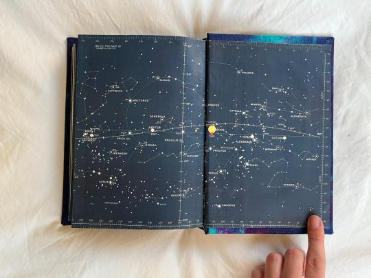
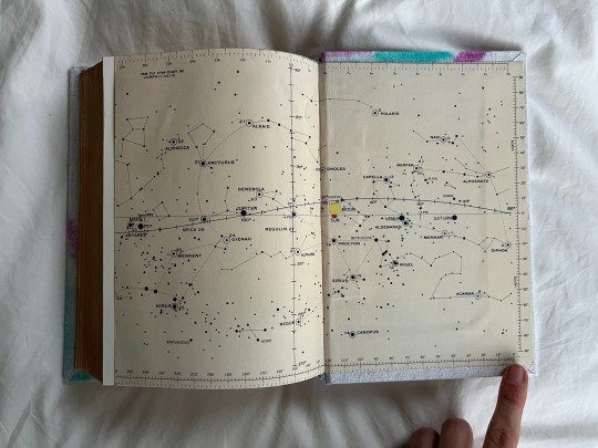
Title page & chapter titles are both rips in the galaxy:
Epigraphs both star-themed:
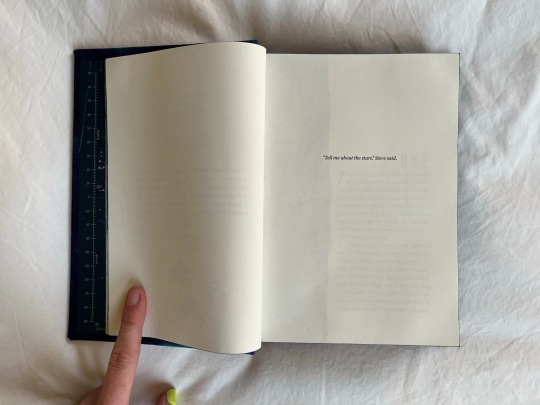
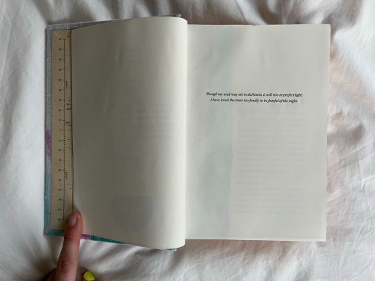
Some more glamor shots because I'm so proud 💕
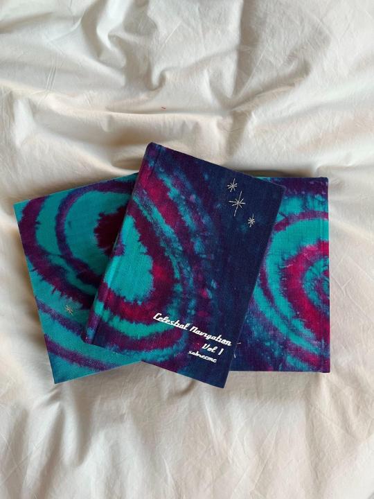
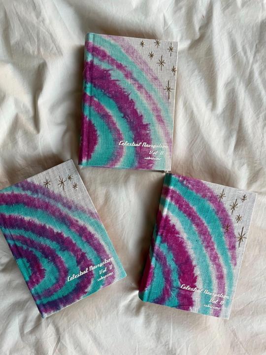
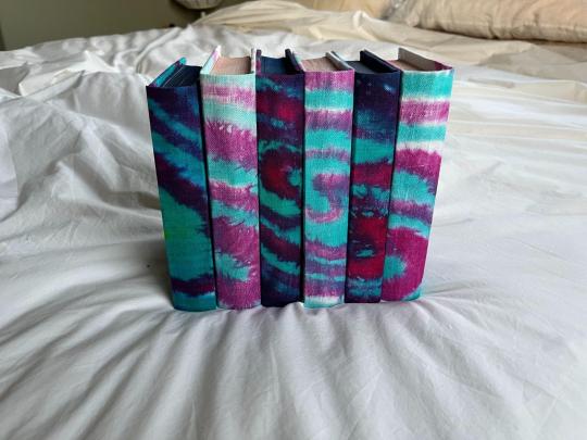
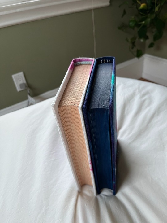
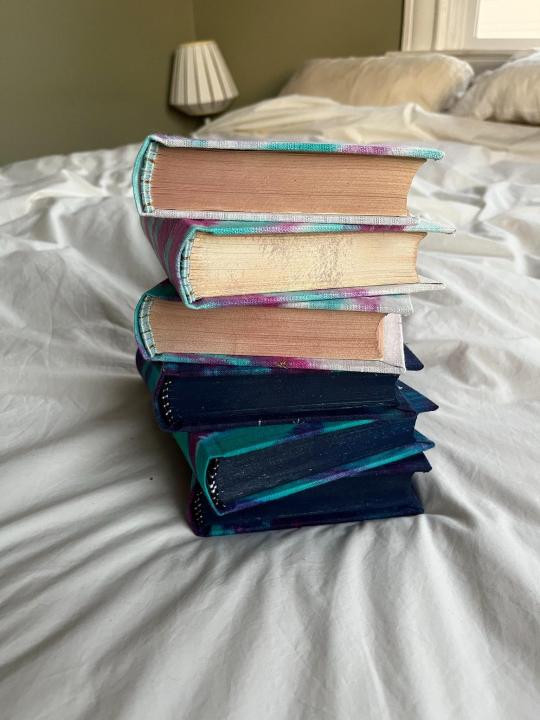
8.6 lbs // 3.8 kgs worth of books (~3000 total pages) 🥰
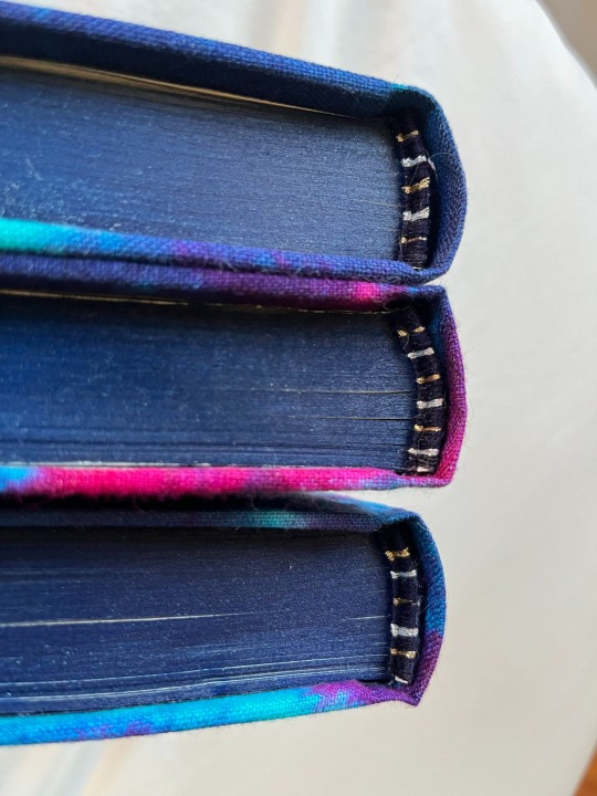
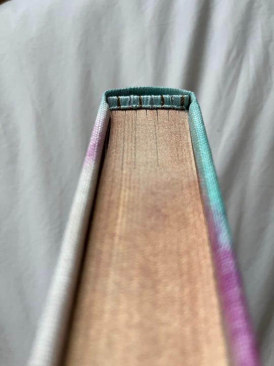
Celestial Navigation is also INCREDIBLY popular, and Sabre has been incredibly generous answering asks on her tumblr + writing additional one-shots in the universe. There is also a veritable volume of fanart. I was so inspired by seeing @robins-egg-bindery copy of ********, with its appendix of fanart & meta, that I promptly copied them.
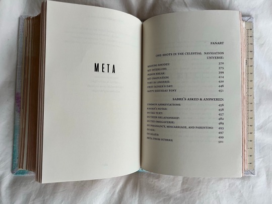
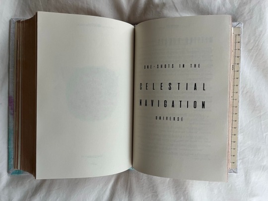
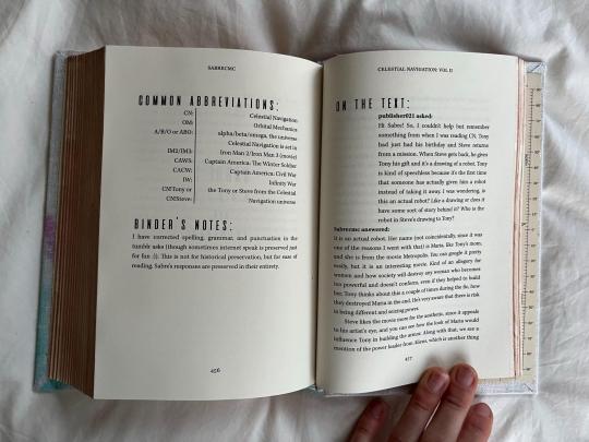
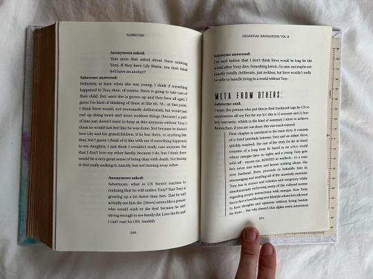
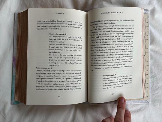
fanart redacted because lots of the artists are no longer active on tumblr but just know i am ECSTATIC about the amount of art in these books
Lastly, I love how @clovenhoofbindery includes their 'Illustrator mess' with their bind posts, as a behind-the-scenes look into the wild process of designing these books. I don't actually have an Illustrator mess for this book (the chapter titles & title page pretty much came in one take), but I do have a DYING MESS. It took me sososo many tries to figure out how to get the dye to look how I imagined in my head. I ended up 'dye painting' instead of tie-dying in the end, but my inbox is always open to chat hand-dying/tie-dying/dyepainting (or what I did differently between any of these attempts). Numbers are the dying attempt.

Last process shot: I hand-dyed variegated linen thread to match the colors of the bind, which ends up being incredibly difficult to see on the finished bind, but was super fun while I was sewing!
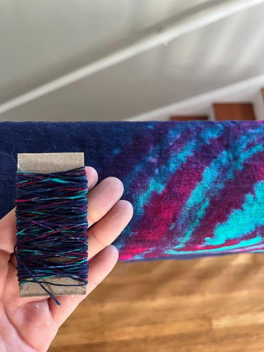
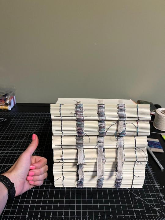
Materials:
Body font: Kepler
Title font: Compaq 1982
Chapter number font: aliens & cows
Endpapers: recolored versions of the star chart used by Michael Collins during the Apollo 11 mission (archived at The Smithsonian)
Bookcloth: dyed using Dharma Trading Procion Fiber-Reactive Dyes
Title page and chapter headers: designed in Photoshop using the Ultimate Space brush pack by jeffrettalyn on DeviantArt
Metallic embroidery thread: Cosmo Nishikiito thread
I would dye for this embroidery thread. It is LIGHT YEARS better than the classic metallic embroidery thread from DMC: much easier to work with & much more sparkly. Literally so eye-catching; it truly doesn't translate to photos.
Paint for edges: Daniel Smith watercolor tubes in Iridescent Sunstone and Prussian Blue
Note: these are GORGEOUS watercolors. The color is so saturated and strong and beautiful BUT I don't think I'd recommend watercolors for edge painting. They went on very differently depending on the grit of the sandpaper I used for the edges + they sometimes bled into the pages + they had to be set with fixative, which then stuck the pages together.
#blood sweat and TEARS into this bind#and now it is DONE my god#stony#stony fanart#celestial navigation#my fanbinding#posts i actually wrote
129 notes
·
View notes
Text
So for some reason I got the idea of designing palaces for “all” of the WOF tribes. The specks that appear in most of these are supposed to be dragons to give a sense of scale.
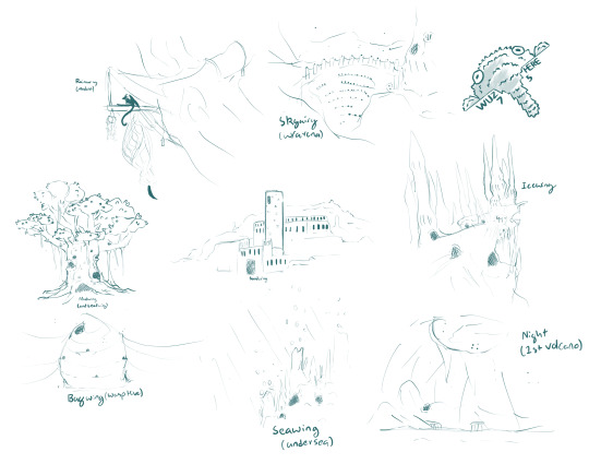
From top left to bottom right
Rainwing (Modern)
-Modern Rainwings don’t really have “palaces” or separate households for the royal family.
-Most Rainwing “houses” are comprised of a covered platform and a hanging nest (the nest is mostly used by dragonets or for storage). The only difference for the “palace” would be a larger platform for social/diplomatic events, plus some extra adornments.
-The “old” Rainwing palace (not illustrated here, think the Queen Anaconda days) was a far more grandiose structure long sense destroyed in some unknown war (think the classic “lost jungle temple”). Scattered ruins of it can still be found around the main Rainwing village.
Skywing
-Mostly just the arena; it’s constructed out of a natural “bowl” at the base of some big cliffs. It was commissioned by some queen who wanted a big space for grandiose events, with the royal family eventually moving into a structure next to the arena after the old palace got destroyed in some war.
-The palace is mostly buried into the cliffs. Its pretty modest, at least for Scarlet-types (everything’s still probably gilded and studded with jewels)
Mudwing
-A prehistoric tree that has been carved out over time.
-The tree itself is likely older than the Scorching, a relic of the time when the Rainforest extended further into the Mud Kingdom. In modern times, while the area around it is still very tropical, but there are no trees remotely of its size around it.
-Even before being used as the palace, Mudwings and Rainwings alike had lived in hollows in its side for generations upon generations. It got moved into by some hippie queen who thought it would be badass to live in the big-ass tree that probably technically exists in another tribes territory but they chill.
-Likely amunis-touched or otherwise magically enchanted; no matter how much it gets tunneled into, the tree stayed alive.
-Historically, the palace has also took the form of large adobe buildings or wood cabins depending on what materials they have around.
Sandwing
-Originally built as a military fort; most previous palaces had been more on the eastern side of the Kingdom. Almost every queen that has occupied it has thought about building a new one; not one has ever gotten around to it.
-Bum fuck in the middle of nowhere
Icewing
-The only remaining palace that has been continuously used as the palace since its creation.
-Created out of an enchanted glacier overlooking the sea. Over the years many additions have been made, magically created or otherwise It looks utterly insane and defies all laws of physics. Largest palace if you don’t count the whole Wasp Hive as a “palace”.
-It’s considered rude and against tradition to try to remove additions made by previous queens, though many work around less ascetically pleasing features by covering it up with even more stuff. This ends up with kind of a full-on Winchester-house situation, there’s a whole bunch of unused rooms and staircases that go to nowhere.
Bugwing (Wasp Hive)
-I don’t have much to say on this one; this is just what the wasp hive looks like (the actual palace is more like a penthouse somewhere in the middle of it).
Seawing
-I originally was just going to do hydrothermal vents some amunis created; but then I remembered “bubble gardens” where described in the books, so the hydrothermal vents, while still warm (enough to incubate eggs), they aren’t scalding and spewing volcanic fumes
Nightwing (1st volcano)
-This is what the first Nightwing palaces that was created on the volcanic archipelago (not Vigilance era, but maybe the next generation afterward). It’s inside of an extinct volcano that has filled with water (inspired by that one part of 20,000 leagues under the sea). There’s smaller caves that have been carved in the sides, with docks built out into the water.
-This got destroyed in one of the subsequent periods of activity of a the volcano on a nearby island.
-I don’t know what the “old kingdom” palace looked like (maybe like a cave hidden behind a waterfall.
Anyways Leafwings don’t really have a palace because that’s not really part of their culture (“the queen sleeps among her citizens”). A whole colony of Leafwings might end up living in a tree similar to Mudwings, but just one hollow would be reserved for the queen.
144 notes
·
View notes
Note
Hello! I have a question for you and your followers. First I love the newsletter - I even signed my mom up for it and I'm enjoying my second year read through! But I also want to get physical copies of the books. My mom kept our old copies and refuses to let me steal them back to my home, so I figure I'm ready to get my own set. I figure there must be some really pretty editions/publications of the series out there (and of the hobbit and silmarillion too). Do you know of any versions of the series - whether by fan creators or big publishing houses - that are really gorgeous editions of the books?
Hi!
Fist of all - thank you so much for your kind words! I'm so happy you're enjoying the newsletter (again!), and I hope that your mom does as well! 🥰🥰
As for the LOTR editions - I for example love the English edition I own, which I got from a very dear friend (the one I have is the left one in the tweet below). It has Tolkien's illustrations in it, the cover underneath the dust jacket is very minimalistic, and the sides have the One Ring inscription on them, it looks amazing. And it looks great inside, too, there's a tiny bit of color for example in chapter titles, which I really enjoy. And you actually get all of LOTR in one book like jirt intended.

There's also this one, also by Harper Collins, which I really like because it uses Tolkien's originally unused dust jacket designs which he made for the first edition of LOTR.

Then there are these pretty classic editions by Mariner, which have very minimalistic covers and I love that - I actually have The Hobbit from this series! They feel like a pretty obvious choice to show you, but I really do like them a lot.
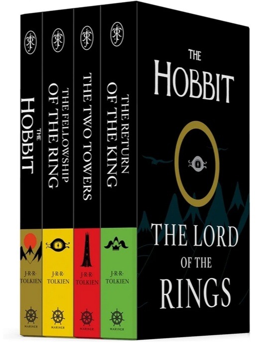
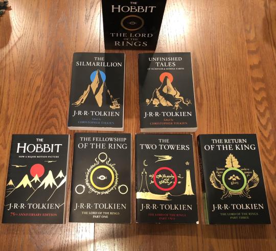
And then there's this pocket-sized box set by William Morrow which I ADORE. It's so minimalistic and simple and small. I love it so much.

And there are also these STUNNING versions but I'm not sure you can commission the author because he does bookbinding as a passion project. But just look at them, they're gorgeous:
I hope you see something you like here and I definitely encourage others to share their favourite editions!
26 notes
·
View notes
Text
Deck Review: The Wonderland Tarot
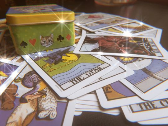
Deck
The deck is The Wonderland Tarot by Chris and Morgana Abbey. I got mine from Amazon, but you can find it at most occult stores. It’s a pretty standard deck and I’ve seen it sold for as low as 12 bucks so it’s very easy to get. I picked this one because I love Alice in Wonderland, and I love cards that come in tins. It’s playing card size so it’s one of the easiest to shuffle and the tin makes it easy to travel with. The imagery is based on the original book and illustrations. Some of the cards are very ugly and charming at the same time, very classic Victorian-era caricatures of royalty and such.
Booklet
It is almost a one-to-one copy of Rider Waite deck in imagery but the suits are changed. Wands and Peppermills, Swords are Flamingoes, Coins are Oysters and Cups are Hats. The Major Arcana is all the same. The deck can also be used as a regular playing card deck using only the minor arcana. There are two extra cards that serve as title cards, it’s a picture of Alice looking in the mirror, one card is normal and the other is flipped. They don’t have any meaning in the booklet, but I usually give them a ‘Happy Squirrel’ type of meaning, aka stop asking the cards and go outside, or use it to determine yes or no.
The booklet tone is very harsh and confusing, the interpretations are based on Waite's Pictorial Key to the Tarot so it's very. victorian esoteric. It’s hard to apply modern situations to some of the guidelines so in general I combine what the booklet says with everything I know about Alice in Wonderland and the regular Rider Waite deck.
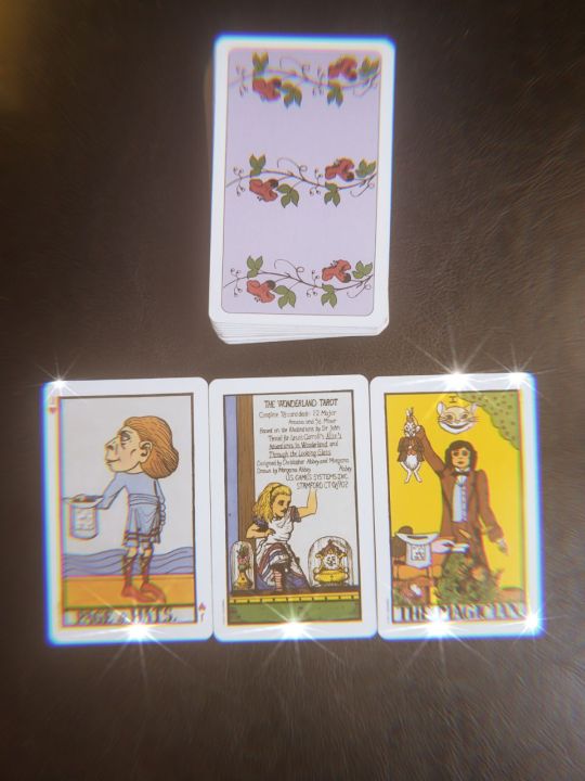
Spirit
Puka is love, peace, and harmony of all things.He is an incredibly devoted spirit and always bounces back from the hardest times with always something good to say about it. I’ve been working with him for most of my life, connecting over similar autism special interests and inspiring me through my family troubles. He is excellent at handling chaos and soothing it back into a more manageable form. Relates very well with current or former Christians. His tag is 'adamkvi'
Reading Style
Puka really does give the best advice if you know how to find it. He is tricky to read with because, like Wonderland, there are multiple meanings and metaphors at play. Sometimes cards are pulled reverse but, within the context of the reading SHOULD be upright. Sometimes what is not in the reading is more important than what is. This also means that the readings are never the same, what a Frog symbolizes to one person is different to someone else. However, every message is always meant with the best intent.
Suggested Readings
I usually do readings about romance or love questions, self-confidence and inner child healing. Working with him has also helped a lot with judgments and shame around sex, being queer, and strengthing found family. He specializes in processing guilt and shame, purity complexes, and generational trauma.
To book a reading please fill out this form! To check out our other services visit our website!
#tarot#tarot cards#tarot deck#divination#cartomancy#magick#magic#witchcraft#witchblr#witches of tumblr#pagan#paganism#spirituality#spiritual#alice in wonderland#adamkvi#mysmyf#alice in wonderland tarot#playing cards#pop culture paganism#pop culture pagan#pc pagan#pop culture magic#pop culture witchcraft#pc witchcraft#pc magic
4 notes
·
View notes
Text
2022 Reading Log, pt 29
My life has been tough lately, so I do what makes me happy. Read books about monsters.

141. The Old Snatchengrabber’s Big Book of Child Eating Monsters by Mike Rosen. This is not beloved British children’s author Mike Rosen, or asshole Republican pundit Mike Rosen. This is a different one. This book is a collection of folkloric bogeymen, illustrated in a cartoony style. Most of these are European, but some from around the world do appear. Some liberties have been taken with the monsters at hand, mostly in the art—the yara-ma-wa-yho, for example, is an amorphous blob instead of a hairless monkey-frog, and Krampus is both female and thicc. Brief, but pleasant.
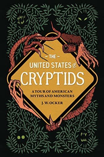
142. The United States of Cryptids by J. W. Ocker. I’ve quite enjoyed Ocker’s Season of the Witch and Cursed Objects, and I quite enjoyed this book as well. The book is as much about crypto-tourism as it is about actual cryptozoology. As such, it takes a pretty broad view of what a cryptid is, including various UFOlogical entities, as well as folkloric entities like the wendigo or Navajo shapeshifters, if they have places to visit or sell merchandise for. It’s also pretty respectful, acknowledging that those aforementioned Navajo shapeshifters, for example, are taboo to a lot of Navajo people still. Ocker has clearly done his homework, and acknowledges that creatures like the Ozark Howler are modern hoaxes, as well as suggesting some very obscure monsters that are ripe for becoming tourist attractions (such as the Derry Fairy, the Prime Hook Swamp Creature and the Kodiak Dinosaur).
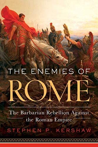
143. The Enemies of Rome by Stephen Kershaw. In some ways, this is the best whirlwind tour of Roman history I could imagine, covering events from the mythical foundation of Rome to the last of the Western emperors. It is most interested in what the Romans thought of the various people they fought and usually defeated, and how Romans built their own identity as separate from “barbarian”, even though they themselves were barbarians from the point of view of Greek culture, which they wholeheartedly appropriated. A lot of time is spent in the late Republic era, which I appreciated. Too often, books about Rome written for a popular audience skip straight from the Punic Wars to Julius Caesar. One thing I didn’t like, however, was its constant use of modern neologisms. “Fake news”, for example, shows up more than five times before I stopped counting. It was cute once, but rapidly became irritating.

144. Flying Snakes and Griffin Claws by Adrienne Mayor. This is a collection of short articles written for various magazines and websites by Mayor, collected and occasionally updated. Most of them are on the subject of weird ephemera of the classical world, often times animal themed. Examples include several articles on tourism in Greece during Roman times, a history of Roman perfumes, the use of weasels as household mousers in the Classical world, and of course writings on Greek and Roman monsters. The book includes her original article proposing that the griffin is based on Protoceratops fossils, and the argument is pretty much just “I went looking for a real animal that looks like a griffin, because I couldn’t imagine that it was a symbolic hybrid, and this is what I found”. In the foreword, she refers to that essay as “embarrassing”, although whether because she has repudiated that (very poorly supported) hypothesis or merely because of its fannish tone addressed to Jack Horner, remains unsaid. I can’t say I recommend this book, but I didn’t consider reading it a complete waste of time.

145. Eaters of the Dead by Kevin J Wetmore Jr. If I could describe this book in one word, it would be “sloppy”. It is a survey of folklore and mythology related to cannibals and man-eating monsters. It seems, at least at first, to be arguing for a hypothesis that all cannibal monsters are embodiments of fears of survival cannibalism, but seems to give up on that thesis half way through. Possibly because the author realizes it’s a non-starter. For example, he claims that ghouls represent a fear of survival cannibalism in the Arabian Desert, before revealing that modern authors consider the corpse-eating and grave-robbing aspect of ghouls to be a Western appropriation in gothic literature, as opposed to an authentic folkloric belief. It also pairs some ideas in very odd ways and acts as if they make sense, like discussing both feeding the dead to vultures (as the Zoroastrians and Tibetans do) and Polyphemus in the Odyssey in the same chapter. It also seems weird to write a book about man-eating monsters, spend an entire chapter on ghouls, but dismiss zombies in two paragraphs. There’s some interesting ideas in here, and some good sources, but I think I would rather read those sources than this book (and in some cases, I have!).
#reading log#monster books#cannibalism#folklore#roman history#classical history#glassical greece#bogeymen#cryptid#cryptozoology
10 notes
·
View notes
Text
I know I just posted another book a few days ago but my new one's done and I have to show it off because it came out so beautiful and I love it.
This is a bind of The Voice of the Lion was Heard in the Land by A_N_D, which is a wonderful soft story that I found by accident. I no longer remember what I was originally searching for, but I'm glad it led me to this one. Check it out!
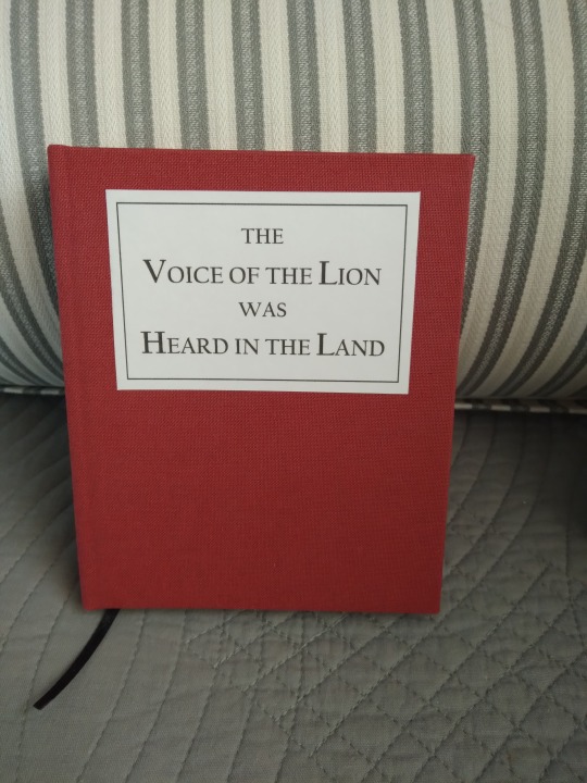
It's so beautiful! I'm in love with it. This is a shorter work than the last few I've made, so I made it half-sized because tiny books are awesome. First time doing it that way, but it definitely won't be the last. More pics and rambling under the cut. I got a little philosophical with this one XD
This is also the first time I've done the title like this. I formatted it in Word, printed it, cut it to size, and glued it to the front with PVA. I don't know how well it will hold up but I love how professional it looks. Here's a top view and the fore edge:
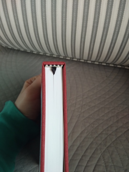
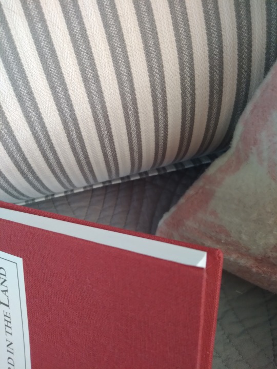
I must have mis-measured somewhere, because the cover *barely* fit. You can see it's right up against the spine in the back, and still juuust barely within the edge of the boards. I actually had to lay the book block inside upright over the spine, put some glue on the boards and fold them up to the block do the casing in, instead of laying the block flat onto the back cover and folding the front one over it like I usually do, because I didn't trust it to be straight any other way. This resulted in a loose back hinge, which I fixed later, but also eliminated the gap I usually have between the spine and book block, so overall a win even though it made me nervous to do.
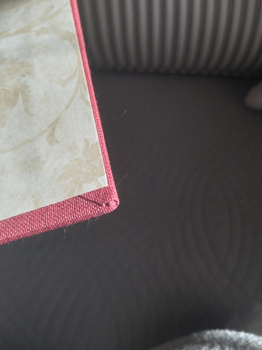
Close-up of one of the corners. Previously I've often had bits of board visible here, but I managed a nice turn-in on all the corners for this one and I'm very proud of that.

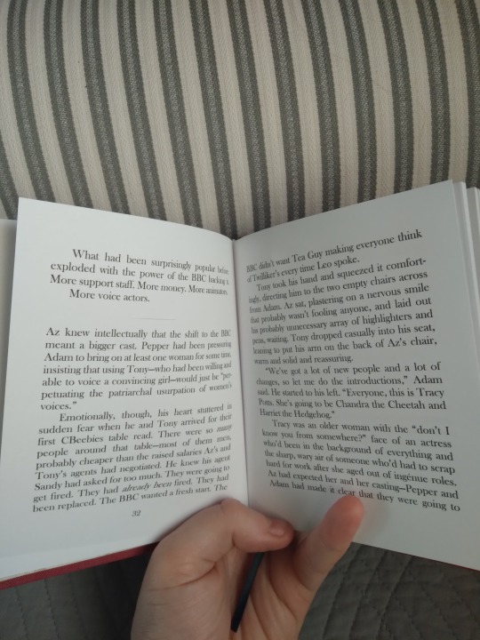
Couple of interior shots, so you can see how small it is. The endpapers are a pattern I've used before, when I did Flowers from Hell, but I can't help it, they're just very pretty. I have discovered that my printer does not like pale grays, which is unfortunate because that's the color I used for the section break lines. Easiest solution would be a new printer, but printers are expensive so I'm looking for a work-around. If anyone has any suggestions, let me know.
When I first started making books I wanted them to look as good as something you'd find for sale in a bookstore, and I think this one is the closest I've come on that goal. I also had a really specific aesthetic in mind. My hometown's library had a bunch of vintage children's classics, some of which were reproductions of early to mid 20th century editions. They were much-beloved and also kind of quirky from being re-bound so many times. They were always cloth or buckram, with no cover illustrations and the title done in nice but fairly plain lettering. I don't know how well they circulated with actual children, but college-age me thought they were awesome, and I wanted this book to look a little like that. Honestly I couldn't be happier with how it turned out.
Next projects is going to be a second copy of this one, for the author, followed by a much longer scifi fic.
#bookbinding#snek makes books#long post#fic rec#good omens#all my binds are from that fandom#i'm going to have a physical fic library that's just good omens fics#and it's gonna be the best thing ever
5 notes
·
View notes
Note
sashaaaaa HI how about...
6, 10, 21, 39, AND 40 OF COURSE
HII CHRISSIEE OK I did it, that’s gonna be long but here you goo
6. What do you use to keep your place when you’re reading a book?
HMM WELL if it’s meant here what object do I use to mark a page where I stopped reading, then most often it’s a paper bookmark. Either one of those which I got in one Paris museum/gallery this year which I REALLY loved visiting, or some simpler ones which are usually given together with a book purchases at stores. I love the former ones so much, they’re very neat; they are basically fragments of works which I loved seeing irl, and I like matching them with the books where I use them. I also recalled about one plastic holographic bookmark with nebulas which I had a while ago and which was VERY neat, but I think it’s somewhere in my books which are either in storage, or in a Kyiv flat where I still haven’t returned to since my family left it after an invasion
10. What’s your favorite kind of uquiz question? (Lyric, color, aesthetic, etc)
SJJSJS This one is tough cause I don’t think I remember now all which I’ve seen bUt honestly all of the mentioned above actually seem good to me shsjjsjsj
21. What’s your favorite period in art history, your favorite famous work and/or your favorite style of art? If you don’t know any that’s ok!
Oohhoh WEll I absolutely adore works by Alphonse Mucha, also William Morrisʼs prints. And I like different elements of art nouveau and art deco, some Renaissance elements in architecture too.. Some brutalist architecture is interesting to me as well; so honestly I love a lot of different bits and pieces from different time periods and cultures. I also really like some of the classicism paintings, OH and dutch floral still-life paintings I’m obsessed with them. I love some of Andy Warhol’s prints too, especially some of his traced drawings and works with a smaller color palette. I looove antique statues, I always want to draw them lol; omg Gustav Dore’s illustrations are gorgeous. I love collages a LoT too, especially those from the times when they were just starting to become a thing. I like vintage concert and some movie posters a lot too. It’s a lot truly, I’m pretty sure I forgot about something here ahhhah
39. What was the best part of your day today?
Well I started writing the response to this yesterday so I will just continue the trend sjsjjks
There were two best parts for me yesterday; the first one was when I was sitting together with my family while we were waiting for our orders, and I thought that it’s actually the first time that we are all (parents and my sister) are reunited after being separated since we left Kyiv in February 2022; dad can’t leave the country while the stupid war is still ongoing. I visited him separately last year, and so did my sister this year, but yes it’s actually the first time that we are all actually together since that time; and even though because of my parents’ divorce it’s a somewhat different, it’s still a very nice feeling. When we don’t fight snsnjsjsjsnsj These are the people I grew up with, it’s something that’s definitely a huge part of who I am today too
The second moment was when I came home after finding a pair of really nice trousers; the thing is, there’s one factory here which makes clothes for different clients worldwide. And sometimes, when certain details in some items aren’t done as they should have been done, according to client’s request (like, for instance a different type of a thread used for stitching), they are just sold in a store by a factory. So as I’ve mentioned I’ve found a pair of dark brown wide trousers yesterday and a dark blue shirt; SO when I came home, I took a closer look at the trousers and.. buttons on them had a brand name which definitely doesn’t sell their trousers for 15 euros sO that made me happy sjsjsjsjjs I do think that the trousers turned out to be of that brand, I think it’s the zipper which originally was supposed to be different
40. What’s your favorite kind of tree?
OH since I was a kid I LOVED trees which I can climb and where I can sit. I remember having a soft spot for willows; they can be climbed easily and also their long supple branches are therapeutic to look at or to touch. I also like huge old trees with big strong low-hanging branches where, yes, you can sit. Also, I love big fruit trees under which you can sit in a shade in summers. OH I almost forgot about blooming trees, sakuras especially. Like please tell me how can you not like them
1 note
·
View note
Text
Dorothy, Volume 1 (2005) Background // Part 1 of 3
Today I wanted to talk about and show off Dorothy, Volume I (2005).
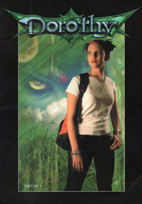
This book is my biggest scanning project to date (148 pages). So it took quite a while to scan and edit this book. Same goes for writing this post. For tumblr's sake, I've broken it up into 3 parts.
This is Part 1 of 3. See the end of the post for links to the other 2 parts.
Part 1 will focus on my sorta deep dive into the wayback machine for information on this comic, and the cool stuff I found out about it!
。°。°。°。°。°。°。°。°。°。°。°。°。°。°。°。°。°。°。°。°
This book is a collection of the first four chapters of the Dorothy comic, which is based on the story The Wizard of Oz. The comics were originally published in a single magazine format starting around 2004.
These comics are super interesting to me, because they are green screened photographs of an actor/actors/props with a digitally edited environment. From the very short wiki entry for Dorothy, I learned that comics illustrated with photographs are called “fumetti” or “photo comics”.
I can’t say I’ve ever seen a comic like this before, so it was a super interesting visual experience. I admittedly was very impressed when I found this book buried in the thrift store children’s story book bin.
Like, "What the heck did I just find? This is so cool!"
I was even more surprised to find out that this was a signed copy from one of the creators and writer, Mark Masterson, that was signed at Emerald City Comic Con back in 2007. I think that's a different signature on top, but I can't make out who it belongs to.
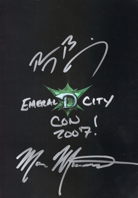
Like what!!! What a weird find.
I felt compelled to buy and keep it, even if it’s not something I personally would pick up at the store.
。°。°。°。°。°。°。°。°。°。°。°。°。°。°。°。°。°。°。°。°
So, a bit of a detour before I go into the book and share some scans.
I tried searching the internet for more info on this comic, as it just felt like a cult classic type of thing that other people would've been talking about…right?
Nothing came up besides a short bare-bones wiki and some links to purchase the comics from various online comic stores.
Really? Nothing?!
But then I had an idea to search the wayback machine, and I was able to get access to the old main site!
Here is a screenshot of how the site looked from 2004 to 2005.
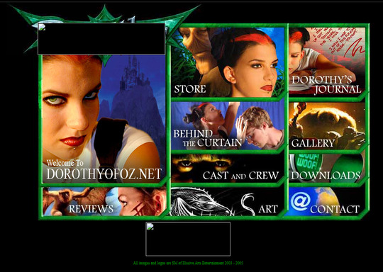
Unfortunately, a lot of the images are broken and do not load. I'm not bothering to include other screenshots of the different tabs because of this. There isn't much to see.
However, I did get lucky with the downloads tab!
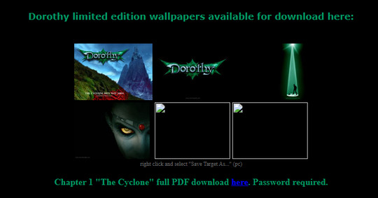
There were some wallpaper images still available to look at, so I went ahead and downloaded them.

I’ll probably throw those up full size on my Internet Archive account too, why not.
Here's how the site looked from 2006 to 2007.
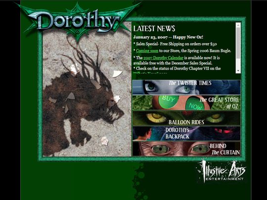
The site remained mostly unchanged during these two years, other than updated news info.
Here's screenshots of how the links appeared.
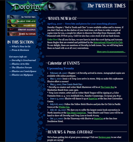
The Twister Times aka the news and updates tab:
The Great Store of Oz aka the store and merch tab:
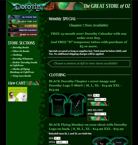
You know I'm going to be on the hunt for Dorothy merch now. The designs are pretty lackluster but I feel I'm in too deep in the Dorothy sauce to care. All I feel is the desire to obtain one of these T-shirts someday.
The Balloon Rides aka the self promotion and other related links tab:
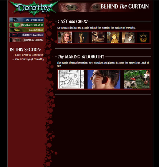
And lastly, the Behind the Curtain aka the cast, crew, and behind the scenes tab (my personal favorite):
Even though these pages used to be public, and I doubt any of their contact information is correct in 2023, I am not going to post any screenshots of their bios.
Well, I'll post a bit of just one. I felt it was pertinent to point out that Mark Masterson's photo was…this…
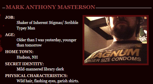
Which uh….was certainly was a choice…
But also, this was the mid 2000s. Most people would've seen this as edgy, quirky, and funny, as opposed to cringe and off-putting.
。°。°。°。°。°。°。°。°。°。°。°。°。°。°。°。°。°。°。°。°
Before I talk about the actual comic and such, I did want to share screenshots from the behind the scenes tab. THIS was the kind of stuff I was interested to see after reading this comic.
I have a feeling these may have been the same photos under the BTS tab on the 2005 version of the site.
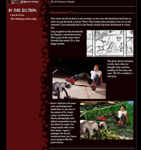
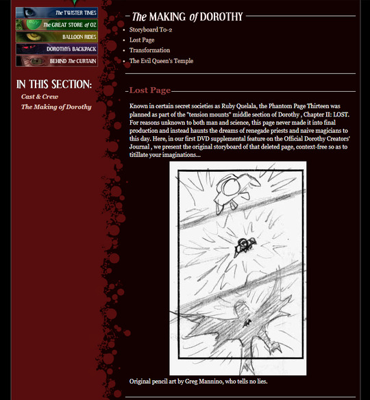
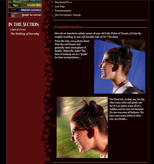
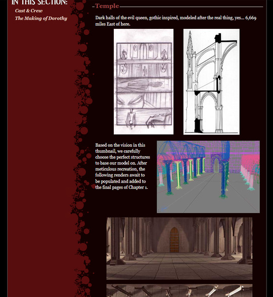
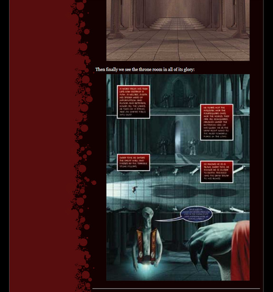
Very cool stuff! Cool to me, anyways.
I'm glad I got to see a glimpse into what the site looked like at the peak of this comic being published. It looked like they were doing rather well and having a good time.
Unfortunately, the site all but dies after 2007. This was also the year the last comic, Issue #7, was published. According to the very short wiki, Issue #7 also ended on a cliffhanger! How sad.
At least we can still experience and appreciate the art and comics that were released.
Before I dive into the content of the book, if you'd like to experience it without spoilers, you can read it on my Internet Archive account.
If not, then come along! Let's get to the (abridged) story of this now defunct comic!
Part 1 -> You're Here!
Part 2 -> Chapters 1 & 2
Part 3 -> Chapters 3 & 4
#txt#dorothy#dorothy comic#dorothy volume 1#dorothy gale#comic#comics#comic book#2004#wizard of oz#scans#nostalgia#part 1#long post#books#catie fisher#greg mannino#mark masterson
1 note
·
View note
Text
2023 Reading Challenge. Audiobook: The X Files: Cold Cases by Joe Harris, Chris Carter and Dirk Maggs
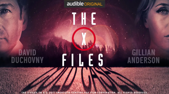
You guys all know I love The X Files, you just have to scroll on my blog for less than a minute and you’ll see something there. I’m also an occasional enjoy-er of radio dramas, so I thought this would be the perfect pick for me for the audiobook category of my reading challenge.
This is not an audiobook in the traditional sense, but a dramatization, which features many of the actors from the classic series, including Gillian Anderson and David Duchovny, returning as Mulder and Scully. One pretty fun aspect of this production is that it acts as something of a revival to the original series, but follows a different canon to the actual TV revival, despite having been released AFTER season 10. This is because this audio drama is actually an adaptation of The X Files Season 10 comic book (don’t be confused by the fact that they have the same name, they are different).
If you haven’t watched The X Files, be aware that I am going to be talking about some of the events of the series in this review, so if you don’t want spoilers, proceed with caution.
The X Files: Cold Cases picks up after the events of the series (I’m not entirely sure where The X Files: I Want to Believe fits into the canon of this comic book, but to be honest, I try not to think about that film very much, so…), Mulder and Scully are living in Virginia under aliases, and are roped back into the X Files, after an unknown person hacks into the FBI databases, looking for information about the X Files in particular.
The story, or rather stories, are pretty fun, we get a mix of myth arc and monster of the week segments (I personally would have preferred more monster of the week segments, but that’s a gripe that I have with the series just in general), some deceased characters, like CSM and Alex Krycek return in ways that are actually quite clever, and much better than the way CSM returned in the TV revival, and we get to see the return of the classic Flukeman. The stories aren’t great, they wouldn’t rank as high as some of the best episodes of the original series, but they’re good, for the most part.
One thing though that was kind of frustrating for me is how they didn’t use the audio format to their advantage. The X Files has the potential to use audio drama in a really interesting way, and I’ll use two well known examples of other audio drama productions to illustrate this: the popular podcast Welcome to Night Vale and the absolutely iconic, classic 1938 radio drama of The War of the Worlds, narrated by the late, great Orson Welles. Both of these use audio and narration in incredibly fascinating and clever ways, with Welcome to Night Vale being presented as a local radio show in the fictional town of Night Vale, a desert town somewhere in the southwestern United States. The host, Cecil, remarks on local goings-on, including bizarre paranormal and supernatural events, which he treats as mundane. The War of the Worlds does something similar, beginning as a simulation of a normal radio program, featuring a weather report and music, before breaking news interruptions regarding an alien invasion interrupt the broadcast. I think that The X Files could have done something similar, almost like the season 7 episode X-Cops, which used the format of a normal episode of the reality show Cops to tell a story about a werewolf (which, incidentally, is one of my favourite episodes). In my opinion, The X Files shines the most when it’s being experimental, and here they play it extremely safe, not to mention that some of the dialogue just feels very unnatural, as the characters are having to over explain their actions to make up for the lack of visuals, which is a shame.
Overall, it’s worth a listen, if you’re a fan of the show and want more X Files content, but it’s not as good as X Files can be.
1 note
·
View note
Text
Cover Analysing (1)
Since I have decided that I want to create a book, looking at different book covers from different periods of time can help me decide in which kind of style I want my cover and illustrations to be .
DUNE (by Frank Herbert)
The Dune books are the series that pretty much invented the Science Fiction genre. It is a classic that stands beside Lord Of The Rings. It is considered the best selling SF series in history.
Through out the years, the covers have changed to accommodate the audience and the time.
These are the 80s paperbacks. I really like the earthy, low toned colours and very detailed style. it really fits well with the books period. Strangely enough, this type of style reminds me of the old Disney movie covers and backgrounds.
However, according to my research, while the illustrations are lovely, the covers have nothing to do with the actual story and that is something that I wish to avoid in my own book.

This set of covers is a bit newer. The simplicity leaves almost no room for errors or misinterpretations in illustrations which is something that a lot of people do for their book covers.
I personally really like that each book has it's own main colour. I think colour coordination works very well and makes a series that has a lot of books look a lot more clean and put together.
The different patterns and (in Dune Messiah's case) could very subtly hint to what the books might be about.

These ones are even newer and from what I have gathered, these ones are special/collector's edition. The minimalistic use of colour combined with the textures and patterns really make these ones worth the extra money.
I don't really think that this kind of cover work that well for what I have in mind though, since children are usually attracted to bright colours and fun characters.

These posters were made after the release of the 2021 Dune movie. I really like how they tried to emulate the older, vintage style with the colours and the overall composition.
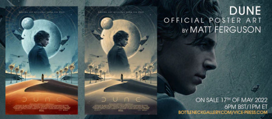
I am, however, somehow neutral about these book covers. While the illustrations are lovely and the protective hardcover in which the book comes is very interesting and original, I have never been a big fan of having actual people (actors/models) on the cover.
I always thought this kind of concept suits video game cases a lot better, since it gives the cover a certain technological feel to it, like something you would see for a PS 4 game. The white and blue colours only further accentuates that. I feel like this modernisation makes the cover lose the classic, old-time quality.

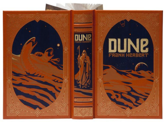
My personal favourite cover version for this Series has to be this one.
I absolutely love everything about this book. The colours of the cover work so well together and really complement each other. It has the exact same atmosphere that the synopsis of the book gave me. The illustrations on the first two page spread only add to this surreal fantasy/futuristic universe full of colour and adventure.
The edges of the page being blue that balance out the blue and the orange combined with the Dune logo and the golden font really complete this book as a piece of art.

Unfortunately I couldn't find out whether the original artist for this set of illustrations is the name stated on artworks or not but I decided to add them anyway because I absolutely love how they look.
Same as with the Dune cover above, the vector inspired style works incredibly well with the retro futuristic and space elements.
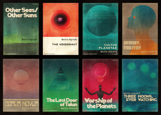
Even though I don't think I will evolve this project towards this particular style, analysing these covers and illustrations might prove useful for future projects.
I think this style could work very well for t-shirts, prints and posters.
0 notes
Text
WIP!

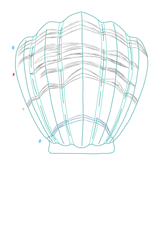
I decided at around like eight this evening, after I'd colored a few frames of the graphic novel, to just go ahead and start the Polly Pocket illustrations.
As a child, I became obsessed with Polly Pocket through frequent visits to a consignment shop that my dad took us to pretty often, until we moved too far away. I was allowed to have quite a few of them. One thing that always bothered me, though, was: What were these tiny little worlds actually supposed to look like? It felt kind of cheap to me that most of these environments had these very detailed stickers, but the rest was all two or three solid colors.
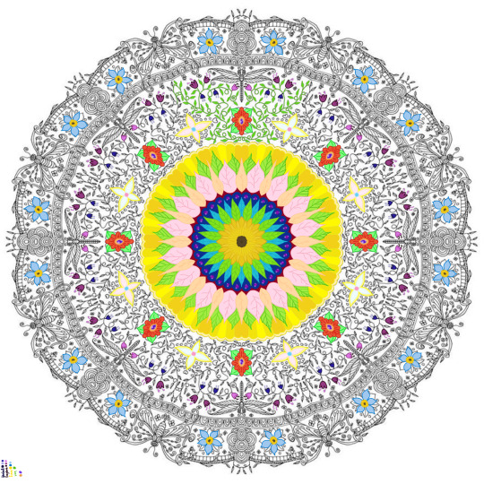
As you can see, I've already taken it upon myself to make this cover much more detailed than the classic Polly Pocket. It's hard to say what exactly I'm going to really do to the inside. I noticed the inside has some details that remind me personally very strongly of an 80s camper, so I might draw some inspiration from that.
This project has me thinking about this bit of dream I can remember from this morning: I learned at the last minute there was going to be some kind of gallery and I had a piece, a series of hand-bound, hand-illustrated books, that would have been a good fit. There were, of course, some things I didn't love about these original books, but there was no way I could whip together an improved set in time for the opening.
I keep thinking over and over about how cool it would be to finish the content for this book--maybe twenty to fifty of these little worlds--and get a good printer (or...... publisher....?) to print it for me. It would, of course, be very cool to print it for myself. The concerning part would be to get the front and back of the flaps to line up neatly. Would I have the stomach to do that fifty times......?? What size format would I want?
0 notes
Text
So You Want to Learn Tarot

Tarot is one of the most popular forms of divination, and my personal favorite tool to use when I’m seeking answers. I talked about tarot a bit in my last post, but I feel like it deserves further discussion here since a lot of new witches are intimidated by it.
Before we get into what tarot is and how to learn it, let’s discuss some popular misconceptions.
Tarot is not…
… evil, demonic, or Satanic. This one probably goes without saying, but tarot has a very mystical reputation in pop culture, and some people genuinely believe that it is evil. In the Christian group I grew up in, tarot cards were viewed with the same fear as seances and Ouija boards. So, for the record, tarot has nothing to do with demons, and in fact classic tarot decks contain a lot of Christian imagery. (There are also modern decks on the market that really play up the Christian themes, if that’s your thing.)
… negative or scary. Some of the most well-known tarot cards are those with frightening names and/or imagery: Death, the Devil, the Tower, etc. For this reason, some people think that tarot only contains negative messages or that using tarot cards invites negative energy into your life. Actually, I find tarot to be very balanced between light and dark, with several cards that are purely positive (like the Sun or the World). Even cards like Death or the Tower aren’t 100% negative — their meaning depends on the context in which they appear. While it’s true that tarot does sometimes hit us with difficult messages, this is true of every divination method if you’re using it right. Part of the appeal of divination is that it allows us to see the truth of a situation, even if that truth isn’t pretty.
… ancient. One popular myth claims that the cards are based on the Book of Thoth, an ancient Egyptian wisdom text. In reality, tarot comes from a card game that was popular in medieval Italy — originally, the cards were just entertainment. The use of these cards for divination was popularized by the French in the 18th century. It wasn’t until 1909 that Edward Waite and Pamela Coleman-Smith created the Waite-Smith deck (or Rider-Waite-Smith deck, as it is sometimes called), which established the “classic” tarot symbolism that we all know and love.
… something you can only use if you’re psychic. As I’ve mentioned before, we all have psychic senses, although most of us are not aware of them. However, you don’t have to be a professional medium or be deeply in touch with your psychic abilities to read tarot. Tarot is a tool, and like any tool it has a variety of uses. Your experience with the cards will be exactly as magical or as mundane as you choose to make it. You don’t need to worry about tapping into magical energy you can’t control, or anything like that.
… hard to learn. Learning tarot is not difficult, although it is time-consuming. No one becomes an advanced reader overnight. However, it isn’t actually very hard to learn how to read the cards. Most readers interpret the cards intuitively, which means that how the images make you feel is more important than the traditional interpretation. Being familiar with the traditional meanings helps, but there’s no rule that says you can’t keep a couple of good books on hand to help jog your memory. If you’re trying to memorize all the card meanings so you can just repeat them later, you’re doing it wrong.
Now that we know what tarot isn’t, let’s take a second to discuss what it is.
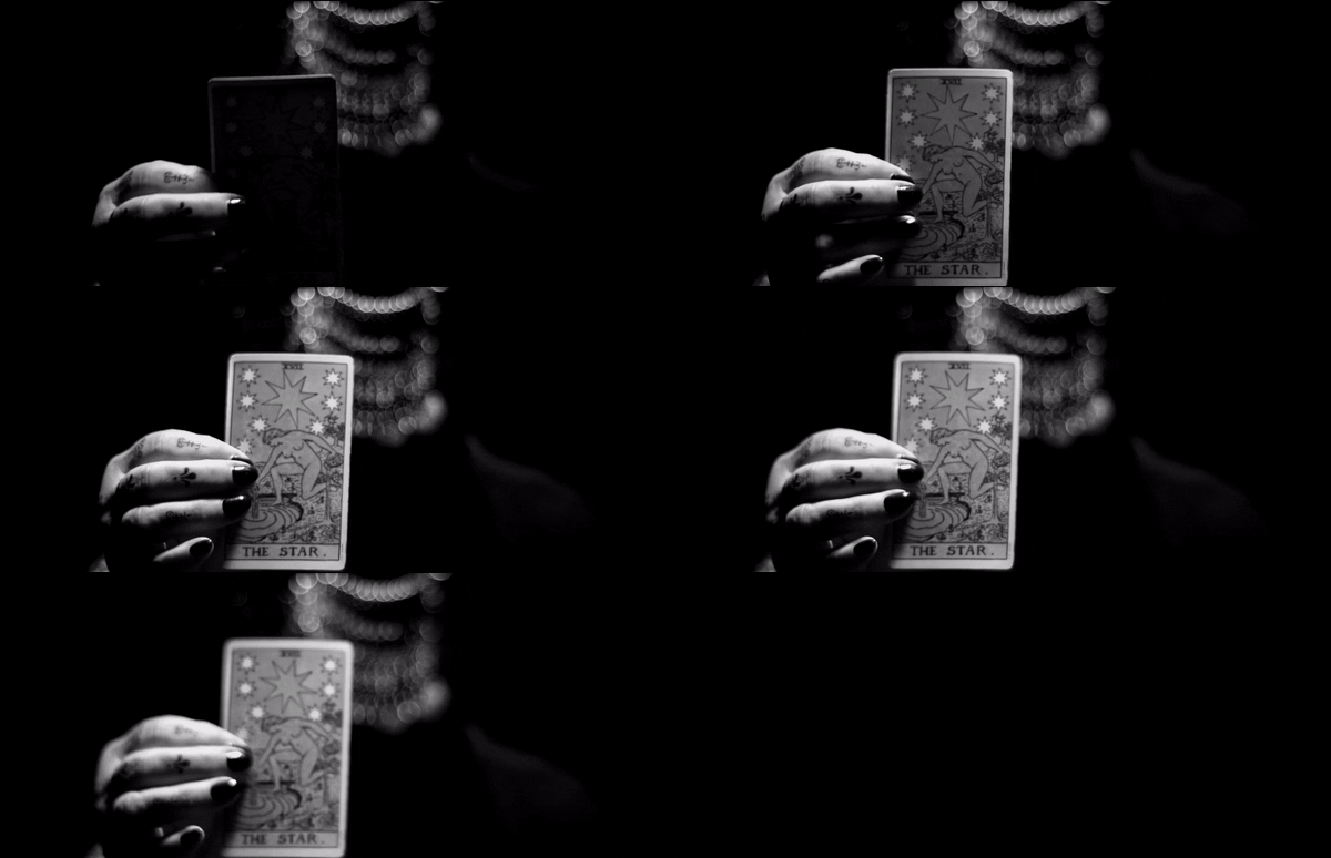
Tarot is a modern system of divination using illustrated cards. Most tarot decks contain 78 cards, which are divided into two groups: the Major Arcana and the Minor Arcana. The Major Arcana is what probably comes to mind when you think of the tarot: these are the named cards like The Fool, The High Priestess, Death, etc. The 22 Major Arcana cards represent major themes, patterns, and events, so they tend to be the dominant energy in any readings they show up in. The remaining 56 cards make up the Minor Arcana, which deals more with day-to-day life. The Minor Arcana is further divided into four suits, which are each associated with one of the classical elements. The suits are wands (fire), cups (water), pentacles (earth), and swords (air).
If you want to learn to read tarot, the first step is to find a deck that you resonate with. Because tarot cards act as a conduit for your own psychic abilities, you want to make sure that the energy of your deck vibes well with your own energy. You can absolutely order your deck online (and you’ll have a wider selection to choose from if you do), but if picking one out in person is important to you, most bookstores and metaphysical shops will have several to choose from.
Some questions to ask yourself as you’re choosing your first tarot deck:
Are there any themes or motifs you feel called to work with? There are tons of themed tarot decks on the market, from goddess decks to crystal decks to pirate decks. What symbolism speaks to you?
What art styles do you enjoy? You’ll spend a lot of time looking at your cards, so it’s important that you like the artwork!
How does this deck make you feel? It’s best not to choose a deck that makes you uncomfortable, at least while you’re still trying to learn the basics. For me, the decks that I end up working with the most feel like an old friend — comforting and familiar. (Note that some of my favorite decks have dark themes and imagery, but I still find them comforting on an energetic level.)
If you don’t feel called to any one deck, starting with the Waite-Smith deck is always a good idea. Most tarot books base their interpretations on this deck, so it’s helpful for beginners who are still learning card associations. There are several versions of this deck on the market — my personal favorite is the Universal Waite Tarot, because I find it easiest to read. (It’s also cheap and widely available, so it should be easy to find a copy.)
Once you’ve chosen a deck, take some time to get to know the cards. Before you begin reading with your deck, go through the cards one by one and write down how they make you feel, as well as any associations they draw up for you. It’s best to do this exercise before you begin learning the traditional meanings for the cards, so you can capture your authentic first reactions to them.
There are other ways to get to know your deck. There’s an old superstition that says you should sleep with the deck next to your pillow for several nights, so that it can become attuned to your energy. Another option is to meditate with the deck, allowing yourself to feel it out.
Once you’ve gotten to know your deck, it’s time to learn the traditional meanings of the cards. Don’t get too hung up on this part — remember that readings are done intuitively; the traditional meanings are only a guideline, and you may find that the information you receive in a reading differs from tradition. In those cases, always trust your intuition. What the Ace of Wands means FOR YOU is more important than what it means for so-and-so author of such-and-such book. (This is why it’s a good idea to write down your own thoughts and feelings about the cards before you begin studying tarot books.)
The book I recommend starting with is Tarot For Beginners by Lisa Chamberlain. At just over 100 pages long, this is a very brief, accessible, “just the basics” introduction to tarot. The book is just long enough to give you a taste of what reading tarot is like, to determine if it’s really right for you.
Books can be very helpful, especially for learning the traditional meanings of cards, but the best way to learn to read tarot is by doing it. Once you’ve found a deck you resonate with, connected with your cards, and learned a little about card meanings, it’s time to start doing readings.
Start by pulling one card each day. Write down your immediate reaction and any messages that come to you when you look at the card. Experiment with it! Try holding the card in your hands and trying to “feel” it energetically — what vibes does it give off? Does a certain word or phrase pop into your head when you look at it? Do certain images on the card leap out at you? Write all of this down. Once you’ve written your own interpretation, look up the traditional meaning of the card in Tarot For Beginners or another book, or online (the website biddytarot.com has a really great guide to card meanings and is 100% free). If anything you read about the card resonates, write that down as well. The goal here is to see how your initial intuitive reading compares to the card’s traditional meaning — eventually, as you get more familiar with the cards, you won’t need to look them up at all.
As you go about your day, keep your daily tarot card in the back of your mind. How do the card’s messages relate to what happened to you throughout the day? Before you go to bed, write about how you saw the card’s message in your life.
Eventually, you’ll begin to get the hang of reading tarot intuitively. You’ll also begin to develop your own readings styles and your own rituals for doing a reading.
#baby witch bootcamp#baby witch#tarot#tarot 101#tarot cards#divination#divination witch#pamela coleman smith#tarocchi#cartomancy#witchblr#witch#witchcraft#magic#magick#pagan#wiccan#wicca#lisa chamberlain#long post#my writing#mine#witch resources#tarot memes#tarot meme
2K notes
·
View notes
Text
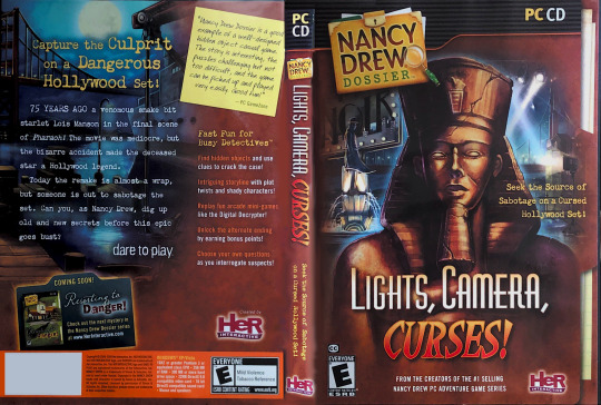
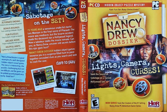
The box art for Lights Camera Curses, with the 2008 original and the 2009 yellow redesign. If you would like to print this for a shelf display, this is my attempt at editing. The original files were not available on the HER website, so I edited these images. (note, I have no idea if these will print well, I apologize if there are issues with how I edited them!)
Featured Artist: Mark Tolleshaug
As for why there was a redesign in the packaging in the first place,
From a July 29, 2009 post on the Dare to Play blog:
Nancy Drew Dossier: Resorting to Danger preorders have begun! You can order your game here. You might notice that it looks nothing like Lights, Camera, Curses even though they're both in the same series. We had to redo the packaging because it needed to look extremely different from the Adventure series games. Although we had tried to keep the two series similar-looking, there was a lot of confusion about the gameplay for the Dossier series. Some people bought the Dossier series expecting to play the Adventure series game and they were sorely disappointed because it's not what they wanted. However, if fans go into the Nancy Drew Dossier series knowing that it's a fun logic-based hidden-object puzzle mystery game, they'll love it! It's just Nancy Drew in a different gameplay style.
So for the box here are a few things we changed:
we used a very yellow box - and yes, we know it's bright. It's actually meant to represent the classic yellow back books and stand out on the shelf.
we decided to use a more illustrated style for the art instead of the realistic cover that we used before. This is to make it more obvious that while the graphics are rich, they aren't rendered in 3D and made to look real.
we added badges with objects in them to represent the actual gameplay. This was a fun addition that gives the customer a hint at what's in store for them.
we added more information about the series and what type of gameplay to expect: hidden-object puzzle mystery (not an adventure game)! Hopefully, this helps set customers' expectations of the game.
So maybe it's not quite as pretty as the Lights, Camera, Curses box, but we think it definitely helps separate the two series so there's absolutely no confusion about what you're buying. What do you think?
And here's a sneak peek at what we have in store for the Lights, Camera, Curses box to make this a new series look.
9 notes
·
View notes