#tumblr always loves to desaturate
Photo
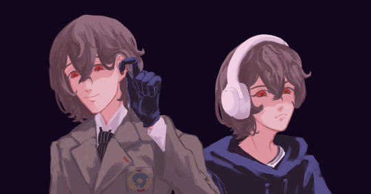
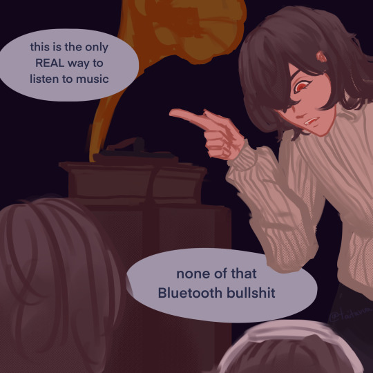
if you could pick a song, any song that goro akechi would ACTUALLY listen to, what is the answer and why is it piano burning from there existed an addiction to blood by experimental hip hop group clipping.
#jk he would just listen to jazz#.... or would he ?#hi i recently made an ill advised purchasing decision.#persona 5#p5#persona 5 royal#p5r#procreate#2022#illustration#digital fanart#goro akechi#5 hours#taitavva sketches#tumblr always loves to desaturate#sometimes i forget to color correct
165 notes
·
View notes
Text

First design of the trolls AU! It’s Mr. Goodtimes himself, Scar!!!
Also I didn’t include it in the drawing but his wheelchair has multiple different modes for things like climbing and dancing and shit!! Because I could only assume it’d be tricky to do boyband dances not just with the lack of use of the legs, but because the hands would be busy operating the wheelchair itself. Therefor, some of the ways he can free up his hands or cross otherwise difficult terrain are listed below!
In total, all the different configurations it has are:
Four total legs (two on each side) for things like dancing and other flat terrain while the hands are busy, or for semi-flat or bumpy terrain (for going off-road!)
eight total legs (four on each side, like a spider) for climbing! Trolls regularly disregard gravity and that shouldn’t be confined to abeled trolls! Let the man hang out on the ceiling!
and last but not least, not technically the wheelchair itself, but the driver’s seat in jellie is retractable (or rather, there can be a drivers seat for other drivers lol) so he can just roll his chair right into place to drive! There are smaller attachments for pressing pedals :)
He also has a folding bow! Sometimes he uses it like JD’s grapple in the movies, sometimes he just uses it like a regular bow.
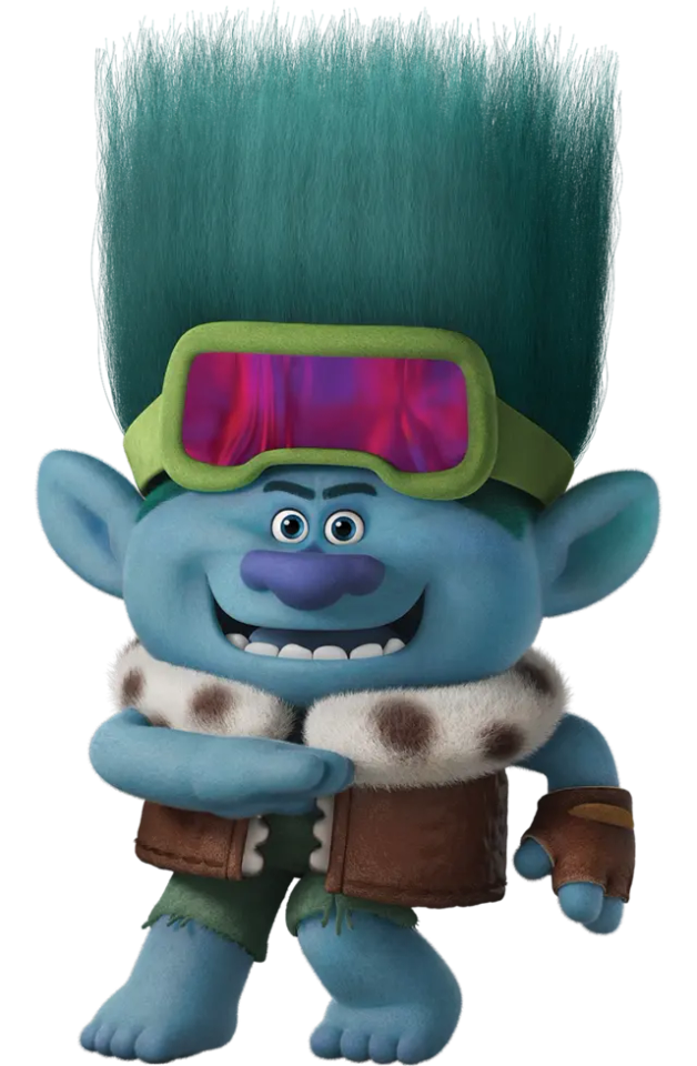
and you know I HAD to reference the pose from this fuckass render. I think I’m gonna base them all off their stupid looking renders, it’ll be great.
#my art#jizzie trolls au#goodtimeswithscar#goodtimeswithscar fanart#Gtws#gtws fanart#gtwscar#gtwscar fanart#I’m planning on doing a page of some of the configurations for his chair to show them off because I had IDEAS. But I haven’t drawn it yet s#y’know#ANYWAYS I love the colors I ended up with for him. They’re so fun#As always tumblr has desaturated them a little bit which is annoying but WHATEVER. I don’t care
43 notes
·
View notes
Text

icon for myself, feel free to use with credit!
#toontown#toontown corporate clash#ttcc#holly grayelle#gatekeeper#my art#icon#pacesetter icon soon maybe i wanna surprise my friend w one#aughhh i love holly so dearly#her and mary on my mind always and forever#oh aw i just noticed tumblr desaturated this a ton </3 oh well
146 notes
·
View notes
Text

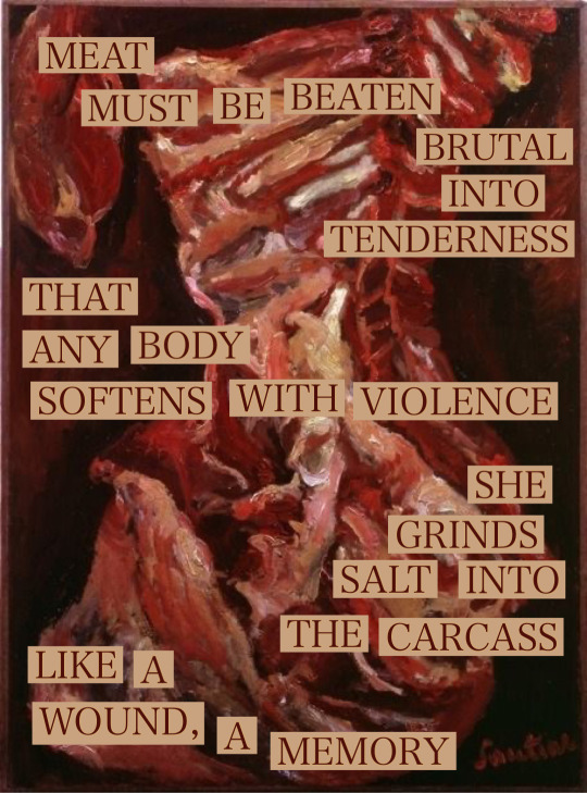
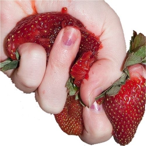
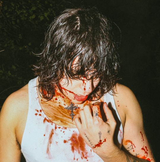


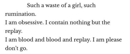
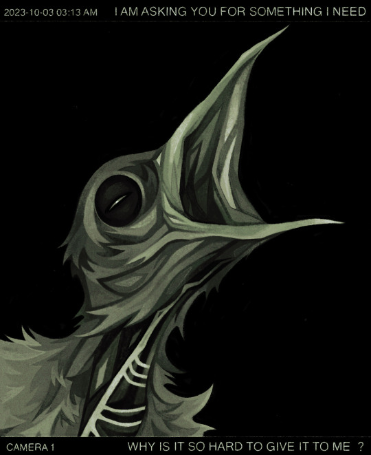





BOTH TOO MUCH AND NOT ENOUGH
1) "I have been found wanting, Natalie thought; I have made myself unacceptable and am not worthy." - hangsaman, by shirley jackson
2) text: "meat must be beaten brutal into tenderness, that any body softens with violence, she grinds salt into the carcass, like a wound, a memory". image: a carcass of beef, cleaned, with the ribs on prominent display, painted in oils and rendered in thick strokes of red, orange, tan and white, on a plain dark red background. the text is cutouts on top, dark red text on light tan. - Family Portrait as Unfinished Meal, by Torrin A. Greathouse and Le Bœuf by Chaim Soutine. collage put together by @invisiblemonstrosity
3) a pale hand crushing ripe red strawberries, green leaves still attached, on a plain white background. - apparently by ouiloved on flickr, but they seem to have deleted.
4) bust photo of a tan person with a spotlight on them outside in the dark, head turned down, shoulder length messy wet black hair obscuring their face. their hand is raised to their chest and they are wearing a white tank top. fake blood is splattered and wiped around their chest and mouth. - i can't actually find this one all my attempts lead back to unsourced tumblr posts if you know where its from. help me
5: "You have no one who has any sort of consideration for you. You have had patience and endurance, and what have they done for you? Half-killed you." - carlyle’s house and other sketches, by virginia woolf
6: "try your whole life to be righteous and be good, wind up on your own floor, choking on blood" - sept 15th 1983, by the mountain goats
7: "such a waste of a girl, such rumination. i am obsessive. i contain nothing but the replay. i am blood and blood and replay. i am please don't go." - i put the coffin out to sea, by lisa marie basile
8: an image of a partially bald baby bird begging for food, drawn in the desaturated greens and black of a trailcam, on top, the text reads "i am asking you for something i need", on bottom, the text reads "why is it so hard to give it to me?" - trailcam baby, by @quezify
9: "was i raised without love? / or was i born unloveable?" - @psychwarded
10: "I, in my corner, with my monstrous needs." - As Consciousness Is Harnessed to Flesh, susan sontag
11: "oh, i know that i'm not whole, and sometimes feel the flies swarming, like much of me is rotten." - roadkill ode, chad abushanab
12: a photo of a cut tree where much of the centre is rotted from fungus, accompanied by the text: "heart rot in pine. heart rot is the softening of a pine trees resinous heartwood, caused by an in-dwelling fungus. not all pines have it, but those that do make the excavation of a tree-hole next cavity easier for the red-cockaded woodpecker."
13: "rot made a home inside my body." - i know it's from "bloat" but cant find the authors name again. i think it starts with a c?
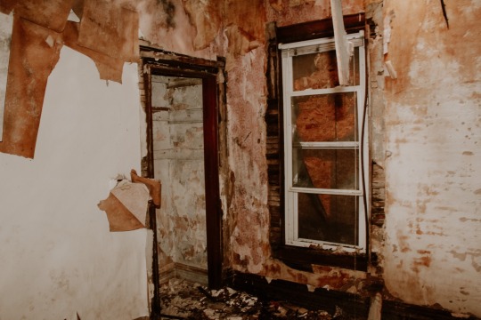
14: photo of an abandoned house in shades of brown and beige and orange, the walls are wet and scuffed and the drywall has been torn open in places, exposing the old lath. - abandoned, by @jaggedplains
15: photo of a mouldy strawberry, fading from bright red to grey-green fluff - Strawberry Gray Mold disease stock photo, by MediaProduction on gettyimages
16: "you ever feel like you were born with something rotten inside you and if people get close enough they're gonna find out" - tumblr post by @twoheadedfawnn
17: "we are meat, we are potential carcasses,' he once said. 'if i go into a butcher's shop i always think it is surprising that i wasn't there instead of the animal." - francis bacon
18: "you dangle on the leash of your own longing; your need grows teeth." - speeches for dr frankenstein, by margaret atwood
19: photo of a python hanging off a roof coiled around a black and white bird, poised to eat it - i heard some noise on the roof this morning, by candycane7 on reddit
20: "all that matters is that you want to hurt me. all that matters is that you want me." - when rome falls, by yves olade
21: "god told me i was forgiven and then he split me open" - god is made of hunger and i am made of dreams, by katie maria
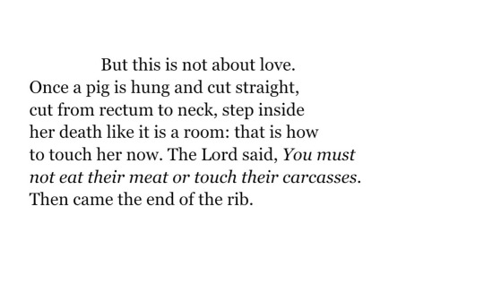
22: "but this is not about love. once a pig is hung and cut straight, cut from rectum to neck, step inside her death like it is a room: that is how to touch her now. the lord said, you must not eat their meat or touch their carcasses. then came the end of the rib." - oh let's just be hogs, by gregory emilio
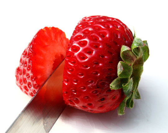
23: photo of a strawberry cut in half with its leaves attached. it is bright red, steel knife wet. the background is bright white and plain. - cut strawberry by liz west on flickr
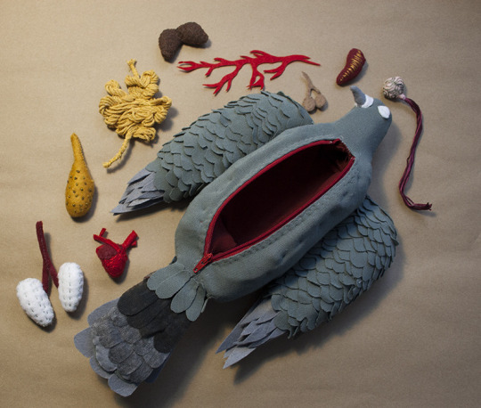
24: photo of a handmade cloth sculpture of a dead autopsied pigeon, red zipper like an incision opening to its empty red interior, small cloth and thread organs arranged around it. - pandora: city pigeon, by jessica bartram
25: '"u need a therapist" actually i need to be euthanized' - tumblr post by deactivated user @122mg
#webweaving#webweave#web weaving#thoughts#poems#quotes#words#aesthetic#spilled ink#writing#trauma#tragedy#poetry#bpd#borderline personality disorder#ptsd#collage#graphics#art#story#prose#lyrics#moodboard#literature#litstack#animal death#gore#mold#bipolar
99 notes
·
View notes
Note
do you have any tips for drawing dynamic poses? i always love the way you draw bodies!!
i know this has been said a million times but the way i draw bodies significantly improved after i started drawing more frequently from reference. if i cant find a reference for a pose on the internet, i'll just use myself or a friend. i spend an unfortunate amount of time just standing in front of my mirror looking at my own joints. pay attention to where your body curves!!
other than that though—honestly my anatomy/pose knowledge is a whack amalgamation of art tips i've accumulated over the years (i miss old school deviantart/tumblr style art tutorials). i also like to look at how artists i admire draw bodies—what details to they include, what anatomical short-hands etc
i think i'm still figuring out how to draw dynamic poses, but here are some cheats i've picked up (under the cut coz this got long again):
gonna use this stray!tim as a base
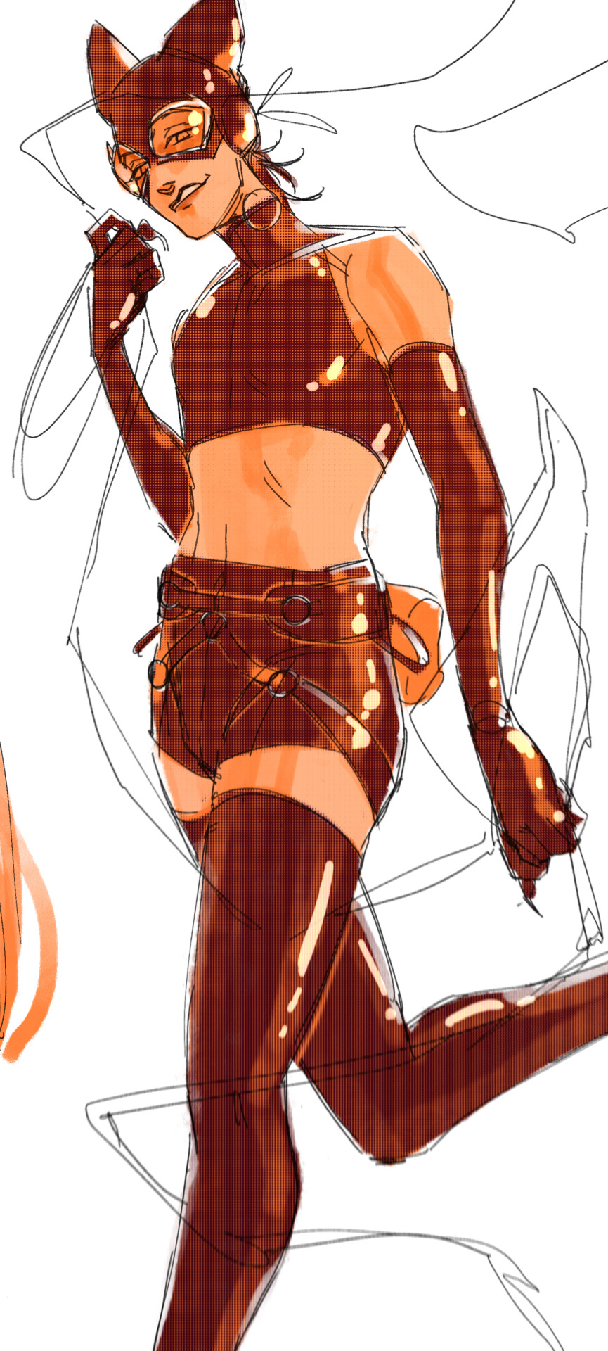
the easiest way for make up a pose is to start roughly with the head, collarbones, ribcage, and pelvis — you can build everything from there
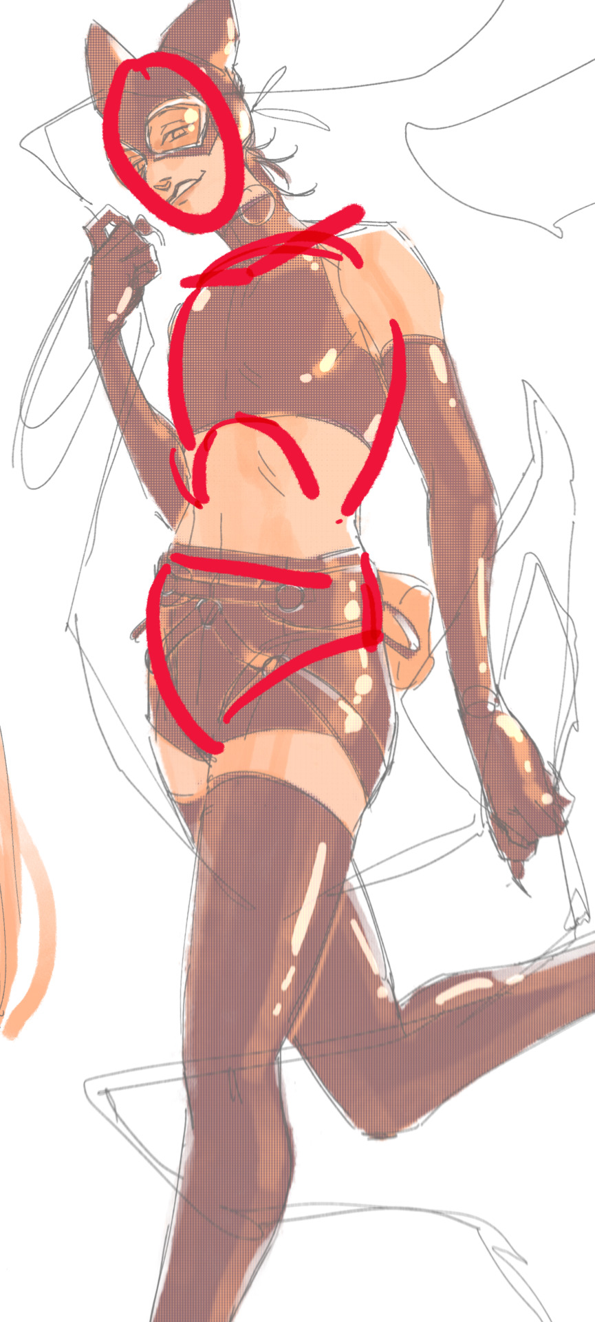
here's a couple more of what i mean by the ribcage-pelvis deconstruction:
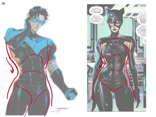
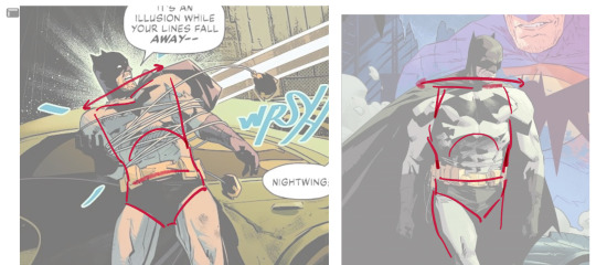
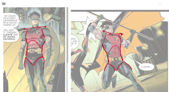
2. push your perspective a little!! imo things look more dynamic if you move your sight-line up or down—the horizontal orange line here. if you look at the panels above, the sight lines tend to be a little low, at around the character's torso or waist. i did the same below with stray!tim
to do this i usually try to get a sense of the space im working in by putting in some sloppy perspective grids
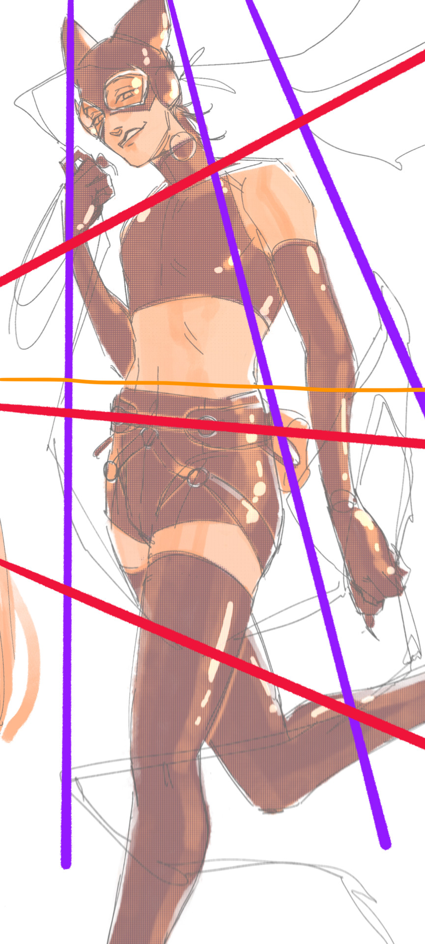
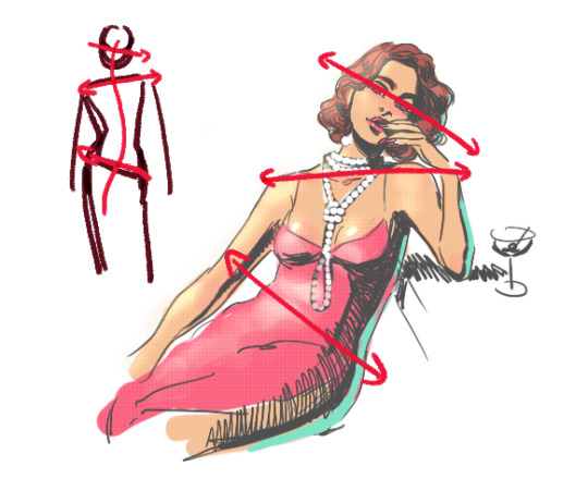
3. S curves!!! exaggerate the lines of the body. the body naturally has parallel horizontal lines—an easy way to get a body to look less rigid is to tilt those horizontal lines which in turn curves the vertical line of the body
this is what a mean by horizontal lines—usually i use the eyes, shoulders, and hips:
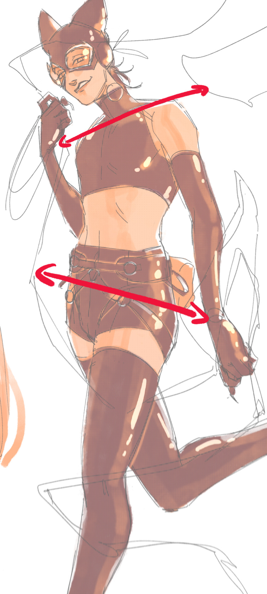
i'm gonna use caterina as a better example—usually you want the horizontal lines to sort of zigzag:
i've also picked up a couple visual tricks that don't exactly add dynamism to a pose? but they do give a static pose a little more oomph. a lot of this is done by visually highlighting one specific point of the body
for our purposes, i'm gonna make the focal point tim's face
motion blur! there are a couple ways to do this. i actually dont like working with traditional motion blur because you have to mess around with selections, so i usually fake motion blur using postional perspective blur:


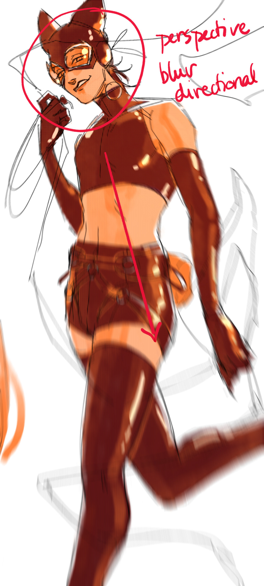
2. gradient lighting—you can add a lot of depth this way. usually i like setting the gradient in the direction of the focal point, e.g. tim's face
below, i added a layer above the base drawing, used an airbrush to get this gradient, and then set the layer to color burn and lowered the opacity. you can also clip the lighting layer to the base drawing and set it to multiply

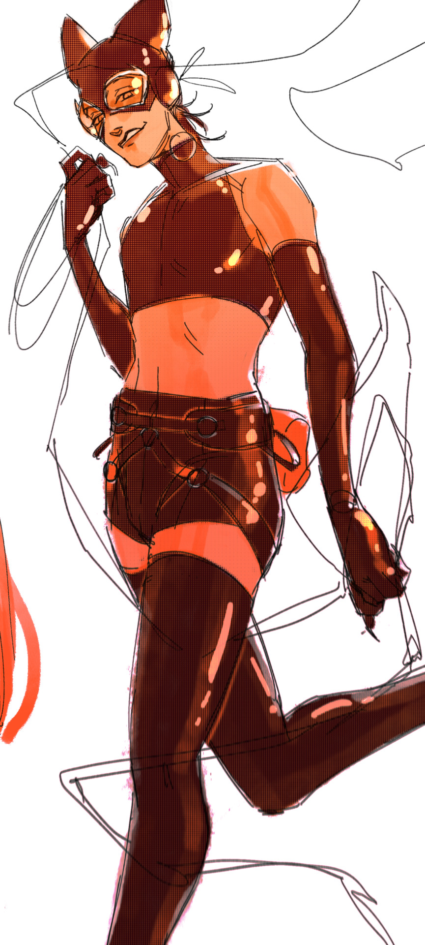
below, i did the opposite—instead of adding a gradient shadow, i added gradient light. i set the layer to add this time (instead of color burn) and then lowered the opacity again.
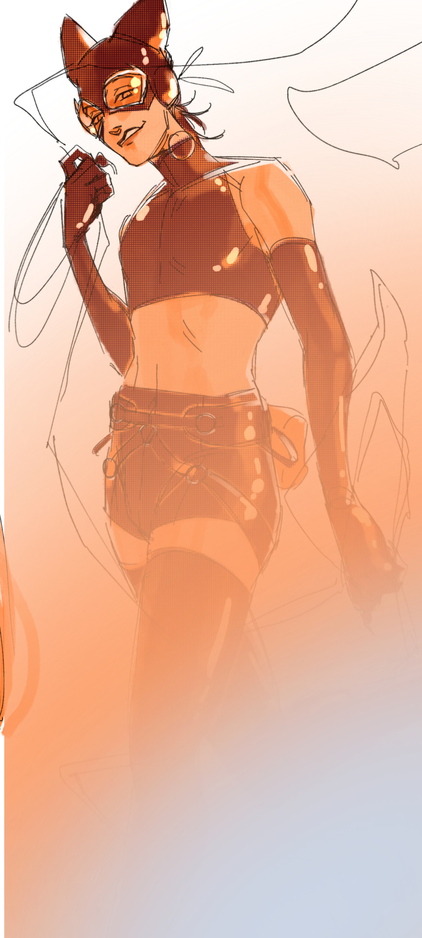
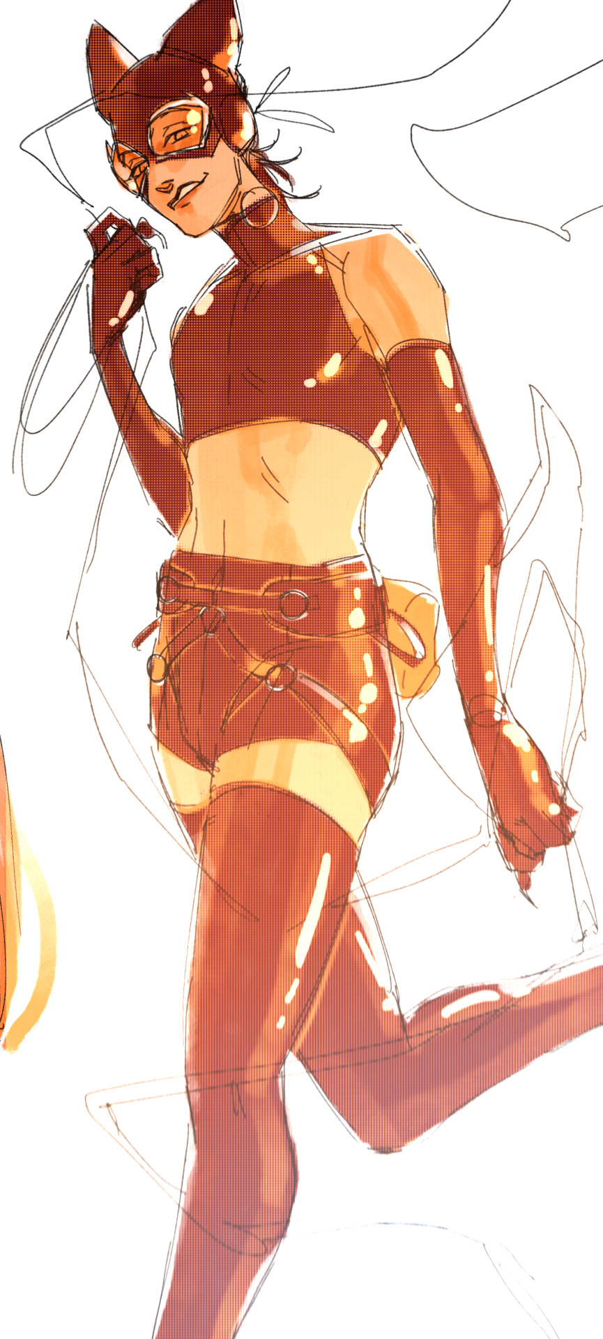
this kinda serves to desaturate the parts of the piece that are less important (ish i was kinda sloppy here), driving the eye to face—the most saturated. the motion blur does a similar thing, where the only thing "in focus" is tim's face
the gradient also sort of adds a directionality to the piece—it starts at the bottom right corner and goes up towards the upper left, causing your eye to follow that same path, which drags your gaze up tim's body
here's what it looks like when i combine 1 and 2:

3. chromatic aberration's been pretty popular recently. it does a similar thing as perspective blur but with more eyestrain (although i went with a really exaggerated version below just to show you what it does) but it looks cool!
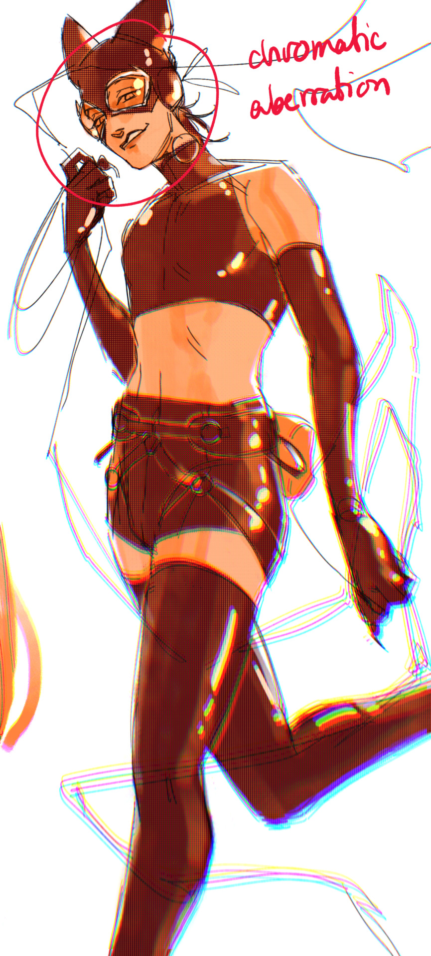
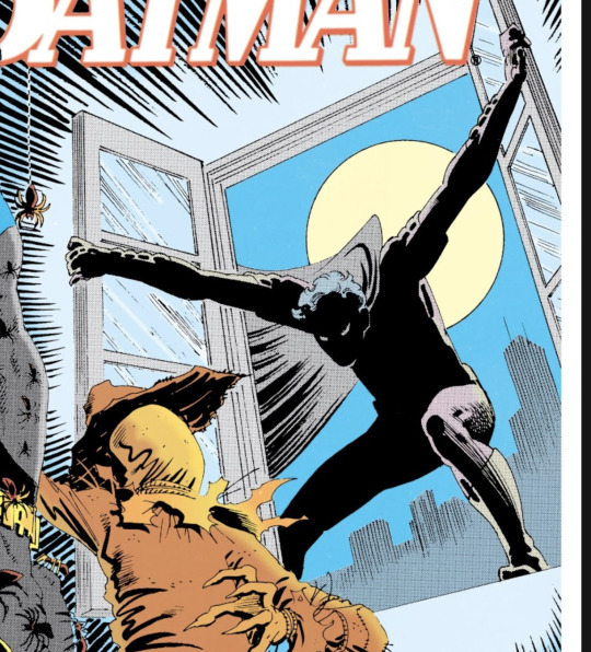
bonus cryptid tim as a reward for getting to the end :-)
#red talks#sart#art tutorial#YeAH UH this got long lmaooo i was on the bus for a Sec plotting this out so#also i am neck deep in a reincarnation/regression manhwa stress hyperfixation so i havent had the brain space to draw#so you get this instead!#if anyone wants recs lemme know lol#thank you anon :)))
41 notes
·
View notes
Text


(Okay let see if I can post this again without tumblr desaturating it)
A few people said they were interested so here’s my fob color pallet I use for all my fob drawings! I love being lazy!!! I add filters and overlays after I’m done so the colors in the end are always a little different but I always use these colors as a base :3
If you use them please tag me :D!!!
#idk if anyone will find this useful#but yeah I just figured I’d post this cus I did a poll and a few people said yes#fall out boy#fob#art#color palette
66 notes
·
View notes
Note
To give credit to the last of us for its queer rep, it’s not just queer characters who have tragic/bittersweet endings. Literally everyone (siblings, parent and child, heterosexual) queer or not, has tragic endings. The older queer couple gets the best one out of all of them.
I guess? I mean, it is certainly much better than if they were the only characters to die in the storyline. But people were on tumblr talking about how theirs was a happy queer story. And I think it is the misleading discussion around these characters that bothers me even more than the writing. Like if I had watched that episode instead of looking up the plot summary, I would have had a meltdown at the end when they both died because I truly had gotten the impression that it was going to be a happy story.
But now that I've mentioned the writing:
It's nice that they live till their 70s. It's nice that they get 20 beautiful years together. And it's a bit fucked that the writers felt the need to end those 20 long years on-screen with a terminal illness and suicide in the same episode they are introduced. It would have been incredibly easy to just say that those men get to live on past the end of the episode. There are a million reasons those men could have continued living in the story.
But that's the thing about a show like this. I think there is a distinct possibility that this show is actually incapable of writing a satisfying happy ending.
Craig Maizin, the show's writer, gained acclaim recently with Chernobyl, proving that he is apparently excellent at writing a long, horrifying tragedy in which character struggle only to find there is no way out.
(His other main credits are The Hangover sequels and the Scary Movie sequels, most of which I haven't personally seen, so make of that what you will.)
But more than the writer's background, the show itself troubles me. It has this repeated mantra in it that goes, "when you're lost in the darkness, look for the light." Which is a cool phrase.
But I have reason to suspect that this writer genuinely doesn't know how to write the light. I have no reason to believe he does. I hope I am wrong.
But when you write episode after episode after episode that is an endless inescapable slog of tragedy and desperation - and then advertise it to me, a sick queer person actually living through a pandemic and trying to escape disease and poverty - well.
I think a better writer would include moments of light and hope beyond just trauma bonding. Moments that don't end in death.
When my wife writes about characters in awful situations, there are still these moments of genuine loveliness and fun and joy between the characters; these moments remind the reader what is worth actually fighting for, living for. Imagine! Entire chapters in a post-apocalyptic novel in which characters don't undergo a "hacking someone to death with a cleaver" level of trauma!
But the fact that Bill and Frank still had to die even after an earnest attempt to tell a beautiful love story....
I fear that the light the story ends with - if there is any - will be as dim and desaturated as the show itself. And personally, I am at a point in my life where I don't care to see a story like that.
It's fine if you do like it. It doesn't matter to me if you find beauty in a tragic queer love story. There are places for that in this world. But it is tragic. I am sure of that. And I wish I hadn't been seeing posts saying otherwise, ya know?
And I hope I am wrong about the writer. But I see cracks in the premise. Like in Stranger Things. There was always a promise of light that kept me watching, but it never seemed to come. Instead, the misery and trauma continued to stack and compound for the lead characters, like in TLOU. But... does the writer know how to make that worth it, for us, for the audience - for me? I don't think he does.
I think it very possible that the light isn't really coming for Ellie and Joel in a way that provides catharsis because I have noticed that on shows with no intermittent joy and hope, this is too often the case.
But I do hope I'm wrong. Because if I am right, then a lot of mentally ill fans will leave the experience more depressed than if they hadn't watched it at all.
But for my own part, I'll just continue to skim through the show for monster design ideas. And also I'll say that everyone should watch Infinity Train - ESPECIALLY season 2 of Infinity Train, if they'd like to see a story in which people actually DO find a light that makes the whole journey feel worth it.
#original#tlou#the last of us#bill and frank#writing#writing analysis#again i don't care if you like the show or not. you can like the show. it is well made. but that is NOT a happy queer ending.#it is not a happy story to me. i know it isn't AS BAD as it could've been but also.... i don't care#my money is on 'joel dies and ellie is so traumatized by the experience that she is basically non functional'#look for the fucking light i guess. wheeeeeeee#infinity train#mt infinity train#lake infinity train#seeing a story in which a character escapes a seemingly inescapable situation GENUINELY made me feel like there was hope for me#and i have personally found that the opposite has an opposite effect#tragedies have a purpose. but i fear sometimes the tragedy in some shows is just there bc the writer feels there must be 4 tragedies per ep#but like. trauma in a story - added just for the sake of extra trauma - it is a red flag for where this story is going#bly manor#FUCKING BLY MANOR MY ARCH FOE#i also see no need for a show of endless tragedy to be this long. like. they are experiencing the SAME trauma repeatedly. what does it add?#ellie loses ANOTHER friend horribly! like. okay. we've... already seen that? why is this one worthy of screen time other than you CAN?
32 notes
·
View notes
Text
luke skywalker has me in a chokehold, i regret nothing but sorry for the mess. this isn't really a fic, more like an outline? (it’s my first tumblr post, pls let me know if i effed things up)
(e)mét
dinluke established relationship, android au | angst, suspense, mild horror | cw: death
luke goes missing, presumably taken by imperial remnants. after about a week, leia is no longer able to sense luke in the force, they fear the worst.
a month or so later, luke arrives back home, injured but alive. he escaped, destroying the base he was taken to in the process.
when asked what happened, luke says they were trying to experiment on the force, so he closed himself off, causing leia to perceive he was dead. then how did i escape? luke doesn’t have a full idea of the experiments but he managed to grab an encrypted chip of data
time has been odd in the lab. there are some points he cannot remember entirely. some are vague impressions. some he remembers two sets of events.
luke has trouble reconnecting to the force. whatever he did to disconnect himself it was done instinctively and too well. despite luke standing right in front of them, leia and grogu have difficulty sensing him. the two do their best to find a fix, leia through research, grogu through connecting with force ghosts.
it takes a moment for anakin, obiwan and yoda to recognize luke. his force signature is muted, desaturated. they hesitate. they suggest luke to meditate with other force users, to have them aid and coax the force and luke to reconnect. for a moment, it was as if luke was an abyss, a black hole in the force.
luke works on decrypting the chip. he’s worried about the experiments that were conducted in the lab. what if they target other force users? what if they target leia and grogu? he doesn’t ask others for their help on the chip. he is afraid. he knows it shouldn’t be, but his family is everything.
when luke dreams at night, he no longer has nightmares. but he cannot recall the rush of joy when he found out leia was his sister. the thrill of flying his x wing. the overwhelming love when he first kissed din. he knows what emotions were felt at the time but the feeling is out of reach.
din does not understand the force, so he does what he can instead. he provides and protects. he brews tea when luke is frustrated over the lack of progress, he tucks a tired grogu in bed after meditation. luke and din may not have exchanged wedding vows yet but they know their relationship is true. din, grogu, and luke, a clan of three. din’s whole world. he never expected to have a family once more after the droids had taken his first one from him.
luke decrypts the chip. he wish he hadn’t. how can this be true? he’s luke skywalker, always has been and always will be. he was born to padme amidala and anakin skywalker. he was raised in tattooine by uncle owen and aunt beru. he had fought in the rebellion against the empire. he— he—
he slices down his left arm. he sees wires.
leia and grogu are able to sense the bond with luke once more. he is able to send basic thoughts to them, he is able to levitate objects, his strength in the force grows daily. a black hole.
they are attacked and luke is injured when trying to protect the children. they were distracted, several of luke’s students had fallen ill. there is no blood, only oil and sparks. then what were these fluids running down his face?
droids had destroyed din’s world once. he knows they were only puppets, ordered by their master, but the shadowed mastermind was not the one that littered the streets of his childhood home with corpses. droids are the symbol of violence, of trauma, of lost happiness. din dislikes droids, din is afraid of droids. luke skywalker is an android.
who is he? what is he? he looks like luke skywalker. he has memories of luke skywalker. he acts like luke skywalker. but he is no longer made of flesh and blood. it's no longer only his right hand that is made of wires and gears. who does that make him? what does that make him? what makes luke skywalker who he is?
the android is a ticking time bomb. a vacuum that siphons and steals. a parasite. its "will" does not matter. it was created for a purpose. both an experiment and a puppet. can the force be stolen? can a non-force user wield the force? can they leash luke skywalker?
robota. it doesn’t matter if “luke skywalker” wants to protect his family. its purpose was not to give, only to take.
din goes to the ruined lab. there is barely anything left after the explosion. but he finds mangled steel and wires that seems to have come from a hand. he holds it tightly to his chest, whispering apologies and words of love. he buries it at the base of the tree that luke loved (loves) to meditate under.
“luke” loves his family and his family love luke. the luke who is no longer here, the luke that is the true owner of these memories and feelings. he is an imposter, a thief that stole luke’s home and family. but isn’t he luke in all parts that matter?
smiles, tears, compassion, strength, the good, the bad. it’s all the same. then isn’t that enough?
leia sees her brother, han and chewie see their friend, r2d2 and c3po see their companion, grogu sees his teacher and din. din sees—
din sees—
din sees blue eyes. leia and din hold luke's hand. they visit where he is buried.
"welcome home, luke."
23 notes
·
View notes
Note
Hello! I'm a little nervous writing you ☺️
Well, I'm from a country where we speak Spanish, so excuses me if I write weird (I'm really not very fluent so sorry if you can understand something 👉👈💨)
I discovered your beautiful Morgyn recently and I fell in love 🤯, They were mind-blowing and I cannot resist to search the person behind the art, so I found you 😊 (And discovered your Caleb and I just could die in peace when I see Morgyn and him in cuddling mode -my heart shake, trust me 🥵-)
Well, I have some questions 🙋 😅
1- Where can I read your story? I need it just like I need air to breath.
2- I'm always ask myself how other people sims are just so beautiful, I think it was a blender or something, but I saw videos with that ...grafic effect?...shadow?... that make sims so natural, like they were took it from a 3D movie and so, Can you tell me that it is a mod, a programming thing or so? And where can I find it?
3- ....Your Morgyn hair... 🙂😳🤌 If you know some CC creator who do curly hair that screams "blond sexy mage"... please recommend me 🙏 (and if you do you Morgyn Hair, I just tell you that it's the most gorgeous thing ever, and I really like to have something like that in my sims CAS some day 🥲)
That it... 😅 thank you and sorry for been a mess in english 🥴
thank you for a warm message. don't worry so much about your english, i'm not a native speaker myself, so i'm not the one to judge you. i mean, you're speaking a whole foreign language, isn't it cool?
okay, lemme answer you in order:
you can't read my story just yet, i'm currently writing it for only myself and playing it out, but i can't gather courage and energy to start taking screenshots for it (mostly because i'm a perfectionist and i want everything to look perfect from the very beginning, but screenshots are not my forte, and i'm not happy with my english). but i'll definitely start posting it at some point anyway because my yearning to share it grows and grows with each day :)
it's not a blender, it's called a reshade. basically, it's an effect overlay that starts with your game. if you look for reshade presets here on tumblr, you'll find a lot of them, some are very bright, or very smooth, or sad and almost desaturated, some have depth of field, some have an outline around objects and sims, etc. this particular shadow effect that you liked is MXAO. i used this tutorial when i installed reshade for the first time. people also use gshade lately, that's just another program but i think the same presets work in it just as well.
i don't usually do wcifs but i must clarify that this is not my hair. this particular hair is named "Leo" and is made by clumsyalien. Here are some "blond sexy mage" hairstyles that will suit Morgyn: 1 (Leo) 2 (Octavian) 3 (Everett) 4 (Eliott) 5 (Adriana) 6 and 7 (Rael and Nicolas, also look at Kea that is longer but also sexy mage) 8 and 9 (Morgyn and Phantasm) 10 (Heartstrings) 11 (Morgyn) 12 (Wave) 13 (Jazz riff). clumsyalien is basically your person when it comes to curly sexy mages.
17 notes
·
View notes
Text
RRR fanart


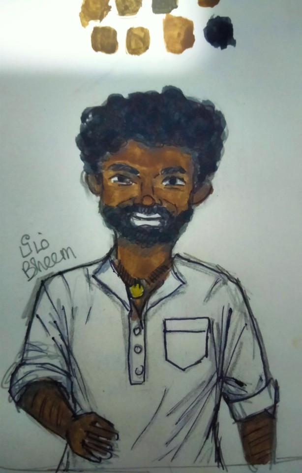
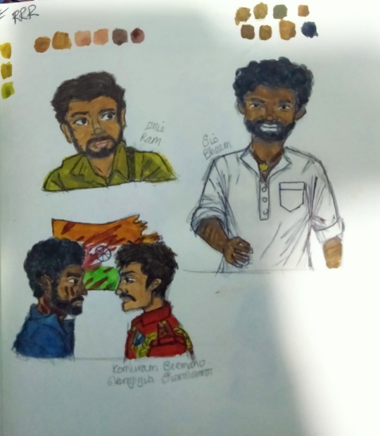
I'm so deep down this hole I can't get out. Also Rambheem has my whole heart man. I'm always out here to share my love with y'all. I’m just sad cause Tumblr killed the colours, so desaturated now.....
PS (if any of you guys are also Rambheem fans and RRR stans in general....join our discord server! https://discord.gg/DQqkgck7 )
#rrr film#rrr fanart#rambheem#rambheem fanart#rrr ram charan#rrr#jr ntr#digital fanart#South Indian Cinema#alluri sitarama raju#komuram bheem#ram#bheem
34 notes
·
View notes
Text
im coming back to the internet!
update post? im coming back to tumblr, insta, yt, etc again. soon i will be back to making up terms and posting the silly little flags.
anyway i need to talk about why a certain hashtag has been removed from many of my posts. and the reason i was gone in the first place.
look, im not going to sugarcoat it, i was in an abusive relationship. im not going to go too much into detail but this person was very controlling over me and my system and was abusive to me and all our headmates. to people worried where me and all my friends went, this is what happened.
i didnt want to say anything about it online while i was still with them because i was scared of them (and i still am.) i had purposefully not questioned our relationship until one of my headmates brought it up that their not going to change. which in all honesty they didnt.
but looking back at the posts i made then, it was obvious something was wrong. firstly i had to break one of my blog rules of not giving credit to creators of terms/flags since terms belong to communities, not people. they always wanted credit for whatever they made, so i gave it because i didnt want to fight about it. also as sone may have noticed, my flags got very desaturated in color. they had this thing for really desaturated colors to the point where some of the flags they made couldnt even have the number of stripes counted because the colors was too hard to see. well he got mad at me for anytime i put even slightly bright colors in my flags. i know some of them are too bright, which is a topic for another time. but they was being somewhat ridiculous with it, making me change the colors on flags even if i already desaturated it. there was also one time they said my flag was ugly and remade it, which made me feel really horrible because i like the flags i make and for someone that i loved to say they hated it made me cry. i dont really care much if people want to remake my flags or hate on them, its just when someone that was close to me did it, it really hurt.
also im going to keep this part short because i really dont wanna have to bring up other stuff they did but basically i never felt like they accepted me for who i am. it was not liking me because of i have too many genders and pronouns or because my orientation is uhh weird. like oh yeah make fun of me because my labels are stupid or becausse i put too many pronouns and shit on my personal google doc. also the um.. roleplaying (not going to elaborate on this.)
they knew how much i care about making terms and flags but yet they ruined it for me. at one point i gave up on making terms and flags and even archiving flags or even adding things to my gender horad because i completely lost my confidence in all of it. shortly after that i started loosing my will to live. one day after something happened that pissed him off he quit talking to me and didnt break up with me. thats unrelated but it still makes me angry. i didnt want to leave them because i didnt want to admit to myself that i screwed up by getting together with this person. only reason i ending up leaving is because one my headmates did it. after that i realized something. i never loved them.
dont go and find this person. just avoid them. if you see them out in the wild, just walk away. just please dont tell them i said anything or that im back online because im trying really hard to avoid them. i dont feel safe being anywhere near this person so i really dont want them slithering back to me. i know their not a very pleasant person to be around and that they do have a history of not only abusing us, but others to.. but please dont ask me for now atleast to make any type of call out post. its not safe me. hell, even posting this probably isnt safe. but im not going to hide this. because im not just going to suck up to them and cover for them forever.
anyway have a good day/night everyone and thanks to anyone who read all the way through!
#anarchy-flagz#anarchy-flagz-boo-boo-bunny#tw abuse#tw trauma#tw selfhate#tw self destruction#long post
2 notes
·
View notes
Note
OUGHGHGHGHGGH thank you so much for the compliments I'm gonna 😭😭😭😭😭😭😭that means a lot coming from you!
I rarely post art though haha, I think all I've got on Tumblr is my one (horrid) MineDai render, and that Mine study I'm sure you've seen on Twitter. So I can probably speedrun all my works right now and save you some scrolling: x x x
I live for the contrast between Ichi's design and the others' honestly! Love that Jo's and Arakawa's remained all moody and sober while Ichi and Aoki wound up wearing opposing primary colors. Mitsu's a fun case because he's always been a mix; dark and colorful in the 2000s, and his suit in 2019 is about the color you'd get from mixing Ichi and Aoki's suits and desaturating it.
But sort of on the topic of Nice and Beautiful and Arakawa doing light makeup for him........

thank you for dropping the links (and preemptive apology for me spamming your notifs in a minute OOPSIE)
the contrast between ichi and aoki's designs is SO good and i love it so much- like Y7 really couldn't stress enough that aoki and ichi were the exact opposite to each other and i live for it 👏👏
PLEASE HE LOOKS SO NICE WITH THAT SHADE THOUGH..
#snap chats#oh i love mitsu tho- its cute how his dress shirt in 2019 has the same design as his shirt from the 2000's#moreover i love how he's like. a part of the family but in the sense where you have that one friend that stays over so much#he might as well live there right. thats the energy mitsu gives and i love it (even if he is technically a part of The Arakawa Family)#his suit being purple is a lot more abundant in rggo's art but i like how its still discernible in his Y7 model#it's a nice way to show him as sort of a bridge for ichi- like helping him get back in contact with arakawa and to get the full scoop#also it was just great to see him again :] he's got My Guy status#ok have i talked like a normal person long enough.... is everyone else gone.... nice....#what movie/show's this from asking for a friend and the friend's me jaLKJAKLEJ#this is just reminding me though that tsutsumi has such a cute smile 😭#bless Why Don't You Play In Hell cause he smiles so much in that movie.. even if its at The Funniest times..#i just wanna go back and watch all my fave roles/scenes with him now.. i shant tho but i will think of them..#but in an attempt to stay on topic maybe i'll dig through the treasure trove of arakawa + makeup ideas i have hoarded#i know i posted that Arakawa Properly Glams Up Daigo one but i know i got jo and masato in the back#no promises though im very fickle but it's necessary to let everyone know I Am Thinking A Lot..
3 notes
·
View notes
Note
Hey Noodle! How's life been? I was wondering a few things...if you wouldn't mind answering a couple of questions!
What kinds of landscapes do you really enjoy painting/drawing?
Are there colours you find yourself really gravitating to?
What do you reference when drawing/painting? Your own pictures? Other peoples? Real life subjects?
Favourite watercolour method?
Do you pick out the size of your canvas/paper or just grab one on a whim?
What kind of subjects draw your attention? (e.g Happy people, colourful flowers, or maybe even still life's you create yourself?)
Favourite pencils/charcoal for drawing?
Do you have any tips for younger artists getting into traditional art? Anything you wish younger you knew?
:] No pressure to answer all of these, if any, btw! Have a good one :D
Hello there :D life has been decent and I hope you've been well too!! Let's see
-i really like to paint very green and saturated landscapes. It can be anything from flowers to trees to mountains, I just love it when there's lots of strong colours. But I mostly like to paint landscapes that are a bit messy? It helps me be a little looser with the painting and not obssess over details, if that makes sense. I try to use techniques that give the illusion of details and depth, though i don't know if i succeed but I try lol
-at the beginning, when I started out with art, I was always quite worried about it being realistic. But after a while I now feel that real life is quite desaturated, everything in nature is a tone of grey, and absolute colours are not very common to find. So I now try to make my art as colourful as possible for it to look lively and more my style, becasue when I was aiming for realism, all my art would turn out dull and muted and I couldn't figure out why. Some colours I really use a lot are greens, all kinds really. I love all colours, but I think green is the colour I enjoy using the most these days.
-i use a lot of places to find my reference photos- pinterest, tumblr, Instagram, Google, and my mom is always sending me random pictures of clouds and landscapes and mountains too. Sometimes when I'm drawing people and I need to understand anatomy I use myself as a reference, although I don't really draw full human anatomy much, only portraits. Sometimes I use my own pictures of flowers and clouds and all that as reference too. I actually have a folder in my phone gallery for references, and I put at least 5 pictures I find in it everyday, because I'm always finding weird things to use as references. I save a lot of old paintings by classical painters too so that I can study them later, learning from the masters is the best way to learn :)
-ehh I don't really know the formal names for methods, you know? But I do like the wet on wet method, I love the look of it. I also like making clouds in watercolour, also fun hack- put down a wash of your blue watercolour, take a paper towel and blot where you want clouds to be-voila pretty clouds!!
-i just grab stuff on a whim and use whatever I feel like whenever I want and make it fit to my art, I don't really plan much, although I'm trying to do that more lol
-i actually don't have a definite favorite subject, I think it really depends on my mood, but I think most of the time I really like making simple things you know, like goats, urban sketches, simple portraits. I don't try to overthink about it, and just draw whatever I feel like. Although in portraits I really love drawing people candid lately
-i use the Staedlr pencils and Faber castle Matt black hb pencils for graphite drawing, and for charcoal pencils I use a local brand. I also have charcoal pencils from General Pencil Co. And they're really good too
-well I think one thing about traditional art is it can be expensive. So what I used to do when trying out a new medium was buy a cheap one and if I like it then get a better quality one. Also when it comes to brushes, I think it's best to buy good quality brushes. I used to buy cheap brushes and use them until they were in horrid condition and then buy new ones every few months. It wasn't a very good system, so I bought better quality brushes and learned how to take care of them and now I have had some of my brushes for years and they're still in really good condition. So learn how to take care of your art supplies!! Also do research about art mediums and supplies, so that you know what you should start with when you're trying something new and don't get overwhelmed
When trying out a new medium, don't feel bad if you don't get it at first, it takes time and the first painting will probably be muddy, but don't give up without trying your best!!
I also think that when it comes to art, it's very important to practice. So draw everything! Fill lots of sketchbooks. And not everything has to be good or perfect, it's quite cruel to expect such perfection from yourself. I still struggle with practicing regularly but it really does help.
And as I mentioned earlier, learn form the masters! Whatever art style you're trying to do or learning, studying and drawing older artworks of masters will help you a lot
thats all I can think of now, thank you so much for this ask galen, you have a good one too <3333
7 notes
·
View notes
Text
I've updated the tumblr app and I finally have the metallic logo too, but I must say
God I love that desaturated purple that appears with the logo as you open the app. I've always used the default mode for colors but I swear if they make a whole mode with that purple instead of the true blue I'm definitely changing into that.
5 notes
·
View notes
Note
Jamie, how do you make such pretty gifs&sets? I’m in love with them! I’m curious about your process, could you tell a bit about it? How do you get such pretty colors/how do you get such pure whites? Asking for a tutorial is too much, but I wanted to let you know that for me you’re the queen of pale gifs on tumblr dot com!!! 😽
hi anon!!! you are so kind omg 🥺💛 thank you so much!!! beneath the read more i will tell you all about my process <3
so usually my layers on a pale gif will look something like this:
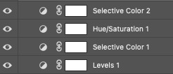
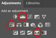
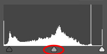
i always like to start with levels to brighten the brights and darken the darks in a gif. i especially like using the middle arrow in my levels layer and moving it to the left to brighten the gif while keeping it soft, but you have to be careful when using this tool because it will lighten skin tones and you don't want to palewash people of color in your gifs.
i also prefer my gifs to be neutrally-colored, so i like to take out yellows, cyans, blues, and greens. to do this, i use selective color and hue/saturation. what i'll do is i'll turn my yellows all the way down with selective color first,
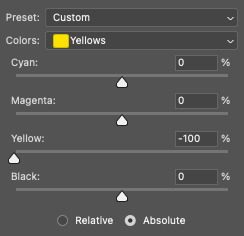
and then i'll completely desaturate yellow, cyan, blue, and green with hue/saturation.

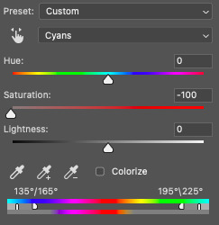
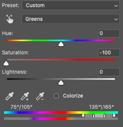

i typically leave reds and magentas alone because i like those colors to stand out in my gifs. i will also skip this step if i want cyan, blue, or green to stand out in my gifs, like in these sets: x, x. you can also mess around with the lightness option, i really like turning that up on cyans if i need a bluish gif to be lighter!
some other tools i like & use from time to time include brightness/contrast, curves, vibrance/saturation, and color balance!

if a scene is proving difficult to color, sometimes i'll start with a curves layer, or i'll add a brightness layer at the top. again, when brightening gifs, you need to be make sure you aren't palewashing people of color. here are some tutorials for making pale gifs without palewashing: x, x, x, x.
color balance is a really helpful tool once you get used to it as well! i used to use it all the time (probably overuse it honestly) in sets like these: x, x, x. if you want your sets to be extra cohesive, this might be the tool for you! nowadays i don't use it to make all my gifs the same color, but i do like to use it to neutralize colors sometimes. like, if a gif is really green and i don't want it to be, i'll turn up the magentas slightly to help!

you can also use the levels layer to help with that! if i have a gif that is very green, red, or blue, i'll use the extra color settings on my levels layer to turn colors up and down till i have a base coloring that works for me.
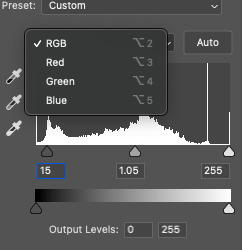
i also like to add contrast if i think the gif looks too flat, or if i don't think the dark colors are dark enough. and although i use the vibrance/saturation tool mostly to desaturate gifs a bit, i also like to increase vibrance sometimes! i think a large part of gifmaking is just letting yourself experiment with different tools and settings to find what works best for you (and for your gifs). since i do each gif by hand, i spend a lot of time just pressing buttons and seeing what happens. sometimes it works, and sometimes it doesn't!
if you have any other questions, let me know! i'm always here to help<3
4 notes
·
View notes
Text
Final Project
Before I begin, sorry Merlin, this post is longer than I expected. But I hope it’s an interesting read as I had a lot of fun attempting this project!
Also I think Tumblr desaturated some of my screenshots D:
-------
For our final project, I opted for personal branding since I was more familiar with myself than CNM, and also because it seemed like a nice opportunity for self-exploration, especially in the last few weeks of the semester where we tend to get pretty lost about who we are and what we are even doing with our lives.

I first created a moodboard for the vibe I was going for. I love the sky, especially sunsets! Most people find sunsets comforting, but I find them fun too. Every sunset is a reminder that the sky isn’t just the same boring blue. I know many people may not see the fun side of sunsets like I do, but I wanted my brand to feel just like how sunsets feel to me.
Logo
I wanted to include my name in it; not my actual name, since people tend to have difficulties remembering Chinese names. Perhaps my initials or a shortened version.

The squiggle
This looks like my handwriting, and it has my initials. I like its minimalism but it’s too elegant.
I continued exploring different ways of portraying my initials, and it suddenly hit me: what about jigsaws? I’m a huge fan of puzzles — jigsaws, rubik’s cube, sudoku, literally anything. I think that says a lot about me: I love problem-solving, and I have a great deal of patience. Those are personal traits that I would want to portray through my logo.

I went through a handful of drafts before arriving at my final logo. Initially, I envisioned using both my initials (MH), but I had issues with the letter M. I tried using both regular and irregular jigsaws, before deciding to focus on H which looks a lot more compatible with jigsaws. It took me long before I finally realised that there’s a jigsaw piece that looks like the capital H (Draft 4), but I had some qualms about using that on its own as my logo. I felt that people would only think of it as a jigsaw, and no one would associate it with the letter H, so I sent that to my friends and they confirmed my thoughts. Thus in my final logo, I included more of my name so that people will read my logo as a word, and associate the jigsaw with “H” as well (gestalt principle: proximity). I used Cooper Black since its curves complement the curves of the jigsaw, and edited the corners of the jigsaw to match the slightly sharp edges of the letters (gestalt principle: similarity).
I considered using the jigsaw on its own as a responsive logo, but decided against it as I really wanted people to interpret it as “H” as well. If I do end up using this brand in the future and it gains some traction, perhaps I’ll reconsider again.
My friend said draft 3 looked like a giraffe, inspiring me to make another giraffe icon that looks like “h”, since giraffes are chill and so am I.
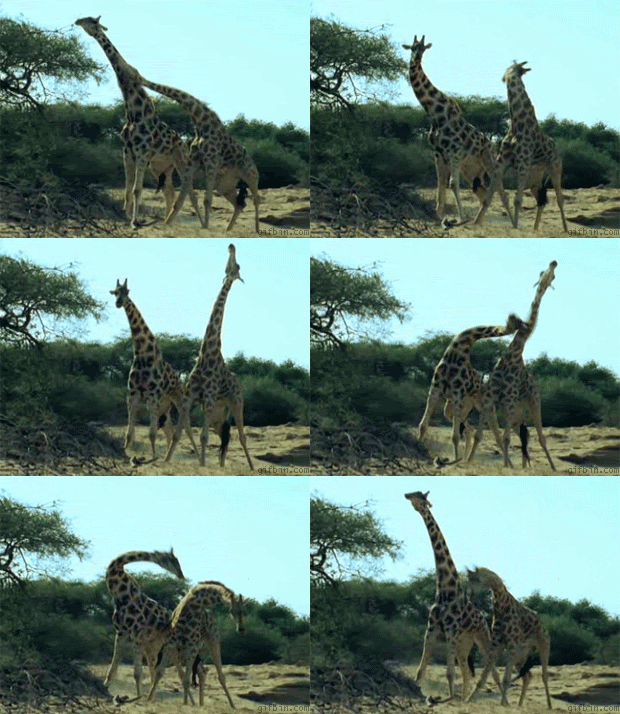
Chill, until they fight
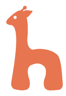
The giraffe
I still preferred my jigsaw logo, but we had to bring 3 logos to tutorial so I brought the squiggle and giraffe along too. My classmates really liked the jigsaw logo and I used that eventually.
Brand colours
I had to include burnt sienna. It’s not my favourite colour, but I have a bag that’s burnt sienna and every time a friend sees me with it for the first time, they always comment that the colour suits me a lot. I don’t get that often, so there must be something about burnt sienna. It’s a common sunset colour, and it’s also inviting, comforting, yet adventurous and fun. I like the connotations associated with it.
To complement it, I included yellow, an equally warm colour, and blue as a contrasting colour to balance them out. I also had neutrals – ivory and charade. Ivory is a warmer shade of white, and charade is less glaring than black, which fits in better with my other colours. As a whole, the brand colours looked fun, which was what I wanted.
I couldn’t decide which colour to use for my logo though. I like the burnt sienna variation but both felt warm and inviting. Eventually, I stuck to burnt sienna after my classmates pointed out during tutorial that yellow could be too in-your-face and less versatile.

Typography
Since I used Cooper Black in my logo, I wanted to use it in my brand too. I like its friendly look and it’s a good match with the style of jigsaws. However, it’s not the best typeface to read in for body text when there are many words, so I used Futura PT for that as it looks friendly too due to its round, sans-serif nature, but more readable.
Business card pt 1
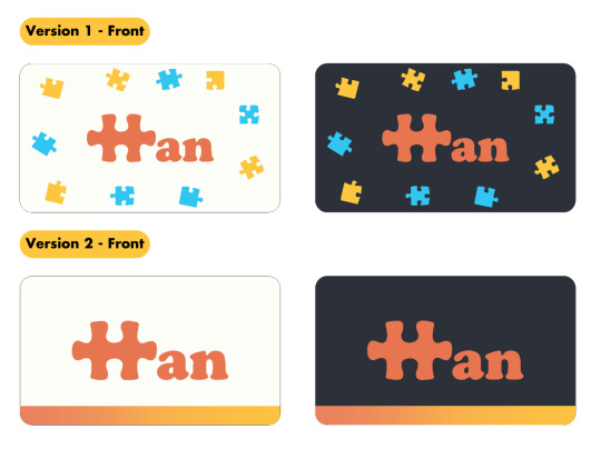
My initial designs. (the blue and yellow jigsaws aren’t by me, I took an online jigsaw template and converted them to vectors using Image Trace. I was going to make my own vectors after I confirm my design)
I ended up using version 1 as it’s more cohesive with my brand, as I saw myself repeating the jigsaw motif. I used my brand colours for the contact details on the back to make it less plain. But when I looked at the front again days later as I assembled my style guide on InDesign, I thought it looked ugly due to my exclusion zone. There was too much space between my logo and the scattered jigsaws.
Style guide
Short interruption to talk about selected pages in my style guide as they will be relevant in explaining my eventual business card design.
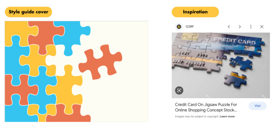
I found the Google image when I was searching for inspiration for my business card, but I found the design more appropriate for the cover page because it reminds me of presentation slide designs. Anyway, I thought the displaced jigsaw adds to the fun style and makes the design interesting. That jigsaw is actually the jigsaw H from my logo, but I’m using it as a secondary graphic instead.
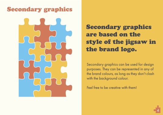
To create the other jigsaws, I first used the shape tool to form rectangles the same size as the jigsaw H. Then, I used pathfinder’s minus front mode to isolate the protruding parts and the blanks, and the unite mode to join them with the rectangles. I wonder if there’s an easier way though, as this was time-consuming.
Problem: I wasn’t exactly sure how to present this page. I think the visual layout can be improved for clarity.
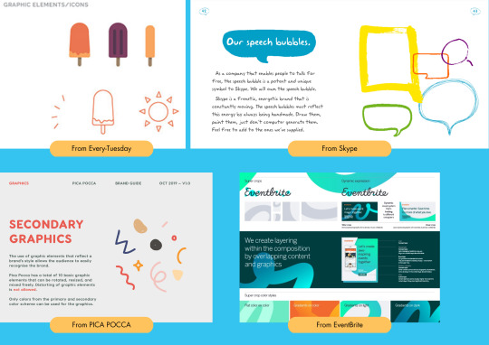
I looked at some references and realised that they split up the different secondary graphics when presenting them, but I guess that’s because they can’t actually combine the graphics too. But jigsaws can be split up or pieced together, so I was in a bit of a dilemma at this point. I wasn’t sure which option would be better, so I kept the pieces together to see what my classmates would feedback during critique.
Business card pt 2
Back to my business card. I decided to tap on my secondary elements and have something similar to my cover page where the pieces are assembled together.

And I got this, inspired by a song I was listening to. The lyrics would translate to “I’m like a puzzle missing a piece, what a jarring void”. I wasn’t going for that emo mood but I realised I can get rid of some pieces to make the design interesting, instead of having everything pieced nicely together. I was concerned that one missing piece would be too jarring though so I got rid of all the jigsaw Hs, also because it feels weird if I got rid of one piece and kept the other. Still attention-seeking (I think), but not to the point of being jarring. Previously, my business card had rounded corners as I wanted a friendlier look. However, I think sharp corners suit the current design better, else the yellow jigsaw on the top left corner will be cut off by the rounded corner. Another reason was because I coloured the jigsaw outlines the same colour as the card to create a tiny distance between each piece. Without outlines, the design felt stifling to me.
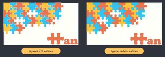
As a result of adding outlines, the pieces on the edges exceeded the card boundary, like in the image above. Initially, I inserted my cards into InDesign as images since I can crop out the exceeded edges, but I realised that after 2 rounds of exporting (once as images, the 2nd time as the pdf style guide), the colours change slightly and they no longer match my exact brand colours, though they look alike. To remain faithful to my colours, I reverted to pasting from Illustrator into InDesign, and added rectangles near the edges of the card to cover the exceeded jigsaw edges. The sharp card corners are helpful in this aspect as I’ll need more than just rectangles to cover the exceeded edges if I had used rounded corners.
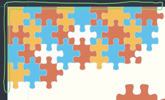
Rectangles
Resume
In my name card, I wrote that I’m a graphic designer and translator. However, since I don’t have any experience in graphic design outside of this module, I included everything that’s related to translation in my resume. I also included my CCAs as it felt obligatory as a student.
After I pasted all the information and trimmed the text, I realised it still has many words. Personally, I wouldn’t say it’s too wordy, but I think it can be subjective. I also coloured the headers and subheaders for all my sections in one brand colour each, besides ivory since that’s the background colour. I kept the body text in charade so that it’s easier to read.
However, something still felt off. My resume also seemed less appealing than the other aspects of my style guide. Anyway, after I submitted my style guide for critique, I realised that the body text for CCA was in black, not charade, oops. I still thought that section felt darker due to the charade headers and subheaders. But I think that played a role too, as it still looks dark (albeit better) after I rectified the colour.
Post-critique edits
1. Added typography use as I missed that out

2. Secondary Graphics
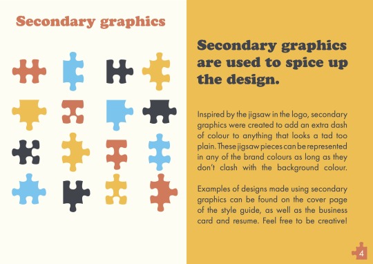
I split up the jigsaws as some of my classmates had issues interpreting what the page was about, affirming that the previous visual layout was indeed unclear. I considered including examples of potential designs by pasting screenshots of my cover page and business card but I had no idea how to format the images without destroying the aesthetics of the page, so I lengthened the text explanation to let the viewer know that they can refer to those examples. I also received feedback that the jigsaws looked like they were in the middle of nowhere, but I realised I happen to have 16 unique jigsaw pieces so I can put them in a 4x4 layout, so hopefully this layout is clearer!
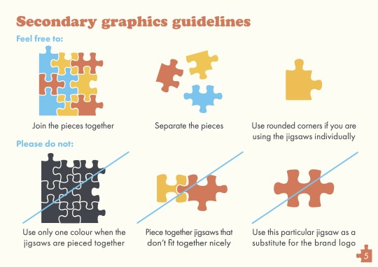
I also edited the guidelines, since the previous one was based on the premise of the jigsaws being joined together.
3. Business card
Some of my classmates said the missing jigsaw Hs looked jarring; some said it looks fine. The consensus was that leaving blanks adds dimension to design, and I had a really interesting comment saying that I shouldn’t change the design even if the blanks may appear jarring as it attracts attention when people wonder “why got blank”, and that's perfect for a business card. Hence, I kept the design and shifted my logo inwards for more breathing space, based on feedback.

4. Resume
Feedback:
Using charade for CCA makes the entire section look dull in comparison, and it also attracts more attention to it
Some think it’s wordy, some think it’s not wordy; ultimately, it depends on my target audience as different audiences have different resume preferences
The jigsaws on the top right corner look too colourful. The use of jigsaws under “Skills” is enough to convey my brand
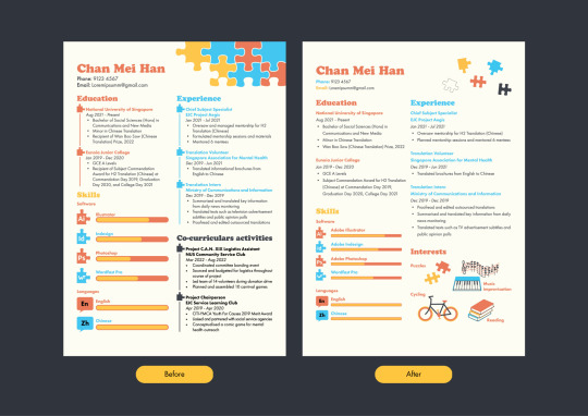
I made pretty big changes here. Firstly, I received a suggestion to colour the body texts of the respective sections in a darker shade of the header’s colour, but the texts were hard to read when I tried it. I think burnt sienna, blue, and yellow just aren’t that ideal to read in regardless of their shade. Besides, Futura PT Book uses thinner strokes, so that plus light colours = eye pain. Thus, I kept the body text in charade for readability, and stopped using charade for headers and subheaders to get rid of the problems of dullness and attracting more attention.
Secondly, I reduced words by replacing the CCA section with “Interests”. “Education” and “Experience” are both closely linked to translation, and I can’t cut the job descriptions as translation is broad, ranging from casual content like food recipes and audiovisual subtitles to formal business contracts. If I submit this resume for translation work, I need the job descriptions so my audience knows what texts I have experience in. If I submit this for graphic design, the previous version doesn’t reveal much about what I can do besides my proficiency in Adobe suite. Thus, I removed CCA since it doesn’t value-add to translation/graphic design, and I drew my interests using Illustrator’s pen and shape tools as a visual representation for what I am capable of designing.
Other minor edits:
Acted on feedback and replaced the jigsaws on the top right with small, scattered jigsaws
Removed the jigsaw ‘timeline’ in each section as my resume looked cluttered
Increased leading for body text to 18pt so my body text looks less like a wall of words
Created the proficiency scales with the line tool initially; replaced them with slightly-rounded rectangles as that suits the block-like aesthetics of jigsaws better
5. Changed my mockup to something less formal to suit my brand

And that concludes my final project! Although it was very time-consuming, it was also very fulfilling. Let me end this with a short story: before another module’s lecture, I showed my Illustrator workspace to my friends for 1 minute to get their opinion on my initial business card designs. I also showed them the first few pages of my style guide. I saw them for tutorial again the next day, and I was searching for jigsaw templates online as references. One of them glanced over at my laptop and she was like, “Oh you’re doing your style guide?” Woah, I was quite happy that she actually remembered my jigsaw motif although she only saw my work for a minute the previous day haha. And so I persevered, and now I’m finally done. Huge thanks to my classmates and Merlin for the feedback; I found the critique for this project to be especially useful!
0 notes