daskunstmaedchen
serendipity
🐱 lillian | 18 | intp-a | pagan witch | artist | vegetarian | graphic design trainee 🐱
960 posts
Don't wanna be here? Send us removal request.
Last Seen Blogs
creatvresoftheniight
wretched and joyful;
xiomatli
eclectic tendencies ✨
nickeeree
god's most pathetic beast
acousticmalta
AcousticMalta Artblog

rachelmbradyart
Artist, music lover, and coffee addict
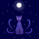
Photo
"Miaka the Witch"
Shop this on Redbubble ♡
#miaka#witch#art#artist#artists on tumblr#young artist#cat#wicca#redbubble#society 6#witchcraft#support artists#drawing#painting#digital art
82 notes
·
View notes
Photo
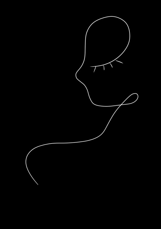
“Simple Beauty”
Shop this on Redbubble ♡
#simple#beauty#art#artists on tumblr#redbubble#design#daskunstmaedchen#lineart#linedrawing#one line drawing
3 notes
·
View notes
Text
Ayeee
I'm back on this account for once!
I'm gonna queue alllll of the art I did for the next few days and try to also get active here again!
1 note
·
View note
Text
OWO
I'll be on my studyblr (@studyinglikeddaeng ) for the rest of the day so if someone needs me, find me over there~ <( ' v ' )>
1 note
·
View note
Text
new netflix show concept idea: two girls, both incredibly ambitious and perfectionist, falling in love and learning how to appreciate life and overcome their fear of commitment. train stations at night, neon signs in dark alleys, gazebos on a rainy summer day, driving on highways, marble statues and ancient architecture. appreciating the other and their quirks and showing them that they are so much more than they think. the wlw power couple everyone needs.
#pleaseeeee omg#that would be so adorable#id watch the hell out of it#i usually dont watch tv shows anymore#but id watch thissss#gay#gayyy#gayyyyy#lgbt pride#lgbtq#lgbt
6K notes
·
View notes
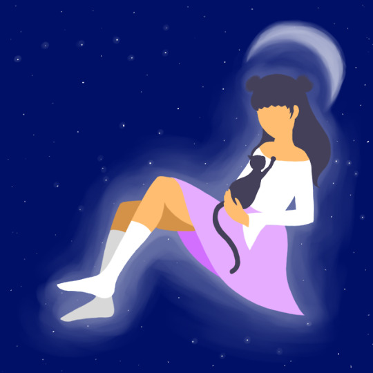
Photo

I’m all aglow and now I know
51K notes
·
View notes
Text
this dumb website is in need of some love, so reblog this if you like the person you reblogged it from!!!
#hellu i jist followed you but i think youre adorable#youre so soft in the tags of the posts ive seen of you#but also youre a nice human for pointing out bad fansites#bc i found that one list of bad fansited and realized i follow bad ppl and now i was able to block them ahshshsh thank you for that#also youre cute
135K notes
·
View notes
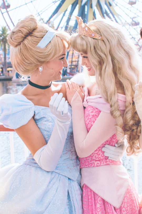
Photo


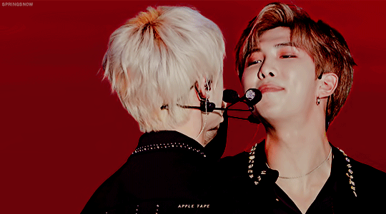
playful, aren’t we?
#ajdhshshshsh#this is so si so so so so adorable#my heartttttt#joonie#jin#seokjin#namjoon#bts#kpop#cute
15K notes
·
View notes
Text
Whoa I didn't know this, I'm gonna block all of them on twt and unfollow the ones I used to follow ewwww
Bad Fansites
so some people might wanna know how many fansites they can actually trust. i won’t include whitewashing since that would be like…..the majority of the fansites but here’s some fansites who have done some bad things that you probably shouldn’t follow and DEFINITELY shouldn’t buy from. also i’m only including ones that haven’t deactivated.
Keep reading
#oof#this is really really scary#honestly im always so sad when i see things like that#why on earth would you stalk and scam peoole like that?#also im kinda sad about dreaminspring bc their photos are really good but when theyre that toxic i cannot follow them without feeling guilty#gonna write all of them down and cross dreaminspring out of my favorite yoongi fansite list#bts#kpop#important#important!!!!#fansites#fansite#bts fansite
4K notes
·
View notes
Text
˚ . . ⊹
. ✧ . * . ˚
⊹ · * .
* . ✦ . ˚
˚ * ·
⋆ . *
˚ * · .
44K notes
·
View notes
Text
Unpopular Opinion #1
So like I hate that women are so pressured in to choosing STEM subjects these days. So many programs are dedicated to steering girls to STEM and that’s great and all but we’ve created a culture that has made it harder for women and girls to study humanities for fear that it’s not good enough. I don’t mean to speak for anyone else but at least for me, I realized through out my high schools years that my love for science and mathematics was little more than an infatuation with being in the “smarter classes” and had much less to do with what I was really interested in. I discovered about half way through sophomore year that I wanted to study law, in particular international relations and philosophy. Once I started to gear my class schedule towards these subjects and to join clubs that better helped me understand these fields, my math and science teachers began telling me how disappointed they were because I was giving up on a “real” career and that it was terrible for me to waste my potential in the better subjects for something I really loved. This isn’t to say that girls shouldn’t be encouraged to try STEM subjects but we’ve begun making a society that believes that no one with a real career has a career in the social sciences or in humanities and to me, it’s absolutely disgusting. We shouldn’t teach young men and women to steer away from their real passions becuase the only real fields of study are in STEM.
#oof this is so true#im still constantly pressured about being interested in arts and languages#bc no one at my school values it#but im an art child#and im very gifted in learning languages#abd theres those few girls that are really good at STEM subjects and theyre constantly complimented and told how cool n intelligent they are#and ive only once in my entire school carreer had a teacher compliment me#it was my german teacher a few months ago#shes asked me what i wanted to study#and ive said first graphic design and then maybe korean or sth with literature#and she said i should totally go for it bc im talented at writing and have a lot of knowledge and interest in languages#but apart from that nothing ever#like our society is all amazed towards stem#but especially art and literature are so looked down on#bc everyones like oh that wont make you get lots of money#but#surprise surprise#i dont want to get lots of money#id rather be happy and less insecure with my art and languages#okay rant over#i talk too much when im upset about sth#witching in the rain#witchingintherain rants
2K notes
·
View notes
Text
What i’ve learned from college thus far
Stop studying the night before. I have noticed that if i keep forcing myself to learn until last minute (which it’s not gonna happen, you know what you have been processing for a while not just right before they hand the paper sheets) i start doubting myself more
Go with an “i don’t care anymore” attitude. This one is my fave. With this i mean letting go of every single worry you may have of failing. If you don’t care about failing there’s no tension or stress during the exam, therefore you will be able to think more clearly than under pressure.
Figure out your minimum hours of sleep. I learned that i need at least 5 hours to function properly. Find yours and use it in your favor.
Relationships with classmates. You probably will only see your friends in some classes or just one, dont let this unmotivate you and not attend to lectures!! Everyone is asleep and no one will think you’re awkward for sitting alone. Don’t force friendships or try acting like someone you’re not, people can see it and repells them.
Relationships with teachers. Can’t stress this enough, if you’re gonna put effort in creating a bond with someone in college, it has to be your teachers. Try getting there early and pick a seat in the front, make questions via email or in person, if you’re shy like me wait until the end of the lecture and talk to the teacher instead of asking out loud.
Learn from failure. Don’t waste precious time giving yourself a hard time, it won’t make you any smarter. Pay attention to details and correct them for the next time, that’s how champs do it AND YOU’RE ONE OF THEM!
Relaxing. I know how guilty you feel when it’s been days and you haven’t looked at your notes, but hey we all go through that. It’s important to disconnect a little sometimes and come back with a %100 battery instead of a %35, am i right? Just don’t let the relaxation become 2 weeks or a whole month.
Hope these few tips may help you if you need them ♡
11K notes
·
View notes
Text
types of note takers
a: spend more time picking which pen and washi tape to use than actually taking notes. their notebook is a giant rainbow explosion.
b: simple. one pen, one notebook, maybe a highlighter if they’re feeling fancy.
c: takes notes on their laptop. organized, minimalist, timely. they have two windows open at all times: homework and tumblr.
d: doesn’t take many notes because they zone out for half of each class and is on their phone for the rest.
e: audio records the classes as well as taking notes by hand. later re-writes notes and types them *just in case* they lose their notebook. they never do.
f: never actually shows up to class, and if they do, they somehow forgot to bring a pen and paper.
g: you never see them taking any notes, instead they are always eating chipotle or mcdonalds in class. yet somehow they have the highest grade in the class.
18K notes
·
View notes
Photo
@demeters-aesthete

1M notes
·
View notes
Photo


A lot of you have been asking how I go about making my graphics, i.e. how I do graphic design, so I thought I’d make a guide - or perhaps a series of guides if you would like - on how to design graphics! First off, I’d like to introduce you to the fundamental elements of graphic design, and hopefully this will help you gain a new perspective. and improve your own design skills.

Lines are structures that connect two points. They make up everything that we see, even the letters and characters we read every day. But more often than not, we take them for granted. In reality, lines are one of the most rudimentary components of graphic design, and they serve to channel ideas and emotion.
Lines can:
Organize pieces of information or elements on a page
Serve as guidelines to lead the viewer’s eye
Provide movement such as using wavy lines to represent moving water
Emphasize certain parts of the page
Set a mood, such as how straight lines evoke order and neatness while zig-zags convey excitement and tension

A shape is any two-dimensional area with a recognizable boundary. They can add interest to designs (such as in backgrounds), organize visual content, and be used to make illustrations.
Shapes exist in three categories:
Geometric shapes are regular shapes like circles and squares
Organic shapes are more freeform, such as a blob or a leaf
Abstract shapes have a recognizable form but are not exactly natural shapes, such as alphabet glyphs, spirals, and stick figures
When brought together, these shapes can form helpful illustrations that will help convey meaning to your work or add some decoration to it.
The effects achieved by the shapes are determined by its form, color, size, and other characteristics. For example, triangles often show excitement and risk, while circles are seen as eternal and often feminine.
In the example illustration below, which is one of my January wallpapers, I use triangles to convey a feeling of vivacity and excitement.

Different shapes may also be used to structure content or create a layout, making it easier for the user’s eyes to find information. This is often the case in blogs and websites.

Color can be used to make an image stand out, convey information, enhance meaning, or group things together, but how do you know what colors ‘fit’ together? When you’re starting out, you might find it easier to look for color schemes from pinterest or wherever you can find inspiration. It also helps to look for images or photographs that evoke the same vibe you’re going for, and then using a similar color scheme.
But what if you want to make a palette yourself? Learn color theory!
Before I elaborate, here’s some terminology for you:
Hue is the color itself
Value is how dark or light the color is
Saturation is the intensity of the color
Now, how do you go about making a color scheme? Here are some types of color schemes you should know about:
Monochromatic color schemes only use one hue but vary in value and saturation.
Analogous color schemes use colors adjacent to each other on the color wheel, such as red, orange, and yellow, or blues and greens.
Complementary color schemes use colors opposite each other on the color wheel. To add complexity, play with the value and saturation of these colors.
Split complementary color schemes use colors on either side of the complement.
Triadic color schemes use three colors that form an equilateral triangle on the color wheel. These are often very stark and in-your-face, so you might want to use this type of color scheme in moderation.
Tetradic color schemes use four colors that form a rectangle on the color wheel. These are more effective if one color serves as the main color and the other three colors are just accents.
When choosing a color scheme, the main thing you should keep in mind is balance. Using fewer colors means it’ll be easier to balance and thus it is less likely that the piece will appear messy and discordant.
Color has the power of evoking emotions and moods, and each hue and shade has certain connotations associated with it.
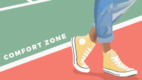
In the illustration below - which is part of my April wallpaper set - I use the color green to convey the safety and familiarity of the comfort zone. The color red, on the other hand, shows risk and danger, but it also represents the courage required to get out of the comfort zone.
So the next time you’re thinking of what colors to use in your project, think of what kind of message you want the audience to receive.

Like the other elements we’ve discussed so far, type conveys meaning beyond what is written. Type can communicate a mood, style, vibe, or feeling. A curly or script font might appear fancy and extravagant, while a handwritten font may seem raw and playful.
Different types of fonts are also suitable for different contexts. For example, sans-serif fonts are more readable on screen while serif fonts are more readable in print. Display fonts, on the other hand, tend to be fancy and decorative, and thus should only be used for small amounts of text, like titles.
Audience and purpose also serve a role in deciding what fonts to use. Large, bubbly text is suitable for a children’s birthday party invitation but probably not for a business card.
In graphic design, different fonts are often used in tandem with each other. The main principle or rule behind this is that you should choose fonts that complement each other. Large, bold fonts should be paired with small, subtle fonts. Oftentimes, you’ll have to rely on your instincts, and that’s okay.
Remember, though, that you wouldn’t want to overwhelm your readers by using too many fonts. Stick to one or two per project. To add variation, change the weight or style of the existing fonts.
Finally, your text would be more effective if you establish some sort of visual hierarchy. This essentially means sorting out your text in order of importance, using different typefaces and fonts. This includes adding a certain weight (or boldness) or increasing the size of texts that are more significant.
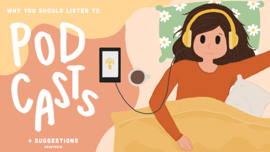
In the title graphic below, the word “podcasts” is handwritten and larger than the rest of the title because that’s what I want to draw attention to, so that readers know what the post is about. My name, on the other hand, is smaller than the other texts.

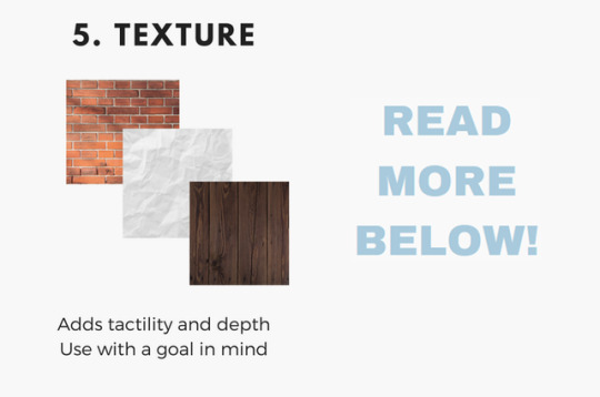
Texture adds tactility and depth and can also be used to evoke a certain feel. In this graphic from my March desktop wallpaper, I used a tape texture and a paint texture to achieve a scrapbook-y vibe.

Some other common textures used in designs are foil, watercolor, and paper textures. Although there are many textures to experiment with and choose from, you should also be careful not to overwhelm your viewers with too many textures in one piece.
Lines, shapes, color, text, and texture are the five basic elements of graphic design, and by understanding how these elements work together, you’ll be able to make more effective designs.
Now, the question is, do I think deeply about all of this when I make my designs? To be honest, not really. A lot of my designs are instinctual, but knowing the theory behind what I’m doing has helped me improve those instincts, and you can do the same!
That’s all for now. Hope this helps, and let me know if you would like me to continue the series or if this brief blog post is enough. Happy designing :)
Disclaimer: I’m not a graphic designer, just a stressed-out senior who sometimes likes to design and stuff.
#eintsein#masterpost#blog#studyblr#studyspo#study hard#graphics#design#graphic design#infographic#productivitiy#organization#learn#knowledge#technology
9K notes
·
View notes
Photo
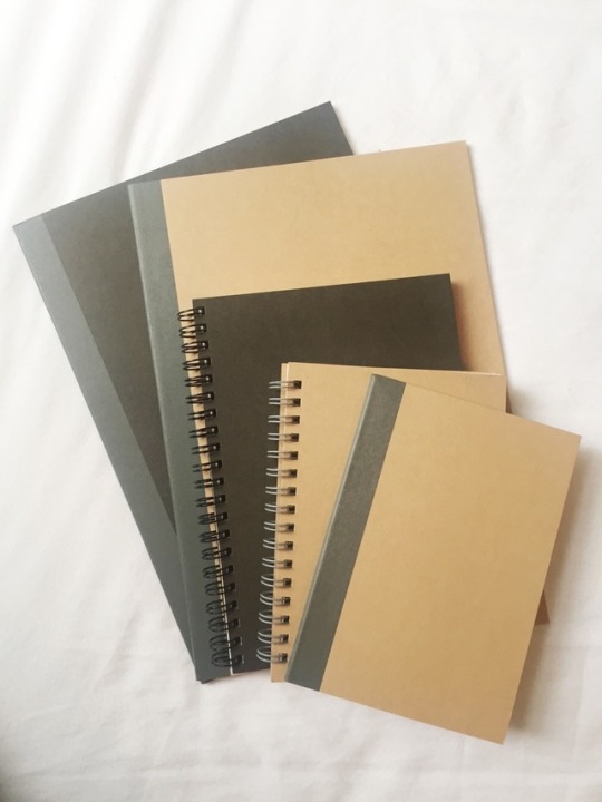

MUJI GIVEAWAY!
Hey my lovely gems its @gemsttudiess here (the new account for @disneygirlstudies) back with another giveaway!
These are my favourite revision essentials from my favourite revision shop! Obviously, to be a studyblr you don’t need nice pens or paper, but I find that it makes encourages me to revise more, so I hope this giveaway acts as an incentive in the way it does for me!
What you’ll win:
Beige A4 lined notebook
Black A4 grid paper book
Black A5 unlined spiral book
Beige A6 unlined spiral book
Beige A6 lined notebook
To-do list pad
Six black 0.5 muji pens
One red 0.5 muji pen
One blue 0.5 muji pen
A little message from me and other little things <3
Rules rules rules:
Must be following me (as its a thank you for my followers) and preferably be active i.e. ask me questions, tag me in stuff, reblog my stuff.
Reblog this as an entry, likes are only bookmarks
You can enter as many times as you like but don’t spam your followers(!!!)
Its international because I love you all and realise very few are lucky enough to have Muji!
The deadline is August 1st so they’ll arrive in time for new school terms!
I’ll use a random number generator to help me pick the winner.
Not necessary but feel free to tag me with #studynshine so I can see your work too!
You don’t have to be a studyblr to enter- maybe these supplies help kick start your new studyblr!
Feel free to follow my Instagram at @gemsttudiess - I’m still in the process of setting this up though and it wont count as an extra entry.
*Disclaimer* I’m lucky enough to be able to work enough jobs to save up enough money to do these giveaways- I work hard to save up and be able to give back to you all for all these years of the support I’ve received! Please not hate x
7K notes
·
View notes
Text
🌺🐱🎨🐱🌺🐱🎨🐱🌺
Ajdhsjhs I'm so hyped for next year (a.k.a. September when I'll start studying Graphic Design)!!!
My new pencil case just arrived and my new highlighters should arrive on Friday and a bunch of muji pens next month and I already have everything else I need for the new academic year ahhhh~
Okay so basically I'm writing this bc I'm planning to start a studyblr over at @studyinglikeddaeng bc I've always wanted to do this but never had the time nor capacity/resources to do so.
But next year I'll have my own apartment, I'll have my own money to buy stationary, I'll have a decent school schedule (every day from 8:45 am to 4:00pm? With a lot of breaks? And very chill teachers that won't kill you when you don't pay attention for a few minutes? Or do other things sometimes? Or even go outside for a few minutes to get fresh air when you're overwhelmed? Sounds good to me!!) and I also know a lot of the teachers and a few students that'll be in my class bc of internships at that school so I'm really So. Damn. Whipped. 😍
So I'll probably start posting random small things like my pencil case, my folders set up, my bullet journal and stuff over the next three months and after that I'm going to start a (hopefully cool and appealing) studyblr!!
I'd be happy to see a few followers from this blog support me over at @studyinglikeddaeng too! 💞💞💞
#studyblr#studying#studyspo#study motivation#study notes#emmastudies#studyign#studyinspo#elkstudies#studyquill#focusign#lookstudyblr#100 days of productivity#bujo#bullet journal
2 notes
·
View notes