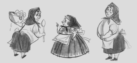
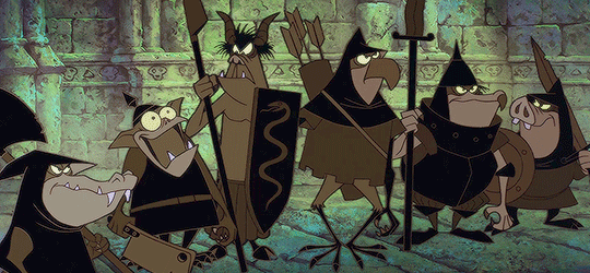
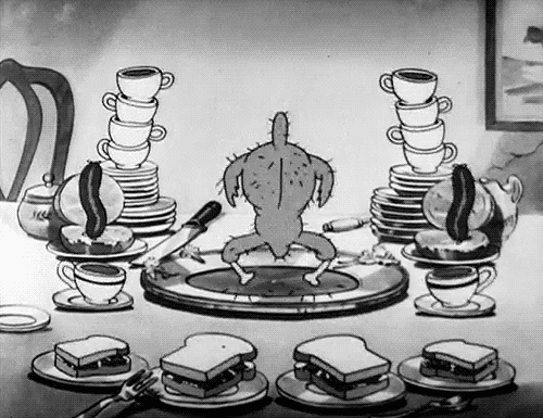
#1950s art redraw
Text

They’re a mess, but a cute one so it’s fine
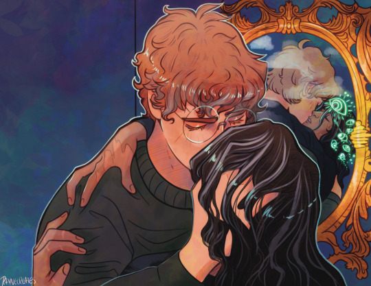
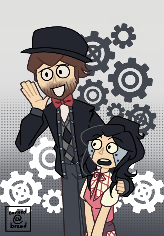
[ This was the Steddie print option for my Acid Rain patrons for Feb 2024 ] Reference
2K notes
·
View notes
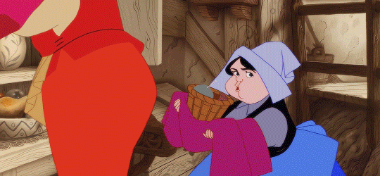
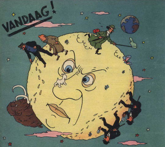
Text
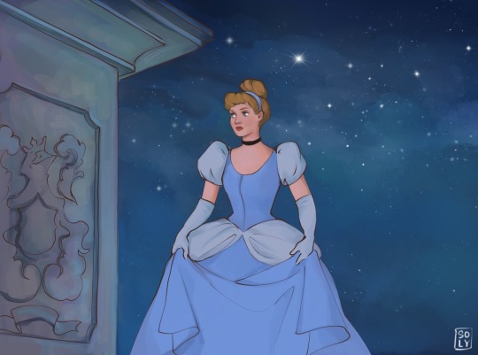

Cinderella
My vision✨
#artists on tumblr#digital art#redraw#screen redraw#study art#disney art#disney movies#cinderella#cinderella 1950#disney prinesses
35 notes
·
View notes
Text

Finally a new post lol
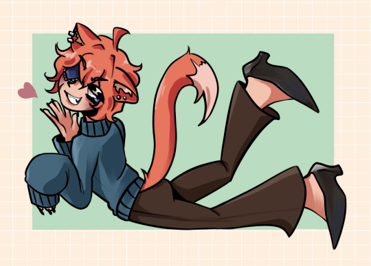
I redrew this old drawing from 2019! This is my oc Ian, he was one of my favorite ocs lol
I tried to keep the big elements of style from the old one like the big feet and hands ! Hope you all like :)
#fanart#kawaii#my art#original art#japan#original character#1950s#60s#glitter#nature#neko#animeboy#cat#oc#oc artwork#ocart#redraw#genahin impact
5 notes
·
View notes
Text
I’ve called to say goodbye

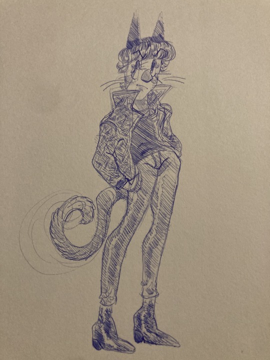
thought it would be fun to redraw this :) I still like the original more but I’ve definitely gotten better at shoes
#pen sketch#doodles#traditional art#pen drawing#my characters#original character#redraw#my art#my artwork#sketches#1950s#1950s fashion#jokingly calling this my 50s au#Because this isn’t something you’d really wear at the time he’s 16
6 notes
·
View notes
Text

I just remembered this au and thought I’d do a bit of a redraw for it!! 💕💙
#my art#nordic winter#rwby#weiss schnee#nora valkyrie#1950s au#drawing#fanart#artists on tumblr#traditional art#redraw
18 notes
·
View notes
Photo


Redraw
#redraw#vintage#1950s#1950s fashion#1950s art#digital art#my art#mine#art improvement#artists on tumblr
1 note
·
View note
Photo
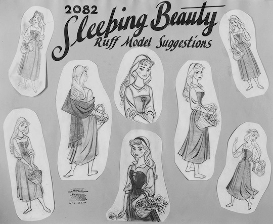


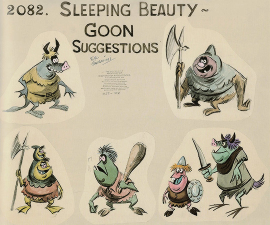
Character designs for Sleeping Beauty by Tom Oreb
“Eyvind and I were the two hot new guys... We’d work on the weekends, we’d throw storyboards up... a lot of the old guys just absolutely turned on us. It was really kind of brutal in a way. But guys like Tommy, Ward Kimball, Bill Peet, Don DaGradi, they didn’t have that closed kind of thing. Tommy really married Eyvind and I. He became our friend. He looked after us. He talked us up. So the three of us became really good friends. We started hanging out together and all of that. Eyvind was kind of like Tom’s equal. They were both in the same age range and everything else. And I was the young kid. I was probably nine or ten years younger than both of them. I just became Tom’s protégé. I idolized him.” - Vic Haboush, layout artist
“There was only absolute harmony and enthusiasm between Ken Anderson, Don DaGradi, Eric Larson, Tom Oreb and myself. We set out to create the most beautiful picture we could do. We all loved each other’s work... The first production layouts were given to me to redraw in my style. Tom Oreb drew the characters over and over and over again. The Ink and Paint Department made finished cels of Tom Oreb’s characters and they were placed over my backgrounds to see if they would fit.” - Eyvind Earle, background painter & color stylist
excerpt and photos from They Drew As They Pleased: The Hidden Art of Disney’s Mid-Century Era: The 1950s and 1960s by Didier Ghez
Aurora photo [x]
for @winged-time-criminal (who asked me to gif my favorite princess movie)
#tom oreb#sleeping beauty#disneyedit#vic haboush#eyvind earle#character design#artist#my gif#my edit
563 notes
·
View notes
Text

More diamonds!
Behold, the small diamonds in another screenshot redraw
Lore and original reference below!
Please read it I liked writing this.
Pink Diamond (Steven Universe)
The excited one.
Everyone knows pink Diamond, the diamond who fell in love with her colony and tried to free it, and her pearl, who followed her out of love. Together they faked her shattering, and ran to protect Earth and the humans who lived on it.
Everyone knows the classic girlie, my beloved pink diamond. Pink is very princess themed, rose being a graceful elegant princess, and Pink, her jester like counterpart.
Blue Diamond (Sage Universe)
The more emotional one.
She discovered Earth and fell in love with its beautiful oceans and silly humans. She sobbed for the other diamonds to free earth, but they simply thought it was another tantrum, and dismissed her time and time again. So she faked her shattering with the help of her Pearl, a soft spoken gem who would do anything to make her diamond happy.
This cutie was so fun to do. Her theming is based off the medieval era, with a slightly more peasant dnd look to her design. I’ve struggled with this design for years, but she finally looks the way I want her to. I let her keep Blue pearl, I just can’t bear to separate the diamonds from their pearls. Blue Pearl is still very soft spoken and sweet, but she can still get angry in the way only blue gems do best, balancing the cute and the scary 💙 She still adores art, and will pursue that later in the “series”
Yellow Diamond (Stephan Universe)
The cautious one.
At first, Yellow didn’t see the appeal of her colony. But after observing the humans, and the strength they showed, she fell in love with the toughness of Earth. She demanded to free her colony, but her fellow diamonds didn’t listen, used to her spoiled behavior. So, with the help of her mischievous pearl, she faked her shattering, fighting for Earth with every fiber of her being. Her pearl was happy for the adventure, and the attention that came with it.
Yellows theming has always felt very war general to me, so I felt the need to keep that warrior, soldier type theming with how she looks. This particular look is, spoiled royal interested in fighting, if that makes sense. Yellow pearl is still in love with herself, but I gave her a bit more mischief. She’s a fan of drama and being sneaky. Of course she still adores modeling, how could I take that from her, come on.
White diamond (Scorpio Universe)
The curious one.
White was fascinated with Earth from day one. She’d never seen a planet so lush, with such thriving species of so many creatures. The way everything fell perfectly into place, and yet was so chaotic and strange, made White want to protect it. She tried to advocate for Earth, but her diamonds ignored her, building her a zoo to satiate her drive to have some of these creatures. But it wasn’t the same, it was too orderly, the organic chaos was gone. So, she faked her own shattering with the help of her pearl, fleeing to earth to study and protect its inhabitants.
Oh man, this one felt so easy and yet I feel like I have to explain myself here. All my White designs are themed after the 1950s, idk why, it just, feels right. So of course, baby White here is themed after the 1950s idea of what the future would be like, think, the Jetsons, or those pin up drawings of the space girls. Her pearl is entirely original, so I’m still working on her. I think she’s very sweet and interested in the scientific aspect just like White, though.

#steven universe momswap#steven universe#steven universe diamonds#sage universe#Stephan Universe#Scorpio universe#steven universe au#digital art#nonbinary artist#digital artist#artists on tumblr#art#nonbinary#procreate#artblr#art tumblr#fanart#queue art#white diamond#blue Diamond#yellow diamond#pink diamond#pearl#blue pearl#yellow pearl#white pearl
52 notes
·
View notes
Text
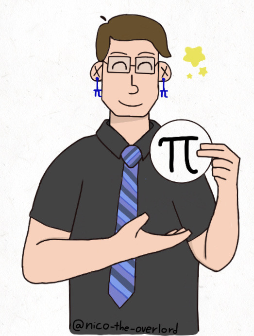
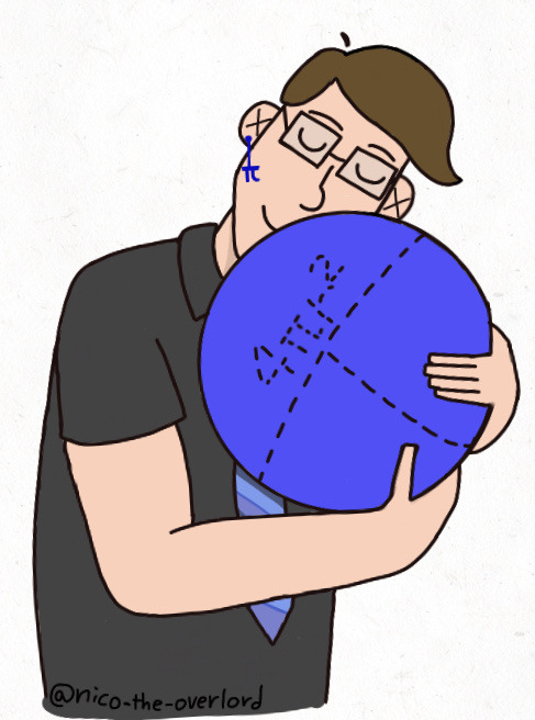
Yeah I know I’m two days late but my garbage camera quality made me redraw and color sketches I originally wanted to post on March 14th so uh, here!
Below is just rambling about these drawings+another little drawing+facts and ramblings about berries ig

Pi pie with loganberry filling and close up of the card (puns were low hanging fruit but I had to take them)
Brief loganberry history- Logan berries are a cross of blackberries and raspberries, created and named after James Harvey Logan in 1881. He didn’t really like existing varieties of either berry so said “fuck it, I’ll do it myself”. It gets even more complex with crossing because another type called boysenberry is made of a cross of loganberries, blackberries, and raspberries and was made in 1920’s. That or a loganberry and dewberry scientist aren’t super sure where it came from. Another variety called olallieberry was made crossing loganberries and another called a youngberry in 1930’s-1950’s. I got this all through brief searches. I only know about loganberries because of ONE mention of it in the show. I didn’t know four of these berries existed till now HOW MANY BERRIES EXIST?? (Google says 400+, I need to stop before I go deeper into searching ok onto the drawings,)
I’m actually kind of proud about these drawings as simple as they are?? This is the first time I’ve fully colored and drawn a pieces of fanart for this fandom which wow, idk why it took me THIS long to make art for it and I have yet to draw more
I did give Logan pi earrings because ✨I can✨
Image on the right, Logan is supposed to be holding a throw pillow/round pillow. I wanted to make it pi themed but I wasn’t sure how to convey that? Or the fact it is a pillow? Idk not too sure of that drawing but I’m gonna share it anyways
If it weren’t for Logan I would have forgotten pi day existed so thanks to him for that
I can finally let myself sleep I wanted to finish this so badly ok bye
16 notes
·
View notes
Text
Thanksgiving Day request event
Gobble gobble that's right this is the month of feast in the middle of the cozy autumn and this year is something special for the middle of November welcome to the Thanksgiving request event everything evolving around food and all kinds of crazy things that go bumping in the middle of fall.
Step right up and don't be shy but most importantly watch out for the Black Friday apocalypse and here is today's menu for a special month of the turkey.
1. Shopping for ingredients
2. Black Friday chaos
3. Cozy nights
4. Turkey day
5. Hunting for turkeys
6. Your ocs (Thanksgiving theme or your choice of picking)
7. Arts n crafts
8. Cooking for dinner
9. Cookbook
10. Thanksgiving Massacre
11. Leftovers
12. Thanksgiving specials
13. Clean up party
14. Animal Crossing
15. Horror themes
16. Decorations party
17. Room for dessert
18. Charlie Brown
19. A new day A New Hope
20. Day off from work
21. Food fight
22. Hungry night
23. Babysitting kids
24. A special toast
25. Raking up leaves
26. Wholesome love
27. Commercials (fan made or references as long if it's good)
28. Parodies of laughing
29. Mischievous Pranksters
30. Sweet as honey
31. To do list
32. Pumpkin harvesting
33. Getting ready for Christmas
34. Order up
35. A day with family
36. Freebirds
37. Break from school
38. Day of madness
39. Japan Thanksgiving theme
40. Delicious goodies
41. Crazy cinnamon day
42. Yuffie's birthday
43. Baking bread for days
44. Jammed up
45. Rosalina's birthday
46. Any type of Thanksgiving theme
47. Thanksgiving prompts
48. Bakery fun time
49. Brightful smile
50. Lovely picnic
51. Sandwich crazy
52. National Men's Day
53. Deep fried days
54. Redraws
55. Nostalgic November
56. Good old times along with old days
57. Delicious evening
58. DIYs
59. Pie of your choice
60. Chilling in cabins
61. Sleepy hibernation
62. Lazy days
63. Aesthetics of choice
64. Craving for tea
65. Dancing dinner table
66. Lame rainy days
67. Fairy tale story time
68. Doodle skits
69. Making scarecrows
70. Playing with board games
71. Biking in forest
72. Hiking through nature
73. Magical Library
74. Ready for vacation
75. Turkey chasing
76. Egg Fest
77. Feeling dozy
78. AUs
79. Parade or Festival
80. Overcooked burnt
81. Busy Chef's Kitchen
82. Love for autumn
83. Retro style of dinner
84. thickgiving
85. Going nuts
86. Writing a wish list
87. Don't beef with me
88. Disney themed of Wonder
89. Are we there yet
90. Sneaking in the kitchen
91. Nostalgic wave of feeling
92. Non-stop Marathon
93. Teamwork friendship
94. What can possibly go wrong
95. Chores of pain
96. Creative mind of Art
97. Starbucks yummy
98. Where's the turkey
99. Hungry appetite
100. Dinner is served
101. Early bird gets the worm
102. Some Creepypastas
103. Wishing for December
104. Wishing on a shooting star
105. Some errands to do
106. Hellish consumers
107. Butter up too exotic
108. Cranberry Harvest
109. Cheesy macaroni
110. Vegan options / alternatives
112. Satire / joke arts
113. Mustard or ketchup
114. Mashy potatoes
115. Too much stuffing
116. pumpkin pie crazy
117. Setting up the table
118. Stayed in bed
119. Too big of sweet
200. Eating up a feast
201. Crazy competition
202. Kawaii seasoning
203. Leafy collection
204. 1950s style
205. Thankful in grace
206. Lumberjack season
207. Jocks around
208. Spicy Danger
209. Exploring the abandon
210. Determination of heart
211. Bacon alive
212. Wildest imaginations
213. Horrific pilgrims
214. Hunting for shinies
215. Best of variety
216. Apple cider bar
217. Enjoying the sunrise
218. Creamy peaches
219. Dead plate

Disclaimer: unlike normal requests you have to request on November theme / Thanksgiving theme also if you prefer something Halloweenish feel free to go to the Halloween request event.
Note: I'll be adding and updating the list if I come up with something creative be on the lookout for that also be sure to read the rules before sending me requests please be understandable and thank you and have a great Thanksgiving one more thing have fun~🍗🍖🍳🍽
If you like feel free to send me a suggestion to add on the list of the prompts list I am now opening to suggestions to what to add on the list that is considered match to the theme leave them down in the comments below if you got a very good idea or possibly for a future adding to a different one.
#thanksgiving#art blog#artists on tumblr#art prompts#taking requests#animal crossing#cozy aesthetic#pumpkin spice#hello november#autumn leaves#fall leaves#send asks#reblog the shit out of this#reblog this#ask anything#send me asks#taking suggestions#video games#desserts#holiday themed#festive#menu#prompt list#fandoms#crossover#pie#thanksgiving day#thanksgiving 2023#thanksgiving dinner#sure why not
4 notes
·
View notes
Text
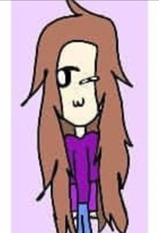
[ This was one print option for my Acid Rain patrons for February 2024 💕] Reference
1K notes
·
View notes
Text
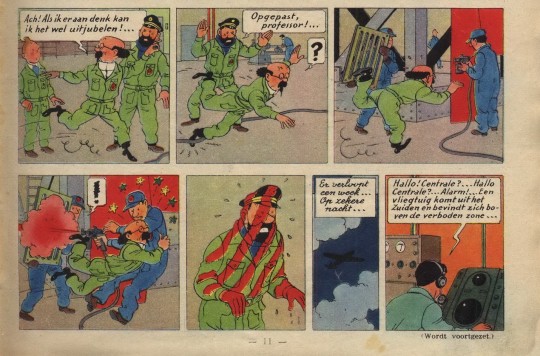
Tintin Destination Moon Paint gag Comparison
Objectif Lune (Originally serialized as On a Marché sur la Lune)
Written by Hergé
Drawn by Studios Hergé (Hergé, Bob de Moor et al.)
In this blog I attempt to show the key differences between this gag in the original serialized version and the later collected edition. I originally wanted this to be a short and simple post but when analysing the strips more closely I started to notice many other differences between the two versions, and I started to write those down as well. Obviously, the colouring is very different between the two versions something which is to be expected and I won’t really comment on.
The original serialized version of the story has only ever been rereleased in French in Hergé, le feuilleton intégral tome 11 and Tintin Les premiers pas sur la Lune both of which can be purchased on the official Tintin store. Unfortunately, the Dutch translation of the original version was never rereleased, and it has never seen a release in English at all. The images I use for this blog are scans of the Dutch language versions of these stories.
On a marché sur la Lune, Le Journal de Tintin Year 5 #27/Mannen op de Maan, Weekblad Kuifje Jaargang 5 #27 was originally published by Le Lombard on the 6th of July 1950.

Objectif Lune/Raket naar de Maan/Destination Moon originally published in Dutch and French by Casterman in 1953 (This Dutch edition is from 1981).
I will be going over these pages panel by panel, describing what’s different and sometimes explaining why. The first panel has been completely redrawn, so all the characters fit in the now slightly shorter panel. Tintin’s position is unchanged, but Haddock and Calculus were moved more to the left. The pockets and folds in their clothing is slightly changed, Tintin’s eyebrows are more pronounced in the redrawn version. The biggest change in this panel is Haddock’s positioning, his head is now turned more to the left (our left). At first glance panel 2 seems to have only been shortened, cutting out Calculus’ question mark balloon, Haddock’s dialogues is shortened to “Watch out!...” dropping the word “Professor”. But on closer inspection we can see that Haddock’s head is drawn differently, Calculus’ pupils are also in a different position. The third panel is now longer and a Haddock chasing after Calculus was added. The man holding the grate has been completely removed from the comic, instead we now see a signpost with a sign saying “Watch out! Freshly painted!”. But these are not the only differences in this panel, when looking closer one can see the painter has also been redrawn slightly. His overall has more folds and is a bit more detailed, his neck has also gotten an extra line and his overall also doesn’t cover his shoes as much as it used to. When looking closely at his head we can also notice that he has a new cap in the redraw which is more spherical. The last difference surrounds the man walking in the background, his original position is now covered up by the sign, so he was moved to the left and is now walking the opposite direction.
Panel 4 was also changed significantly. Obviously, the man holding the grate was removed again his exclamation mark balloon was also removed and instead the painter now gets a question mark balloon. The panel is also wider now, so we actually see Haddock getting hit by the paint. Calculus falling into the painter now also has the added side effect of knocking over the signpost, causing the sign to leap through the air. The painter was redrawn again for this version, his face was redrawn in a style much closer to Bob de Moor’s personal art style and his cap now has 129 on it instead of the double-digit number it had before. Panel 5 is also quite different, in the redrawn version Haddock no longer has the striped pattern because the man with the grate was removed and is instead completely read from the shoulders and above. The original panel shows us a medium shot of Haddock which the redrawn version changes to full shot. In the redrawn version the paint blast has also knocked over Haddock’s captain’s hat which can be seen (painted red) on the floor in the bottom left corner. The sign has also landed on Haddock for added comedic effect, the knocked over signpost can still be seen in the bottom right corner. Panel 6 was completely removed from the collected edition, its text now having been added to panel 7. The seventh panel is the only one not to have been redrawn, the only changes were the added caption from panel 6 and that the text balloon was moved down to make room for this.
The main differences between the two versions are that the grate was removed from the joke and Haddock was more present in the drawings as extra set up. This last bit caused some panels to be widened which in turn caused others to be shrunk. Although Bob de Moor worked on both versions, it’s obvious judging by the style that he redrew the pages largely on his own.
Destination Moon and its companion book Explorers on the Moon have many differences from their original serialized version. Certain pages were added, others were scrapped, certain panels were redrawn, reordered, or slightly enlarged. Most of this was done because the original 118 page* story had to be divided over two collected editions each holding 62 pages of comic strips. Most of the new pages were added to Destination whilst about 2,5 pages were cut for Explorers. The reason I decided to focus on this paint gag specifically was because it looks very different from the original yet there seems to be no obvious reason for the change. Both versions take up the exact same amount of space on the page. Perhaps Hergé wasn’t happy with the original gag, the grate does make it a bit more contrived or perhaps he wanted Haddock to be more present in it. But this is pure speculation, in any case I’m happy it got redrawn. I personally find the version in the collected edition much funnier because there’s a bit more anticipation in this version; we see Haddock chasing after Calculus and then we actually see him get hit by the spray paint. That said I really like the original drawing on panel 5, I like Haddock’s expression and figure more in that one. The paint dripping off his fingers is a nice touch too.
I hope you enjoyed my comparison of this short gag from Destination Moon, as mentioned before the story has many differences which I might delve into in the future!
*The exact number of pages depends on whether or not you count the cover pages especially made for the story and the summary page, I excluded these from my count (none of these made it into the collected editions anyway) including them the total would be 125 pages.
#tintin#captain haddock#hergé#bob de moor#bande desinee#comics#franco belgian comics#adventures of tintin#professor calculus#moon#comparison#le journal de tintin
6 notes
·
View notes
Text


2023 vs 2020 vs 2018
#fanart#kawaii#my art#original art#japan#original character#1950s#60s#glitter#nature#self improvement#art improvement#redraw#animegirl
8 notes
·
View notes
Text
I recieved my first ever Twitter gift art!

Thought it was only fair that I give something back in return… So I decided to participate in her DTIYs prompt :) I decided to give Amy a 1950s-style outfit, since that’s the time period that CBA takes place in. This was fun to do…
«Left is Redraw - Right is Original»


#billys basic educational game#bob the great#corny creations#dtiys twitter#gift art#captains basic adventure in a broken underwater ship#bob the great cba
4 notes
·
View notes
Photo

b&r no.1
d.b. updike’s advice on acquisition of material for a printing office: «A third type (which originated with Binny & Ronaldson of Philadelphia over a hundred years ago) is in design transitional between old style and modern face. For books where the old-fashioned air of Caslon would be to obtrusive, and yet which call for a letter more interesting in design than the somewhat bald Scotch face, there is nothing better. I should not advise the purchase of this transitional series at the expense of the first two types chosen, but it will frequently do the work of either. … It is called ‘Oxford’ by the American Type Founders Company, from whom it may be had. I have used it for this book [first illustration]. It seems to me a type of real distinction.» [Printing Types, 2nd ed., vol ii, oup, 1937, p231].
a.f. johnson confirms: «The roman which Updike used for the text of his Printing Types, called ‘Oxford’ and originally cut by Binny and Ronaldson of Philadelphia, seems to have some affinity with Austin’s¹.» [Type Designs, grafton & co., london, 1959, p74].
in the same year as the 1892 merger that constituted the american type founders company [atf], joseph warren phinney, atf vice-president & former partner in one of atf’s original constituents, the dickinson foundry of boston, advocated revival of the b&r no.1: repaired & augmented with additional sorts, b&r no.1 was reissued as atf «oxford» (but what has this face to do with oxford—presumably the university? ² ). «oxford» is not shown in atf specimen books of 1897 or 1923 (nor do i find b&r no.1 material in the huge mackellar, smiths & jordan book of 1892 ), but was available for special order into the 1960s. the atf oxford matrices (what of binny’s punches? [✓]) now repose in the smithsonian institution.
in 1946, in order to provide historically allusive faces for planned publication of The Papers of Thomas Jefferson [princeton unversity press, 1950], p.j. conkwright, then art director of the princeton university press, advocated adaptation of atf oxford for the linotype; c.h. griffith, then a vp at mergenthaler linotype, designed a b&r no.1 revival: linotype monticello, named in reference to the publication of its first showing. in 2003 linotype issued a digital version of monticello, based not upon the earlier linotype revival but on matthew carter’s redrawing, afresh from the atf oxford material [cf. ‹Monticello Typeface›]. for an allusive composition set in monticello vide ‹perdita›.
1st illustration: excerpted from Printing Types [updike, op. cit., p241]; oxford types.
2nd illustration [iphone photo]: showing of long primer no.1 roman & italic [Specimen of Printing Type, from the Letter Foundry of James Ronaldson, successor to Binny & Ronaldson. | Cedar, between Ninth and Tenth streets, | Philadelphia. | 1822. [Am 1822 Ron 17455.O.1]. for the largest size of no.1, long primer, binny cut a variant, more cursive, italic p; & note the dollar sign—binny was the first to engrave this famous symbol.
with thanks to the library company of philadelphia for permitting my examination of their extremely rare binny & ronaldson material.
⎯⎯⎯⎯⎯⎯
¹ johnson refers to the types cut by richard austin of london for london publishing pioneer john bell—vide ‹the letters of john bell›. the roman also shares affinity with baskerville’s—e.g. unclosed loop or bowl of g. updike affirms bell’s type but has no knowledge of bell: «The two upper sections in our plate (fig. 367) are set in a transitional font, which is, both in roman and italic, a fine and workable letter.» [updike, op. cit., p.243].
² latterly i discovered, harry carter posed the same question in his review of The Specimen Books of Binny and Ronaldson, 1809-1812, in facsimile [introduction c. p. rollins, the columbiad club, connecticut, 1936] in The Library [volume s4-xviii, issue 1, june 1937, p118].
#typography#binny & ronaldson#american type founders#daniel berkeley updike#theodore low de vinne#linotype#c.h. griffith#p.j. conkwright
4 notes
·
View notes
Photo
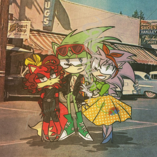
read smthn on the wiki abt scroog’s fashion being loosely based on 50s greaser fashion and m. my hands slipped. (this is old and i forgot to post this sooner)
bonus that has lowkey no relation to the above pic:

#my art lol#sonic#sonic the hedgehog#rosy the rascal#scourge#scourge the hedgehog#fiona fox#1950s fashion#greaser#sth#im too lazy and scared to put more tags ugh#i deleted an older post of mine b/c i thot it was cringe but i'll ee if i redraw it later. this still kinda looks okay?#yes the main pic's background is an old postcard i was too lazy to draw smthn on my own#im reallly happy w/ rosy tho like. PLEASE she needs more differences aside from looking like classic amy#maybe im just based cos i like to think of the classics as like; younger vers of the main charas but#not included were: jokes i was gonna do abt everyone smoking in the 50s and smthn abt scroog respecting women#also before i get flamed: yea i know like bare minimum abt comic shit but idc. i draw wot i want. my city now
68 notes
·
View notes
Last Seen Blogs

anemptychest
Empty Chest

newdeliyoga-blog
Vulkan Run Time Libraries Data
theyfound-wonderland
tara

kiksluts
Kik sluts

mountinbear
Mountin’ Bear.
Looking To Play With Dad Bears.