#film technique
Text
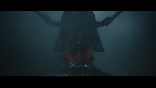
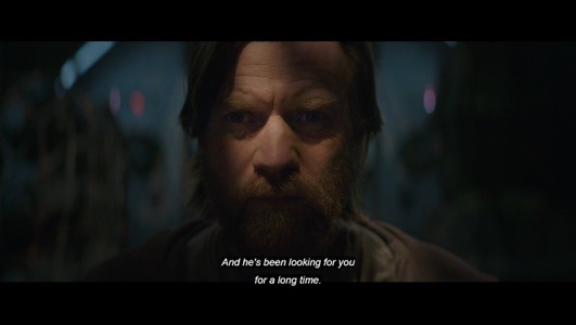
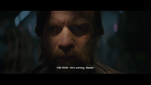
The intercut between Vader’s suiting up and Obi Wan trying to communicate with Qui-Gon is done beautifully in this opening.

#obiwan kenobi#obi wan kenobi spoilers#sw obi wan kenobi#Obi wan Kenobi#darth vader#episode 3#kenobi series#star wars spoilers#intercut#film technique#Star Wars#disney plus#disney+
61 notes
·
View notes
Text
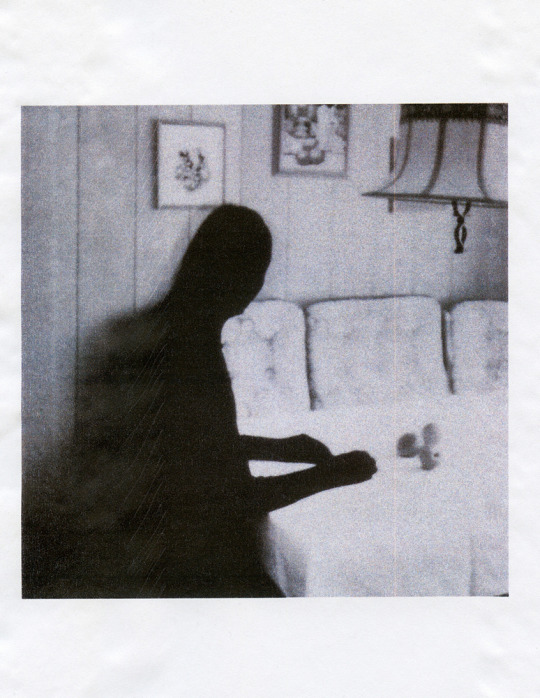
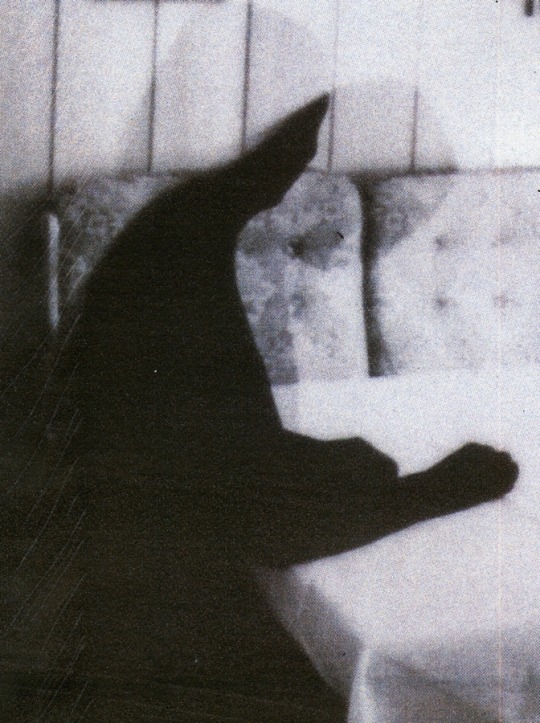
©Philomena Famulok
.
#philomena famulok#personal#photographers on tumblr#original photographers#artists on tumblr#mixed techniques#emotion#conceptual#ghosts#memories#memories & ghosts#print/copy paper#scanner#original art#analog photography#film photography#instant camera#fuji instax 90 neo#analog#filmisnotdead
847 notes
·
View notes
Text
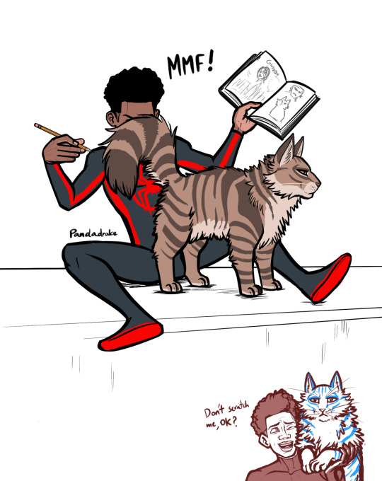
Variant status still unclear.
#Meowgel performs cat affection technique known as 'shove butthole in face’#is this me projecting my belief that if not for the very specific circumstances in the film Miles and Miguel would've been friends? maybe#my art#across the spiderverse#miguel o'hara#miles morales#atsv miguel#atsv fanart#atsv#miles spiderverse#ultimate spider man#cat#cat miguel#meowgel o'hara#dark garfield#spiderman 2099#into the spider verse#miguel spiderverse#spider man#spiderman#spider man across the spider verse#spider man atsv#spider man: across the spider verse#across the spider verse#spiderman across the spiderverse
557 notes
·
View notes
Text
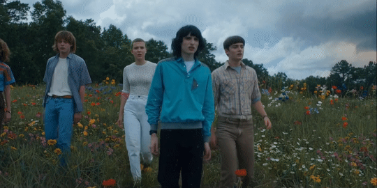
Ya'll catch the final rose ceremony at the end of s4?!
#byler#stranger things#'last nights episode ended on a cliffhanger with the audience left wondering who bachelor-mike would choose--'#'will he choose the one who walked around the rose delicately to stand with it framed neatly in the background between the two of them?--'#'or will he choose the one who bulldozed it?'#'all will be answered tonight on the series finale of bachelor apocalypse'#no but seriously is that flower in front of el cgi?#depending on how many takes this shot took... i don't think they'd have something like this occur unless they wanted it to#i know they hand picked flowers for these shots#but it's not like that rules out them using movie magic#especially in this case where it was apparently important enough for them to handpick in the first place...#meaning there is in fact some significance to it#i hope this shot puts the 'it's not a love triangle' allegations to rest#like idk why fans would rather believe the duffers are sorcerers who can do dozens of things coincidentally all fitting a specific narrativ#bc that would honestly be way more impressive to me than them just using basic film techniques and tropes lmao
255 notes
·
View notes
Note
yo, hi,
please rant about the use of colours/shots in dead boy detectives (if you want to), that would be amazing to read!
omg hell yeah i would love to. <3 buckle up everybody!
(there were some other people in the comments who wanted to hear more as well. for convenience's sake i'm going to keep it all in one post.)
I'm not going to talk about every single frame in the last post, because there are a lot, but I'll be sure to touch on all of the ones that have a good amount of depth beyond the dramatic lighting. (sorry, Angie shot.)
...this is going to get long.
so first, this one:
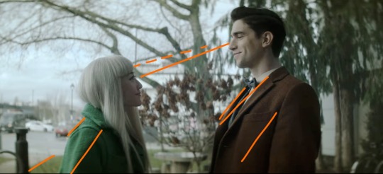
With Edwin's brown coat, Niko's green coat, the brown bushes in between them, and the trees behind Edwin, this shot is cohesive and satisfying. I drew the orange lines to sort of illustrate how your eye moves across the frame; the line of eye contact, the tree branch (dashed lines) almost parallel to that, the sidewalk/grass line, and the lapels/shadows/folds of their jackets all form a general diagonal streamlined snapshot. Then the black post behind Niko, the tree between them, and the tree trunk behind Edwin continue to divide the frame vertically and add to the additional invisible "line" created by their height difference. Finally, the sky behind Niko, as well as her hair, contrast heavily and very well with the darker colors of the tree behind Edwin, though there is still white on his side (the building) and brown on hers (tree branches). If you were to take a single diagonal line from the bottom left corner to the top right, you would get two incredibly distinctly colored sections, but they complement each other so well.
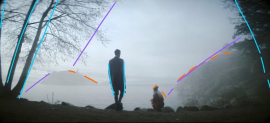
This whole scene is gorgeous because of the pale sky and water up against Niko's hair and the brown tree trunks with Edwin's jacket, but I also love it because it's so simply colored. We have the classic blue+orange color dynamic, but diluted down to very pale blue and very dark brown. This shot specifically features Edwin focused at the center (the blue lines show that he is standing mostly straight up, while the trees on the borders of the frame are all leaning inwards), with Niko crouched down to fit with the shape of the hillside (orange) AND the silhouetted rocks in the foreground. Then the hillside, the shadow on the water, the general cutoff of the tree branches, and the island in the distance (purple) frame the two of them in the middle without making a Point of it. It looks very natural, especially with the dark shadows around the border of the frame. (personally sort of brings to mind Wanderer Above The Sea of Fog).
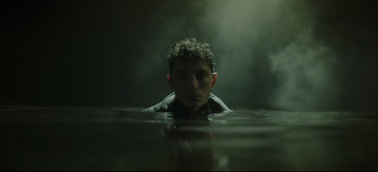
I don't think I need to add any annotations to this one. The lighting is sharp and so are the shadows. The fog and the shine on the water, his hair, and the collar of his coat are starkly lit, while everything else, including his face, is deeply shadowed. Plus it's all an ominous, murky green. It's almost the opposite of Lilith coming out of her blood-red ocean. 10/10 frame, I have no words.
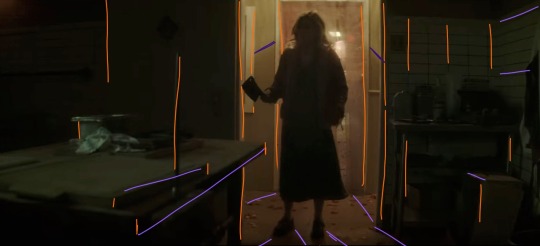
I gasped the first time I saw this shot. There are so many vertical lines (orange), which make the space feel thinner: the spike, the bulletin board(?) on the far left, both doorframes, the edges of the table and boxes, the tile on the wall on the right, Maxine herself... and then there are the diagonal lines, all sort of spreading out from Maxine, which includes the table edge, the shadows, and the wall tiles again. Then there's the fact that it's all so dark, but not quite pitch black. Once again we have a green/orange combo, and the light behind Maxine being so small in the whole frame makes it very effectively claustrophobic. We also never saw her enter this room from behind, which elevates her as threatening, because the camera work makes it seem as though we, the audience, are backing away from her as she enters, and then hiding from her as well. While I am devastated by the lack of a sapphic romance arc, I have to say I was blown away by the production of this scene.
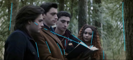
I love this one because they're arranged so neatly around the book. I didn't draw a curve over their heads, but it's easy to visualize by following Monty's hairline up to Edwin's, and then Edwin's down to Charles' down to Crystal's. The height order is perfect. Then there's the black-brown-black-brown of Monty's jacket, Edwin's jacket, Charles' jacket, and Crystal's hair. The book itself helps frame their faces (diagonal blue lines), and their clothes fall into uniform with the vertical trees behind them, creating a satisfying, natural, unobtrusive background. This is definitely more visually appealing than a shot of them leaning over and looking down at the book/camera. It's also broken up very nicely by the greenery. Plus, none of their faces are shown from the same angle! Refreshing!
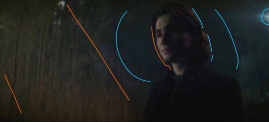
Poor Monty :( but hey, he gets a really awesome shot here! We're back to orange+blue, and the angle of this shot makes it look like the vertical trees behind him are positioned diagonally (orange) to follow the dark blue shadow behind his head. We also get two light sources: one of them is the moon, and the other one comes from the same place as the music. The moonlight (blue) sort of encircles his head and cuts off at the line of trees about halfway across the frame. Both the back of his hair and the far side of his face are illuminated, which is very effective in terms of bringing him into the foreground and making him the focus of the shot even though he's not in the middle of the frame. It's also balanced nicely by having background detail on the left, with the orange trees, but not on the right, where there's nothing but dark blue behind Monty. This is also a great shot when it comes to his hair and jacket, because the jacket is used to add to the framing of his face with the dark blue background, and his dark brown hair is lit sparingly, which ties in the left side of the frame.
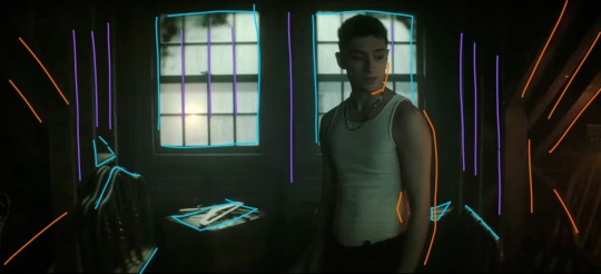
Like the frame with Maxine, this one has a lot of shadow and a little bit of light, and again works with an orange/blue (or teal, really) color scheme, but this one is much friendlier. The windows are larger than the doorframe and Charles isn't actually blocking the light the way Maxine did. Instead, he's illuminated from the right by Edwin's orange lantern, and the shot is balanced by highlights (blue) that stop it from becoming cramped and stressful. There are stable vertical lines (purple) and rafters and shadows spreading out from the center (orange). Charles, though he is blocking the window, is wearing a white tank top, and his skin takes on the warmth from the lantern, so he's not in silhouette and he blends very nicely with the scene. I love that he's not at the center of the shot, but instead framed almost perfectly in the right window. (Another thing I love about this show is that the characters almost always interrupt the continuity of the background even when they're positioned to be framed by it. It makes the scenes feel much more natural even while they continue to be gorgeously directed from an artistic/stylistic point of view.)
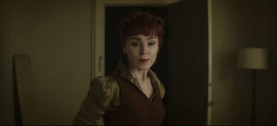
This is one of the simpler ones, but it's perfect. The Night Nurse's hair and vest are the same brownish orange, and her shirt is the same as the walls, sticking with our tried and true brown/green (easy variation on orange/blue) color scheme. She is framed in the blackness of the doorway, but once again interrupts the white doorframe on the left side. Even the lamp and the board (?) on either side of the frame fill the negative space in a natural way. Also, the vertical lines of the board, doorframe, door, and lamp aren't perfectly spaced apart, which makes the whole shot feel more down-to-earth.
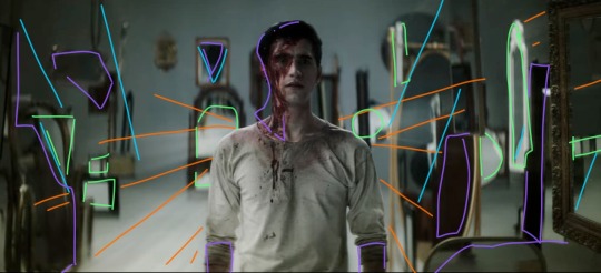
There is so much going on in this shot. The beams of light (orange) are emanating from behind Edwin in a shape sort of reminiscent of wings. The angles of light/shadow and the immediately obvious position of some of the mirrors (blue) also spreads out from behind him, reinforcing the wing imagery and focus. The background is lighter than the floor, and Edwin's clothes blend in with the floor and the reflecting highlights (green) in the mirrors. It's all balanced by shadows (purple), which aren't so much shadows as they are dark-colored mirrors and the blood on Edwin's face. This shot is an unsettling combination of chaos and order, increased by the strange phenomena of mirrors endlessly reflecting into each other, especially since Edwin doesn't show up in any of them. You'd expect him to look out of place, and he mostly does, but there's just enough immediate immersion with the color scheme and light angles to make him fit perfectly. And he wouldn't fit in this shot nearly as well if he were wearing his usual clothes. It's such a good way to introduce Despair. I love this scene.
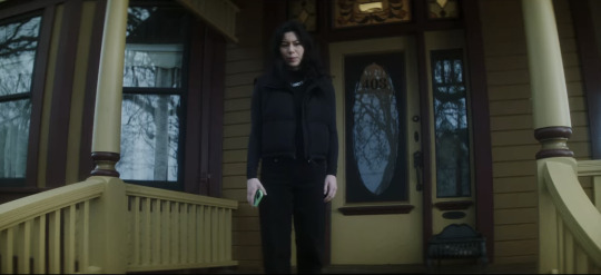
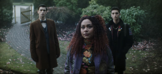
Now I needed to include these two next to each other, because they're. They're the same scene. Maren is on the porch looking down at Crystal and the boys, but the color schemes and blocking are so starkly different. Maren is wearing black, and the house is washed-out yellow and maroon, both unfriendly colors in this scene. The windows all show the gray reflections of the dead tree instead of even a glimpse inside the house, immediately showing that Maren is hiding something. Then in the shot with Crystal and the boys, they're positioned behind her on the path. Edwin is next to the brown gate and gray stones, and Charles is sort of shadowing Crystal and framed by the green bushes. Crystal's shirt is flower-patterned to match the pink petals on the ground, and her red hair and purple jacket make the whole shot more vibrant and friendly-looking than Maren's, even though Maren is supposedly the one being helpful/friendly/hospitable. The first time I watched this episode I knew I couldn't trust Maren as soon as I saw her standing on her front porch. This scene is, as Charles would say, brills.
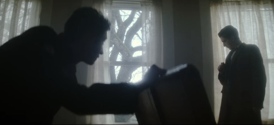
Okay, last one, I have to stop somewhere. (I have so many more. I have. SO many more. that i could talk about. but this post is so long already). There are three windows, evenly spaced, white light and curtains framed in them. Charles is in nearly full silhouette as he opens that chest; his head and the lid of the chest intersect with the vertical window frame, and his arm runs parallel to the middle bar. He also blocks a good portion of the leftmost window, while Edwin stands in front of the one on the right. He's fully framed by the window and standing farther back than Charles, not quite silhouetted but still very dark compared to the background. When he ducks down to inspect the cabinet, his head ends up in front of the wall between the two windows. This whole scene is an excellent display of blocking/framing/lighting, just in terms of where they end up holding any given position while they talk. Once again, there's nothing artificial or manufactured about their blocking. These aren't statement shots (all film projects have a few Really Good Shots, but they're often at extremely important, pivotal, or emotional times, instead of spread out through the storyline.), which makes them even better.
I might have to make another post and include shots with Jenny, the sprites, the Cat King, Esther, and more landscape shots. There is no shortage of stunning frames and scenes, and there's no reason not to dive into the production and hidden meanings.
TL;DR: this show is an ARTISTIC MASTERPIECE. Please watch it. :)
#dead boy detectives#edwin payne#charles rowland#crystal palace#niko sasaki#monty finch#monty the crow#film stills#cinematography#this. got away from me.#appreciation post#color schemes#film techniques#analysis#symbolism
92 notes
·
View notes
Text

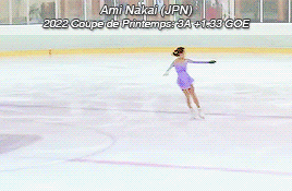
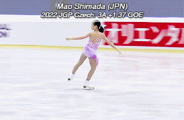


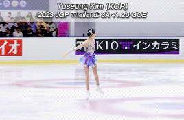

First Triple Axels in Women's Skating: Part 3
Hana Yoshida (JPN) - 2022 Bavarian Open FS: 3A +2.13 GOE
Ami Nakai (JPN) - 2022 Coupe de Printemps FS: 3A +1.33 GOE
Mao Shimada (JPN) - 2022 JGP Czech Republic FS: 3A +1.37 GOE
Rinka Watanabe (JPN) - 2022 Lombardia Trophy FS: 3A +2.40 GOE
Inga Gurgenidze (GEO) - 2023 Dragon Trophy FS: 3A2T +1.60 GOE
Yujae Kim (KOR) - 2023 Jr World Championships FS: 3A +1.94 GOE
Yuseong Kim (KOR) - 2023 JGP Thailand FS: 3A +1.26 GOE
Amber Glenn (USA) - 2023 Skate America FS: 3A +1.94 GOE
#figure skating#fskateedit#hana yoshida#ami nakai#mao shimada#rinka watanabe#inga gurgenidze#yujae kim#yuseong kim#amber glenn#program#mix#ladies 3A#(international competitions only)#truly sorry about the quality but some of these videos were filmed on potatoes and there was nothing i could do#i started this series in...2016 or something?#and we're up to 26 women now#some certainly have better technique than others#(looking at the GOEs side by side is...lol)#but i love 3As and i love when a skater lands a good one#mao rinka and amber have my favorite ones out of this set#maybe i should do a 'best 3As' post one day instead of 'first 3As'
151 notes
·
View notes
Text
Alan and Wen broke up for 45 min and the cinematography engulfed them (and US) in the dying light of their love until the fire went out.
Warm sunny yellow
To lonely blue grey coexisting with yellow memories


Dying amber/embers

Lights out
#moonlight chicken#cinematography#filming technique#aof noppharnach#P’Aof said you gonna SEE LOVE DIE#color theory#firstmix
863 notes
·
View notes
Text
Everybody’s always talking about the biblical imagery in Goncharov but I haven’t seen anybody talk about the allusions to Greek mythology like !!! Goncharov looking at Katya through the mirror when she threatens to shoot him, not making direct eye contact - Perseus and Medusa’ poisonous vision. When Sofia is leading Katya in the tunnels, not looking as they talk, but she turns around and Katya is gone - Orpheus turns and Eurydice vanishes. That unnamed taxi driver is paid two coins by Goncharov right before That Scene - he’s literally Charon, transporting the ‘dead’. Guys the whole boat scene is an allusion to the River Styx. The theme of time and the human hubris to defy it and the seemingly divine punishment of that ambition. Tell me I’m not the only one seeing this.
#ra speaks#shitpost#goncharov#gonchorov#unreality#greek mythology#there’s probably more#I’m just calling out what I noticed - I’m no greek mythologist#also the structure of the film feels like it was inspired by Greek tragedies - half the lines sound like they belong in theater not film#maybe that’s why the critical reception was a little off? they didn’t like the meshing of film techniques with more theatrical writing?#someone smarter than me fit ice pick Joe into this framework I feel like he’s neglected narratively and that impacts his thematic ties#<- this is all a joke based on the fake film Goncharov.
399 notes
·
View notes
Text
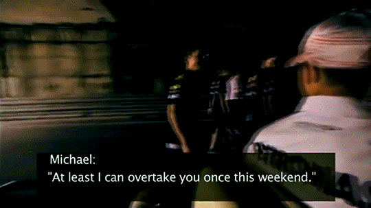
Michael Schumacher and Sebastian Vettel at the Canadian GP
#michael schumacher#sebastian vettel#f1edit#f1#formula 1#mine#just pretend dc isn't there#the video quality was SO BAD#and the way this was filmed was HORRID#I also tried a new sharpening technique and I hated it#so I had to redo one of the gifs
109 notes
·
View notes
Text
youtube
*incredibly nerdy screaming*
#corridor digital#as someone trying to get into indie film & who has virtual production training & knows its limitations & cost this is VERY VERY exciting#and I sincerely hope more ppl get into trying to make this technique a thing again#TIL that while corridor do have a linkedin page they never post on there even tho they could literally go viral on linkedin#with shit like this which is a flex on industry I can only aspire to lmao#but also unfortunate bc it means I can't just share their post on there I'll just have to make a post of my own#if I want to show this to my virtual production etc ppl smh
10 notes
·
View notes
Text
Mean Ninjas

Survival Techniques by Tobirama.
#mean girls#tobirama senju#hiruzen sarutobi#hiruzen#kagami uchiha#kagami#uchiha#tobirama#senju#danzo shimura#homura#utatane koharu#utanate#koharu#akimichi torifu#torifu#funny#film#Survival Techniques#sex education
109 notes
·
View notes
Text

©Philomena Famulok
.
#philomena famulok#personal#photographers on tumblr#artists on tumblr#original photographers#analog photography#fuji instax 90 neo#fuji instax mini color#bw scan#instant camera#instant film#film photography#film#analog#scan#laser prints/copy paper#mixed techniques#double exposure#mood#night#ghosts#memories#2020/2023
1K notes
·
View notes
Text
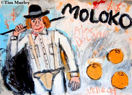
Moloko Plus.➕ (V.2)⏰🍊🥛🕘(mixed media on canvas)🍊🕰🍊
#pop art#dystopian society#dystopian fiction#dystopianfuture#dystopian film#dystopian art#dystopian future#malcolm mcdowell#stanley kubrick#70s#70s movies#scifi#scifiart#sci fi and fantasy#sci fi#sci fi art#droogs#droog#costume design#cinema#ultraviolence#Durango 95#a clockwork orange#clockwork orange#anthony burgess#dystopia#ludovico technique#Moloko#milk#korova milk bar
8 notes
·
View notes
Text
concept: found footage horror movie where the spooky is a vampire, but the vampire doesnt show up in the recording
#vampires#vampire#horror#Look is it silly and with modern film technique doesnt make much sense? yes#do i think that it is also a really cool concept? ALSO YES#full lenght movie that is the ballroom mirror sceen in Van Helsing 2004#I'm uncertain if the audio recroding should have the vampires voice but it's such a strong concept imo
81 notes
·
View notes
Text
Easiest way to get me to laugh: Gilligan cuts. A few examples from Ninjago:
Vania: You're right. I need to relax. I'm sure Cole is doing just fine!
*Cuts to Cole screaming for help, dangling over a pit*
Garmadon: Vinny of NGTV News, in his infinite wisdom, let me in with open arms.
*Cuts to Vinny shutting the door, panicking, and calling the police*
Vania: Cole, the Lava Monster! What if it's still in the cave waiting for us?!
Cole: What? Just standing there, staring at a wall? No way, I'm sure he's gone back to his --
*Cuts to the Lava Monster doing exactly that*
I have literally never not laughed at a Gilligan cut. They ALWAYS get me and I don't know if it's the actual cut itself or the irony of having a character say something then cutting to the complete opposite happening.
96 notes
·
View notes
Text
while reading house of leaves: i physically cannot take in all this referencing, it's too many connections
after reading house of leaves: wow everything is so house of leaves coded
#my technique while reading can be summed up as: just fuckn keep going through the trenches#which tbh once i got past the first 150 pages it didn't wall-of-text so much anymore#and i was IN the main plot which is relatively simple#but yeah just let all the conceptual Stuff hit me in the face and keep going#although it did help me knowing a lot of the names being dropped it gave a literary philosophical film grounding#anyway... sneaky fuckn book
10 notes
·
View notes
Last Seen Blogs

lostinmymind24-blog
My Prisioner

erichayesmusic
ERIC HAYES

oh-nippon
日本!


augustlovestarlight-blog
Без названия