#Visual Rendering
Photo
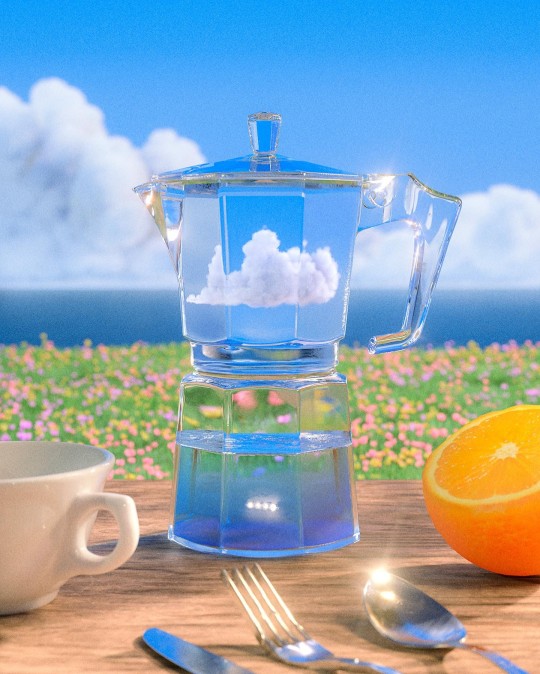
Hayden Clay Williams
#art#design#3D#render#hayden clay#visual art#visual artist#artist#artwork#visuals#landscape#photography#fruit#still life#hayden clay william#u
7K notes
·
View notes
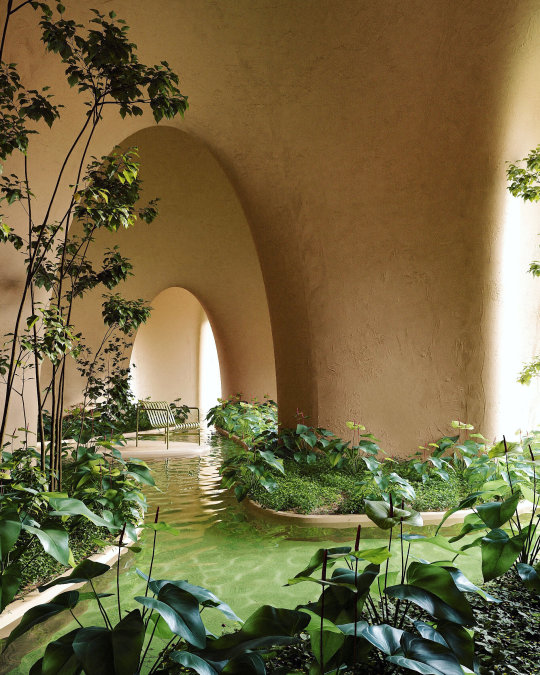
Text
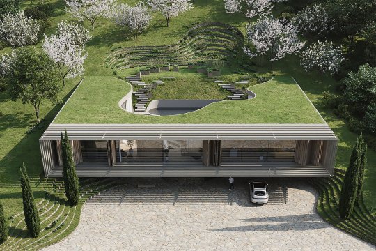


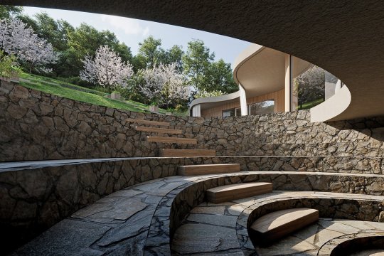
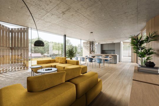
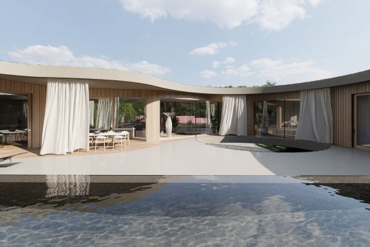
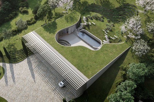
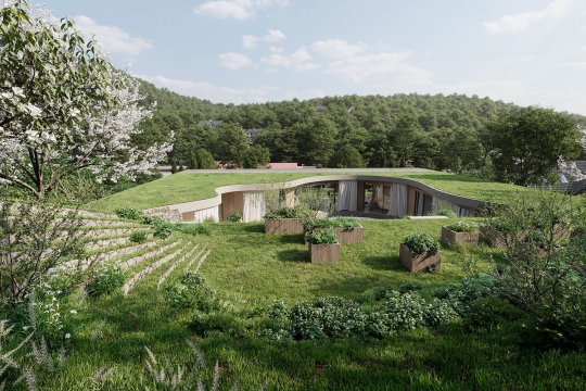
"My little big world," Rogaška Slatina, Slovenia,
Superform Architects,
Photo Credits: Visualisation Spacer
#art#design#architecture#landscaping#luxury house#luxury home#slovenia#rogaska slatina#superform#concept#render#visualization#garden#organic#luxury lifestyle
2K notes
·
View notes
Text
#darkness#visual rendering#women's rights#state of mind#black and white#photography#photography blog#photo blog#blackandwhitephotography#photoblog#images of women#portraits#hands#hand portraits#self portraits#women rights are human rights
1 note
·
View note
Text
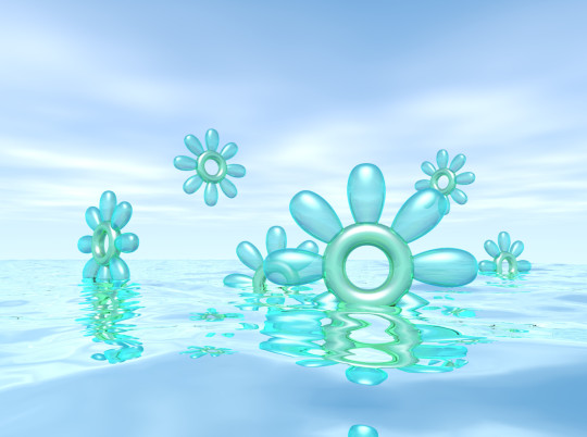
primavera
#y2k#y2k aesthetic#2000s#webcore#y2kcore#2000s aesthetic#wallpaper#neo y2k#graphic art#art#cyber y2k#cybercore#y2k style#y2k moodboard#y2k cyber#3d#blender#blender render#early 2000s#visual art#graphic design#kaybug#yqueuek
228 notes
·
View notes
Photo
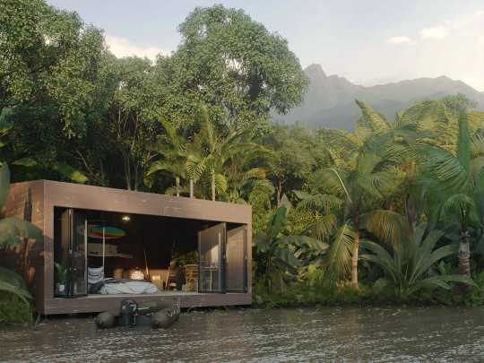
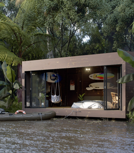
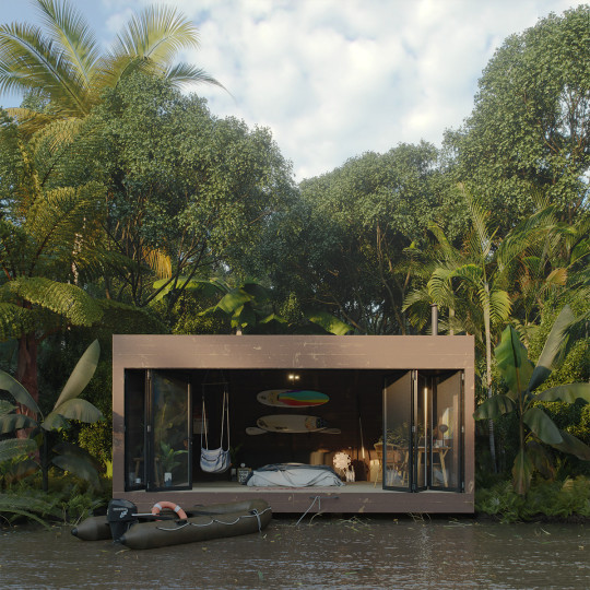
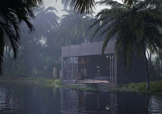
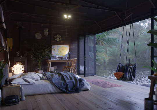

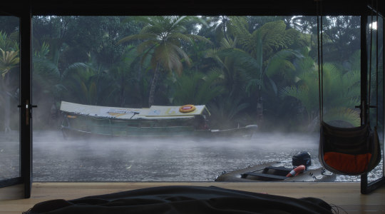
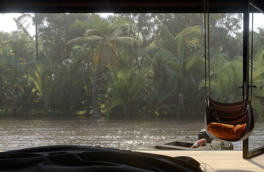


”Hut Adventurer” (Jungle Hut) by Dmitri Reviakin
#art#design#architecture#retreat#cabin#CGI#cgiart#river#adventurer#dmitri reviakin#render#visualization#tropicalhouse#tropical#jungle#hut#indonesia#lombok#islandhouse
4K notes
·
View notes
Photo
“The Cave”
Nicholas Preaud Architect
#art#design#architecture#pool#indoor pool#vace#green#arches#nicholas preaud#doorway#3dartist#render#visualization#visualart#cgiart#organic
4K notes
·
View notes
Photo
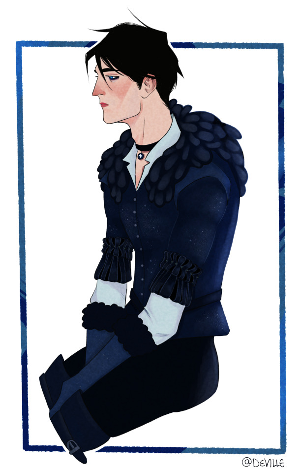
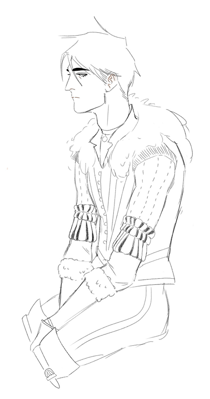
@softest-punk so i literally never stopped thinking about yen!Dream and this whole witcher au is running laps around my brain....i love it
including the sketch bc he’s pretty <3
#lets just ignore all the detail i left out in the render#lmao#sorrrryyyy#anyway#drawing dream-yen just made me realise that visually#they are the same person#this could absolutely be taken for a male version of yen#they are just the same#ravens and all#i love the sketch tho#i might go back and re-render it#bc im not totally happy but#i said i would post stuff even if i wasnt happy w it this year soooo#here we are#i can always go back and do it again#the joys of art#anywho#WITCHER AU#i love it#dreamling#witcher#sandman#dream of the endless#hob gadling#mmm maybe witcher hob is next.......
977 notes
·
View notes
Text

Die
#pretty mediocre painting but whateverrrre#i didnt wanna finish rendering so im gaslighting myself to say it looks nice unfinished#dir en grey#fanart#visual kei#vkei#jrock#digital art#procreate#music#red#painting#portrait#art#sketch#DECAYS#dir en grey die#guitar#heavy metal#artists on tumblr#metal#painting study#merrymakes#die#diru#horror#horror art#concept art
374 notes
·
View notes
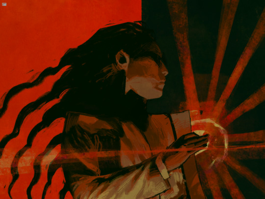
Photo
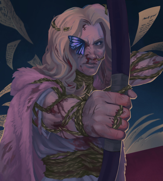
I don’t think it’s my time to rest.
#I think we should talk more about the idea of thorns physically moving her body like in place of muscles.#its the one visual i cant get out of my head after last ep#obsesseed w this part of the episode#shes so cool shes so cool#i dont do rendering often pls dont roast me on this#wish i got more design in her dress but the thorns burned me out#neverafter#dimension 20#rosamund du prix#cw blood
668 notes
·
View notes
Note
this might sound like a silly thing because I am not an artist, but I feel like it's incredible how consistent vasco and machete look in all of your drawings. Like line weight and colors and how vasco's ears slope, all of it seems so precise. Like you could do hand drawn animation of both of them and every frame would look EXACTLY right.
Oh, thank you! Keeping the characters on model isn't always easy, and despite my best efforts I see details like ear length and the profiles of their noses varying a little bit from piece to piece. But that's the nature of hand drawn art I suppose, and maybe they're only noticeable to me (or I hope that's the case) because I'm the one doodling them several times a week. Their designs are really pretty simple, they don't have complex markings or a lot of facial detail, so when I draw them I try to pay extra attention to their specific proportions and shapes and angles to get the likeness right.
#answered#anonymous#in my head I always visualize them like they were animated#but in reality I think I wouldn't have very good time trying to make that happen#Machete's head fluff would be a nightmare to render from different angles consistently#and you'd have to consider the physics of Vasco's ears every time he moved his head
212 notes
·
View notes
Text

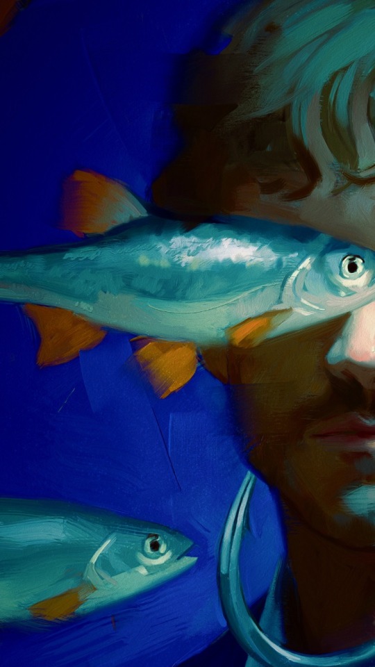
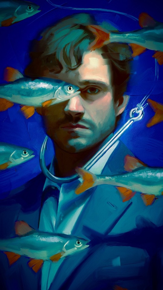
What would an ocean be without a monster lurking in the dark? It would be like sleep without dreams.
Will Graham surrounded by fish but he's the real catch fr fr.
Corel Painter + Photoshop
(p.s. I just restocked my print shop!!)
#digital art#digital painting#hannibal fanart#corel painter#hannibal nbc#hannigram#artists on tumblr#will graham#oil painting#oil on canvas#visual arts#acrylics#hannibal lecter#nbc hannibal#nbc hannigram#murder husbands#hugh dancy#rendered#ocean#fish
76 notes
·
View notes
Text
what is their problem tbh
#lg doodles#nooo dont turn ur art jealousy into misplaced hatred noo~~#sry ive been thinkig of yotasuke a lot recently so im goig 2 make it ur problem too#also i liked yatoras beanie + glasses look hes kind of a loser#they r drawn ontop of jayjaykay shibuya spoiler drawing if u can believe it#blue period#yotasuke#yatora#ngl im still so floored by the admissions reveal#inwhich we find out yotasuke was never accepted 4 his art .. LIKE THTS CRAZZYYYYYY#smth so real abt their shared envy . and their disconnect w each other#n yet they still hang out tgt#n for the like . wats it called . idk its 2 am#their like . perception of each other as artists n how that inverts w the reveal . U KNWO WHAT J MEAAAN#like yatora always revering yotas work and yota struggling to understand yatoras passion n yatora feeling inadequate#and yotasuke almost protected by his skill alr bc he has that foundation and he thinks thats all he needs#n then like .dealing w the realization that u can have all the skill in the world but if ur msg isnt there if ur passion or ur identity isnt#in ur work then what are u saying for urself (yotasuke) vs yatora realizing that his art can and does speak for itself n that is just as#important or just as transformative as having smth visually pleasing and that being a storyteller can be ur strongest asset#and u are as much an artist as the guy who renders still lives w utmost ease (ytaske)#n thats not even going in2 the way they feel . yota like art is an obligation and yato like art is a decision u make for urself#these 2 are sick inthe head .
240 notes
·
View notes
Text
heyyyy who wants some lowish-resolution Lights Out angst scribbles before i go sleep!!!
(gonna put this under the cut bc im not sure if it can be considered spoiler-y or not? does this au even Have spoilers if there's no shared cohesive plot yet? who knows! i'm doing this impulsively i don't know what i'm doing ever! ! i like drawing characters in distress and anguish! thank you!)


#also if i dont share them now i just Know i never will#i like scribbling distress but Especially when its barnaby. he has the face for it. sad puppy <3#i mostly scribble these to help myself Think and Visualize#who knows! in a week some or all of them could be rendered non-au-canon by Evolving Ideas#scribble salad#wh lights out au#the last wally one is probably my favorite of the bunch#i like making myself sad by playing the Scene its from in my head <3#wail in anguish puppet boy... wail and sob....#going back to my roots with these babeyyyyyy#kind of. mildly.#its been too fluffy on this blog#i need to remember where im from... what im about... Who I Am....#also 'why is wally so small' bc all of the puppets are there physical sizes#also im Terrible at scribbling consistent size differences <3#i will Always overcompensate <3#anyway this au is called lights out aka I Torment Barnaby On An Intensely Emotional Level#what can i say? i have cuteness aggression <3
254 notes
·
View notes
Text
[I am the chosen one]
Edit by Rem
#call of duty#modern warfare#call of duty modern warfare#MWII#CoD MWII#CoD MWIII#MWIII#blender renders#Phillip Graves#Philip Graves#Shadow Company#CoD OC#OC: Jax#Jackie Ramirez#Ship: High Places#what if I chew glass#song is renegade by valorant ksjdbg#the visual style too
124 notes
·
View notes
Text
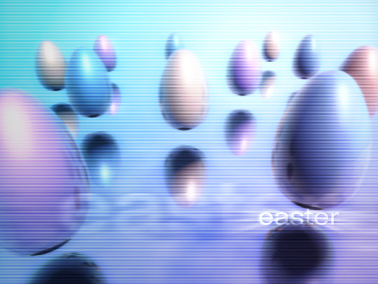
easter '24
#y2k#y2k aesthetic#2000s#webcore#y2kcore#2000s aesthetic#wallpaper#neo y2k#graphic art#art#blender render#cgi#easter#easter 2024#cyber y2k#y2k moodboard#y2k style#early 2000s#y2k cyber#cybercore#eggs#easter eggs#kaybug#yqueuek#design#graphic design#visual art
104 notes
·
View notes
Text
So I'm on of those people who enjoys a good "art style challenge" videos. Looking through a lot of different "styles" of art, I've noticed a sort of spectrum that slides between two points.
Stylization and Rendering.
I've made this handy blob to to visualize this spectrum.

Stylization to me is the design of something using shape language, proportions, details vs simplicity, and exaggeration or lack thereof.
It slides between Semi Realism: being more based on reality, Semi Abstract : based more on shape and exaggeration, and Stylized: having a basis in reality but takes artistic liberties to emphasize on certain aspects/feelings.

Rendering to me is the application of form or lack of on a design. Lighting (shade, highlights, rim light), textures, patterns, and lines (there or not). Leaning more graphic or more form based.
No or Low Rendering leans into being graphic. Stylized being some lighting to get an idea of form but not too much to clutter the scene or slow down production. Hight Render leaning on form.

Here are some examples of how different visual stories fit on the scale.

Here you can have stylized character designs with different scales of rendering. Stylization is mostly seen in Japanese Anime and those inspired by Disney.

Same with Semi Abstract designs with different rendering styles. Semi Abstract comes from the UPA shorts from the 50s that really pushed into exaggerated shape language.
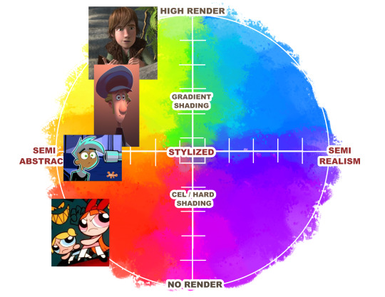
Semi Realistic designs can change with how you render them. Semi Realism is based more on reality.

Works the other way around with Rendering.
You can have the same amount of rendering but take in a story way different with how a character is designed.
Most high rendering is seen in high budget 3D animated features because it would take forever to ask an artist to render this much detail at 24 frames per second. And we already torture animators as is.
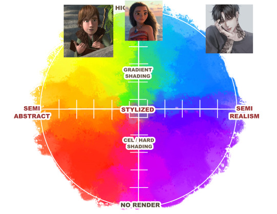
Gradient rendering is seen mostly in webcomics, Korean comics, and illustrated books. Though with Klaus we are starting to see it more in animation.
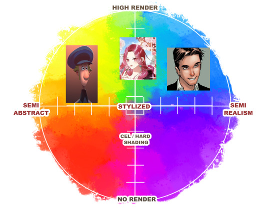
Cel Shading is most common in 2D animated series and movies. Gives it more form and gets the point across.

Low or No Rendering becomes more graphic and emphasizes on color and design.

I will use Donna from my comic Legend Catcher as an example.
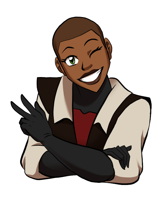
Same design, different ways to render.
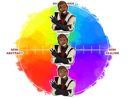
Same amount of rendering, different ways to stylize.
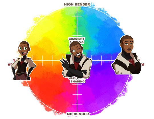
This was just some things to think about when looking at and creating art.

If you wanna check out the process in how I drew all these, check out my Ko-Fi for the video at https://www.ko-fi.com/tessshadowcast
Just some fun thoughts I had. If there are other points to make, let me know!
#style#art styles#Donna Dale#Donna#style spectrum#Style Blob#fun thought experiment#thought experiment#art tip#art tips#stylization#rendering#visual arts#cartoons#comics#ATLA#Avatar The Last Airbender#She Ra#she ra and the princesses of power#powerpuff girls#power puff girls#Klaus#Peter Parker#korean manhwa#Danny Phantom#Moana#Disney#American comics#Ghost in The Shell#castlevania
233 notes
·
View notes
Last Seen Blogs
lauren-malinaxoxo
♡Bunny♡

yowchin-blog1
Yow Chin

kaligw2
Watching & Waiting...

newsonlines-world
News Onlines World

cxnsani
Consani