#ignore the rest of these
Text
If you haven’t already, go and read Tuesdays with Morrie. I think it’s affected me more than any other book I’ve read. It’s heartbreakingly beautiful, and makes you think about your own life so deeply. It’s made me smile and it’s left me in floods of tears, to the point where I had to fan my eyes with the book to carry on reading. I wish I could recommend it to everyone.
#tuesdays with morrie#mitch albom#morrie schwartz#literature#als#love#chronic illness#death#reading#book recs#academia#depression#anxiety#mental health#ignore the rest of these#dead poets society#dps#dark academia#light academia#romantic academia#poetry#beauty#romance
37 notes
·
View notes
Text
also i like to think fifteen shunted all of his mental illness into fourteen while regenerating btw. he said have fun with those millennia of undealt with trauma. bye
#doctor who spoilers#doctor who#the doctor#fourteen#fifteen#okay vulnerability over time to shitpost#donna: doctor you can rest! you can heal!#fourteen who suddenly is unable to ignore his ptsd and depression: 👍
7K notes
·
View notes
Text
if yall ever want like serious advice from me about how to solve burnout as a creative it's like...
literally ignore it. stop pushing. go do something else, enjoy your life, fill it with other things, do what brings you joy in the moment if you can.
go to the gym, take a walk to touch grass and look at dogs and smell flowers, cook dinner, watch tv with your friends, talk about your feelings as needed with ppl you trust, take a drive and blast your music, do the chores you need to do, the job hunting slog you need to do, read books that aren't for research, stop cordoning off your brain for The Craft or The Draft or whatever the fuck
forget about the project, stop thinking about it for as long as it takes to be excited again.
fuckin rest, basically
#thoughts#writing stuff#personal#wish there was better advice than Stop Pushing and Rest and Ignore It#but sure haven't found any#and the time in between sucks a lot#jay prescribes a nice beverage four orgasms and a good movie with friends for your burnout#hope that helps#jay philosophies
13K notes
·
View notes
Text
I love that everyone in TMA is just. Unremarkable. Jon isnt a heroic character; he's self-loathing and depressed and he exhibits the same self-pity as I do when I'm self-loathing and depressed. He doesn't stand out for his strength of will or quick-thinking or virtue. He's a good person but he stops trying to stay human when it gets uncomfortable. He's everything that a regular person is when theyre trapped in a horrible situation and it's ugly and insufferable and Real.
#and dont even get me started on the rest of them#martin is jealous and petty and manipulative#and look at his life— look at his mother— of course he is!#basira would never do the things daisy does but she's perfectly content to look the other way and ignore it#and she does the same thing in the archives— the world is ending and she hides away with her books and pretends it's none of her business#and oh god MELANIE#like#it really drives home tim's point that all you need for the fears to ruin your life is just bad luck#tma#the magnus archives#jonathan sims#jon sims
3K notes
·
View notes
Text
It’s finally time to share this year-old piece made for the GhostSoap Zine
#call of duty#mw2#mwii#call of duty modern warfare 2#simon ghost riley#ghost#johnny soap mactavish#soap#they are resting#ignore the iffy anatomy ;-;
3K notes
·
View notes
Text

girls in their rooms
#female hysteria#my year of rest and relaxation#girl blogger#girlblogging#just ignore my ramblings#just girlboss things#it girl#victorias secret#lana del rey#coney island queen#coquette#girlblogger#lana is god#lizzy grant#girl interrupted#born to die#80s#aesthetic#black swan#girl interupted syndrome#lisa rowe#femcel#feeling cunty#lust for life#manic pixie dream girl#just girly things#coquette girl#cinnamon girl#female manipulator#gaslight gatekeep girlboss
6K notes
·
View notes
Photo


I want to stand with you in front of all the Daturma Ox things to come.
JESPER FAHEY and WYLAN HENDRICKS in Shadow and Bone ( 2021- )
#shadowandboneedit#sabedit#sixofcrowsedit#shadowandbonesource#shadow and bone#sab spoilers //#bare chest //#wesper#my edits#*mysoc#delivered!#still not sure what theyre gonna do with them in upcoming seasons but u know what having them as an established couple#while the rest of the crows dance around their romantic dramas is not the worst possible scenario#and kind of funny to consider if this is how things would have gone in an alternate universe without weeks of annoyingly flirting#and first kisses gone wrong etc etc#also their scenes are cute and all but the best is kit&jack delivering whenever theyre just in the background adding little moments#lets ignore how you cannot make cohesive sets of this show at all bc the colorings are horrendous#*6k
8K notes
·
View notes
Text
putting my prediction on record now that the coming decade is going to see the rise of viral-marketed fancy at-home water filtration systems, driving and driven by a drastic reduction in the quality of U.S. tap water (given that we are in a 'replacement era' where our current infrastructure is reaching the end of its lifespan--but isn't being replaced). also guessing that by the 2030s access to drinkable tap water will be a mainstream class issue, with low-income & unstably housed people increasingly forced to rely on expensive bottled water when they can't afford the up-front cost of at-home filtration--and with this being portrayed in media as a "moral failing" and short-sighted "choice," rather than a basic failure of our political & economic systems. really hope i'm just being alarmist, but plenty of this already happens in other countries, and the U.S. is in a state of decline, so. here's praying this post ages into irrelevance. timestamped April 2023
#apollo don't fucking touch this one#serious post#not a shitpost#hope i forget about this post and have no reason to ever look back on it one day#fyi i'm aware that access to potable water is already a major issue in parts of the U.S. yes i know flint michigan exists#i'm saying that this issue is going to GROW unless local & federal governments work together to fix it.#so it's a matter of if we trust them to fix it. And well--do you?#what are the chances the government just denies there's a problem until the water actually turns brown#at which point it's already been common knowledge for years and people have just become resigned and that's our new normal#i'm mean come on. how many of us already believe that we're being exposed to dangerous pollutants we don't know about and can't avoid#like that's pretty much just part of being a modern consumer. accepting that companies will happily endanger your life for a few pennies#and the most you'll get is like a $50 gift card as part of a class action rebate 20 years down the line#probably the history books will look back on Flint as a warning and a harbinger that went ignored#luxury condos will advertise their built-in top-of-the-line filtration systems--live here and you can drink water straight from your tap!#watch the elite professional class putting $700 dyson water filtration systems on their wedding registry#while the rest of us figure out how to fit water delivery into our grocery budget while putting 90% of our paycheck towards rent#also eggs are $15
5K notes
·
View notes
Text
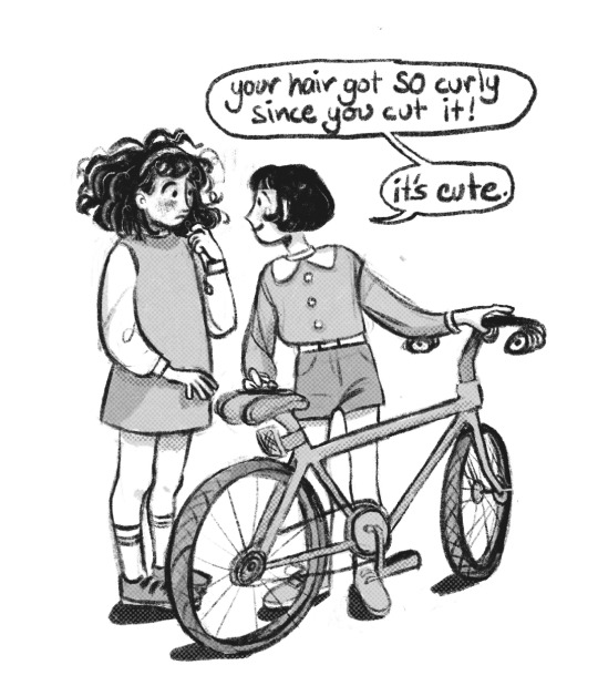
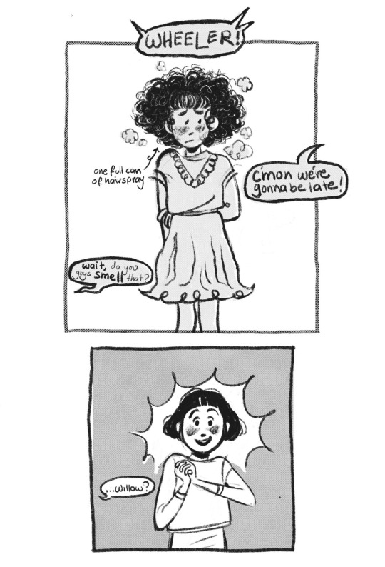
“If byler were both girls nobody wou-“ yes they would! as someone who grew up sapphic I would love them even more!
@rainyydazze Ty for putting this in my brain
#lesbyler#is this rule 63? are they trans? you decide!#stranger things#byler#rainyydazze#will byers#mike wheeler#unintentional but I just realized hair-do Michelle looks just like Nancy :’-)#I also realized the bike is huge but let’s just say it’s Jonathan’s old bike#I’m usually not big on quote unquote genderbending#mainly because it can get into ignorance and insensitivity towards trans issues#but I also love the idea of lesbian byler bc I grew up lesbian and I relate to these characters a lot!#it’s cute!#but yea I was thinking about adding the rest of the party/el but I refrained from it#bc I want to allow people to decide whether the switch in genders applies to everyone or just byler#st#stranger things fanart#fanart#illustration#drawing#art#artists on tumblr#byler fanart
3K notes
·
View notes
Text
Dc x dp idea 123
Danny is haunting the watchtower. No regrets. He was just so fed up with the lack of action.
Seriously they had a whole bs site claiming they were pro meta and basic rights. Like it had links on where to “report” breaches. All utter bs.
Nothing about the anti ecto acts. He personally called in and reported it many times. And nothing happened. As the king. He had a duty to his ppl. Now he didn’t want to hurt anyone or declare war.
But he will absolutely in the middle of their meeting change the screens of the computer to the site to report breaches. Mayhaps add bloody green text seemingly dripping in all cap LIARS and maybe YOU IgNORED US.
Was it a tad much to leave a stabbed article about the anti ecto acts in the middle of the meeting room ozzing ectoplasm. Or maybe the whispering in the ears of anyone who slept here.
He certainly didn’t think so.
So now the screens occasionally flickered the failed experiments of the GIW. Sure no one’s been killed yet. But the justice league didn’t know that. Danny is great at breaking them out.
#dcxdp#dpxdc#dcxdp prompt#dpxdc prompt#Danny is pissed#like they ain’t helping#clearly those acts set a bad precedent#at least that’s what sam told him#yet they did nothing!#just ignore them all#like rude#enjoy being haunted#technus helped Danny#ghost king danny#cause i love that#danny is a little shit#danny is a gremlin#danny will prank them for the rest of time if he has to
2K notes
·
View notes
Text
"why would you read a fic with a scene or something you dont like in it" you see i have this ability called using my thumb to scroll down the phone screen really fast
#some of the fics i care for are rated E but i dont like hanky panky so i just scroll really fast and boom the rest of the plot is still ther#this goes for a lot of things also#remember you have the power to literally Ignore It and keep going#not everything is going to be perfect for you so take it like cupcake where you love the icing and not the cake#just eat the icing you dont have to eat the rest#sara shush
1K notes
·
View notes
Text
“For a long time, Nico had assumed he himself did not have a heart.”
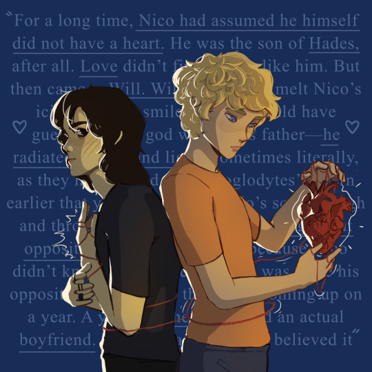
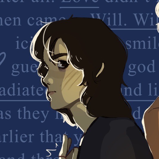

#Ignore the fact that I could not be bothered to shade and draw their clothes#Just focus on the rest x#solangelo#solangelo fanart#tsats#nico di angelo#nico di angelo fanart#will solace#will solace fanart#pjo fanart#tsats fanart#pjo hoo toa tsats#tsats spoilers#not really but you know…#percy jackson#pjo#rick riordan#pjoverse#pjo fandom#rrverse#riordanverse#my sillies#my art#artists on tumblr#fan art#the sun and the star
2K notes
·
View notes
Text
Thinking about how, at the end of the day, at the fatal moment, the sunset of the Republic, it wasn’t Yoda, or Obi-Wan, or even the Chosen One himself standing in the way of Palpatine. It was Mace Windu.
Mace Windu, the inventor of Vaapad and Master of Form VII, the Jedi's strongest duelist, the only person to ever defeat Palpatine in combat. Mace Windu, Master of the Jedi Council and the youngest Master ever appointed to it, the revered leader of the Order. Mace Windu, who forgave even those who tried to kill him, who risked his life over and over again for his troops, who, after 3 years of desperate war, tried to negotiate with battle droids. Mace Windu, who knew the clones were created by the Sith and chose to trust them, who saw every Shatterpoint in the Republic, and loved it still, and fought for it until his last breath, until he was betrayed by Anakin, who he believed in and trusted despite everything.
Mace Windu, High General and hero of the Republic, the embodiment of the Light, the last and greatest champion of the Order, the best Jedi to ever live.
#I’ve said my piece goodnight#don’t play with me Mace Antis I have receipts for every last one of these#pretty much everyone agrees that he was the best duelist there was and he obviously won the fight#Anakin's choice wouldn't make thematic sense otherwise#also vader did not defeat palpatine in combat sorry he just grabbed him while he was distracted#it literally had to be a fair fight and Anakin had to be the one to choose to create the empire that's what the prequels are about#Star Wars databank calls him ‘revered’ shatterpoint tells us he was the youngest (real) member of the council#Boba Fett (tcw) and Prosset Dibs (comics) tried to kill him and he asked for amnesty and forgave them#literally just watch the Ryloth arc he spends most of his screentime saving his men#in tcw season seven he pleads with the battle droids to surrender hoping that no one else has to die#there's the part near the end of tcw where the council realizes that the clones were created by Dooku but Mace and the rest of the council#trust the clones so much they're willing to ignore it#the scene from Mace's POV in the rots novelization talks about how much he loves the republic and how he was blindsided by Anakin's betraya#because he trusted him!! we see in aotc that he has more faith in Anakin's abilities than Obi-wan#and he defeated the most powerful sith of all time single-handedly#BEST JEDI EVER!!!!!!!!!!!!#sw prequels#star wars prequels#prequel trilogy#sw prequel trilogy#star wars prequel trilogy#sw rots#star wars rots#revenge of the sith#star wars revenge of the sith#galactic republic#pro mace windu#mace windu#pro jedi order#pro jedi
707 notes
·
View notes
Text
why Aurora's art is genius
It's break for me, and I've been meaning to sit down and read the Aurora webcomic (https://comicaurora.com/, @comicaurora on Tumblr) for quite a bit. So I did that over the last few days.
And… y'know. I can't actually say "I should've read this earlier," because otherwise I would've been up at 2:30-3am when I had responsibilities in the morning and I couldn't have properly enjoyed it, but. Holy shit guys THIS COMIC.
I intended to just do a generalized "hello this is all the things I love about this story," and I wrote a paragraph or two about art style. …and then another. And another. And I realized I needed to actually reference things so I would stop being too vague. I was reading the comic on my tablet or phone, because I wanted to stay curled up in my chair, but I type at a big monitor and so I saw more details… aaaaaand it turned into its own giant-ass post.
SO. Enjoy a few thousand words of me nerding out about this insanely cool art style and how fucking gorgeous this comic is? (There are screenshots, I promise it isn't just a wall of text.) In my defense, I just spent two semesters in graphic design classes focusing on the Adobe Suite, so… I get to be a nerd about pretty things…???
All positive feedback btw! No downers here. <3
---
I cannot emphasize enough how much I love the beautiful, simple stylistic method of drawing characters and figures. It is absolutely stunning and effortless and utterly graceful—it is so hard to capture the sheer beauty and fluidity of the human form in such a fashion. Even a simple outline of a character feels dynamic! It's gorgeous!
Though I do have a love-hate relationship with this, because my artistic side looks at that lovely simplicity, goes "I CAN DO THAT!" and then I sit down and go to the paper and realize that no, in fact, I cannot do that yet, because that simplicity is born of a hell of a lot of practice and understanding of bodies and actually is really hard to do. It's a very developed style that only looks simple because the artist knows what they're doing. The human body is hard to pull off, and this comic does so beautifully and makes it look effortless.
Also: line weight line weight line weight. It's especially important in simplified shapes and figures like this, and hoo boy is it used excellently. It's especially apparent the newer the pages get—I love watching that improvement over time—but with simpler figures and lines, you get nice light lines to emphasize both smaller details, like in the draping of clothing and the curls of hair—which, hello, yes—and thicker lines to emphasize bigger and more important details and silhouettes. It's the sort of thing that's essential to most illustrations, but I wanted to make a note of it because it's so vital to this art style.
THE USE OF LAYER BLENDING MODES OH MY GODS. (...uhhh, apologies to the people who don't know what that means, it's a digital art program thing? This article explains it for beginners.)
Bear with me, I just finished my second Photoshop course, I spent months and months working on projects with this shit so I see the genius use of Screen and/or its siblings (of which there are many—if I say "Screen" here, assume I mean the entire umbrella of Screen blending modes and possibly Overlay) and go nuts, but seriously it's so clever and also fucking gorgeous:
Firstly: the use of screened-on sound effect words over an action? A "CRACK" written over a branch and then put on Screen in glowy green so that it's subtle enough that it doesn't disrupt the visual flow, but still sticks out enough to make itself heard? Little "scritches" that are transparent where they're laid on without outlines to emphasize the sound without disrupting the underlying image? FUCK YES. I haven't seen this done literally anywhere else—granted, I haven't read a massive amount of comics, but I've read enough—and it is so clever and I adore it. Examples:


Secondly: The beautiful lighting effects. The curling leaves, all the magic, the various glowing eyes, the fog, the way it's all so vividly colored but doesn't burn your eyeballs out—a balance that's way harder to achieve than you'd think—and the soft glows around them, eeeee it's so pretty so pretty SO PRETTY. Not sure if some of these are Outer/Inner Glow/Shadow layer effects or if it's entirely hand-drawn, but major kudos either way; I can see the beautiful use of blending modes and I SALUTE YOUR GENIUS.
I keep looking at some of this stuff and go "is that a layer effect or is it done by hand?" Because you can make some similar things with the Satin layer effect in Photoshop (I don't know if other programs have this? I'm gonna have to find out since I won't have access to PS for much longer ;-;) that resembles some of the swirly inner bits on some of the lit effects, but I'm not sure if it is that or not. Or you could mask over textures? There's... many ways to do it.
If done by hand: oh my gods the patience, how. If done with layer effects: really clever work that knows how to stop said effects from looking wonky, because ugh those things get temperamental. If done with a layer of texture that's been masked over: very, very good masking work. No matter the method, pretty shimmers and swirly bits inside the bigger pretty swirls!
Next: The way color contrast is used! I will never be over the glowy green-on-black Primordial Life vibes when Alinua gets dropped into that… unconscious space?? with Life, for example, and the sharp contrast of vines and crack and branches and leaves against pitch black is just visually stunning. The way the roots sink into the ground and the three-dimensional sensation of it is particularly badass here:

Friggin. How does this imply depth like that. HOW. IT'S SO FREAKING COOL.
A huge point here is also color language and use! Everybody has their own particular shade, generally matching their eyes, magic, and personality, and I adore how this is used to make it clear who's talking or who's doing an action. That was especially apparent to me with Dainix and Falst in the caves—their colors are both fairly warm, but quite distinct, and I love how this clarifies who's doing what in panels with a lot of action from both of them. There is a particular bit that stuck out to me, so I dug up the panels (see this page and the following one https://comicaurora.com/aurora/1-20-30/):

(Gods it looks even prettier now that I put it against a plain background. Also, appreciation to Falst for managing a bridal-carry midair, damn.)
The way that their colors MERGE here! And the immense attention to detail in doing so—Dainix is higher up than Falst is in the first panel, so Dainix's orange fades into Falst's orange at the base. The next panel has gold up top and orange on bottom; we can't really tell in that panel where each of them are, but that's carried over to the next panel—

—where we now see that Falst's position is raised above Dainix's due to the way he's carrying him. (Points for continuity!) And, of course, we see the little "huffs" flowing from orange to yellow over their heads (where Dainix's head is higher than Falst's) to merge the sound of their breathing, which is absurdly clever because it emphasizes to the viewer how we hear two sets of huffing overlaying each other, not one. Absolutely brilliant.
(A few other notes of appreciation to that panel: beautiful glows around them, the sparks, the jagged silhouette of the spider legs, the lovely colors that have no right to make the area around a spider corpse that pretty, the excellent texturing on the cave walls plus perspective, the way Falst's movements imply Dainix's hefty weight, the natural posing of the characters, their on-point expressions that convey exactly how fuckin terrifying everything is right now, the slight glows to their eyes, and also they're just handsome boys <3)
Next up: Rain!!!! So well done! It's subtle enough that it never ever disrupts the impact of the focal point, but evident enough you can tell! And more importantly: THE MIST OFF THE CHARACTERS. Rain does this irl, it has that little vapor that comes off you and makes that little misty effect that plays with lighting, it's so cool-looking and here it's used to such pretty effect!
One of the panel captions says something about it blurring out all the injuries on the characters but like THAT AIN'T TOO BIG OF A PROBLEM when it gets across the environmental vibes, and also that'd be how it would look in real life too so like… outside viewer's angle is the same as the characters', mostly? my point is: that's the environment!!! that's the vibes, that's the feel! It gets it across and it does so in the most pretty way possible!
And another thing re: rain, the use of it to establish perspective, particularly in panels like this—

—where we can tell we're looking down at Tynan due to the perspective on the rain and where it's pointing. Excellent. (Also, kudos for looking down and emphasizing how Tynan's losing his advantage—lovely use of visual storytelling.)
Additionally, the misting here:

We see it most heavily in the leftmost panel, where it's quite foggy as you would expect in a rainstorm, especially in an environment with a lot of heat, but it's also lightly powdered on in the following two panels and tends to follow light sources, which makes complete sense given how light bounces off particles in the air.
A major point of strength in these too is a thorough understanding of lighting, like rim lighting, the various hues and shades, and an intricate understanding of how light bounces off surfaces even when they're in shadow (we'll see a faint glow in spots where characters are half in shadow, but that's how it would work in real life, because of how light bounces around).
Bringing some of these points together: the fluidity of the lines in magic, and the way simple glowing lines are used to emphasize motion and the magic itself, is deeply clever. I'm basically pulling at random from panels and there's definitely even better examples, but here's one (see this page https://comicaurora.com/aurora/1-16-33/):

First panel, listed in numbers because these build on each other:
The tension of the lines in Tess's magic here. This works on a couple levels: first, the way she's holding her fists, as if she's pulling a rope taut.
The way there's one primary line, emphasizing the rope feeling, accompanied by smaller ones.
The additional lines starbursting around her hands, to indicate the energy crackling in her hands and how she's doing a good bit more than just holding it. (That combined with the fists suggests some tension to the magic, too.) Also the variations in brightness, a feature you'll find in actual lightning. :D Additional kudos for how the lightning sparks and breaks off the metal of the sword.
A handful of miscellaneous notes on the second panel:
The reflection of the flames in Erin's typically dark blue eyes (which bears a remarkable resemblance to Dainix, incidentally—almost a thematic sort of parallel given Erin's using the same magic Dainix specializes in?)
The flowing of fabric in the wind and associated variation in the lineart
The way Erin's tattoos interact with the fire he's pulling to his hand
The way the rain overlays some of the fainter areas of fire (attention! to! detail! hell yeah!)
I could go on. I won't because this is a lot of writing already.
Third panel gets paragraphs, not bullets:
Erin's giant-ass "FWOOM" of fire there, and the way the outline of the word is puffy-edged and gradated to feel almost three-dimensional, plus once again using Screen or a variation on it so that the stars show up in the background. All this against that stunning plume of fire, which ripples and sparks so gorgeously, and the ending "om" of the onomatopoeia is emphasized incredibly brightly against that, adding to the punch of it and making the plume feel even brighter.
Also, once again, rain helping establish perspective, especially in how it's very angular in the left side of the panel and then slowly becomes more like a point to the right to indicate it's falling directly down on the viewer. Add in the bright, beautiful glow effects, fainter but no less important black lines beneath them to emphasize the sky and smoke and the like, and the stunningly beautiful lighting and gradated glows surrounding Erin plus the lightning jagging up at him from below, and you get one hell of an impactful panel right there. (And there is definitely more in there I could break down, this is just a lot already.)
And in general: The colors in this? Incredible. The blues and purples and oranges and golds compliment so well, and it's all so rich.
Like, seriously, just throughout the whole comic, the use of gradients, blending modes, color balance and hues, all the things, all the things, it makes for the most beautiful effects and glows and such a rich environment. There's a very distinct style to this comic in its simplified backgrounds (which I recognize are done partly because it's way easier and also backgrounds are so time-consuming dear gods but lemme say this) and vivid, smoothly drawn characters; the simplicity lets them come to the front and gives room for those beautiful, richly saturated focal points, letting the stylized designs of the magic and characters shine. The use of distinct silhouettes is insanely good. Honestly, complex backgrounds might run the risk of making everything too visually busy in this case. It's just, augh, so GORGEOUS.
Another bit, take a look at this page (https://comicaurora.com/aurora/1-15-28/):

It's not quite as evident here as it is in the next page, but this one does some other fun things so I'm grabbing it. Points:
Once again, using different colors to represent different character actions. The "WHAM" of Kendal hitting the ground is caused by Dainix's force, so it's orange (and kudos for doubling the word over to add a shake effect). But we see blue layered underneath, which could be an environmental choice, but might also be because it's Kendal, whose color is blue.
And speaking off, take a look at the right-most panel on top, where Kendal grabs the spear: his motion is, again, illustrated in bright blue, versus the atmospheric screened-on orange lines that point toward him around the whole panel (I'm sure these have a name, I think they might be more of a manga thing though and the only experience I have in manga is reading a bit of Fullmetal Alchemist). Those lines emphasize the weight of the spear being shoved at him, and their color tells us Dainix is responsible for it.
One of my all-time favorite effects in this comic is the way cracks manifest across Dainix's body to represent when he starts to lose control; it is utterly gorgeous and wonderfully thematic. These are more evident in the page before and after this one, but you get a decent idea here. I love the way they glow softly, the way the fire juuuust flickers through at the start and then becomes more evident over time, and the cracks feel so realistic, like his skin is made of pottery. Additional points for how fire begins to creep into his hair.
A small detail that's generally consistent across the comic, but which I want to make note of here because you can see it pretty well: Kendal's eyes glow about the same as the jewel in his sword, mirroring his connection to said sword and calling back to how the jewel became Vash's eye temporarily and thus was once Kendal's eye. You can always see this connection (though there might be some spots where this also changes in a symbolic manner; I went through it quickly on the first time around, so I'll pay more attention when I inevitably reread this), where Kendal's always got that little shine of blue in his eyes the same as the jewel. It's a beautiful visual parallel that encourages the reader to subconsciously link them together, especially since the lines used to illustrate character movements typically mirror their eye color. It's an extension of Kendal.
Did I mention how ABSOLUTELY BEAUTIFUL the colors in this are?
Also, the mythological/legend-type scenes are illustrated in familiar style often used for that type of story, a simple and heavily symbolic two-dimensional cave-painting-like look. They are absolutely beautiful on many levels, employing simple, lovely gradients, slightly rougher and thicker lineart that is nonetheless smoothly beautiful, and working with clear silhouettes (a major strength of this art style, but also a strength in the comic overall). But in particular, I wanted to call attention to a particular thing (see this page https://comicaurora.com/aurora/1-12-4/):

The flowing symbolic lineart surrounding each character. This is actually quite consistent across characters—see also Life's typical lines and how they curl:

What's particularly interesting here is how these symbols are often similar, but not the same. Vash's lines are always smooth, clean curls, often playing off each other and echoing one another like ripples in a pond. You'd think they'd look too similar to Life's—but they don't. Life's curl like vines, and they remain connected; where one curve might echo another but exist entirely detached from each other in Vash's, Life's lines still remain wound together, because vines are continuous and don't float around. :P
Tahraim's are less continuous, often breaking up with significantly smaller bits and pieces floating around like—of course—sparks, and come to sharper points. These are also constants: we see the vines repeated over and over in Alinua's dreams of Life, and the echoing ripples of Vash are consistent wherever we encounter him. Kendal's dream of the ghost citizens of the city of Vash in the last few chapters is filled with these rippling, echoing patterns, to beautiful effect (https://comicaurora.com/aurora/1-20-14/):

They ripple and spiral, often in long, sinuous curves, with smooth elegance. It reminds me a great deal of images of space and sine waves and the like. This establishes a definite feel to these different characters and their magic. And the thing is, that's not something that had to be done—the colors are good at emphasizing who's who. But it was done, and it adds a whole other dimension to the story. Whenever you're in a deity's domain, you know whose it is no matter the color.
Regarding that shape language, I wanted to make another note, too—Vash is sometimes described as chaotic and doing what he likes, which is interesting to me, because smooth, elegant curves and the color blue aren't generally associated with chaos. So while Vash might behave like that on the surface, I'm guessing he's got a lot more going on underneath; he's probably much more intentional in his actions than you'd think at a glance, and he is certainly quite caring with his city. The other thing is that this suits Kendal perfectly. He's a paragon character; he is kind, virtuous, and self-sacrificing, and often we see him aiming to calm others and keep them safe. Blue is such a good color for him. There is… probably more to this, but I'm not deep enough in yet to say.
And here's the thing: I'm only scratching the surface. There is so much more here I'm not covering (color palettes! outfits! character design! environment! the deities! so much more!) and a lot more I can't cover, because I don't have the experience; this is me as a hobbyist artist who happened to take a couple design classes because I wanted to. The art style to this comic is so clever and creative and beautiful, though, I just had to go off about it. <3
...brownie points for getting all the way down here? Have a cookie.
#aurora comic#aurora webcomic#comicaurora#art analysis#...I hope those are the right tags???#new fandom new tagging practices to learn ig#much thanks for something to read while I try to rest my wrists. carpal tunnel BAD. (ignore that I wrote this I've got braces ok it's fine)#anyway! I HAVE. MANY MORE THOUGHTS. ON THE STORY ITSELF. THIS LOVELY STORY#also a collection of reactions to a chunk of the comic before I hit the point where I was too busy reading to write anything down#idk how to format those tho#...yeet them into one post...???#eh I usually don't go off this much these days but this seems like a smaller tight-knit fandom so... might as well help build it?#and I have a little more time thanks to break so#oh yes also shoutout to my insanely awesome professor for teaching me all the technical stuff from this he is LOVELY#made an incredibly complex program into something comprehensible <3#synapse talks
743 notes
·
View notes
Text
maybe unpopular opinion but probably one of the least useful pieces of advice I've ever got as an auDHD person to the question of "how tf does one make friends" was to go and join clubs/groups that do hobbies I enjoy. Not only does this not actually answer the question of how to make friends (yknow, how to approach people, how to start a conversation, how to appear friendly enough that they don't immediately reject you for existing, how to actually keep them as friends later on, etc), but also the chance of me choosing to force myself into the discomfort of "making smalltalk with random strangers" is absolutely nonexistent when the alternative of engaging with a hyperfixation is not only socially acceptable but even encouraged
#autistic#autism#actually autistic#adhd#actually adhd#neurodivergent#actually neurodivergent#one time a friend of mine took me to a knitting club#she kept telling me beforehand how nice everyone was and#i shouldn't be anxious cuz they are all nice ppl#when we got there the social anxiety got to me#so to calm myself i took out my project of the time#i then proceeded to hyperfocus on knitting for the rest of#the two hours that we spent there#ignoring everyone else and not talking whatsoever#and since they didn't approach me either i just sat there in silence#she obviously couldn't pass up the opportunity to make fun of me afterwards#needless to say i never went back there again#cuz i mean if i wanna knit i'm gonna to it in the safety of my home#i don't need the added stress of masking in front of others#i still don't know how to make friends
583 notes
·
View notes
Text
Being aromantic is ignoring That One Lyric
1K notes
·
View notes
Last Seen Blogs

fenixfluxing
Mental Melt

vandiveriyan
Untitled
yuka
YUKA @ POW!

alunasky-blog
Alunasky
les-anges-s-amusent
Abraham, Jésus, François et compagnie