#the color decisions and shots were also works of art
Text
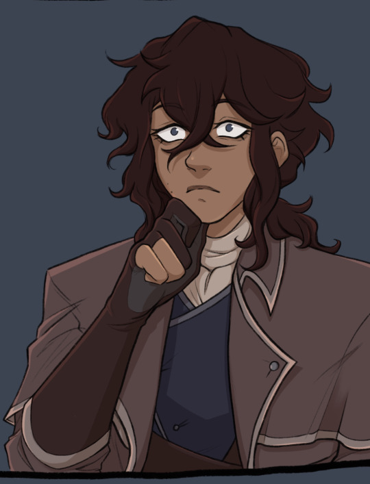
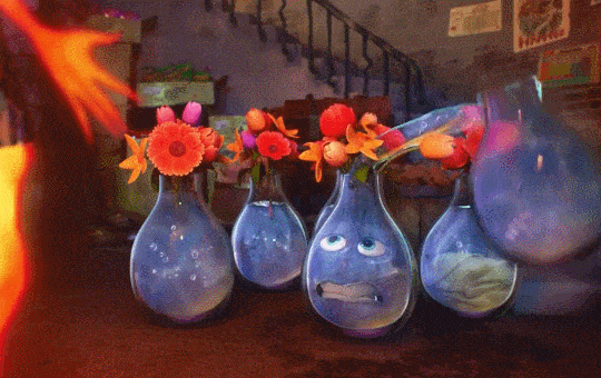
THE MAP IS OUT!! Here's my individual part for it, along with my credit image! I'm so happy to have been able to work with such cool collaborators on this project, this was so fun! :D <33
WIP and fun facts below the cut!
First pass of my part!

General Notes:
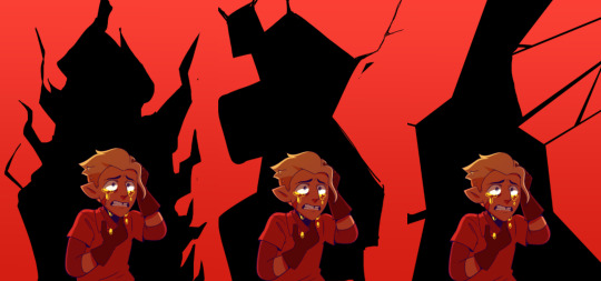
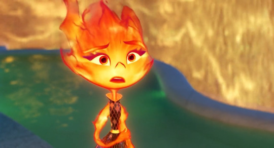
- All of us had a cut-off frame so Sammy (our MAP host!) had space to transition shots! the stick in my cut-off is my oc Lixy <3
- As always, I don't have an actual animation program. Each frame of this was individually drawn in Clip Studio, saved as PNGs, and meticulously arranged in a video editing software. it took a while and a headache. the software crashed 4 times hdkjh </3
- The process was sketching, lining, then compiling it all together! Line art took the most time (because i don't like lineart hkjdh)
- Fun fact, all of the sketches (seen in the wip above) were all drawn on my first plane ride ever :> <3
- The background is Alan's animation program that I took from a screenshot from AVA 6 :> I didn't want to do anything too complex for it ;w; <3
- All of the slide transitions were done manually! It may look like tweening, but I don't have a program that can do tweening lmao :'> <3 Each of the slidings was individually 3-6 frames of moving them across the frame, a single frame of stretch for movement, then a settling frame before the next stick slid in.
- Green is doing air guitar as they slide in :3 <3
- My Blue design has a hat that can magically change into a Witch hat (when potion making), Chef hat (when cooking) or Sunhat (when gardening <33
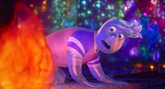
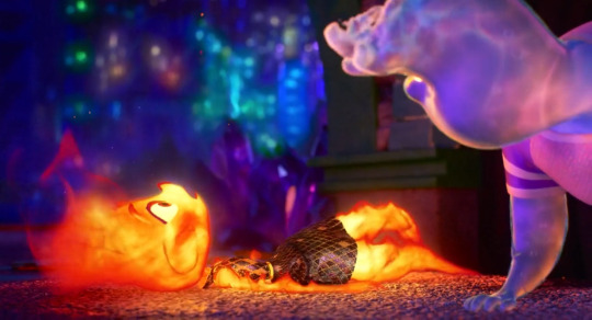
- Purple looks nervous after he crashes into everyone, like they're expecting to be in trouble, but smiles and laughs when everyone else does. You can see Blue with their hands up, reassuring Purple.
- Originally Yellow didn't move as much in the final laugh scene, but I saw the first frame of the person after me (@/sleptonce!) which had Yellow in a little crouch :> i adjusted Yellow to match the next frame a little better!
- Also Yellow's hair is flipped from the way I usually draw it because I felt it worked better this way hgkjh <3
- (I totally didn't forget my Second's design has green eyes and had to edit those frames very quickly hfkjh <33)
- The only colors that aren't the stick's original colors are when Blue's hat falls on Purple, and Red's yellow bandana <3 (These are also the only movement animation in the blinking sequence!)
- Adding Alan's cursor was a literal last minute decision, he was never in any of the sketches, I literally added him in 15 minutes before submitting my part hgkjh <33 I think after my shot, Alan helps gently pick them up <3
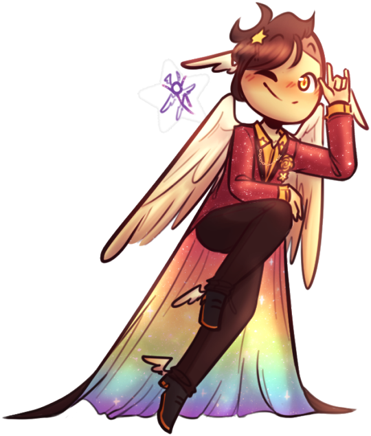
- My suit in the credits is mostly red and orange, because my favorite sticks are Red and Second! <3 The rainbow cape reflects how I enjoy the color gang the most though hkjdh <33
Thanks for reading!! :D <33
#Alan Becker#Animation Vs Minecraft#Animator Vs Animation#AvM#AvA#my avm art#avm red#avm second coming#avm orange#avm yellow#avm green#avm blue#avm purple#starlight originals#lixy
179 notes
·
View notes
Text
Does He Know?

Charles Leclerc x Reader
Genre: forbidden relationship
Warnings: suggestive content, swearing, angst
Word Count: 865
Author's Note: I seen a TikTok and then I thought of this. I realize that everything I posted so far deals with the Leclercs and that's not on purpose. I told myself that the next time I write anything for this blog its gonna be someone else, but then I saw this TikTok with Arthur and Charles so ofc it had to be Arthur and Charles for this. Also I don't condone cheating in any sense, unless you're cheating on a groomer or something, but that's a conversation for another time. one more thing, idk if this is getting a part two yet, lmk what you guys think lol
post about part 2
-----------------------
‘Oh shit’ were the first words in your mind, when you felt the morning sun on your face. Your head ached with last night's decisions. You pulled the blanket closer to you realizing that somewhere between the club last night and your bed this morning you lost your dress. You opened your eyes finally looking around to notice the dark blanket that didn’t match your nice cream ones. You noticed the walls lined with racing posters that didn’t match your art filled walls. You turned over in the bed to notice the man laying there that wasn’t your boyfriend.
“Shit,” you cursed aloud as you shot up in bed.
The man that laid next to you turned over, “Charlotte why are you yelling?” he asked with a mumble.
“Um…” you were at a complete loss for words, you don’t even remember drinking that much, “i’m not Charlotte.” you said softly, hopeful not to startle the man next to you.
He shot up next to you, finally sitting up and looking at you, “you’re not my girlfriend,” he said as the color drained from his face.
“You’re not my boyfriend,” you said, hopeful that he was trying to catch your hint.
“This didn’t happen,” you both said at the same time. You thanked the heavens above that he caught on to what you were trying to say. You made quick work of finding your dress, and getting a cab to get the hell out of his apartment. You and him skipped over the pleasantries, not wanting to know each other's names or anything that happened last night. He didn’t even walk you out the door, not that you really wanted him to.
You were just grateful that he let you go without any argument. As soon as you got back to your place, you threw that wretched dress into the trash and jumped into the shower. When you were done with your shower, scrubbing off all the remnants of the other man you called your boyfriend, Arthur.
-
Arthur wasted no time in getting over to your place, when you opened the door to see him standing there you thought that maybe you shouldn’t tell him. He didn’t need to know, who would tell him? You were sure all your friends would cover for you, you didn’t know the guy that you slept with, maybe you could just keep this to yourself.
“I made a mistake,” the words tumbled out of you before you could catch them. Arthur stood in front of you so happily that you couldn’t further break his heart by keeping this from him to find out later on.
“Mistake?” Arthur took a step back from you, “what kind of mistake?”
“I think…” you felt tears welled in your eyes, this was gonna be the end to a relationship that hasn’t even started yet, “I slept with someone last night.”
“I see,” Arthur said, looking down as if he were in deep thought. You stood there in silence for a minute. Then two minutes, then ten minutes, then fifteen minutes. “Arthur, say something please.”
“What do you want me to say?” Arthur scoffed, “I want to be angry, I am angry but I don’t know if I have a right to. I have never asked you to be my girlfriend yet.”
“Be angry, you have a right to be angry. Even if I’m not your girlfriend, there was an unsaid agreement that we were committed to each other. Be angry, just don’t leave.” You said, as you held onto Arthur's hands.
“I don’t want to leave,” Arthur said, finally looking at you.
“I don’t want you to leave either.” You said, as you took a step closer to Arthur, hoping to close some of the space between the both of you.
“I am still very angry with you though,” Arthur said, “but I don’t want to lose you just yet.”
“I don’t want to lose you Arthur, last night was a terrible mistake, something that I would never do. When I woke up this morning, the first person I thought of was you. I rushed home to see you. I wanted to tell you before anything else.”
“I am gonna put this behind us because I want to be with you,” Arthur said, closing the gap between the two of you. You nodded your head, hanging onto every word that passed his lips, “but from this day forward you’re mine. You belong to me, and only me.”
That day was over three months ago now. The past three months you have been happy, loved, overjoyed with Arthur. You didn’t even dare to look at another man. You and Arthur moved past it and never brought it up again. You didn’t even think about it again. Until now, when Arthur wanted you to meet his family. You were sitting across the table from the man you had a one night stand that almost ended your relationship before it happened, Charles Leclerc. And all the memories from that night, everything you thought you were too drunk to remember came rushing back to you. Based on how Charles looked at you, you would say he remembered too.
part II
#formula 1 imagine#formula 1 fanfic#formula 1#formula 2 imagine#formula 2 fanfic#ferrari#fda#charles lecrelc#charles leclerc imagine#charles leclerc fanfic#charles leclerc x you#arthur leclerc imagines#Arthur Leclerc x you#clxja works#charles leclerc imagines#formula 1 au#formula 1 angst#charles leclerc
709 notes
·
View notes
Text
[Chapter title: Irresistible]
Muichiro Tokitou x Reader
Wattpad: [KNY Fanfiction] (One shots) Tokito Muichiro x Reader
Archive: Kimetsu No Yaiba: Tokitou Muichiro x Reader
Master list: ♠ Information ♠
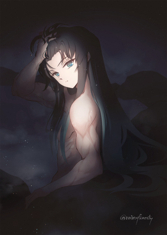
Link of the artist's profile is this: https://twitter.com/rainyforesty
I am open to requests for Muichiro x Reader content, and I also enjoy engaging in roleplays. If you're interested in either, please feel free to check out my pinned post for more information. ~ ♠

The late evening had arrived, and the once thunderous music had subsided, replaced by a hushed silence. Surveying the scene, her friends sprawled across the living room, their exhausted bodies in various positions, their faces etched with weariness from the night of revelry.
Y/n sighed as she looked around the messy living room. Empty bottles, half-eaten snacks, and scattered party decorations were strewn across the floor. It had been a wild night, filled with laughter, dancing, and perhaps a bit too much alcohol.
She gently tiptoed over her sleeping friends, careful not to disturb their much-needed rest. As she made her way towards her bedroom, she couldn't help but smile at the memories created during the evening. The party had been a success, and everyone seemed to have had a great time.
Thankfully the decision to rent the villa instead of hosting the party at her own house was made. She couldn't imagine the chaos that would have ensued if they had chosen her place. Her friends had suggested it, assuming it would be more convenient, but she had insisted on the villa for precisely this reason.
The thought of her pristine home being transformed into the aftermath of a wild party made her shudder. She cherished her space and valued cleanliness, so it was a relief that the mess was contained within the rented villa.
Y/n wasn't much of a drinker anyways, hence saving her of losing her dignity unlike her friends who were now scattered and laying down on the floor.
Y/n stepped out onto the patio, the cool night air enveloping her as she made her way towards the pool. The sight before her was breathtaking. The large, inviting pool glistened under the soft illumination of the surrounding dimly lights, casting a mesmerizing reflection on the water's surface. It was a tranquil scene, a stark contrast to the raucous energy of the party that had taken place just hours before.
The gentle ripples and undulations of the water captured her gaze, and she noticed the elegant movement of long strands of hair gracefully gliding through the pool. Initially assuming it belonged to a female friend, she soon recognized the unmistakable mint-colored ends that distinguished it.
Y/n's eyes widened in surprise as Muichiro emerged from the pool. The sight before her was nothing short of stunning. Droplets of water cascaded down his chiseled physique, accentuating his well-defined muscles. His long black-to-minty hair clung to his shoulders and back, creating an ethereal and captivating image. She couldn't help but appreciate the beauty before her. Muichiro had always been attractive, but in this moment, he seemed like a work of art. His presence exuded confidence and a quiet strength that drew her gaze.
"Y/n, How come you're still awake?" Muichiro inquired, his gaze fixed on her. Water droplets lingered on his lashes, resembling tears, as they cascaded down to his chest, adding to the allure that captivated Y/n's attention.
"U-Um, I can't sleep." she stammered, her cheeks flushing slightly as her gaze trailed to his well-defined abs. He looked incredibly attractive in that moment.
"And I don't feel tired just yet," she explained, her eyes briefly scanning the surroundings, trying to divert her focus from him.
Muichiro hummed in agreement, he too didn't felt tired. He shifted his position, sitting on the ledge of the pool beside her, his feet still dipped into the cool water. The moonlight cast a soft glow on their surroundings, heightening the sense of calmness.
Y/n watched as Muichiro's damped strands scattered messily across his forehead and the concrete, adding a touch of untamed allure to his already captivating appearance. Her eyes lingered on his relaxed posture, the way his muscles flexed slightly as he settled into a comfortable position.
"Isn't the water cold at this hour?" Y/n asked, stealing glances at him, her eyes attempting to catch a glimpse of his gaze hidden beneath his drenched bangs.
He shook his head gently. "No, not at all." Muichiro leaned closer to the pool, observing his own reflection on the translucent surface.
With a mischievous grin on his lips, he cupped some water in his palm and playfully declared, "See?" He then splashed the cupped water onto Y/n's face.
"WHA—" Y/n's eyes widened in surprise as the cool water splashed onto her face, drenching her in an unexpected splash. The droplets trickled down her skin, leaving her momentarily stunned. She blinked, wiping away the water that clung to her eyelashes, and her surprise turned into a mixture of disbelief and amusement.
She stared at Muichiro, her expression shifting from shock to playfulness. Despite the unexpected splash, she couldn't help but be captivated by the enchanting sound of his laughter. It was infectious and filled with a carefree joy that seemed to light up the night.
"Mui! I just took a bath!" Her eyes twitching in a playful banter of annoyance. "Oh, you think that's funny, huh?" Without a second thought, she reached her hand into the pool and splashed water back at him, her aim true and retaliatory. The water splashed against Muichiro's chest, droplets scattering around him, and he let out a surprised gasp before breaking into another bout of laughter.
"I find this much more entertaining," Muichiro remarked before abruptly yanking Y/n towards the pool, causing her to be drenched in a cascade of water that spilled over the pool's edge.
For most people, being in the pool would be no cause for concern, but unfortunately, Y/n did not know how to swim. As she was pulled into the water, panic seized her, resembling a startled cat that had accidentally fallen into a body of water
"M-MUI!" Y/n's heart raced as she instinctively wrapped her arms tightly around his neck, seeking support and stability in her vulnerable state.
As she clung to him, her face mere inches away from his, she couldn't help but feel a mixture of embarrassment and heightened awareness of their proximity. The rush of adrenaline mixed with the heat of her blush, creating a cocktail of emotions that swirled within her.
Muichiro's smug grin didn't escape her notice, and she couldn't help but feel a mix of annoyance and amusement at his mischievousness. Part of her wanted to wipe that smug off his face for pulling such a prank, but another part found the closeness and intimacy of the moment exhilarating. Muichiro's laughter filled the air, intertwining with the sounds of the water and creating a joyful symphony. His arms encircled Y/n's waist, providing a reassuring embrace that eased her worries.
"Y-You bastard..." Y/n cussed despite this her lips curved into a reluctant smile. She couldn't deny the magnetic pull that Muichiro had on her, his charm and charisma breaking through any attempts to stay angry with him.
Muichiro knew this and often abused this, it was so unfair!
But what can you do?
You can't resist him.
"Maybe I am a bit of a bastard," Muichiro admitted, his voice tinged with amusement. "But you know you love me anyway."
Y/n's blush deepened, the truth of his words ringing in her ears. She couldn't deny the strong affection and connection she felt towards him, even if it sometimes came with its fair share of exasperation. It was a delicate dance between annoyance and adoration, a balance that seemed to define their unique bond.
She playfully nudged him with her elbow, a mock scowl on her face. "You're insufferable, you know that?" she teased, unable to hide the affectionate glimmer in her eyes.
Muichiro chuckled, his gaze softening as he looked at her. "And you're too irresistible for your own good," he replied, his voice filled with sincerity. "I can't help but be drawn to you."
Smooth bastard.
Yeah, you definitely can't resist him.
#muichiro x y/n#demon slayer kimetsu no yaiba#fanfiction#muichiro x reader#muichiro tokito#demon slayer#kimetsu no yaiba#one shot#female reader#x reader#fluff#kny x reader#kny x you#anime x reader#demon slayer x reader#anime x y/n#demon slayer x y/n#demon slayer x you#kny muichiro#muichiro x you#kimetsu muichiro#kny x y/n#mist hashira#kimetsu no yaiba hashira#kny hashira
154 notes
·
View notes
Text
IRL Sixsona Designs Pt. 2: Makeup Edition
Hey y'all! This is second in a series of a few extra sixsona posts that @lightleckrereins and I are doing this week. The first post is here, showing the real-life vinyl inspirations we used!
This time around, I'm doing yet another hypothetical: what makeup would be used for each sixsona design!!
My list of makeup recommendations for Six cosplayers is probably the post I'm second-most proud of (after sixsonas ofc). When I was initially working on that I kept seeing makeup that would be perfect for some of our sixsona designs, so because I have absolutely zero chill of course I had to figure out the full makeup plots for each.
The basic rules were
- one glitter
- one eyeshadow palette
- and two additional products to fill in any gaps, as needed (this included fun stuff like an extra glitter or liquid liner, but also practical things like additional eyeshadow shades when needed or a liquid base for more sheer colors)
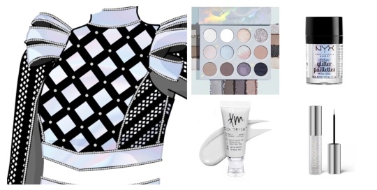
White (swing): Colourpop palette in Cloud 9, NYX Metallic Glitter in Lumi-Lite, Danessa Myricks Colorfix Matte in Lift, Urban Decay Moondust Liquid Eyeliner in Pyro
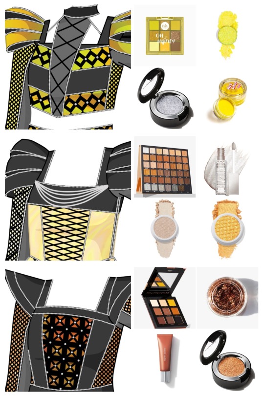
Yellow (A/B): Nicka K Pop Neon Palette in Oh Honey, With Love Pressed Glitter in Pineapple, MAC Dazzleshadow in It's All About Shine, Glisten Cosmetics wet liner in Bananas
Cream (A/S): Beauty Bay (42), NYX Ultimate Glow Shots in Come Thru Coconut, Colourpop Super Shock Shadow in 3rd St, Colourpop Super Shock Shadow in In Harmony
Bronze (A/C): BPerfect Cosmetics in Compass of Creativity North Skintones, Lemonhead Spacepaste in Dirty Penny, Haus Labs Hy-Power Pigment Paint in Copper Shimmer, MAC Dazzleshadow Extreme in Objet D' Art
Mint (B/S): Nicka K Pop Neon Palette in Lucky Charm, With Love Pressed Glitter in Mint, Haus Labs Hy-Power Pigment Paint in Mint Matte, Colourpop Super Shock Shadow in Life Coach
Coral (B/H): Kimchi Chic Palette in Citrus Queen, Slayfire Cosmetics in Peaches & Scream, Danessa Myricks Colorfix Matte in Phoenix, Glisten Cosmetics wet liner in Rose Quartz
Emerald/peacock (B/P): Cozzette Beauty Palette in Blue-Green, Designer Dust Co in Water Country Flakes, Danessa Myricks Colorfix Metallics in Firework, MAC Eye Shadow in Carbon
Amber (S/C): Colourpop in Rock On, Danessa Myricks Infinite Chrome Flakes in Hot Lava, Danessa Myricks Colorfix Liquid Metals in Hot Fire, Lemonhead Spacejam in Rainbow Road
Peach (S/H): Colourpop in Sweet Talk, Lemonhead Spacepaste in Mulholland, MAC Dazzleshadow Extreme in Kiss of Klimt, MAC Eye Shadow in Shell
Light blue (S/P): Colourpop in Blue Velvet, Designer Dust Co in Carolina Bae Micro, Danessa Myricks Colorfix Foils in Mermaid, Colourpop Super Shock Shadow in Ice Dream
Magenta (C/H): Beauty Bay in Berries (16), Designer Dust Co in Bubblegum Bae Micro, Colourpop Super Shock Shadow in Roy G. Biv, MAC Eye Shadow in If It Ain't Baroque
Maroon (C/P): Juvia's Place in The Berries, Lemonhead Spacepaste in Wine Safari, MAC Pigment in Gold, Glisten Cosmetics wet liner in Bloody Mary
Lavender (H/P): Juvia's Place in The Violets, Barry M Biodegradable Body Glitter in Hypnotic, MAC Dazzleshadow in It's All About Shine, Glisten Cosmetics wet liner in Amethyst
Some credit info: Designs for white, yellow, cream, mint, amber, peach, magenta, maroon, lavender + all sixsona art featured here by @lightleckrereins. Original designs for bronze, coral, emerald/peacock, and light blue are mine. I did most of the sourcing work for the makeup, but Sofia created the inspiration + made final decisions on the makeup for all her designs.
#2023 sixsona project#2022 sixsona project#game art#six makeup#six the musical#six musical#six costumes#sixsonas
26 notes
·
View notes
Text
ParaSenses Update
Hi everyone! We wanted to give you a little update on how the comic is moving forward, along with our work progress! We have a few notes to give for those of you who are interested, and how we plan to keep going in the future.

Art Style
First of all we do want to say that we have found a new work flow that works a lot faster for the both of us! We were struggling in our beginnings to find a consistent art style (that some might have noticed between chapter 1.1 and chapter 1.3) that we do believe we have fully fixed. With this new found style, we are able to work between panels a lot faster.
Something we always wanted was to have our own backgrounds drawn, and our characters shaded. This will take more time to do, but we hope you all understand this artistic decision we took. We did cut corners on any heavy shading to cut back on time, but we want to give the best quality possible.
Chapter Length
The chapters have all been pre-written in advance, and we have realised just how terribly long these have ended up being. However, we do not want to cut them up to the point of releasing five to six panels a week just to push out content.
We will continue to cut our chapters in a few pieces as we have previously done (chapter 2.1, chapter 2.2, chapter 2.3, etc...) but make sure one chapter is fully done to release it ever two weeks. This will give us time to work on the next few chapters, and Patreon content. We still want to release long chapters for people to enjoy even if the time is more distanced, than releasing them in smaller increments.
Character Design
Small changes that will be done for the characters for chapter 2 is their color scheme. A small modification has been done to adjust their tone:
Blair

Blair's colors for his clothes were too clashing with his skin and face. Not only that, the line art was hard to see on his gloves, and we felt that the red was too sharp. We made small modifications on his clothing colors-

-for something much softer!
Xephan
We found a different kind of problem for Xephan. His color schemes completely blends together; his gloves are almost the same color as his hair, his pants are the same tone as his coat... It makes him extremely difficult to color (Avery's note: And I'm the one coloring him. So I remade his color palette.)
Unfortunately, I didn't keep a before picture, but here's Xephan in the comic beforehand.
He's blending a whole lot together. I made some very light rearrangement so his glove at least doesn't disappear if it gets in the same shot of his hair.
It's faint, but we didn't want to make something too apparent.
HOWEVER. This isn't the last change Xephan will go through. His design is overly complex, and takes too much time to do (Avery's note: Not only that, half the time I receive the line art to color and shade, Xephan is missing at least an element or two.) And so, after the first mission these two will go on, we will reduce the amount of clutter he has on him so it at least doesn't feel out of the blue.
Time Frame
Finally, when it comes down to time before the release of our chapters, we still need more time to work. Life has been hectic on our side, but we've been working everyday to make this happen, and we wanted to show you guys that this isn't a project that's been discarded. We are still working day and night to make it happen. We also have a small animatic coming up in the meantime to thank you for your patience.
If you've read all of this, thank you so much for your support, and thank you for our Patreon supporting us. You guys mean the world to us!

#webtoon#art#lgbtq#original character#webcomic#webtoon canvas#parasenses#comic#update#announcement#comic announcement#webtoon update
39 notes
·
View notes
Text
What is cinematography? Hannibal edition
We know Hannibal often gets cited for its beautiful cinematography. But what does that mean, exactly?
If we talk about the cinematography of an episode, we're talking about the decisions that went into making each shot and scene and episode look just right. It's helpful to remember that at its most basic level, film (or television) is just about using some sort of camera equipment to photograph light. And when you do that, there are a ton of variables affecting the way that recorded light is going to look when you play it back.

Hannibal gets it.
Cinematography means: "We've got these amazing actors performing this great story in this scenic location, now how do we light and photograph all this stuff so that it looks exactly the way we want?"
And this is super important, because of course, the way a scene or shot looks is going to deeply affect what it makes us think and feel.
Elements of cinematography:
Lighting
Types of cameras and lenses, and how you use them
Shot distance (how close you place the camera for each shot)
Shot composition (figuring out where to place everything in each shot, including actors)
Use of color, brightness, shadow, contrast (very important in a "dark" show like this)
Camera movement
Camera angles
Depth of focus (do we want to clearly see everything that's in the shot? or do we want to have things in focus and others out of focus? should the focus change during the shot or stay the same?)
So really, when we say that a show has beautiful cinematography, we more or less mean that the way it's shot is beautiful, striking, evocative. We can tell that someone didn't just throw on some basic flat network procedural lighting and shoot from all the conventional angles. They put thought and style into it.
What does a cinematographer actually do?
The cinematographer is also called the director of photography (DP). They work closely with the director, workshopping their vision with them. They're in charge of both the camera crew and the lighting crew, deciding what they should do to make every scene look exactly the way it should. They read the script ahead of time, and they visit sets and locations before shooting to plan how they're going to tackle the look of each scene.
Director of photography might sound like kind of a secondary position, but not really! It's incredibly important. Hannibal had the same cinematographer, James Hawkinson, working on almost every single episode. This isn't always the case in television, so I think we're very lucky that he was such a consistent part of the artistic process.
Hawkinson dropping that DP wisdom in the season 2 DVD extras.
Check out this interview, in which Bryan Fuller explains how when he saw Hawkinson's cinematography in action, he changed his whole approach to writing the series:
Hawkinson’s cinematography helped elevate the network show into one of the most visually exciting series ever produced for any platform. [...] Bryan Fuller and his staff had written five episodes that tried to toe the tricky line between Thomas Harris’ Hannibal Lecter novels and the structured storytelling of a network investigative procedural. “I remember leaving the edit session where we’d seen the first cut [of the pilot] and I was like, ‘We’re doing the wrong show,” said Fuller in an interview with IndieWire. “When I saw David Slade and Jim Hawkinson’s work, and really understood the artful piece that they were able to conjure for what we had, I threw out the scripts.”
I mean, this says a lot, right? Fuller is saying that he completely rewrote the beginning of the first season, in part because Hawkinson's photography on the pilot made him realize they had the chance to reach for something deeper, something more artistic than he'd thought possible.
Gorgeous moody lighting and photography from the very first episode.
With new directors working on the show from week to week, and Hawkinson needing to work closely with each of them, it became part of his job to make sure they were on the right wavelength with show's vision. He talked in this interview about how he would sometimes need to "check" guest directors if their ideas didn't quite fit the Hannibal style:
There's times where I've been asked to do shots that I didn't feel were the show. And as the director of photography, keeping the aesthetics consistent from director to director, I have to protect and justify the aesthetics of the show. So that's kind of a torch that I kind of just bear, whatever director comes in.
[...] Say someone has a vision of a dead person and I'll be asked by a guest director to put smoke and backlight. And I'll argue that ... as soon as you do it becomes hokey and it becomes a B-movie and it's cliché. So the horror in Hannibal is more based in some sort of reality. Yes it's heightened but ... there's nothing fantastical about it.
We can see here that Hawkinson knew the visual language of Hannibal inside and out, and he played a key part in keeping it so consistent and distinctive. The show became known for its evocative color palette, thoughtful shot compositions, and use of light and shadow -- all elements of cinematography. And as Hawkinson said, it was always important that the violence and death at the center of the show was photographed artistically, emotionally... even beautifully.

A horror image becomes moving and mysterious through cinematography.
Imagine how different this shot could have felt with a different quality of light. Or if we were looking from a different angle, or distance. Cinematography is all about making sure those elements are perfectly positioned, as much as possible, so that we see the show just the way its creative team hoped we would.
7 notes
·
View notes
Text

Here’s a (partial) process pic for that last piece. It was a heck of a time to make, so that gives me a great opportunity to talk about the process in depth down below!
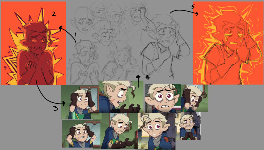
So the initial idea was that I wanted to explore color and emotion. I wanted to try to depict a panic attack with big bright colors and shapes. So of course I picked Hunter as my victim.
At point one I just did a very quick initial sketch, and at point two I threw some color behind it. Just getting the idea down. Sort of like thumbnailing. Just getting a visual I can reference to see where I wanted to go with this.
At point three I went back to the show and looked at how the character acts and what he does when upset, then used that to explore posing and expressions in point four. (I’ve got shots from one ep up there, but I looked at multiple.)
Clenched teeth, wide eyes, raised shoulders, curled fingers. He digs his hands in his hair. His breathing gets loud and uncontrolled. He shakes sometimes, curls up, and hides his face.
I was initially attached to an open mouthed expression because I wanted to try to get a sense of that uncontrolled breathing, but I couldn't make it work. So I went with clenched teeth and later decided that I might be able to indicate trouble breathing with his hand positioning. I have him reaching for his throat in the final sketch.
(Side note. These aren’t all the sketches / versions. These are what I thought to save while sketching. I do like looking back on the process so I end up saving a lot of it, but by nature of the work, a lot of it gets drawn over, erased, or otherwise destroyed.)
Looking back, if I were to change anything, I maybe would have gone for a more claw like finger positioning on that hand. I did have one sketch where he was grabbing at his chest, but I’ll be honest, I didn’t want to deal with the fabric folds on that one. I also think it maybe would have visually distracted from his face, which is where I wanted the main focal point to be.
I also wanted to try and get a sense of him shaking. I tried to indicate that with the wiggly lines off his shoulders in some of the sketches and with the yellow spikes, but that also was another point I just couldn't make work and had to let go. Though I did try to capture a little of that in the eyes.
I tried a few different eye positions. Looking up, looking down, looking away, looking at the audience. Ultimately I wanted him looking at nothing to give the sense that in that moment he’s not seeing, his in his head, he’s freaking out. So his eyes are pointed off into the unspecified distance.
I liked the scratchy lines for his eyes. It added to that idea of him not really seeing in that moment, and those tightly spaced, heavy contrast vertical lines can kind of have, like a vibrating visual effect. Opinions may vary, but I think that helps give off the idea that he’s shaking.
Anyway, moving on to point five, I took the sketch and started thinking about over all colors and composition again. I was a big fan of the orange and yellow, so I moved on to line art.
Back to the image from the top. Pretty straight forward, just line art, flat colors, then I used overlay and multiply layers to mess with the lighting and colors.
With line art, before I gained more confidence with it, I used to do really detailed sketches and get everything figured out in that phase, then try to copy it exactly. These days I’m more comfortable with it, and I do some of the detailed work and creative decision making during the line art process.
One such decision was the little displaced chunks of hair on the side of his head. I really liked that. I feel like it adds to the story, implying that he was already pulling at his hair on that side. I also like putting little lines near his scar, to suggest that there is like a skin texture difference there, like a raised edge. It gets a bit covered up by the tears later, but I still think it adds to the overall effect.
I also did the tears completely separately from the initial line art so I could have full freedom to mess with style, positioning, color, and everything. I tried a few different combinations of color, transparency, and style, but ultimately liked the bright yellow from the sketch phase and ended up going back to it.
Moving on to coloring. I find it much easier to just start with the normal flat colors, and mess around in filters (sai) / tonal correction settings (clip studio) / layer modes, after or on another layer. I knew going into it I was going to want reds and oranges and yellows, but I need those initial value differences as a foundation to work from.
Easy tip for getting that lighting, fill a layer with a color, set it to multiply (or your layer mode of choice), clip it over top, mess around in filters till you get the shadow look that you want, then erase out the parts light hits.
Now this next bit is where crap started to fall apart.

Initially this was just going to be a bust with a background of expressive shapes and bright colors with the goal of supporting and putting the focus on his emotions and facial expression. But my god, no matter how much I messed with it, I hated it. It looked awful. I saved very little from that process. None of it was worth saving.
So I took a nap.
Then I came back to it with fresh eyes and decided to take it into another direction. I shrunk Hunter down, and decided to give the piece a real background showing the things that were going on inside his head.
I really liked that red, pinkish orange gradient from the previous phase, so I wanted to keep that as a prominent part of the final piece. So I put a dark shape behind Hunter, and I was going to have everything happening inside his head, be inside that shape, and in a different color palette to add to that separation.
These were some of those shapes. This also gave me a really hard time. I tried something organic and loose, something breaking apart, tried looking up references of broken mirrors, nothing was working for me. I thought about maybe scrubbing the episodes to look for a meaningful shape there,( like maybe that wiggly shape the collector made when implying that he thought Belos was going to go off on Hunter. ) But at that point I was getting fed up with it.
So I went and made dinner.
During this process up to this point I was trying to do as much as I could in Clip Studio, because I’ve owned it for over a year now, and barely touched it, and god damn it, it was time to buckle down and learn to use it. But that extra level of frustration in getting used to a new program was completely messing me up. So I went back home to my good pal Paint Tool Sai.
(Sometimes art is a bitch, and you just need to eliminate the other factors that are getting in the way in order to move forward. Take naps, eat, switch mediums, go for a walk. It's productive. It’s part of the process. Don’t fight it.)

After switching back into my comfy program, I busted out a thumbnail sketch of where I wanted to take this. I spent time thinking about what he’s worried about and decided to have everyone being angry with him, and turning their backs on him, and then I had Belos looming tall over it all.
Something I also really liked here is that in establishing a rule that everything within the shape is in Hunter's head, it gave me the opportunity to break that rule in a meaningful way. I did that by having the mask horn break out of the shape, and later had Belos’s coloring transition from the cool palette of his mind to the warm palette of his present panic. I feel like it gave off this really menacing “He’s coming to get you” vibe. And it implies that of all the things he’s worrying about, Belos is a very real very immediate threat.
From there it was just more of the same. I filled in my big dark shape, then I went and found shots of each character in profile, did my sketch, did my lines. Took a while.
Each character sketch was on its own layer so I could have the freedom to move them around in the composition. The bg shape also changed a bunch in order to accommodate everyone's positioning. I didn’t want to put a character under Hunters elbow, and I didn’t want to have Amity be the only one with a full body, so I threw some spikes down there, that pointed back up to the focal point, and threw some shards on the other side of him to try and balance that.
I also wanted to include Luz in the piece, and the upper corners were looking a little empty, so I made space for her. In doing that though I had to balance it out on the other side with something, so that's how broken Flapjack ended up in the piece.
I also ended up with a sort of happy accident with Luz’s placement. One of the points on the shape she’s in ended up overlapping with her cheek in a way that somewhat mimics Hunter's scar. Unintentional, but I just think it’s neat.

Next up it’s more of the process. I briefly considered leaving it just as yellow line art, I liked the look it had. I liked how it furthered the idea that everything in yellow was just in his head, and I liked how it tied back in the yellow tears, but in the end it just looked too unfinished.
So I moved forward with putting in everyone's flat colors, then desaturated the heck out of them, and messed with colors and lighting again. Fading the characters into shadow also proved itself to be a major pain in the ass. I had liked that purple gradient, but with it at the bottom it just made the characters look muddy, so I flipped the gradient to put the dark end at the bottom, then ditched it entirely, and just put some blue behind Belos.
I also learned something new in Sai. I didn’t know you could layer mask a whole ass folder! So that's what I did to fade the characters back, while still keeping everything on separate layers to allow for further editing. (Hooray for non-destructive workflow!)
After that it was just finishing touches. I realized the whole thing had been kinda dark, so I messed with the brightness, contrast and color balance. I also felt like the edges of the piece felt too open, so I threw on a gradient to bring the focus back into the center a little bit.
Over all, it was a fun piece and I’m really happy with the results. If you got to the end of this and liked reading about this process, please tell me. I am shouting into the void and I have no idea if anyone’s hearing it. So comment, reblog, reply, say something if you want more of this kind of thing.
#toh spoilers#toh hunter#luz noceda#emporer belos#the owl house#toh darius#eda clawthorne#raine whispers#toh gus#toh willow#amity blight
350 notes
·
View notes
Text
The Resurgence of Cult Jam: Why Their Comeback Is Worth Celebrating
by Levi Wise Kenneth Catoe Jr.
Step back in time with me to the 1980s, when New York City's art scene was bursting with vibrancy and color. From the underground Hip Hop culture to the iconic Paradise Garage and Funhouse, the city was a haven for creatives of all kinds. Whether you were into New Wave, CBGB's Punk Rock, Graffiti art, or Breakdancing in Times Square, NYC was the place to be.
Amid all this creative energy emerged the musical group that would take the city by storm: Lisa Lisa & Cult Jam featuring Full Force. "I Wonder If I Take You Home" sold out in record stores as the soulful voice of Lisa Velez and the group's unique sound made them an instant success.
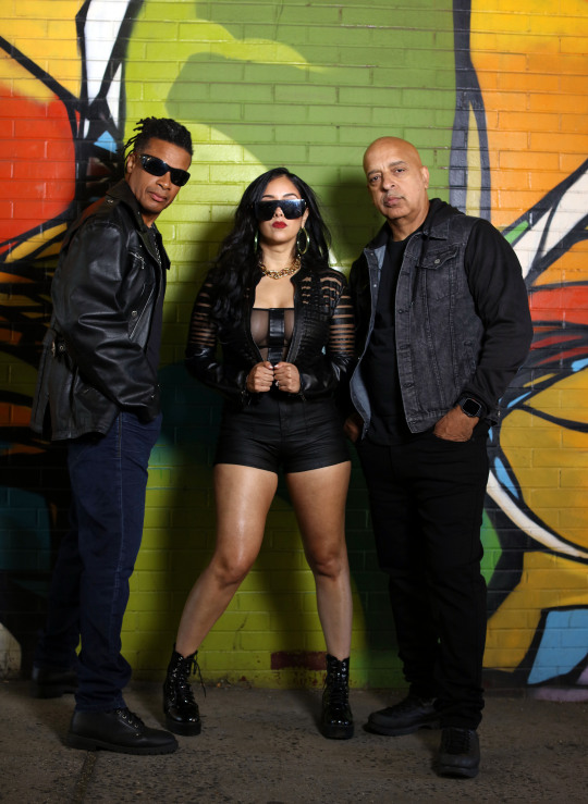
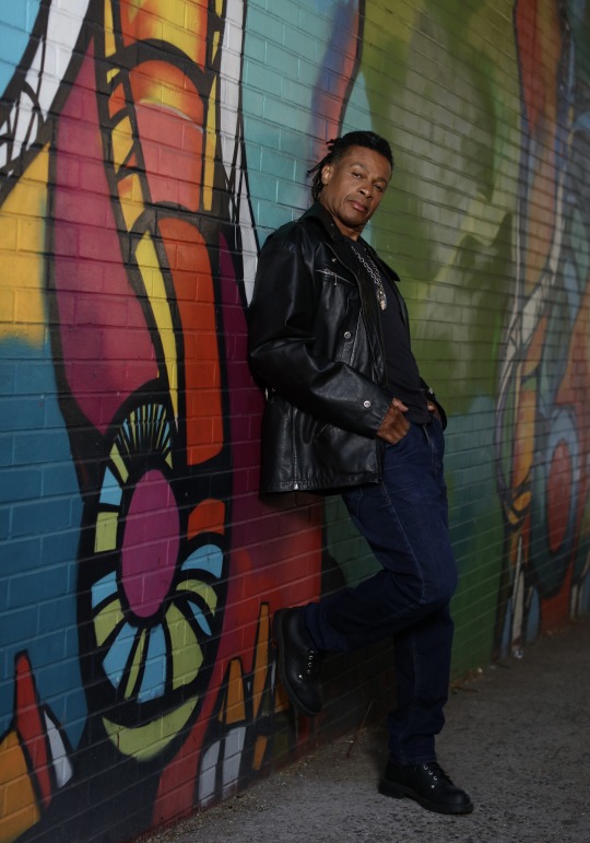
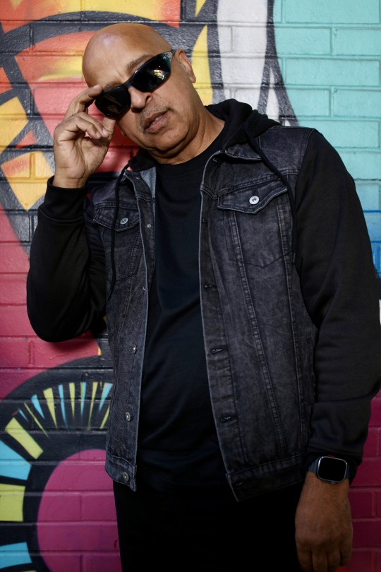
But with fame came a price, and it was a steep one. Recently, I had the chance to sit down with Michael Hughes, one of the founding members of Cult Jam, and discuss the challenges that come with success in the music industry. From the highs of topping the pop, R&B, and dance charts to the struggles of navigating the industry's demands, We spoke in-depth regarding the price of fame. I was fortunate enough to have musician Michael Hughes share his insights on making it in the music business in the 1980s and today
Levi Wise Kenneth Catoe Jr.: How are you, Mr. Mike Hughes? You came out of a very vibrant art scene in NYC that pretty much centered around “you had to be there to understand” How would you describe those days in the early 1980's on W. 26th Street in NYC at the Funhouse?
Michael Hughes: At that time in New York City, at that age was phenomenal. Music and dance were so experimental then. We had such a great variety of music. Not just House music, R&B, or just Funk and Disco if it had a great rhythm or said something special, it got played; mixed crowds, straight or gay, we danced all night.
LWC: Back in those days you had innovators like Keith Haring, Basquiat, Jellybean Benitez, Madonna, Africa Bambata, Shep Pettibone, Mister Magic, Funky Four Plus One More, and on and on and on; even Sade once worked at the Danceteria what was it about that period in a time in which none of the useful tools that young people now have easily at their disposal is made available; but yet so much creativity came out of that scene of music artist, graffiti artist, makeup artist, DJ, dancers, etc.?
MH: When you appreciate and respect all that came before you. And feed on the creativity of those around you. It's impossible for the seeds of growth not to enter your soul.
LWC: Cult Jam was the first Street/Urban act that came out of Columbia Records which is now Sony take me through that from A&R to executive decisions it was apparent that they were jumping on a bandwagon by opening the door to an act that had street-cred yet were still musically accomplished to be a gateway for the Hip-Hop that followed once you guys opened the door with two #1 smash hits on the Pop charts Head To Toe which also topped R&B and Dance Charts as well, and Lost In Emotions which to me aged better than Head To Toe and that music video was amazing; especially given the time of cheap urban videos. What was your take on that?
MH: Cult Jam came out following in the footsteps of groups like "Secret Weapon ", Unlimited Touch, GQ, and Shannon; other groups and artists came behind us continuing the music flow. Labels and the so-called powers that like to put music in boxes/categories so they can control what they usually don't even understand.
LWC: CBS/Columbia Records {note: CBS/Columbia records is now SONY} did a poor job promoting the group the name was too long ‘Lisa, Lisa & Cult Jam featuring Full Force’ I feel it was a marketing strategy that was also being used with Miami Sound Machine to breakup the act and create a solo space for Lisa Lisa (Lisa Velez) do you agree?
MH: The add-on to our name ‘Cult Jam’ was merely a shot in the dark at marketing something catchy. You never really know about that stuff. We used to say what's in a name. It's a stupid name until you have a hit.
LWC: How has the music industry changed since those early years?
MH: The industry is different now, but what remains the same is money makes promotion make success.
LWC: Do you guys, Cult Jam {note: founding member drummer/keyboardist Michael (Cultjam)Hughes, guitarist/bassist Alex (Spanador) Mosely, and their latest female vocalist/soultress, Long Island native Mystina Sol} feel more empowered today, or was the industry machine better than the social media and internet freedoms of today?
MH: We as a lot of indie artists are empowered. We can create something we love 100% with no interference or someone looking over our shoulder. Those creations can feel like your children. But the company machine can be very helpful. There is a give and take in every situation. Life is full of compromise.
LWC: Talk a bit about where you are now and Cult Jam in its current form and describe your music genre. Are you still under the umbrella of Hip Hop and freestyle? What is the evolution?
MH: Cult Jam music can be best described then and now as feel-good-good. You dance and sing we supply the ambiance.
LWC: I represent a Black Literature space as well as a college student base that often is unaware of music beyond the same mainstream artist that’s constantly being streamed if there was one song of Lisa Lisa & Cult Jam to introduce them to your music what would that one song be?
MH: I wonder if I take you home our first puts you into the feel of what comes in the colors of Cult Jam. Celebrate what love can do from our current creations and keep that sexy feel essence.
youtube
LWC: So now my question is how would you introduce someone unfamiliar with your previous music to who you are as Cult Jam today?
youtube
MH: Seeing Cult Jam live has always been what represents us best. We were a touring band from day one.
youtube
LWC: Thank you so much for speaking with our audience today. You are a boss.
youtube
MH: Much love and appreciation - Mike "Cult Jam" Hughes.
Levi Wise Kenneth Catoe Jr.
Editor, BOSS NYC
#music#black fashion#black theme#black tumblr#musician#tunes#music video#songs#new music#good music#black entrepreneurship#black history#afro latina#afro latino representation#nyclife#nyc#vintage nyc#new york#manhattan#new york city#nyc photography#harlem#Youtube
4 notes
·
View notes
Note
I'm not particularly feeling these non-canon covers, to be honest. They're cute, but the likes of Darkshine and Spiral Garou certainly deserved their own covers. Also, tbh, the body shot of Psykorochi works a lot better than Genos running up the tower. In general I think the volume covers and pages have taken a bit of a dip, but thats just me
If the outer cover's job is to entice people's attention and sell, then are they really doing their jobs? The hidden inner covers (underneath the outer dust jackets, which viz doesn't publish anyway) honestly feel like they have more bang for their buck going for them lately - vol26's were great (worth the money imo), and vol27's Psykorochi posing in the sunset has some neat aesthetics, while the Blue Dragon panel fits the same theme (even if it does feel like another panel coloring, but at least now, with official colors) - so honestly the pair of those together feels like they'd do better placed on the outside for people to see. Cause I'm not feeling the placement of the fluff outer cover; it's cute as standalone chapter art but feels misplaced/irrelevant for the main contents of this volume. (It doesn't say or sell anything to me, unfortunately.) Vol25's with Saitama and Flash running in a nondescript hall was probably the first cover I felt underwhelmed, but this one just has me....confused for the decision behind it how random it is. I liked when Murata gave arc-relevant characters their solo cover spotlights (and when he layered gouache on his copics for a much stronger, full-bodied impression) so unless he's been pressed for time lately, I'm not sure what happened here.
#opm#anonymous#replies#apparently no bonus omake this time either hmm#if the cover's impression is underwhelming and doesn't entice you to buy it then...? welp#i'm not the only one who's not feeling it this time
15 notes
·
View notes
Text
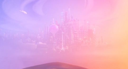
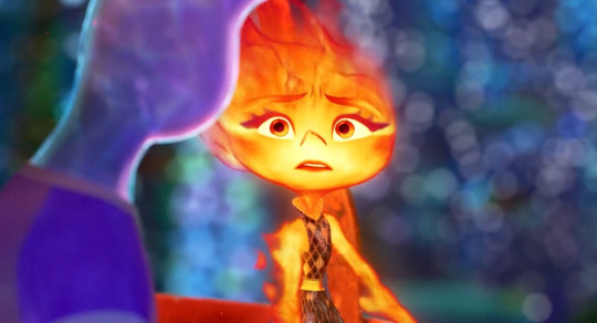
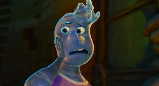
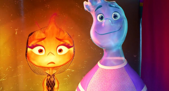
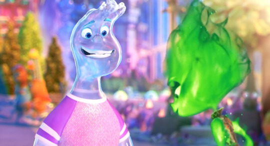
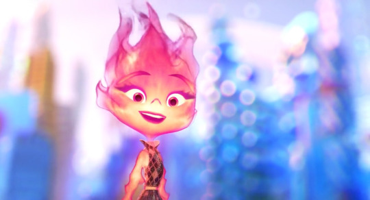
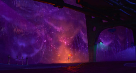
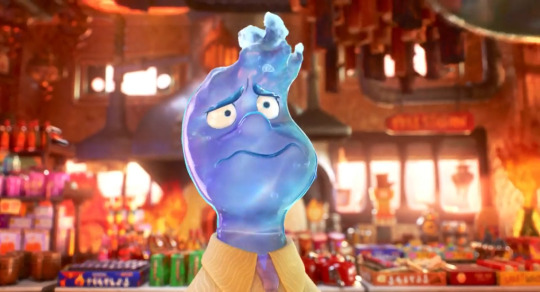
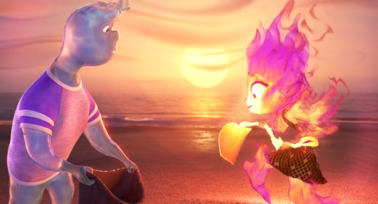
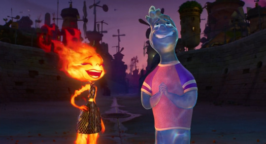
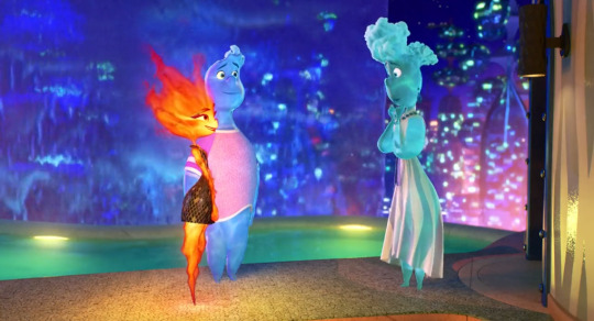
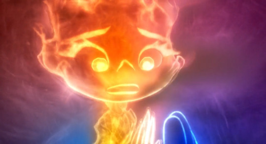
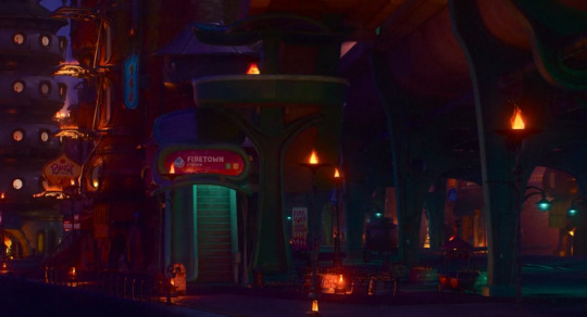
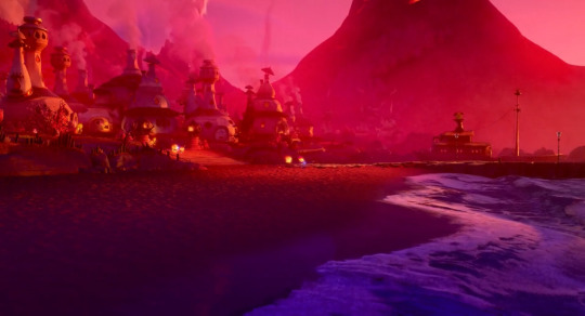
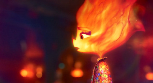
had a hell of a time (good) bit ago watching elemental and feeling things including enjoying a film, great ride, i love a metaphor & anything vignettey (just living life, alongside but also including the [this is about the metaphor] threads), i do love it when a couple of fun people have an enriching dynamic that they enjoy and huaaaghwgh (good) & i liked the premise metaphor exactly as is for what it is for what it did with it & i liked overlaps & resonances w/other experiences i saw ppl perceive. i liked the way i was going oh my god that painting looks the way i feel b/c like navigating a complementary dynamic where what's holding one person back is what helps the other person along, vice versa, no interaction or relationship that develops by like having some [theoretically your trait/quality/behavior] contained in the other person, rather it being an interaction within yourself, such that i was going "i have this interaction Within Myself, right now, in life currently like always and the past years but also past months especially really, it's ongoing, i'm going Oh Goddamn Omg" scintillating to see it externalized as a conversation imagined by others. and also still different / more capacious on both ends than "wow Exactly that." feeling things going ohh my god. music is going for it so Noticeably. hot air balloon scene And track changing me with an immediate Resonance
easier when having fun but i was also like continually so hype gasping about intrigued about pointing at art direction decisions & execution and one especial element i was sooo noting was the use of Color b/c it's Really colorful like rainbow palette nigh constant noticeable saturation, And it was atmospheric, always readily visibly parsed, varying in styles but cohesive. the backgrounds babey, with obvious priority for working with a vivacious orange and/or blue. oh and the related use of Light like different visuals for different glows and just different effects and waugh....i collected mostly a bunch of bgs to point at often for that "look at the color design & atmosphere" but also so much more & foreground things big time too. semitransparent characters like bitch. the physics of fluid dynamics. optics like refraction like my God. i'm mclosing it and that these effects would be sooo prohibitively intensive w/o computer but it's so impressive w/computer and that Stylistic Decisions were made all over, it's clearly not ever simply just "oh this is what it'd 'realistically' look like if uhhh someone was made of fire or water" even as realism Based effects were employed for style and fun and our lives. the use of of course 2D animation / art conventions for style and effect and fun & our lives!!! maybe ember a bit too but wade has a whole like 2D style profile so the [curved droplet] shape always faces the camera, how are we doing that it's so cool & i love to see it. not to mention being transparent but also like clearly not!! first time i've properly thought about how inside of mouth 3D animation has Ever worked lmao
cut so i can go on & on (^ that's brevity up there lol) & post mostly various backgrounds to gesticulate at what i notice abt the use of color like oh my god. and some other things. laughed, cried, lived & loved like for real lol
oh my god
and like immediate intro theme going "oh my god blue and orange making Purple (magenta, pink) oh my god we're doing Additive Light with that holy shit yes"
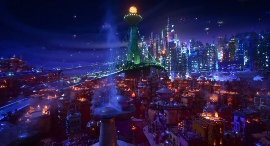
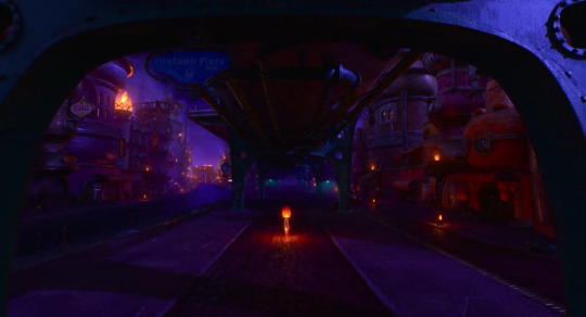
so extra [!!!] about city nighttime shots especially. and the details of all the building designs, it's all the shit like i haven't even sat and Studied any given shot for all small elements like that but that you know they're There so that it looks this complex and "realistic" like you know the attention & effort is there & you get the Overall Effect baby. also the way purple/green are employed to contrast with blue/orange often. the Glows here, the Bluer upper half and the Oranger lower half that both also have some purplishness to them, the Green bridge breaking it up / spanning this
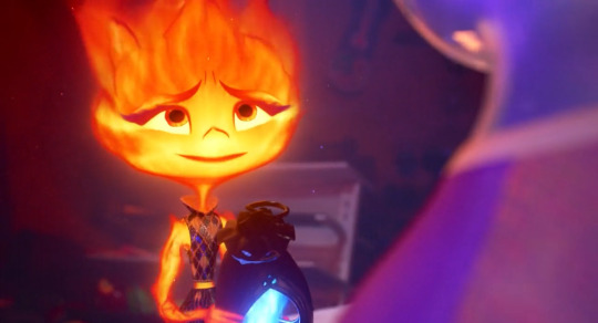
the colors in closeups even. first of all the expressions styles are after my own heart & got it, and i'm sure i'll go on & on more there. pull mouths down do the m upper lip n lower lip lines combo, you know what i mean, i Love it. wavy flowy design vs more triangular / ending in peaks/corners design for your water vs fire aesthetiques. i think that's [heat creating refraction in the air] effect like lord. the pink blue purple here. the slight shadow framing the pic for better contrast, the pink / glow around ember, wade slightly Glows from within too, the constant wave refraction there. okay obsessed again with both sorta transparent and fluid Figures like you've got the outermost layers. you've got the Inside. you've got the silhouettes and the lines that are "drawn," reddish outlines of flame shapes and constant highlight "outlines" for water so it never "realistically" blends in with everything / just Is clear and is impossible to easily parse. that those silhouettes are constantly Flowing and responding to motion / pressure as well. i can only imagine. oh and the colors again that the Glow for fire is often a Soft gradient, but there's this like, slightly convex polygonal style of "glow" / Light in backgrounds a lot and it works great for style and contrast with the important Soft Glow from fire and even also water, again the slight inner glow there too. and again the mutual [pull mouths down] expressiveness lol so much fun. the Elasticity is fantastic, same with like 2D style Movement like invoking a smear frame for example like fuck yes it's about What Works it's about style & effect & what things like lighting color faces can do that aren't just aiming for "be peak realistic" like clearly it isn't. note the sharper line of shadow in the upper corner with a deeper blue. we framing
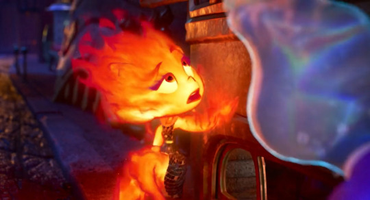
oh this one was to point out "look at how you can see the full spectrum rainbow in the wave surface light refraction oh my fucking god" not to mention of course In Motion the shapes, the effect, some bubbles and flow for flare and seeing that constant Light Outline, the cyan leaning aqua that's put in along with the overall slight blue not b/c it's "realistic" but b/c it's what works baby the artistic design choices fuck like hell. and only when i took this one frame was it like oh my fucking god look at these split second flame shames flowing off of ember there above her head especially. all the more stylization required for fire without it being like, "realistically" mostly transparent, overly bright, not very strongly delineated / silhouetted....the shape, color, flow of flames on the "inside," outermost breaking off shapes & "outline" as well augh god. and look at the purples in the background's left side
AUGH the night city backgrounds. pottery burn haha yeah the blue orange AND purple my god!!!! it's thematic ([blue + orange = purple] b/w the blue & orange characters) and it fucks like hell holy shit!!!!!
meanwhile the green & purple here with One orange element getting to stand out / not that much blue either, but more ultramarine style than aquamarine, and LOOK AT THE MOON!!! the surface!!! check out that Polygonal glow around it and the green/purple there too!!!
and the use of bokeh. immaculate, not holding back, after my heart. the Purple/Pink additive light properties coming into play!! her reflection is more simply orange(tm) sometimes and i would presume it tends purpler when we are getting [emotionally connecting / recognition of the self through the other] but oh my god heaving overhead like a hero this additive light blue+orange=purple ingenious and stylistically fucking like hell choice. and again their "outlines" working so well while also retaining enough softness/fluidity to be part of them as a whole. everything is so cool
there's the mouth shape i was talking about. you see the slight m upper lip simply n lower lip and resultant (idk like a video game controller?) shape lol. flexible expressive asymmetry. the closeup transparency of [can always see the other side of shirt collar]. green bg for contrast while also incorporating the orange glow. the full spectrum rainbow refraction just also an immaculate and probably characterfully relevant lmao as a bonus. also hell of cute moments wauugh yes, fun, dying thanks
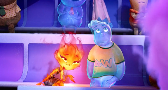
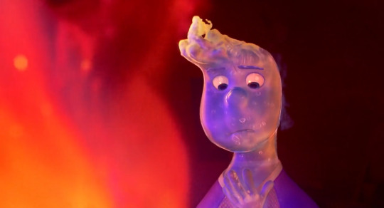
the additive light!!! (how magenta/purple/pink the reflection of Orange is off the Blue like employing what's realistic in another context for what fucks aesthetically & carries symbolism. like wade wouldn't Realistically be constantly [surface wave refractions] but it fucks like hell. also wouldn't be someone made of fire or water but it fucks like hell & embodies a central metaphorical layer to the literal material). also look at that curtain from deep purplish red to deep bluer purple!!! the line of bright blue!!! the glow in the Background with sharper polygonal lines / corners to contrast with the visual effects of glows elsewhere!!! wade default =3 as [wavy featured] and inherent =3 vs ember's more flame tipped => (not pictured)
ohh this one for rainbow color / out of focus usage and b/c it's like how the semi transparency but only So Much + constant outline of Highlights / constant inner glow and visible infusion of like aquamarine / bright turquoise cerulean color helps a water guy stay perfectly Visible / parsable. also besides ember being green, an effect subtly pictured at any given point: like cinders continually rising off fire but depicted so much like Sparkles :') there's so much colors and highlights and choices after my own sensibilities out here like i love a shoulder swoop design that flows right into the arms from the neck from the head. and that's exactly what we get precisely b/c it has so much flow!!! ember's like whole head Flaring out from her neck, terminal points like tips, or sources, of flames. Styles
the bokeh!! the blues and pinks and purples!!!
ouuwaah
UGH obviously in motion the like arcing falling curtains of water, the shimmering....the purple into pink into dusky orange!!! the little bit of contribution of the turquoise light aaa wahooo, ofc what the bridge adds in Composition for this & that previous shot
lmao this is b/c Wavy Scribble Squiggle Mouth again the design choices after my own heart. the constant extra wobbliness to Mouth Outline obviously works great to emphasize [water design] but it also works great b/c i love it
every shot of the background with this beach is gongious like jesus christ. the closeup of sand is like that looks amazing and So soft. look at the wavy swoopy shapiness of the clouds, look at the [in this shot] faintly detectable Polygonal outlines of Glow from the sun. feel free to look at that water like i said every shot of this, wrow. tasked with Pretty Beach Sunset and coming through big time
expressive design contrast, glow contrasts, refracting, silhouettes, those flame shapes breaking off again epic hot wheels style fuck yes....and the bg!!! look at the purple to muted purple pink sky, the atmospheric distancing on layers of buildings that goes from blue to purple!! the dimmer purple / blue / teal on the ground in the foreground here UGH the COLOR USE
ooh i was so Noticing the like, full ultramarine blue here, like it's been used Before in any night environments but the way here it's brighter, making it like "okay yeah night but more Lit Up. also the visual variety of [water curtain] textures there, the area of Pink, the Yellow that hasn't previously shown up too much but might be saved for associations with tension / "danger" lol. also love the "straightup a pool" designs lol wish i was swimming
oh the orange + blue = purple on display here / translating Outlines
amazing sequence and again look at the Purple shadows the Blues the Oranges the Greens!!!! aughhh again like So colorful and so bright but also ofc dimmed, atmospheric, balanced, waughhh!!!
oh my god what can i say. "bisexuality" for one but and also fr like the pink of the sky vs deep purple, lighter with more blue in the water, the streak of oranger light, pink atmospheric haze....augh!!!
speaking of "and then really vivid striking colors in another overall palette we haven't seen before" the teal & golden yellow for this shot was new & noticeable. the yellow of problems, but not too bad lol, looking at that Contrast with the blue on the outer pool edge there. i wanna take a swim yippee....but fr like holding some colors more in reservation, finding new combinations, as Ever how bright the bgs are but atmospheric, non overwhelming of other elements, i Love it
bokeh!!!! colors!!!!!!!
bokeh!!!!!! colors!!!!!!!!!!!!!!!!!!!!!!!
fucking roy g biv like yes gorgeous. nice tree evocative bridge. composition. lots of lights and colors but the distribution being so balanced, but organic, broken up in all the right ways and all encompassing....the bright orange lights in shadowed blue/purple buildings in the upper left corner, leading down to the path of lights across the center of everything....ugh incredible great
out of focus bg, the lights, the purples, the blue/Green, look at everything on the right side ugh lovely, the slight Shapes of glows, can see that arc in the right side as well, the emotional relevance of all the colors and glows as this bg dims / desaturates a second later
and so similarly here, the Purple, the Glows....like the use of both the perfect balance of soft edges/borders but no sacrifice in clarity
oh and i suppose there's then any amount of spoilers following but like, in part only b/c i point them out as as much but also like. it's about the journey lmfao you see two screenshots, containing some information, well you've seen it all
and to pad that out i'll also note without screenshots about it like bringing in a very like Clear for Compositional Effect sort of Danger Yellow again twice over, with the harshest like chartreuse leaning yellow yet for it, v much a color that it'd just take more effort to fit into a palette / would have to be kind of the color centerpiece, vs the orange/blue/purple here
(but also not to say yellow was never used otherwise....some perfectly harmless golds, paler lighting like just Daytime vibe, constant presence w/fire of course. so the Particulars of a hazard yellow are all the more notable)
the COLORS....look at that orange that pink red the pink reflections the Purples....the just deep slightly slightly purple red in the bg and how like smoothed over / Immediate that background is to just make everything close & present!! the flame textures going!!! water textures going!!! cinders as points of light!! the colors the orange purple pink blue UGHH it's amazing they're really off the shits with it in every scene
spoilers they do kiss about it and i was like smacking hand to forehead like oh my god and they did another "breaking out a new Light thing" when we've glowed and refracted within and without, lit up or dimmed, sparkled, reflected, used further styles in environmental lighting....answer was Lens Flare rainbow refracting glow like goddamn!!! and again like putting In the purple, but also the blue, the orange, the out & out more cerulean / aquamarine that is not gonna simply come from elsewhere in the environment. nice commitment to also having someone smile into a kiss lmao we've all been like i Will make this work. i'm still just like ugh the focus on and variety of Light too, the backgrounds' like soft polygon/hexagon glow "fields," straightforward soft/even gradient glows, wave pattern refraction, refraction also separating light into rainbows, remember water is a lens, stylized light of fire, bokeh, additive color mixing....holding on to & breaking out Cinematic LENS FLARE is fr like ohhh my god they're just fucking On It, got this, here's another effect for you
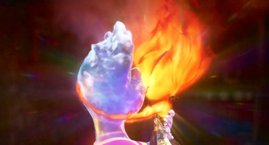
i also have a gif b/c i couldn't note anyone's fluid dynamics / flowing / Interacting physics enough, and little moments giving that some extra flair are a delight, but holy shit a highlight i'm instantly obsessed with forever, now if there's something and nobody pours themself, i'm out
oh we sloshing!! all the water physics going on here to fantastic effect but also all working within the confines of "and it's some guy." immaculate joke 5 sec later around the "i am Not an inspector" line just What a delight. the vision....the manifestation of effort, craft....i'm not kidding at all i'm like okay forever treasuring [pours yourself] clip and if someone doesn't get it it's like it's called joie de vivre, panache, taking all kinds. some sloshheads out here
again i had a delightful time at the cinema (figuratively. i didn't go anywhere. though i did go "oh fuck re: even the idea of seeing plenty of this in theater format" like i was going oh Shit at visuals and music and every damn thing enough already, can only imagine) i was like bitch i love ppl living life vignettesquely with the emotional arcs aids of metaphor, symbolism. i love the styles and designs and i love paying attention to details and going damn how they'd do that, i love technical shit, noting techniques that are centered around 2D derived visuals, about aesthetic effect & visual purpose....i was going "oh my god same. lately, always, ongoing. oh my god it's me always crying at everything, but also never at anything, and also just sometimes at some things. it's me with the Temper it's me with one like everyone else but not about to let it out at all / not be making room for anyone else's. me like 'just powering through like arghhh' me like 'that, but [a puddle]' liable to spontaneously interact with randos by just doing your own thing, also [dying] and beloathed at that, going with the flow trying to carpe diem it, having these conversations and navigations like just as one person lmao, and also ofc it's different" lol like oh damn okay. and twentysomethings popular with the nebkids like wow in real life....and just having a great time entirely straightforwardly and expecting as much but also being increasingly delighted and surprised and going "wow my aesthetique sensibilities piqued" and going "wow okay a journey" and like Gasp at details and loving the overall effects and little moments and shots and entire deal. did weep repeatedly, when you slosh, when you soggy....delighted a lot, along for the ride having fun for the whole way, so much abt [bummed 20somethings who are nevertheless very vivacious Feeling Things, including About feeling things] and the way that's given sooo much space, Saturating things even, maybe with light & color....i liked it a bunch, [aaaaaa], great time, thinking about feeling things and feeling about it and about thinking about it & so on & so forth too like man hang on a second. and the soundtrack. and the character designs Overall there did i mention?? so cute & fun. wobbly wavy shivery tapering having Flow in the lines / shapes of silhouettes in different ways just like flow in [fluid dynamics] of flame or water in different ways. there's a lot i can say but i just mostly did the backgrounds / color / lighting noncomprehensive slideshow lol. i was very engaged like oh wahoo yippee aaa then mfs let's go and keep going
#i'm big on like rainbow lot of color constant saturation....Yet; Atmosphere / skilled balance in application/usage#i don't have the restraint (or like full knowledge / experience lol) to Use it myself but i Love when i see it used lol. Very colorful here#and i had thoughts & feelings & a good time so that made it easier to be like oh whee AND look at that background. mf we sloshing#nonzero spoilers via largely contextless static images; many wide shots / environments; really doesn't matter much#but i guess if you're like ''i specifically want to know Nothing at All'' like well then there are images in there#like 65% me going ''and look at that purple. oh my God the green blue & blue green. Orange''#b/c like wrow....#pixar elemental#films to whisper to myself like omg. like me. right now#btw it's kind of long post inside there. but For Me; typically so lol#can't say shit in thirty tags!! esp when i had a great time i liked it i was like oh my god#can't even say that shit in regular text which is why i mostly talk about colorful backgrounds lmfao. and even Then!! and so on so forth#and hand over heart like omg when by yourself you're a bit too much; but together; you're a bit too much together ;w;#like wow just like me; me; & still me!!! and not caring about what's all ''too much'' like it's about the me & me actually thanks#(and ofc the premise / central metaphor/conflict there as is; vulnerable cultural identity that needs to be maintained but uh oh)#speaking of uh oh look who's underway in the tags!! i'm heading myself off now lmao. time for half past 3 am Night Sandwich
6 notes
·
View notes
Text
hello! i am starting this blog mainly for art- i predict about 90% of it will be reblogged art, usually of animals or video game stuff. i'll also be sharing my own art and talking about video game stuff occasionally, mainly my genshin impact challenge runs. yes runs plural. i have 3 currently, alongside my main account. more about them under the cut further below.
my current art style is just space with planets. mildly cartoony i think? def not realistic, but i think it's pretty (im a sucker for space, though i'd be terrified to actually go up in a space ship or anything- im content to admire from afar lol).
planning to share art on a MWF schedule- i can make the space art p quick and easily, so i need some sort of limiter so i don't burn myself out, while also practicing sticking to a schedule and also just doing art more frequently- im extremely rusty atm. hoping getting into the habit of drawing more often will shake off the rust and bolster my confidence.
i also like to use free stock photos as a sort of cut-out guide to make animal shapes out of space. it's fun and pretty painless- im used to spending hours getting angry at myself for not being able to free-hand anatomy, to the extent i stopped drawing for i think about two years now? cause i just hated everything i tried to make. rn i just wanna get used to drawing again without getting so angry with myself, and then slowly work on free-handing again.
oh, and! if you're doing a genshin challenge run, feel free to ramble to me about it! i love genshin challenge runs- i've got several im keeping tabs of on yt, and several more i wanna catch up on. aand question- what's your pulling plans for this upcoming patch?
on my main, im at i think 53 pity on 50/50, gonna try to pull xianyun. my most hoped for result- lose 50/50 to tighnari (or jean, ill take jean too), then spend a few 10 pull to get xianyun while getting faruzan and noelle to c6. overly hopeful maybe! i'd also be happy to win 50/50 too, of course. not getting the 4 stars c6 would sting a little, but it's more primos for future banners (already have nahida so once i get xianyun im done pulling).
challenge run #1 is a standard banner only account. it's the furthest along by a long shot, having been started several months ago, but bc it's a more casual account, im thinking it'll get overtaken fast. currently post act 1 of inazuma, with level 60 characters, almost ready to upgrade them to 70.
originally planned to not pull at all til i got all the free characters up to 90 and fully built, and then had a realization that was kinda incompatible with how i was playing- there just keep being more and more free characters, and it's a slow paced account that im mostly using to replay story stuff when i feel like. so now i just do pulls whenever.
i feel like the game mildly punished me for that decision, bc out of 200+ pulls, i got. 3 5 star weapons and a diluc (who im not really interested in playing atm, though i DID get wolf's gravestone. so im on the fence). and then a little while ago, i got qiqi. i had been really, really hoping for tighnari, or at least. pretty much anyone else? keqing, jean, and dehya i'd have been fine with. don't really want mona, so i'll probably end up getting her next. or another weapon :P
next is dark hair only, where yeah. i only play characters with dark hair. i just started less than a week ago now, so very young account. i judge who has dark hair using medibang's color picker on the character' hair in their icon (ignoring shadows and highlights), since it's neutral lighting. any character who stays generally at or under 100 value counts as dark haired.
some characters were hard to judge bc gradients- shout-out to mona for being a weird edgecase- the purples in her hair are definitely too light, and most of her roots are in shadow or covered, so it's hard to get a good read. i'm thinking she will count though- if for no other reason than, there's literally only 13 other characters that count currently.
all who are currently allowed in dark hair only- amber (this one caught me off-guard ngl), beidou, dehya, kaeya, mona, tighnari, venti, wanderer, wriothesley, xiao, xinyan, yelan, yun jin, and zhongli. surprisingly, raiden shogun, xiangling, and kujou sara don't actually make the cut-off- they're all generally just a little bit above 100.
xianyun and gaming's icons aren't officially released yet, so while i expect they'll make the cut-off, im still not gonna count them quite yet.
last account, which i finally got going yesterday, is signature weapons only. simple enough for most of the limited 5 stars- and with xiao coming up, this is the best time to start, since PJWS is also a standard banner weapon. ganyu's also a must-pull for this account for similar reasons.
as far as four stars and five stars without signature weapons, my first thought was "whichever weapon they used in their character miscellany". and then i actually checked, and dear mercy, there is. 0 synergy with the weapons they chose for so many of them. i still haven't gotten over EM layla. it would be a severe power discrepency- 5 stars get a weapon that bolsters their abilities, while 4 stars often get a stat stick at best.
so im kinda at square one with them now. my next thought is just, scrub through the character miscellany, record all the weapons a given character uses, and then those are the weapons available to that character. repeat for the next character. which could give them much more flexibility. that's gonna take hours though, so ive been putting it off lol.
could also just keep it simple and say, if a character has a signature they HAVE to use it, if not, then whatever. or put a rule that i have to pick 1 weapon per 4 star, and they can't be shared (ie yun jin and yaoyao can't both have fav spear), with shuffling allowed when new weapons come. dunno, ill think on it some more while exploring new region on my main ;P
oh, and general rule for all accounts- trial characters and traveler are allowed for solving puzzles, if necessary, just not for combat. will try to avoid when possible of course.
#intro post#my posts#standard banner only#dark hair only#signature weapon only#genshin impact#feels wrong to just tag genshin and not any art stuff but like#there's no art here it's mostly just me rambling about genshin lol#ill post some art later while game is updating#for now i think i'll just go reblog a bunch ive had sitting in my likes bc ive been too shy to post til now
1 note
·
View note
Text
Week 7
At today's lecture, we covered such topics as fair use, copyright, trademark, etc.
Fair use is an opportunity to use materials without asking permission from the copyright holder. This is a very interesting legal concept.
Andy Warhol, the founder of the pop art movement who was tried several times, but he won some courts thanks to fair use. For example, he has a job shot Marilyns.
It turns out he took the original work of some author, it was a picture of Marilyn Monroe. And he changed some colors, applied a filter, and made such an interesting design. And this painting with an interesting design became popular, sold for a lot of money than the original painting. Ms. Aynur cited this example as fair use.
But this does not mean that you can rely on fair use. Each case is different, and the decision of the judge or jury may always be different.
If we talk about copywriting, it turns out that in most cases it is connected with celebrities.
And Miss Aynur gave such an example, there is a singer Taylor Swift. And she has the song shake it off. She was sued by an American band because of this song, namely because of one line in this song: lovers gonna love, haters gonna hate.
And it ended with the fact that Taylor Swift won the court, they were able to justify themselves by saying that this quote is generally very popular in society, everyone knows her. And it was not plagiarism, which she repeated from another group, but just took as a very popular quote that so everyone in the world uses.
Another case, this is the case of Farrol Williams.
He had one song that was very popular, won a lot of nominations. And it turned out that another band had exactly the same song, but it was not popular in their performance. And it turned out that those artists sued Farrol Williams. This case lasted for several years.
And in the end, it really turned out that he really took this song and redid it a little.
And also in these cases, everything is individual, and the judge has the last word, and everything depends on him (as well as on the lawyer, and on what you will build a defense)
We discussed a lot of other interesting cases, in general, the lecture was very informative and useful.
0 notes
Text
The Creativeness Influence of War and Culture in the Film World
Dante Calabrese
This week, I went into depth and watched La Belle et le Bete (Cocteau, 1946) and Rules of the Game (Renoir, 1939). Even though I haven't watched any of these movies before, they appear intriguing because they were made in a very different way from American productions. "Marcel Pagnol's last work, La Belle Meuniere, is a fictitious depiction of Schubert's life, interesting only because it experimented with the new, still imperfect, French color process, routcolor," claims The Postwar French Cinema. Regarding the movie itself, it is best to say as little as possible because it is completely unworthy (Sadoul, 239). To further go into depth on these two films id like to discuss a quick summary of the two films. The film Rules of the Game (Renoir, 1939) chronicles the hunting party and social activities of the high class French people at their chateau, with commentary from their staff. The way this movie depicts the social classes in society during World War II is my favorite part of it. It displays the affluent people's lifestyles and the struggles they face on a personal level. By the end of the movie, the affairs and decisions made by the characters have culminated in full-fledged brawl scenes, one of which results in an angry person getting shot by accident. The story's scenes where the servants observe almost resemble a feud amongst the wealthy. At this historical juncture, Renoir still had authority over his pictures and had not left France. It's fascinating to observe how his art actively critiques the power of the wealthy and reflects society. Renoir consistently depicts the wealthy in this film negatively, showing them as enraged and cheating on one another. Its very interesting throught the time ive spent throughout this course so far watching all the different eras of films as i stated once more before the idea and concepts are always impacted by the time and era they were created during its very intresting how 3 specific films previously tackled the mindset of producing and creating these films during the worst time in known history being WWll. For the main points and idea's of the 1946 rendition of the classic story The Beauty and the Beast is called La Belle et le Bête (Cocteau). Upon its premiere in 1946, Europe was still getting over the war's aftermath. Low budgets made money difficult to come by. But in some way, the film's producers persisted and produced something creative. Given that they were naturally denied access to computer-generated imagery, the Beast's utilitarian appearance is a clear reference to the movie's costumes. It made effective use of its circumstances and was able to divert attention from all the difficulties that followed the war. It was a retelling of a famous tale, nothing too gloomy or directly related to pain. Its very intresting seeing these two films perspectivley from one another try to tackle and utilize their limited means and budget for what they can work with during the post aftermass of the war. I can only imagine how hard it was for these directors and the entire crew to produce these films while having in the back of their minds that they are living in the worst times of their lives fearing everyday scenarios becoming life threatining. It's also important to note that this is a traditional French story that showcases a lot of the culture. The scene, the attire, and the artwork all serve as examples of this. The film was intended for the general public, and it succeeded admirably in that regard. It stood for them and everything that made their history so meaningful to them. Even while this movie doesn't specifically address what happened during the conflict, it might be seen as a commentary on it. With the curse on him and all, the Beast is going through pain in order to represent absurdity and grief. Belle may have been the people's desire to persevere and see the other side through, as well as the hope that ultimately won the war. Its very unfortunate we dont see anymore this much creativity and detail in films like today, the use of practical effects and prostetics of the makeup crew really steal's the show for telling a classical tale in the form of new light and rendition especially with the approach of the culture of french influences the way the characters look and dress. It very unique from the iconic disney 2D animated film thats considered to many as the definitive version by so many beloved fans alike to this very day.


Refrences :
Misek, Richard, et al. “Senses of Cinema.” Senses of Cinema, 18 Oct. 2018, www.sensesofcinema.com/2004/great-directors/cocteau/.
Sadoul, Georges. The Postwar French Cinema - JSTOR, www.jstor.org/stable/1209394. Accessed 23 Oct. 2023.
0 notes
Text
IT'S NEVER BEEN DONE
It's never been done, we realized after we hung up the phone and contemplated the complexity of the shoot we’d just been pitched.
— Over 150 hero shots of crystals of all types shapes and sizes— ranging from 2 pounds to well over 2 tons, shot over 7 weeks, on a remote estate on the island of Kauai, 2,500 miles away from all the amenities and gear of our studio— all for the one of the most extravagant coffee table books that has ever been dreamt up.
It had never been done… that is until destiny in the form of a one of the most captivating women we have ever met named Tatiana Dorow, chose us out of the country’s best still life photographers to make it happen.

There have been times when we have looked back on our career and appreciated how all of our choices in the past have made projects possible, but few projects have given us such satisfaction in the moment as this one.
“It couldn’t have been any one else,” Tati said. “You are the complete package.”
Tatiana and her art director Jason confided in us they realized early on that choosing the right team would be pivotal in ensuring the project was not only successful but truly enjoyable— especially when working on a project of this scope with near priceless pieces of both monetary and personal value over such a long period of time.
Because of our unique synergy as a photographer and stylist team, our experience with photographing luxury crystal objects, our fascination of depicting natural elements with new understanding, our ability to continually evolve and problem solve, and our easy going personalities— Tati made it clear we were the one’s for the project.
… So the planning began.
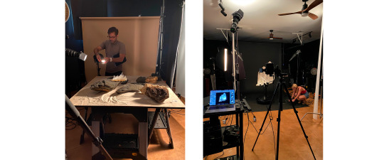
Over the next two weeks we navigated the logistics of: transporting over 500 pounds of gear, ordering and shipping more, creating inspiration boards and choosing color ways, designing and ordering custom surfaces, deciding what could be built on site for the set designs, creating spreadsheets… and the list goes on.
In the end our planning payed off, and we overcame all of the obstacles, so that when we arrived on site at the breathtakingly beautiful beachfront estate we were prepared to make magic, but there are some challenges that cannot be tackled with organization and for those we came armed with creativity and ingenuity.
The lights dimmed as we entered the gallery and we were surrounded by thousands of the most exquisite museum quality crystals in the world and we were immediately moved. “This project has been 100,000 years in the making,” Matthew whispered softly as we examined each piece, overwhelmed by their beauty. As each crystal was forged in the earth and hidden for countless years, we not only wanted but needed to give them a voice in the world, since so few people will have the opportunity to visit this astounding private gallery.
We soon realized that each crystal would demand nothing less than our best efforts. This was not simply a matter of placing the crystal on a set and rotating them through. Each crystal, even those of the same make and general size, required custom tailored lighting, carding, exposures, focus stacking, decisions regarding the most flattering set design, and often required the use of a forklift!
The largest crystal, a most breathtaking cluster that we cannot begin to describe adequately with words, was over two tons and required ten lights and countless other accommodations.

Saws Out! Given the size of the pieces, the isolation of the gallery, and shipping concerns related to the pandemic, we ended up building a large custom plexiglass water tank on site and several rocky landscapes. In all we ended up creating over 20 full sets!
(Check out the time lapse of one moon scape below!)
vimeo
The Island. It must be said that the island also had a profound impact on our work, and allowed us a glimpse into Tatiana’s inspiration for the book. We were even able to source many of the natural elements from the island on the property. It was our goal to display these crystals in an elemental sense from their birth in the cosmos into a world rife with life.
We will cherish this experience for years to come and look forward to the next trip back!
By Jessica Roharik Stylist

0 notes
Text
✰ ☾ ✰ ☾ ✰ ☾ ✰ ☾ ✰ ☾ ✰ ☾ ✰ ☾ ✰ ☾ ✰ ☾ ✰ ☾ ✰ ☾
FINALLY watched “But I’m a Cheerleader” and it’s probably one of the most beautiful movies I’ve ever seen.
✰ ☾ ✰ ☾ ✰ ☾ ✰ ☾ ✰ ☾ ✰ ☾ ✰ ☾ ✰ ☾ ✰ ☾ ✰ ☾ ✰ ☾
#but I'm a cheerleader#wlw#wow I loved that movie#I'm still really emotional#the music was beautiful#the color decisions and shots were also works of art#and of course the actual content of the film made me feel like it was a masterpiece#honestly it made me feel so many things#I really wish I'd had the option to watch it when I was in high school#lunasleeptalks
21 notes
·
View notes
Note
Hey youre a wonderful artist there! I just wanted to ask when it comes to drawing a comic or a short one. How do you make it? Like to het an idea and then start making it I allways wanted to make one but since I don't know any pf this just asking from a pro
Obligatory disclaimer: I'm not a pro. I've just been doing this for a while.
Not sure what part of the process you find confusing, so I figured I'd just go over the general steps in comic-making process and give some personal notes. You can ask for clarification for a particular step then, if you still find it confusing. (Also, not gonna cover other drawing skills here, like anatomy, color theory, character design, acting, etc.)
1. Idea. You need one to make a comic. While there are some exceptions, comic ideas are usually stories — yes, even if they're four-panel strips. If you plan on making it a one-shot, you obviously have to know what that story is — beginning to end. If you're making a longer comic, you can leave some parts to be figured out later. (My longest comic, the Apple Incident? Like, half of its contents were improvised as I worked on it. Things often fall in place when you're already making a comic, so you shouldn't procrastinate on starting just because you don't know every last detail.)
2. Should this idea be a comic? An unexpected question maybe, but consider whether this idea is best suited for a comic. For example, sometimes, if what you want to do is highly introspective or relies on monologues, it would make a better written story than a comic. On the other hand, comics allow for the timing and visual descriptions that writing doesn't provide. So consider what art medium is best for what you're doing first. (Side note: if you have a chance, check out Understanding Comics by Scott McCloud. It's an amazing exploration and explanation of comics as a medium.)
3. Assuming you are, in fact, making a comic, figure out the technical stuff.
One-shot or a lengthier comic? Depends on how long your story is.
Strips or pages? Strips are best for humorous and slice-of-life stories; pages are more versatile.
Traditional or digital? Depends on your skillset.
How detailed will the artwork be? Depends on what you're trying to achieve: humorous strips rarely need a lot of background; if you plan to get new pages out quickly they shouldn't take you days to draw, etc. (A lot of my decisions have me cutting corners. I rarely have shading in my digital comics. The Apple Incident is made traditionally and in grayscale because it takes me less time to draw it this way. Etc.)
4. (Optional) Write your script. Some people prefer to have their script written out in advance — at least for the page/strip they're about to work on. Some don't. (I tend to keep scripts only when I have very specific dialogue I want to fit in.)
5. Plan out your page/strip. Make a thumbnail that indicates where the main parts of your comic page/strip go: panels, characters, speech bubbles, etc. You might want to look up a tutorial on comic composition (there are plenty online). Though the basic ways to check yourself are such: If it's unclear what bubble/panel to read next, you're probably doing something wrong. (And yes, it's best to plan the placement of speech bubbles at this stage. Pretend they're also characters you need to fit into the scene. That way their placement would be more coherent and won't interfere with the composition afterwards.)
6. Draw the page/strip. Here the process is the same as with how you normally draw your artwork. One thing to note: it's best to treat the page/strip as a single artwork, so when you're sketching, sketch all of it at once, and the same goes for all the other stages of drawing.
7. If there's more than one page/strip, repeat points 4-6 until you're done.
159 notes
·
View notes
Last Seen Blogs
neoncherris
HAVOC

kevinparkerhorseboxesltd
Kevin Parker Horseboxes

allpictures4u
Little Thing

m0n0t0n3-inkw3ll
M0n0t0n3 Inkw3ll's.

todaysverse
Todays Verse