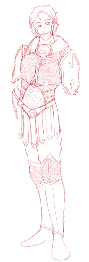
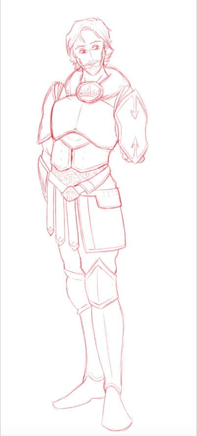
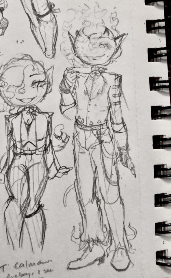
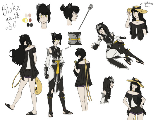
#I’ve been redesigning his look a bit as well as designing the outfit he wears when employed by Haltman
Text
Brain full of Kirby oc thoughts
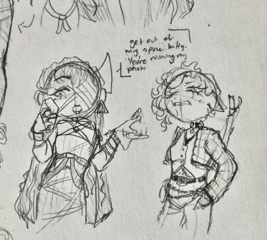
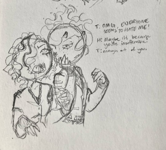
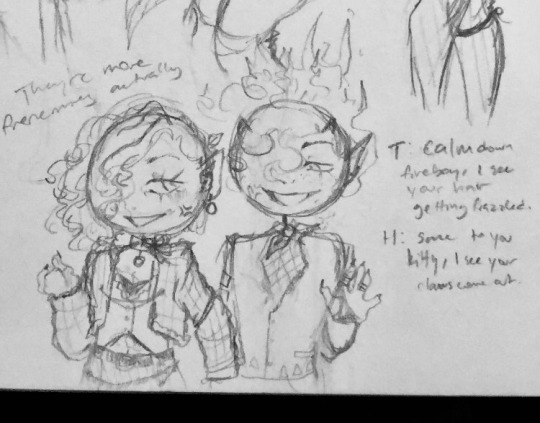
#snappy speaks#Kirby oc: Terra Knight#I’ve been redesigning his look a bit as well as designing the outfit he wears when employed by Haltman#kinda fun making him a set of armor that matches the ceo because they are besties#the most annoying part is setting on his mask detail for the seperate GSA and HWC designs#both masks have the false tusks but making them attach without looking awkward is the tricky part#but it’s been fun doodling my boy he’s the worst I love him#Star Warrior era Terra Knight: baby boy baby#Haltman Works Co. era Terra Knight: evil#it’s funny because he’s absolutely miserable when with the gsa but becomes a lot happier when he becomes the bff of the worst guy ever
3 notes
·
View notes
Text
WIP Wednesday!!!
Pretend there’s a cool graphic here. Perhaps I’ll have time to make one some day soon. Or if anyone wants to whip one up for me, I’ll draw your blorbo as an exchange of goods and services.
Anyways! On to the sharing! I was really pleasantly surprised with last week and how many people shared with each other what neat things they were working on and kept the chain going. So I’m doing it again! Remember, there’s no pressure, but show me what you’re working on! What neat things do you have cooking in either the Dragon Age or otherwise fandoms?
I myself don’t have a whole lot this week. I’ve been suffering from an overwhelming number of ideas and brain bugs and can’t really sit down to complete any of them. Instead I’m bouncing from idea to idea like a ping pong ball. I did a little more work on my Inquisitor’s character sheet this week, focusing on his post-Trespasser design as head of Divine Victoria’s honour guard.
(Art and discussion of concept ideas, as well as tag list are below the cut.)
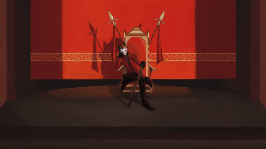
For context, this was the original “design” which was done last year and mostly on a dare after making the joke that the Divine’s bodyguards in Trespasser were just wearing recoloured versions of Sebastian’s outfit and “lol wouldn’t Quinn look dumb in that.” I added a few elements of Divine Victoria’s armour - mainly with the red fur mantle but it’s pretty basic.
This was my first pass at the redesign for Quinn’s new reference sheet done a couple months ago. I kept the shoulders the same, but tried to lean into Divine Victoria’s armour more. Unfortunately, I don’t think it suits a male figure or it just didn’t really translate well for me. The addition of texture/embossing on parts of the armour also made it feel a bit too busy for me more than looking decorative or elegant. It also didn’t look like it allowed for much movement in the torso and while I make the dark joke that Quinn is so drunk and depressed at this point in his life that it’d make sense to strap him into armour that forces him to stay upright, compared to the other outfits I’ve redesigned this just... didn’t feel it.
Here is my more recent pass at the redesign! Again, the shoulders are largely untouched. I like the idea of the armour completely covering what remains of his left arm, plus it has the added practicality of likely having a strap at the bottom that wraps around the bottom of his sleeve securing it into place. The bracer on his right arm has also largely been left alone - it’s a hold over from some of his Inquisitor gear in one of my designs and I like carrying bits over... like a wardrobe evolution. It also shows that Quinn has personal attachment to articles of clothing and accessories. The fur mantle of the Divine is still there... never gonna get rid of it, but it’s sort of combined/blended with the in-game body guard appearance. The chest has also been flattened and simplified, going back to resembling the body guard/Sebastian chest piece but a little larger and more protective. Plus the hint of plate layering too. The scaled coat is still there as the under layer, but it’s less prominent or visible. There is a vest between the armour and the scale coat to give the breast plate a little more friction to stay in place. It will likely be red with gold accents. All the embossing on the armour has been removed. I am unlikely to bring it back.
The waist design was also re-worked, taking inspiration from one of my favourite artists’ character design work in Fire Emblem. The Roman-esque belted skirt is more of a half-skirt, with a fabric skirt draped over part of the belt. I’ve blocked out a section where I am going to experiment with embroidery patterns similar to what I’ve done on previous outfits to give this more of a my-idea-of-the-Trevelyans feel. I haven’t done a colour test yet. But I do think I like this better overall.

Close up of his face, if you like. He’s so sad. He’s so tired. He needs a beard shave and a haircut.
Tagging with absolutely no pressure: @rosella-writes @roguelioness @potatowitch @cleverblackcat @noire-pandora @darethshirl @kittynomsdeplume @little-lightning-lavellan @little--abyss @plisuu @blarrghe @inquisitoracorn @morganlefaye79 @knuttydraws @knightdawn @n7viper @sulky-valkyrie @drag-on-age @oxygenforthewicked @bluewren @nirikeehan @effelants @greypetrel @scribbledquillz @transprincecaspian @transfenris-truther @jellydishes @absyntthe @idolsgf @terencessong @internetdoashouting
As always, if you would like to be added or removed, please let me know. Don’t feel shy or bad about it! You can even DM me privately and know one else has to know!
#i need to make a spreadsheet for this#no one say anything about the rat man#unless it's to agree both he and quinn have great hair and facial hair#i have a type#and I'm cool with that
46 notes
·
View notes
Text
So I’ve been redesigning some of G3’s characters (more like all of them lol), and I have been wanting to share some of them!
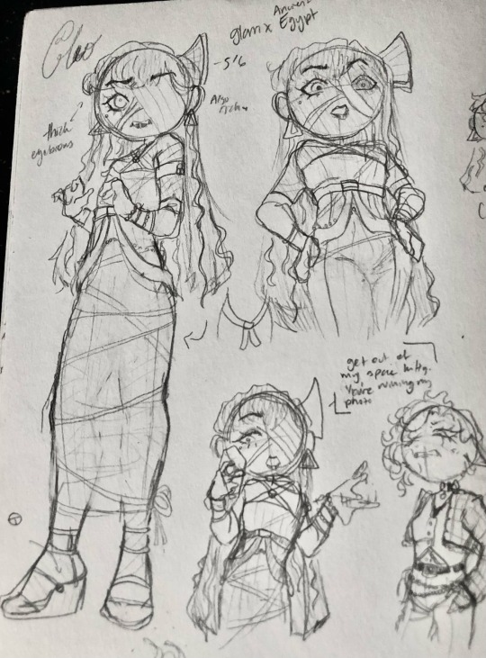
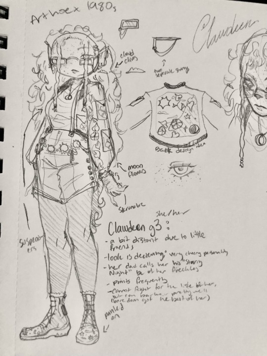


I wanted all of them to have a set aesthetic, so for most if, not all of them, they have two aesthetics.
Cleo - ancient Egypt and glamour aesthetic. Ancient Egypt isn’t an aesthetic, but it is an influence on how I designed her. Her dress is based on a kalasiris and I gave her sandals high heels. A lot of the hair on her is fake: her hair is a wig, her eyebrows are fake, as well as her eyelashes. Happens when you have rotting for a long time!
Clawdeen - Clawdeen is Art Hoe x 1980s because I thought it’d look cute on her. Art hoe is mainly because I hc her to be into painting, especially painting different clothes and outfits (kind of like the Renaissance era), but she still likes to paint other things like inanimate objects and skies.
I was sick and tired of seeing the crescent motif on her everywhere I go, so I gave her other things to be interested in. The crescent moons are still there (as well as the other phases), but there are stars, clouds, and suns on there too! And also moon flowers because yeah
Abby - I decided after a little while that Abby switches between pants and skirts, so in Nightmare Nightmore, she wears pants there, but in school, she wears skirts. Her design is based off of Winter aesthetic and E-Girl. A lot of people have been saying that her outfit reminded them of TikTok clothes, so I decdided to take that to heart.
She’s also fat in my version, because it makes sense (more body weight usually equals more warmth! Come on). She also has baby horns like her mom, her bottom fangs pop out more, and she now has fur.
Heath - He is 1970s (??? I forgot which era he was based off of) mixed with a bit of punk. There are multiple things to say about his design (they did him so freaking dirty holy hell), but to keep it short: his physical design is based on the Biblical Devil and his background is based on Hades.
Toralei - honestly I have no idea what her aesthetic is. I just took something I thought was cute and made it into an outfit.
Not only did I redesign their outfits , but their personalities (personalities is gonna have to be for a different post) and friend groups are also a bit different
Toralei is still enemies with basically everyone, but she is friends with mainly Heath (Lagoona isn’t fond of her; Lagoona is seen as an object more than a friend).
We barely know Cleo’s other friends besides Clawdeen and possibly Frankie, so I have nothing for her.
Abby is friends with mainly Draculaura
Clawdeen gets along with a good chunk of everyone
Heath is friends with all of the Greek boys and Toralei.
#monster high g3#mh g3#monsterhigh#monster high generation 3#monster high#mh#g3 clawdeen#g3 Abby#g3 Heath#g3 toralei#g3 cleo de nile#redesign#Fanart
26 notes
·
View notes
Photo

During my recovery, this has been my biggest project, no kidding. I looked but couldn’t find Obi’s witcher!AU body template so I sketched some Bruxa!yuki designs instead. <w< I’ll finalize and colour them when I’m well, or so I hope, unless I forget XD
Pls forgive any mistakes I’m not 100% yet. ^^;
Explanations below the cut~
AnS (c) Akizuki Sorata
Witcher (c) Andrzej Sapkowski
TW3 models (c) CDPR
Art: Me
Disclaimer: I am not a tailor and as such all my opinions are based on preference and evt pushing rules in my favour XD
The main idea with her wardrobe was to underline that whatever she’s doing, Shirayuki is feminine, and wants to present feminine, hence the skirts and ribbons and embroidery. She’s also a person fond of utility, so belts, pockets, and layers that can be added or removed as she fancied, was also an important facet to add. But she’s also bruxae, monster species, so she’s got a few blind spots, so to speak, regarding what is and isn’t proper to wear in human society. But most of all, her clothes make it easy for her to use her bruxa powers to move around swiftly, silently, and with purpose
Around half of these were referenced from the witcher 3 game, with me picking my favourite garb, and what made more sense for her in different situations.
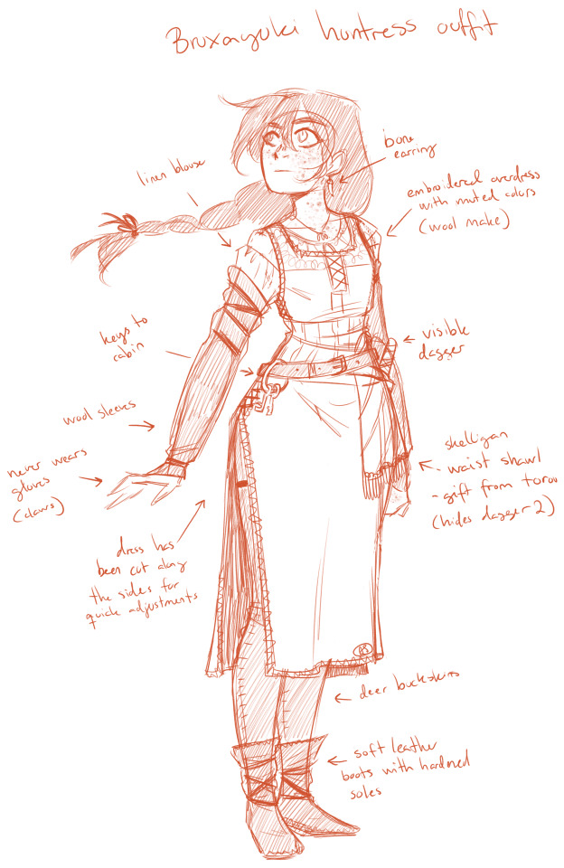
1. Huntress Outfit - this one I made myself, using only some of the basic wardrobe notes from tw3. I’ve a softness for overdresses/kaftans with splits, especially if they’re combined with tights/buckskins. Shirayuki is a poor bruxa living in the woods outside a small human settlement, so she doesn’t have access to a tailor other than on market day, or when peddlers arrive, hence she often has to redesign old/too-small clothing for new purposes. Another point was to reinforce her sleeves, to make it easier to brush away branches and undergrowth, and adding the Skelligan waist shawl, a gift from her half-sister, as recurring themes.
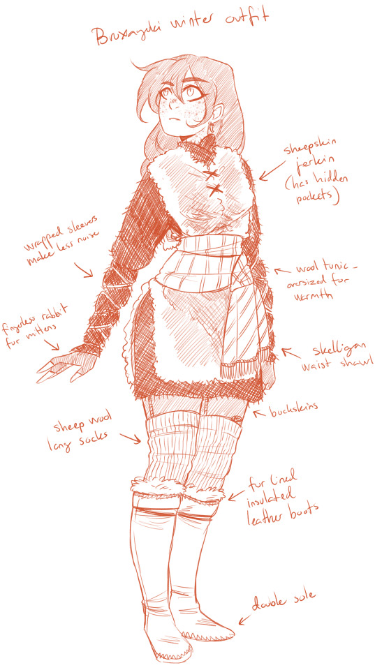
2. Winter Outfit - another I made myself, because I was dying to design something that included a sheepskin jerkin. The waist shawl helps redefine the jerkin and give it a feminine twist, and the wrapped sleeves both reduce noise and keeps her cuffs from leaking precious warmth. The wool tunic could have been a dress, but I wanted to focus on showing off her fur-tucked winter boots and knitted long socks. Shirayuki probably knitted them herself.
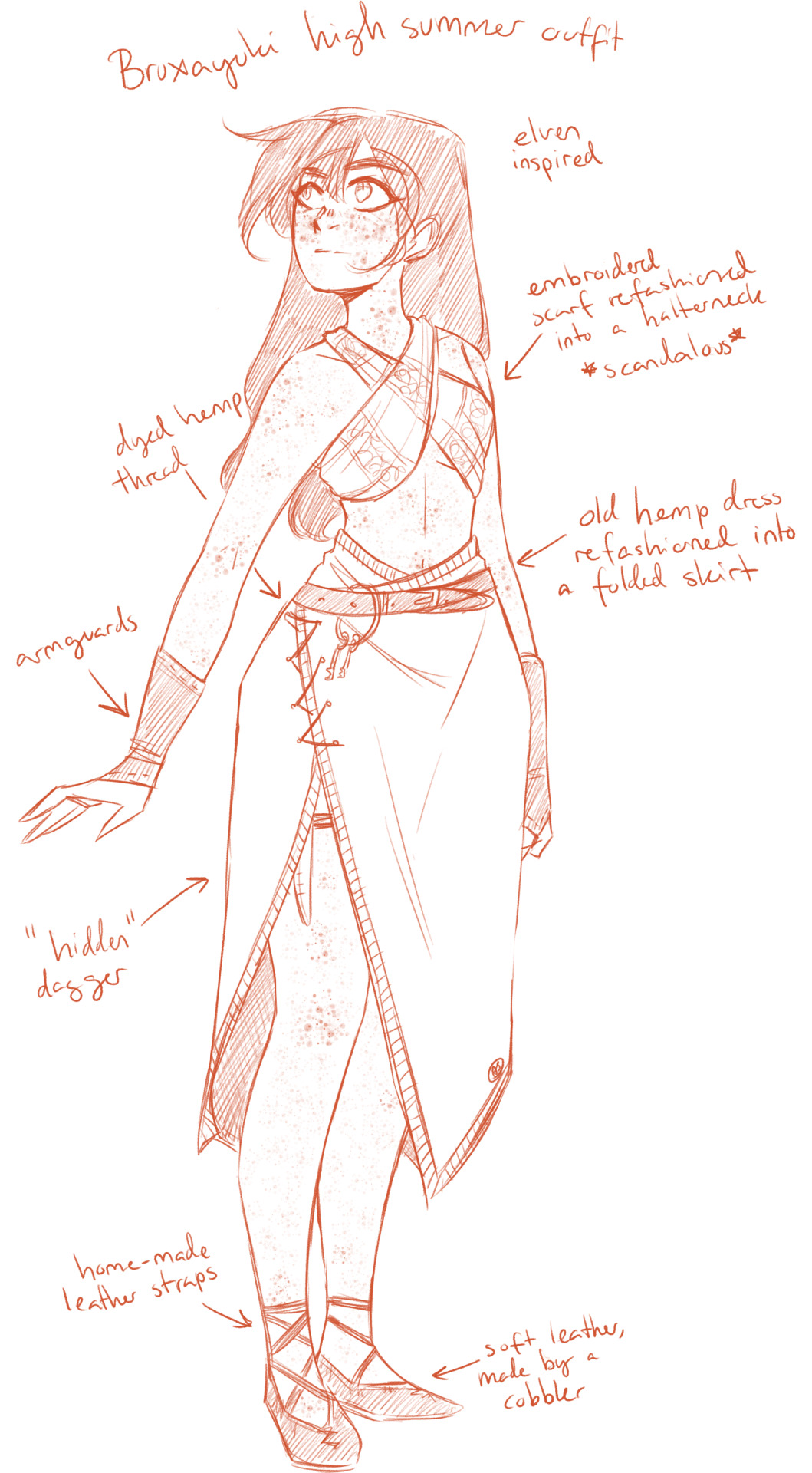
3. High Summer Outfit - another self-made design. Made so as to underline her non-humanness, borrowing heavily from witcher elven aesthetics, with lots of exposed skin, crossed fabric, and asymmetrical cuts. This is what she wears when the weather *won’t* allow you to dress decently or you get purged by the sun, basically. Again, since Shirayuki’s often short of fabric, a lot of refashioning going on.
4. Commoner Outfit - A very basic woman’s dress, very presentable, very respectable, especially since Shirayuki is trying to sell the lie that she’s a normal human woman. It’s her go-to outfit for visiting human settlements, or for performing simple chores around the house, such as cooking, sewing, or spinning. Things that keep her in or around her homestead, and not gallivanting in the woods at midnight looking for prey.
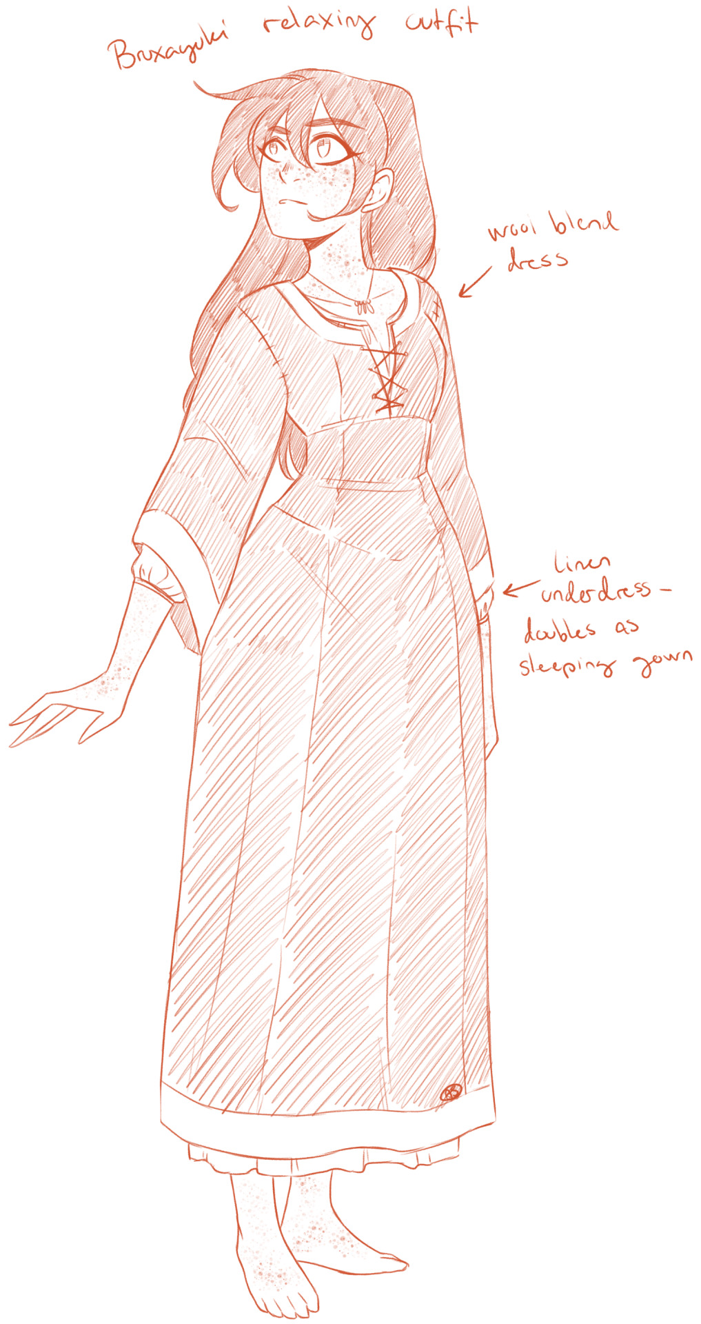
5. Relaxing Outfit - merely a dusty day dress pulled over her nightgown, for those chilly nights where Shirayuki doesn’t want to undress for bed until she’s halfway under the covers. When the chores are done and all that’s left to do is sip a cup of blood, read a book beside the hearth and wait for Ryuu to return from his late night wandering, she likes to shed all those layers and relax.
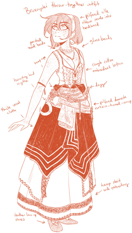
6. Throw-together Outfit - referenced from the game, almost entirely (Keira Metz’ witch model) - save the shoes and headband. After the loss of her home and her more presentable clothing thanks to witcher Obi (who will later admit that yes he does in fact owe her a new dress... and blouse... and apron...) this outfit was assembled through raiding an abandoned witch’s hut. Anything that could suffice as clothing, basically, even the old curtains. Shirayuki doesn’t personally care that some of her *assets* are pretty much on display, but she would like some linen anyway, the cotton does chafe a bit. Aside from the pearl necklace, nothing she’s wearing actually belonged to her in the first place.
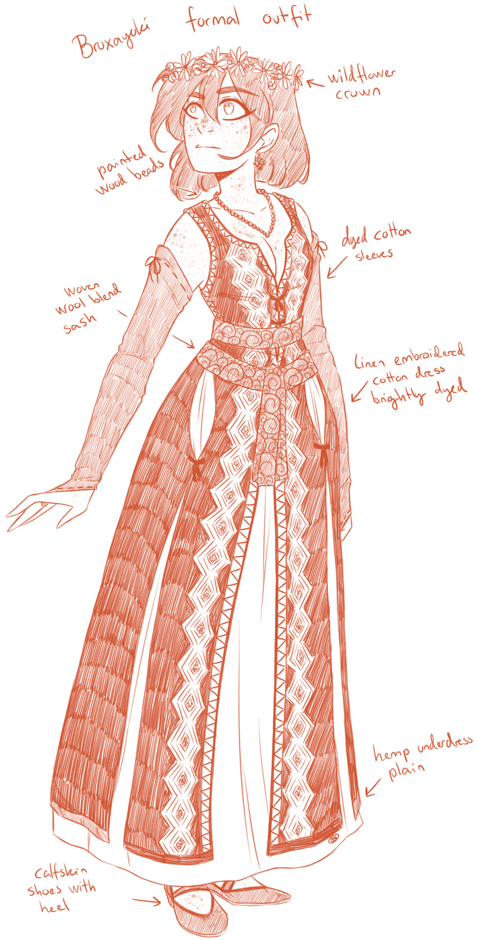
7. Formal Commoner Outfit - reffed from the game, (Keira Metz’ second model) the shoes being the sole exception. A dress for special occassions, perhaps May Day, Equinox celebrations, etc. Not that Shirayuki often dared participate in such events, due to the amount of people who show up even in small villages to throw tankards together and dance around bonfires. But she does pilfer the dress from the abandoned witch’s hut anyway, thinking maybe, afterall, since it’s so pretty and it had matching sleeves to go with it... keeping it wasn’t such a dumb idea.
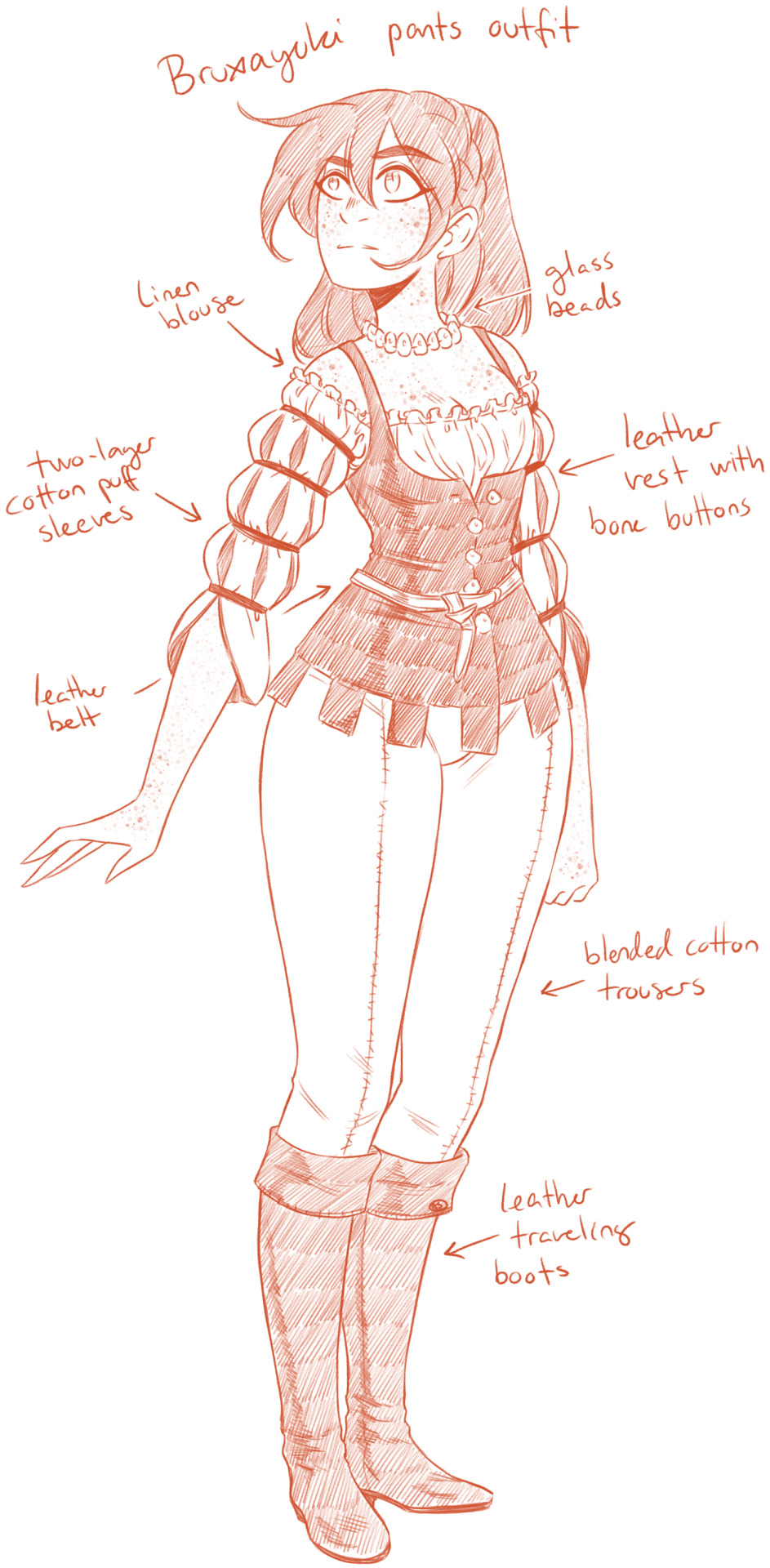
8. Pants Outfit - reffed from the game (juggler npc) A cross between a traveler and a city dweller, a light-weight yet very elegant outfit for strolling in the human cities. The top is presentable enough that she doesn’t look poor as a pauper, while the pants give the impression of someone on the move, a stranger. It also provides the most comfortable riding experience, the few times she does ride, as she has no need for a lady’s saddle.
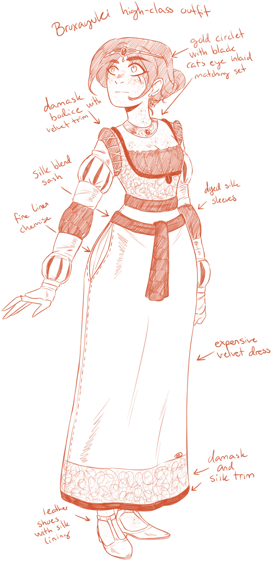
9. High-Class Outfit - reffed from the game/one of my favourite tw3 modders, (New Sorceress models by Roksa) I only added the shoes and circlet. When Zen has the dress made for her, it is by FAR the most expensive thing she’s ever worn. Not a single thread of the dress isn’t well-made, the dyes are the brightest and most even-coloured, and the silk is light as a touch on her skin. While the dress itself is a demure, feminine dream, what sets the ensemble apart are the dark cat’s eye gems, just hinting at Shirayuki’s darker secrets. They’re set in gold, for obvious, unspoken reasons, as she reacts to silver much like being set on fire...
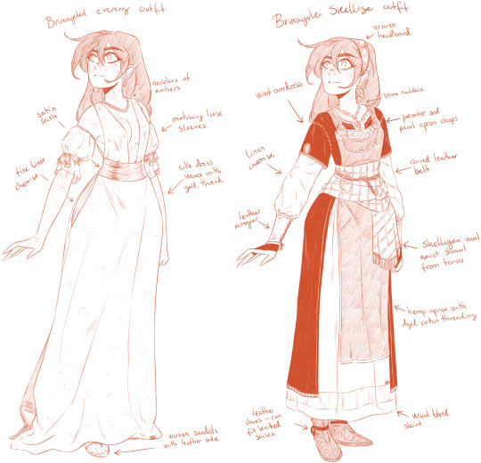
10. Evening Outfit - reffed from the game, I just changed the necklace (Ida Eméan’s Gwent card art) another very expensive dress, but surprisingly one that Shirayuki tolerates better. No stiff, itchy velvet, no heavy damask, just sheer silk with gold thread (again for reasons obvious to a bruxa) some simple sleeves, and a chain of stones, no gilded jewellry that could empty a bank vault if sold to the right people. She probably takes a fancy to this dress while attempting to woo a certain witcher, which explains the understated beauty, the most daring of cuts, one that screams “look at me, only me” and the simple-at-a-glance design. Much like Shirayuki herself.
11. Skellige Outfit - inspired by the viking-esque game design for Skellige fashion, this dress is for when Shirayuki and her family stay in the Isles, following her sister’s suggestion. A dress that signifies the matron head of a household with its pewter clasps and apron, follows Skellige fashion demanding you wear a shawl with your clan colors (Shirayuki, although clan-less, was given one by Torou) and layers. And armguards. And a split overdress. To show that this is Shirayuki’s choice wear afterall.
#akagami no shirayukihime#ans#snow white with the red hair#shirayuki#witcher!au#in which shirayuki is a bruxa#a sort of all-female vampire#and obi is the witcher#listen I have only been able to sketch so it was only a matter of time before I fell down into the rabbit hole of outfit designs again XD#let's hope I remember to render them later lolol#myart#I also tried to hint to time passing between her outfits#by using different hairstyles#idk if it worked ahahaha
81 notes
·
View notes
Text
On The Style and Effectiveness of 1-A Hero Costumes - Part 2/5
Part 2 of this post!
NAVIGATION
Part 1 2 3 4 5
INGENIUM / IIDA TENYA
It’s armor time!!! Behold a man.
What I don’t like:
The costume seems too bulky for a Quirk and fighting style that optimize speed. And while it’s true that cars are pretty bulky but still go fast, it’s equally true that certain types of cars are designed to go faster. The current design reminds me most of a semi or a big SUV, but if the costume was more streamlined along the lines of racecars or sports cars, it would help take off the extra weight that the bulk provides, leaving Iida lighter and more streamlined - therefore, faster.
Some examples of slimmer armor include Go Go Tomago’s from Big Hero 6 and Jim Lake Jr.’s from Trollhunters. And while I get that his body type inherently lends itself to being tank-like, lightening up on the bulk would probably be great for him.
The exhaust pipes out of his back confuse me. They bring some car energy, which is entirely welcome, but they likely hinder balance and motion, which is bad. They leave him looking a little unbalanced, and since so much of his strength and his fighting ability focuses on his lower body, having excess superficial material protruding out of the sides like that doesn’t seem to lend him any favors. And even while it looks cool, it just seems like it would be uncomfortable? Especially since a lot of runners - Iida included - like having full range of their arms to help propel them forward. The pipes might get in the way of that.
Here’s what I like:
The overall aesthetic. I love how this look both makes sense with Iida’s Quirk and personality and plays with elements of his older brother’s costume. It simultaneously puts across some knightly vibes - which is genius, considering how chivalrous and rule-following Iida typically is - and also calls to mind Transformers and cars with the emphasis on the engines and some of the more mecha elements.
The support! Armor is such an easy way to protect yourself while also getting some serious style points. His most essential areas are covered - neck, chest, arms, and legs - which is especially important considering that Iida’s legs are integral to his Quirk and his fighting style. The helmet is also a really good choice, considering this boy is essentially a human car. He looks a bit intimidating wearing it, which is good for fighting Villains, I suppose. Class dad is protected.
And a misc. note:
You know how after Iida’s special Recipro Burst move, he has to wait awhile while his engines cool back down? I think it would be really neat if he implemented some cooling technology into his Hero suit (similarly to Todoroki’s temperature-regulating gear). Theoretically, if he could find something that worked a bit like coolant for his engines, he would have a much quicker reaction time - and speed is the main facet of his Quirk, so it would probably help a lot!
Overall: Very good at providing protection while having a bomb-ass aesthetic. Not quite so good at being built for speed.
I CANNOT STOP TWINKLING / AOYAMA YUUGA

On the other side of the armored spectrum… we have this kid!
What I don’t like:
*Edna Mode voice* NO CAPE! Why do I not like the cape? Capes can snag on stuff very easily and it would be an easy thing for Villains to target and use to unbalance Aoyama. Longer capes are especially susceptible to getting trapped under rubble, torn up, or covered in gunk from the environment (which is not the Look he seems to like). I feel like a shorter cape would get a similar message across while minimizing the potential dangers that a long cape poses. Of course, Aoyama can be trained via experience to utilize his costume effectively with the full-length cape, but when his life and the lives of others are on the line, I’d rather not take that chance.
The shades. I get that they’re iconic, but they’re taking rose colored glasses a bit too seriously. 110% will fall off his face and also messes with the princely Vibe the rest of his costume provides. I do like their Elton John energy, though.
Not a bad thing, but I just want to know how his belt works.
Here’s what I like:
The overall aesthetic. I love how the costume’s obvious “princely knight” vibe reflects so much of Aoyama’s character.
The support here is also really good! Working the belt into the theme of his costume so seamlessly is very innovative and I love that for him. Getting the knee pads and shoulder pauldrons to match his central laser both adds to the uniqueness of the outfit and also pushes that royalty theme since they look very similar to inset gems.
The color scheme. Purple, silver, gold, and black look very classy and regal together, and I appreciate how the royal purple ties back into the concept of European royalty, which is very in-character for this boy. His pantaloon-looking things??? Neato.
Overall: Eh, okay. Ditch the glasses and shorten the cape. Superb, you funky lil knight light.
CREATI / YAOYOROZU MOMO
Here we are! I’m finally taking a crack at one of the most highly debated hero costumes in the entire show, and like a good portion of people, I’m gonna be extremely salty about it. Yaomomo doesn’t deserve this - none of the girls deserve this. These are my thoughts:
What I don’t like:
The absolute lack of support. For any aspect of her. Nothing about this costume is protective (other than maybe the partial high collar). Her most vulnerable areas are exposed, and while it makes sense for easy Quirk usage, it does not make sense for a girl who’s fighting homicidal maniacs on the front lines. The most glaring area in need of support is obviously her chest, as nothing substantial is holding her bust in place. However, so much could be done to work with the benefits of Creation and against its weaknesses that is not being done in this costume. I’ve seen quite a few redesigns that include a sports bra with a front zip closure, which is worlds better. With the show being set in the future, having a slightly mechanized costume with the ability to retract certain pieces at the press of a button would be useful and likely doable considering Yuuei’s own Support department. Gloves would probably be a good idea to give Yaoyorozu a better grip on harder-to-handle Created objects, such as heavy metal machinery.
The over-sexualization is, obviously, disgusting. Nothing about this costume says “Hero.” What it does say, in-universe, is that someone had the absolute gall to approve and send this outfit to a 15-year-old girl about to be thrown headfirst into training for an extremely dangerous profession. It says that giving a person in their freshman year of high school an overly sexualized outfit meant for combat training is okay (it isn’t, for reasons I can’t even begin to explain). This more closely resembles an outfit for a lingerie or swimsuit model than it does for any type of superhero, which alone should be enough to warrant some serious changes - especially, as I have stated, since the girl is only 15!
The overall aesthetic. There is no aesthetic reading for this costume other than “sexy”, which, as I explained above, is very problematic. Sure, the exposed skin makes sense for her Quirk, since she needs access to skin in order to produce items with Creation, but nothing about this outfit denotes anything about her personality. Yaoyorozu Momo is a gentle girl who has been shown to have self-esteem issues from early on in the show, and just knowing that makes me wonder if she feels uncomfortable wearing this. If she’s totally comfortable in this look, good for her! But comfort in our clothing factors so much into our mental states, which translates directly to our physical performance - it’s the same reason why having clothes that fit you and your style well make you feel more confident and more content. And especially if Yaoyorozu wasn’t quite expecting the amount of skin revealed when her costume was given to her, it could likely have added on to her self-esteem issues as seen early in the school year.
The skintight fit of what amounts to a glorified bathing suit is not conducive or acceptable whatsoever. With such a powerful Quirk, Yaoyorozu needs all the protective material she can get - which, as I said in Uraraka’s analysis, is quite simply not possible to fit under that bodycon fabric. Some padding at the very least would work wonders, and bulletproof material would serve her even better.
Once again, heels are not good for any kind of running or fighting! At least it’s a block heel, which is marginally more stable than, say, a stiletto, but still.
The literal bookshelf on her ass. It makes no sense to put it there - it’s an inconvenient place (what if she needs to sit down?) and it looks incredibly awkward to move around with. Besides, there’s absolutely nothing stopping that book from falling at the slightest jostle. At least give her a proper holster or implement it into a toolbelt like some of the boys have.
What’s with the belt? Can it hold emergency supplies? Or is it just there to make it seem like she’s wearing more than a deep v one-piece? I’m at a loss here.
Here’s what I like:
The color scheme. Deep red, white, and pale yellow look good on her! The color ratios are also pretty good in my opinion. Unfortunately, this is the only good thing I can say about her getup.
And to round us out, some misc. notes:
I feel like the book could be done away with entirely and replaced with something digital. This universe is set multiple centuries into the future, and I think something like a holographic data set would look slick, enable for faster search time for whatever info Yaoyorozu would need, and eliminate the bulk problem completely. At the very least, there could be a smartwatch-type gauntlet to pull up info with a larger screen to enable easy reading. Really, the lack of support for Yaoyorozu’s look is devastating because she could go so many directions in creating an outfit that works with her Quirk’s strengths and against its weaknesses.
Overall: Awful, a disgrace, and a disservice to one of the coolest, kindest characters in the class. I would kill for her to get the outfit she deserves.
INVISIBLE GIRL / HAGAKURE TOORU
Wow, look! Two travesties in a row! One more and I get a bingo!
Hagakure, I love you so much, and I am so, so sorry that the yahoos over at the Support company thought that this was a good idea.
What I don’t like:
Uh. The fact that there isn’t a costume. There is literally no in-universe rationalization for this. Surely, they have the technology. Just look at Lemillion! Togata Mirio’s Quirk is literally phasing through materials (including his own clothing) and they made him his own non-phaseable costume by weaving his own DNA into the fabric! Even if they don’t have the technology (they do), I know that Hatsume and probably the rest of the Support students would immediately jump on the chance of creating a fabric with the ability to switch between visible and invisible modes.
Once again, the sexualization of minor Hero students continues to disturb me. Who in their right mind thinks it’s okay to send a naked teenager out into a live battlefield just because she’s less likely to be noticed that way? This line of thought surely doesn’t account for stray bullets or falling debris, nor does it account for this poor girl’s peace of mind. She should be focused on getting the job done and saving people, not worrying about how it’s too cold for her to work properly or how there’s nothing between her body and a loaded gun except for the air between them.
The gloves and shoes seem like they’re kinda. Missing the point of contributing to a stealth Hero costume? Yes, they’re good so that Hagakure can be easily recognized among her allies, but does she just have to stow them wherever when she needs to go fully invisible and hope she can find them once the mission’s over? Plus, Hagakure will always, at the very bare minimum, need something to protect the soles of her feet. Walking barefoot just for everyday civilian stuff would cause a lot of problems, but Heroes likely have a lot of broken glass, broken nails, debris, and other nasty things on the streets where they fight. Tetanus is not fun to have.
Here’s what I like:
The gloves are a nice color, I guess?
Some misc. notes:
I gotta say, I’ve seen SO many good takes on outfit redesigns for Hagakure (same with Yaoyorozu) and the fandom collectively has some wonderful ideas on how to go about creating a costume for her. Personally, I think it would be cool if she had a full-body suit that could change between visible and invisible modes - that way, she would be easy to identify in head counts and it would likely be easier to see places where she could be injured after a fight. At the very, very least they could pull a Lemillion and have her outfit infused with something from her own DNA so it can disappear as she does while leaving her at least covered.
Overall: So, so bad. Please give this girl a suit. I’m tired.
TLDR Part 2:
Great Costumes:
Good: Iida
Okay: Aoyama
Questionable:
Bad:
The Absolute Worst: Yaoyorozu, Hagakure
#happi rambles#anime#bnha#walk walk fashion baby#meta#iida tenya#aoyama yuuga#yaoyorozu momo#hagakure tooru#and here's part two!#as I said earlier I'll link everything together once all parts are posted and I'm sorry if I didn't catch some spelling/grammar errors#long post#class 1A costume analysis
34 notes
·
View notes
Photo
My redesigns for this popular trio!
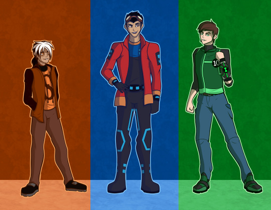
The Secret Generator 10 (Or Celebrity Trio but that doesn’t really work for me because of Zak...)
I’ve been meaning to get around to doing this, since I am really fond of these three boys. With Zak and Rex both being part of my top two shows of all time. Sorry Ben....
-Zak Saturday-
He was the most fun working with. His warm colour palette isn’t something I work with often, but I think I did alright. He also as some small details you might notice, like the fangs, eyes and scales.
Notes:
14 Years Old
5′5 (Will only grow to be 5′8. Which confuses him since both sides of his family have very tall genes. Ulraj pokes fun at him, saying all that height is going towards his ‘Kur Form’)
Dead on the inside.
Aggressively Pansexual
His human side has been growing reptilian features. Noticeable fangs, scales growing around his lower neck, around his chest and upper back/shoulders, pure orange eyes with pupils that can become thin slits and a slight forked tongue.
Even also displays some reptile behaviour. E.g, soaking up sunlight on a rock, alert nature, able to stand still as a statue. (He’s done these things since he was young. His parents just thought it was something he picked up from Komodo.)
The light that forms around his eyes when using his powers have darkened the skin around his eyes. (Suggested by my friend)
He is oddly thin and lanky, but it’s often hard to see because of the baggy clothes he wears.
That being said, he’s a lot stronger than you think he is. Can easily lift people twice his size.
Constantly has to get new hair ties. They keep breaking because 1. Every time his powers cause all of his hair to flow, the tie snaps. 2. Working out in the wild, it keeps getting snagged by tree branches or slipping off when he tumbles downhills.
While quiet and casual outside of battles, he will become a lot like his mother on the field.
Has freckles from his maternal side. His mother doesn’t have them, but Doyle does.
Will casually mention his ridiculously and scary adventures like they’re nothing, not because he’s bragging, but because he truly doesn’t understand what normal really is.
So use to being grabbed by the scruff of his shirt that he will always go limp when you grab him like that, much like a baby animal.
While he can act very eerie and strange, he’s a very sweet and understanding guy.
That being said, he can be hella scary when he wants to be.
Don’t mess with his family or he will send an army of Grootslangs to your house.
Still trying to figure out his placement in life and what Kur was really meant to be.
After being taught by his family and uncle, he went to Tsul 'Kalu to be his new mentor.
-Rex Salazar-
I think I changed him the least, but I added extra details and made his shirt, pants and shoes into a one-piece suit. It always baffles me how he can pull off this colour scheme so well.
And while I didn’t draw it here. I would definitely make his pure EVO form a lot smaller. Make him come across more like a monstrous zombie robot thing. The reason why is because those EVO forms he had just felt like they belonged to different shows, like transformers. A more creature design would fit better, I feel.
Notes:
16 Years Old
6′1 (Will grow to be 6′5. Yeeeeeee, he’s a big guy.)
Lady killer~
Best wingman and even offers pretend dates to help you.
Can always hear and feel the technology around him. Strange to everyone else, but he’s learnt to live with it. Even comes in handy when trying to find a good wifi connection.
Knows when to cut the bullcrap.
He does have a bit of a science brain, but he uses it differently than his family had.
Constantly jumping between worlds. Sometimes even tossed by someone.
Talks in his sleep, mostly reciting nanite binary coding.
Lonely lad and child solider, great mix, right?...
Goes all out with holidays. He once, somehow, got real snow in Providence. No one knows how to this day.
Hates lightening.
Has nearly called Holiday and Six mum and dad multiple times.
Has a lot more abilities he has yet to discover. (Including turning people EVO.)
Never asked for any of this, but, eh, what ya gonna do
Is always overexcited when doing normal things. (Werids out Noah a lottt.)
You’re endangered if he decided to use his full raw power. (Key signs to look out for is a large amount of circuit patterns covering him, glowing eyes, tips of his hair glowing too, sharp metal growths and technology around you flashing like crazy.)
Loves Imagine Dragon.
Sharp eyelashes.
Just wants hugs, give him hugs!
Always frustrated when someone from his past tries talking to him about the past. Sometimes he wonders if people forget.
Skilled drawer and smooth singer.
Has an EVO pet (Her name is Siri, Btw)
Some have compared him to being a living, breathing nanite.
Eager to have family game nights! “Poker doesn’t count, Bobo...”
Once had a malfunction, his whole body was out of wack. (Noah laughs about it and even has some recordings, much to Rex’s dismay.)
Has a civilian outfit that Noah put together. (He refuses to take off his goggles, however.)
-Ben Tennyson-
Now, I already made a redesign for him, along with Gwen, Julie and Kevin (Both for teen and kid versions). I used the same look, just adjusted some details and colours.
Notes:
15 Years Old
5′9 (And he stays that height. He peaked in height very young, but stop growing quickly. This does annoy him.)
Dumbass with bad impulse control.
Even he’s confused by how he keeps attracting women.
Had a rather lonely childhood with many bullies. (It’s why he often seeks attention, he’s afraid of being alone and forgotten again.)
It’s also what made him jealous of Gwen when they were young. Most treated her like the better of the two.
Pretty crap at sharing his feelings. He would rather play it off as a jerk, then go and drown himself in smoothies...
A secret momma’s boy. “Benny Bear” As his mother likes to call him.
Has an interesting dynamic with Azmuth. Despite their arguments, they balance each other well. Others have even seen them taking care of each other (Almost like father and son), but the pair will always deny this and say it’s ‘strictly’ professional.
Surprisingly great with kids. (This was truly noticed when seen around his 14 baby chills.)
In the future, he will have a nasty wound on the battlefield, which will result in the Omnitrix becoming his new arm and merging with him.
When he takes thing seriously, you know shits going down!
Has a german shepherd name Boston.
Likes to call Vilgax ‘Calamari’.
Has grown to be close to most Tennyson members. (E.G Camille, who was actually his babysitter after she joined the family.)
He doesn’t like peacocks after...an incident at the zoo. His mother still apologizes to this day.
Decent singer and very skilled at the guitar.
Has picked up combat moves from Tetrax.
Has always felt like he’s nothing without the watch. Others have said otherwise.
He knows how to speak certain alien languages, Galvan being one of them.
His schedule is a nightmare, because something is always popping up that involves him. This means he sometimes forgets to eat, sleep or even wash. It’s why he’s often caught napping.
Sometimes wonders if he’s human or alien at this point, maybe something else entirely.
Very soft poofy hair.
Is hated by almost all his villains. He just loves pissing them off.
#ben 10#the secret saturdays#generator rex#zak saturday#the secret saturdays zak#the secret saturdays zak saturday#Ben Tennyson#ben 10 alien force#ben 10 ultimate alien#ben 10 original series#ben 10 omniverse#Benjamin Tennyson#rex salazar#GR#Generator Rex Rex Salazar#Ben 10 Ben tennyson#Generator Rex Ben 10 Secret Saturdays#Crossover#cartoon network#redesign#Redraw#TSS#My Art
310 notes
·
View notes
Video
youtube
Wowee wow wow, the final part of Fixing RWBY volume 4 is finally out! Which means I can finally share all the art I’ve been sitting on and holding back on sharing this entire time!

First up is Ruby! Basically we wanted to return her to more of a gothic lolita aesthetic. Covering her back up because hey she’s a young teen was definitely a factor. I also wanted her to feel a little more sporty and practical.
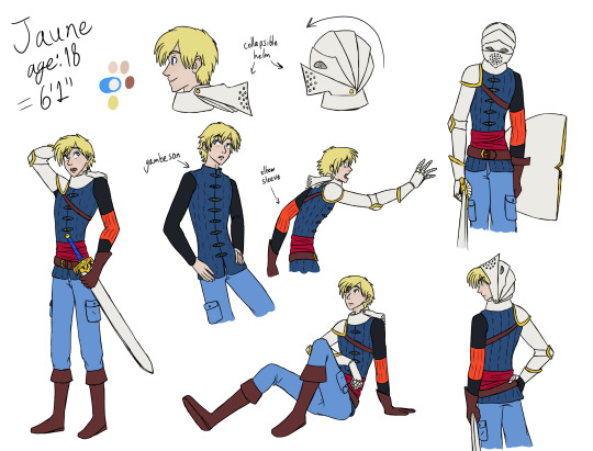
Then comes Jaune. For him we wanted to push him to feel much more knightly. He’s always just looked way too casual, and we wanted to fix that. His helm took a couple tries to get quite right in terms of design while keeping its function, for which I thank ButterflyBlueLady over on twitter as the other character designer for smoothing out.

Then comes Ren! Ren actually came pretty naturally to me, and basically it was fun to really hammer in a wuxia aesthetic for him.
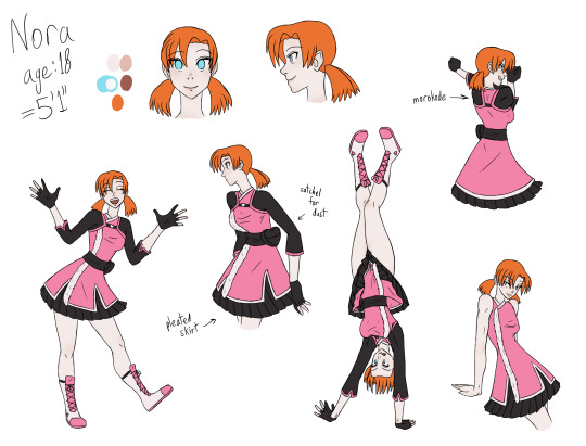
For Nora we wanted her to be a matching pair to Ren, since after all they share the same backstory. So she also got the asiatic fashion treatment, as well as a piece of samurai armor in the form of a morokode, which in its original function is a rash guard, but damn if it doesn’t look nice when worn on the outside too. xD

Weiss was actually pretty difficult to design for! We didn’t know right away what sort of vibe she should give off or how much we should really deviate from her canon v4 design. One thing was for sure, we wanted to make white one of the most prominent and dominant colors on her outfit again, which I think we accomplished.
Blake we wanted to make sure had some really nice casual wear since she’s taking it easy for the moment in the tropics, and most importantly, we had to cover up her stomach!! That plus her guard uniform made for a great outfit combination, especially since the canon guard uniform already has all of her colors in it.

While we liked Yang’s canon casual outfit well enough, we felt her “adventuring” clothes really needed some work, especially since the canon design was so top-heavy. We wanted to go for a more practical biker aesthetic, for which I referenced 50s british biker fashion in order to carry the right classic punk vibes. I also referenced ouji fashion a bit for her, something I also did a little bit for Blake as well. I was especially keen on trying to make yellow a more prominent part of her palette this time.

Ooh-la-la, Adam was even harder to design for than Weiss, if you can believe it! We wanted him to return more to his roots, but also make him more impressive and leader-like since he’s in the spotlight now and heading the white fang. A black coat felt too samey, and while a white coat was considered, it felt too far off and not quite right for him and his arc. Hence, we opted for a dazzling red coat with lush vine patterns all over, as well as on his waistcoat and pants. Making him both cool and stylish was what we aimed for!

And finally Roman, the surprise redesign that nobody saw coming! He was so much fun to design for, but so tough to keep a secret from everybody so his survival would be a surprise! The main idea behind his redesign was to make him look more business casual, a bit lowkey with some scars after surviving his grimm ordeal. We also introduced some green into his design here to both hint at Ozpin’s presence, and because it matches so prettily with his eyes~
Last but certainly not least, here’s the scene I illustrated which appears in this video! I actually made this before Adam’s ref sheet, since nobody knew about his redesign at the time, and I had my own, rougher guide to follow from the concept art that was done for him. I actually posed in a chair with a prop sword on the front porch and had my mom take a picture of me to use as reference, when the lighting from the sun was just right. I’m glad I took the time to do so, I think it helped a lot for making the pose and the shading look more natural xD
It’s been an incredible experience to work on FRWBY this year! There was a lot of learning and growth as I adjusted to the role of being one of the character designers, and despite some difficulties, it was pretty fun too~ I look forward to continuing to contribute to the project for the foreseeable future and for illustrating for Fixing RWBY vol5!
#art#rwby#fanart#fixing rwby#reference sheets#video#ruby#jaune#ren#nora#weiss#blake#yang#adam#roman#it was a lot of work but i enjoyed it lol#ruby rose#jaune arc#lie ren#nora valkyrie#weiss schnee#blake belladonna#yang xiao long#adam taurus#roman torchwick
22 notes
·
View notes
Photo


Redesigned Bladebreakers from my BEYBLADE AU "Beyfantasy" in 2010.
Their redesigns mostly dealt with refining their costume details- now keeping in mind a more realistic comfort and tighter battle-ready gear. They were also recolored to look less monotone. I decided to give them new hairstyles!
Samurai Takao
One of my frustrations in the old art of Samurai Takao was that I was not able to draw him in a pose that showed his front torso properly. I wanted to keep him in a "drawing katana" pose without changing too much. His pose was changed into something where he is in flight or jumping while ready to attack- characterizing his element of wind. Compared to the old art where he was grounded with heavy shoes, this new pose and shoes work better since they make him look lighter and more aggressive than defensive.
His old hairstyle covered much of his face which is a pity since Takao's expressions were always very vivid- so I parted his fringe to show more of his eyebrows. His ponytail at the back is also tied higher to further emphasize Dragoon's hunching silhouette with scales when he's standing.
I thought it would be unrealistic for him to wield the displayed sword of Dragoon/Seiryuu as is, so I redesigned it as well. The scarf was an addition since I thought his chest area was very empty and his neck would look too long since I planned for him to have a longer neck and slanted shoulders built like a Dragon. I had to make it a short scarf so that it wouldn't share the same features as Kai's or get in the way of the coat design.
Ninja Kai
Ninja Kai's design is the one that went through a lot of changes. Looking back, while his outfit was fancy and beautiful- it worked more like an amateur's costume than something that looks professional. I wanted to keep the deep reds but I wanted a darker color for him. I decided to mix in a dark cyan/blue color for his top to emphasize the reds I wanted to show off.
I hesitated in recoloring his scarf from the trademark white to red, but Takao was already wearing a white scarf so I thought it was alright to do that. The red scarf looked like a swishing flame so it works.
I relocated his obi and rope on the waist. It was probably difficult to move around in the old design, and the loops might have been caught by something during stealth or battle. I downsized it and allowed it to be aesthetic instead.
As much as his old sleeveless design flaunted his toned arms, I thought he would look more professional if he covered more skin as a ninja. The paint on his face is also a different design inspired by Dranzer/Suzaku's eye shape. His hair was also styled into something neater and more masculine to balance his graceful outfit. His new pose was heavily inspired by the old one, but I wanted him to follow the silhouette of "火" and/or a fuma shuriken in this illustration!
Cleric Max
This character is undoubtedly the hardest redesign in the group, and the illustration I took the longest to draw. Cleric Max's design is all about reorganizing the elements in the old one. I did not want to change his pose at all, but I had to if I wanted to show the details on the front of his costume. It was difficult to pick the exact colors to use for his new design.
I was certain about his hairstyle, but the original plan was to make his hair a little pinker/strawberry blonde. It did not work well at all with the outfit's colors and it made him look less like a “boy” as I intended. His outfit already has a lot of feminine elements, so giving him softer colors gave him a different appeal that I was not going for.
His weapon was redesigned to be more minimalist so that it would not clash with his outfit, and blended better with the straight lines on his robe. I wanted him to look more mage-like than a timid adventurer, so I added tails at the back of his shoulders! A lot of care was put into drawing his facial features.
Monk Lei
There isn't much change with his design since this is only his first outfit in the series. He can’t wear those garbs forever!! His lifestyle in the mountains had to be emphasized so I still kept it simple. I really wanted to change his pose into something that emphasized lightning on his arms so it took a lot of reposing.
I had to draw him rugged because of his current situation, but I did not want him to look too dirty/filthy. He still had to look reliable in features and manner/gesture. His hair was drawn to be more silky, and his outfit fabric is also a bit more yellowed from aging and weathering. Since the old shoes looked more comfortable- I gave him shoes that would not fly off this time from kicks! I scrapped his knuckles from the old design too since his Byakko-imbued strength is what I wanted to show in this illustration. He can still use knuckles though.
His face was drawn to be shown better- I've always had this ideal face structure for Lei and took the opportunity to show it off here. I was always fond of his smile where one of his eyes is slightly pinched too. I decided against putting a visible fang on his mouth since it would make him look too fierce. His body structure is the same as in the old design.
And those are the notes! I rewrote their character descriptions as well and made small changes to those. I think I am most satisfied of my redesigned Ninja Kai in this group!
Thank you for reading ^-^
78 notes
·
View notes
Note
Did you ever make that joker tier list, I always like seeing what people think of all the different ones. Though if they put Romero last I can no longer respect them.
LMAO I DID! I think I’ve made it kind of obvious in this blog but I... don’t... particularly... care... for... the joker.... unless he’s, y’know, fun to watch. Cause he’s a clown, and clowns are supposed to be entertaining. But since you politely brought it up, and and because I have a deep respect for mutual Romero-lovers, I guess this would be a good time to explain my rankings and just discuss my general thoughts on each clown:
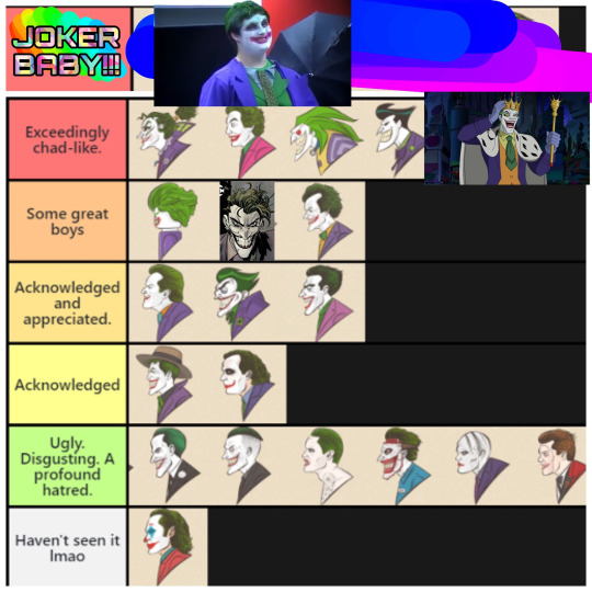
General Thoughts:
For the most part, I don’t really care for the Joker. This is hardly an uncommon opinion here on tumblr, but I definitely fall on the side of the fandom that feels that he gets too much attention from DC. I get WHY they use him so often for films and comics, and I don’t have anything against *most* folks who consider them their favorite Batman villain, but at this point he’s used more for shock value and as a crutch instead of anything interesting. Like, instead of giving attention to the other Rogues, writers (at least for the comics) will try and make up some bullshit story that they can shoehorn the Joker into, ‘cause it sells. It’s tiring, and I feel like the character has lost his meaning; I can only read so many stories about the Joker, I don’t fucking know, wearing a suit made from dead babies and Jason Todd’s flayed corpse before I get sick of it.
I’m at the point where I’ll like any Joker who’s just fun to watch. I genuinely respect those who prefer darker interpretations of the character, but that isn’t me; I vastly prefer the lighthearted takes on him, because... at this point... writers who use the “cleaner” version of him tend to be more creative, since they actually have to write a Joker story that doesn’t rely on gore/torture porn.
TIER ONE:
Joker Baby: Self explanatory. Joker Baby is thematic, thoughtful, and intense. Everytime I watch this video, I shiver with fear and pleasure; something primal in me awakens whenever Joker Baby runs his fingers through his spray-on dyed hair, and ends up smearing green paint on his forehead- it represents the inner turmoil, the chaos, that resides within the disturbed body that is Joker Baby. Nothing can ever hope to top the artistic and cultural impact Joker Baby has had on society.
TIER TWO:
Batman Ninja: I genuinely believe that Batman Ninja is one of the most fun, organic, and creative things to come out from the Batman side of DC comics in like... hmmm... a decade, maybe (I could talk for hours about how much I love this movie but that’s something for a future post). This Joker is easily, and unironically my favorite interpretation of the character, period. I love his energy, his design, everything. This is the most fun I’ve ever had watching a Joker on-screen, and for that I’ve gotta give the film credit where it is due.
Batman ‘66: I looooove Caesar Romero. Batman ‘66 in general is one of my favorite pieces of Batman media, and I absolutely adore this Joker. The show is pure, genuine fun, and it’s nice to turn my brain off and watch a show where the entire cast was allowed to goof around. This Joker is just a cute, goofy little clown-man who likes to commit crimes, go surfing, turn Gotham’s water reserve into gelatin, and have wild orgies with Penguin, Catwoman, and the Riddler. I massively appreciate the hustle. I love his little mustache and his facial expressions. I’d give him a chaste little kiss on the cheek if I could.
The Batman: EXTREMELY CONTROVERSIAL TAKE BUT. I think TB!Joker is better than what people will give him credit for. I can only imagine how stressful it must have been to be the first Batman cartoon to follow BTAS and the writers for this show knew they were gonna be fucked no matter what they did with the Joker, so they just decided to try something completely different with him. Personally, I appreciate the new direction- he has a fun, unhinged energy. I’ve placed him higher than BTAS/BTNA!Joker simply because The Batman was the show that got me into the Rogues in the first place, and I’m just a bit closer to this Joker because of it. Also his vampire form was cool as FUCK in Batman Vs. Dracula and the scene where he gets drenched in blood at a blood bank is fucking awesome.
Batman the Animated Series/The New Adventures: Everyone loves BTAS’s Joker, and I’m no exception. Mark Hamill is fucking great, and the writers clearly knew the character well enough to create a version of him that can be fun and threatening. As an aside, I unironically like his redesign in BTNA- I remember Hamill mentioning somewhere that he thought it was neat that this Joker looked more like a shark (I’ll see if I can find a source on that... I think he said it in an interview with Kevin Smith?) and I kinda agree with him. the redesigns in the final season are hit or miss, but I didn’t get why so many people bitched about the Joker’s new look.
Batman Unlimited: Hear me out... Hear me out... Clown... funny... and cute... He wears a little crown and gives Solomon Grundy a little smooch on the cheek and it is as delightful as it sounds. Yes the Batman Unlimited films literally only exist to sell toys but that doesn’t mean I can’t enjoy them on some ironic level.


TIER THREE:
Lego Batman: He’s a gay icon. He has the range. Enough said.
White Knight: This is just a genuinely good, original take on the character, and the art in White Knight is absolutely gorgeous.
Arkham: My friends and I joke that this Joker is basically a more unhinged version of BTAS! Joker and... yeah. I’m glad Hamill and Paul Dini got to fuck around with the character more, but I never really dwelled on the Joker parts of the games like I might have for other characters. I definitely liked him the most in Arkham Asylum, as he was more fun to watch. Arkham City was fiiiiine, but I think I replayed the game so much that I kinda got fatigued with everything about it. Genuinely hated his part in Origins, and I was pissed that he stole the attention from Black Mask and Bane (who’s the best fucking part of Origins IMO). I’ll admit that I... Haven’t... played... Knight yet (I have it on PC but my laptop is too wimpy to run it) but like... He’s dead at that point, so I’d assume he isn’t the main point of that game anyway. I love Mark Hamill and the fact I can personally beat the shit out of this Joker, so he’s ranked up pretty high for those reasons.
TIER FOUR:
Batman ‘89: TBH this Joker should be a rank higher, but I’m too lazy to hop onto PicsArt to change it. NIcholson was an excellent choice, and I apprecaite how this Joker makes use of the playful and unhinged aspects of the character. Also, his outfits are cute, and I love the museum scene.
Brave and the Bold: Technically this Joker SHOULD be ranked higher since he’s literally based on the more lighthearted comics in the 60′s but... ehhh... I haven’t really watched BATB so I don’t have any strong opinions on the show and how it handles the character. he’s ranked this high through beause I appreciate what they were going for.
Golden Age: The quality of comics are always subjective, based on the creative team behind them. Some I’ll like more, others less so, It’s kind of hard to rank the pre-52 comic version of the Joker because of this.
TIER FIVE:
Killing Joke: Read it, didn’t care for it. I acknowledge how massive the impact this comic had on... everything, but just because I recognize how important this graphic novel is, doesn’t mean I have to like it.
The Dark Knight: Ledger did an excellent job with the role, but uhh... I’m kind of sick of the alt-right chuds who are out there sucking this Joker’s dick. The fanbase definitely ruined the character for me.
TIER SIX:
99′: Eh
Endgame: No
Suicide Squad: NO
Death of the Family: Hate him. Despise him. Lame stupid dumb little edgy bitch.
Gotham (Jeremiah): I don’t particulary care for Gotham in general, but the only reason I ranked this Joker over Jerome is beause I thought it was kinda funny to see that they made him a little rat-man, and I liked watching all the fujoshi on here cry and complain that they can’t ship this version of the joker with the pre-pubescent Bruce Wayne in the show bc he’s too ugly.
Gotham (Jerome): stop shippping this freak (who is fucking eighteen years old) with a literal twelve year old child. what the FUCK is wrong with yall.
UNRANKED:
The Joker (2019): I don’t plan on watching this film, nor will I ever. I know this is ironic, coming from someone who runs a Rogue blog, but stuff that focuses primarily on a character’s deteriorating mental health makes me reaaaaallllllyyyyy anxious (it’s kind of a phobia) and considering that I don’t particularly the Joker, I have no reason to watch something I know will only give my dumb ADHD-ass intrusive throughts.
#tier list#this was nice to finally write out- I don't typically write Joker stuff unless someone prompts it#the joker#gonna tag this as discourse just to hopefully keep it out of ppl's feed#bc i know how... defensive... joker fans... can get...#discourse#long post
53 notes
·
View notes
Text
Just to See You Smile--Ochako’s Story (3): Team Battles
This… can’t be right.
Ochaco’s face was absolutely burning as she stared at what she’d taken out of the suitcase. I said space-themed heroes! A spacesuit! Like Thirteen!
“Yo, Ura, what’s taking so long?” The dangle-eared girl (Jiro?) called over at her. “C’mon! Teach is gonna be upset if you’re not out there in time.”
“Right, right…” Ura bit her lip, still looking at the costume. Perhaps it stretched, but it still seemed far FAR too small. This sort of thing couldn’t be practical for hero work. It’d be like wearing a swimsuit! People would be staring at her…
There was no help for it. Sighing, she started to slip out of her uniform. Is my bra even going to fit in this thing?
#
It did, and even seemed to hide the outline relatively well, but Ochaco kept tugging different sections, hoping to loosen it up, so it was impossible to be sure. Are they looking? Are they looking? They probably think I’m one of those heroes like Mt Lady or something! Oh my word why didn’t I just say I wanted a space-suit!?
“Are you uncomfortable?”
Ochaco looked up and saw cleavage. She blinked. “Um…”
“Is it your costume?” the supermodel girl, Momo, asked. “Did they not make it to your specifications? They don’t allow for complete redesigns, but you could probably get it resized.”
“Uh… well, I didn’t offer many specifications, really…” Ochaco said, tugging under her armpit. “I guess I just thought… I figured they’d choose something practical.”
Momo snorted. “Oh yes,” she said, “it seems support courses are full of people who prefer to take ‘creative licenses.’ They left this with my costume.” She showed Ochaco a note.
Momo Yaoyorozu. We reviewed your request for an open costume with exposed skin and came up with this. It’s not quite like your original design, but we think you’ll agree that it’s cooler and sexier.
Ochaco blinked at the note. “…huh.”
“I didn’t give them many specifications, but I noted that the back and midriff seemed like logical spaces to leave open for the creation of large items.” Momo gestured at her front distastefully. “How do they expect me to move in this?”
Ochaco had to agree with that point. In fact, looking about at the other kids, Ochaco felt a bit better about her own outlandish costume. Even the boys—one was topless, and another had a skin-tight bright yellow costume, like an overmuscled banana. Iida’s armor at least looked practical, but the French boy was almost painful to look at, and Bakugo had some bizarre orange-and-black hair pieces that she couldn’t begin to guess the point of.
The whole thing seemed more than a little ridiculous, like wearing a clown costume to a war zone. Izuku, she noticed, as the boy ran out to join the others, had chosen a much more sensible outfit—not much more complicated than a hooded jumpsuit. “That’s a great costume, Deku!” she grinned at him. “Really down to earth.”
Izuku rubbed the back of his head. “It… my mom made it,” he admitted. “Yours looks really… nice.”
That was a relief, at any rate. Ochaco turned, just in time to see All Might give Izuku a very strange look. It quickly vanished, though. “All right!” the pro hero called. “Today, we are doing team battles!”
#
She watched as Izuku was carried off in a stretcher by the robots. He really needs to do something about that quirk, she thought. They’d won (Iida was sitting, crushed with shame, next to her, Bakugo fuming on the other side of him), but it’d been down to the wire.
After getting their score and evaluation (Ochaco felt irritated at Momo calling her attack “haphazard”, but she couldn’t actually disagree), it was time to watch the others.
Mina skipped close to her. “Excited to watch Shoto’s match?” she whispered.
“What? Why do you ask?” Ochaco looked at her.
Mina giggled. “All the girls are. Well, I guess Toru’s in the match against him, but it should…”
“MATCH OVER! HEROES WIN!”
Both their heads went up, just in time to see the building ice over.
Ochaco blinked. “That was fast.”
“Awww…” Mina pouted. “Oh well. You’re up, Kirishima! She gave the grinning red-head a high five. “Knock ‘em dead!”
“That’s the idea! We’re the villains!” Kirishima smiled, moving out the door.
“I told you we know each other from middle school, right?” Mina said. “He’s really great.” She leaned in closer and whispered, “anyway, don’t listen to Momo, I thought you did amazing against Iida!”
“I shouldn’t have laughed, though, she was right about that.” Ochaco smiled at Mina. “I feel like I should be taking this stuff more seriously, really; it all seems like one big game sometimes.”
“Eh, we’re in high school.” Mina waved. “You need to have fun in high school. I mean, once we start doing internships and stuff, sure, but at school you gotta take a moment to crack up now and then.” She leaned back, interlacing her fingers behind her head.
“You and Midoriya work really well together, Ochaco-chan,” a voice said. Ochaco actually had to look down to find the speaker—the frog girl was crouching low on the floor, squatting on her haunches. “Most people would have been only focused on their own fight. You two were coordinating back and forth. Ribbit.”
Ribbit? Ochaco shrugged it off. “Deku set up the teamwork, I just took advantage of his attack.”
“You took advantage of it quickly.” Frog-girl said, stroking her own cheek. “That’s just as much part of teamwork as anything.”
“Dude. Midoriya was a beast.” The yellow-haired blonde grinned. “Dodging all around those blasts…!”
“All Might really should have called off the match,” said the frog girl. Her tone wasn’t accusatory or wondering. It was calm, observant.
“Was it that dangerous?” Ochaco looked at the others.
It had all been too fast to think. One moment, they were running through the building, then suddenly Deku had tackled her, just in time to dodge the explosion. They’d hit the ground hard, the heat had washed over them, and then Deku was pulling her to her feet by the arm, shouting at her to go-- Run on ahead, Uraraka, don’t worry about me! That last image of the scrawny boy standing between her and the maniacally grinning Bakugo had haunted her all the way up the elevator shaft. She had kept telling herself to stick to the plan, to trust that Deku knew what he was doing…
She swallowed. “He’d… Midoriya said Bakugo would focus on him… so we thought we should split up…”
“That was the right call.” Frog-girl nodded again. “Bakugo seems too nimble to effectively gang up on. You would have been in the way.”
It was a bald, tactless statement, and Ochaco blinked at the strange girl. She saw some of the others looking too—but no one disagreeing. Apparently the girl had only said what the others were thinking. But the girl herself hadn’t even looked away from the screens. “Kirishima and Sero seem to do well together.”
Ochaco hadn’t really been watching the screens. It looked like Kirishima was taking on the kid in the yellow muscle outfit, while the tape-boy (Sero?) had already ensnared the flocks of birds trying to attack the bomb.
“Playing to their strengths while retaining independence,” the girl mused. “It’s a flexible strategy, but could be exploited by a more coordinated team like yours. Too bad it looks like Sato and Koji aren’t that sort of team.”
Sato. Koji. Sero. Ochaco repeated the names in her head. People liked it when you remembered their names, but it took a bit of work. “You’re… taking this pretty seriously.”
“Ribbit? Am I?” The girl’s large eyes blinked over toward her for a moment. “I guess I don’t really know the difference. Tokoyami and I are going up pretty quickly.”
“Kirishima and Sero are really well suited to defense.” A bird-faced boy seemed to materialize out of the darkness. “A devious stratagem, to use the tape as a net like that.”
“Sato could have charged right through them. If Koji could’ve distracted Kirishima…”
Ocahaco felt her attention slipping as the others began analyzing the attack strategy of the boys on the screen. She should be focused, she knew, she should be paying attention, like the others were, but she couldn’t help it.
It was weird, but she kept feeling it—the firm pressure of arms grabbing her around the waist, pulling her clear of the heat of the explosion. Surprisingly firm arms.
#
To Ochaco’s surprise, Deku disappeared soon after class. Everyone wanted to talk to him about his amazing battle, the way he’d dodged Bakugo, all sorts of things that Ochaco had had no idea about, but he excused himself nearly immediately. It was a pity, because the others had all decided to grab an after-school snack together.
“A mochii cake? Is that all you’re getting, Uraraka?” The blonde boy (Kaminari, Ochaco reminded herself.) looked at her.
“Um…” Ochaco hadn’t expected anyone to really notice. “…yeah. I’m… um… I’m on a diet.”
“Ah, right, that makes sense.” Kaminari nodded.
The earlets girl (Jiro) smacked him. “You’re not supposed to agree, moron.”
“Wait, I’m not?” Kaminari looked confused.
Jiro gestured. “Does she look like she needs to go on a diet?”
“Well no, but…”
Ochaco felt relief as the table started arguing about how to respond to diets. At least they’d forgotten about her meal plans. The mochii cake was honestly a bit extravagant, but after a look at the school’s lunch plan, Ochaco felt she could splurge a bit—UA had a remarkably affordable cafeteria. Probably due to Lunch Rush’s quirk… She shook the ungrateful thought away.
“You have quite a formidable quirk, Uraraka,” said a voice.
Ochaco turned. “Ah! Thank you…” she struggled to remember the tail-boy’s name.
�� “Ojiro.” The quiet teen did not seem put off at being forgotten. “Mashirao Ojiro. Does your quirk run in the family?”
“Ah… no.” Ochaco swallowed. “No, my parents are… there’s not a quirk like that anywhere in the family. It’s a mutation.”
Ojiro nodded. “How do you come up with your moves, then? I’ve never heard of a quirk like it; there must not be a lot of examples for you to study.”
Ochaco shrugged. “I don’t really… come up with moves, I guess. I just use it for whatever seems handy at the moment.”
“You improvise, then,” Ojiro said.
“…yeah, that sounds right.” Ochaco nodded. “I mean, I’m always looking for ideas—when we figured out my quirk actually was I started reading up on space and gravity and stuff so I know how to use it. But I haven’t really thought of any combat applications.”
“It’s impressive that you’re able to react that quickly,” Ojiro took a drink of water. “I needed to practice a great deal before my reflexes were fast enough to use my quirk effectively.”
“What is your quirk, anyway?” Ochaco asked. She’d wondered if there was more than the obvious to this boy.
“It’s just the tail.” Ojiro smiled. “That’s all it is.”
“…oh.” Ochaco wasn’t quite sure what to say. “That’s… wow.” She blinked as the full implications hit her. “Wait, so you smashed your way through the placement exam like that?” She stared at him. “You… must train a LOT.”
“…I do.”Ojiro seemed to preen, just a little, before quickly re-composing himself. “Many heroes do. It’s not that unusual. Midoriya, I’m sure, must train extensively—he was able to fight Bakugo with almost no quirk at all.” His face fell. “Certainly he fared much better than I did against Shoto.”
“Oh, but that was…”Ochaco realized she had nothing to finish the sentence. “…I mean, you couldn’t have…”
“We were outclassed, yes.” Ojiro nodded. “Hard work cannot always overcome raw power or an impressive quirk.” He played around with his glass. “Good to keep in mind.”
Ochaco looked at him for a moment more, then let her head rest against the table with a sigh.
“Something wrong?” She heard him ask.
“It’s just…” Ochaco waved. “People here are analyzing and practicing and have names and costumes and moves all thought out and I… just…” she gestured. “I mean, I didn’t even have a good idea for my costume. I feel like…” she laughed, sitting up. “…I feel I’m just not on the same level with you guys.”
“If you’re here, then you are,” Ojiro said. He smiled, almost to himself. “I suppose I should keep that in mind myself—second-guessing whether one is ‘good enough’ to be here isn’t a judgment one can make.” He nodded. “In a way, the school accepted us not even because of who we are, but who we could become.” The nodding grew more pronounced. “That’s a very good point. Thank you, Ochaco.”
Ochaco was confused. “I didn’t…”
“That makes me feel much better.” Ojiro drained the rest of his water. He looked at her with a smile. “I don’t usually talk this much to people I’ve only just met. You’re a very easy person to talk to.” He leaned closer. “For what it’s worth, I didn’t put a lot of thought into my costume either, I just asked for somethin that would give me a lot of freedom to move.”
Ochaco blinked. I wonder what costume I would’ve gotten if I’d put that down.
#my hero academia#boku no hero fanfic#boku no hero academia#bnha ochaco uraraka#bnha#female main character#fanfiction#fanfic
2 notes
·
View notes
Text
Imprint Zine: New Creators’ Spotlight
This is my full article for the twewy @imprintzine!!! There’s still digital copies available of the full zine, and some merch left too!!! It was a blast to write and work with the other participants!
If you like this and wanna chat with me about it hit me up here or in my twewy discord!!!
Ao3
NEW CREATORS SPOTLIGHT
Hello again readers, and welcome to this month’s New Creator Spotlight! We find up-and-coming artists of all types to highlight! From fashion, music, and art, we know how to find the hidden talent in Shibuya and illuminate them all for you to see!
Mr. Mew Creations
First up is Mr. Mew Creations, a new fashion brand led by the fabulous Eri and Shiki Misaki. This duo has taken the fashion scene by storm with their innovative ideas and inspiring designs. From dresses to bright three-piece suits, these two push the boundaries of how we define outfits.
The star of their debut collection is a marvelous dress suit! It’s a dress, and a suit, combined into one! The top half is styled as a silken tuxedo jacket in bold fuchsia, with a pale lavender undershirt and iridescent pearl buttons. The bottom half, however, is a skirt designed to evoke the image of an elegant ball gown. The slip is comfortable enough to wear all day, while providing a backing to the outermost layer, which is a cascade of feathers dyed a stunning cobalt blue.
They have a myriad of other pieces in this lineup, going beyond the binary while staying fashionable and comfortable. From a simple purple shirt with embroidered orange foxes along the hem, to a yellow sweater with a detailed pink squirrel on the front, there’s a wide variety to choose from!
We sat down with the girls for an interview in their studio to talk about their threads, and they had a lot to say!
Thank you for interviewing with us. Could you both introduce yourselves for our readers?
Eri: Yeah sure! Thank you for interviewing us! I’m Eri, the lead designer of our two-person team, Mr. Mew Creations! I do most of the conceptual work, putting ideas down on paper and seeing where that gets us. Shiki definitely helps with that, but her talent shines in, well-- She can tell you!
Shiki: Hah, yeah! I’m Shiki Misaki! I’m the seamstress, so I made all the outfits you can see here in our workspace! Taking what Eri gives me, I bring our ideas to life! We’re both good in each other’s field, but together it feels like we’re unstoppable. She’s handed me some amazing designs to work with, and some I never thought I’d be able to turn into reality. The star of our show, the dress, was one of those. It almost ended up in the trash on more than one occasion, actually. We had to completely redesign it multiple times because we’re both perfectionists, and because someone sees the laws of physics as a challenge to beat. Eri likes to see how far we can push things past their limits, but we work best together because I can reel her back in if it goes too far.
We’re glad you two make such a good team! What led you to make the half-dress, half-suit outfit?
Eri: We wanted to design something that ignored gender norms. Something that defied them, without defaulting to a vaguely-masculine, androgynous look. The fact that clothing is gendered is ridiculous, and there’s this idea that men’s clothing is the default when you want a “gender neutral” item. We decided to go in the opposite direction, and add as much gender as we could, without being limited to one gender.
Shiki: It, like most of our line, is inspired by one of our friends. This dress was originally designed for him, before we decided to use it as part of our lineup. Gender is weird, and the society we live in makes navigating it more confusing than it needs to be. To be able to wear what you want, without worrying about the perception others have of you, without worrying about the way you’ll be labeled? That’s the ideal we strive for, and we hope our work can make a difference.
You said your friends inspired your line. What can you tell us about your creative choices?
Eri: Our friends are unique individuals, and we are too, so we know how to take a look at what people want, and what they need. Not everyone has the perfect model body. Not everyone wants to wear the high-fashion bling, or keep up with all the latest trends. The trick is to find what people want to wear, and design that, instead of chasing what’s trendy. If it’s stylish, people will want it, but it has to look nice and fit right.
Shiki: Just because something is comfortable, doesn’t mean it can’t have style. People are going to notice if you’re not at ease in the clothes you wear, and that unease ruins otherwise perfect appearances. We custom make everything here, and as the seamstress it’s my job to take what Eri gives me for the design and bring it to life. Doing that, while taking sensory issues into account, and ensuring nothing irritates the person who will be wearing it, is of the utmost importance.
Can you tell us a bit about yourselves and your brand? How you got started, or where your mascot came from?
Shiki: Oh! Our mascot, Mr. Mew, was the first thing I ever made. I still have the original, and I carry him around with me. My quality of work has improved a lot, but he’s a big comfort item. He helps me face all the big scary monsters of the world, and I want him to be there to help others too.
Eri: We met when we were younger, back in middle school. I’ve always been good at making friends, but Shiki was a lot more shy then. Actually, we got in an argument, once when we were 15. I was so worried, I thought I was going to lose my best friend forever over a misunderstanding. Thankfully, we worked it all out, and here we are now! She’s a wonderful seamstress, and all of our friends are so supportive, so it’s nice. I don’t think we’d be where we are today without each other, and the help of everyone in our lives.
It’s clear that these girls put lots of effort and dedication into what they do!
These girls offer more than some great threads! The namesake of their brand, Mr. Mew, is an adorable cat, and you can get merchandise of him too! Show off your love by picking up one of their plushies, cat ear headbands, and more!
Check out their full line at https://MrMewCreations.Com
Neku Sakuraba
The artist of the month is none other than Neku Sakuraba! If you’ve taken a walk around Shibuya, you’ve already seen his stuff! This graffiti expert has been gaining a name for himself with stunning displays of color and intricate designs. If you frequent 104 or Molco, you’ll have seen his stylish bold lines on ads for some of the stores!
He first started making waves in the art world last December, when he put up a mural in the Miyashita Park Underpass. Dubbed Hachiko’s Guardian Angel by the public, it features a glowing figure standing over Hachiko, with white feathery wings stretched out over Shibuya’s night-time skyline. There are people at the base of the statue, and musical notes fill the outer space. We reached out to Sakuraba himself for commentary, and managed to secure an interview in his studio!
The space was big, half-finished paintings and sketches scattered across the room. Cans of spray-paint, colored pencils, and charcoal were everywhere. Interestingly, we also spotted a couple Mr. Mew plushies laying around. A second guest, a friend of Sakuraba’s who insisted on being called Joshua, was also in the studio.
But without further ado, the interview:
Thanks for welcoming us to your studio! Can you give us an introduction?
Neku: Right, hi, thanks for interviewing me. I’m Neku Sakuraba. Music geek, CAT fanboy, unwilling follower of fashion trends. That one over there [he gestures toward his friend] is Joshua. Please ignore everything he says. He decided to be here for “moral support,” but I think he just wants to tease me.
[Joshua, at this, gasped, and said, “I would never!” but as requested, his further commentary has been cut from the interview.]
Got it! What inspired you to start making art?
Neku: I’ve always been a doodler. My mom has artwork from back when I was six. The big moment of inspiration for me, when I went, I want to do this, was when I saw CATs art. Looking up at the mural in Udagawa for the first time, back when I was ten, I felt a spark, and I haven’t let go of that feeling since. It’s been rough, I’ve struggled with mental health issues, but art has always been a solace in the dark. I never thought I’d make it this far, or get as much recognition as I have. It’s amazing, and wonderful, and terrifying all at once.
You first got popular because of the mural you put up last December, in the Miyashita Park Underpass. Can you tell us anything about it?
Neku: Oh, yeah! It was the first mural I’d ever done, and I drew a lot of inspiration from Shibuya. In my head, I’ve nicknamed it Shibuya’s Composition. The piece is loosely based off a dream, if I’m being honest. The glowing white figure in the center, with the wings, is meant to be a guardian of Shibuya. Someone who helps the city grow. Meanwhile, the people at Hachiko are waiting for their friend to show, but he can’t, because he’s watching from above, protecting them from afar.
Fascinating! Do you feel like there’s a story you can make from that, one you might tell in the future?
Neku: I don’t think this is ever going to be a story or comic, unfortunately. It’s more of a personal piece. A few years ago, I only had one friend, my first friend, but I lost him. When he died, I isolated myself, and it took a lot from some special people to draw me out of that shell. Even now, I wish I could see him again, and the idea of him still being out there, watching over me and my new friends, comforts me when I miss him the most. I guess I’m like Hachiko, waiting for a dead person to come home.
I’m sorry for your loss. Can you tell us anything about your other artwork?
Neku: I do a lot of graffiti-style works. There’s no other big murals out there by me yet, but I’m working on a few designs right now. People have commissioned me to do stuff ranging from tattoo designs to album covers and store promotions. One of my favorite things to do when I make art, though, is to take the mundane and re-imagine it as something mystical. Why can’t you make foxes purple? Who says there isn’t danger lurking in the shadows? What’s stopping me from adding fire and lightning as weapons, from creating fantastical fights?
Another big source of inspiration is Shibuya. I’ve grown up in this city, it’s my home. If I can look around and see things others don’t? Then I can put that down on paper. Whether it’s as simple as catching the neon lights illuminating the Scramble, or the leaves falling around Hachiko, I can see that, pull it apart, and let my imagination run wild.
That’s pretty cool. You mentioned doing album artwork earlier, so can you tell us what it was like to design the cover for the latest album by The Albatross?
Neku: It was fun! I can’t tell you anything about them, obviously, but it came as a shock when they asked me if I could take on this project. In hindsight, it makes perfect sense. But what I can say, without getting myself vaporized on the spot, is that it was enjoyable, and they’re fun to work with. Even if they’re kinda a priss. The amount of artistic freedom I had was nice, and I think we collaborate well together. So there might be more partnership between us in the future, but nothing’s certain yet.
Wonderful! With that, one last question: what motivates you to create?
Neku: Art has always been an escape for me. It can be pretty, or loud. It can shout your thoughts from the rooftops or disguise them under the rustling of leaves in the wind. You can influence others with it, if you’re lucky. I create art for myself, first and foremost. But if I can provide a glimpse into my own secret garden, and let others see pieces of who I am in my work? Then I’m glad. I want to share it. I want to make my mark on the world, and provide others with the escape I once sought.
This up-and-coming young artist is going to be a big name someday! With his talent, dedication, and heart, Neku Sakuraba might just be the next CAT!
If you want to support him, you can find information about him, his store, and his commission prices at https://nekusakuraba.com
The Albatross
Our final creator of the month, someone a bit less new, but never interviewed, is The Albatross! Their first album, Noise, featured CAT artwork on the cover: an albatross in flight, with TV static cutting through the image. These two are a mysterious duo, but The Albatross takes the title of most elusive. Despite gaining fame from fans latching onto CAT art, The Albatross has never given the public a single word.
Until now, that is! With their second album, Pulse, set to release in a couple of weeks, they have consented to an interview for the first time!
The album artwork was done by Neku Sakuraba, and it features a feathered white wing, sprouting from the right-hand side of the image. Some of the lower feathers have been replaced with graffiti-like designs.
As for the music itself, their first album featured orchestral tracks, heavy on the violin, alongside electro-punk tunes! Some were instrumental, while others had lyrics. Pulse is looking to be the same style, but rather than the dark themes of Noise, it contains brighter, more hopeful songs.
We went through a lot of paperwork, involving multiple non-disclosure agreements, and the interview took place over a call while they utilized a voice changer, but it was worth it! And we’re happy to share what we’ve learned with you!
Thank you for choosing to have your first interview ever be with us! Can you give us an introduction? Nothing too personal is required!
Albatross: You were the only ones I felt were trustworthy, and the only ones completely willing to honor my anonymity. Also, a friend may have bribed me into it with promises of ramen. As for introductions… I am The Albatross, composer of music, avid Tin Pin fan, and a nerd when it comes to all things Shibuyan. History, culture, the trends. I thrive off her, it’s like the city’s got a pulse that matches my heartbeat.
Shibuya is amazing, we agree. Can you tell us why you chose your alias?
Albatross: There’s a lot of symbolism in the albatross. The bird can be a sign of good luck for sailors, historically. In the poem The Rime of the Ancient Mariner, though, one of the sailors kills an albatross, and thus it becomes a curse. He bears the burden as the other sailors hang the bird around his neck, reminding him of how he’s doomed them all. I’ll let fans keep speculating on why I picked it, though. I can’t give away all my secrets here.
Of course. We wouldn’t want you to spoil all the fun! How do you make your music?
Albatross: It’s amazing what you can do with technology! I know how to play the violin and piano, so any parts in my songs with those are actually me playing, but for the rest I use a few different music programs! For vocals, I outsource it to Shibuyan singers, but all lyrics are still written by me. In the end, I weave everything together, and finagle it so it fits.
Sounds like a lot of work. Where do you get your inspiration for it all?
Albatross: From Shibuya! This city has a life of her own. Feet tapping against pavement, voices reaching through the air, all the beeps and honks and the myriad of noises that resound in every corner; it all creates a rhythm, it creates music. Sometimes I’ll sit and let it all wash over me. The city holds so much, a million stories fighting for attention. They echo in my head, begging to be told, so I write them. I turn them into music in the hopes of expressing their messages for everyone to hear.
The tone between your first and second album has changed a lot, from what the previews are showing. Is there a reason for this?
Albatross: Yeah. I’m going to be blunt. When I wrote and released my first album, I was suicidal. Completely isolated from the rest of humanity, with no friends or good experiences to fall back on for comfort. My only outlet was music, and because I was so depressed and misanthropic, my work reflected this. I saw the world as poisoned, felt like people would never change, and thought my existence contributed to the negativity.
But now? I have friends. Someone entered my life, not quite of their own free will, but they stuck around. They dragged me into the sun, undoing all my self-sabotaging attempts, and they helped me grow. Helped me learn to see the good in humanity again. Shibuya is full of life, full of creativity, of people trying to do their best and help others. I wasn’t able to see it before, vision clouded with my own preconceived notions, but they… Removed the tinted glasses from my face, so to speak. And this is why my new album is more hopeful and lighthearted.
You mentioned mental health, just now. Are you able to elaborate on any of that?
Albatross: Mhm, I can. It’s not pleasant, but… Mental health isn’t talked about enough, even though it impacts so many people. I’ve had depression for years now. I still do. Some friends and a few bonding experiences doesn’t magically cure everything. There is no magic cure. What helps is finding people you can rely on when things get tough. If I lock myself in my apartment, I used to hide away for weeks. Now, though? One of them comes knocking after a few days, with ramen and orders to shower. Sometimes it can feel like you’re going to shatter into a million pieces. But instead of falling apart in secret and cutting myself on the shards of glass, I have people who hold me as I break, minimize the damage, and help me piece myself back together.
Recovery is not a straight line, and there’s no end to the winding trail you take. What’s important is having friends there with you. People who help you stand up when you stumble, who help you make camp when you need to rest. Find someone who makes you feel safe enough to fall apart. Someone who can be there to pick up the broken shards, and help you create something new and beautiful with the pieces.
The Albatross is still a mystery to us all, but hopefully their words and music have reached those of you who need to hear them!
They don’t have an official website, but you can find The Albatross on your preferred music streaming service, or head to a local music shop to pick up their stuff! Don’t forget to pre-order their newest album, Pulse, and if you haven’t grabbed Noise yet, be sure to snag that too!
And that’s all for our New Creators Spotlight this month! Be sure to get next month’s issue for all our latest stories, and to discover the up-and-coming talents of Shibuya!
#twewy#the world ends with you#Subarashiki Kono Sekai#Joshua Kiryu#Neku Sakuraba#shiki misaki#eri#eri twewy#yoshiya kiryu#imprint zine
19 notes
·
View notes
Text
The Fabric of Time and Space
Hello friends! It's been quite a busy time for me. Not only did we have a houseguest for about a week, we got a dog! She's an adopted Irish greyhound named Aoife, and she's a good old girl. Needless to say, lots of things happening. I wanted to write sooner so that I could talk about the death of Terrance Dicks, but finding the time was difficult. While Dicks was a bit of an old school writer when it came to women, I absolutely love "The Horror of Fang Rock." However, one of the things for which Dicks was most beloved was his Doctor Who prose. Whether it be the Target novels, or even the BBC range, chances are that if you've read much Doctor Who prose, you've read some Terrance Dicks. Which is why I plan to do something I've never done on here, and that's to review a Doctor Who novel, specifically- The Eight Doctors. Mind you, I'm going to re-read it, just after I finish these Dark Crystal books.
Speaking of Dark Crystal, how many of you have been watching the new prequel? I've been a bit obsessed, myself. It's captured my imagination in a way I haven't felt in years. For those of you not in the know, I was born in the far off year of 1983, just one year after "The Dark Crystal," entered theatres. However, it wasn't until around 1994 that I even became aware it existed. I remember this because the night I bought two Flintstones movie books, there was a display for "The Dark Crystal," in enticingly green Disney style VHS cases. All of these things released around 1994. I was perplexed by this Jim Henson movie that somehow went completely under my radar. I took my books home that night. The Dark Crystal would have to wait a bit longer.
One of the things I loved most about my copy of "The Flintstones: The Official Movie Book," was the pictures of the Jim Henson Creature Workshop fabricating the dinosaur puppets. Something about their ability to create something realistic while still looking like a cartoon resonated with me. I wanted so much to do that job. Since then I've always had a passion for filmmaking and movie magic. Watching "The Dark Crystal: Age of Resistance," has rekindled that childhood love I have for the Creature Workshop and character design. As per usual, this got me thinking about Doctor Who. Specifically, its costume design. So I thought I might keep it simple and talk about the costumes of each Doctor. Where better to start than at William Hartnell?
First Doctor

Style: "Edwardian Grandad"
To me, the First Doctor will always look the most like the Doctor the first time we see him in "An Unearthly Child." Topped with an Astrakhan hat and shrouded in a black cape, he cuts a mysterious figure framed by the door of the TARDIS. His costume was a team effort between Maureen Heneghan and William Hartnell who was adamant as to what he would and would not wear. The decision was to make him slightly Edwardian, as the time period would look somewhat out of place, yet not too far removed from the 1960's.
There's something delightfully camp and yet simple to the way he dresses. Nothing about his wardrobe seems out of place. Even his slightly manky fingerless gloves make sense for an old traveller twisting knobs and flicking switches on his fantastical machine. Sometimes leaning on a cane, and other times standing tall holding onto his lapels with his dark ring glinting against the light. He's an enigma and just a touch out of time.
Second Doctor

Style: "Cosmic Hobo"
When the 60's counterculture movement had started to shake up the status quo, we saw learned men like Timothy Leary and Richard Alpert abandon their stuffy collegiate positions for newfound roles as acid gurus. Much like these wild professors, we see the same thing in the Second Doctor's attire. It's as if the First Doctor partied so hard that he regenerated, and his disheveled clothes were whatever he was wearing when he woke up the next morning.
At the time, we had men like Maharishi Mahesh Yogi popularising words like "cosmic," and I believe it caught on in the Doctor Who production offices. Costumers Daphne Dare and Alexandra Tynman really brought a sort of anarchic spirit to the Doctor's attire that I believe has really carried on throughout the series. While I'm glad the stove pipe hat was annexed early on, I loved the additions of things like his giant fur coat held closed with twine. There's something so very Doctory about a man who looks like he sleeps in boxcars that can also attune his mind to build a perfect white cube. He really is far out, man.
Third Doctor

Style: "Space Dandy"
I've heard it said that there are two men that can pull off ruffles- Jimi Hendrix, and Jon Pertwee. And my god, does he ever? Primarily designed by Christine Rawlins, he was influenced by Adam Adamant's wardrobe. However, the biggest inspiration behind his crushed velvet and scarlet lined capes was colour television! Colour! Colour! Colour!
There's a lot of timeliness tied up in his garb. The increasing abundance of colour TV mixed with a post-60's desire to cut loose. This new night-time apparel was a way for gents to relax after a long day in their office suits. Leave it to the alien time traveller to completely ignore this fact and wear said nightwear in the middle of the day. Not only does the Third Doctor introduce a trend of the Doctor stealing his clothes from hospitals, he also marks the first major shift in apparel. The First and Second Doctors may have worn different ties, or trousers, but their overall look remained consistent. The Third Doctor's look adhered more to a wardrobe, or a style of dress. And boy does he have style!
Fourth Doctor

Style: "The Bohemian"
Once again, we see a continuation here of the style of the previous two Doctors. There's a bookishness, mixed with counterculture. Costume designer James Acheson, based a lot of the Fourth Doctor's look on Henri de Toulouse-Lautrec’s painting of his friend Aristide Bruant. Bruant was a man known for his wide brimmed hat and long scarf. As legend has it, Acheson commissioned a woman named Begonia Pope to knit the famous scarf. Only instead of stopping at a sensible length, this witty little knitter used every last spool of yarn she was provided.
As much as I love Tom Baker's costume in it's versatility and appropriate alienness, I am less a fan of the series 18 redesign by June Hudson, which was notoriously meddled with by John Nathan-Turner. While I rather like the new scarf, the all burgundy ensemble with question mark lapels seems to me like the first time the costume felt like a costume. That being said, there is something timeless about Tom Baker's look that even carries on into its various redesigns such as in "The Talons of Weng-Chiang," or "The Horror of Fang Rock." So much so, that even today if I go out in my Thirteenth Doctor cosplay, you always get some joker saying "Hey, where's your scarf?"
Fifth Doctor

Style: "Beige Cricketer Dad"
Before I had ever watched the Fifth Doctor's episodes, I used to look at his costume and contemplate what kind of guy would dress like that. The cricketer uniform with that red piped coat, and those garish pinstripe pyjamas over white trainers is a definite statement, but what is up with that celery? You can imagine my further confusion when I discovered Davison's portrayal was slightly more subdued and less eccentric. It made him almost the weirdest Doctor in that such a normal seeming guy would dress like his five year old picked out his clothes.
Hell, even the celery is there for a pretty mundane reason. It changes purple in the presence of certain poisonous gases. Very practical. They didn't even illustrate this purpose, we were told about it in his last episode! And you know how I feel about "show, don't tell." Regardless, I can't help but kind of love this outfit, question marks and all. I don't know if it's because I'm a fan and we grow to love this show, warts and all, but there's a reason it's on my list of costumes to cosplay. It's unmistakably the Fifth Doctor, even if it doesn't really make much sense.
Sixth Doctor

Style: "Hot Alien Mess"
Out of all of the Doctor Who costumes, I don't think a single one has been more notorious than this one. Unlike the Fifth Doctor's costume which piqued my curiosity, my initial thoughts upon seeing the Sixth Doctor's costume was "Well that was a mistake." And I wasn't wrong, it definitely was too much. Though in many ways, it also marries so well with the rest of his tenure. John Nathan-Turner's goal was to have a completely tasteless costume to match his tasteless vision for the show. He gave poor Pat Godfrey the thankless task of bringing this monstrosity to the screen.
Though, like I said, you do get used to it, as it does fit Colin Baker's irascible narcissist. I totally believe that an alien might find something like that fashionable. Even his little cat badges on his lapels inspire something I think is essential to his character. He's a big loud tomcat yowling until people stop what they're doing and recognise his brilliance. This is another one of those "I can't help but want to cosplay it," outfits. I especially like his tropical look in "The Two Doctors." It would have been nice to see more this variation in his run, such as the original black design or even the blue one we got in other media. Sigh.
Seventh Doctor

Style: "Tweedy Eccentric"
Remember how I mentioned in previous articles that the Seventh Doctor era was a series of course corrections? This is a definite one of those. We're back to something a lot more subtle, like the First or Fourth Doctor's eccentric professor vibes. But my god, those question marks just won't die! You ever have one of those friends who just can't help themselves? You can give them good advice, but at the end of the day, they're still going to do things their way? That's JNT with these goddamn question marks.
I really love the Seventh Doctor's era as I feel like the show was on the up and up. The writing was getting back on track, and Ace and Seven's chemistry was brilliant. So when you look at the Doctor's jumper, it's a kind of visible evidence of JNT being dragged kicking and screaming into this new era. Yet, funnily, when we see the Eighth Doctor movie, the Seventh Doctor's new waistcoat seems somehow less exciting. There's a certain playfulness sacrificed for realism. Perhaps JNT was onto something with his campy vision.
Eighth Doctor

Style: "Anne Rice Vampire Boyfriend"
It's going to be hard for me to view this costume without rose-tinted glasses. The Eighth Doctor is my first Doctor, so his costume will always have a place in my heart as one of the greats. But which costume? Well, of course I mean the first one from the TV movie, but my god has the man had some costume changes! Be it book, comic, or audio, the man has changed his clothes. My favourite being the unjustly maligned "Dark Eyes," variant, as I had always wondered why the Doctor never wore jeans.
Marking the second time the Doctor stole his wardrobe from a hospital, his original costume, designed by Jori Woodman, seems geared toward evoking a more classic look. A little Hartnell, a little Pertwee. For the most part it works, but I could see the argument some have made that it is a bit "costumey." In its defence, it is a costume. By the time we see McGann again in "The Night of the Doctor," we get a more subdued version of the movie look, befitting the modern series. Gotta love a man who can pull off a neckerchief.
War Doctor
Style: "Metrosexual Post-Apocalyptic"
Sadly, there's not a lot of information on the War Doctor's ensemble. But I believe you can learn a lot simply by looking at it. It's design by Howard Burden (who also did the Eighth Doctor redesign), is meant to be a sort of dark in-between of the Eighth and Ninth Doctors. Which makes a lot of sense, really. His costume looks like the clothing of a man at war. Utilitarian in it's form an function, it looks designed for durability and versatility.
I've often felt the War Doctor would not look out of place in the Fallout universe. He still wears the bandolier of a woman he couldn't save in a previous life. So much of his costume is meant to tell a visual story of a Mad Max-style road warrior. Funny then that the man still has the time to form the perfect faux-hawk coiffure and manscaped goatee with just the right amount of neckbeard. It's more of that visual storytelling I love so much- the Doctor may be a man lost at war, but he's still a bit of a narcissist. Brilliant.
Ninth Doctor
Style: "Navvy Bloke"
Christopher Eccleston has been in the news a lot these last few days due to the release of his new book "I Love the Bones of You." We've learned so much about his time as the Doctor that talking about the look of his character has become a bit of a tough subject. A lot of the man's look is now intrinsically tied in his body dysmorphia, which was at its worst when in the role as the Doctor.
I say it's "tough," in that I do want to talk about how he looked like no other Doctor Who came before him. His northern bloke look and sound almost dared the audience to reevaluate the Doctor they thought they knew. His costume is almost a non-costume. Black leather on black trousers with an assortment of dark coloured v-neck jumpers were a far cry from the question marks and long scarves of the Doctors before. Yet despite all of these differences, he quickly dispelled any doubts many longtime viewers had. He was the perfect Doctor to breathe new life into the show. These last few days have shown us just how lucky we are to still have such a man with us.
Tenth Doctor
Style: "Hipster Geek"
People often times call Matt Smith's Doctor a hipster. But who's the one wearing horn rimmed glasses and Chuck Taylors with a form fitting suit? You want to talk about first impressions from a photograph, my first thought was "hipster geek." And I love him for it. David Tennant's Doctor is such a charismatic goofball, that it's hard not to love him. And I honestly can't think of a better costume for him. I will say however that I think this one falls under that "costumey," look I've mentioned before. There's something very Scooby-Doo about a guy who owns two of the same suit in reverse colour.
I also love the simple fact that he's wearing actual Chuck Taylors. I'm surprised more Doctors haven't. Even with the logos on the sides whited out, you can spot the real McCoy (or Tennant) a mile away. Top all of this off with that marvellous coat of his, and you've got a real super hero look. Just picture it- his coat blowing in the breeze as it clings to his matchstick frame, his hair and eyes trembling with Time Lord fury. He's iconic as hell and it's no wonder he's caught the hearts and minds of so many fans.
Eleventh Doctor
Style: "Young Old Man"
I absolutely love Matt Smith's Doctor, especially his early look with the tweed and floppy hair. Ray Holm really came out swinging with this costume as it bred countless one-liners about his bow-ties and love for a good fez. If you've ever seen pictures of other Eleventh Doctor costume concepts, you'd realise what a stroke of genius that bowtie really was. He just doesn't look like the Doctor without it. I believe it was Smith himself who suggested the bowtie.
I would not say I am as onboard with the later purple suit the Doctor wore with Clara. It just lacked the subtlety of the tweed. And that top hat looked especially out of place, which is funny when you consider how good the black top hat looked on him in "Let's Kill Hitler." While I would not say the purple ensemble was a total failure, it's got nothing on his original look. Which, if you'll recall, was also stolen from a hospital.
Twelfth Doctor

Style: "Punk Magician"
Peter Capaldi is the first Doctor I ever had to wait to see the costume reveal. I had gotten into Doctor Who around the tail end of Matt Smith's first series. I remember my first reaction to Howard Burden's costume being something like "Huh." I didn't really love it. Perhaps it was the mixture of it being new, and not having already been established as the Doctor's clothes, but I was slow to come around to it. Capaldi's inspiration behind the costume was David Bowie's "Thin White Duke," persona, which is a telling bit of inspiration considering what a dark point it was in Bowie's life.
For me, the Twelfth Doctor's look truly comes together over time. I think it's somehow tied to his hair. The wilder it got, the more I liked his look. I absolutely love the hoodies and the First Doctor inspired trousers. There's something so perfect about a black jumper bespeckled with holes allowing the white shirt beneath to shine through like stars. The cosmic hobo is back in a punk rock fashion. There's something very lived in about the Twelfth Doctor's style that really resonates with me. He may be the eldest Doctor of the modern series (unless you count John Hurt), but there is something undeniably youthful about him
Thirteenth Doctor
Style: "Godspell Casual"
Jodie's costume was another one of those "Huh," moments for me. It was such a departure from anything before it, bar maybe the Ninth Doctor's jumpers. However, it only took me a few days to get used to, as compared to multiple episodes with Capaldi. A female Doctor was something I had pondered over for such a long time, that I had some expectations as to what she should and shouldn't be wearing. I definitely wanted her in sensible footwear and no floofy skirts. I wanted her like an adventurer. Think Rachel Weisz in "The Mummy." So when she showed up with a pair of high water trousers and comfortable boots, I was pretty happy. It was her t-shirt I was most taken aback by. It seemed a little more casual than I expected, but when you consider she's been a bloke her entire life, having no nonsense clothes is very much the Doctor.
It's not hard to imagine why this was the second Doctor I've cosplayed (the other being Four). There's lots of symbolism tied into the coat that Ray Holm and Whittaker devised together, and I love that they put that much thought into it. At this point it's still early days in her character. Aside from a blink and you miss it scarf or a red shirt, we've not seen a whole lot of wardrobe variation. Rumour has it she'll be donning a pair of black trousers is series 12, which I'm all for. I'd also love to see her wear some grey checked trousers like Hartnell and Troughton. Or even a black and white version of her current look. There's so much versatility possible in her costume. I hope they explore a bit of it.
And that's it for now, friends. I hope you enjoyed this article. I tried to put a little bit of research into it. While I was writing it, this blog turned one year old! I can't believe I've been doing this for a whole year! It's such a wonderful sight to see when you all like the posts and share them. Knowing I've resonated with someone like yourselves feels a little less lonely. Expect to see a Sixth Doctor review corresponding with his blu-ray (I missed the Third Doctor Blu-ray/Pertwee 100th birthday). I'm also planning on covering "The Edge of Time," VR game if they ever decide to release it! Oh and I might start covering the Dark Crystal as well, because I really love that show. I hope you are having a great weekend!
#doctor who#dark crystal age of resistance#costumes#production design#costume design#first doctor#william hartnell#second doctor#patrick troughton#third doctor#jon pertwee#fourth doctor#tom baker#fifth doctor#peter davison#sixth doctor#colin baker#seventh doctor#sylvester mccoy#eighth doctor#paul mcgann#war doctor#john hurt#ninth doctor#christopher eccleston#tenth doctor#David Tennant#eleventh doctor#Matt Smith#twelfth doctor
17 notes
·
View notes
Text
okay, i’m on my way home from AWA and i’ve finally had time to actually look into overwatch 2 and collect my thoughts, so here goes... this is gonna get far too long and essentially be a big essay that i know most people won’t care about, but i just really wanna get my thoughts out so i’ll drop it under a readmore! also be warned that if you‘re super into the new character designs you won’t be into part of this post, lol. but anyway:
first off, i think a lot of the discourse i’ve seen about it seems... overblown and based on inaccurate info?? (don’t worry i am not talking about hong kong here, people are absolutely justified in hating blizzard for that and so do i). people keep acting like they’re gonna charge $60 just for new maps or something but for one thing no price or release date has been announced (in fact, the dev team doesn’t even know when it will release and it’s been said that we may have to wait until 2020 for a date, because it’s still early in development), and for another thing overwatch 1 wasn’t even $60 on pc at launch?? yes on console it was which sucks but most of the playerbase is on pc, and the base game was $40 at launch for us. blizzard cannot be so colossally stupid that they’d charge more for this than for the base game, and if they do i’ll absolutely be complaining about it, but for now we literally have no clue how much the cost for OW2 will be.
and on top of that, it’s... not just new maps? it’s new maps, yes, but also multiple new heroes at launch, a whole new PvP mode, a PvE story mode which is something people have begging for to move the lore forward, a new updated engine, and the PvE will have its own maps and brand new abilities and skill trees—with the abilities and skill trees being unlike anything overwatch has done before, and uniquely exclusive to OW2 and not affecting the PvP so you’re not unfairly disadvantaged if you don’t have OW2—and i also feel the need to reiterate that it’s still in early development so i highly doubt we already know all there is to know. blizzard hasn’t been entirely clear on what overwatch 2 even is tbh but it’s certainly not just new maps and if you think it is then i’m actually begging you to spend at least 30 seconds on google because 30 seconds is really all you need to click on one article and see that that’s far from the truth.
also if you’re not interested in the lore then from what i’m gathering you don’t even need to buy it because apparently OW1 is getting all the same stuff except for that? like, people are saying blizzard should just release it all as free content, but apparently they almost are since the new “push” game mode, plus the map that comes with it (and any future ones) is coming to OW1 and it’s gonna keep getting all the hero updates and everything that isn’t exclusive to the PvE mode and players will be put into the same PvP lobbies across games?? correct me if i’m wrong on that but it sounds like if you already own OW1 and don’t want the story mode stuff you literally don’t need to buy OW2 at all—so if you do then you’re just buying the story mode/PvE stuff, that’s it. and if you do, every cosmetic item you already own will transfer over! it’s also not like OW1 is done updating, as we know we can still expect new heroes in it before OW2 releases.
don’t get me wrong, i am a bit worried that the amount of new content won’t be enough to justify the price, i do still hate blizzard for the entire hong kong controversy and desperately wish they would do better, and as a massive lore enthusiast and someone whose primary reason for loving overwatch is based in its characters and world i am very frustrated that this is what it takes for the story to actually move forward, but i’m also really excited to see where this all goes and i honestly think people are largely just complaining without actually looking into what they’re complaining about. i also literally don’t understand the idea that “lol overwatch already had this for like a week before they took it out” about the PvE stuff and would like someone to explain that to me if possible because i’ve been playing this game since very shortly after launch and i’m confused asjdjdnfkd
that all being said i do have what i’m guessing is a pretty unpopular opinion though, and it’s that i... i don’t like most of the character redesigns we’ve seen, and the ones i do like i mostly just kinda like, i don’t love them or feel excited about them, while the rest i’m neutral toward or hate, and that actually really upsets me because the ones i hate most are for two of my most favorite characters and it makes me worried for what they might’ve done to redesign and potentially mess up my other faves—but i guess these will be the designs going forward, and everybody’s pretty fanart is gonna have these designs, so i’ll just have to get used to them.
to be more specific on that last point: i absolutely hate lucio and mercy’s hair and i’m honestly really sad about that, especially since i run a mercy appreciation blog and i don’t wanna celebrate her new design on it because i hate it so that would be very insincere of me but i don’t wanna say negative things and complain on it either, but i just think her hair looks so strange now. and i like lucio’s outfit tbh but his weird neon glowstick hair just... ruins it, it looks so bad to me i can’t stand it and i want his regular hair back. i would honestly prefer not to even acknowledge these 2 designs (well, mostly the hair i guess) exist if i could help it. i also don’t like reinhardt’s beard or bun although i am glad to see his face exposed and like the lion on his armor, and i can see his new hair possibly growing on me eventually. and while mei’s design is mostly okay i loved her old hairpin, it was distinctive and cute and i’m sad it’s gone because i dislike whatever it is that’s in her hair now sjdjdkgkd. also before seeing a side by side comparison i legit had to ask a friend if anything was even different about winston or if i was just blind—which i guess, considering how i feel about the others, is a good thing for me lol. but if you like all these designs that’s valid and i’m happy for you!! just don’t expect to see me praising them, but i’m also not gonna be super negative like this too often either.
for kinda-positives: i actually do really enjoy one single new design though, and it’s genji’s, but not for any specific reason other than i’m excited that he’s finally wearing clothes lol. i don’t feel strongly either way about the design of the clothes themselves (...though i do lowkey agree with the people saying they’re boring looking, but hey, my man is finally done running around naked everywhere, so i’ll take it). and i like tracer’s new glasses and the fact that she ditched the crocs finally!! i’d also like to talk a bit more about mei’s design—a friend of mine is saying people are complaining they slimmed her down, and i haven’t seen any of that for myself but if they really are then i uh... don’t get that? she still looks just as fat to me?? i’ll just let this comment i made in discord as soon i saw the new designs speak for itself:
so yeah, if she is any skinner it’s because of the newly normal-sized coat, because when i look at the models side by side she legit looks the same size to me or maybe a little bit smaller—but hey, who knows, maybe i truly am just blind! but anyway, if you gave her old hairpin back then i’d honestly have no issue with her new design.
i truly hope the new designs will grow on me more though, especially mercy’s because the feeling of having an appreciation blog for a character you love a lot and not being able to celebrate something like this is a feeling that really sucks, but i... feel very alone in disliking them as much as i do and while i’m glad everyone else is happy i’m sad about that?? at least all the old skins will still be there though, so ultimately i suppose it isn’t that big a deal, i just really really hope i don’t hate symmetra or hanzo’s redesigns too whenever we see them, assuming that every character is getting these design overhauls.
i’ve also had the time to finally watch the gameplay trailer and the cinematic, and you know what’s one of the things i’ve always loved about overwatch? the maps have always been gorgeous, and the ones shown in the OW2 trailer are no exception and i can’t wait to fully see them and explore them. the gameplay itself looks solid too imo and i am very excited to see sojourn will be added to the game, she’s gorgeous and i love her. and the cinematic!! it had so many cute little details, like the ana & baby pharah photo and the birthday photo, and tracer having that picture of emily. and the winston-tracer-mei friendship, getting to see genji and rein being badasses... seeing brigitte and then echo both show up, mercy and mei having that cute little moment, everybody working together and being amazing. the scene between brigitte and tracer that was adorable, the fact that rein made a terrible “ice to meet you” joke the second he was introduced to mei. seeing winston so happy to be able to say that overwatch is back. just... it was cute and cool and fun and i liked it a lot, it reminded me of what made me fall in love with this game in the first place and it made me really excited! i also think that the story should’ve moved forward like this much sooner and that we should’ve been getting much more shorts and comics in between, and i also wish that we didn’t have to wait until overwatch 2 to get sojourn because we still don’t actually have a black woman that we can play as and that really really sucks, but i’m still looking forward to everything as well.
so, in conclusion: i uh... may have mixed feelings about some things but i have to confess that i’ve loved overwatch for years, many of the characters are very special to me, and i’m genuinely excited about overwatch 2. i fully intend to start looking into charities that support hong kong as soon as i can because i want to actually do something for them and show that i’m not ignoring what’s going on over there, but i also wanna buy overwatch 2 whenever it’s released and i feel excited to play it. unfollow or block me for that if you have to but nothing good would come from me being ashamed to say it and i won’t hide it, i definitely hate blizzard but it doesn’t remove my love for the world they created. i‘m going to donate to hong kong charities and i‘m also going to buy overwatch 2 (which probably won’t even come out until 2021 or something), and i feel like giving more to them than i give to blizzard instead of just not doing anything at all is a fair enough way to deal with this issue especially since i am doing my best to boycott them otherwise. and if i play the new OW2 content and it sucks and/or just isn’t worth whatever the price is i’ll complain about it then, and if/when we see other redesigned characters i’ll probably complain about some of them too, but for now i really am excited for the most part!
#again if you need to unfollow or block me for wanting to buy overwatch 2–or even just continuing to post about ow—then fine go ahead#but i genuinely AM gonna find at least 1 reputable charity to donate to to help hong kong and not only will i donate as soon as i can#but once the price for OW2 is announced i’ll donate more than that price to HK if help is still needed#bc i really do think that will help more than just making posts about how much blizzard stinks#and i do want to help! and i do also think blizzard stinks! i just wanna help AND also get to play this game#so ANYWAY here are my honest thoughts and you can reblog this but if you’re rude to me you’ll be wasting your energy#if i got anything factually wrong about like. what’s in OW2 or whatever please let me know.
3 notes
·
View notes
Photo

‘Tis done finally! Critical Fan art of the Sparkletones and thier Malgublyet makeovers from episode #497. Episodes were there are makeovers are some of my all time favorites and this one was a doozy! It instantly sparked my creativity. Whenever possible, I love to brandish my love for costume/clothes design. Especially when you get the reactions we did from the crew from their new duds. While working on this I realized just how long it’s been since my last fan art I’ve done for Critical Hit. So this was more than overdue. Plus it gave me a chance to play with character designs themselves again.
For those interested, here is my breakdown for each character’s outfit:
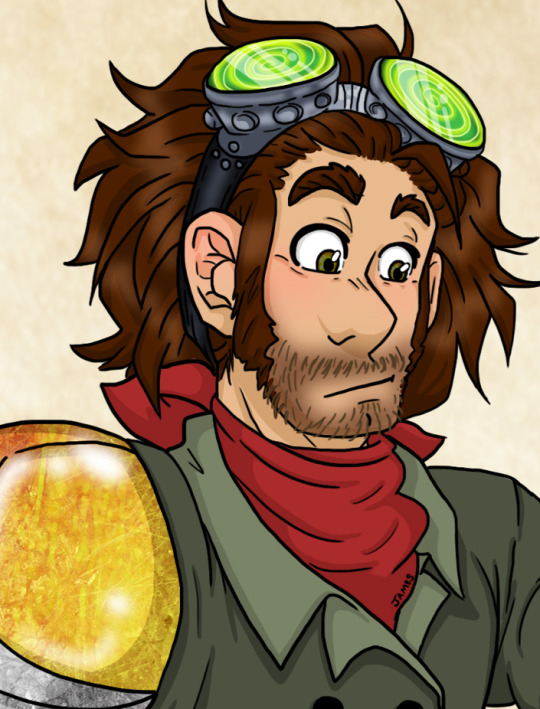
Randus: Probably the easiest design for me to come up with, because as soon as the items “Bigger stupider goggles and elbow length gloves” were uttered, my thoughts immediately went to: “Oh, those cute fashion Goblins are going for mad scientist-meets-blacksmith.” So really it’s a more goofier version of his usual adventuring gear, with a hint of flare through out (since they are about to meet a very style over function God). I imagine that Randus doesn’t mind the look too much since at the very least, it isn’t like the formal attire he has to wear back at home (you know, clothes he has to keep clean and are far too lacking in the pocket department). However, he definitely keeps the bandanna on because #1: He always wears it when adventuring because he’s a sentimental mush. #2: Goblins think it works with the outfit. #3: I adore bandannas. Lol.

Orem: Oh my gods...this was amazing to design because the goal was coming up with something Orem would just absolutely be miserable in but still be sorta fashionable in a “retro/thrift store wizard shop” way. As soon as Rodrigo was an evil genius and told him it was a comical red wizard outfit; far different then Orem’s usual preferred fashion of light, form fitting, elegant, white and blue Eladrin silks...I had to take it up a notch and a half! I made the already suggested floppy wizard hat, even more floppy and implying that it’s made of a gross suede material that would just really amplify the feeling of a weighty, miserable hat. The outer robe I also wanted to be made out of a suede, very heavy material that wouldn’t match his hat. Tied in a gaudy silk braided belt. Lets face it, Orem seems the type to hate outfits in which patterns and/or textures don’t vibe well for an overall look. Which Lastly is why I came up with a “tacky” maroon star pattern robe for underneath his outer robe so it could clash and act as the stereotypical nod to wizards wearing robes with stars on them.

Little Sparkle: Sparkle’s all grey, Goblin vision of what a “rouge” outfit was fun. Honestly the first couple a drafts I drew, I was going to go with very plain textures and coloring, but I really wanted to get creative with this “all grey” look. My justification was that Malgublyet’s idea of “simple or plain” is still pretty chic. It also helped that her attitude was all more than pleased with the outfit, so I wanted to put her in something that would still be really cute on her. I was really close to drawing her with the hood up, but I was just so happy with how my redesign of her came out (it’s been so long since I drew her, I had to change it up), I wanted to show off her pretty face and plumage! By the way, I now want those baggy-ass pants. They look gloriously comfy!!!

Ket and Gai: Holy cow...it was probably the fact that Gai was fluffed to look like a poodle that I made it a promise to draw the group’s fashion makeover. It doesn’t help that in the past I actually worked as a groomer and I have done my fair share of poodle grooming, so drawing Gai was just a funny and amazing experience. As for Ket, I took advantage of the fact it had been so long since I last drew him to redesign him from the ground up...and DAMN, he’s never looked more handsome in my opinion. As for his outfit, I chose royal blue/purple color schemes mainly because #1: I hardly doubt Ket’s choice of clothing really has these sorts of nice cool and rich colors and verity is the spice of life. And #2: It was made kinda as a slight to Orem because he adores blue and I’m sure he very much dislikes this atmosphere in which Ket is the more better dressed and fancy individual. LOL. Psst!!! BTW, OMG THAT MUSTACHE!!! <3
Sekhar: Once the description for him was made I was so stoked to get to work on the amazing Sekhar Obleea! I really love designing armor when given the chance, and huge shoulder piece ones are some of my favorites! For this, I wanted our favorite large, suave, Vampire fellow, to look like a major kick-ass, fashionable, knight in shining armor that would make bad guys weep about their own outfits and flee in shame. It helped too that he seemed quite pleased with the look, which to me meant that it must be dazzling to look at since I see Sekhar as someone who does occasionally enjoy dressing well, since after all he is handsome as f**k and he knows it. Lastly, just as a cute nod, it has “M” shaped motifs through out the design as tribute to the amazing Malgublyet.
I hope you fellow Critical Hit fans enjoy this as much as I liked making it. I would have finished it sooner, but it’s been a bit rough finding free time to work on this because currently @messybitch802 are still working on our Hobbit Fanfiction/Fanart project. So time for art has been eaten up by that as of late. It will probably be a while, but I do really want to do some more nice finished pieces of the crew’s time spent in Malgublyet’s domain because I really enjoyed those episodes. Especially focusing on Malgublyet himself. I ADORE HIM. Here is a link to doodles of my design of him btw -->X feel free to check out that process.
#Critical Hit#Critical Hit Podcast#Randus Duthane#Orem Rivendorn#Little Sparkle#Ket H'zard#Gai#Sekhar Obleea#The Sparkletones#Sparkletones#episode 497#dnd podcast#dnd party#d&d podcast#d&d character#fashion design#costume design#fan art#critical hit fan art#art#illustration#human?#eladrin#kenku#half elf#book imp#half vampire
34 notes
·
View notes
Note
Hi, I've been think of watching Good Omens, is it any good? Also, how do you feel about Draal's character design, and if you could redesign him any way you want, how would you? Finally, I'm working on a Jungle Book fanfic, based more off of the book, and in the final battle against Shere Khan, Akela sacrifices himself, either pushing him away from Mowgli and dying due to old age and heart failure, or taking the bullet for her from the evil hunter Buldeo. The Sapphire One.
I thought Good Omens was good.
If you like thwarted apocalypse stories, and “characters meant to be on opposite sides become allies and grow to love each other dearly and this love is so obvious from how they treat each other that they never feel the need to directly say it (and as such it can be interpreted as platonic, romantic, or familial love, although a vocal segment of the fandom does ship them)” as a co-protagonist dynamic, and you aren’t scared off by ‘blasphemy’ (apparently some people got quite huffy about God being voiced by a woman), this might be just the mini-series for you!
It’s six episodes, and each episode is not quite an hour long. I got it by getting the ‘30 day free trial’ for Amazon and then cancelling before I’d have to pay them any money, since I don’t like Amazon but it was the only place I found to watch the show. You’ll need a credit card to sign up for the trial.
Or, if you have a friend or relative with an Amazon account, you can piggyback off theirs. I’m sure with a bit more time and digging it’s possible to find pirated versions as well.
+=+
Draal had a good design. I quite liked it and don’t have anything in particular I would change.
Well, maybe increase his shininess and iridescence just a smidge. Look at different scenes of him; he definitely changes colour subtly depending on the lighting. He and Nomura are the two shiniest trolls in the show, but she’s a lot glossier. Draal can’t be shinier than she is, though, because that would be visually distracting in scenes when he’s supposed to be a background character. Nomura is the ideal degree of shiny.
It would be cool to make the crystals on Draal’s back fade to translucency near the tips, but that would be expensive to animate and probably only be done for a movie, not a TV show.
A few scenes of his eyes glowing, outside of the blue glow of brainwashing, would be nice. Blinky’s glow a couple of times in the first few episodes (the sewer grate and Jim’s basement), and Bular’s and Gunmar’s glow all the time, and AAARRRGGHH’s eyes do that inversion where the iris and sclera go black and there’s a glowing green tiny pupil (or maybe the pupil expands and there’s just a tiny green eye-shine?), so it’s not a Changeling-exclusive thing. Of course, not having Draal’s eyes glow may have been a deliberate choice to add to the visual impact of the brainwashing glow …
But overall, I really like his build and spikes and facial structure and giant eyes and ridiculous teensy legs.
Might add a pocket or pouch to that kilt thing he wears, like Vendel has. I dislike outfits without pockets.
... Well, you know what, actually, if I had full creative control ... I might make my joke idea about Draal having beetle wings under the spikes canon.
+=+
I think I’ve mentioned before, although I do like Jungle Book it’s not one of my favourites, and so I’ve never been inclined to look at fanfiction for it, but I wish you luck in finishing your story!
Akela is the pack leader of the wolves who adopt Mowgli, if I recall right. I don’t know who Buldeo is and so I take it this is a character from the book; or possibly the Disney sequel which I never watched; or possibly an original character of your own, but given your description of them as ‘the’ evil hunter rather than ‘an’ evil hunter, I am more inclined to think they are a book character.
Akela taking the bullet might feel like a reference to Bambi (animal parent of protagonist gets shot) or, more likely, Tarzan, (Kerchak taking a bullet from Clayton to protect Tarzan). Either of those death scenes sounds very dramatic and impactful.
4 notes
·
View notes
Text
Sanders Sides Queer Eye AU
I know, I know, I come up with a lot of fucking AUs and never do anything about them! But listen, I was watching Queer Eye season three and it just kind of hit me like a freight train. Idk if it’s been done before or not but fuck it, here’s my version of it!
Patton (Antoni Porowski – food and wine expert)
I’ve always loved the idea of Patton having a passion for the culinary arts
He mainly enjoys baking and sweets but he knows a full range cuisines
Always promoting healthy food options with the occasional guilty pleasure (mainly cookies)
Just like Antoni whenever they go into a client’s house he goes straight for the kitchen and is always smelling funky things or putting stuff in his mouth.
Always makes sure to teach each client simple and healthy recipes that they can continue using in their everyday lives as well as a few fancier ones for special occasions.
Rocks the fanny pack look like nobodies business!
Logan (Bobby Berk – design expert)
I was actually going to make him Tan but I really couldn’t picture Logan as a “fashion expert”
Our boy is smart and has a good eye for design and is not afraid to roll up his sleeves and get down and dirty on the job.
Also really likes plants so in almost every redesign he does there’s always got to be at least one plant somewhere.
Our boy is still a HUGE nerd whole loves space!
Came off as really serious and cold at first but as time went on he warmed up a bit
Usually the one that ends up driving the Fab 5 car around because he’s the best driver and honestly the other’s are not the best multitaskers
Roman (Jonathan Van Ness – grooming expert)
Do I honestly have to explain WHY I chose Roman as Jonathan?
Most fabulous! Most extra! The biggest Queen ever to slay!
Plus Roman being able to rock heels and skirts is always amazing! Toxic masculinity where? Gender norms who? I don’t know her!
Likes to incorporate a lot of home remedy self care stuff: home made facial masks, exfoliant, hand scrubs, etc.
Has had some funky hair styles throughout the season, from long hair to multi colored hair of every shade.
Just like Jonathan he is the WORST driver!
Virgil (Karamo Brown – culture and lifestyle expert)
Virgil has had the most growth and personal development throughout the Sander Side series so who better to help other people grow in their own self fulfillment
Obviously he’s not as chipper as Karamo but he’s still very kind and warm
Likes to keep things real, he knows when to call people out on their bullshit and how they should use this as a motivator to better themselves
Has a weird form of positive nihilism: “Life is meaningless anyway, so might as well do the thing you want to do. It’s not like you have anything to lose?”
Despite his dreary exterior people still very easily open up to him and because Virgil is a soft boi he’s always ready with tissues and hugs.
Still an introvert to the fullest, so after they finish with each client he just crashes on the couch back at home base and naps for the entire day.
Deceit (Tan France – fashion expert)
I find this ironic because his outfit in the Sanders Side series is very cheesy and cartoon villain-ish. But for some reason in real life I always thought that Deceit would be very fashionable.
Still has that yellow and black color scheme and makes it work! Roman is forever envious!
Still promoting the French Tuck to every client just like Tan (shut up!)
Crocs are an atrocious invention of man and it is his life goal to burn every single one of them!
Can be very cut throat and critical but also very sweet and gentle. People should always feel beautiful and amazing in the clothes they wear.
Has vitiligo on one half of his face as well as being blind from one eye and still looks amazing!
More headcannons!
Okay, so the whole “To Gay Or Not To Gay” episode was just a sobbing emotional mess and the Fab 5 all fucking sobbed for hours after watching the epilogue clip
Same thing with the “God Bless The Gays” episode!
The “Sky’s The Limit” episode where Tan and Skyler have that moment when getting fitted for a proper suite and Tan has a breakdown because he had no idea how difficult it was for trans people to find clothes they feel comfortable in while other people could just grab and go so easily. That’s like a whole Deceit mood and afterwards he makes it his goal to learn more about transgender folk and their different body types so he’ll be more knowledgeable next time.
Yes, they were in Lip Sync Battle and yes they were absolutely fabulous!
They’re all married with loving husbands and all either have kids or at least two pets.
(*gasp* Whaaat, Bunny not projecting their default ships into their own AU??? Bitch yes! Platonic DLAMP is a beautiful thing and there should be more of it in the world!)
So many platonic hugging, hand holding, and cheek kisses! They’re best friends damn it and they love each other!
Just like the og Fab 5 they support each other and send complements through social media and it’s super cute!
Do they vacation together? Of course they do!
Roman and Virgil always go out together for spa days and to get their nails done.
Patton likes to have family potlucks whenever they all get together
Logan actually has a doctorates degree in astronomy and physics but fell in love with design so much he decided to changer career paths
Deceit likes to run a lot of charity events and fashion shows which helps provide clothing for children and families in need.
They all actually have their own charity organizations that they manage and are always willing to help each other with planing.
They call and facetime each other a lot when they have to separate and head back home after each season.
Patton is still the “dad” friend and Logan is still the “mom” friend and their fan base always makes fun of them for that!
There has literally been a moment when both of them have been sitting in the driver and passenger seat while the other three bicker in the back and Patton is trying to be the mediator but Logan turns around and is like “If you guys don’t settle down I am turning this car around, right now!”
On long car rides they like to do karaoke and sing all the classic 80s and 90s bops! Plus a bunch of musicals, of course.
Like, it’s all so gay and beautiful aND I LOVE IT SO MUCH!!! 😭❤😭❤
#thomas sanders#sanders sides#queer eye#logan sanders#patton sanders#roman sanders#virgil sanders#deceit sanders#sympathetic deceit#queer eye au
25 notes
·
View notes
Last Seen Blogs

agenbluegenicbanjarmasin
Agen Bluegenic Banjarmasin

nishi-kigoi
nishi ✨
animelyrics
Lyrics from the japanese popular culture songs
stairway2happiness-blog
On My Way To Happiness (pervertedloverversion)

plumbershaberfield-blog
Plumbers Haberfield | Call 1300 679 274