#pure light
Photo


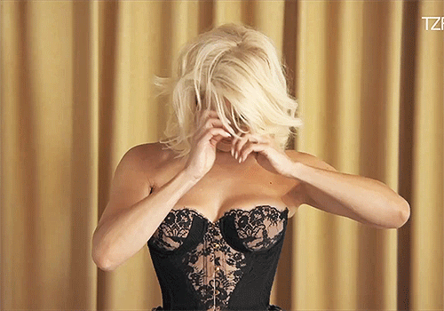
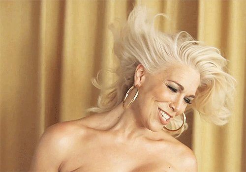

Things You’d Only Know if You Were Hannah Waddingham | TZR
#hannah waddingham#stunning#goddess#woman#god is a woman#TZR#magazine#interview#TZR magazine#SHE IS BRIGHTER THAN THE SUN ITSELF#PURE LIGHT#I LOVE HER SO MUCH#HER SMILE GENUINELY MAKES ME SO HAPPY#she really is the most beautiful woman on earth#with her stunning beautiful eyes#and her bright beautiful smile#and her joy and love and warmth#and her ARMS AND BODY ODY ODY#ii cant#im hers completely and entirely hers
841 notes
·
View notes
Text
if merlin is blue and arthur is red, then merlin and arthur together are gold.
everything about merlin is blue. his kindness, his anger, his fear. they are the color of the sky and the depth of the ocean. merlin's mourning is a grey shade of dirty cerulean, his grief drips deep blue everywhere, falls from his cheekbones, from his lips. his sadness and his happiness are azul and they swirl, twin butterflies taking flight. pale blue is death and cyan is the relief of forgiveness and blue is the silent quiet. azure is healing and pain and gentleness and electric power. blue his unshaken faith and blue his loyalty, marked on his skin and bones. merlin is spring horizons, cloudless night, where the indigo almost turns black.
arthur is coated in red. blood red, frustration and annoyance red, his hands and his voice are full of it. arthur is the softest velvet, embracing with a shy yet bold love. red is his pride, weapon and shield, and adorned with rubies his protection. arthur is the heart that beats hard, he pumps blood in camelot, he is affection and pure passion. red is war and red is penitence. he is crimson courage, fearless because of his cherry honeyed love. a scarlet hued justice follows in his steps, beneath his trademark cloak. he is dusk and sunset and coming back home. he is summer hot and blazing midday.
merlin and arthur are blue and red but oh, together they are the most anciet shade of gold.
gold of magic and gold of camelot. gold the lining of arthur's cloak and heart, gold the brightness in merlin's eyes and soul. gold the tendrils that bind them together. gold the sun and the stars, which twinkle above them all, dancing to a silent tune. gold is the pendragon crest, and gold the eyes of dragon. gold is where the night meets the day, and gold is eternity, and gold is time outside of time, where the young and the legend live forever, untouched. gold the bridge, the door and the key. gold is life.
gold is memory and gold are the smiles that are shared.
gold the dawn when love is born and a new era begins for them all.
#i love my blue x red couples#but merlin and arthur together are gold and you wont fhange my mind#i also love when people are merlin being blue and silver while arthur is red and gold#but i think i love the idea of merlin and arthur being linked together#gold is the color of magic. merlin is magic and arthur is born of magic#magic is merlin and magic is also arthur#merlin's magic is for arthur but arthur's existence is for merlin as well#separate they are blue and red but together they are light#pure light#merthur fic in which something goes wrong in a spell or potion or whatever and whenever merlin and arthur touch the skin is color stained#gold is the bridge between merlin and arthur#merlin is night and arthur is day but gold is gentle down and they can meet there#for all their days and more#merlin#merlin bbc#merthur#arthur pendragon#merlin and arthur#i wrote this#colors#merlin ficlet#maybe#merlin headcanon
619 notes
·
View notes
Text
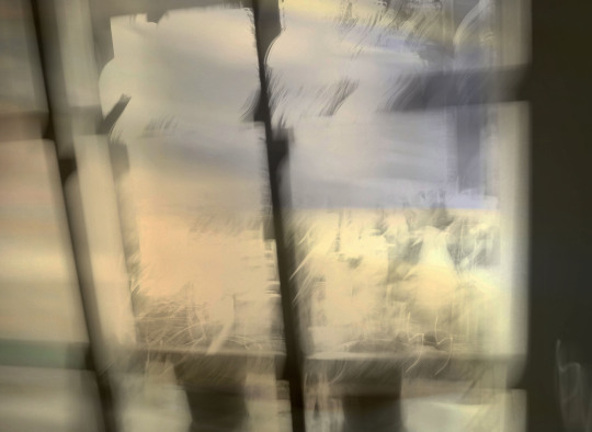
I hate sundays...
#photography#photographers#original photography#urban photography#black and white photography#creative photography#sunday#abstract#pure light
12 notes
·
View notes
Text
Jonny all wet, messing with his gorgeous hair. you're welcome 🫦🥵
#jonathan bailey is a god#jonny bailey#jonathan bailey#gay icons#anthony bridgerton#bridgerton#johnny bailey#i wish this was me#i want him#ugh i love him#my heart#hes so pretty#why are you so pretty#pure light#love him#wicked#on set
68 notes
·
View notes
Photo
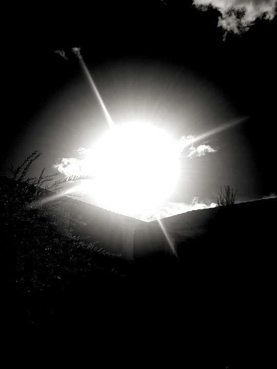
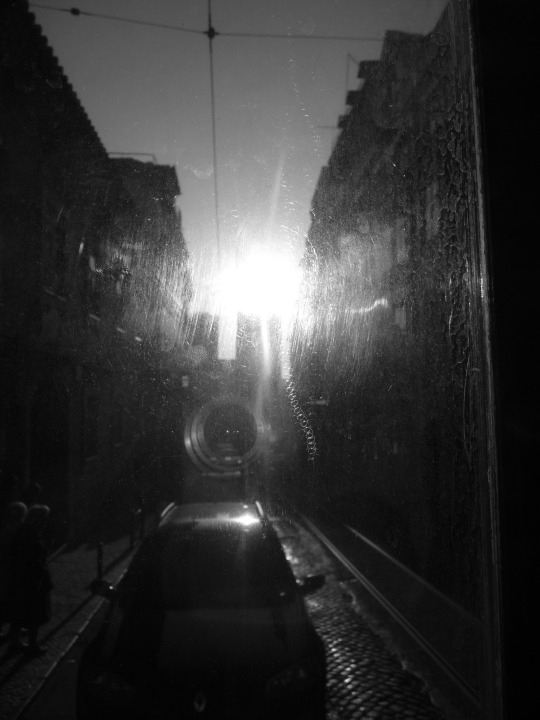

Pure light (Charente - Lisboa - Provence)
#lumière#light#soleil#sun#photography#Photographie#fotografia#pure#pure light#summer#mediterranean#portugal#lisbonne#lisboa#charente#Provence#France#photo series#mescalinartofnoise#djccjung#Black and White#zen#love#beauty
33 notes
·
View notes
Text
"Beauty is a fragrance and it smells like you.."
Smells like your soul in the sunshine and it smells like pure light - eUë
#beauty#you are beautiful#beautiful#fragrance#sweet fragrance#smells like you#smells like sunshine#sunshine#your smell#soulmates#soulmate#pure light#poetic#poem#poetry#spilled poetry#poet#poets on tumblr#twcpoetry#writerscreed#spilled ink#spilled thoughts#spilled words#love quotes#love#love quote life quotes#love quote for her#quoteoftheday#romance#romantic
58 notes
·
View notes
Text
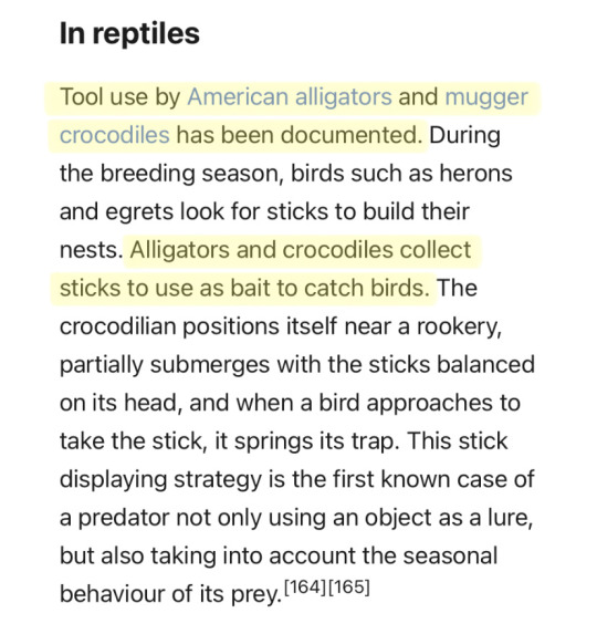
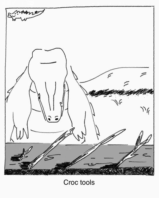
no fucking way
#sketches#comics#the far side#crocodiles#my art#i don’t know how to tag this.#also i should probably say. i tried to look into it further and i haven't seen hard hard evidence that they do this on purpose#personifying animals is tempting but ultimately i think it's just hot speculation atm. crocodilians are famously tough to research too#like the advantages may be a coincidence or just pure curiosity/play. which is also really cute...love those guys#sorry for the misinformation! light theory only afaik#comic
64K notes
·
View notes
Text


Not keeping such important things solely on DA.
1 note
·
View note
Photo

Goretober Day 9: Crystal Gore
Saw the prompt I knew I had to do Rykos' death
Social Media
DA
Tumblr
Furaffinity
Twitter
Instagram
Pixiv
Artfight
Inkblot
Mastodon
Itaku
Bluesky
Stores
Commission Info
Sale Info
My Ko-fi
Redbubble
My Public Discord
My Patreon
Ko-Fi Membership
Posted using PostyBirb
1 note
·
View note
Text
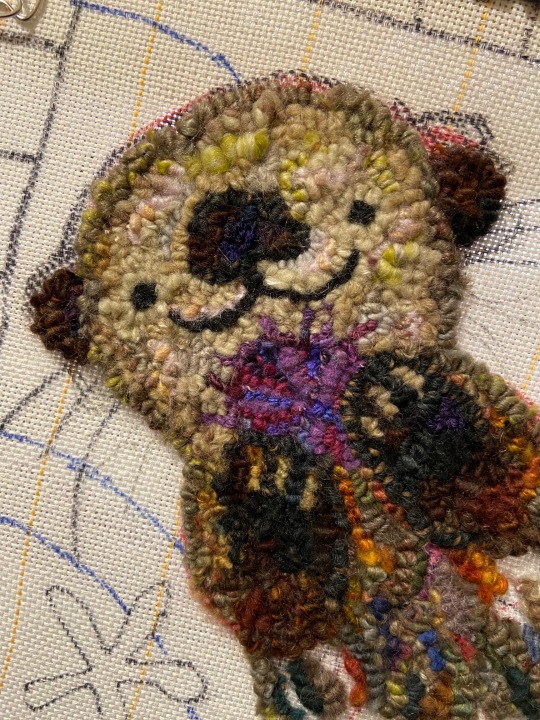
on to the next gift wip
#rug hooking#fabrication#wip#purely personals#don't mind the really warm lighting haha#had to undo most of the face/head the first time because something wasn't working out#as well as the paws but a lot happier with how it looks now#also discovered the delight of using extremely uneven chunky yarn#scrubs hands over yarn loops every time I trim off the extra yarn tails sticking out hahhkjfd#can't really go to sleep yet so have this wip
6K notes
·
View notes
Text

justice
#after jean delvilles sketch by the same name#which i got an accidental hit tweet over#that was pure agony#BUT HEY akeshu :3#i feel. SO smart for the lighting for the two goros in the back#be proud of me#persona 5#persona#shuake#akeshu#goro akechi#ren amamiya#akira kurusu#joker#my art
3K notes
·
View notes
Text
so like. if anyone else, like me, still has the occasional fanfic they follow on fanfiction.net, and hasn't been getting the update emails for the longest time and was wondering if ti meant the site is on its last legs
no
no they've done something stupid as fuck

you have to opt back in to getting the emails/notifications of new chapters every six months, because they automatically assume you don't want to know when the fics you followed for the updates have updated
#for fucks saaaaaaake#now i have to go back thorugh all the fics i follow to see if they've updated in the last like year#ffn why are you doing this#this is the shit that drives ppl to ao3#and for the record i don't like ao3 purely because somehow ffn still has the better accessible reading options on its base site#without requiring you to log in and find [or code your own] site skin. it's just on the base site.#dark/light mode and increasing text size on a fanfic archive should not be a logged-in members-only coding-required thing
2K notes
·
View notes
Text
I think 90% of my gripes with how modern anime looks comes down to flat color design/palettes.
Non-cohesive, washed-out color palettes can destroy lineart quality. I see this all the time when comparing an anime's lineart/layout to its colored/post-processed final product and it's heartbreaking. Compare this pre-color vs. final frame from Dungeon Meshi's OP.


So much sharpness and detail and weight gets washed out and flattened by 'meh' color design. I LOVE the flow and thickness and shadows in the fabrics on the left. The white against pastel really brings it out. Check out all the detail in their hair, the highlights in Rin's, the different hues to denote hair color, the blue tint in the clothes' shadows, and how all of that just gets... lost. It works, but it's not particularly good and does a disservice to the line-artist.
I'm using Dungeon Meshi as an example not because it's bad, I'm just especially disappointed because this is Studio Trigger we're talking about. The character animation is fantastic, but the color design is usually much more exciting. We're not seeing Trigger at their full potential, so I'm focusing on them.
Here's a very quick and messy color correct. Not meant to be taken seriously, just to provide comparison to see why colors can feel "washed out." Top is edit, bottom is original.
You can really see how desaturated and "white fluorescent lighting" the original color palettes are.
[Remember: the easiest way to make your colors more lively is to choose a warm or cool tint. From there, you can play around with bringing out complementary colors for a cohesive palette (I warmed Marcille's skintone and hair but made sure to bring out her deep blue clothes). Avoid using too many blend mode layers; hand-picking colors will really help you build your innate color sense and find a color style. Try using saturated colors in unexpected places! If you're coloring a night scene, try using deep blues or greens or magentas. You see these deep colors used all the time in older anime because they couldn't rely on a lightness scale to make colors darker, they had to use darker paints with specific hues. Don't overthink it, simpler is better!]
#not art#dungeon meshi#rant#i'm someone who can get obsessive over colors in my own art#will stare at the screen adjusting hues/saturation for hours#luckily i've gotten faster at color picking#but yeah modern anime's color design is saddening to me. the general trend leans towards white/grey desaturated palettes#simply because they're easier to pick digitally#this is not the colorists fault mind you. the anime industry's problems are also labor problems. artists are severely underpaid#and overworked. colorists literally aren't paid enough to do their best#there isn't a “creative drought” in the anime industry. this trend is widespread across studios purely BECAUSE it's not up to individuals#until work conditions improve anime will unfortunately continue to miss its fullest potential visually#don't even GET ME STARTED ON THE USE OF POST-PROCESSING FILTERS AND LIGHTING IN ANIME THOUGH#SOMEONE HOLD ME BACK. I HATE LENS FLARES I HATE GRADIENT SHADING I HATE CHROMATIC ABBERATION AND BLUR
2K notes
·
View notes
Text
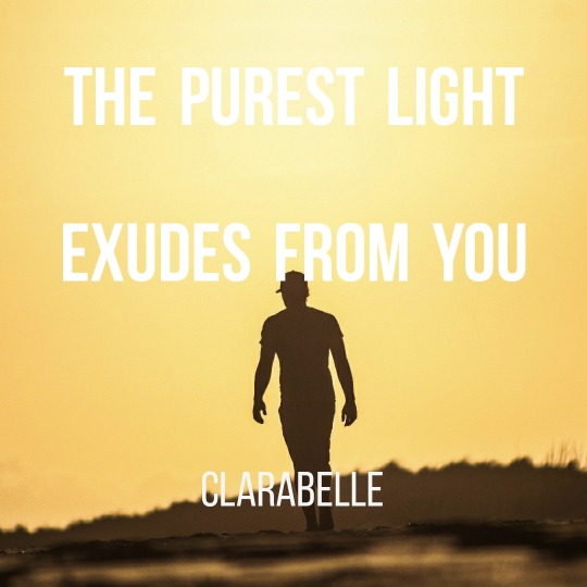
The Purest Light
The purest light exudes from you.
As soon as you realise even the sun cannot compete with your own beautiful light, the greatest things begin to happen for you.
Your pure light can permeate any problem, challenge or worry and all you have to do, is let you shine.
Yes indeed – LET YOU SHINE – today and everyday.
Clarabelle
View On WordPress
0 notes
Text
"You are so beautiful that flowers must lean towards you just like pure light, you are that beautiful.. much more beautiful than the moon at night."
Moonlit nights are often sought after, but it is in your soft sunshine that my heart gets filled with laughter - eUë
#you are so beautiful#beautiful#you are beautiful#beauty#beauty of you#beauty of love#flowers#sunshine#moon#moonlit night#moonlit#pure light#you are my sunshine#i love you#loving you#sweet#poem#poetry#poetic#poet#poets on tumblr#spilled ink#spilled thoughts#spilled words#love quotes#love#love quote life quotes#love quote for her#quoteoftheday
10 notes
·
View notes
Last Seen Blogs
newattitude
Blogger Second Life

gallerylover
Hello
peppermin
Alice
guavora
mads

arisvgm
Aris's Favorite VGM